FAO
I would like to foucus on latest (2017) asia data and would try to find distinguishing country or pattern using population and GDP information.
Data Source
Downloaded data from here 
Data Overview
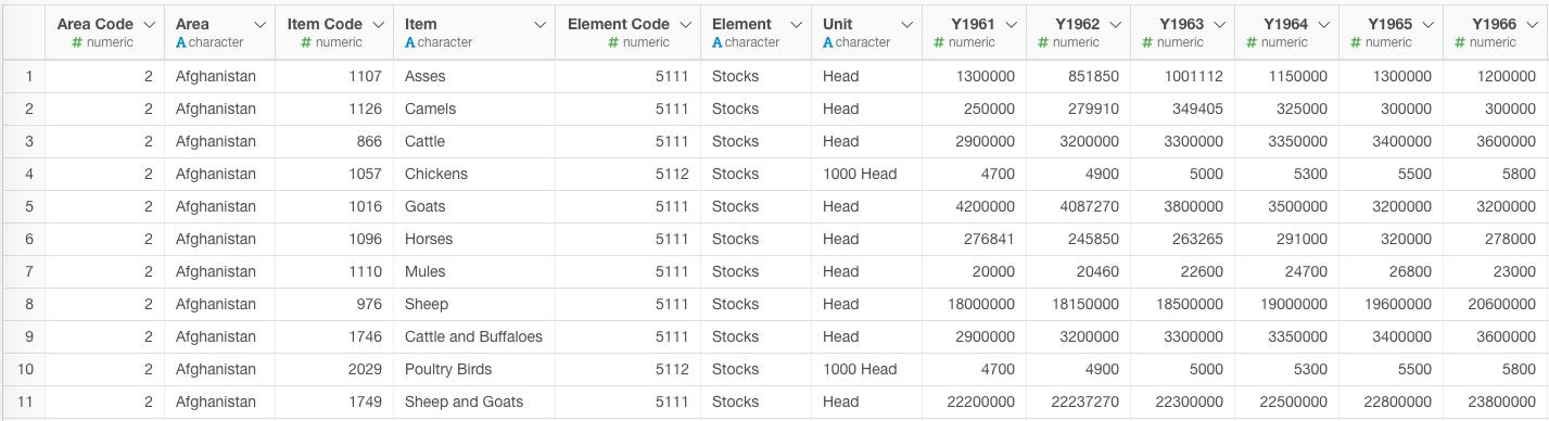
Data format is same as sample data that Kan posted.
Data wrangling
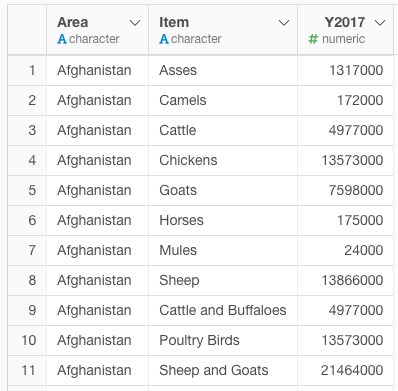
The data included bunch of years so I exclude all the year and did some wrangling like making the data clean, reflecting units.
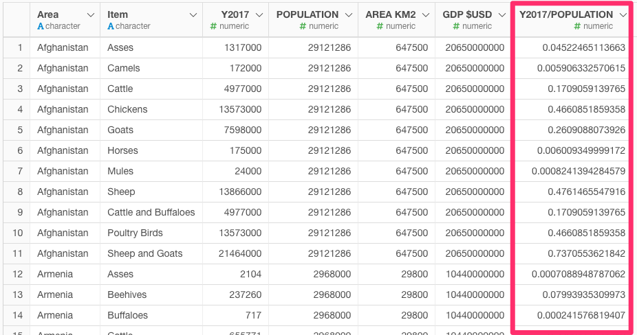
Next, I joined population data from web to mutate a column dividing value by population
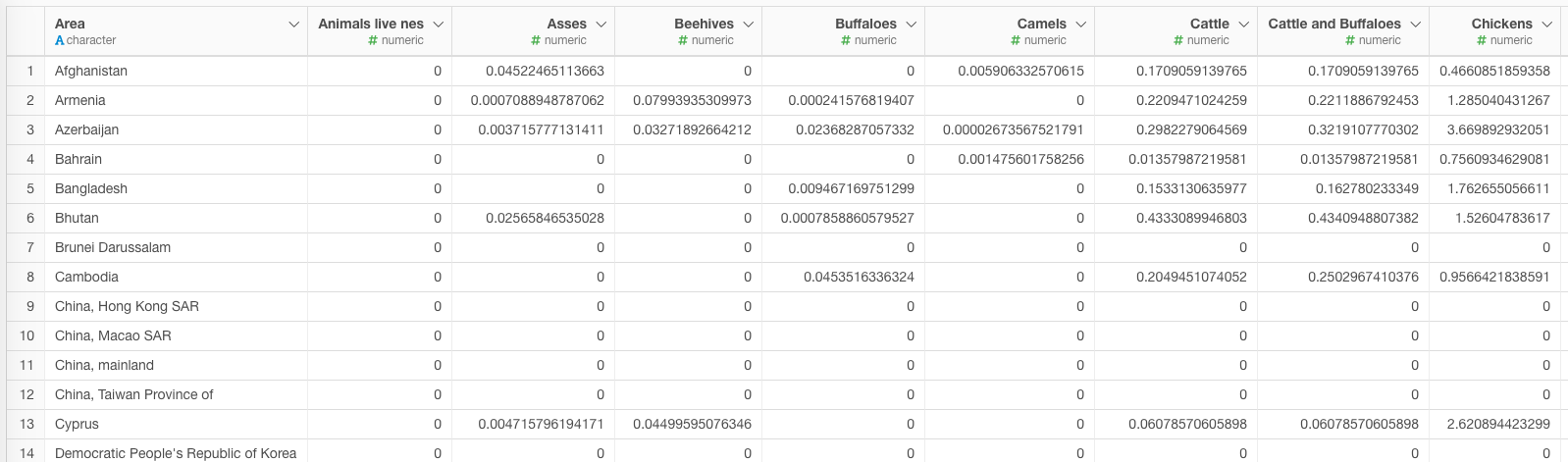
And finally I used spread function that I can use PCA in later step.
Analytics
With the data, I ran PCA.
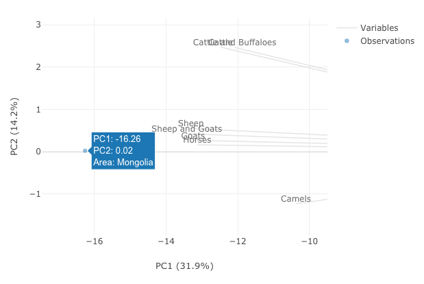
With PCA, I found a very distinguishing data point at the left side. It was Mongolia. Off course, we know Mongoila is famous country for sheep but what made me surprised, was there were no other countries like Mongolia.
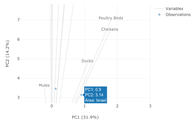
Additionally, I found that Israel plotted upper right side, has some characteristic point. Ducks, Poultry birds, and Chicken’s line could be found near Israel. May be there are some connection between birds and Israel.
And from the bottom side of the chart, we can find several Islamic country. As we can find pig in the upper side, this verifies that Islamic country has less demands for pig.
Next, I tried to assign GDP category in this plot as follows, however, could not reach out any good insight.
Conclusion
With PCA, I find things as follows.
- Mongolia has a unique position. Sheep!
- Israel has some connection with birds like Duck, Polutary birds, Chicken
- Islamic country like Afghanistan, Pakistan and United Arab will not eat pigs so plotted contrary to the pig line.