Assignment 4: Discourse Analytics
Examining Perusall Data from the Learning Analytics Spring '22 Semester
The dataset I worked with in this discourse analysis captures every comment made in Perusall (a discussion forum platform) over the course of the Spring ’22 learning analytics course and the details about those comments (date created, page number, length, which reading, who composed it).
Examining the data distribution
There are missing values in the Student ID column.
There are more comments (661) than questions (151). However, this could be slightly skewed since there is an additional action that users must take to label a reply as a question on Perusall, so there may be a few mislabeled comments that are actually questions, though this would not be a significant number.
Type
Document
Wise 2019 and Brooks 2017 received the most comments.
Page number
Most of the comments appear in the first few pages of the article, with the most comments significantly appearing on page 2 (159 total comments compared to the next highest: 92 on page 4). Pages 2-5 contain most comments.
Last name
Michelle Han and Athia D. Fadhlina were the most prolific commenters with 98 and 94 total comments respectively, with Kyra Williams trailing them with 78 total comments. This result tracks with previous Perusall data analysis we have done in this class.
Tokenizing the Text
After tokenizing the text, the columns Tokenized text, document_id, and sentence_id columns are added to the dataset.
The structure of the current data is long. Each tokenized word appears multiple times.
The original text could be rebuilt from the new columns because each word has a sentence ID and a document ID. So, the words could be grouped into sentences and rearranged based on the most coherent sentence form. It would take some critical thinking, but it could be done.
Tokenized Text
The top 10 most frequently used words in our Perusall comments are: the, to, I, of, a, and, is, in, that, this.
Cleaning the Bag of Words
After cleaning the bag of words, the top words now give us more information about the course. Now, the top 10 words are* data, student, think, learn, use, also, make, time, help, way*. This is a course about working with data and learning, so it makes sense that these words appear frequently. I’m intrigued by the appearance of the word “help” so frequently, because it suggests that, as a class, we were focused on the idea that learning analytics platforms and collected data should benefit students.
Tokenized Text
I don’t think we lost important information in this cleaning because the comments still exist in the data with their full text. The stopwords and words beyond the stems only serve to string the sentences together. The only data of possible significance could be the endings of words, which reflect different meanings. For instance, "analy" could mean analysis or analytics. However, this is a minor issue. These cleaned data give us more important information about the course.
Creating Bi-grams and Tri-grams
The Tokenized text column disappeared when I created N-gram tokens, but two new columns, “gram” and “token” were created.
First, let's look at Bi-grams (I had to take a screenshot of the following 3 pivot tables' previews in Exploratory because some of the data was unable to be recovered after an accidental deletion of a step that could not be undone).
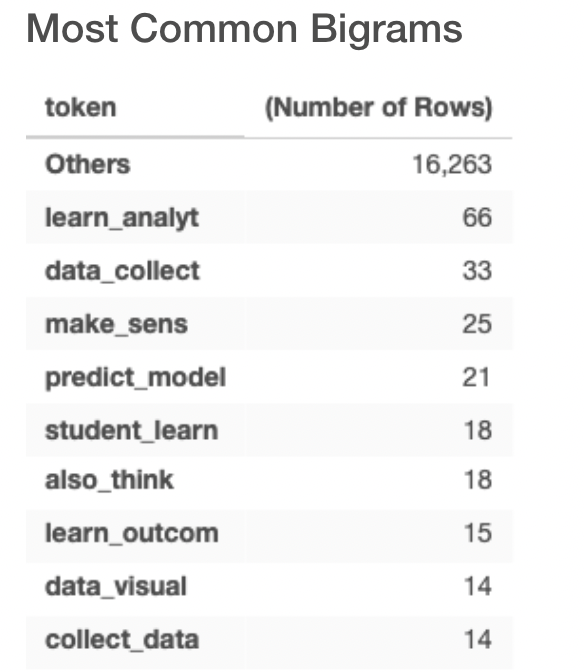
The top 5 most common bigrams are learn_analyt, data_collect, make_sens, predict_model, student_learn. Since we are only using the stem of the words, I interpret these to represent the phrases learning analytics, data collection, makes sense, prediction model, and student learning, respectively.
The top 5 most common bigrams are learn_analyt, data_collect, make_sens, predict_model, student_learn. Since we are only using the stem of the words, I interpret these to represent the phrases learning analytics, data collection, makes sense, prediction model, and student learning, respectively.
Next, let's look at Tri-grams.
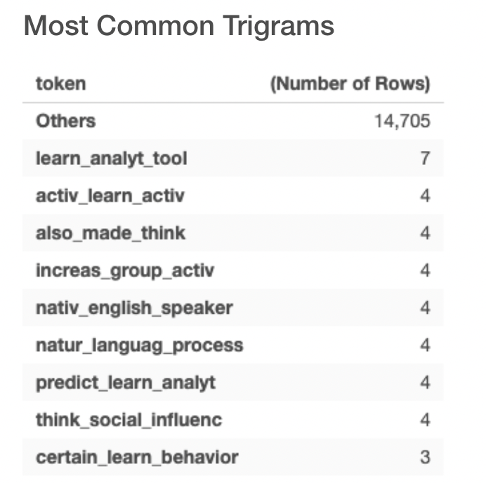
The most common trigram is learn_analyt_tool, which appears 7 times in comments. There is a tie for 7 next most popular trigrams, each appearing 4 times. These include those listed above, such as also_made_think, increase_group_activ, and nativ_english_speaker.
The following pie chart displays the commonality of bigrams, trigrams, and simple words. As one would expect, simple words appear most often making up 36.97% of comments. I was surprised by the frequency of bigrams and trigrams. Bigrams make up 33.28% of comments, and trigrams make up 29.74% of comments. However, the name of this course is learning analytics, which is in itself a bigram, so this makes sense.
Single/Bi/Trigram Pie Chart
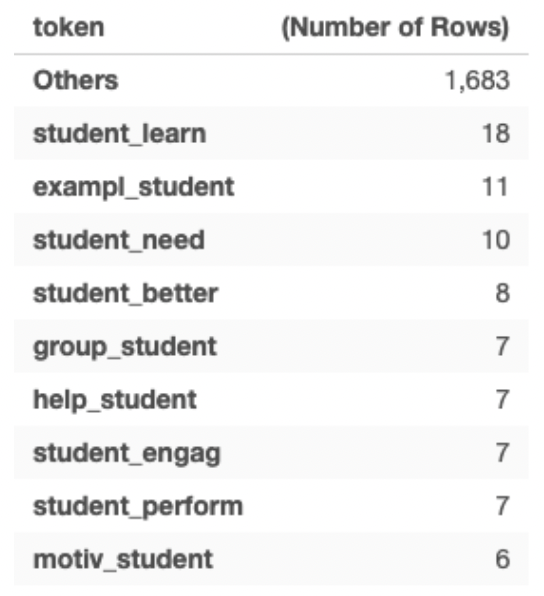
The most common bigrams and trigrams containing the word “student” are student_learn, example_student, student_need, and student_better. In these examples, we can see the effect of removing the stopwords and keeping only the stems. For instance “students learn” and “student learning” have two different meanings (verb vs. noun), but in the data, they appear as the same thing because of the way the data is cleaned.
Important Words by Paper
Just by looking at this list, the viewer can get an idea of what each paper may have been discussing. It is clear that paper 5, for instance, is about the use of learning analytics dashboards for college advisors based on the relevant words SAS, advisor, and dashboard_use. Paper 11, with high tfidf words like inequ, digit_data, target_ad, creepi, data_secur, is clearly about the ethics of analytics. For some, it is less clear because of some popular discussions in the comments. For instance, paper 2 has high appearance and relevance for bebe_thank, extremist, and extremist_group. I remember this paper was about Social Network Analysis (and SNA does appear 12 times with a high tfidf score), and not about extremist groups, but Bebe contributed a study about the SNA of extremist groups in the comments.
Sentiment Analysis
Average Sentiment Bar Chart
Sentiment Across Papers and Comments
The paper that received the most positive comment was Introduction to Learning Analytics, and the comment that received the most negative comment was Wise, 2013. However, on average, the Wise 2019 paper received the average highest sentiment score with Introduction to Learning Analytics close behind. Brooks 2017 received the lowest average sentiment score.
Introduction to Learning Analytics Sentiment
I decided to take a deeper look at these papers. Upon further inspection, I found that while Introduction to Learning Analytics had overall very positive comments, it also had a very negative one, with the lowest sentiment score being lower than -40. Despite it receiving one of the highest average sentiment scores, it still had a couple negative-leaning comments.
Sentiment Summary by Student
Average Sentiment
On average, Patricia and then Ruobing had the most positive comments, whereas on average, Elaine had the most negative comments (excluding Xavier, who is not a student).
Based on a random sample of highly or lowly rated comments, in general, it looks like the sentiment analysis is fairly accurate. Some comments that got negative scores tended to lean towards the sentiment of “While this paper says x, it’s also important that we look at another perspective,” which is generally negative. Most comments are positive or neutral, which rings true from my personal experience of reading comments on Perusall.
Conclusion
These analytics are helpful in examining discussion patterns on Perusall. With TFI-DF, one can identify a student's niche within Perusall discussion, and could even steer a student toward a particular path within the subject. Sentiment analysis can show teachers how students felt about a paper. Papers with more divisive sentiment often lead to the best discussion. Papers with more neutral sentiment may be more boring for students to read. Bi-grams and tri-grams can identify common patterns in discussion and patterns in the academic language of the subject. Author clusters can show us who is contributing uniquely, and who is contributing to the same discussions.