Introduction to Data Visualization Vol. 1 - Introduction
Hello Everyone, I’m Teagan.
I am going to start our new data visualization series today!
In this series, I want to show you how to visualize data effectively with Exploratory. I will cover topics like, ‘How to use Trend lines, Reference lines, Window calculations’, ‘How to visualize times series data?’ etc.
Let’s get started.
Why Data Visualization?
Just by visualizing data, we can tell by intuition what kind of problems are likely to arise.
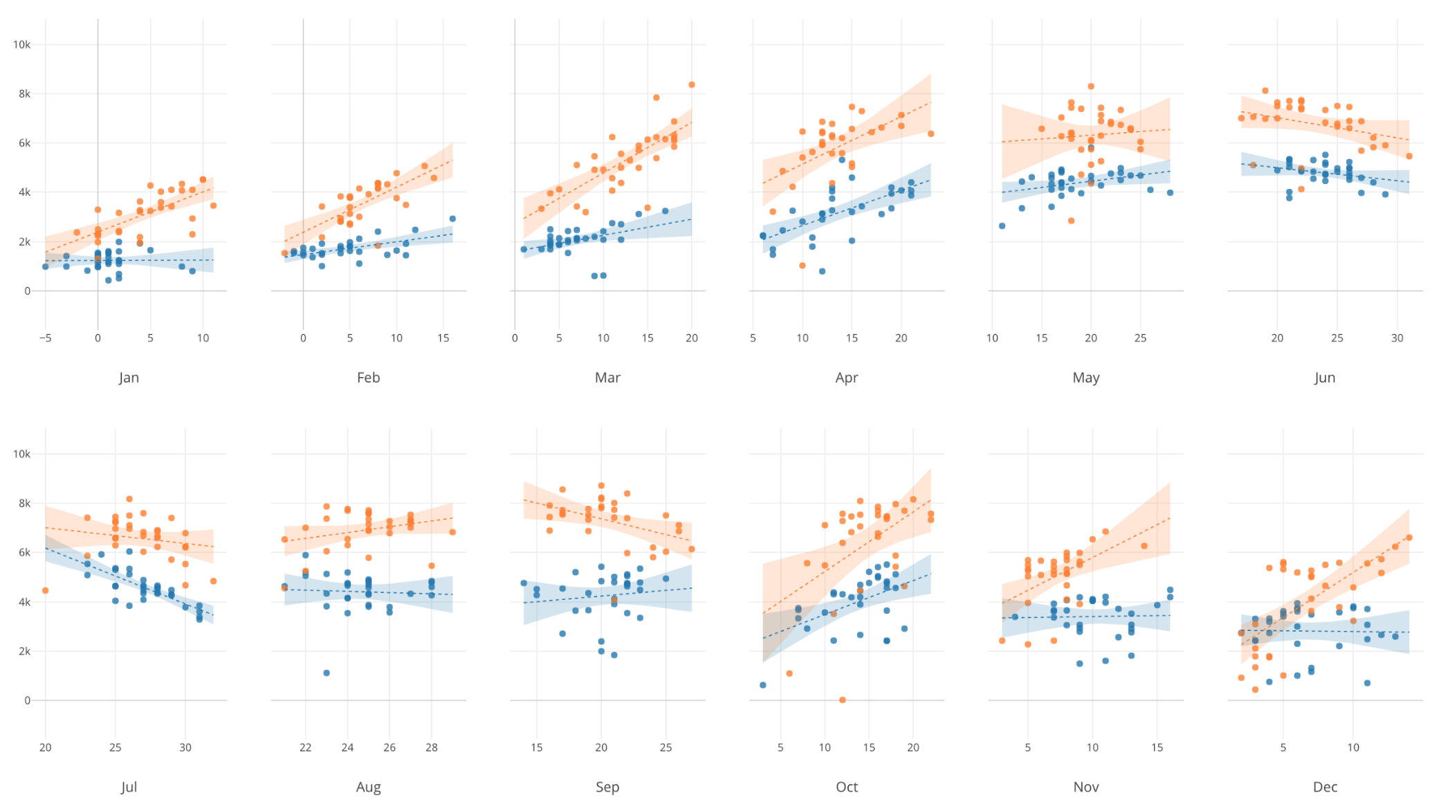
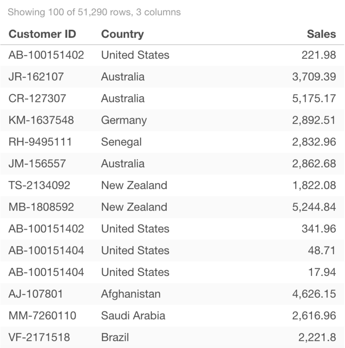
For example, Let’s say that we want to know the sales numbers for each country in our data set.
If we look at the data in this form, it is hard to compare the sales of each country.
However, if we visualize that same data in the chart below, we can easily see which countries sales are higher and which countries sales are lower.
Then, using the information that we attained from the chart above we can develop new questions and continue on to our next steps.
In this series I will introduce various techniques of how to visualize data in Exploratory.
Sample data
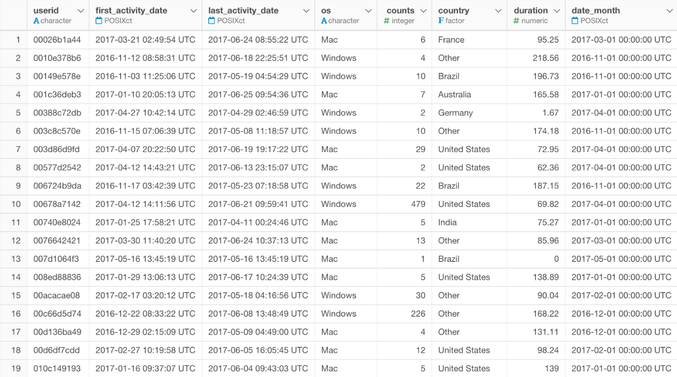
In this series we are going to use the data set called “activities.”
This is an access log data to a fictional website. You can find information like ‘Who accessed’, ‘When accessed’, ‘Which countries did they access from’, etc.
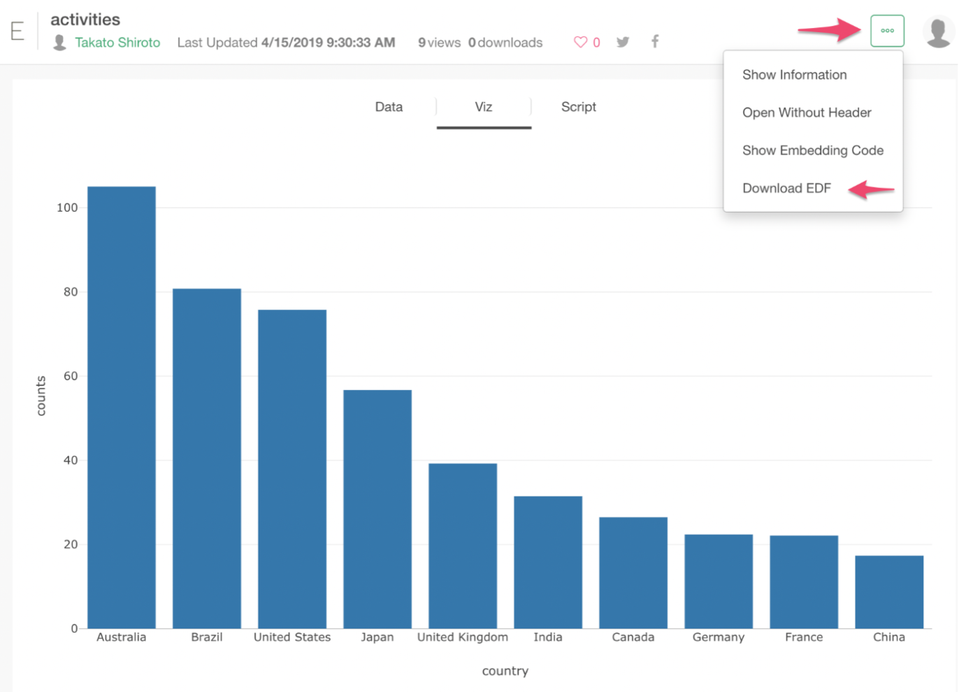
You want to download the EDF (Exploratory Data Format) file from the menu shown in the picture below.
You can download the data from here.
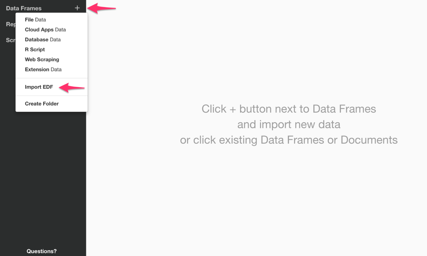
How to Import your data
Inside the project, click on the plus mark next to Data Frame, then select ‘Import EDF’.
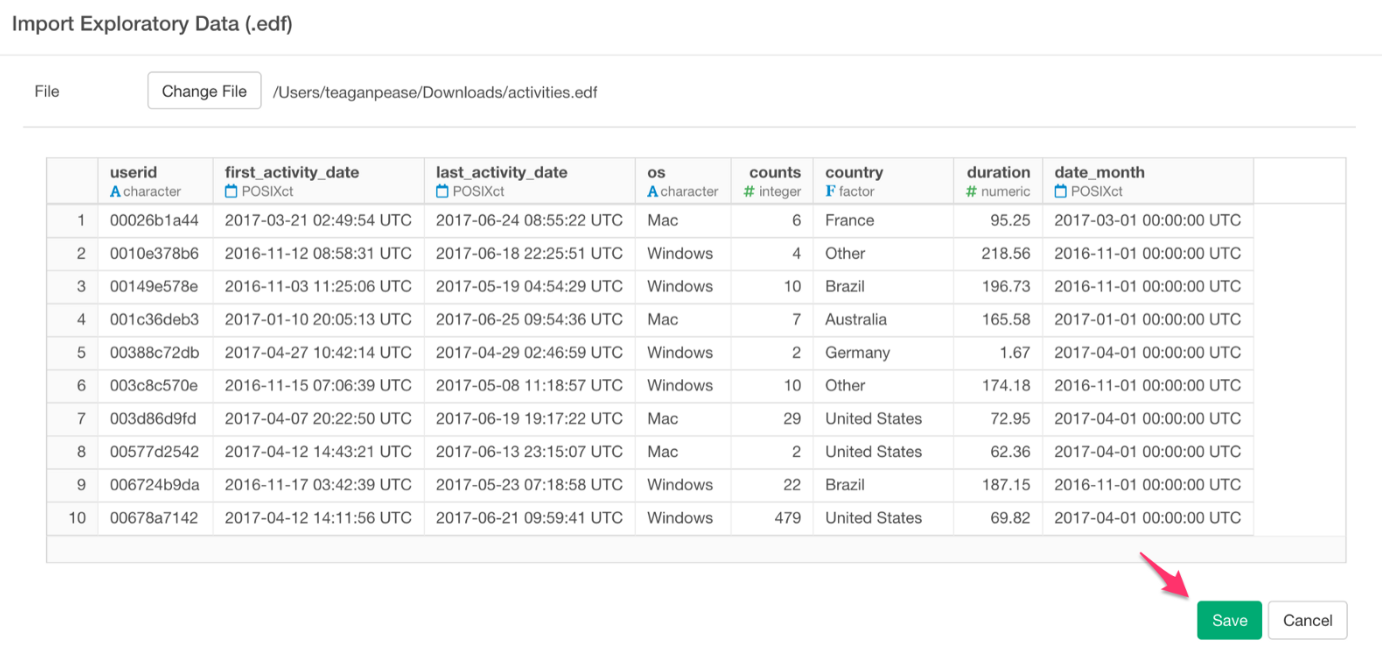
Now select the previously downloaded activities.edf file. Once you have done this, your screen should look something like the photo below. If you have the same image as below, go ahead and click save.
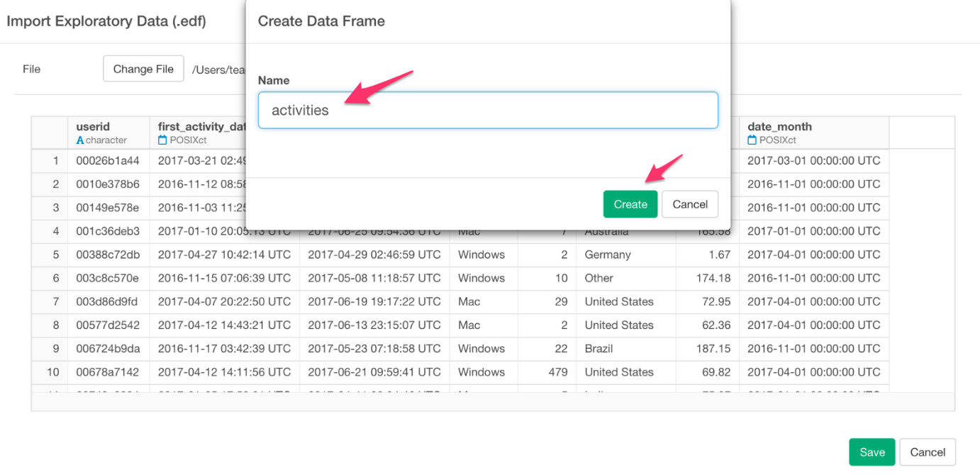
In the box labeled name, input “activities,” or a title of your choice. Once you are satisfied with the title of your project you can click save.
You have now imported your data successfully.
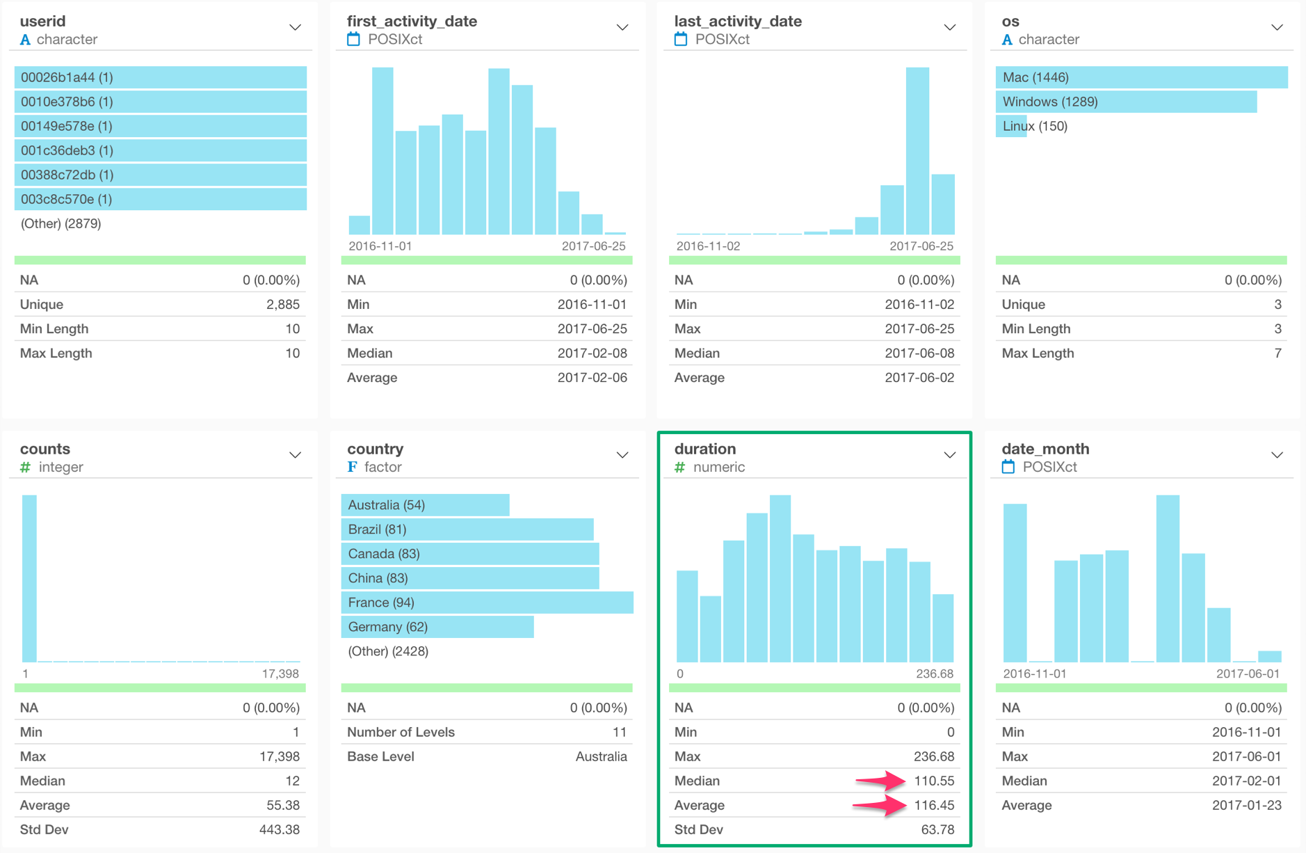
Once you have imported your data you will see the summary view below. With the Summary view, we can quickly gain insights about the data at glance.
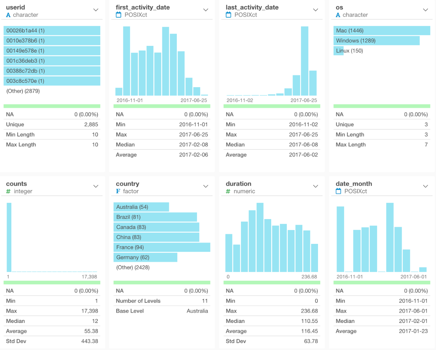
By looking at this summary view, we can see that there are 11 countries. 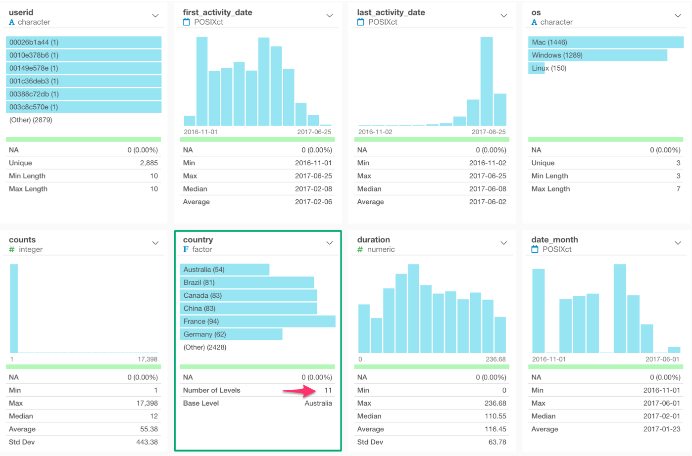
We can also see that there are 2,885 unique users. 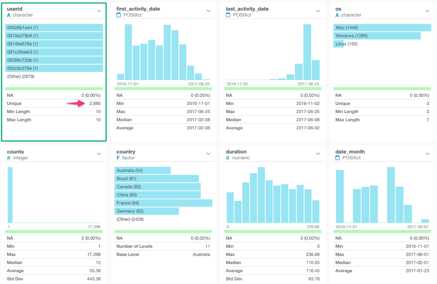
If we look at the duration (the time between the first access and the last access for each user) column, we can see that the average is 116 days and the median is 110 days.
Next Time
In the next post, I’m going to show you how to “compare” among the countries by using the Bar chart and Reference Line features so that we can answer questions similar to the ones below.
- Which countries are accessing our website a lot and which are not accessing so much?
- In which countries are customers accessing our website at a more frequent rate?
Next Post: Introduction to Data Visualization Vol. 2 - Comparison