Introduction to Data Visualization Vol. 2 - Comparison
Hello everyone, I’m Teagan!
In our last post we started our Exploratory Data Visualization series. In this post I am going to show you how to “compare” among variables in your data sets.
We are going to use the same data as the first post in this series, however, for those of you who haven’t viewed our first post you can download the data from here.
Before We Start
Here are the questions that I want to answer by visualizing the data.
- Which countries are accessing our website a lot and which are not accessing so much?
- Which countries have a higher number of unique users?
These are the chart features inside Exploratory that I am going to use in this post.
- Bar chart
- Reference line
- Zoom In
Let’s get started!
Visualizing Data
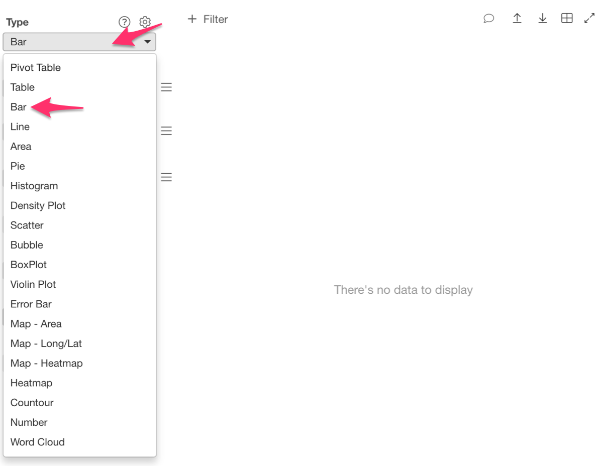
First select the Bar chart from the chart type options.
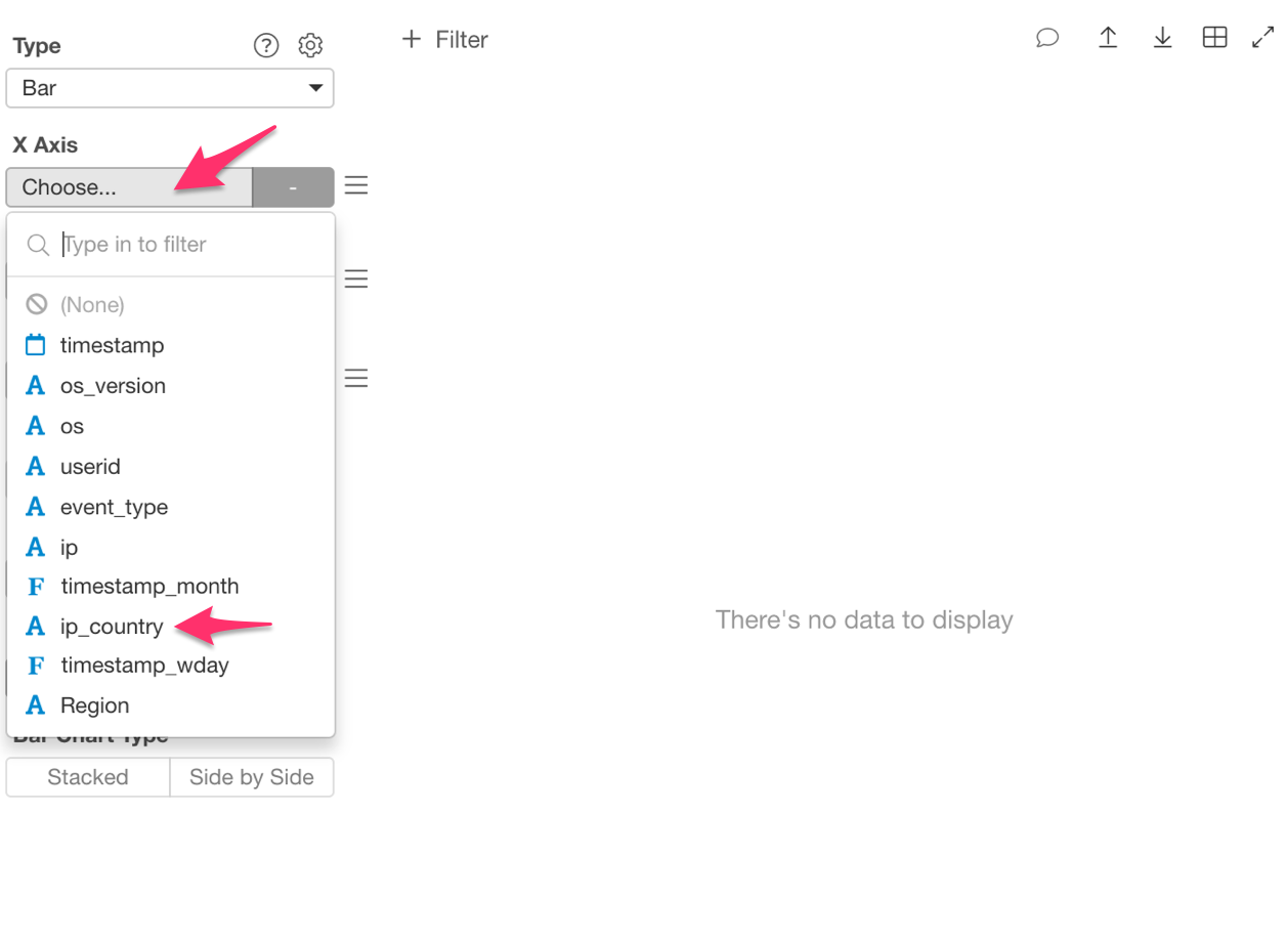
Then assign ‘ip_country’ to the ‘X Axis.’
And finally, ‘Number of Rows’ to the ‘Y Axis.’ Each row represents an access to the website.
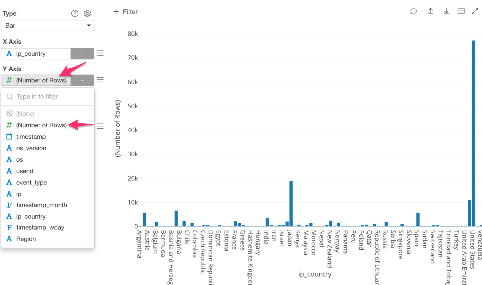
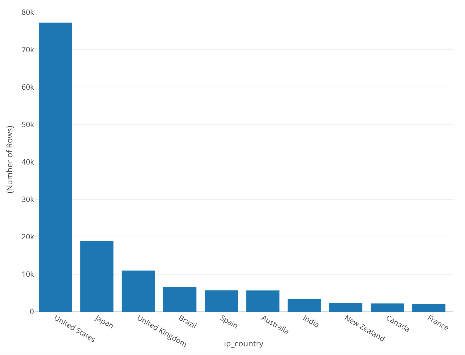
Once we have done this, our chart should look something like the photo below.
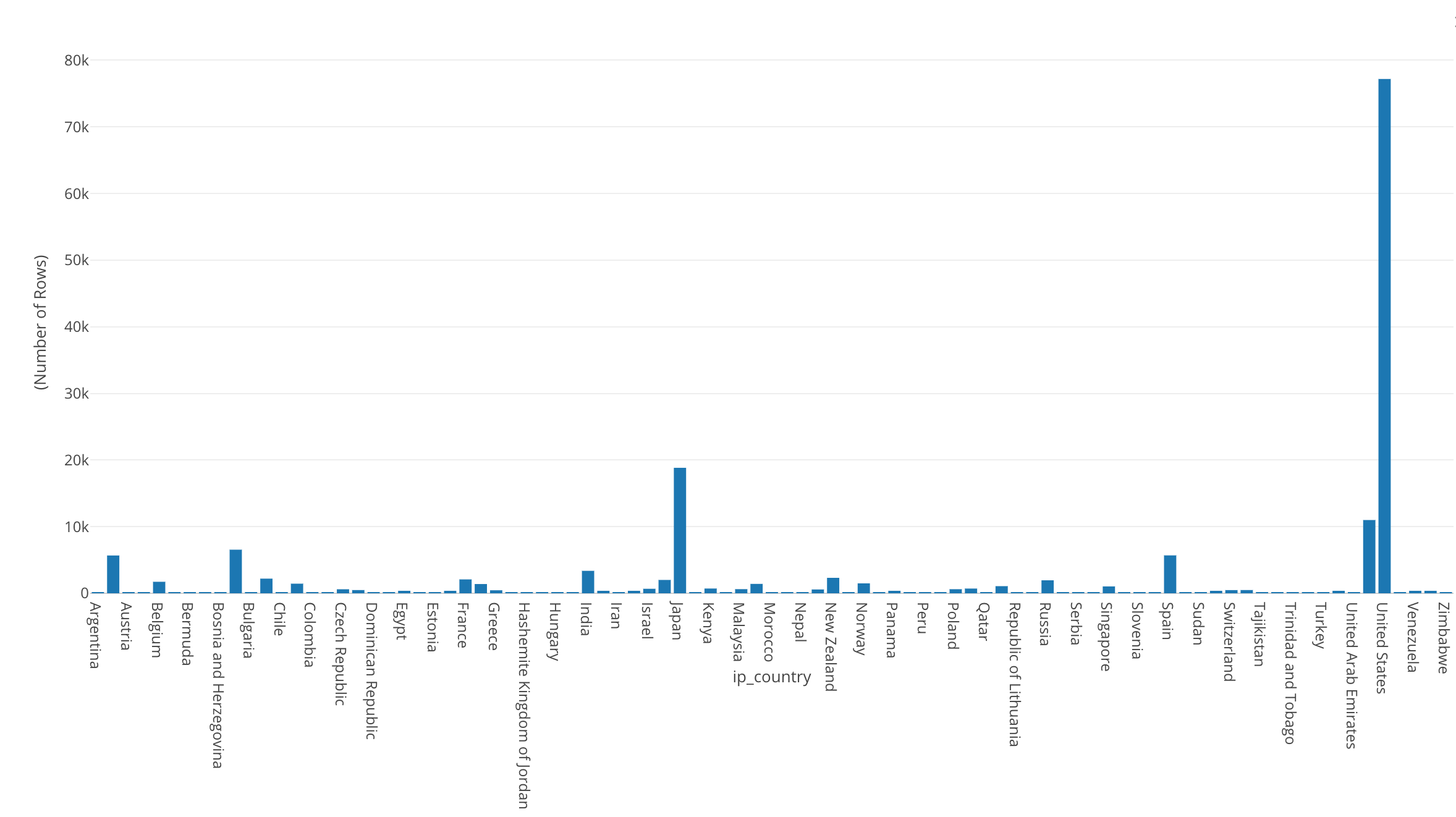
With this chart we should be able to see the number of accesses from each country.
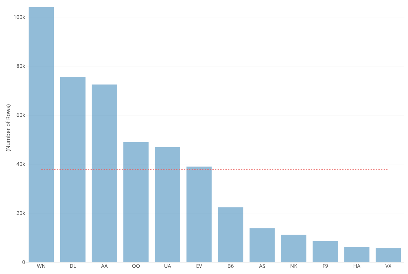
We can see that the United States’ number of accesses is the largest, followed by Japan as the second largest.
In order to make it easier to see which countries have more accesses than others, we can rearrange the bars from the highest to the lowest.
To do this, click on ‘Sort By’ in the left-hand side, and select ‘Y1 Axis.’
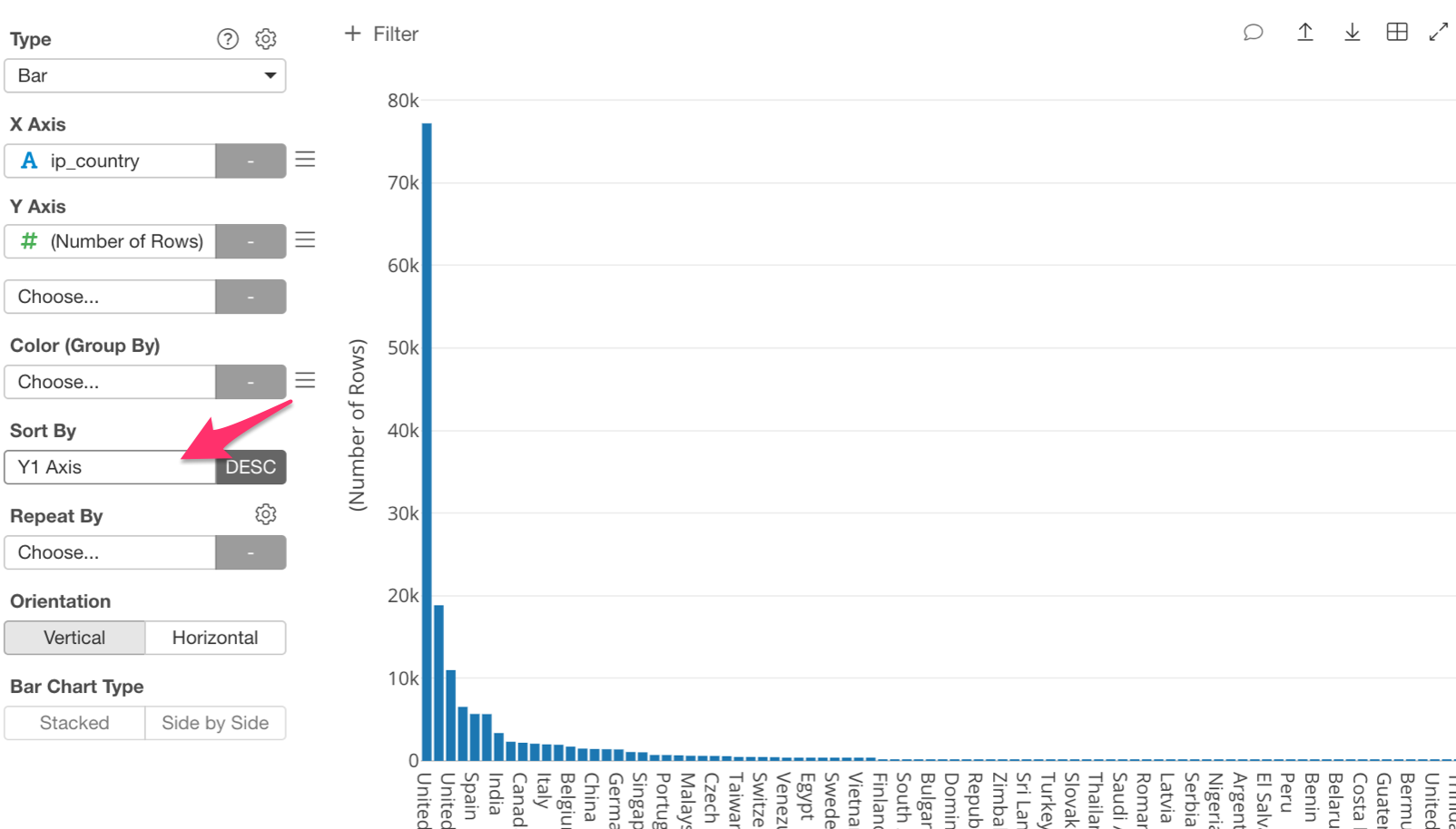
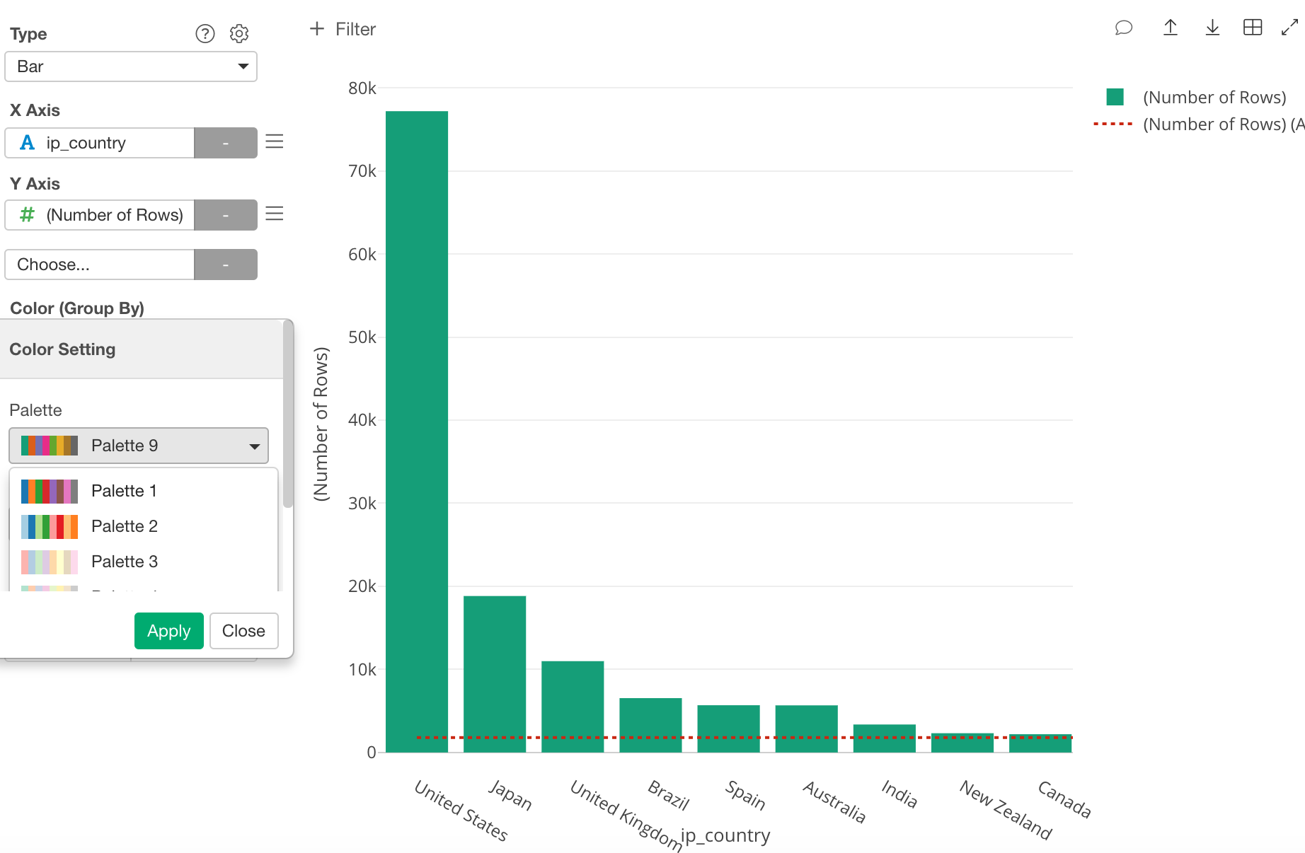
We can now see each country’s number of accesses from highest to lowest.
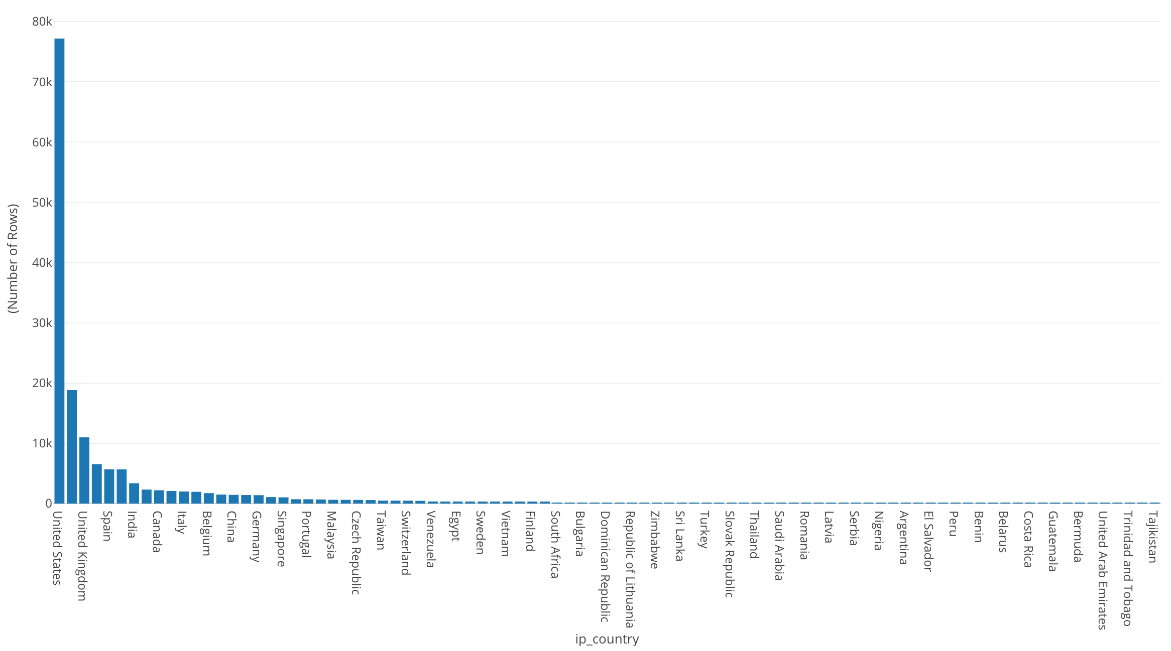
It is kind of hard to see because there are so many countries, so let’s use the ‘Zoom In’ feature.
There are a couple ways to do this, however, the quickest way is just to click on the left-hand side of the United States bar and drag it out as far as you would like to zoom in.
Once we have zoomed in we can see more clearly the size of the bars. If you would like to zoom back out to see the full chart, just double click anywhere within the chart.
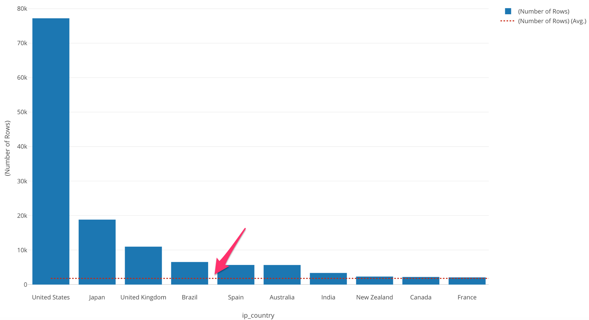
In this chart we can easily see the top 3 countries. We can also see that Japan is about 1/4th the size of the US.
By looking at this bar chart we can see that it consists of three groups. The top group consisting of the United States, Japan and the UK, the middle group consisting of Brazil, Spain, and Australia, and the lowest group, consisting of India, New Zealand, Canada, France and so on.
Use Reference Line to Compare
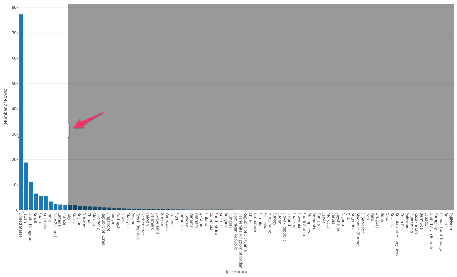
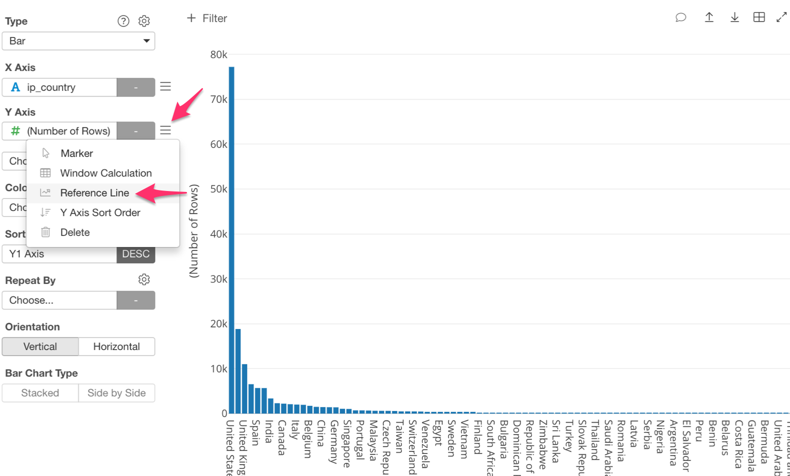
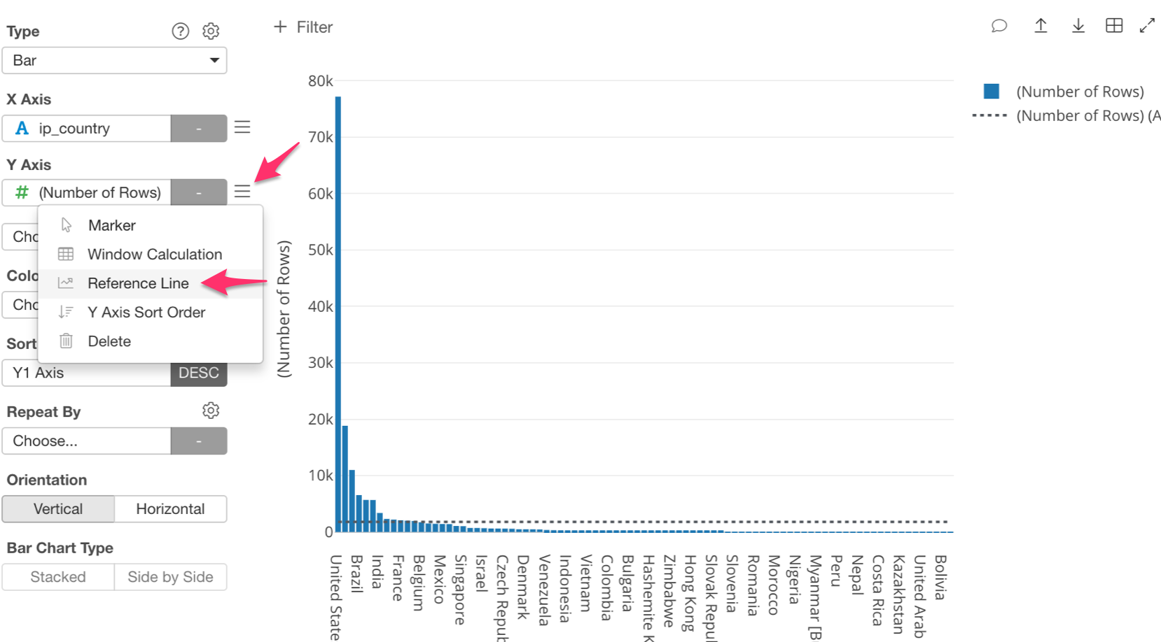
Next, let’s draw a reference line that shows the average number of accesses; so that we can compare each country’s accesses against the average. Next to the ‘Y Axis’ box in the side menu, click on the three bars and select the ‘Reference Line.’
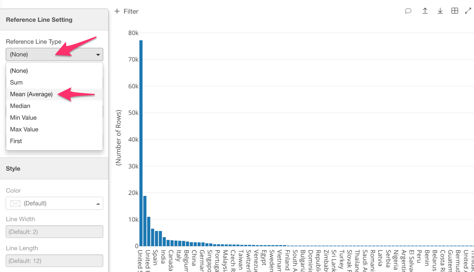
We want to know the average, therefore, let’s select ‘Mean (Average)’ as the ‘Reference Line Type.’
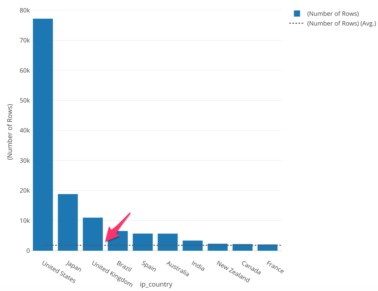
Once we apply the reference line we are able to see the average number of accesses.
This ‘Reference Line’ is black, so it may be difficult to see. Let’s change the color of this line to make it stand out. In order to do this, click on the three bars next to the ‘Y Axis’ box, and select ‘Reference Line.’
Once inside, click on ‘Color’ and select the color you wish to change to.
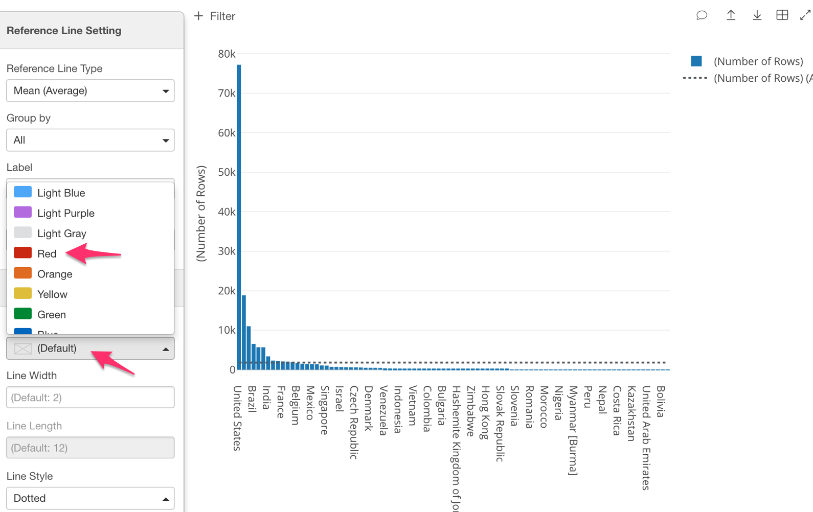
Once you have done this your reference line color should look like the one in chart below.
This bar color seems to be a little too dark to see the reference line clearly. Luckily, we can change the color or opacity of the bars, simply click on the three lines next to ‘Color (Group By)’ and select ‘Color Palette.’
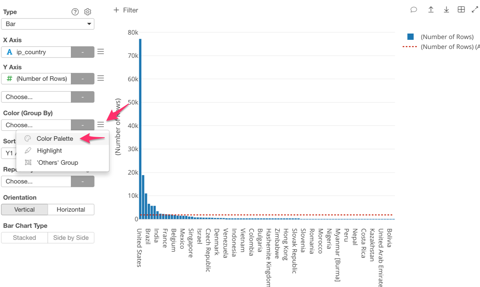
If you want to change the color, click on ‘Palette 1’ and choose whichever color scheme you would like. There is even a ‘Color Blind’ option!
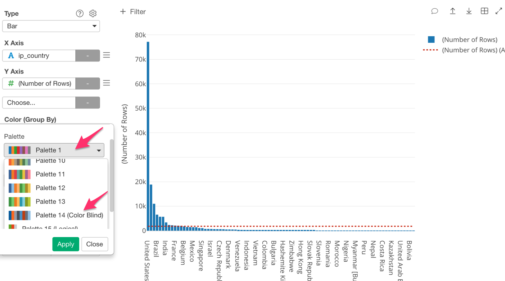
Once you have done this, the bars will change their color! Neat right!
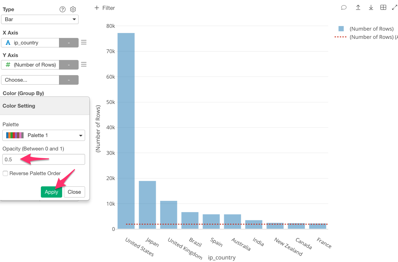
If you would like to change the opacity, click on ‘Opacity’ and type 0.5, then click ‘Apply.’
Show Number of Unique Users by Country
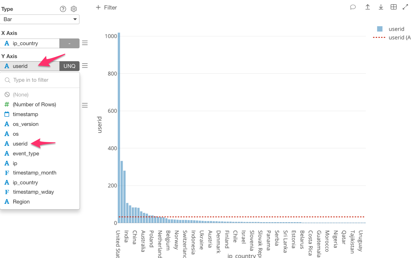
Next, let’s change the ‘Y Axis’ to ‘userid (UNQ).’ If we do this, we will be able to visualize the number of unique users per country.
The chart should look like the image below.
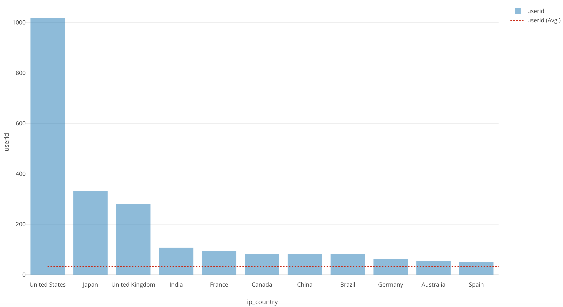
The top 3 have remained unchanged, however, we can see that although, Brazil, Spain and Australia were in our second highest group, they have dropped drastically. India and France have more unique users, but less accesses.
Simply put, although, Brazil, Spain and Australia, have a lower number of unique users, they are accessing the website a lot more than other countries.
Conclusion
What have we covered in this session?
- We used the bar chart to find the number of accesses in each country, and the number of unique users there are overall in each country.
What have we observed?
The US, Japan, and UK stayed in the top group for most accesses, as well as, the most unique users.
Australia, Spain and Brazil have fewer unique users, however, they access the website more frequently than most of the countries.
Next Time
In the next post, I will use color (grouping) to separate each bar by OS (Operating System such as Mac, Windows, etc.) type, In order to see the ratio of OS types users are using for each country.
Next Post: Introduction to Data Visualization Vol. 3 - Break Down