Introduction to Data Visualization Vol. 3 - Break Down
Hello everyone, I’m Teagan!
For those of you returning, welcome back!
In our last post we learned how to “compare” among variables in our data sets.
This time, I will use color (grouping) to separate each bar by OS (Operating System such as Mac, Windows, etc.) type, in order to see the ratio of OS types users are using for each country.
We will continue to use the same data as the last posts. The data can be downloaded from here.
Before We Start
Here is the question that I want to answer by visualizing the data.
- How many unique users use each OS in each country?
These are the chart features inside Exploratory that I am going to use in this post.
- Bar Chart
- Color (Group By)
- Repeat By
- Zoom In
- Duplicate
Let’s get started!
Chart Preparation
For those of you who have been following along with the series, we are going to start off this visualization with the chart that we used in our last post.
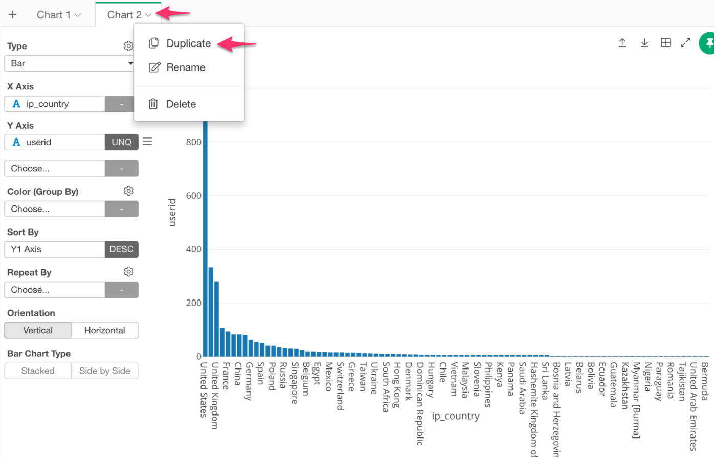
For convenience sake, we can use a short cut that will duplicate the chart that we already created.
Next to the chart name there is an arrow symbol, click on this and select ‘Duplicate.’ It will create the same chart in a new tab.
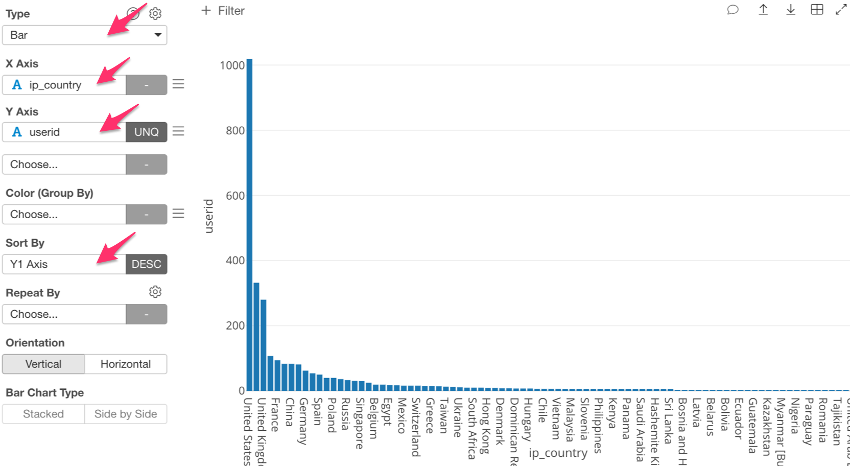
For those of you who are new to this series, here are the steps to create this chart.
For chart type, select Bar. Then, assign ‘ip_country’ to X Axis and ‘userid’ (UNQ) to the Y Axis. Lastly, in Sort By select ‘Y1 Axis.’
Your function bar should look like the photo below.
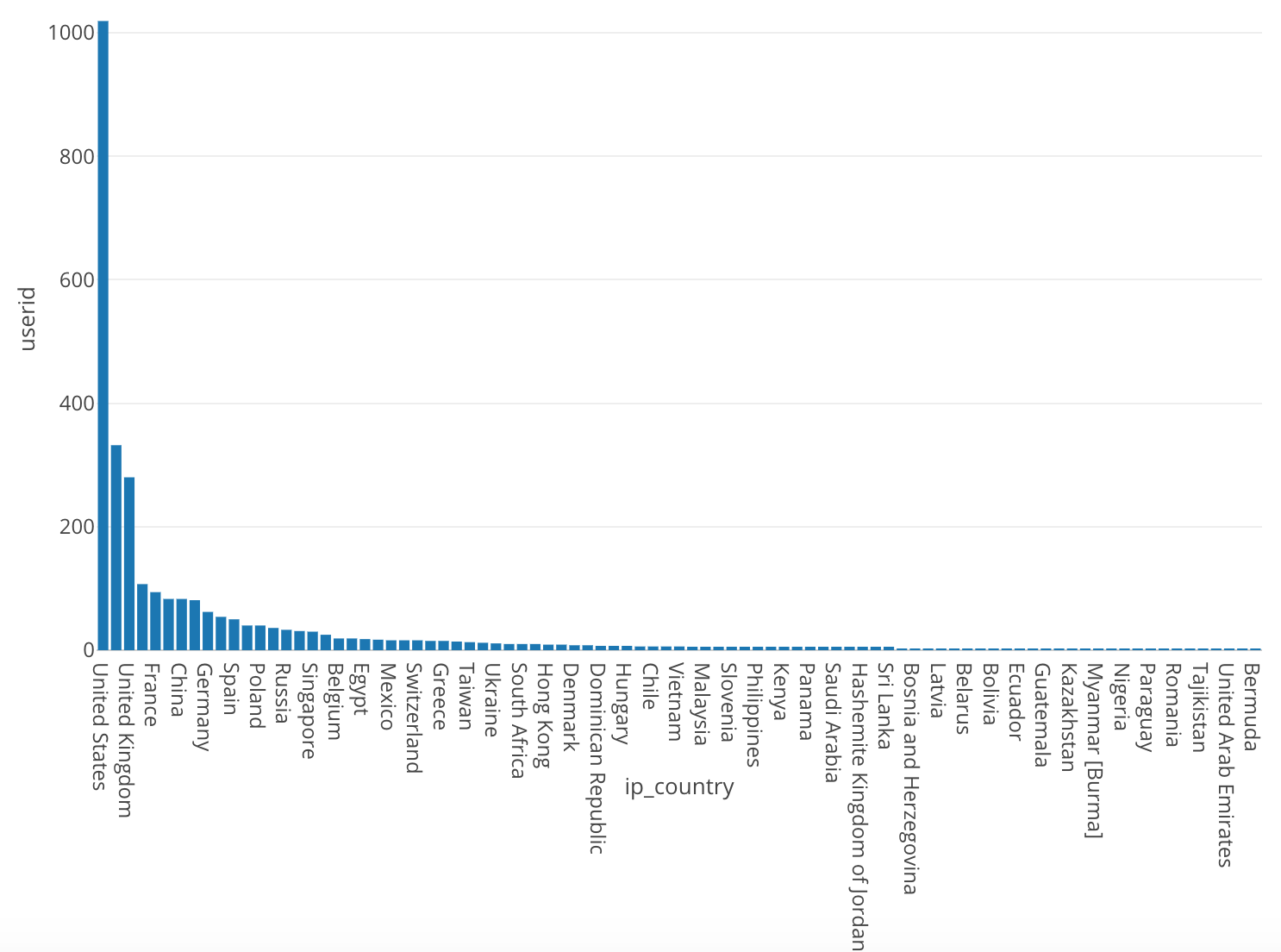
After you have input all the information, the chart should look like the one below.
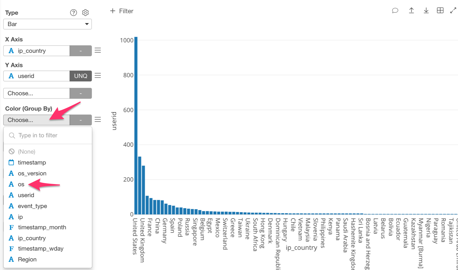
Break Up Through Color Use
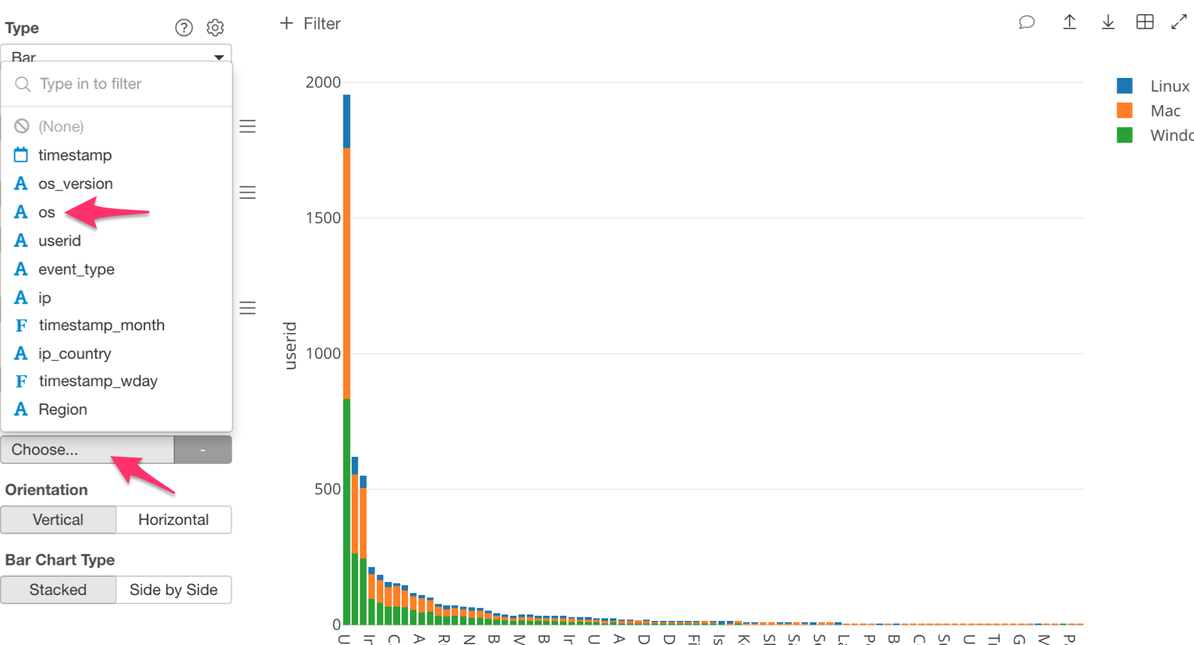
Let’s take a look at the number of users for each OS in each country. For this, we are going to use ‘Color (Group By).’ This will break our bars into color coded groups that represent each OS.
Click on ‘Color (Group By)’ and select ‘os.’
Once we have done this, we will be able to visualize the number of users for each OS in each country.
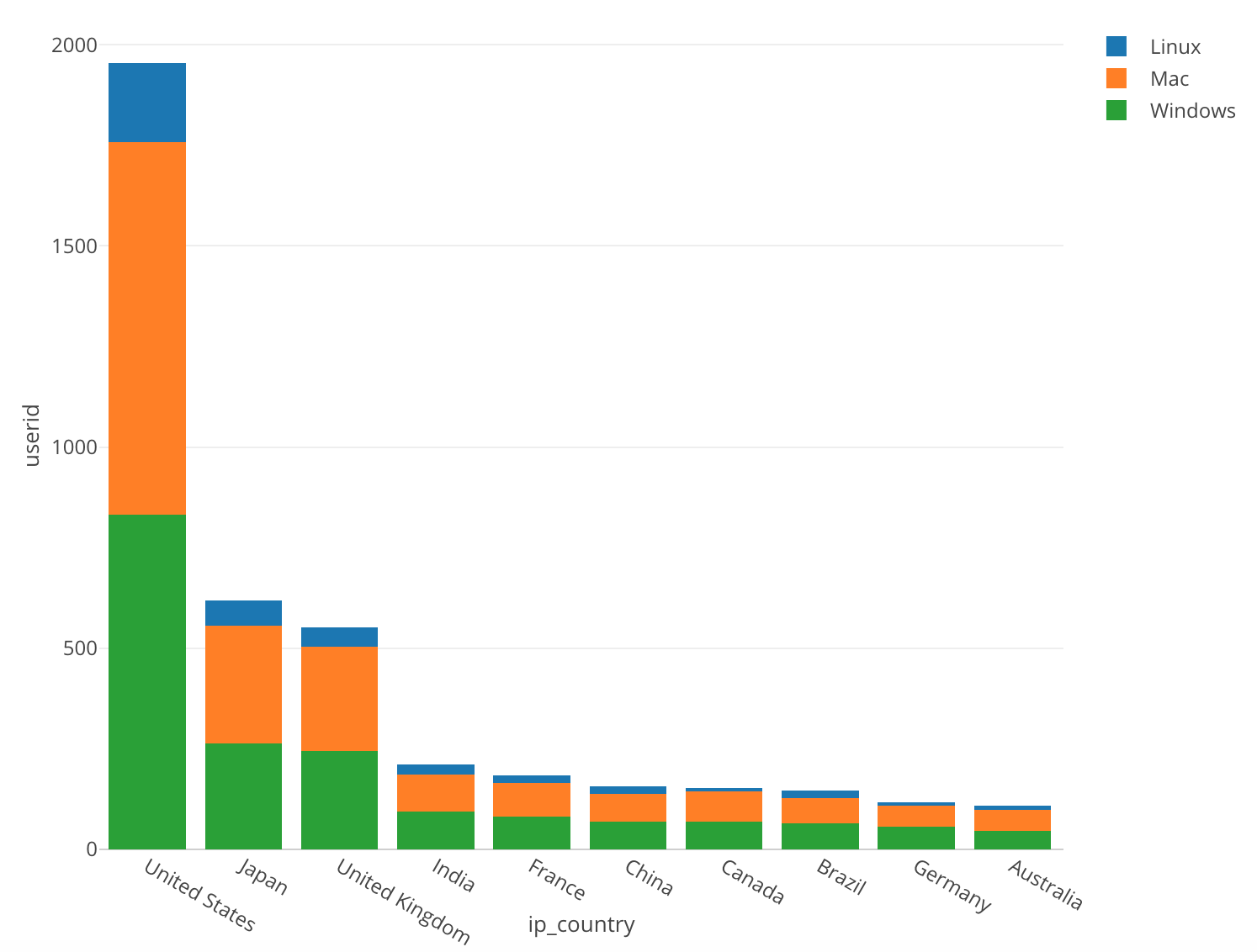
In all of the countries we can see that Mac and Windows both have fairly high ratios. However, because the US’s number of users is so large it is hard to see the ratio differences in the other countries. Let’s zoom in on the bars excluding the United States.
In order to zoom in, click above Japan’s bar and drag to the other side of Australia.
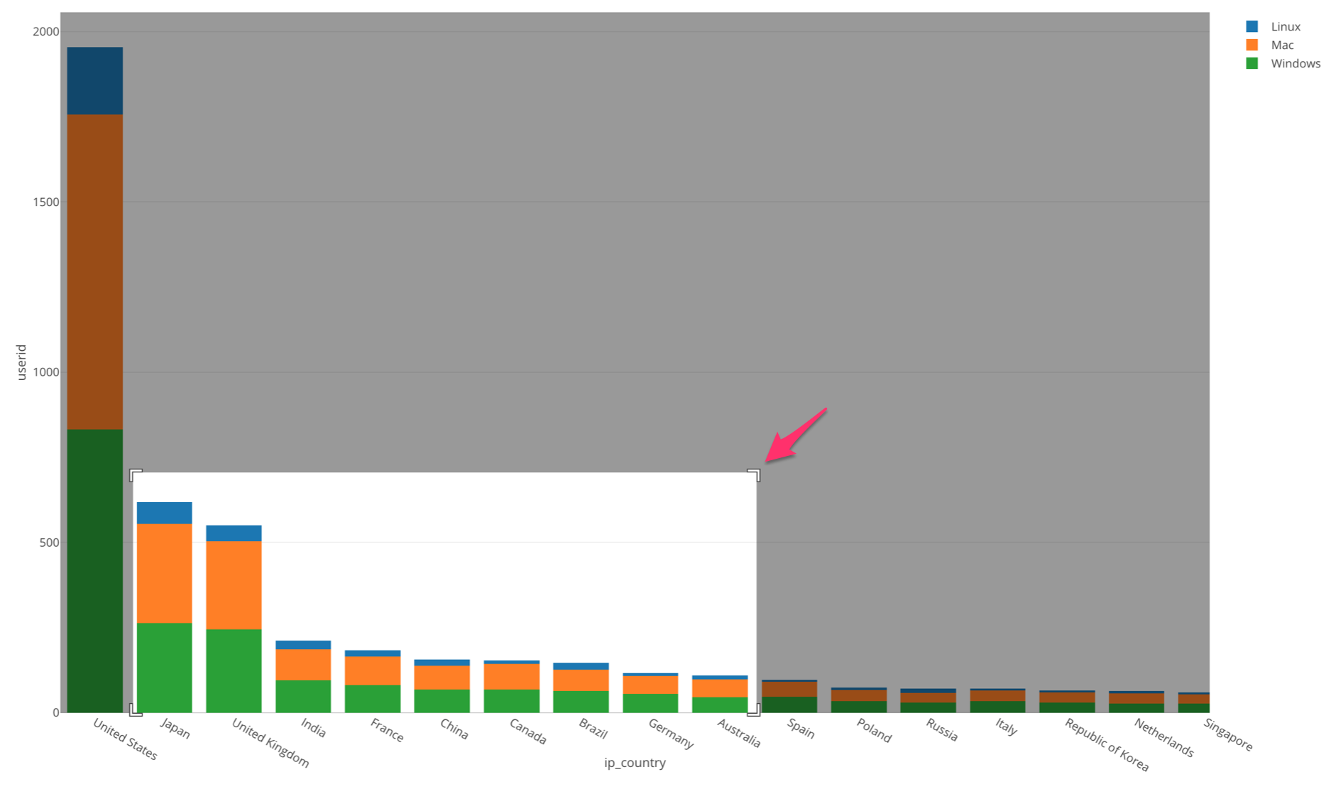
If you do this, the area that you highlighted will become enlarged and become easier to read. If you want to go back to the original view just double click anywhere within the chart.
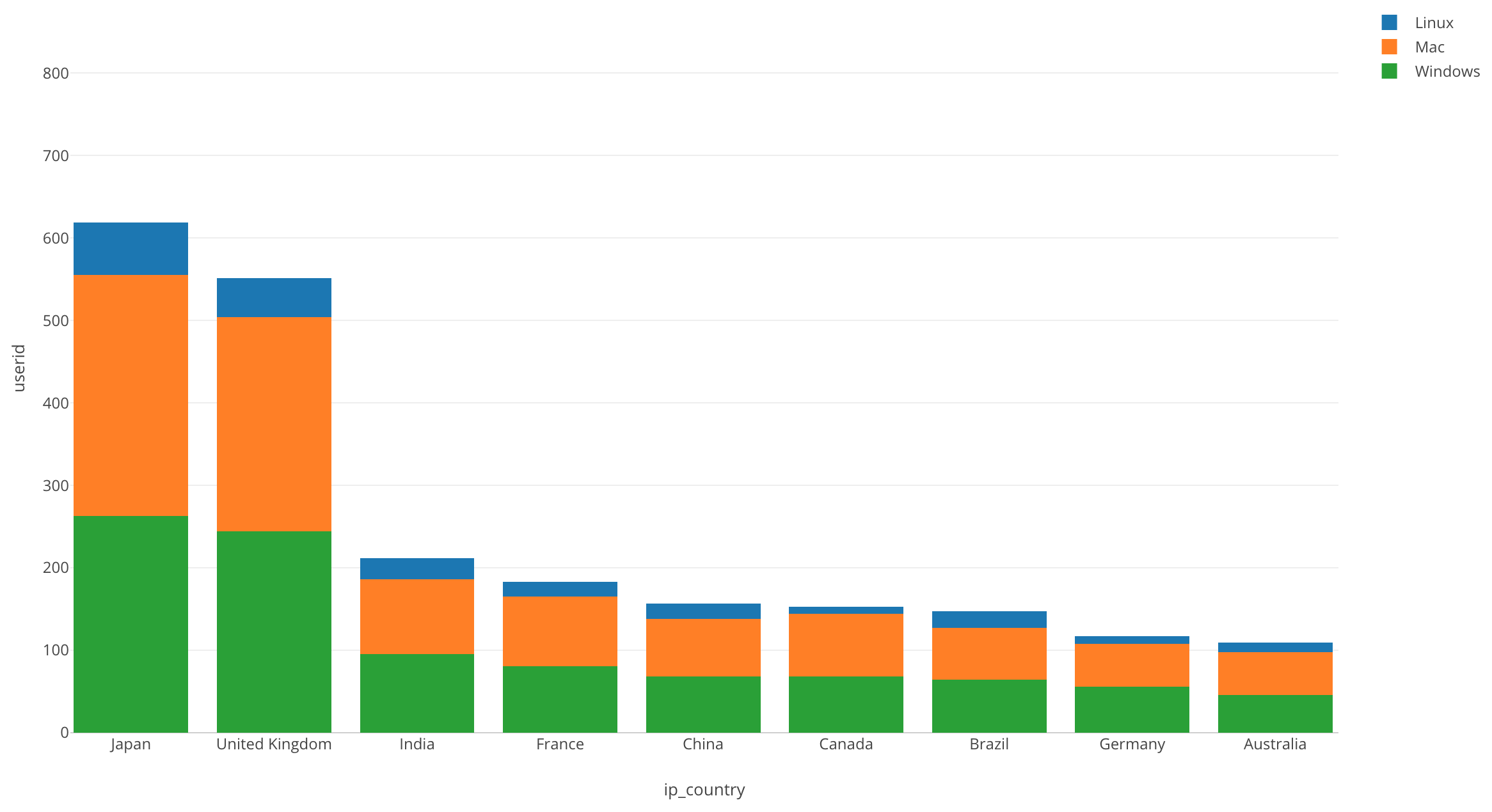
Now we can see more of a difference in ratio’s, however, Mac and Windows still make up the majority. Linux has a very small ratio in every country.
We have seen how we can break down the data by using color.
But instead of breaking up each bar, sometimes it’s better to separate the bar chart itself for each OS type. This will help us observe the trend for each country and compare it among them.
For this, we can use the ‘Repeat By’ feature, which will separate a chart into multiple charts, each of which is created for each value of a given column, in this case, that is the ‘os’ column.
Let’s take a look at how to do this.
Breaking Up Through the Use of Repeat By
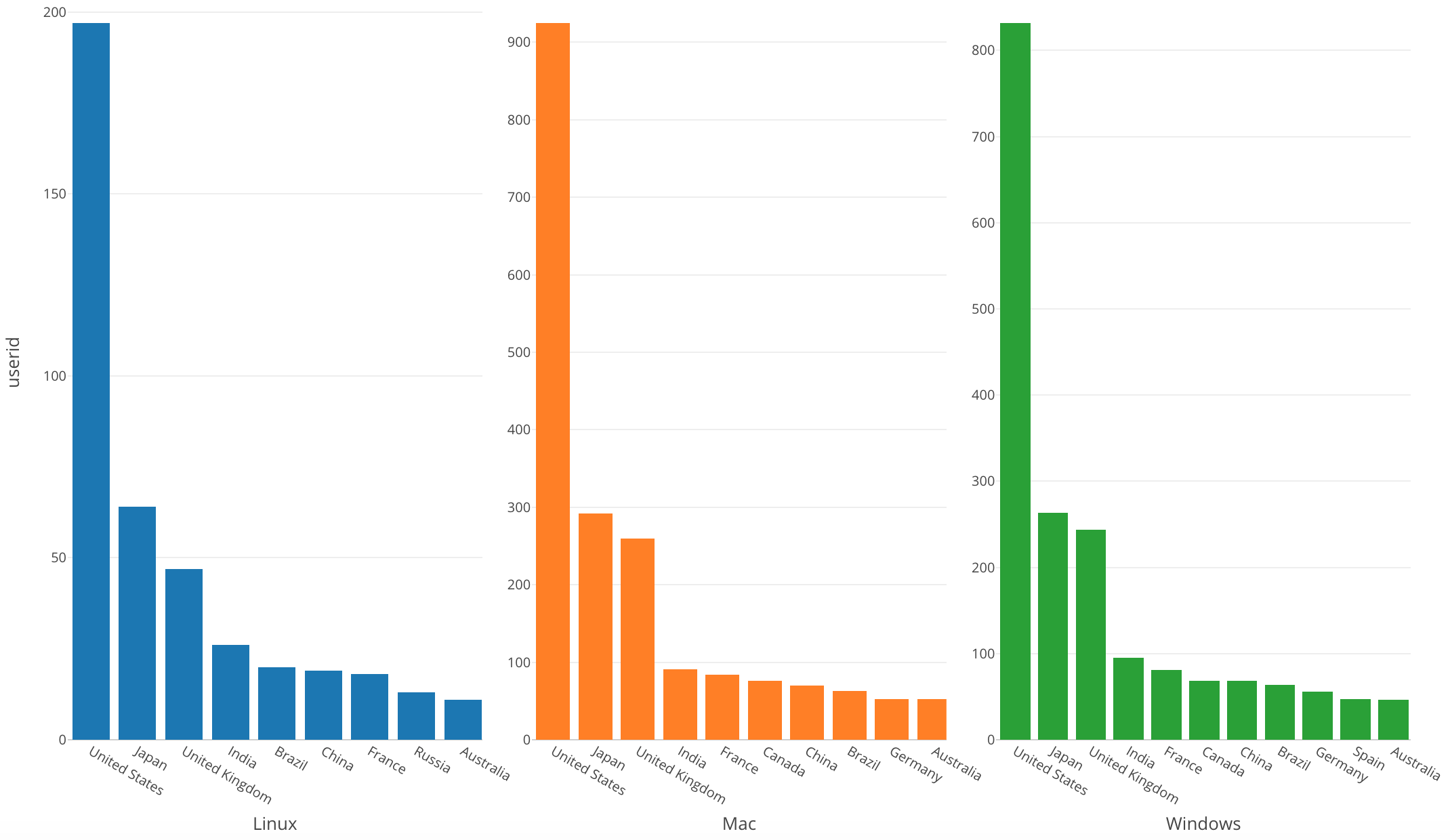
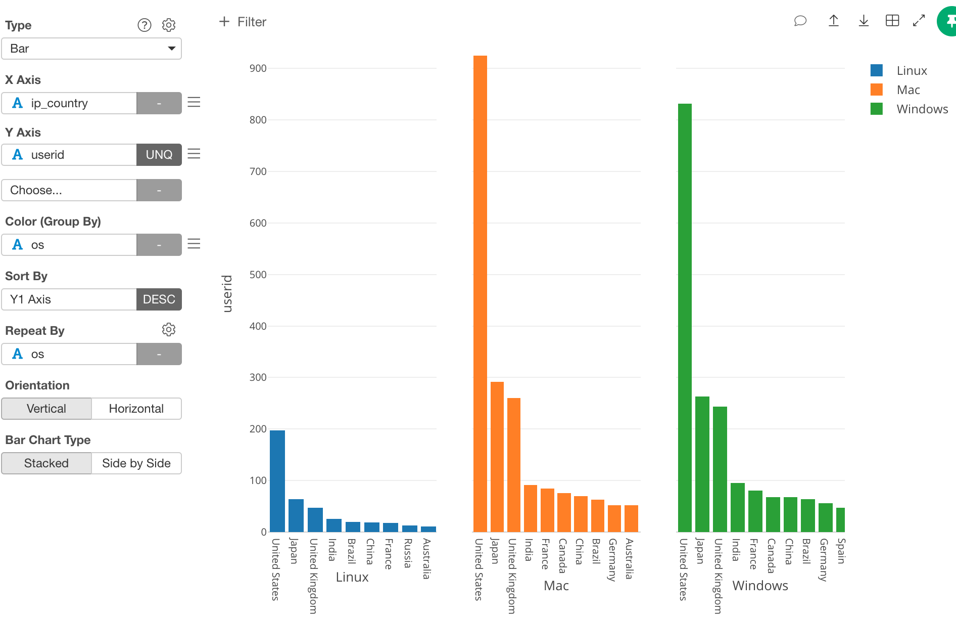
Click on ‘Repeat By’ and select ‘os.’
Once we do this our chart will break into the three different operating systems.
By visualizing each operating system separately, we can see in what order each countries usage is for each OS.
Right now the Y Axis is the same for each chart, but we want to change the scale so that it is tailored to fit each OS.
In order to do this, click on the gear icon next to ‘Repeat By.’
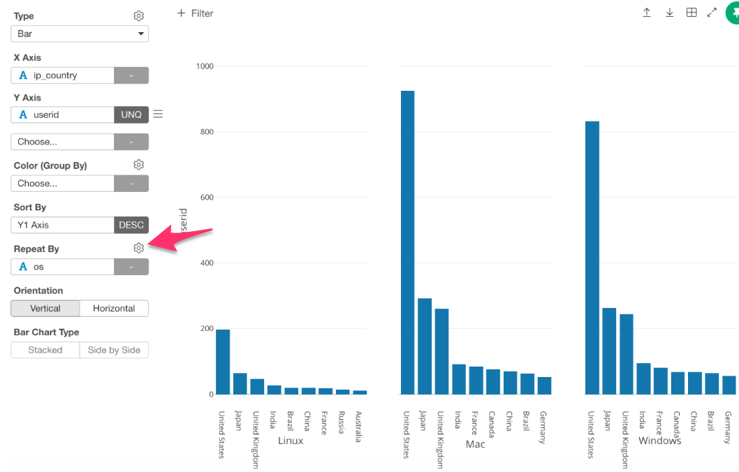
Underneath ‘Repeat By Setting,’ uncheck the box that says ‘Sync Y Axis Among Charts.’
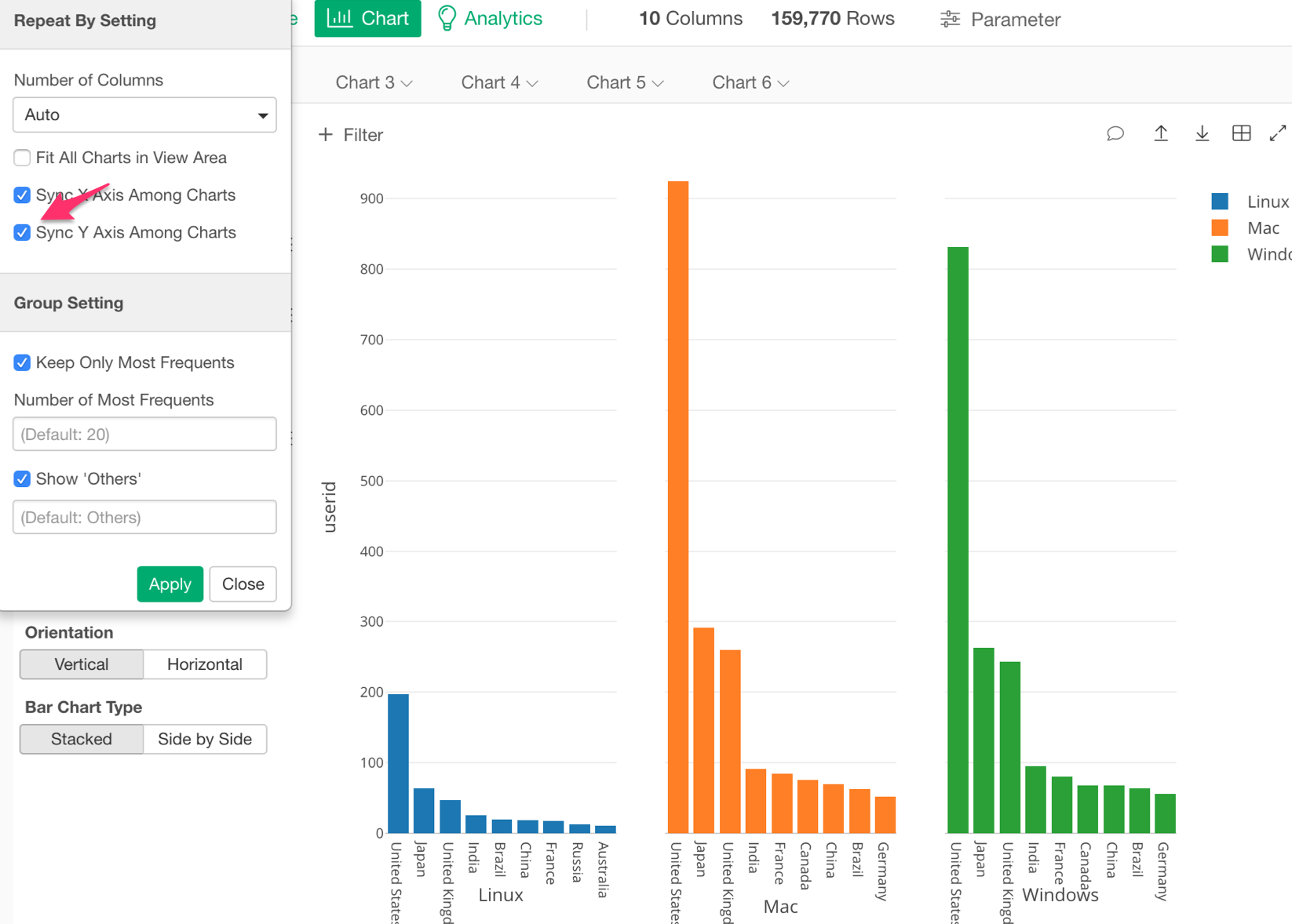
This will change each OS scale allowing us to view and understand the data better.
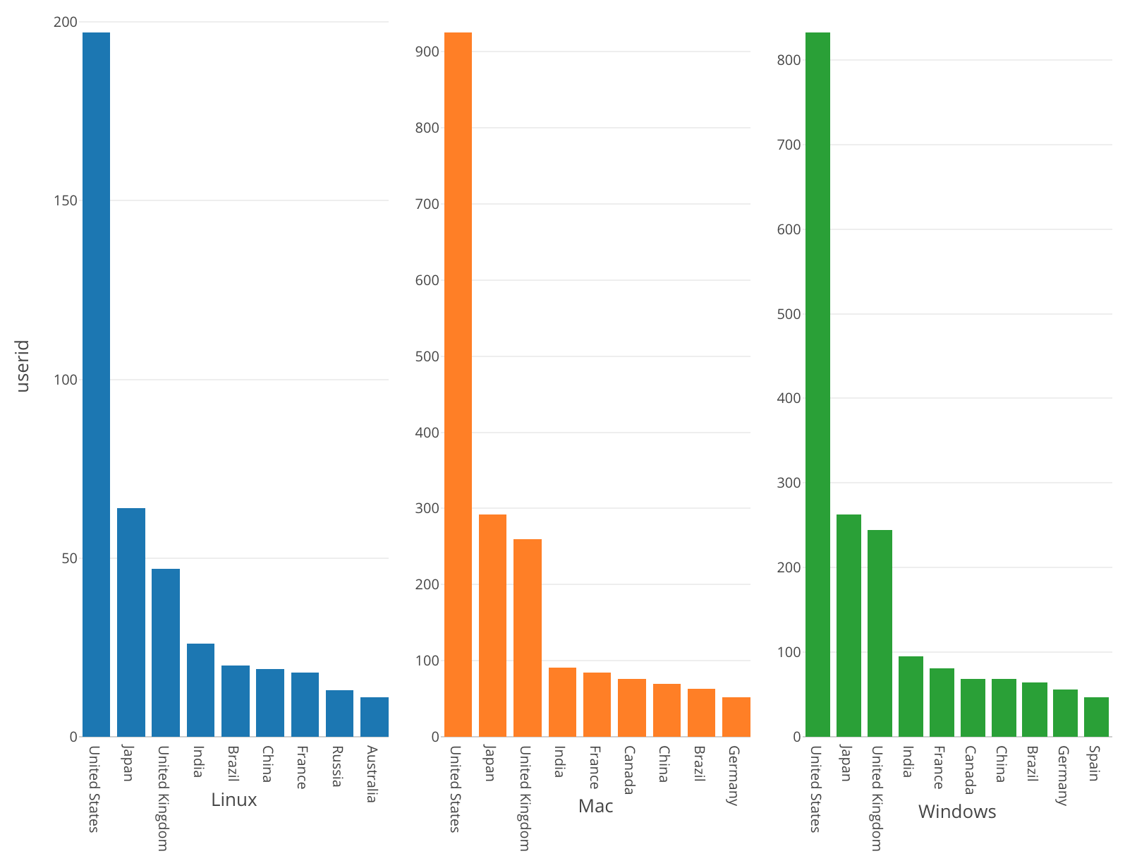
What information can we gain from this chart?
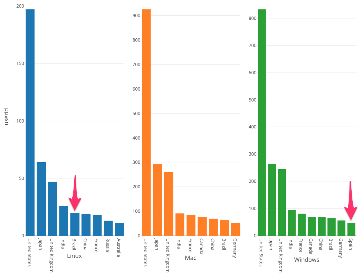
By looking at this chart, I can make the following observations.
Brazil’s position is higher in the OS, Linux, section compared to its position in Mac and Windows.
Mac and Microsoft are almost the same except that Spain’s position is higher in Windows.
Overall, the top countries for each os are the US, Japan, and the UK.
By using ‘Repeat By’ we can see that in each country the number of unique users using each OS is different.
Conclusion
In this post we used the Bar chart, Color (Group By), Zoom In and Repeat By to visualize which OS users are using in each country.
We found that there is a difference in the number of users using each OS in each country.
Through grouping, we were able to understand the number of users in each country that are using different operating systems.
Next Time
We have learned how many users are for each operating system in each country. Now, here is another question.
What is the percentage of users using each operating system in each region?
In my next post, I’m going to use one of the Window Calculation types called ‘% of Total’ to answer this question by visualizing the percentage of each OS in each Region.
Next Post: Introduction to Data Visualization Vol. 4 - Window Calculation: Percent of Total