Introduction to Data Visualization Vol. 4 - Window Calculation: Percent of Total
Hello everyone, I’m Teagan.
For those of you returning, welcome back!
In our last post, we learned how to break down data by using ‘Color’ or by using ‘Repeat By’.
In this post, I want to visualize the ratio of the broken down data by converting the chart above into percentages of each OS used.
We can quickly do this by using one of the Window Calculation methods called ‘% of Total.’
We will continue to use the same data as the last posts. The data can be downloaded from here.
Before We Get Started
Here is the question that I want to answer by visualizing the data.
- What is the percentage of users using each operating system (OS) in each region?
These are the chart features inside Exploratory that I am going to use in this post.
- Bar chart
- Color (Group By)
- Window Calculation
- Show Value on Plot
Let’s get Started!
Chart Preparation
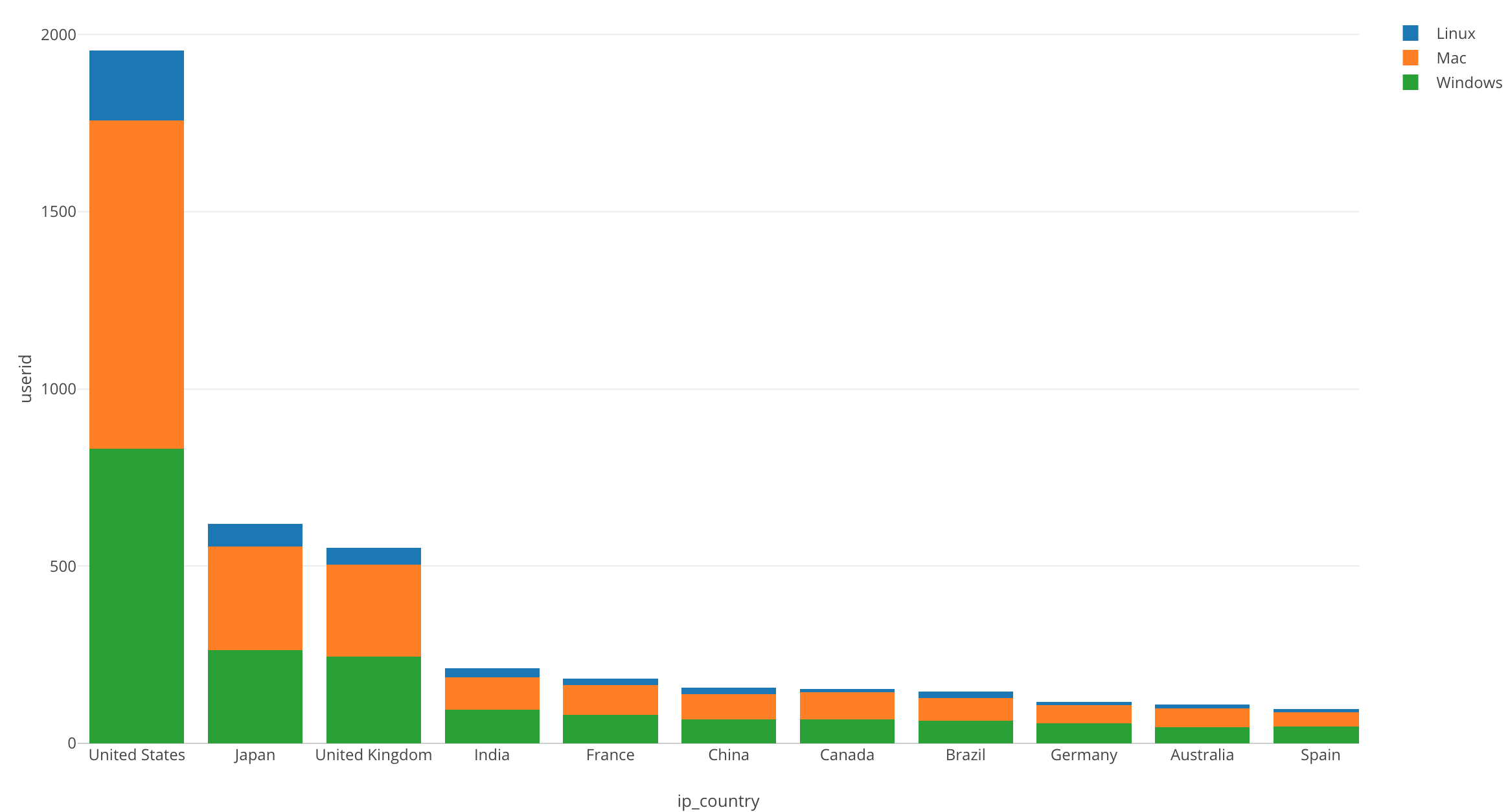
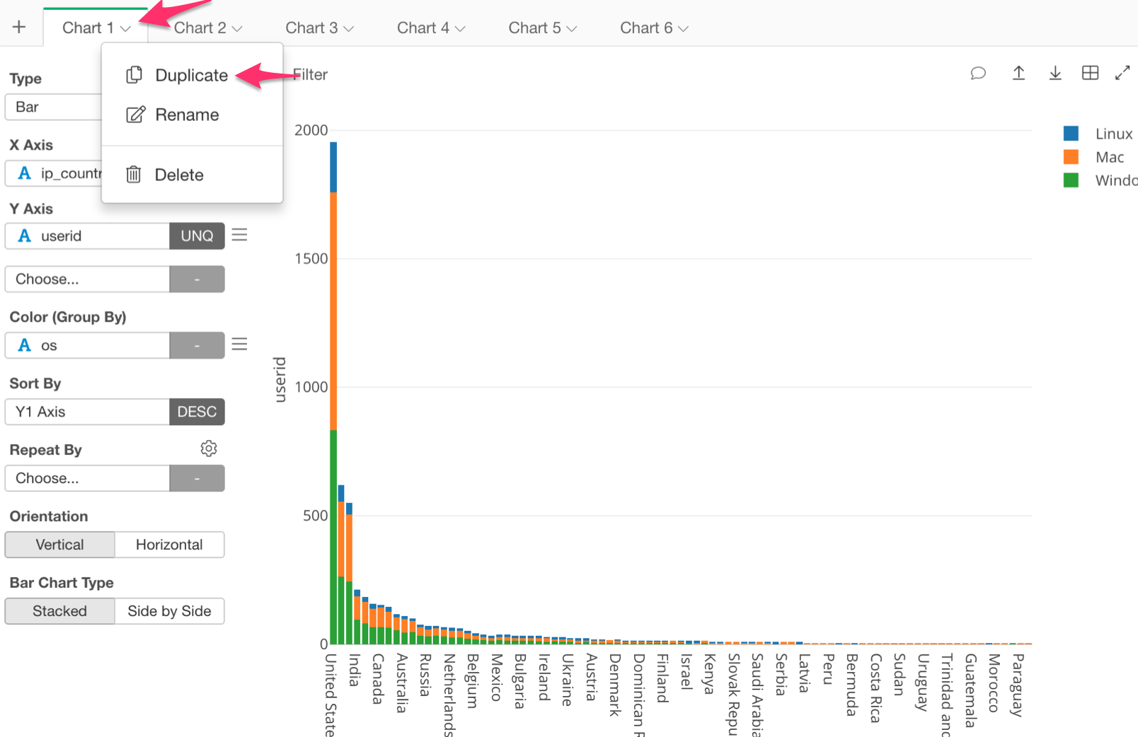
We are going to use the same bar chart as we did in our last post. So let’s use ‘Duplicate,’ the feature that we learned about in our last post.
Our chart should look like the one below.
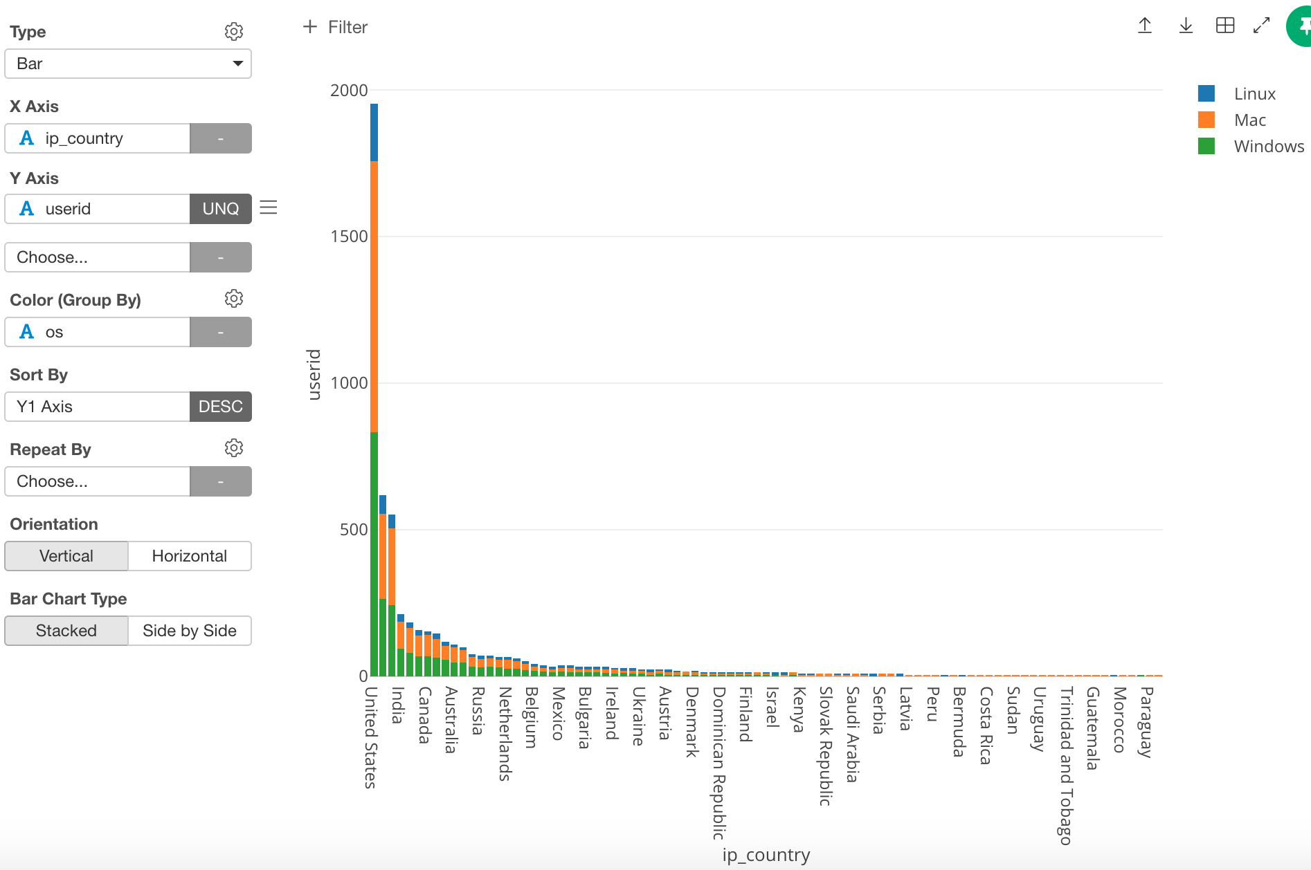
Until now we have been using countries, however, in this post I want to use regions. In order to do this, change the ‘X Axis’ from ‘ip_country’ to ‘Region.’
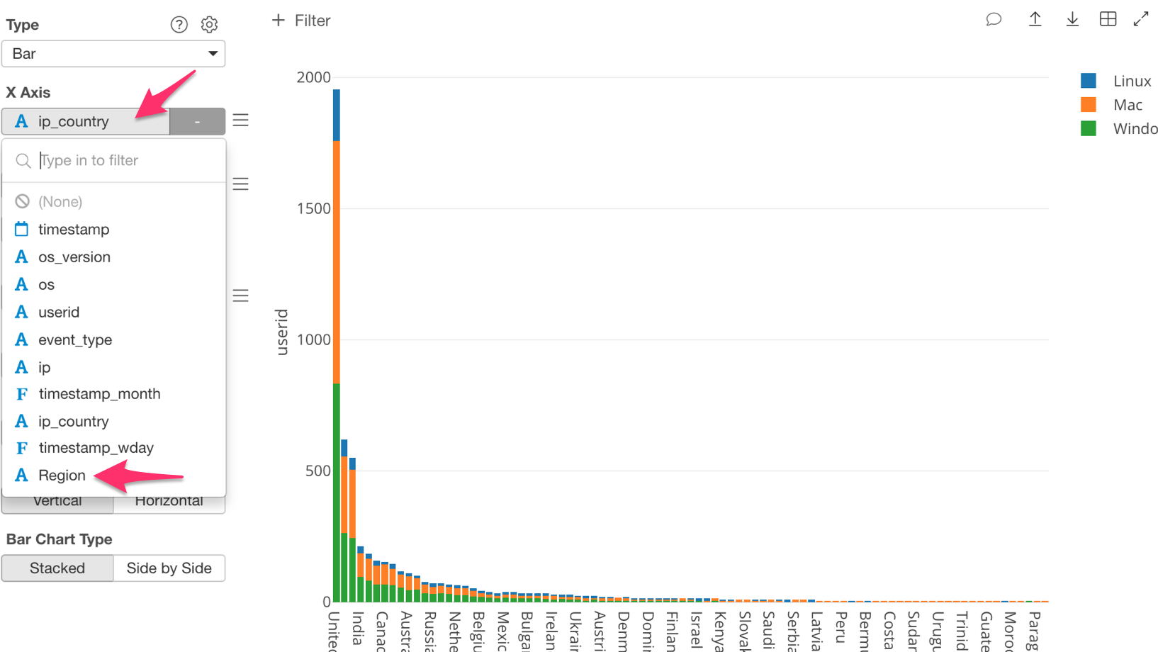
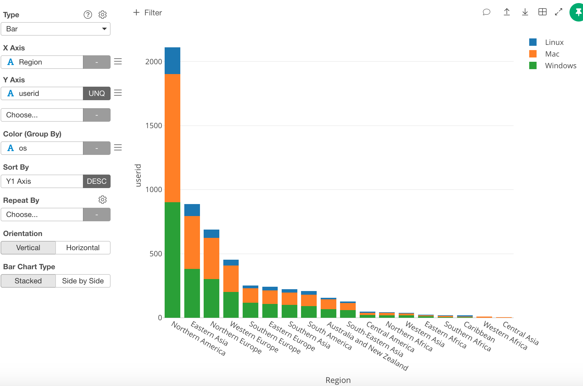
Once you have done this, the chart should look like the one below.
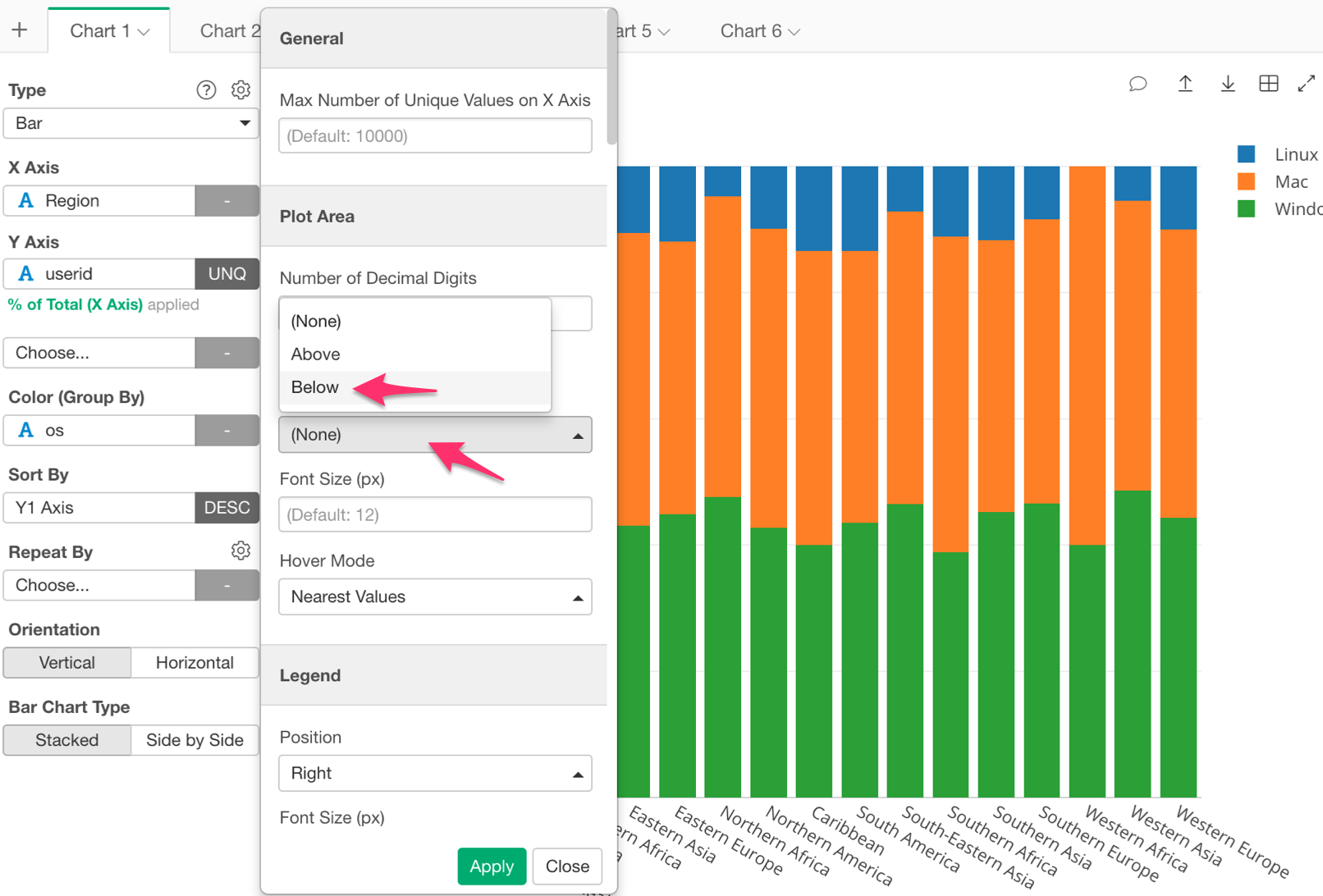
Window Calculation Use
We want to look at the percentage, so let’s click on the three bars next to the ‘Y Axis’ box, and select ‘Window Calculation.’
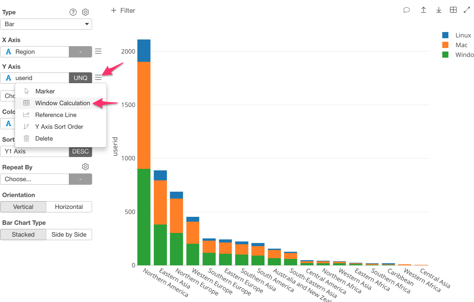
Inside the Window Calculation there are a few options to pick from, however this time we want to know the percentage of users using each OS, so let’s select ‘% of.’
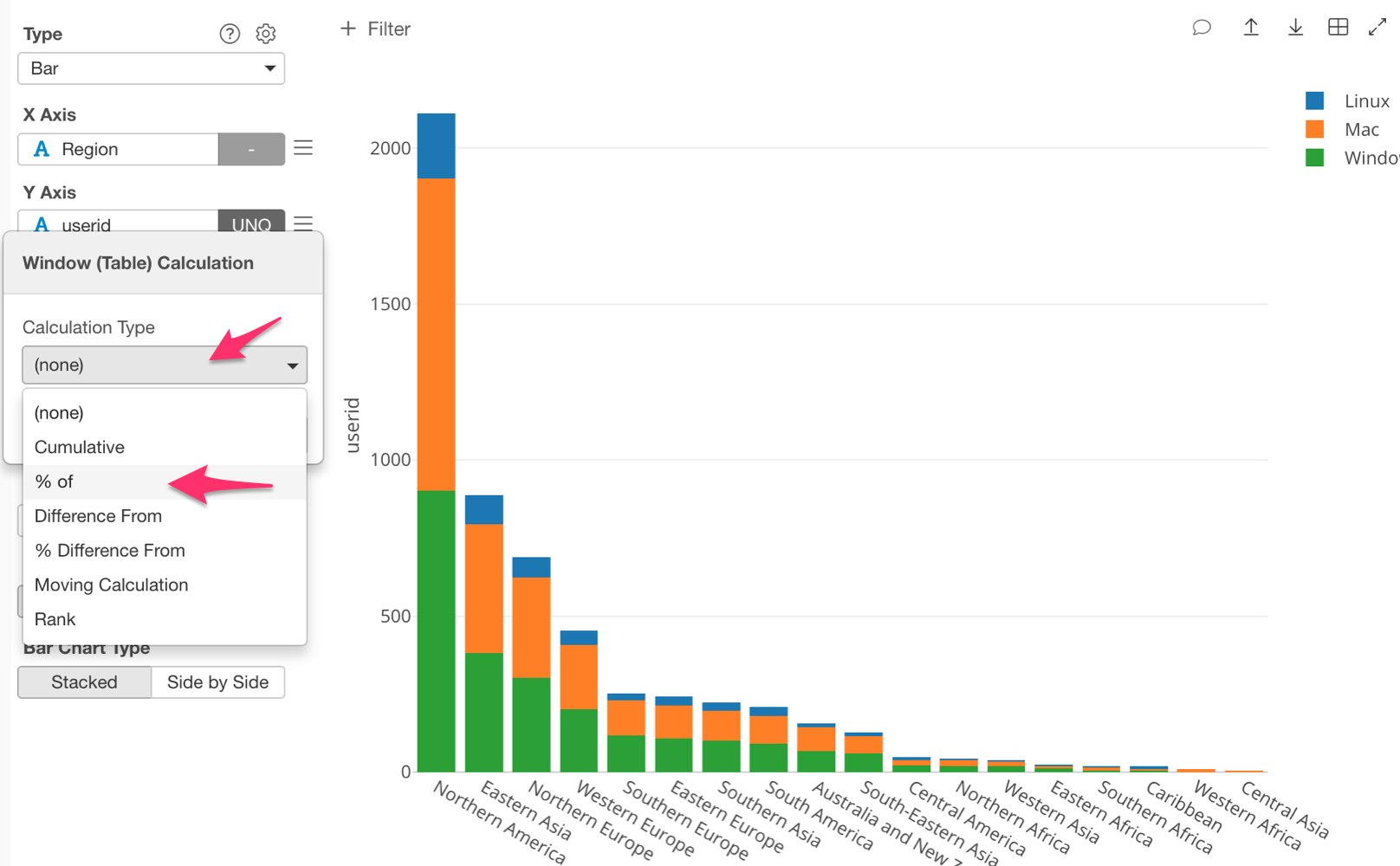
Once this is done, I want to point out an important piece. Notice that ‘Sum (Total)’ is selected under ‘Summarize Values Using’ by default.
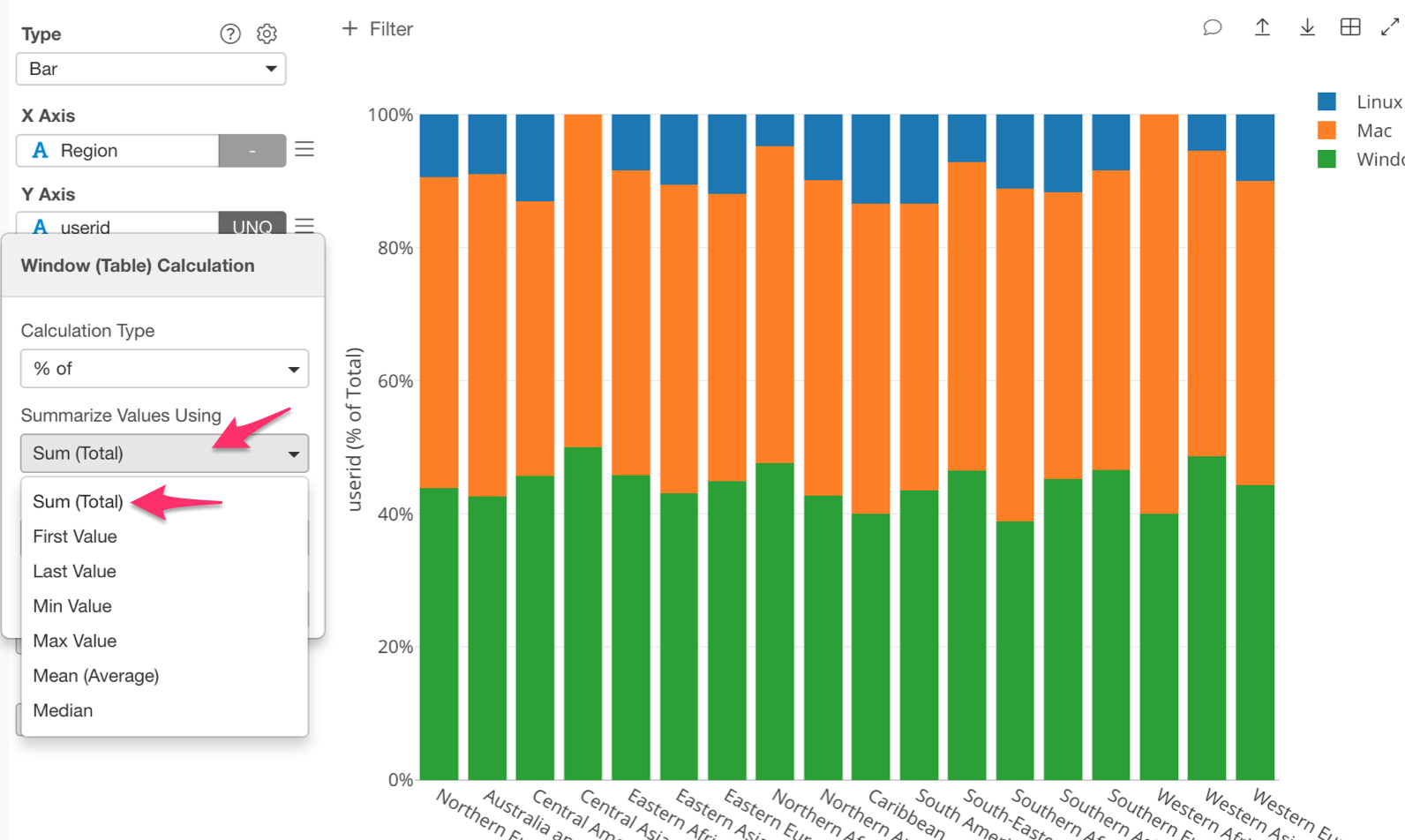
This makes ‘% of’ into ‘% of Total’. That means that it will calculate the total number of users for each region, which is the ‘Sum (Total)’ part. It will then calculate the percentage of each OS in each region, which is the ‘% of’ part.
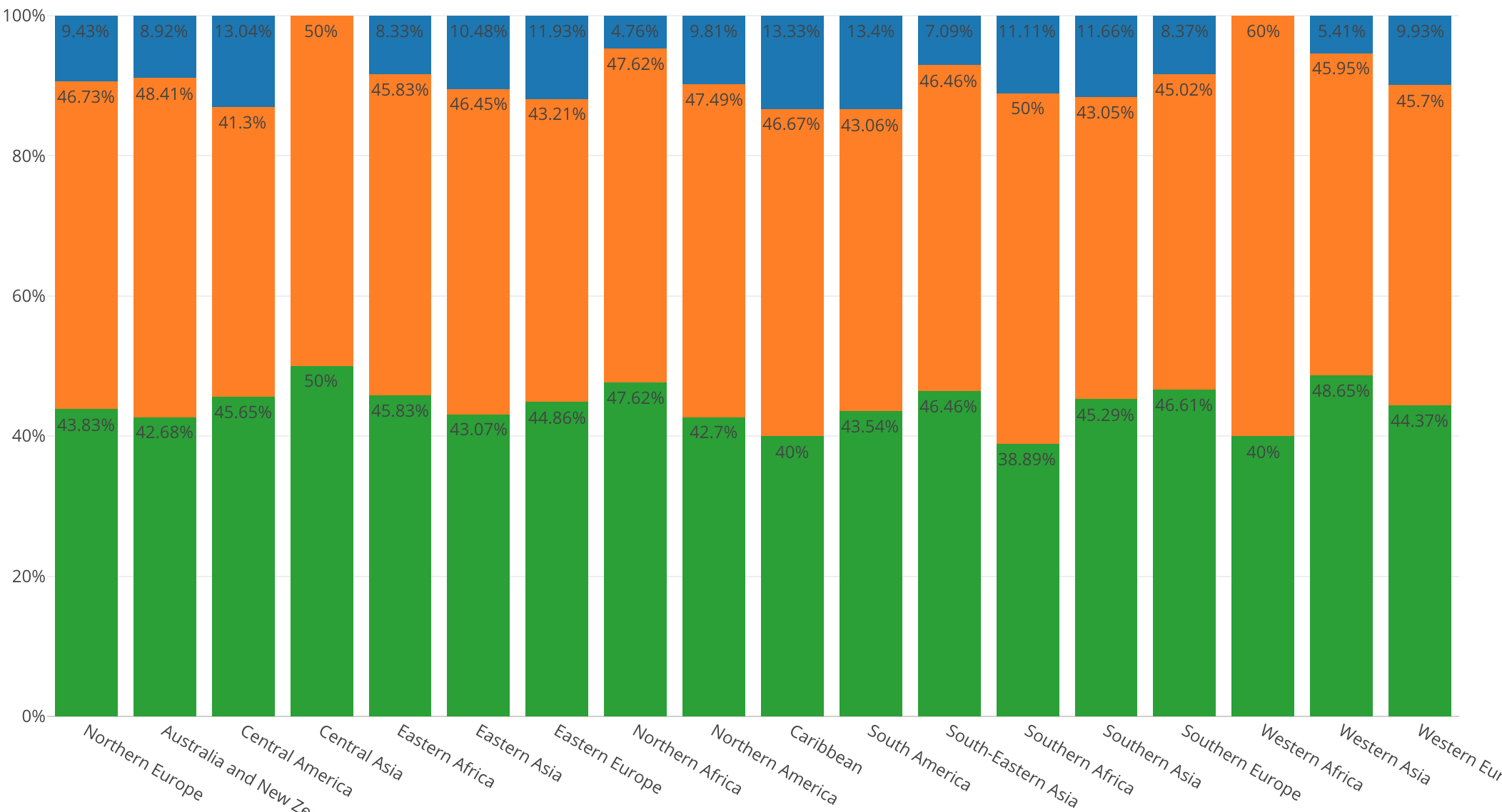
Once we have assigned ‘% of,’ ‘Sum (Total)’. Our chart will look like the one below.
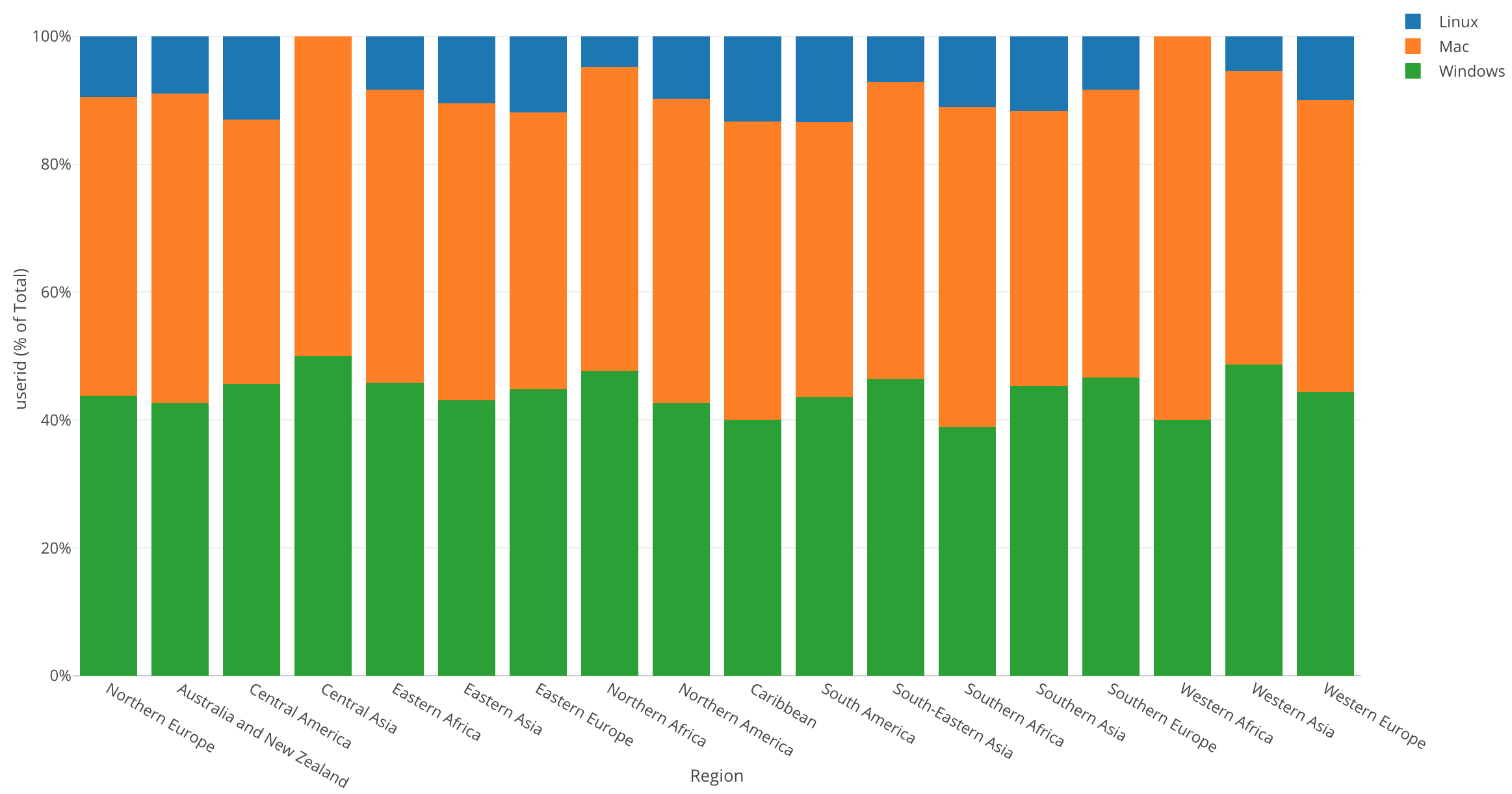
The Y Axis’s scale is now percentage, which starts from 0% at the bottom up to 100% at the top, and it shows the percentage of each OS in each region.
By looking at this chart, we can tell that each region has a different percentage of users using each operating system. But, I want to be able to tell what percentage each OS is just by looking at each section. For this, we can show each value on the chart.
In the left-hand corner above the chart type function, there is a gear icon called ‘Property,’ click on this icon.
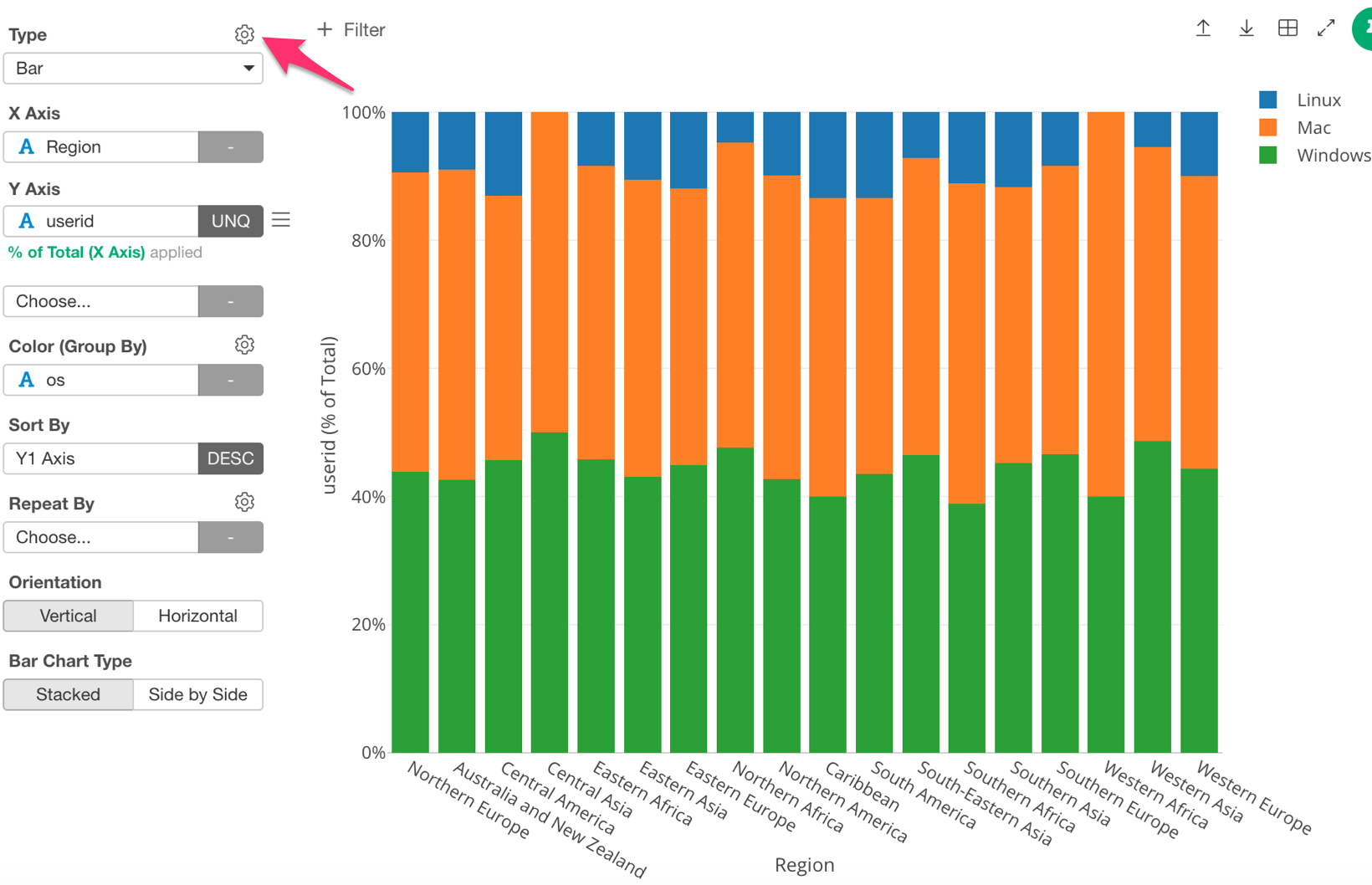
Next, under ‘Plot Area,’ click on ‘Show Value on Plot.’
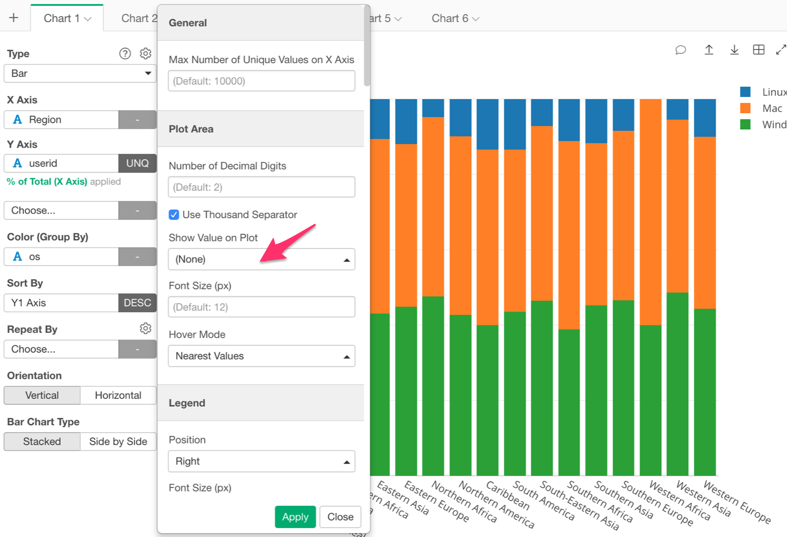
Then, select ‘Below.’ This will display the value of each bar below its top line.
Once we have done this our chart should look like the chart below; displaying the percentage of each OS.
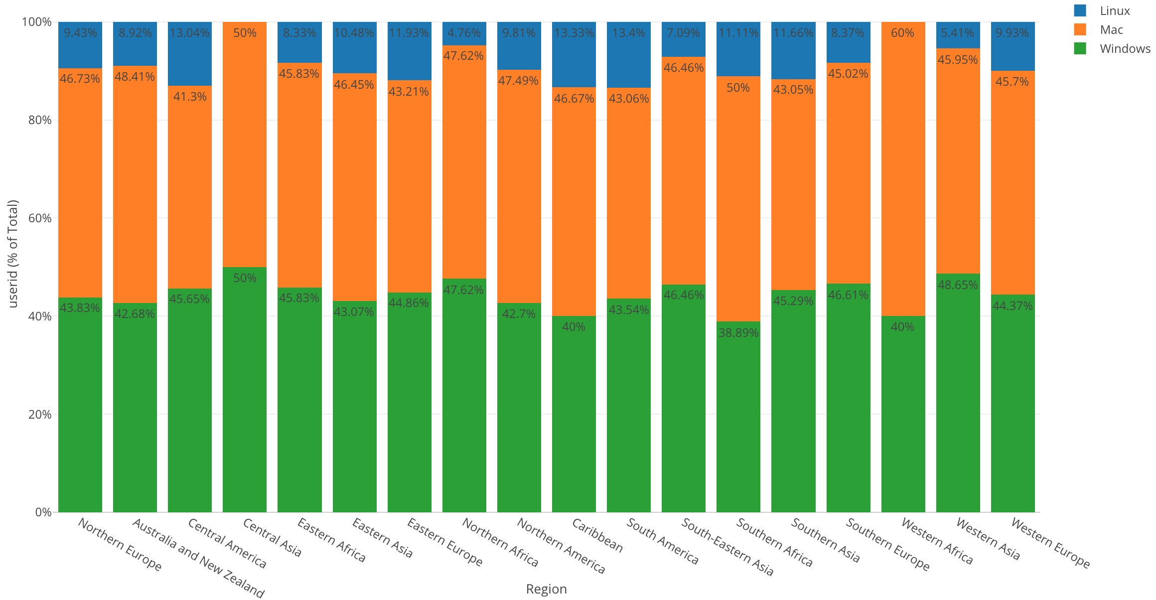
By looking at this chart, I can make the following observations.
West Africa has the highest percentage of Mac users but no Linux users.
In Central Asia, Mac users and Windows users are split 50/50.
Caribbean has the highest percentage of Linux users.
Conclusion
In this post, we used one of the Window Calculation methods called ‘% of Total,’ along with the bar chart and color (grouping) in order to visualize the percentage of users using each OS in each region.
Within all of our visualizations so far we have used the bar chart. Who would have thought that a chart as simple as a bar chart could lead to so many discoveries? With the bar chart, we were able to compare and group our variables, as well as change our scale in order to see the percentages of each variable.
Next Time
This activity log data also has information of what day and time users are accessing the website. This type of data is called “Time Series data”. Having said that, I want to understand how the number of user accesses has changed over time.
In the next post I am going to use a Line chart to visualize such trend over a period of time!
Next Post:Introduction to Data Visualization Vol. 5 - Time Series Trend