Introduction to Data Visualization Vol. 5 - Time Series Trend
Hello everyone and welcome back, I’m Teagan!
In our last post we used one of the Window Calculation methods, called ‘% of Total,’ along with the bar chart and color (grouping) in order to visualize the percentage of each OS in each Region.
In this post, I am going to use a Line chart to visualize how the number of user accesses has changed over time.
We will continue to use the same data as the last posts. The data can be downloaded from here.
Before We Get Started
Here are the questions that I want to answer by visualizing the data.
- How has the number of user accesses changed over time?
- What is our user trend?
These are the chart features inside Exploratory that I am going to use in this post.
- Line chart
- Y2 Assignment
Visualizing Time Series Data
This time I will use a Line chart to see how the number of accesses changes over a period of time. For chart type, select Line.
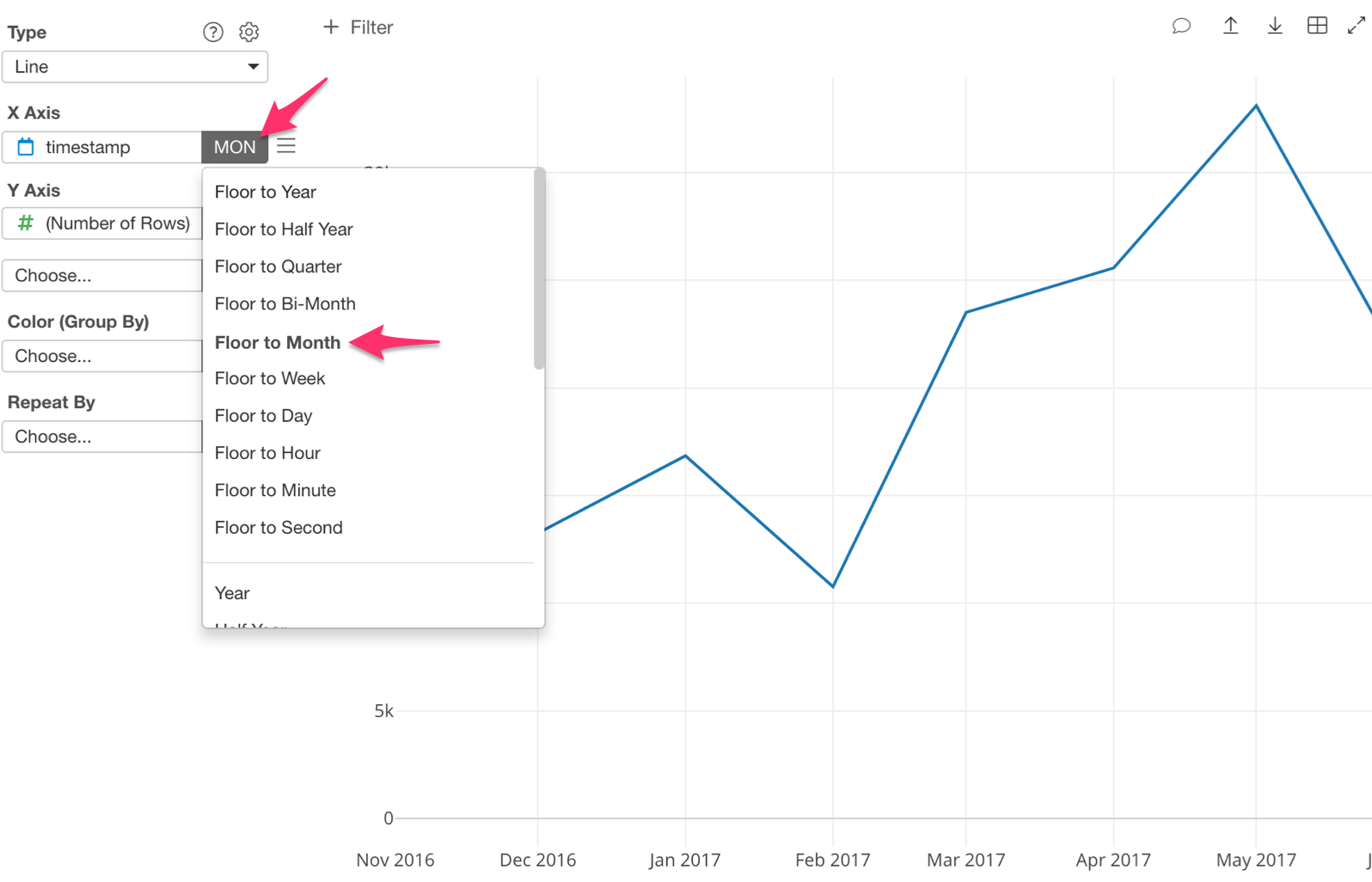
Next, assign ‘timestamp’ to the ‘X Axis’ and ‘Number of Rows’ to the ‘Y Axis.’
Next to the ‘X Axis’ bar there is a shaded portion. This is the scale, basically the time period that you want to use. So let’s select ‘Floor to Month.’
The Line chart is now showing us the number of accesses per month.
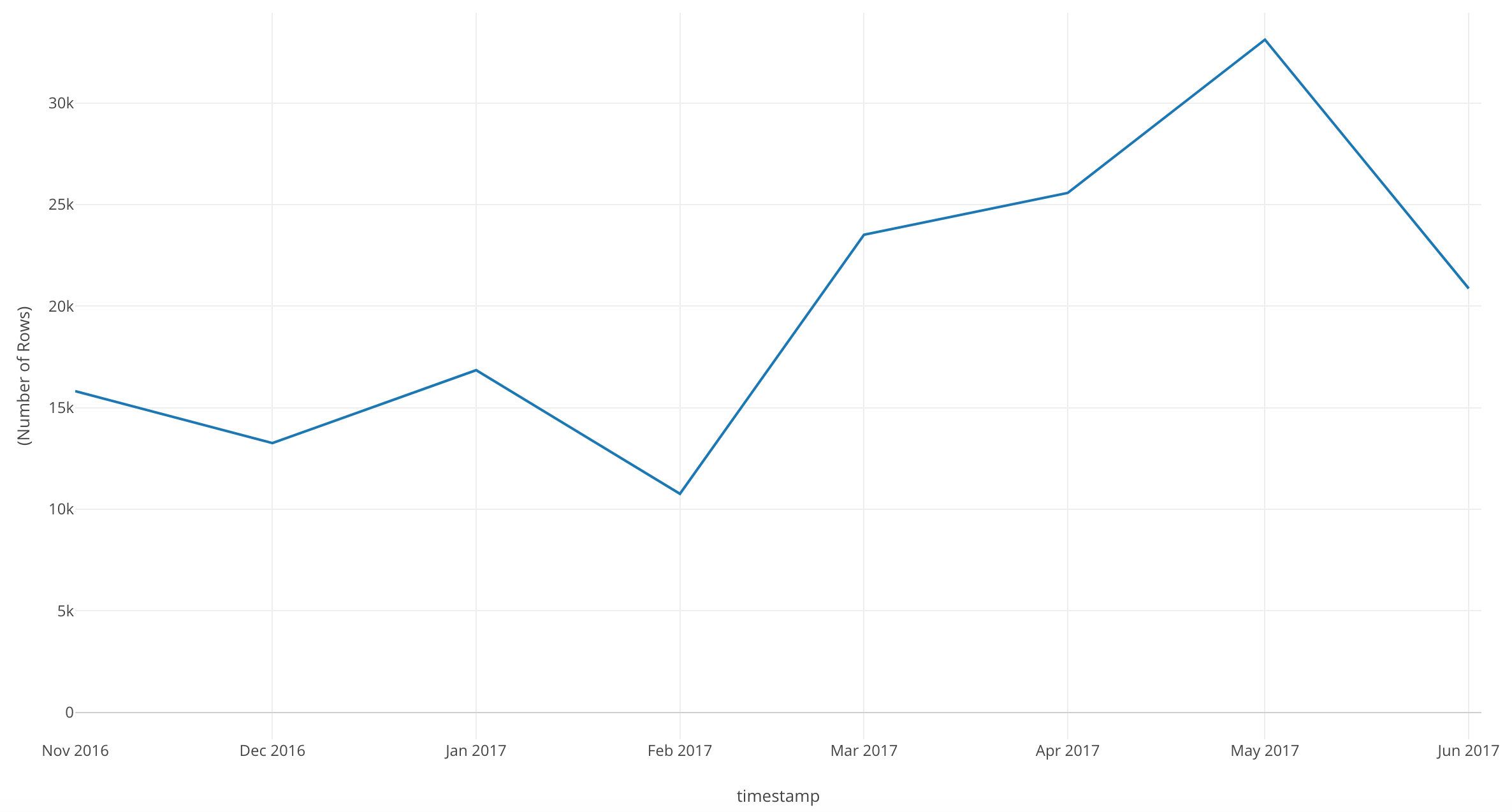
We can see that there are some dips in our number of accesses per month. Our peak was May 2017, but it looks like it drops quite a bit in June of 2017.
Let’s go more in depth!
Change the scale on the ‘X Axis’ to ‘Floor to Week.’
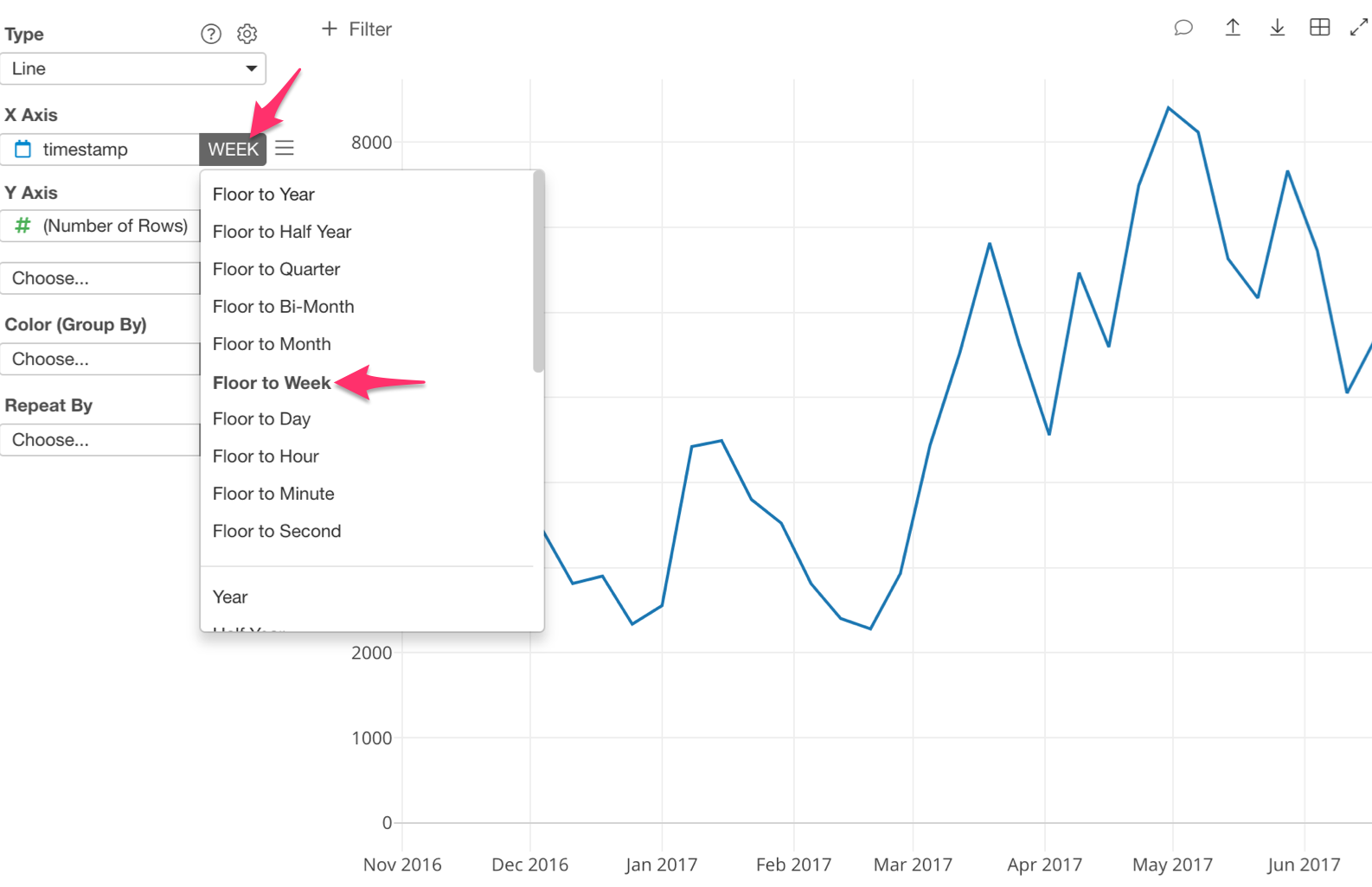
Now we can see the number of accesses per week during each month.
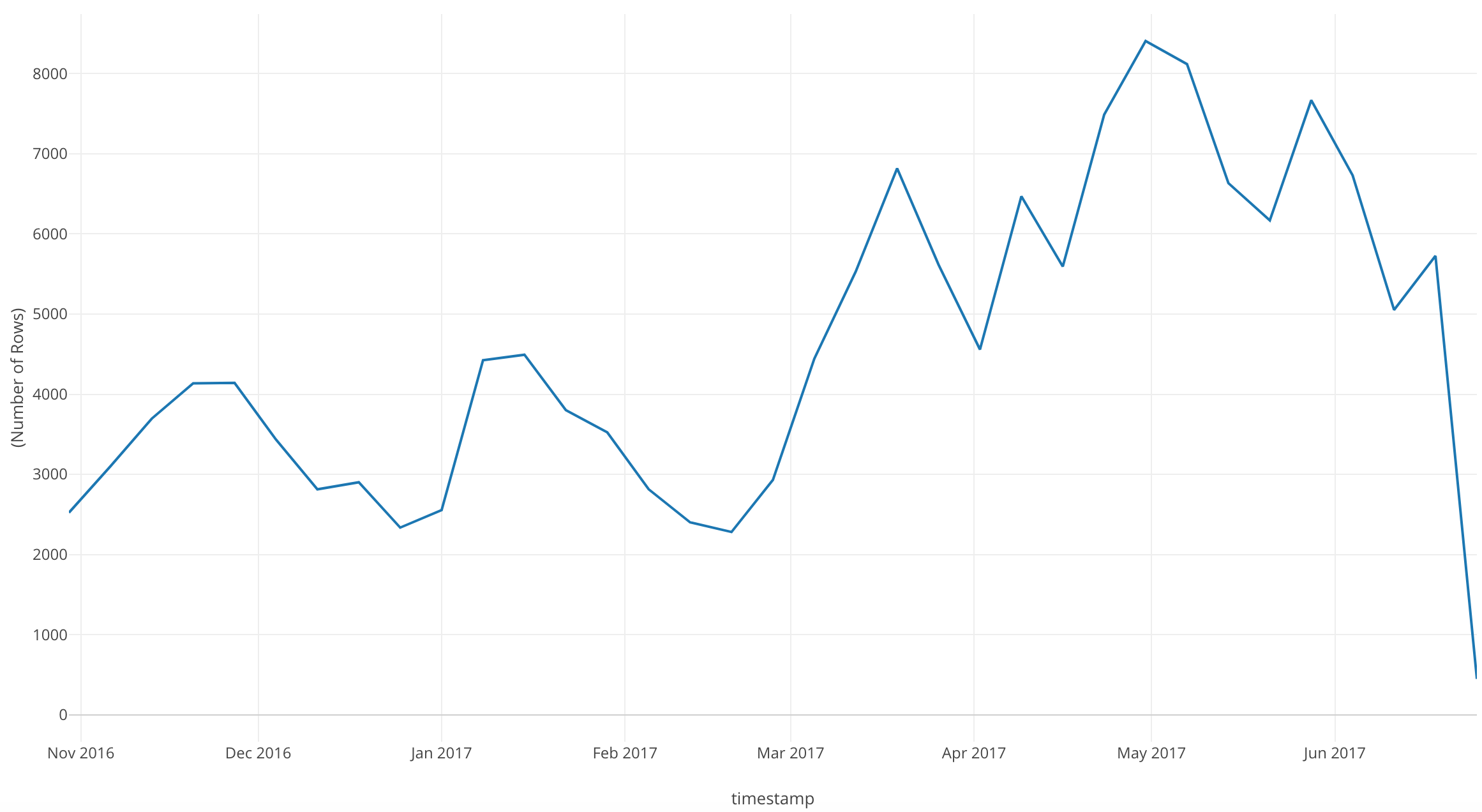
In this chart, with ‘Floor to Week’ we can see more dips and peaks than with ‘Floor to Month.’
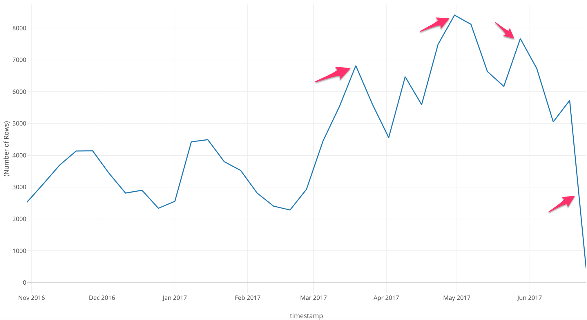
If we look at this chart, we can see that after March 2017 there are three large peaks, but during June 2017 our number of accesses drop drastically.
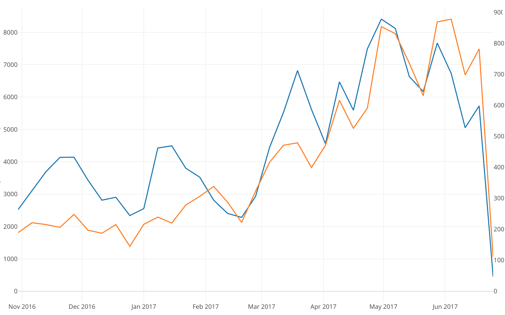
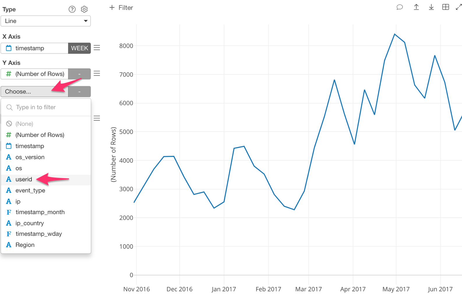
Now, let’s bring in the number of users so that we can compare between the two - the number of accesses and the number of users.
We are going to assign another variable to the ‘Y Axis.’ Let’s assign ‘userid.’
With this step, we want to know how many unique users are accessing the website per week.
If we look at this chart we can see that our number of accesses per week line stays the same, but now we have a number of unique users line as well.
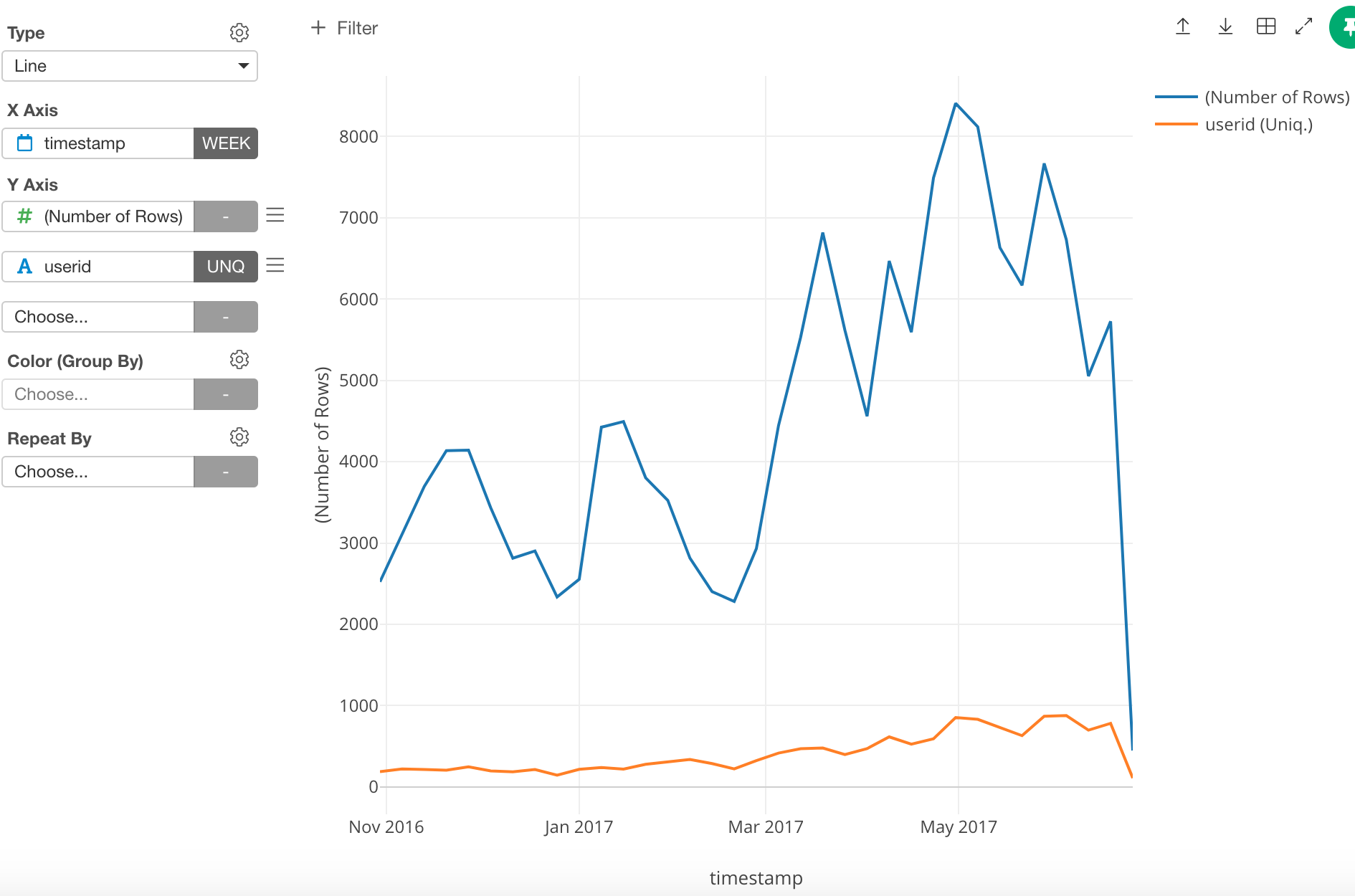
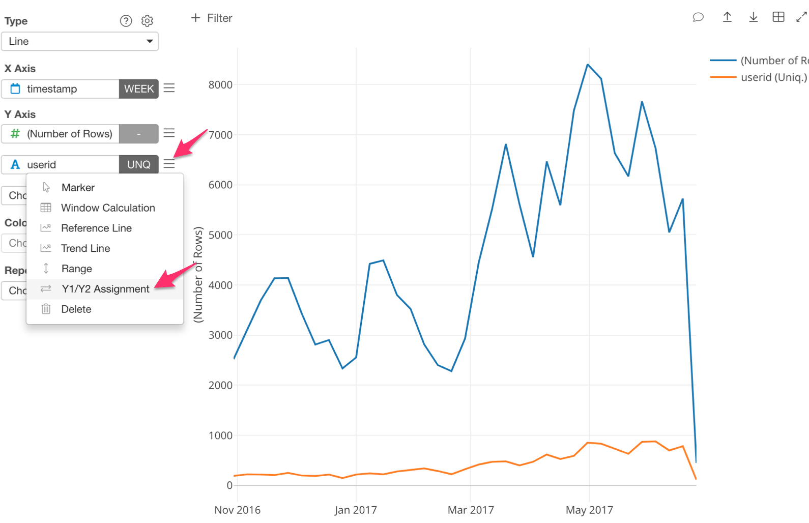
Of course, the line for the number of unique users is on a much smaller scale, which makes it harder to see the trend. To address this, we can assign the number of unique users line to the Y2 Axis so that it will be shown using a scale different from the one used for the Y1 Axis .
Here’s how!
Click on the three bars next to ‘userid’ and select ‘Y1/Y2 Assignment.’
Next, check ‘Assign to Y2.’
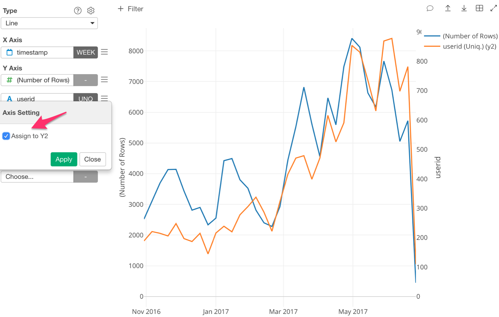
The ‘Number of Rows’ is now assigned to Y1 and ‘userid’ is assigned to Y2.
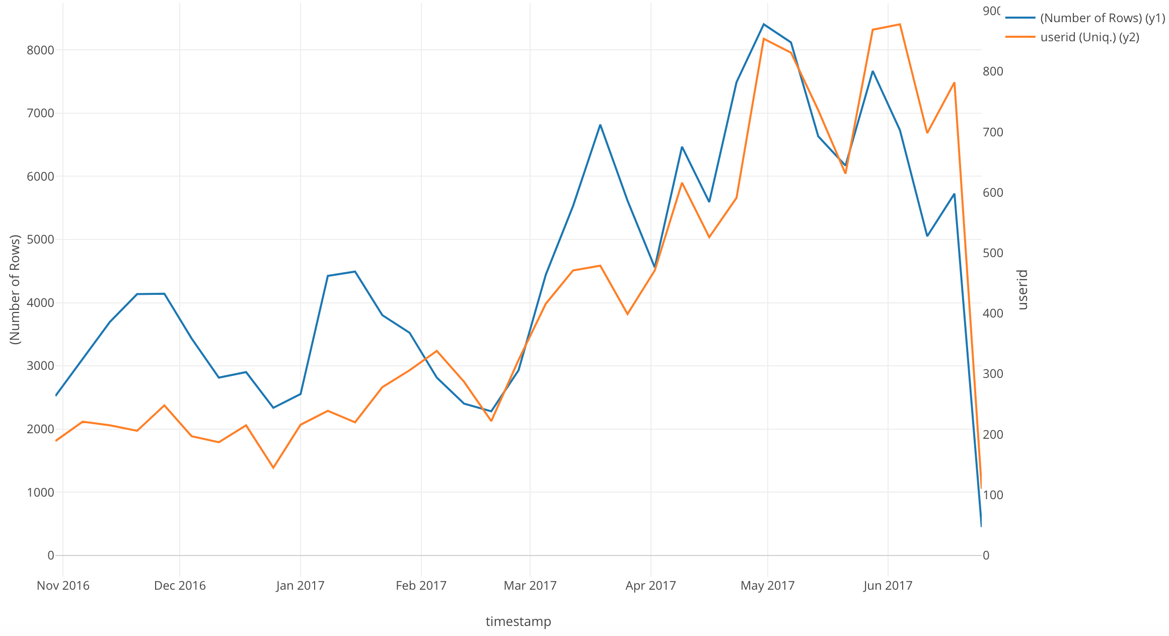
An interesting point of this chart is that after February 2017, the lines are closely correlated.
Conclusion
In this post, I used a Line chart to visualize a time series trend in our data.
Next Time
The next information I want to know is, how many new users overall accessed the website?
In our next post, I am going to use another Window Calculation function, called ‘Cumulative.’ I will use this function to visualize the trend of the accumulative number of new users.
Next Post: Introduction to Data Visualization Vol. 6 - Cumulative Sum