Introduction to Data Visualization Vol. 6 - Time Series Trend - Cumulative Sum
Hello everyone, I’m Teagan!
For those of you returning, welcome back!
In our last post, I used a Line chart to visualize how the number of user accesses had changed over time.
In this post, I am going to use a new Window Calculation function, called ‘Cumulative Sum.’ I will use this function to visualize the trend of the accumulated number of new users.
We will continue to use the same data as the last posts. The data can be downloaded from here.
Before We Get Started
Here is the question that I want to answer by visualizing the data.
- What is the number of cumulative users over time?
These are the chart features inside Exploratory that I am going to use in this post.
- Line Chart
- The Window Calculation, Cumulative Sum
Data Preparation
In this post we are going to continue to use the same data, however, we are going to use a different data wrangling step.
In this post we want to compare the first value recorded in our time series data, therefore we want to use ‘step 7.’ The reason being, ‘step 7’ is the wrangling step in which our first value has been calculated for our time series data.
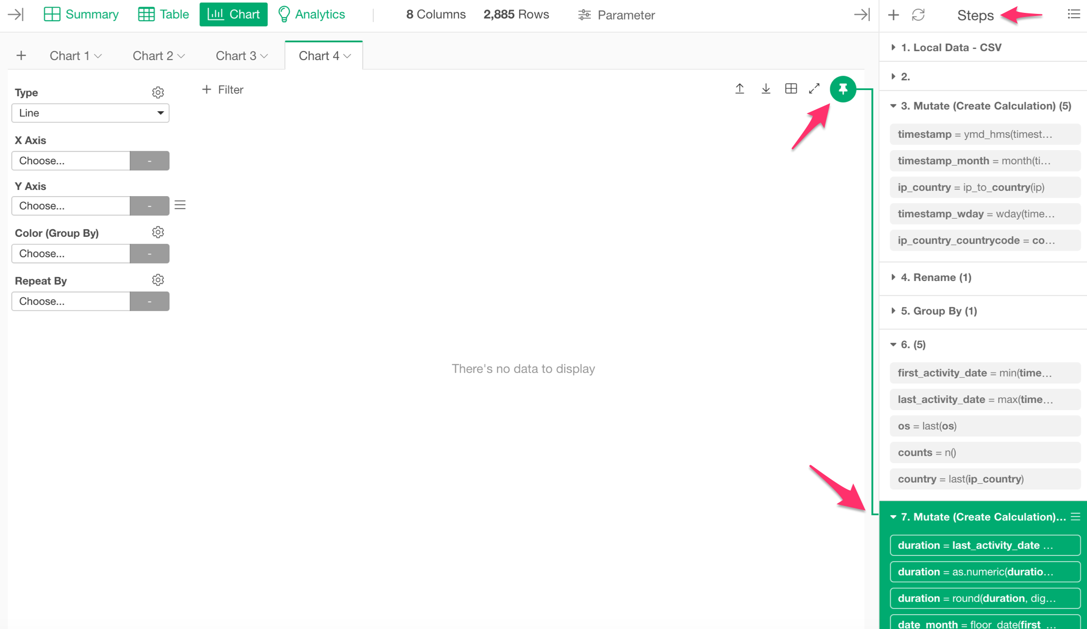
On the right-hand side of the chart view there is a column labeled ‘Steps.’ Click on the green pin icon and drag it to ‘step 7.’
Now let’s get started!
Visualizing Time Series Data
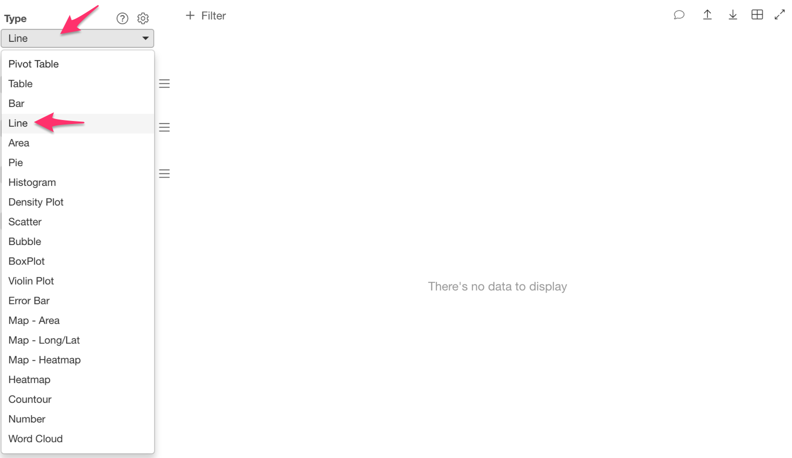
We want to see the number of new users over time, so we are going to use a Line chart.
Let’s assign ‘first_activity_date’ to the ‘X Axis’ and select the ‘Floor to Week’ scale.
Then assign ‘userid’ to the ‘Y Axis.’
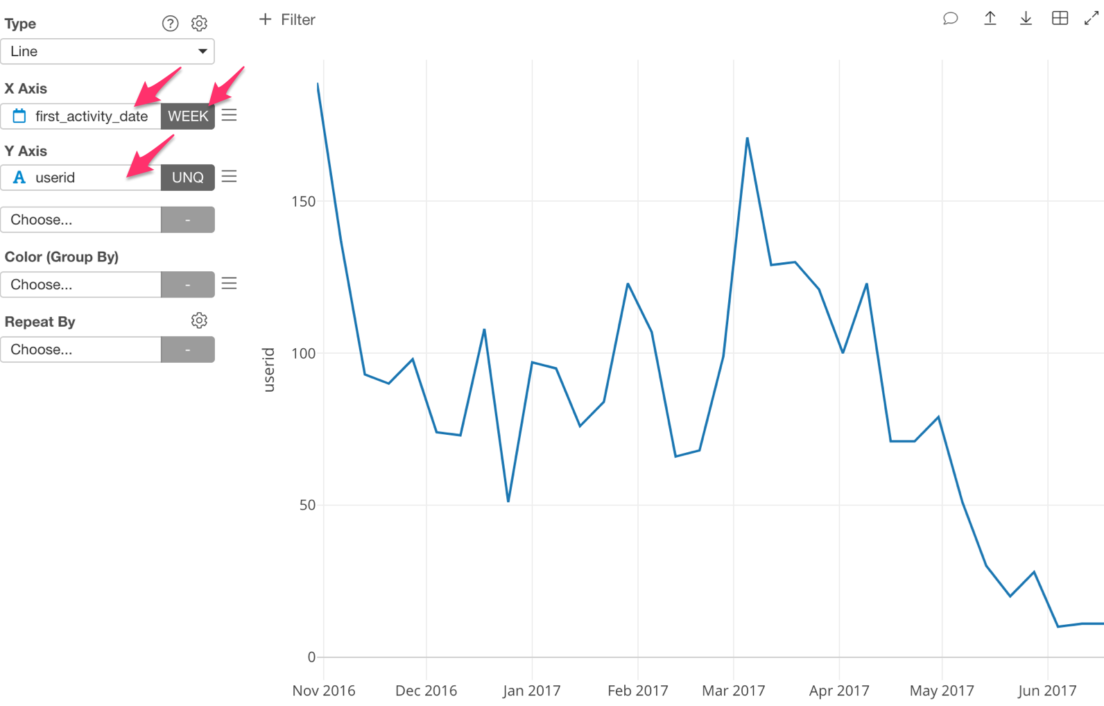
We are now able to visualize the number of new unique users per week, each month.
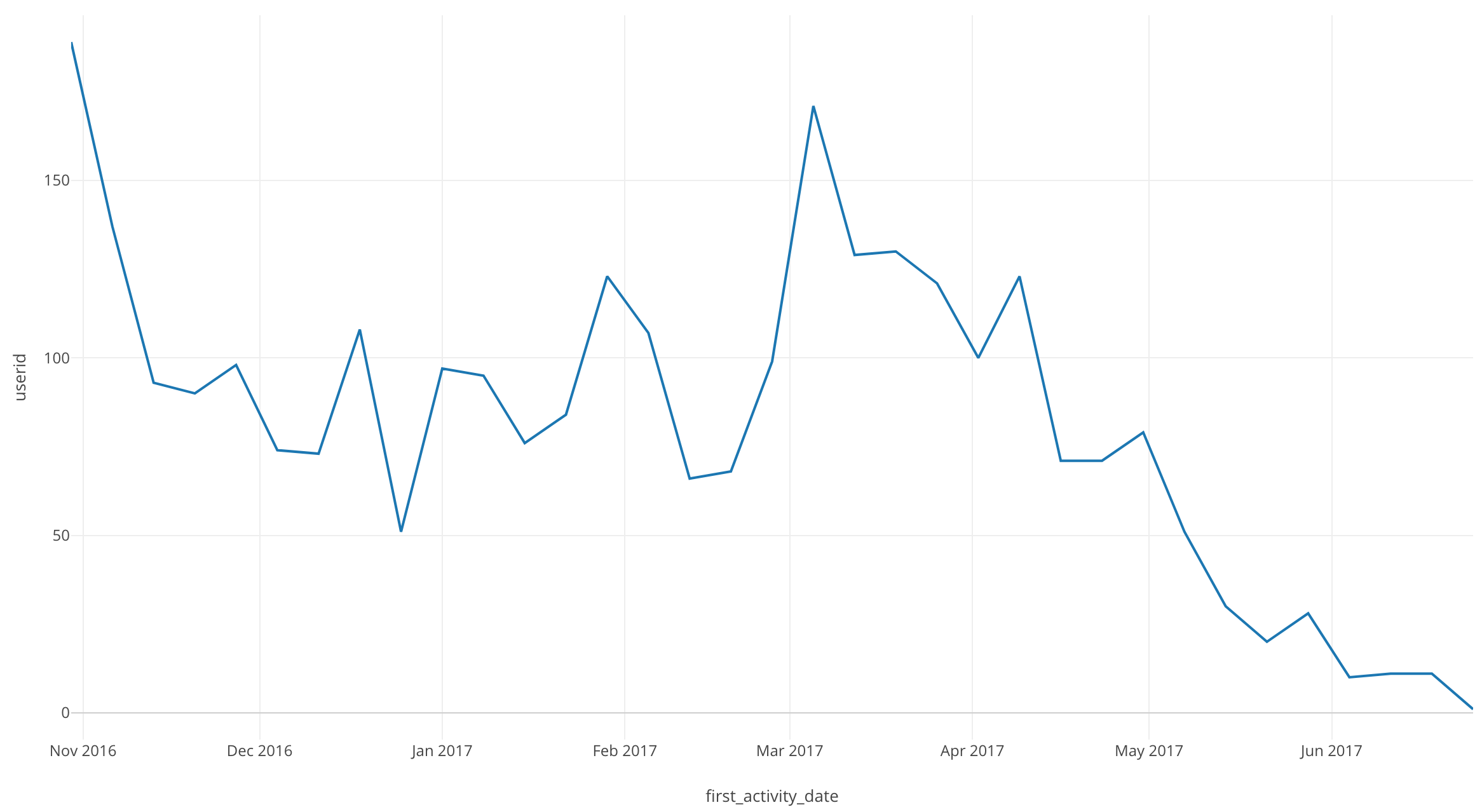
There are quite a few dips and peaks, but an interesting point is that after April 2017, the number of new users continues to drop.
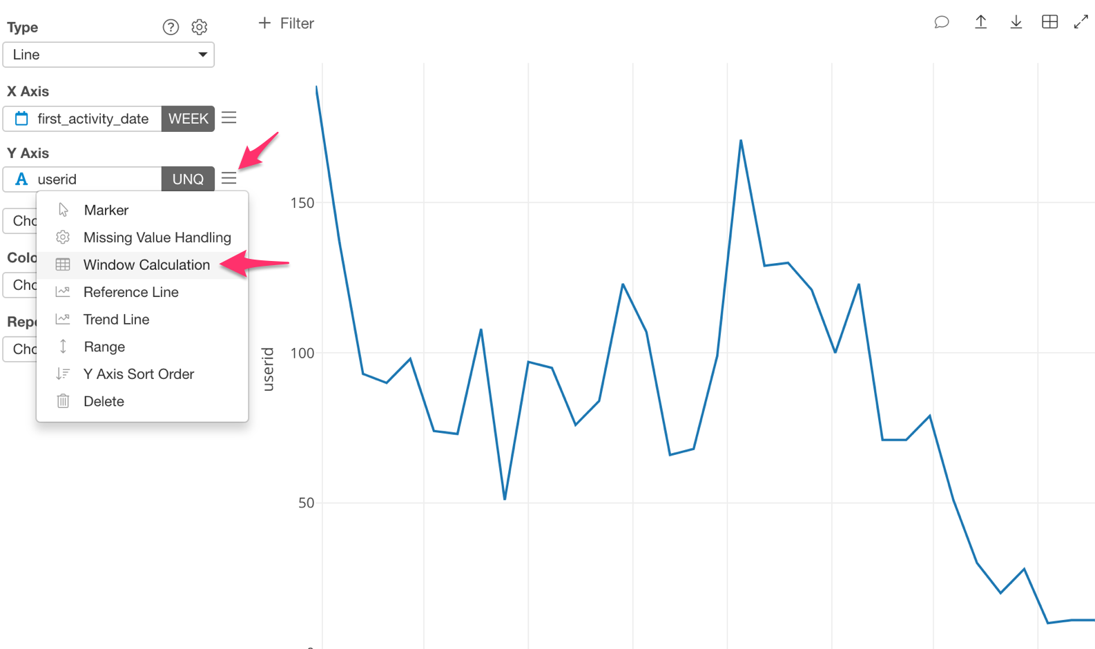
Next, lets take a look at the number of accumulated new users.
Click on the three bars next to the ‘Y Axis’ and select the ‘Window Calculation.’
For ‘Calculation Type,’ select ‘Cumulative.’
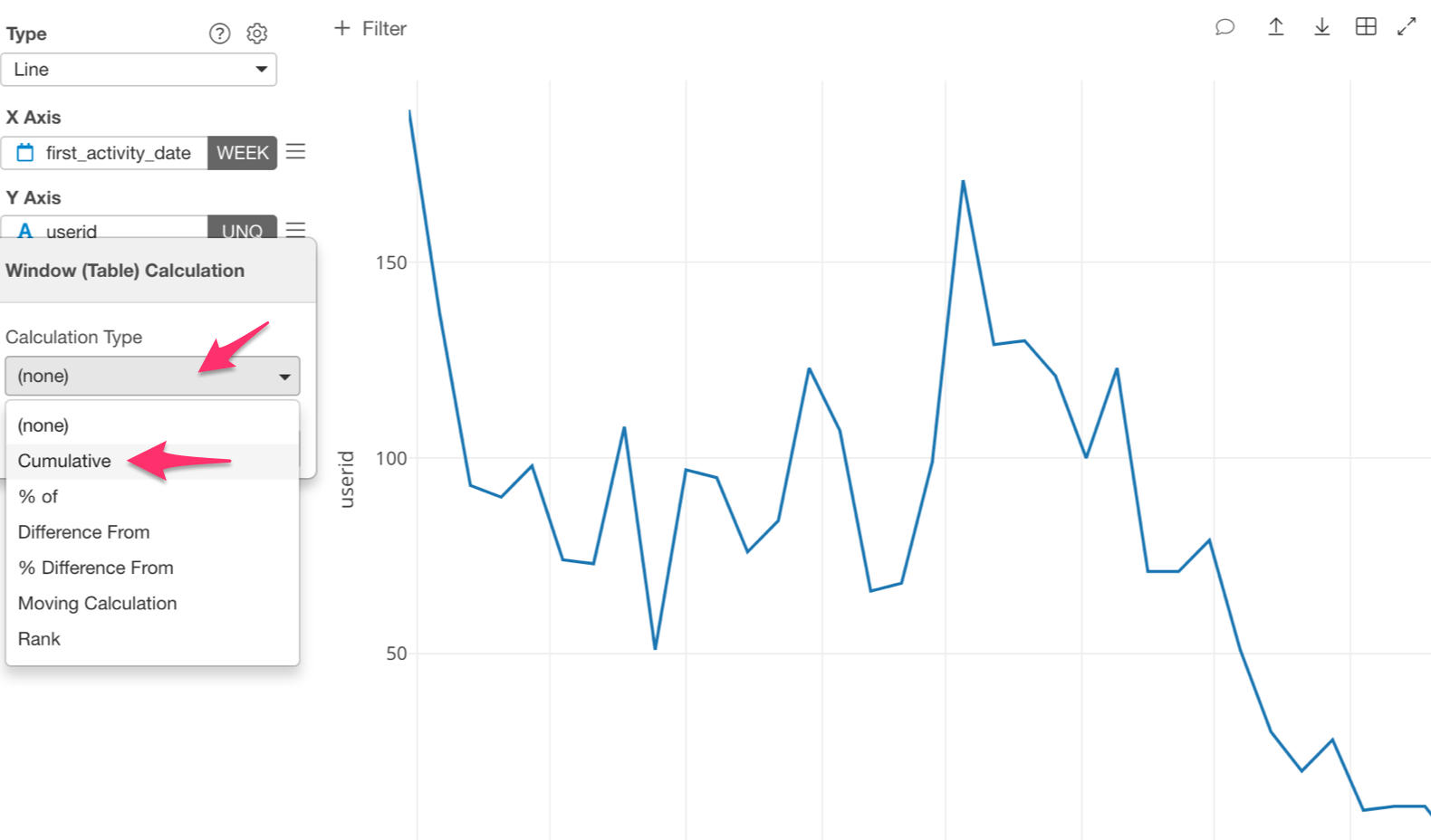
Under ‘Summarize Values Using,’ we are going to use ‘Sum.’
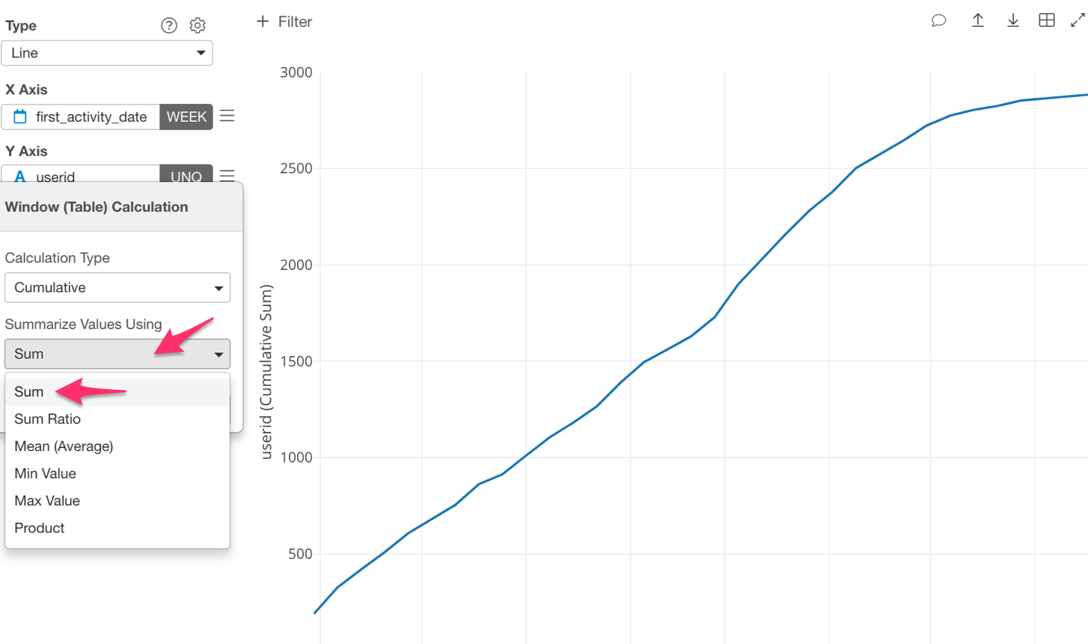
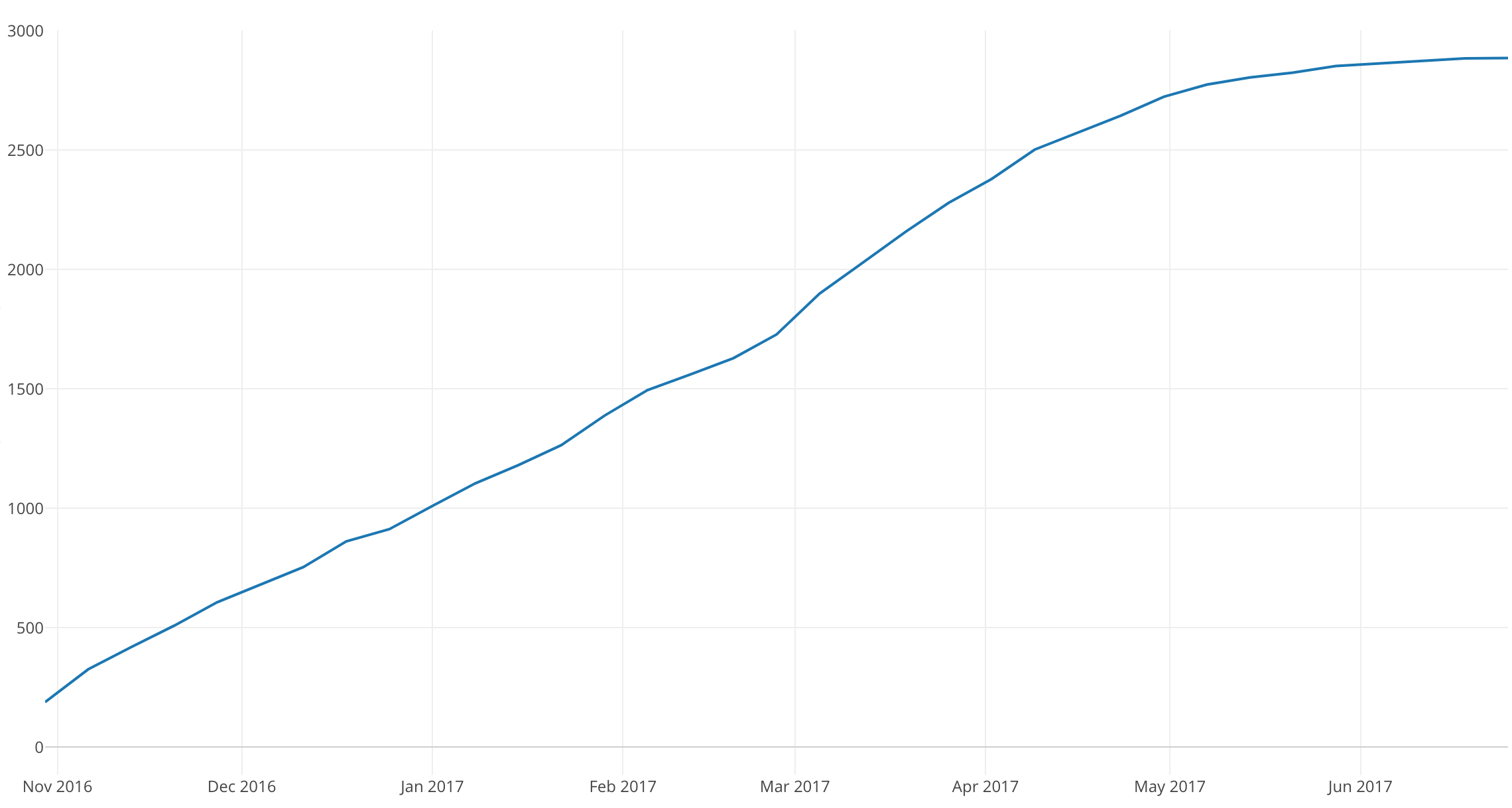
We can now visualize the number of cumulative new users.
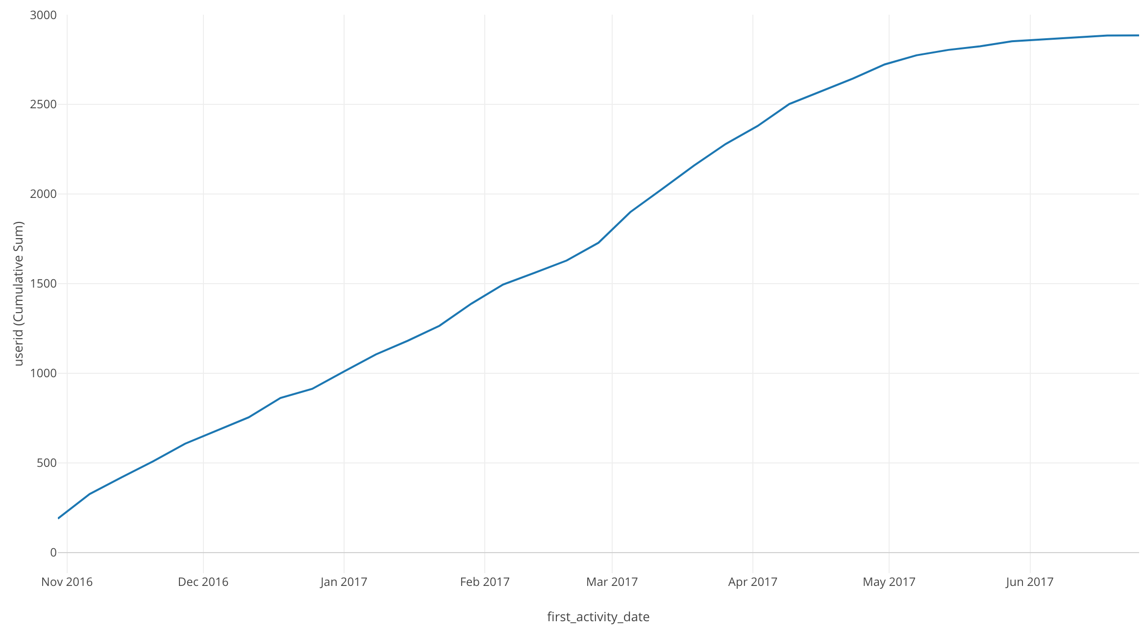
By looking at this chart, we can see the cumulative user total at each point in time.
In July 2017 there are 2885 users.
After May 2017 the line’s slope started to level out. Meaning the number of new users began to plateau.
Conclusion
In this post, I used the Window Calculation function, ‘Cumulative,’ and the Line chart to visualize the trend of the number of accumulated new users over time.
Next Time
In the next post, I am going to use the Line chart and Window Calculation function, Total % of again in order to visualize the percentage of users using each operating system over a period of time.
Next post: Introduction to Data Visualization Vol. 7 - Time Series Trend - Percentages