Introduction to Data Visualization Vol. 7 - Time Series Trend - Percentages
Hello everyone, I’m Teagan!
For those of you returning, welcome back!
In our last post, I used the Window Calculation, Cumulative Sum to visualize the trend of the accumulated number of new users.
In this post, I am going to use the Line chart and Window Calculation function, Total % of, in order to visualize the percentage of users using each operating system over a period of time.
We will continue to use the same data as the last posts. The data can be downloaded from here.
Before We Get Started
Here is the question that I want to answer by visualizing the data.
- What is the percentage of users using each OS?
These are the chart features inside Exploratory that I am going to use in this post.
- Line Chart
- Color (grouping)
- Window Calculation, Total % of
- Area Chart
Data Preparation
In this post we are going to continue to use the same data and same wrangling step (step 7) as our last post. If you have not already done so, drag the green pin to step 7.
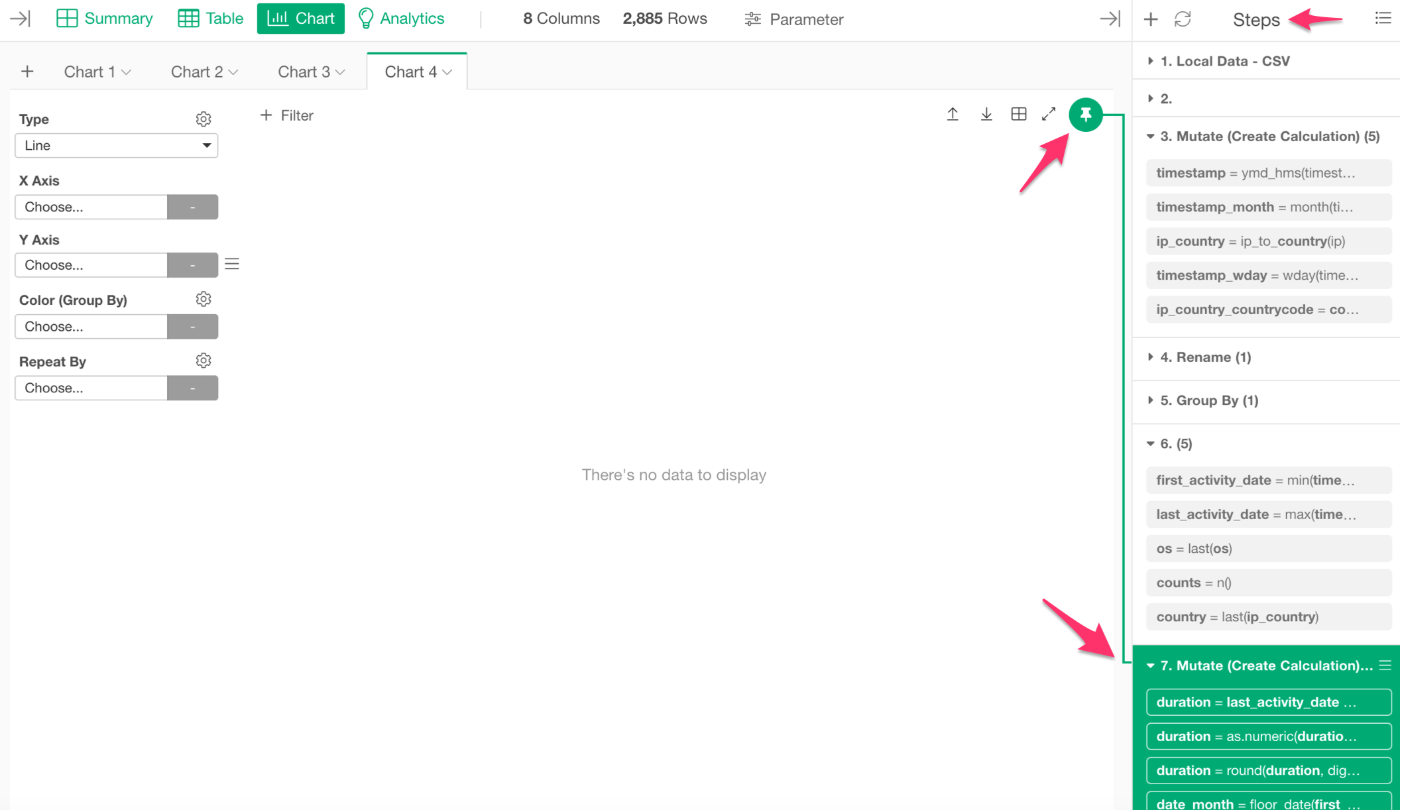
Chart Preparation
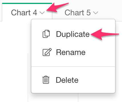
I want to use the same chart that we used in the last post. For those of you who have been following along with the series, let’s use the duplicate feature again to save time.
For those of you who are new to this series, here are the steps to create this chart.
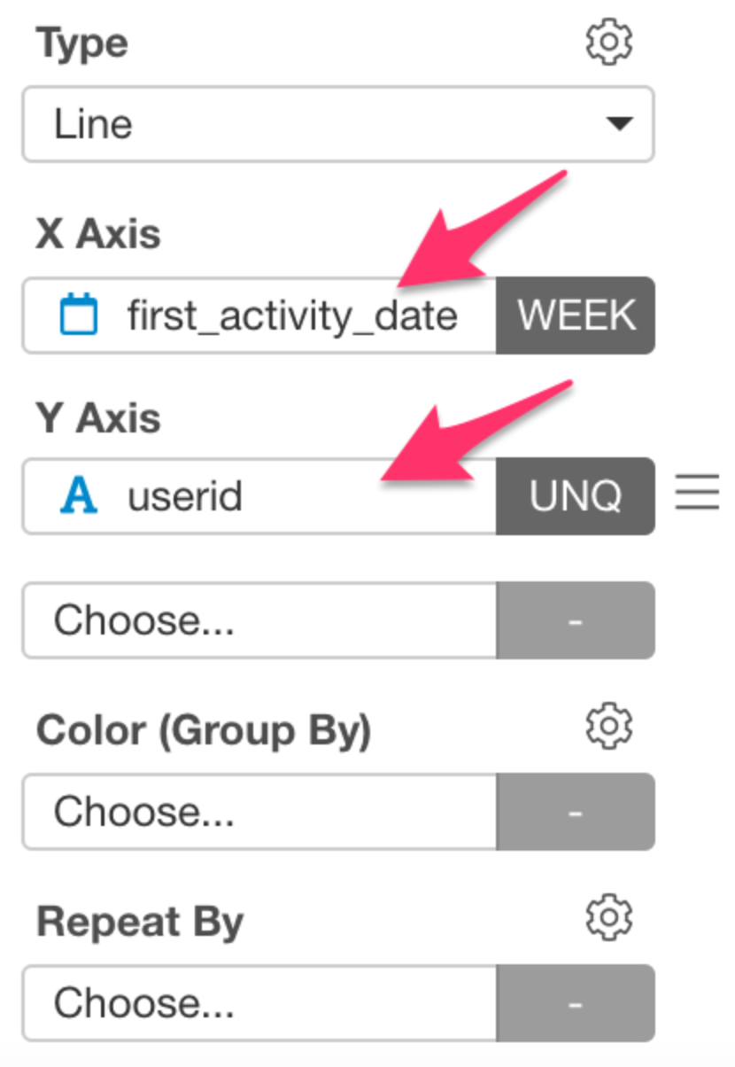
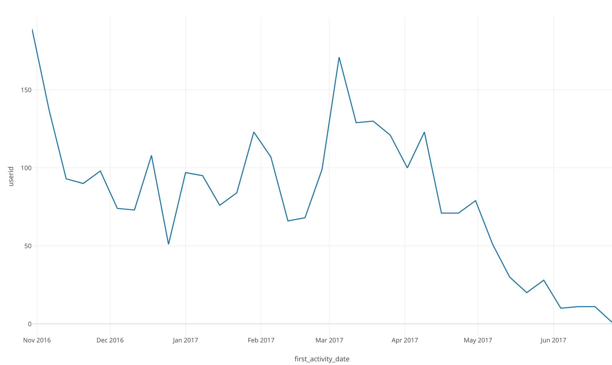
For chart type, slect Line. Then assign first_activity_date to the X Axis and select the Floor to Week scale. Lastly, assign userid to the Y Axis.
The function bar should look like the picture below.
After you have input all of this information, the chart should like the one below.
Let’s get started!
Visualizing Data
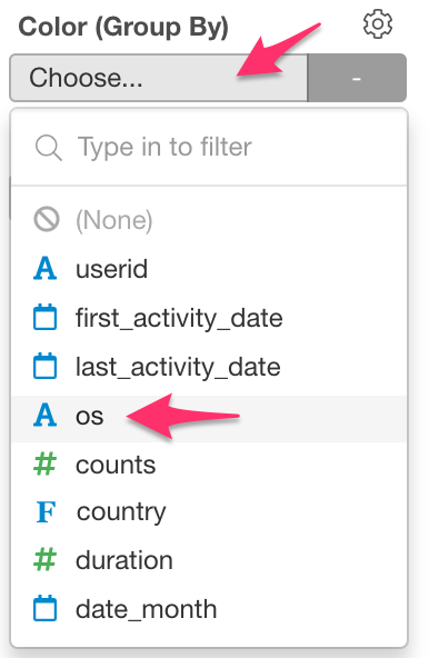
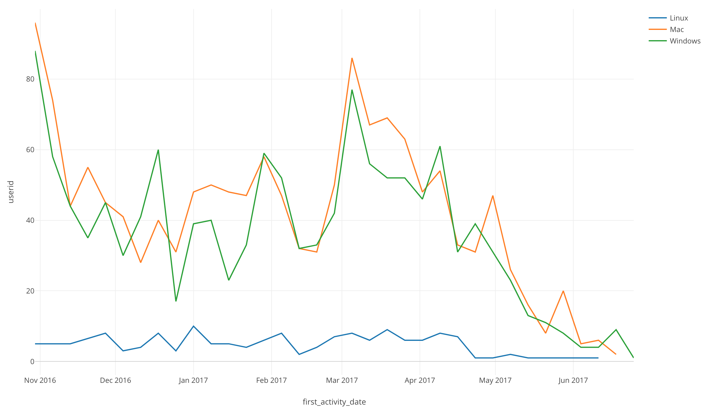
Click on Color (Group By) and select “os.”
Once we do this, we will be able to see the number of new users using each os over time.
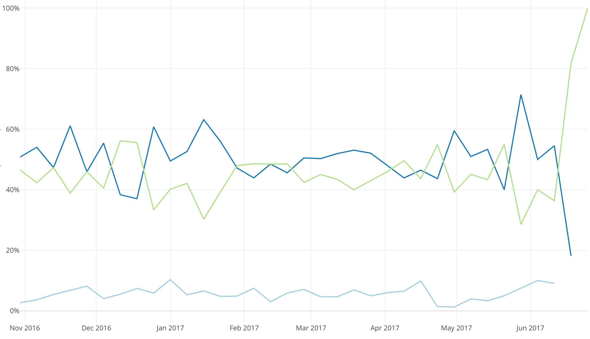
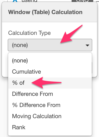
Window Calculation: Total % of
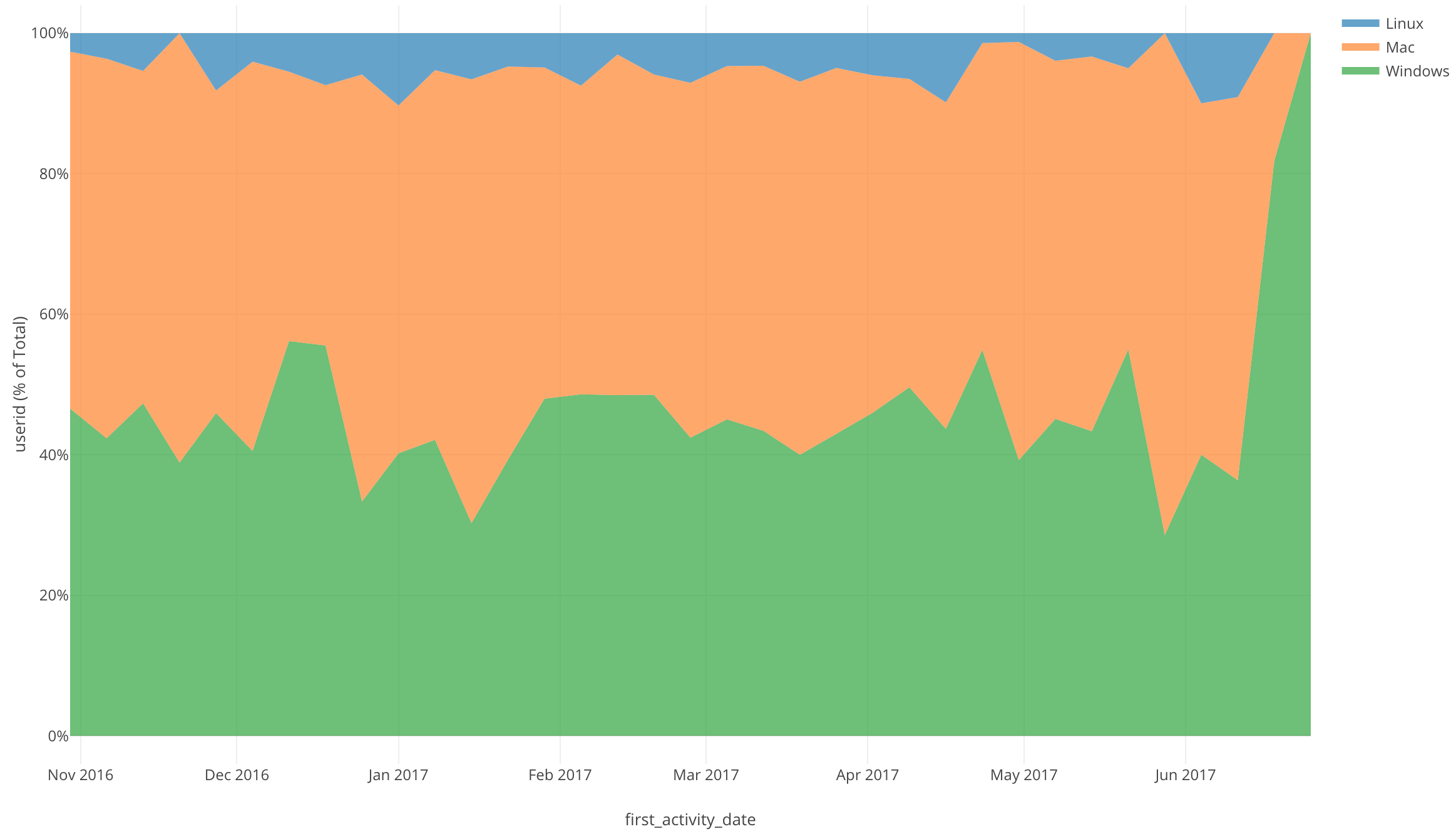
Now let’s look at the percentage of users using each os over time.
Click on the three bars next to the Y Axis and select the Window Calculation.
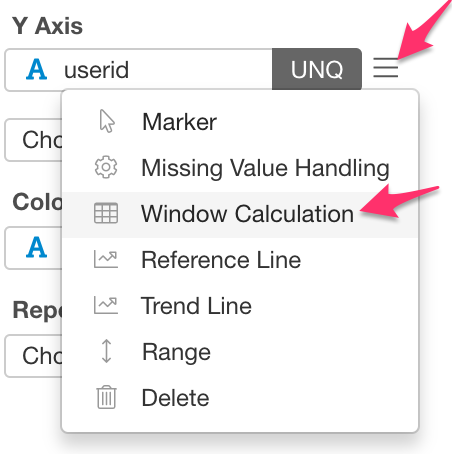
For the Calculation Type, select % of.
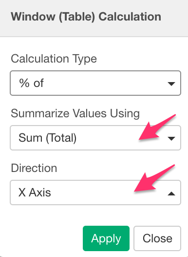
Make sure that Sum (Total) is selected for Summarize Values Using and X Axis is selected for Direction.
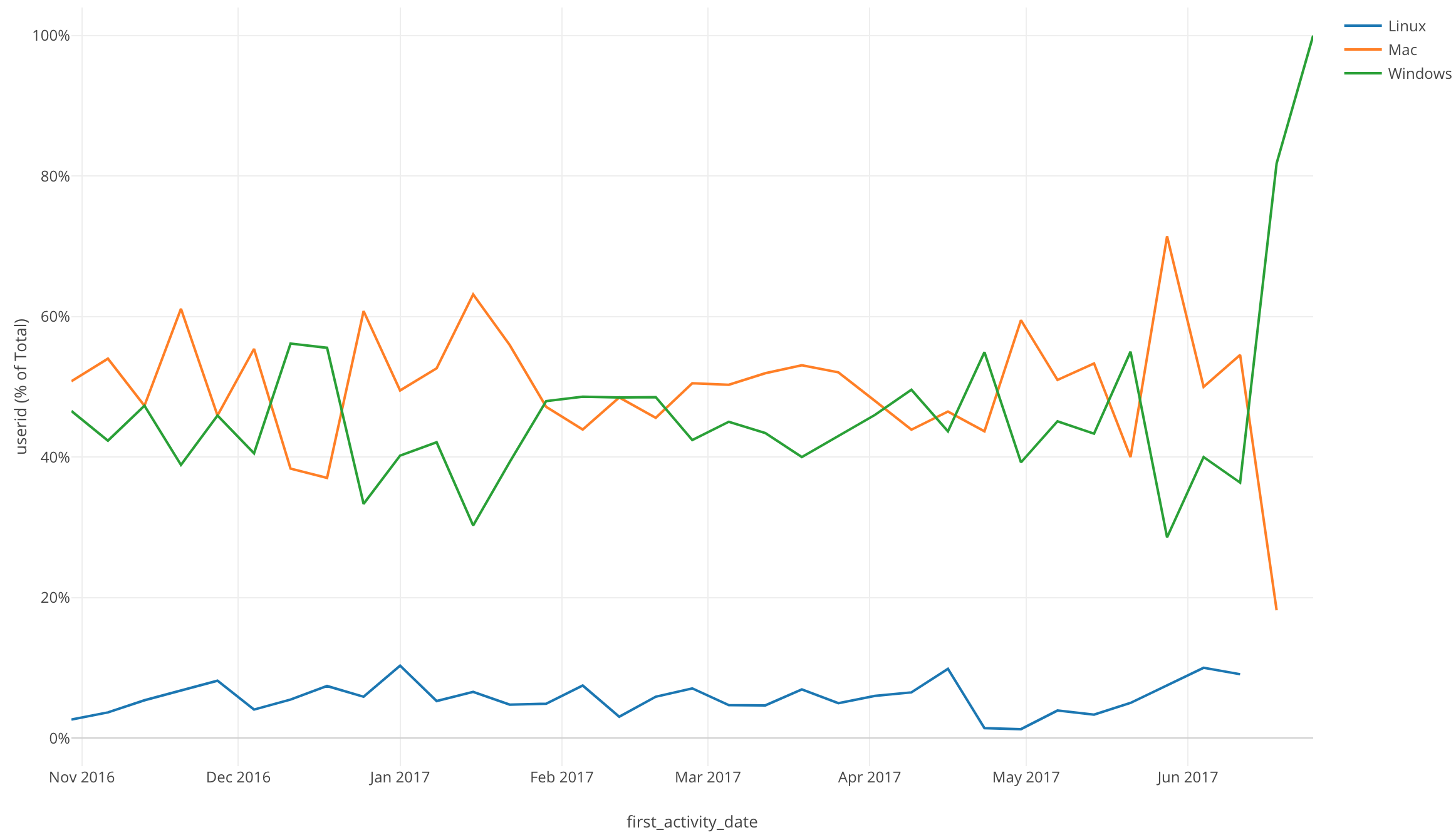
We can now visualize the percentage of new users using each os over time.
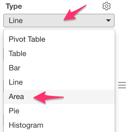
If you are looking for other ways to view percentages, the Area chart is a good choice.
Let’s check it out!
Change the Line chart to the Area chart.
With the Area chart we can see the percentage of each os being used.
Conclusion
I used the Line chart and Window Calculation function, Total % of to visualize the percentage of users using each operating system over a period of time.
With the time series data, there are a few other Window Calculation options that we can use to answer so many more questions about our data.
Next Time
In my next post, I will use another Window Calculation function called, “% Difference From” in order to visualize our time series data trends.
Next Post: