Introduction to Data Visualization Vol. 8 - Time Series Trend - Percentage Differences
Hello everyone, I’m Teagan!
For those of you returning, welcome back!
In our last post, I used the Line chart and Window Calculation function, Total % of, to visualize the percentage of users using each operating system over a period of time.
In this post, I am going to visualize big tech companies’ (Google, Apple, Facebook…) stock prices overtime. I will also compare the starting point of our data (first value) to the last point of our data to see whether the companies’ stocks prices increased or decreased over time.
Data Preparation
This time, I am going to use big tech companies stock price data.
The data can be downloaded from here!
If you don’t remeber how to import data, check out my first post for instructions.
If you are interested in more stock price data from different companies, you can download Historical Stock Price data from here.
Before We Get Started
Here are the questions that I want to answer by visualizing the data.
- What is the growth rate of each companies stock price over time?
- Which company’s stock prices increased the most?
These are the chart features inside Exploratory that I am going to use in this post.
- Line Chart
- Color (grouping)
- Window Calculation, % Difference From
Visualizing Data
First, let’s select Line chart as our chart type.
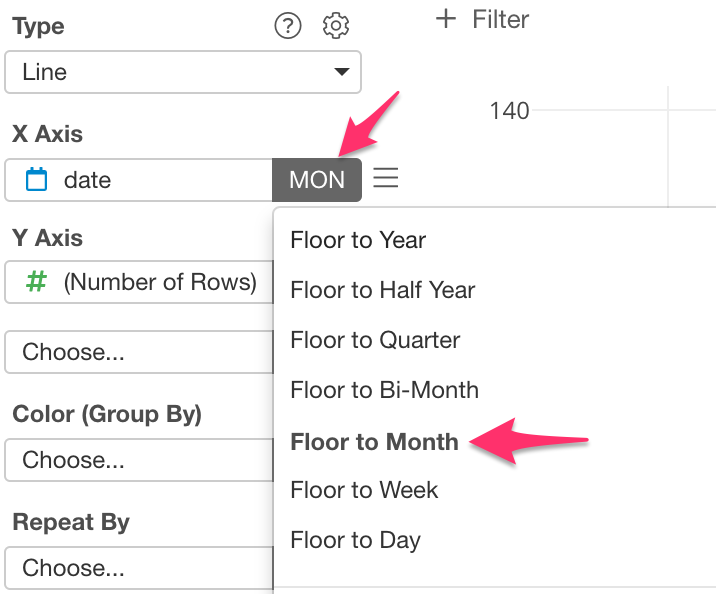
Next, assign ‘date’ to the X Axis, and select Floor to Month as the scale.
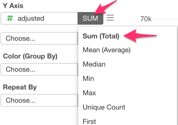
Then assign ‘adjusted’ to the Y Axis, and make sure that SUM is selected as well.
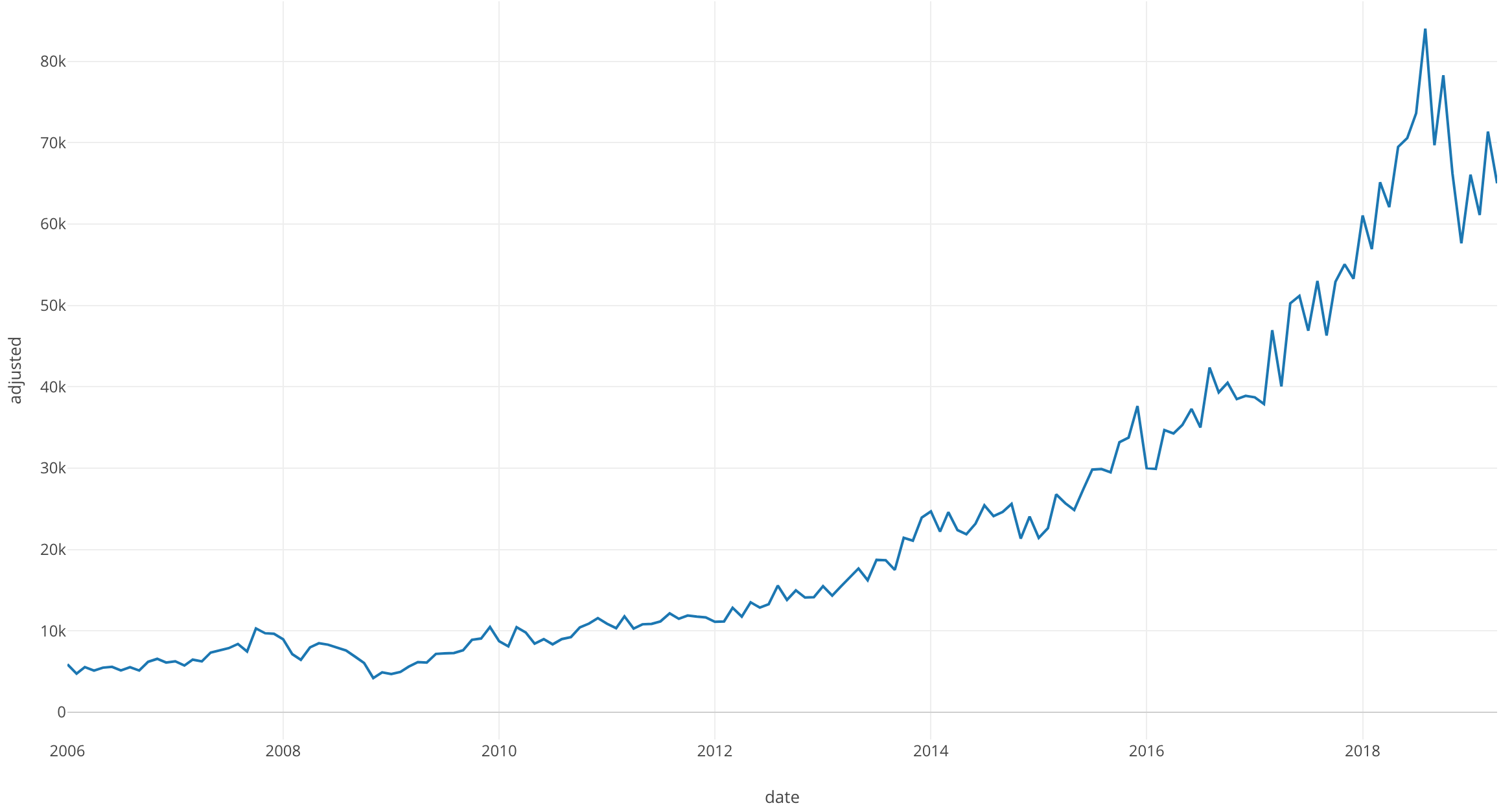
Once this is done, we can see the sum of every companies stocks.
Next, in order to look at each company sepertely we are going to use Color (Group By).
For Color (Group By) select ‘symbol’.
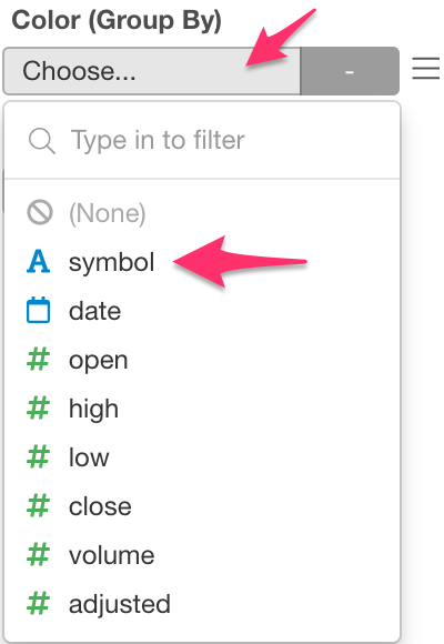
Now we can visualize each company.
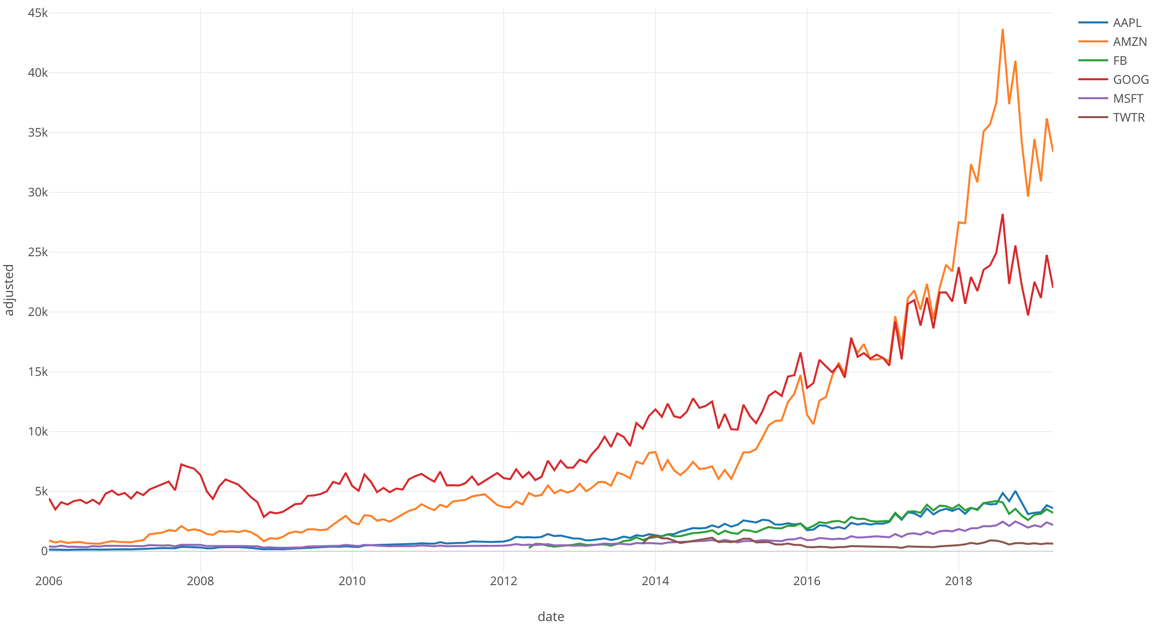
In this chart Amazon and Google’s stock prices look like they have increased the most over time. The other tech companies seem to have little change.
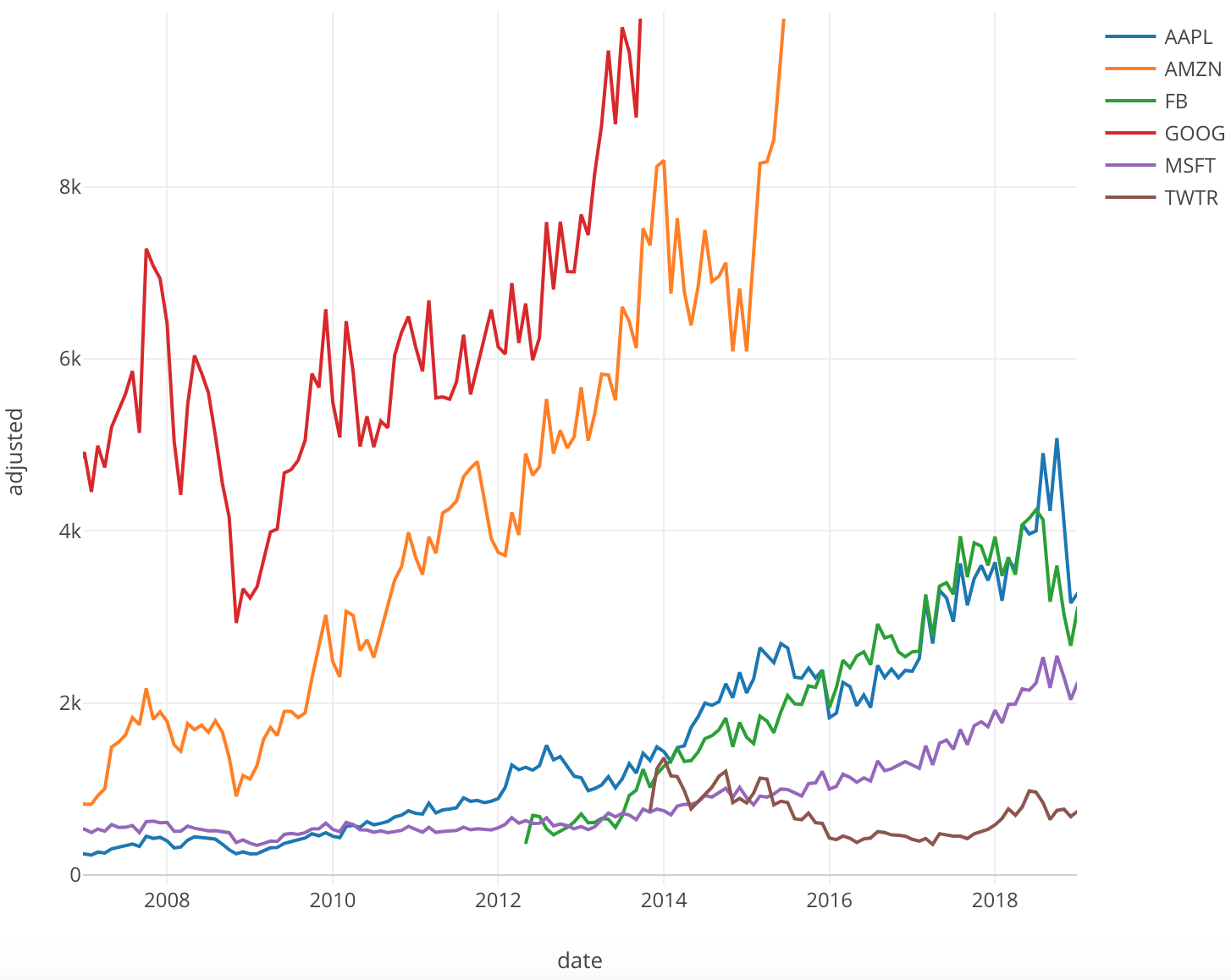
If we zoom in on these other tech companies, we can see that even though they are increasing they don’t seem to be displayed properly.
Window Calculation: % Difference From Use
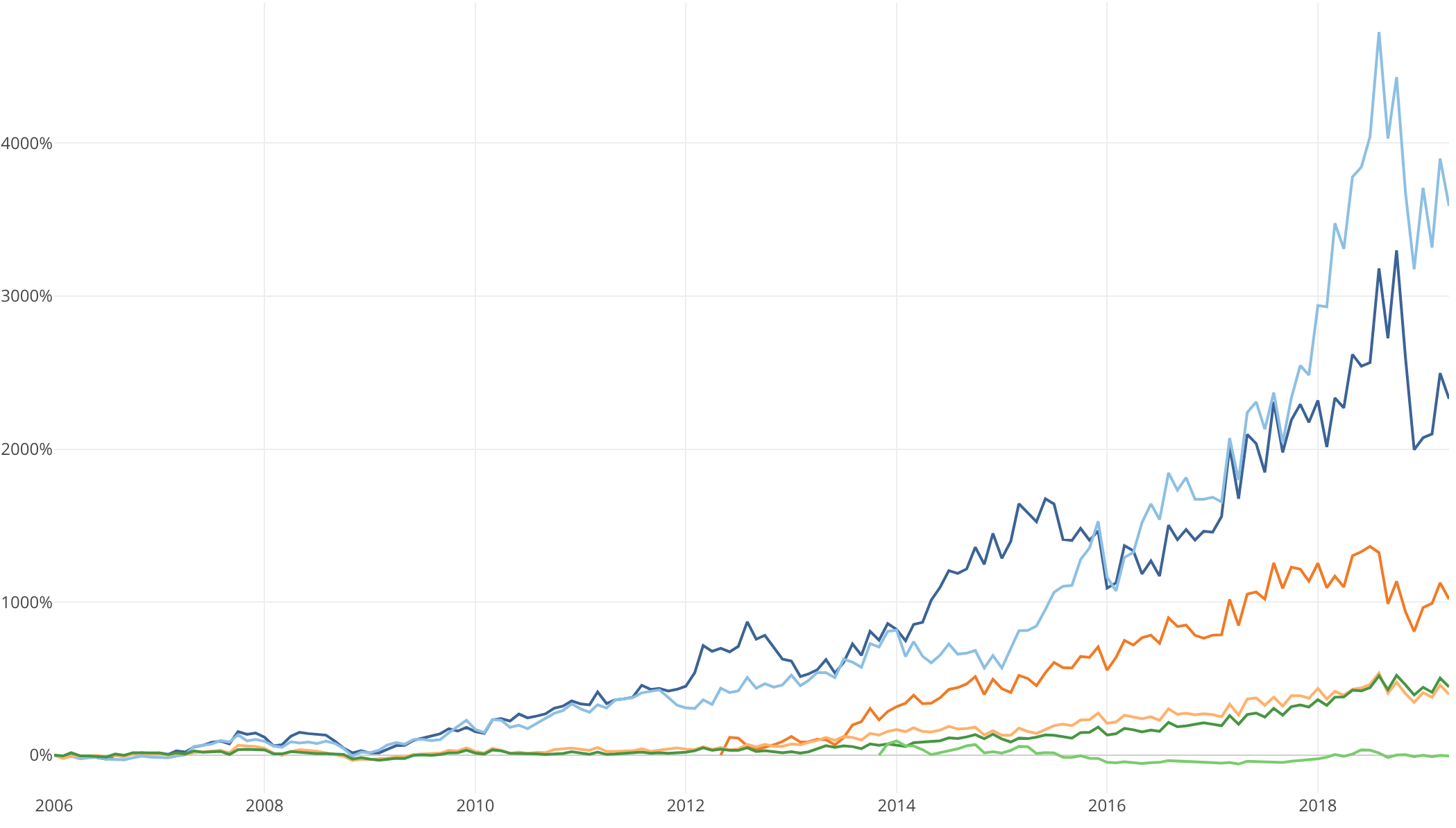
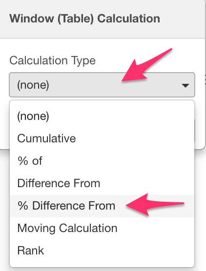
Now let’s use the Window Calculation function ‘% Difference From’. If we do this, we can calculate the growth rate from the first day of the period within this data, visualize it and compare it.
Click on the three bars next to the Y Axis and select Windown Calculation.
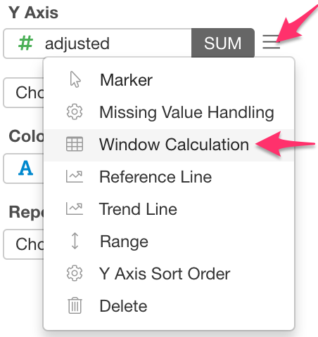
For Calculation Type, select ‘% Difference From’.
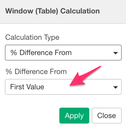
We want to see growth rate from the first day in the data so make sure that ‘First Value’ is selected.
We can visualize the growth rate by looking at the difference from the first value as a percentage.
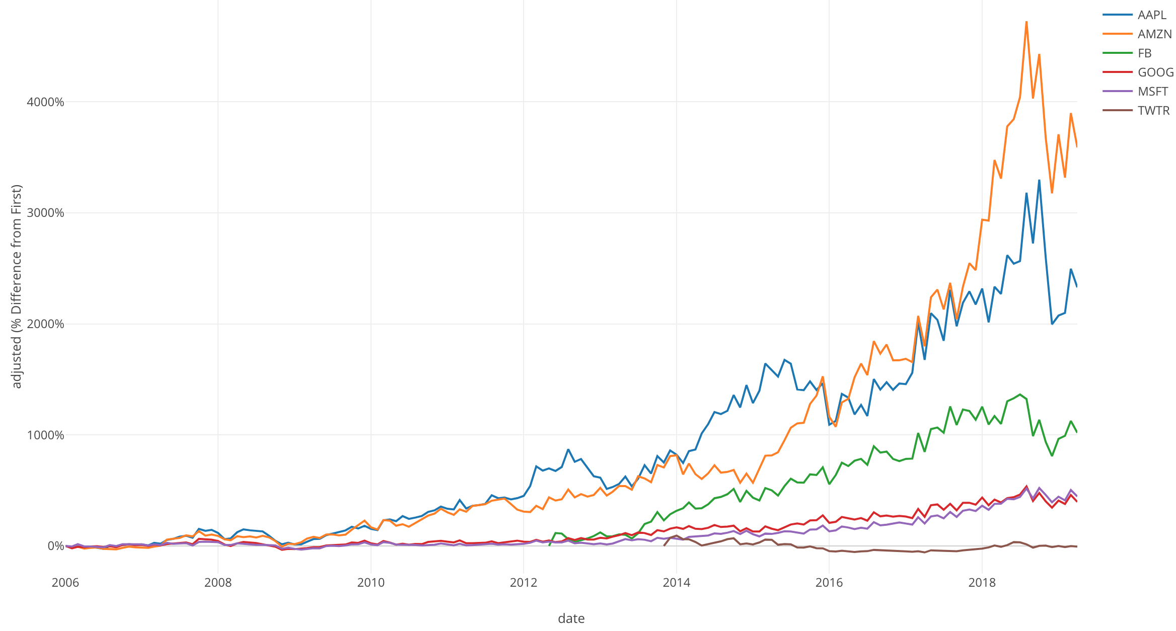
If we look at the growth rate, we can see that Amazon and Apple grew the most. Especially Amazon with an increase of 4000%.
Although Google was showing high value with regualr stock prices, it can not compare to other companies growth rates.
Twitter has litttle to no growth.
Conclusion
I used the Line chart and the Window Calculation, % Difference From, to visualize and compare the growth rate of big tech companies’ stock prices.
I found that Amazon and Apple take the cake when it comes to largest growth rate.
Next Time
In my next post, I am going to use yet another Window Calculation function called “Moving Calculation” to visualize our Time Series Data.
Next Post: