5 Essential Charts to Monitor for Subscription-Based Businesses
In the world of subscription-based businesses—often referred to as SaaS (Software as a Service) in the software industry—the revenue model differs significantly from traditional one-time sales. Because of this, the key metrics and charts you need to monitor for business are also different.
A common issue is when businesses fail to recognize this difference and monitor metrics and charts commonly used for “one-time purchase” businesses. This can lead to missing growth opportunities, experiencing sudden declines in what seemed like growing businesses, or being unable to share growth prospects internally or explain them effectively to external investors.
In this article, we introduce five essential charts for growing a subscription-based business.
1. Cohort Analysis (Survival Analysis)
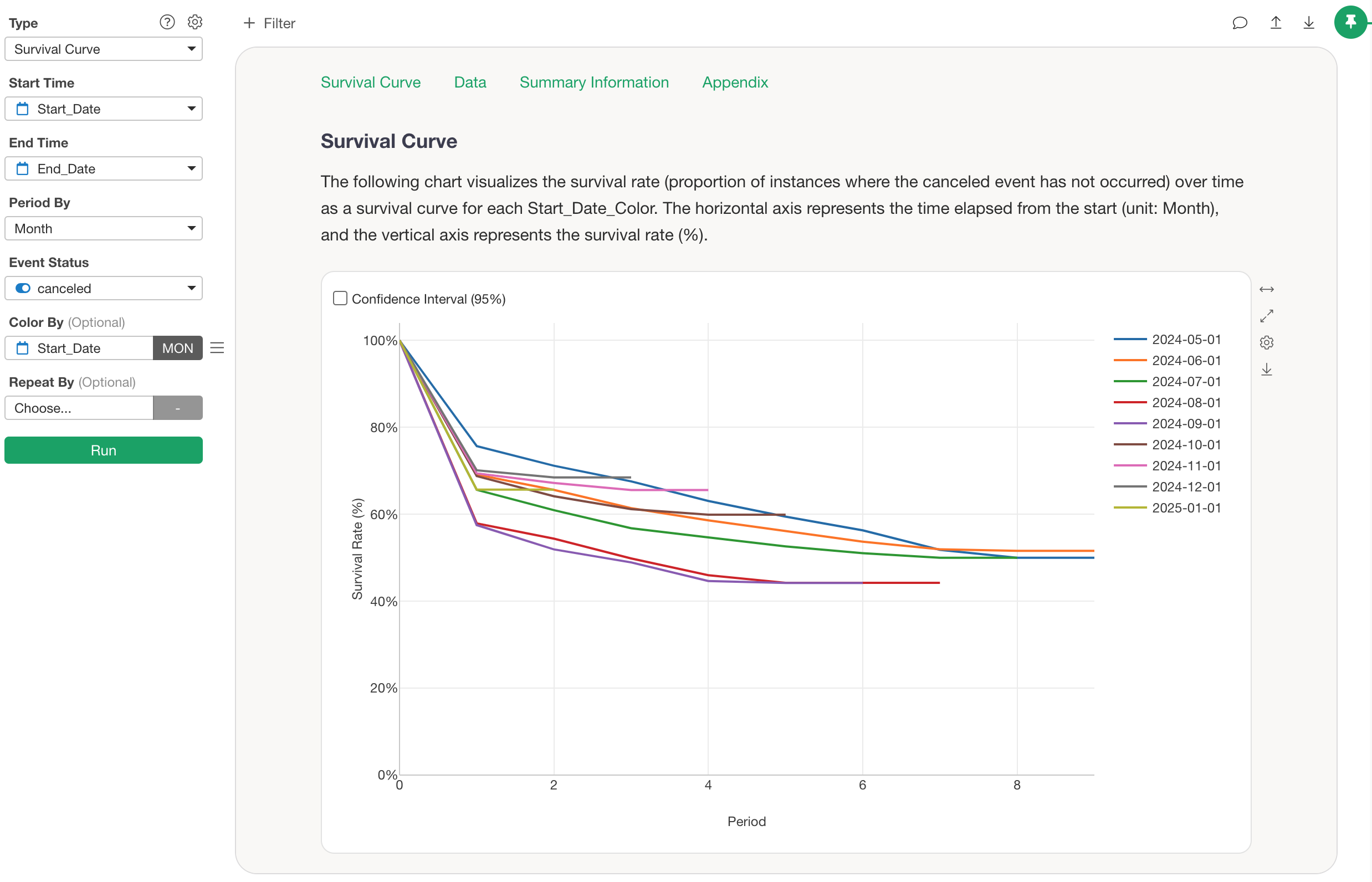
Cohort analysis (survival analysis) is an effective visualization method for properly understanding customer churn (cancelation) and retention.
For the growth of subscription-based businesses, it’s important not only to increase conversions from new customers but also to reduce churn.
In general, this naturally leads to creating monthly churn/retention rate charts.
However, churn rates have the following two problems:
- You can’t identify when customers are most likely to churn after they start using your service, making it difficult to know which customers need more support at which point in time.
- The churn rate may appear to improve, even though the business is getting worse — so it’s unclear whether retention is truly improving.
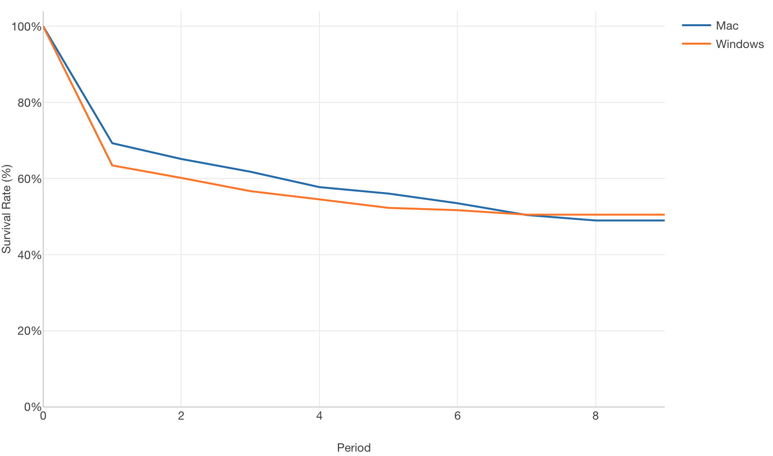
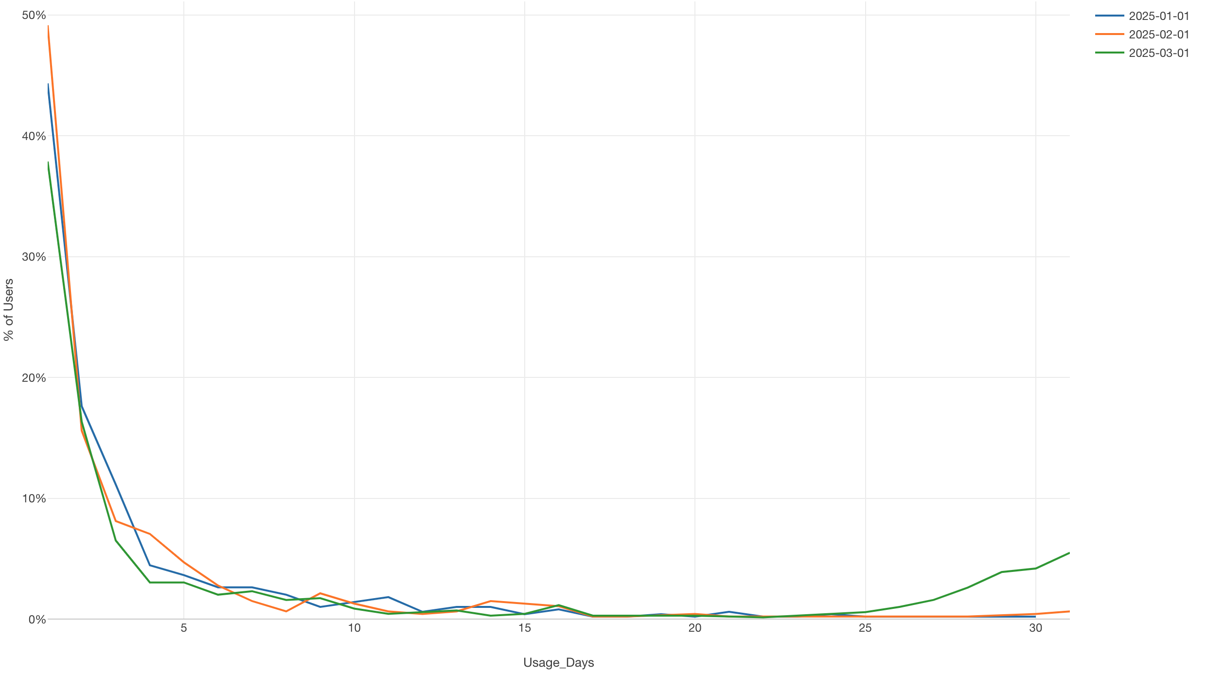
To solve these issues, customers can be grouped by conversion timing, and retention rates for each subscription period of each group can be visualized using Line charts.
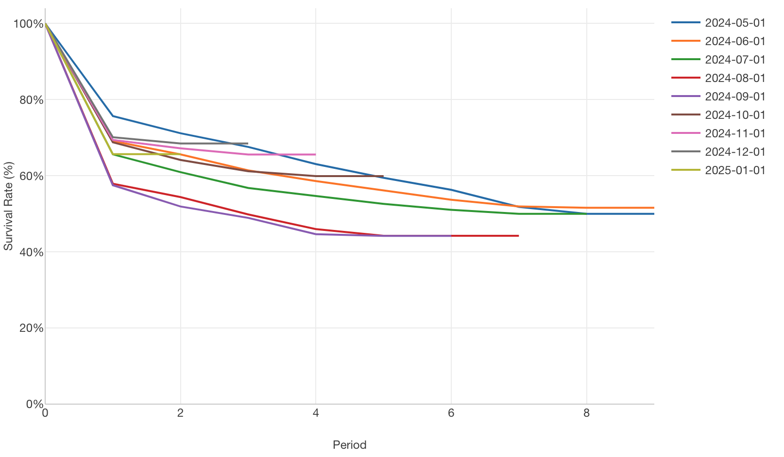
This allows you to clearly see when churn (cancellation) tends to rise or stabilize after the start of a subscription. In addition, by comparing the curves of different groups, you can assess whether churn is worsening or improving.
For example, if curves become more gradual over time, it means retention is improving for some reason (e.g., addition of new product features).
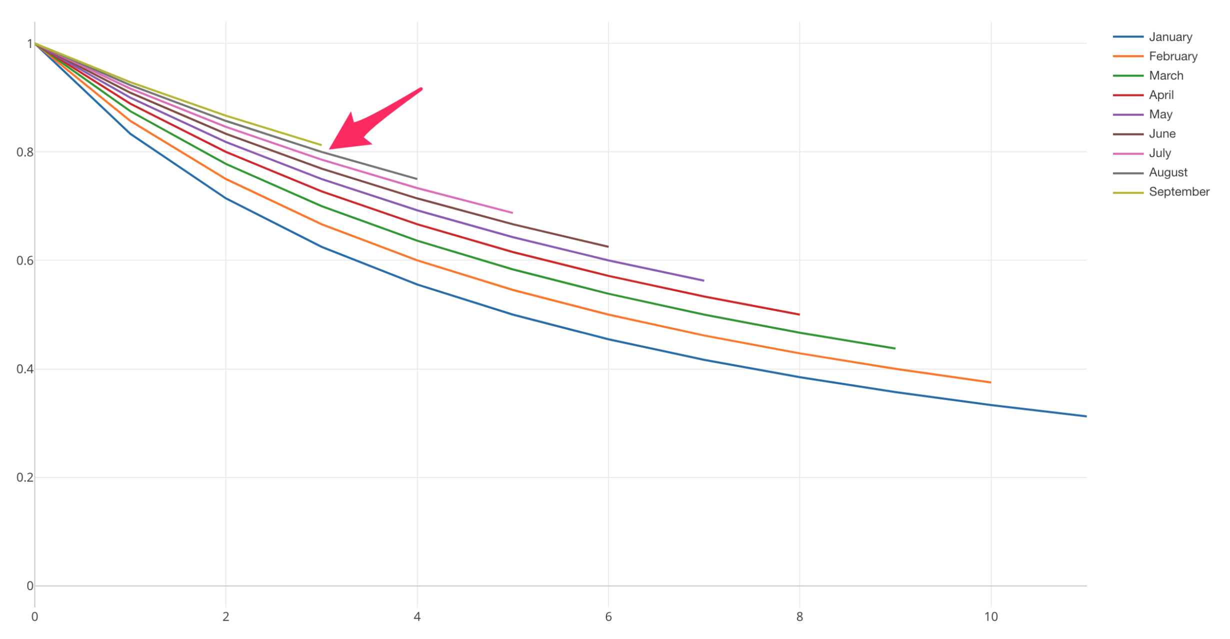
Conversely, if retention is worsening due to some problem, you can confirm that curves for groups with recent subscription start dates become lower compared to curves for groups with older subscription start dates.
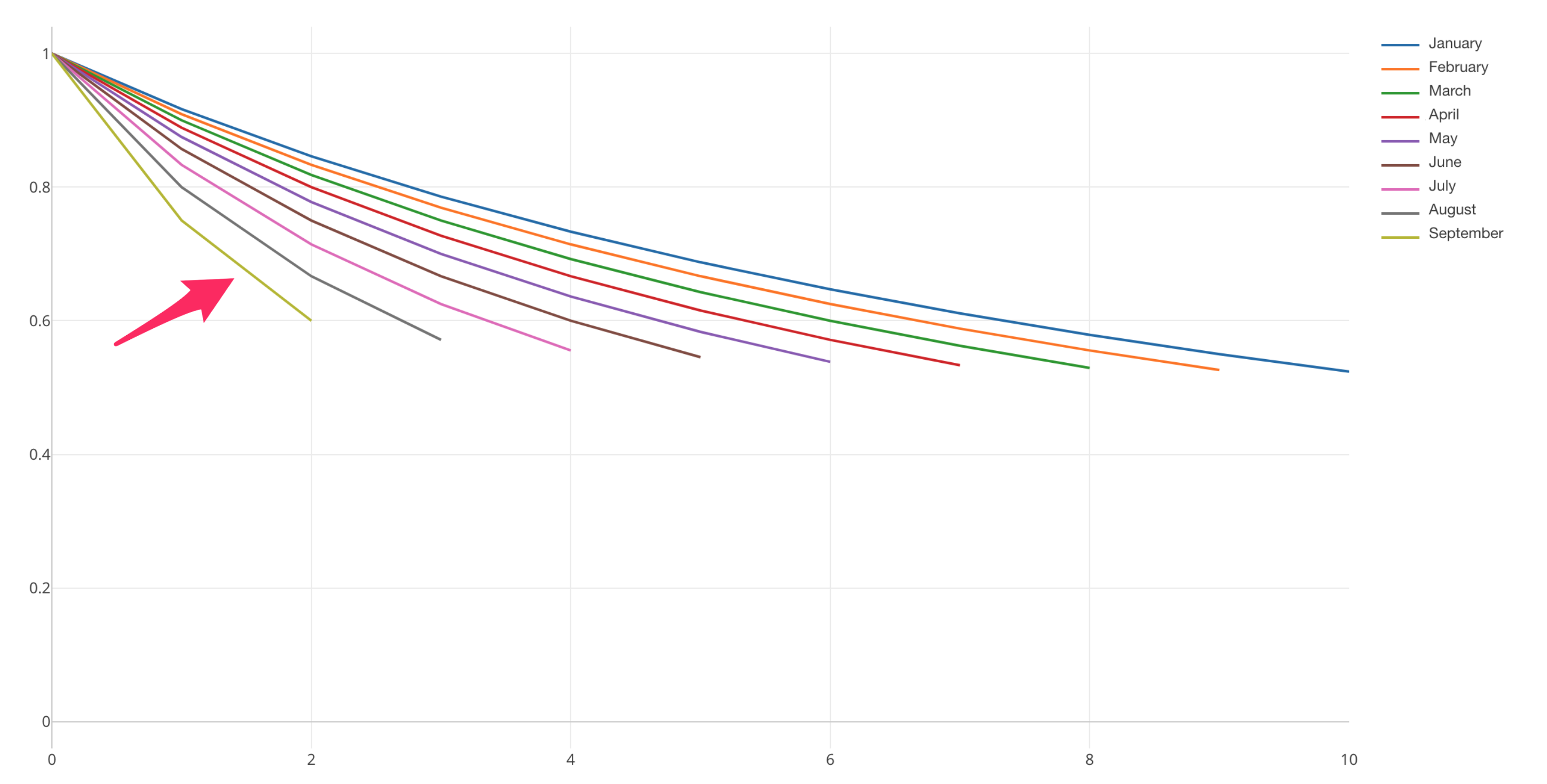
This analysis of dividing customers into several groups and comparing retention rates (or churn rates) of each group is called cohort analysis.
Note that this cohort analysis can be used not only to investigate whether retention is improving, but also to help identify segments with good retention by conducting cohort analysis between two different groups.
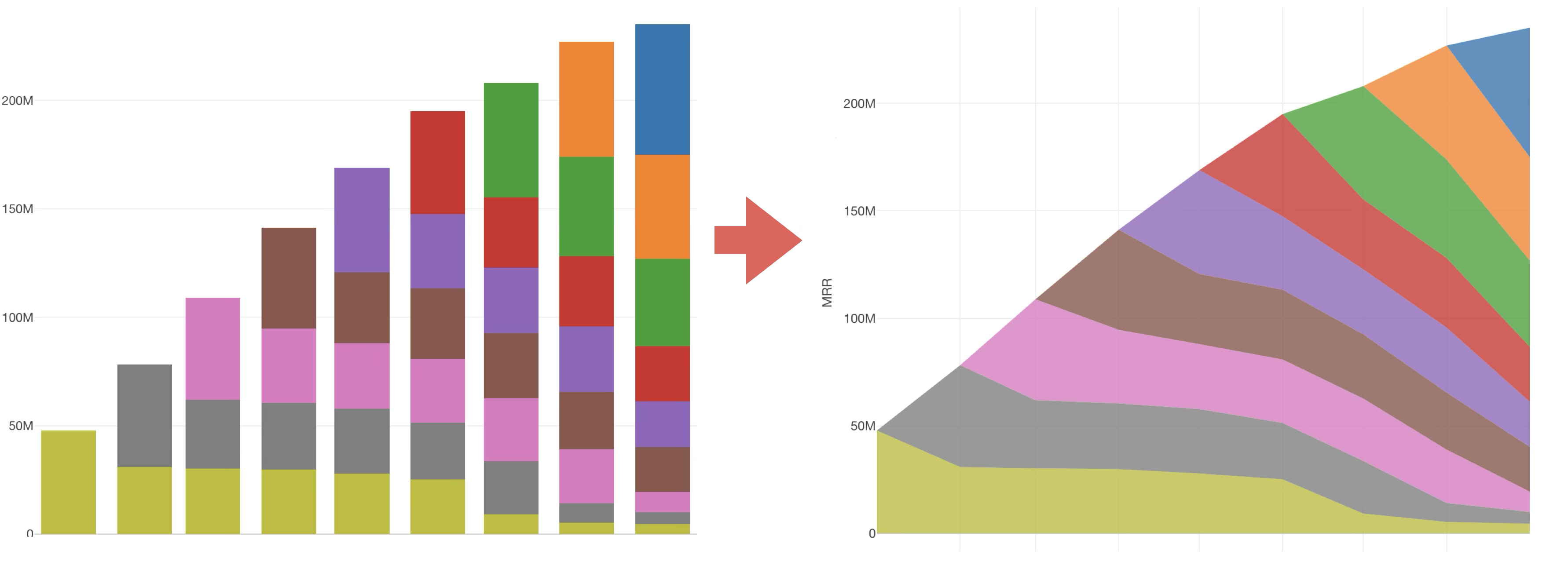
2. Layer Cake Chart
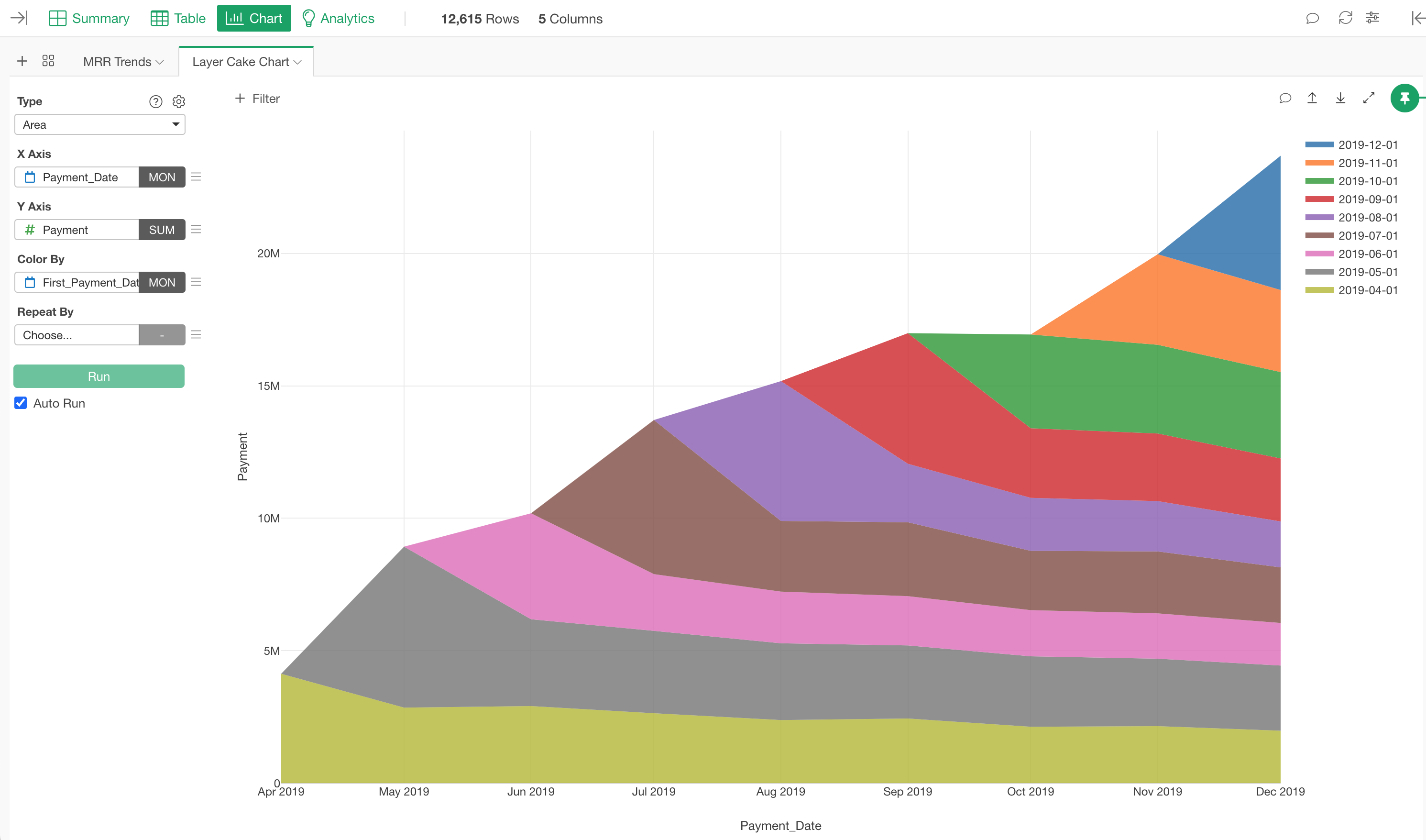
A layer cake chart divides customers into groups based on when they started using the service and visualizes revenue from each group by stacking them. It becomes a chart useful for measuring whether the business is growing efficiently.
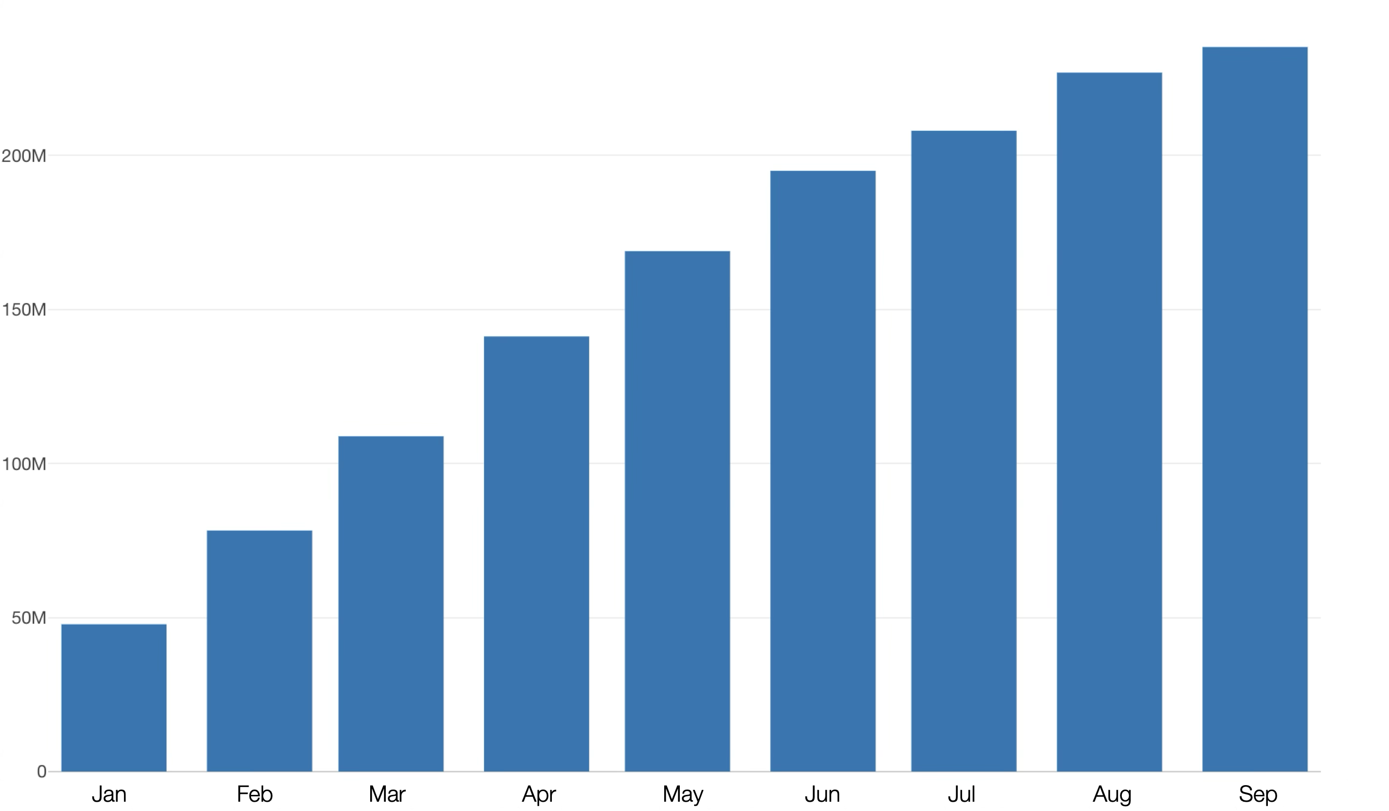
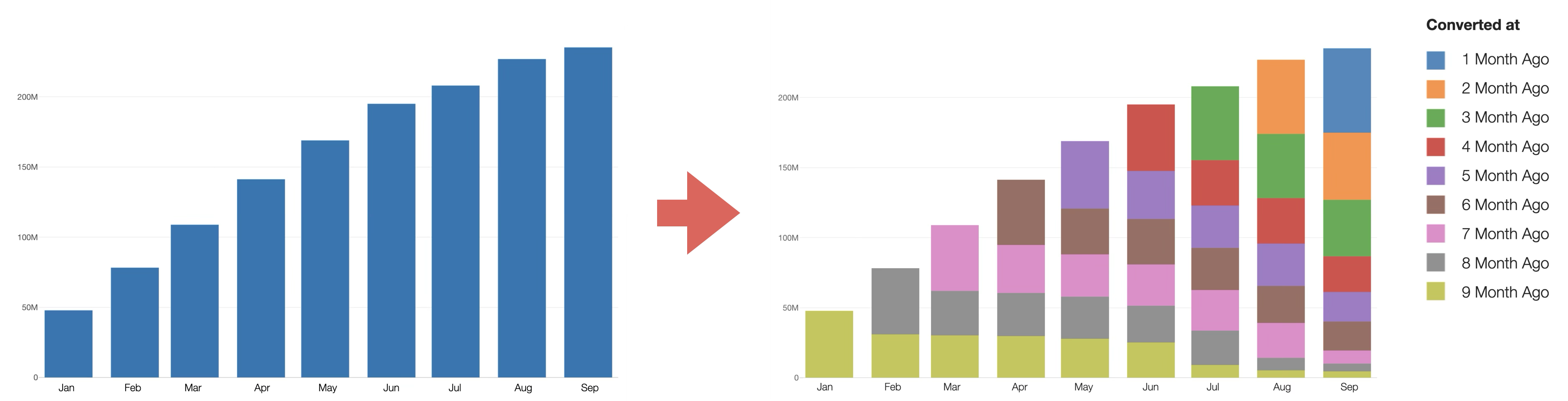
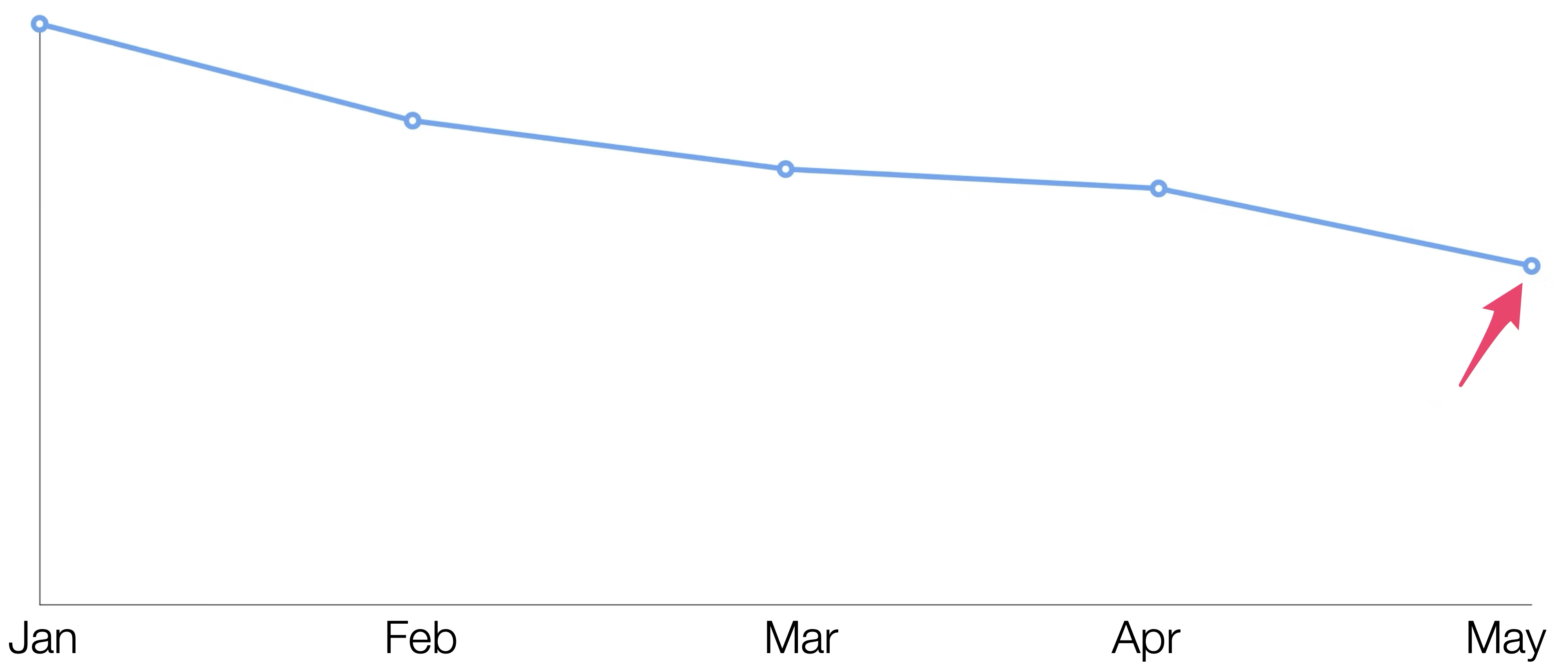
Generally, the growth of subscription-based businesses is measured by tracking MRR (Monthly Recurring Revenue) trends.
However, monitoring only MRR trends cannot capture the following business efficiency-related situations:
- Whether new customers are settling in and the business can grow efficiently
- How much revenue can be continuously obtained from existing customers
- Whether revenue from existing customers can be increased through plan upgrades, etc.
To solve these problems, you can create a chart called a layer cake chart, dividing customers into groups based on when they started using the service, and compare revenue from each group to analyze whether the business can grow efficiently.
In layer cake charts, Area charts are used to divide customer revenue into layers based on when they subscribed.
Because it looks like a cake with multiple layers, the chart is called a “layer cake chart.”
When creating layer cake charts, you can confirm that revenue from each cohort gradually decreases as customers churn over time.
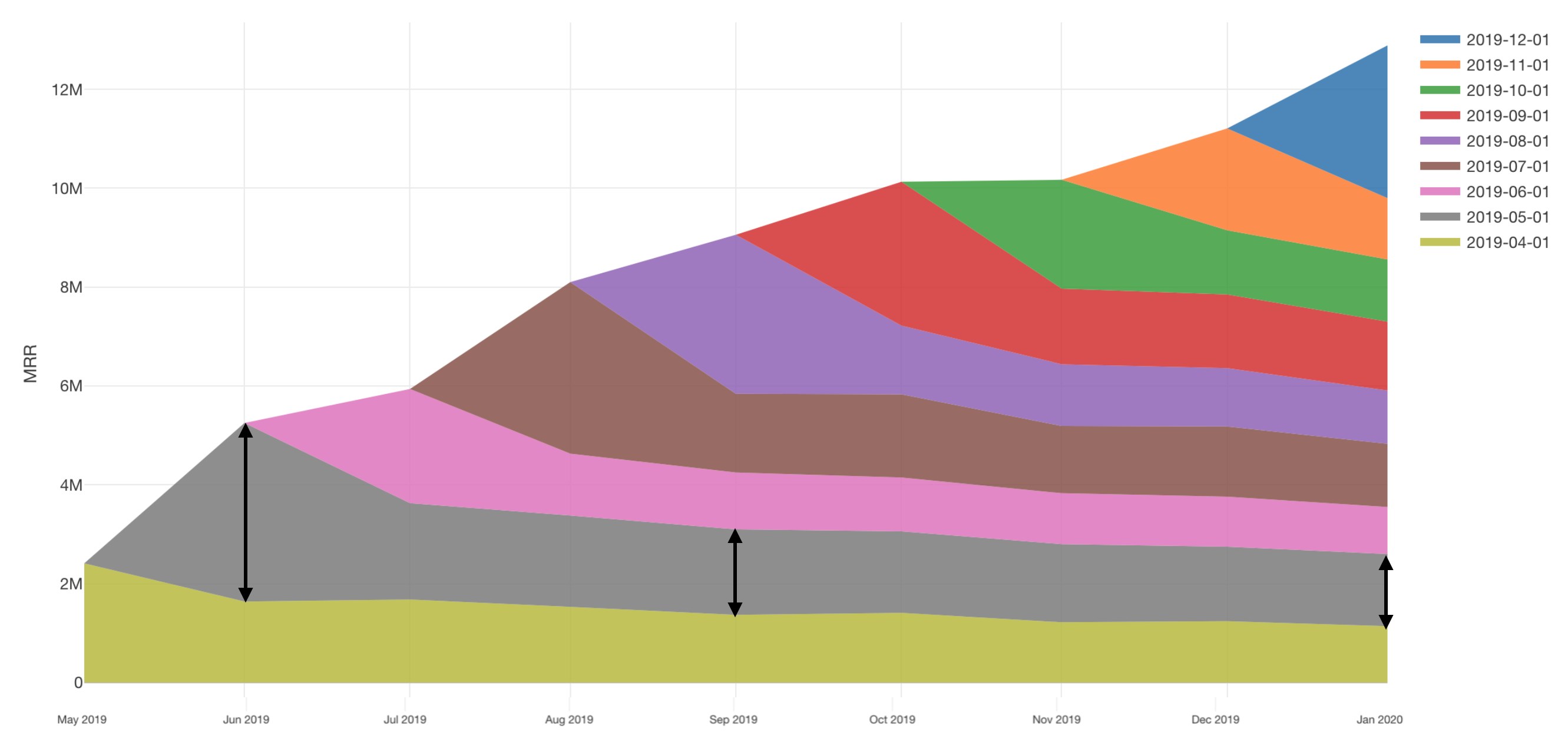
However, if onboarding and product improvements enable customers to quickly experience the value of services, churn rates for groups that recently started subscriptions should decrease, so the decline in MRR will also be smaller.
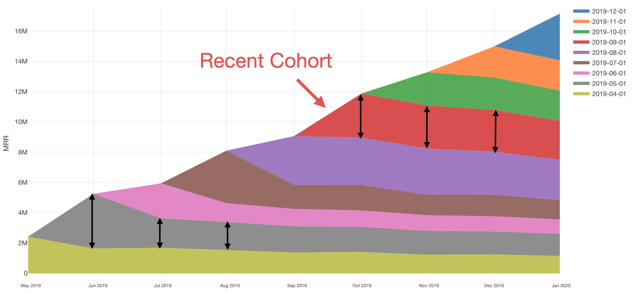
Therefore, for services that can retain customers over the long term, revenue from new users directly translates to business growth.
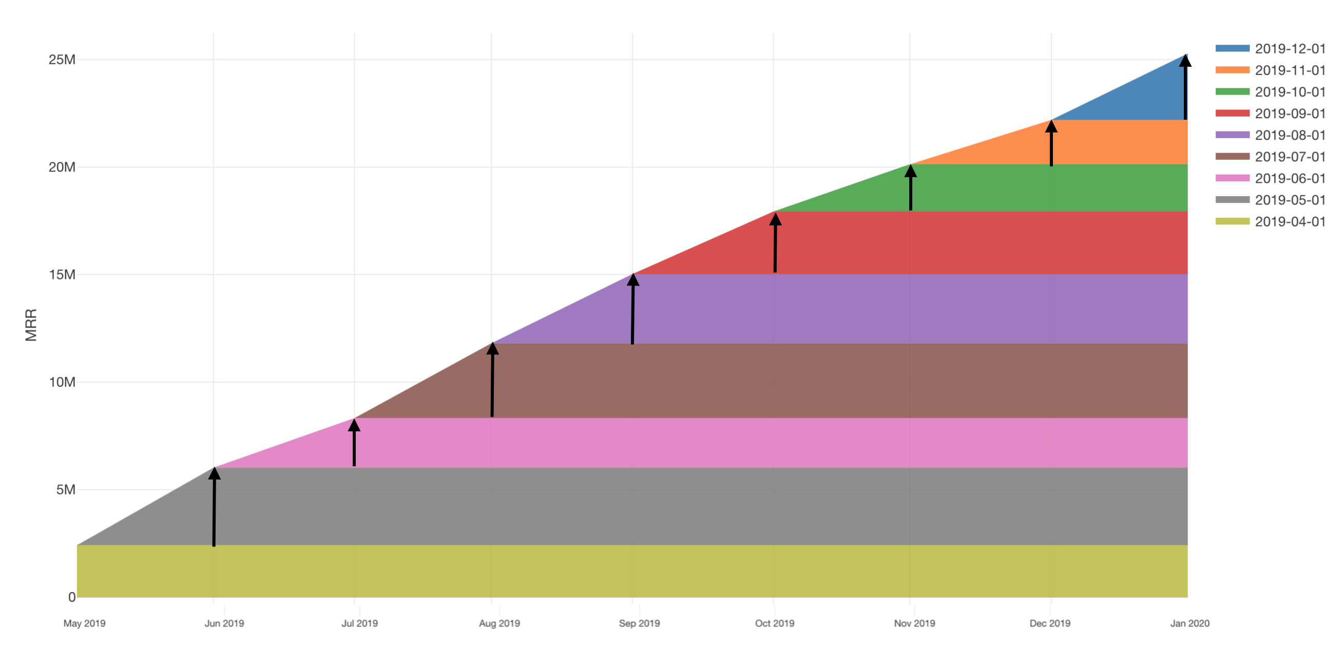
Furthermore, since many subscription services allow plan upgrades, some customers may pay more than when they started their subscription.
Therefore, when revenue increases from plan upgrades exceed revenue decreases from churn, revenue from existing customers becomes larger than past MRR, resulting in upward-sloping layer cake charts.
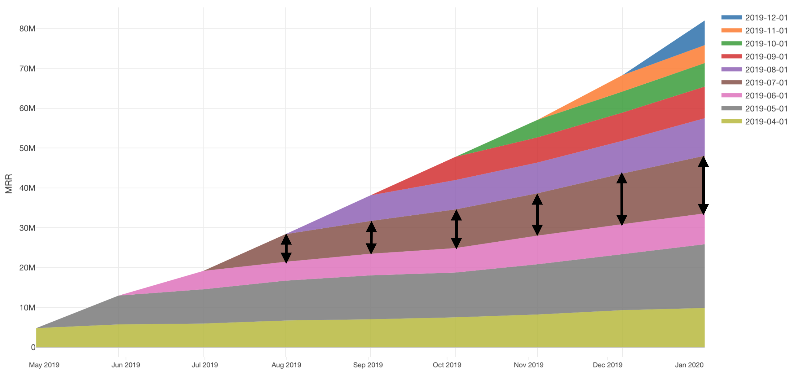
By creating layer cake charts, grouping customers by when they started using the service, and visualizing and comparing revenue from each group, you can understand how efficiently the business is growing or not.
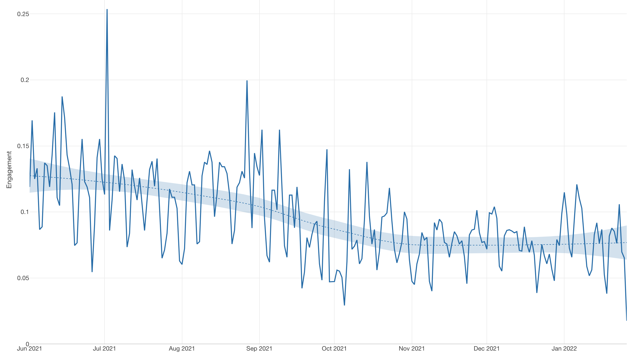
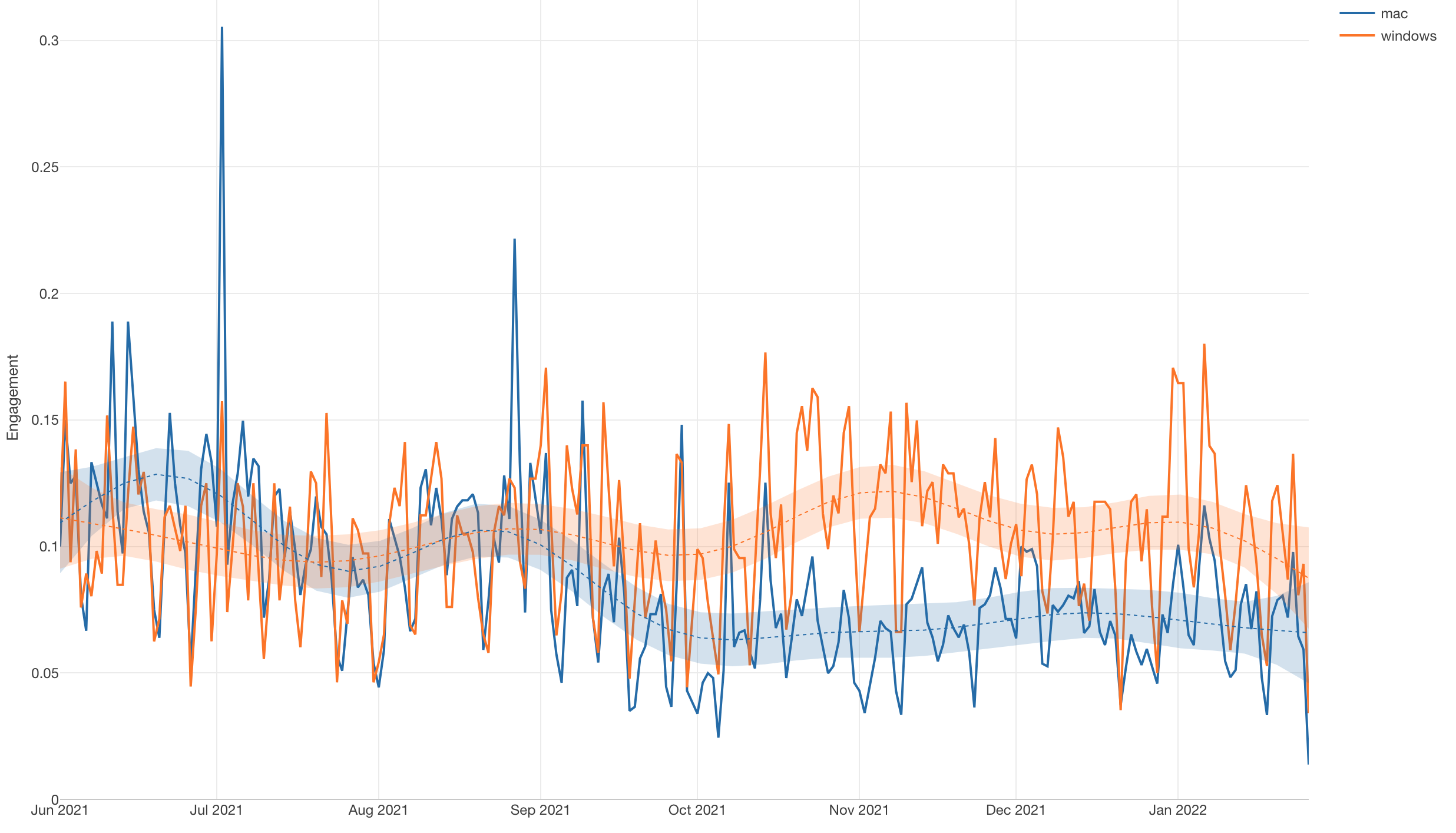
3. DAU/MAU
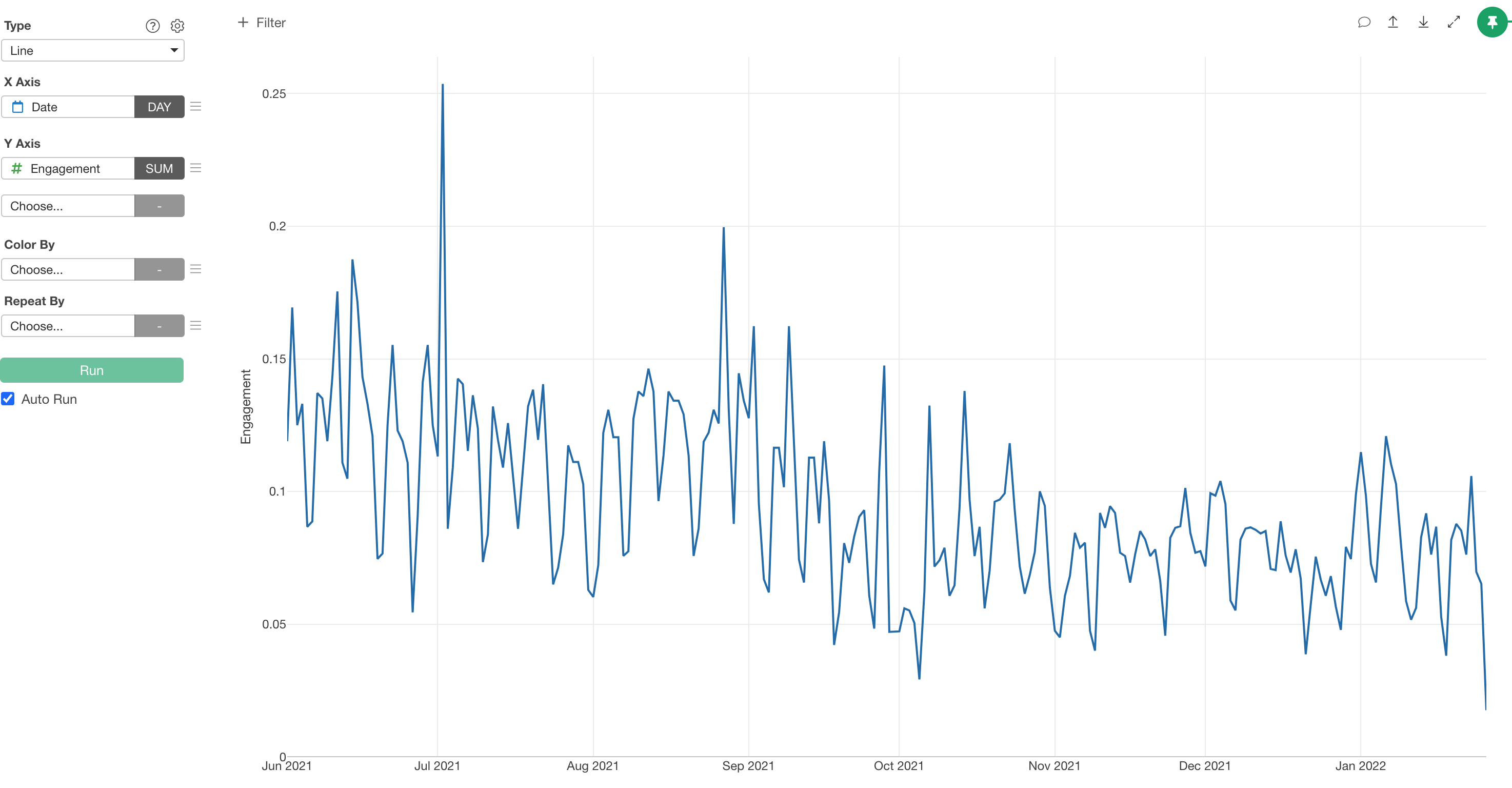
DAU/MAU is one of the metrics for measuring service “engagement.” Also, “engagement” is a concept that represents how frequently and enthusiastically customers use services or products.
In subscription services, this concept of “engagement” is extremely important.
This is because metrics like churn rate aggregate situations of customers who have already churned, so when aggregation is done, it’s too late to take action to retain those customers.
In contrast, “engagement” targets currently contracted customers, so it can be considered a metric that leads to taking action before customers churn—in other words, a leading indicator of churn and retention.
As a result, for example, there are cases of monitoring DAU (Daily Active User), which is a metric of how many users used the product on a daily basis,
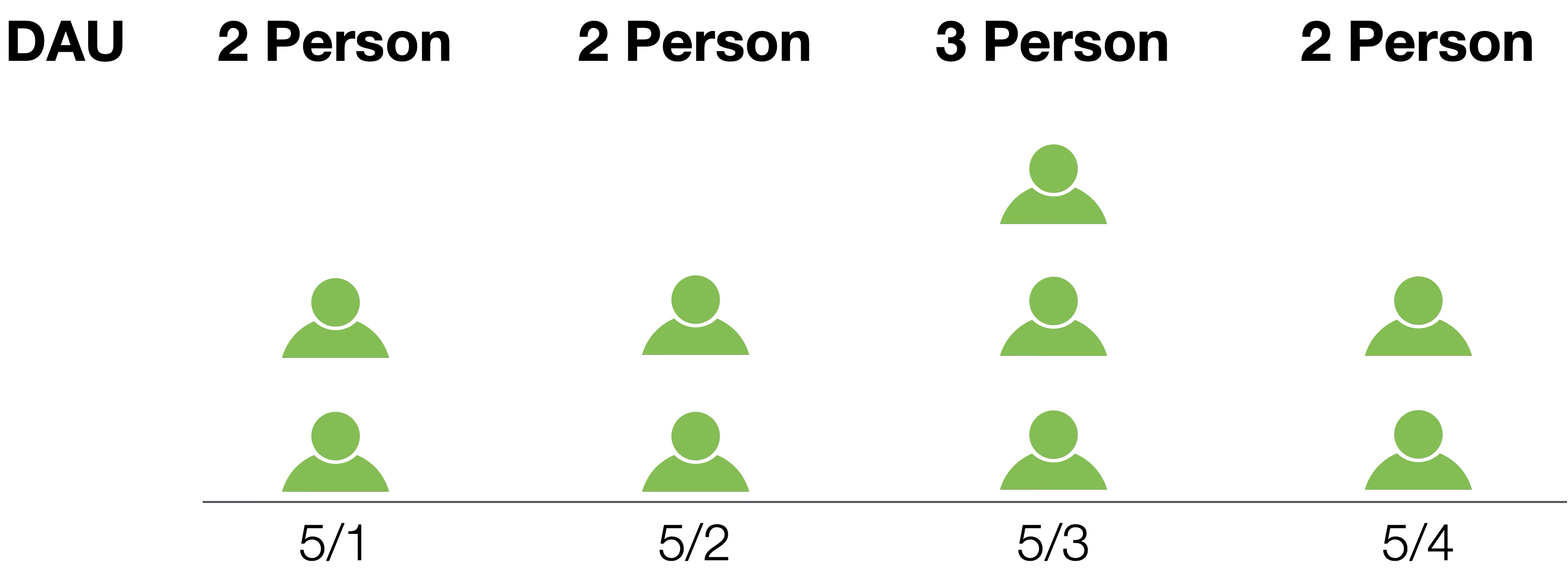
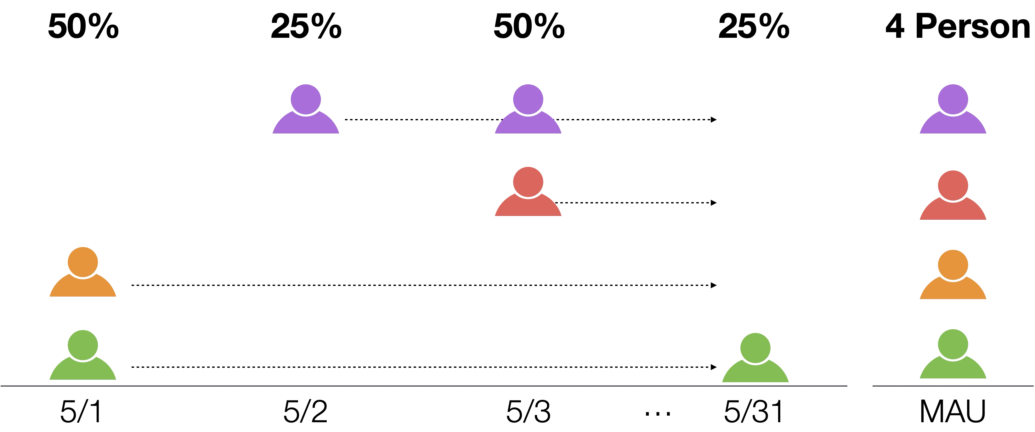
or monitoring MAU (Monthly Active User), which is a metric of how many users used the product on a monthly basis.

However, metrics like DAU and MAU are easily influenced by advertising and marketing, and they treat users who use the service only once a month or just happened to use the service equally, so they don’t reveal how frequently customers use the service—in other words, how enthusiastic they are about the service.
To address these issues, DAU/MAU—a metric that became well known through Facebook—is often used.
DAU/MAU is the ratio of DAU to MAU, and by calculating it, you can understand how frequently users use the service.
DAU/MAU is a metric calculated daily with 100% as the maximum value, and the higher the daily usage frequency of the entire service, the higher the value it maintains.
Note that DAU numbers in the numerator tend to fluctuate greatly, metrics like DAU/MAU tend to have large fluctuations.
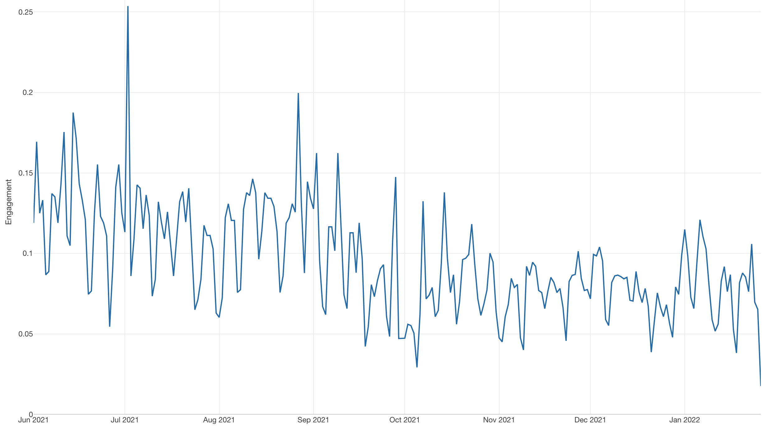
Therefore, trend lines are used to monitor whether engagement is improving in the long term.
Also, DAU/MAU is visualized by customer segment and used to examine engagement of specific customer segments.
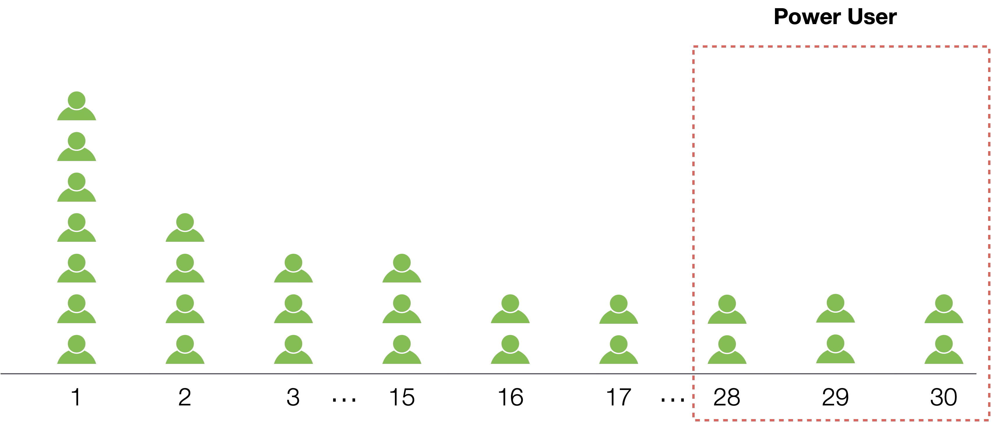
4. Power User Curve
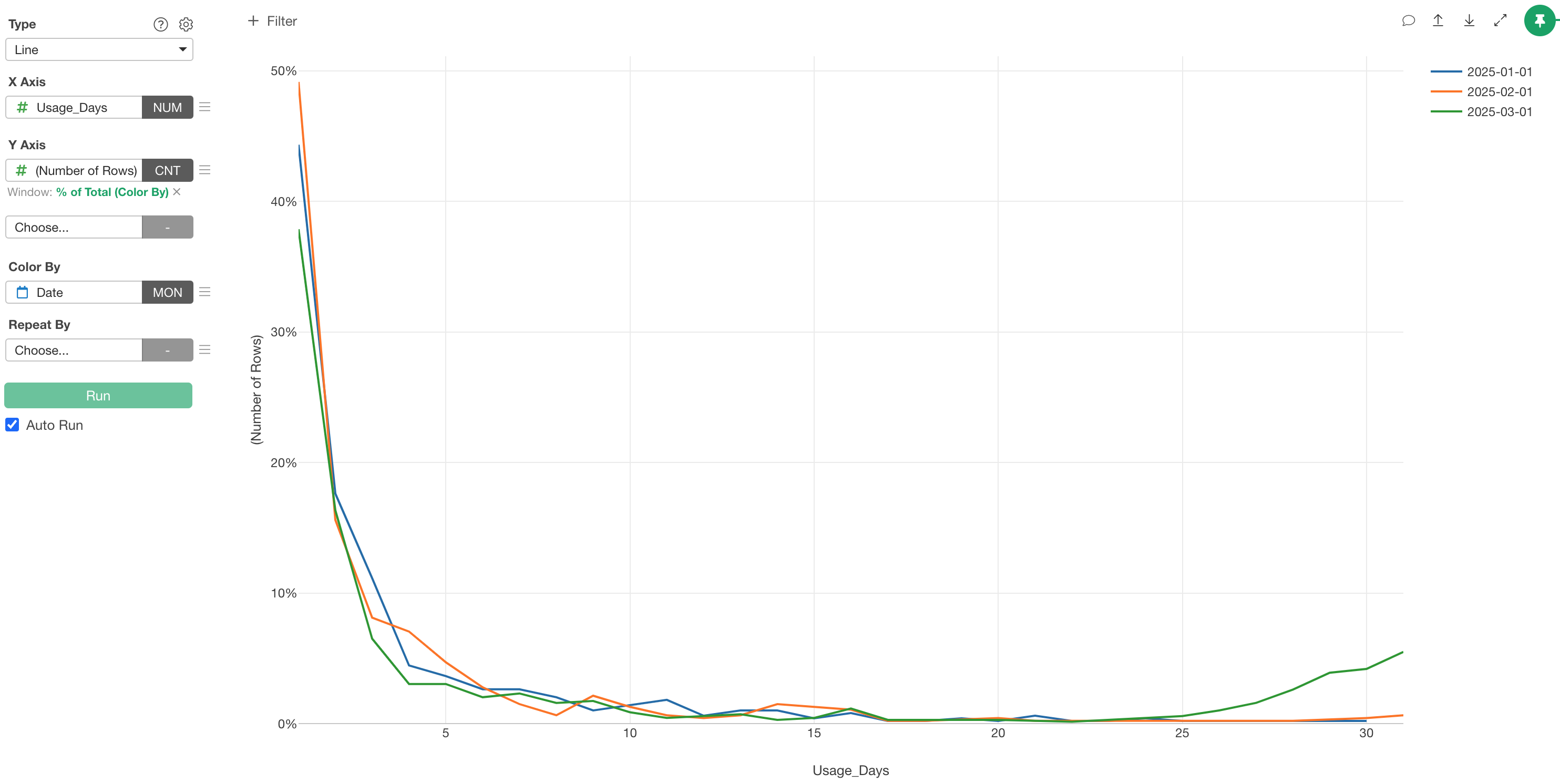
A power user curve is a chart that visualizes the distribution of service usage days within a week or month, and it’s a visualization method useful for understanding how much you can increase customers with high service usage frequency or how much you can reduce customers with low service usage frequency.
The engagement metric DAU/MAU introduced earlier is useful for understanding overall user engagement, but since it’s a metric representing the engagement of the entire service, it only represents average user engagement.
Therefore, even if service engagement (DAU/MAU) is declining, since usage frequency differs by user, not all users necessarily have decreasing usage frequency.
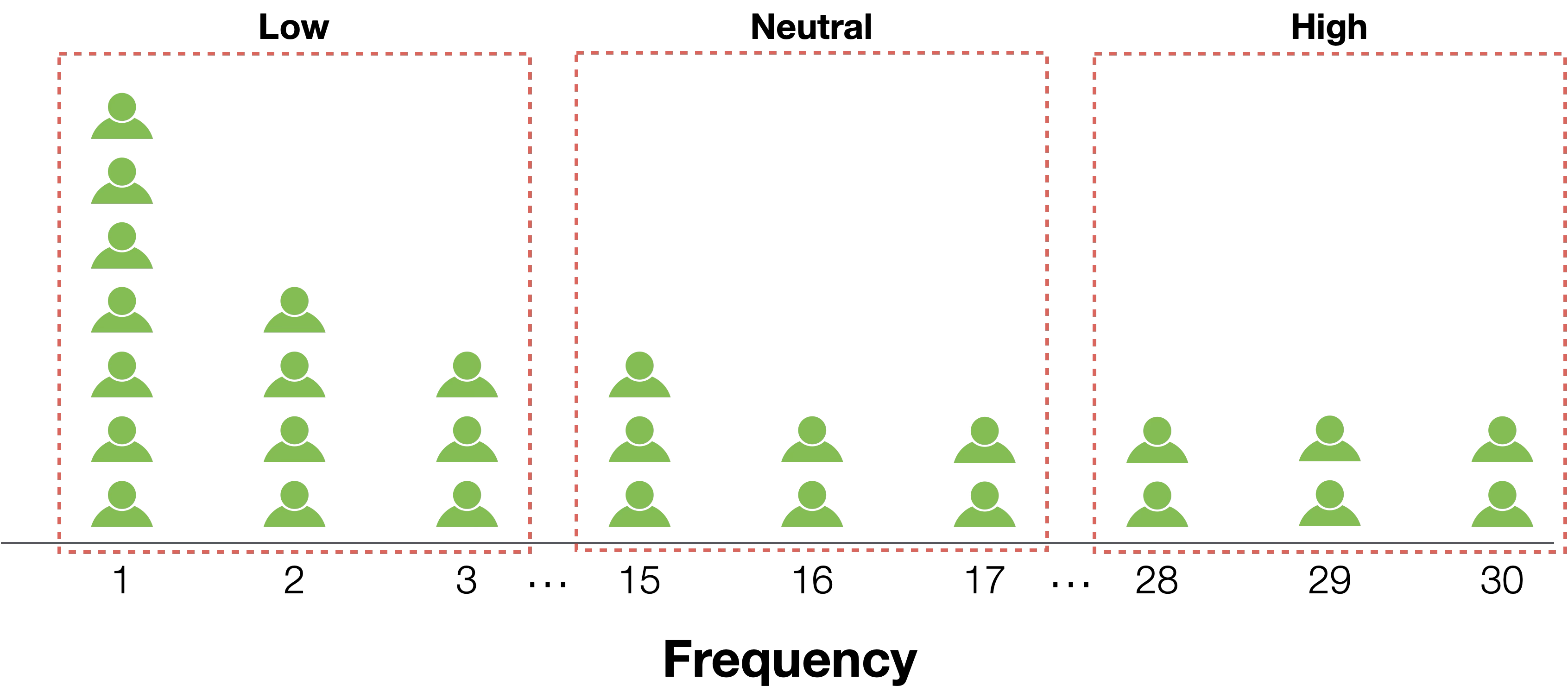
To understand more specific usage situations, power user curves visualize usage frequency distribution using Bar charts or Line charts.
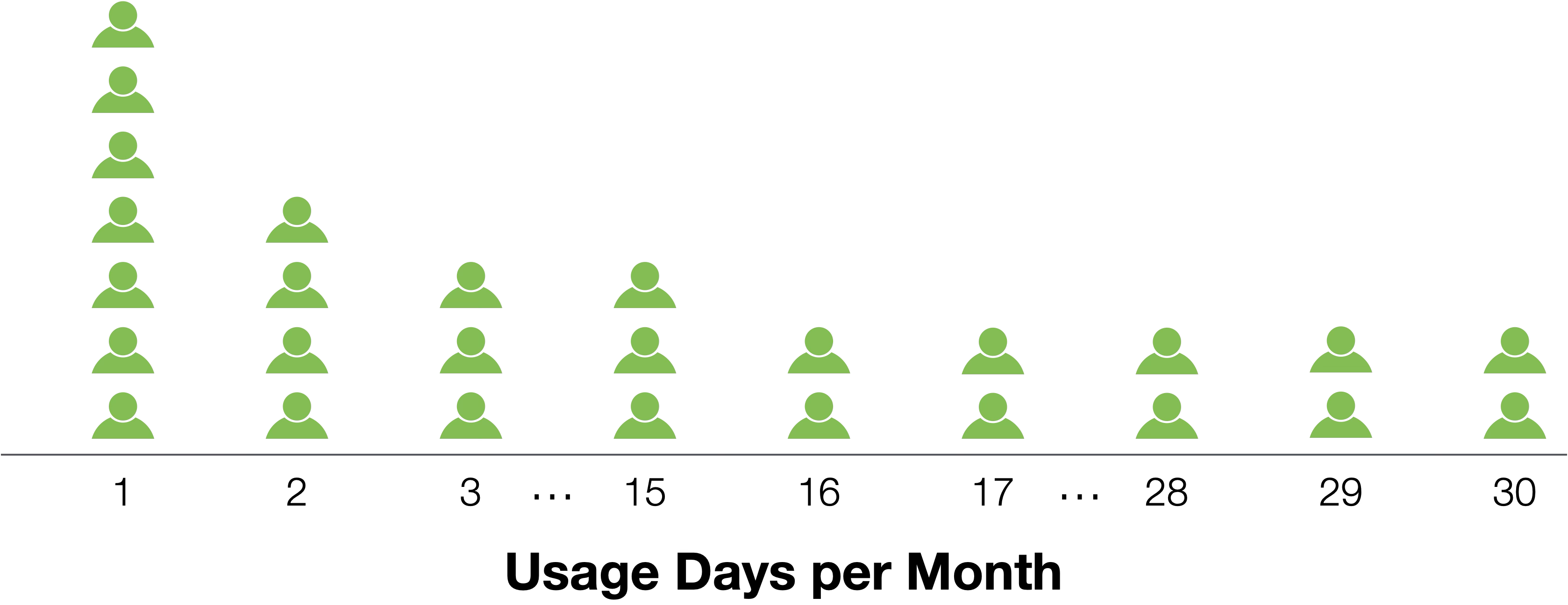
When creating a power user curve, you get a chart like the one below.

In most cases, for any service, there are highly engaged users who use the product almost daily, so users with high usage frequency exist at a certain percentage.
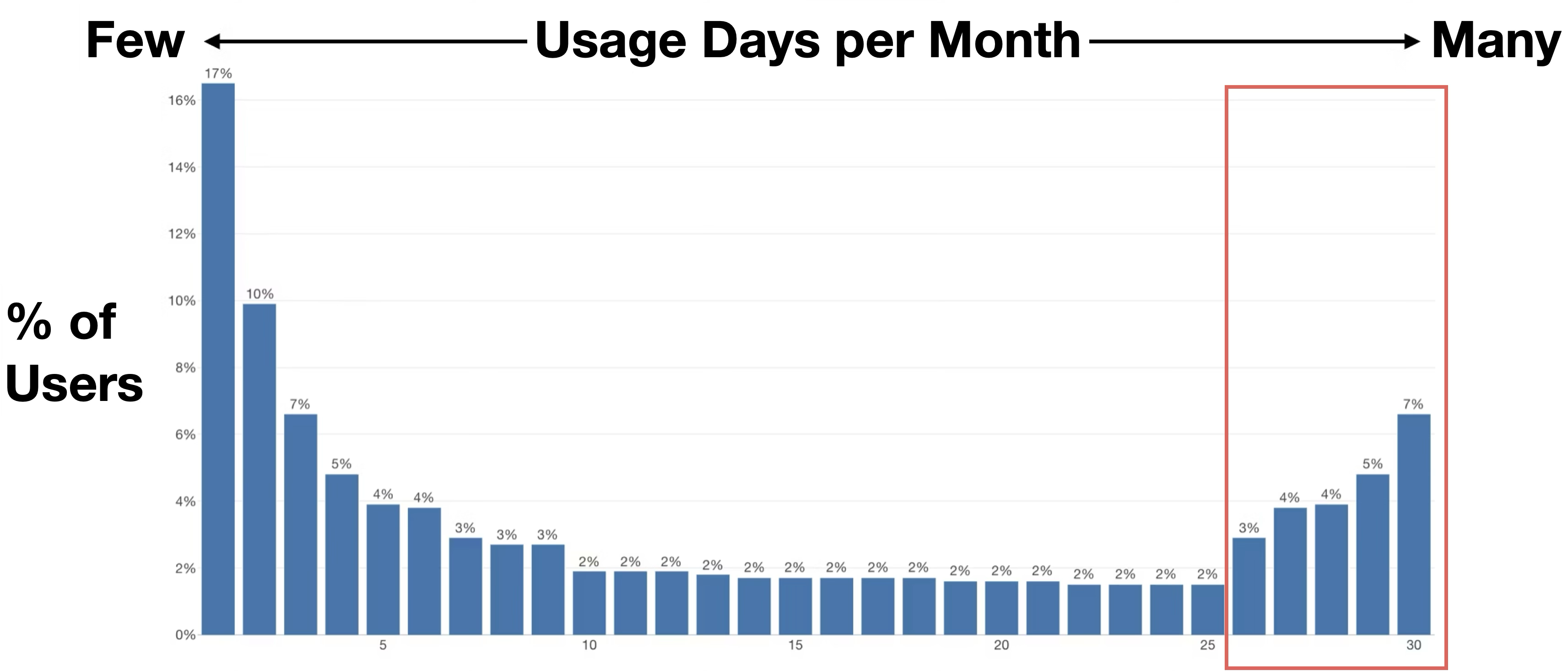
Users with particularly high usage frequency are called power users, and the more successful a product is, the higher the proportion of power users becomes.
Power users may act as influencers or introduce services and products to others within organizations, contributing to business growth, so the higher their proportion, the better.
Also, when there are many power users, connecting user percentage ratios with lines creates a characteristic U-shaped curve. This is why such charts are called power user curves.
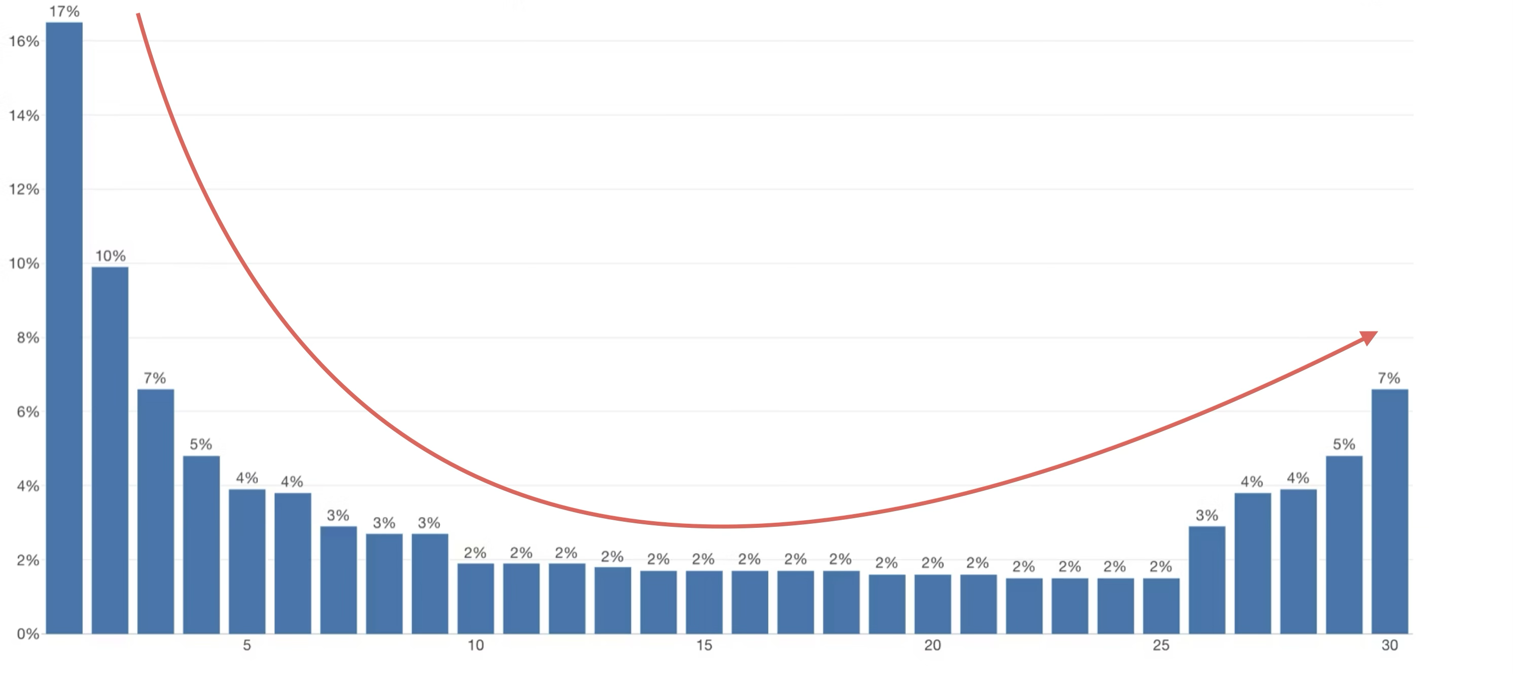
Power user curves can be compared over time to understand whether you’re able to increase power users.
Also, not only comparing over time, but by comparing power user curves across different groups, you can understand which customer segments have power users.
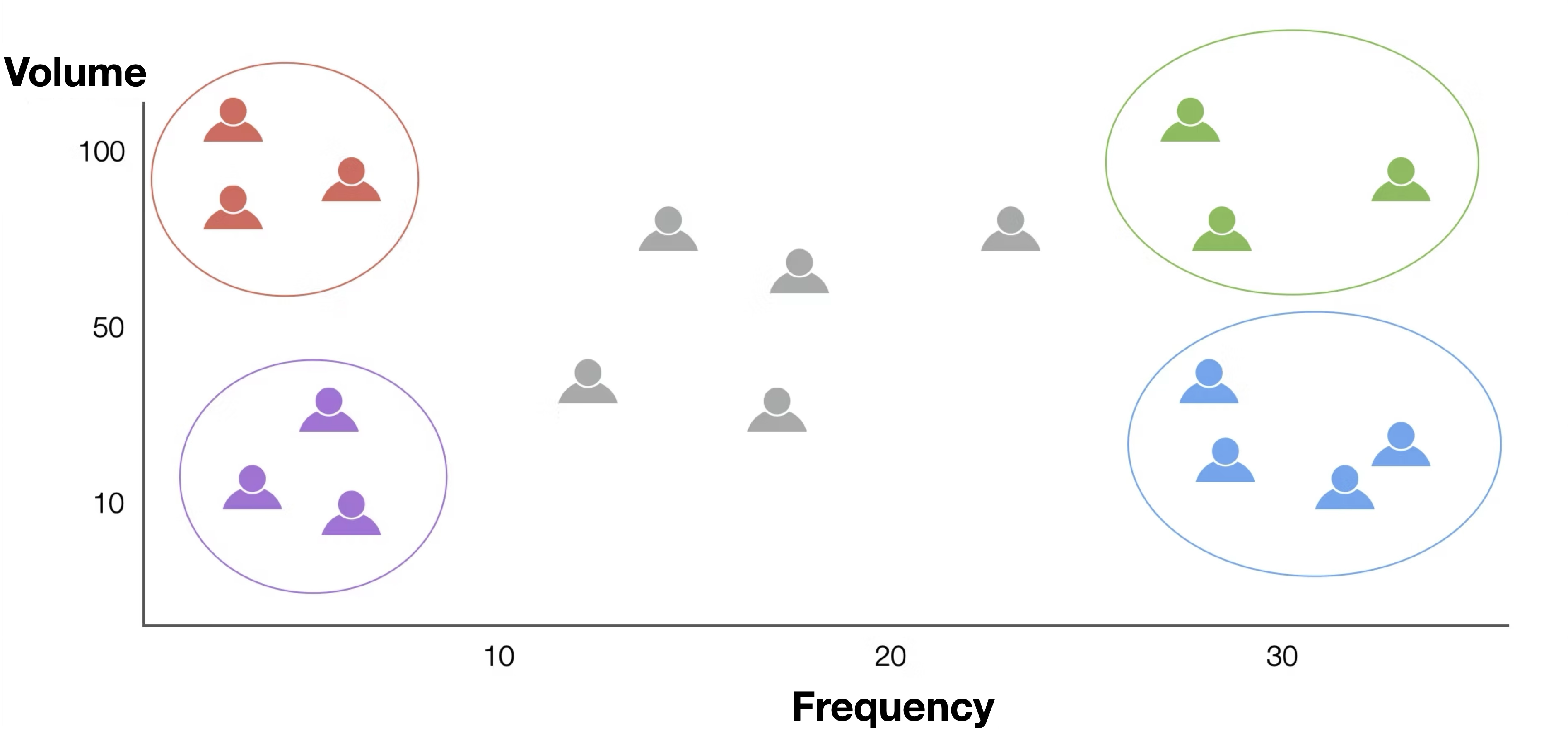
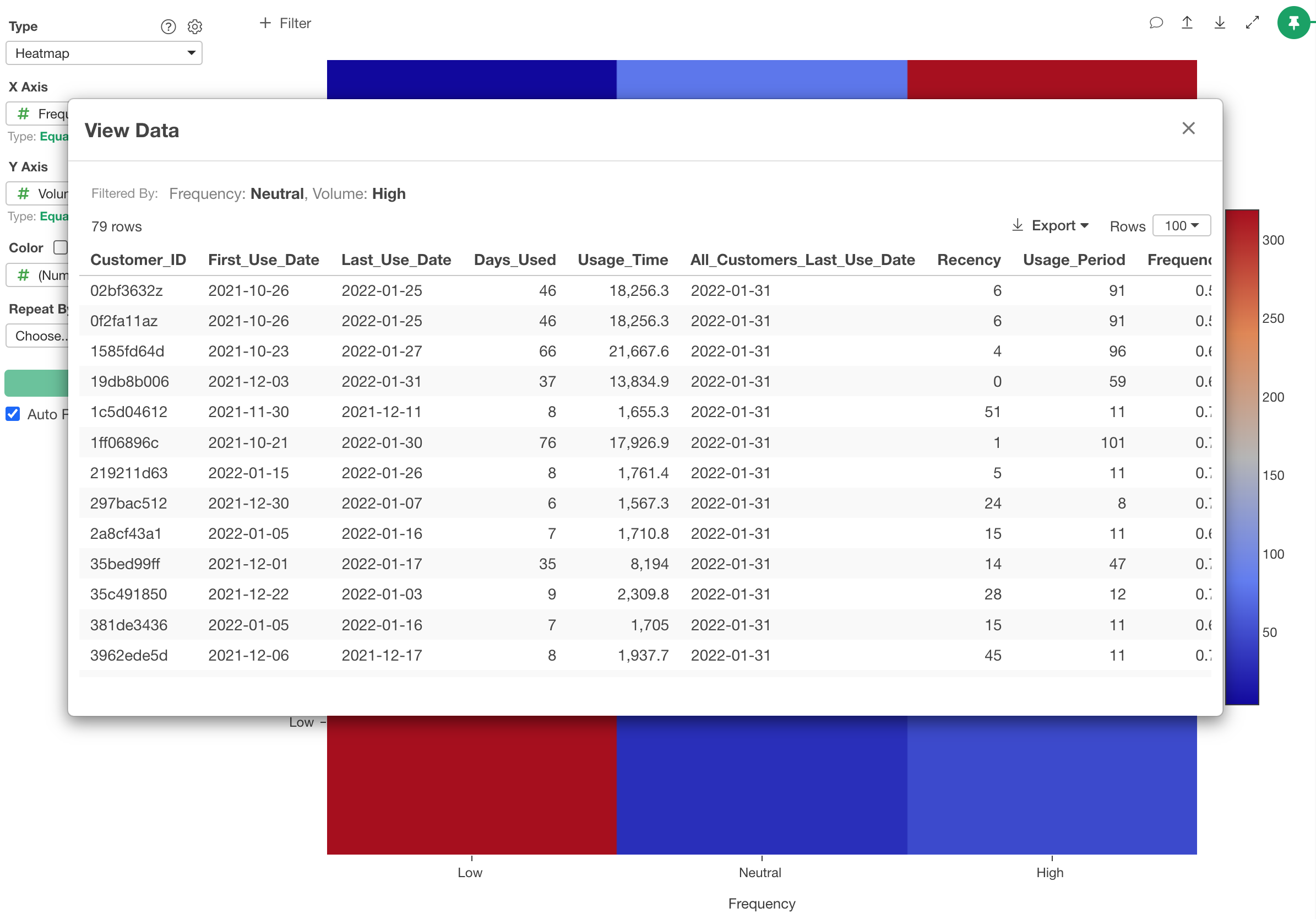
5. RFV Analysis
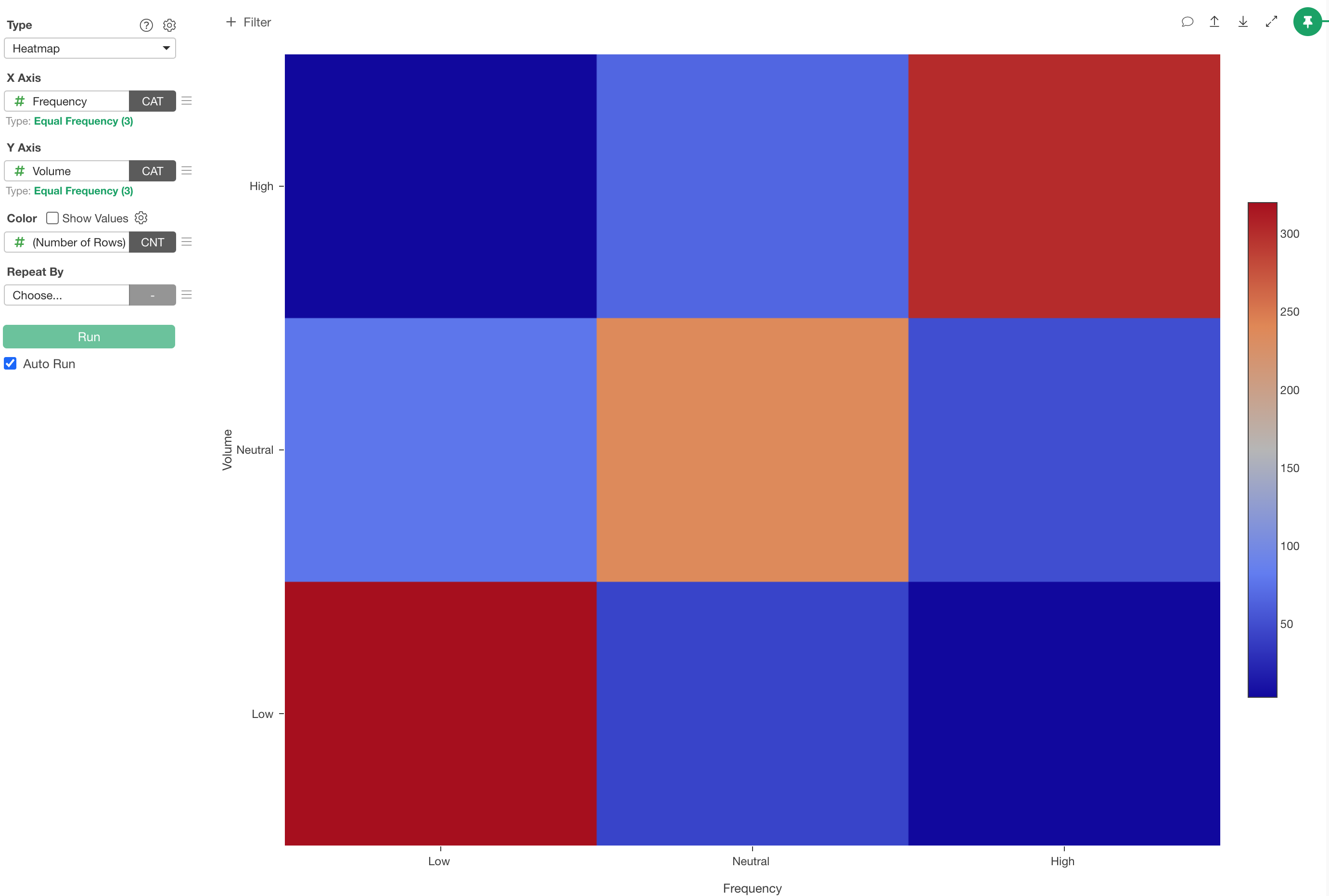
RFV analysis calculates scores for the following three metrics for each customer from service usage data and visualizes them using Heatmap charts.
It is a visualization method that helps segment customers and identify appropriate actions for each segment.
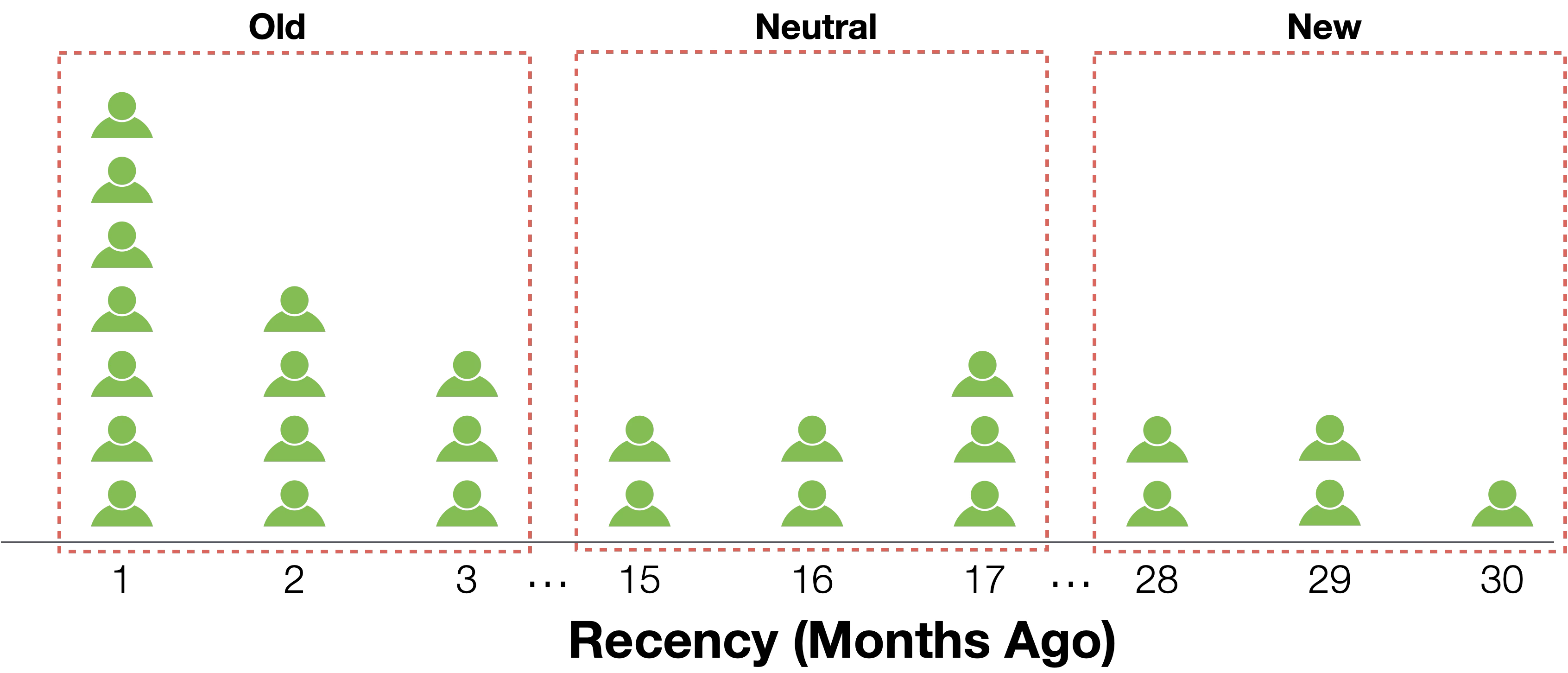
- Recency - How recently did they use the service
- Frequency - How frequently do they use the service
- Volume - How much do they use the service (time/content count/feature count, etc.)
In the power user curve mentioned earlier, we discussed how customer engagement can be examined by visualizing the distribution of customer usage frequency.
Power user curves are a method that focuses on and visualizes high service usage frequency, but when considering actions to improve business, instead of focusing only on customers with high usage frequency, it can also be used to divide customers into segments by usage frequency and consider appropriate actions for each segment.
However, when measuring customer engagement, depending on the service (e.g., Netflix), engagement can be measured by usage time and divided into segments too.
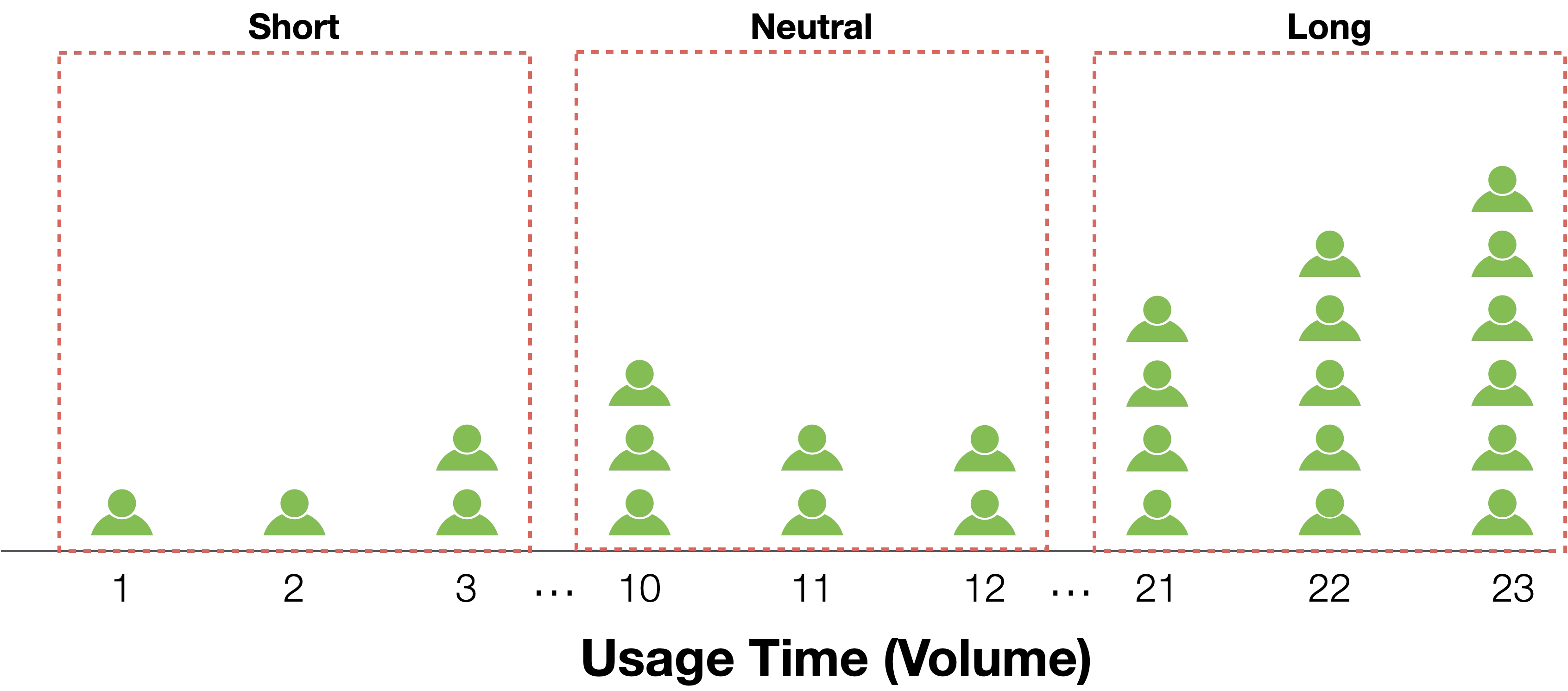
If that’s the case, instead of using just one metric, if customers could be grouped based on both usage frequency and volume (usage time), more appropriate approaches could be taken for each group.
However, customers who haven’t used the service recently cannot necessarily be said to have “high engagement,” so the time elapsed since last service use should also be considered when measuring engagement.
Therefore, RFV analysis segments customers using the following three metrics:
- Recency - How recently did they use the service
- Frequency - How frequently do they use the service
- Volume - How much do they use the service (time/content count/feature count, etc.)
In RFV analysis, scores calculated from time elapsed since last service use, usage frequency, and volume (usage time) are categorized, and which categories many customers gather in is visualized using Heatmap charts.
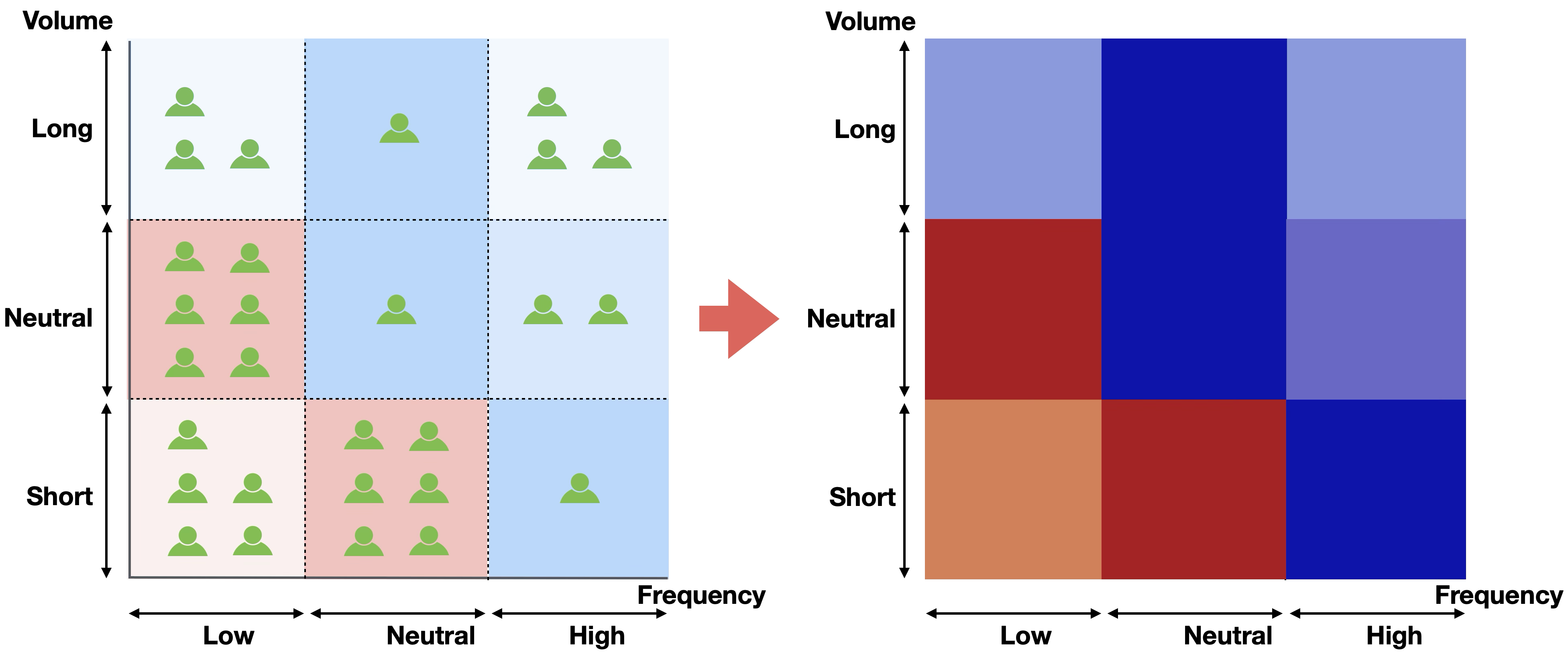
After dividing customers into segments, you consider actions optimized for each segment, decide action priorities based on characteristics and volume of each segment, extract customer lists included in each segment, and execute actions.
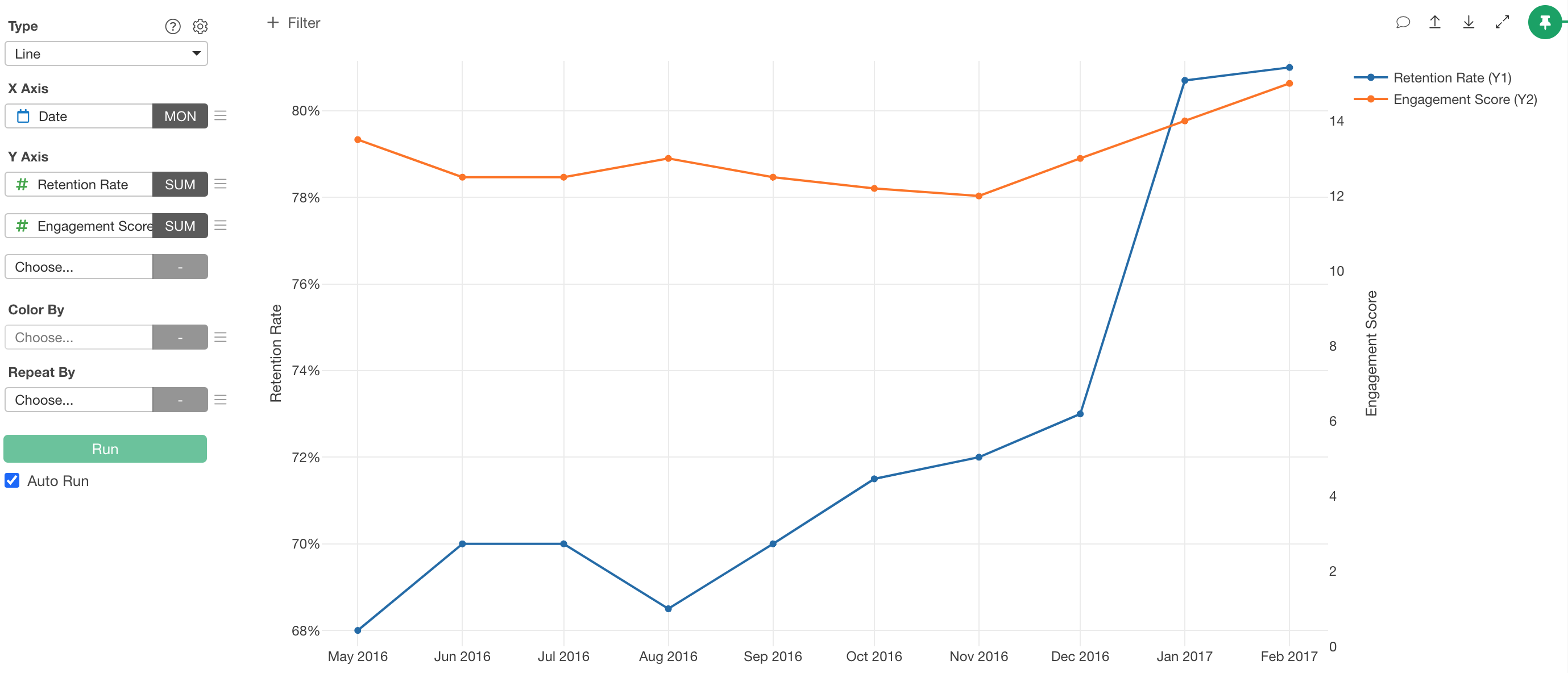
Note that there are times when you want to know whether RFV metrics are improving for the entire service or product in a single metric.
In such cases, there’s a method of adding up the three RFV metrics into one metric and monitoring it.

However, the weights of Recency, Frequency, and Volume differ depending on the service being provided.
Therefore, you can weight each metric based on experience (domain knowledge) or use statistical or machine learning models to understand how much each metric influences (correlates with) conversion and churn, then use this for weighting each metric.
Also, once you decide on the definition of engagement score, you monitor whether it correlates with retention (churn), and if there’s divergence, you review the weighting or recreate engagement metrics using metrics other than R, F, V.
Want to Try with Your Own Data ?
All charts in the article were created using Exploratory, a UI tool for data processing, visualization, analysis, and reporting.
For those who want to create these charts or analyze data using your own data, a free trial is available through the link below, so please try it!