
Introducing Pivot Table
Pivot Table lets you summarize (aggregate) data by using Column and Row, which sometimes a great way to show summarized values in each intersection of two (or more) categories that are assigned to Column and Row.
Here's a quick introduction on how you can use Pivot Table in Exploratory.
Here is a list of features you'll learn in this note.
- Pivot Table Basic
- Missing Value Handling
- Limit Values
- Color Configuration
Sample Data
We'll use this Flight Delay data. You can download it from this page.
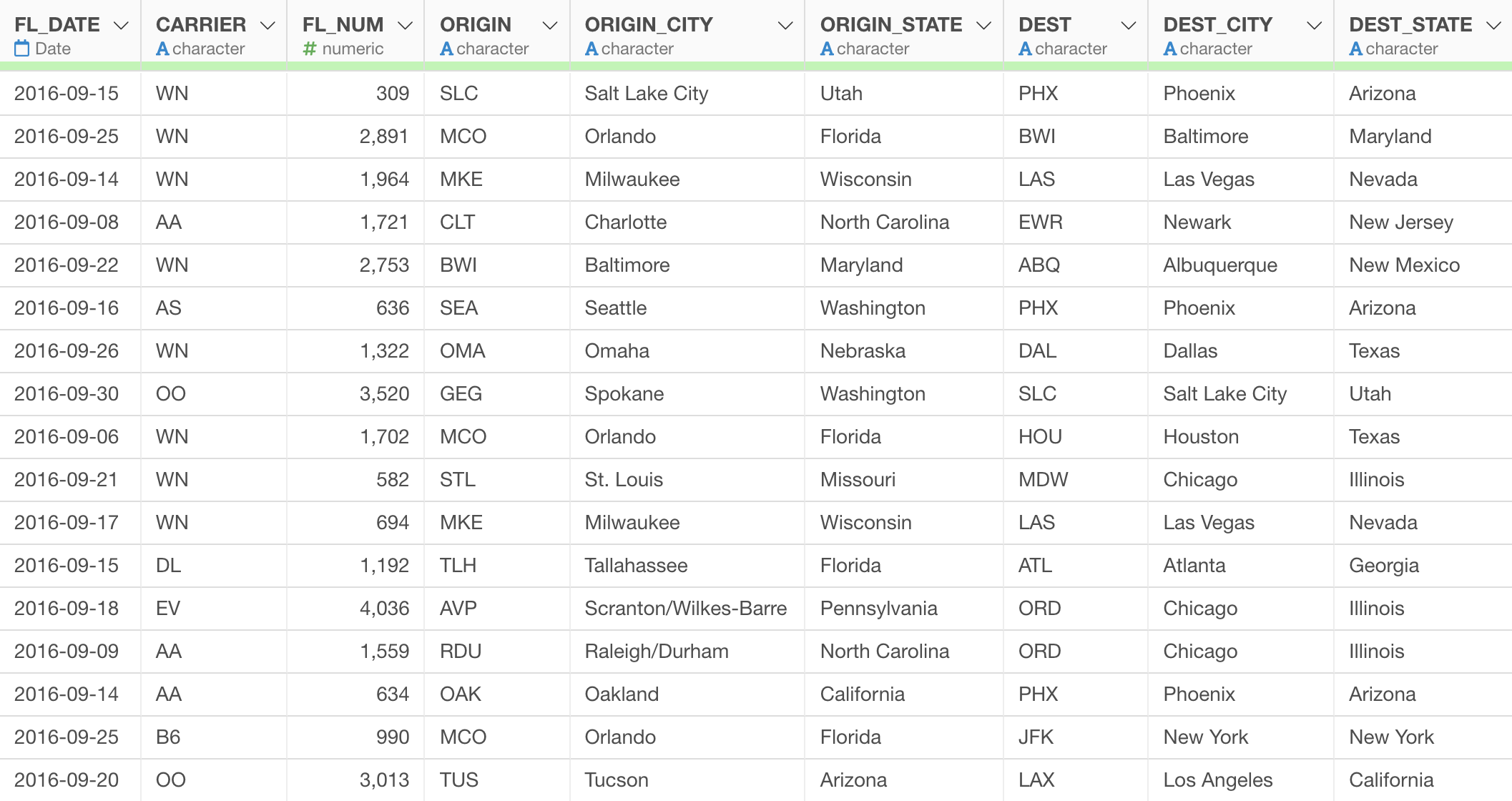
In this data, each row represents each flight that departed one airport and arrived another airport. It has the delay times for both departure and arrival of each flight.
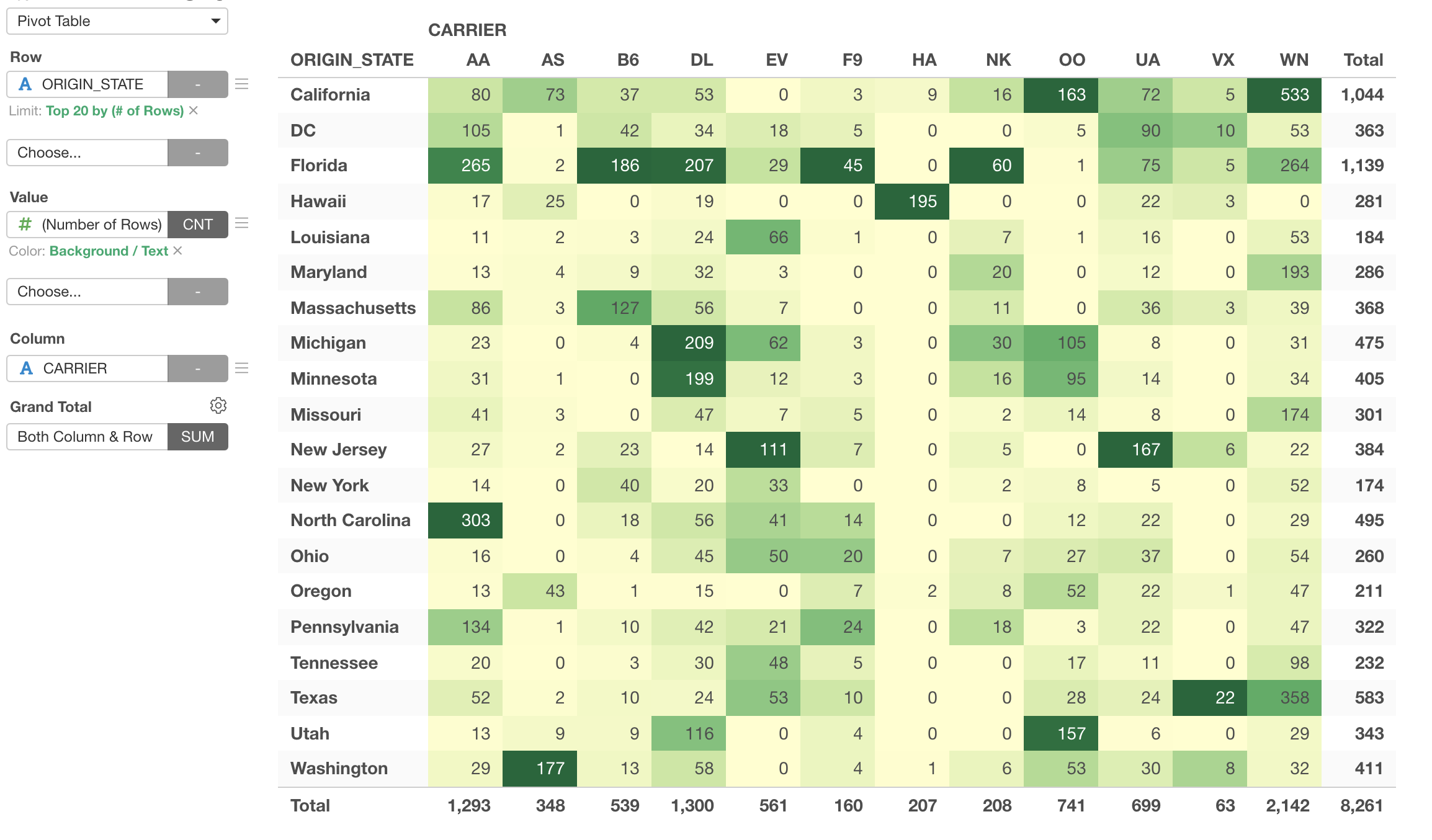
1. Pivot Table Basic
Let's create a Pivot Table to see how many flights are by the departure state (ORIGIN_STATE) and the carrier.
First, assign 'ORIGIN_STATE' column to the Row and assign 'CARRIER' column to the Column.

By default, 'Number of Rows' is selected for the Value. This is perfect for now because we wanted to see the number of flights for the intersections of ORIGIN_STATE and CARRIER.
2. Missing Value Handling
There are many empty cells, this is simply because there are no flights in those intersections of State and Carrier.
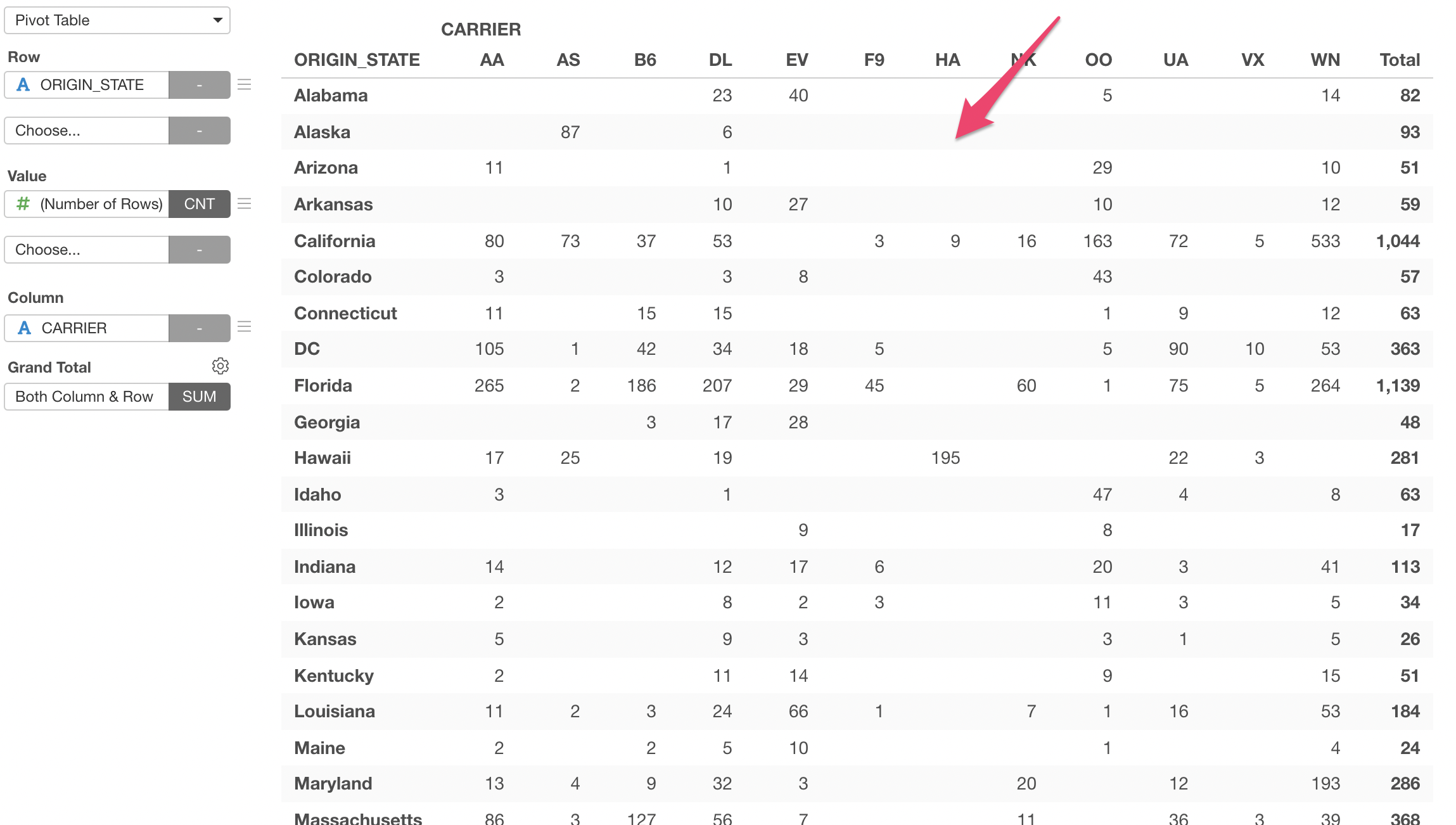
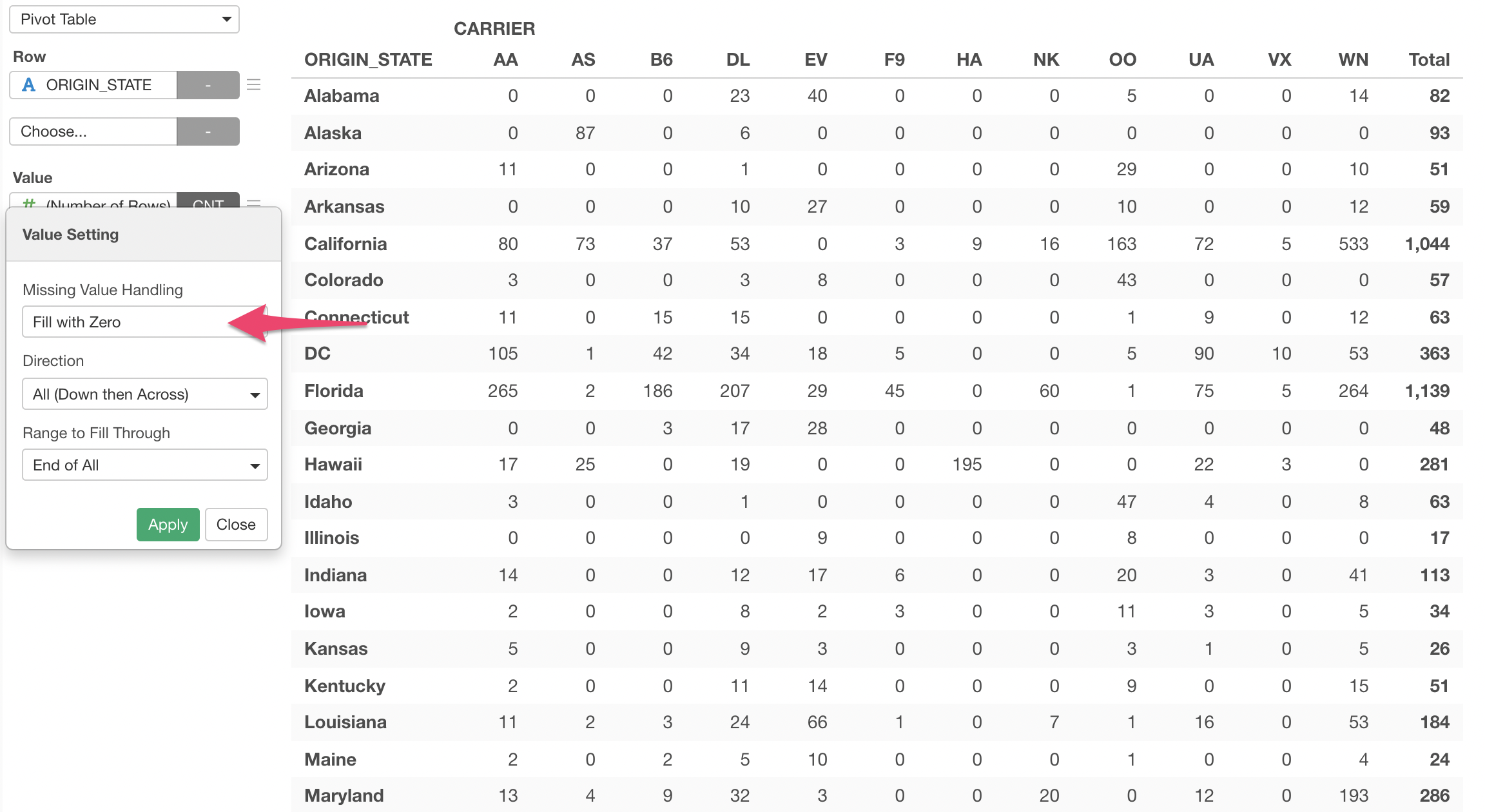
We can show 0 for those empty celss.
Select 'Missing Value Handling' from the Value menu.
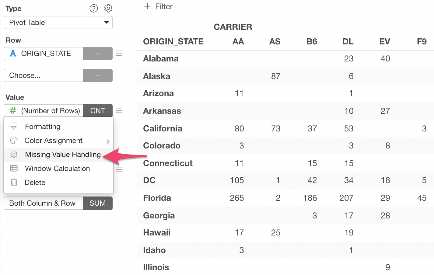
Select 'Fill with Zero' for 'Missing Value Handling'.
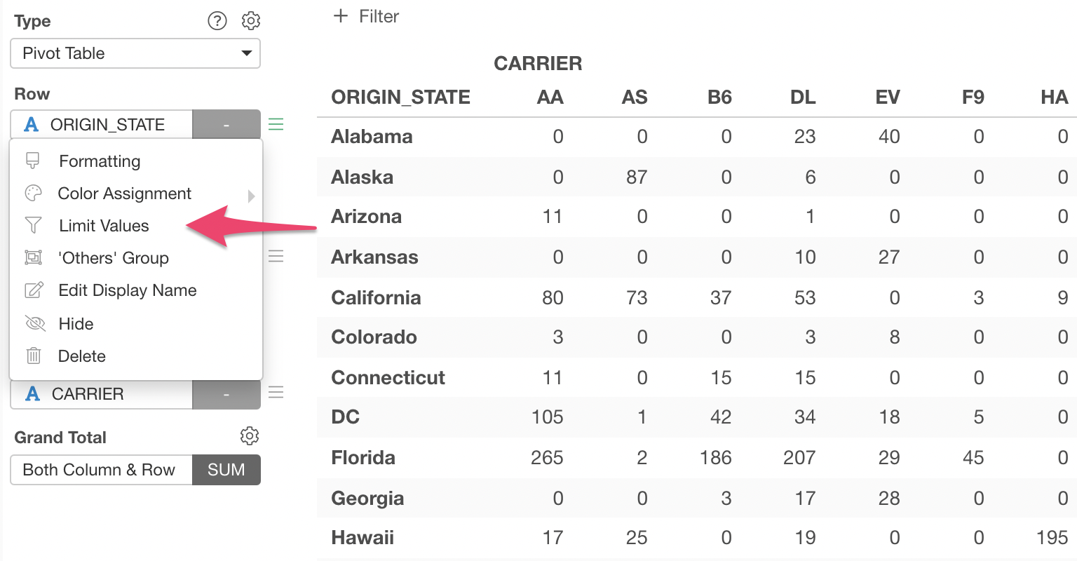
3. Limit Values
Currently, there are 51 rows (50 states plus Washignton DC).
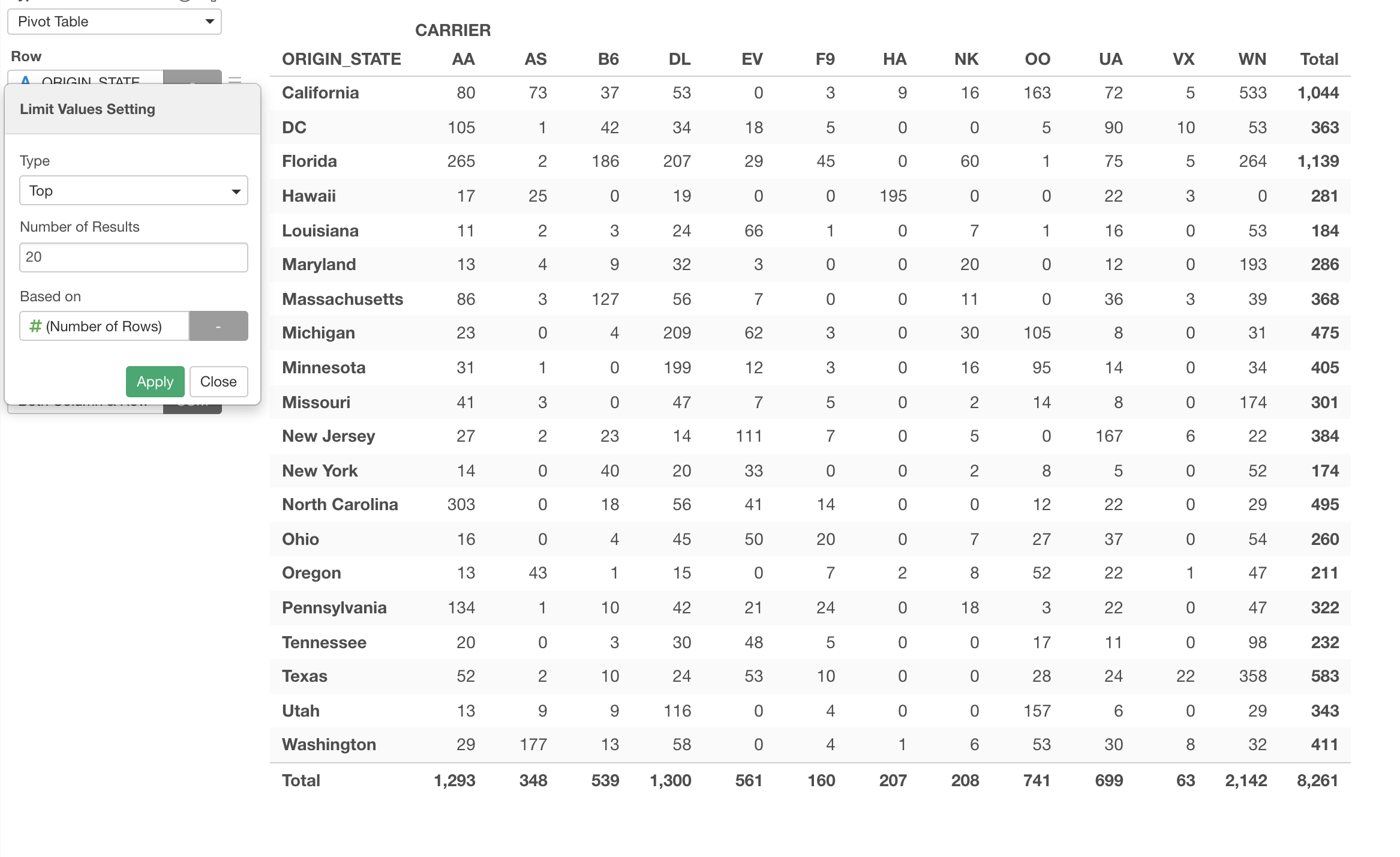
We can limit them to show only the top 20 states based on number of the flights.
Select 'Limit Values' from the Row menu.
And select 'Top' for the Type and type 20 to make it as 'Top 20'. This will make the Pivot Table to show only 20 rows of the Top 20 states.
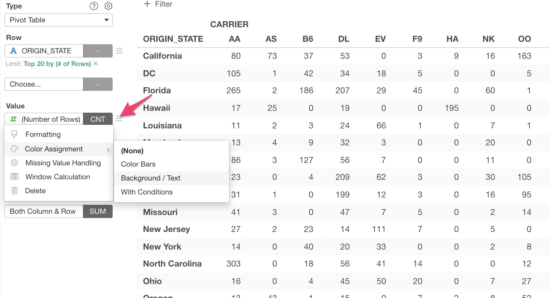
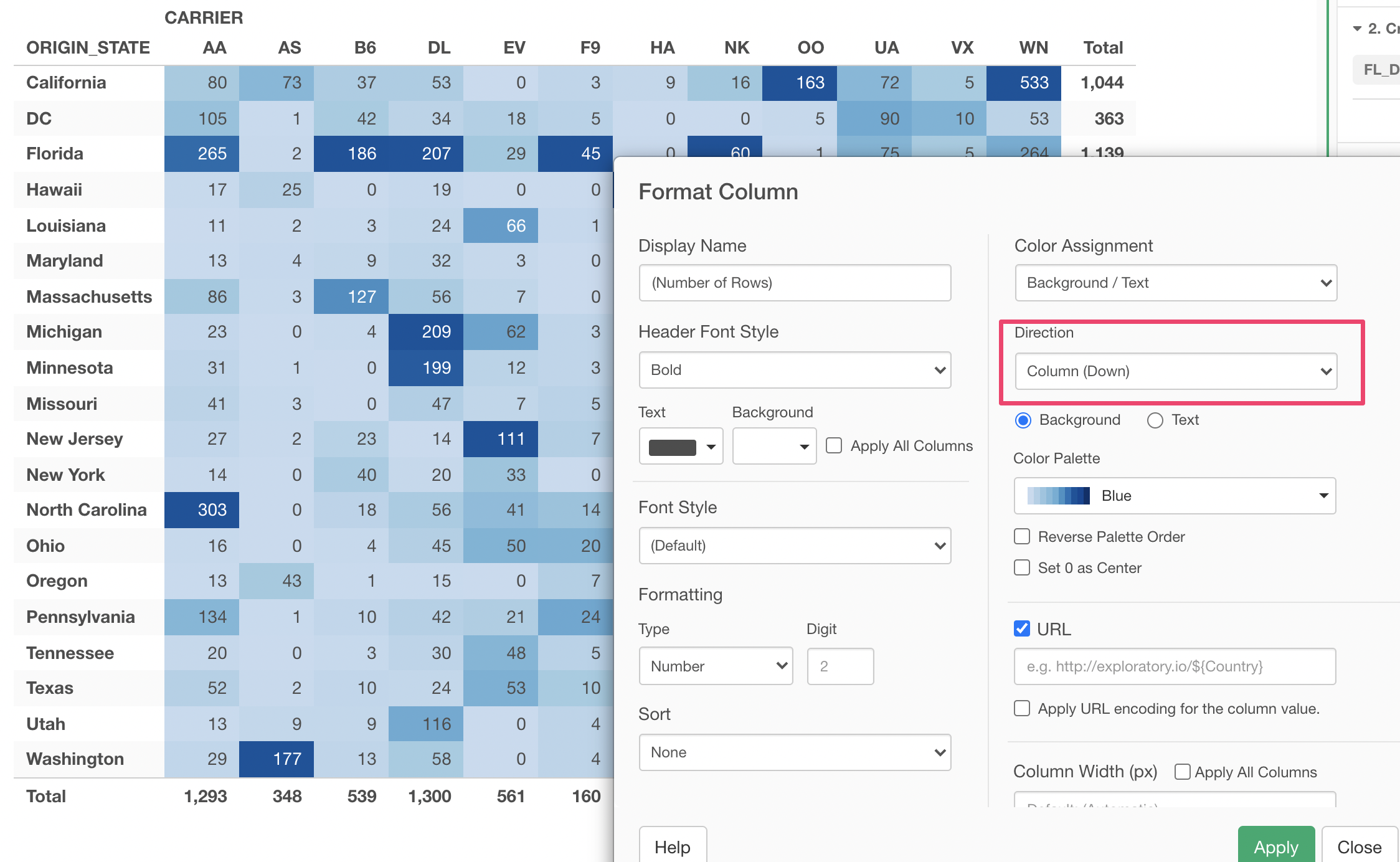
4. Color Configuration
Lastly, let's assign Color to the values so that the bigger numbers will have darker color and the smaller numbers will have light color.
Select 'Color Assignment' and 'Background / Text' from the Value menu.
This will open the Format dialog. You can click the Run button at the bottom to see how the color is applied on top of the Pivot Table.
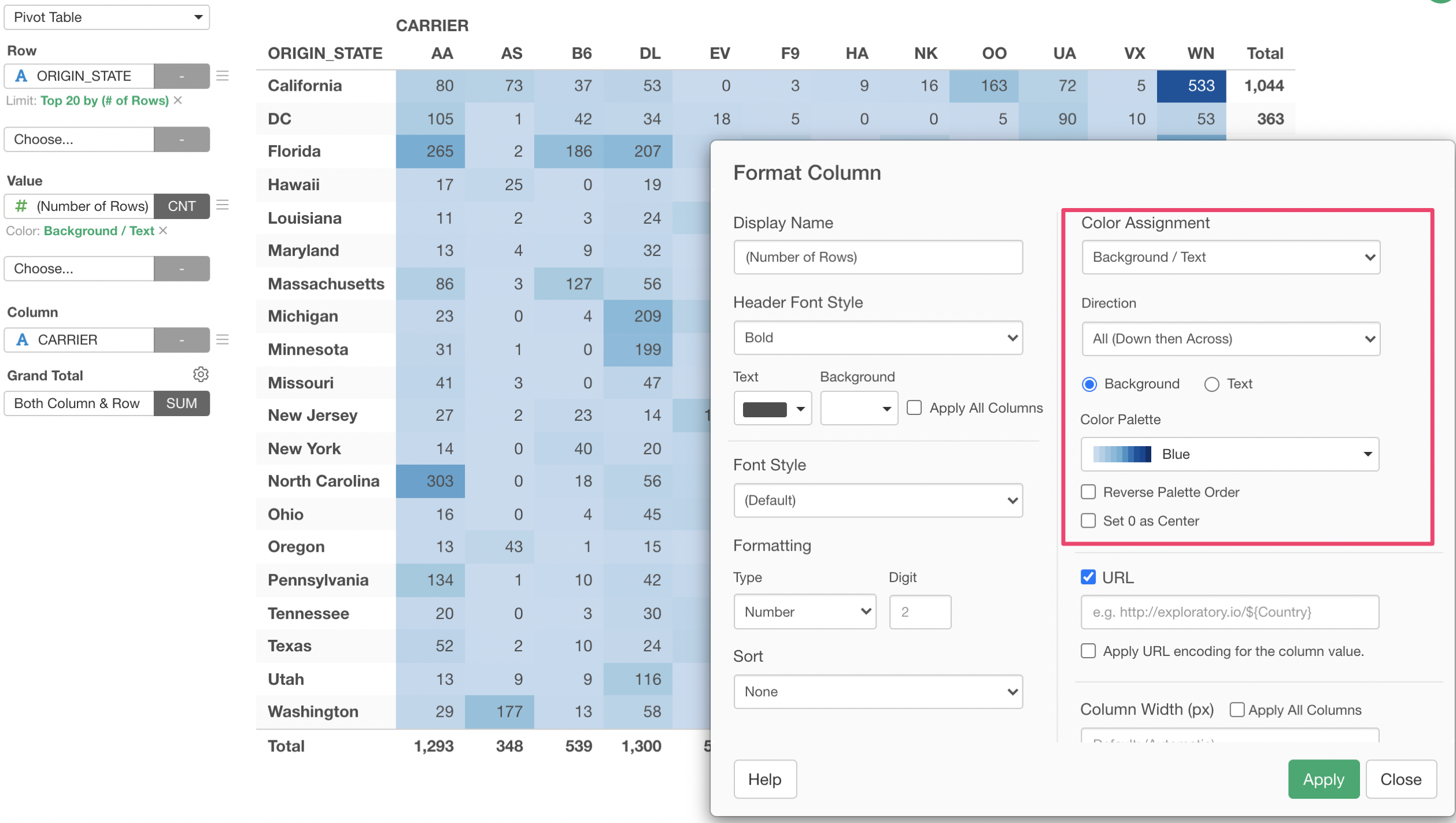
By default, it compares all the values in the Pivot table and assigns the color. But, we can change it. Let's assign the color by Column so that the assignment of darker or light colors is done for each column.
Select 'Column' for the Direction and click the Run button.
You can change the Color Palette if you like.
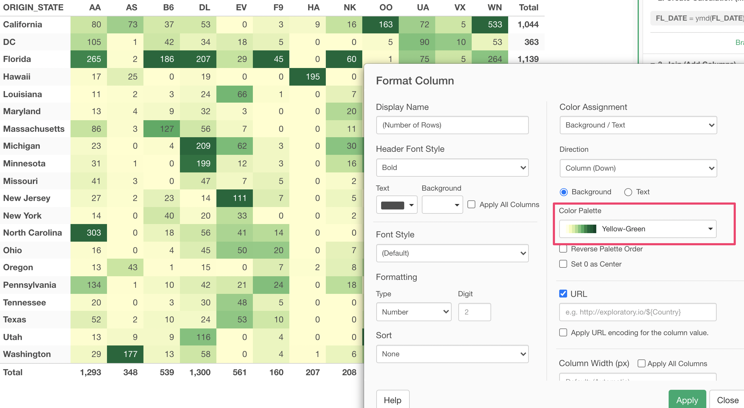
Here's the final Pivot Table!
Try it for yourself!
If you want to quickly try it out and you don’t have an Exploratory account yet, sign up from our website for 30 days free trial without a credit card!
If you happen to be a current student or teacher at schools, it’s free! Sign up for Community Plan.
And, if you don’t mind sharing what you create publicly you can sign up for Public edition of Exploratory (FREE)!