How to Create Chart to Show Ratio to Same Month in Previous Period
Before getting started, let me explain what the 'Ratio to Same Month in Previous Period (Year, Quarter, etc.)' is first.
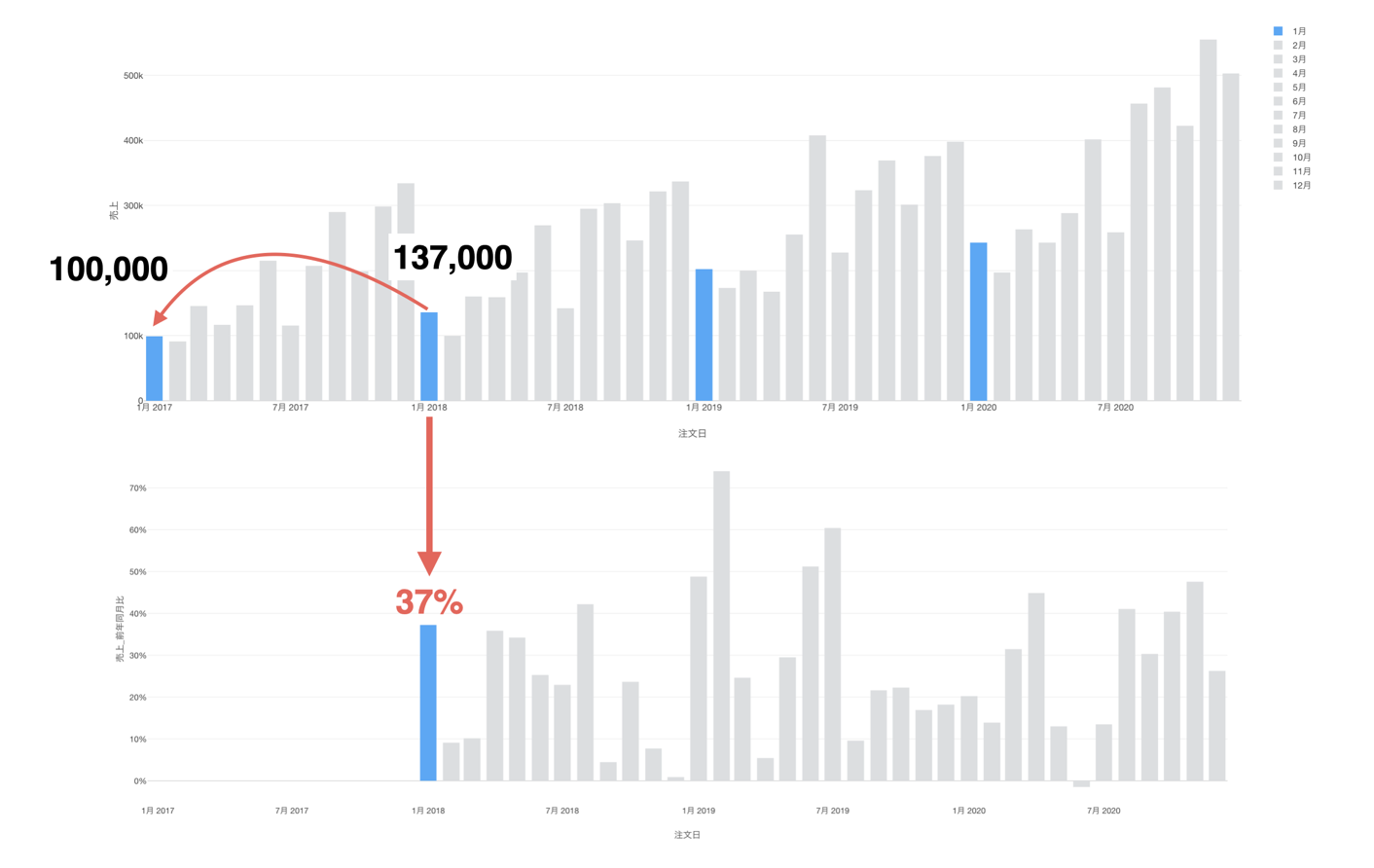
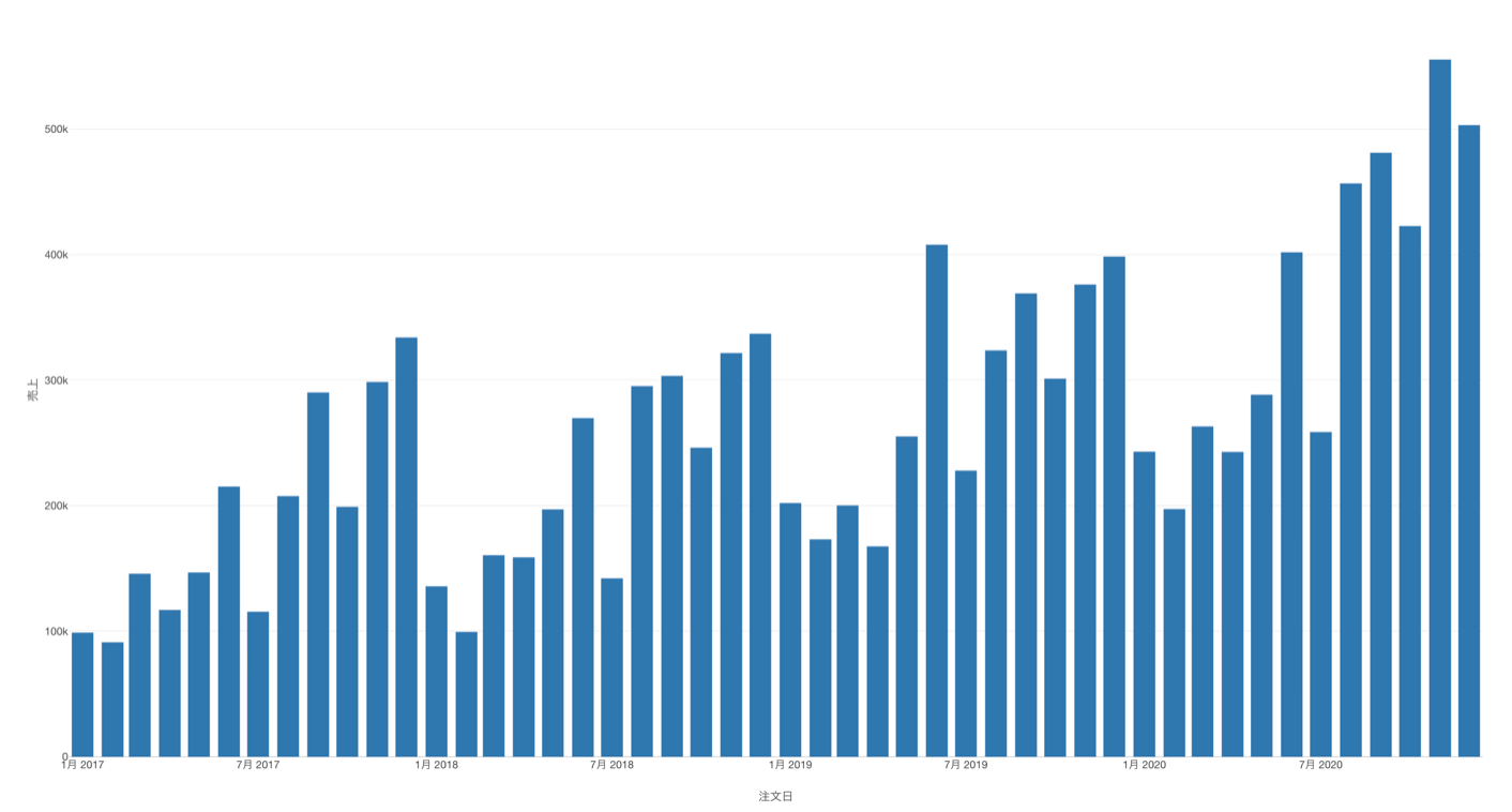
The chart below shows the sales numbers by month on the timeline.
Now, we want to show how much our sales increased or decreased in percentage over the years by comparing a given month against the same month of the previous year.
For example, we want to compare January's sales against the previous year's January.
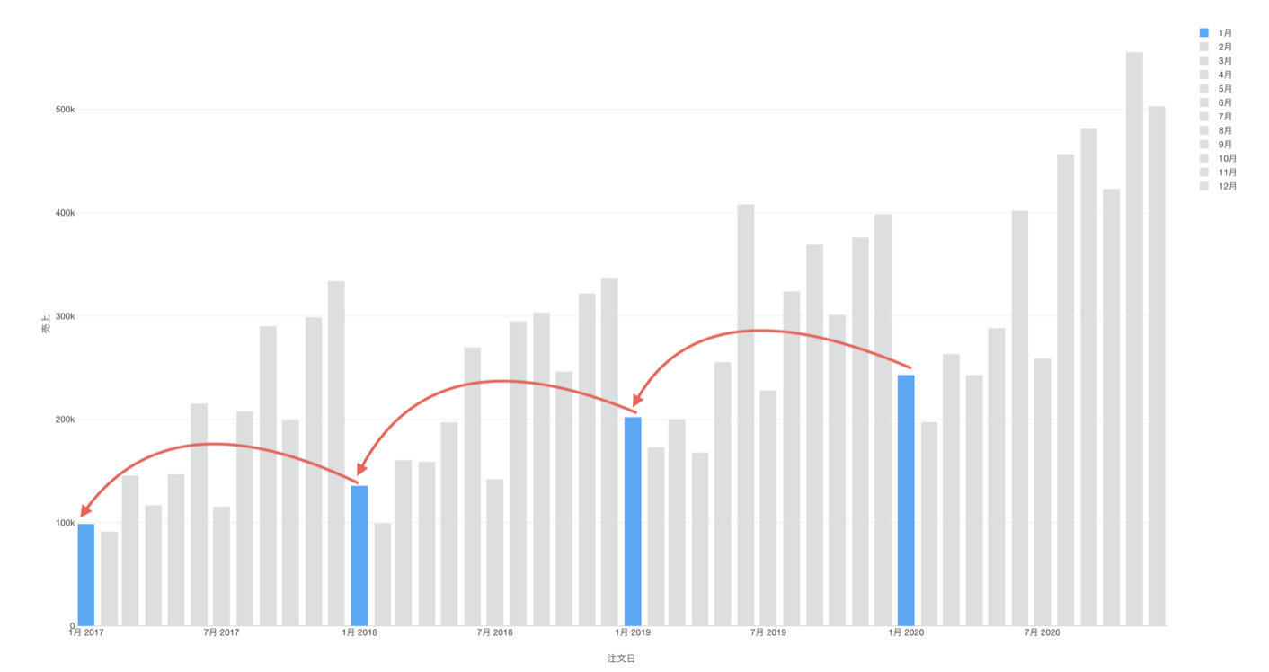
Sales of January 2018 should be compared to the sales of January 2017.
And same thing for other months. For example, we want to compare the February sales against the February sales in the previous year.
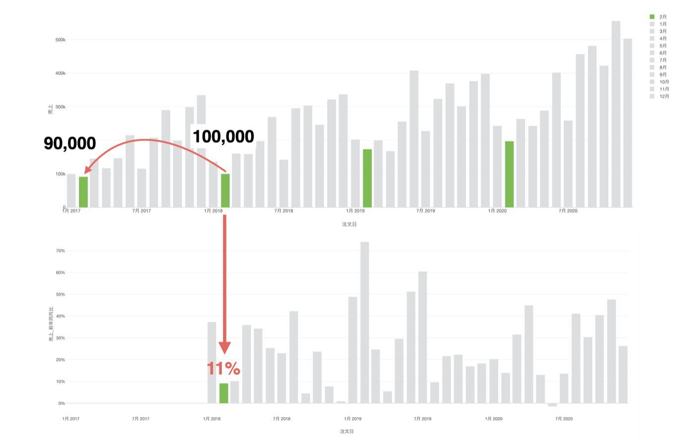
And we want to do this calculation for every month and for all the years and visualize the sales growth rate by month.
Here's a quick how-to video.
Step by Step Instruction
Sample Data
We'll use this Sales Data. You can download it from this page.
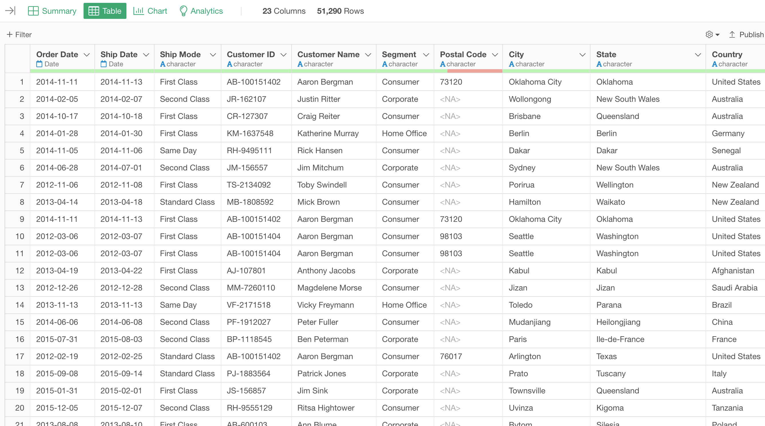
In this data, each row represents each customer's order, and the columns are additional information about each order.
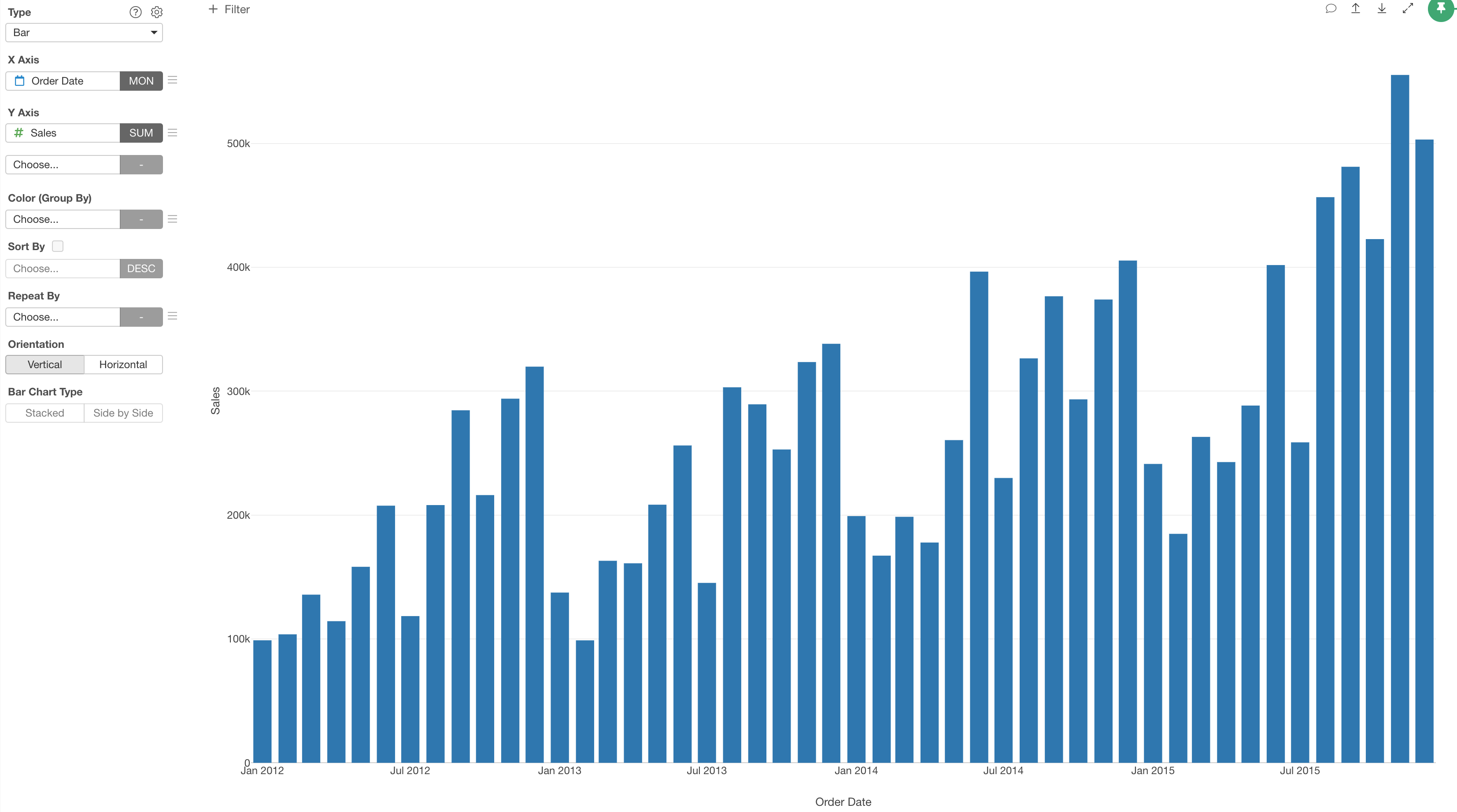
1. Create a Line Chart
First, let's create a bar chart by selecting the followings.
- X-Axis: Order Date -> Month
- Y-Axis: Sales with SUM
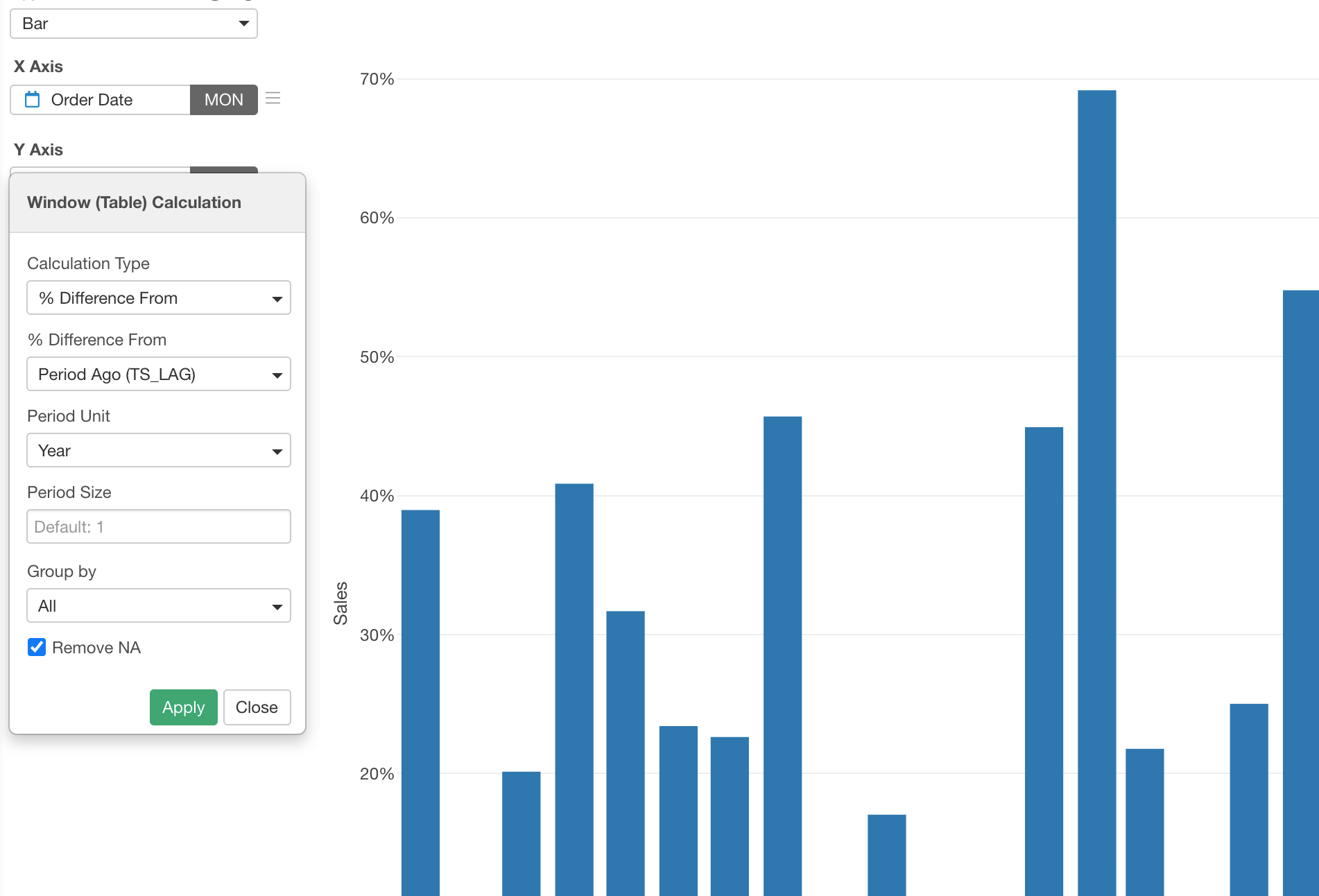
2. Use Window Calculation to Show Ratio to Same Month in Previous Year
Now, it's time for 'Window Calculation'!
Click the 'Menu' icon next to the Y-Axis, select 'Quick Window Calc.', then select '% Difference from Period Ago'.
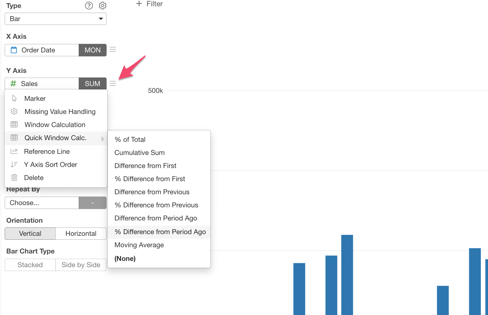
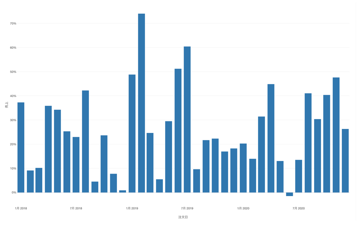
Now each bar is showing the ratio to the same month in the previous year.
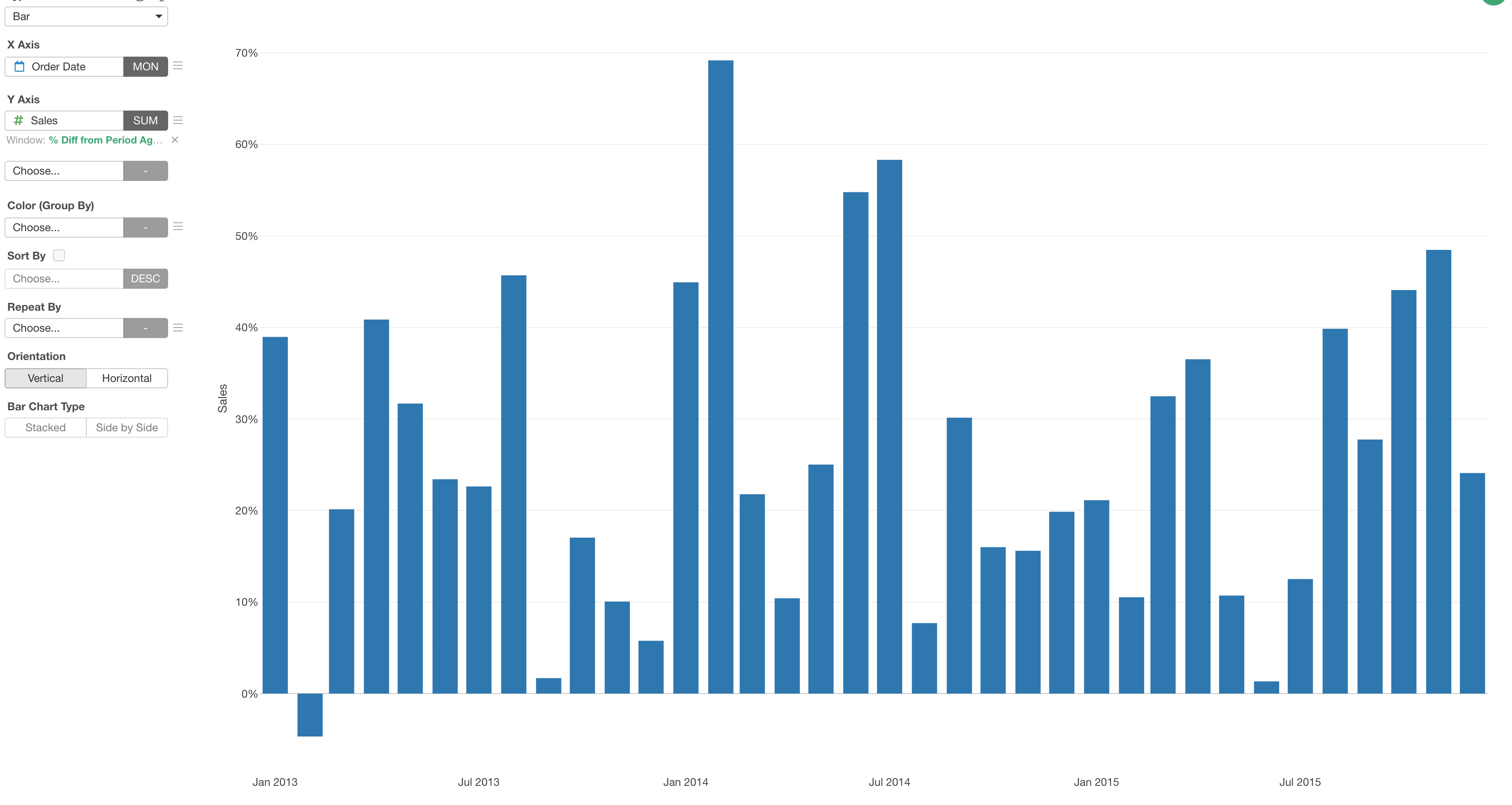
You can click the green text to adjust the configuration.
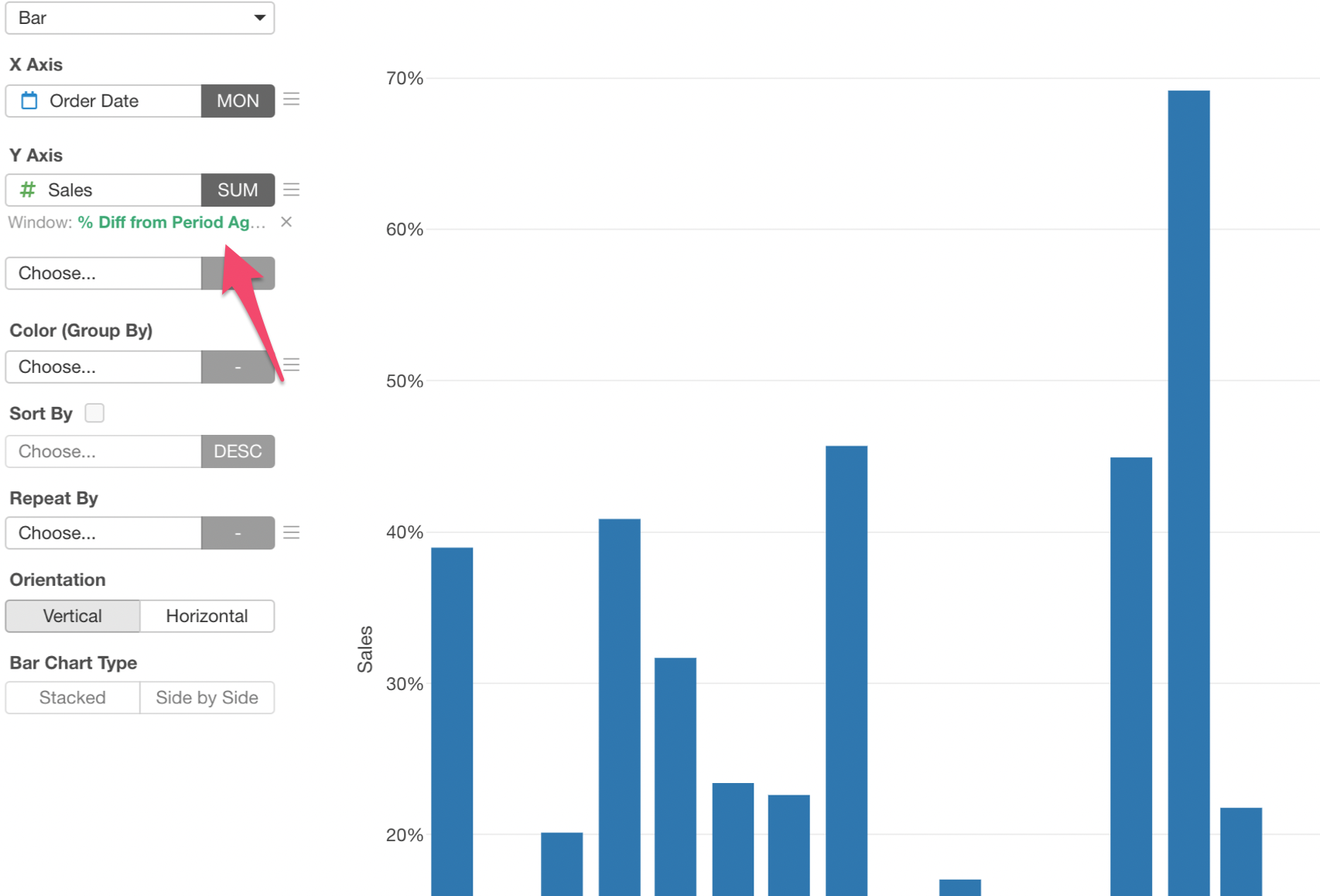
For example, you might want to change the 'Period Unit' to show the ratio to the same month in the previous quarter.