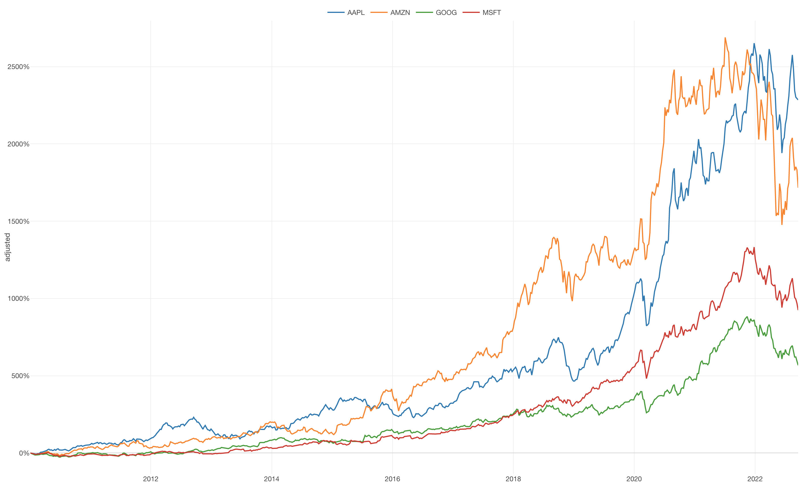
Show % Difference from First Value
In this Note, we'll show you how you can create a chart to show the % of Difference from First Value with 'Window Calculation' feature.
This is useful especially when you are looking at the time series data with multiple groups whose numerical scales are different from each other.
Sample Data
We'll use this Stock Price. You can download it from this page.
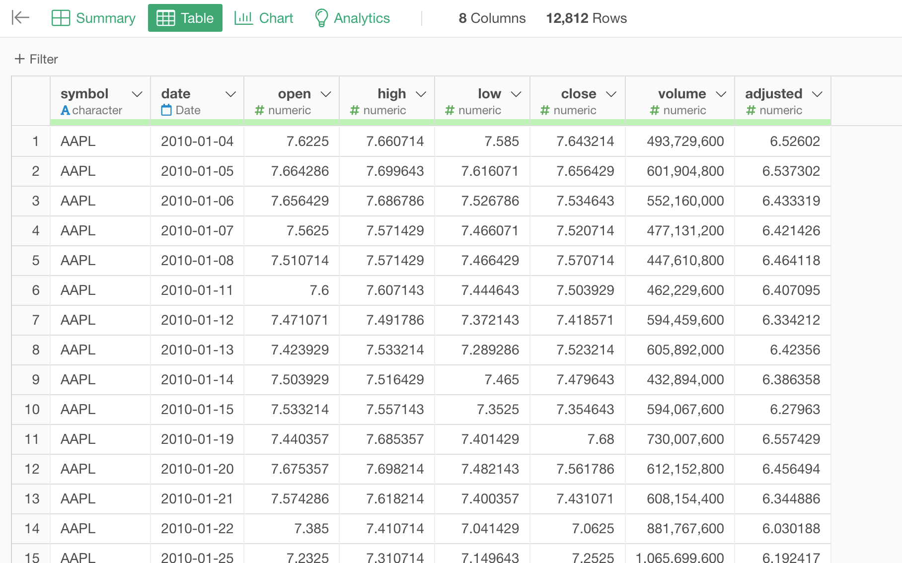
In this data, each row represents a daily stock price for each of the tech companies (e.g. Apple). The 'Adjusted' column holds the daily prices that have been adjusted for the price changes due to stock split events throughout the time.
1. Create a Line Chart
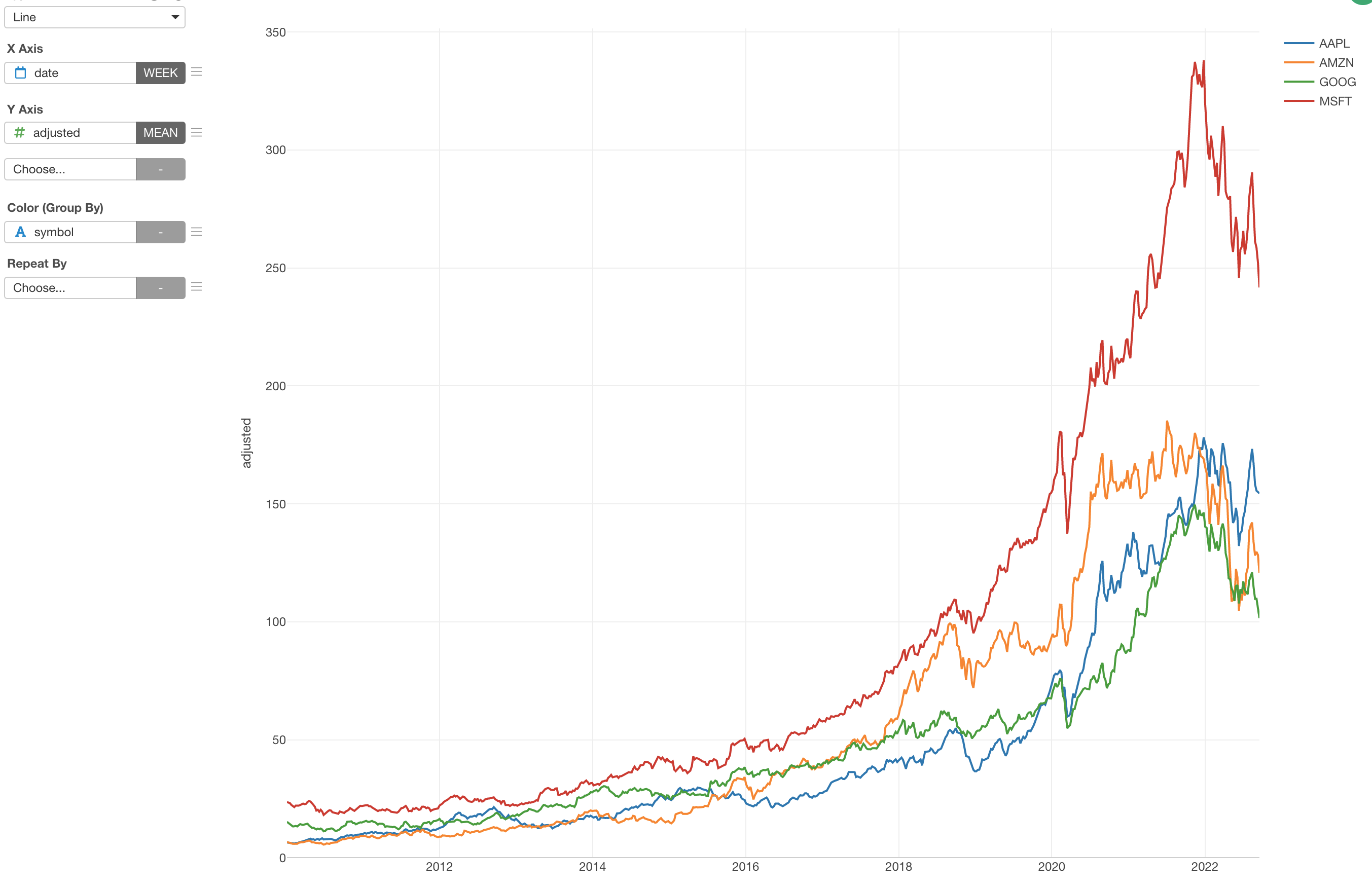
The goal is to create a line chart with each line shows the trend of the stock price for each company along the timeline.
First, create a line chart by selecting the followings.
- X-Axis: date -> Week
- Y-Axis: adjusted
- Color: symbol
2. Use Window Calculation to Show Percentage Difference from First Value
Now, it's time for 'Window Calculation'!
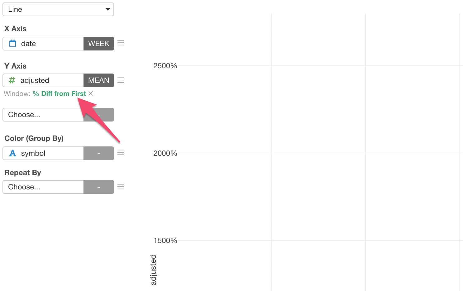
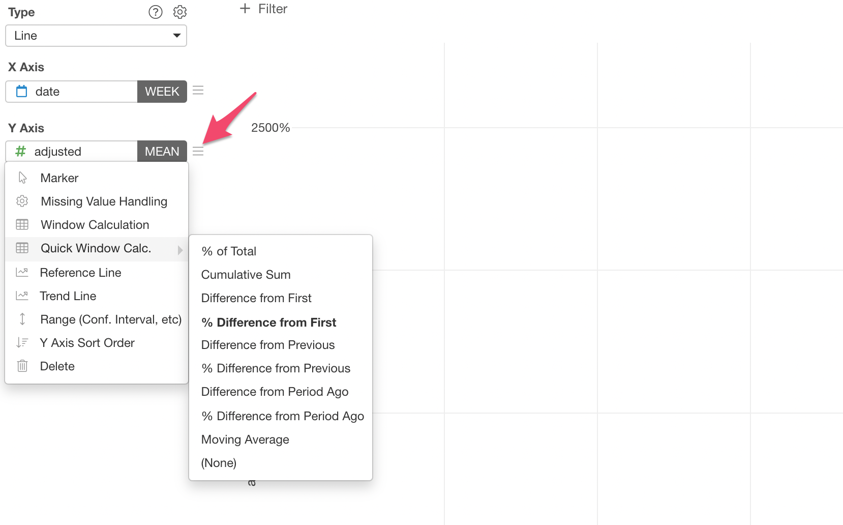
Click the 'Menu' icon next to the Y-Axis, select 'Quick Window Calc.', then select '% Difference from First'.
And that's it, now you have a line chart that shows the multiple lines each of which shows the percentage difference from the first date of the data for each company.
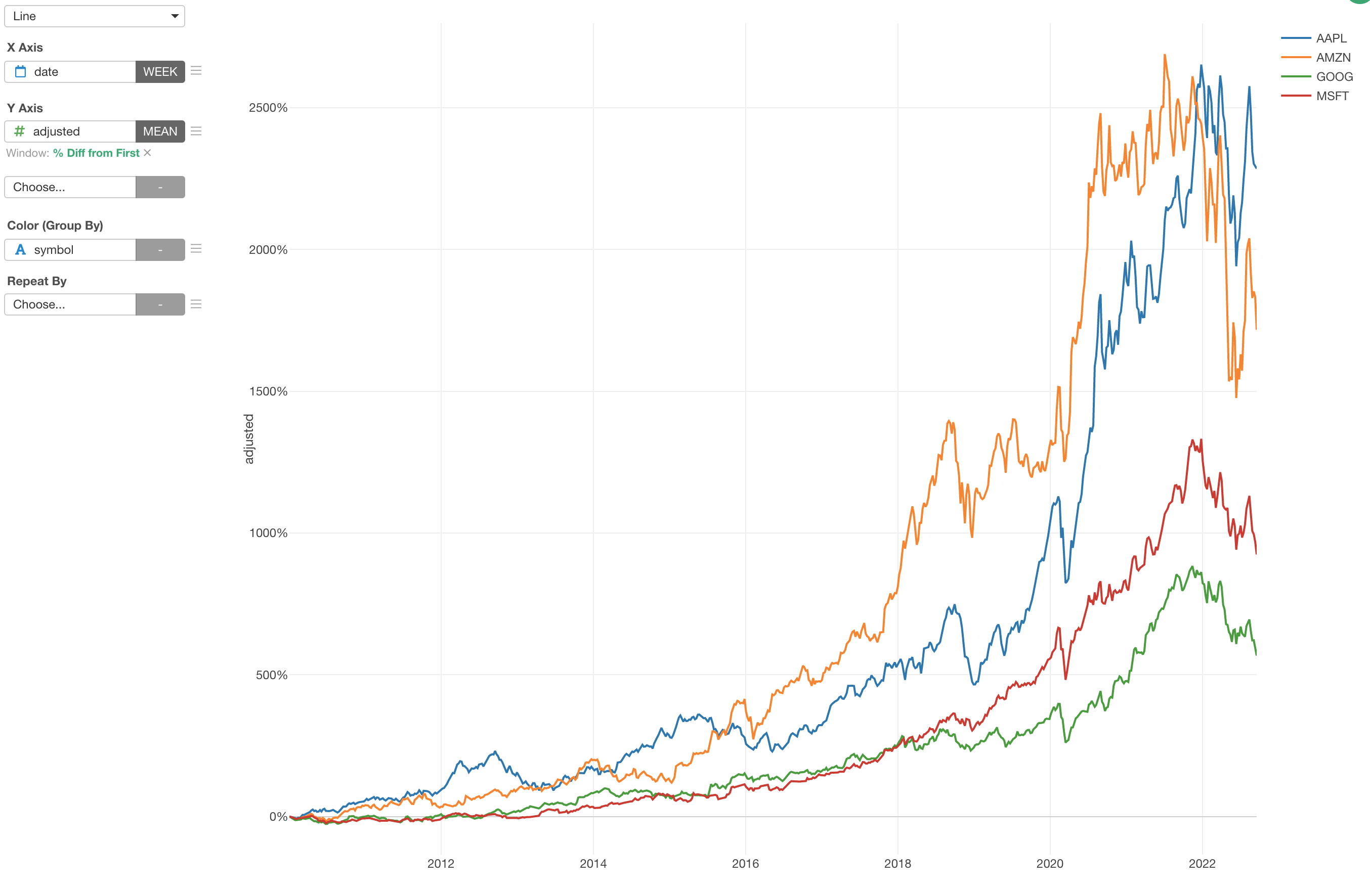
You can click on the Green Text to open the configuration dialog for more detail setting if you like.
