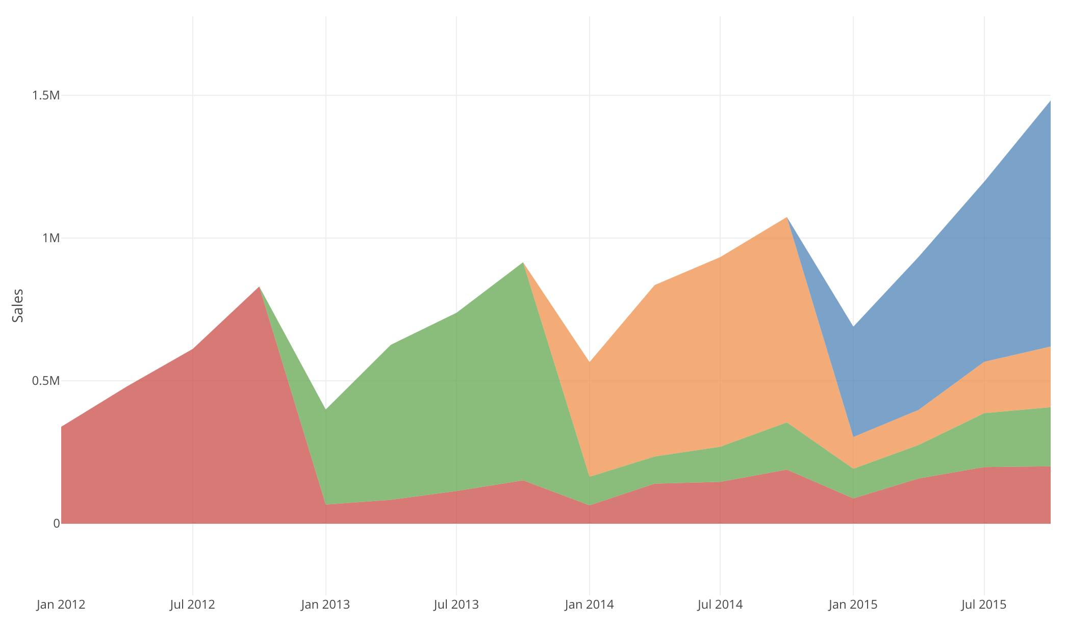
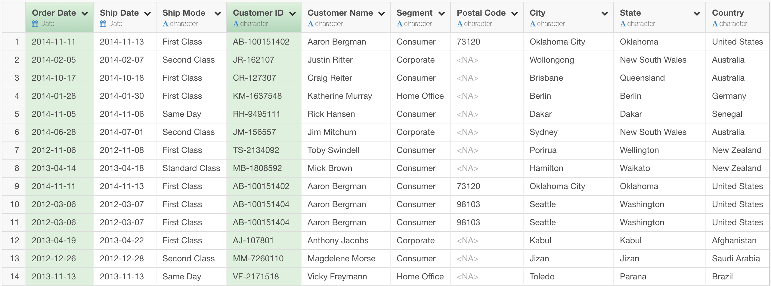
Let’s say you have sales data that has date of each order and ID of customer who made it, which looks like this.
And you are interested in how the new customers you got each year have been staying, or how much they have been buying from you. In other words, you want to run cohort analysis on this data.
There are a few different ways to do cohort analysis, but here I will introduce a simple way that is done just by data wranling and visualization.
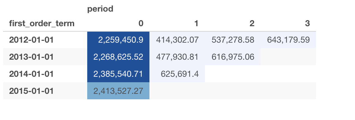
At the end of this post, we want to see a Pivot Table that looks like this.
And, an Area Chart like this, which is called “Layer Cake Graph”. 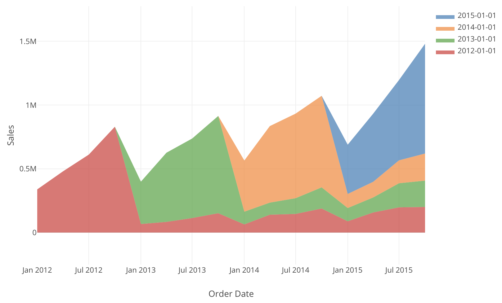
Prepare Data for Cohort Analysis
1. Get the first purchase day for each customer
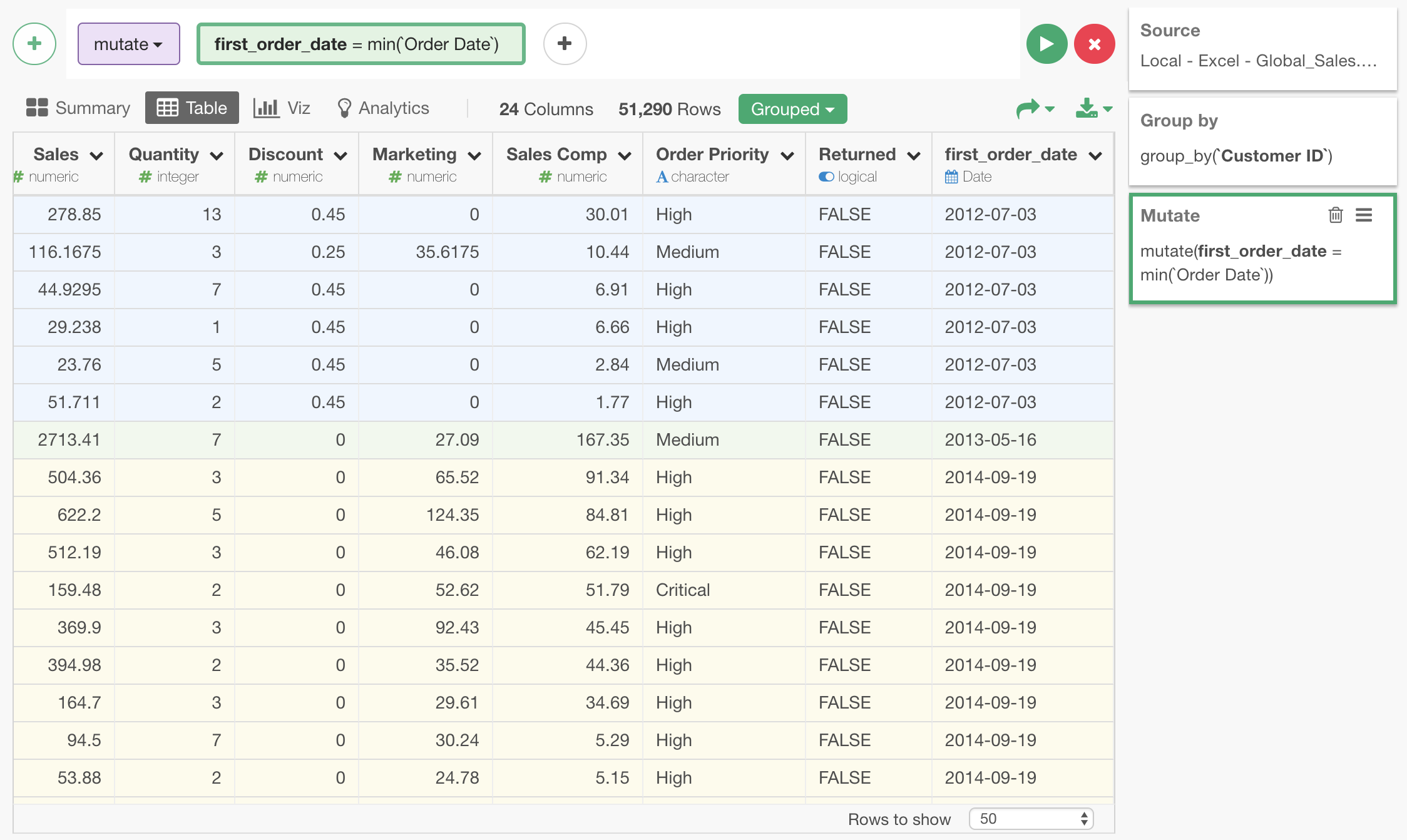
Since we are grouping customers by when they first became our customer, we are interested in the date of their first order. This can be done by first grouping the rows by Customer ID. (Remember, in this table, one row represents one order.)

You can see that rows are grouped by Customer ID, and the grouping is expressed by colors.
Now, since this table is grouped by customer, if we create a new column with mutate command with following expression, we get the smallest Order Date within each customer, which is what we just want.
min(`Order Date`)You can see that the right most first_order_date column is added and it is with the first order date of the customer who made that order.
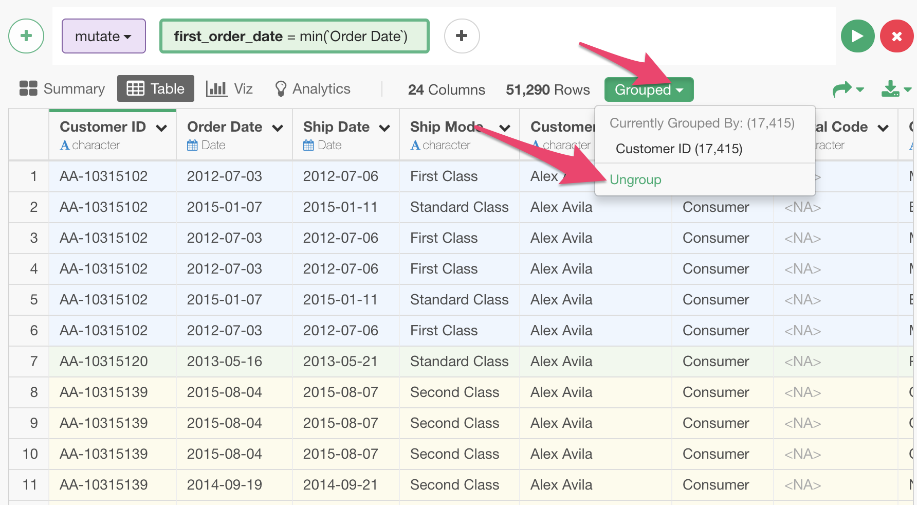
After this step, we can ungroup this table, since we don’t need the effect of grouping for the following steps any more.
2. Round the first purchase date to Year
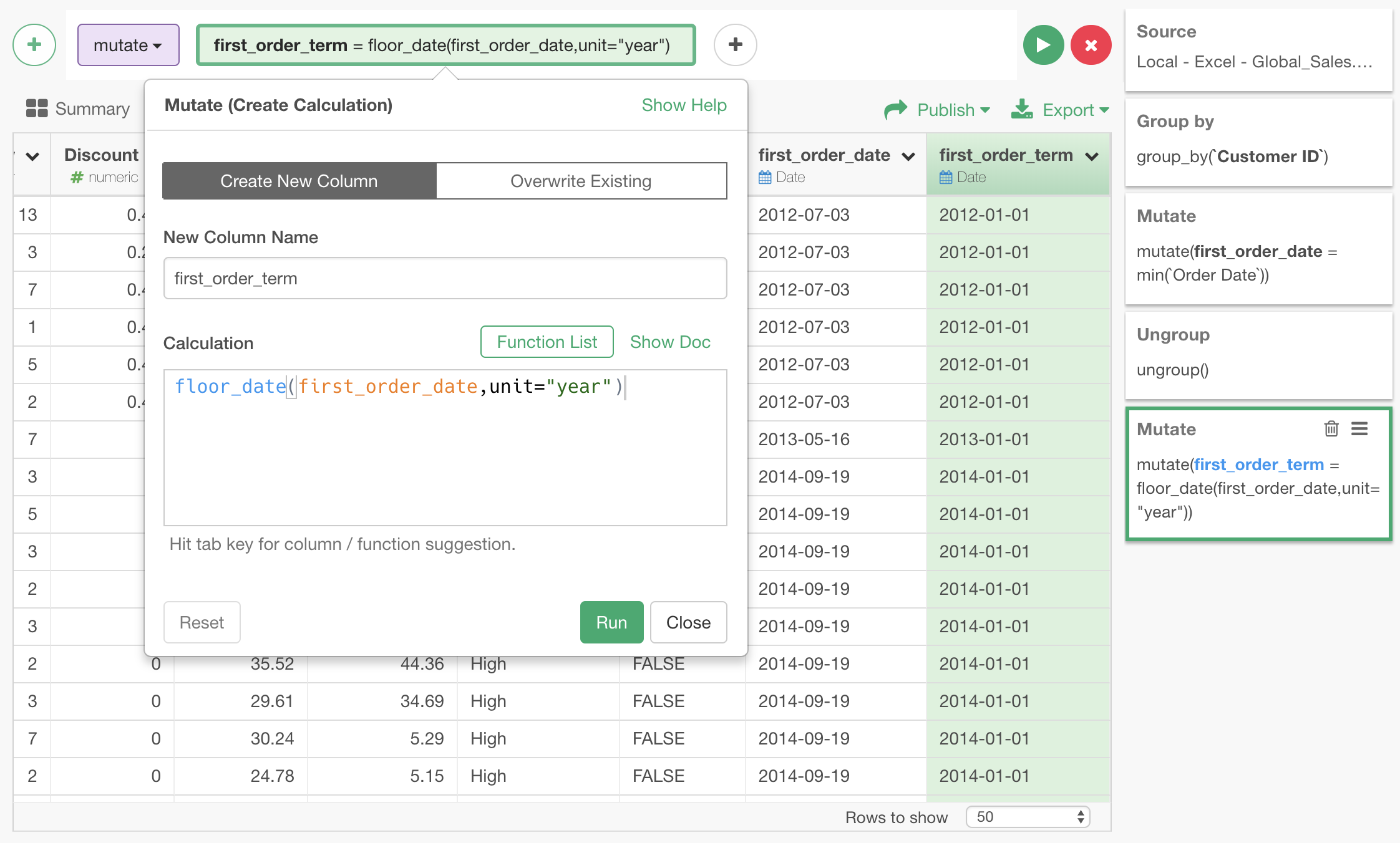
Now, with the first order date of the customers, by rounding that date to year, we know which year the customer first became our customer. We can do that by creating a new column with mutate command with following expression.
floor_date(first_order_date,unit="year")The new first_order_term column is added. We use this as the cohort (group) that the customer who made the order belongs to.
3. Express each order date as number of years since the first purchase date
Now we have cohort, but another thing we will need to create the Pivot Table we want is which period in the customer’s lifetime each order belongs to. In other words, we want to know if the order is made in the same year the customer became our customer, or in her 2nd year as our customer, or 3rd year, or so on.
This can be done by mutate command with the following expression.
floor(as.numeric(`Order Date` - first_order_term)/365.25)The difference between the beginning of the year the customer became our customer and the date of this order is devided by 365.25 to change the unit from day to year. Then, it is floored to make it an integer number.
Let’s create new period column with the above expression.
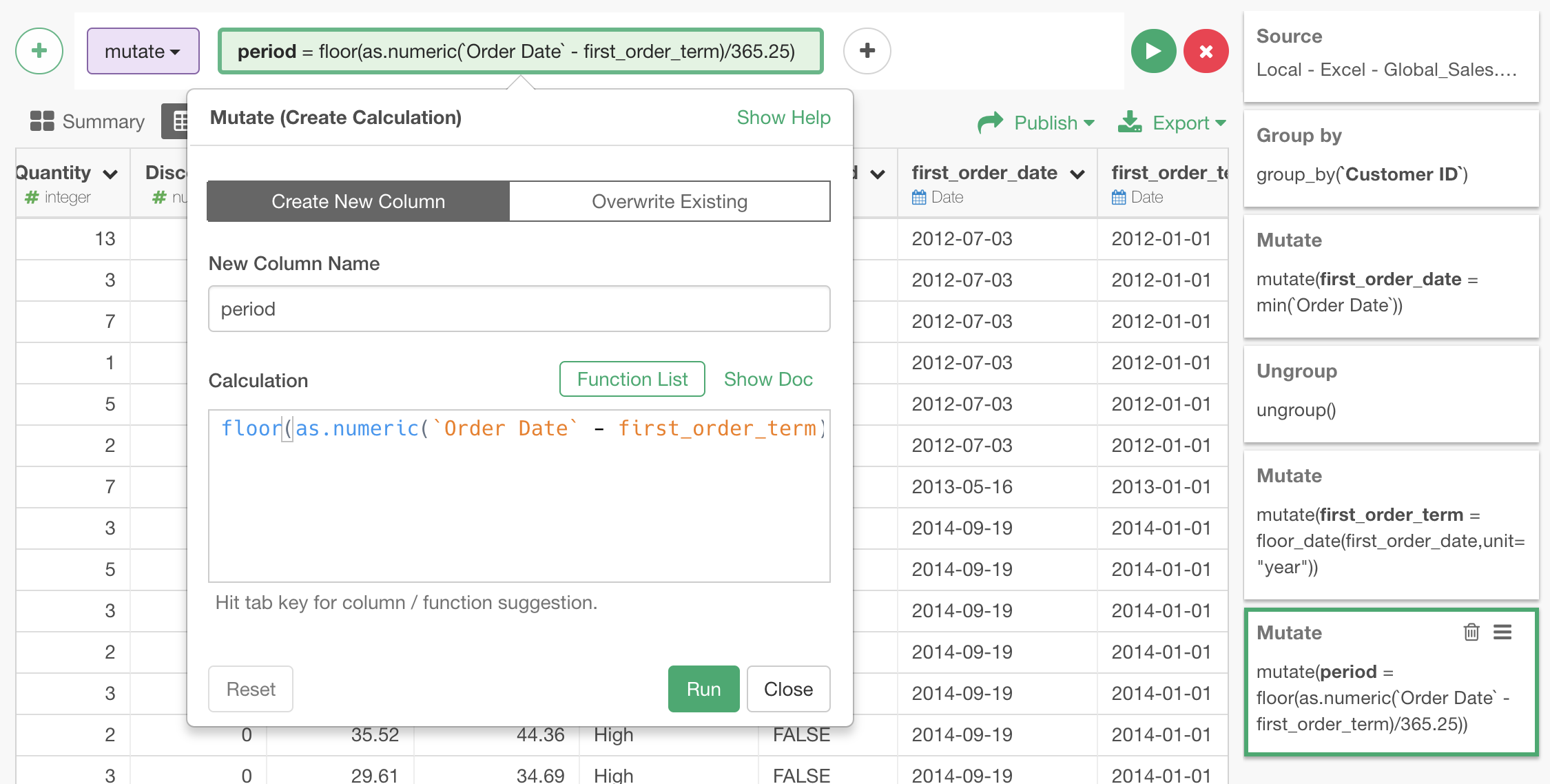
Now, we have prepared all the data necessary for the Pivot Table and the Layer Cake Graph.
Use Pivot Table for Cohort Analysis
With the cohort (first_order_term column) on the rows and period on the columns, we can get this Pivot Table we wanted.
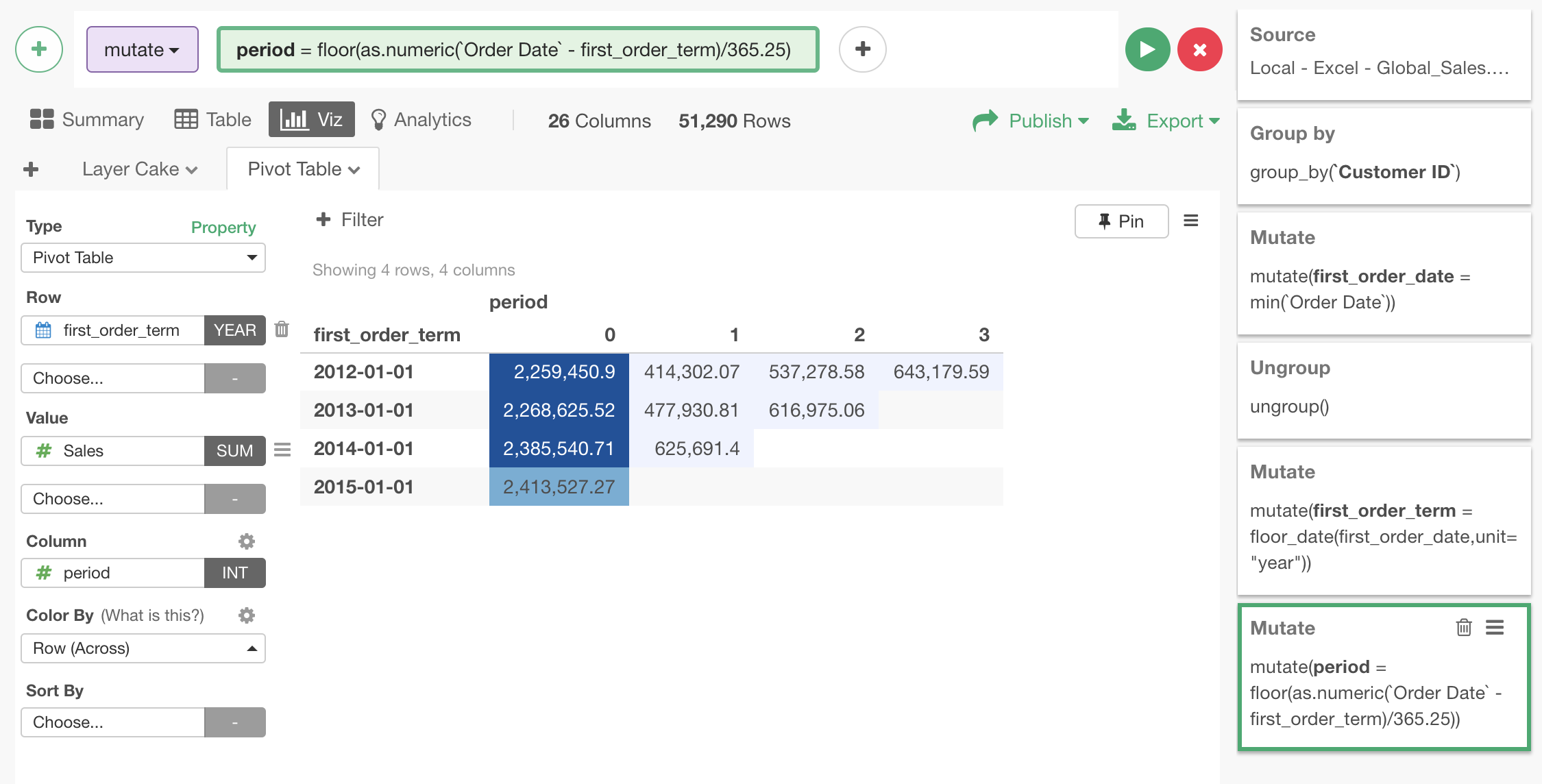
Here is interactive version of the same Pivot Table.
User Area Chart (Layer Cake Graph) for Cohort Analysis
If we set up an Area chart to show how much sales are coming from each cohort, which is expressed by different colors, at given time, we get the following Layer Cake Graph.
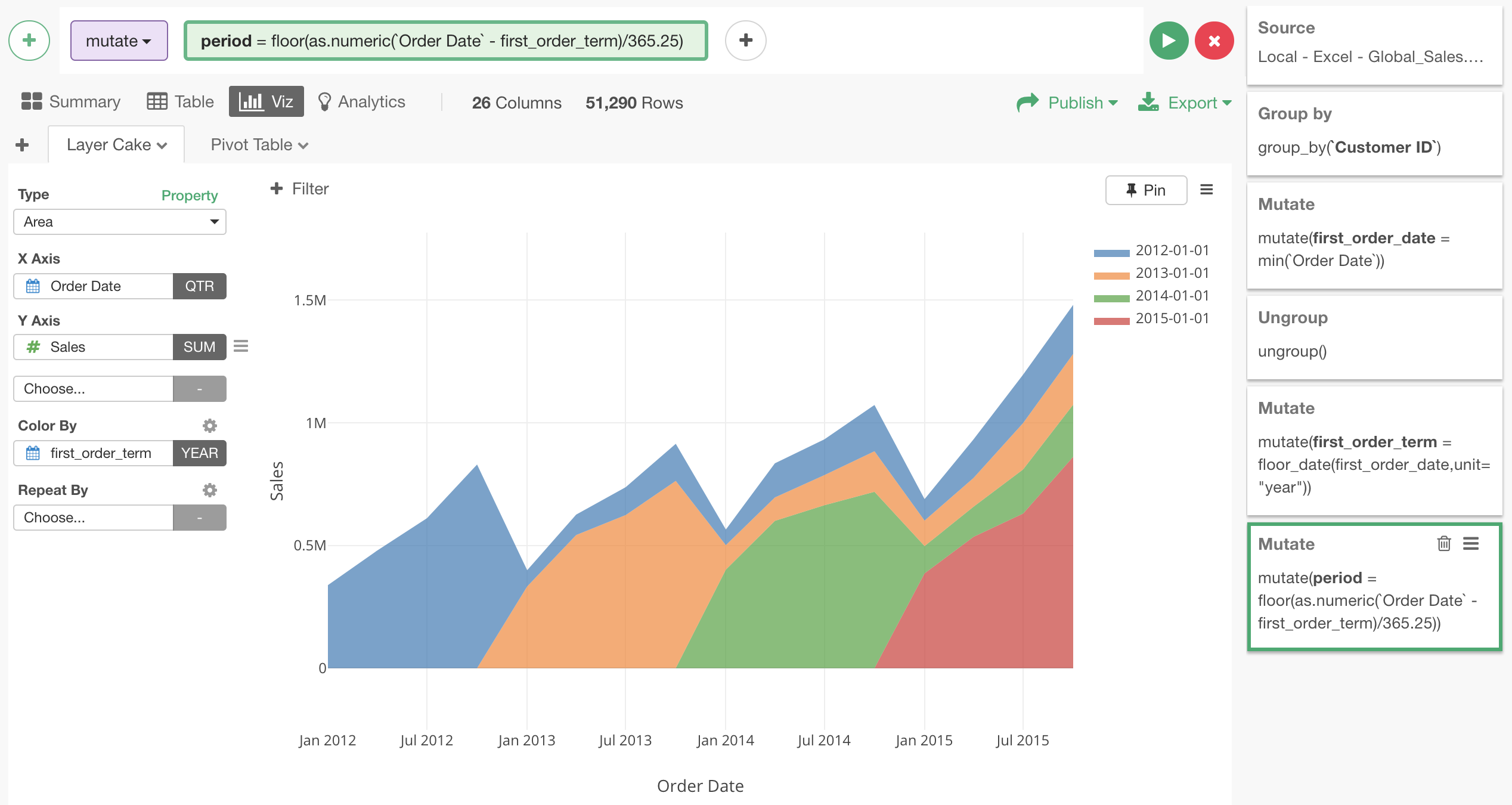
Change the order of the layers by using Factor
One problem with the above Layer Cake Graph is the order of the color. In Layer Cake Graph, we want to see how the new customers are accumulated above older customers, but this is the other way around with the new customers put beneath old ones. The order of the color in chart can be controlled by making the cohort a factor, and reversing its order.
This can be done with a mutate step that looks like the following.
Create new cohort column by turning first_order_term into factor.
factor(first_order_term)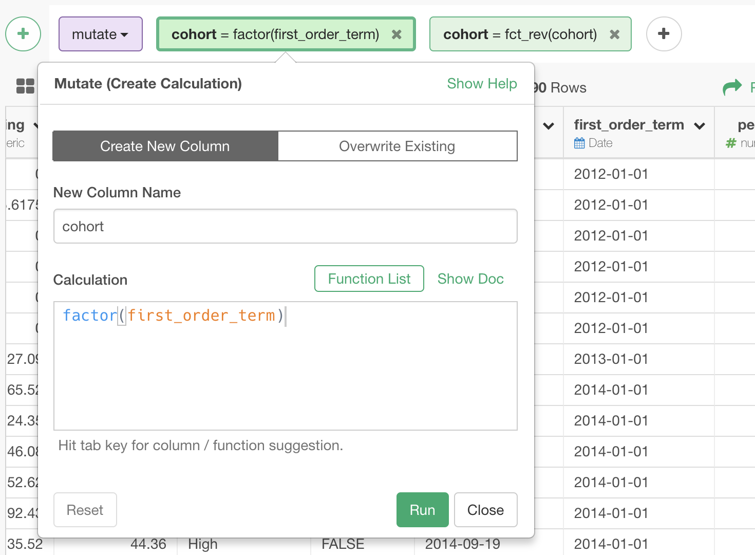
Revert the order of the cohort column created above.
fct_rev(cohort)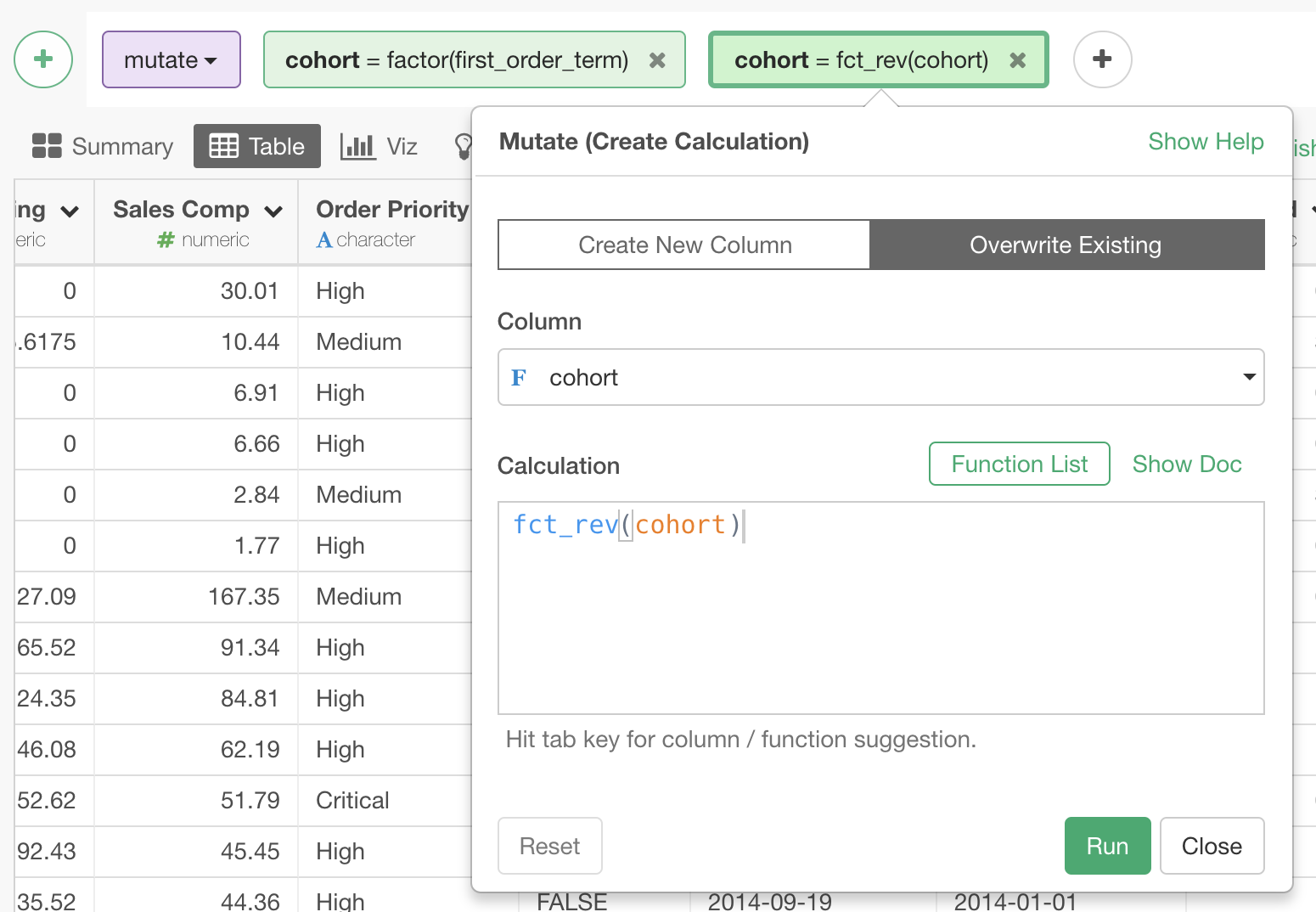
Now, we get this Layer Cake Graph.
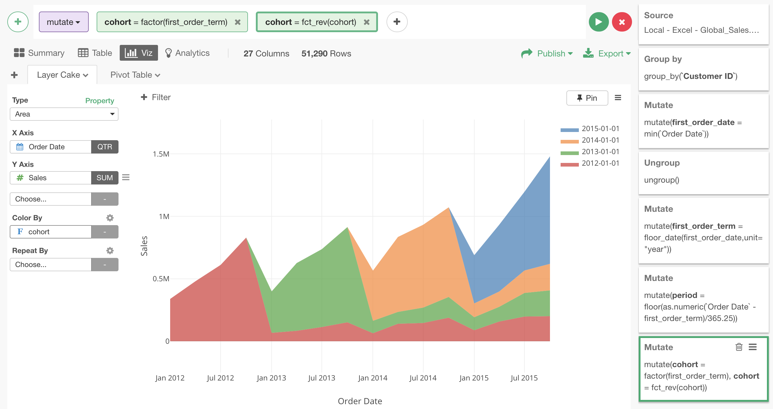
Here is interactive version of the same Layer Cake Graph.
Try it for yourself
You can reproduce this data analysis steps for yourself by downloading EDF file of this Note from right-hand side top of this post.
After downloading it, if you import the EDF file in your Exploratory Desktop, you can reproduce the data analysis steps I explained in this note, and the resulting interactive charts, and this Note itself!