- Data Wrangling Part 2 - How to Structure Data
- Data Structure - Wide Format and Long Format
- Importing Data
- Two Methods for Data Processing: “AI Prompt” and “UI Menu”
- Processing Data with AI Prompt
- Processing Data with AI Prompt
- 1. Converting Wide Format Data to Long Format
- 2. Converting Long Format Data to Wide Format
- Processing Data with UI
- 1. Converting Wide Format Data to Long Format
- 2. Converting Long Format Data to Wide Format
- Data Wrangling - Trial Tour

Data Wrangling Part 2 - How to Structure Data
This note is the second installment of the “Data Wrangling” trial tour, “Data Structure” edition, designed to help you efficiently experience Exploratory’s data wrangling (processing and formatting) functions through hands-on practice.
There are two ways to structure data: “Wide” format where data expands horizontally as it grows, and “Long” format where data extends vertically. Each structure has its own advantages.
In this part, we hope you’ll experience how to freely convert between wide and long format data.
The estimated time required is about 20 minutes.
Let’s get started!
Data Structure - Wide Format and Long Format
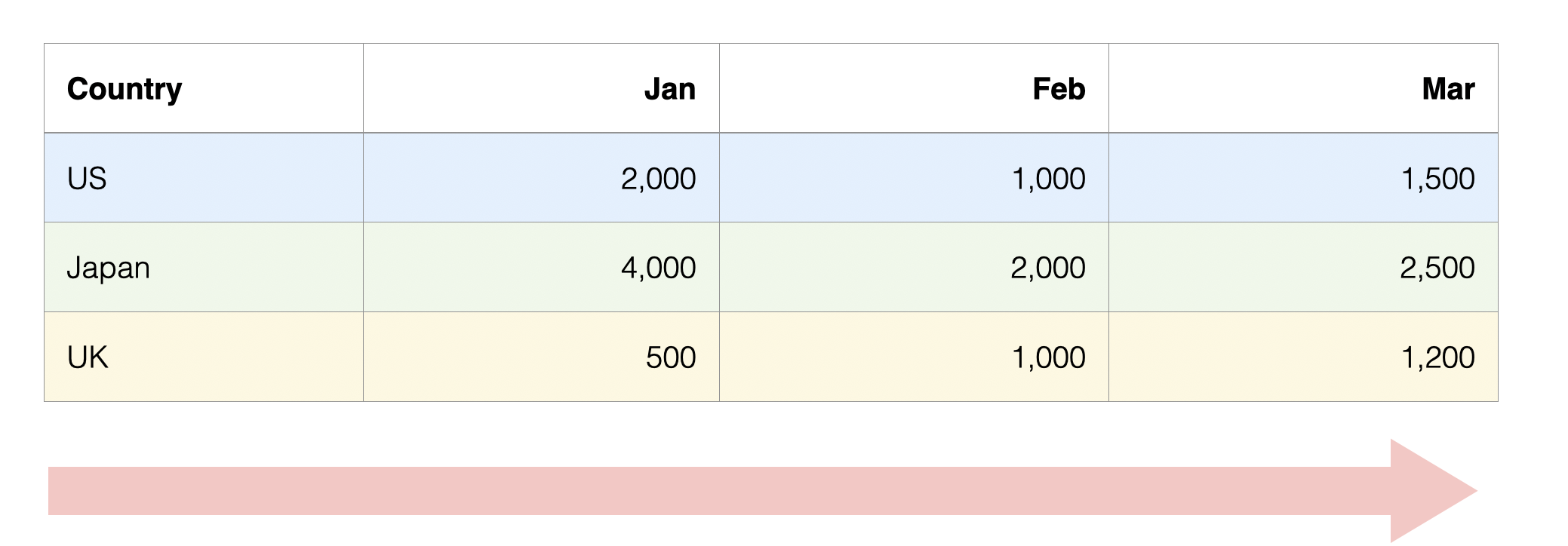
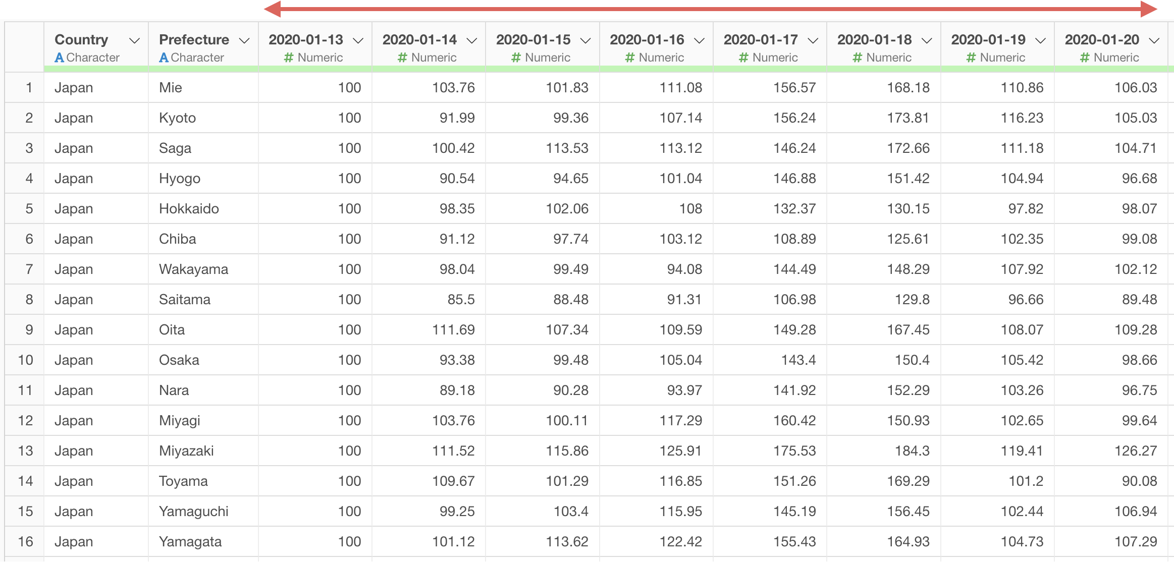
For example, let’s say we have the following data. In this data, there are columns for each month.
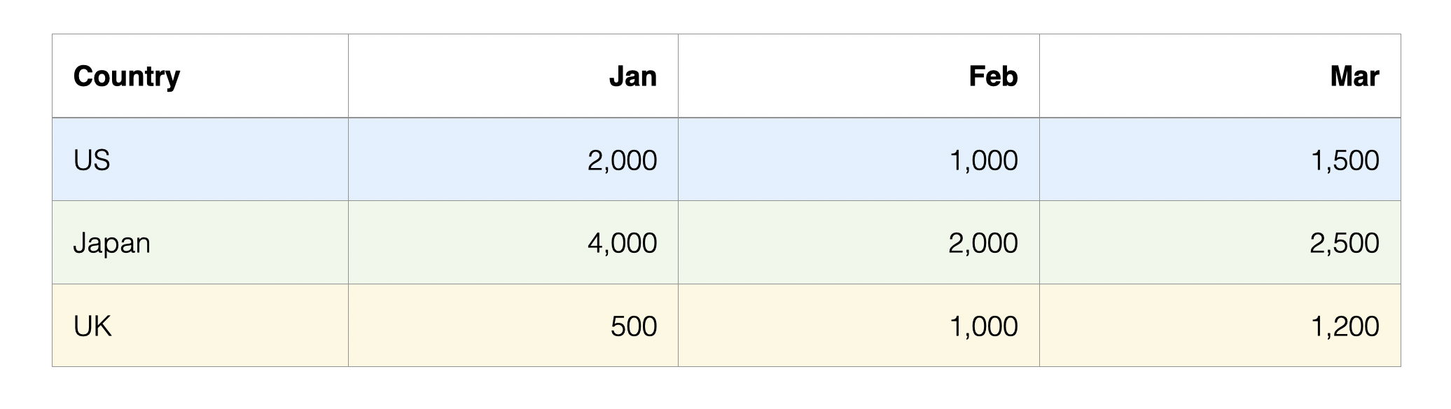
This type of data format is called “Wide format” because as data increases, it extends horizontally (columns increase).
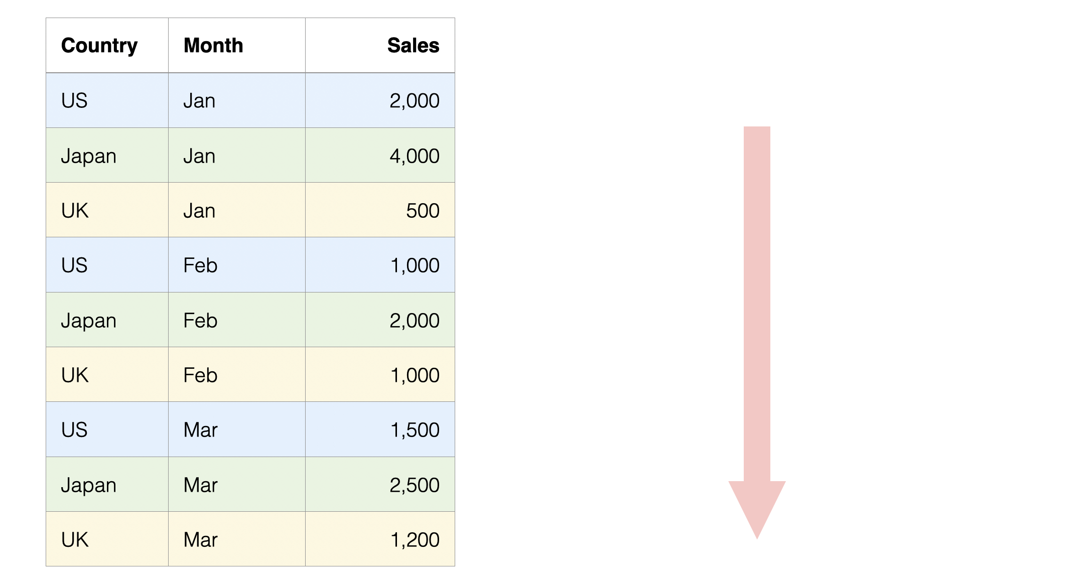
 On the other hand, here is data where rows are separated by month and
country.
On the other hand, here is data where rows are separated by month and
country.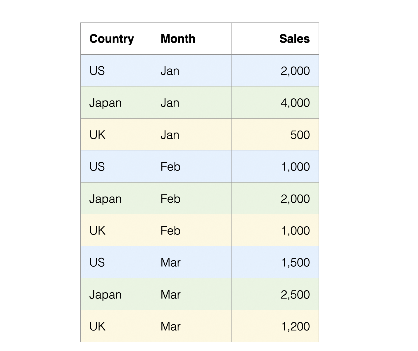
This type of data format is called “Long format” because as data increases, it extends vertically (rows increase).
Generally, wide format data where each row represents an observation target (customer, employee, product, etc.) is suitable for analysis using analytics, while long format data where categories and values are organized in separate columns is suitable for aggregation and visualization.
When analyzing data, you need to convert the data structure according to the desired output.
Importing Data
For this tutorial, we’ll use “Apple Mobility Trends” data for the long format conversion part, and “Customer Satisfaction Survey” data for the wide format conversion part.
You can download each dataset from the following pages:
For information on how to import data, please refer to this link.
From here, we’ll use the imported data to experience how to convert wide format data to long format and long format data to wide format.
Processing Data with AI Prompt
In this section, you’ll experience AI Prompt, but if you want to know more details about AI Prompt, please refer to this link.
Let’s start processing data using AI Prompt.
Processing Data with AI Prompt
1. Converting Wide Format Data to Long Format
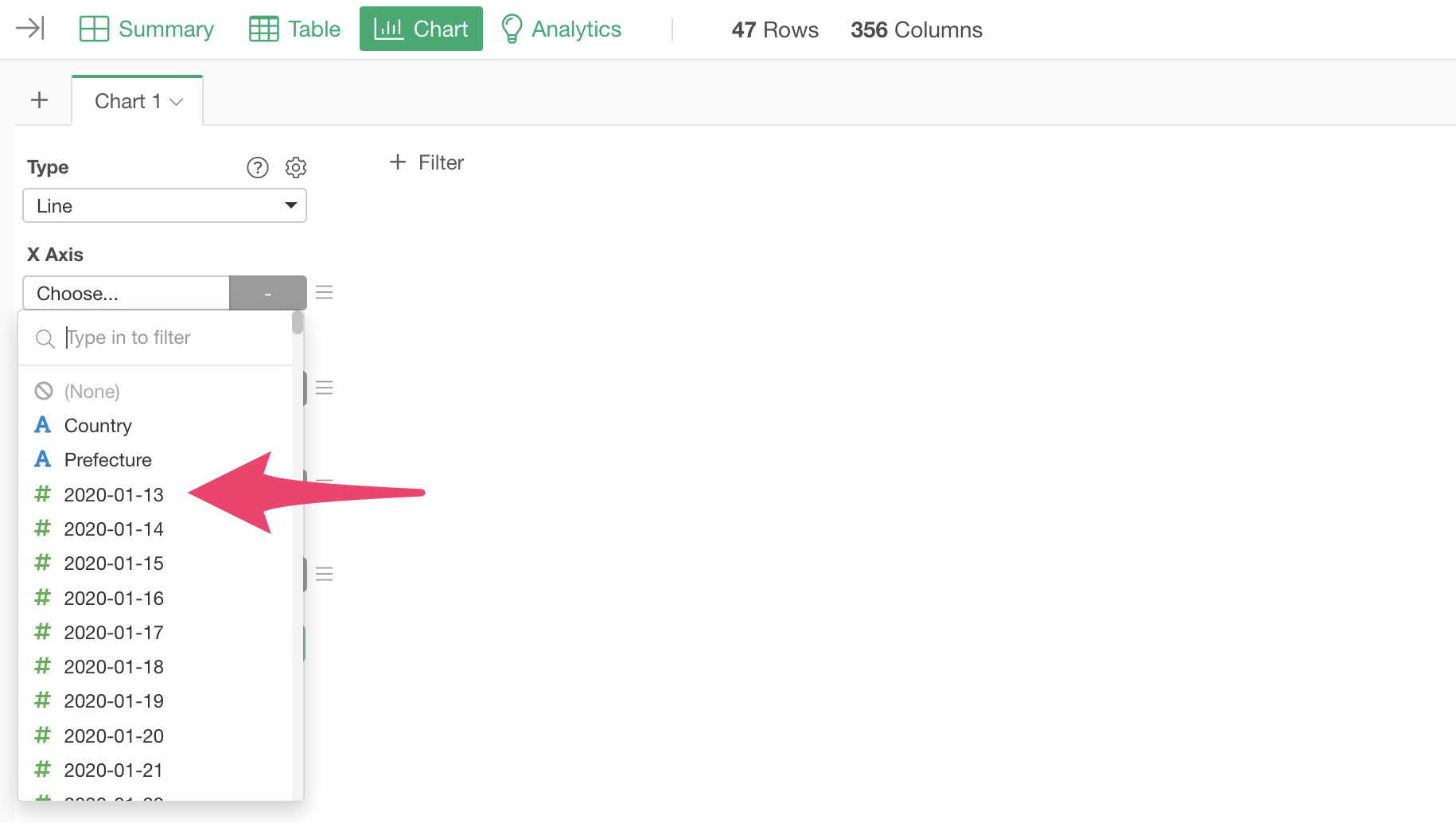
Looking at the “Apple Mobility Trends Data,” we can see it’s in wide format with many columns as the mobility trend data is organized by day, making it difficult to visualize.
For example, we want to visualize mobility trends with date on the X-axis.
However, since each day is a column, we can’t select “date” for the X-axis, making it impossible to visualize time series trends.

If the data were in long format with columns for date and mobility change:

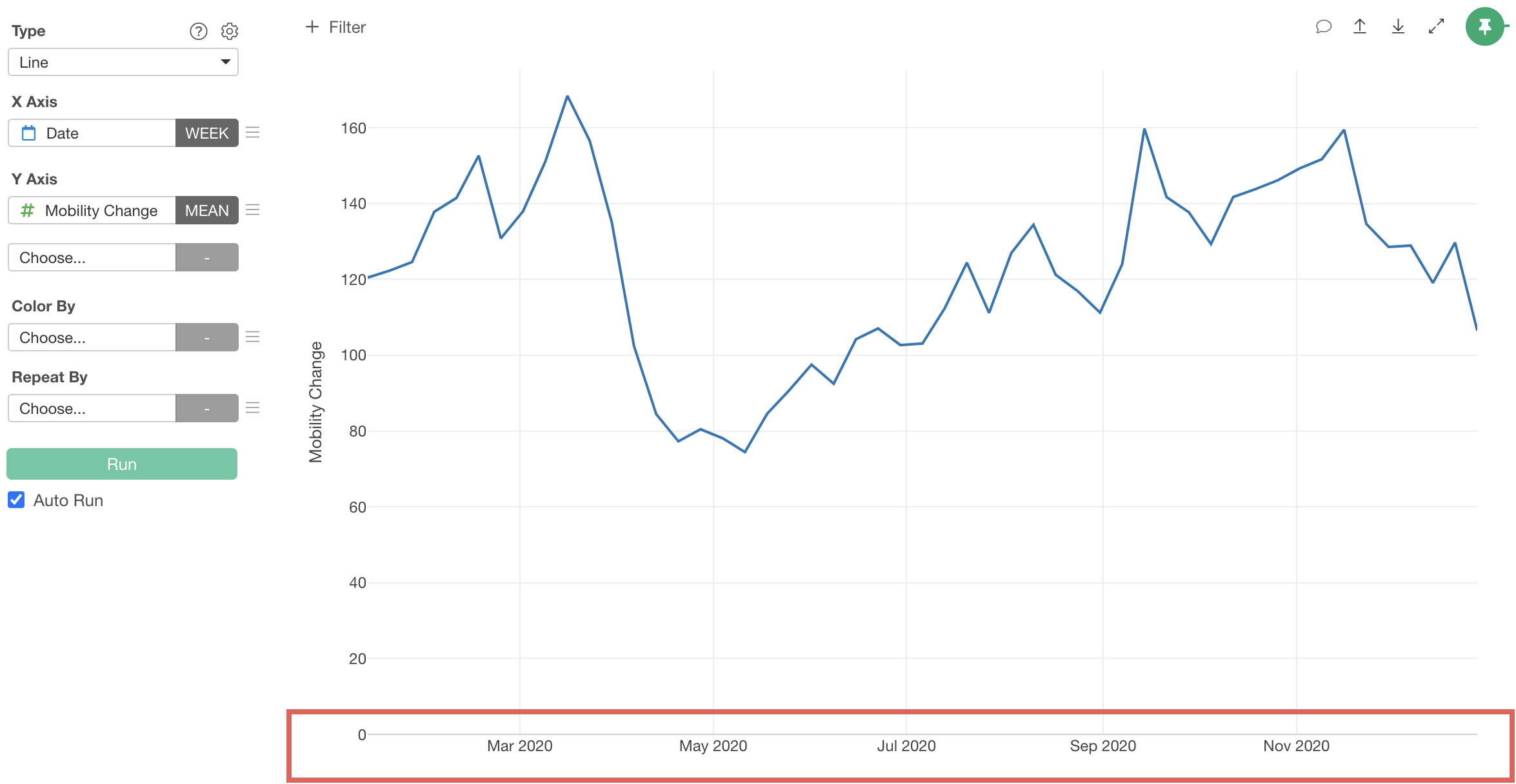
We could visualize time series trends as a line chart by assigning “date” to the X-axis and “mobility trend” to the Y-axis.
Therefore, let’s convert the data from wide format to long format.
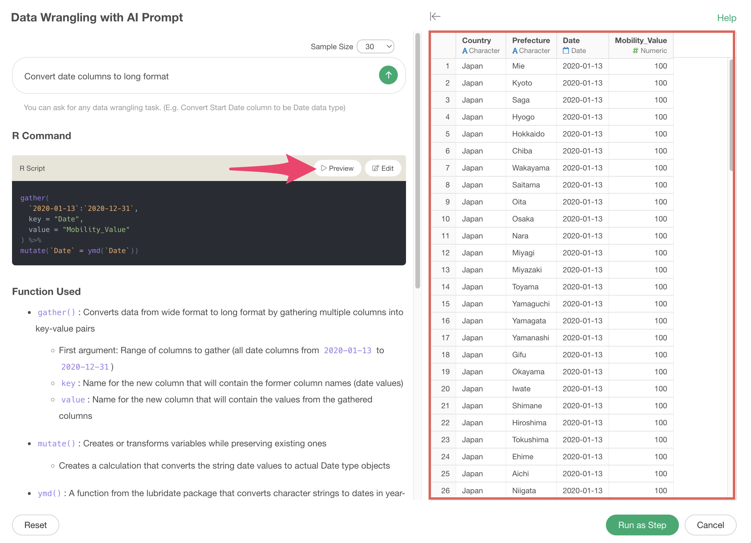
Click the “AI Wrangling” button, and when the AI prompt dialog appears, enter the following text and execute:
Convert date columns to long format
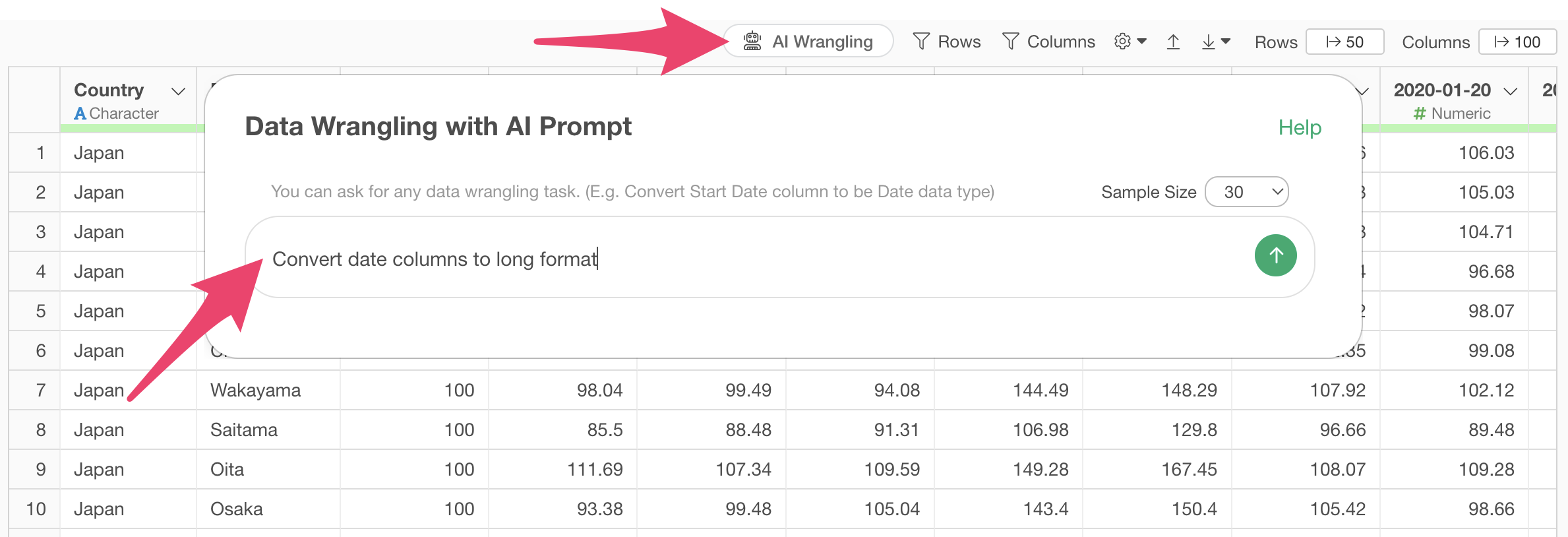
This will generate code to convert date columns to long format.
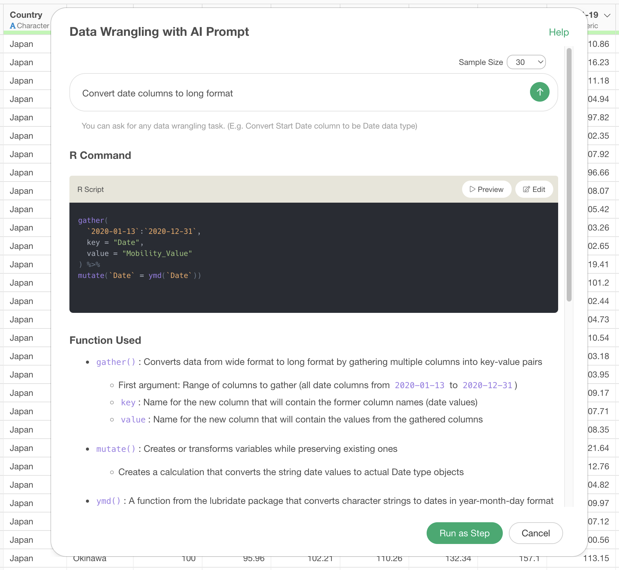
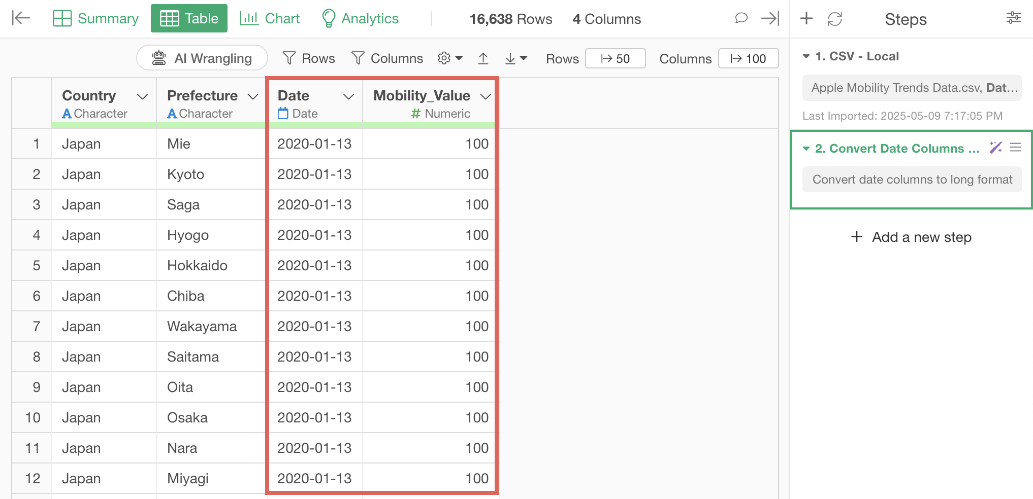
After clicking the preview button to check the results of the AI prompt execution, click the “Run as Step” button.
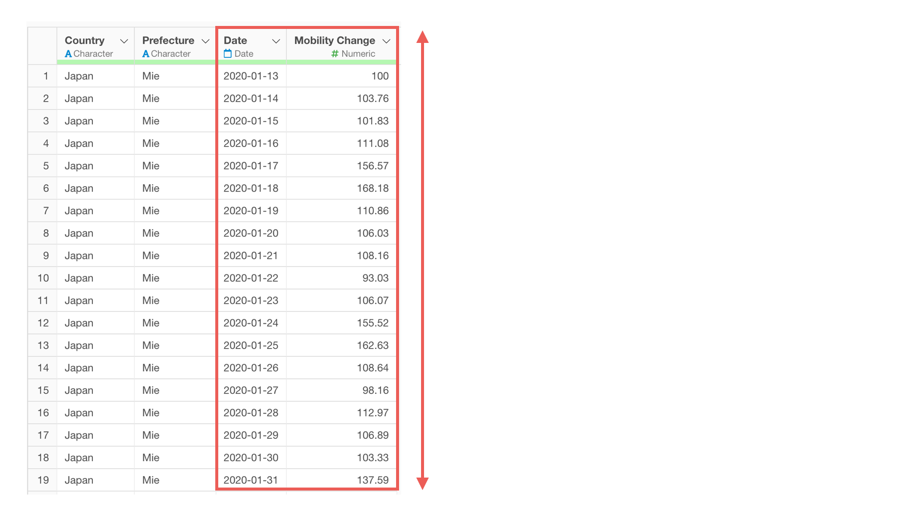
We’ve successfully converted from wide format to long format.
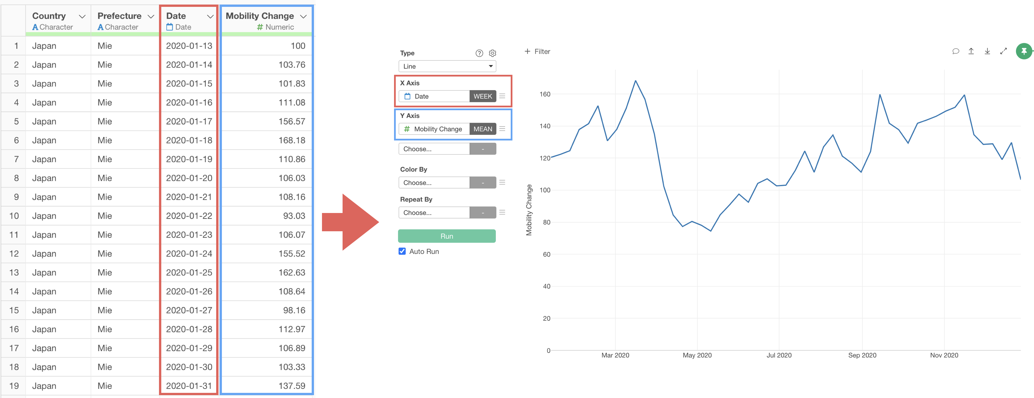
If you want to visualize mobility trend changes as a line chart, go to the Chart view and link the chart pin to Step 2.
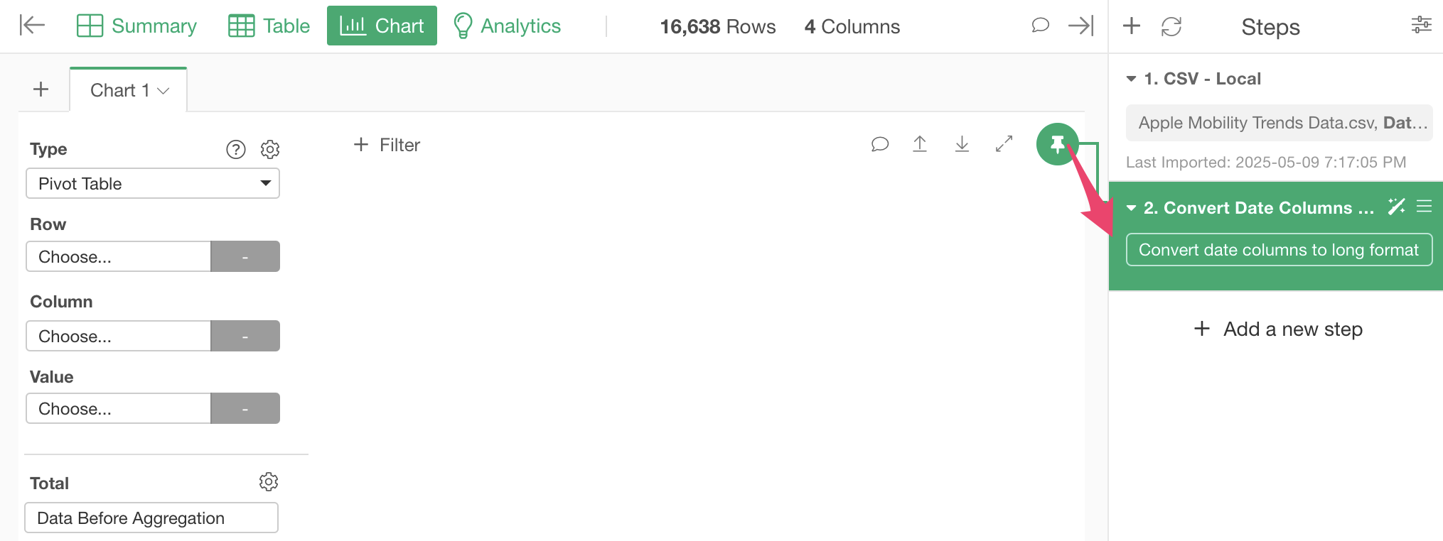
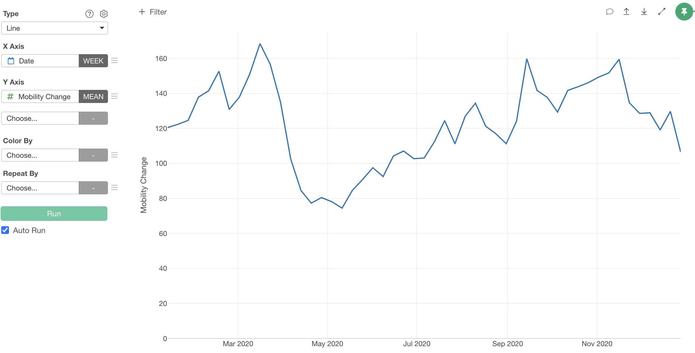
Configure the chart with the following settings:
- Select “Line” as the chart type.
- Select “Date” for the X-axis and “rounded week” as the date unit.
- Select “Mobility Valude” for the Y-axis and “mean” as the aggregation function.

This allows us to visualize mobility trend changes as a line chart.
2. Converting Long Format Data to Wide Format
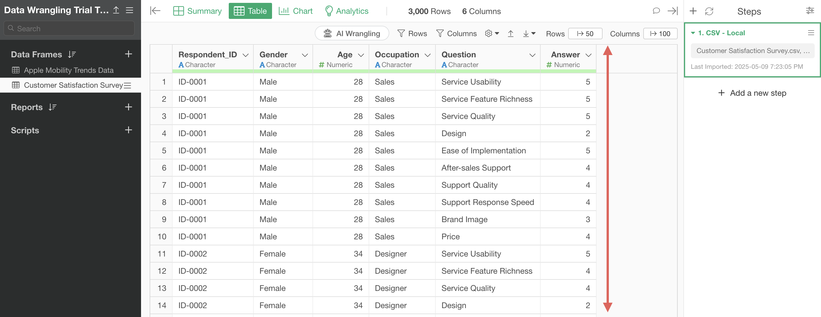
Next, we’ll use the “Customer Satisfaction Survey Data,” which is in long format with rows for each respondent and survey question.

As we’ve seen, long format data makes it easy to visualize average responses by question.
However, to visualize relationships between questions or analyze them, we need separate columns for each question.

Therefore, let’s convert the data from long format to wide format.
Click the “AI Wrangling” button, and when the AI prompt dialog appears, enter the following text and execute:
Convert Question and Answer columns to wide format
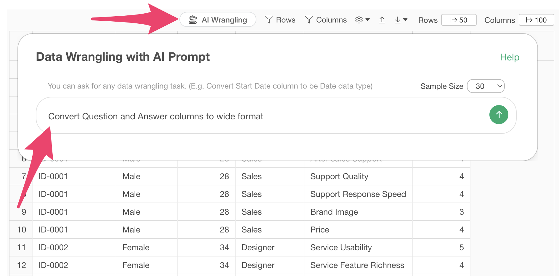
This will generate code to convert question and answer columns to wide format.
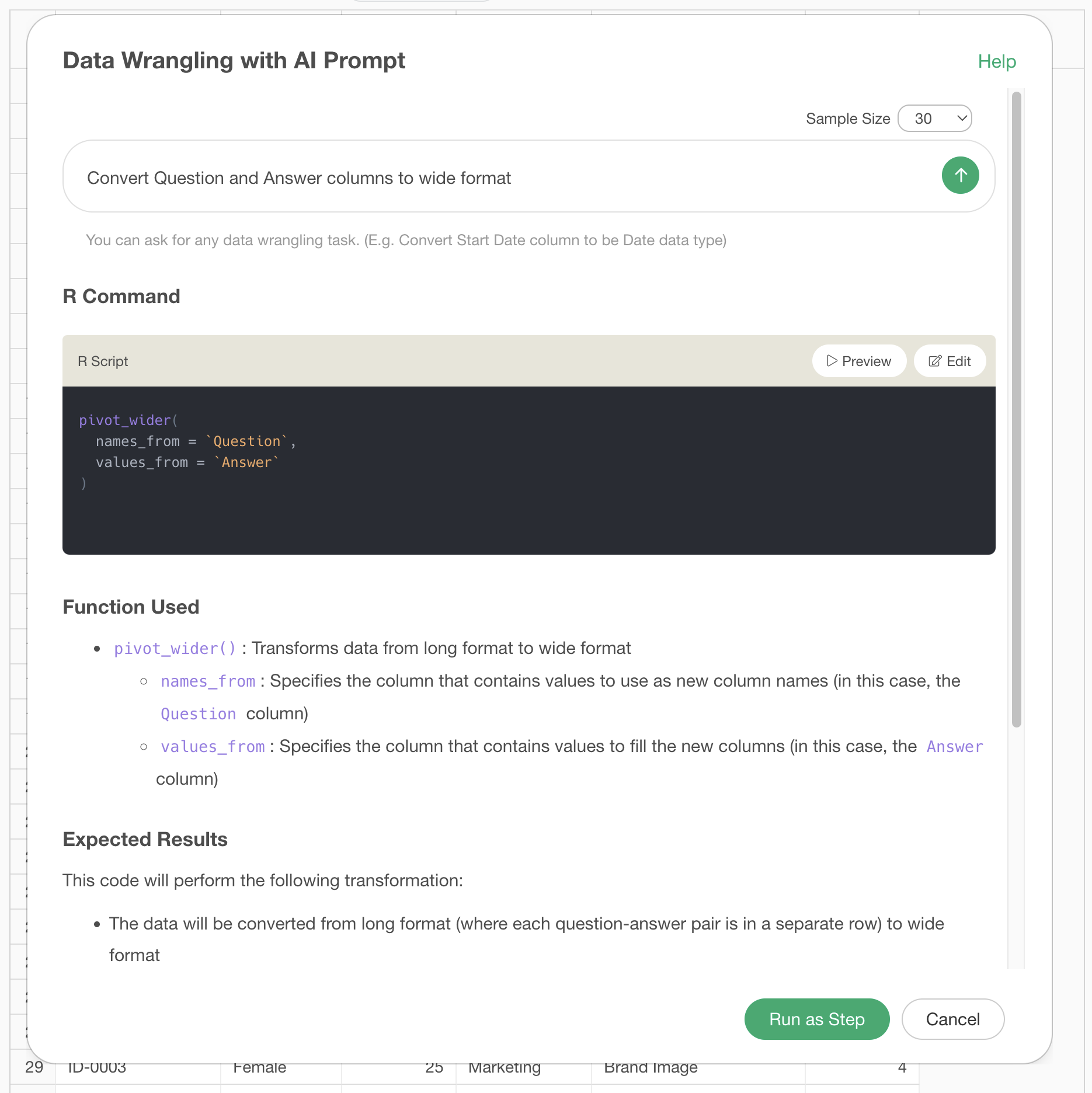 Clicking the preview button allows you to check the results of the AI
prompt execution.
Clicking the preview button allows you to check the results of the AI
prompt execution.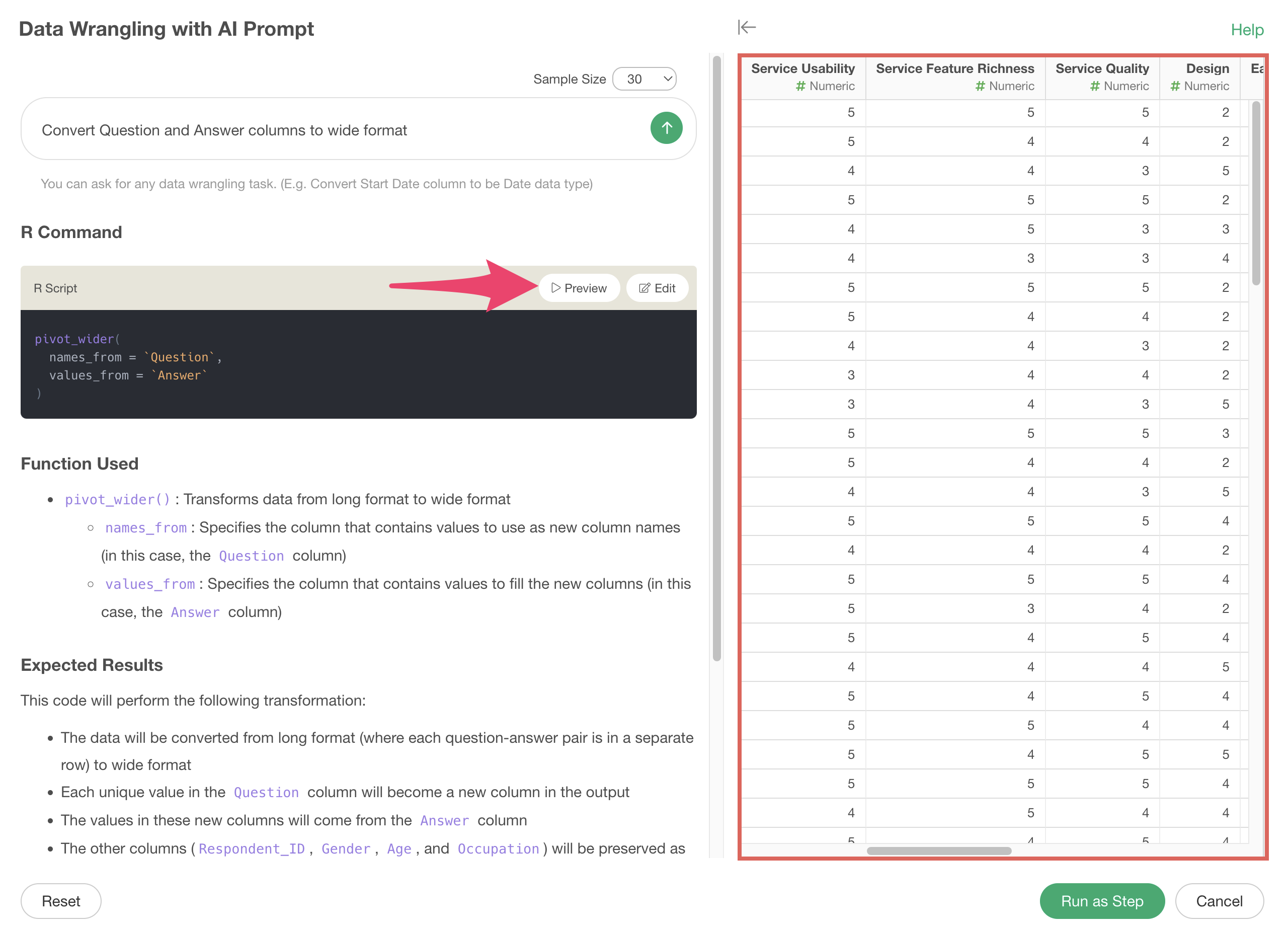
After confirming the data has been converted to long format, click the “Run as Step” button.
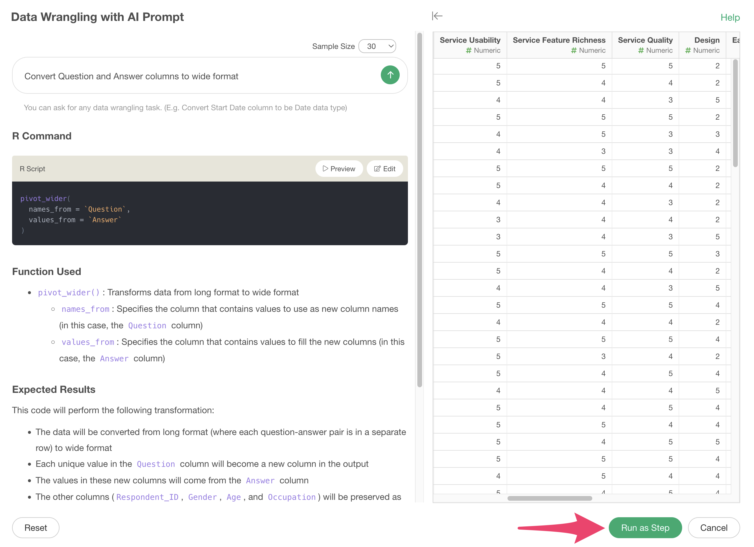
A step is added, and we’ve successfully converted from long format to wide format.
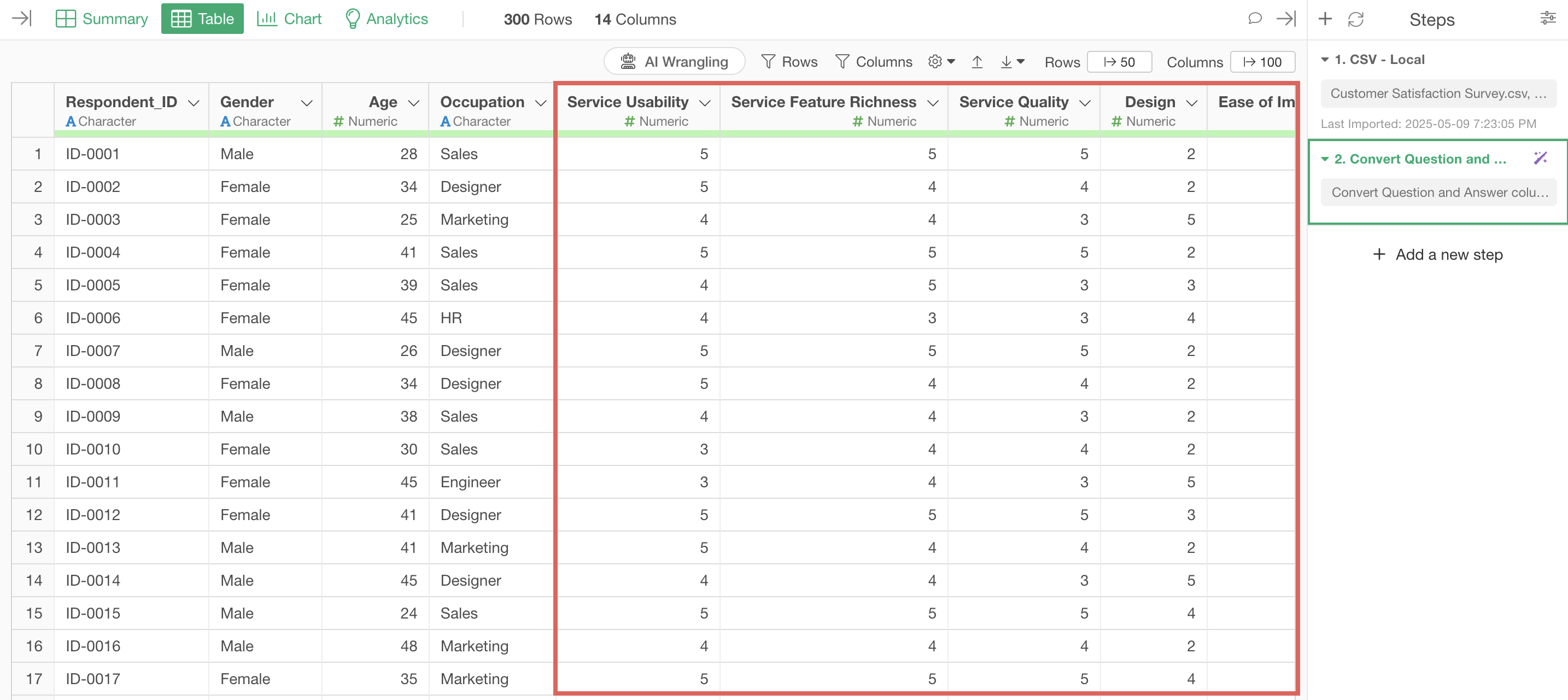
This gives us data with columns for each survey question, making it easier to analyze and visualize relationships between questions.
Processing Data with UI
1. Converting Wide Format Data to Long Format
Looking at the “Apple Mobility Trends Data,” we can see it’s in wide format with many columns as the mobility trend data is organized by day, making it difficult to visualize.

For example, we want to visualize mobility trends with date on the X-axis.

However, since each day is a column, we can’t select “date” for the X-axis, making it impossible to visualize time series trends.
If the data were in long format with columns for date and mobility change:
We could visualize time series trends as a line chart by assigning “date” to the X-axis and “mobility trend” to the Y-axis.
Therefore, let’s convert the data from wide format to long format.
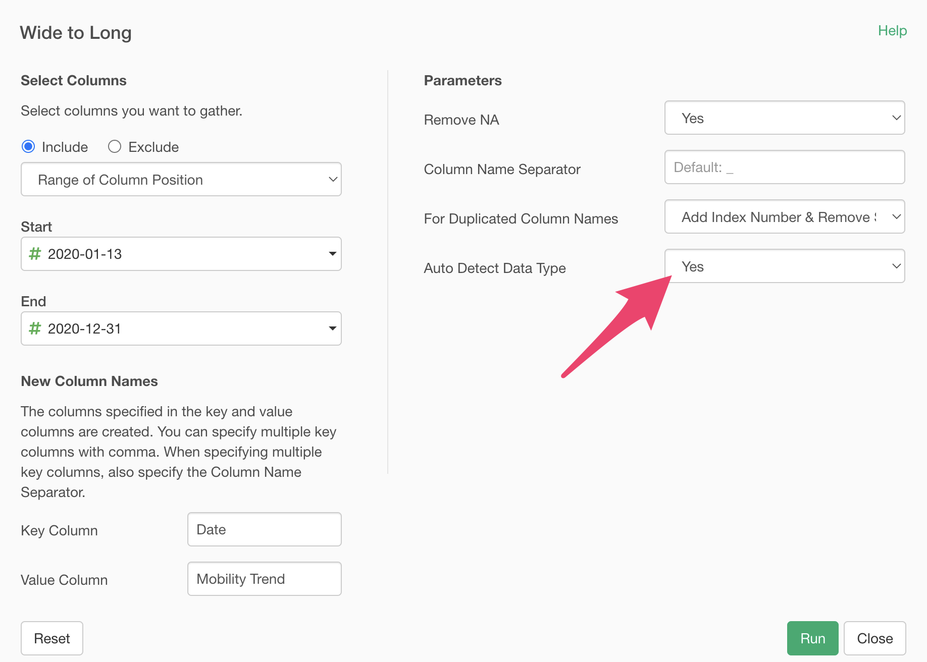
Select multiple mobility trend value columns by day using the shift key, then select “Wide to Long” > “Selected Range.”
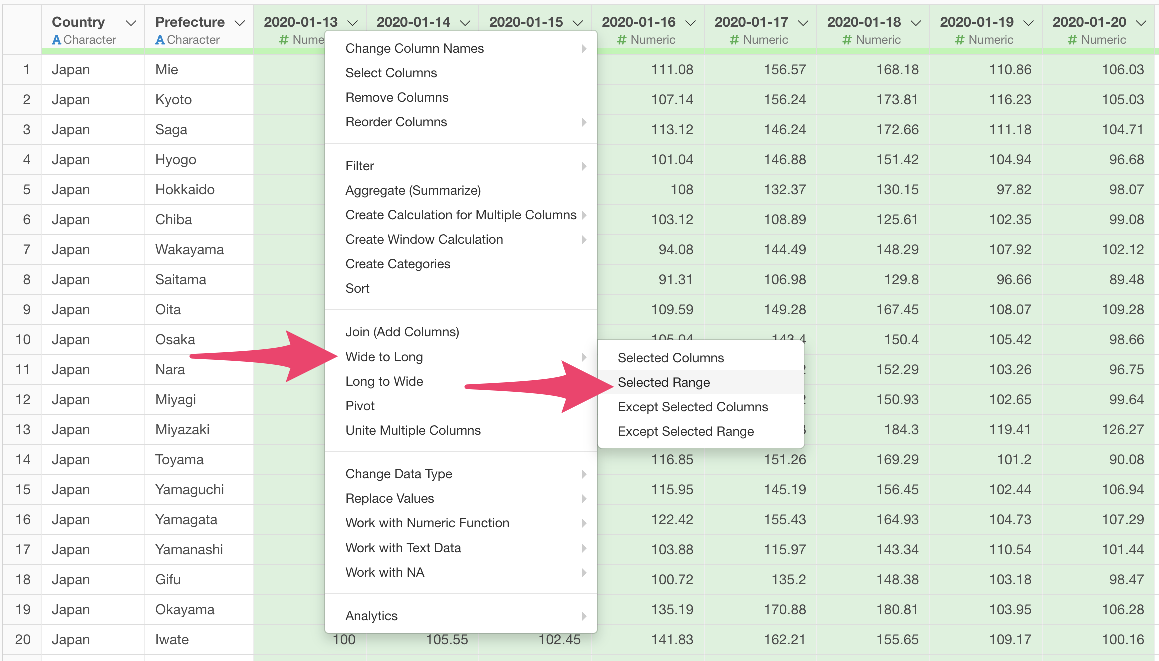
The “Wide to Long” dialog will appear.
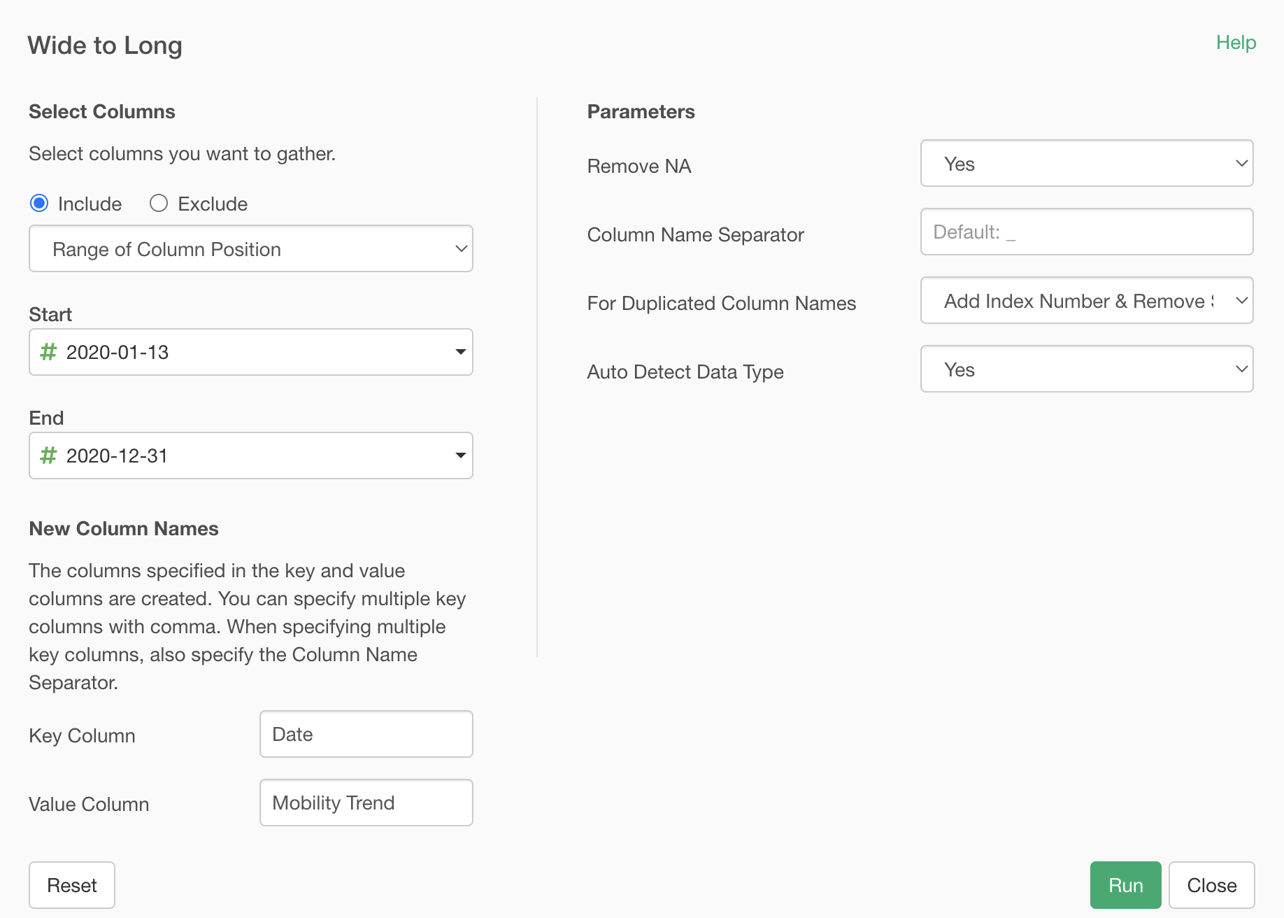
Select the first day for the “Start” column and the last day for the “End” column.
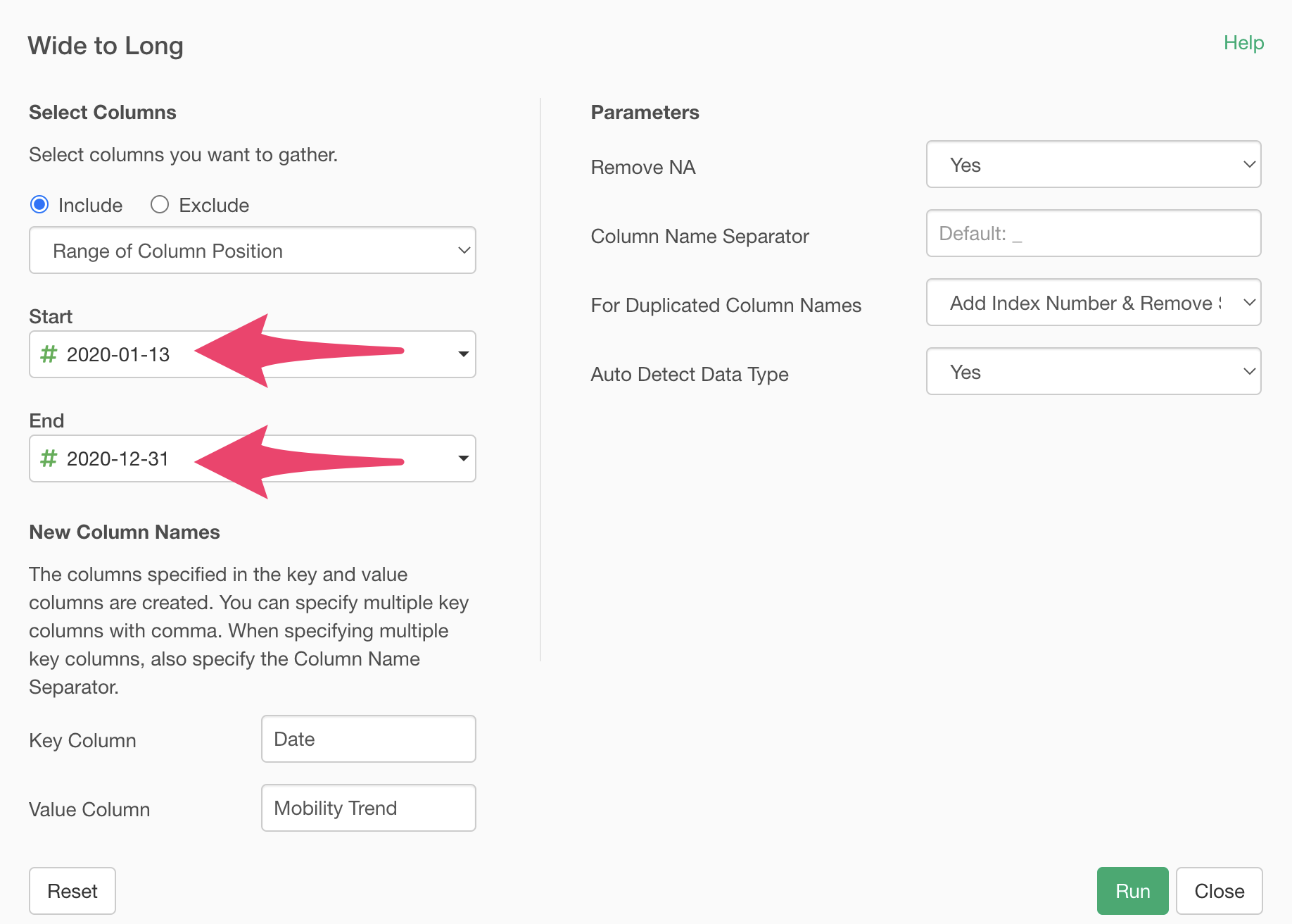
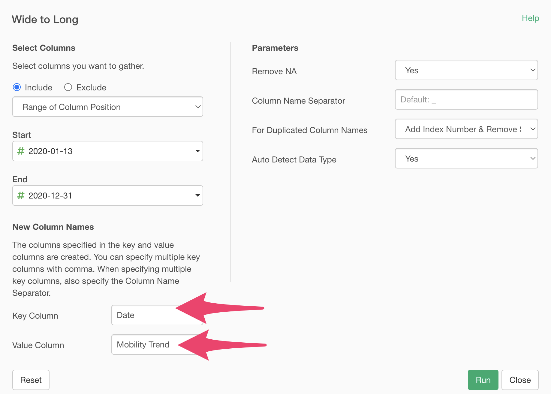
Enter “Date” for the “Key Column” and “Mobility Trend” for the “Value Column” and execute.
Also, the “Auto Detect Data Types” feature is set to “Yes” by default to automatically convert data types according to the key and value columns when converting to long format.
By executing, we’ve successfully converted from wide format to long format.
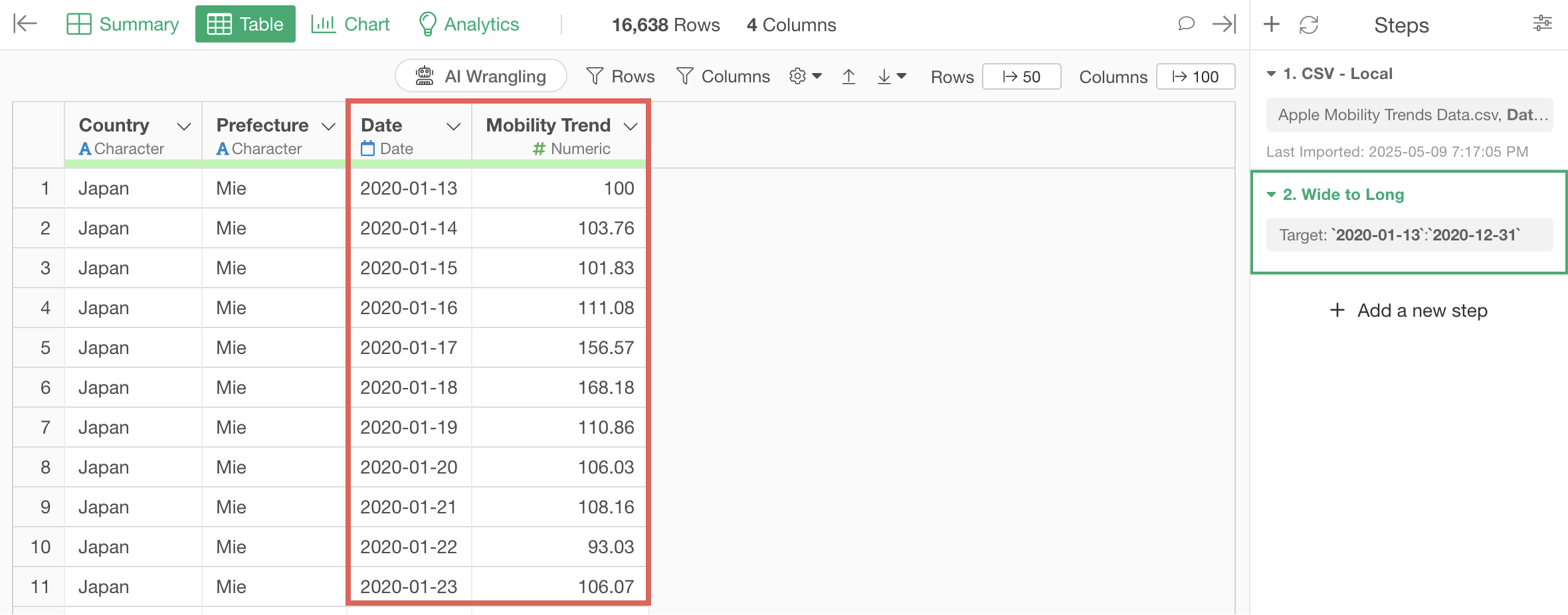
Additionally, the date column has been automatically converted to Date type and the mobility trend column to Numeric type according to their values.
If you want to visualize mobility trend changes as a line chart, go to the Chart view and link the chart pin to Step 2.

Configure the chart with the following settings:
- Select “Line” as the chart type.
- Select “Date” for the X-axis and “rounded week” as the date unit.
- Select “Mobility trend” for the Y-axis and “Mean” as the aggregation function.
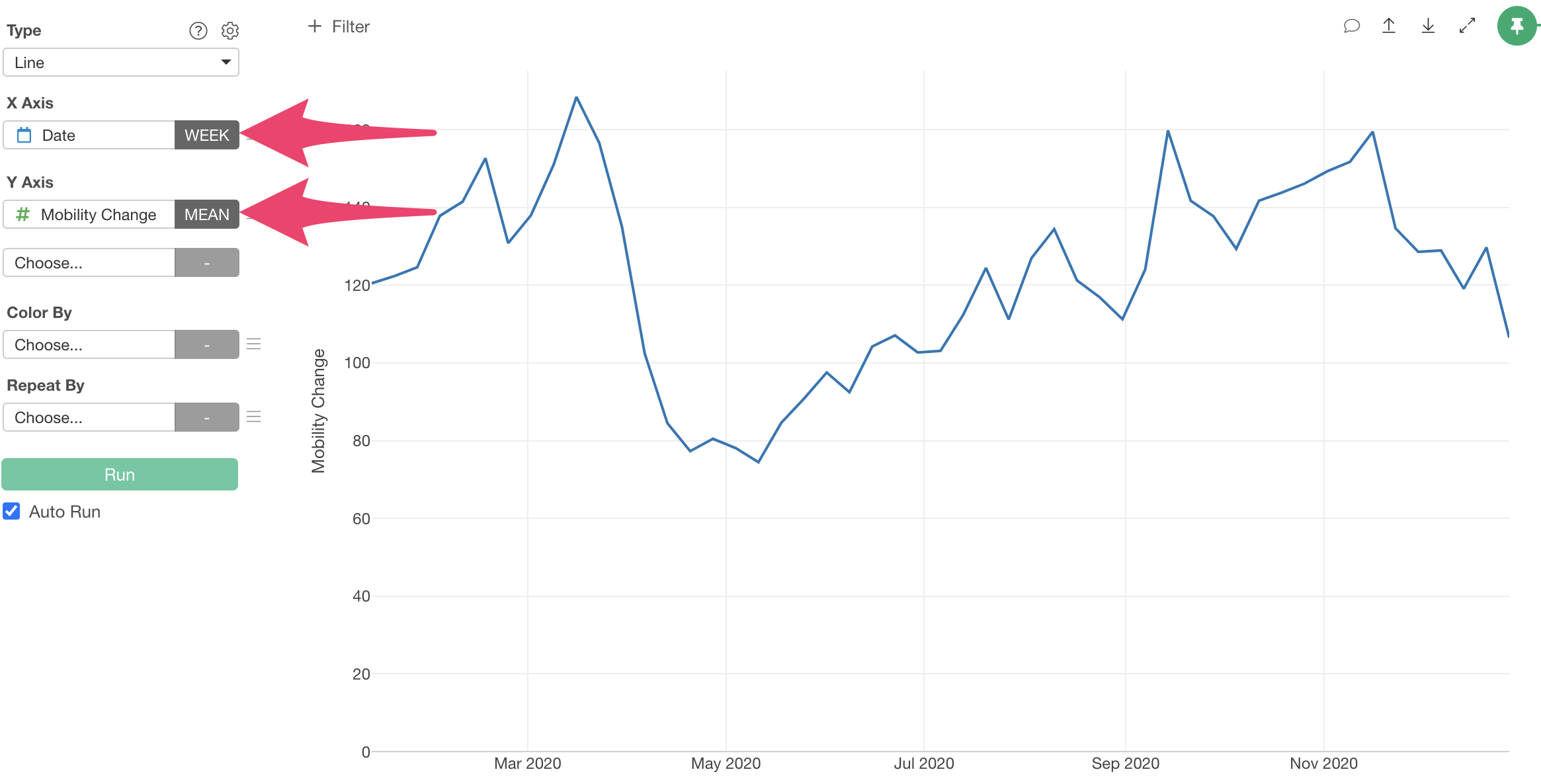
This allows us to visualize mobility trend changes as a line chart.

2. Converting Long Format Data to Wide Format
Next, we’ll use the “Customer Satisfaction Survey Data”. It’s in long format with rows for each respondent and survey question.
As we’ve seen, long format data makes it easy to visualize average responses by question.
However, to visualize relationships between questions or analyze them, we need separate columns for each question.
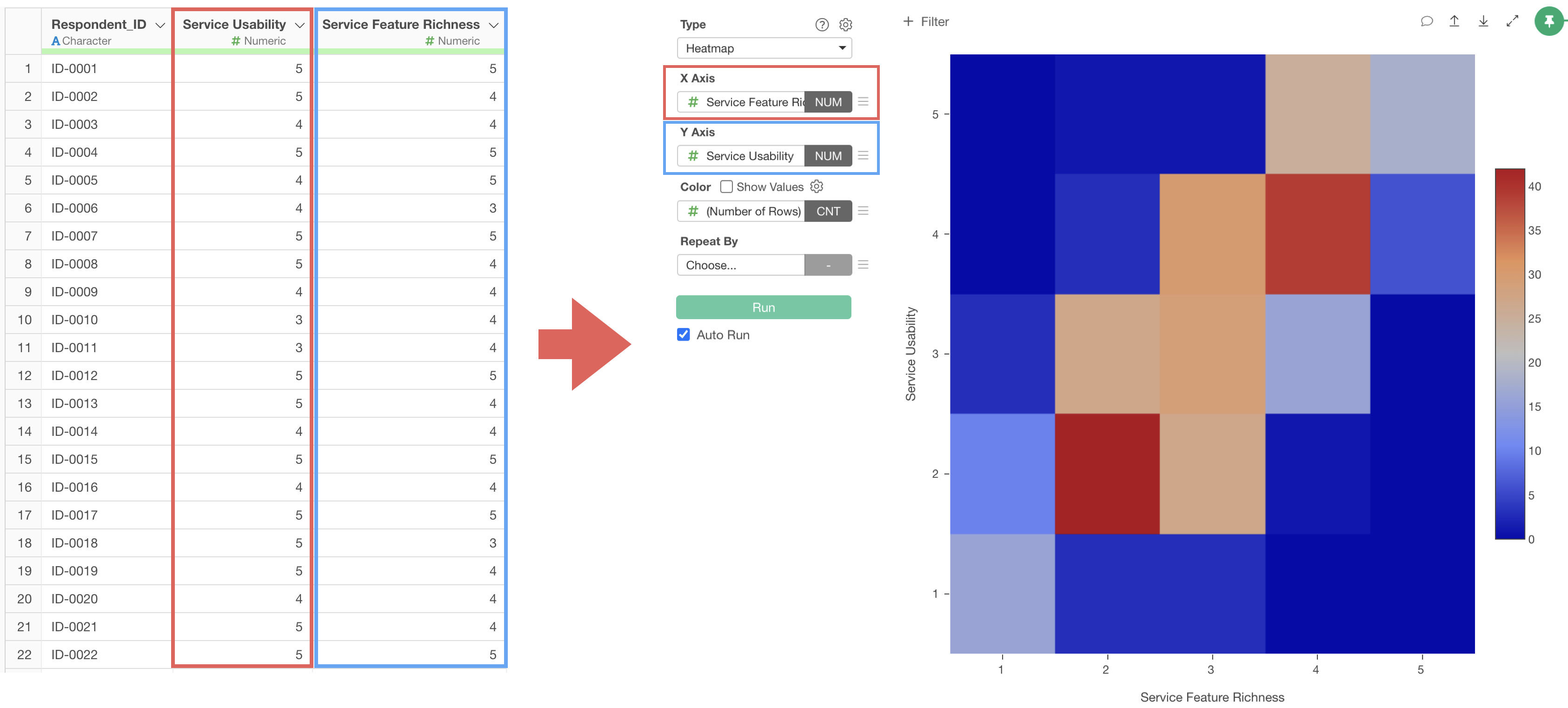
Therefore, let’s convert the data from long format to wide format.
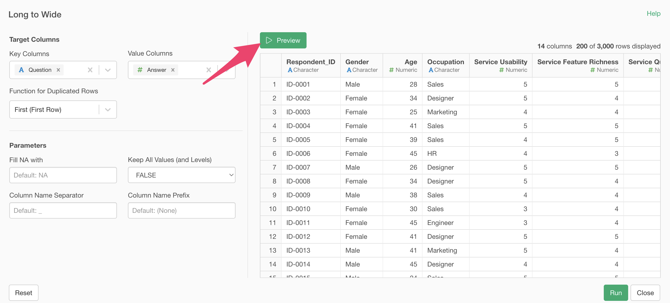
Select multiple question and answer columns using the shift key, then select “Long to Wide.”
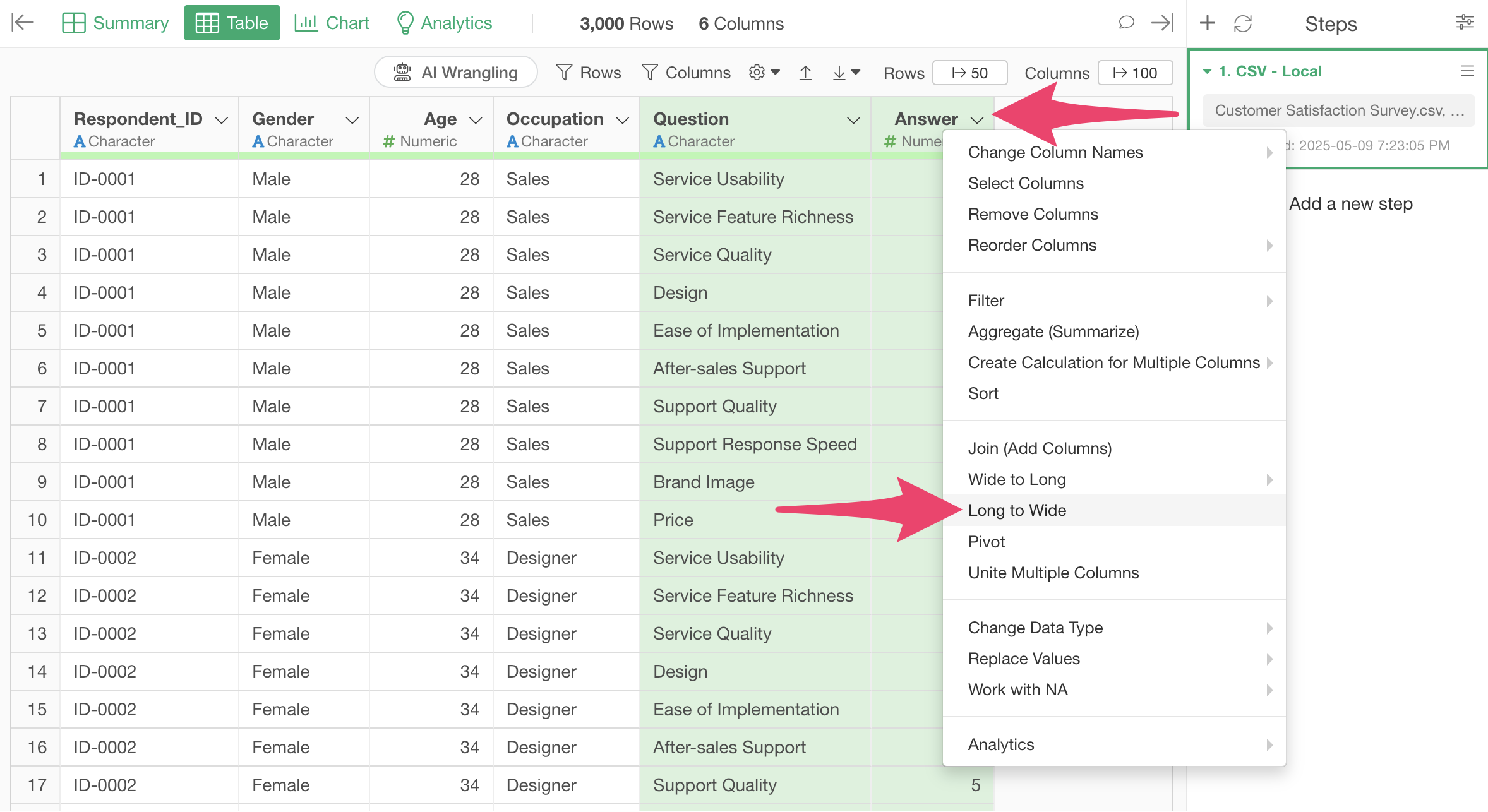
The “Long to Wide” dialog will appear.
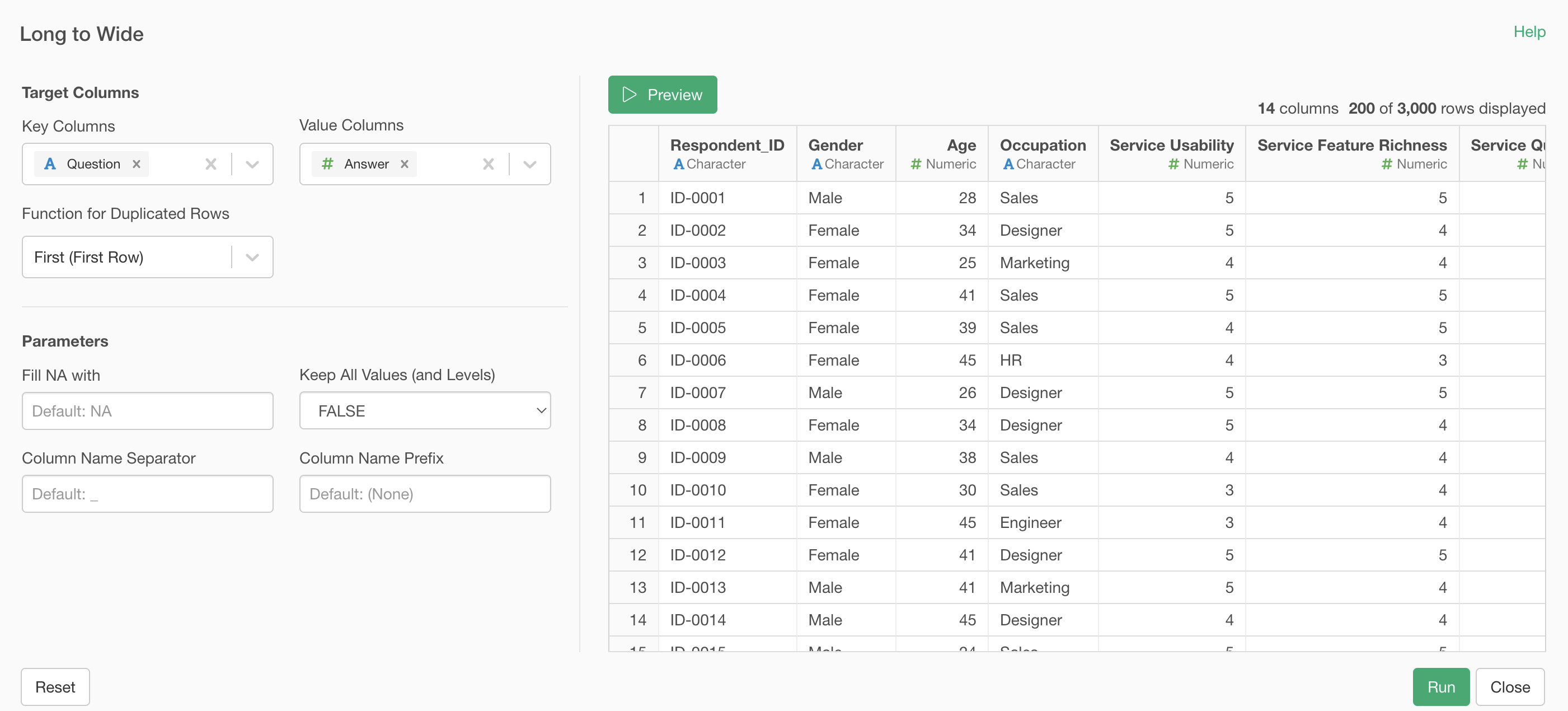
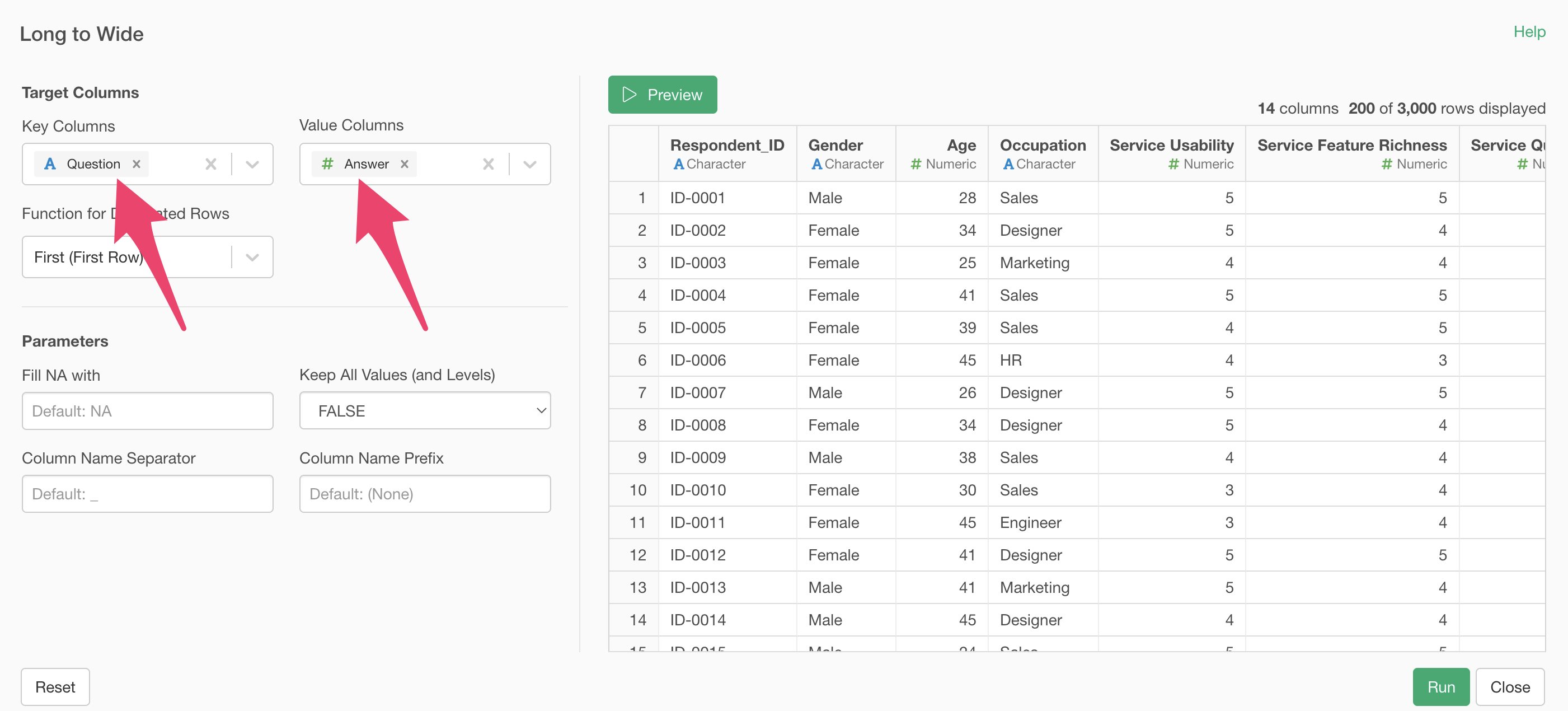
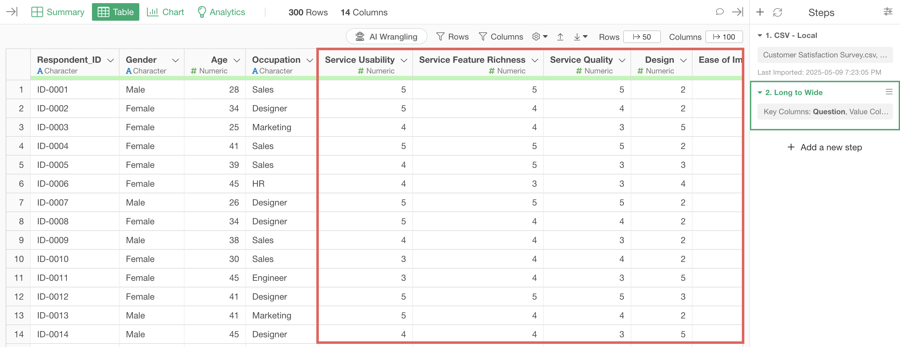
You can see that “question” is selected for the key column and “answer” for the value column.
If there are no issues with the preview results, click the execute button.
We’ve successfully converted from long format to wide format, giving us columns for each survey question.
This concludes the Data Structure edition of the Data Wrangling trial tour!
Data Wrangling - Trial Tour
You can check other parts of the Data Wrangling trial tour from the links below. Please try the next “Data Structure” part as well.