How to Add Your Favorite Color Palette
Exploratory provides a wide variety of default color palettes to represent charts beautifully. However, if you want to create a color palette that matches your company’s corporate colors or colors that align with the meaning of your data, you can use the User Color Palette feature to create your own custom-defined color palettes.
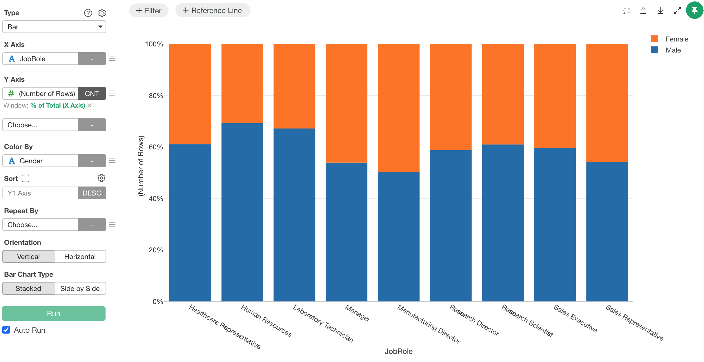
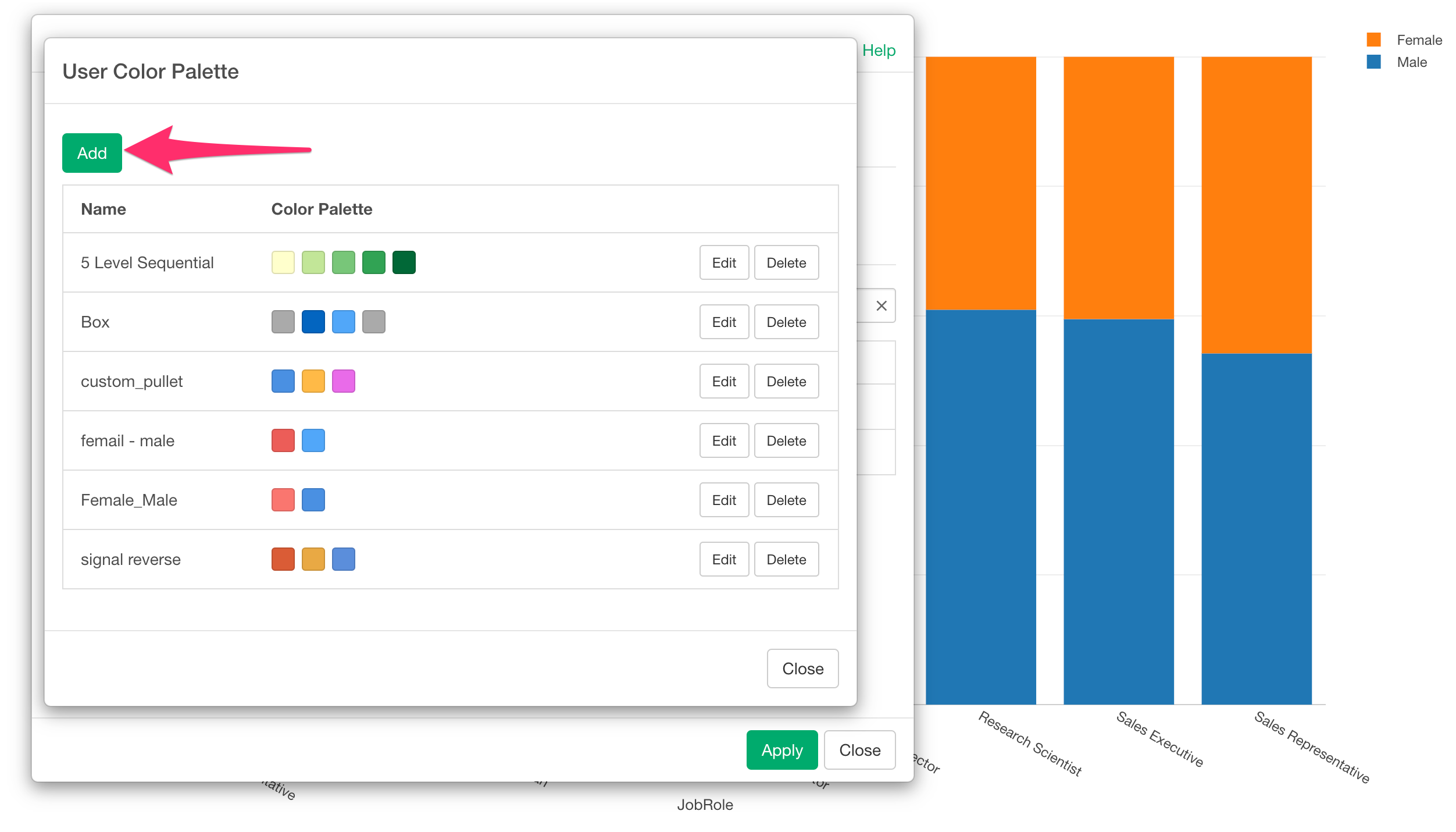
For example, suppose you have a chart like this and you want to display “Female” in pink and “Male” in blue.
Select “Color, Group, and Sort” from the Color By menu.
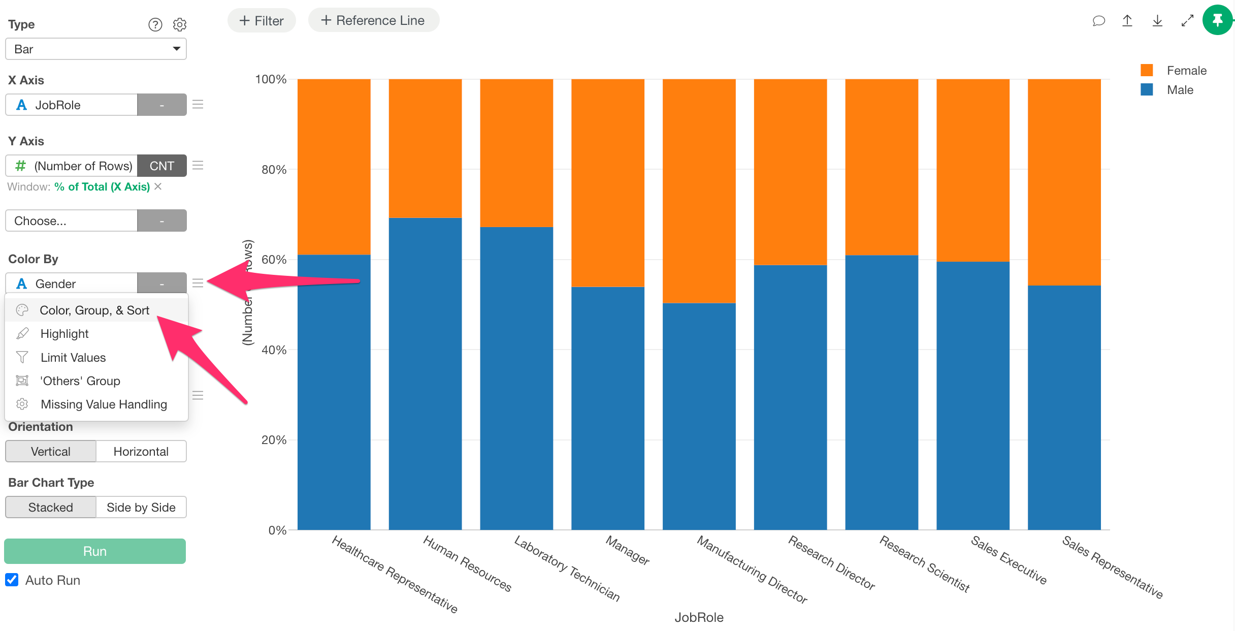
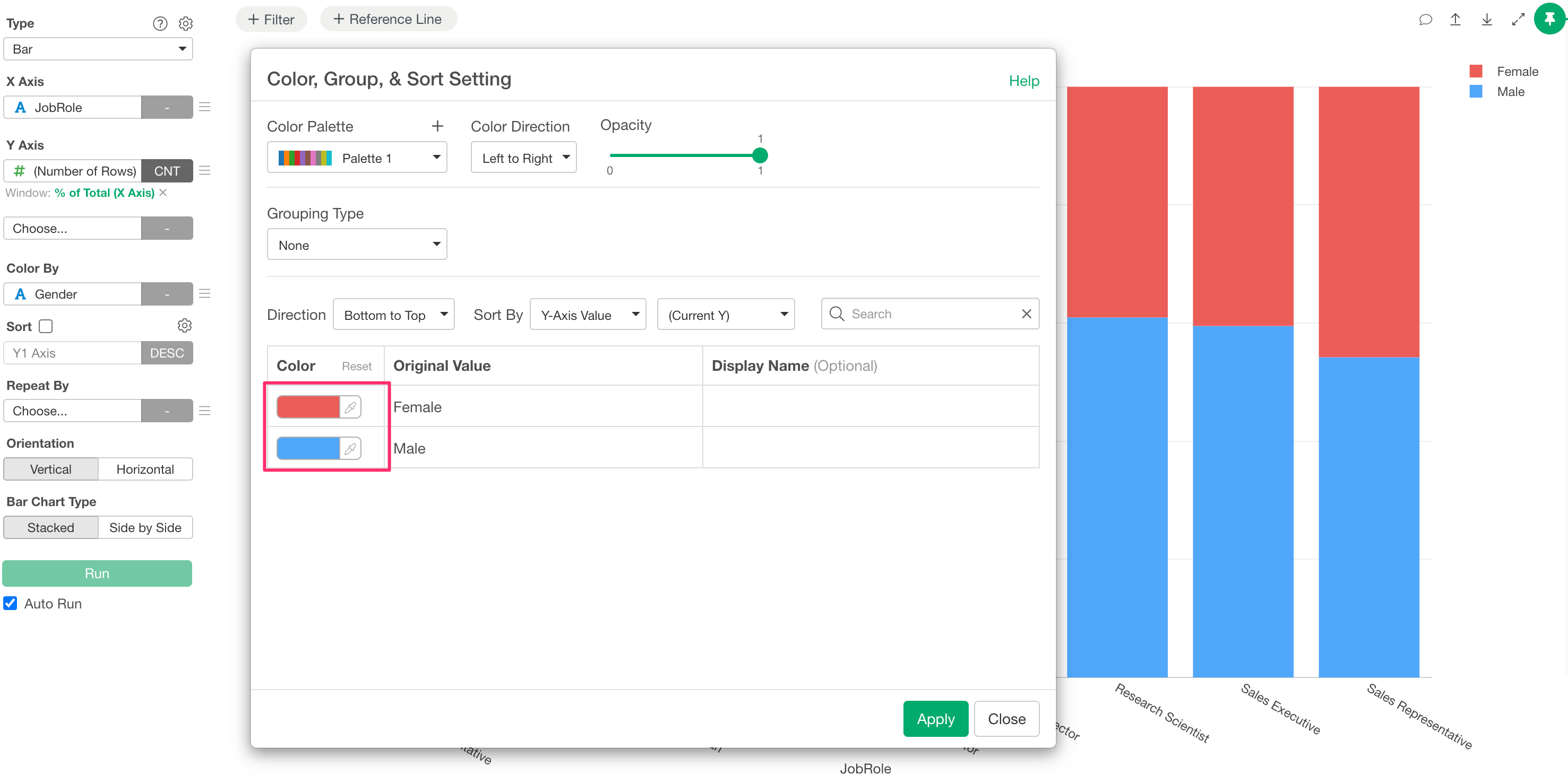
If you only want to change the colors for this specific chart, you can individually specify the color for each value.
On the other hand, if you always want to use the same colors for charts using gender, or if you need to create charts with unique corporate colors, it is tedious to set them every time.
Therefore, let’s create a User Color Palette.
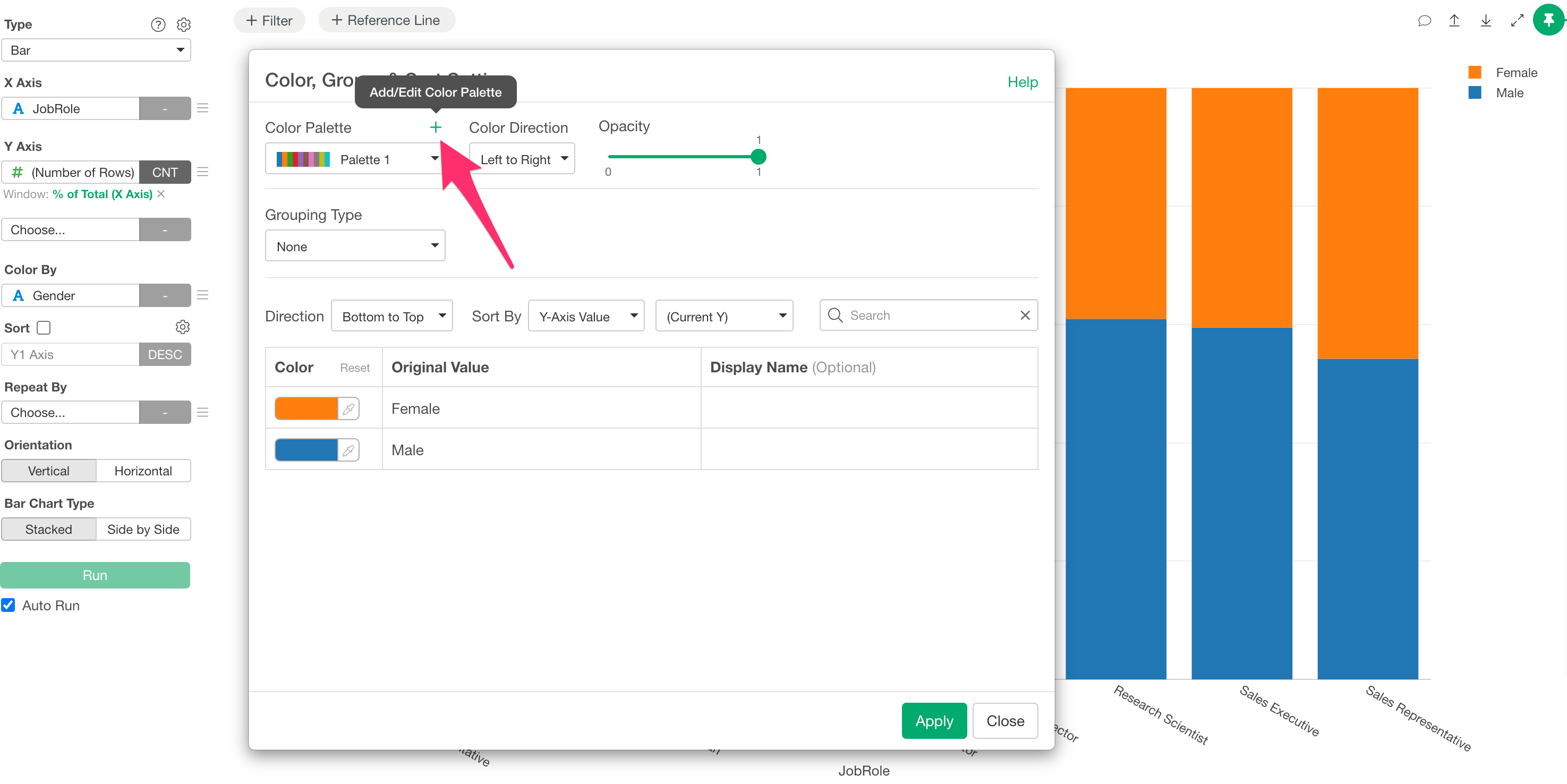
Click “Add / Edit Color Palette” from the plus button in the color palette section.
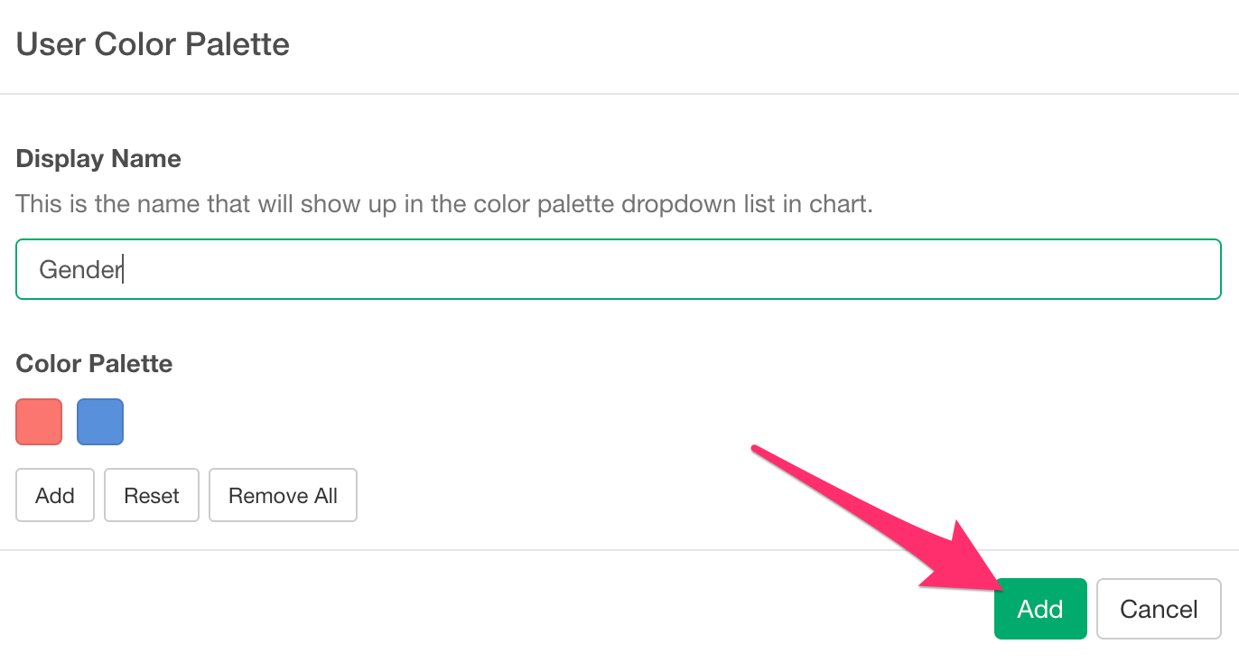
The User Color Palette dialog will appear, so click the “Add” button.
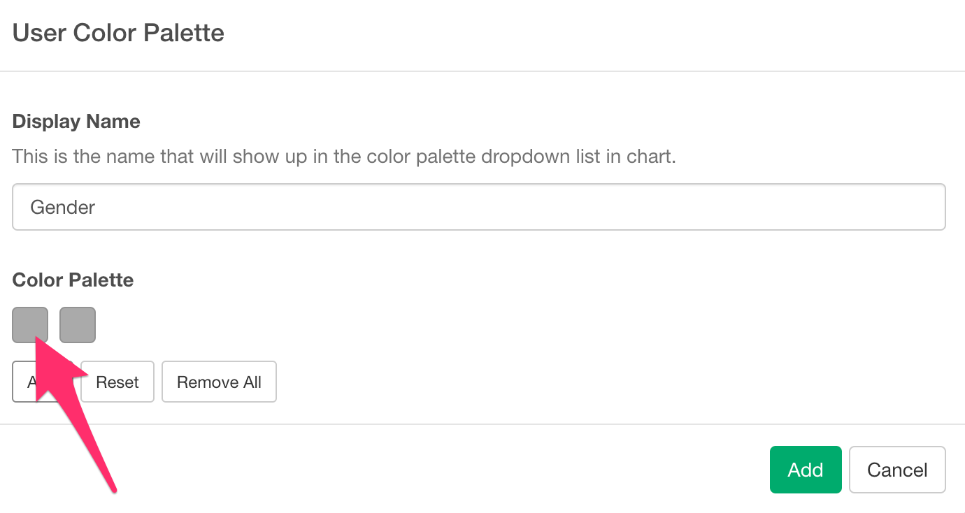
Let’s proceed with “Display Name” and “Add” Color Palette.
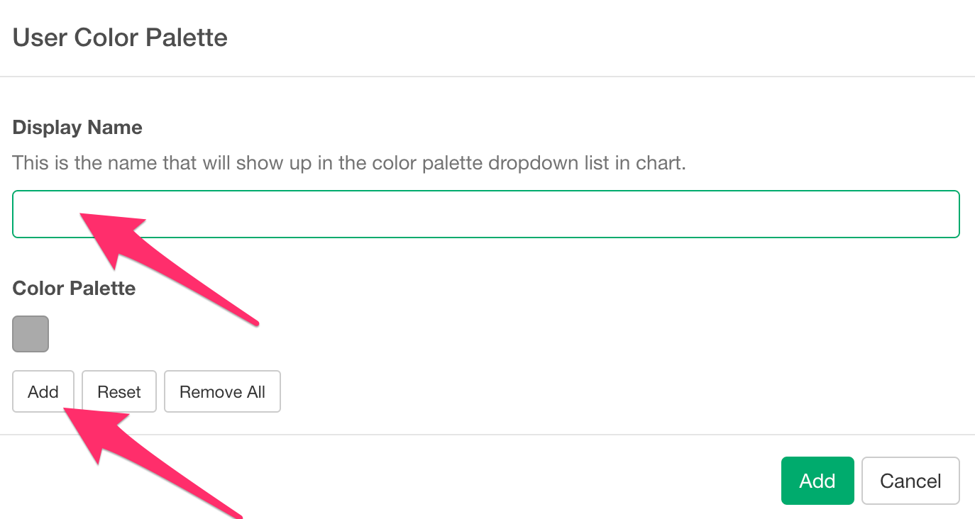
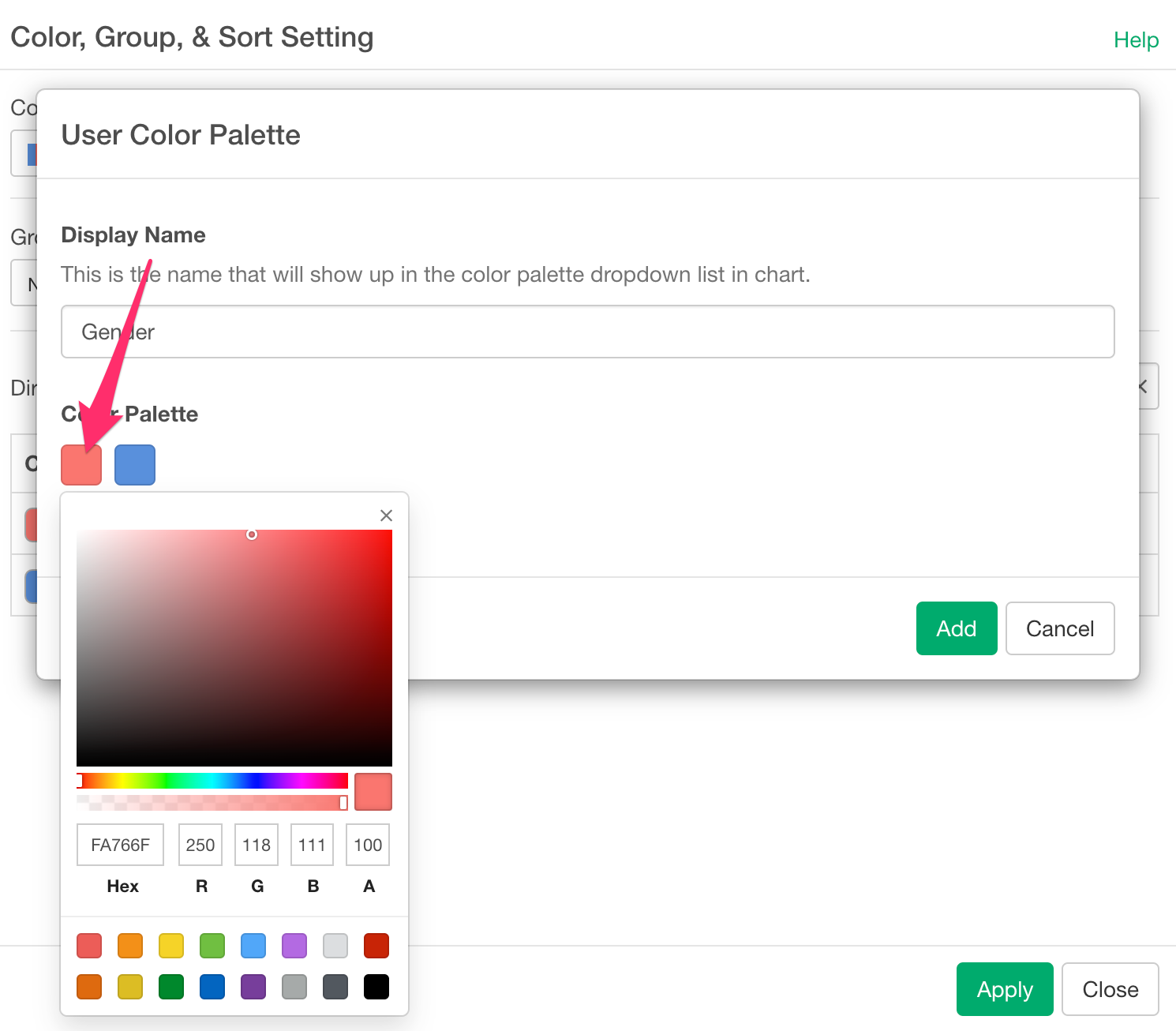
Next, click on the palette where you want to assign a color.
Here, you can freely specify any color you like. In this case, we will assign “Pink (Hex: FA766F)” to Female and “Blue (Hex: 4A90E2)” to Male.
Once you have finished adding the palette and assigning the colors, click the “Add” button.
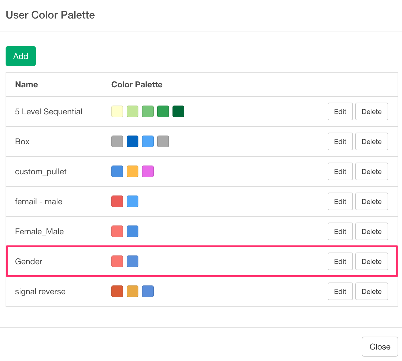
You have successfully created a User Color Palette.
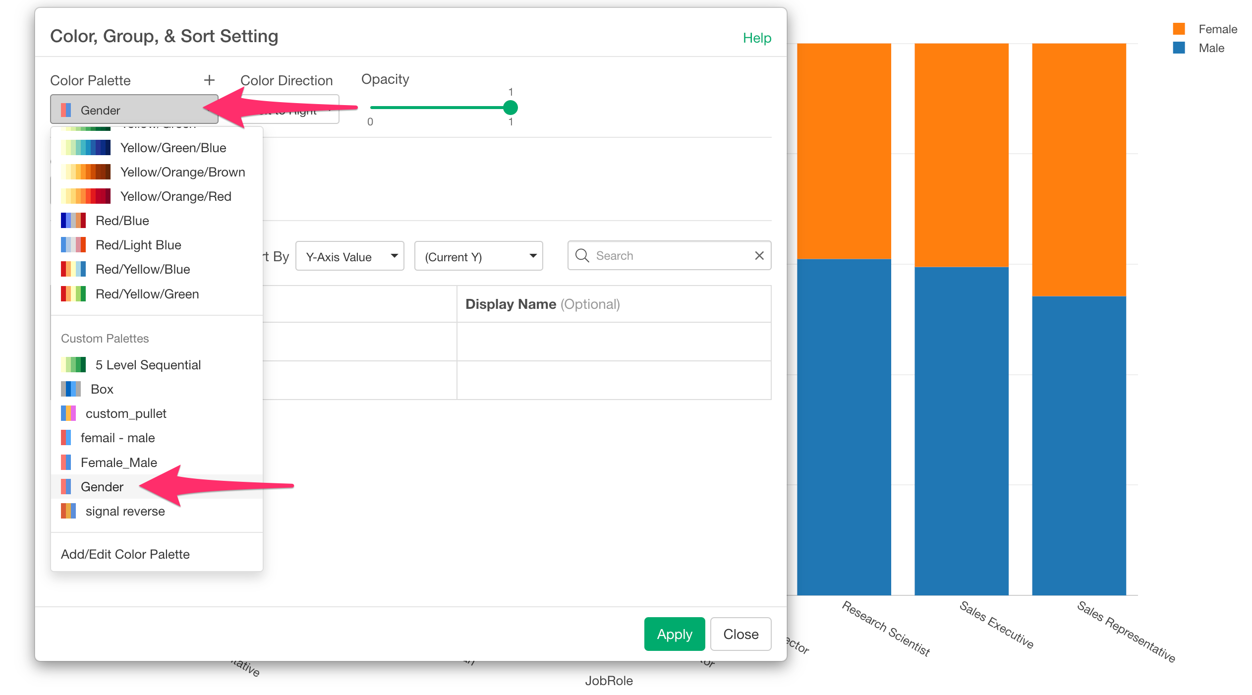
Now, let’s apply the User Color Palette to the previous chart.
From the color settings dialog, select the “Gender” color palette you just created.
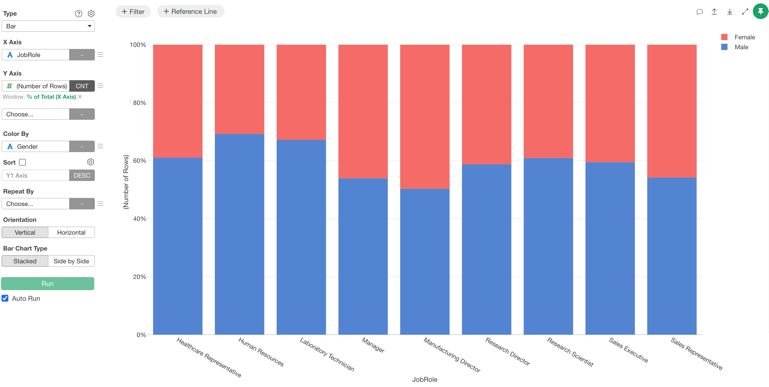
You have successfully assigned pink to Female and blue to Male.
Add multiple color palettes at once
If you have palette information that you manage yourself, you can add multiple custom color palettes all at once using JSON files without using the UI.
- How to Add Multiple Color Palettes at Once - Link