How to Change Color & Display Name
Changing color for charts in Exploratory is pretty simple. In this Note, you'll learn the basics of Color setting.
Sample Data
We'll use this Stock Price. You can download it from this page.

In this data, each row represents each employee, and the columns are employees' attribute information such as age, job type, income, etc.
1. Create a Line Chart with Color
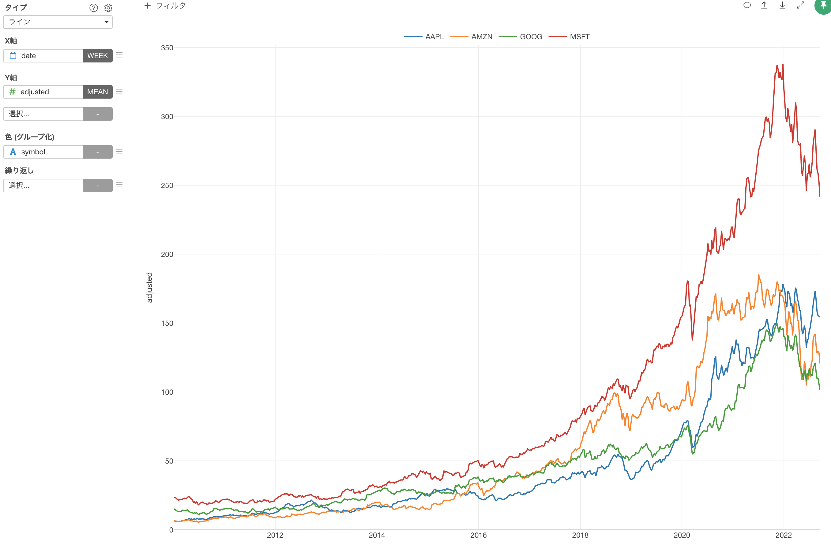
The goal is to create a line chart with each line shows the trend of the stock price for each company along the timeline.
First, create a line chart by selecting the followings.
- X-Axis: date (Week)
- Y-Axis: adjusted (Mean)
- Color: symbol
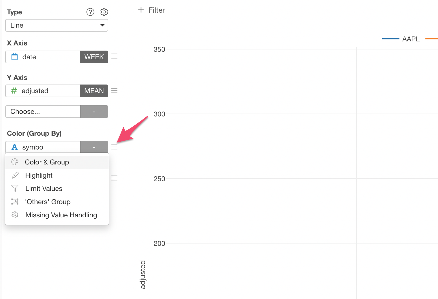
2. Update Color
It automatically assign a color to each line by default, but you can customize it.
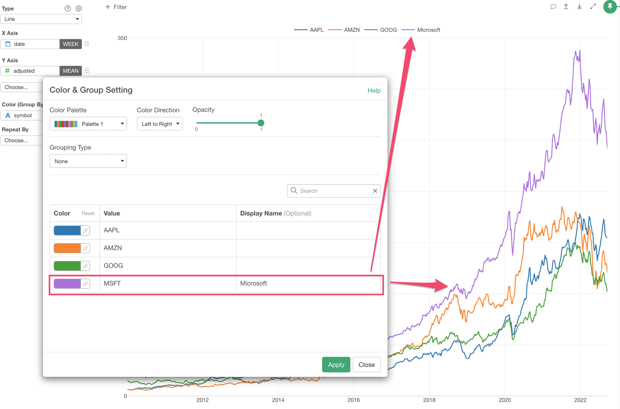
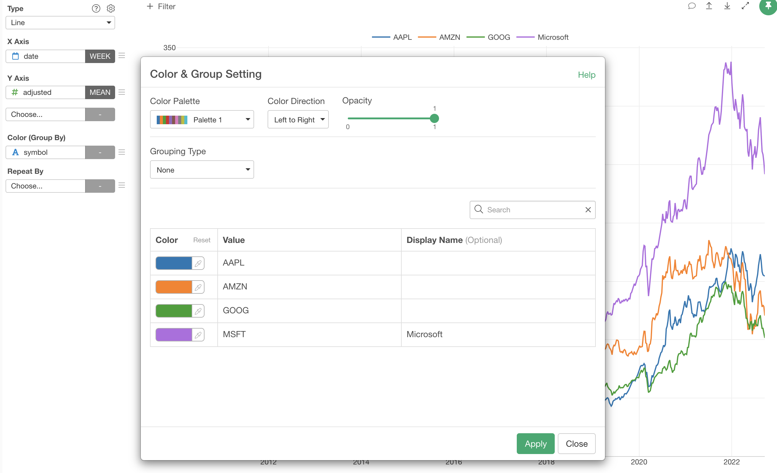
Select 'Color & Grouping' from the Color menu.
In the 'Color & Group Setting' dialog, you can click on the color dropdown and select the color you want.
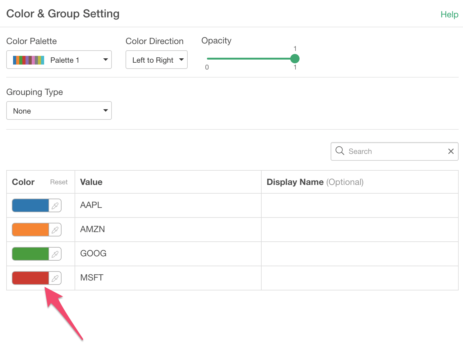
Here, we are setting a purple color to 'Microsoft (MSFT)'.
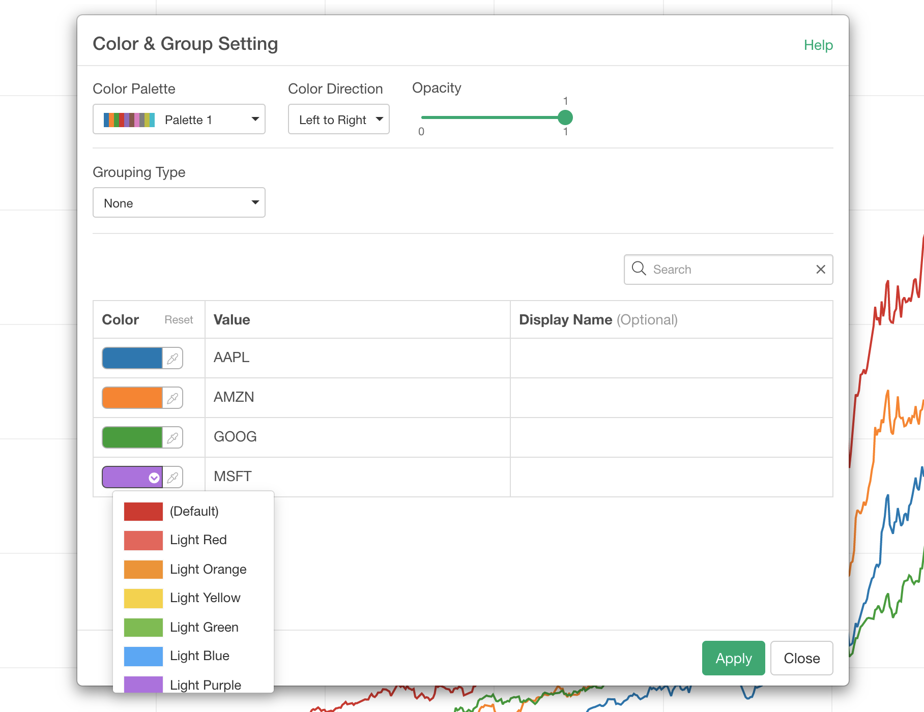
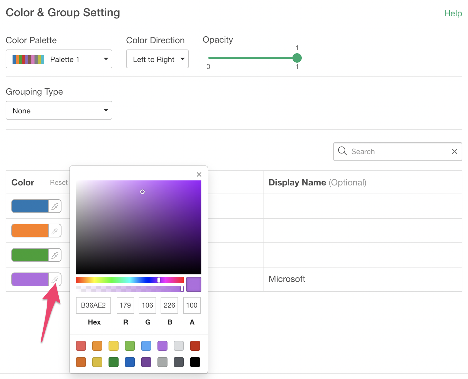
If you want to assign a color that is not listed in the dropdown you can click on the 'Pen' icon to open a Color Picker dialog and pick a color you like.
3. Update Display Name
You can also change the Display Name for each group. Here, we are setting 'Microsoft' for 'MSFT'.
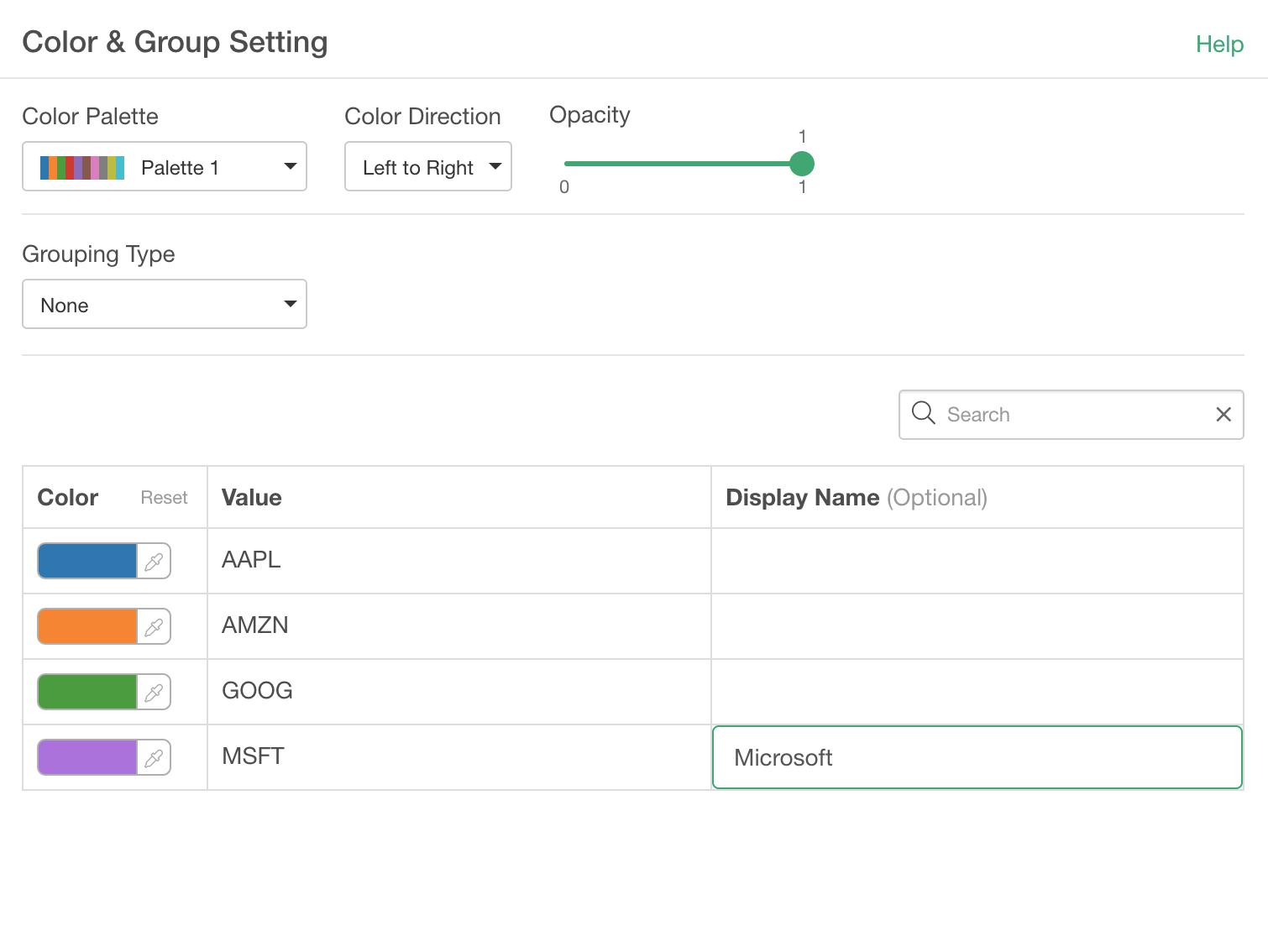
You can click on the Apply button to check if the setting is reflected in the chart.