How to Create Chart to Show Moving Average
The 'Moving Average' is often used to smooth the line so that you can understand the trend when the original time series data moves ups and downs daily (or monthtly, etc.) dramatically.
Here's a quick how-to video.
And in this Note, we'll show you how you can create a line chart to show the moving average with 'Window Calculation' feature.
Sample Data
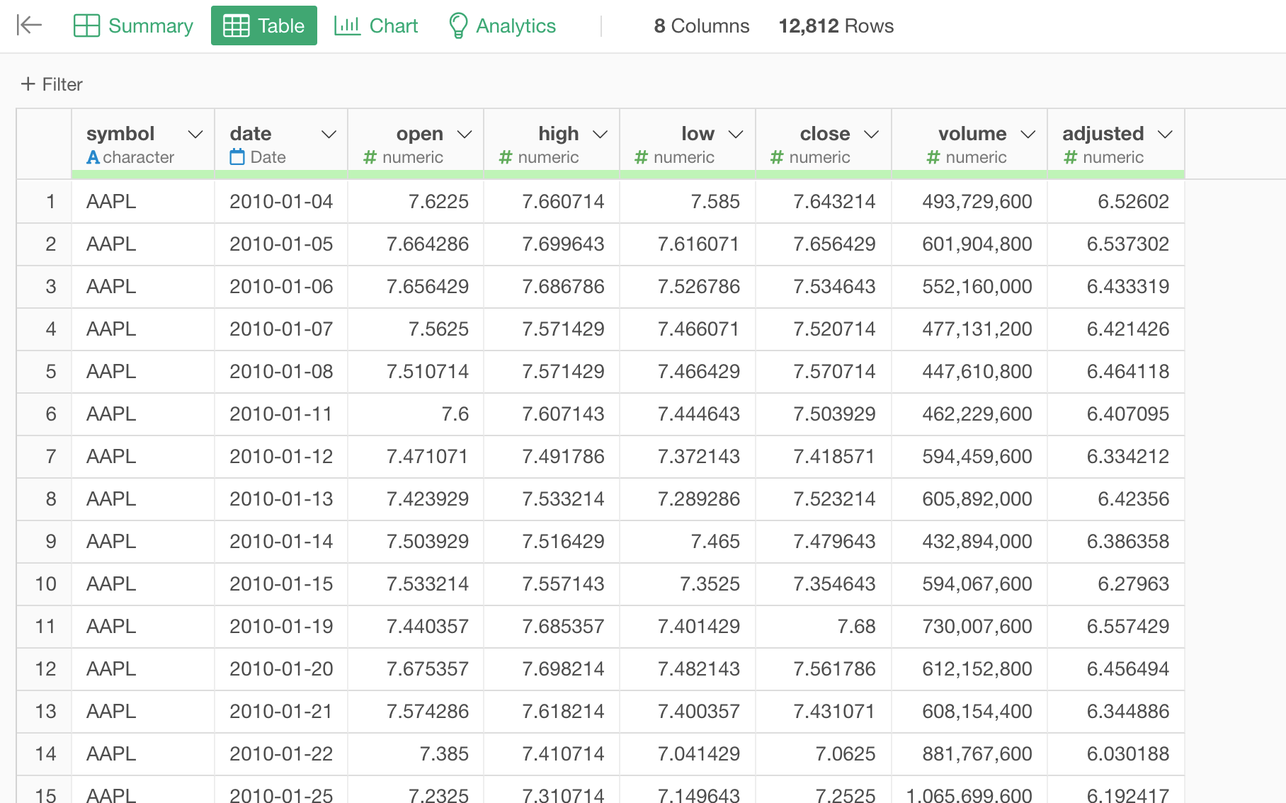
We'll use this Stock Price. You can download it from this page.
In this data, each row represents each employee, and the columns are employees' attribute information such as age, job type, income, etc.
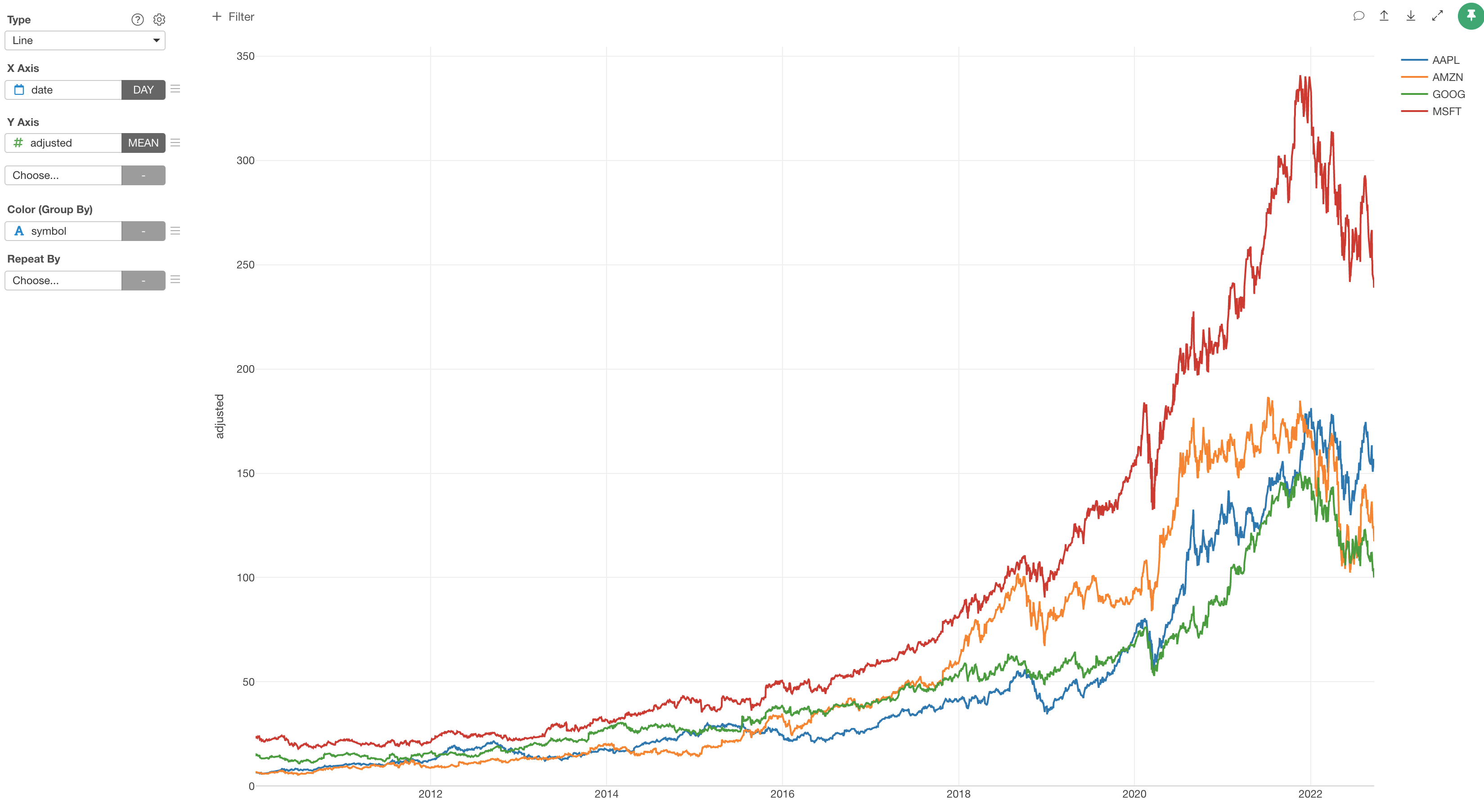
1. Create a Line Chart
The goal is to create a line chart with each line shows the trend of the stock price for each company along the timeline.
First, create a line chart by selecting the followings.
- X-Axis: date -> Day
- Y-Axis: adjusted
- Color: symbol
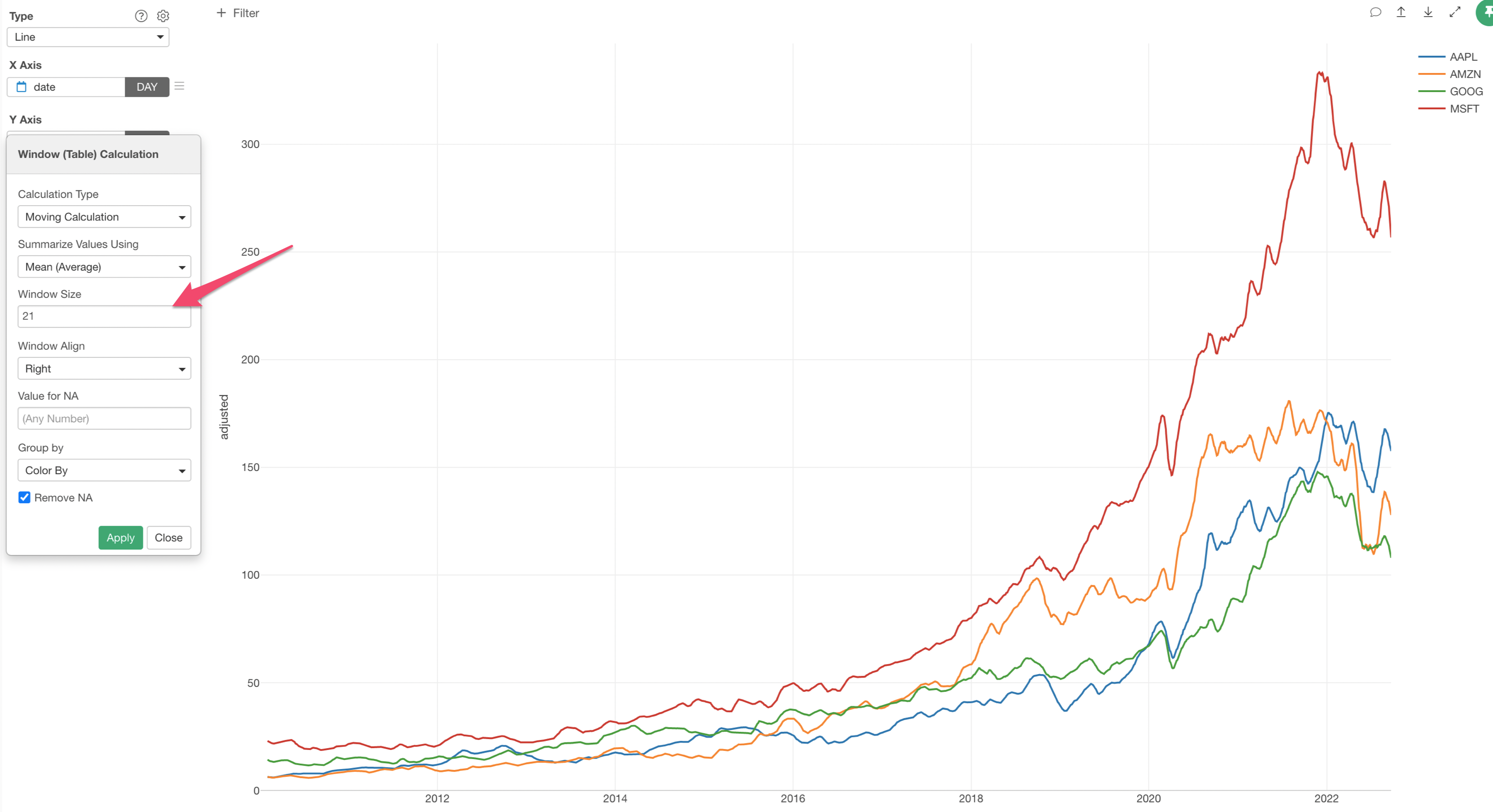
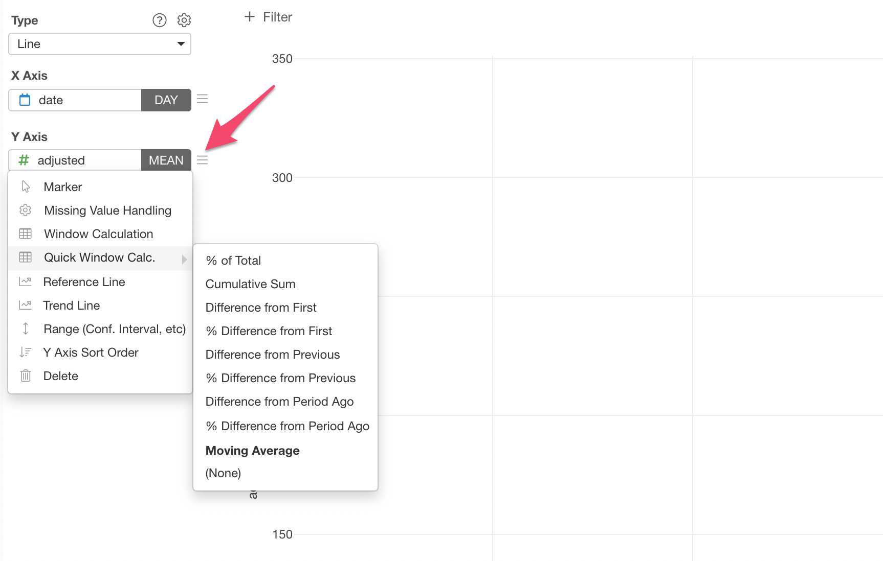
2. Use Window Calculation to Show Moving Average
Now, it's time for 'Window Calculation'!
Click the 'Menu' icon next to the Y-Axis, select 'Quick Window Calc.', then select 'Moving Average'.
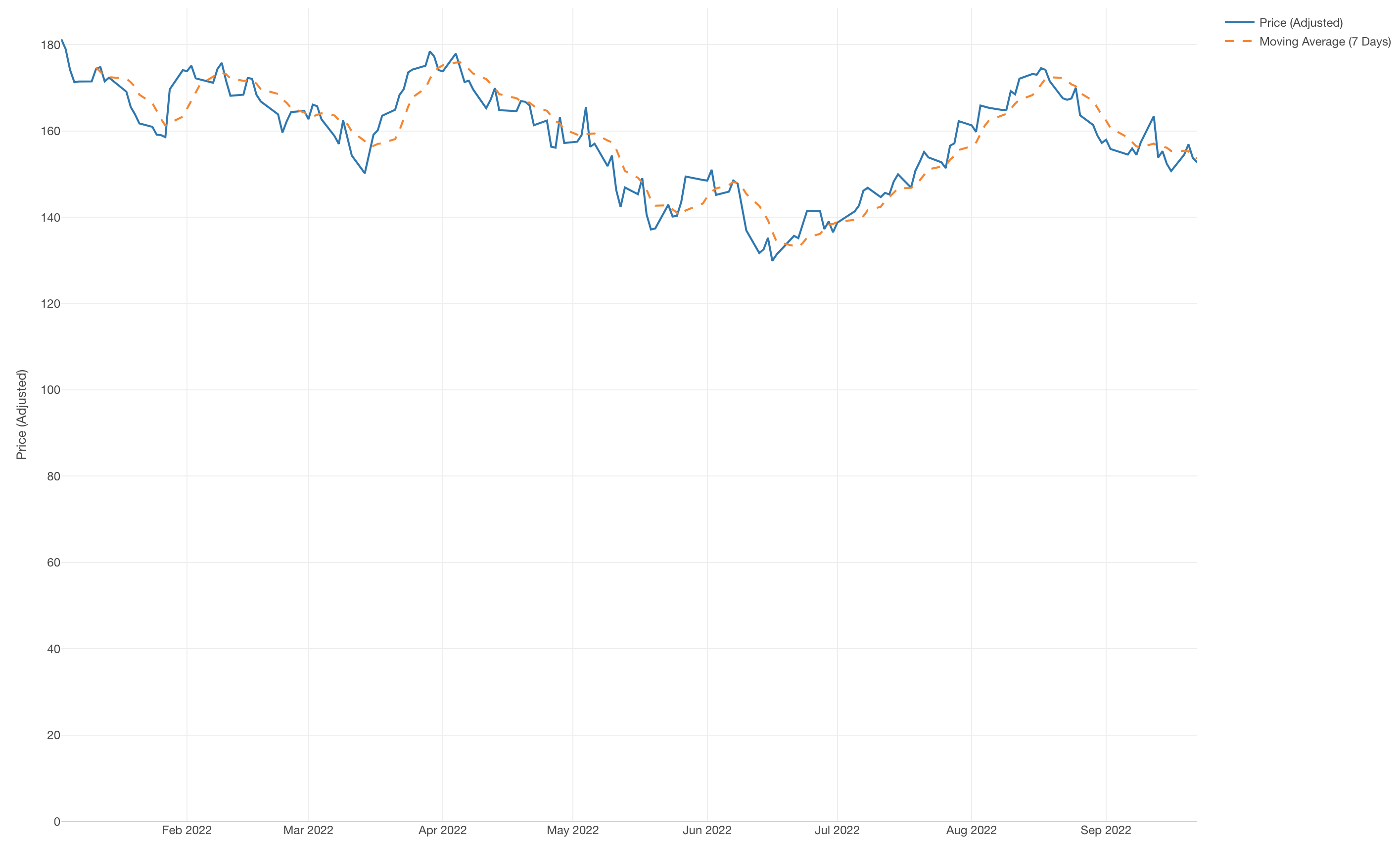
Now you have a line chart that shows the moving average of the stock price for each companies!
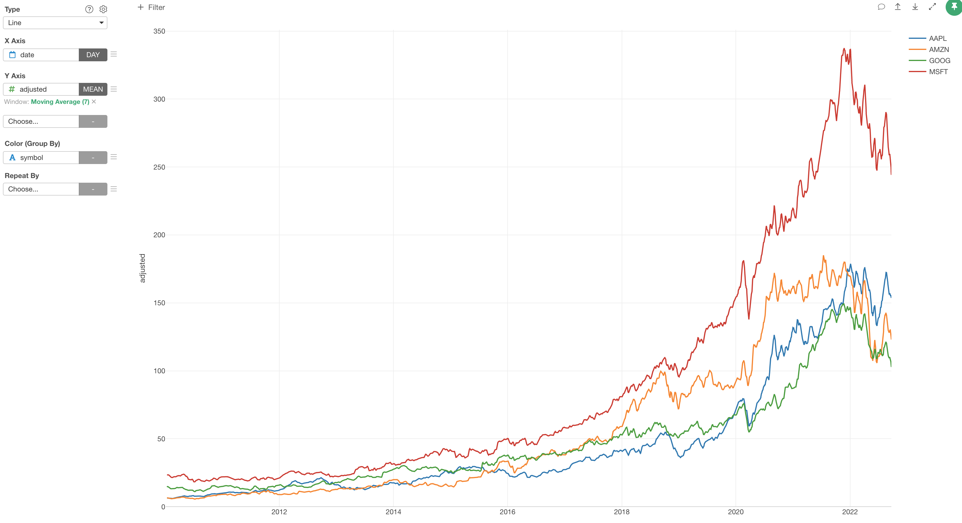
The period of moving average is set to '7' by default. This means that the chart is showing the 7 days moving average. The unit of '7' depends on the X-Axis's date aggregation setting, which is currently set to Day.
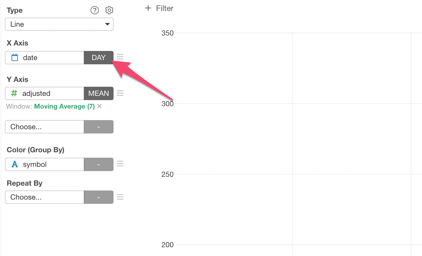
You can click on the green text to change the setting.
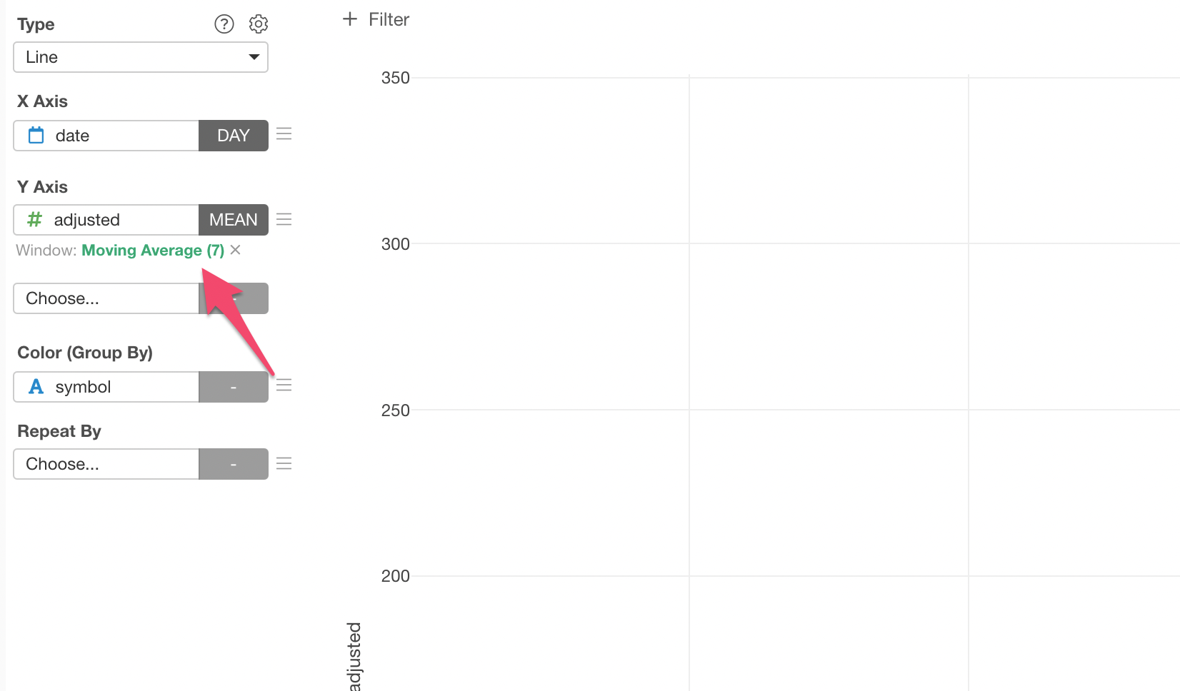
For example, here, I'm setting the Window Size to '21' to show 21 days moving average.