How to Create Chart to Show % of Total
In this Note, we'll show you how you can create a bar chart to show the percentage of total with 'Window Calculation' feature.
Sample Data
We'll use this Employee Data. You can download it from the page.

In this data, each row represents each employee, and the columns are employees' attribute information such as age, job type, income, etc.
Create the Chart
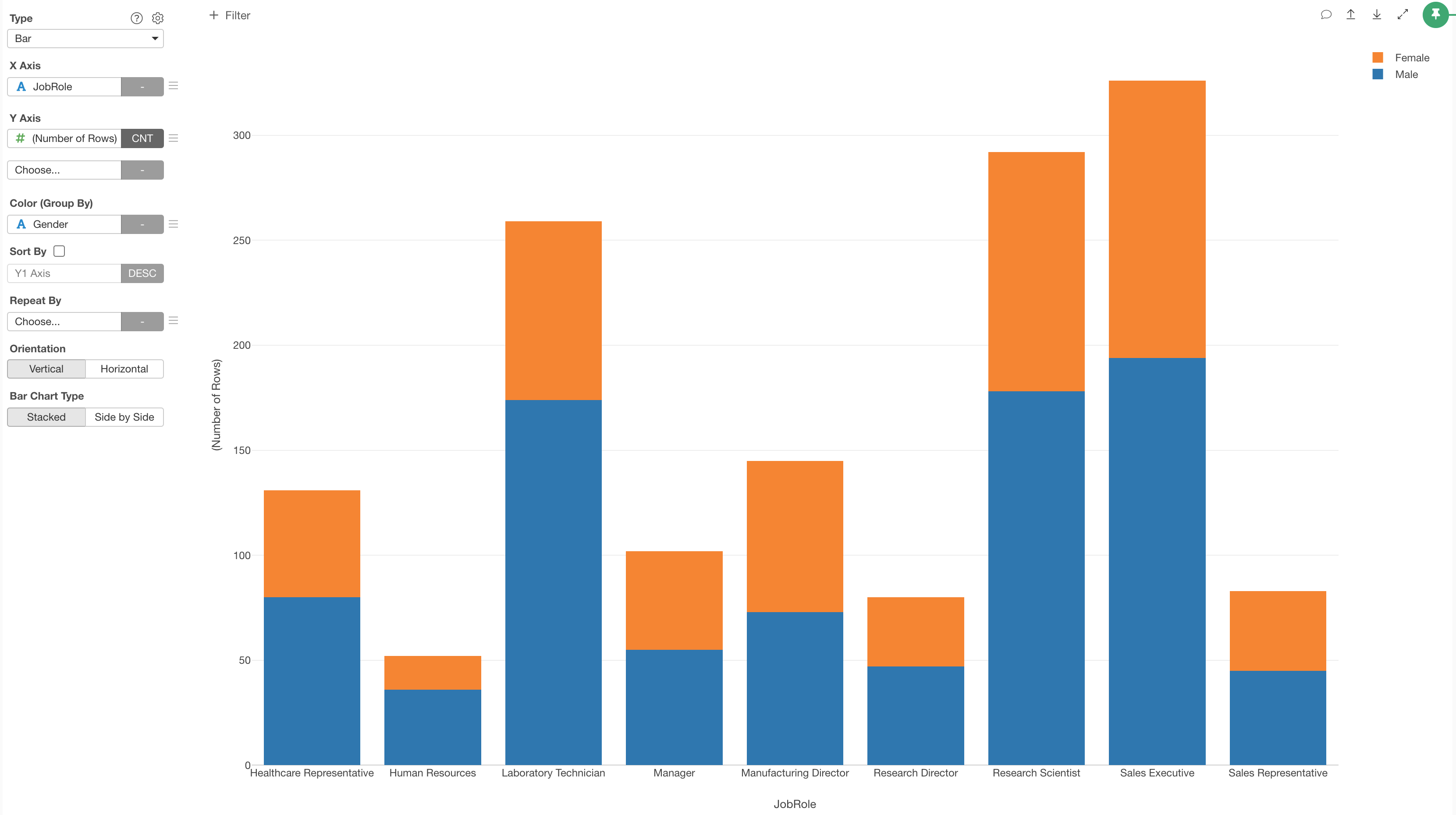
1. Create a Bar Chart
The goal is to create a bar chart with each bar shows the percentage of Male and Female employees for each Job Role.
First, create a bar chart by selecting the followings.
- X-Axis: Job Role
- Y-Axis: Number of Rows
- Color: Gender
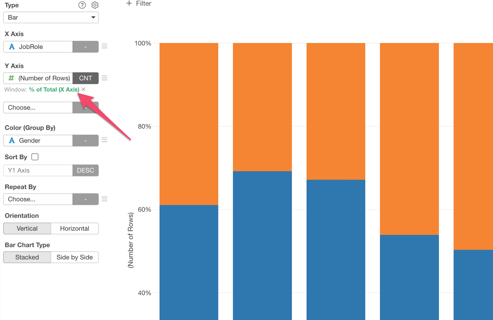
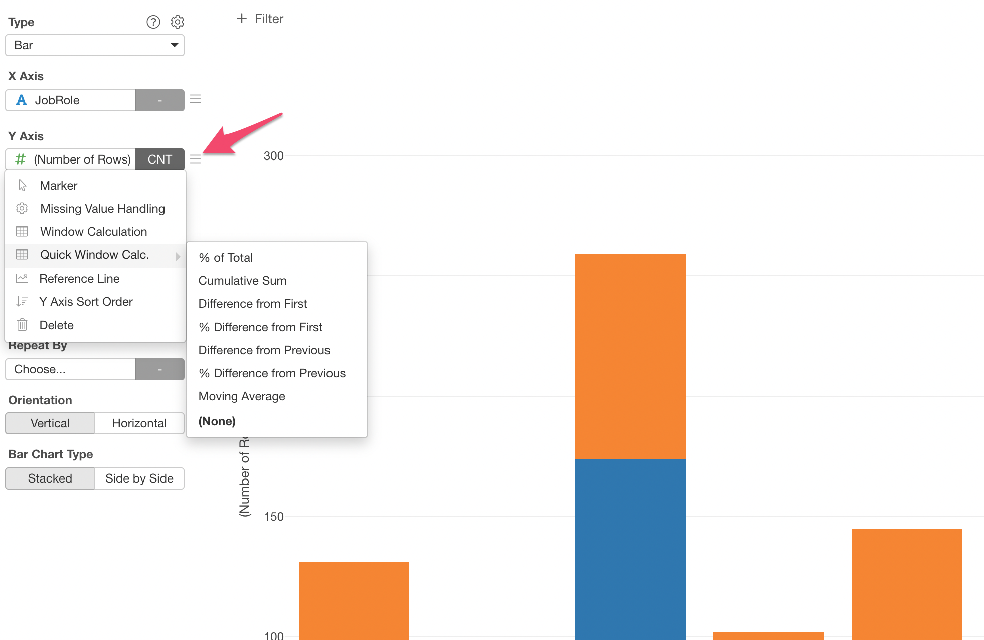
2. Use Window Calculation to Show Percentage of Total
Now, it's time for 'Window Calculation'!
Click the 'Menu' icon next to the Y-Axis, select 'Quick Window Calc.', then select '% of Total.
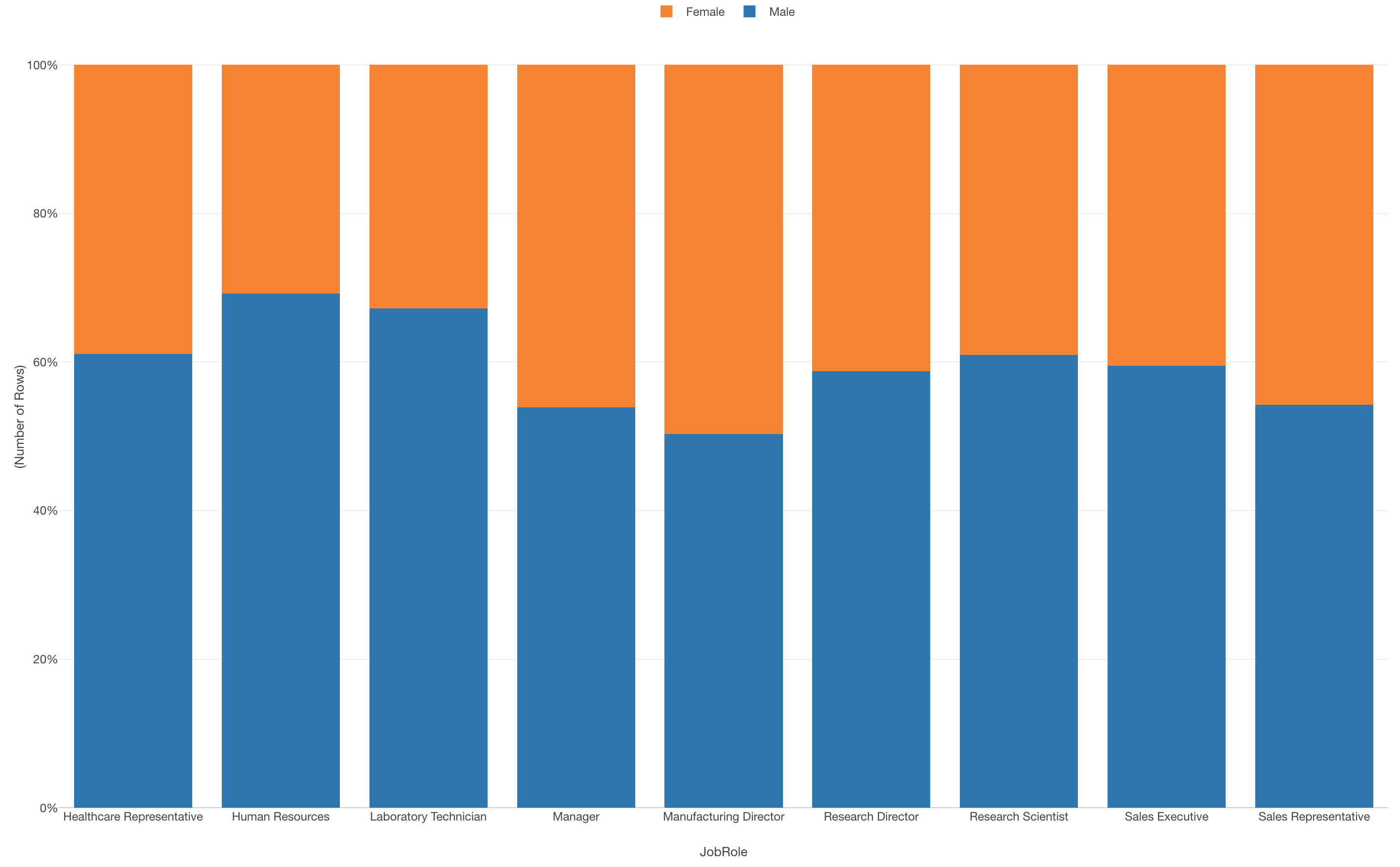
And that's it, now you have a bar chart that shows the percentage of Male vs. Female for each Job Role!
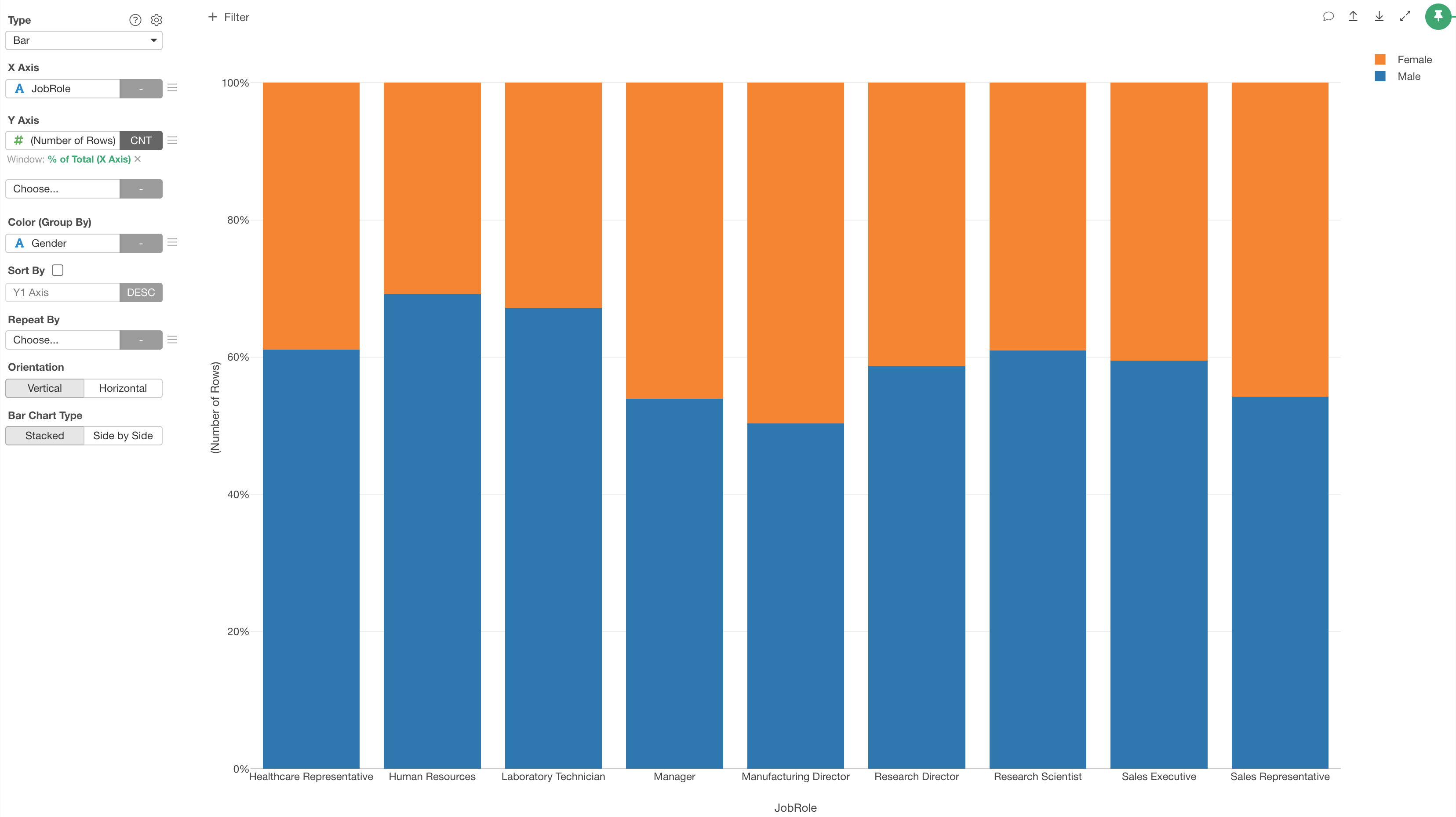
Y-Axis is now 'Percentage' and each color (Blue or Orange) shows the percentage of either Male or Female.
You can click on the Green Text to open the configuration dialog for more detail setting if you like.