How to Create Venn Diagram with eulerr package
I'm sure you have seen Venn Diagram charts before. It helps you to understand the similarities (or non-similarities) among multiple groups by visualizing the partially overlapping circles.
This chart type is currently not supported in Exploratory, but you can create this type of chart in Note or Dashboard by writing R scripts.
There are several R packages that can help you create the charts quickly. In this note, I want to introduce a way to do it with 'eulerr' package.
Venn Diagram with eulerr package
You might have seen a typical Venn Diagram like this before.
You can quickly create such with 'VennDiagram' package.
But one problem is that all the circle sizes are always the same regardless of the underlying values.
And the overlapping areas between the circles are always the same.
This could be misleading if you are depending on the size to understand how big (or small) the values are.
To address this problem, you want to use the next package called 'eulerr'.
Let's take a look how you can use the 'eulerr' package to create a Venn Diagram.
1. Prepare Data
First, you need to prepare the data in a format that the 'eulerr' package expects.
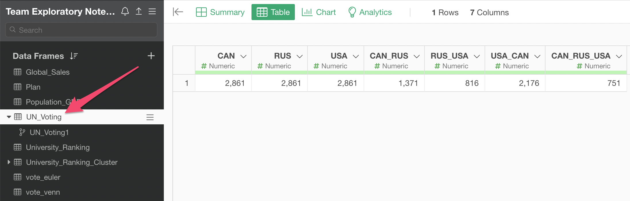
Here's a data that shows United Nations resolution voting results for Canada, Russia, and United States (USA).
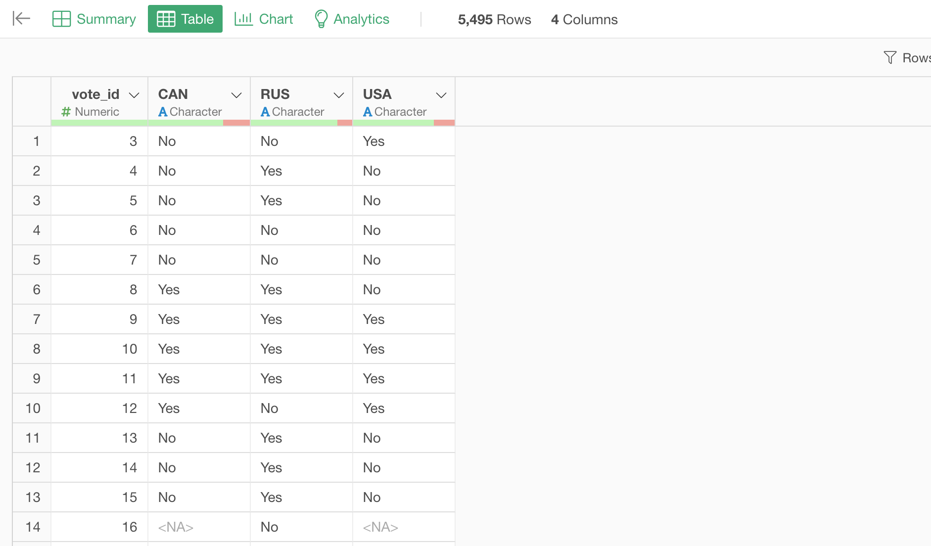
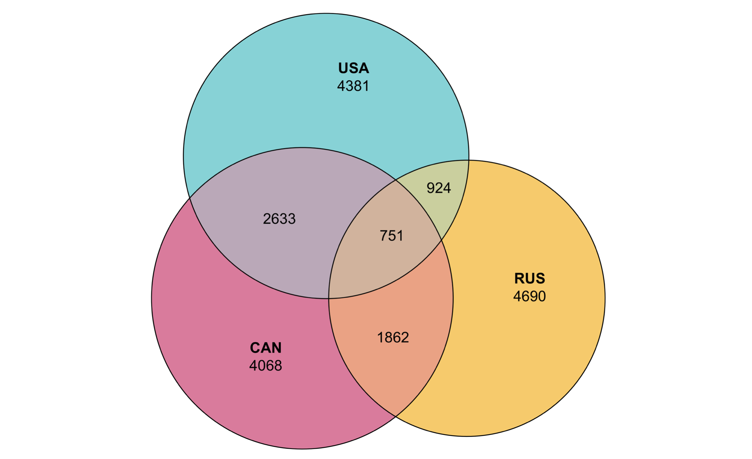
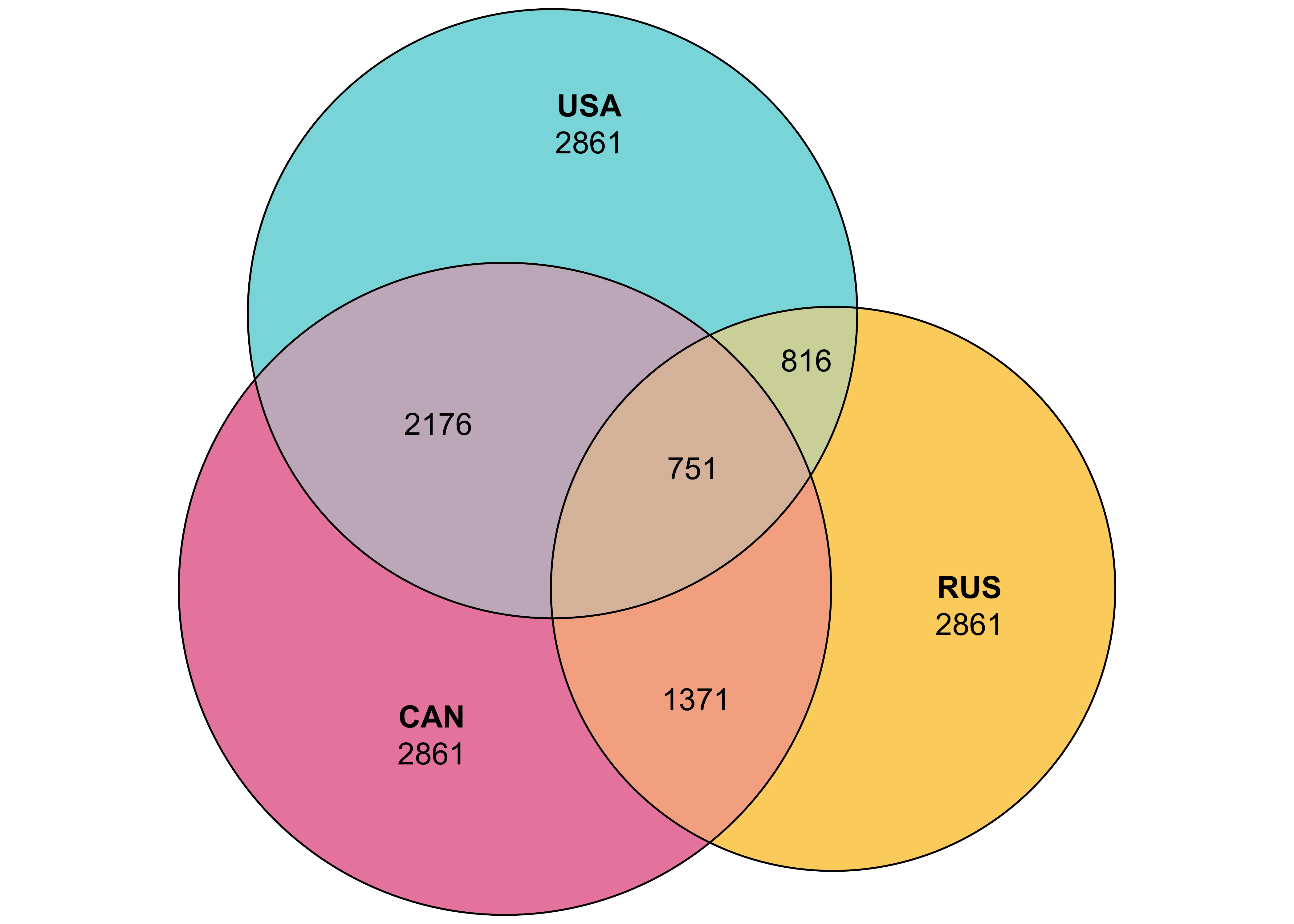
Based on the voting record, we want to create a Venn Diagram so that we can show how a given two countries voted the same way (or the different way) like the below.
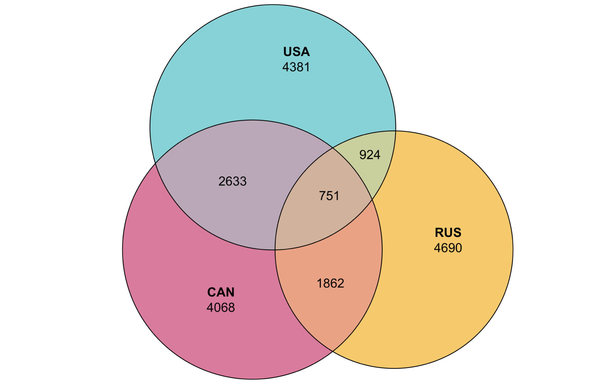
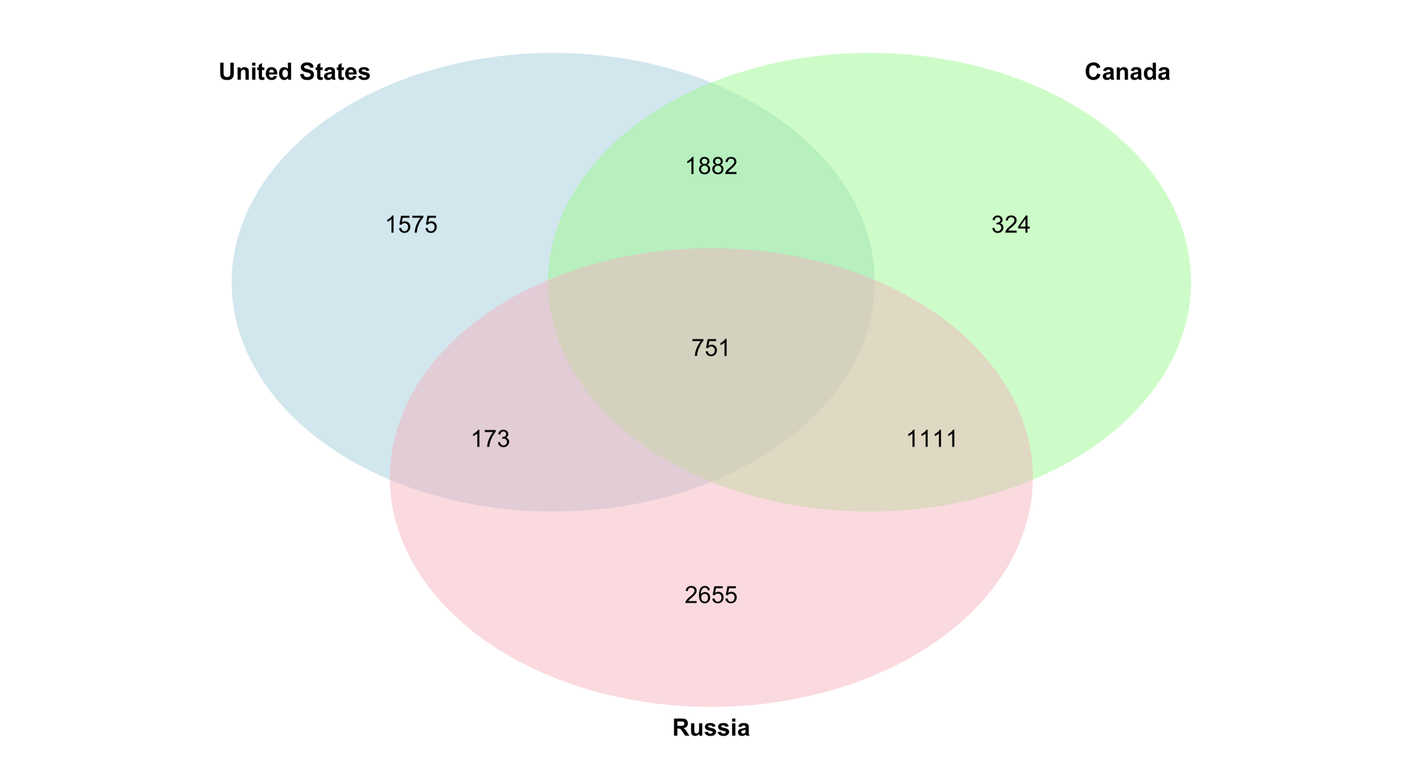
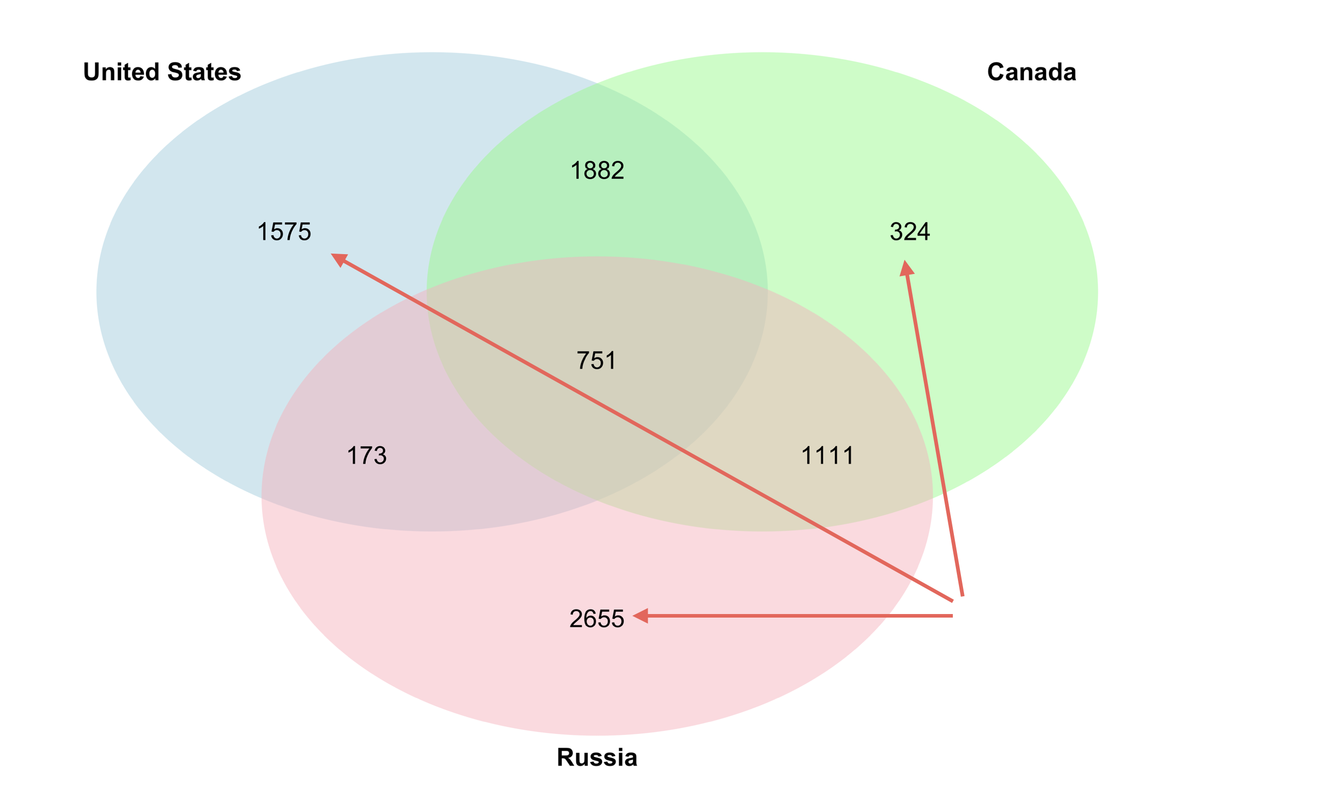
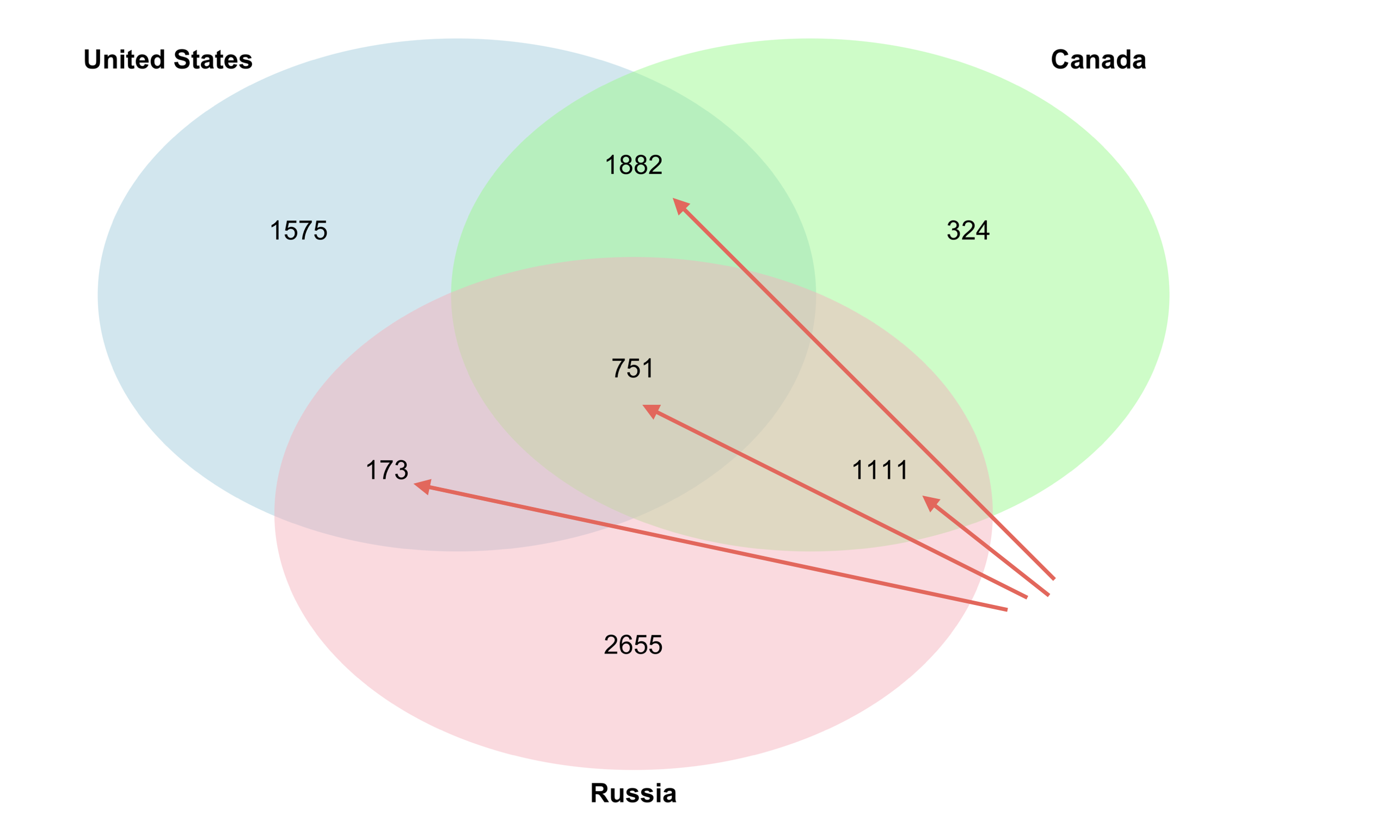
You can create the above Venn Diagram with eulerr package, but it requires the data to be in this format.
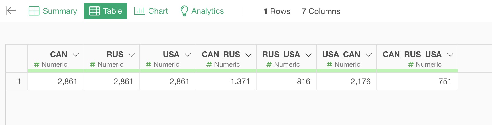
The 3 columns shows the number of rows or resolutions in this case. The next 3 columns such as 'CAN_RUS' are how many rows (or resolutions) are the same voting result of either 'Yes' or 'No' for all the combinations of the 3 countries.
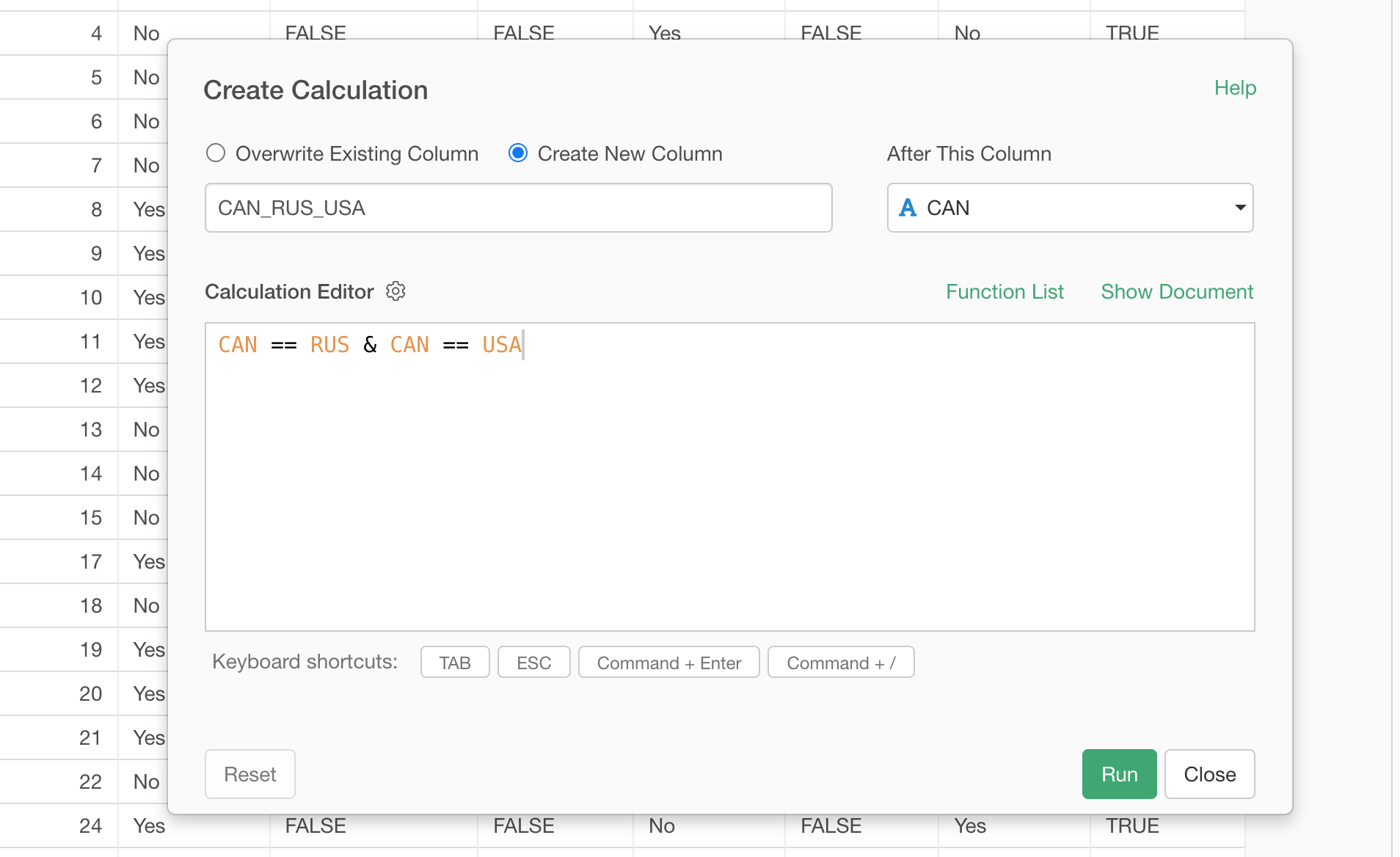
The last column of 'CAN_RUS_USA' shows how many rows are the same result among the 3 countries.
1.1. Flag when two countries voted the same way
First you want to select 'Create Calculation' -> 'Standard' from the column header menu.
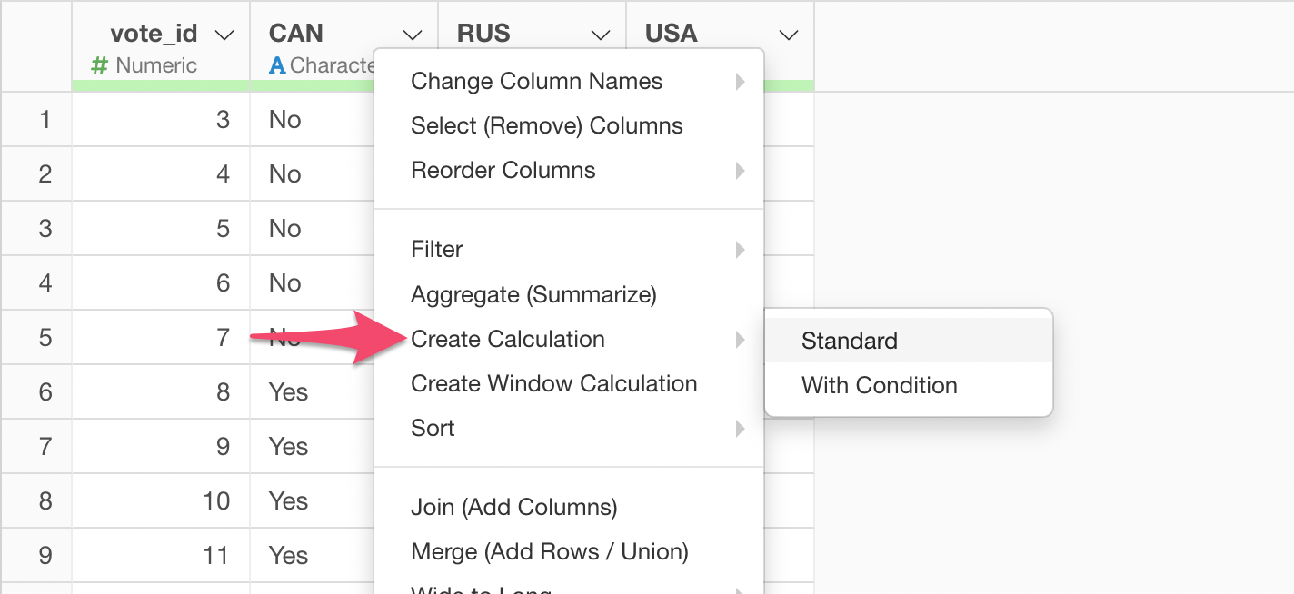
Then, type in 'CAN == RUS'.
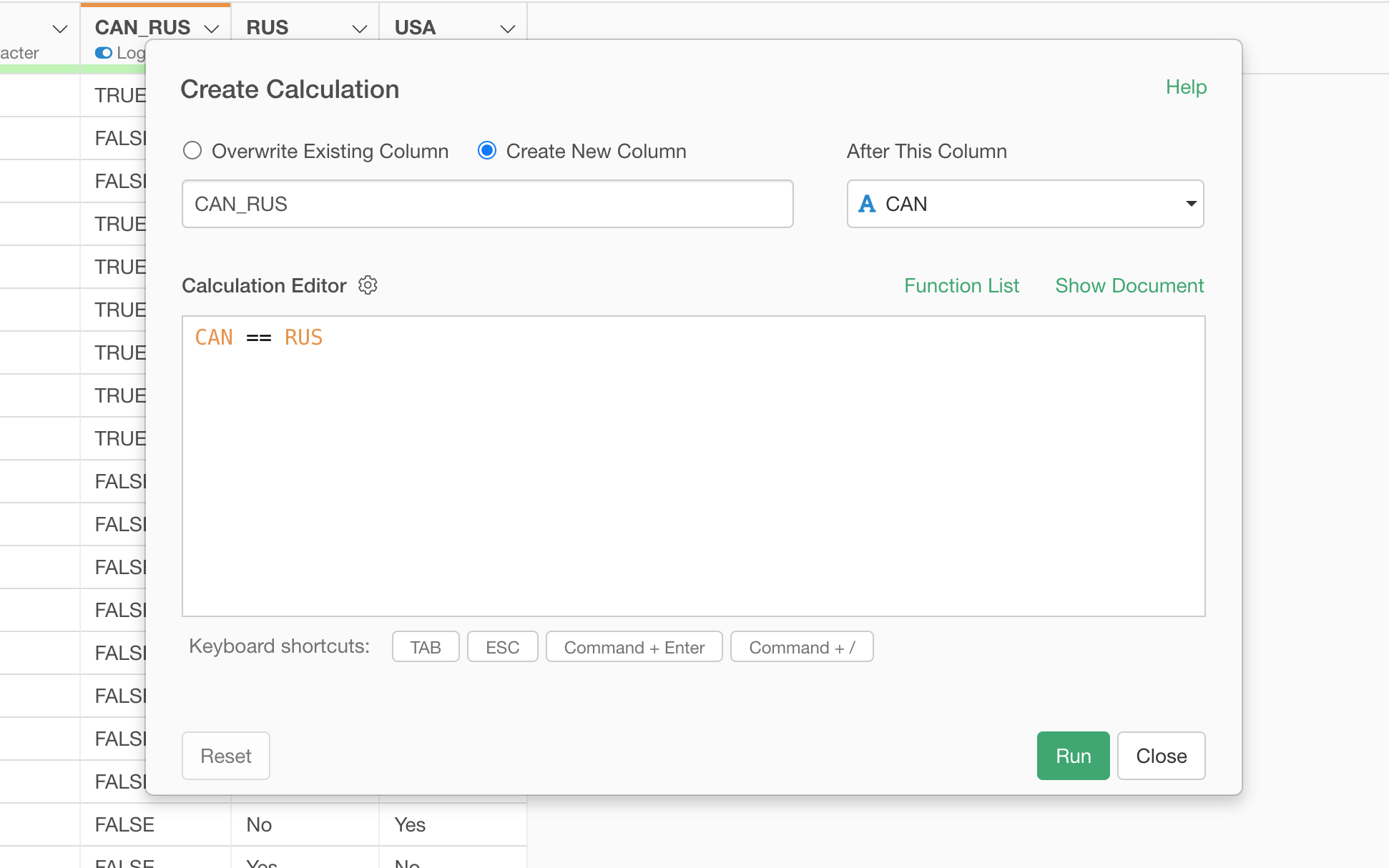
This will check if the value of 'CAN' column and the value of 'RUS' column are the same for each row, it would return TRUE if it is the same, otherwise it would return FALSE.
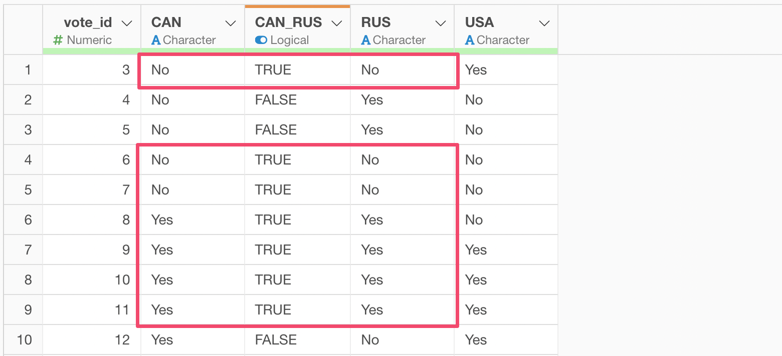
And you want to do the same thing for a combination of 'RUS' and 'USA' columns and for 'USA' and 'CAN' columns.
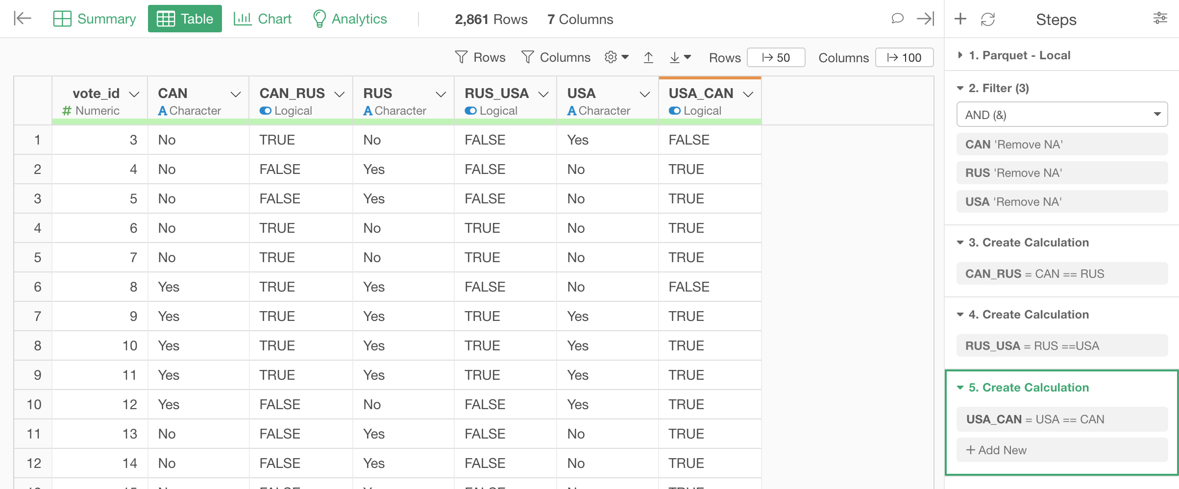
1.2. Flag when all three countries voted the same way
Now, we want to flag when all the three countries voted the same way by creating a new calculation, but this time you want to type in two conditions.
1.3. Aggregate data by counting # of Trues
Now you want to aggregate the data by counting the number of rows for the country columns and counting TRUE for the countries combination columns.
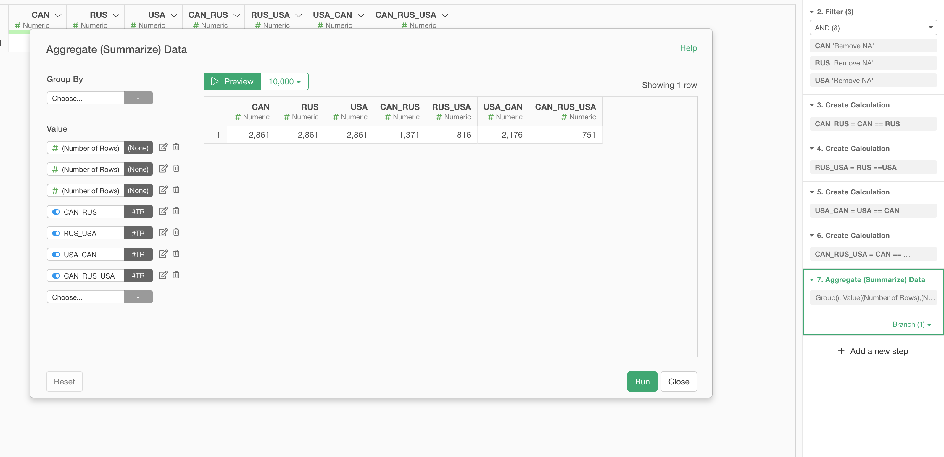
You want to select 'Number of TRUE' for the countries combination columns.
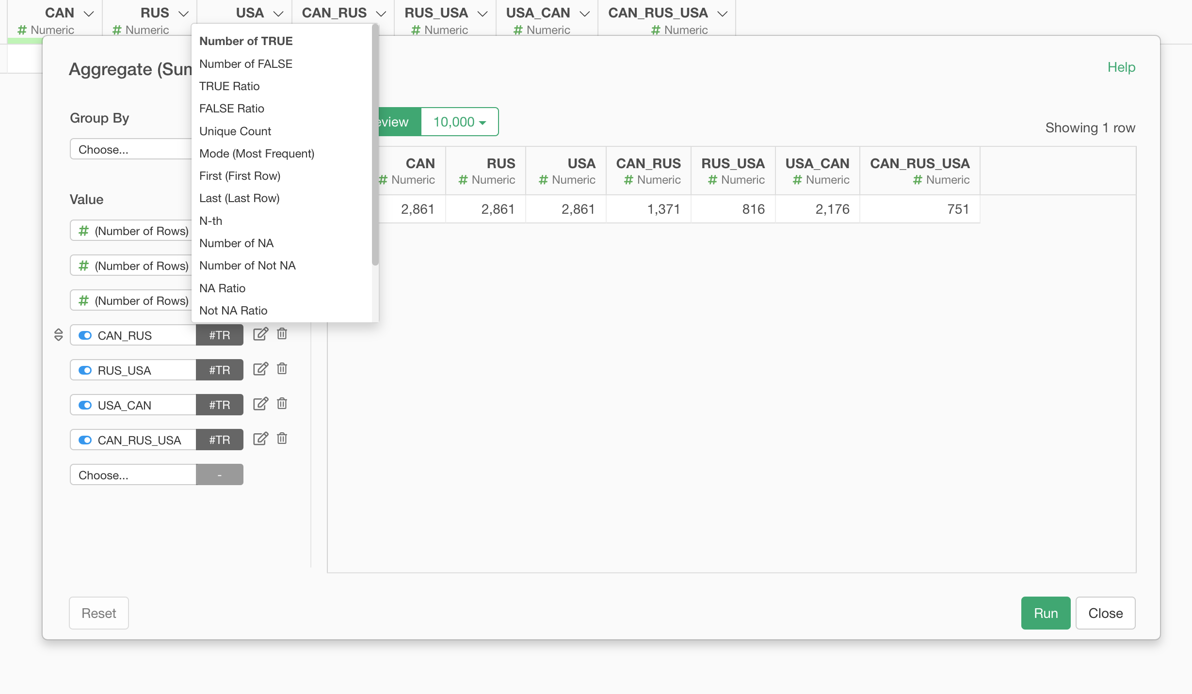
Note that the column names order matters.
2. Install 'eulerr' package
You want to use a R package called 'eulerr'.
You want to install this package into Exploratory before using it.
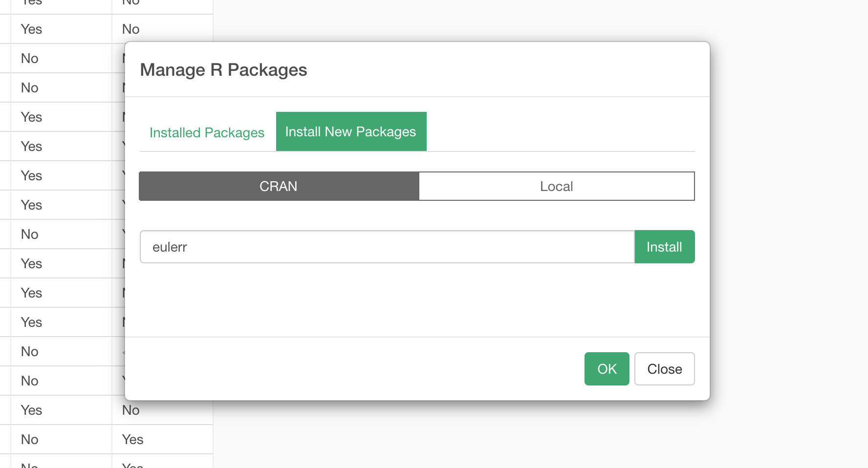
Take a look at this note for more details on how to install R package.
3. Create Venn Diagram Chart in Note
Select 'R Script' from the Plus menu to insert the R Script block.
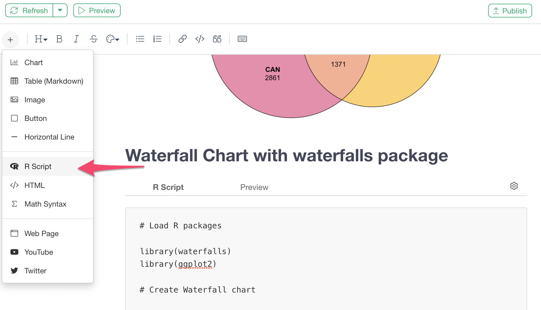
And you want to type in something like the below.
# Load R packages

library(eulerr)

# Create a Venn Diagram data with 'euler' function.

data <- euler(setNames(as.numeric(UN_Voting1[1, ]), names(UN_Voting1)))

# Plot the Venn Diagram chart

plot(data,
     quantities = TRUE,
     fills = list(fill = c( "#E56997", "#FBC740", "#66D2D6"), alpha = 0.8),
     edges = "black",
     labels = list(fontsize = 12))
And it should look like the below in your Note Editor.
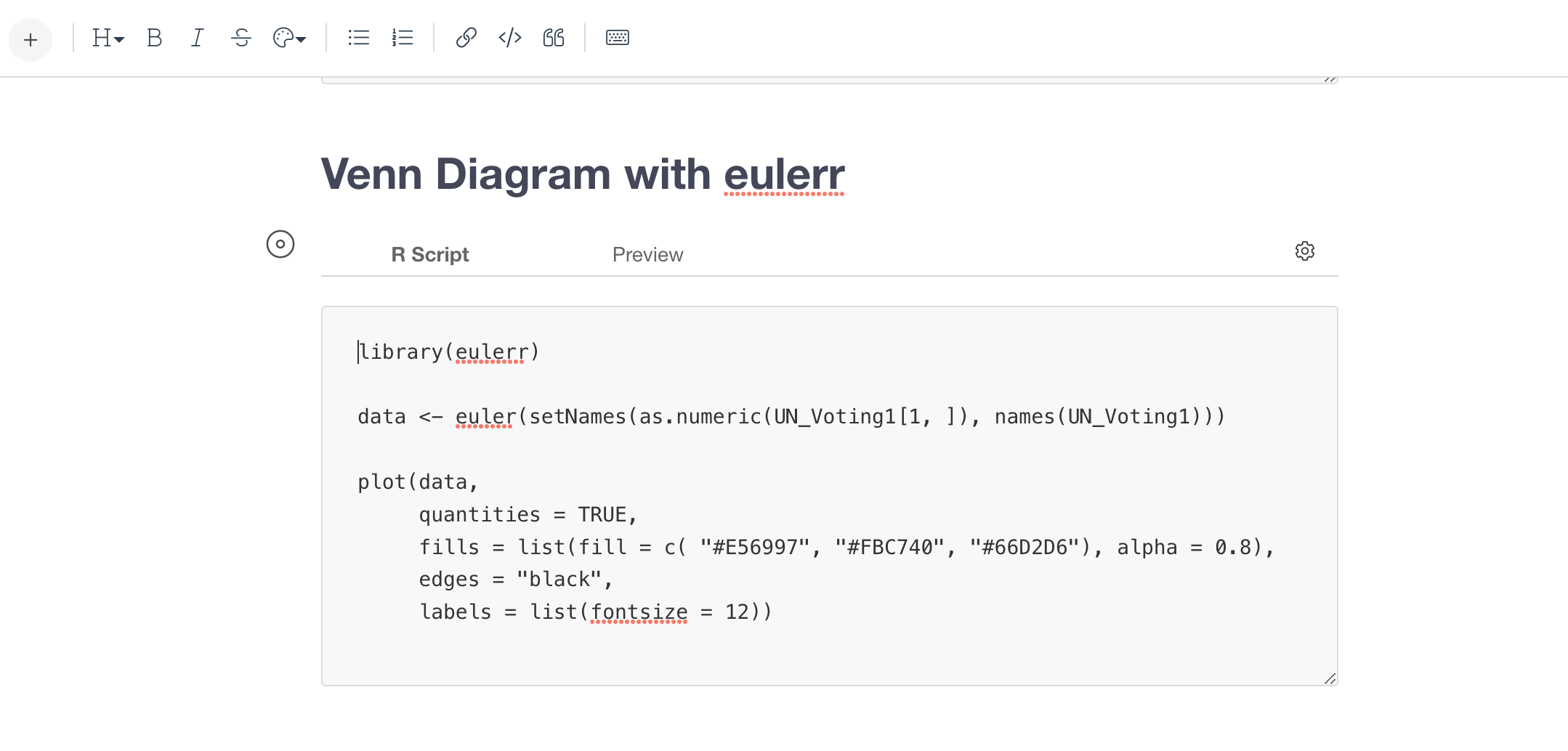
The important thing is that you want to set the name of data frame inside the 'euler' function.
The first argument inside the 'euler' function is setting the value row, which is the first row (and only row) of the data. The second argument inside the function is setting the column names, which will be used to label the circle names.
The last 'plot' function is simply visualizing the data generated by the above 'euler' function by taking the formatting inputs such as color, font size, etc.
Once that's done, then you should be seeing a Venn Diagram chart like below when you click on the Preview tab.
4. Create Venn Diagram in Dashboard
You can do the same thing in Dashboard as well.
You want to select 'Add Text' button.
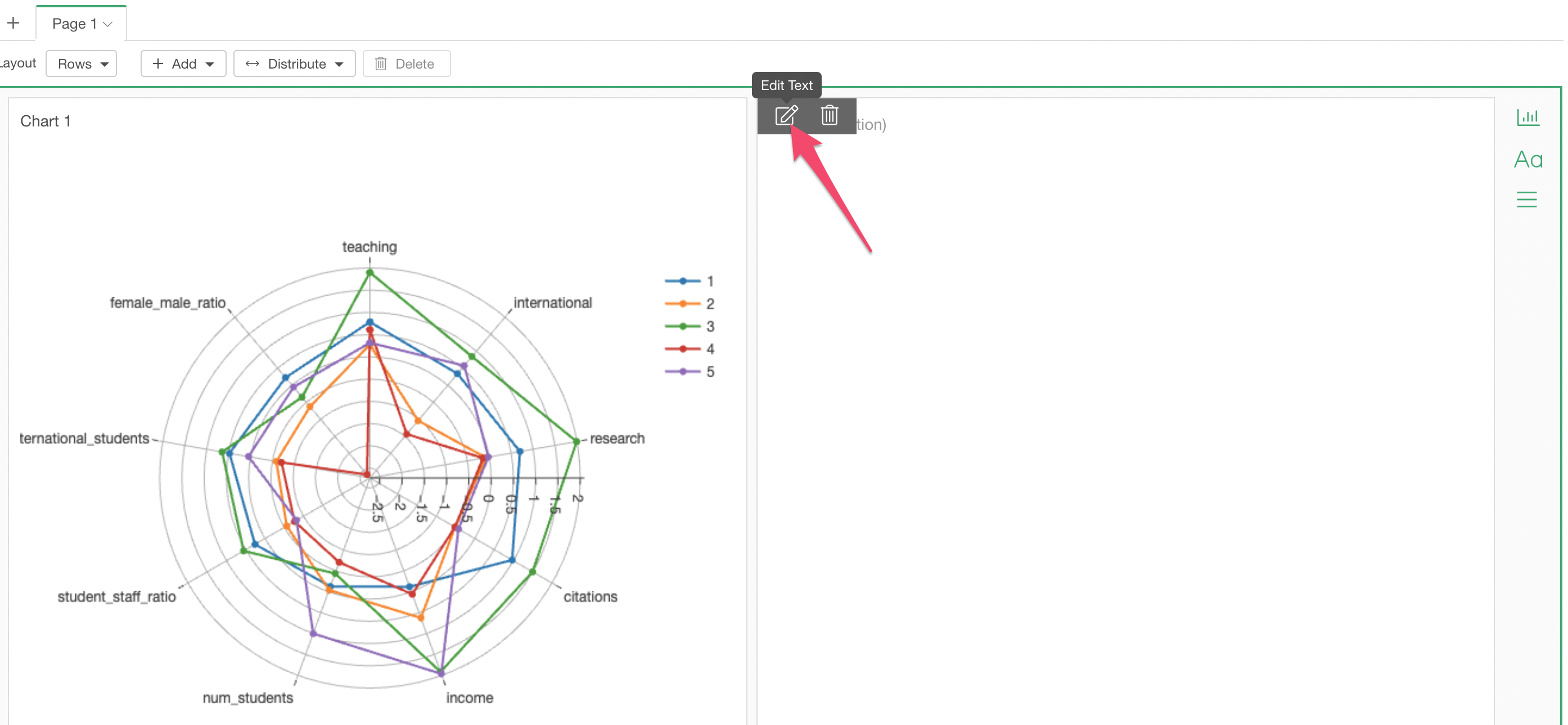
Click the 'Edit Text' button.
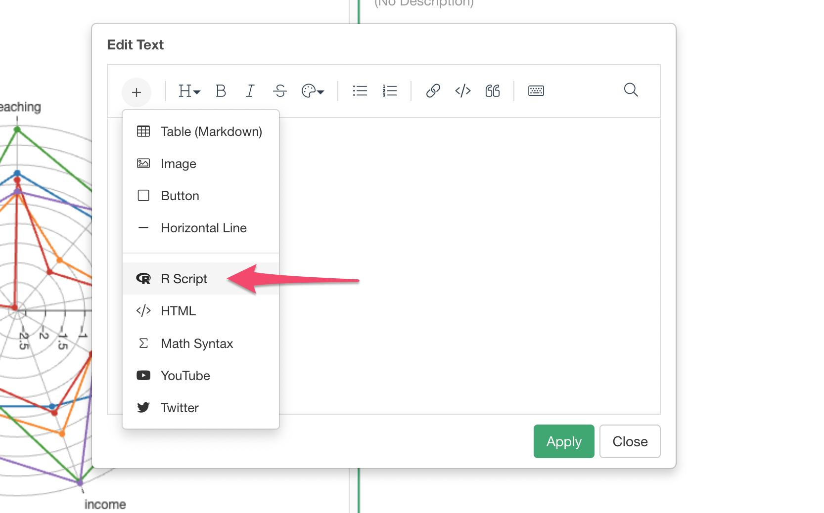
Select 'R Script' from the Plus button menu.
Then, type in the same code that we used for the above Note example.