How to Create a Gantt Chart in Exploratory
A Gantt chart is an essential tool for visually representing project tasks and progress over time. By displaying tasks’ start dates, end dates, and assignees along a timeline, it enables at-a-glance understanding of overall project progress.
1. How to Install R Package
We’ll use a R package called timevis to create Gantt
charts.
For details about the timevis package, please see here.
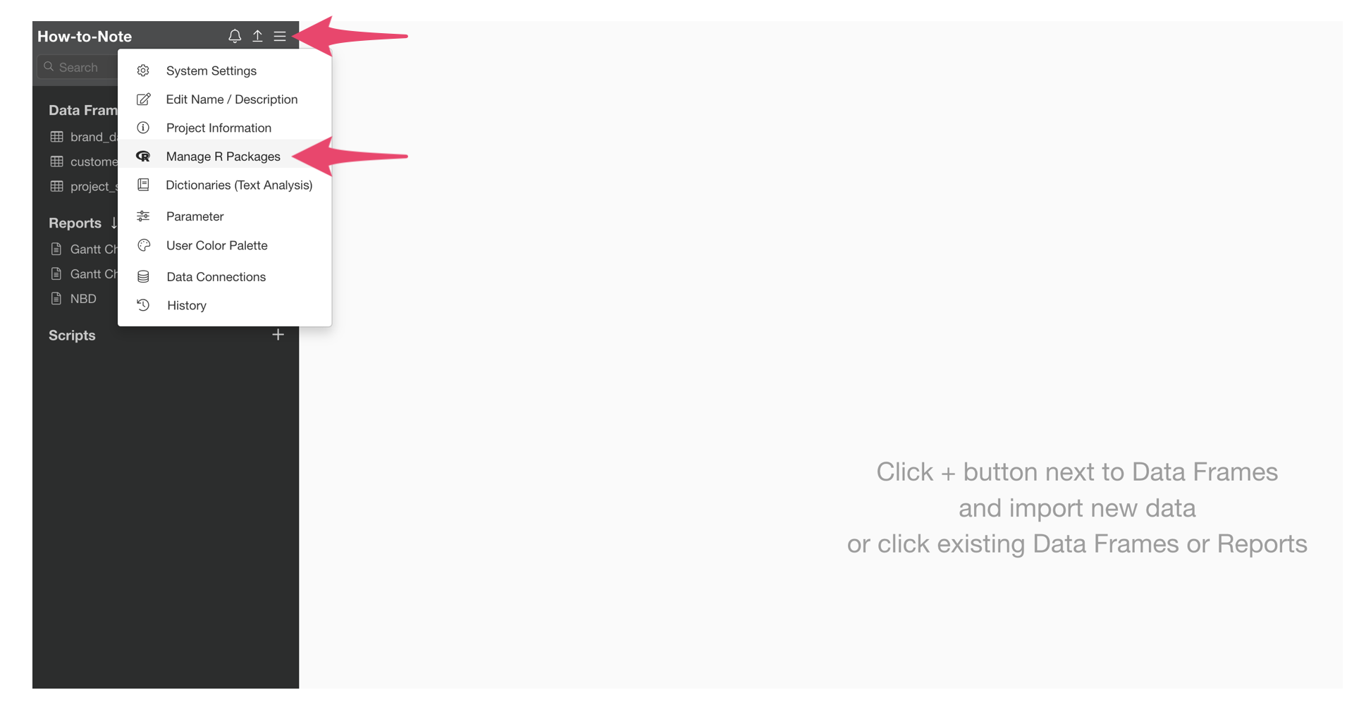
Select “Manage R Packages” from the project menu.
When the R Package Management dialog opens, select “Install New
Package,” enter “timevis” and click the install button.
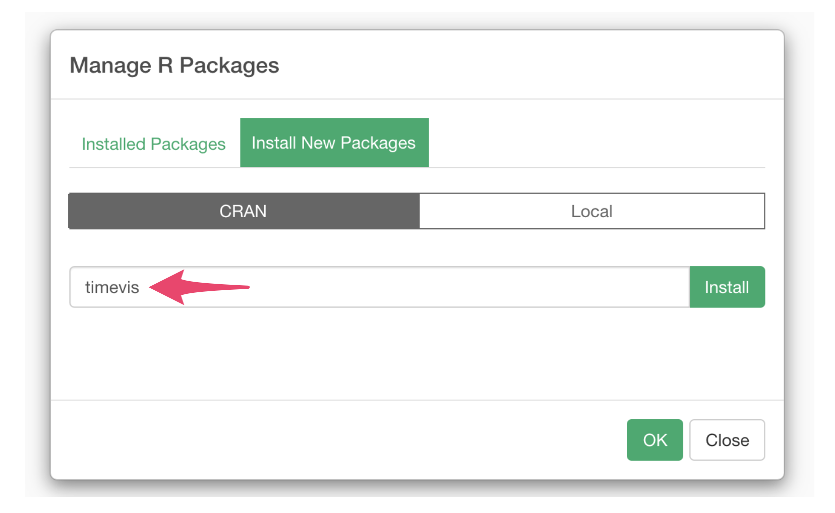
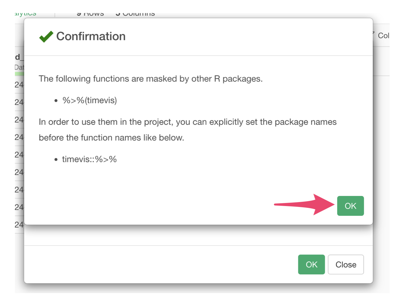
A confirmation dialog will appear, click the OK button.
2. Data to Use
We’ll use a sample project management dataset called “project_schedule”. The data can be downloaded from here.
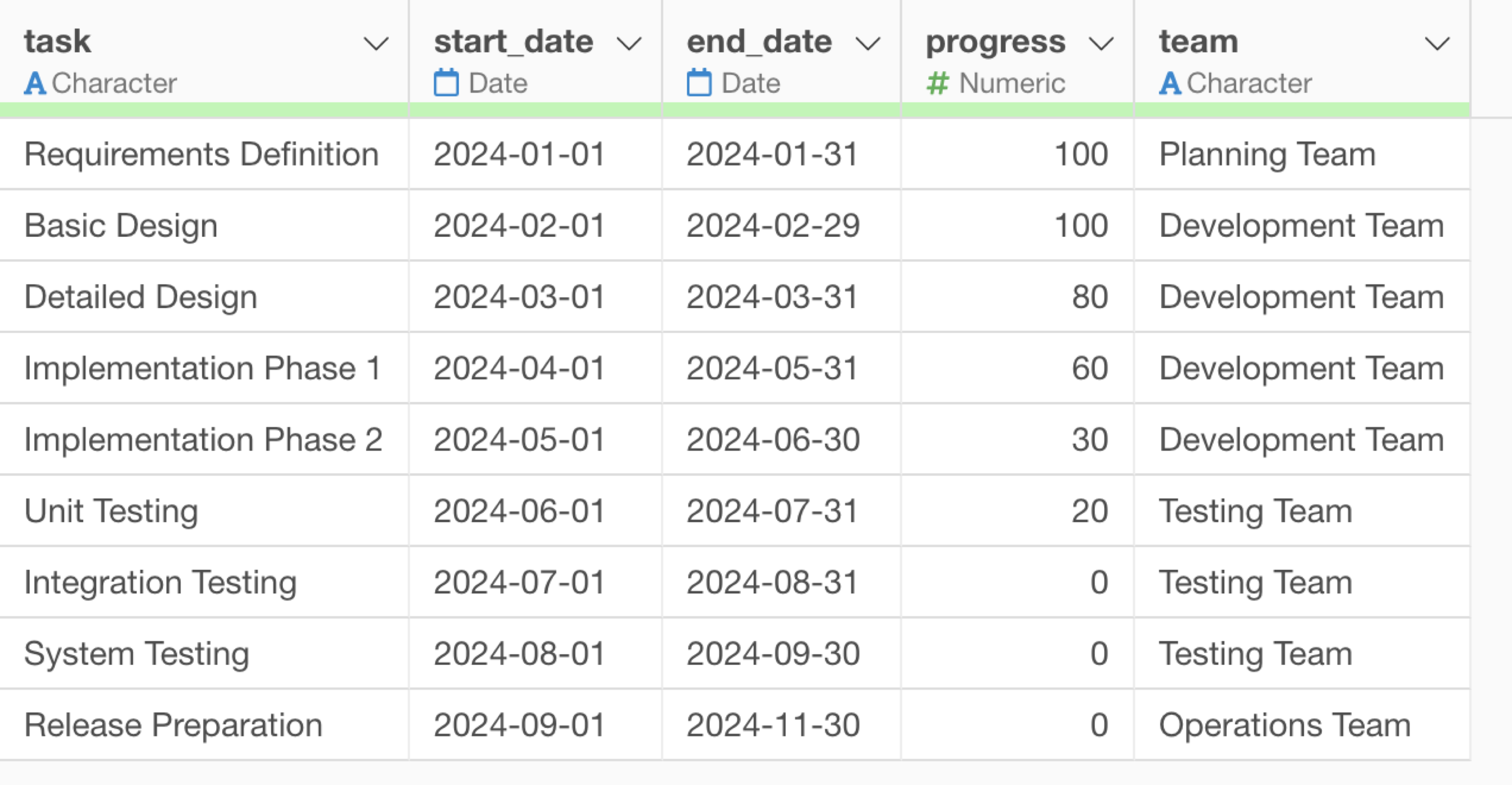
This data is used for managing project task schedules, where each row represents one task and includes the following columns:
- task: Task name (e.g., Requirements Definition, Basic Design, etc.)
- start_date: Task start date
- end_date: Task end date
- progress: Task progress rate (%)
- team: Responsible team (e.g., Planning Team, Development Team, etc.)
3. Creating a Gantt Chart
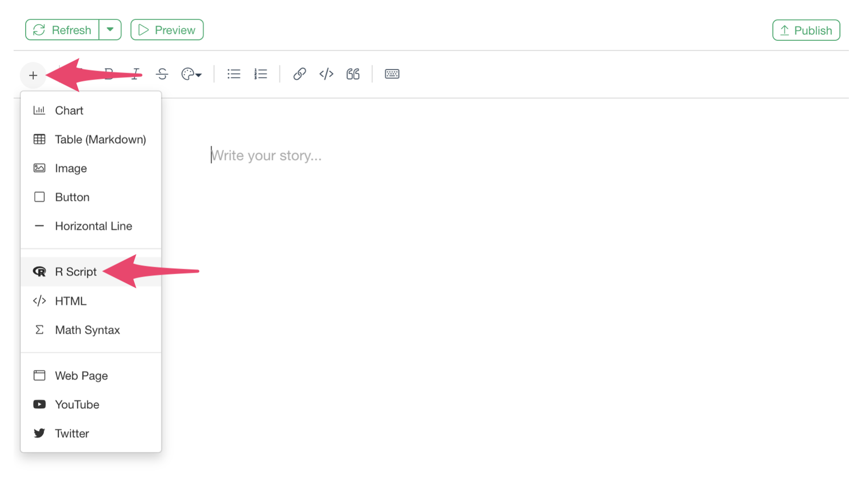
Click the + button on the right side of the report and select “Create Note.”
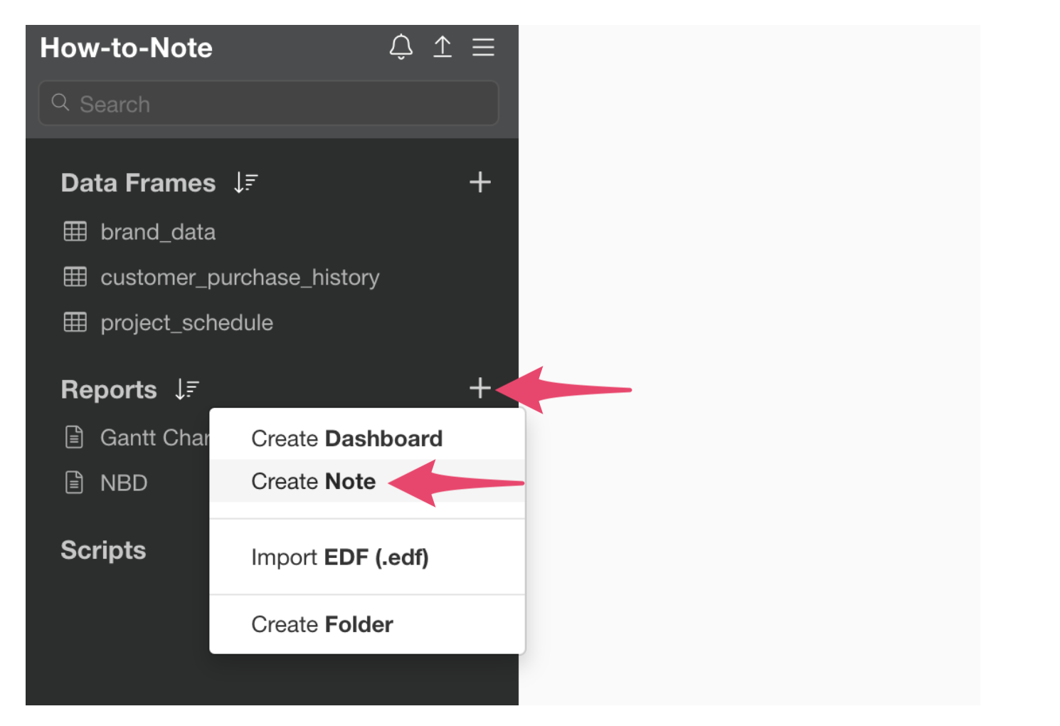
This will open the note window.
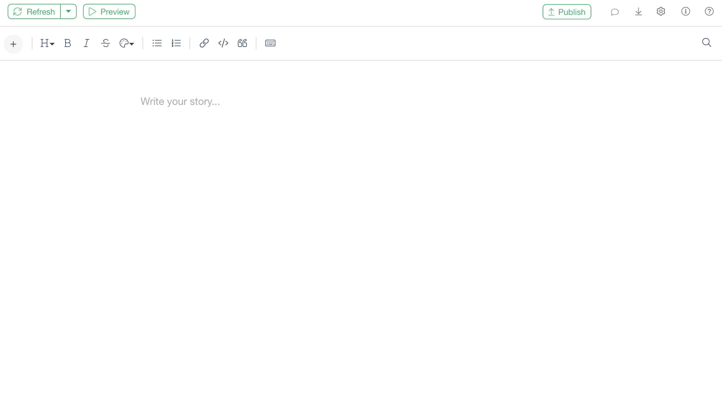
Since we need to write R script to visualize the Gantt chart, select “R Script” from the plus button inside the toolbar.
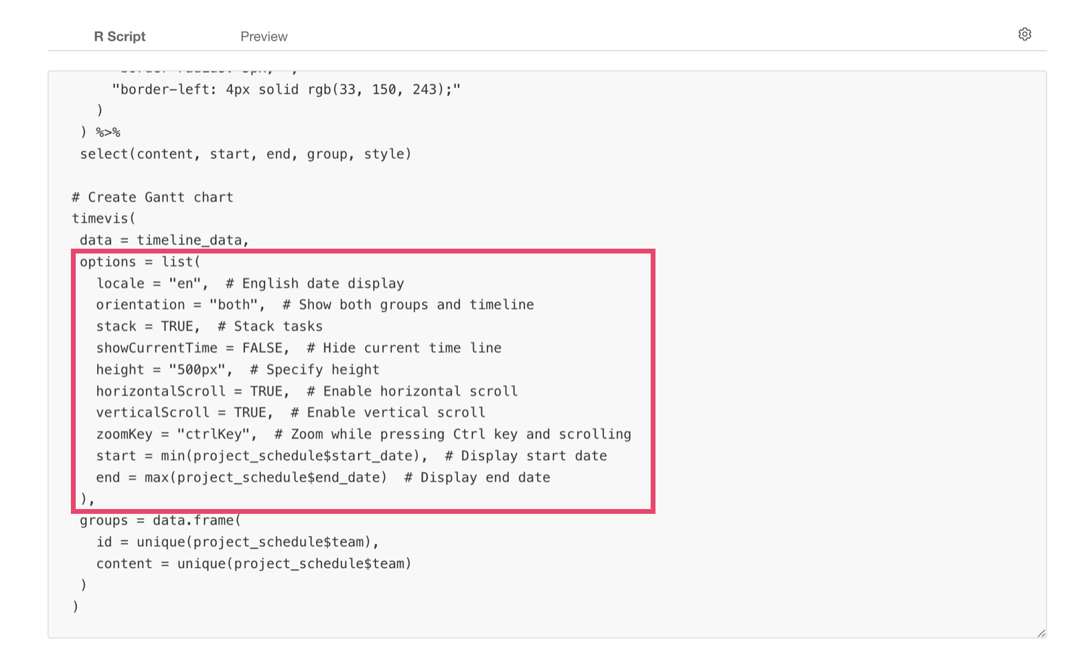
Copy and paste the following script into this R script:
# Load libraries
library(timevis)
# Data preparation (formatting data for timevis)
timeline_data <- project_schedule %>%
mutate(
content = task,
start = start_date,
end = end_date,
group = team,
# Progress bar style settings
style = paste0(
"background-color: rgba(33, 150, 243, 0.3); ",
"height: 30px; ",
"border-radius: 5px; ",
"border-left: 4px solid rgb(33, 150, 243);"
)
) %>%
select(content, start, end, group, style)
# Create Gantt chart
timevis(
data = timeline_data,
options = list(
locale = "en", # English date display
orientation = "both", # Show both groups and timeline
stack = TRUE, # Stack tasks
showCurrentTime = FALSE, # Hide current time line
height = "500px", # Specify height
horizontalScroll = TRUE, # Enable horizontal scroll
verticalScroll = TRUE, # Enable vertical scroll
zoomKey = "ctrlKey", # Zoom while pressing Ctrl key and scrolling
start = min(project_schedule$start_date), # Display start date
end = max(project_schedule$end_date) # Display end date
),
groups = data.frame(
id = unique(project_schedule$team),
content = unique(project_schedule$team)
)
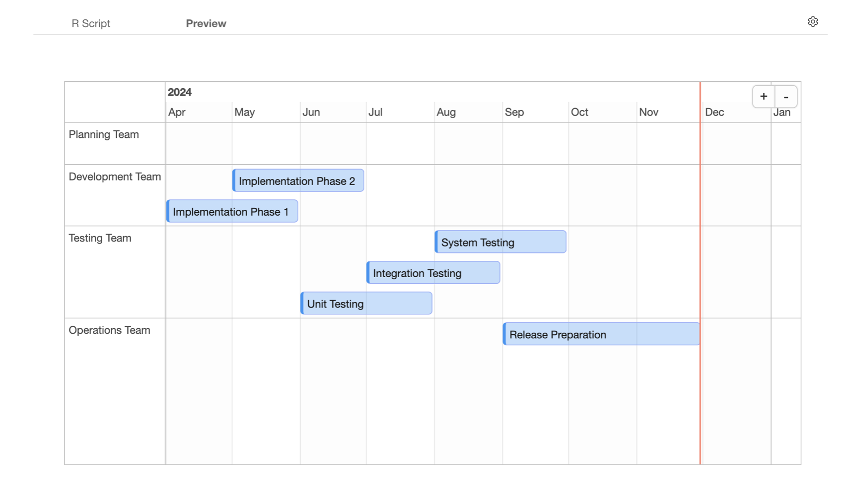
)It should look something like this.
When using your own data, modify the following parts inside the code:
- Specify your Data Frame name instead of
project_schedule. - Specify actual column names for
task,start_date,end_date,team.
After the R script is ready, click the “Preview” button.
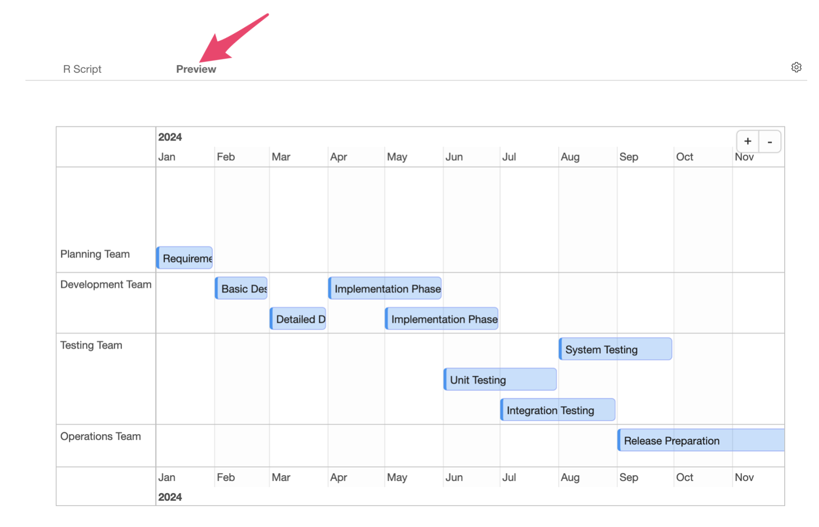
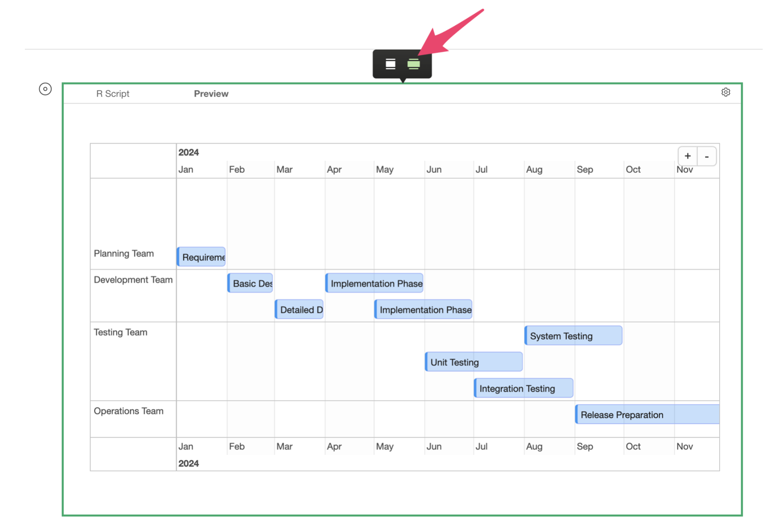
To enlarge the chart size, click the chart and then click the expand button.
When previewed, you can see the following features in the Gantt Chart:
- Tasks are grouped by team
- Task details are shown on mouse hover
- You can move across the entire timeline
4. Options for Customizing Gantt Charts
When creating Gantt charts with the timevis package, you
can modify chart settings using the following options:
- orientation: Specify timeline label position (“top”, “bottom”, “both”)
- stack: Control task overlap (TRUE: no overlap / FALSE: allow overlap)
- showCurrentTime: Current time line display (TRUE: show / FALSE: hide)
- horizontalScroll: Horizontal scroll function (TRUE: enable / FALSE: disable)
- verticalScroll: Vertical scroll function (TRUE: enable / FALSE: disable)
These options should be listed with commas inside the
list brackets.
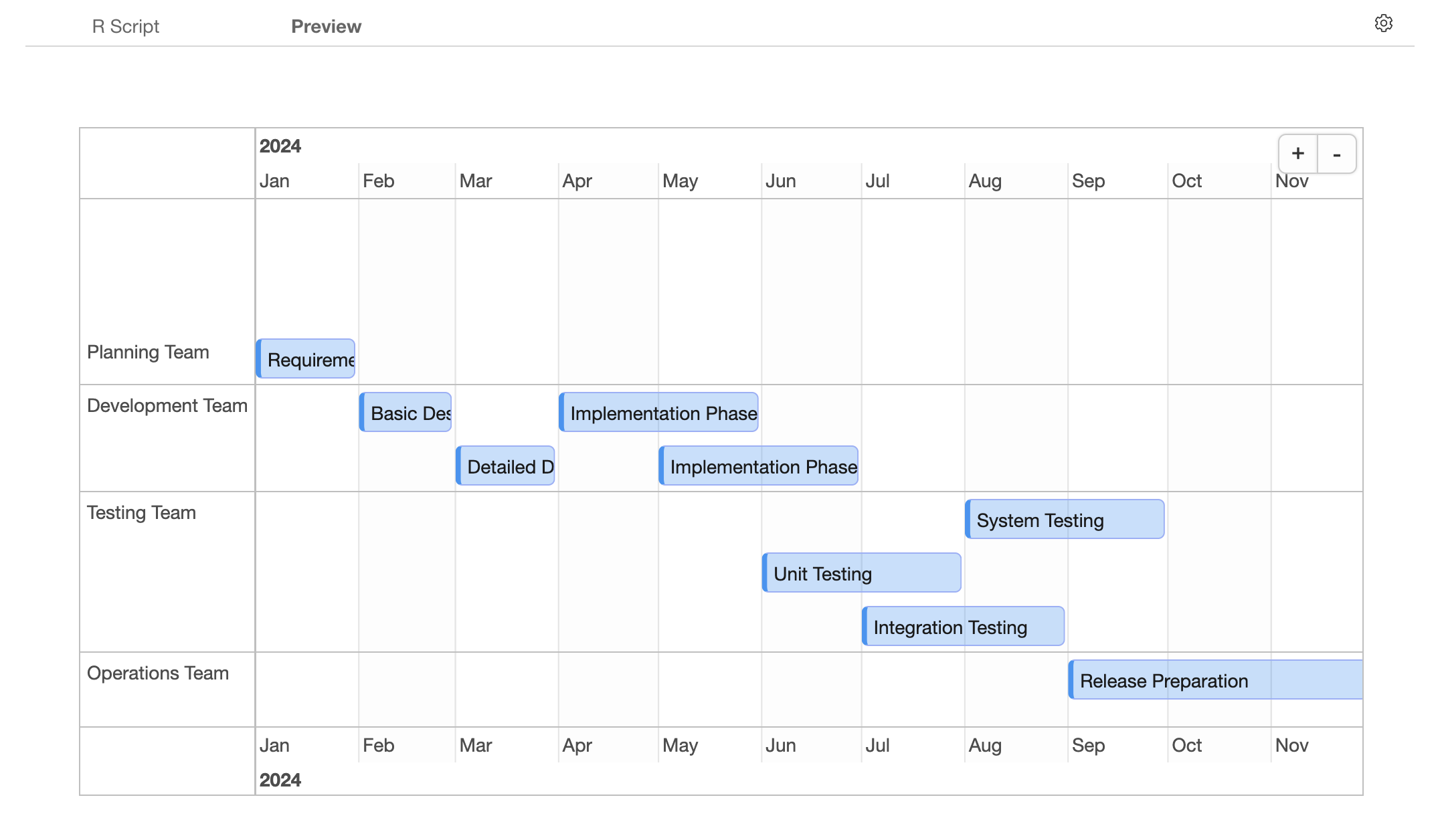
For example, by changing the following two options, we can display timeline labels only at the top and position it to show the current time line:
- orientation = “top”
- showCurrentTime = TRUE