How to Create a Sankey Chart
A Sankey chart is a type of visualization that represents the “flow” from one category to another using the width of bands. The wider the band, the greater the volume or proportion along that specific path.
This is particularly effective when you want to intuitively understand how values change or are distributed across multiple steps, such as user behavior from a site’s entry point to exit.
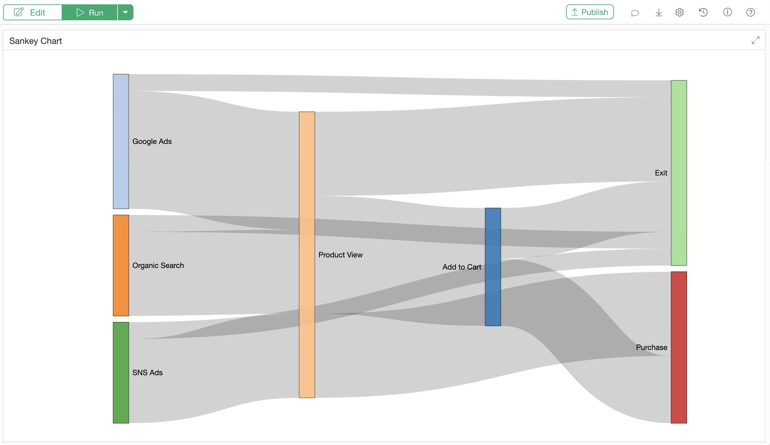
For example, the chart above is a Sankey chart representing the navigation paths of users entering an e-commerce site. You can track the journey from the entry source on the left to either exit or purchase, where wider bands indicate a higher number of users (sessions) for that path.
Data Required for a Sankey Chart
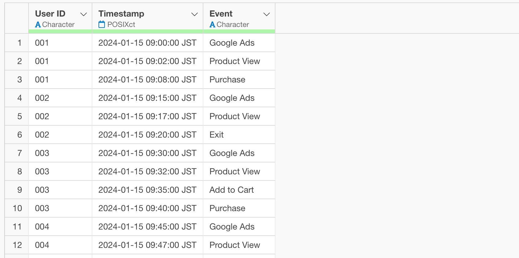
In this example, we will use event log data from a website where each row represents one user.
The sample data used in this note can be downloaded from here.
Installing the networkD3 Package
To create a Sankey chart, we use the R package
networkD3. If it is not already installed, follow these
steps to install it.
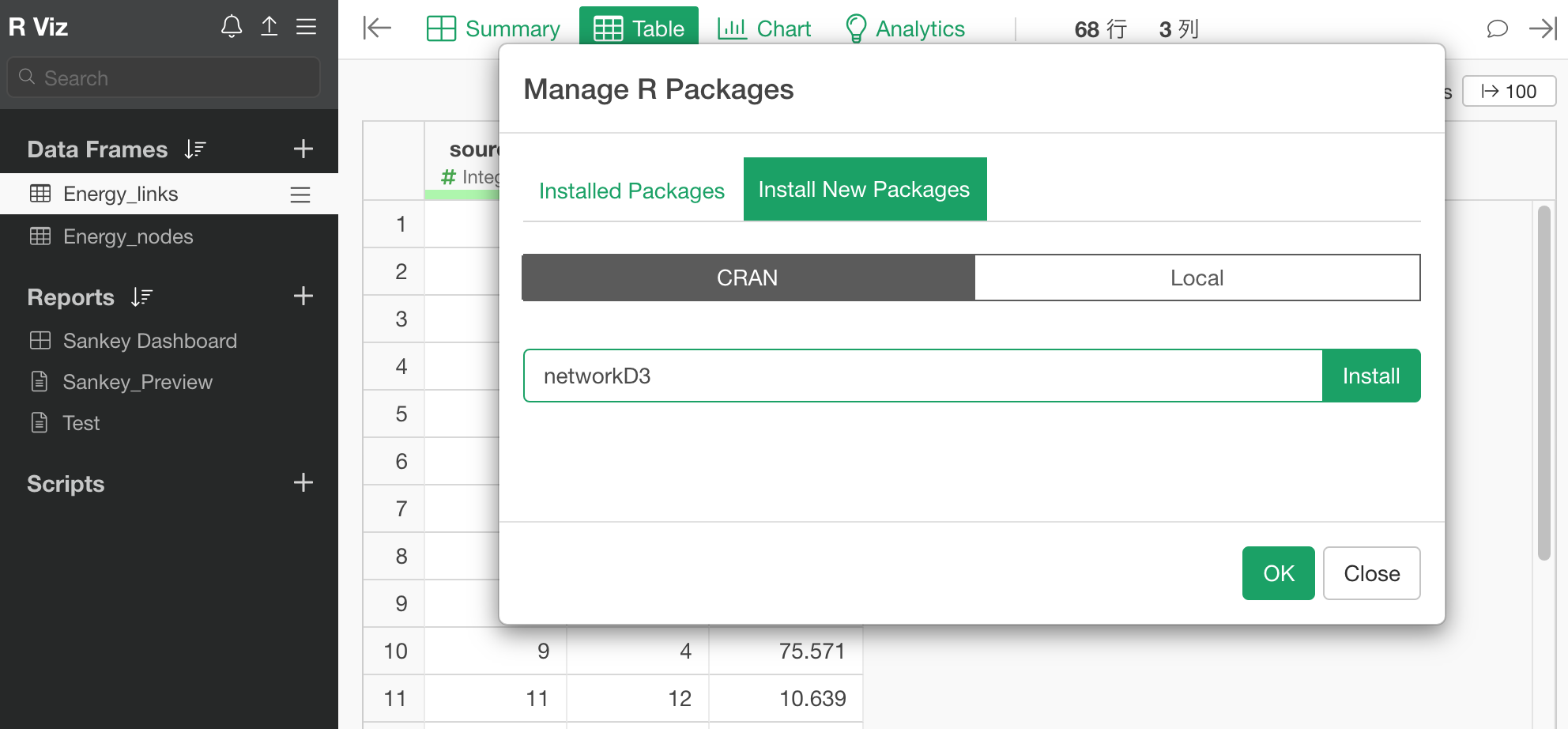
From the project menu, select “Manage R Packages.”
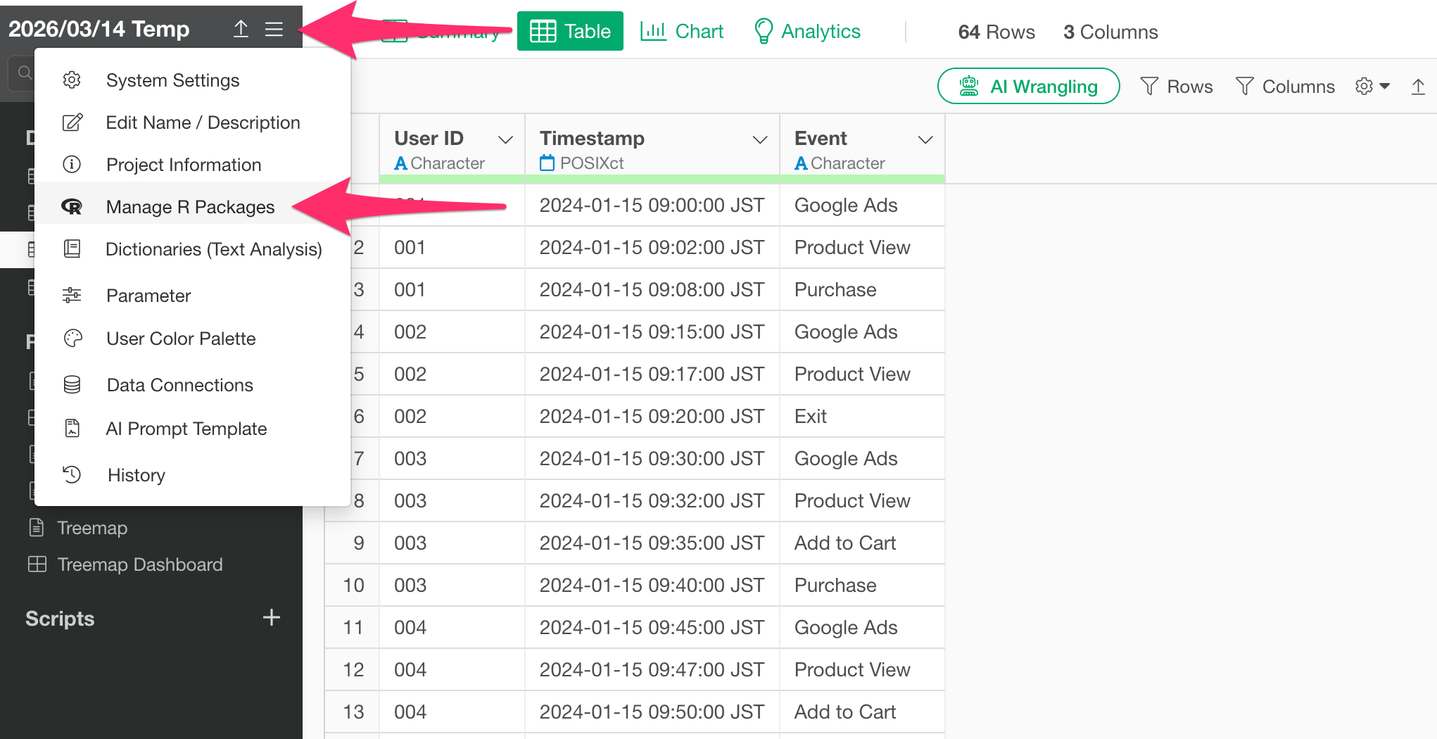
The “Manage R Packages” dialog will open. Select “Install New
Packages,” type networkD3 into the text box, and click the
Install button.
Once the message “networkD3 is Successfully installed networkD3” appears, the installation is complete.
Processing the Data
To create a Sankey chart, the data must be formatted as required by
the networkD3 package.
Specifically, you need two pieces of data: one that represents “which element (event) transitioned to which element and how many times,” and a “node data” list that enumerates all unique event names.
In this guide, we will use AI Prompt to perform this data processing.
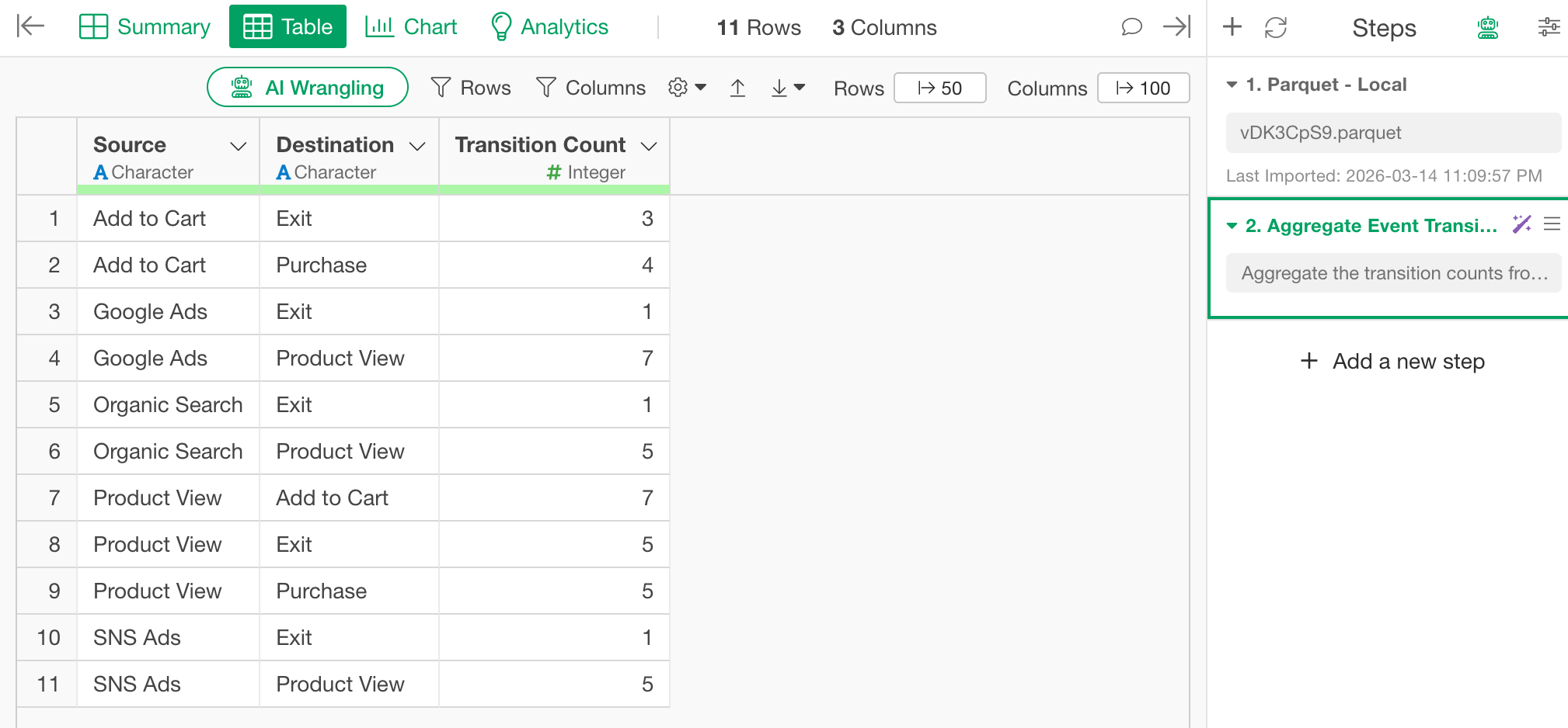
1. Aggregate Transition Pairs
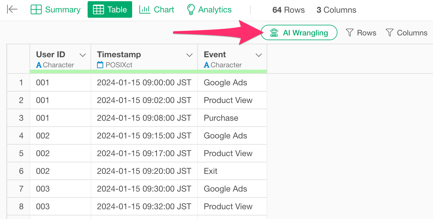
First, open the log data and click the “AI Prompt” button at the top of the screen.
When the AI Prompt input field appears, enter the following prompt to aggregate all transition combinations and run it.
Aggregate the transition counts from source to destination, excluding cases where the destination is missing.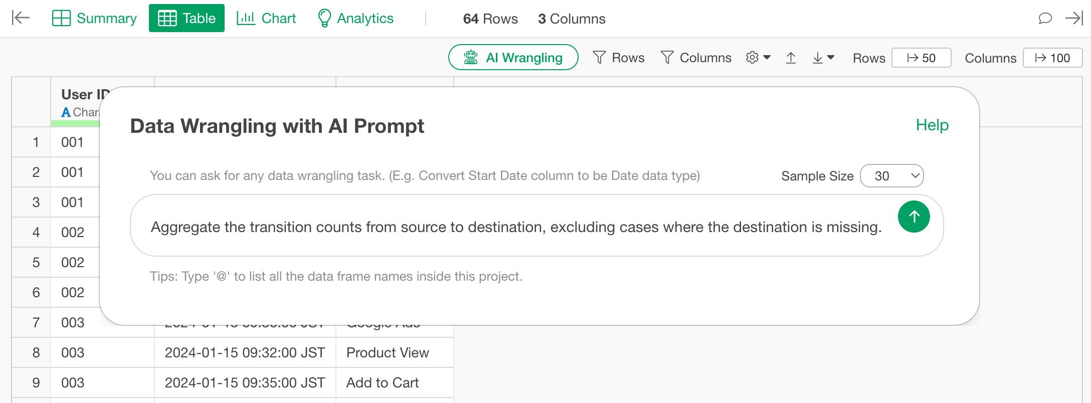 Review
the generated code and click “Run as Step.”
Review
the generated code and click “Run as Step.”
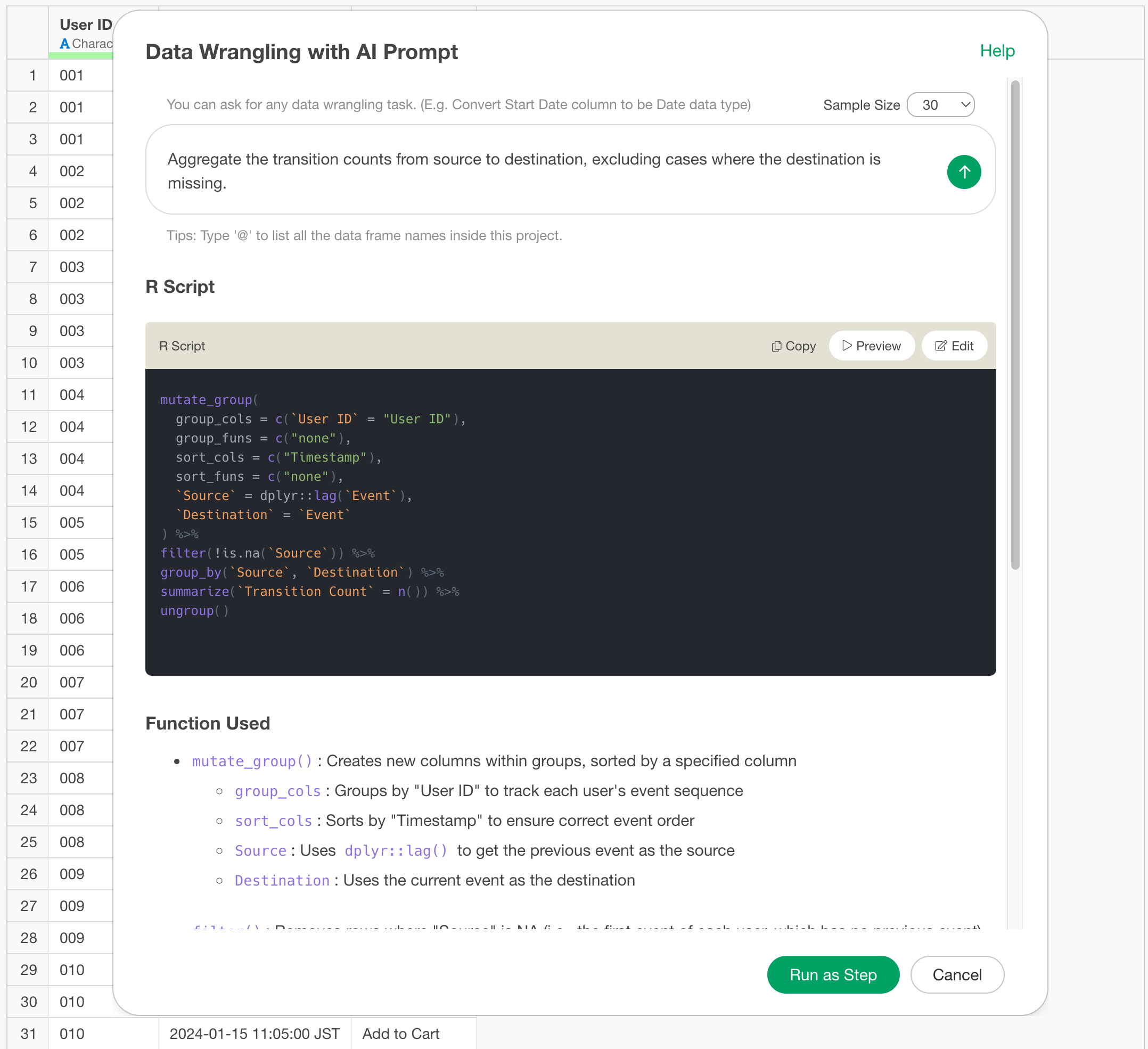
This creates a data frame consisting of three columns: Source, Target, and Count.
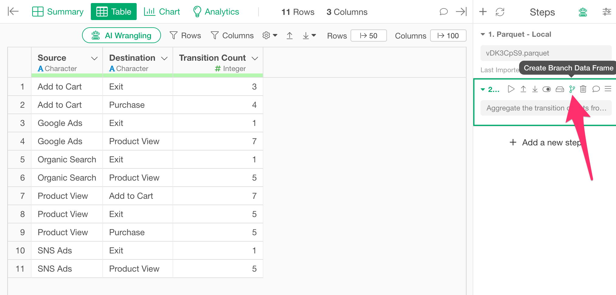
2. Create a Node List using a Branch
Next, create a “Node” data frame that lists all unique event names.
Since nodes require a unique list of event names appearing in both the source and target columns, we will use the Branch feature to split this into a separate data frame.
Click the “Create Branch Data Frame” button.
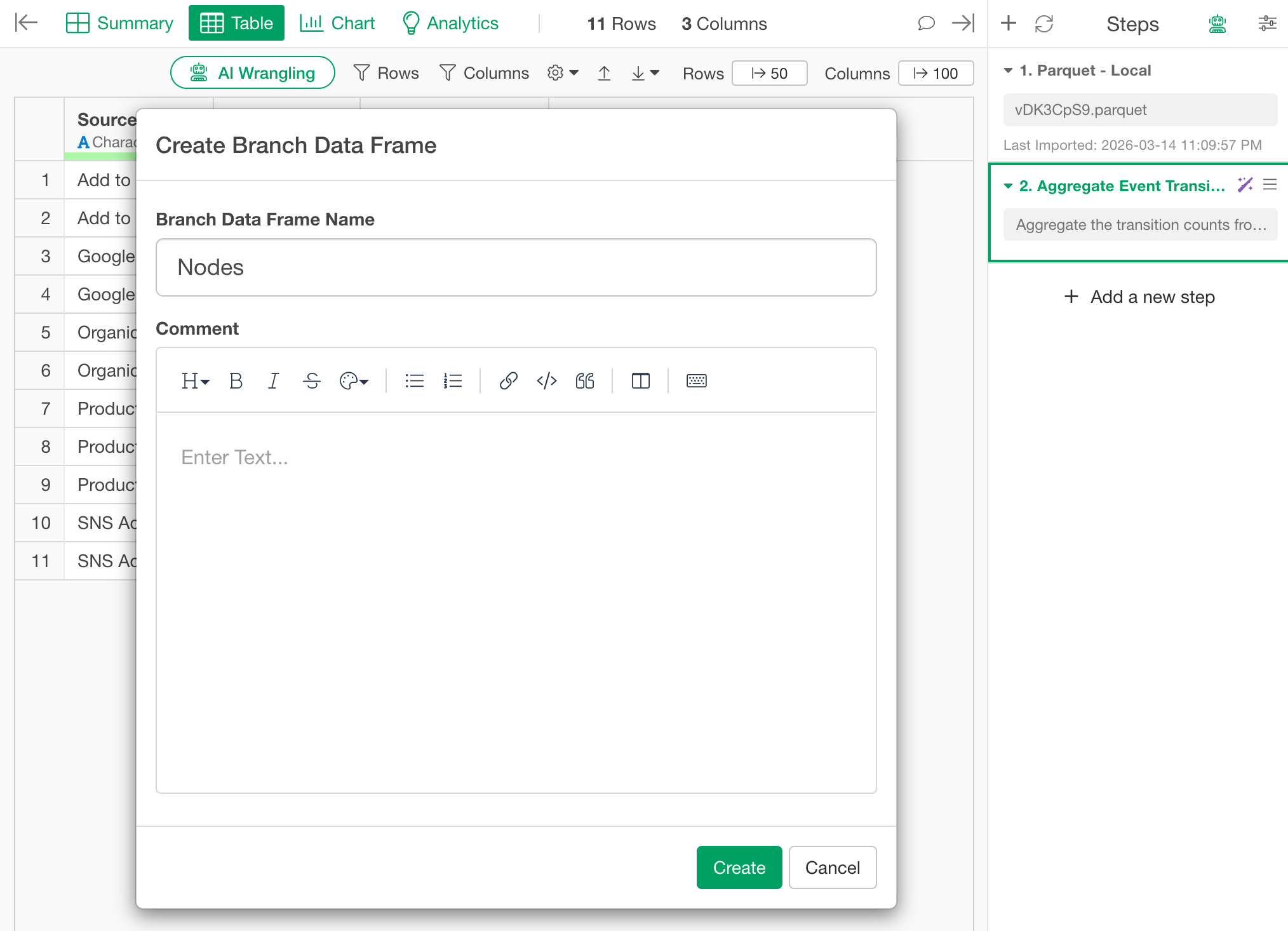
When the dialog opens, enter “Nodes” as the branch name and create it.
Once the “Nodes” branch is created, execute the AI Prompt again and enter the following prompt:
Merge source and destination into one column to generate a unique list of elements.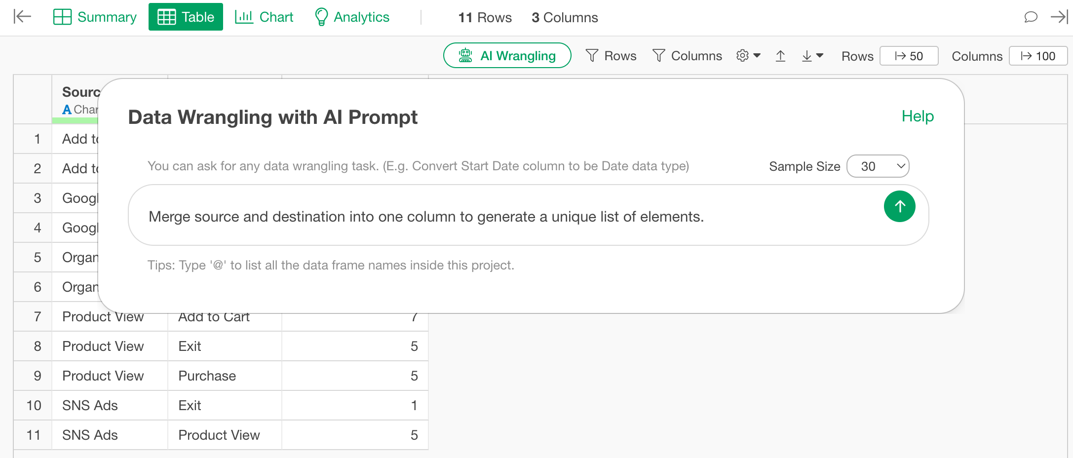
Review the generated code and click “Run as Step.”
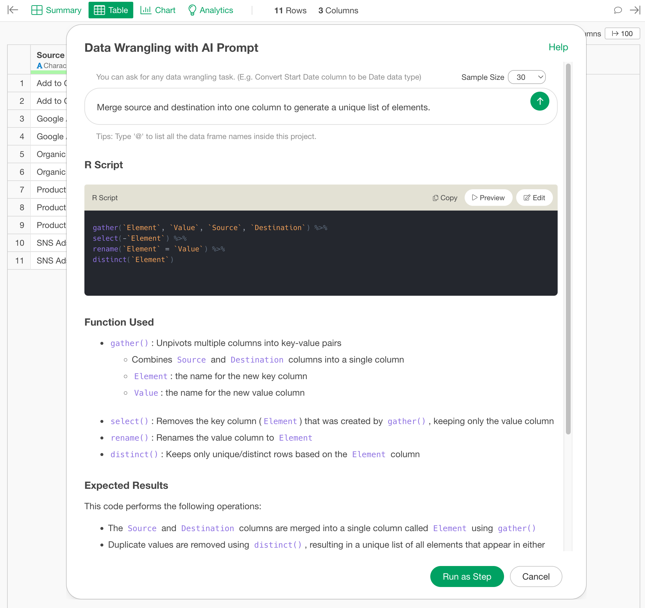
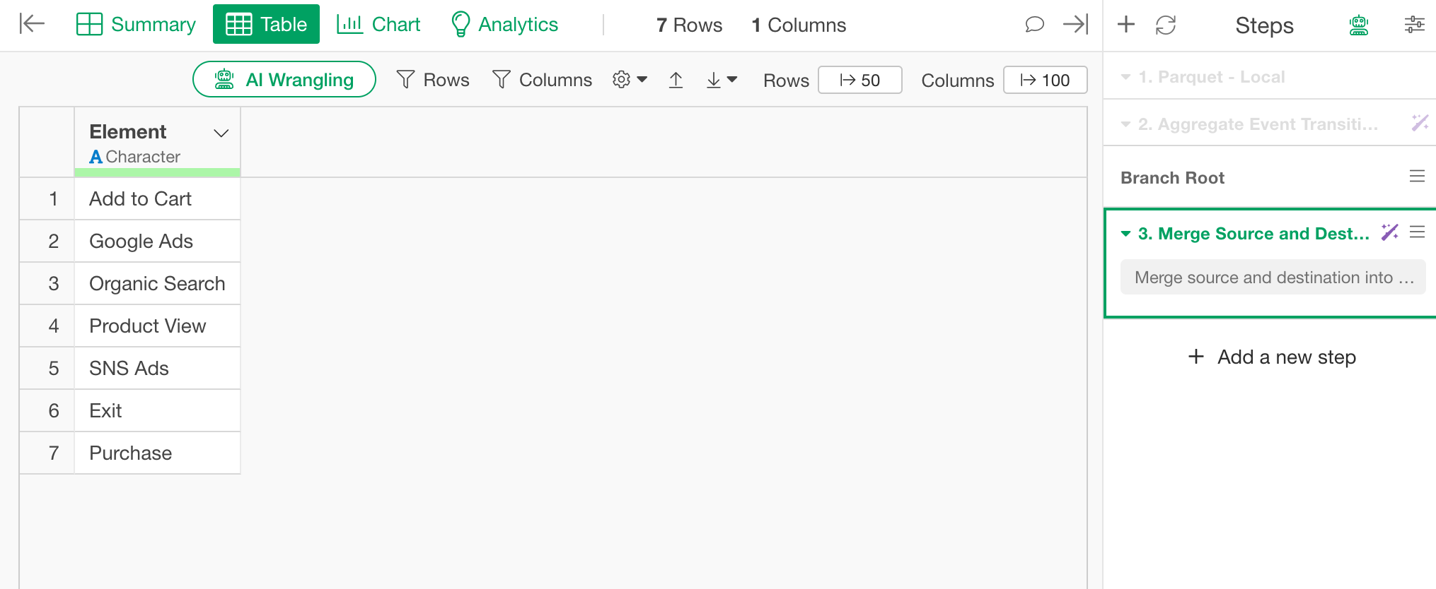
A node data frame consisting of a single “Element” column is completed.
3. Convert Transition Pairs to Indices
Return to the original data frame (log data) where you created the branch, and add a new step following the branch point.
The networkD3 package requires the source and target
values to be row numbers (0-based indices) rather than column names, so
we will perform the index conversion here.
Open the AI Prompt again, enter the following prompt, and run it.
Lookup the source and destination entries in the Nodes column and replace with their 0-indexed positions.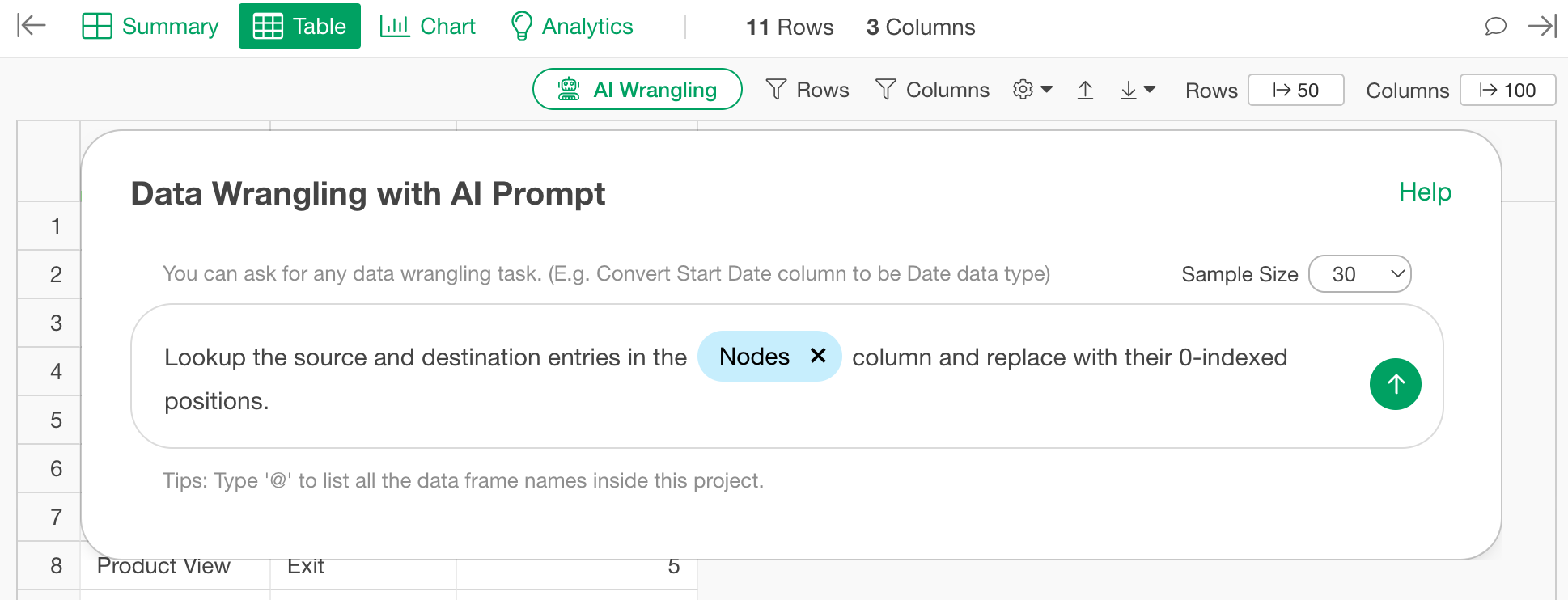
At this point, remember to specify the node data frame according to the AI Prompt data frame notation.
Once the R script is generated, click “Run as Step.”

This results in a data frame where the source and target are converted into integer indices.
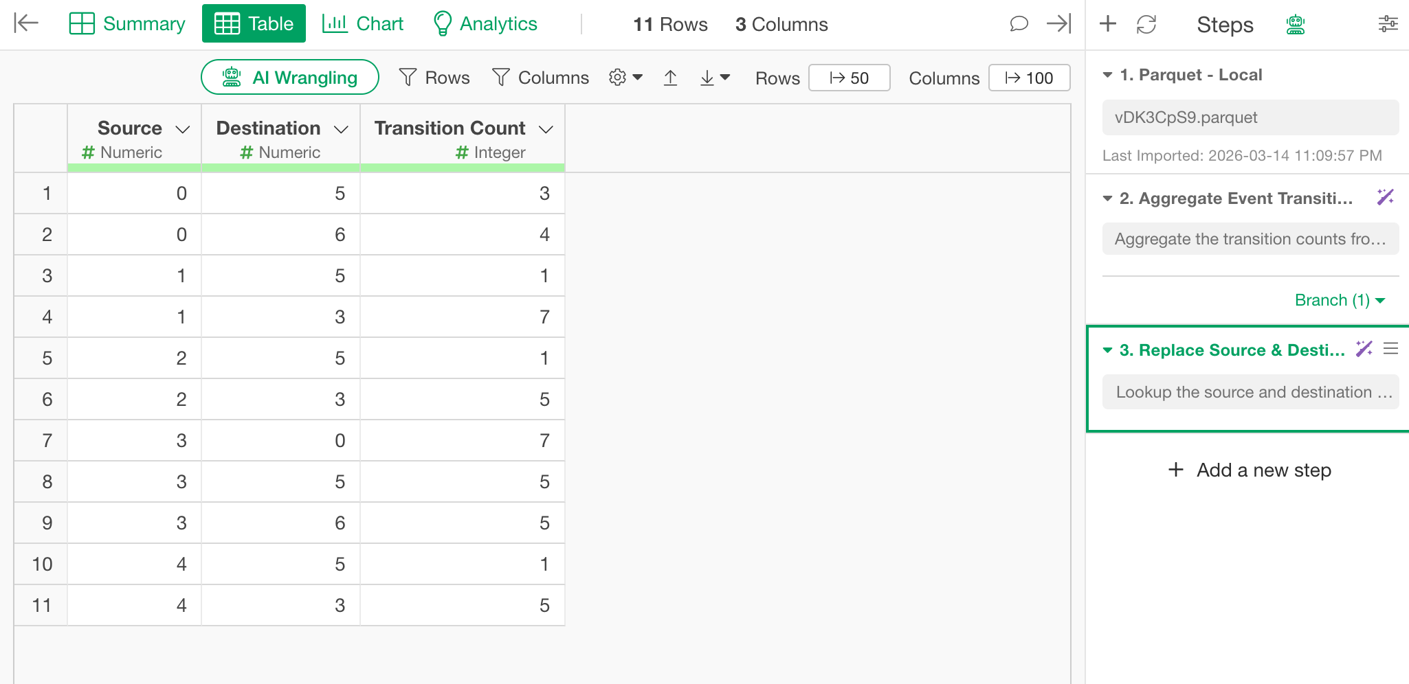
This is the final form to be used as the link data for the Sankey chart.
Creating the Sankey Chart
Select “Create Note” from the Report menu.
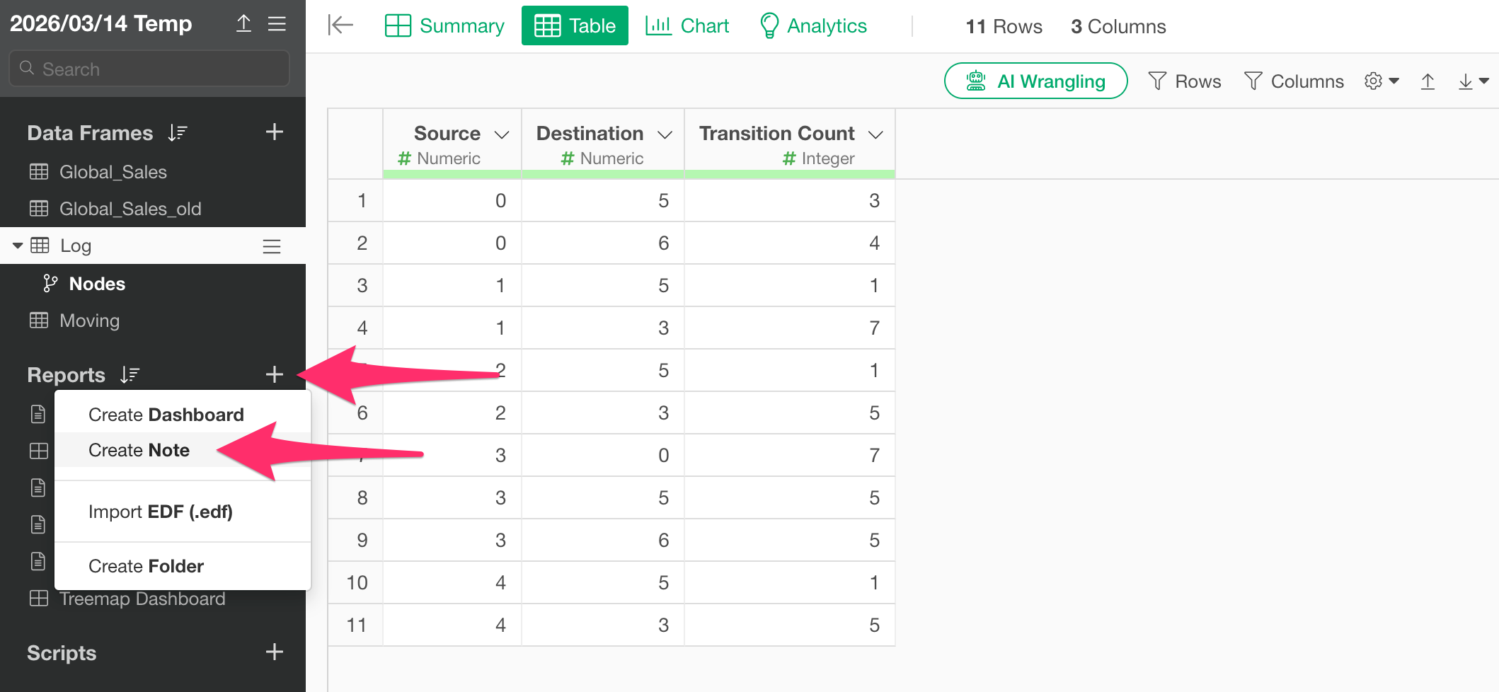
Once the new note is created, click the “Add Content” button and select “R Script.”
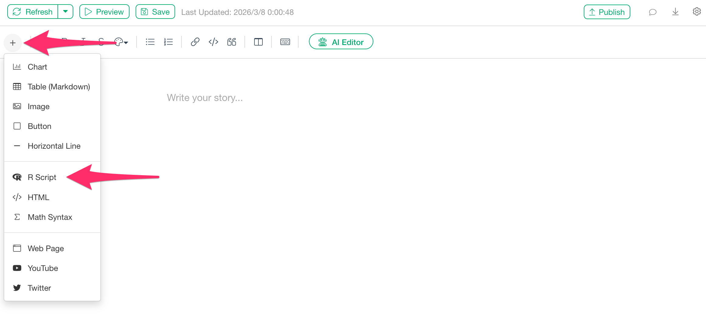
When the R script input dialog appears, paste the following code. (Please change the parts marked with # to match your own data.)
library(networkD3)

sankeyNetwork(
  Links  = Log,      # Aggregate transition pairs converted to indices
  Nodes  = Nodes,         # Specify the node list
  Source = "Source",      # Column name in "Links" (must be in quotes)
  Target = "Destination",      # Column name in "Links" (must be in quotes)
  Value  = "Transition Count",       # Column name in "Links" (must be in quotes)
  NodeID = "Element",     # Column name in "Nodes" (must be in quotes)
  units  = "people",      # Unit label (e.g., "people")
  fontSize  = 12,         # Adjust label font size
  nodeWidth = 25,         # Adjust width of node blocks (in pixels)
  height    = 600,        # Adjust chart height (in pixels)
)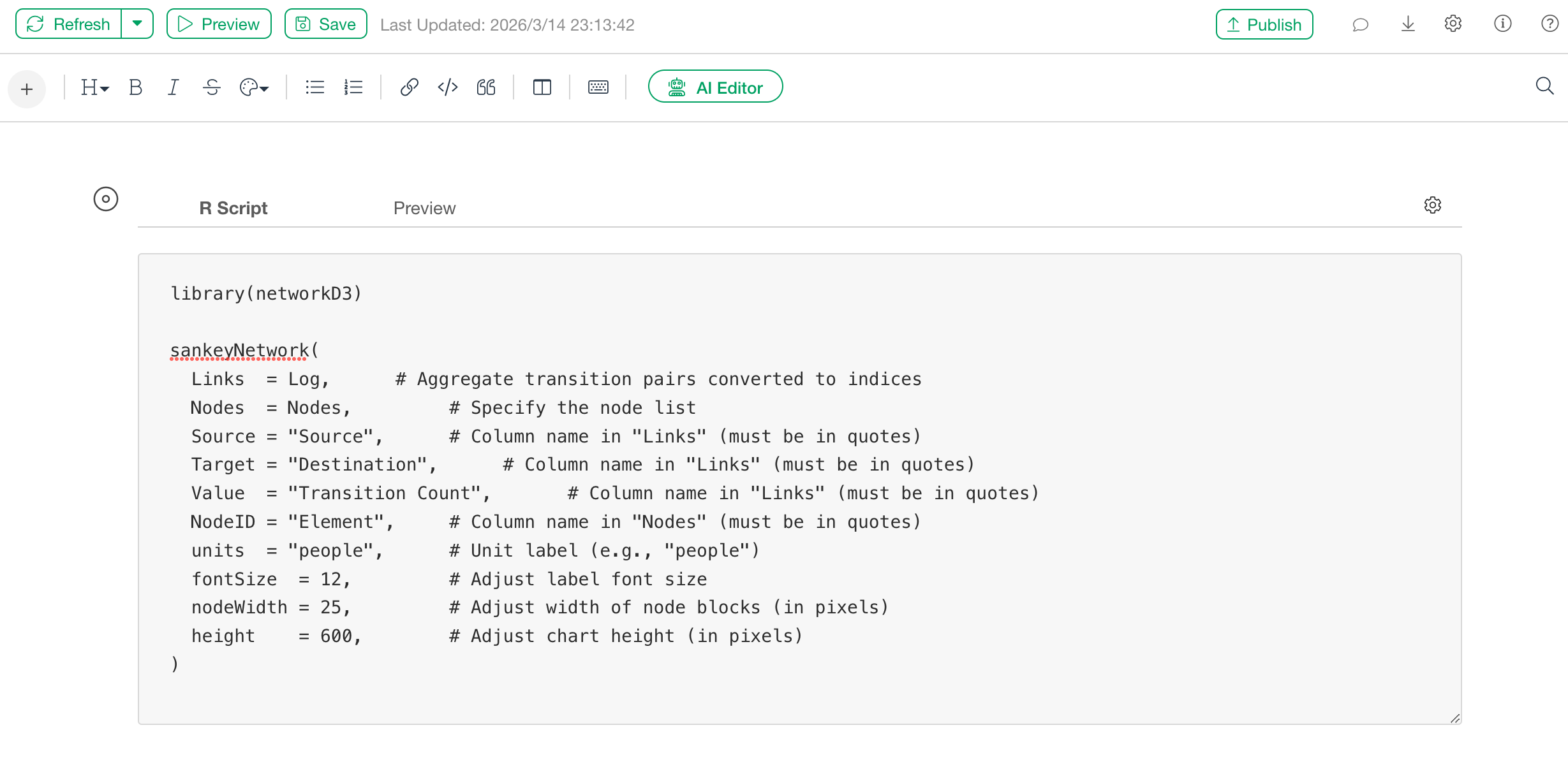
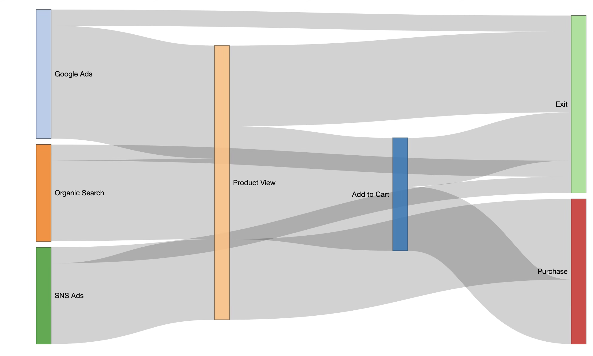
After pasting the code, click the “Preview” button at the top left of the note.
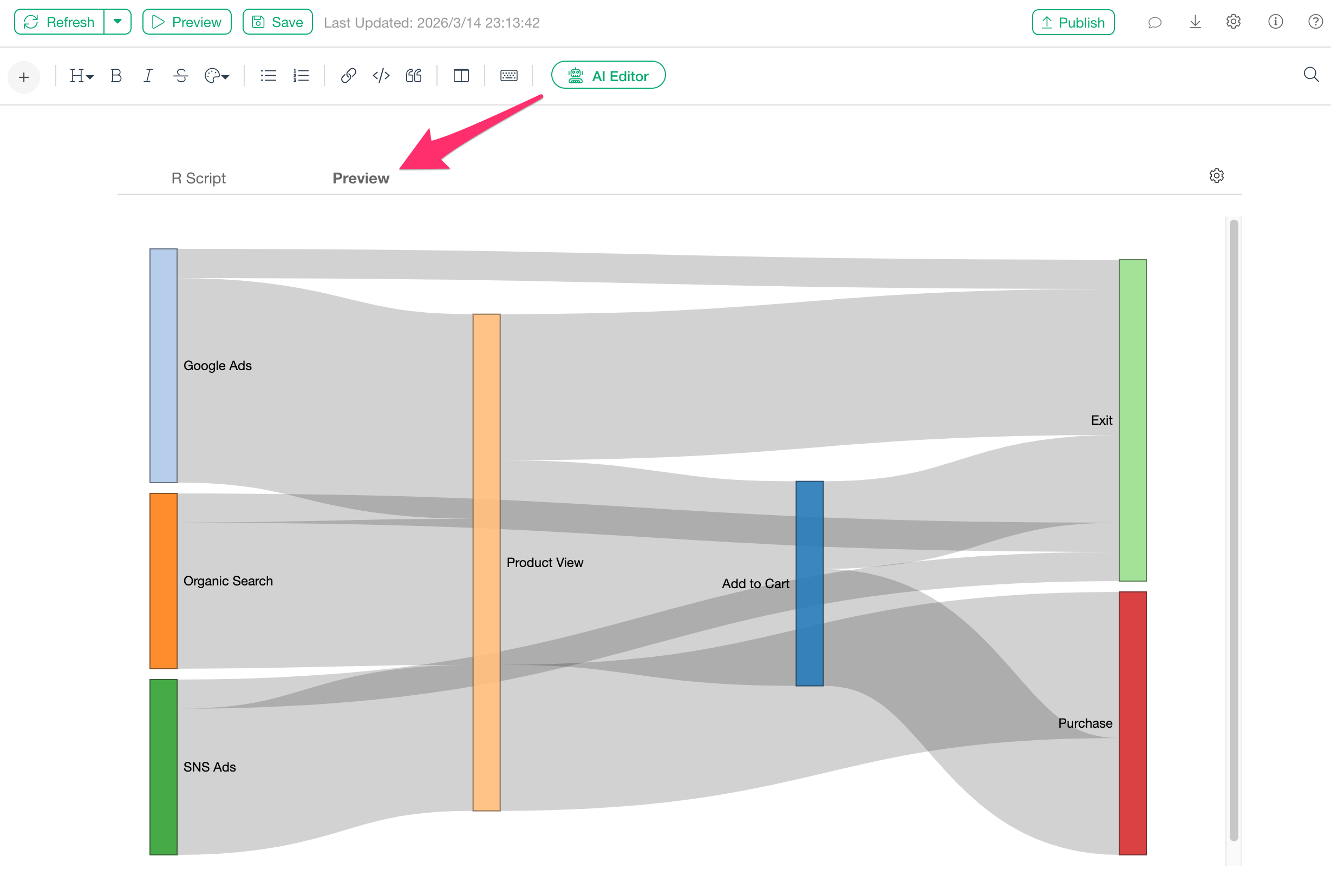
The Sankey chart will be displayed as shown above, and you can adjust the positions of each node by dragging them.
If the chart does not fit within the drawing area, please change the
value of the height argument.
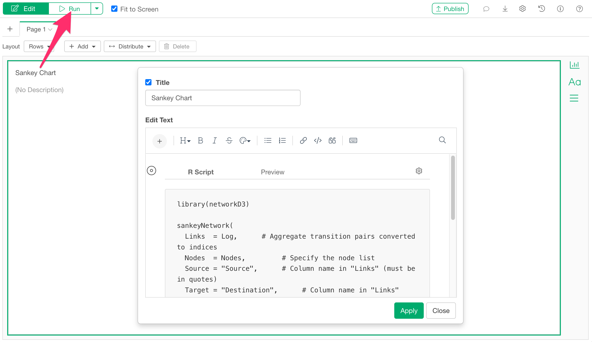
Adding a Sankey Chart to a Dashboard
Sankey charts can also be displayed in a Dashboard in the same way.
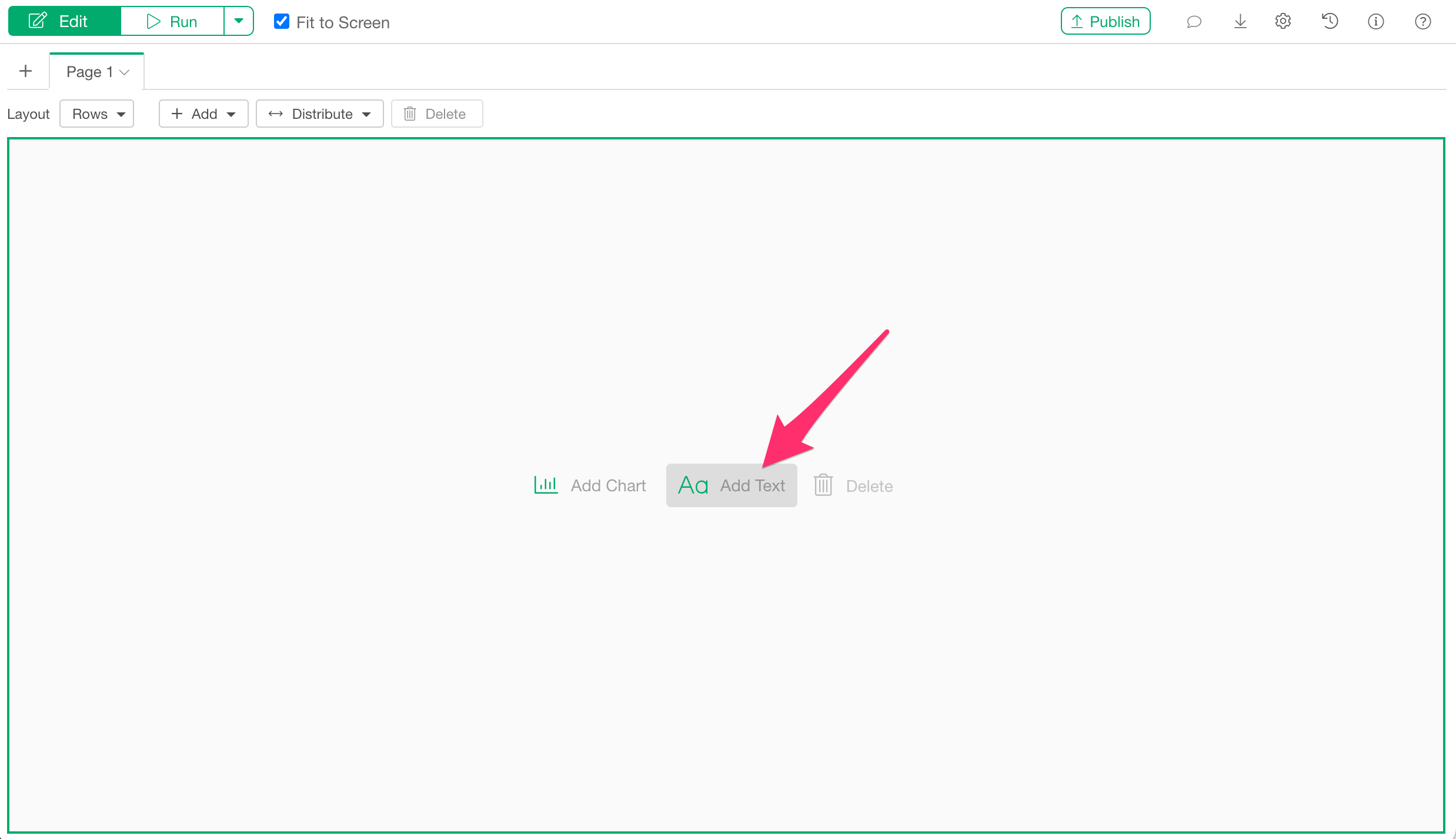
Once you open the dashboard, click the “Add Text” button from the edit screen.
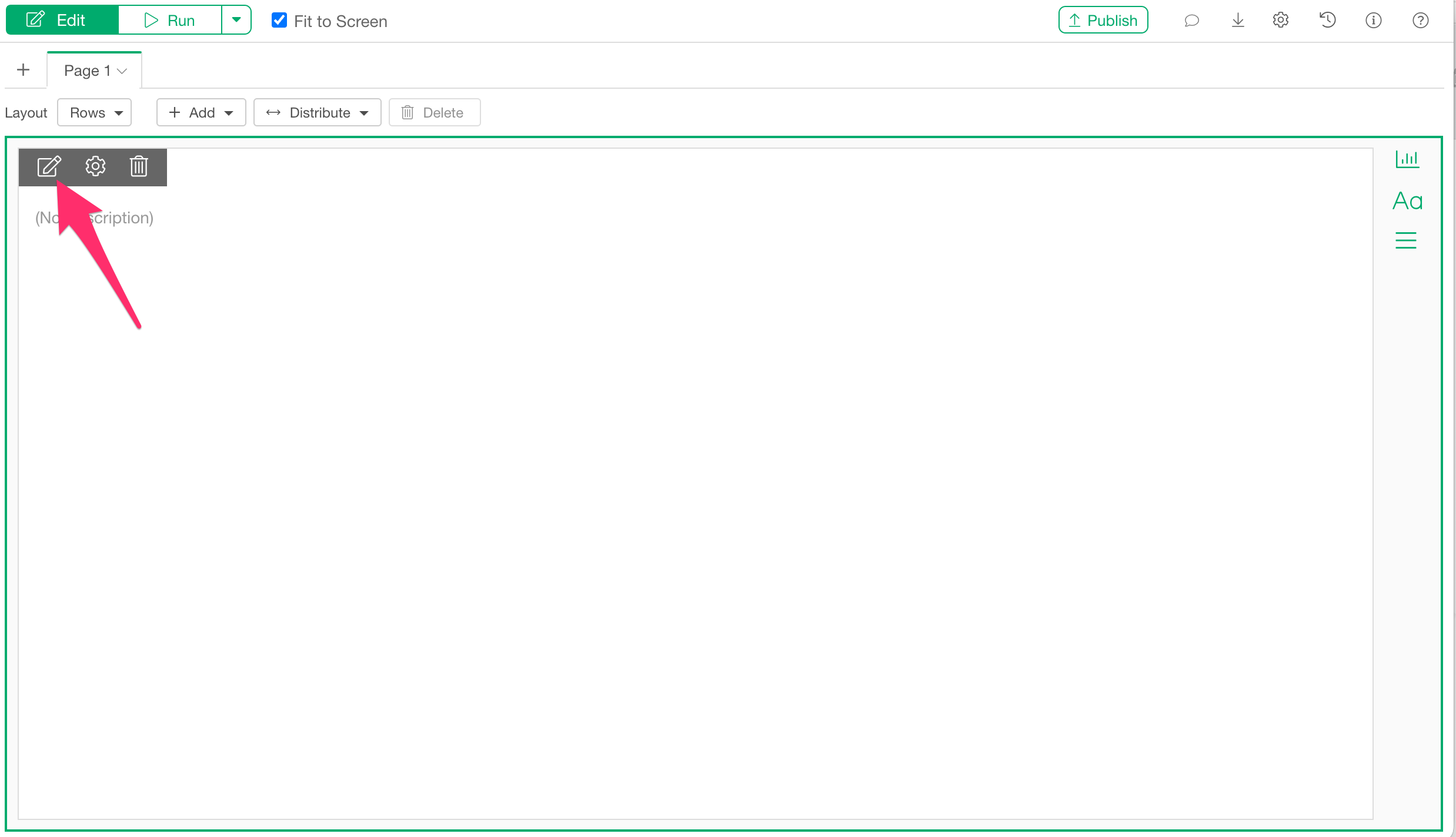
When the text panel is added, click the text edit icon.
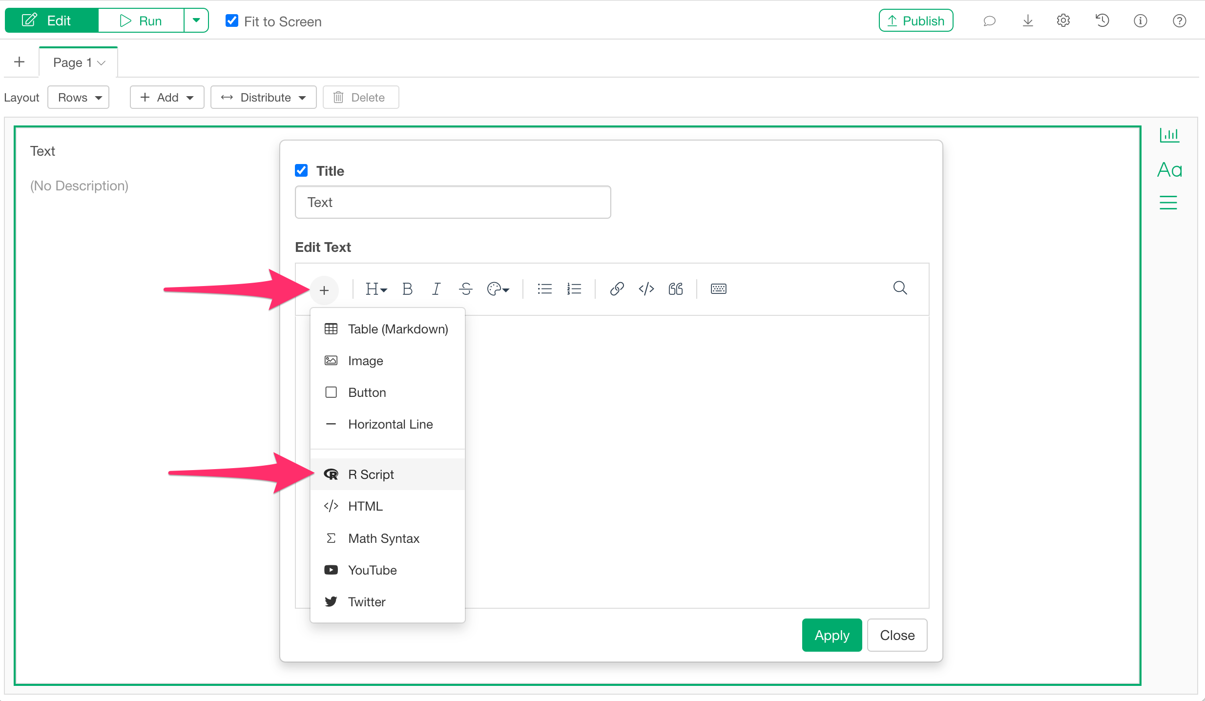
When the text editor opens, select “R Script” from the “Add Content” button.
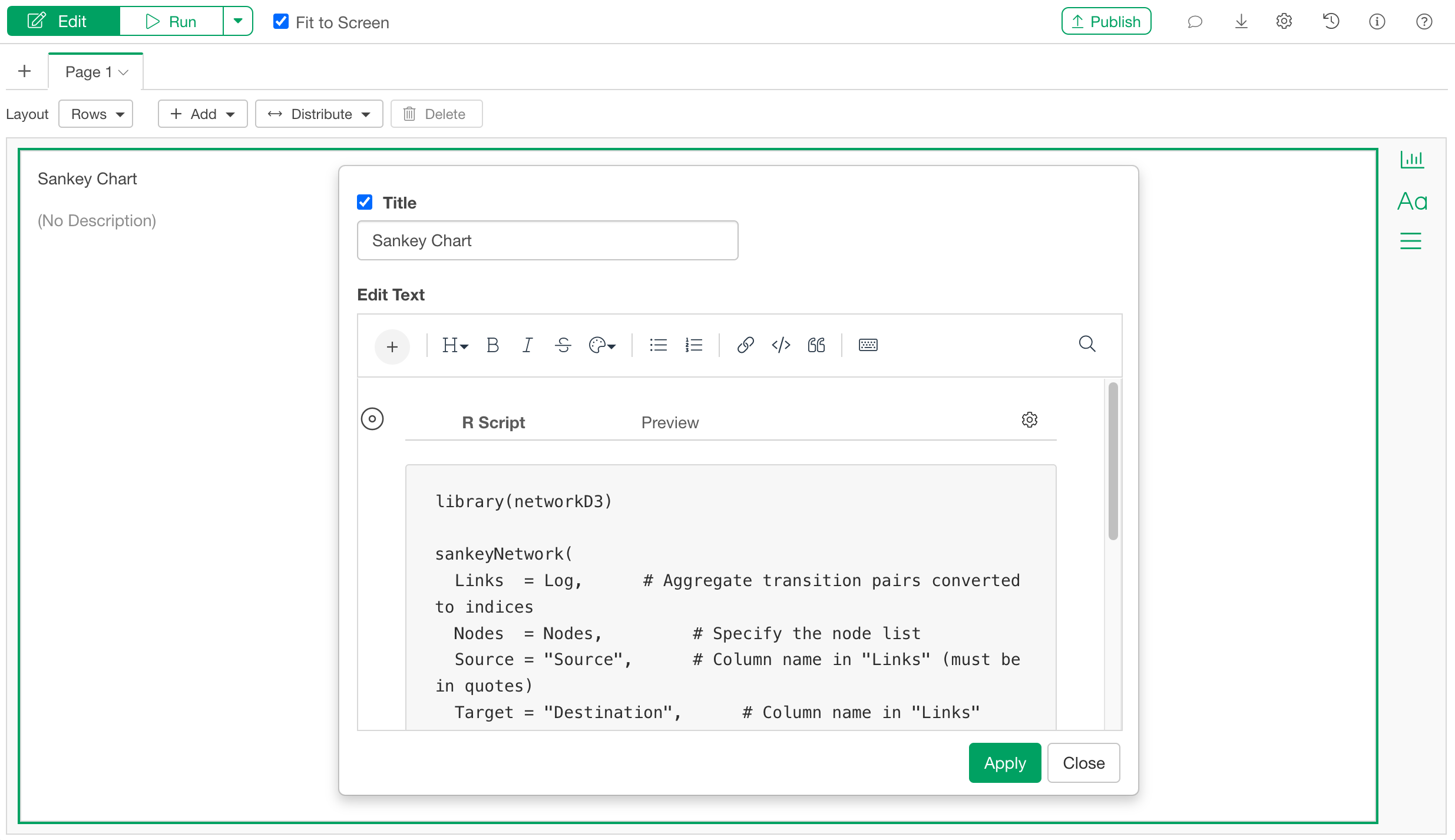
When the R script input dialog appears, paste the same code used previously in the note.
library(networkD3)

sankeyNetwork(
  Links  = Log,      # Aggregate transition pairs converted to indices
  Nodes  = Nodes,         # Specify the node list
  Source = "Source",      # Column name in "Links" (must be in quotes)
  Target = "Destination",      # Column name in "Links" (must be in quotes)
  Value  = "Transition Count",       # Column name in "Links" (must be in quotes)
  NodeID = "Element",     # Column name in "Nodes" (must be in quotes)
  units  = "people",      # Unit label (e.g., "people")
  fontSize  = 12,         # Adjust label font size
  nodeWidth = 25,         # Adjust width of node blocks (in pixels)
  height    = 600,        # Adjust chart height (in pixels)
)
After pasting the code, apply it and run the dashboard.
You have now successfully displayed a Sankey chart on the dashboard.