How to Create a Table
This section explains how to create a “Table” that allows you to display data in a table format within the chart view and apply visual formatting.
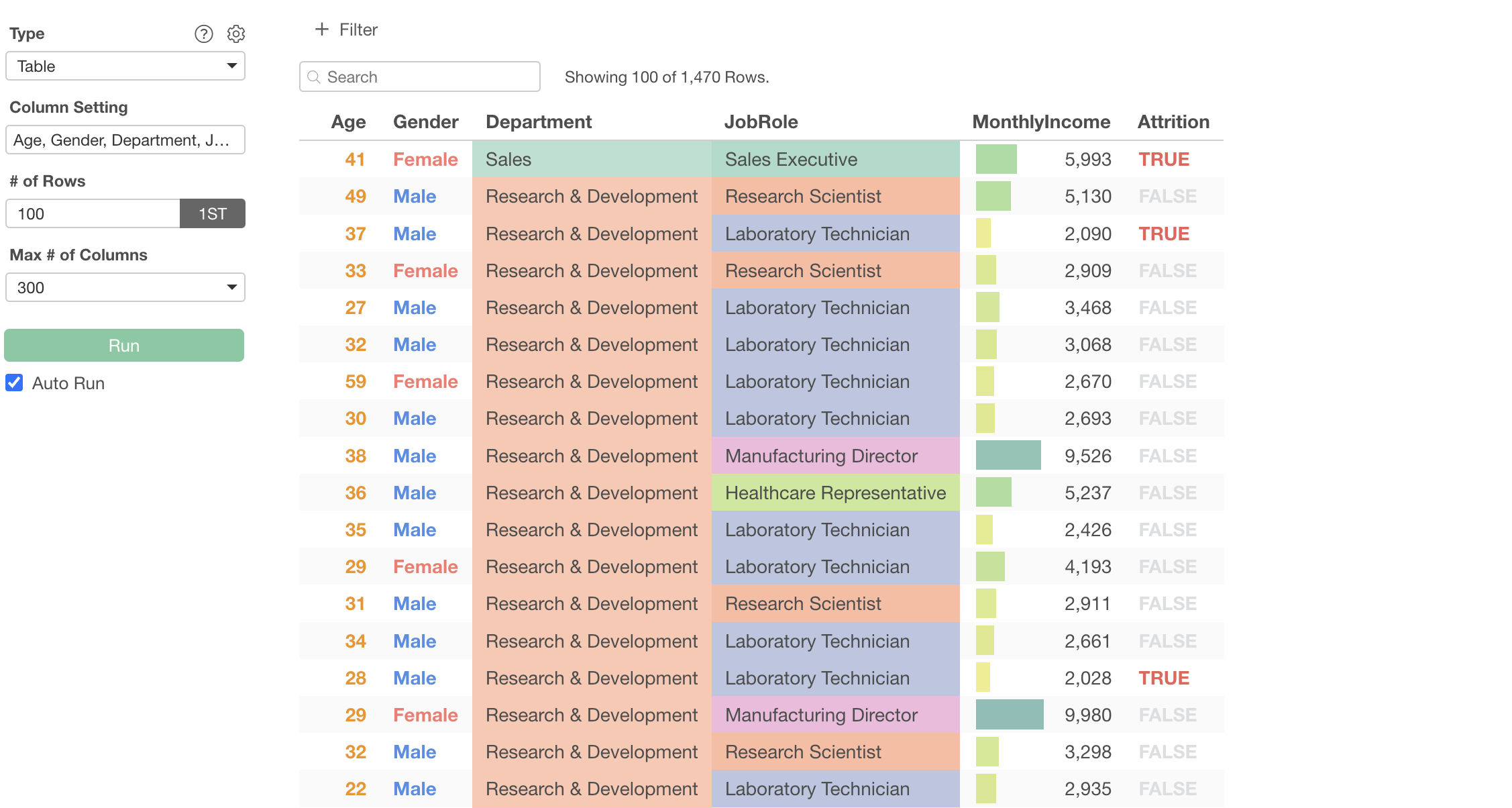
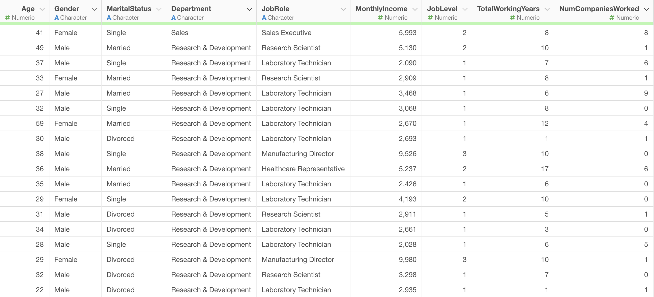
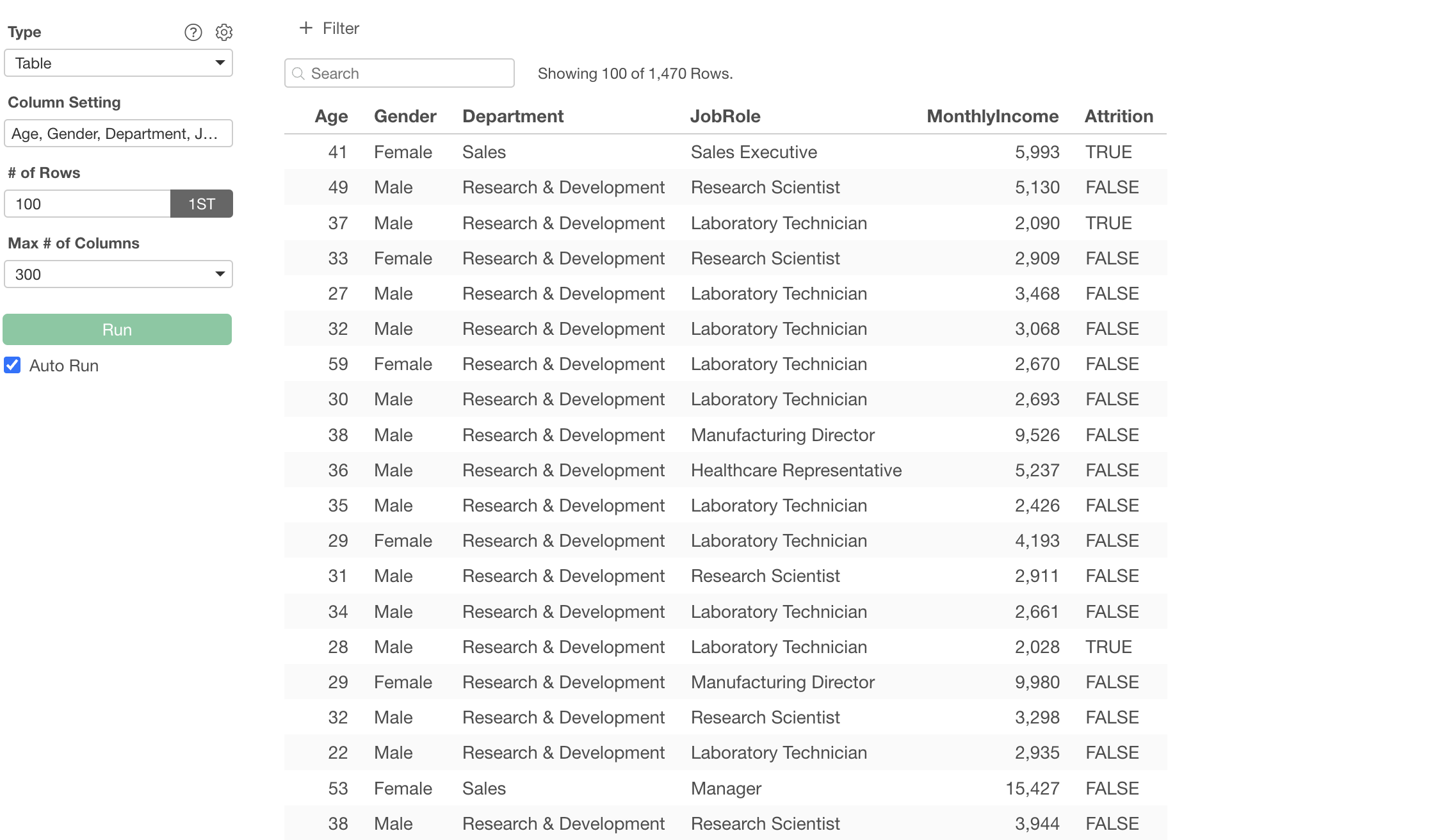
We will use employee data as sample data. In this data, each row represents one employee, and columns include information such as Monthly Income and job title.
How to Create a Table
This time, we will demonstrate how to use a table to visually format employee gender, Monthly Income, and other information.
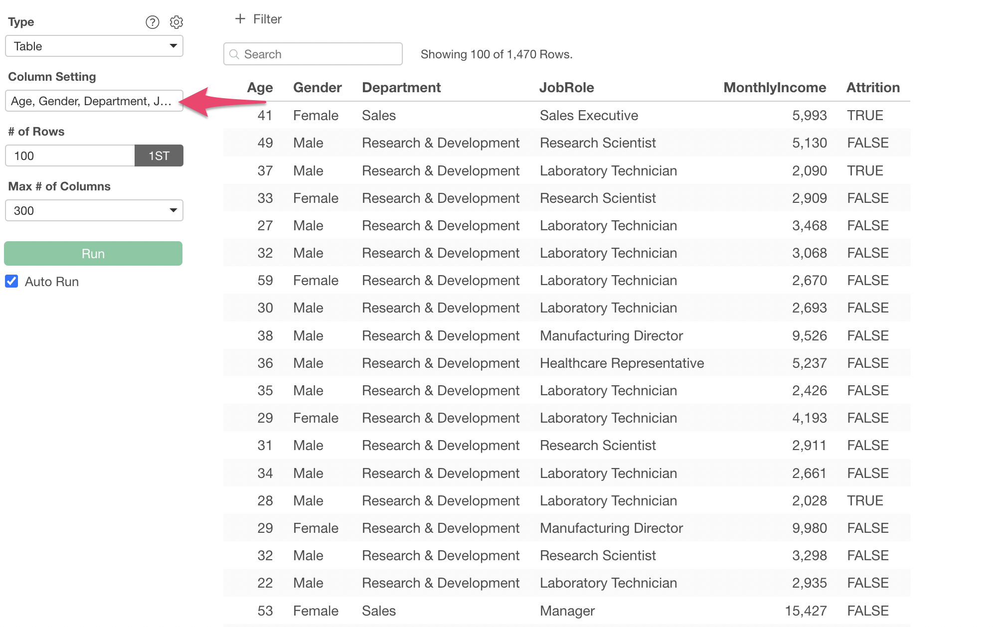
Create a chart from the chart view and select “Table” as the type.
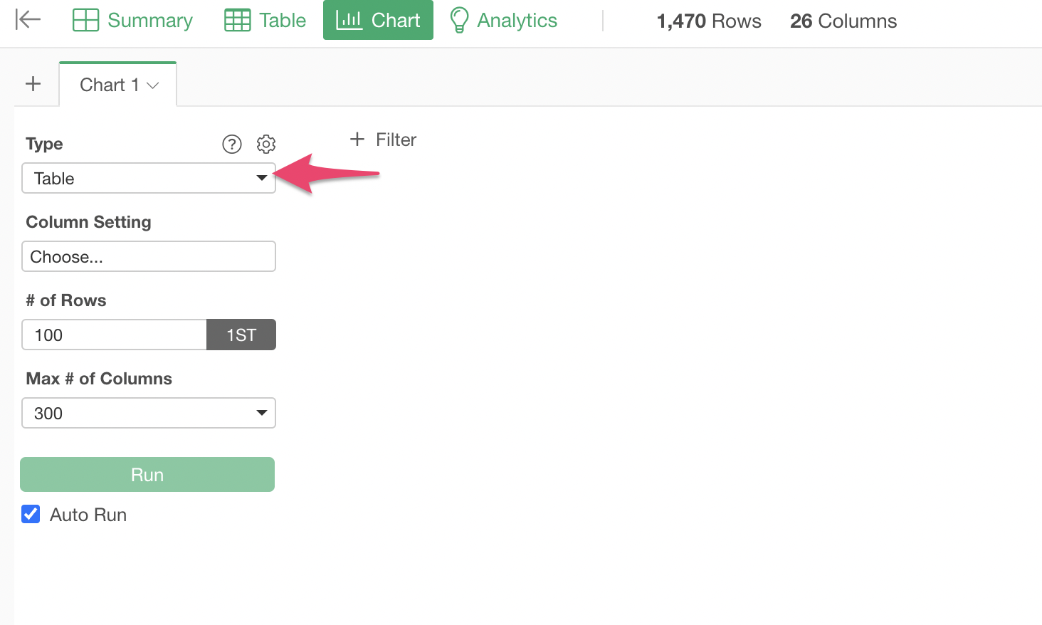
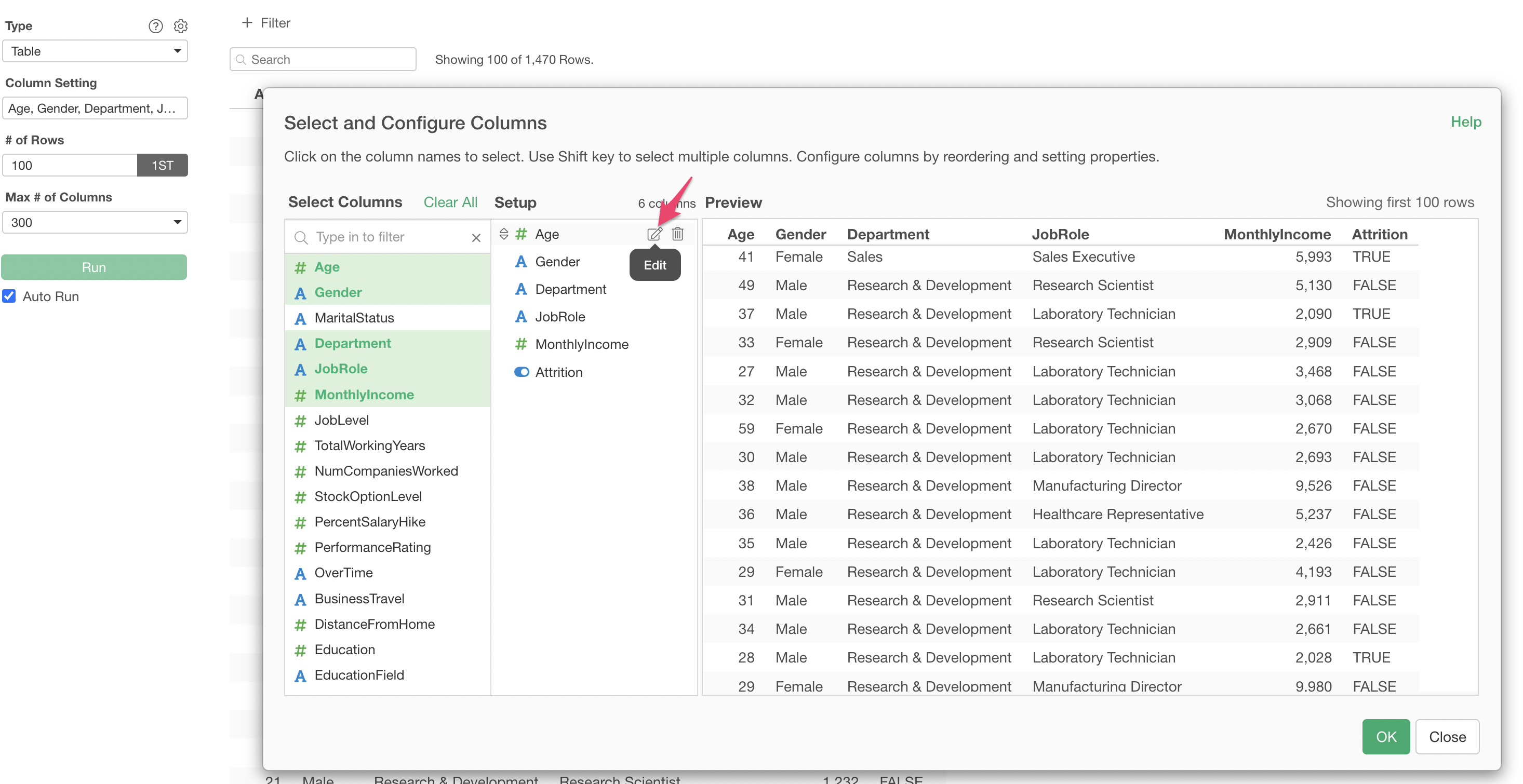
Click on “Column Setting”.
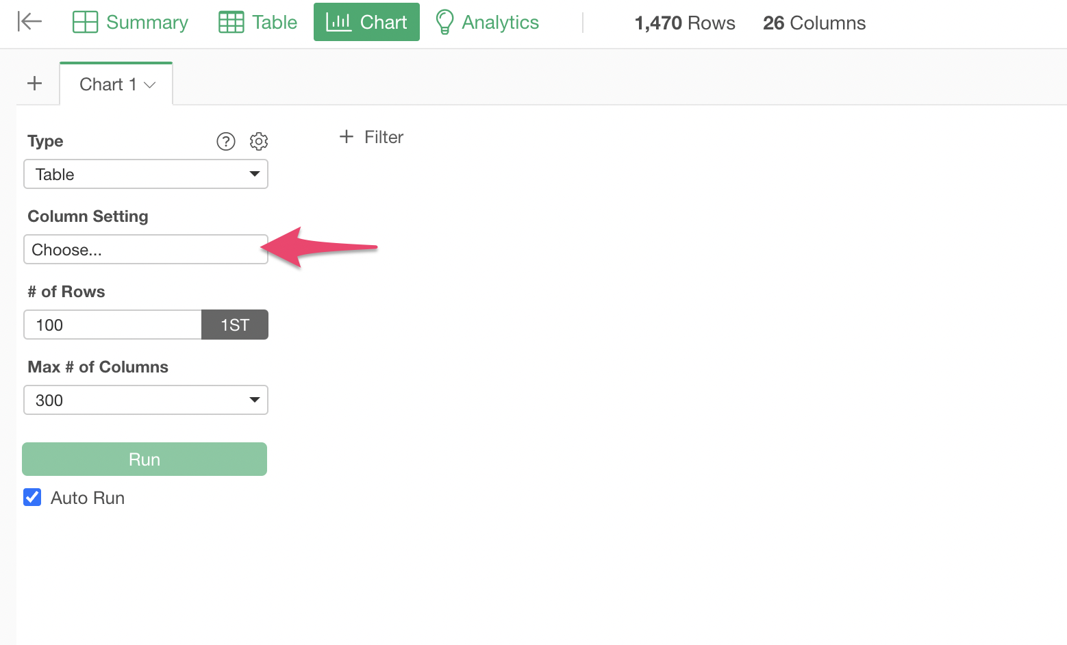
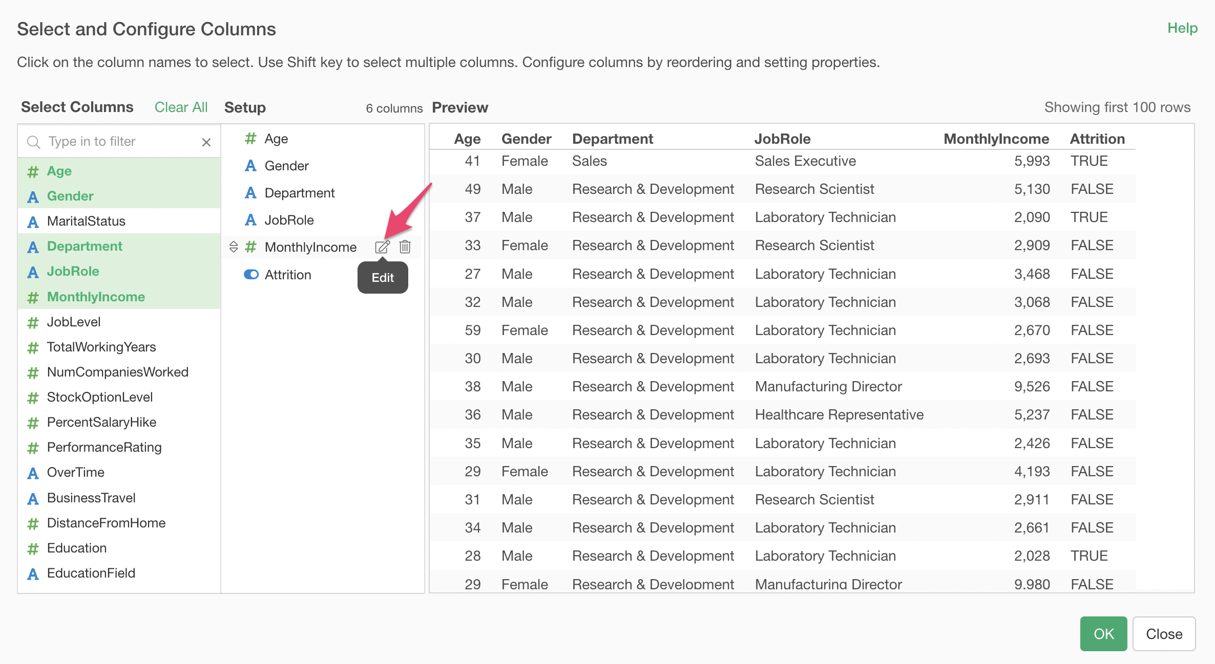
The “Select and Set Columns” dialog will appear.
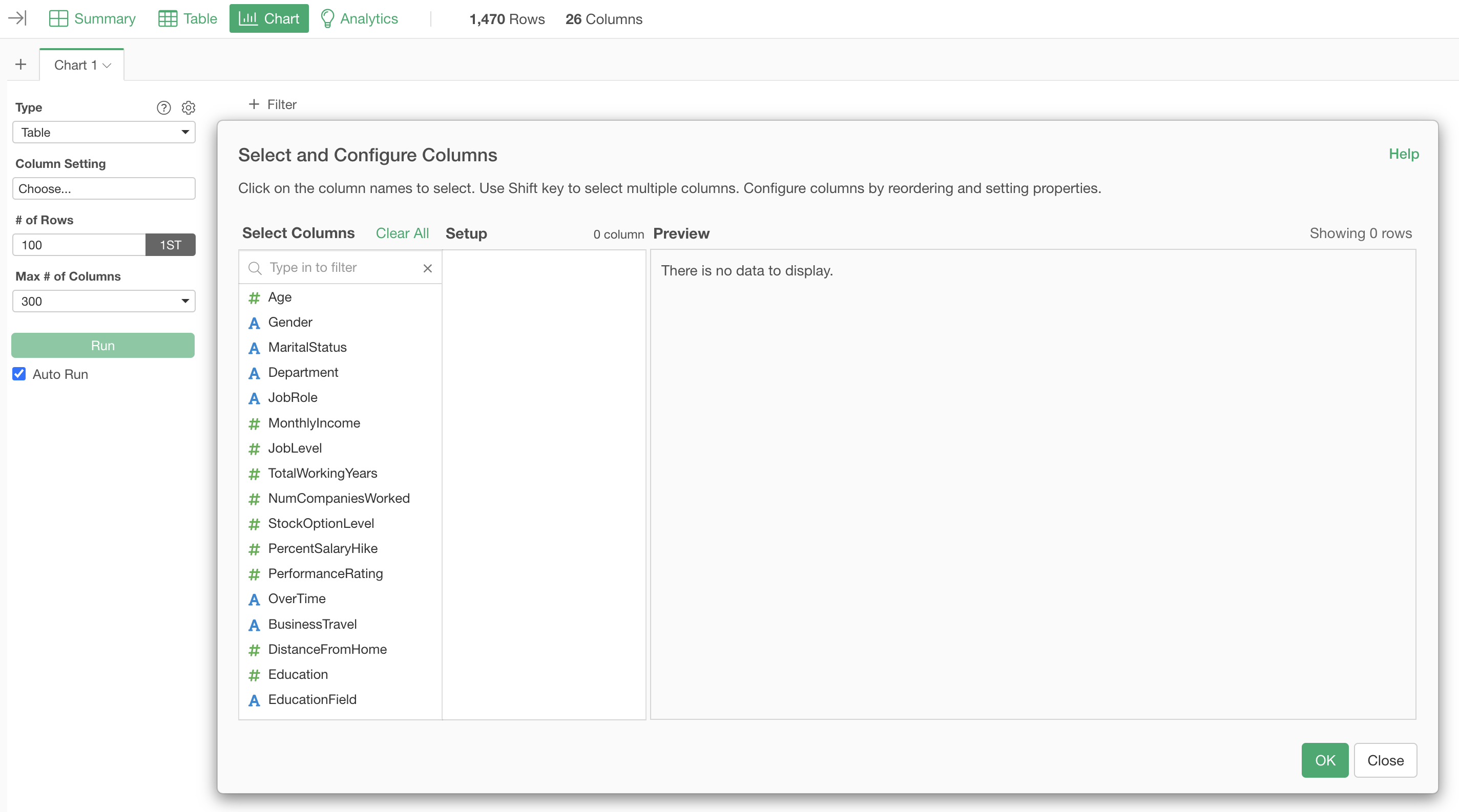
To select multiple columns at once, hold down the Shift key while selecting them.
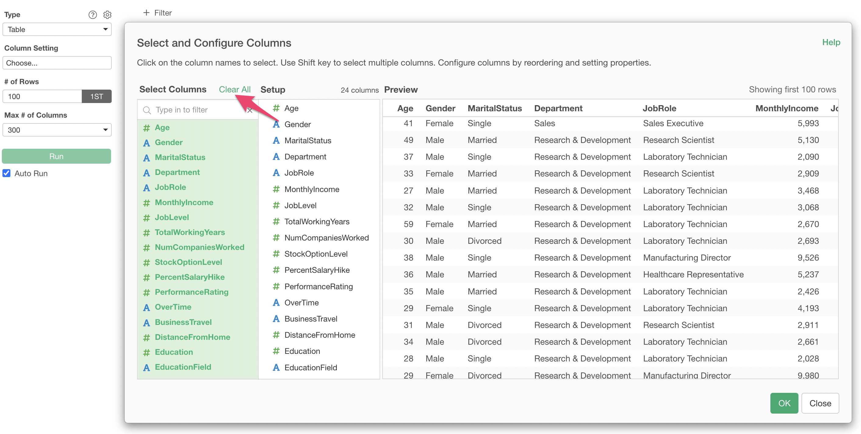
To clear the selected columns, click “Clear All”.
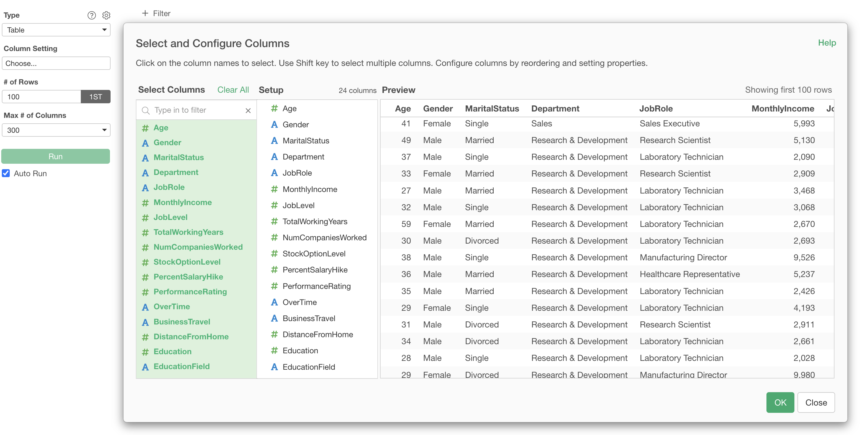
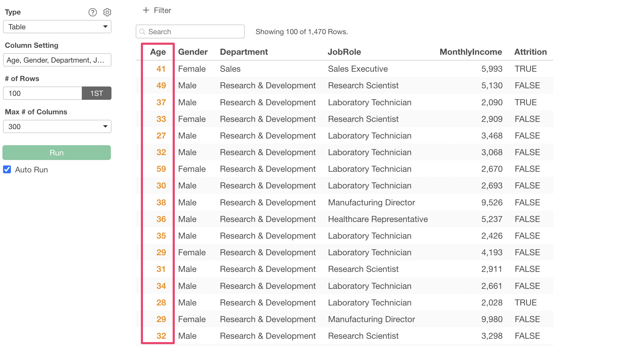
This time, we will select 6 columns, including age, gender, and Monthly Income, and then click the OK button.
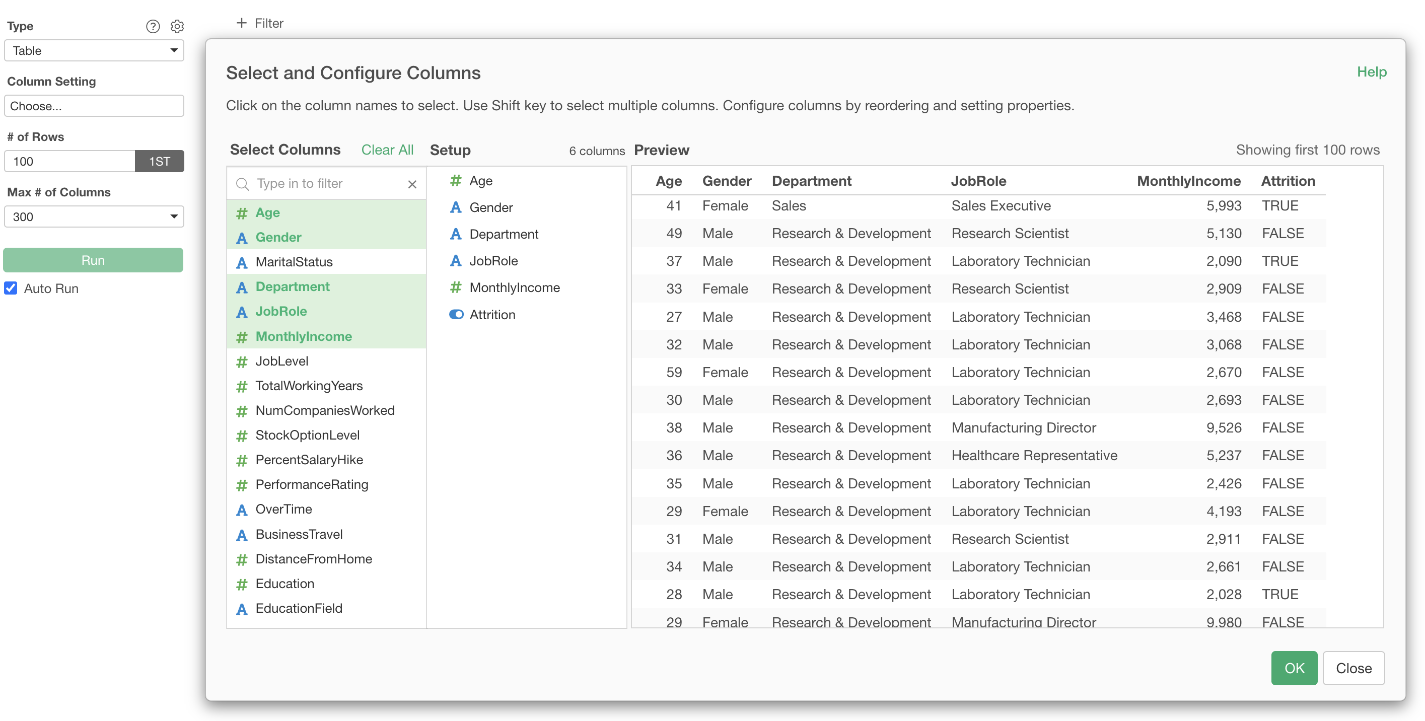
We have successfully displayed only specific columns in a table format.
Specify Value Styles and Colors
As shown below, you can make values displayed in a table bold or change their color.
To set this, click “Edit” for a specific column from the “Select and Set Columns” dialog.
From “Style” in the Value section, you can change the text to bold or italic.
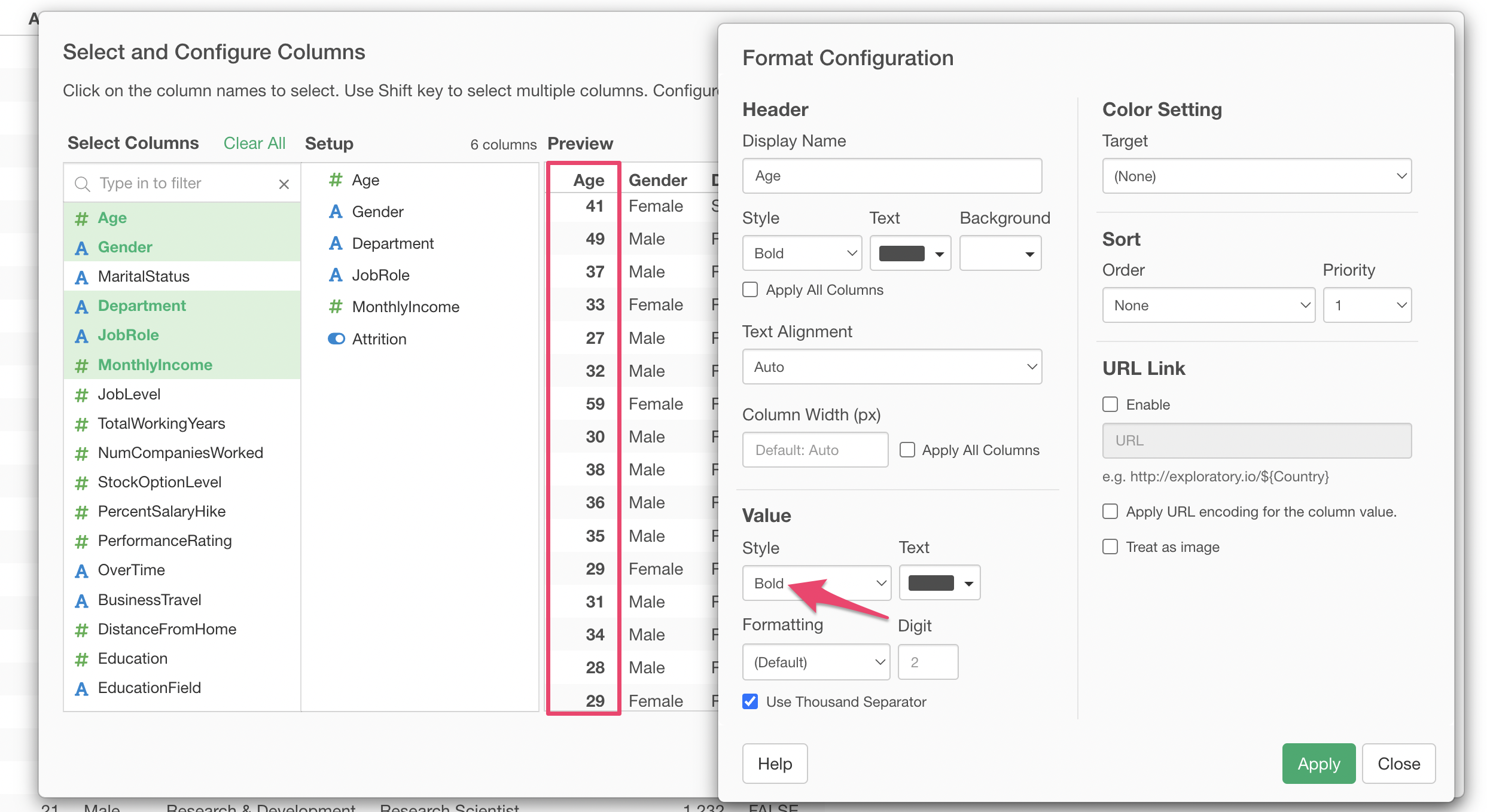
Furthermore, you can change the “Color” of the value’s text display.
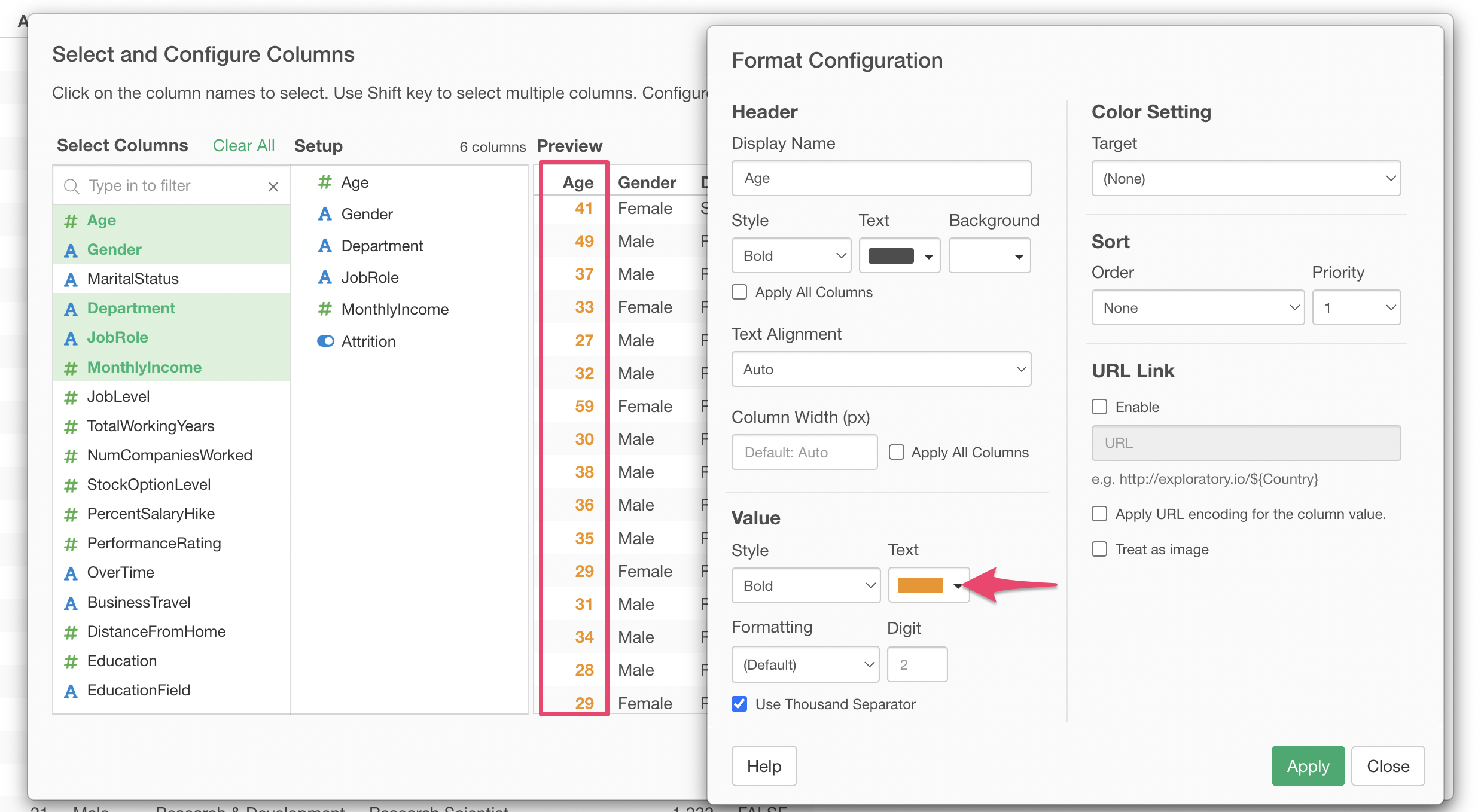
If you change the value color and also use “Assign Color by Value Size” (described later) simultaneously, the “How to Assign Color” setting will take precedence.
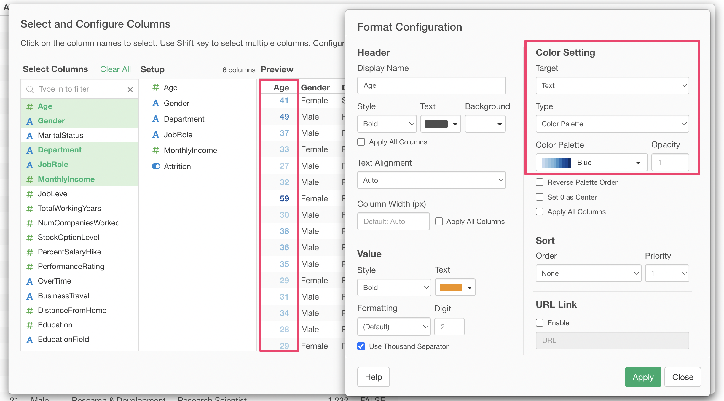
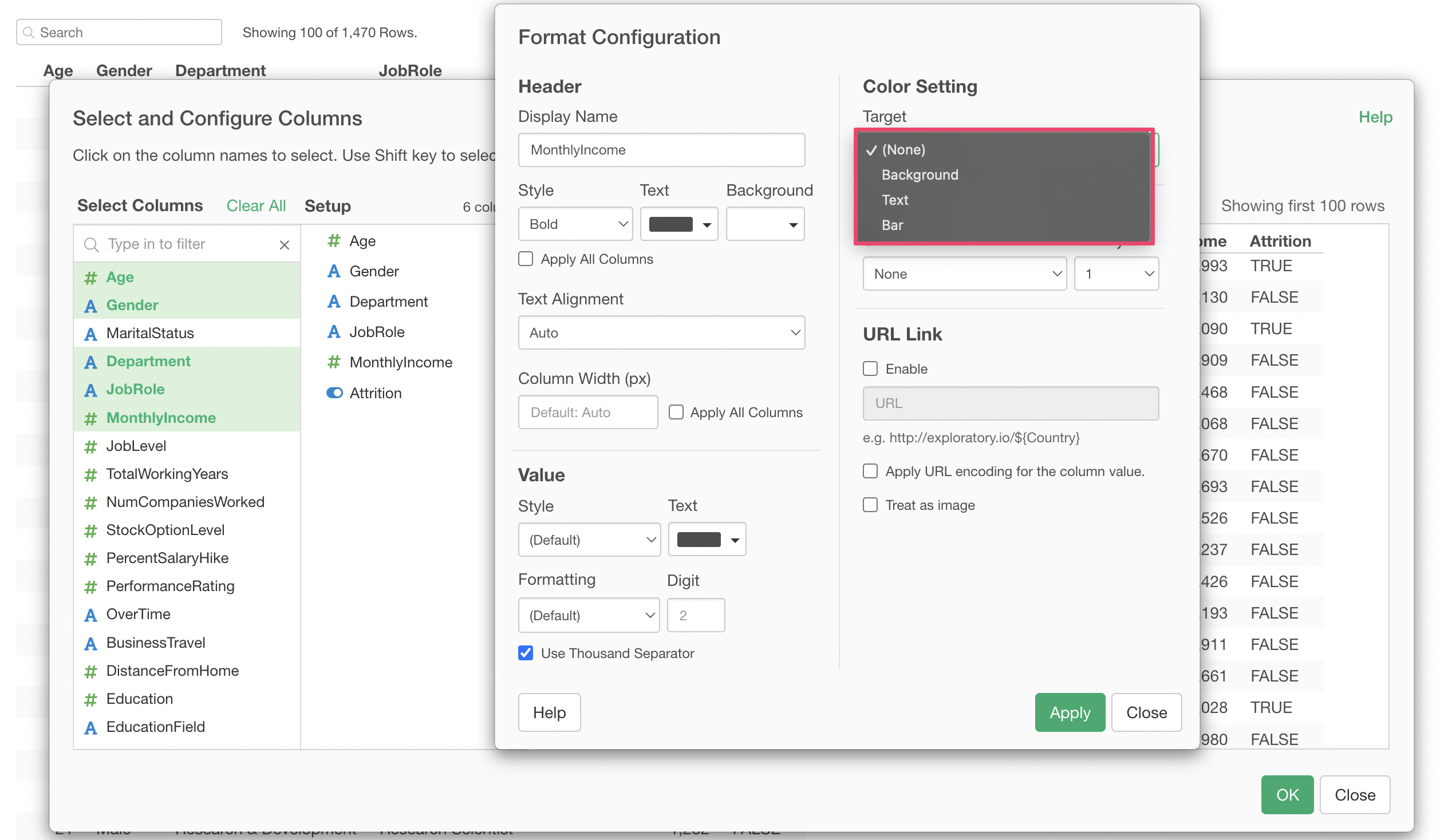
Assign Color by Value Size
Tables offer a feature called “How to Assign Color” to make it easier to visually judge the magnitude of values.
Click “Column Setting.”
Click the “Edit” button for the Monthly Income column.
There are three types of targets for assigning color.
This time, we will select “Bar” to represent the value size with the length of a bar and apply it.
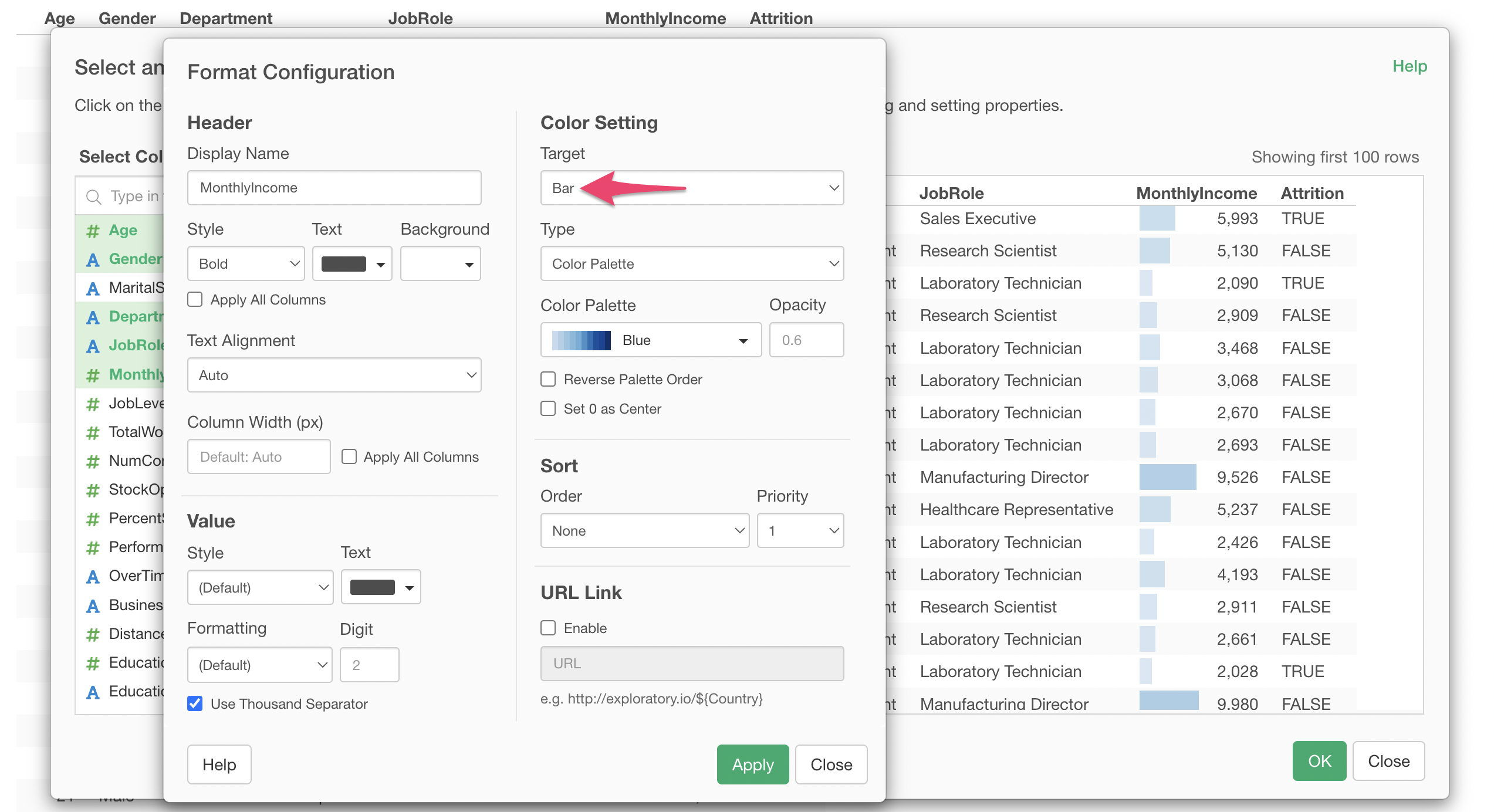
We were able to display the Monthly Income value size using bar lengths.
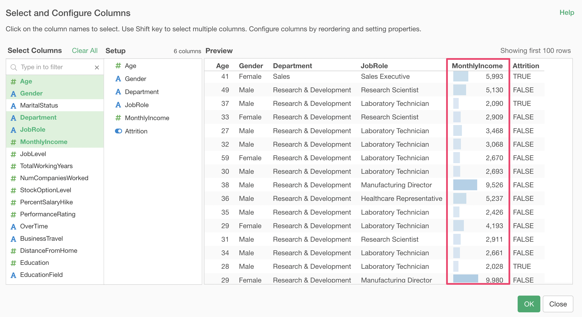
By using tables in charts, you can display necessary columns in a table format and make it easier to visually judge the size and differences of values.
