How to Overlay Multiple Cohort Analysis Results
In Exploratory, you can create Survival Curve using the Kaplan-Meier method from the Analytics view.
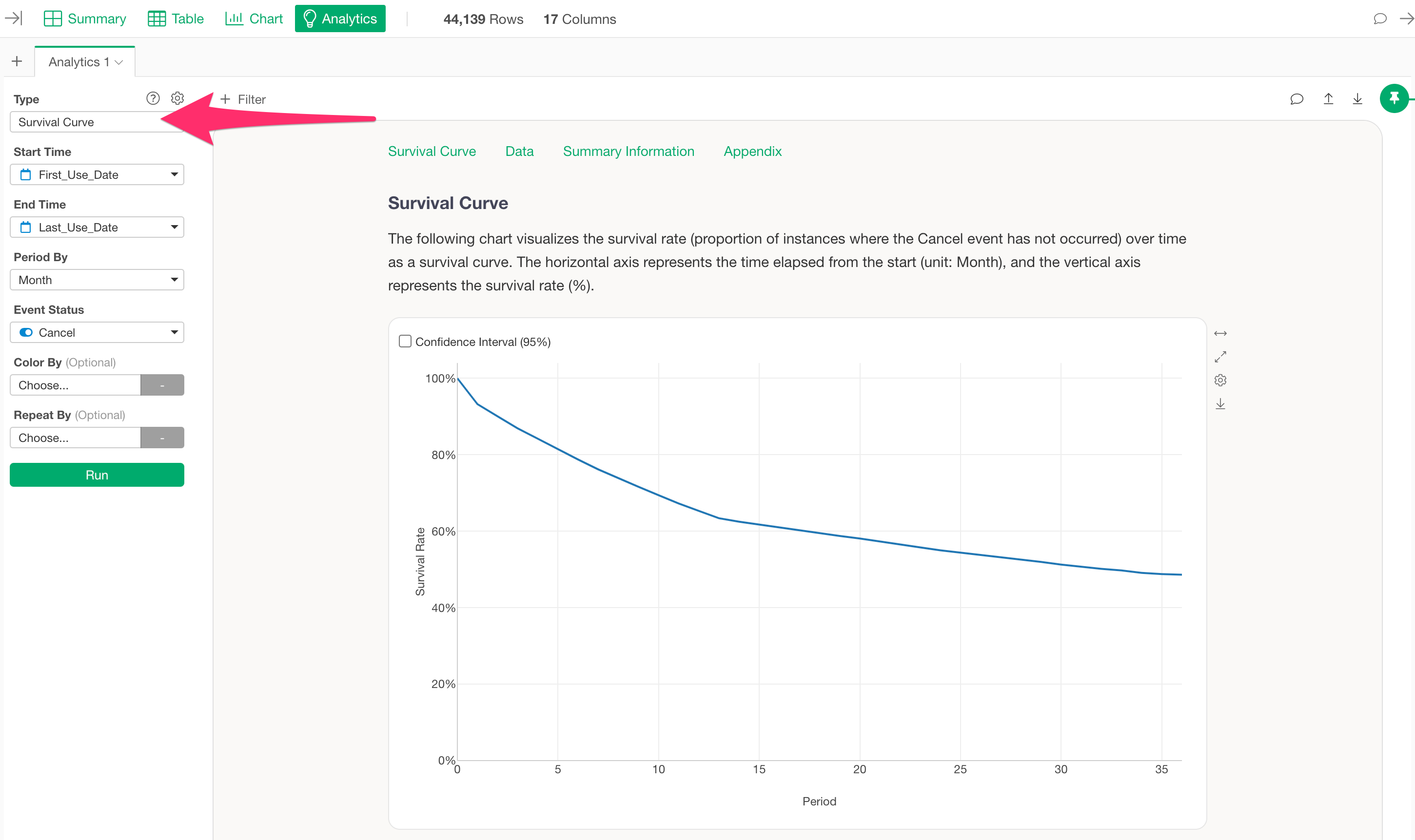
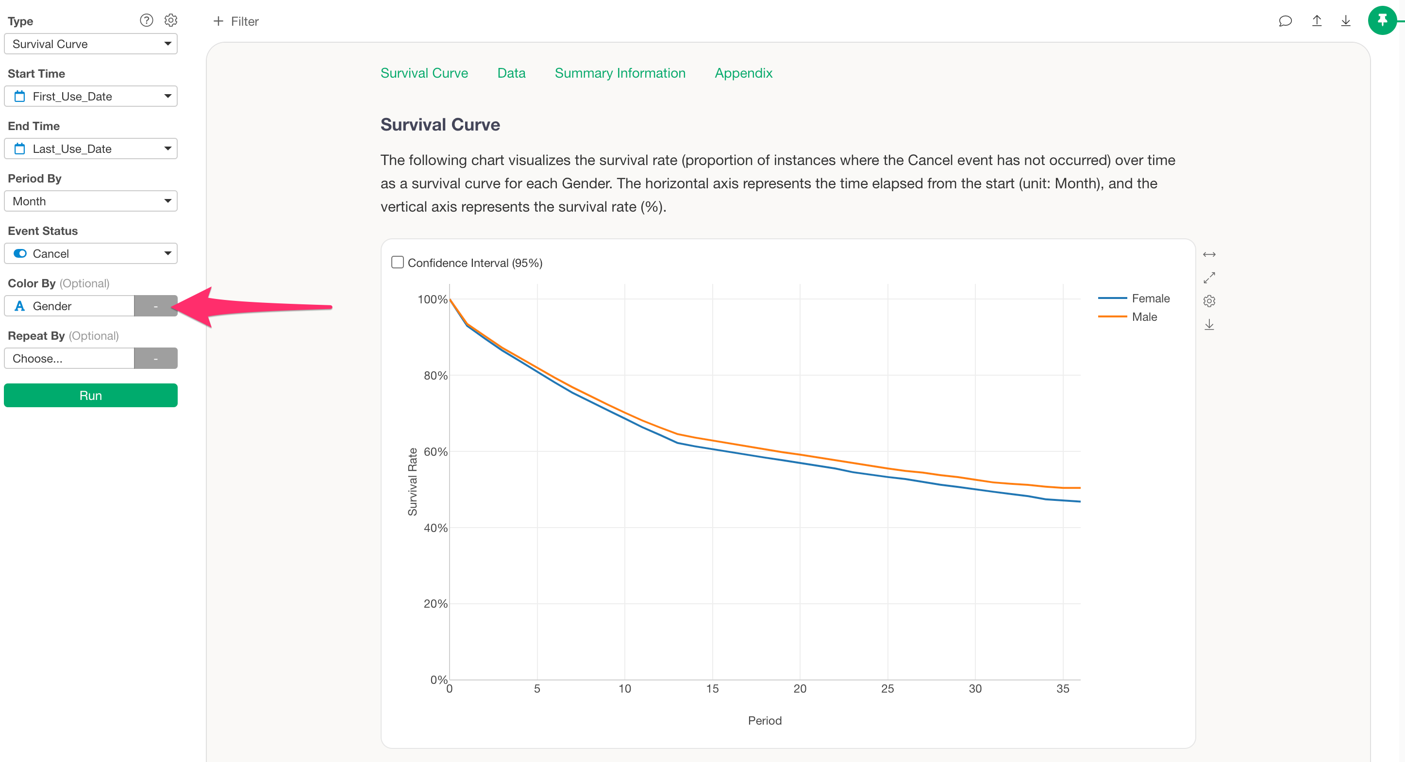
Survival curves allow you to conduct cohort analysis by specifying a column for “Color By” enabling comparisons of survival curves across categories.
However, since only one column can be selected for color splitting, this note introduces a method for combining and visualizing results from two different cohort analyses in a single chart.
To overlay multiple survival curves, follow these steps:
- Export each survival curve you want to overlay as a dataset.
- Merge the exported datasets into one.
- Use the merged data to draw the survival curves with a line chart.
Export Survival Curves as Data
To export the data from a survival curve, click the export button on the chart you created and select “Save Chart Data as New Data Frame.”
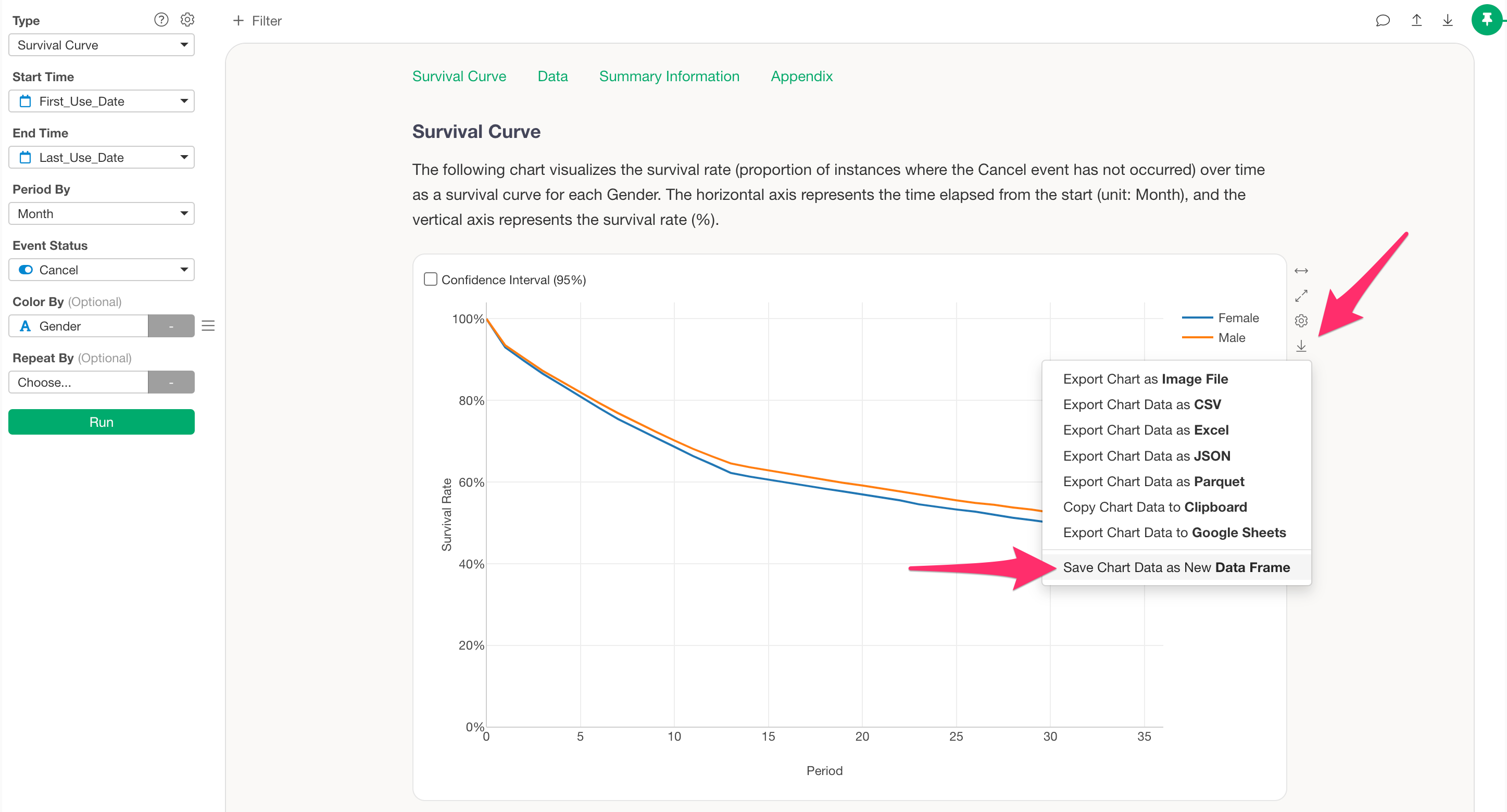
A dialog will appear for saving the data frame—enter a name of your choice.

This adds the new cohort analysis result as a new data frame.
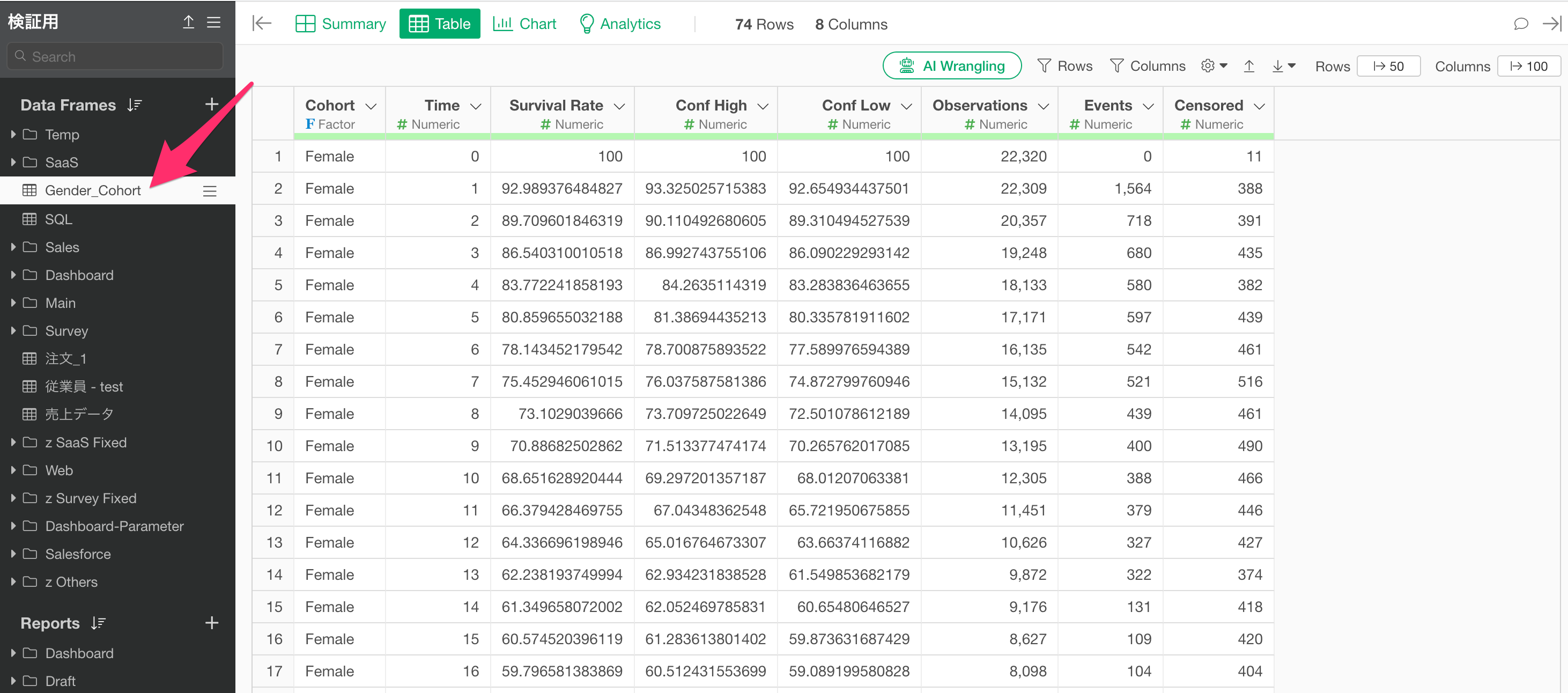
Repeat the same process to save all the cohort analysis results you wish to overlay.

Merge Exported Data into One Dataset
After saving all the survival curve datasets, select any one of the data frames, then from the step menu choose “Join / Merge” and then “Merge.”
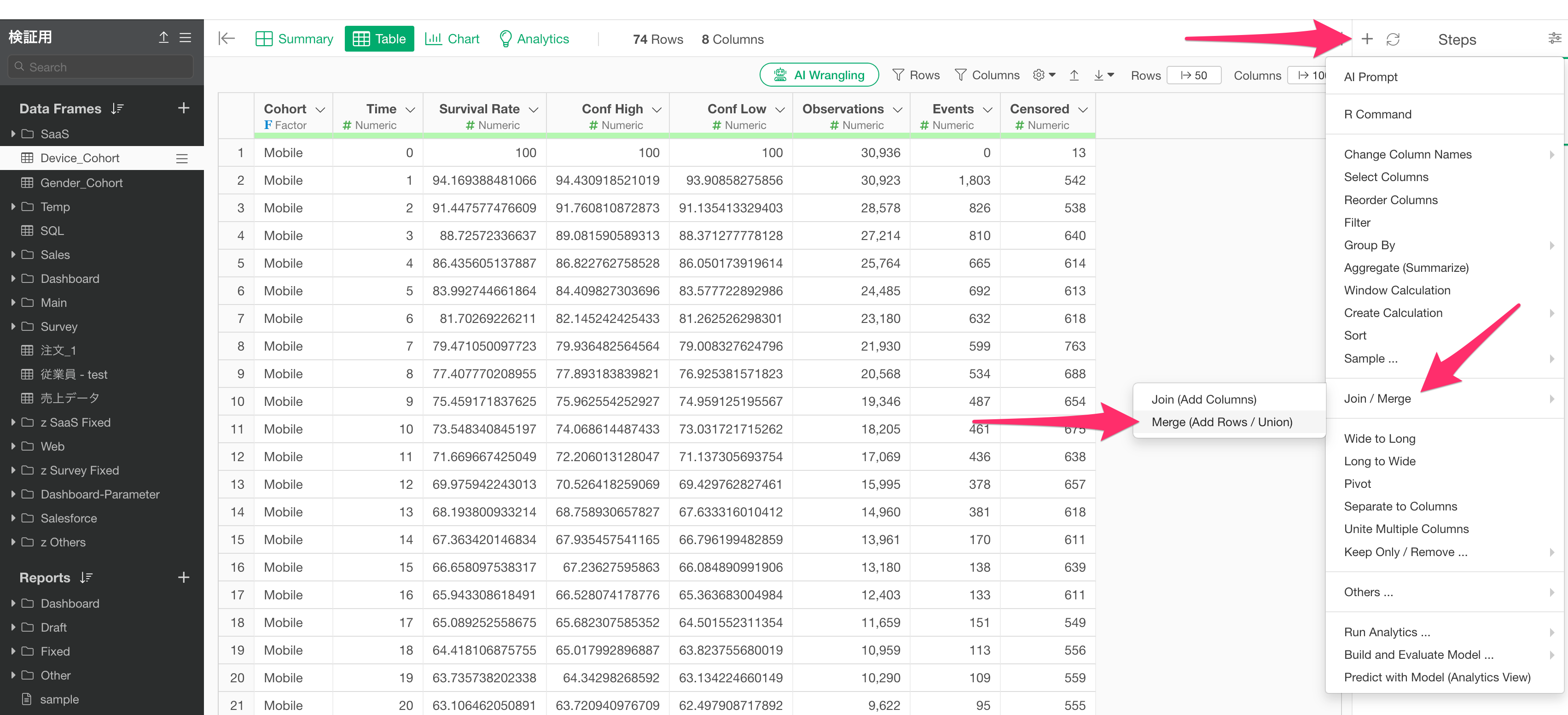
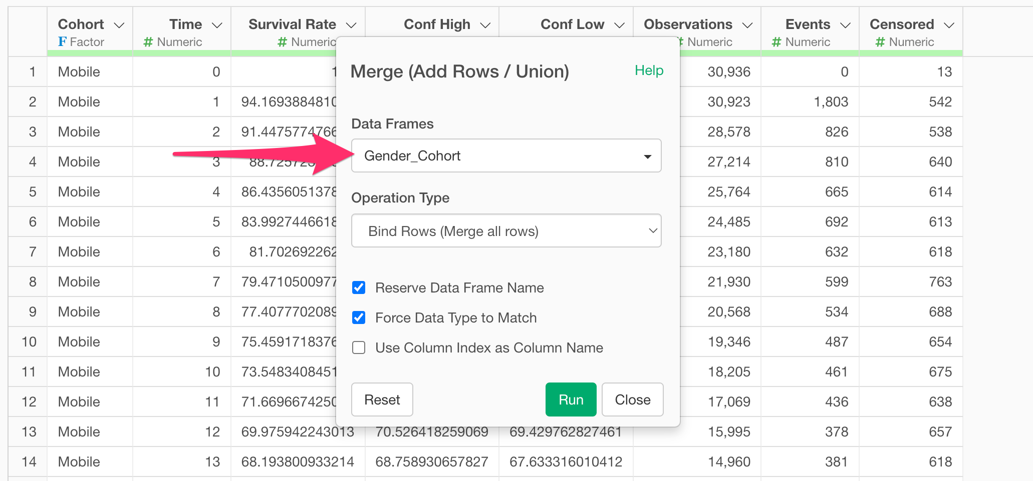
In the merge dialog, specify the data frame to merge and click the execute button.
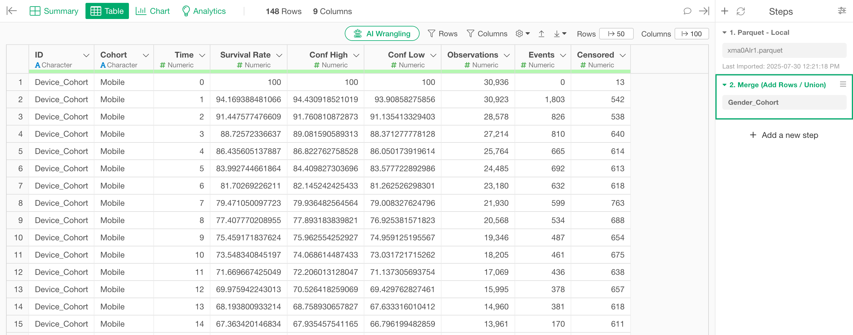
Now the data from multiple cohort analyses is combined into one.
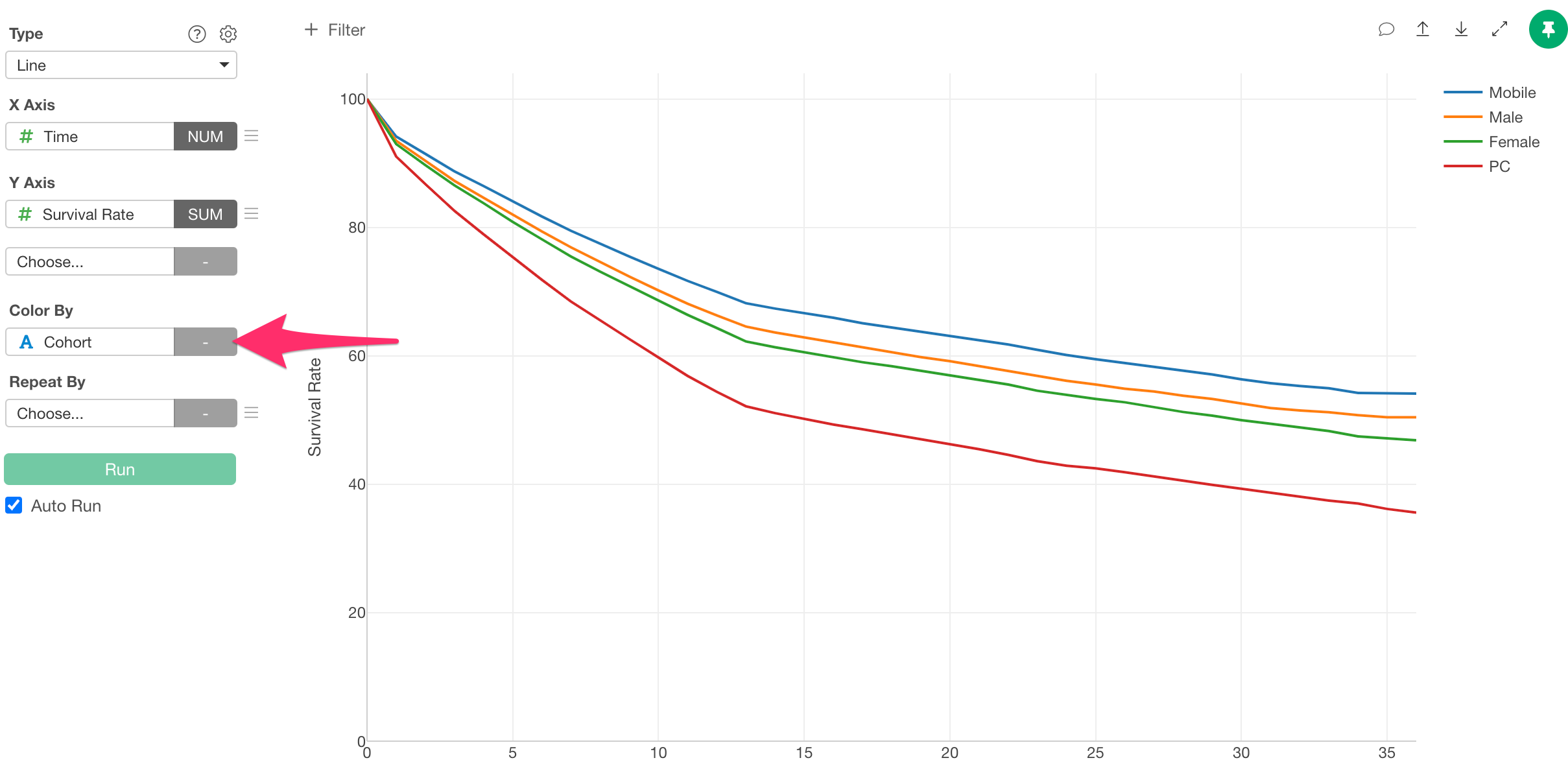
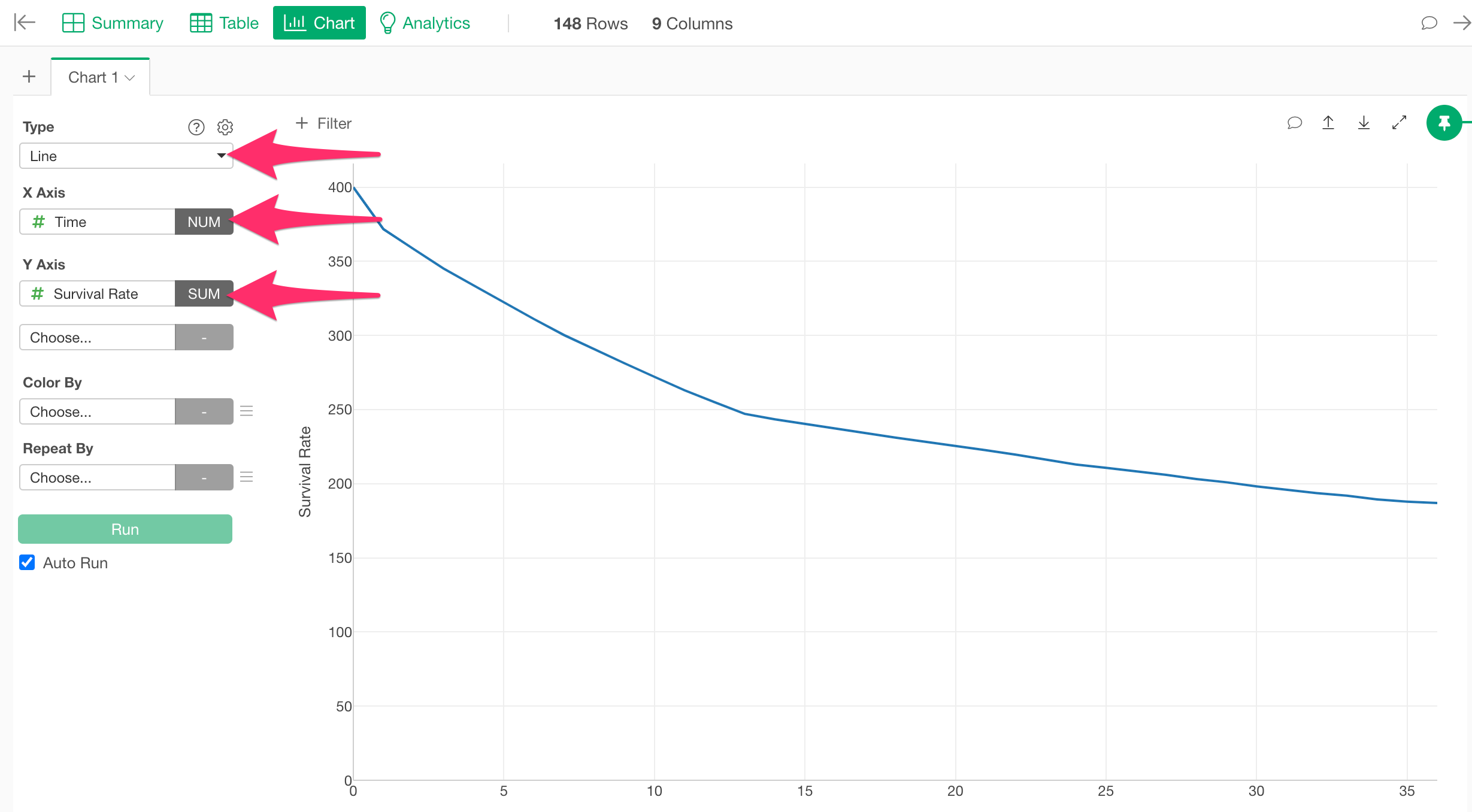
Draw Survival Curves Using the Merged Data with a Line Chart
Move to the Chart View and select “Line” as the chart type. Set “Time” (representing survival duration) as the X-axis, and “Survival Rate” as the Y-axis.
Next, select “cohort” for color splitting to visualize the combined results of multiple cohort analyses in one chart.