How to Perform Structural Equation Modeling (SEM) in Exploratory
Structural Equation Modeling (SEM) is a powerful statistical method that introduces “latent variables” that cannot be directly measured and allows you to visualize and verify complex causal relationships between variables as path diagrams.
Currently, Exploratory’s standard UI (Analytics View) does not have a
menu for structural equation modeling, but you can perform SEM using the
R package lavaan through Exploratory’s
“Note” feature.
Installing Required Packages
First, install the packages needed to run SEM.
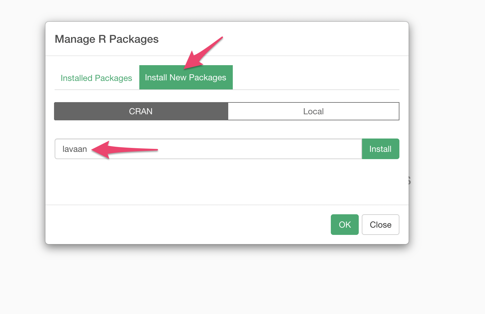
Select “Manage R Packages” from the Project menu.
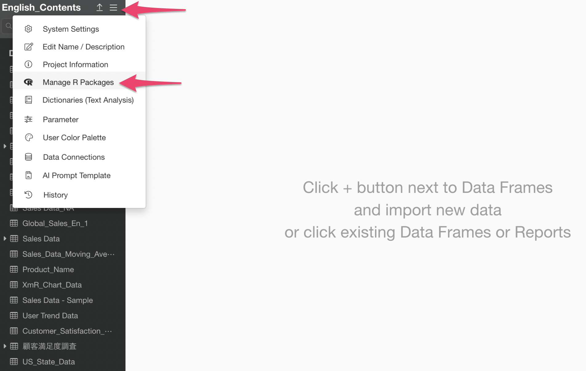
When the R Package Management dialog appears, click “Install Package” and install the “lavaan” and “semPlot” packages.
Sample Data
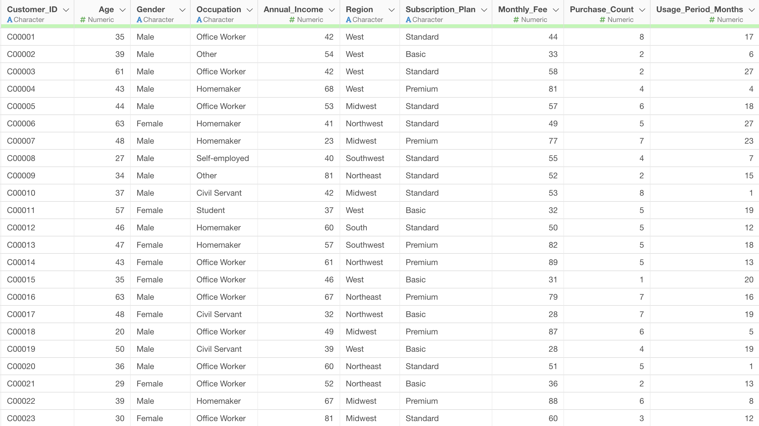
We will use customer satisfaction survey data as sample data. You can download the data from here.
Creating a Note and Running Structural Equation Modeling
Click the plus button in Reports and select “Create Note”.
Once the Note window opens, click the plus button in the upper left and then click the “R Code” button.
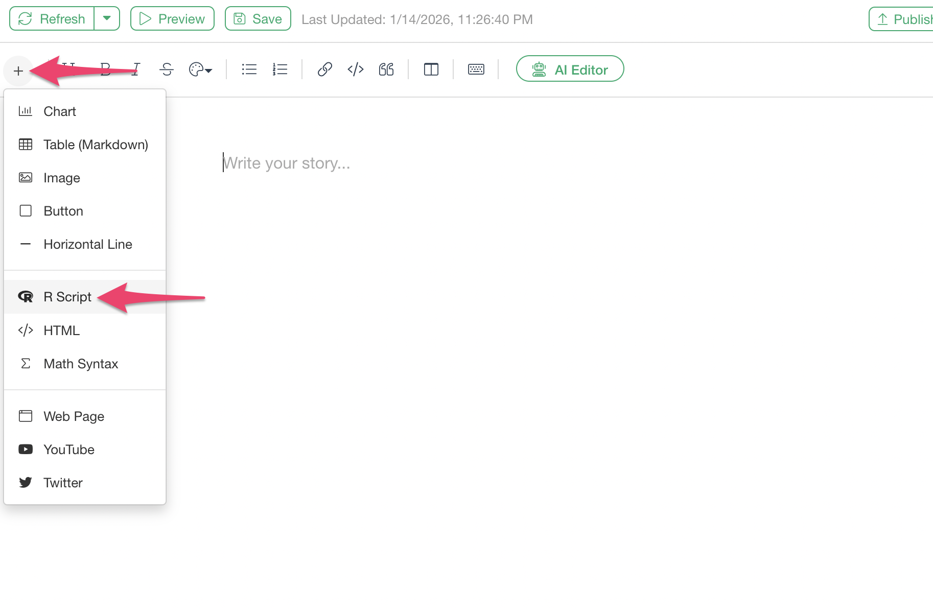
A code block for writing R scripts has been added.
Running Structural Equation Modeling
In the lavaan package, models are defined in text
format. The key is to use these three symbols appropriately:
=~: Defining latent variables (composed of observed variables on the right side)~: Regression (causal relationship)~~: Covariance (correlation)
Use the following R script:
library(lavaan)
library(semPlot)
# Create variable names for SEM model
customer_satisfaction_survey$y1 <- customer_satisfaction_survey$Product_Quality_Satisfaction
customer_satisfaction_survey$y2 <- customer_satisfaction_survey$Service_Satisfaction
customer_satisfaction_survey$y3 <- customer_satisfaction_survey$Price_Satisfaction
customer_satisfaction_survey$y4 <- customer_satisfaction_survey$Would_Use_Again
customer_satisfaction_survey$y5 <- customer_satisfaction_survey$Would_Recommend
customer_satisfaction_survey$x1 <- customer_satisfaction_survey$Purchase_Count
customer_satisfaction_survey$x2 <- customer_satisfaction_survey$Usage_Period_Months
customer_satisfaction_survey$x3 <- customer_satisfaction_survey$Age
# Define SEM model
model <- '
# Measurement model
f1 =~ y1 + y2 + y3
f2 =~ y4 + y5
# Structural model
f2 ~ f1 + x1 + x2
f1 ~ x3
'
# Fit SEM model
fit <- sem(model, data = customer_satisfaction_survey)
# Summary of results
summary(fit, fit.measures = TRUE, standardized = TRUE)
# Visualize the model
if(requireNamespace("semPlot", quietly = TRUE)) {
semPaths(fit,
whatLabels = "est",
layout = "tree",
rotation = 2,
edge.label.cex = 0.7, # Make labels slightly smaller
sizeMan = 8,
sizeLat = 10,
curve = 1.5, # Bend arrows slightly
edge.label.position = 0.55, # Adjust label position
mar = c(3, 3, 3, 3), # Increase margins
nodeLabels = c("Age", "Price Sat", "Service Sat",
"Quality Sat", "Purchase Count", "Usage Period",
"Use Again", "Recommend",
"Customer Satisfaction", "Repurchase Intention"))
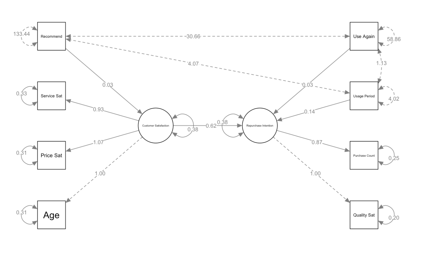
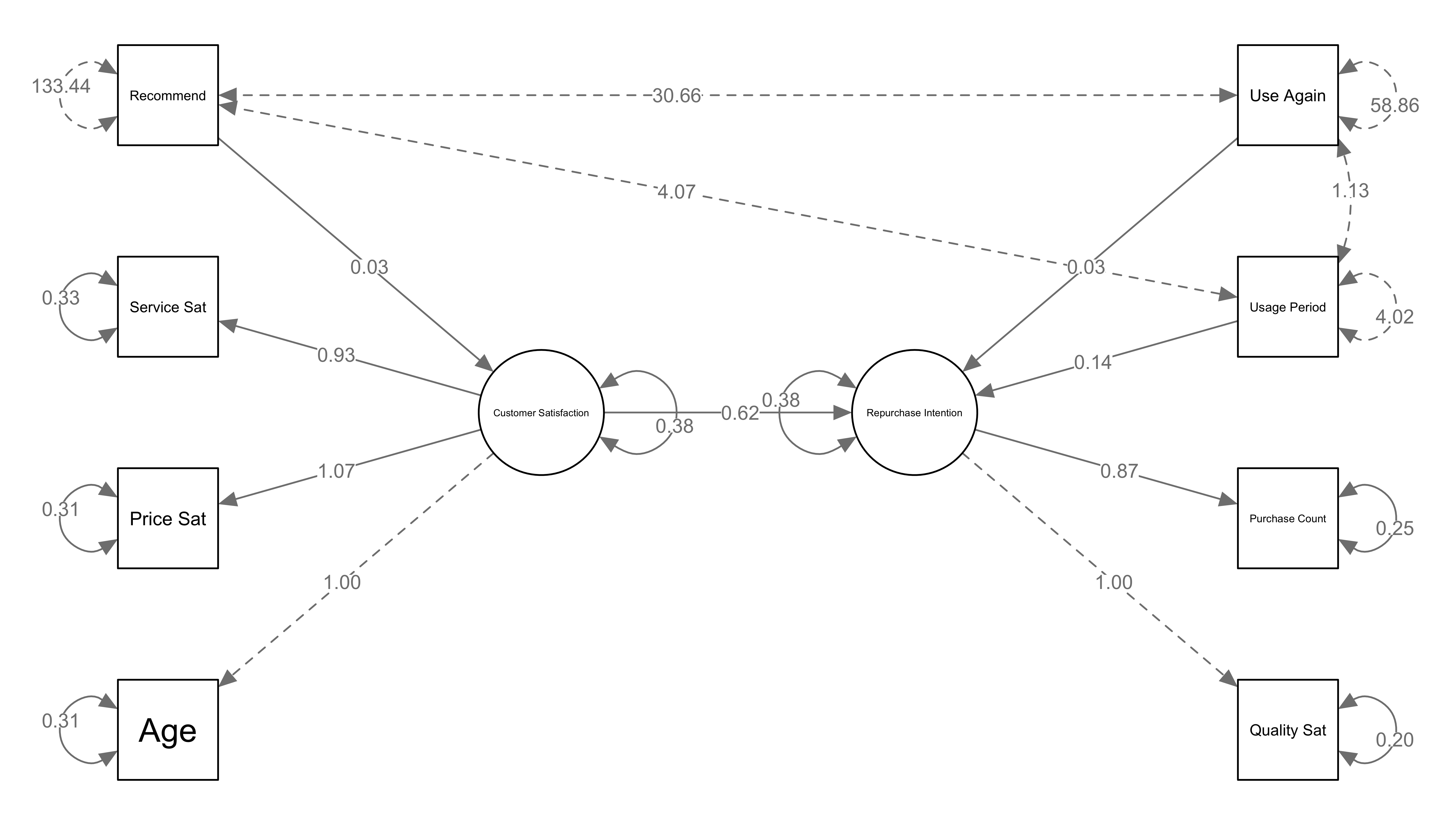
}The results of executing this R script are as follows:
What to Change When Using Your Own Data
When applying the above sample code to your own data, change the following sections:
1. Specifying the Data Frame Name
Location to change: The data parameter
in the sem() function
# Example: When the data frame name is "customer_satisfaction_survey"

fit <- sem(model, data = customer_satisfaction_survey)

# Example: When the data frame name is "survey_results"

fit <- sem(model, data = survey_results)
2. Mapping Column Names (Variable Names)
Location to change: The section for creating variable names for the SEM model
# Change according to your data's column names

dataframe_name$y1 <- dataframe_name$actual_column_name1

dataframe_name$y2 <- dataframe_name$actual_column_name2

dataframe_name$y3 <- dataframe_name$actual_column_name3

dataframe_name$y4 <- dataframe_name$actual_column_name4

dataframe_name$y5 <- dataframe_name$actual_column_name5

dataframe_name$x1 <- dataframe_name$actual_column_name6

dataframe_name$x2 <- dataframe_name$actual_column_name7

dataframe_name$x3 <- dataframe_name$actual_column_name8
3. Changing Model Definition (If Needed)
Location to change: The model variable
definition section
If you want to change the model structure itself (for example, adding a third latent variable or adding paths), modify this section.
# You can use the basic model structure as is

model <- '

# Measurement model

f1 =~ y1 + y2 + y3    # Latent variable f1 is measured by y1, y2, y3

f2 =~ y4 + y5          # Latent variable f2 is measured by y4, y5

# Structural model

f2 ~ f1 + x1 + x2      # f2 is influenced by f1, x1, x2

f1 ~ x3                # f1 is influenced by x3

'
4. Changing Graph Labels
Location to change: The nodeLabels
parameter in the semPaths() function
Change the labels displayed in the diagram to match your data. The order of labels is: x3, y3, y2, y1, x1, x2, y4, y5, f1, f2.
nodeLabels = c("Age", "Price Sat", "Service Sat",

"Quality Sat", "Purchase Count", "Usage Period",

"Use Again", "Recommend",

"Customer Satisfaction", "Repurchase Intention")
How to Read Path Diagrams
SEM path diagrams display various arrows and numbers. Understanding what each represents is important.

Types of Arrows
- Solid arrows: Represent causal relationships or
influence
- Example: “Customer Satisfaction → Repurchase Intention” = Customer satisfaction influences repurchase intention
- Dashed arrows: Represent covariance (correlation)
- Example: Dashed lines between age and other variables = These are correlated, but no causal relationship is assumed
Meaning of Numbers
- Numbers on arrows from latent variables (ovals) to observed
variables (rectangles): Factor loadings
- Example: Customer Satisfaction → Service Sat: 0.93
- Meaning: Service satisfaction strongly reflects the latent variable of customer satisfaction
- Numbers on arrows between latent variables or from variables
to latent variables: Path coefficients (standardized
regression coefficients)
- Example: Customer Satisfaction → Repurchase Intention: 0.62
- Meaning: When customer satisfaction increases by 1 unit, repurchase intention increases by 0.62 units
- Numbers in small circles next to observed
variables: Error variance (residuals)
- Example: Recommend: 133.44
- Meaning: The amount of this observed variable that cannot be explained by the model
- The number 1.00: A value fixed as a measurement
standard (for model identification)
- Example: Age → Customer Satisfaction: 1.00
- Meaning: This value is fixed at 1.00 to establish a scale for the latent variable
Common Errors and Solutions
Error: variable ‘xxx’ not found
- Cause: The variable name specified in the model formula does not exist in the data frame, or there is a spelling error
Error in strrep(” “, pflen): invalid ‘times’ value
Cause: Using long column names directly in the model definition
Solution: Create short variable names (y1, y2, x1, etc.) and use them in the model definition
Overlapping number labels in the diagram
Cause: The default layout has arrows that are too straight, causing numbers to overlap
Solution: Add the
curve = 1.5andedge.label.position = 0.55parameters to bend the arrows and adjust label positions
Summary
Structural Equation Modeling (SEM) is a statistical method that uses latent variables that cannot be directly measured to visualize and verify complex causal relationships between variables. It can extract underlying concepts (such as customer satisfaction and repurchase intention) from multiple survey questions and express their relationships as path diagrams, making it useful for clarifying the basis for business decision-making.
In Exploratory, while the standard UI does not have a menu for
structural equation modeling, you can perform SEM by using the R
lavaan package in the Note feature. This method allows you
to consistently perform data analysis and result visualization within
Exploratory.