Visualizing Overall and Category-Specific Averages Simultaneously with the Repeat Feature
Exploratory’s “Repeat By” feature allows you to visualize a single chart for each category of a selected column. This is a powerful visualization capability, and when combined with reference lines, it can provide even more insights.
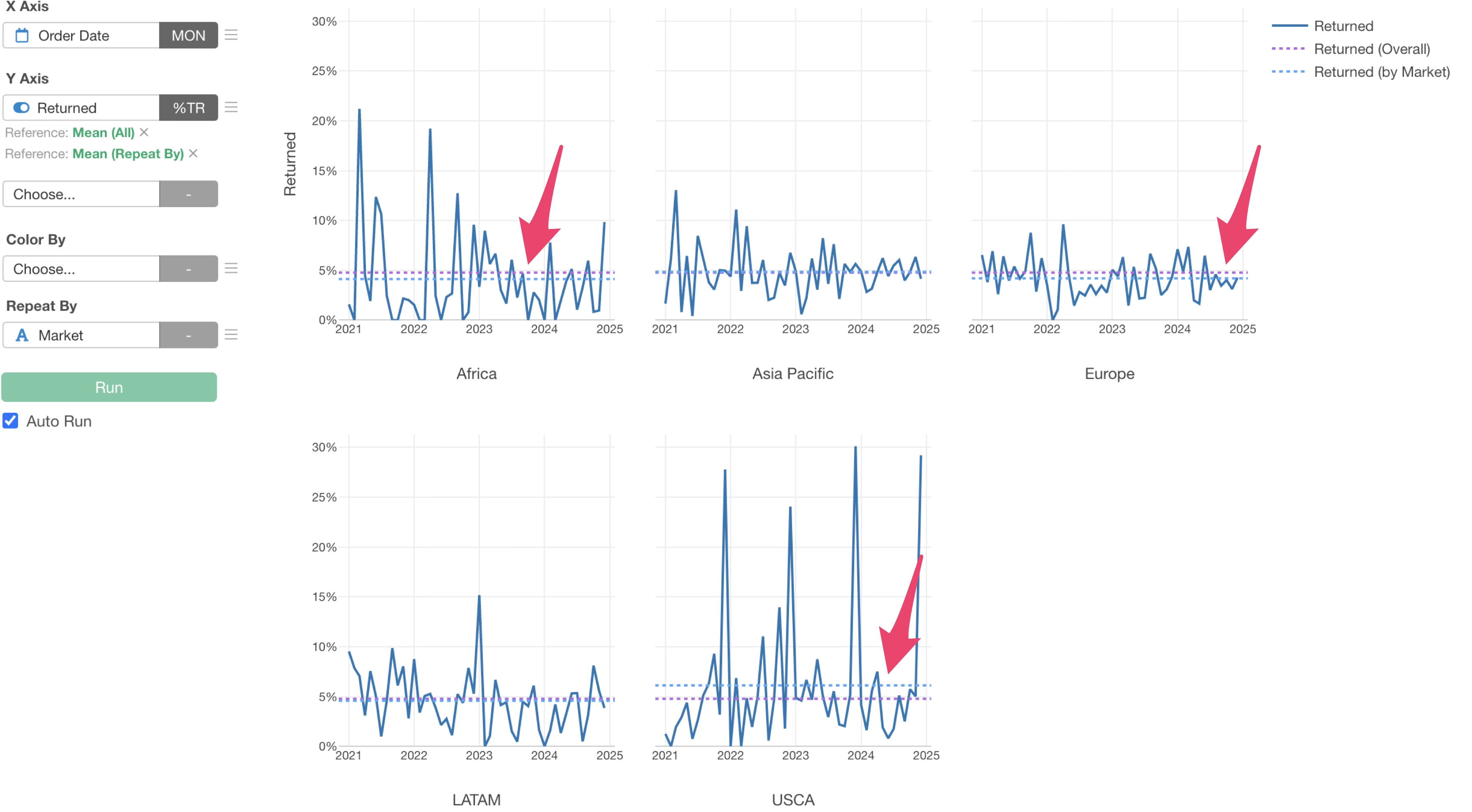
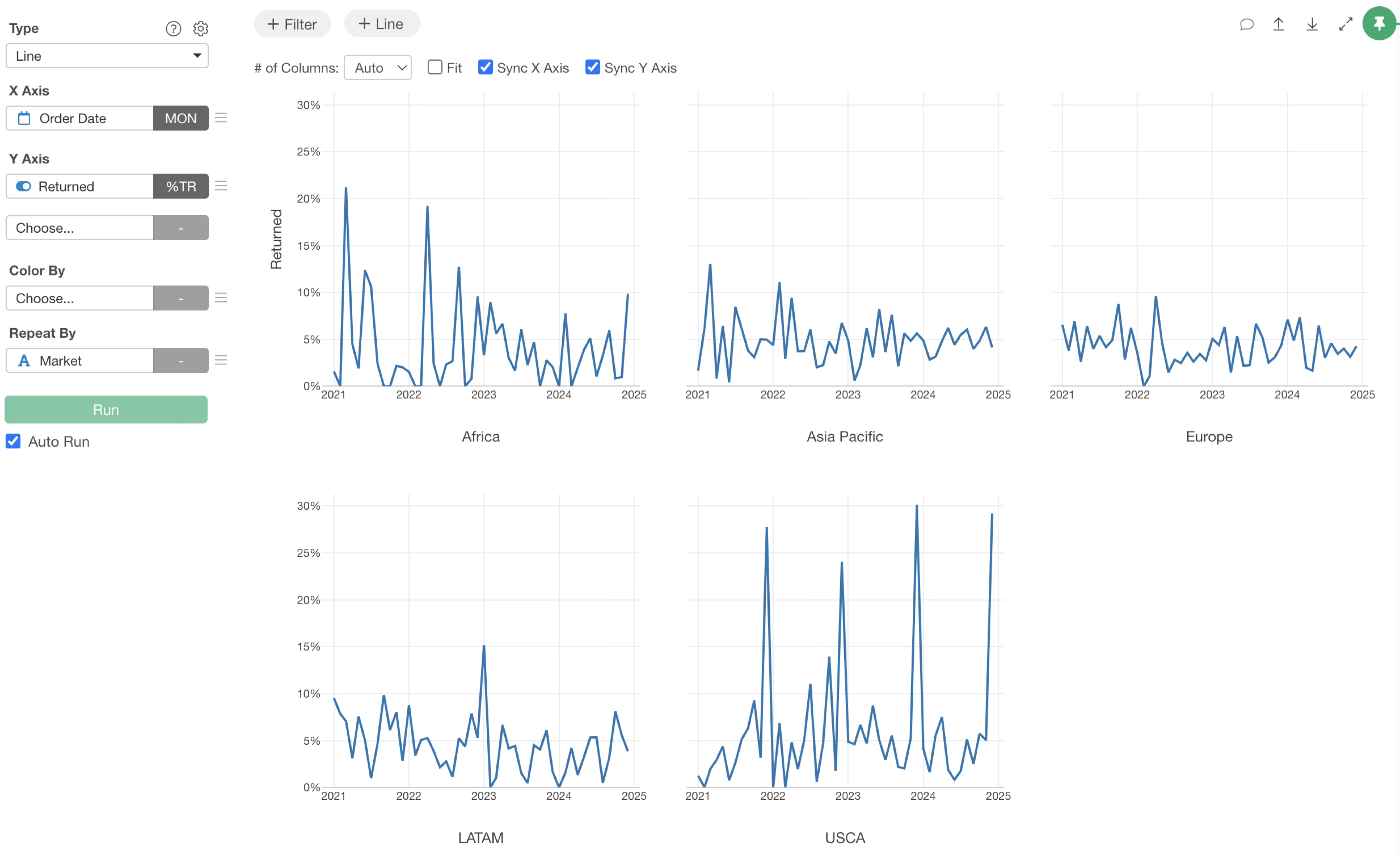
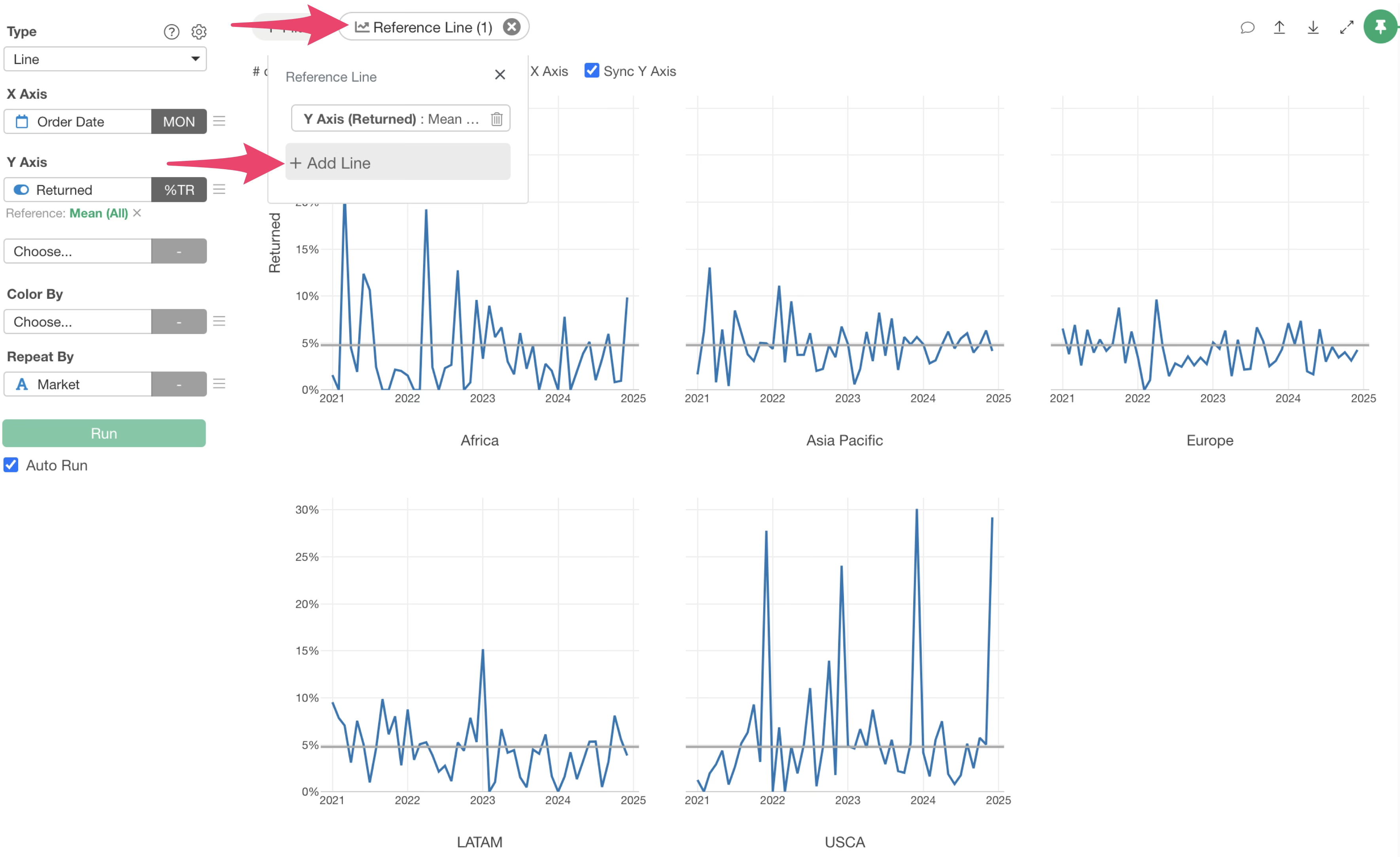
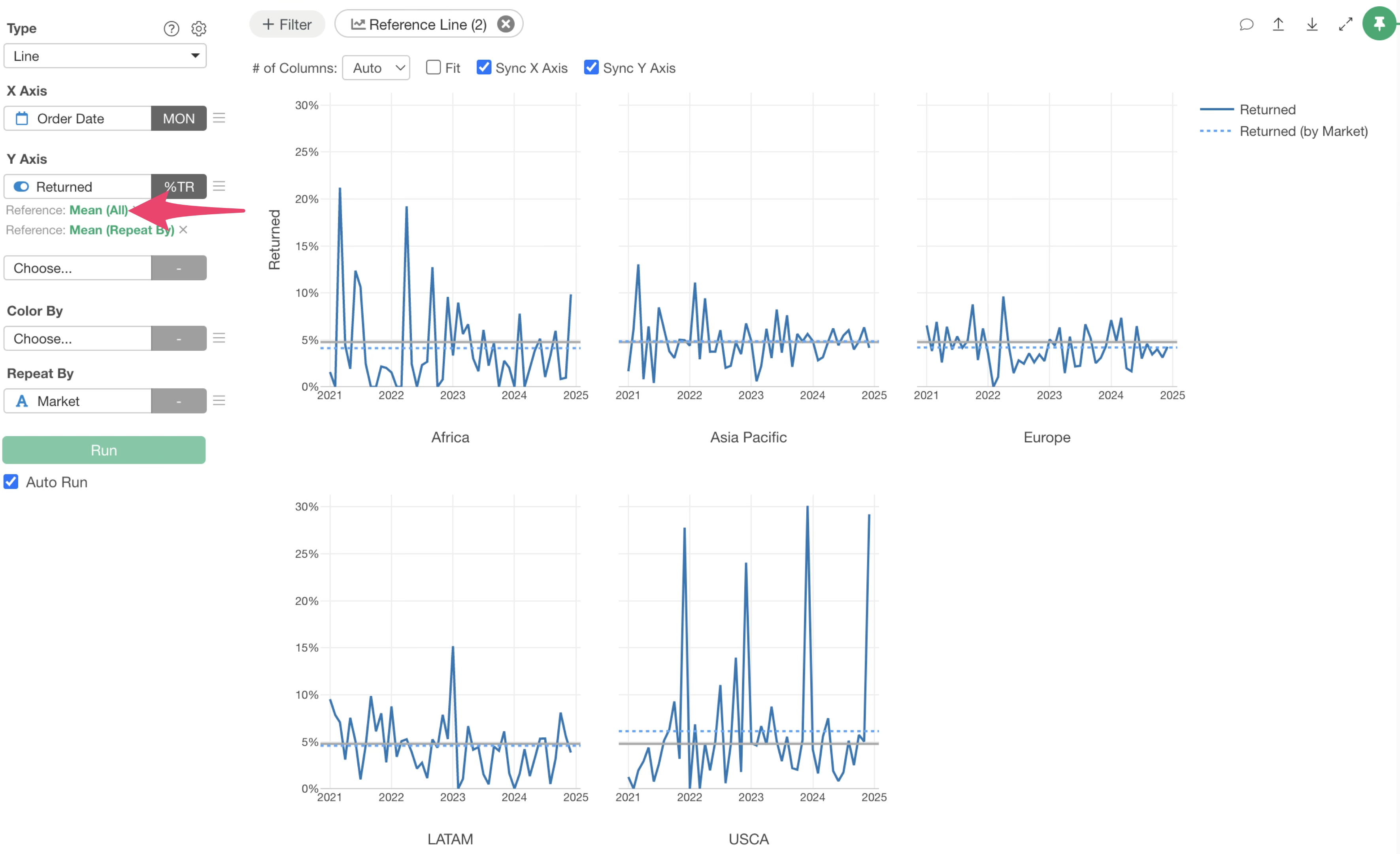
For example, the chart below visualizes return rates by market using the repeat by feature.
When you want to add average reference lines to such a chart, there are two approaches.
One is to visualize a reference line for the overall return rate. The other is to set an average reference line for each repeated category (in this example, for each market).
Exploratory not only allows you to set each of these individually but also to visualize both simultaneously. This note will explain how to visualize both the overall average and the average for each repeated category as reference lines at the same time.
Adding an Overall Average Return Rate as a Reference Line
First, let’s visualize the overall average return rate as a reference line.
Click the “Line” button at the top of the chart and select “Mean (Average)” from the Y-axis menu.
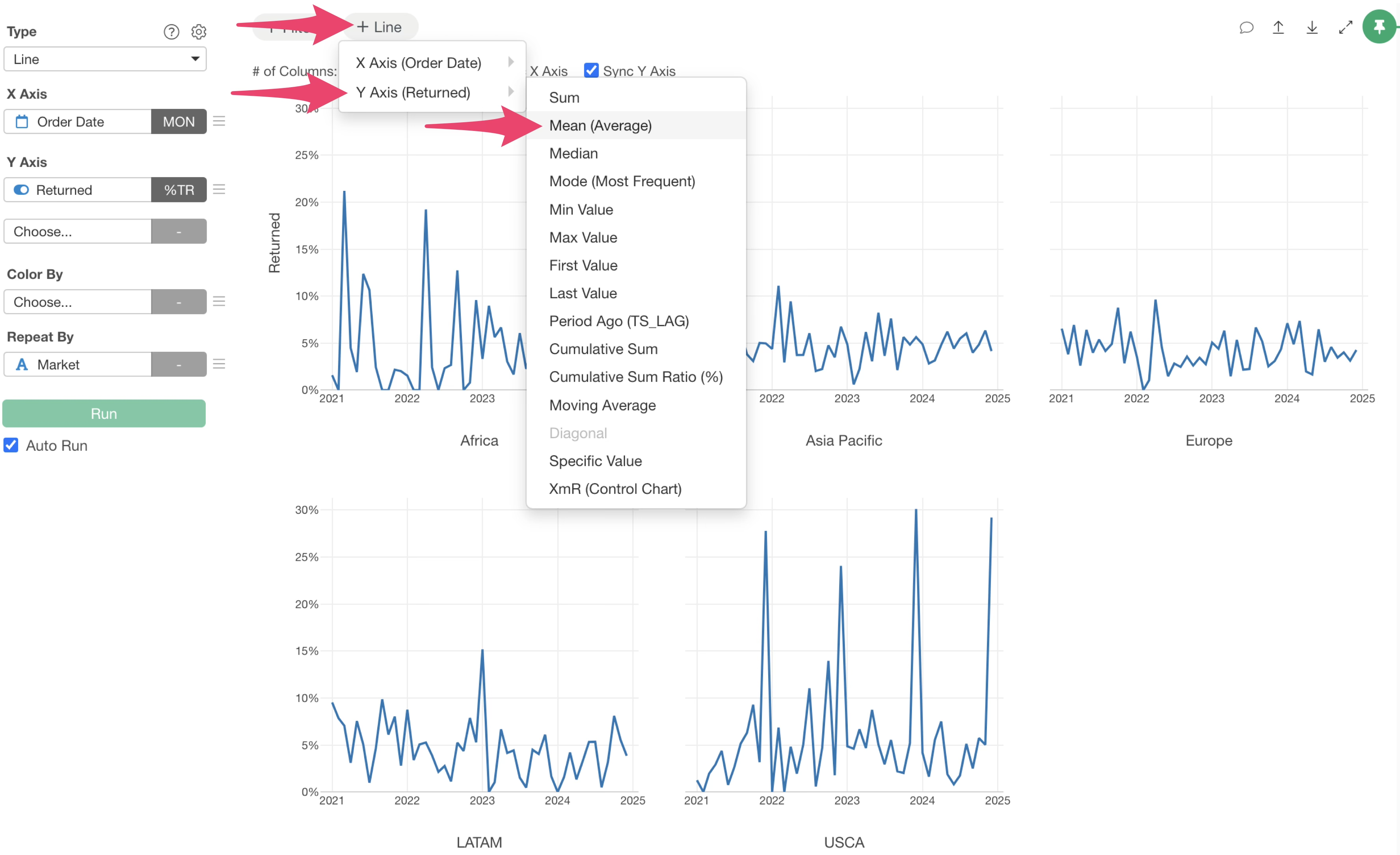
This adds a reference line showing the overall average return rate.
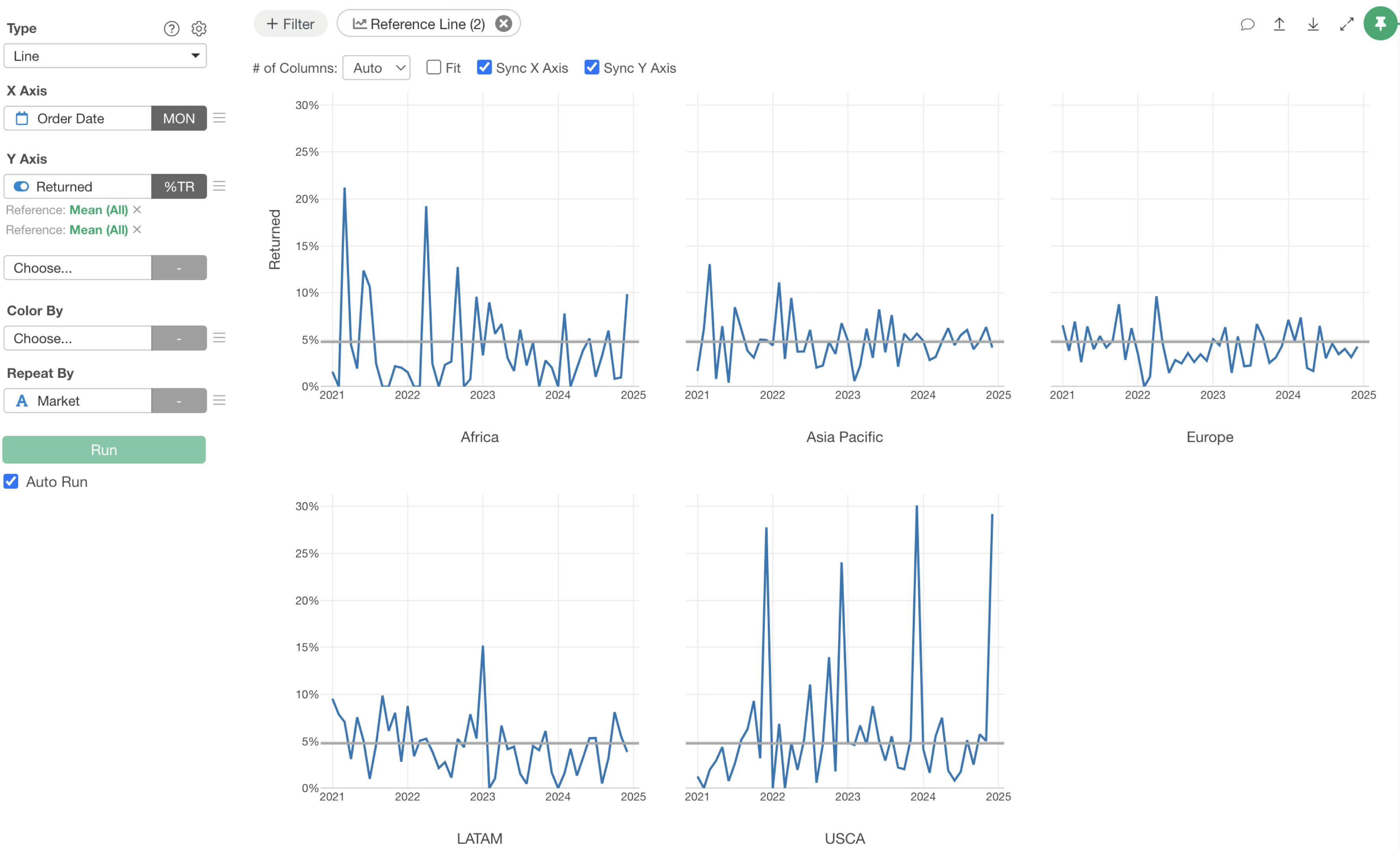
Adding Market-Specific Average Return Rates as Reference Lines
Next, we will visualize the average return rate for each market on the chart.
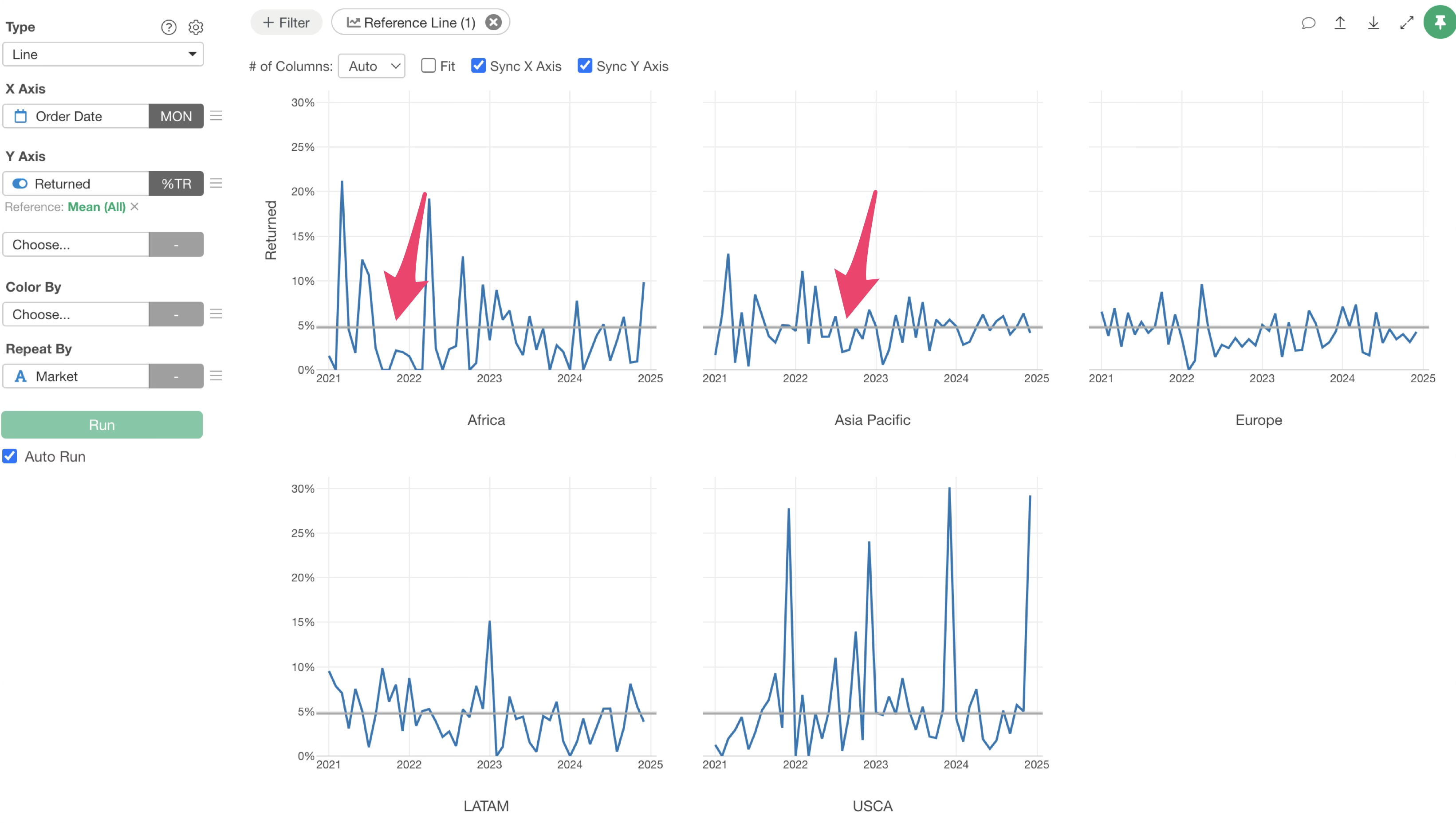
Click the “Reference Line” button at the top of the chart again, then click “Add Line.”
Select “Mean” again from the Y-axis menu.
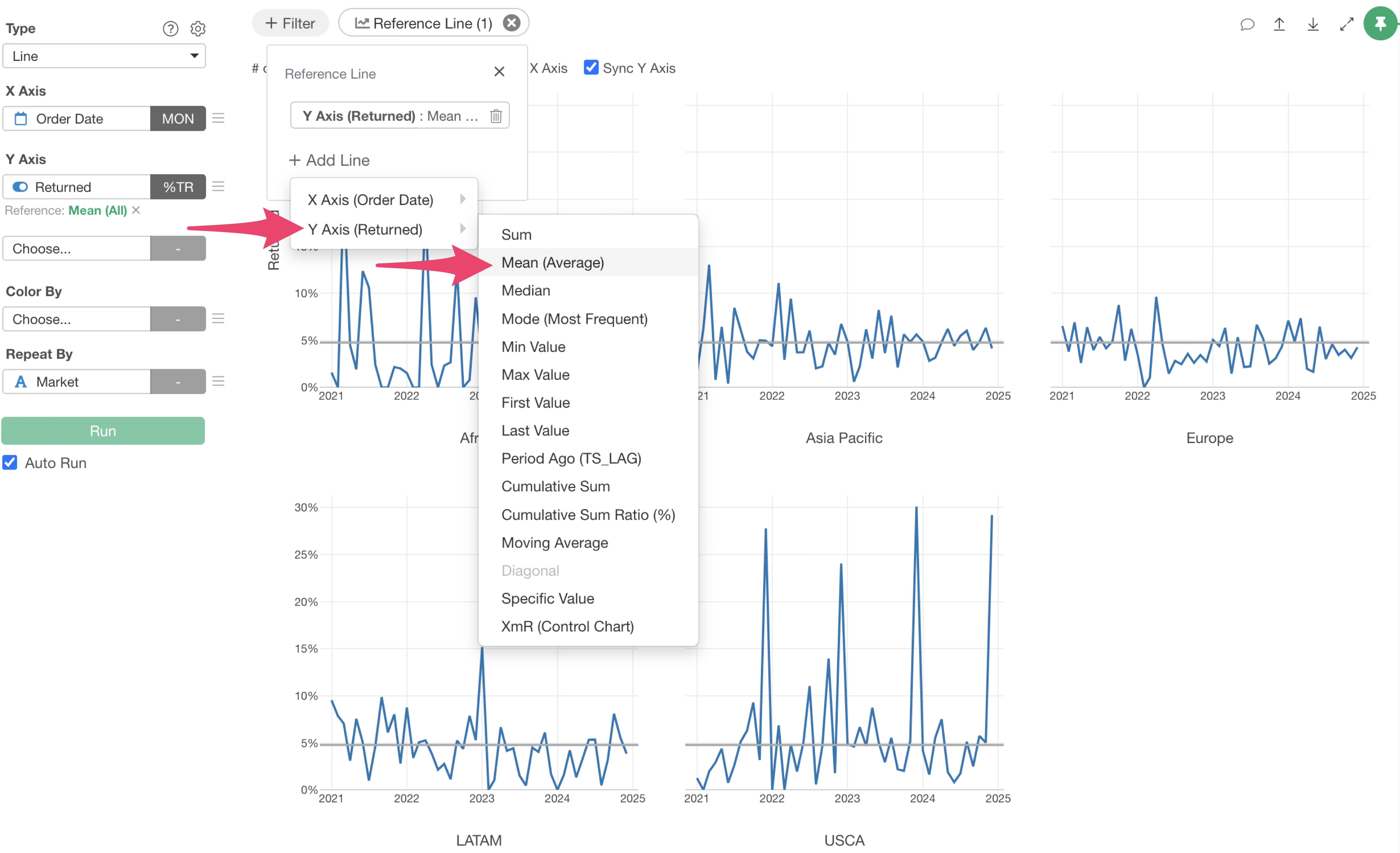
At this point, you won’t see any change on the chart, as the exact same average reference line has been added.
Now, let’s change the second reference line to reflect the return rate for each market.
Click the green text of the second reference line.
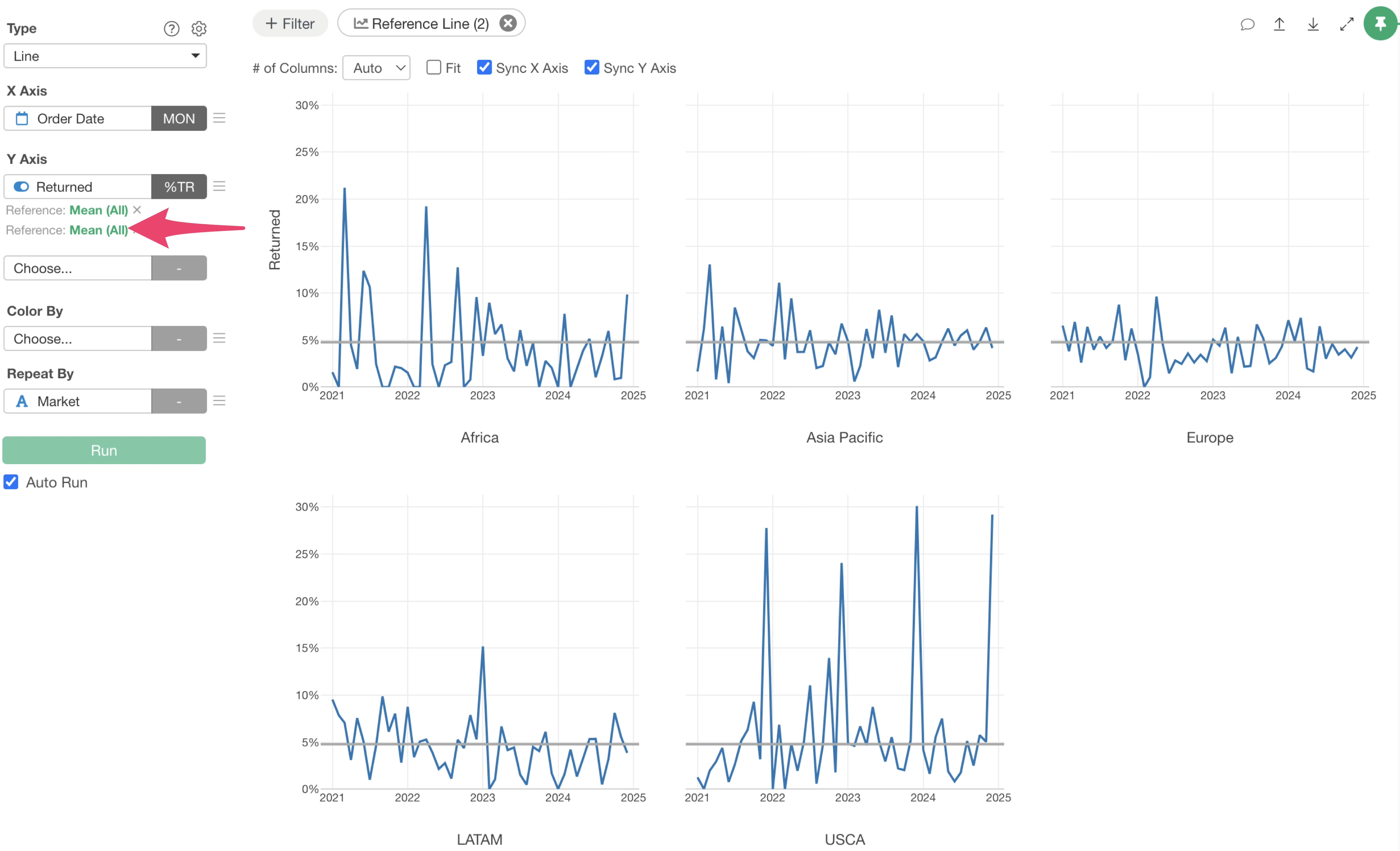
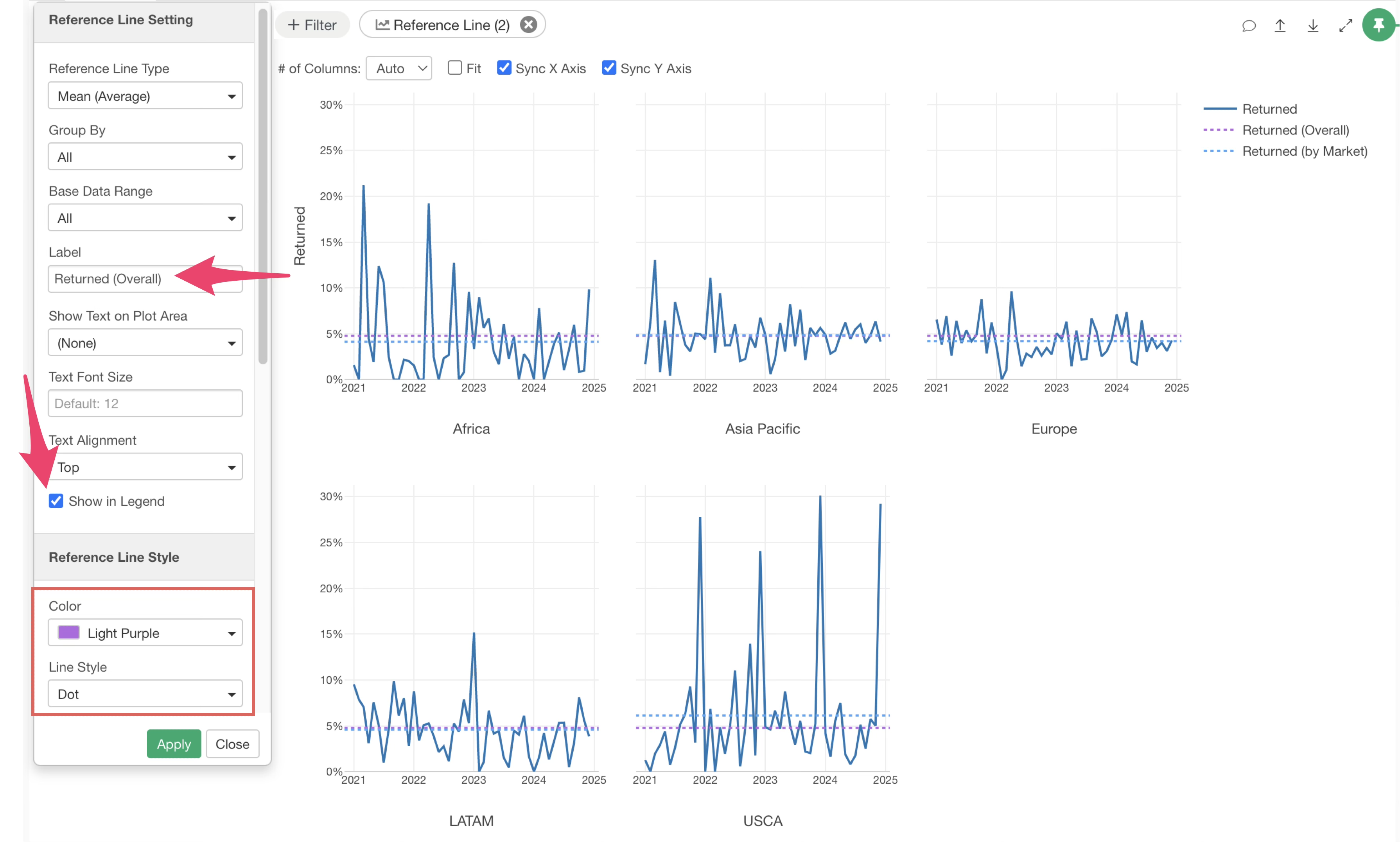
The Reference Line Settings dialog will appear. To visualize the average for each repeated category, select “Repeat By” for Group By.
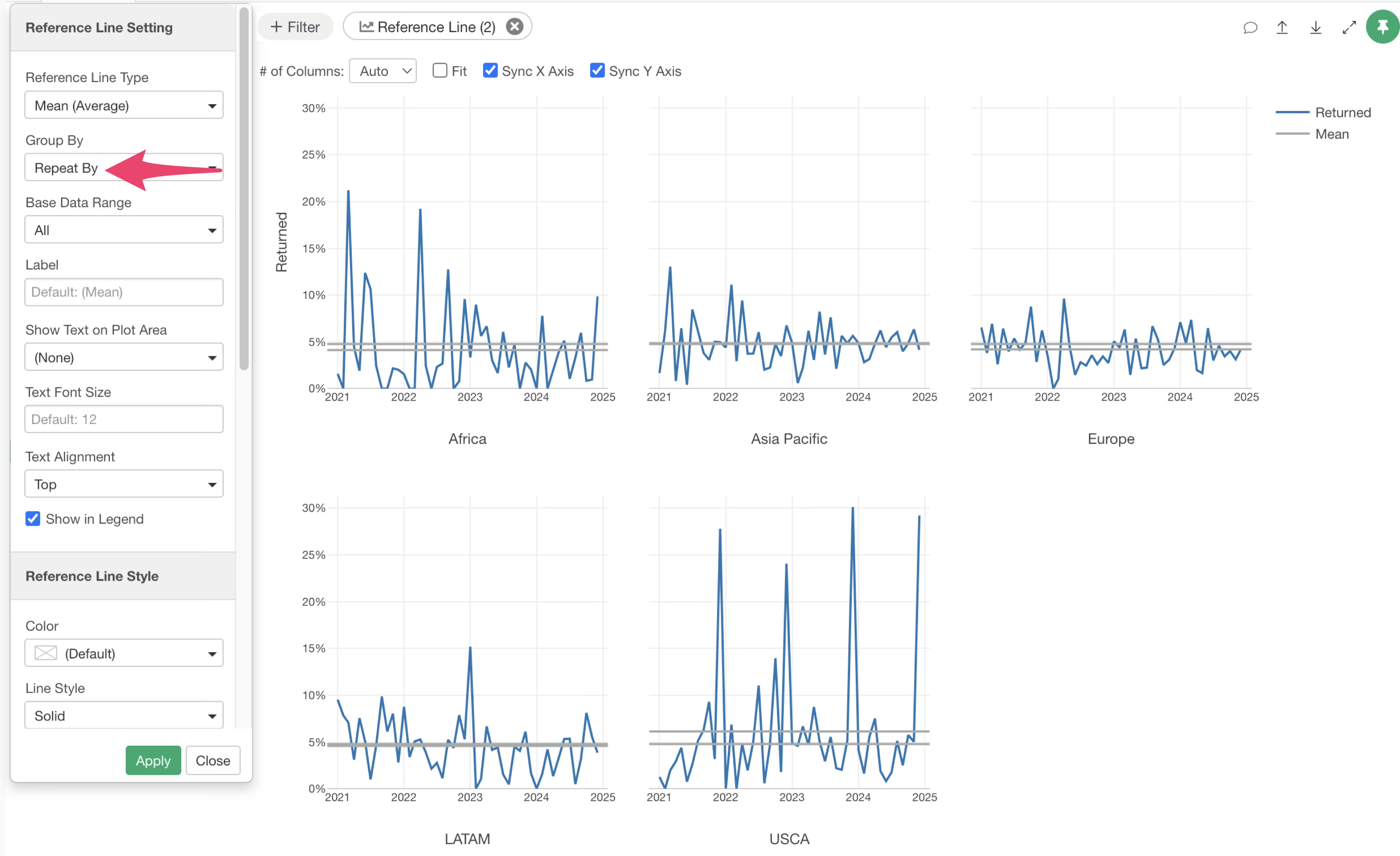
By default, the Grouping setting is “ALL,” which draws a reference line for the entire average.
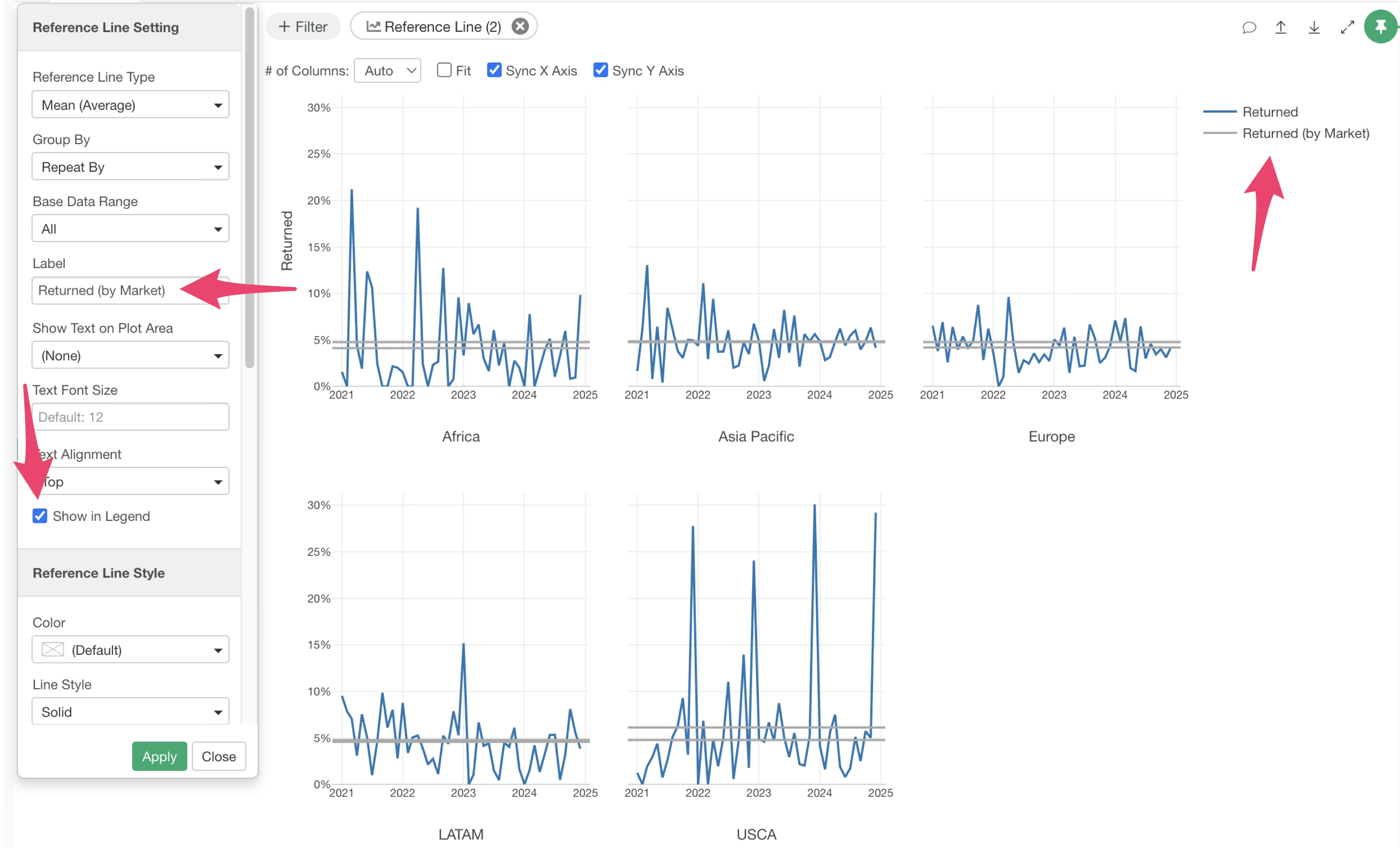
Next, let’s adjust the display settings to make the two lines easier to distinguish.
You can enter the necessary information in the label field of the Reference Line Settings dialog to display it in the legend.
You can also change the color and line style from the Reference Line Style options.
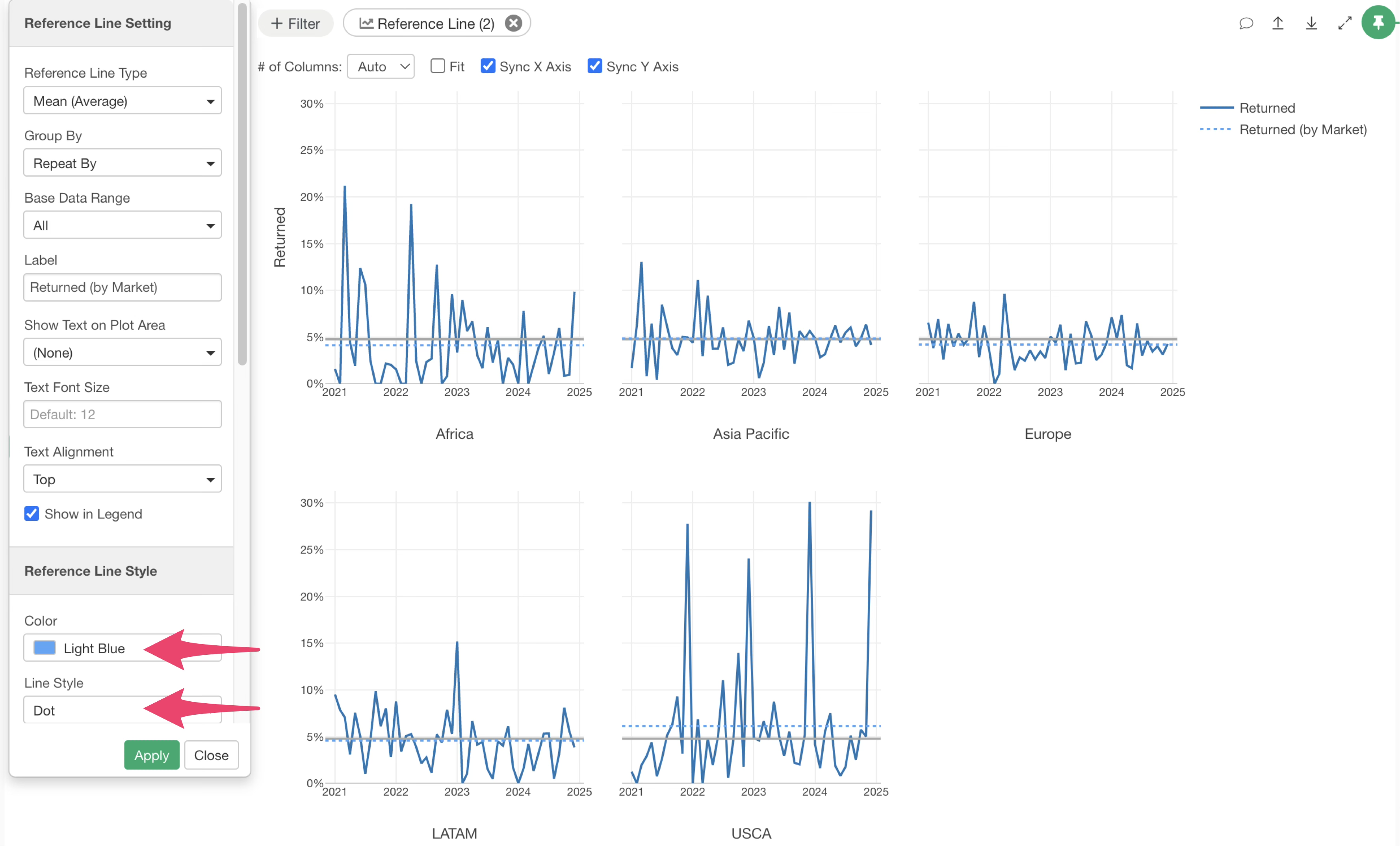
Once you have finished setting up the reference line, click the “Apply” button to update the chart.
Similarly, if you want to edit the overall average reference line, click the green text of that reference line.
The Reference Line dialog will appear again. You can change the label, legend display option, color, and line style in the same way.
After completing all settings, click the “Apply” button to update the reference line content.
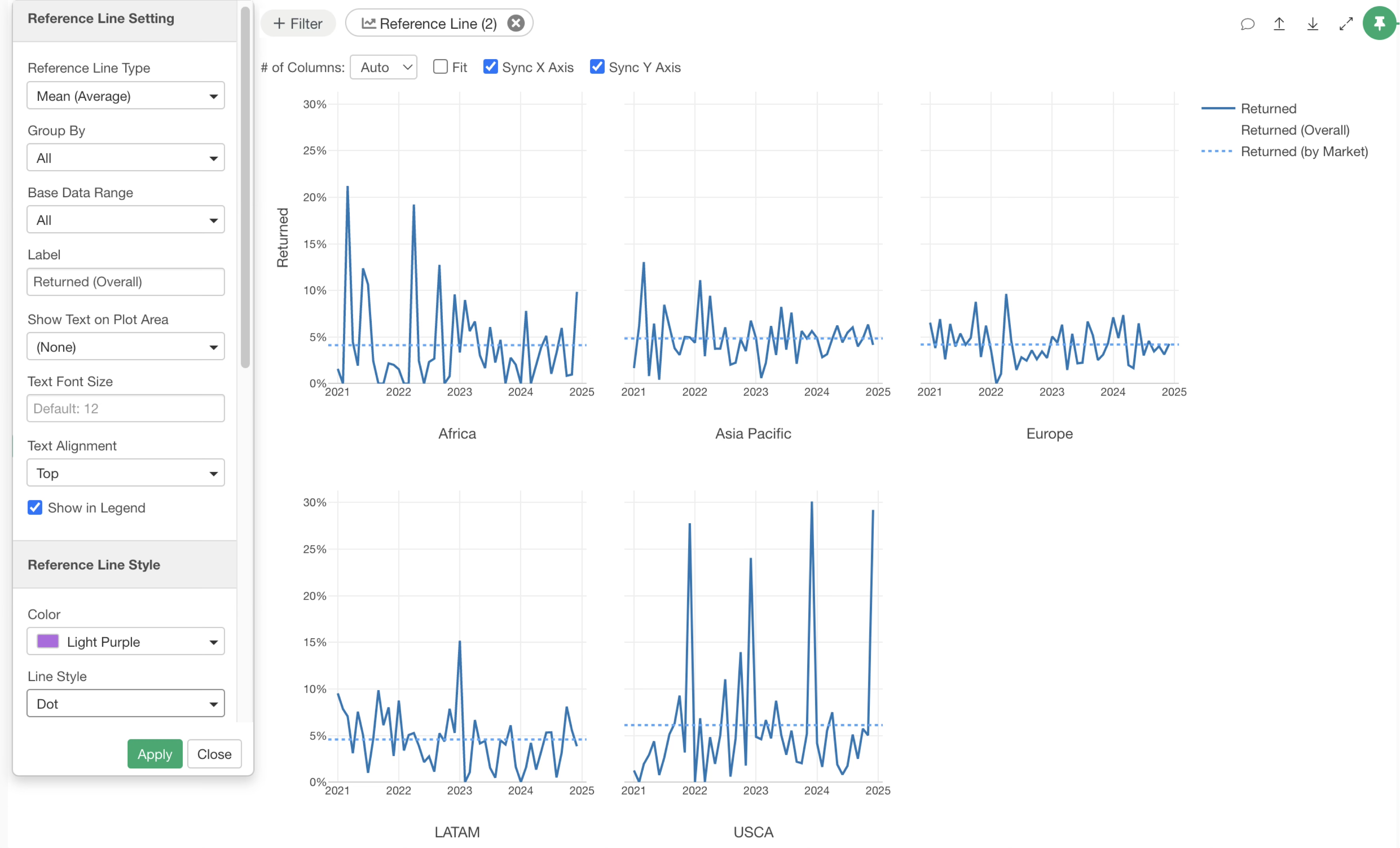
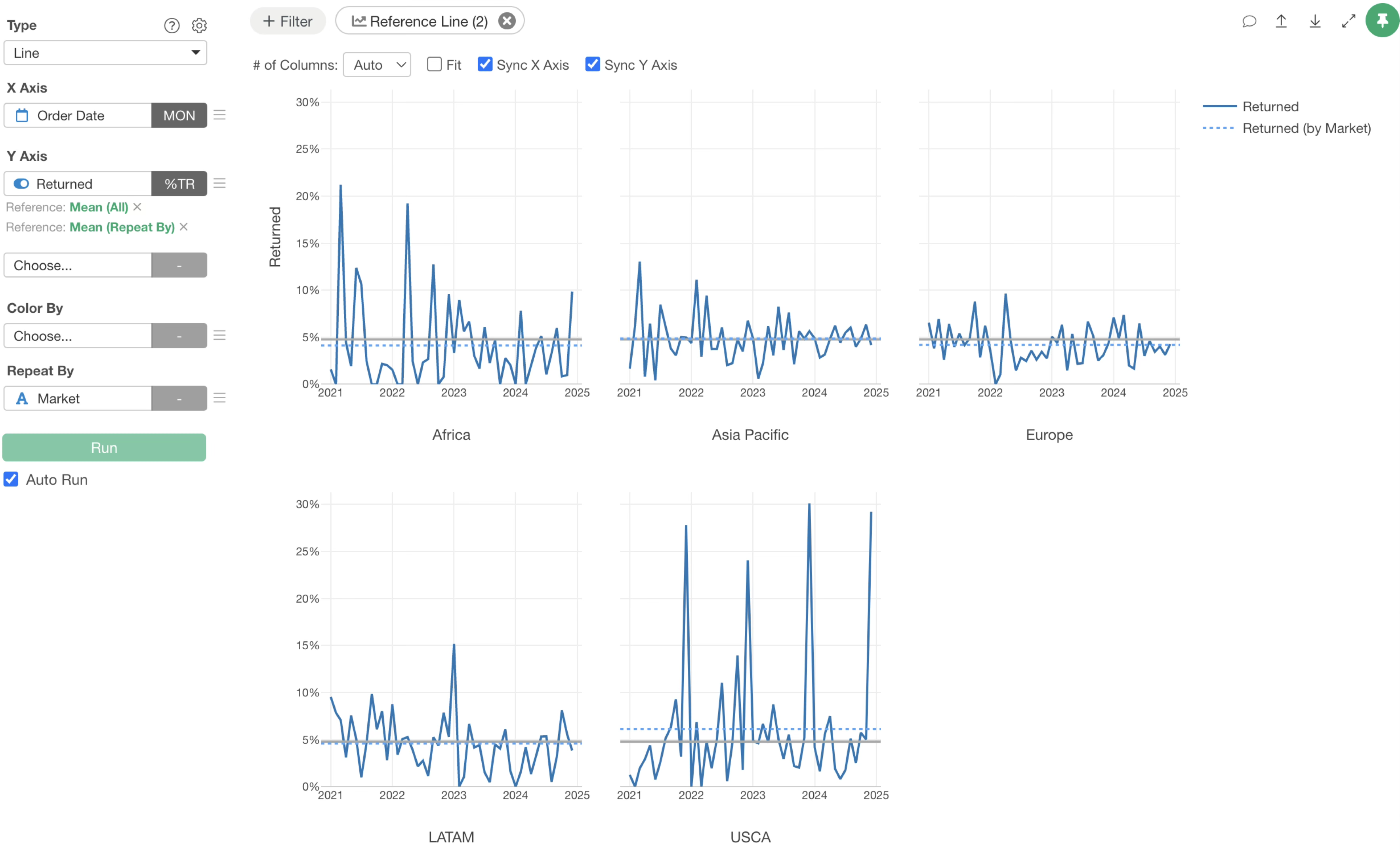
Now, you can display both the overall return rate reference line and the market-specific return rate reference lines simultaneously.
From this result, you can quickly see that the North American market has a higher average return rate compared to the overall average, while Africa and Europe have lower return rates.