How to Use Error Bar
You can use Error Bar chart to show confidence intervals for Mean (Average) values and for Ratio values.
If you want to learn more about the confidence interval you can check this seminar 'Visualizing Uncertainty'.
Sample Data
We'll use this Employee Data. You can download it from the page.
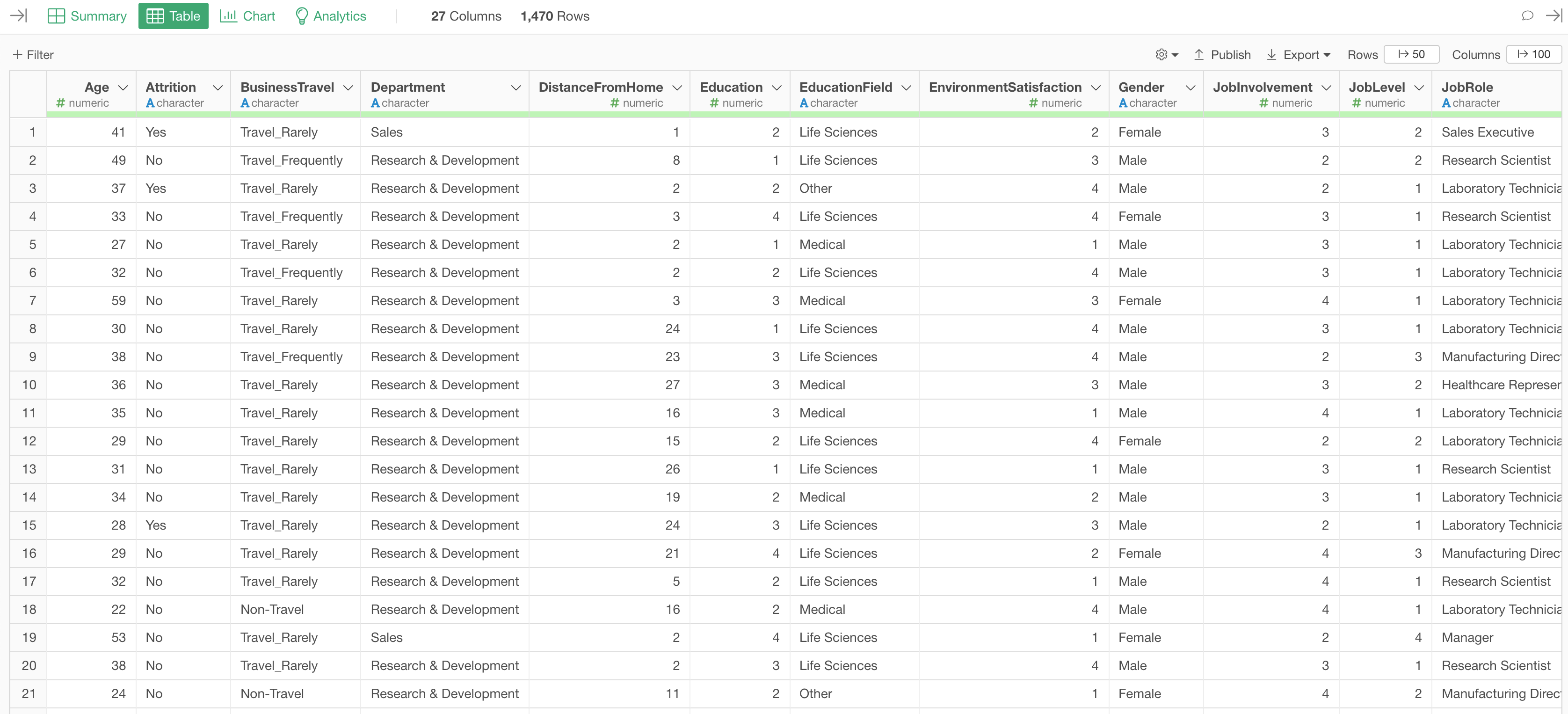
In this data, each row represents each employee, and the columns are employees' attribute information such as age, job type, income, etc.
Confidence Interval for Mean (Average)
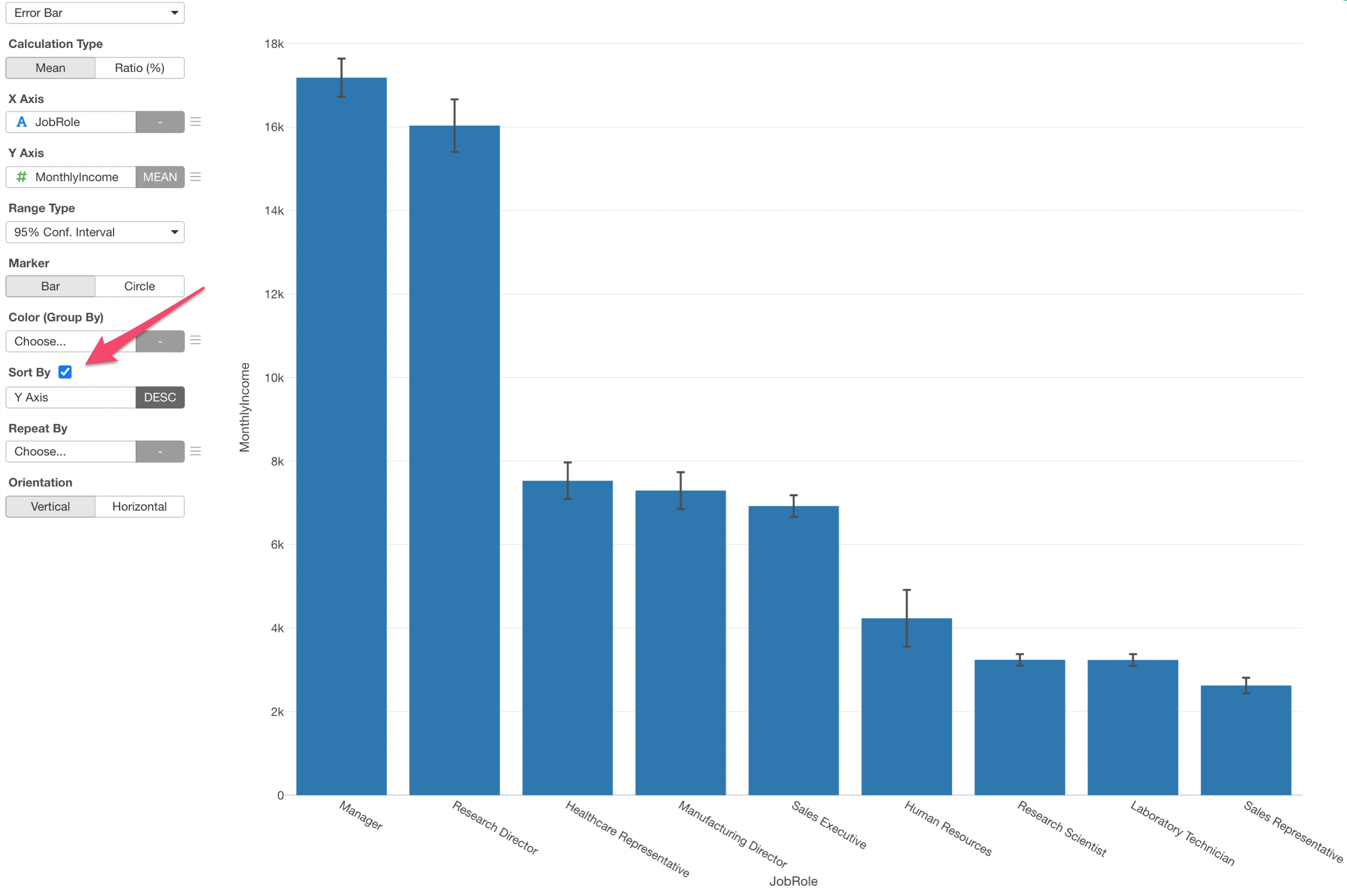
We'll create an Error Bar chart to visualize confidence intervals for the mean of monthly income for each job role.
Select 'Error Bar' chart and assign columns as below.
- X-Axis: Job Role
- Y-Axis: Monthly Income

Sort by Y-Axis Values
You can sort the bars by checking the 'Sort By' option.
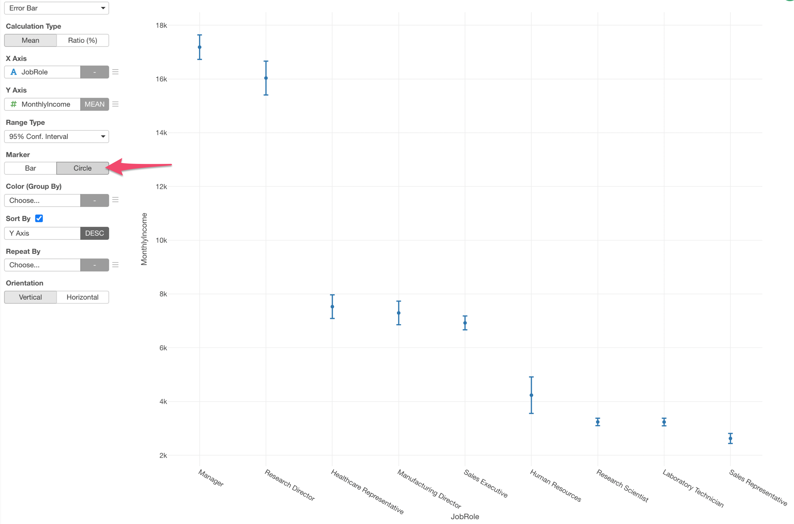
Change the Marker to Circle
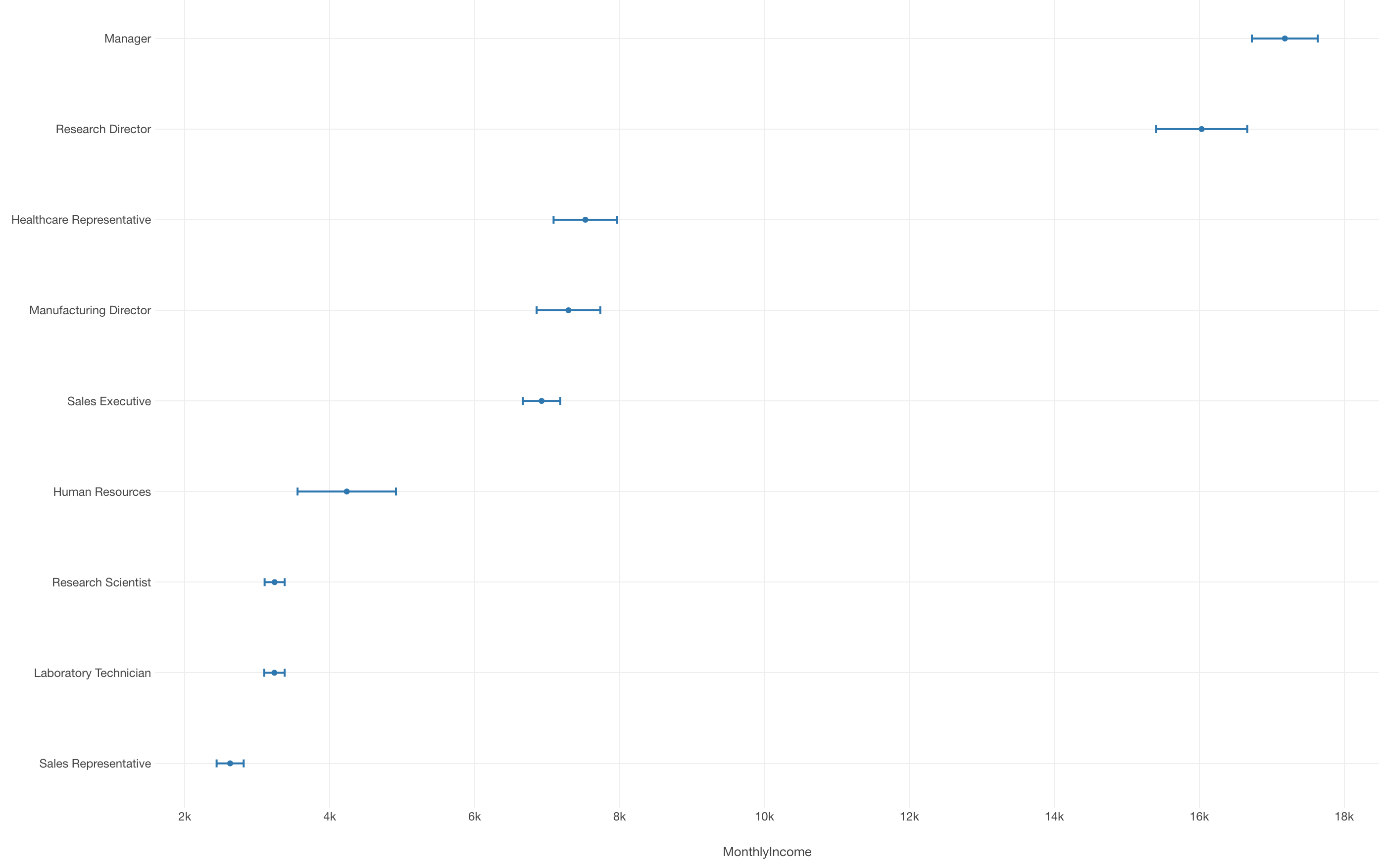
You can change the marker to Circle, which will visualize the mean values as positions (when on the Y-Axis) rather than lengths of bars, hence it's better when you want to focus on the confidence intervals.
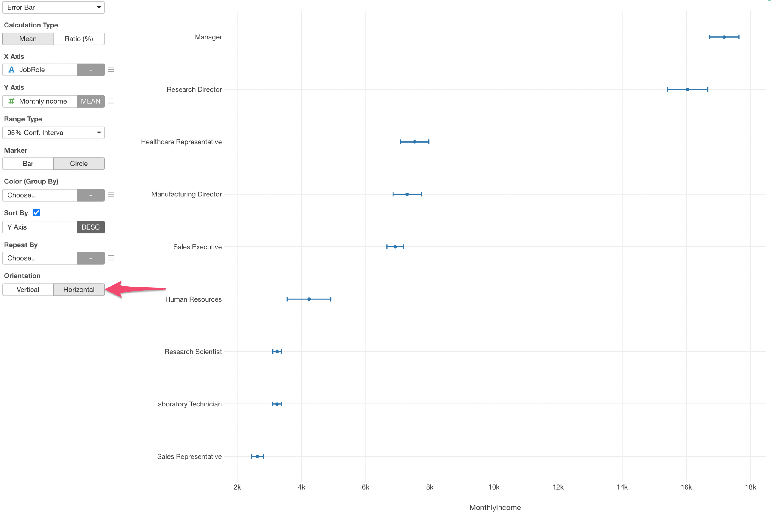
Change to Horizontal Orientation
You can choose the orientation between 'Veritical' and 'Horizontal'. Here, I've switched to the horizontal orientation, which makes it easier to read the group names (Job Roles).
Confidence Interval for Ratio
You can show the confidence interval for Ratio values with Error Bar chart as well.
Convert to Logical Data Type
If you want to show the ratio of binary data such as Yes/No, 1/0, TRUE/FALSE, etc. then you want to make sure to convert the data type of the column of your interest.
For example, here I have 'Attrition' column whose values are either 'Yes' or 'No.'
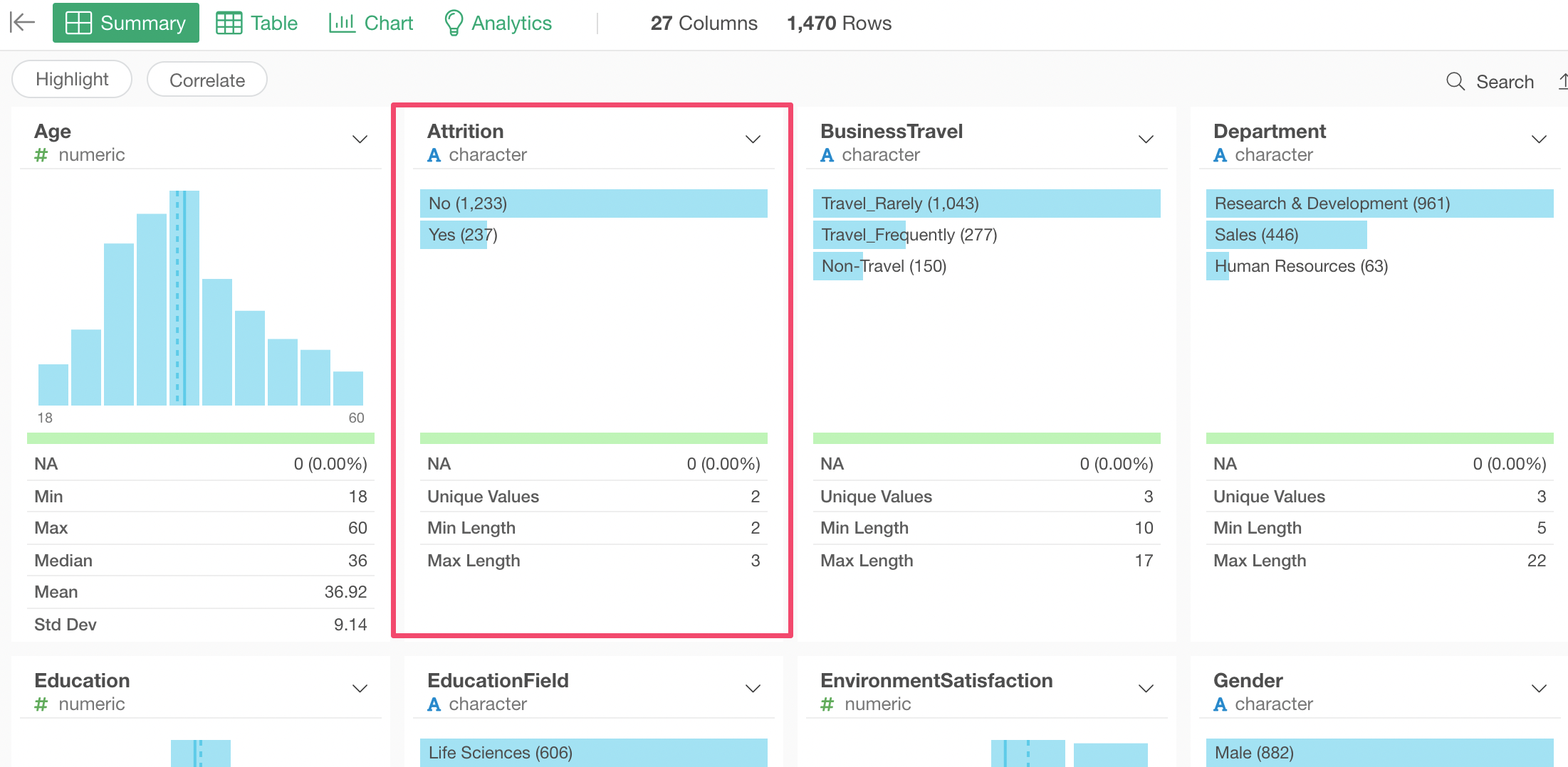
And if we want to use Error Bar to show the ratio of 'Yes' employees along with the confidence interval, first we need to convert the data type to the Logical type.
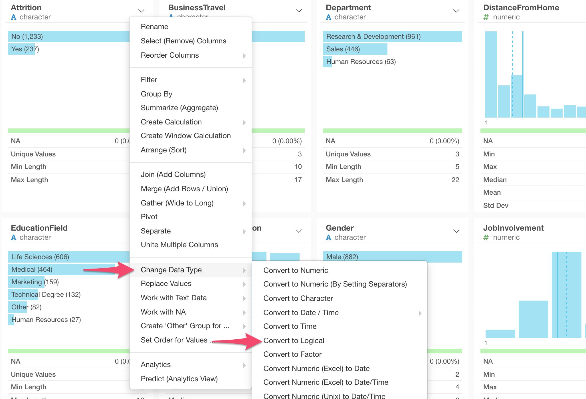
Once it's converted to the Logical data type the values are changed to TRUE and FALSE.
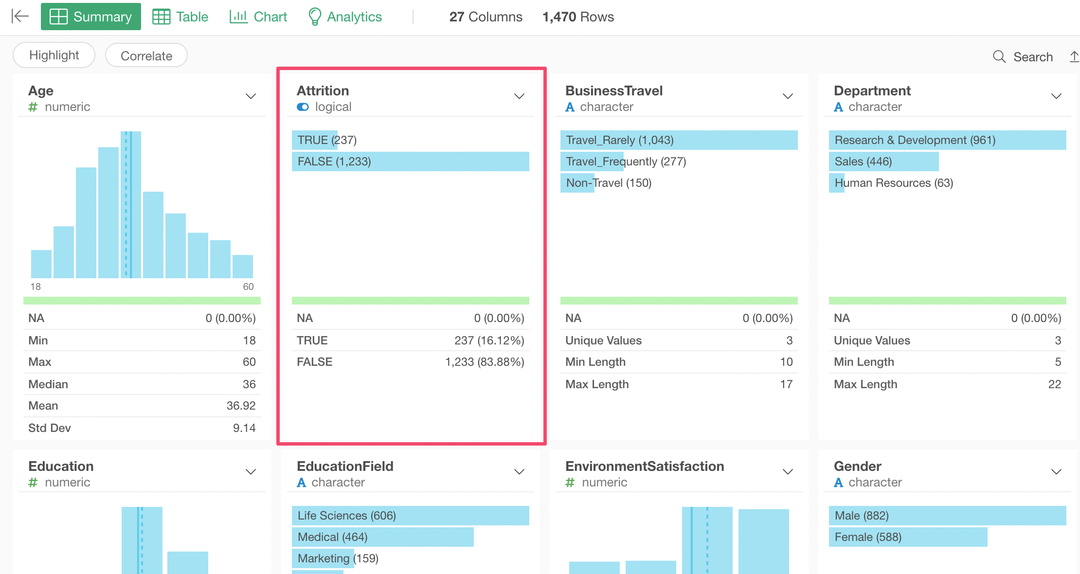
And it's ready to use Error Bar.
Use Error Bar to Show Confidence Interval for Ratio
Before configuratin the Error Bar, make sure the Pin button is connected to the step where you have converted to the Logical data type if you have.
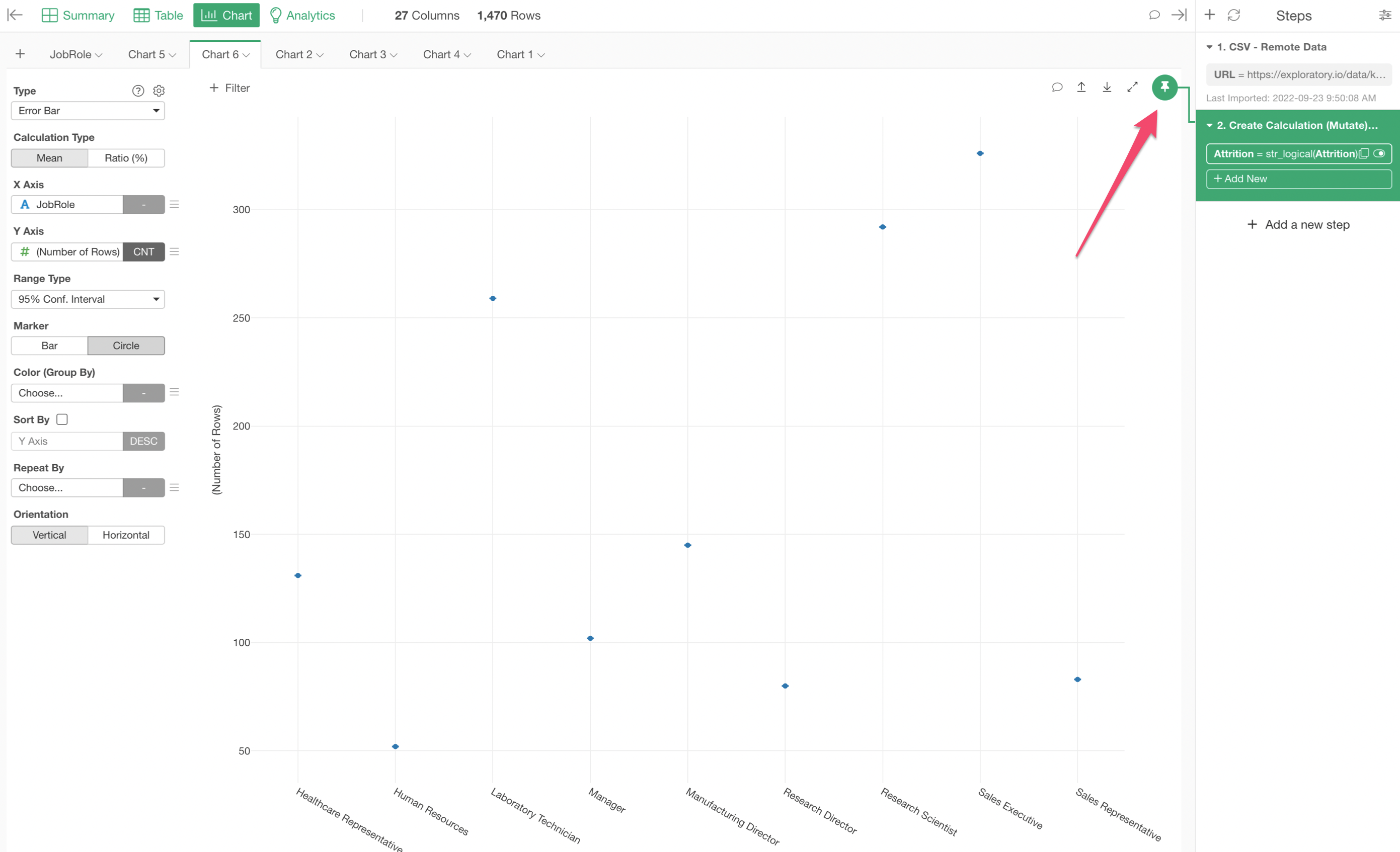
You can check 'Introduction to ‘Pin’ Feature' to see more details on the Pin feature.
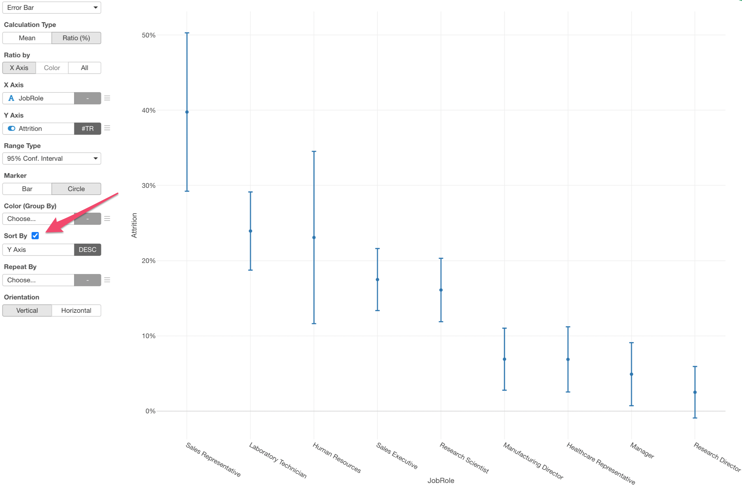
Now, select the Error Bar chart, select 'Ratio (%)' under the Calculation Type, and assign the columns as below.
- X-Axis: Job Role
- Y-Axis: Attrition
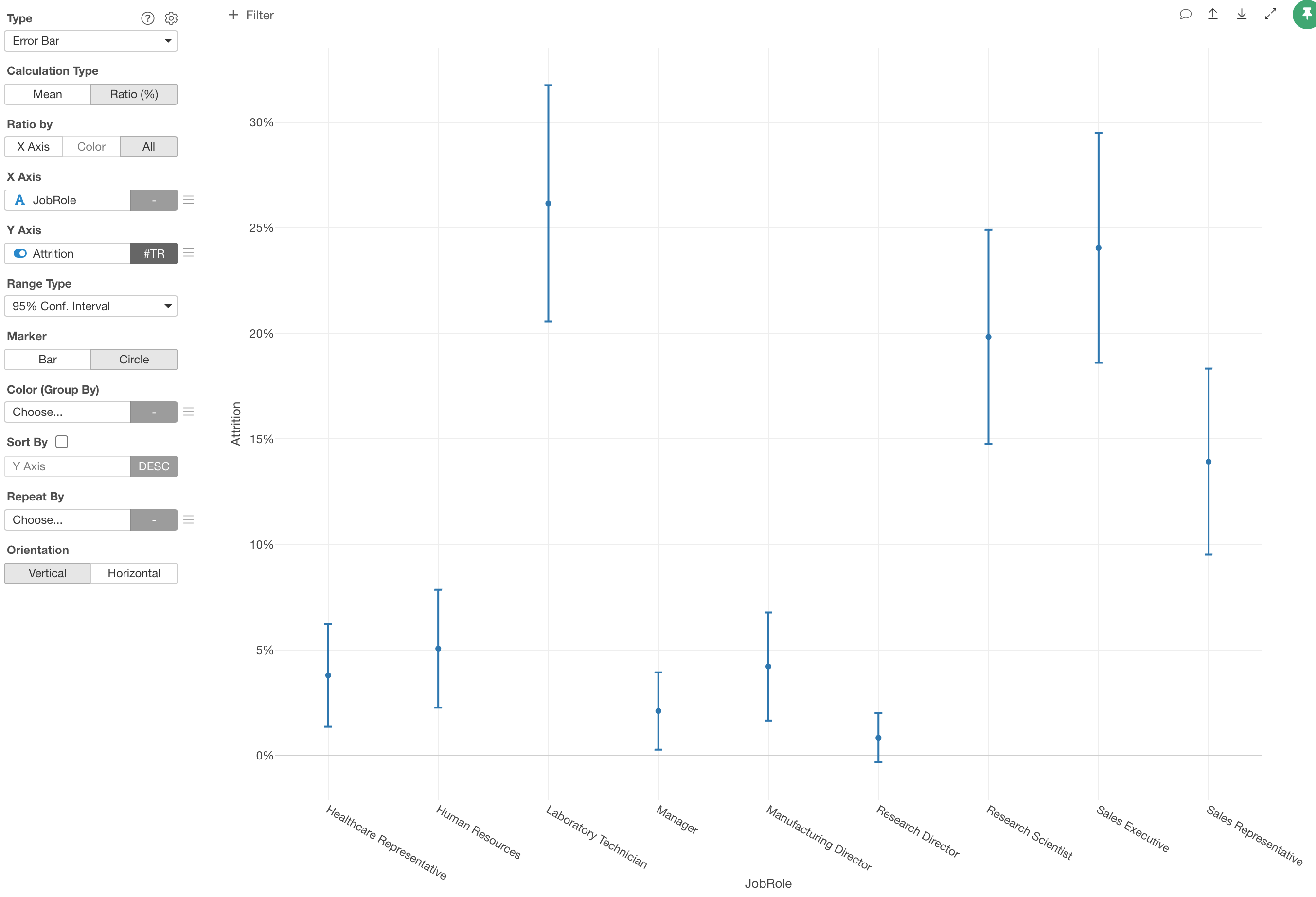
At this point though, the chart is calculating the ratio as '# of TRUE (Attrition) employees divided by All TRUE employees'. This is because the 'Ratio By' is set as 'All'.
We want to change it to 'X-Axis' so that the ratio calculation is done as '# of TRUE (Attrition) employees divided by each Job Role (e.g. Manager, etc.) employees.
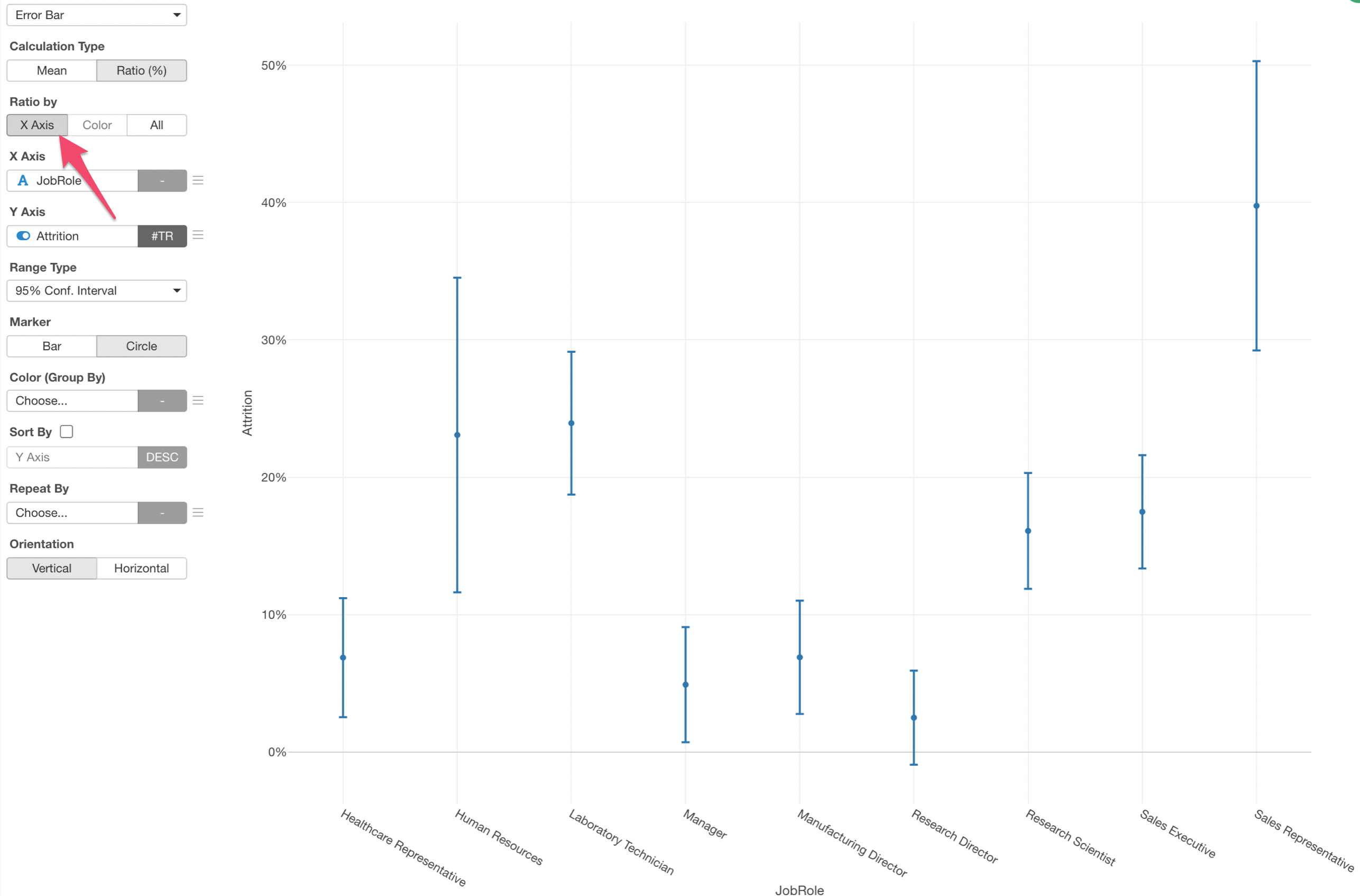
We can sort the bars by the Y-Axis values (Ratio) to make it easier to understand which Job Roles have higher ratios than the others.
