How to Use Exploratory - Basics
This is a 'How to Use Exploratory' tutorial we have created to help you familiarize basic yet important functionality of Exploratory in the most effective way.
You can learn the following topics in a hands on format with step-by-step instruction.
- Import CSV Data
- 4 Types of Views in Exploratory
- Understand the Data Summary with Summary View
- How to Create Calculations
- Creating the First Chart
- Using Key Features of Chart
It takes about 20 minutes to finish.
Let's start!
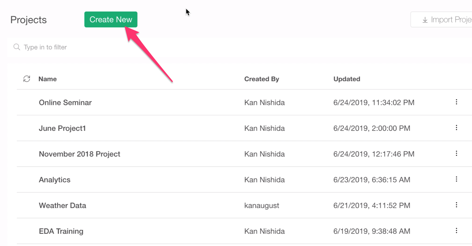
1. Create a New Project
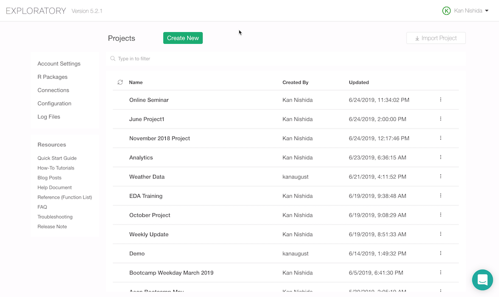
When you launch Exploratory Desktop and finish the initial installation step, you will see this Project List page.
In Exploratory, you import data and do everything in projects. So first, you want to create a project.
2. Import Data
Once you open a project, the first thing you want to do is to import data!
We are going to use a sample data set called 'Airbnb Listing Data for New York City'.
Each row represents each property. And the columns are the attributes about the properties such as price, number of rooms, neighborhood, etc.
You can download this data from this link.
Once you have downloaded it, go to the downloaded folder, and you can drag-and-drop the file into Exploratory's window. Make sure you are inside the project.
It will prompt you a Data Import Dialog where you can configure how you want to import the data with a set of parameters at the left hand side. This time, we don't need to change anything, so you can click the Save button to import the data.
Type a data frame name and click the Save button.
Once the data is imported, you'll see a Summary view of the data that is automatically generated.
3. 4 Types of Views
There are 4 views to help you work with your data efficiently.
- Summary View
- Table View
- Chart View
- Analytics View
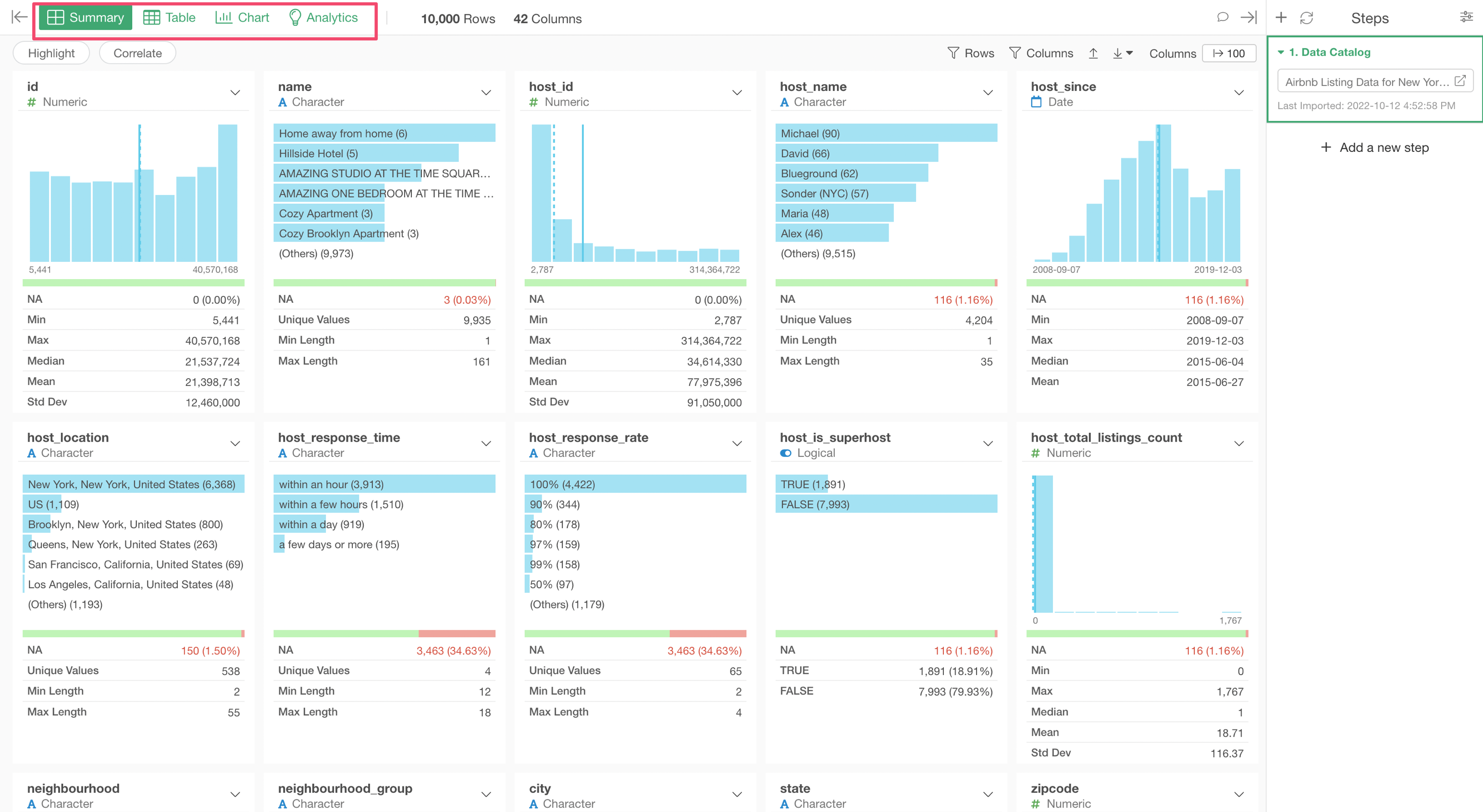
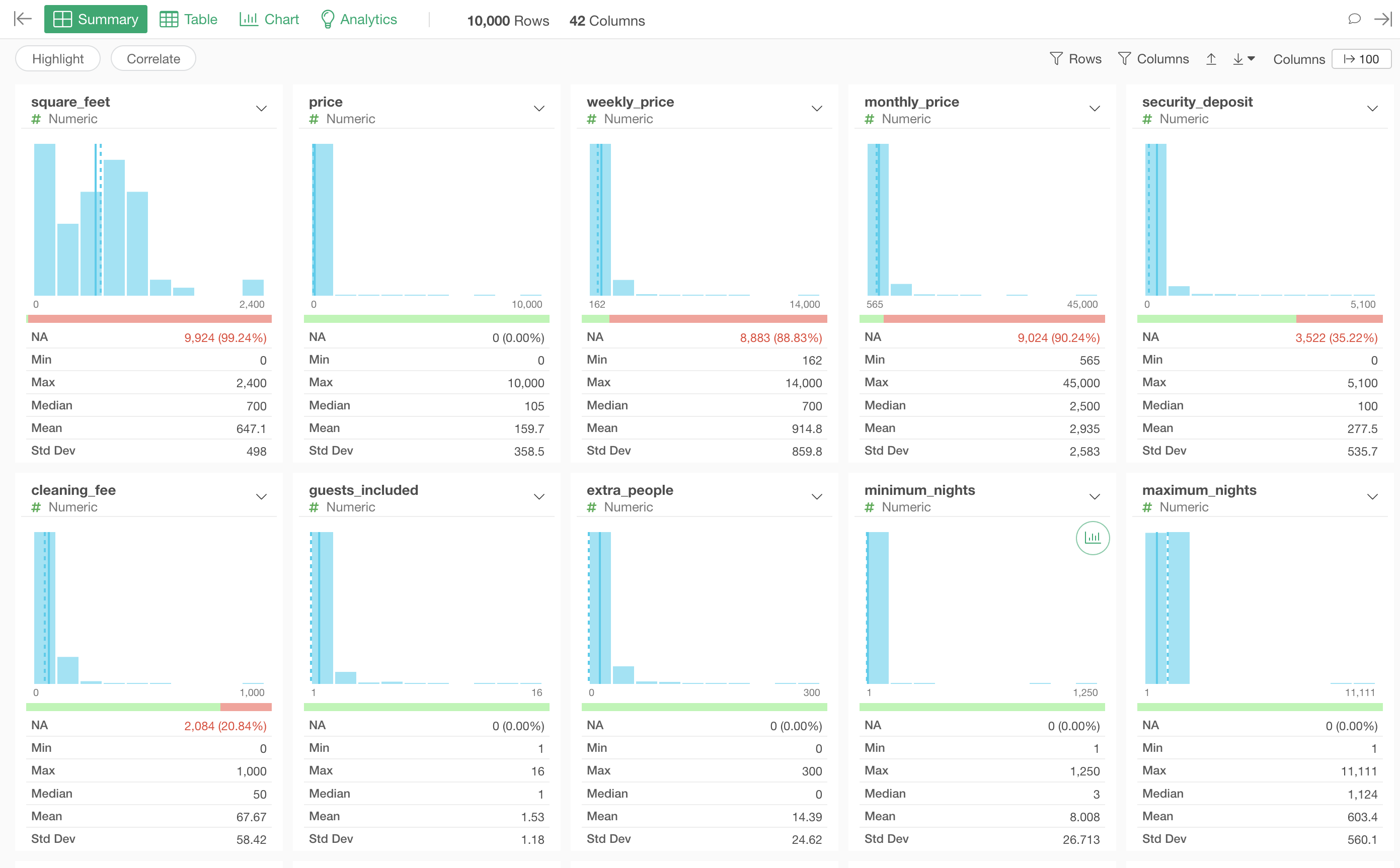
Summary View
The Summary View helps you understand how the data is varied or distributed with summary statistics and charts.
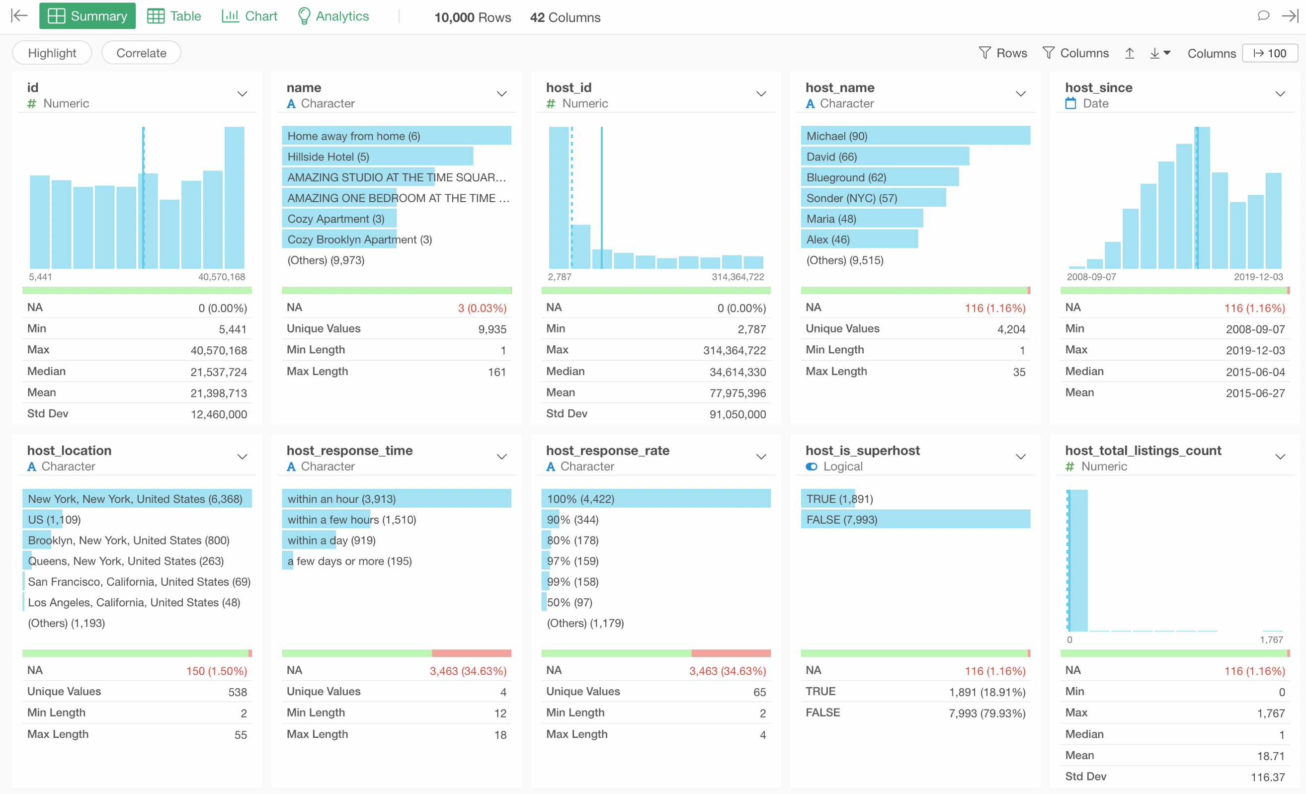
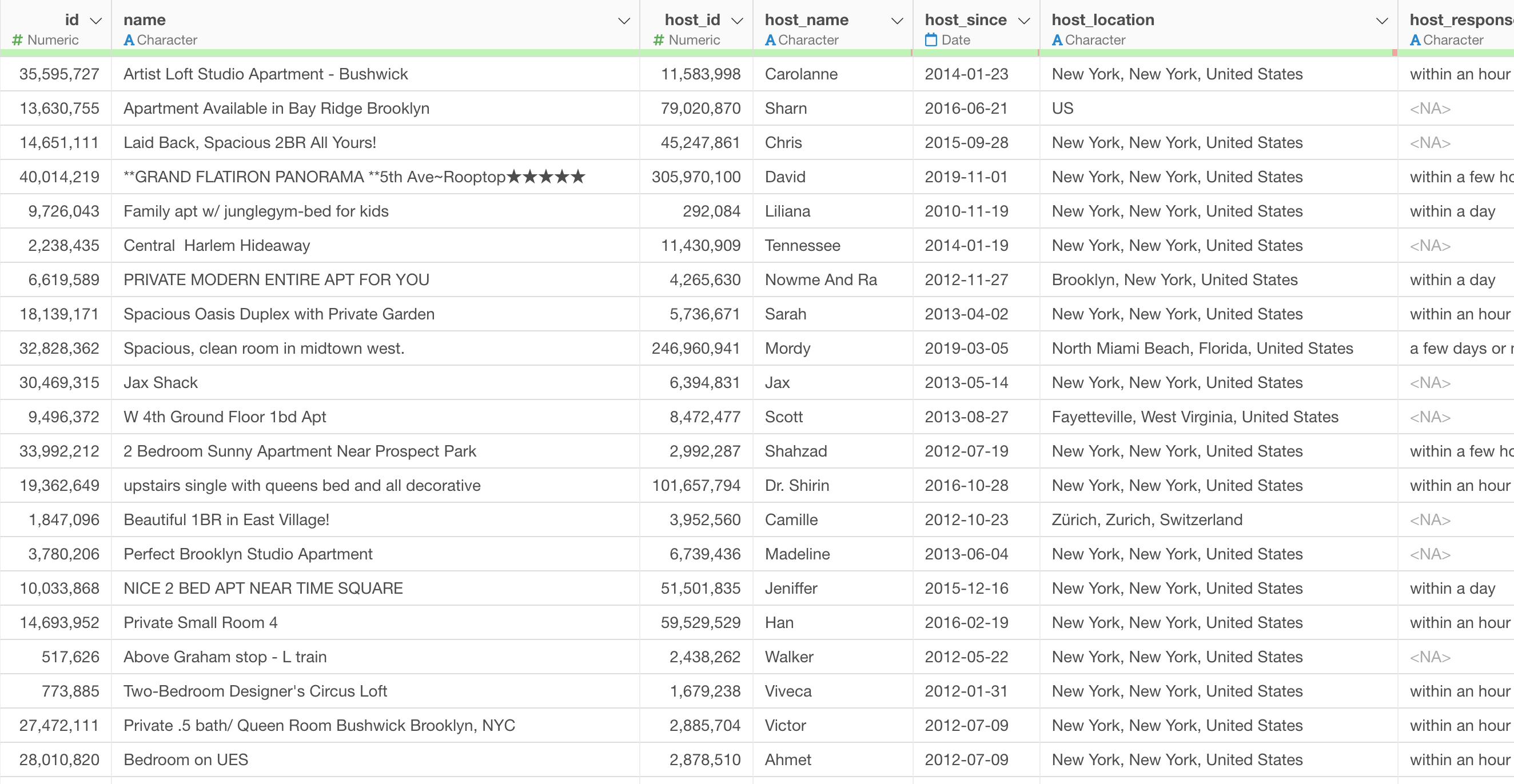
Table View
The Table View helps you see how the data looks like with rows and columns format.
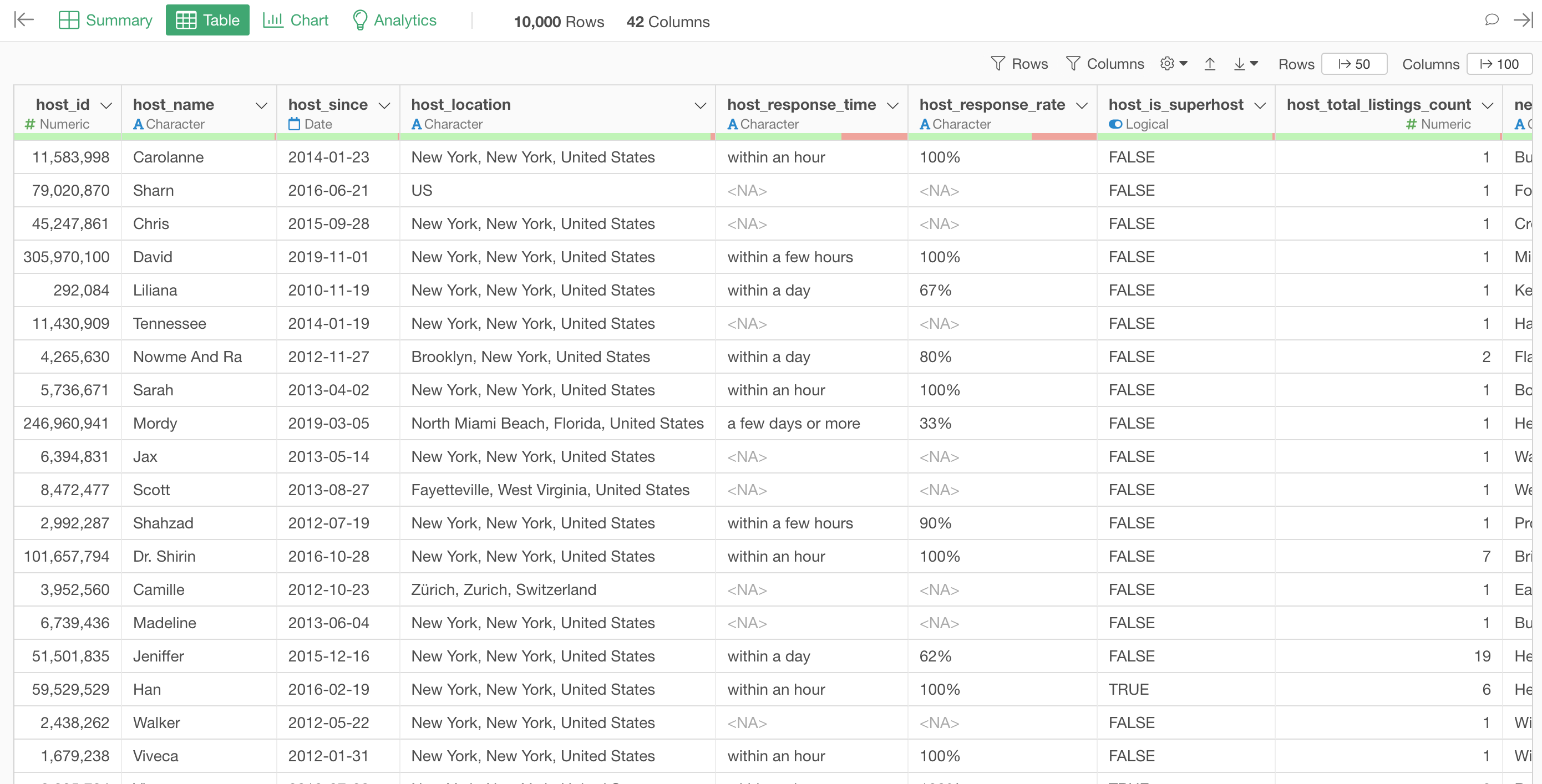
Chart View
Under the Chart View, you can create charts to visualize the data and find patterns and trends in data intuitively.
Analytics View
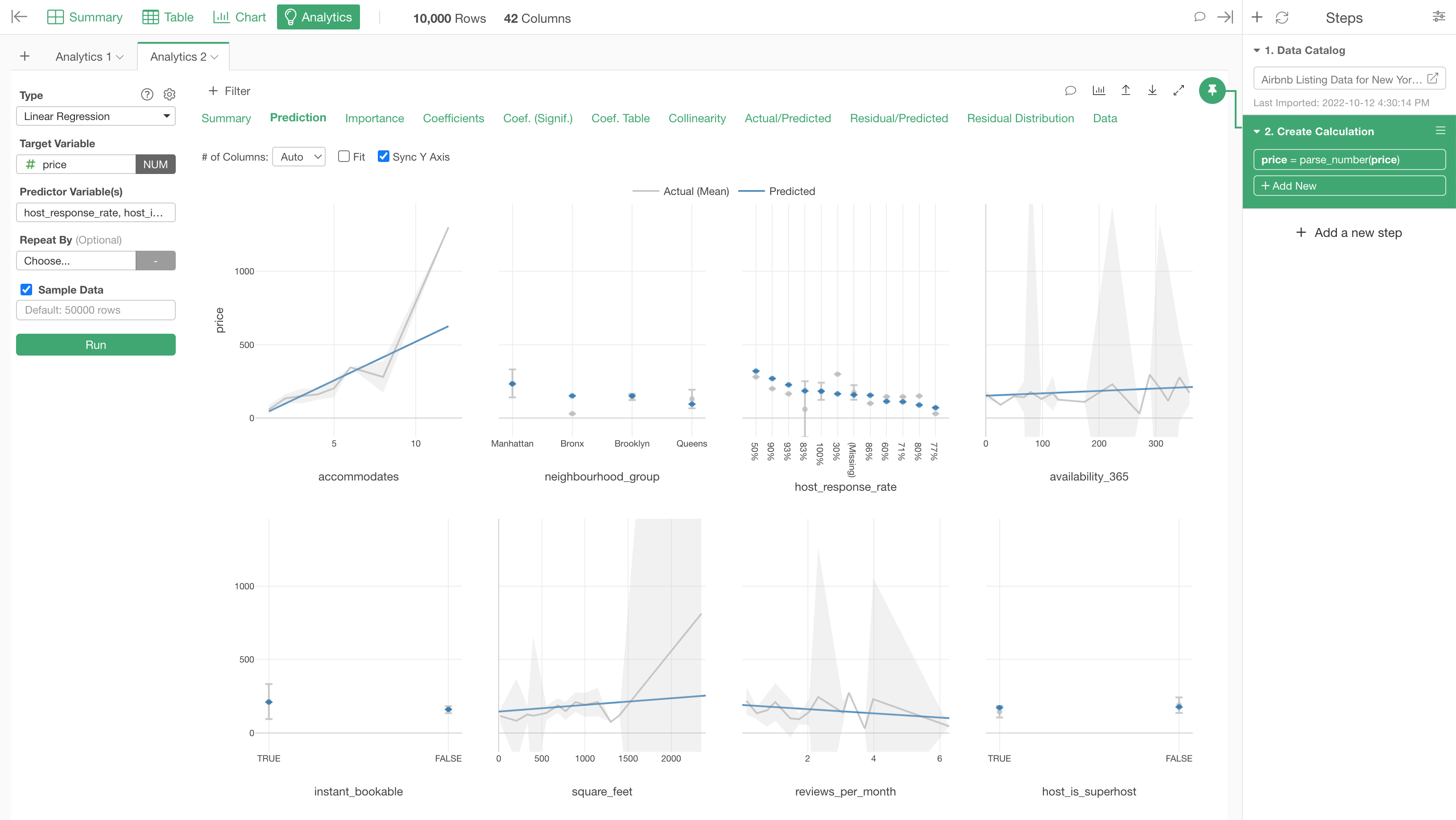
Under the Analytics View, you can use various types of statistical and machine learning algorithms to find deep insights from your data.
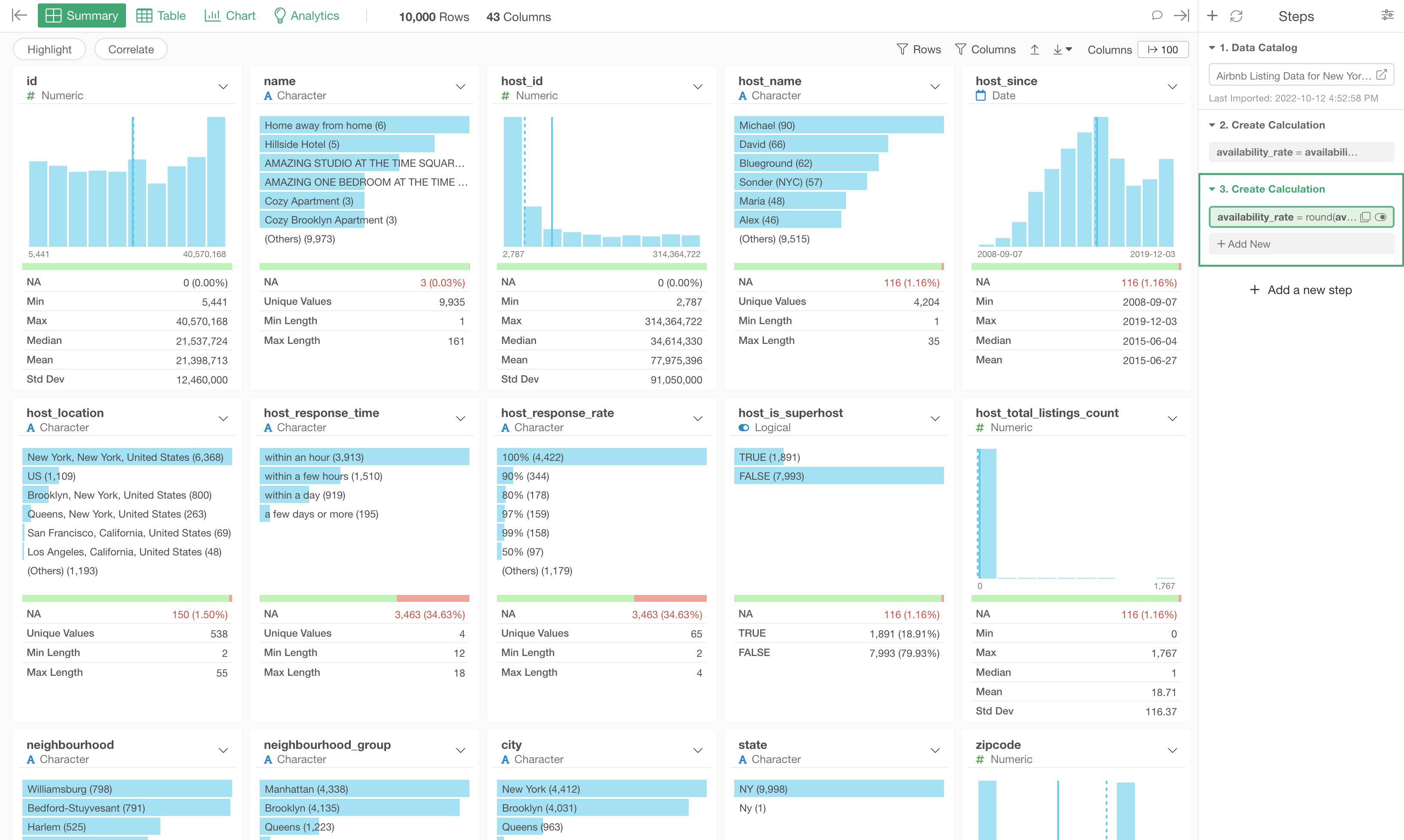
4. How to Use Summary View
The chart and the summary statistics can be different among the columns depending on the data type of each column.
There are many data types that are supported in Exploratory, but the following 5 data types are the most common.
- Numeric
- Character
- Factor
- Logical
- Date, POSIXct
Numeric
You will see histogram charts for the numeric data type columns. Each chart divide the numeric values into 10 groups with equal width and show how many rows for each group are.
Character
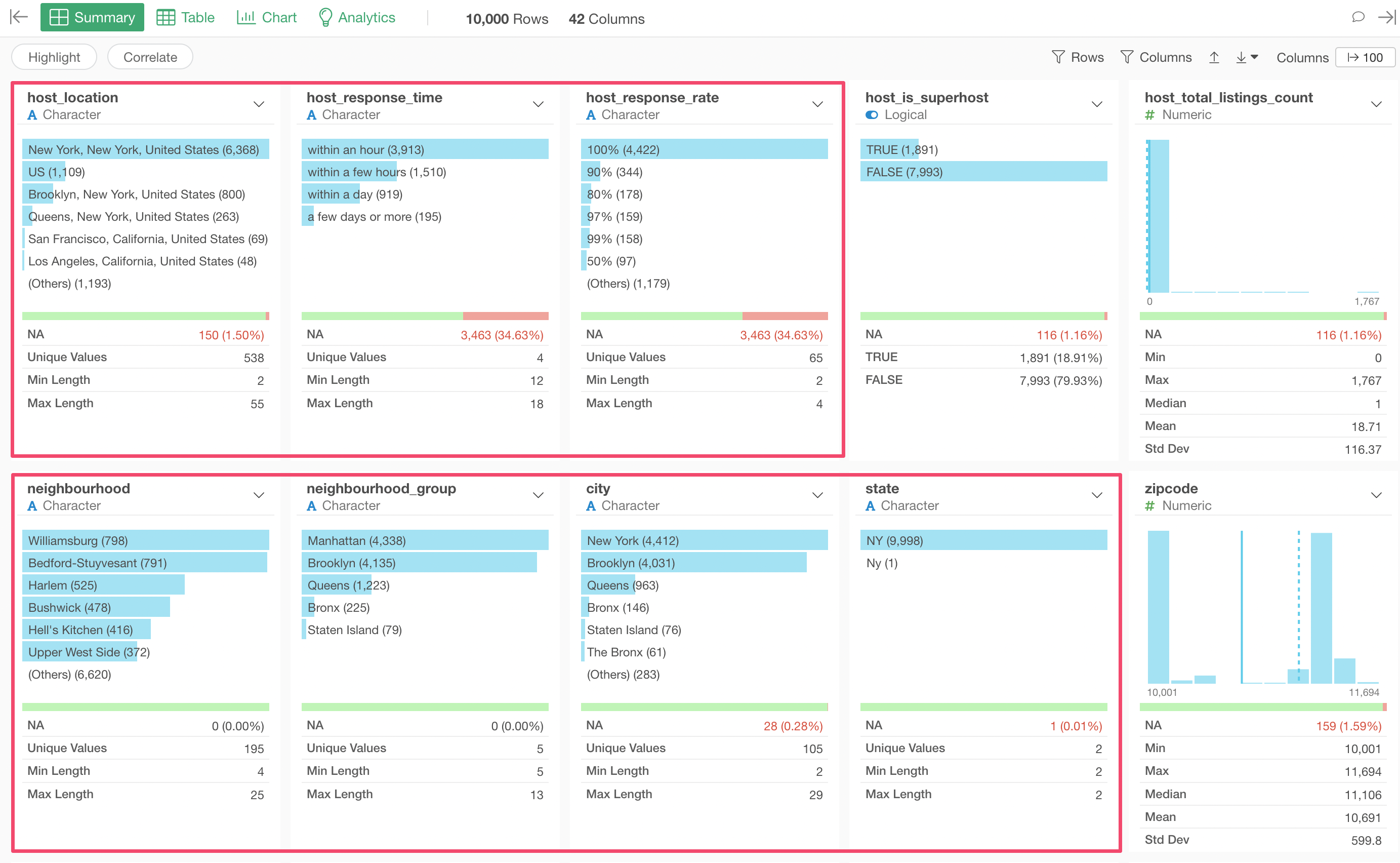
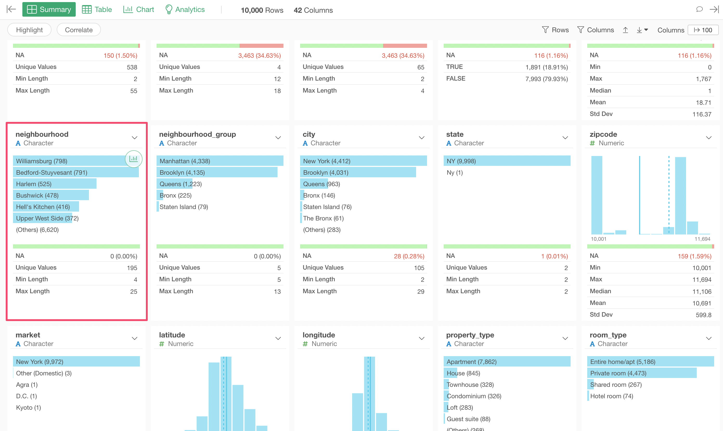
For the Character data type columns, you will see bar charts that show the most frequent (Top 6) values and 'Others' group if there are more than 6 unique values.
The 'Unique Values' in the summary statistics area shows you how many unique values are in a given column. For example, the 'neighborhood' columns shows you that there are 195 unique neighborhood names.
Logical
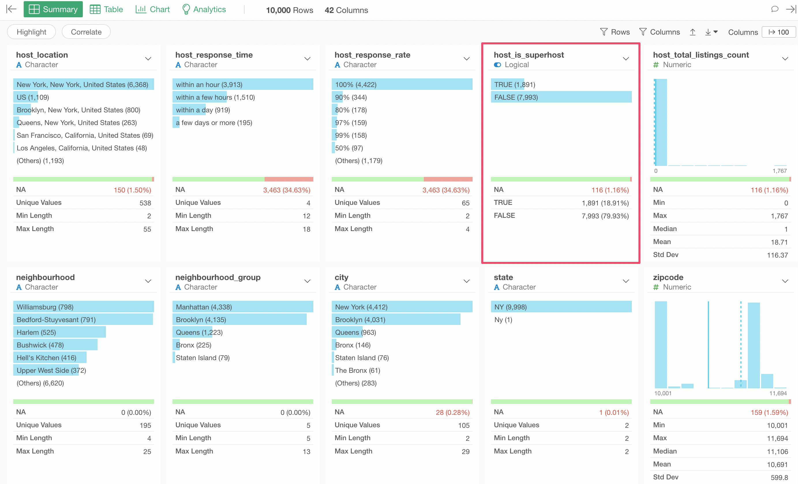
The Logical data type is used for columns that have either TRUE or FALSE as the values. With this sample Airbnb data, we have 'host_is_superhost' column that is the Logical data type. Since this column have values of TRUE or FALSE in the original CSV file, therefore Exploratory automatically registers it as the Logical data type at the data importing time.
But often, you create Logical data type columns from other data type columns such as Numeric, Character, etc. Take a look at 'Create, Visualize, & Analyze Logical Data with Conditions' to see how you can create the Logical data and visualize it.
Anyway, you can see the TRUE ratio is 18.91% in the summary statistics area. This means that 18.91% of the properties are owned by super hosts, whatever that 'super' means.
Date, POSIXct
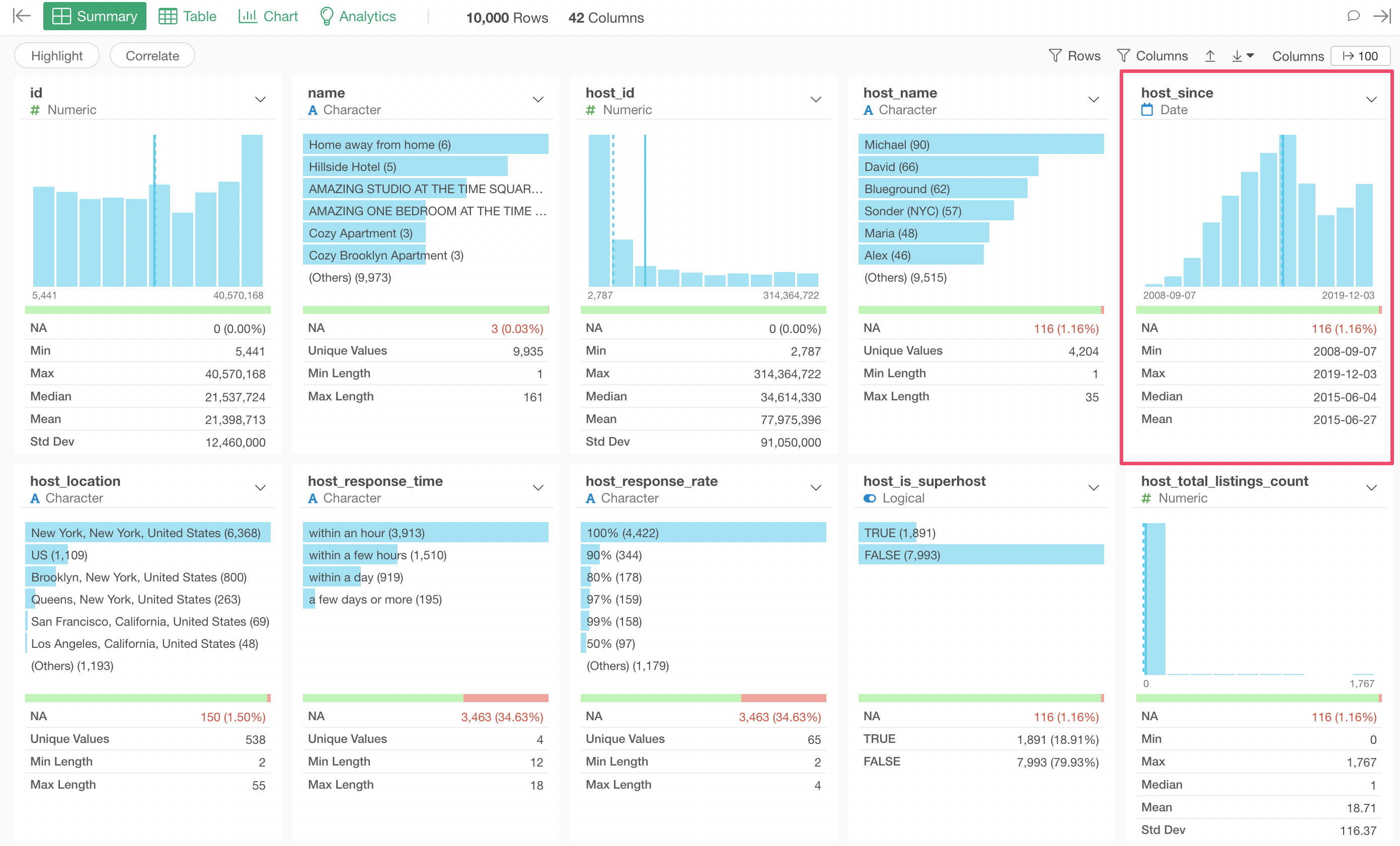
In Exploratory, there is a data type called 'Date' for data like '2022-03-10', and POSIXct for data like '2022-03-10 02:15:30'.
In this Airbnb data, we have the 'host_since' column that indicates when a given property joined Airbnb.
Similar to the Numeric data type data, you can see how many rows for each of the equally divided periods and also see the period of data by looking at the Min and Max values.
NA / Missing Values
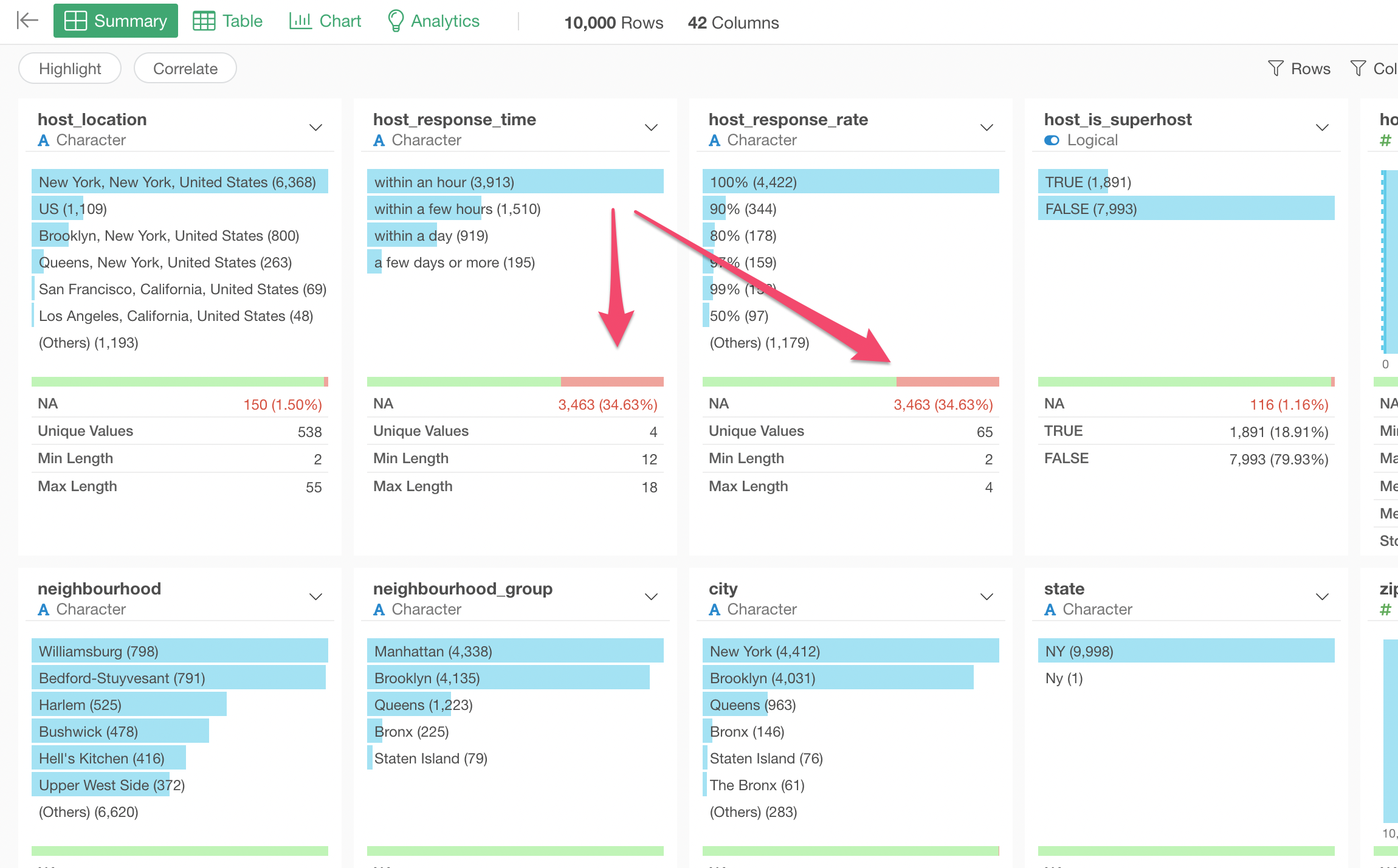
When there is no value in a given row we call it NA, which is often called missing values. A number of NA values and its ratio are shown as red line indicator in each column if there are any NA values.
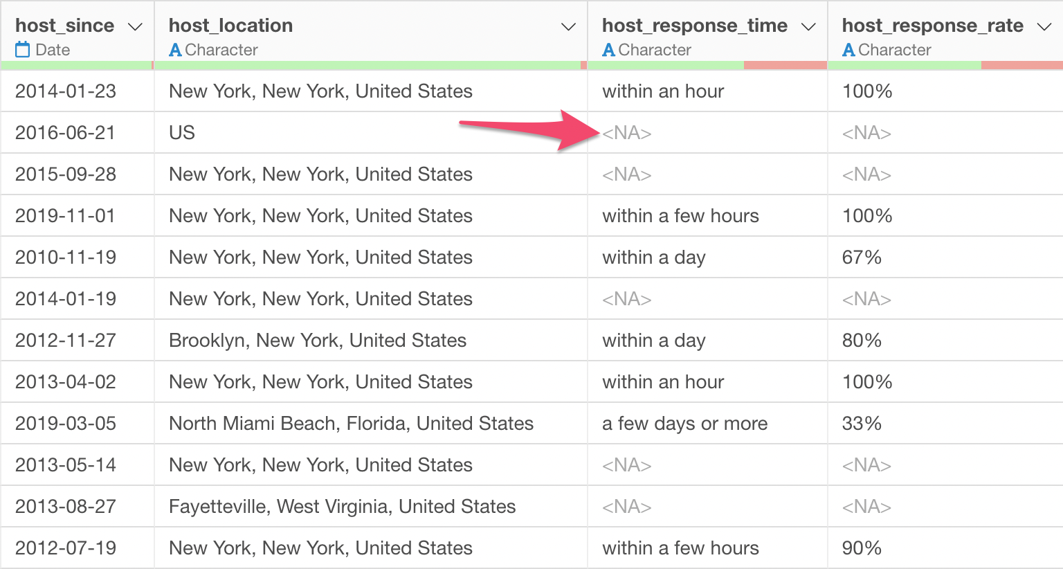
Under the Table View, you can see <NA> for the cells with no values.
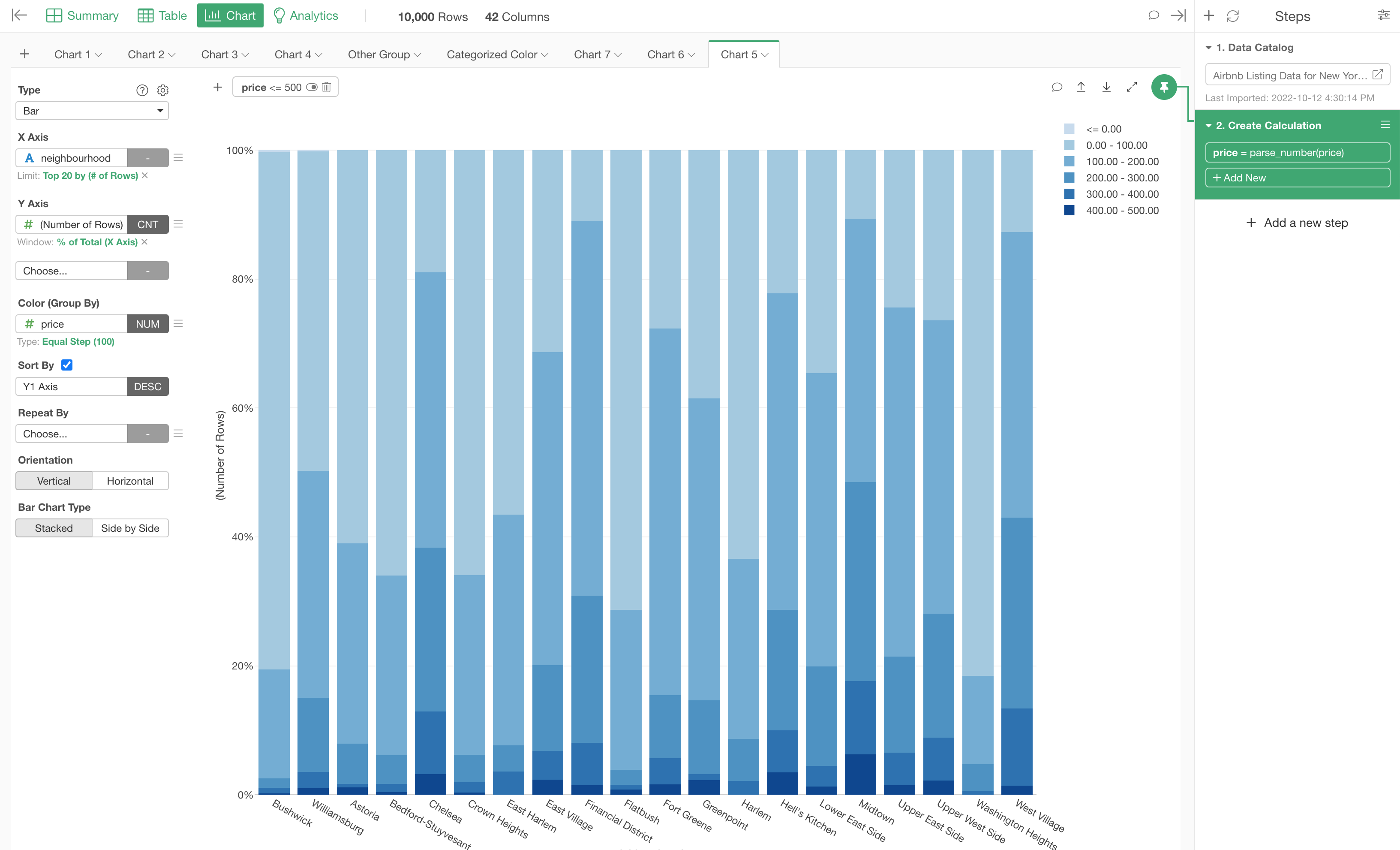
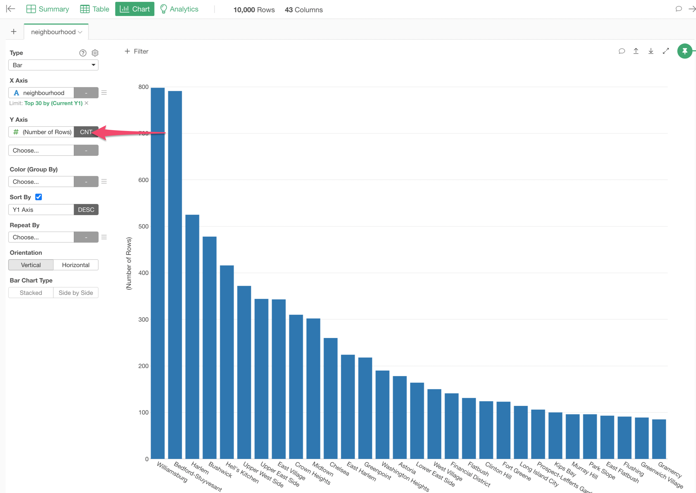
5. Create the First Chart
Let's create a chart to visualize how many properties there are by the neighborhood. You can do this from the Summary view quickly.
Move the mouse pointer over on the 'neighborhood' column and click the Chart icon.
This will create a bar chart under the Chart view.
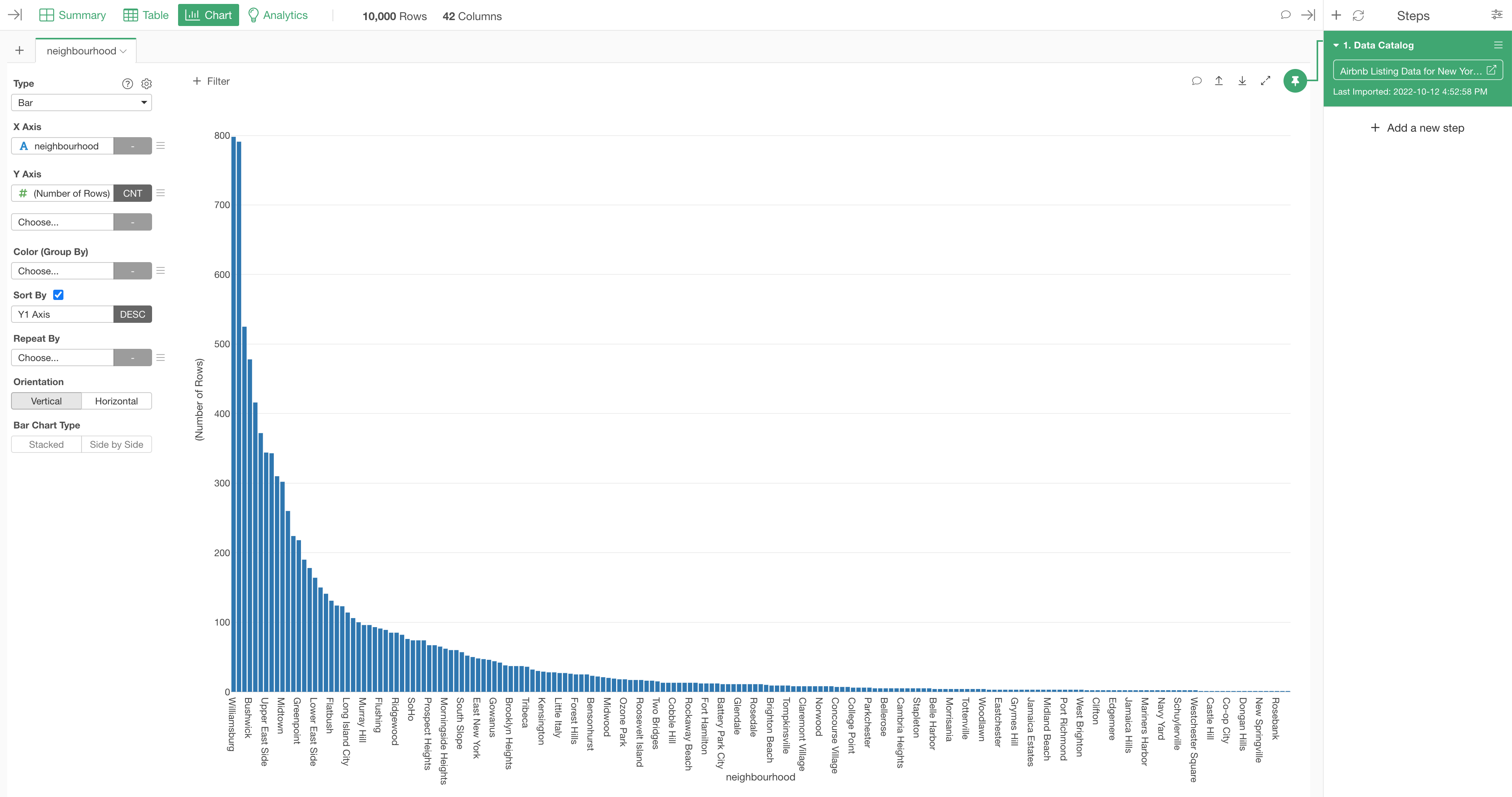
The neighborhood column is assigned to the X-Axis and 'Number of Rows' is selected for Y-Axis.
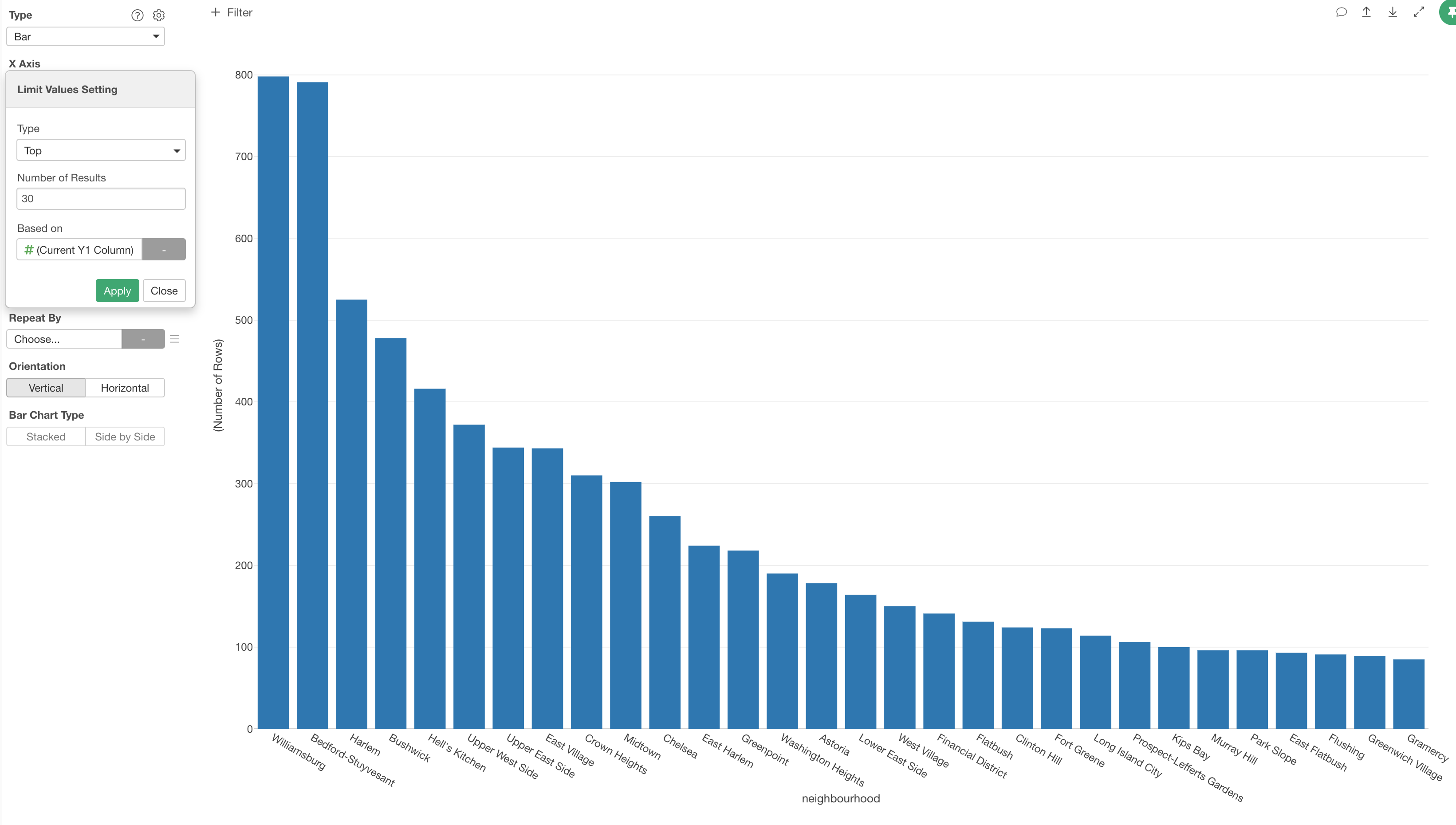
6. Limit Values When There Are Too Many Values
There are 195 neighborhoods in this data. This means that there are 195 bars and it's hard to see what they are.
You can limit number of the bars to be shown by using the 'Limit Value' feature.
Select 'Limit Values' from the X-Axis menu.
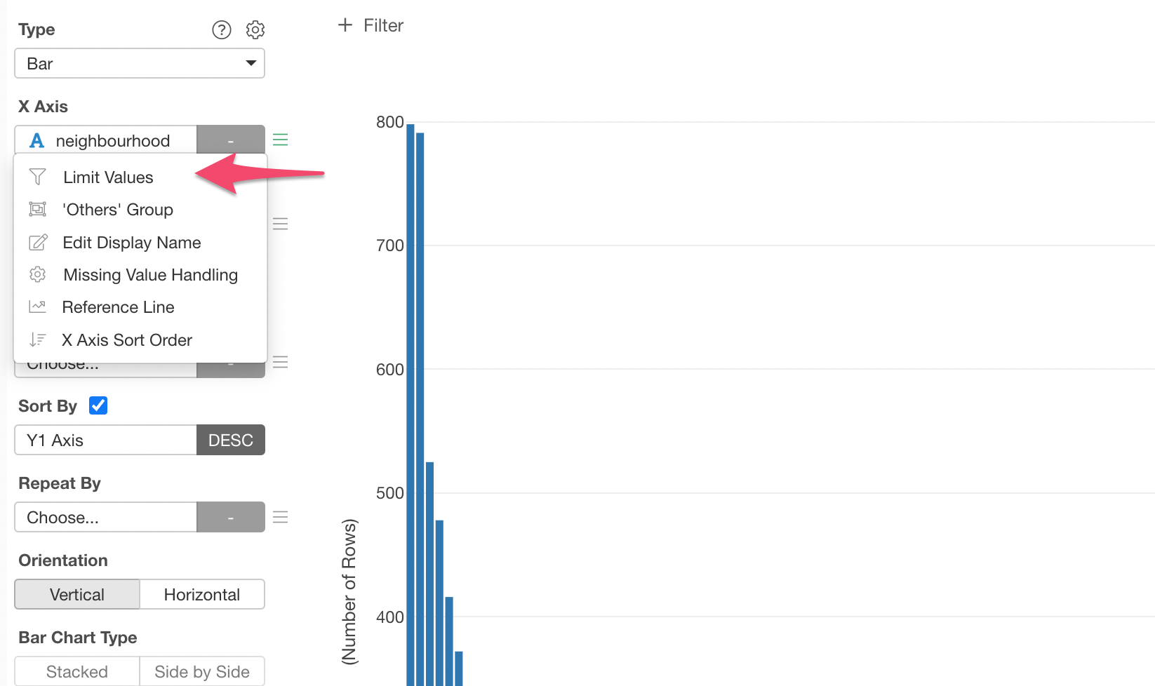
And, for example, you can select 'Top' for the 'Type' and type 30 for the 'Number of Results' to show top 30 neighborhoods based on the number of rows.
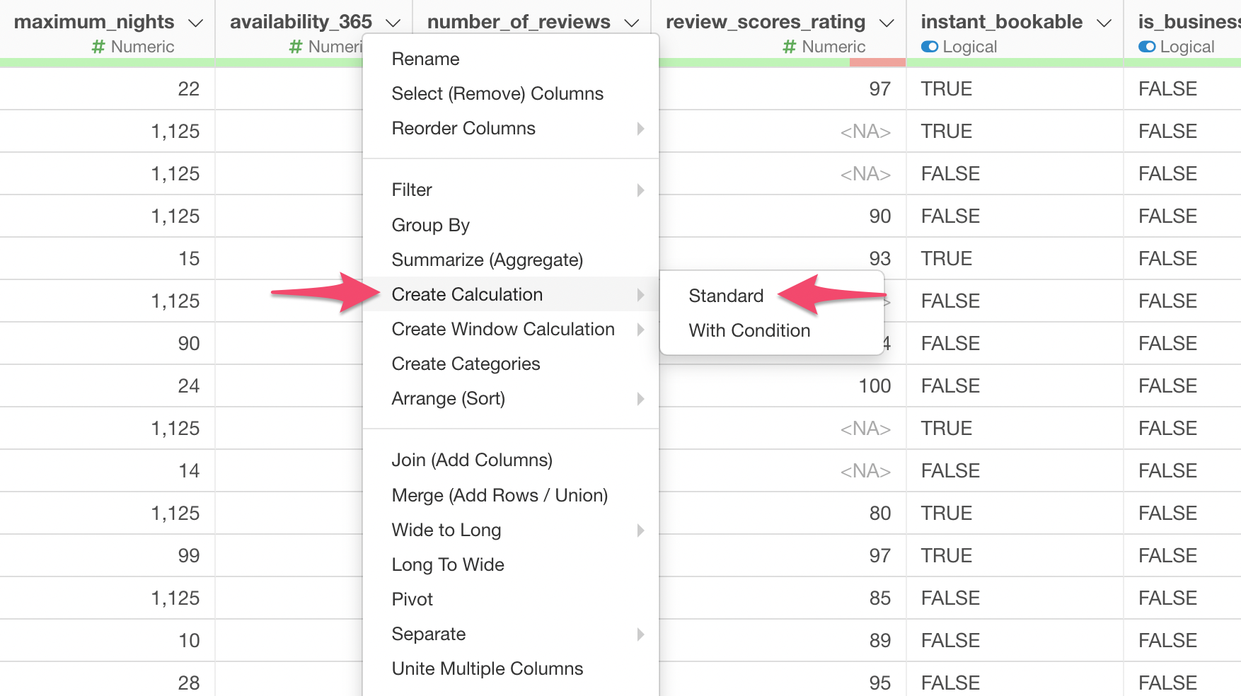
7. Create Calculations
In Exploratory, you can create calculations and either override the existing columns or create as new columns.
Let's say we want to calculate an availability rate for each property based on the 'availability_365' column which indicates how many days are available for the use per year.
Go to the Table view and find the 'availability_365' column.
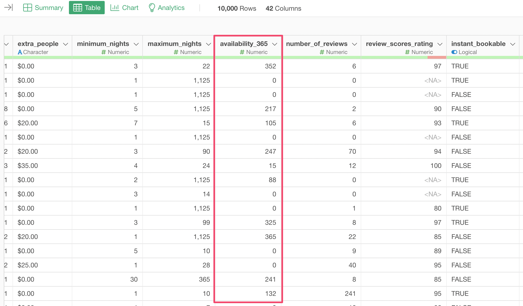
Select 'Create Calculation' and 'Standard' from the column header menu of the 'availability_365' column.
This will open 'Create Calculation' dialog with the 'availability_365' column name being populated automatically.
In this Editor, you can create calculations just like you would do with any other tools such as Excel.
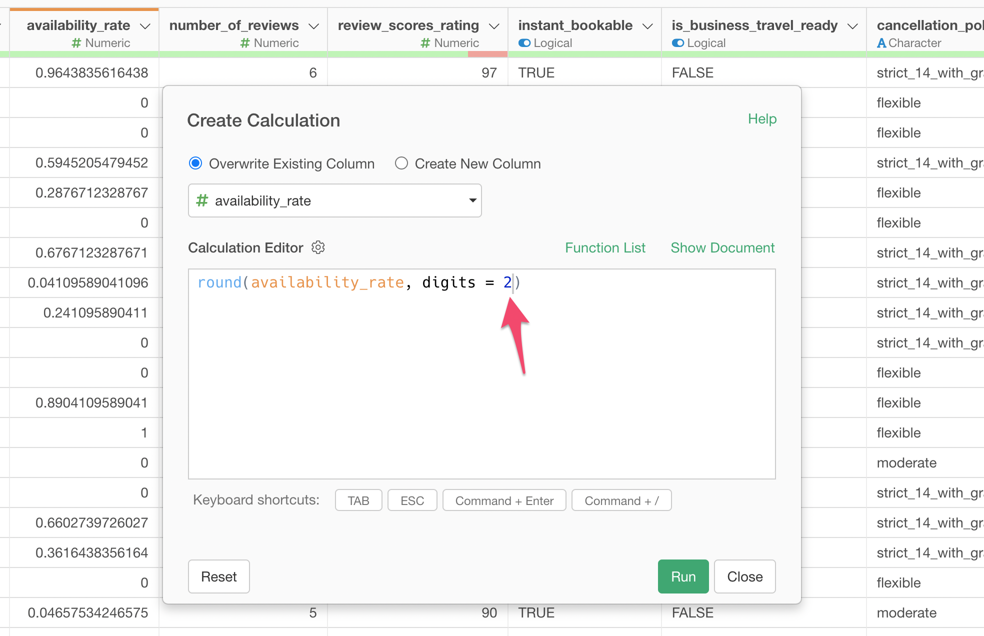
This time, we'll type the following to calculate the availability rate.
availability_365 / 365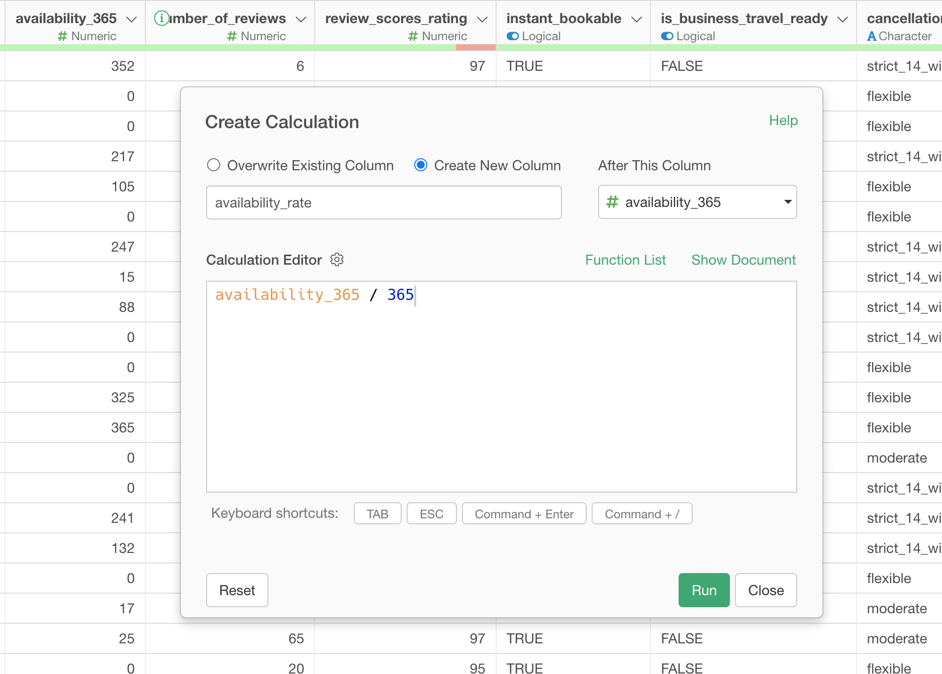
Type 'availability_rate' for the column name and click the Run button.
Now you see the new column is created and it shows the availability rate.
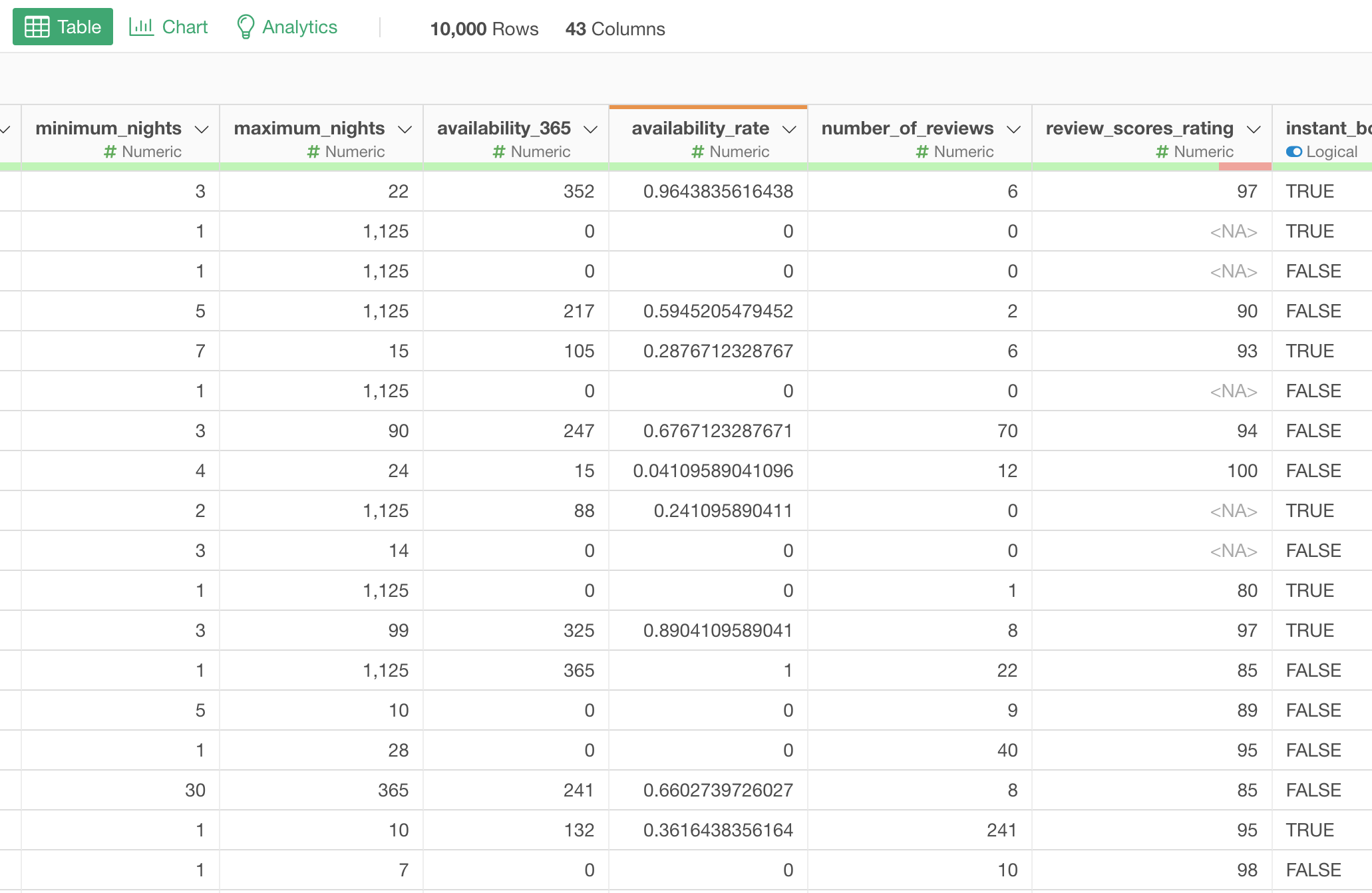
There are too many decimal digits. We can round them and keep only two decimal digits.
Select 'Work with Numeric Function' and 'round' from the column header menu.
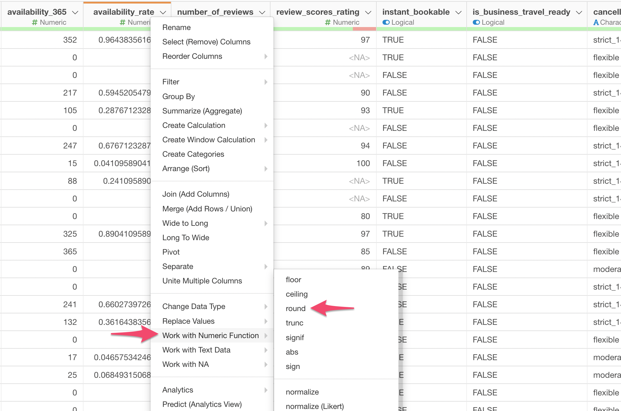
And set the 'digit' parameter to 2 so that it will round at two decimal digits.
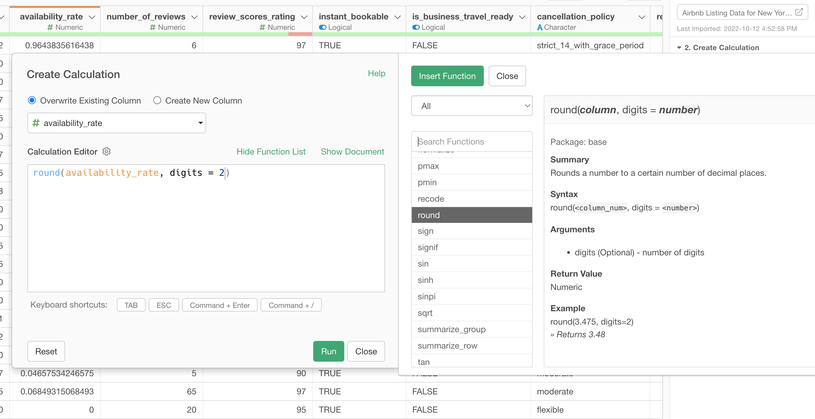
You can click on 'Function List' button to show a list of the functions available in Exploratory.
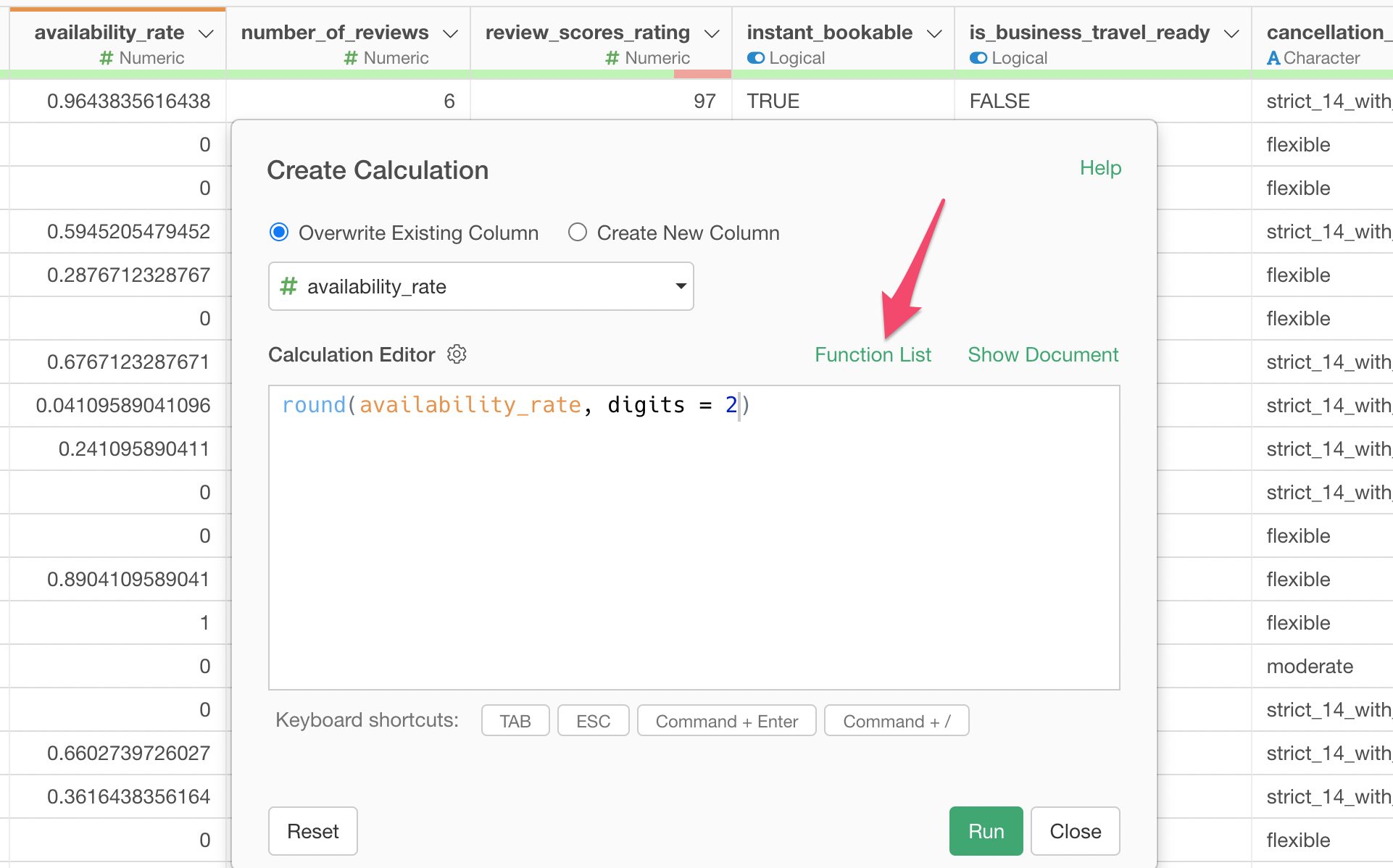
And you can see what a given function does and how you can use it.
Anyway, once you click the Run button you'll the 'availability_rate' column being updated.
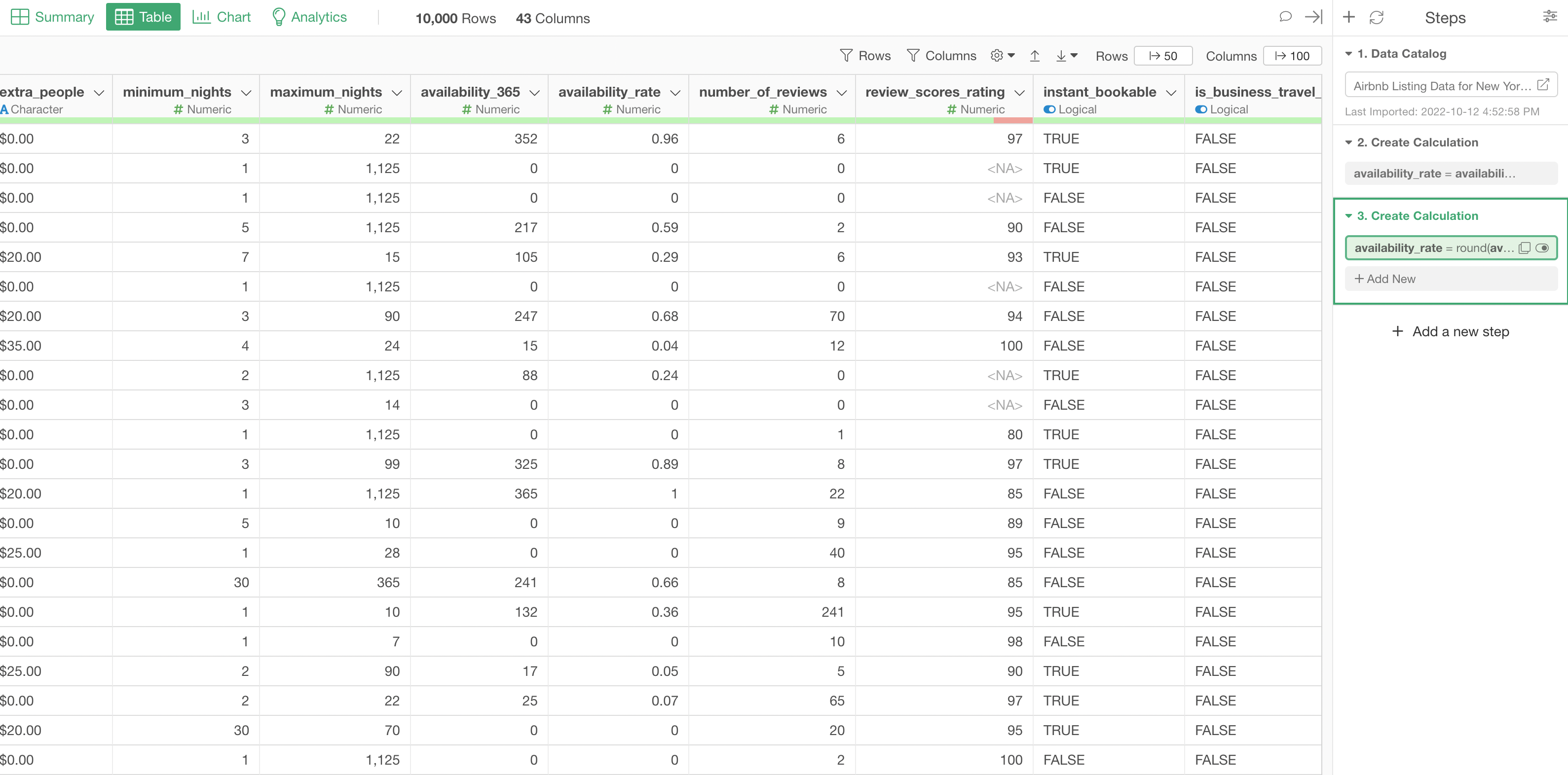
Now, notice that the previous two operations (calculating the availability rate and rounding the rate values) are recorded as Data Wrangling Steps at the right hand side.
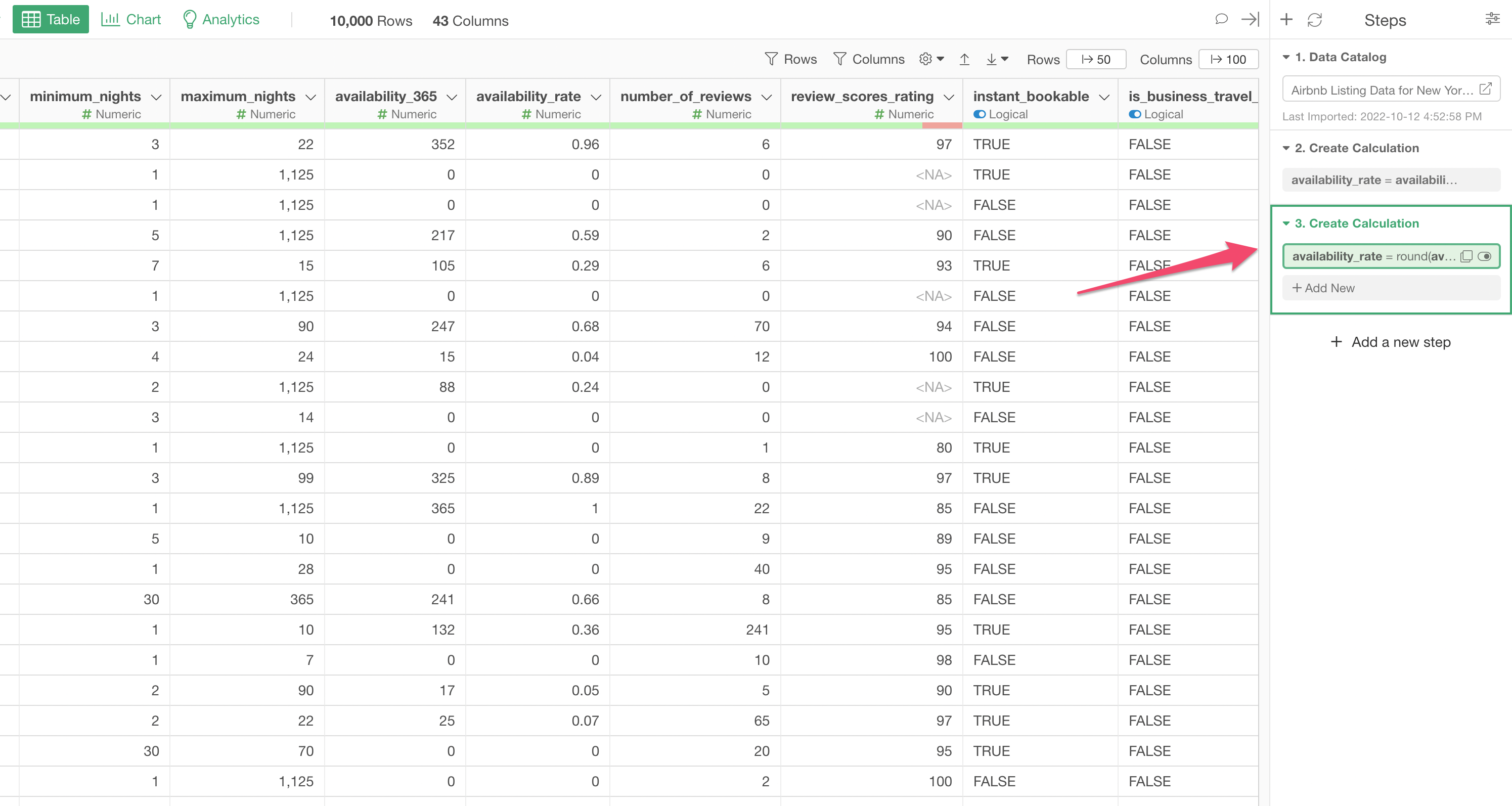
In Exploratory, all the data wrangling operations are recorded as the Step so that you can not only see what you have done before but also update or delete the existing steps.
You can see more details on how you can take advantage of the Step from our tutorial video page.
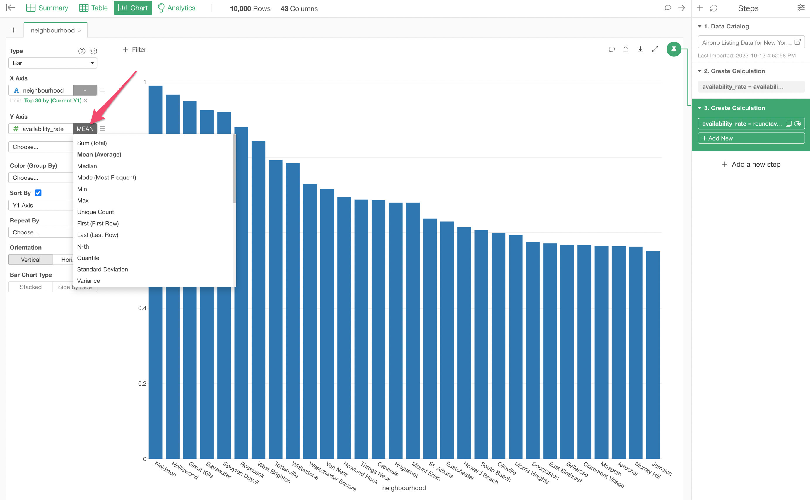
8. Chart Pinning Feature
Now, let's show the availability rate by neighborhood.
You can go back to the Chart view and open the chart you have created before.
But here is a problem. You can't see the newly created column 'availability_rate' from the Y-Axis' dropdown list.
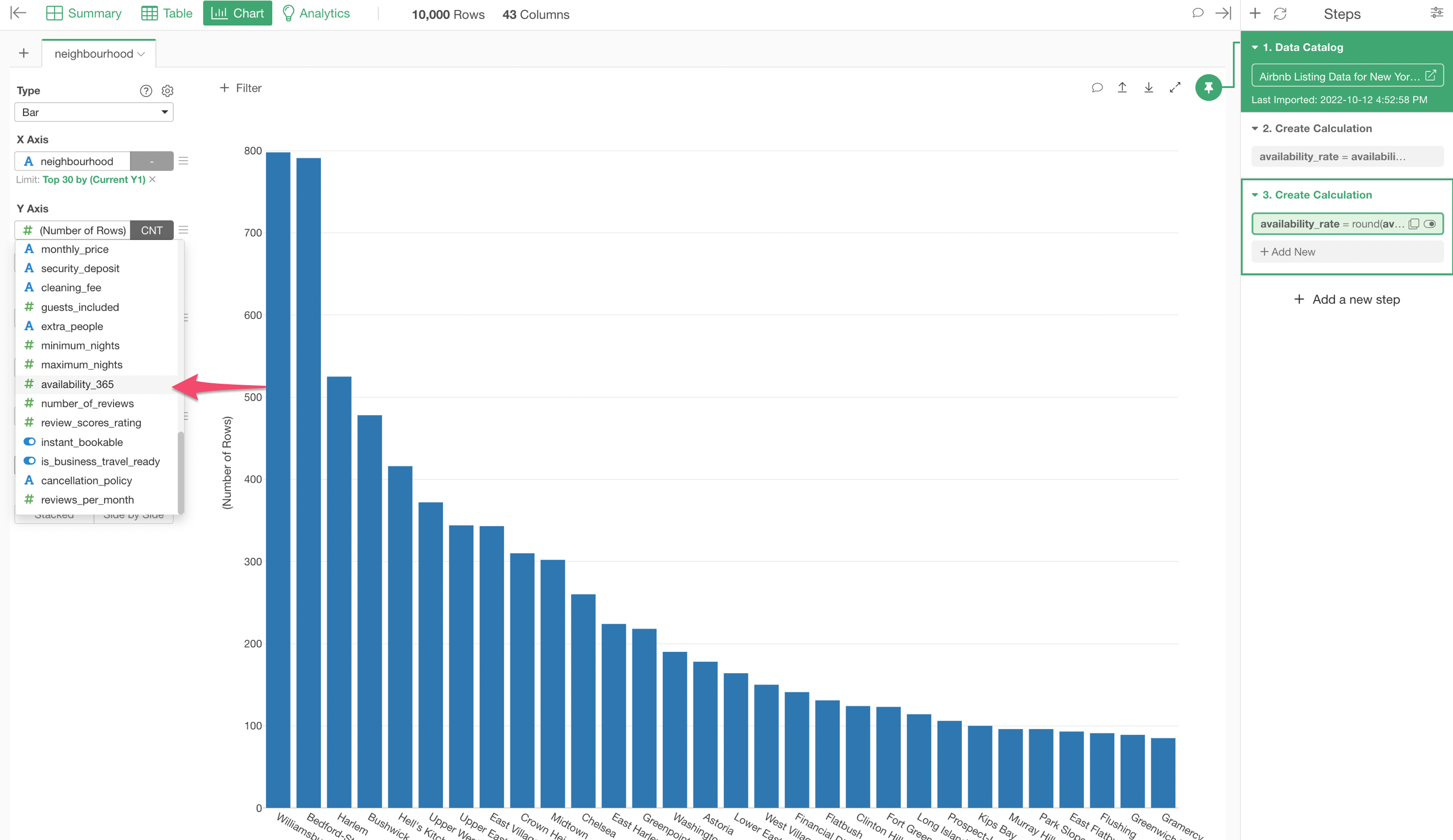
This is because this chart is 'Pin-ned' to the 1st Step where the 'availability_rate' column has not been created yet.
One of the main features of Exploratory is this 'Pin' feature. It pin a given chart to a particular data wrangling step so that the chart takes data from the pinned step. This is very useful because the underlying data changes, sometimes dramatically, as you add the data wrangling steps and more often than not you want to control what data you want to show by selecting a particular step.
Anyway, in order to show the 'availability_rate' column you can move the Pin to the 3rd step by drag-and-drop.
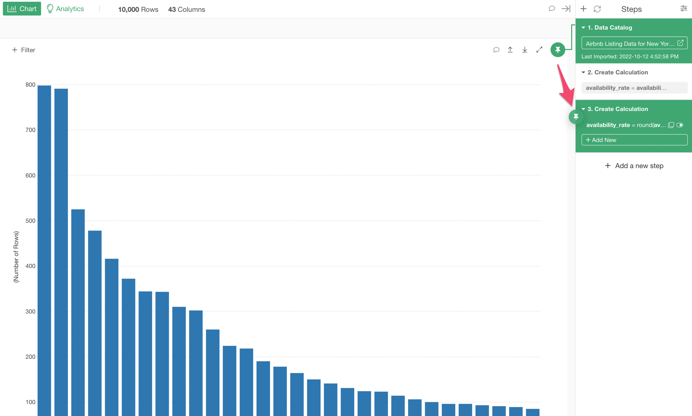
Once the Pin is moved to the 3rd step you can now see the 'availability_rate' column in the Y-Axis dropdown. Select the column and select 'Mean' as the summarize function to show the mean (average) of the availability rate by neighborhood.
9. Create Groups by Assigning a Column to Color
You can slice and dice the data to see the trend and pattern at deeper level by using Color.
Let's say we want to see how many properties there are by property type in each of the neighborhoods.
First, let's change the Y-Axis back to 'Number of Rows'.
Now, you can assign the 'property_type' column to the 'Color'.
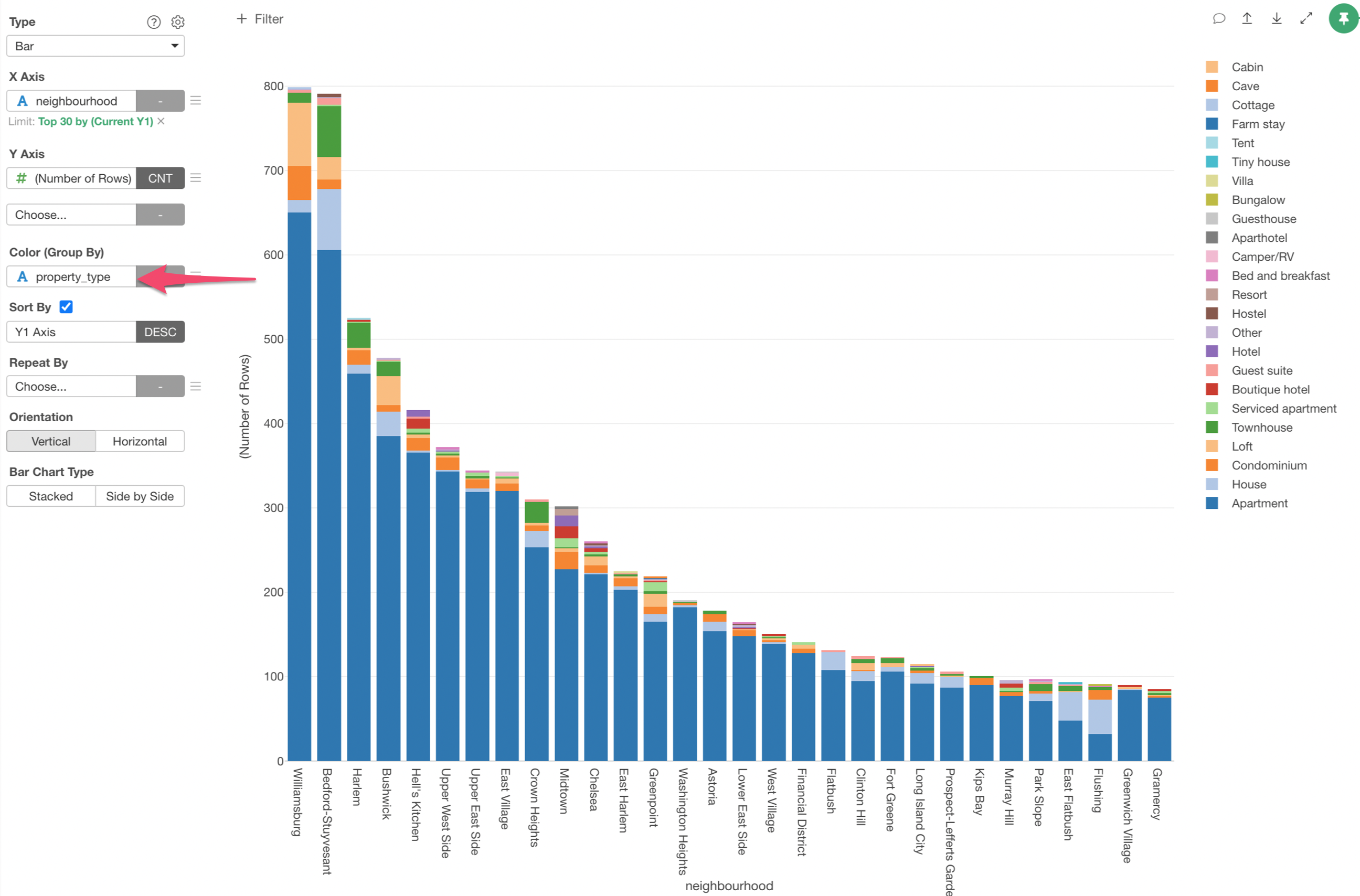
We can see what are the most popular property types for each of the neighborhoods.
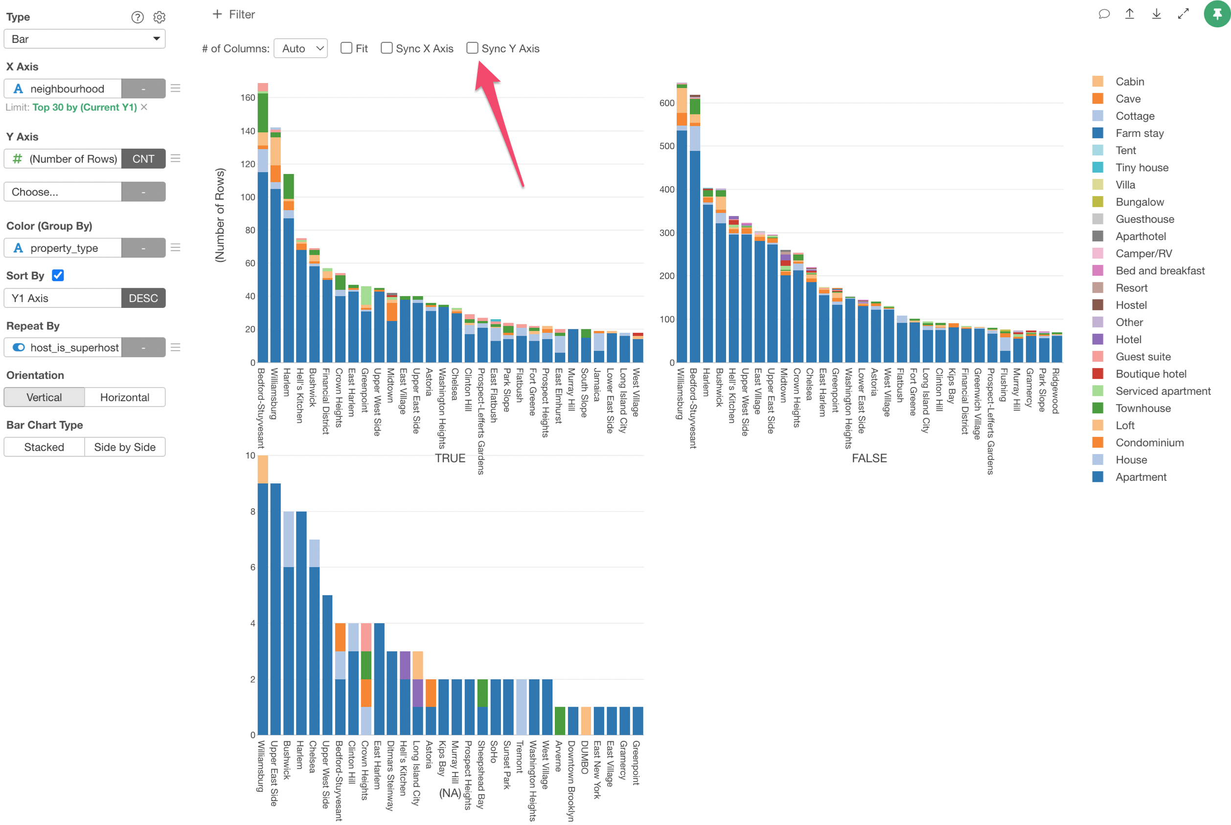
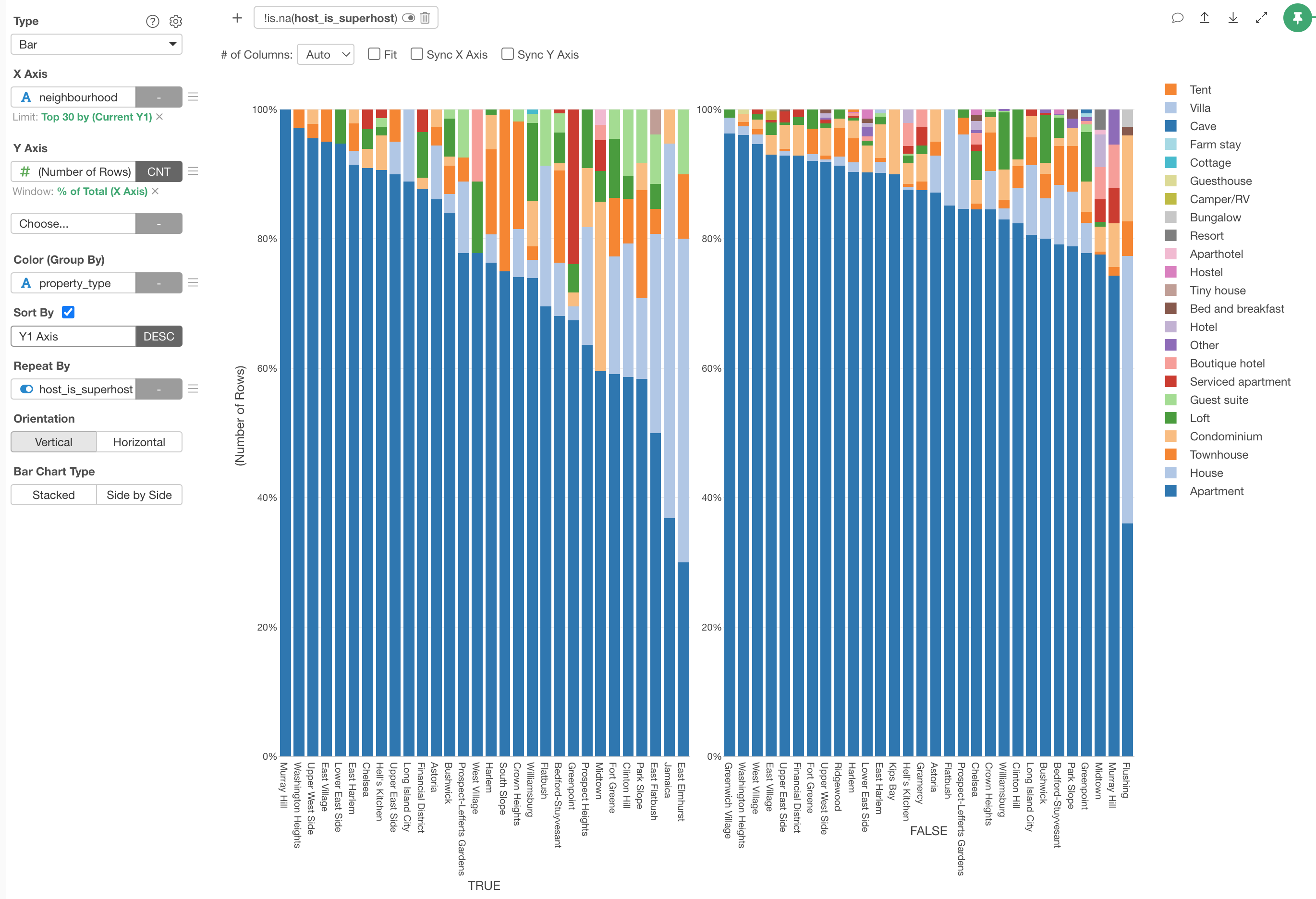
10. Separate a Chart into Multiple Charts with Repeat By
Now, does it make any difference on the trend whether the properties are owned by Super Host or not?
We can separate this chart into multiple charts depending on the status of the 'Super Host' column by using 'Repeat By' feature.
You can assign the 'Super Host' column to the Repeat By.
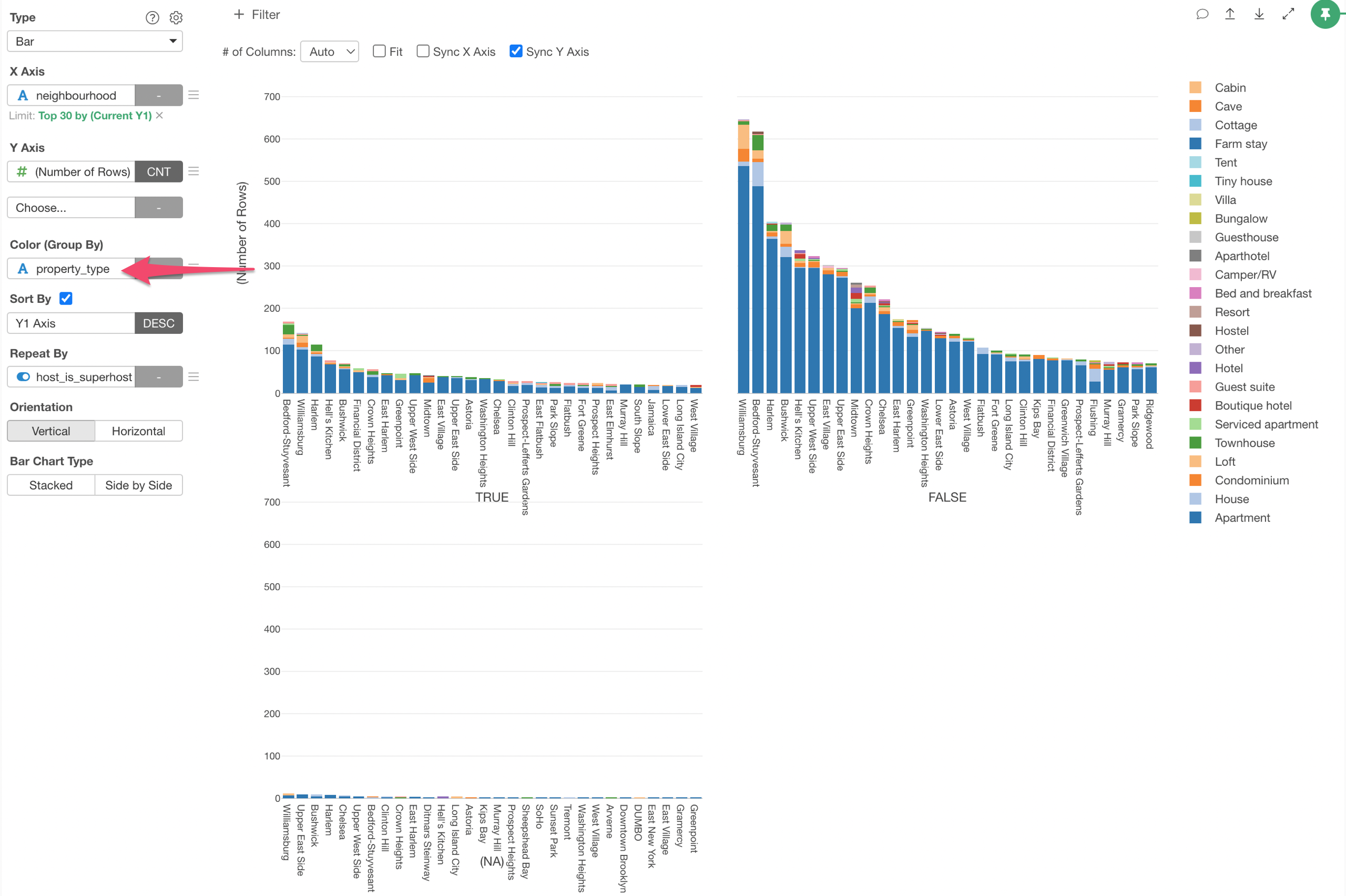
Now we have 3 charts created, one for Super Host, one for Not Super Host, and one for NA (Missing Value).
Currently, the Y-Axis scale is sync-ed among the three charts but this makes it hard to see the chart with less values on Y-Axis.
We can disable the sync by unchecking the 'Sync Y Axis' check box.
11. Remove Unnecessary Values with Chart Filter
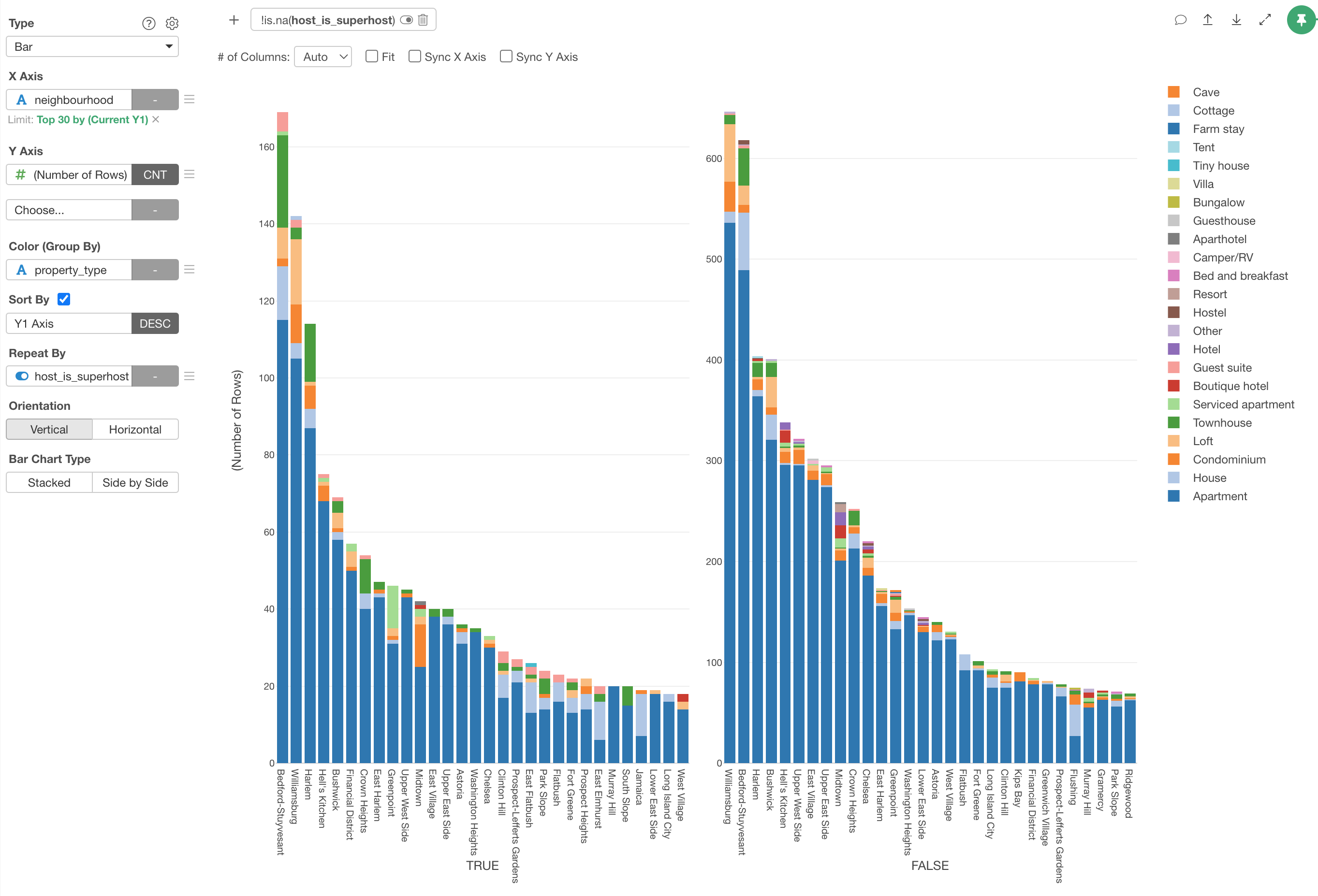
One of the charts is for the properties with NA in the 'Super Host' column.
We are not interested in those properties for this analysis so let's remove it by using the Chart Filter, which filter the data only for this particular chart as contrast to the Data Wrangling Step's filter that works at the data set level.
Click on the 'Filter' button at the top.
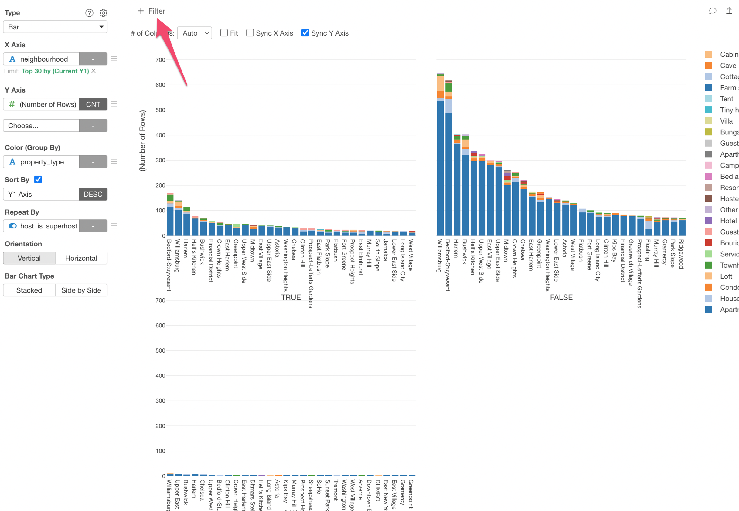
And select the 'Supert Host' column and select 'Remove NA' for the Operator.
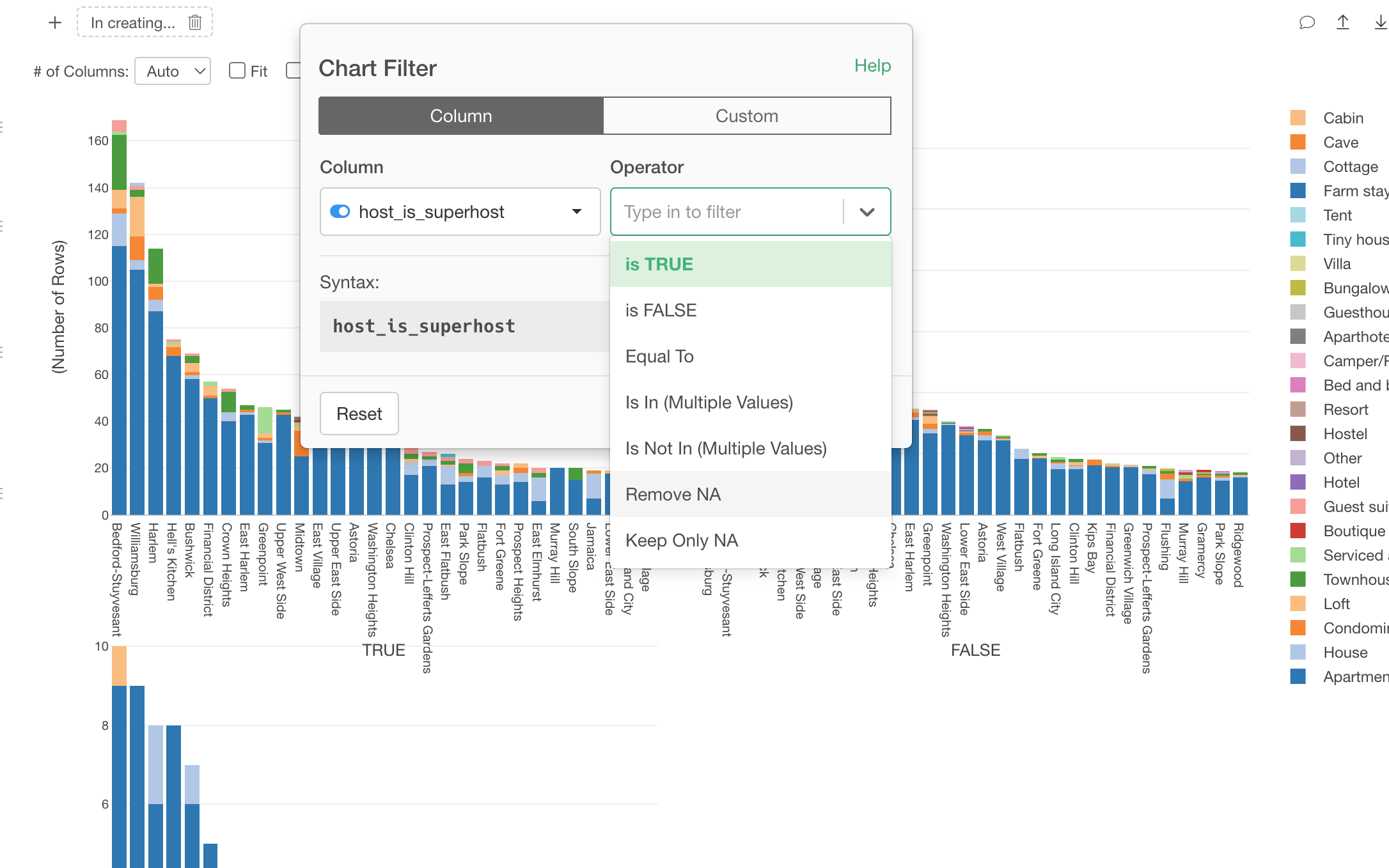
The, click the 'Run' button.
Notice that the neighborhoods are sorted slight differently but the overall trend seems to be very similar between the two.
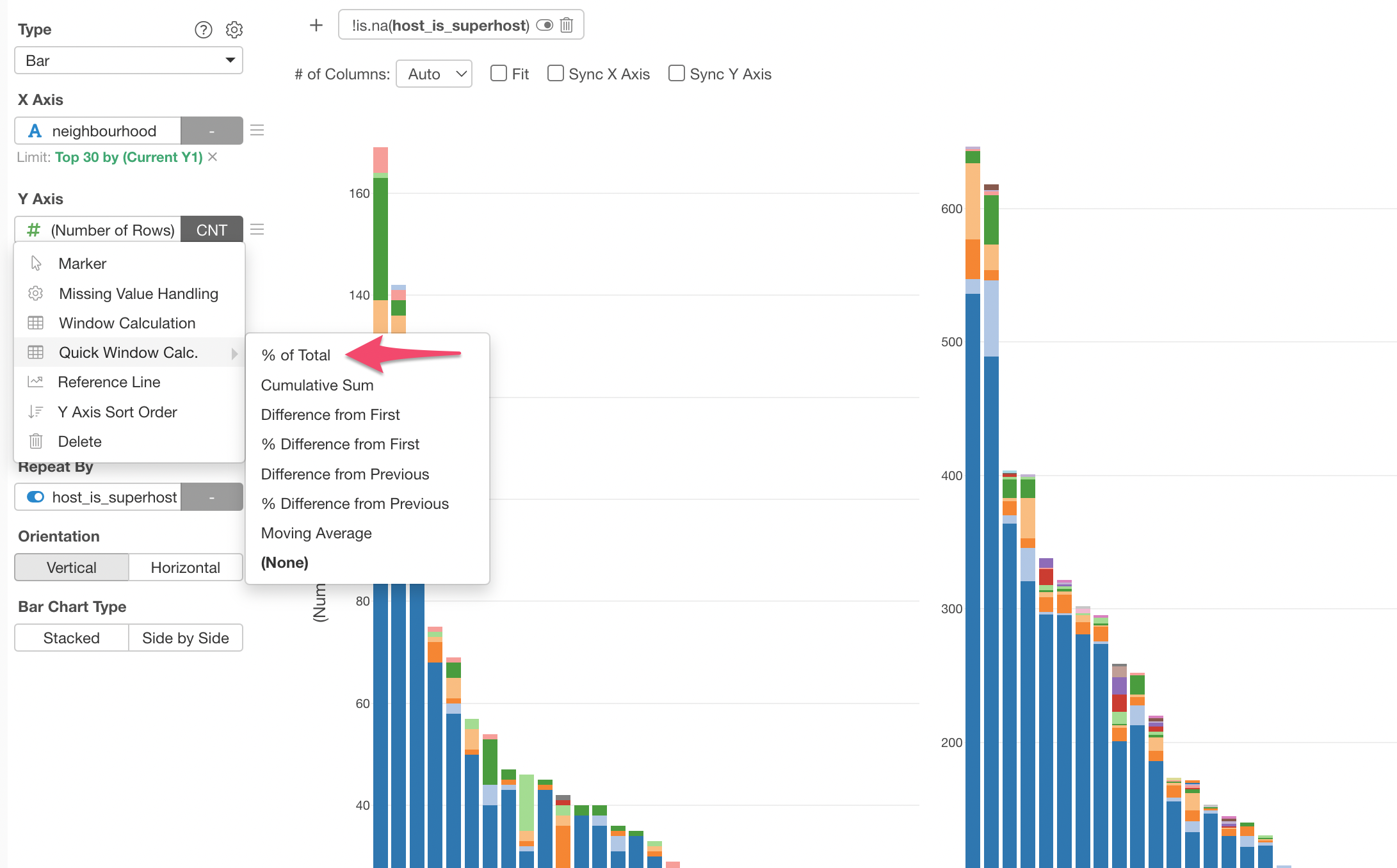
12. Use Window Calculation to Quickly Transform Values
This is the last topic of this tutorial.
Now that we know how many properties are in each property type for each neighborhood separated by the Super Host status.
But, what if we want to know the ratios of the property types rather than the actual numbers themselves?
This is when you want to use 'Window Calculation' feature.
Select 'Quick Window Calc.' and '% of Total' from the Y-Axis menu.
Now the charts are showing the ratios of the property types for each neighborhood.
That's it for this 'How to Use Exploratory - Basic' tutorial!
References
You can find many more tutorials and how-to videos from the 'Learn' menu on our website.
Check out the following resources!
- How-to Videos - A series of short videos introducing how to use various features of Exploratory.
- How-to Tutorials - You can find the Step-by-Step tutorials on various topics on the How-to page.
- Chart Gallery - You can find many introductory notes on how to use various chart types and chart functionalities.