How to Use Exploratory Part 1 - Basics
This is a “How to Use Exploratory” tutorial we have created to help you familiarize basic yet important functionality of Exploratory in the most effective way.
You can learn the following topics in a hands on format with step-by-step instruction.
Exploratory is a versatile tool capable of data visualization, analysis, and data wrangling. In this guide, we will focus on the essential functions required to follow the hands-on exercises in this note. We will learn by working through the following tasks using sample data:
Create a Project
Import Data
4 Types of Views in Exploratory
Understand the Data Summary with Summary View
How to Create Charts
How to Create Calculations
Data Wrangling Steps
Chart Pin Function
It takes about 20 minutes to finish.
Let’s start!
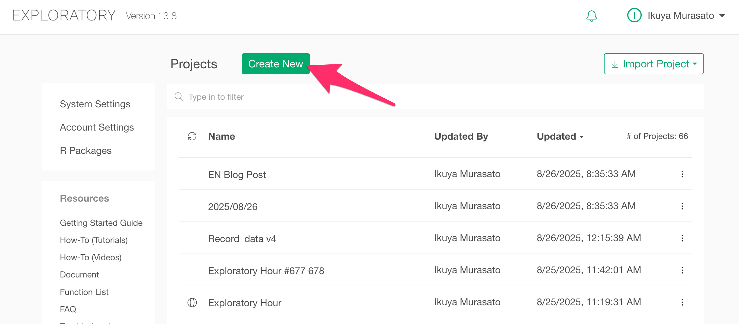
1. Create a New Project
In Exploratory, all data-related tasks, including data import, are performed within a project.
Therefore, the first step is to create a project.
From the project management screen, click the “Create New” button.
Enter a project name and click the “Create” button.
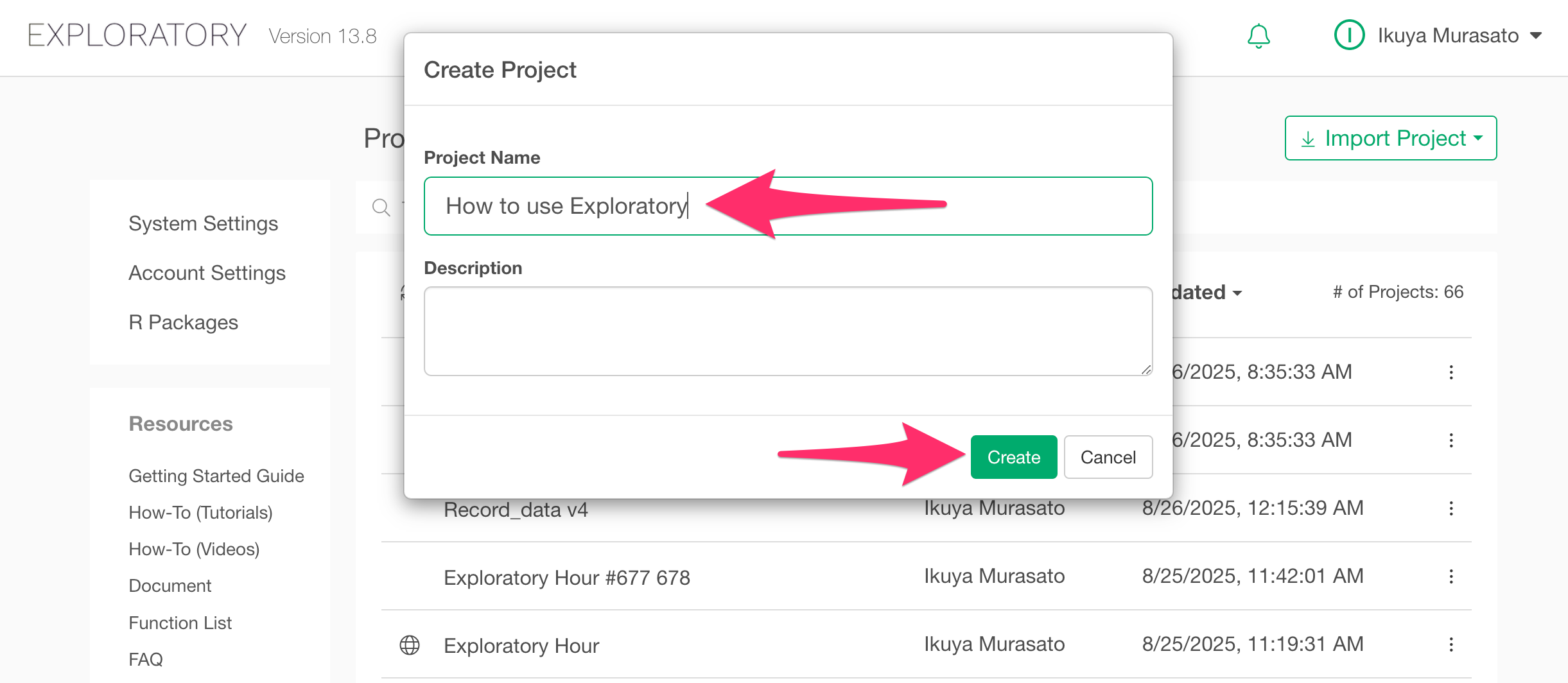
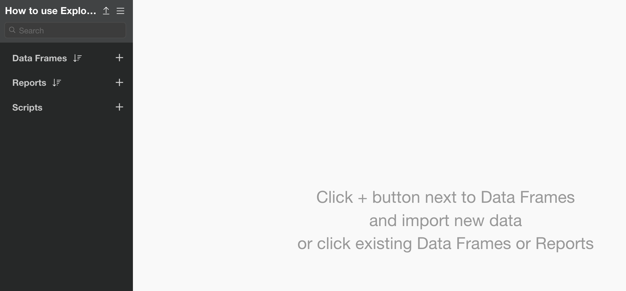
The newly created project will open.
2. Import Data
Once you have created a project, let’s import some data. For this example, we will use sample data of “Airbnb Listing Data for New York City”.
You can download the data from here.
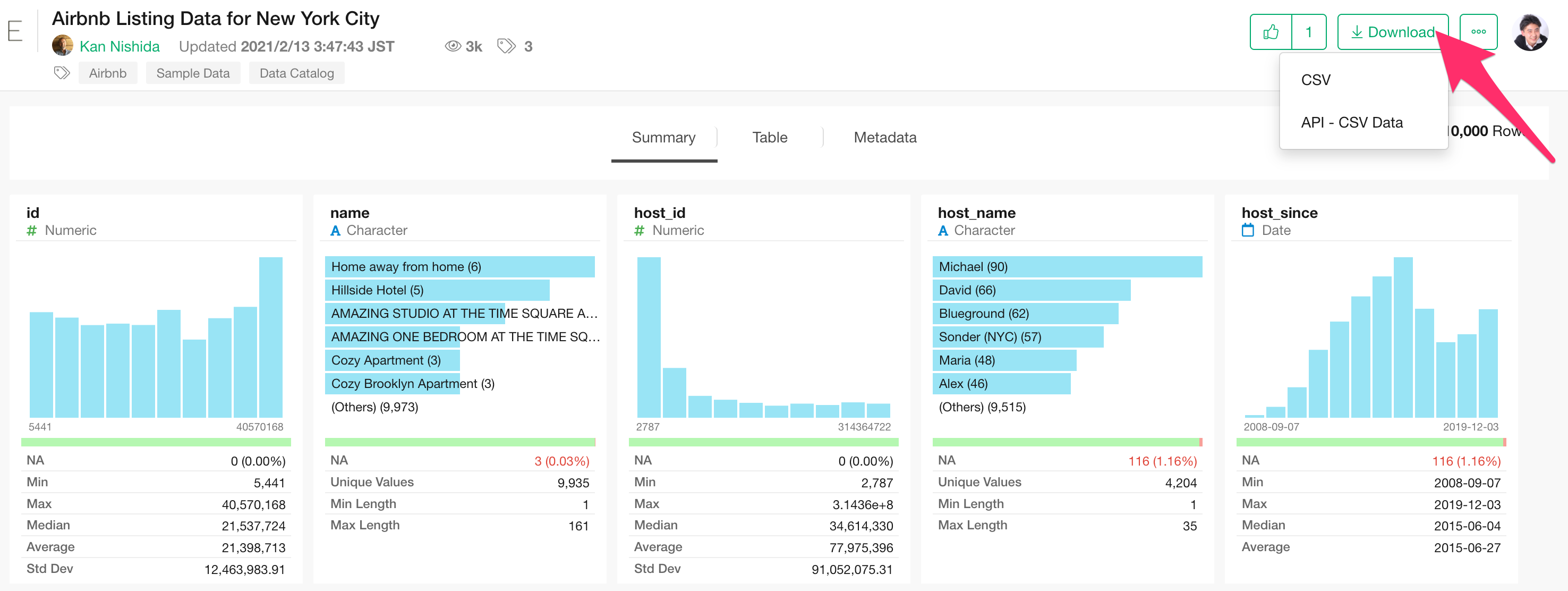
In this dataset, each row represents one property, and columns contain information such as price and size for each property.
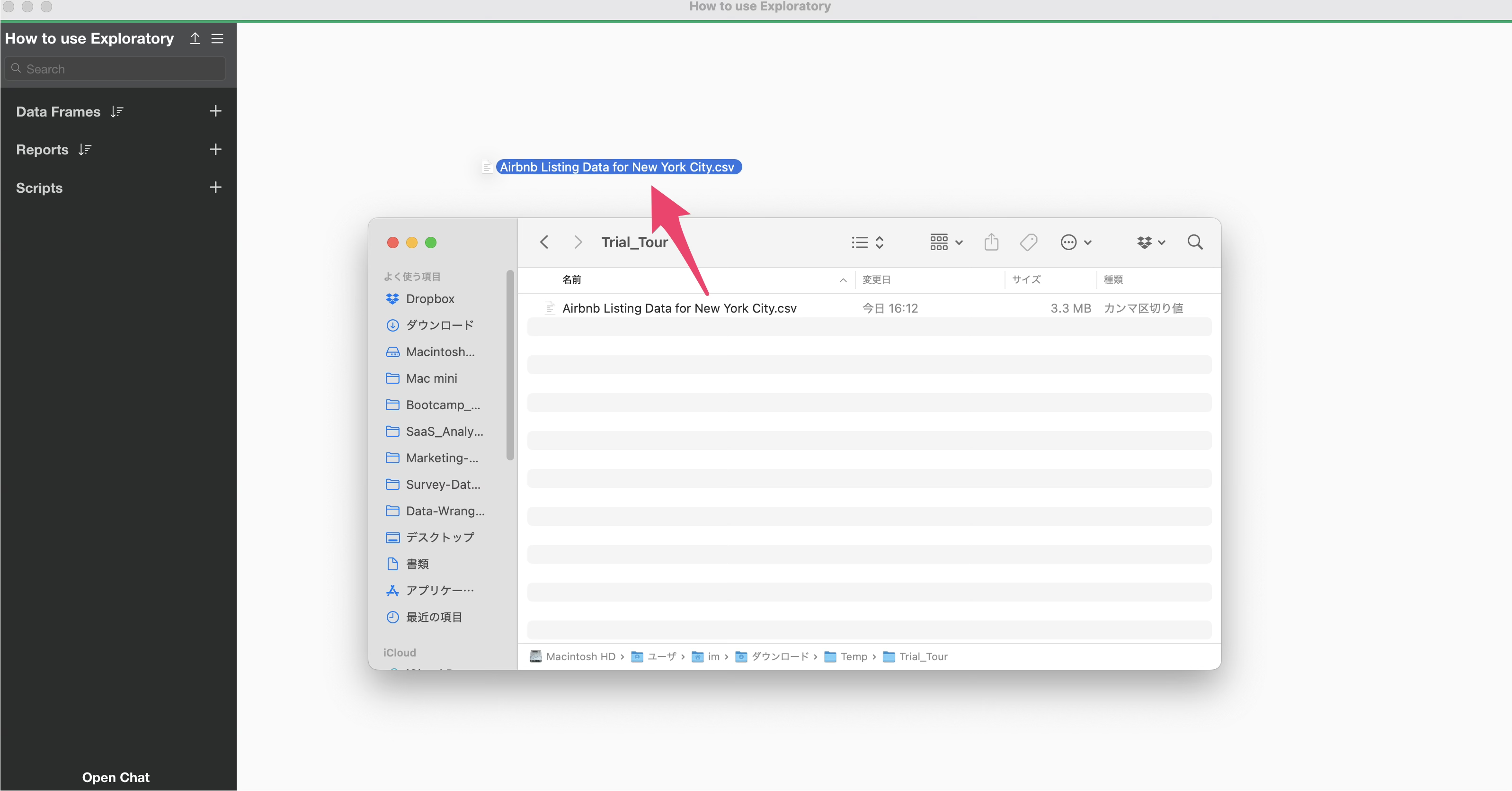
Once the data is downloaded, open the download folder and drag and drop “Airbnb Listing Data for New York City.csv” into the Exploratory window.
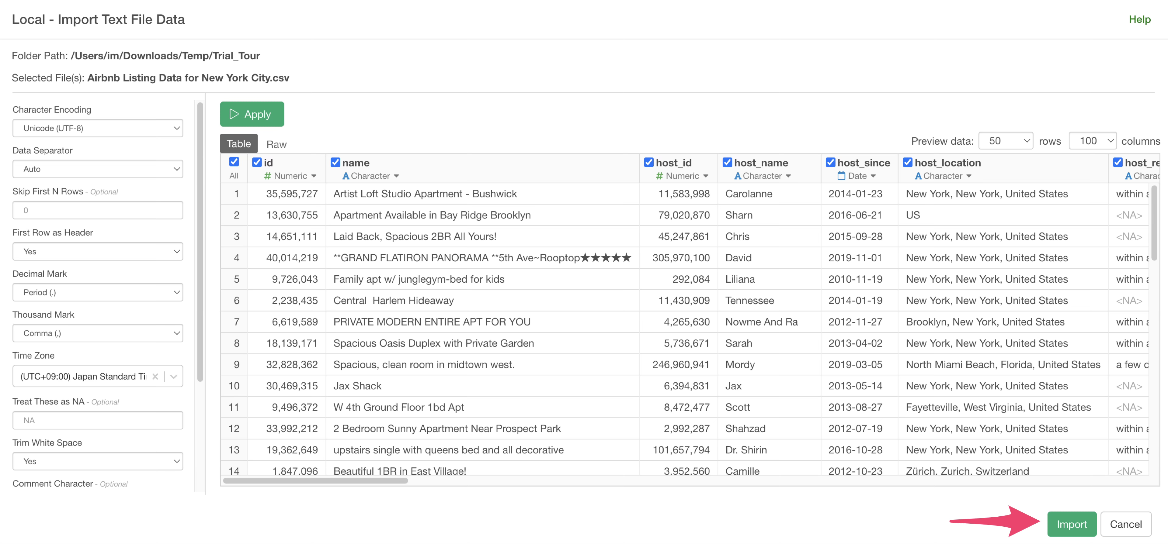
A dialog for importing data will open. On the left side of the data import dialog, you can configure various settings for how the data is read during import, but for now, simply click the “Import” button.
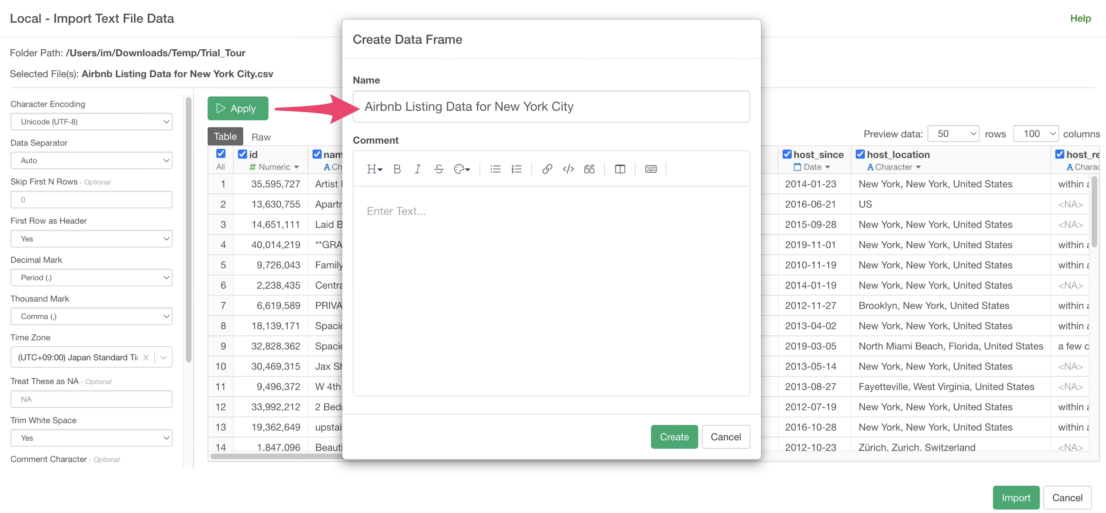
Specify a data frame name and click the “Create” button.
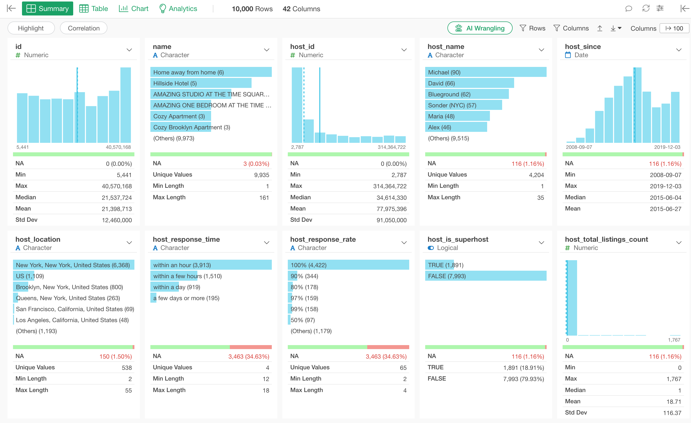
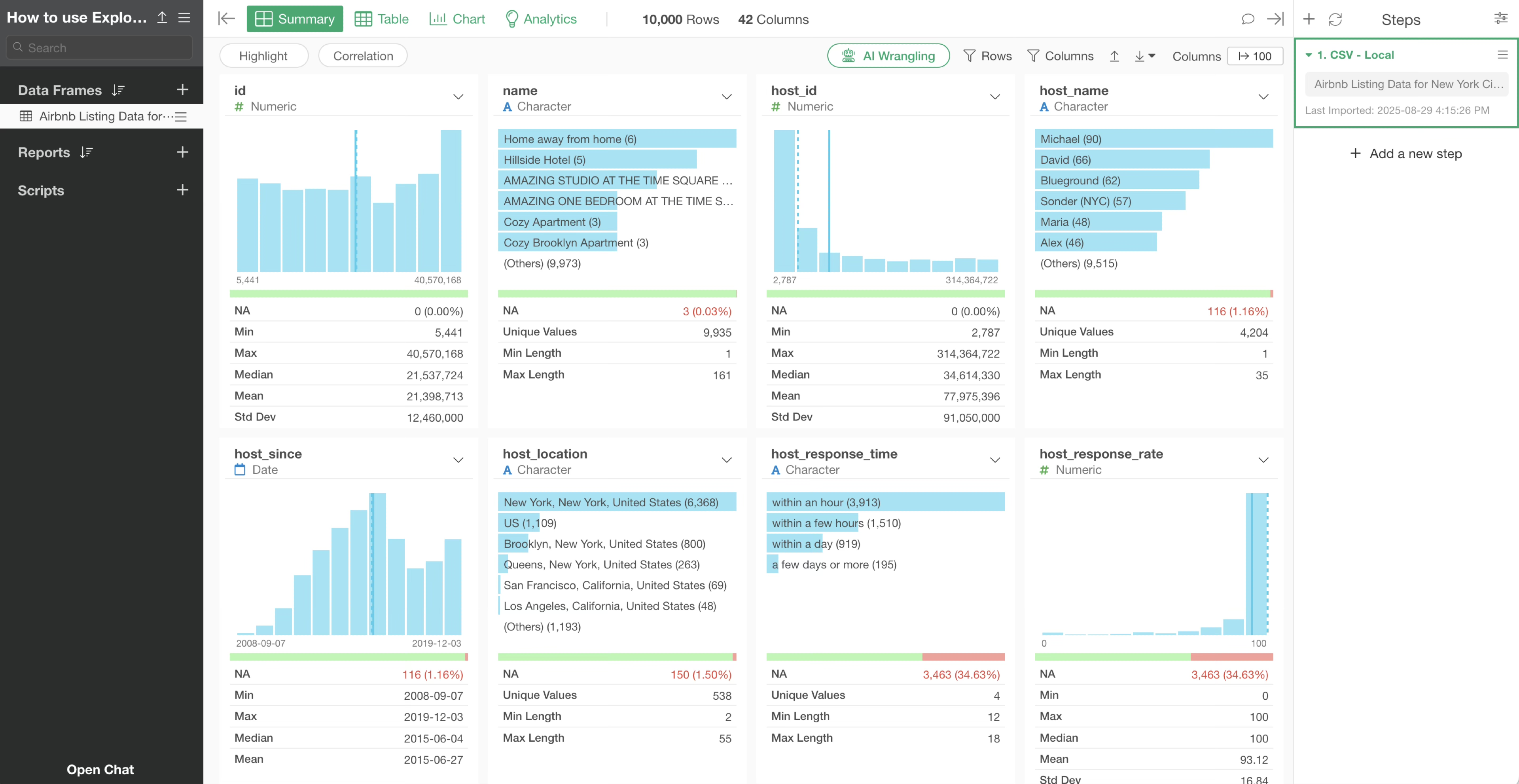
Once the data is imported, the Summary View will be displayed, allowing you to quickly overview the data.
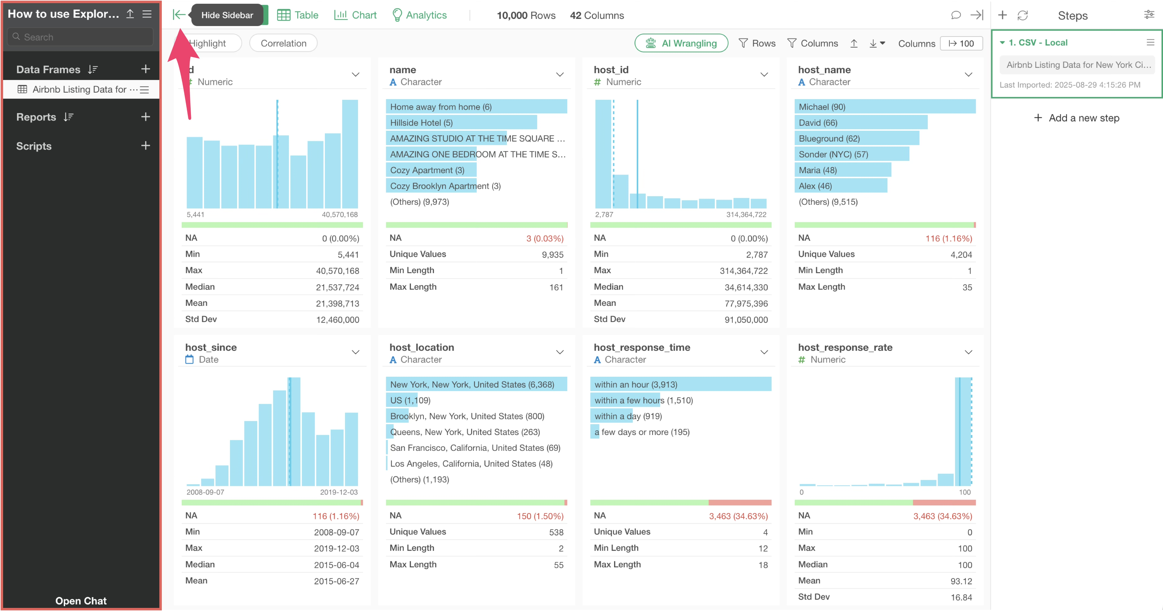
If you wish to expand the display area, you can click the “Hide Sidebar” button to conceal the left sidebar where data frames are listed, or drag and drop to narrow the sidebar’s width.
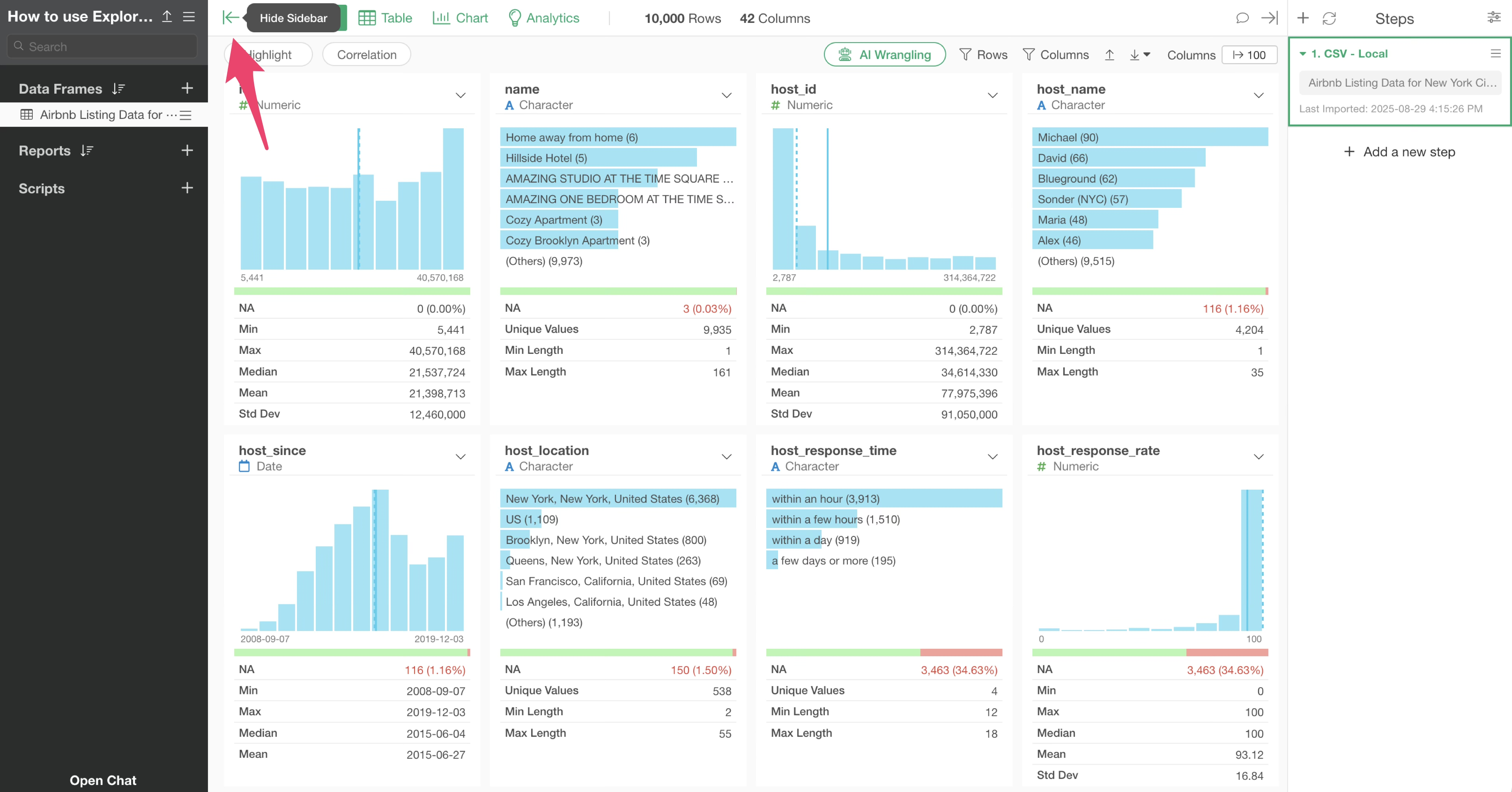
Hide Sidebar:
Adjust Sidebar Width:
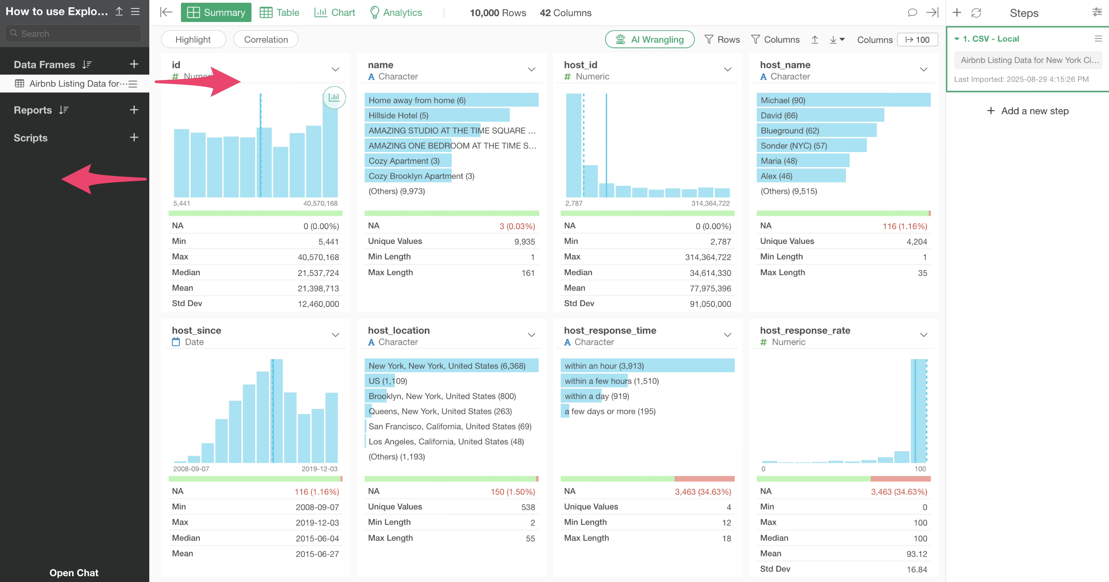
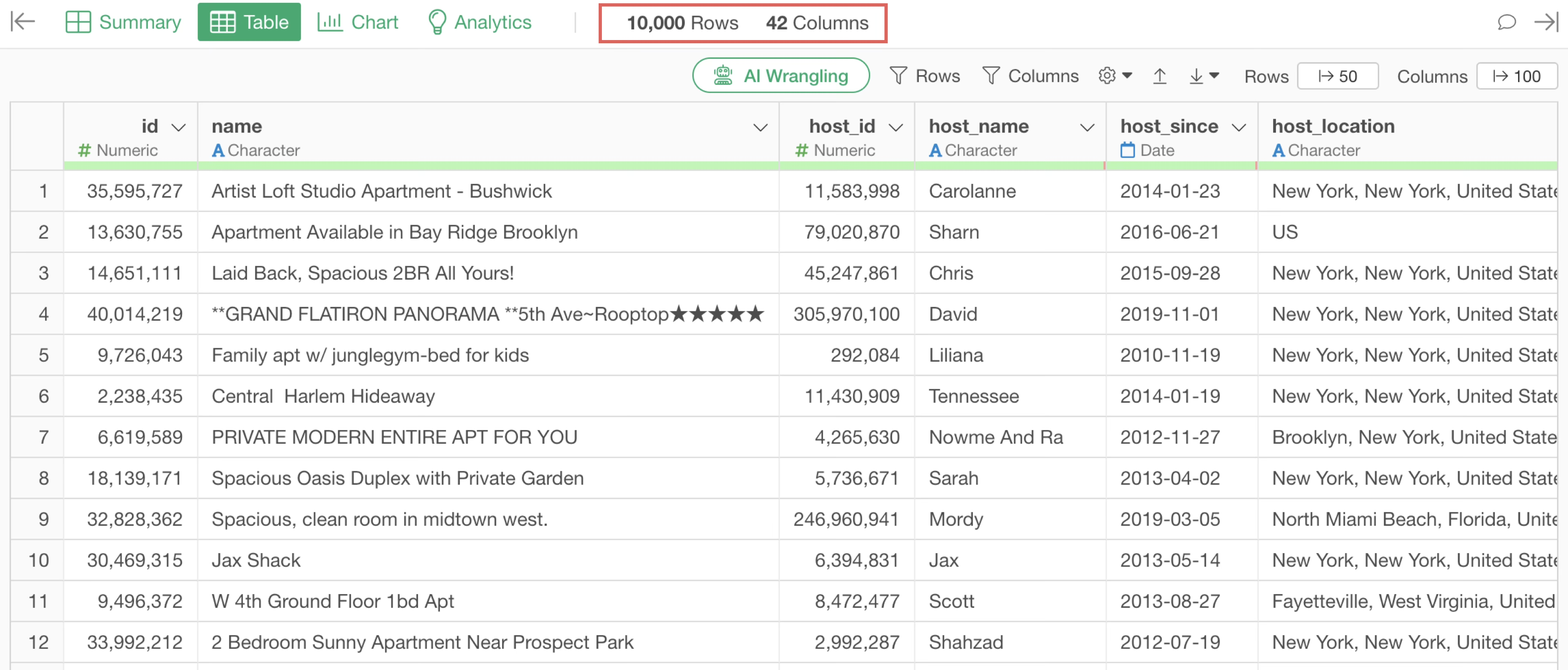
Number of Columns and Rows
The “number of columns” and “number of rows” in the data are always displayed at the top of the screen.
3. Four Views
Once data is imported, the following four “View” menus appear at the top:
Summary View
Table View
Chart View
Analytics View
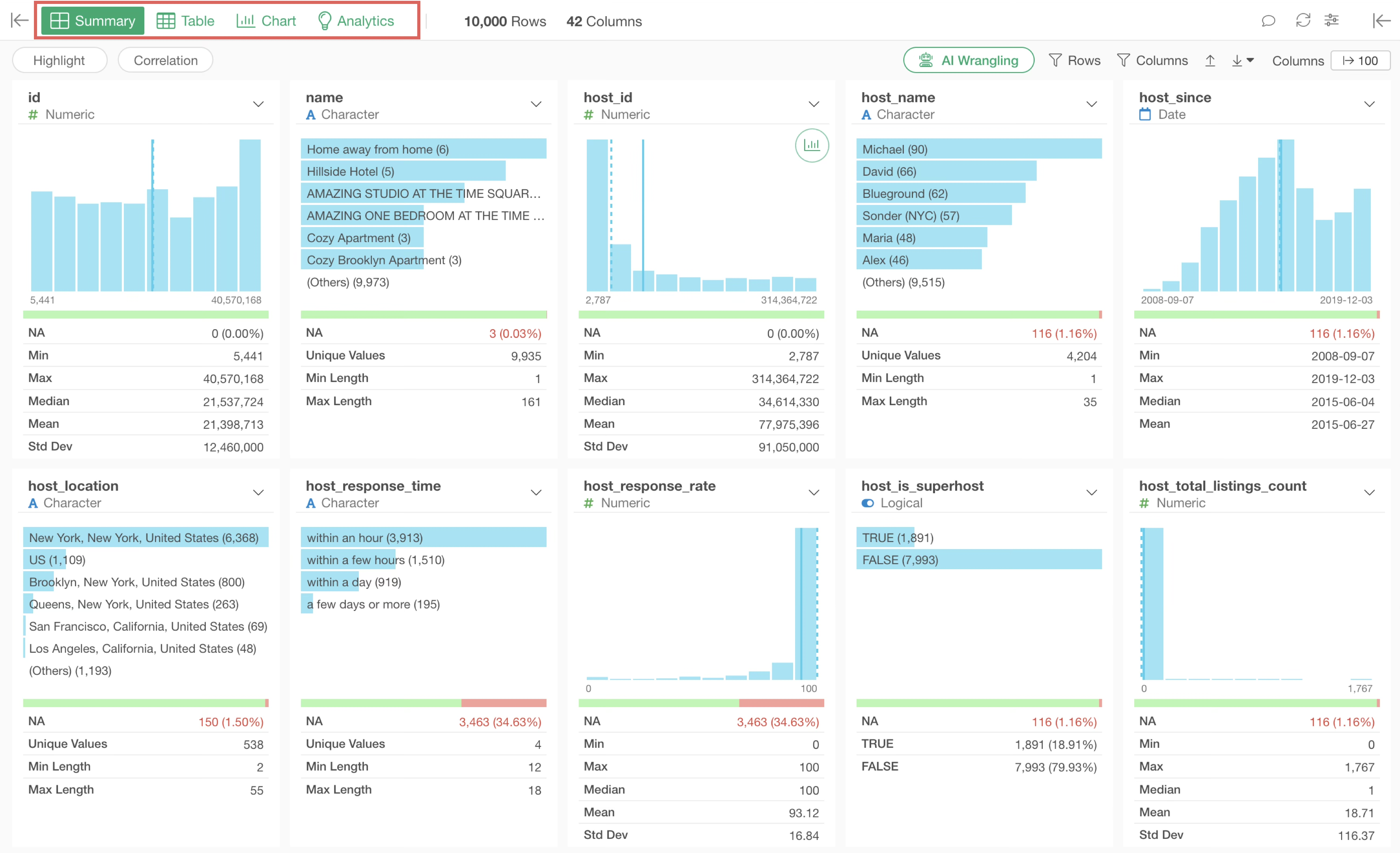
Summary View
Statistical information for each column and charts describing data distribution are automatically generated. The way to interpret these numbers and charts will be explained in 4. How to Use Summary View section.
Table View
Data is displayed in a tabular format, allowing you to review data row by row.
Chart View
Using charts, you can visualize data from various angles to discover patterns and trends within the data.
Analytics View
You can analyze data using various statistical and machine learning algorithms.
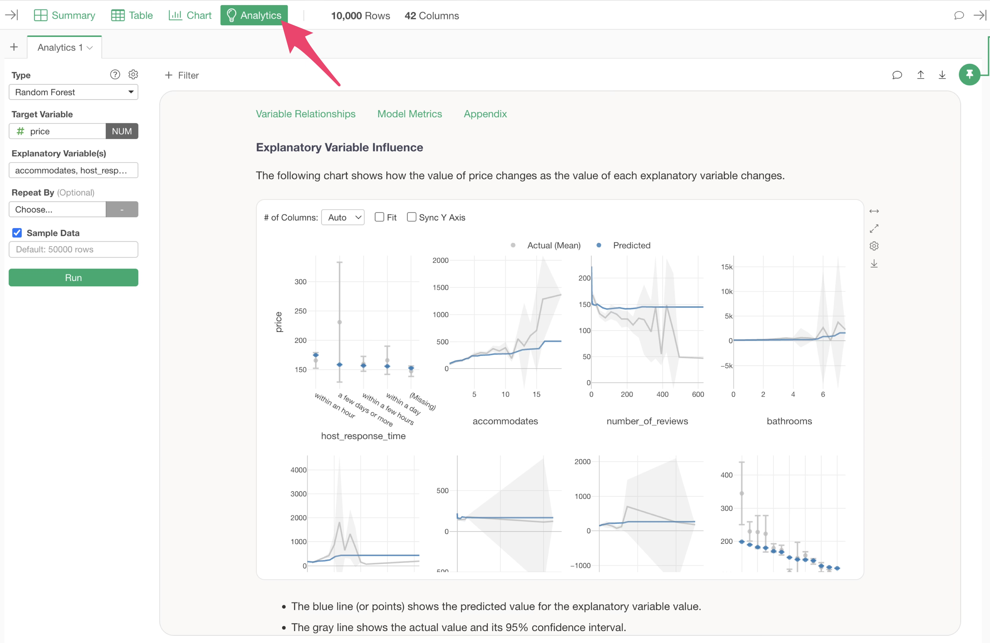
Furthermore, Exploratory’s “Guided Analytics” feature automatically displays detailed explanations on how to interpret each chart and analysis method, making analysis results understandable even for beginners.
4. How to Use Summary View
The statistical information and charts displayed in the Summary View vary depending on the “data type” of each column.
Exploratory supports many data types, but the following five types are commonly used:
Numeric
Character
Logical
Date, Date/Time (Date, POSIXct)
Numeric
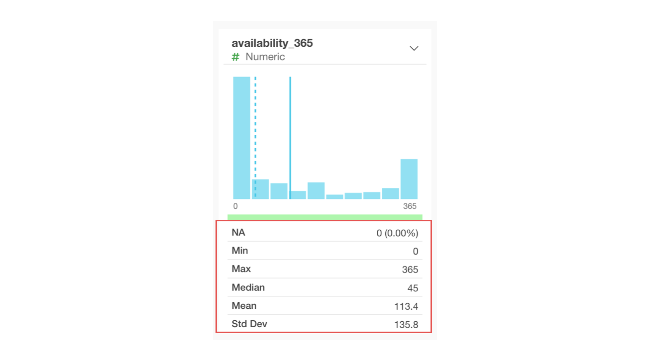
For numeric columns, a bar chart is displayed, dividing the values into 10 equal-width bins (equal numerical ranges). When you hover over a bar, the number of rows within that numerical range is shown.
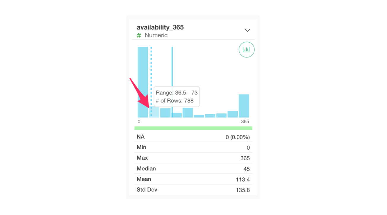
Below the chart, statistical information related to the numbers, such as “Mean” and “Median,” is displayed.
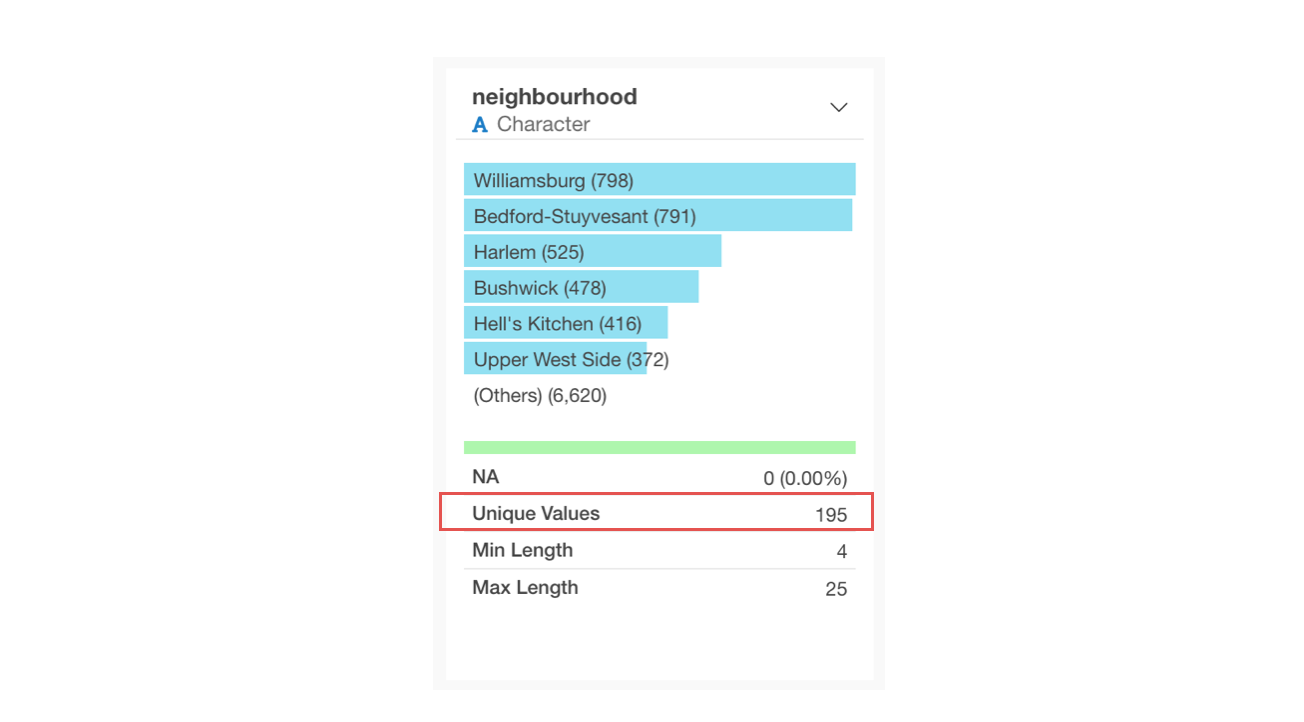
Character
For character columns, a horizontal bar chart representing the frequency of occurrence (number of rows) is displayed, ordered from the most frequent values.
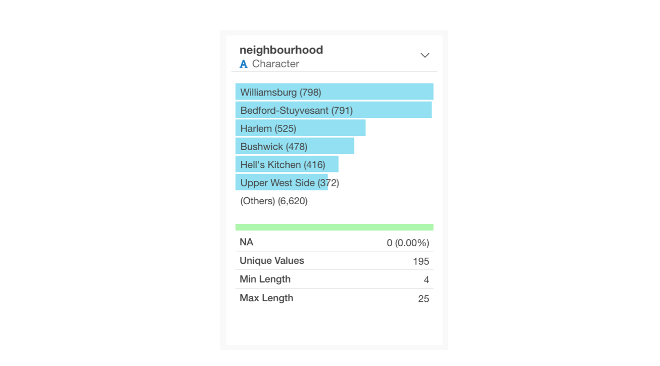
The number of unique values indicates how many distinct values exist in that character column. In the example below, with 59 unique values, it shows there are 59 municipalities.
Logical
For logical columns, a horizontal bar chart showing the number of TRUE and FALSE rows is displayed. By viewing the summary information, you can check their respective proportions.
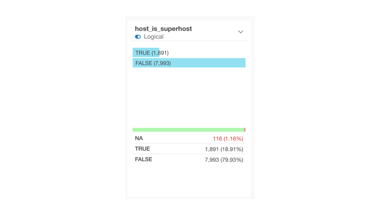
By setting the data type to logical, you can easily compare the proportions of TRUE and FALSE when creating charts, and utilize analytics suitable for logical types (e.g., logistic regression). For details on how to set the data type to logical, please refer to this note.
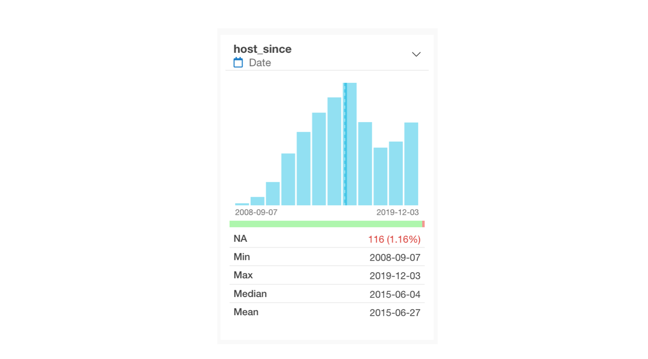
Date, Date/Time (Date, POSIXct)
For Date or Date/Time columns, a bar chart is displayed showing the number of rows within each defined period. By looking at the minimum and maximum values, you can determine the data’s time range.
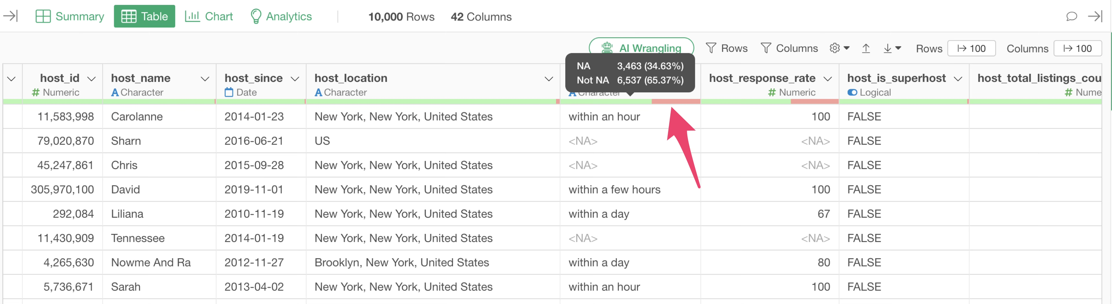
About Missing Values
If a column contains missing values, the number and percentage of missing rows will be displayed.
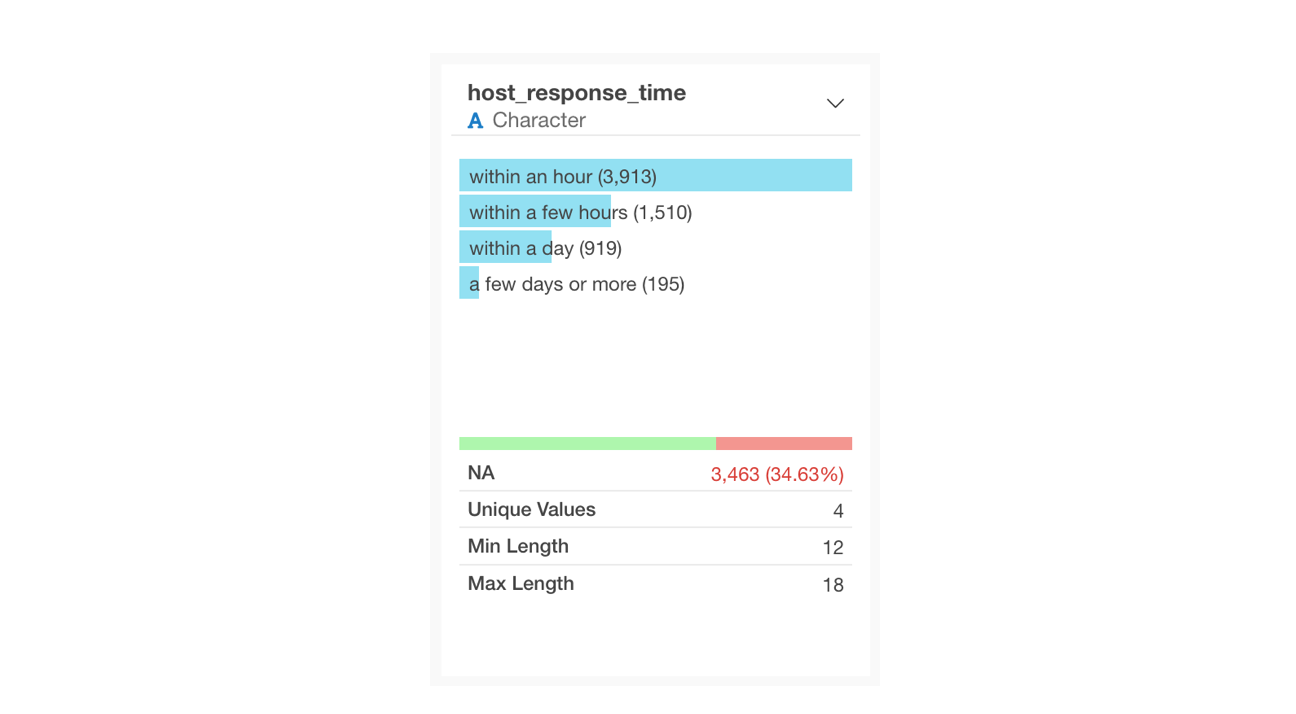
Missing values represent the absence of a value and are displayed as <NA> in the Table View.
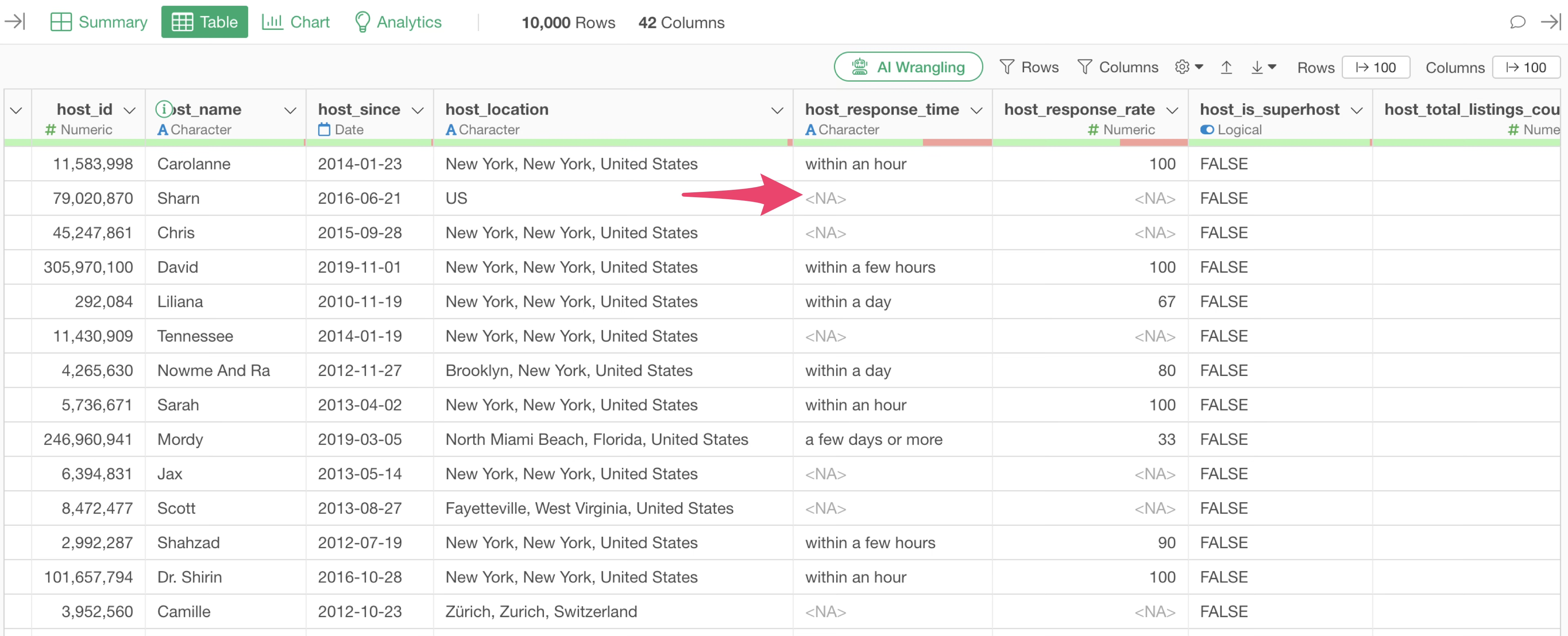
Similar to the Summary View, in the Table View, you can hover over the green and red bars below the column name to check the number and percentage of missing values.
5. Create Charts
When performing data analysis, visualizing data with charts is essential to visually identify patterns within the data. Furthermore, when communicating analysis results, charts play a crucial role in making the patterns and trends you want to emphasize easy to understand.
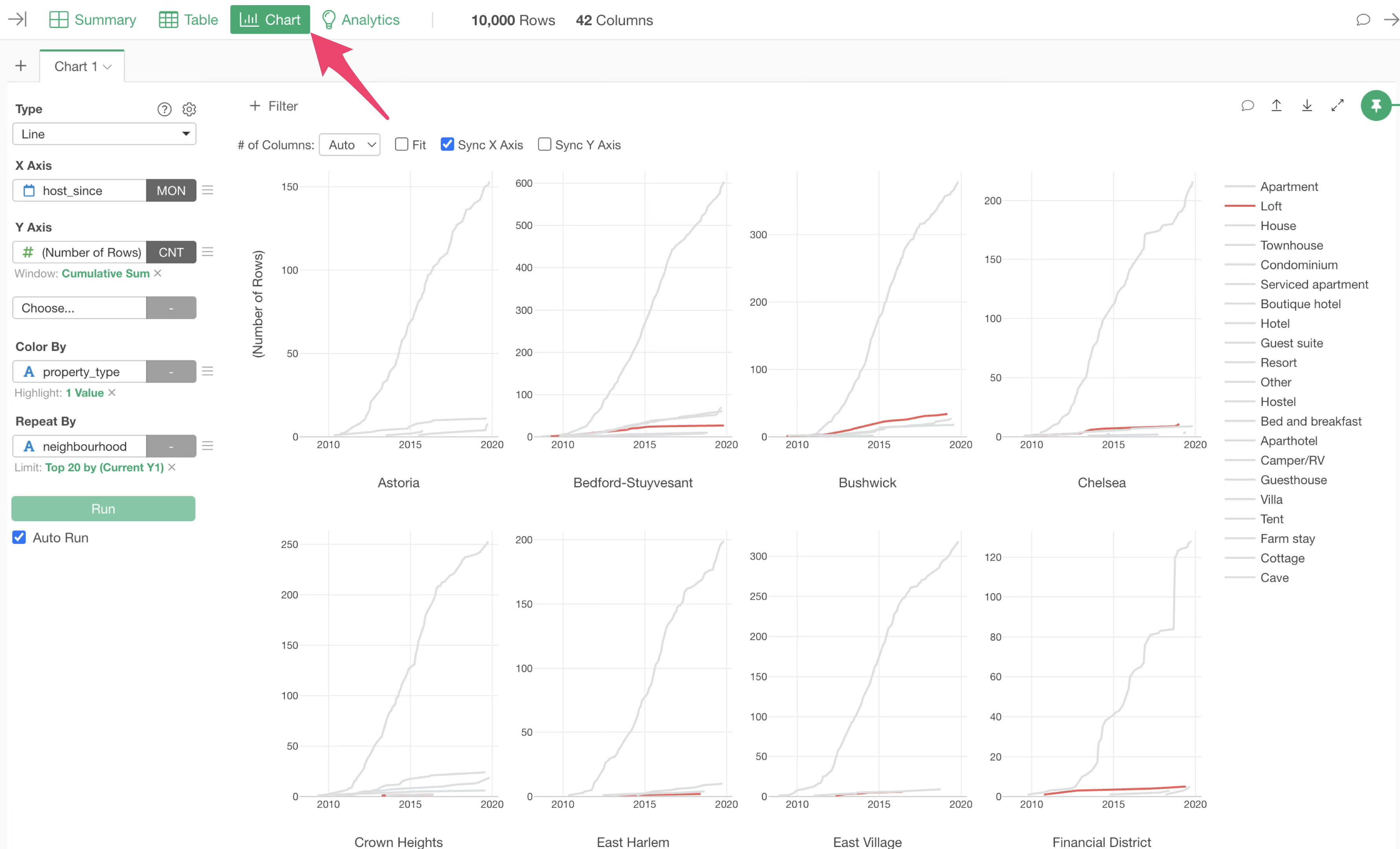
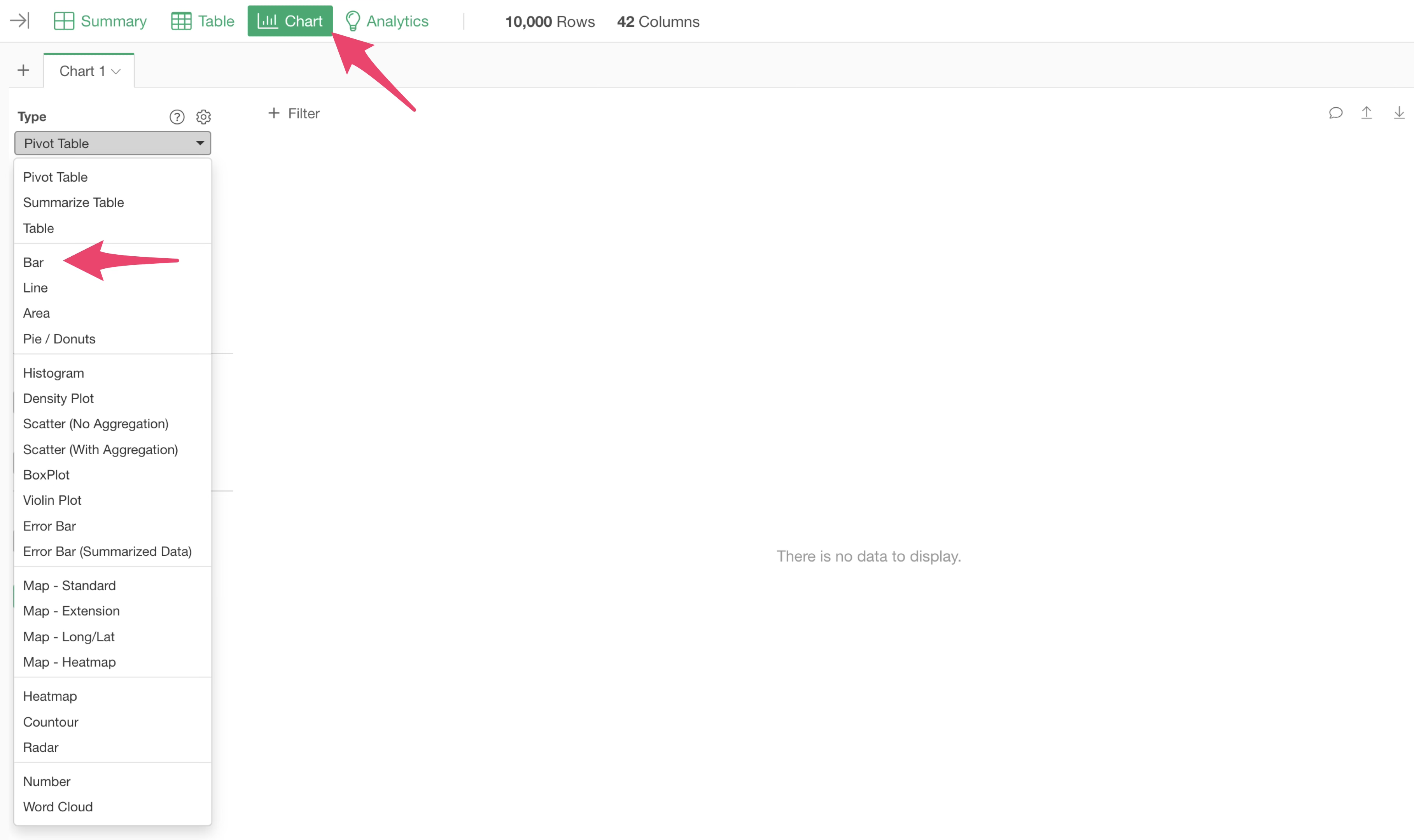
In Exploratory, you can create charts under the “Chart” view.
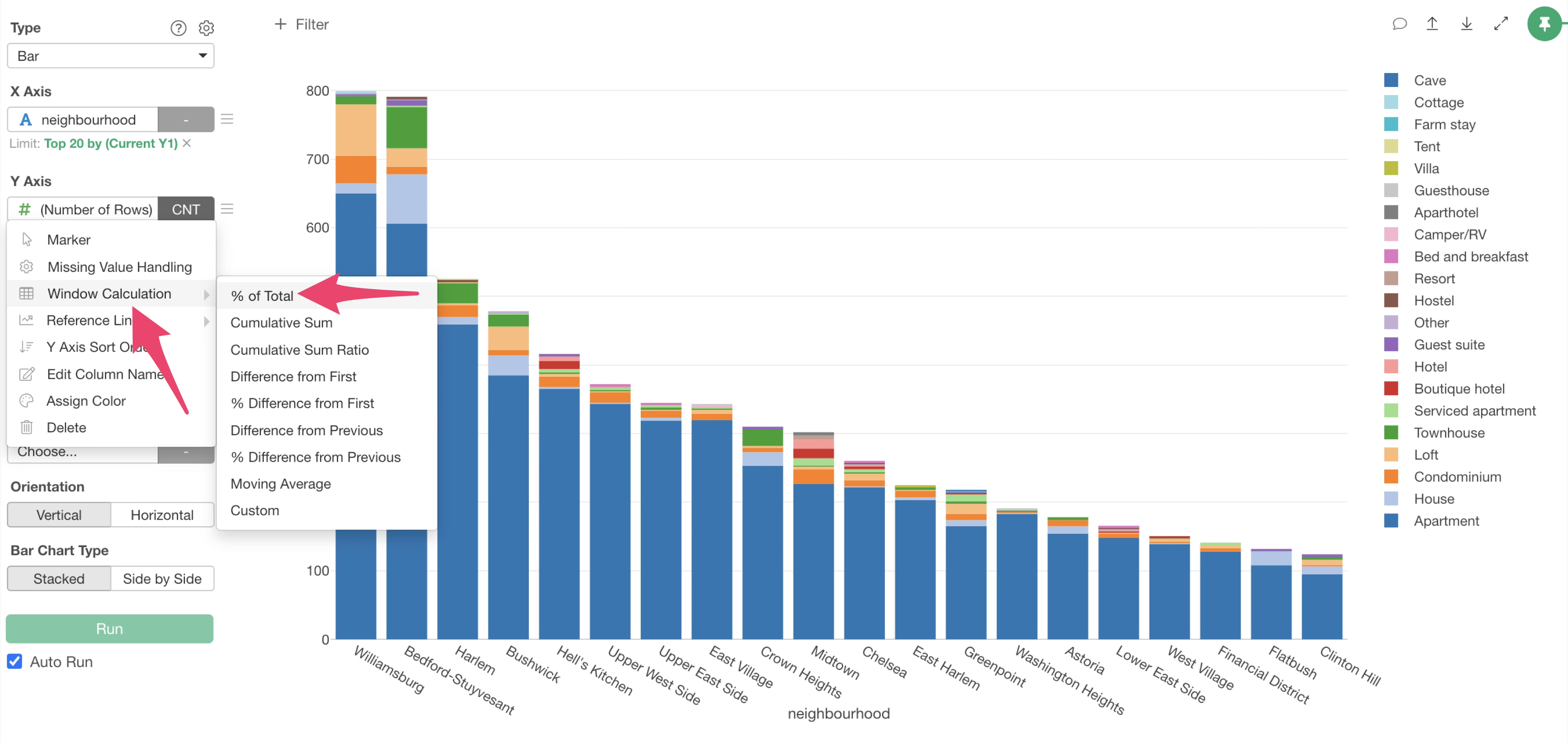
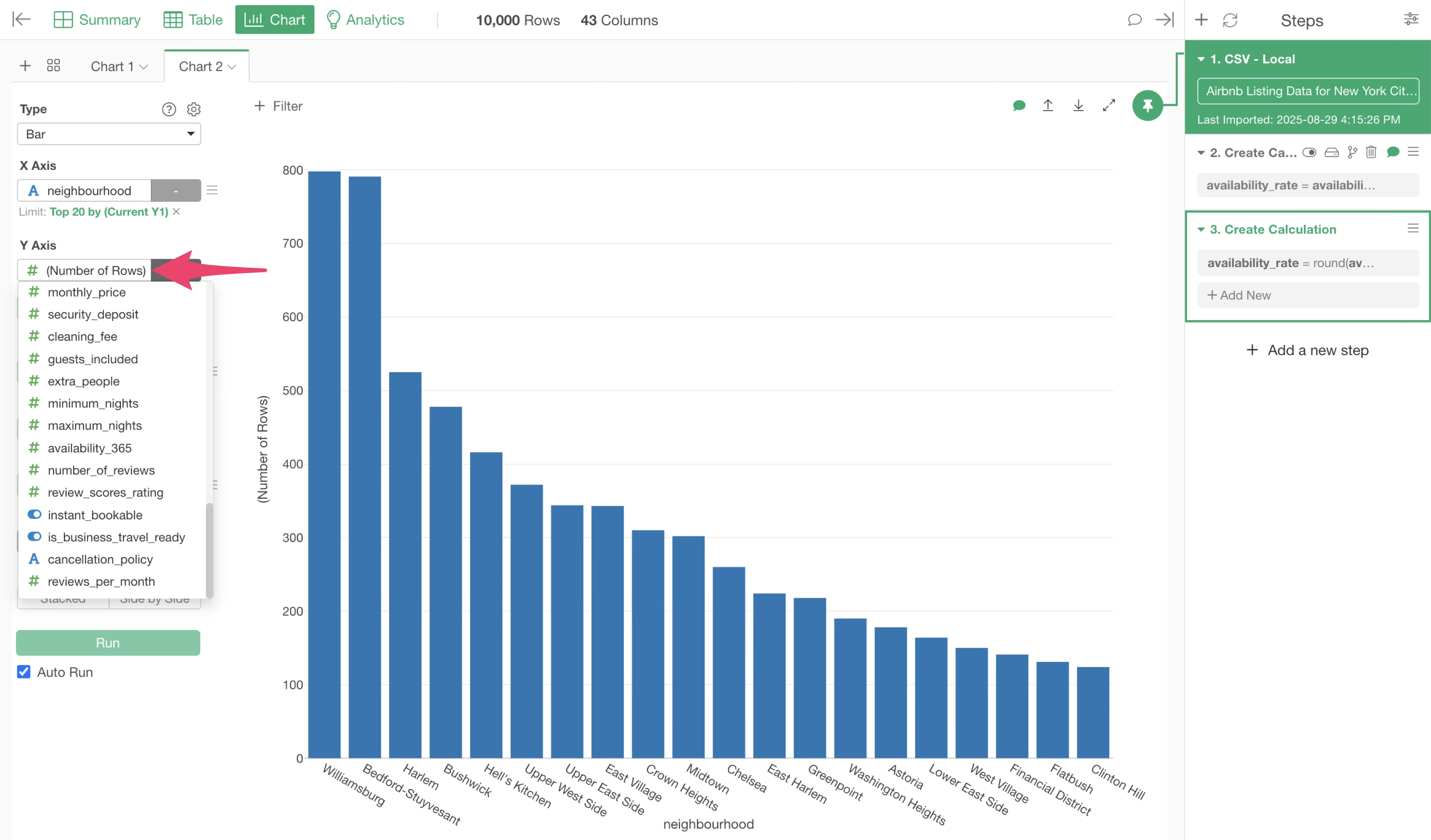
First, let’s create a chart showing the number of accommodations (number of rows) per neighbourhoods.
Open the Chart View and select “Bar” as the type.
Select “neighbourhood” for the X-axis and “Number of Rows” for the Y-axis.
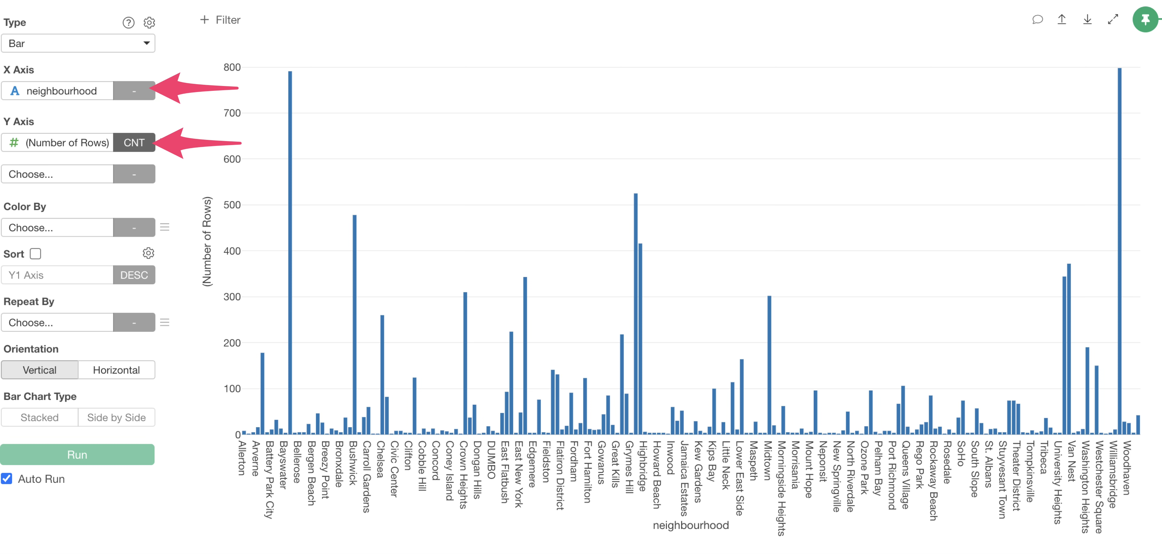
Since the X-axis is sorted alphabetically, it’s hard to compare the values. To fix this, enable “Sort”.
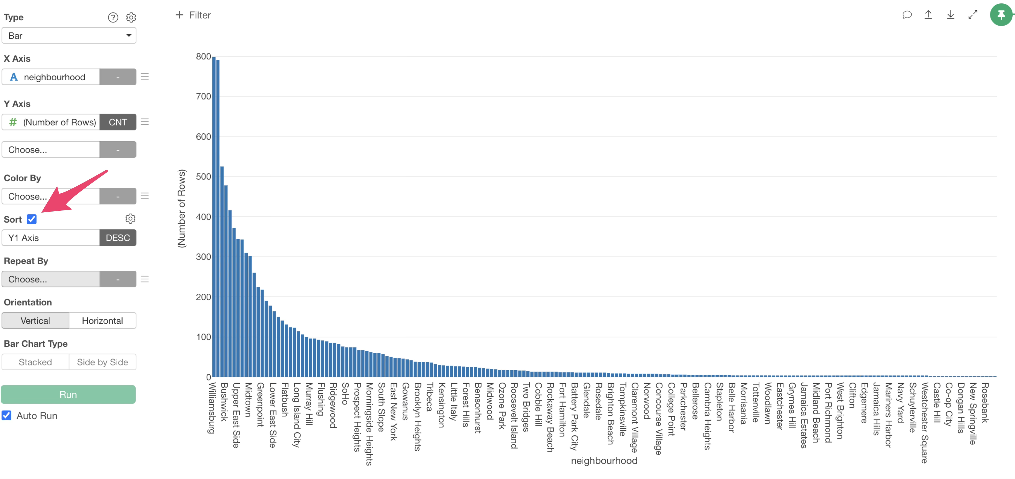
This allows us to visualize the number of rows (number of accommodations) per neighbourhood using a bar chart.

Limit Values to Display
By the way, this data contains many municipalities, so that many bars are displayed. However, most of them have very few accommodations.
So, let’s display only the top 20 neighbourhood with the highest number of accommodations.
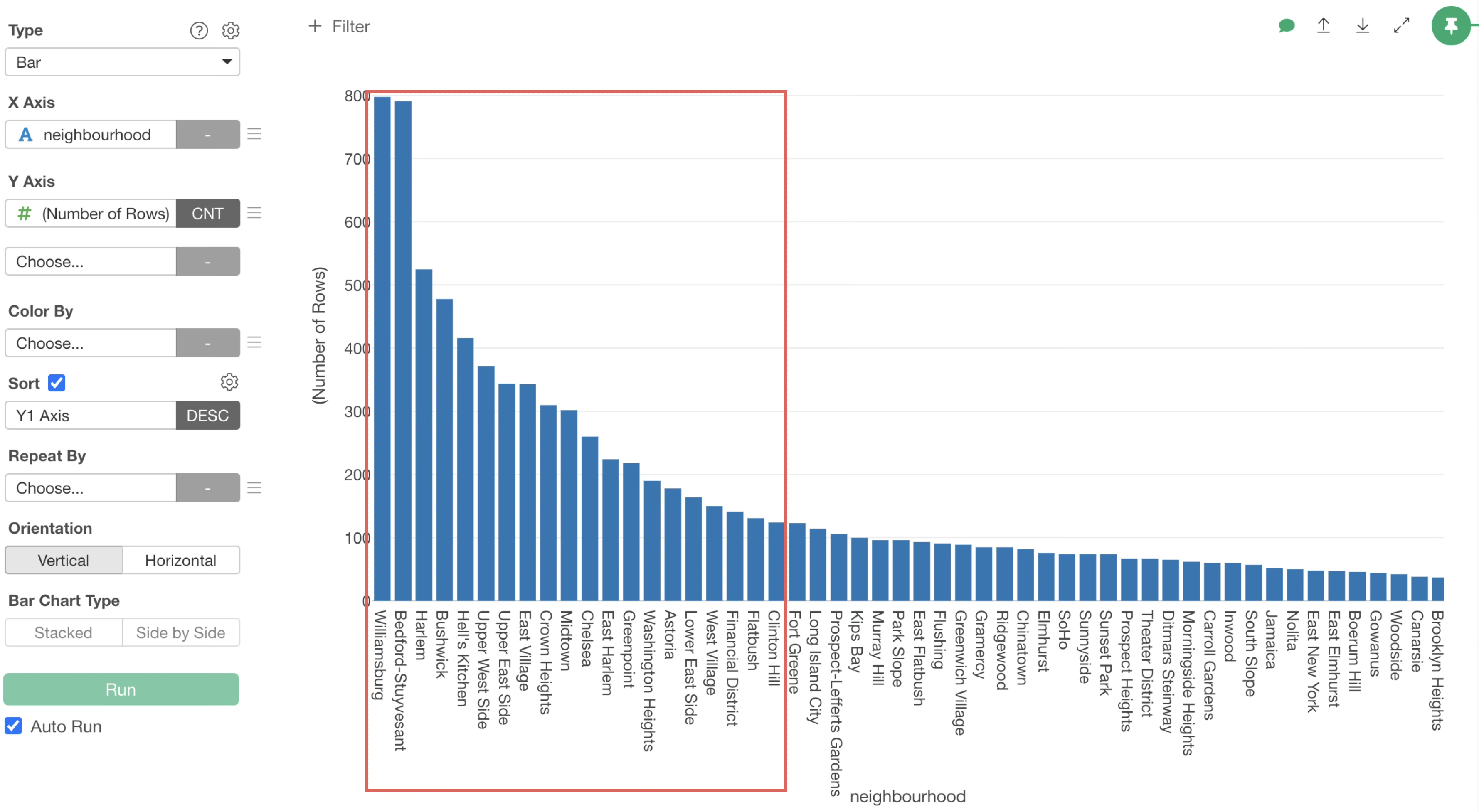
From the X-axis menu, select “Limit Values”.
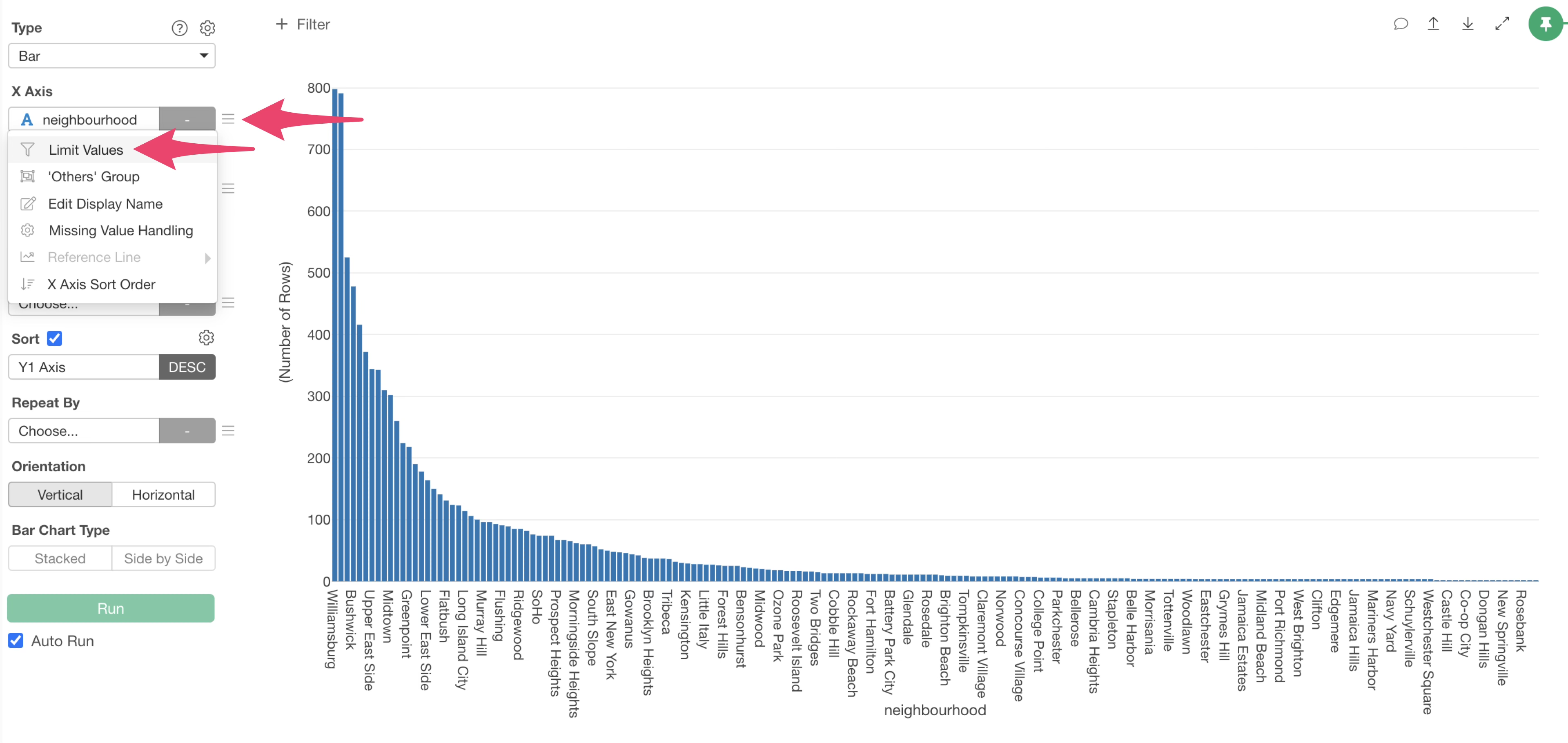
Select “Top” for the type, specify “20” for the number of results, and click “Apply”.
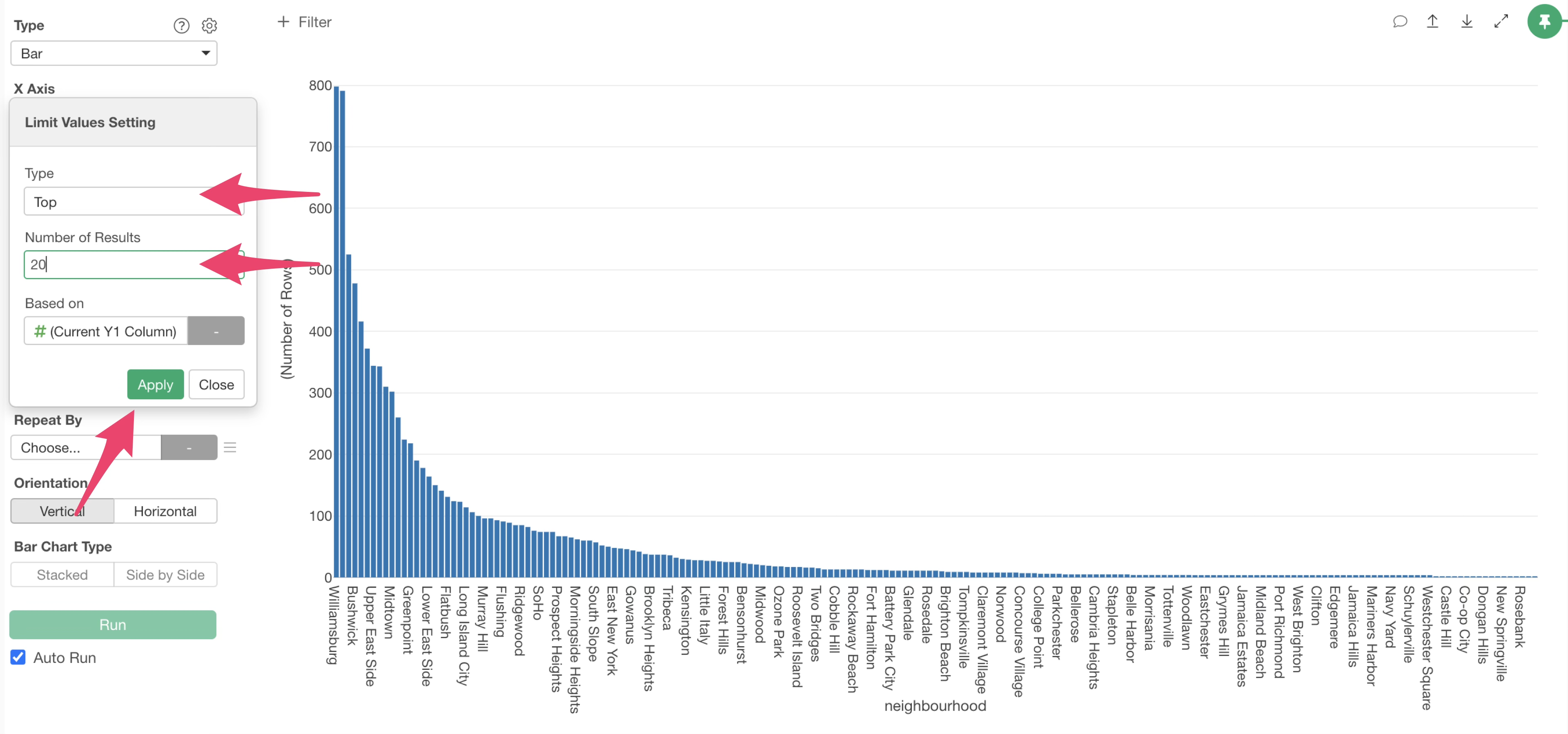
This allows us to display only the top 20 neighbourhood with the highest number of rows,
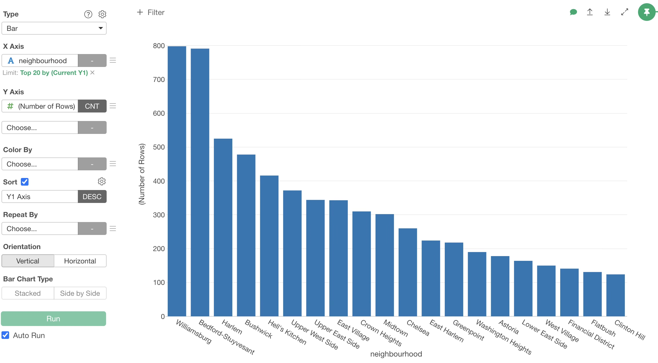
It is evident that Williamsburg has the most accommodations, followed by Bedford-Stuyvesant.
Grouping by Color
Let’s divide the bars for each neighbourhood by “property_type” (e.g., Apartment).
Select “property_type” for Color By.
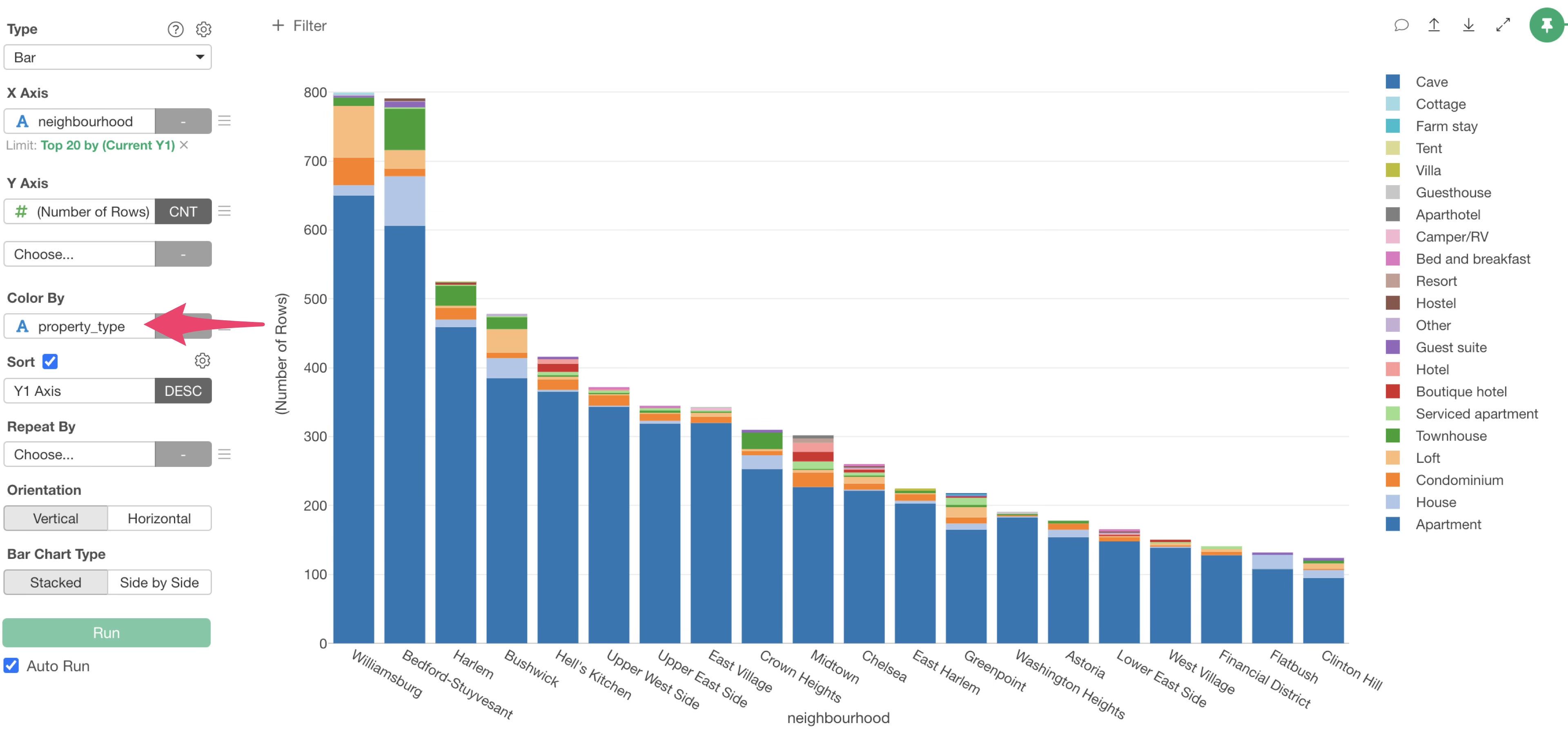
This allows us to visualize the number of rows per municipality, with bars colored by “property_type”.
Next, let’s visualize the proportion of each “Room Type” within each municipality, with all bars set to 100%.
Select the Y-axis menu.
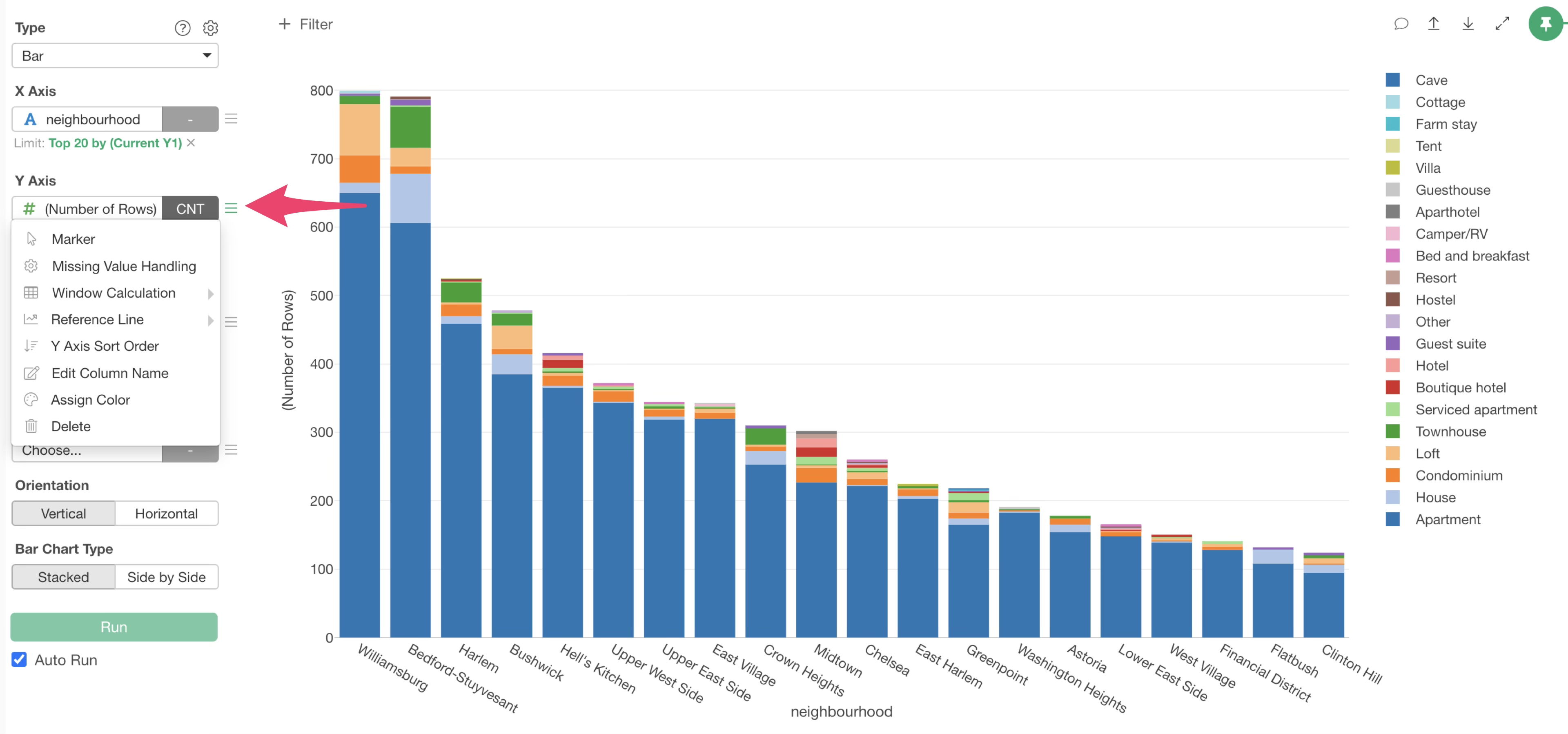 And
Select “% of Total” under “Window Calculation”.
And
Select “% of Total” under “Window Calculation”.
This allows us to visualize the proportion of room types within each municipality, with all municipality bars set to 100%.
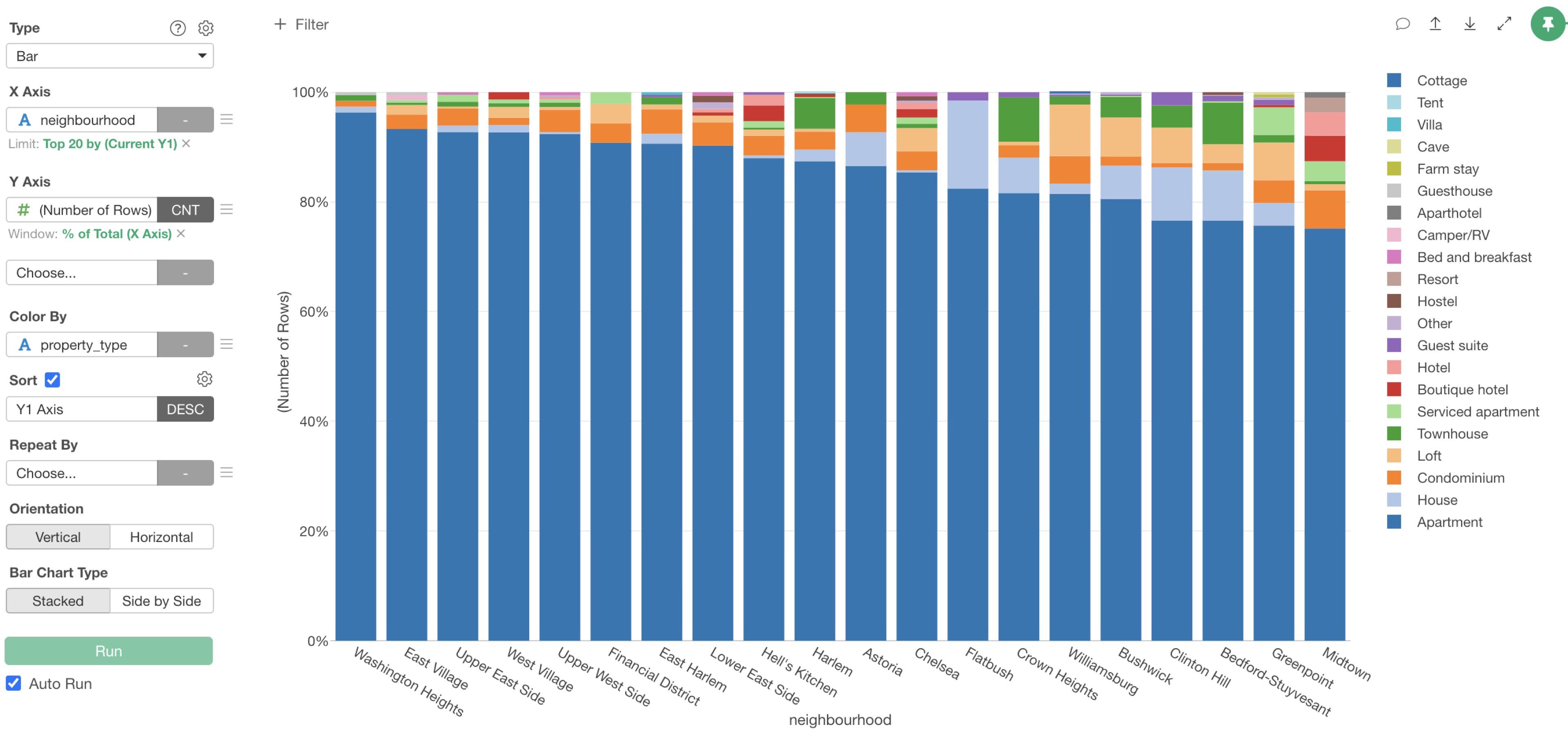
You can see that the proportion of house in Flatbush is high.
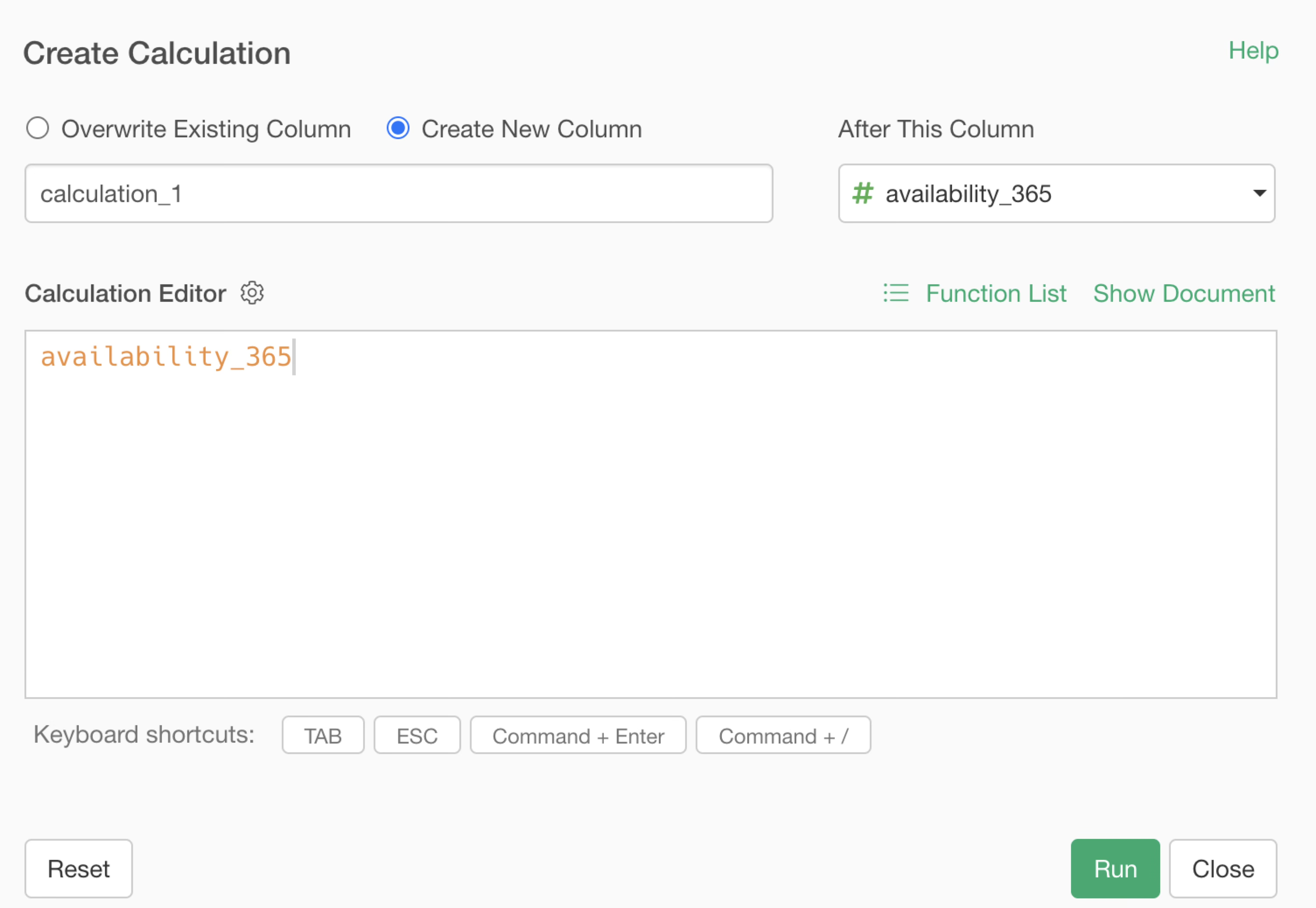
6. Perform Calculations
Exploratory allows you to perform calculations easily, and you can either overwrite the original column with the calculation result or save it as a new column.
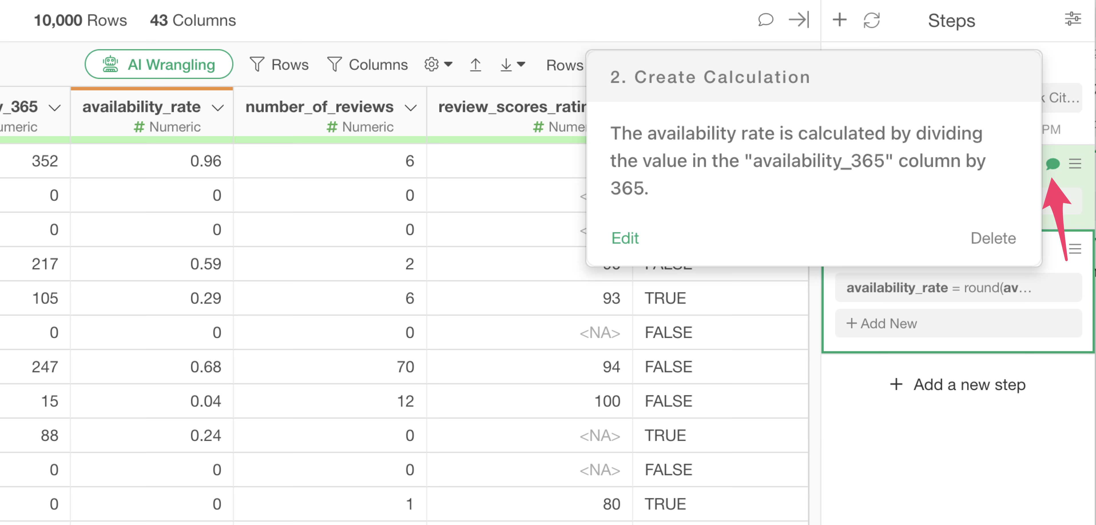
Here, let’s calculate the availability rate based on the “availability_365” column.
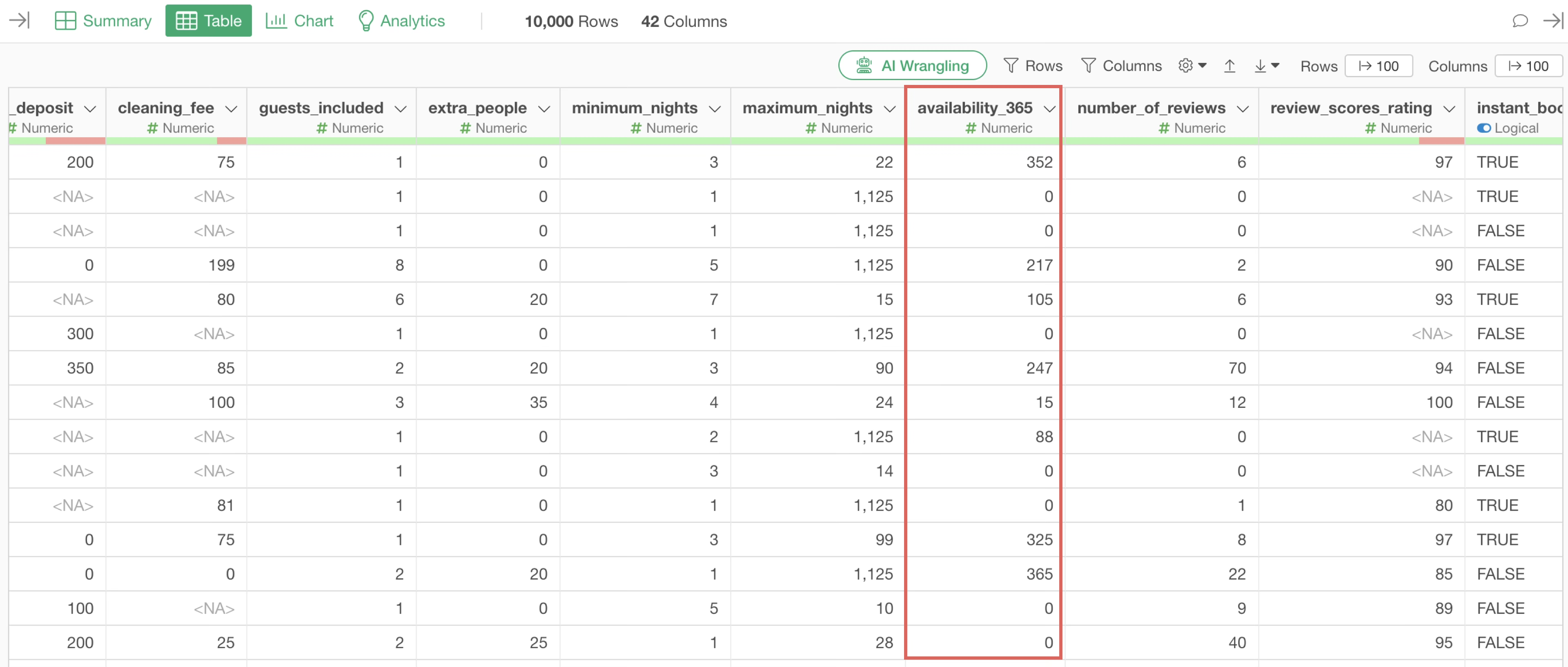
The availability rate is the number of days a property was operational (used) during a year, i.e., 365 days. Therefore, the formula for calculating the annual availability rate is as follows:
availability_365 / 365In the world of software, division is represented by the “/” (slash) symbol. And Multiplication uses the “*” (asterisk) symbol.
| Arithmetic Operation | Notation |
|---|---|
| Add | + |
| Subtract | - |
| Multiply | * |
| Divide | / |
To perform calculations in Exploratory, use “Create Calculation” found in the “Column Header Menu” that appears when you click the downward arrow icon on each column.
This time, we want to create a calculation based on the values in the “availability_365” column, so select “Create Calculation” from the column header menu of the “availability_365” column, and then select “Standard”.
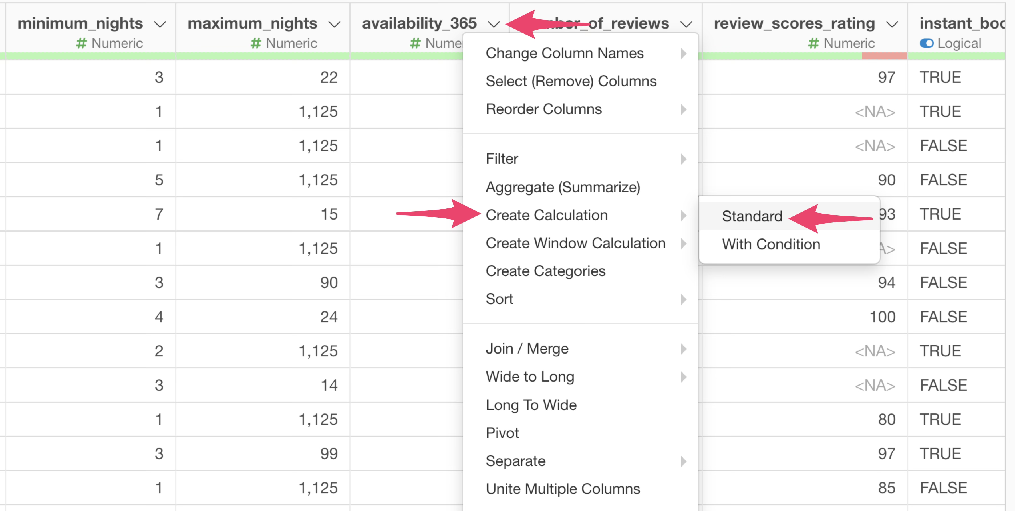
“Create Calculation” has two sub-menus, but “Standard” is used in most cases. Occasionally, there are situations where you want to perform a specific calculation only if certain conditions are met; “Conditional” is for such cases.
When the “Create Calculation” dialog opens, you will see that the column name “availability_365” is already entered in the calculation editor. This is because you opened the “Create Calculation” dialog from the column header menu of this column.
Usually, the column name should be entered as is, but sometimes,
column name would be enclosed in backticks (`). This symbol
is used as an escape character when the column name starts with a number
or contains special characters like spaces.
As long as you are using Exploratory, these escape characters are automatically entered, so you don’t need to specifically worry about when they are required.
Within this “Create Calculation” dialog, you can perform calculations freely using formulas and functions.
This time, to calculate the annual occupancy rate, you need to enter the following formula in the calculation editor:
availability_365 / 365Since the column name is already entered, you only need to input
/ 365 after the column name “availability_rate”.
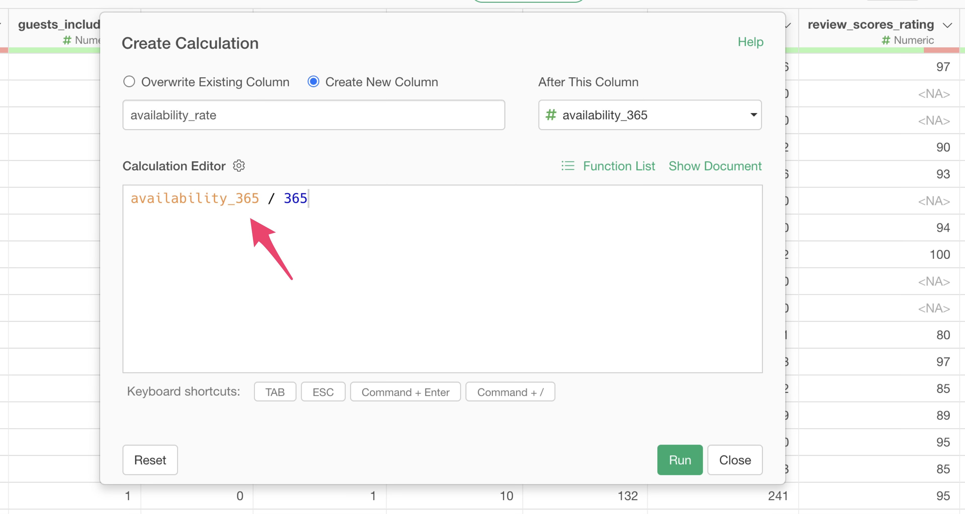
Since we want to add the calculation result as a new column, ensure that “Create New Column” is selected.
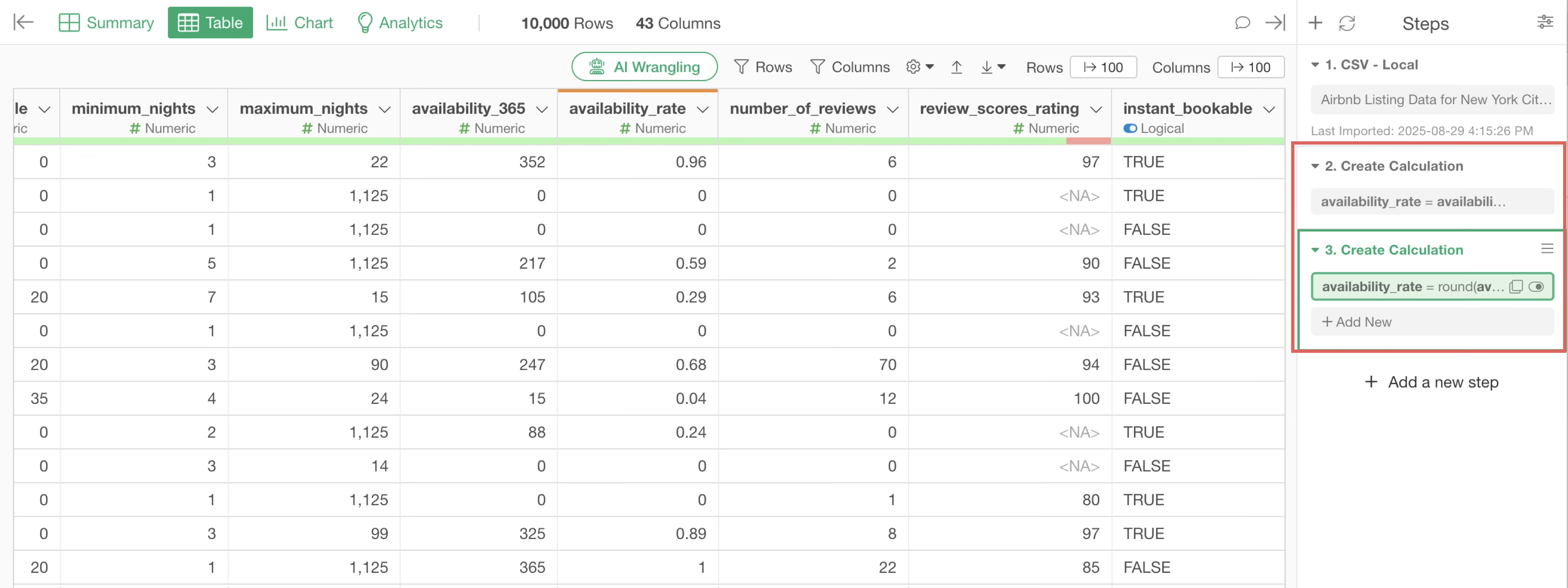
Once confirmed, click the “Run” button. A new column with the “availability_rate” calculated for each row will be added.
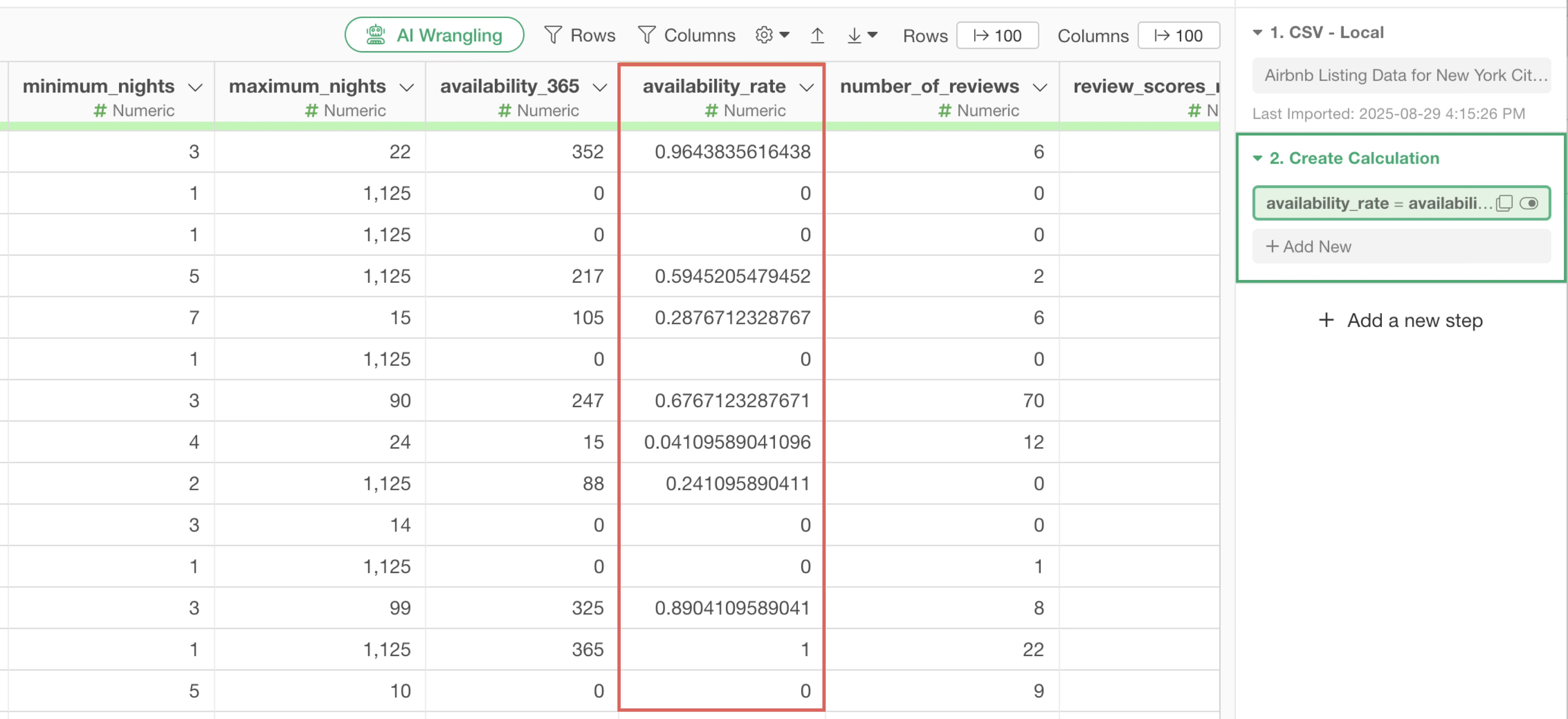
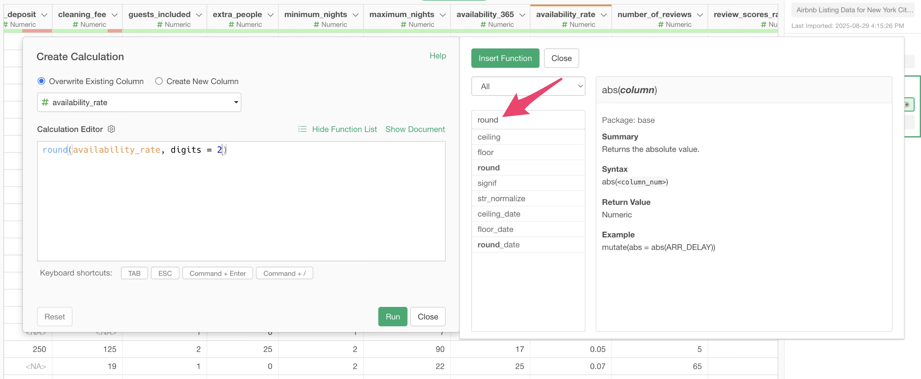
By the way, the values for the annual occupancy rate contain many decimal places. To make these values more readable, let’s round them to two decimal places.
To round in this way, you can use the “round” function with a formula like this:
round(availability_rate)In Exploratory, even if you don’t remember the function, you can automatically generate a calculation formula using a function from the column header menu.
From the column header menu of the “availability_rate” column, select “Work with Numeric Function”, then select “round”.
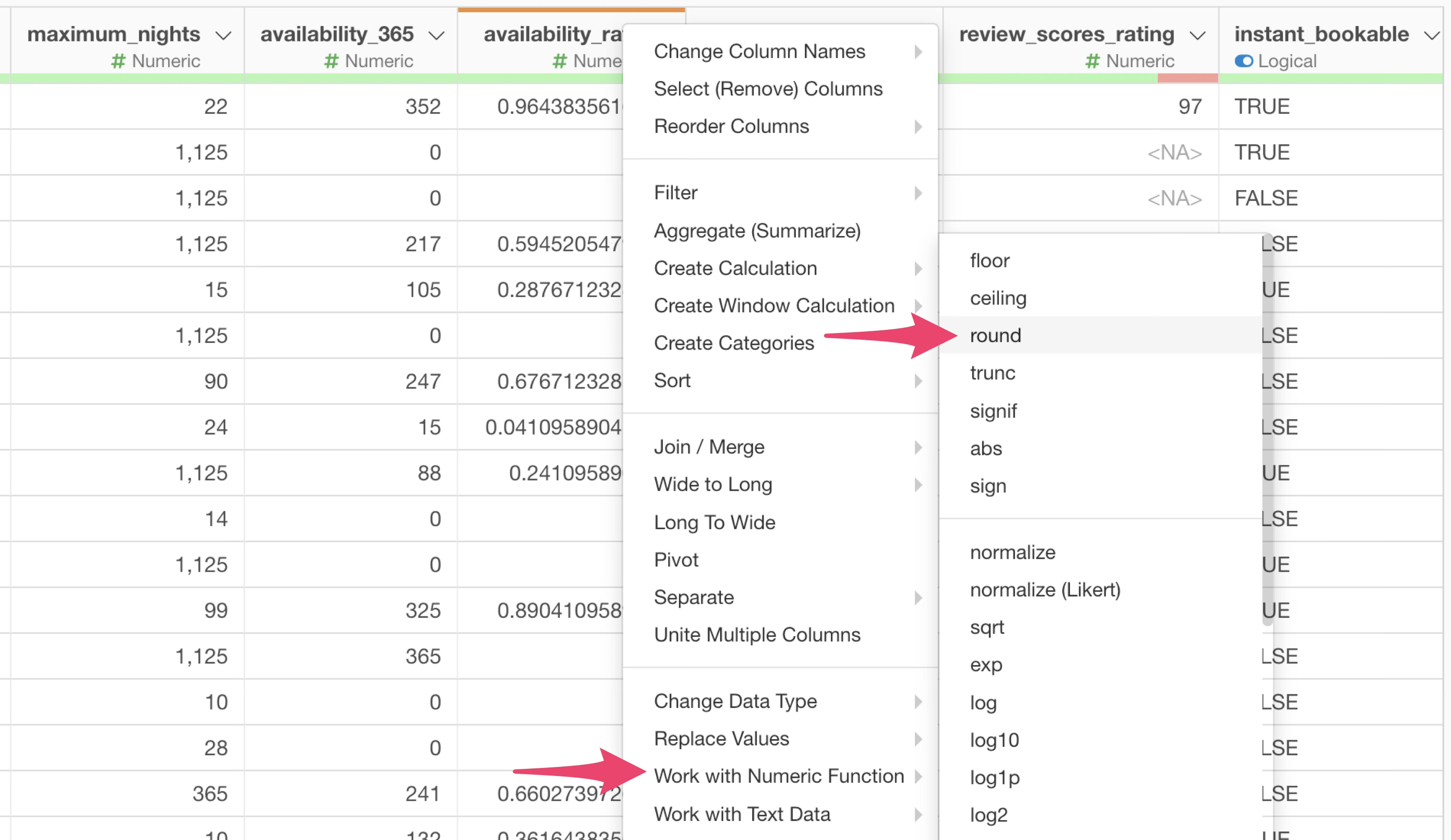
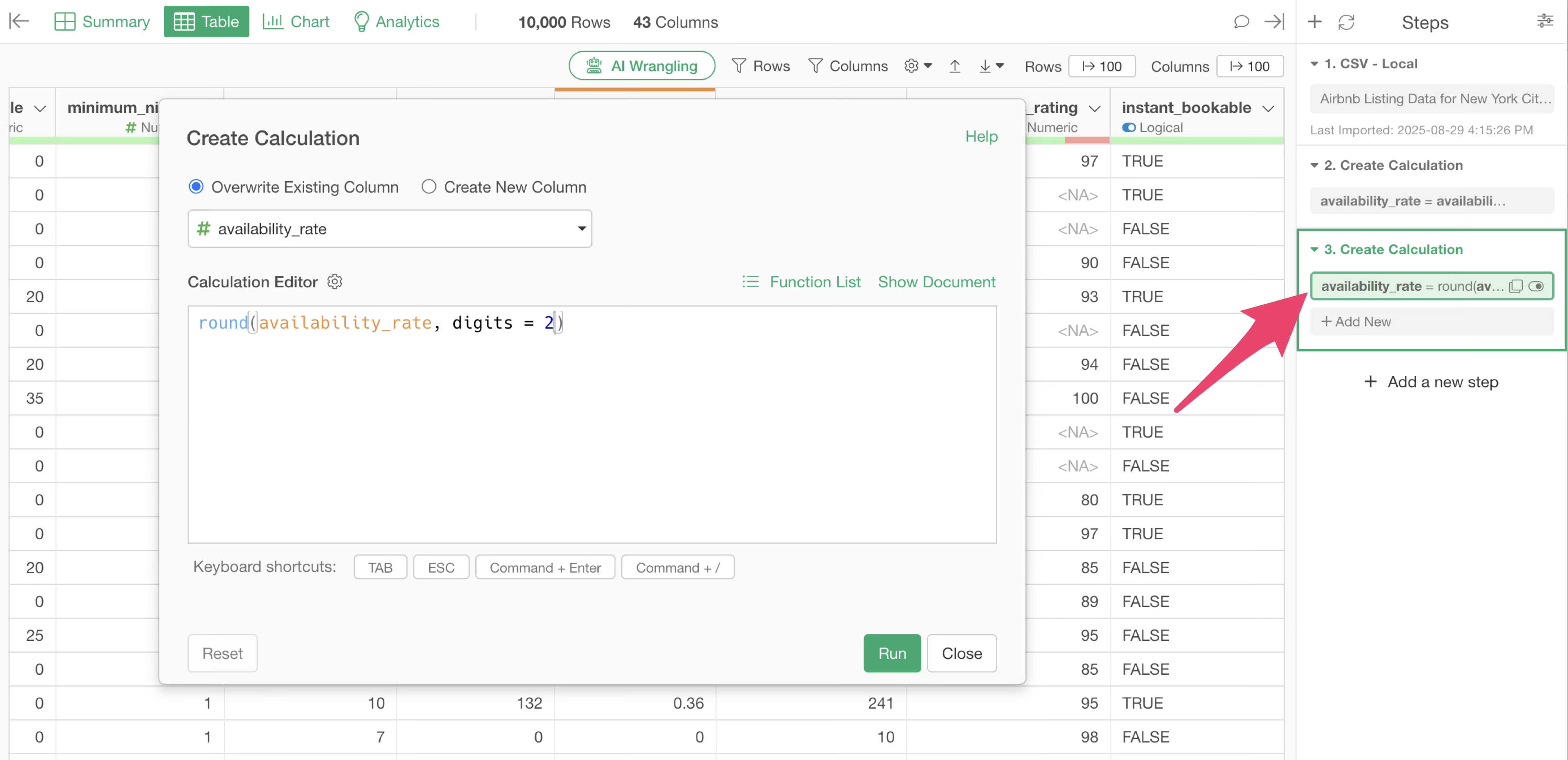
The “Create Calculation” dialog will open, and the calculation editor will already have the “round” function formula for rounding entered.
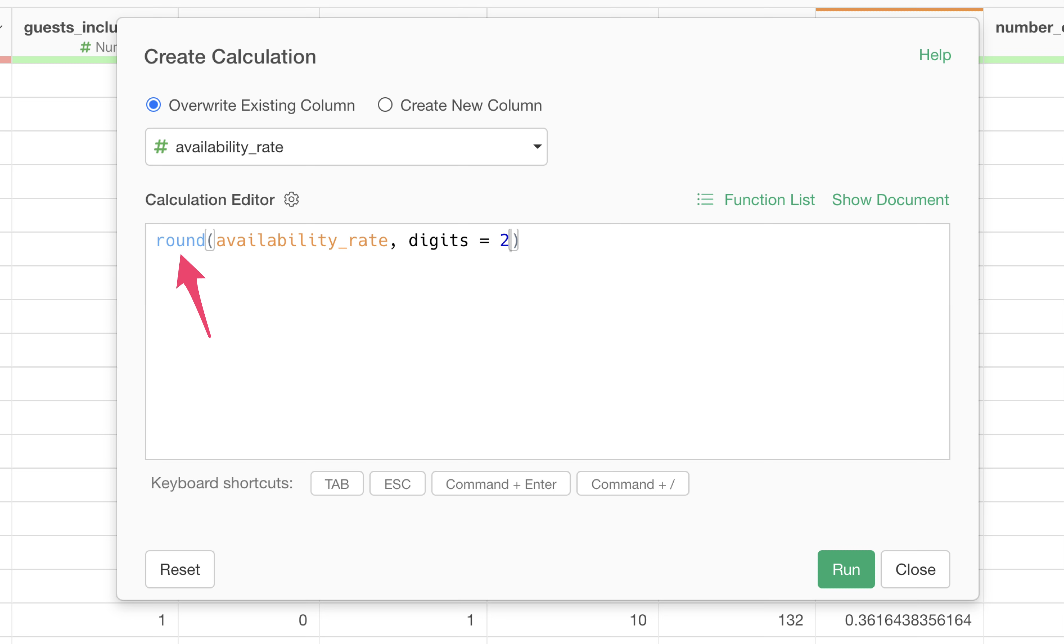
Since we want to round to two decimal places, specify “2” for
digits, which means two decimal places.
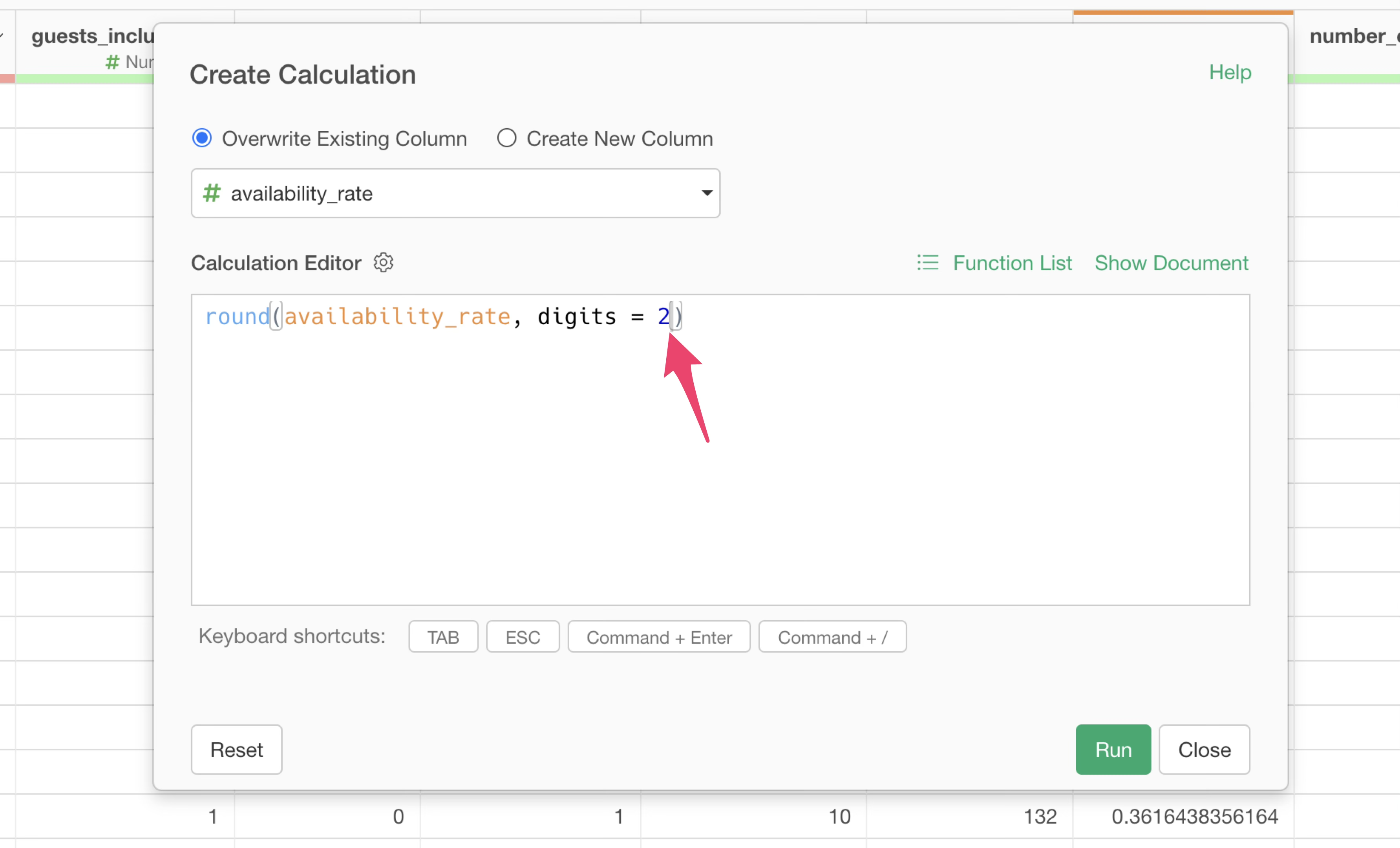
This time, instead of adding the calculation result as a new column, we want to overwrite the existing “availability_rate” column. So, select “Overwrite Existing Column” and click the “Run” button.
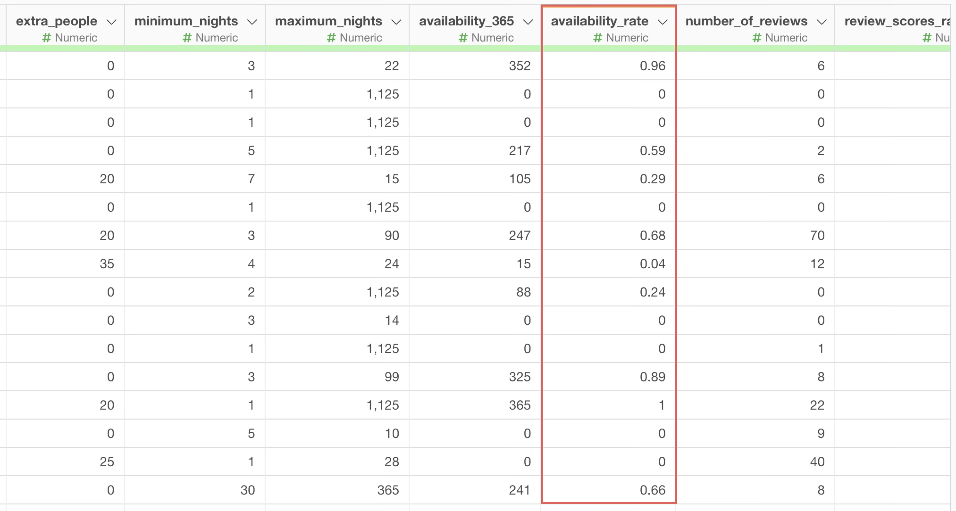
You can see that the “availability_rate” values are now displayed rounded to two decimal places.
As demonstrated, in most cases, selecting an option from the column header menu automatically inputs functions and their arguments, making it easy to start using them even if you don’t remember each function.
However, there are rare instances where you might want to use a function not available in the column header menu. In such cases, you can click “Function List” within the “Create Calculation” dialog to search for function names and their usage.
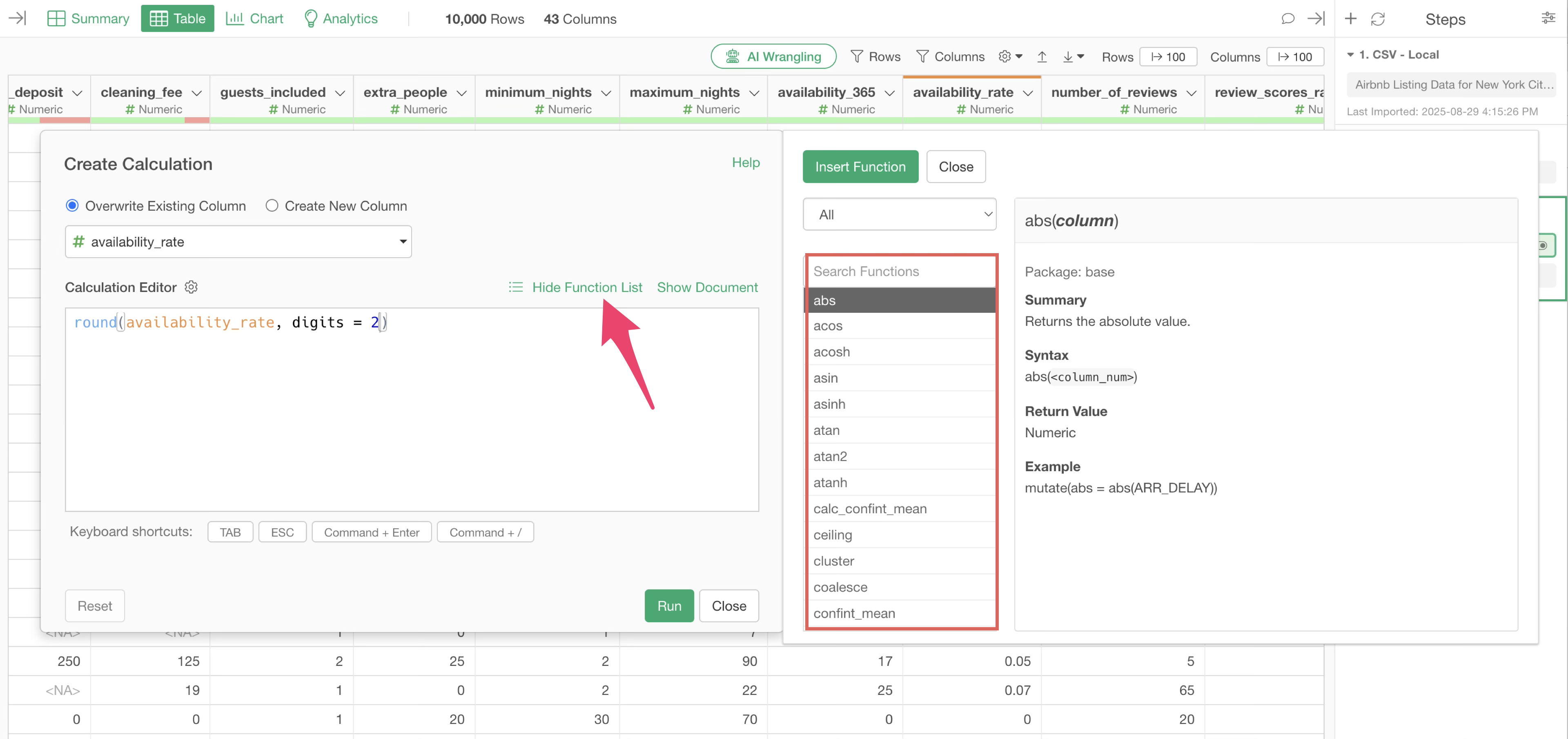
For example, if you type “round” into the search box, the
round function we just used will appear.
7. Data Wrangling Steps
As you perform these calculations and data transformations, these processes are automatically recorded as “step” on the right side.
To edit an existing step, click on the token. The corresponding dialog will then appear.
You can change the name of a step or leave comments on it by clicking the step’s comment icon.
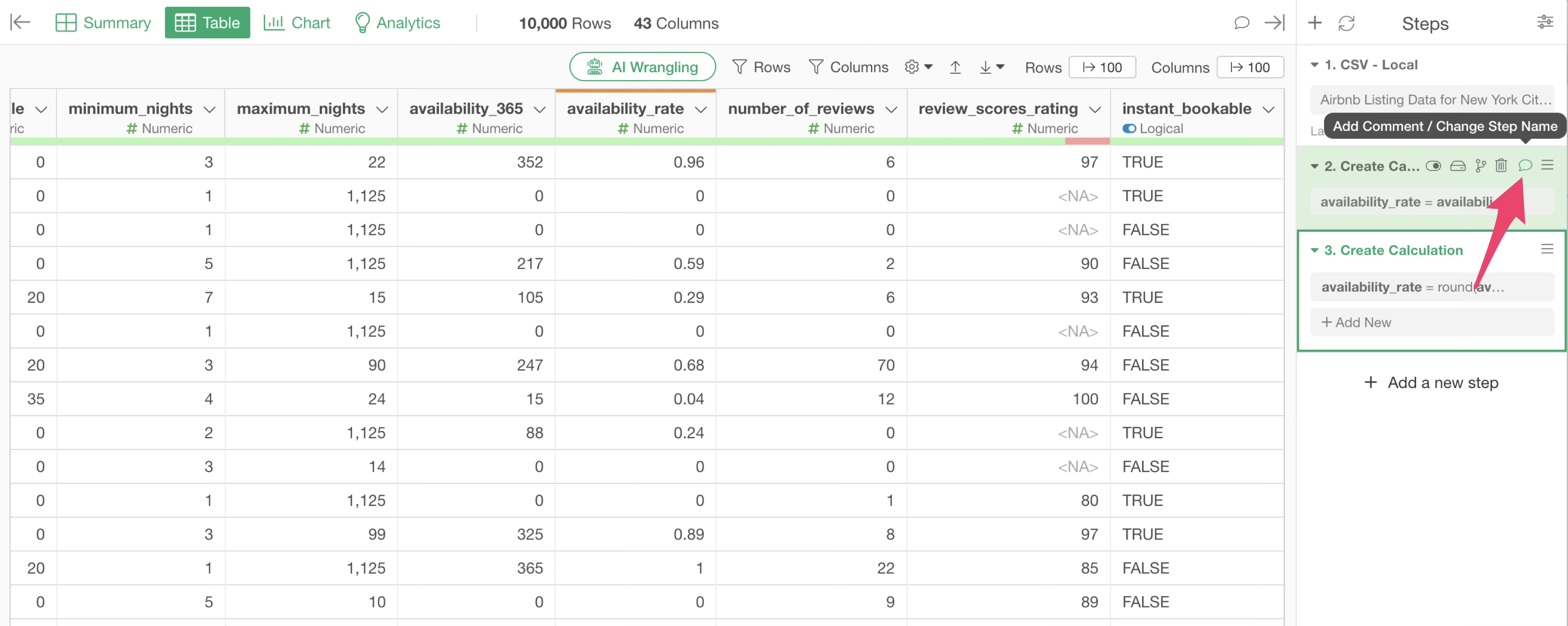
When you add a comment to a step, the comment icon for that step will be filled in green, and hovering your mouse over the comment icon will display the entered comment.
8. Chart Pin Function
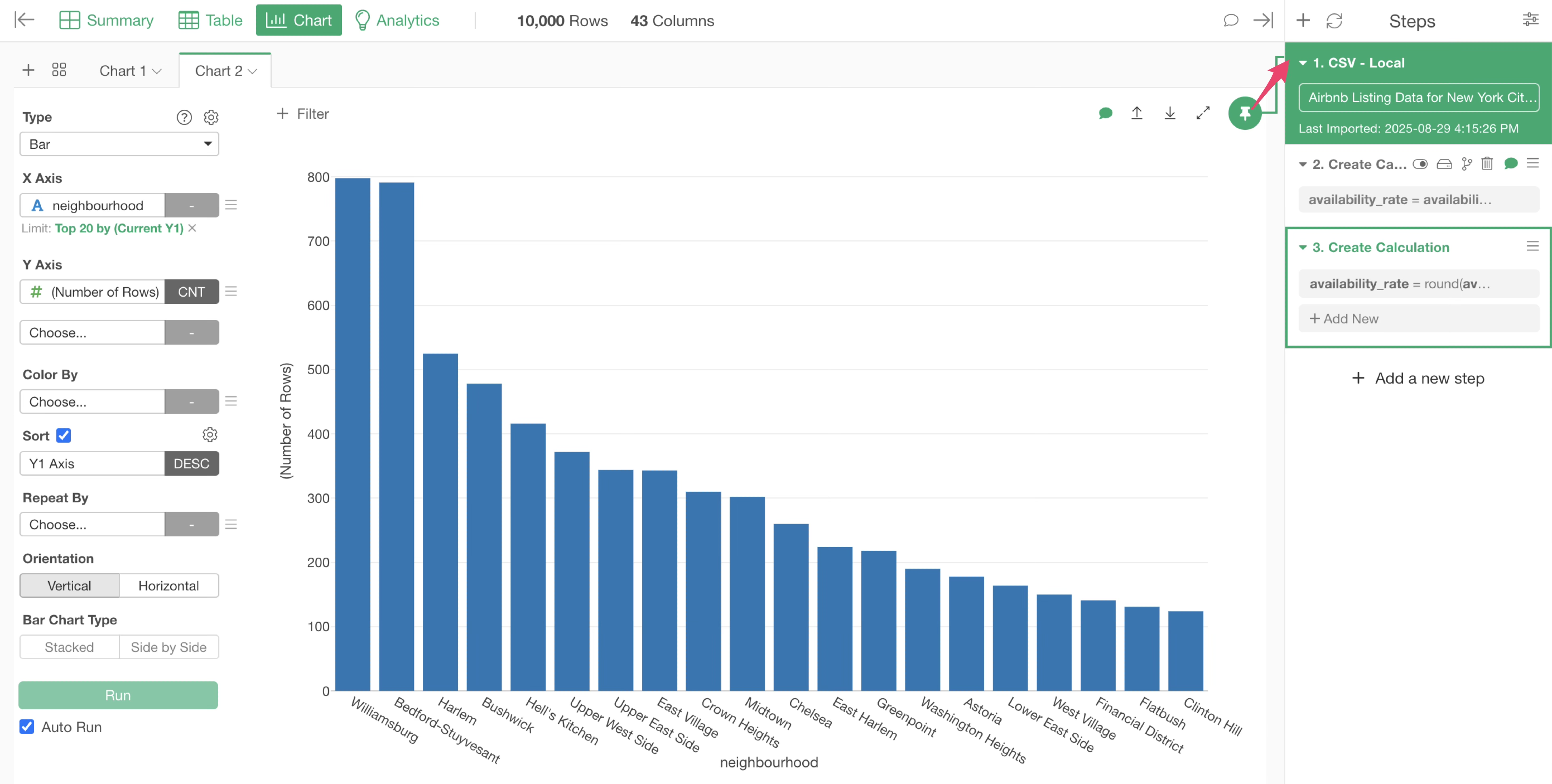
Let’s create a chart that displays the average “availability_rate” we just calculated, grouped by “neighbourhood”.
Return to the Chart View and press the +(plus) button to open another tab and re-make the bar chart you created earlier.

We want to change the Y-axis to the “availability_rate” column, but it is not displayed.
In Exploratory, there is a chart pin function, where each chart visualizes the data from the data wrangling step to which it is “pinned”.
This chart is still “pinned” to the first step. This means that the “availability_rate” column has not yet been created at this point.
Therefore, we need to move the chart pin to the third step, where “availability_rate” was calculated and rounded.
Let’s drag and drop the chart pin to the third step.
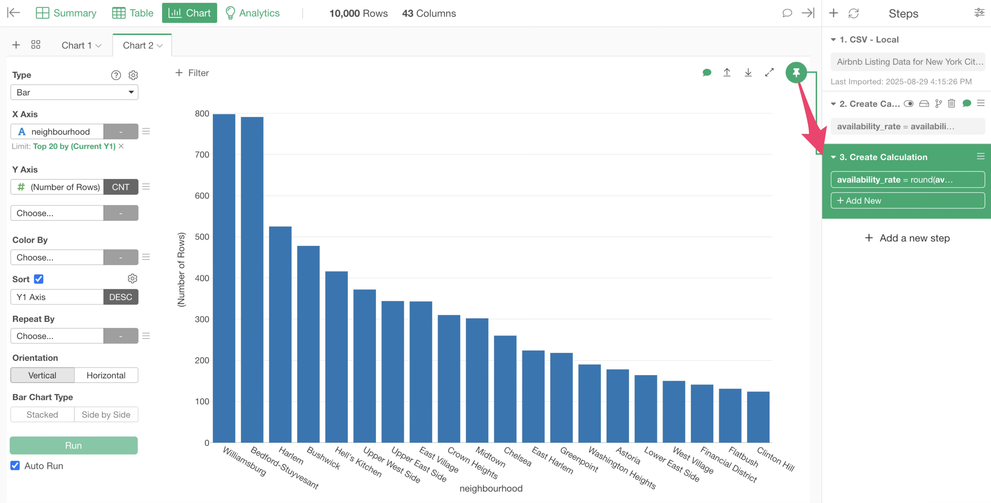
This will allow you to select the “availability_rate” column for the Y-axis. Select “MEAN” for the aggregation function.
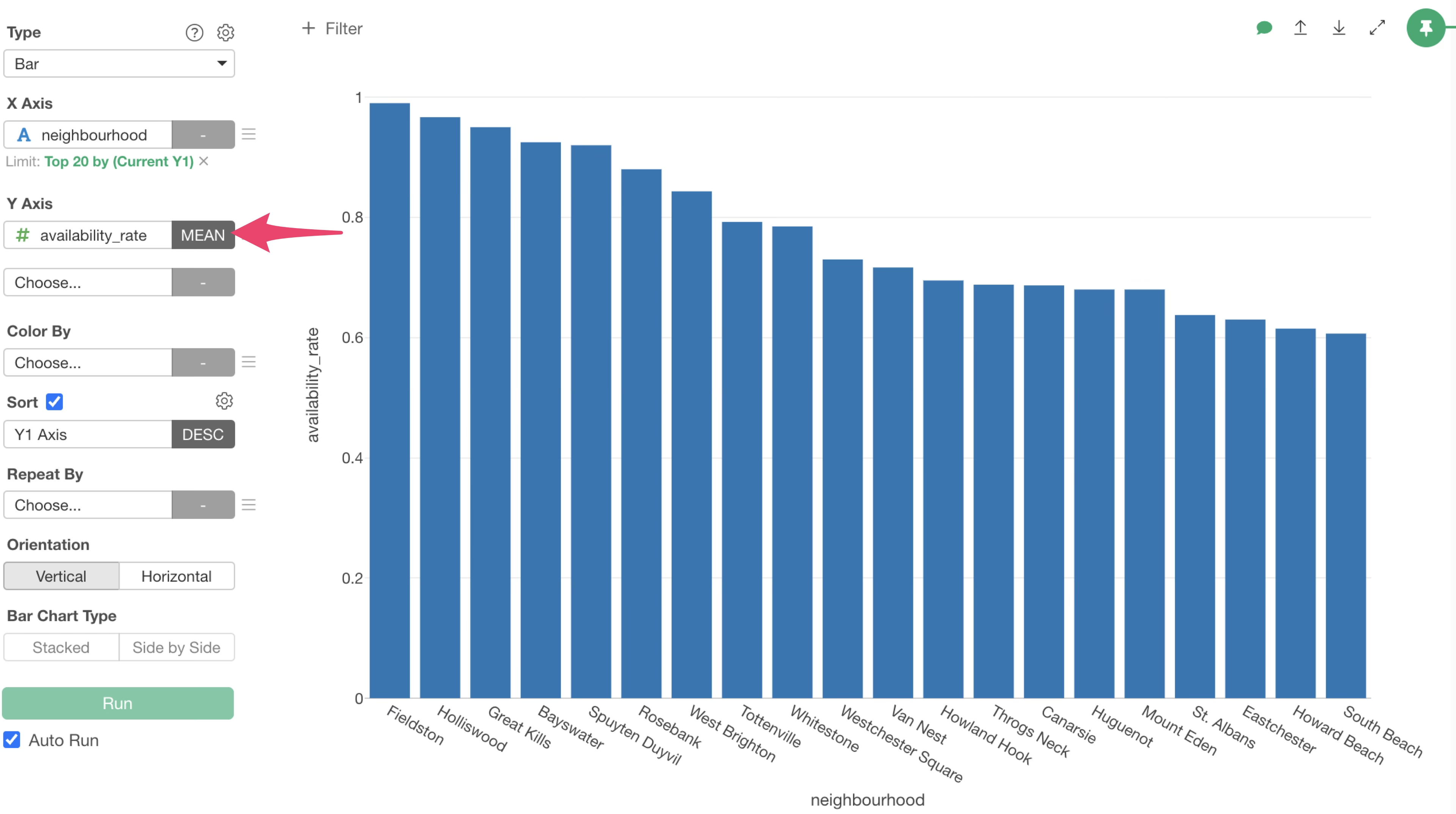
We have successfully visualized the top 20 municipalities with the highest average annual availability rate. It appears that “Fieldston” have the highest average annual available rate.

This concludes the basic guide to using Exploratory!
How to use Exploratory Series
You can find other parts of the Exploratory Usage Series via the links below. Please try the next part on “Visualization”.