How to Use Exploratory Part 2 - Visualization
This note is the second part of “How to Use Exploratory” series, designed to help you start using Exploratory efficiently, focusing on “Visualization.”
It is designed to help you learn useful features for quickly discovering hidden patterns in data using charts in Exploratory, by working hands-on with sample data.
The estimated time to complete this is about 20 minutes.
Let’s get started!
1. Import Data
We will use sample data of “Airbnb Listing Data for New York City” data. You can download the data from here.
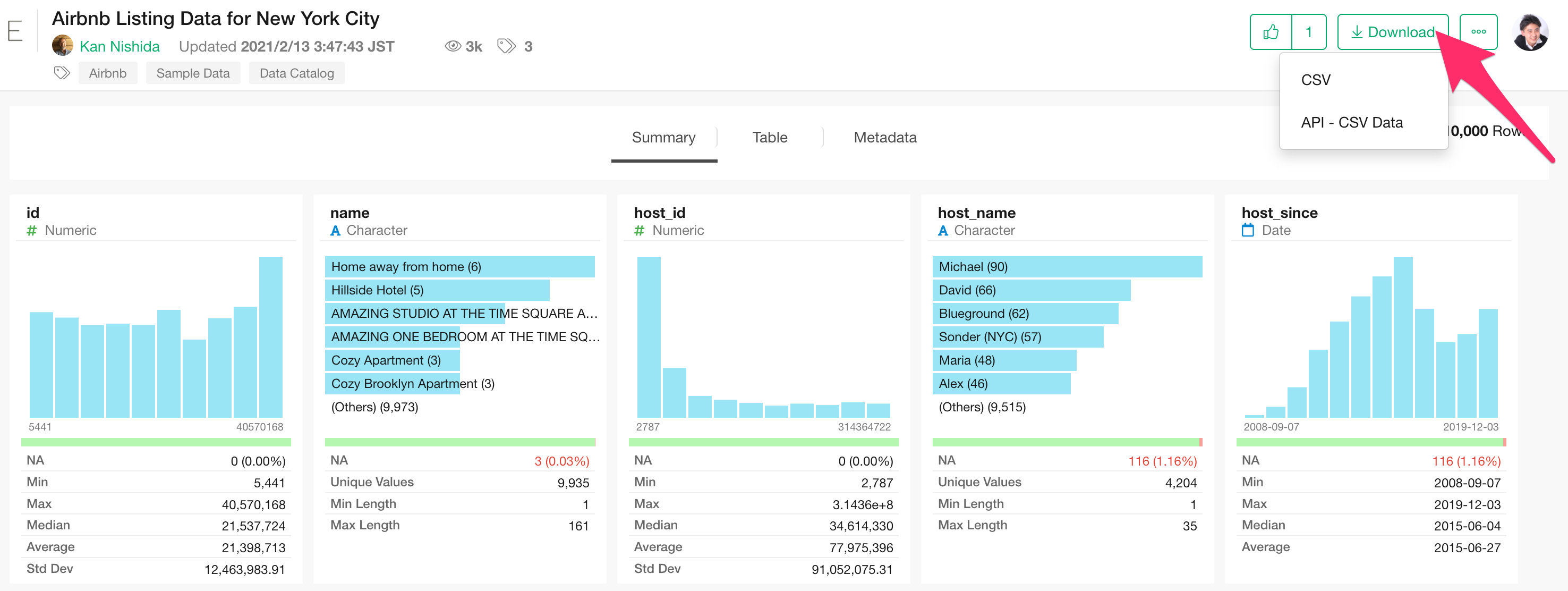
In this dataset, each row represents one property, and columns contain information such as price and accommodates for each property.
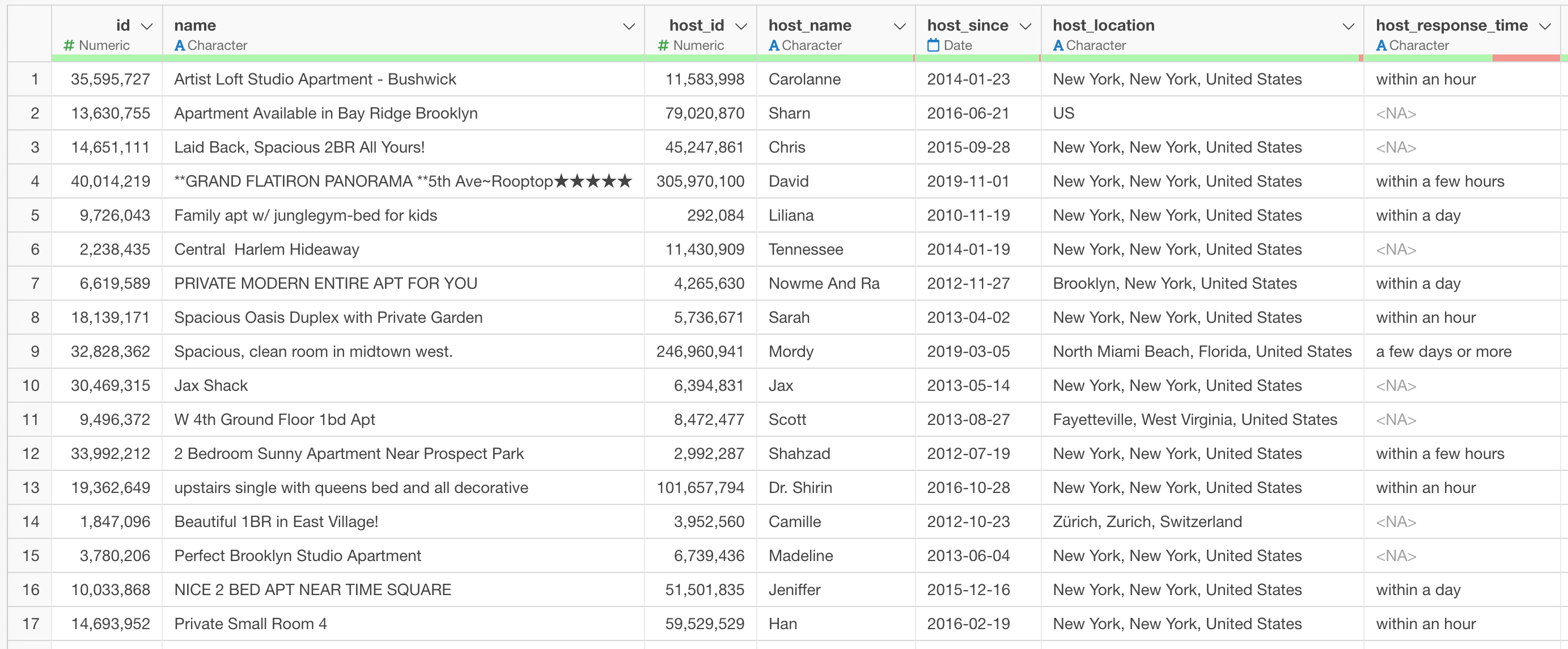
Once the data is downloaded, open the download folder and drag and drop “Airbnb Listing Data for New York City.csv” into the Exploratory window.
A dialog for importing data will open.
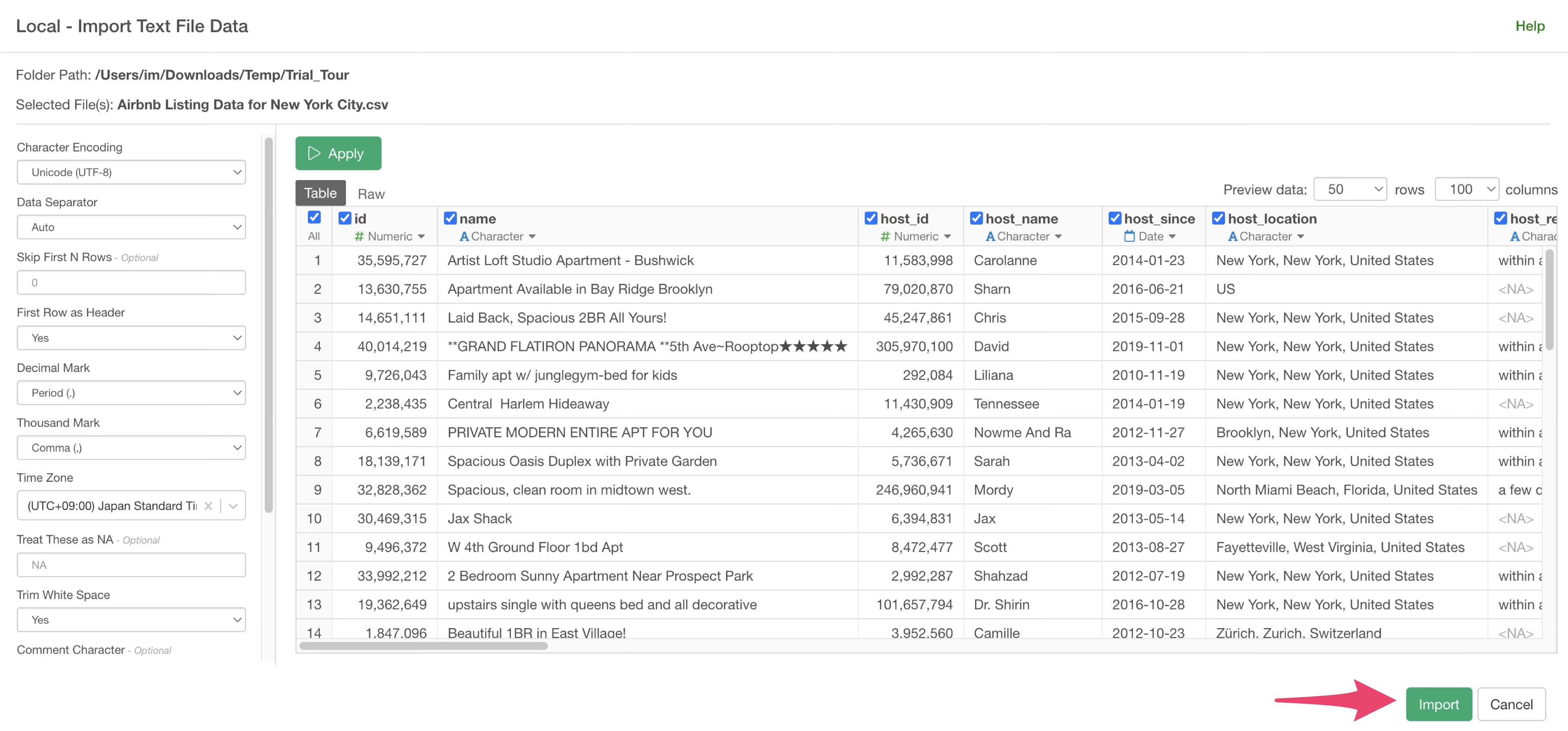
On the left side of the data import dialog, you can configure various settings for how the data is read during import, but for now, simply click the “Import” button.
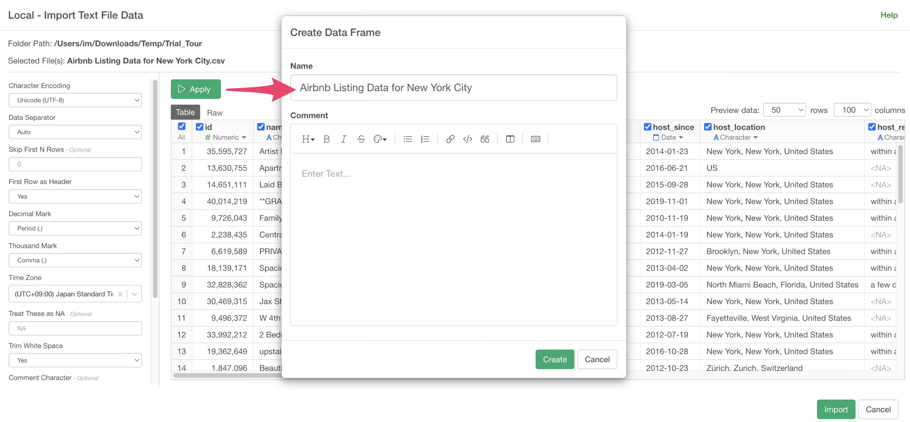
Specify a data frame name and click the “Create” button.
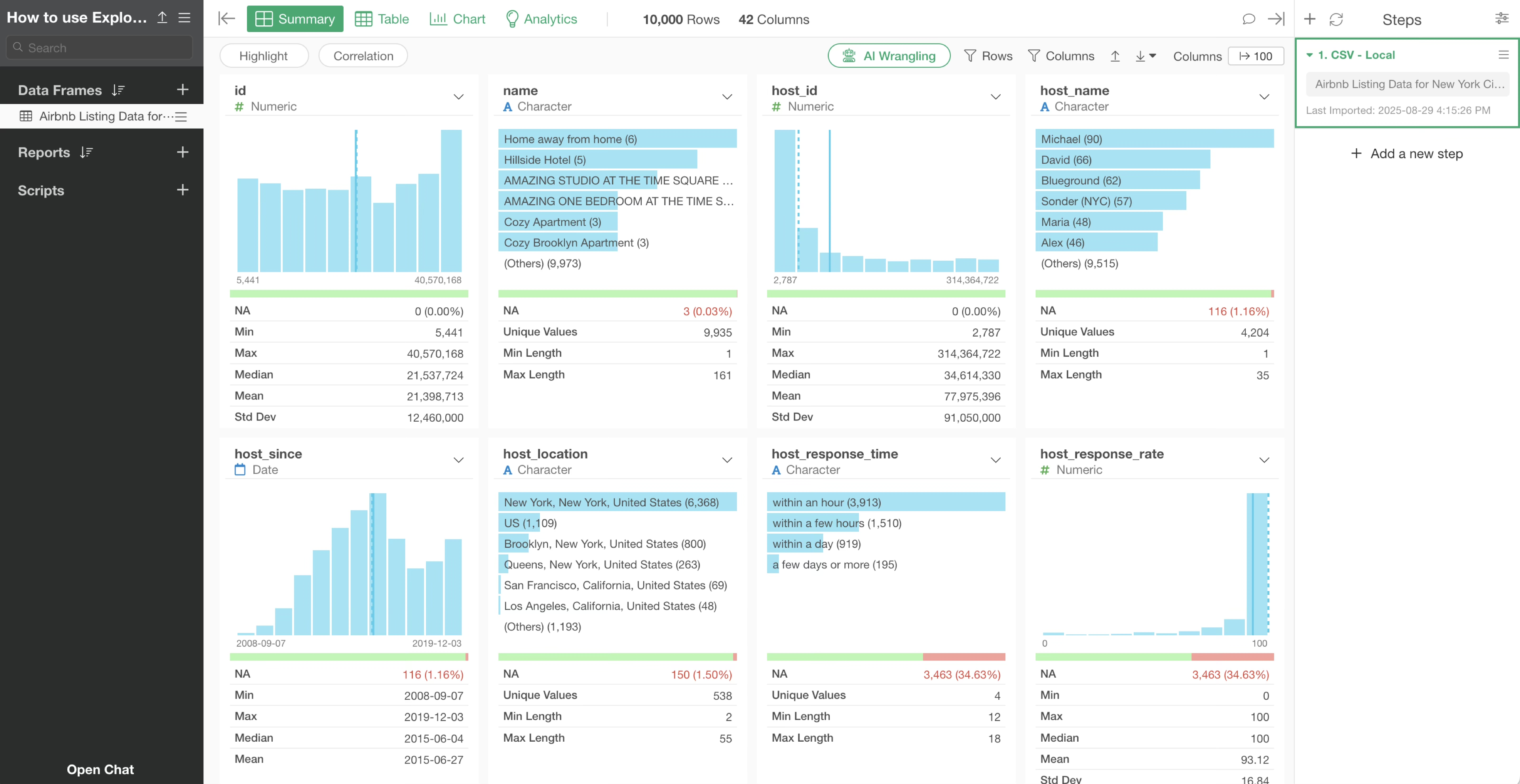
Once the data is imported, the Summary View will be displayed, allowing you to quickly overview the data.
2. Visualize Trends in Time Series Data
Time series data refers to data measured over periods or time units, such as daily user sign-up counts or weekly sales data. Here, we will use Exploratory to quickly visualize such data with charts.
This time, we want to visualize and investigate how much the number of properties has increased each year and month.
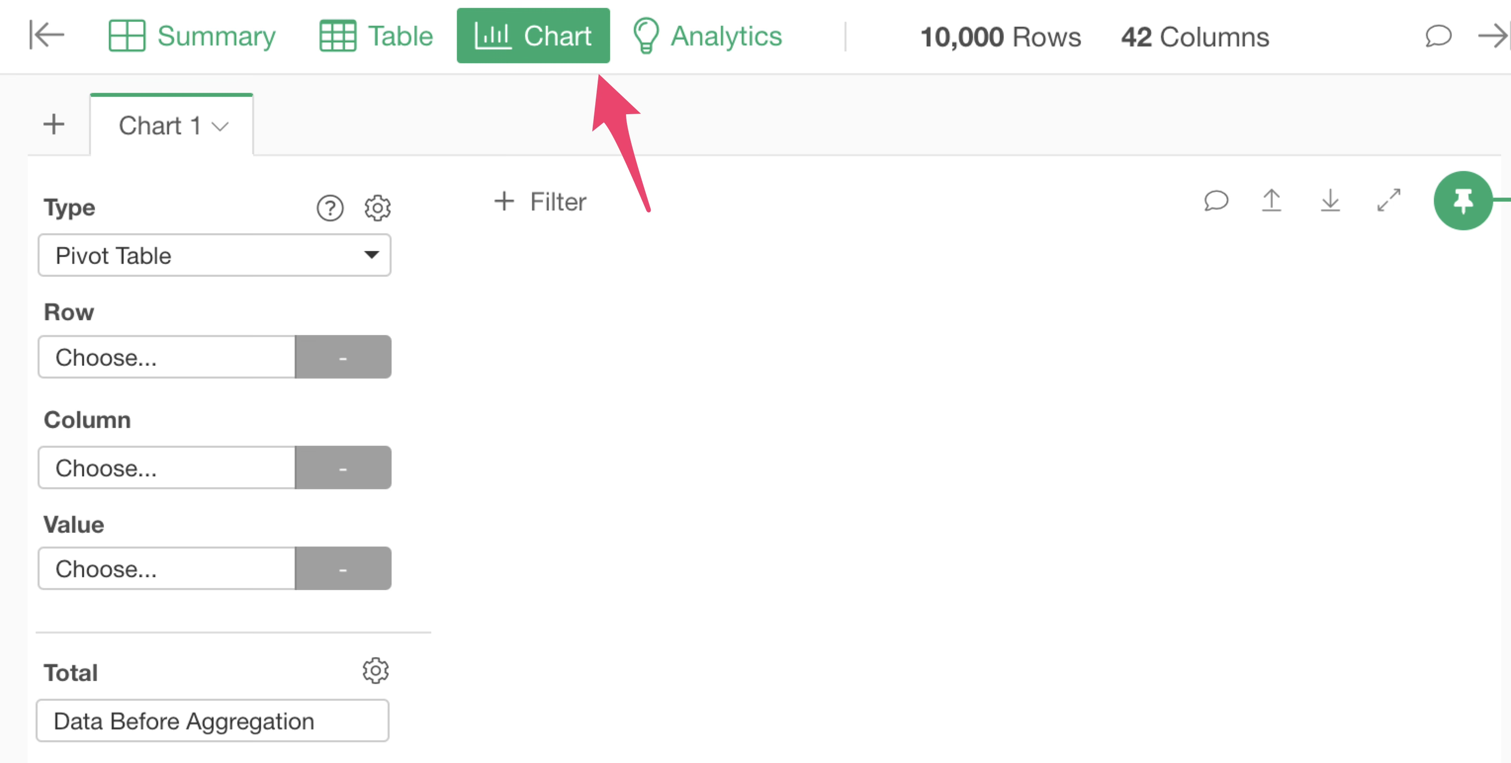
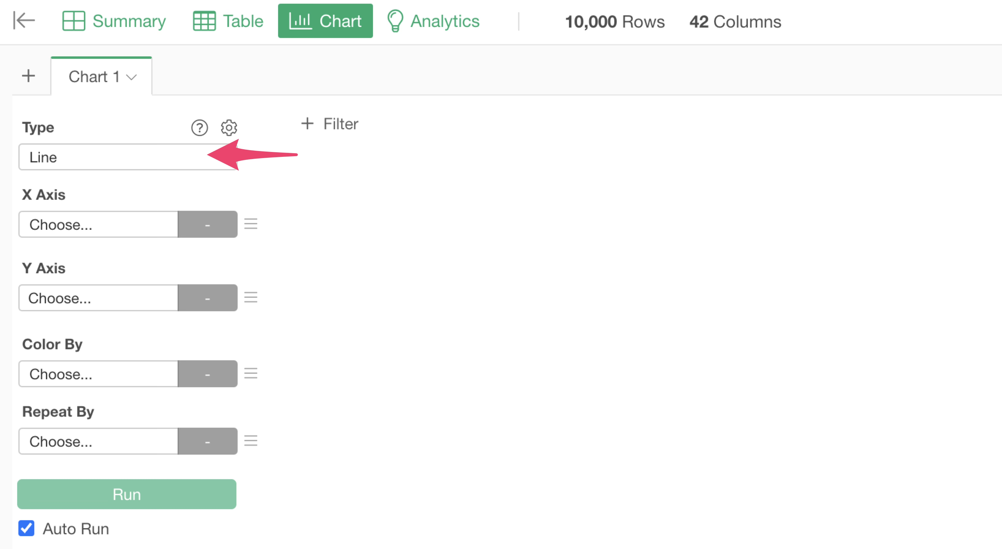
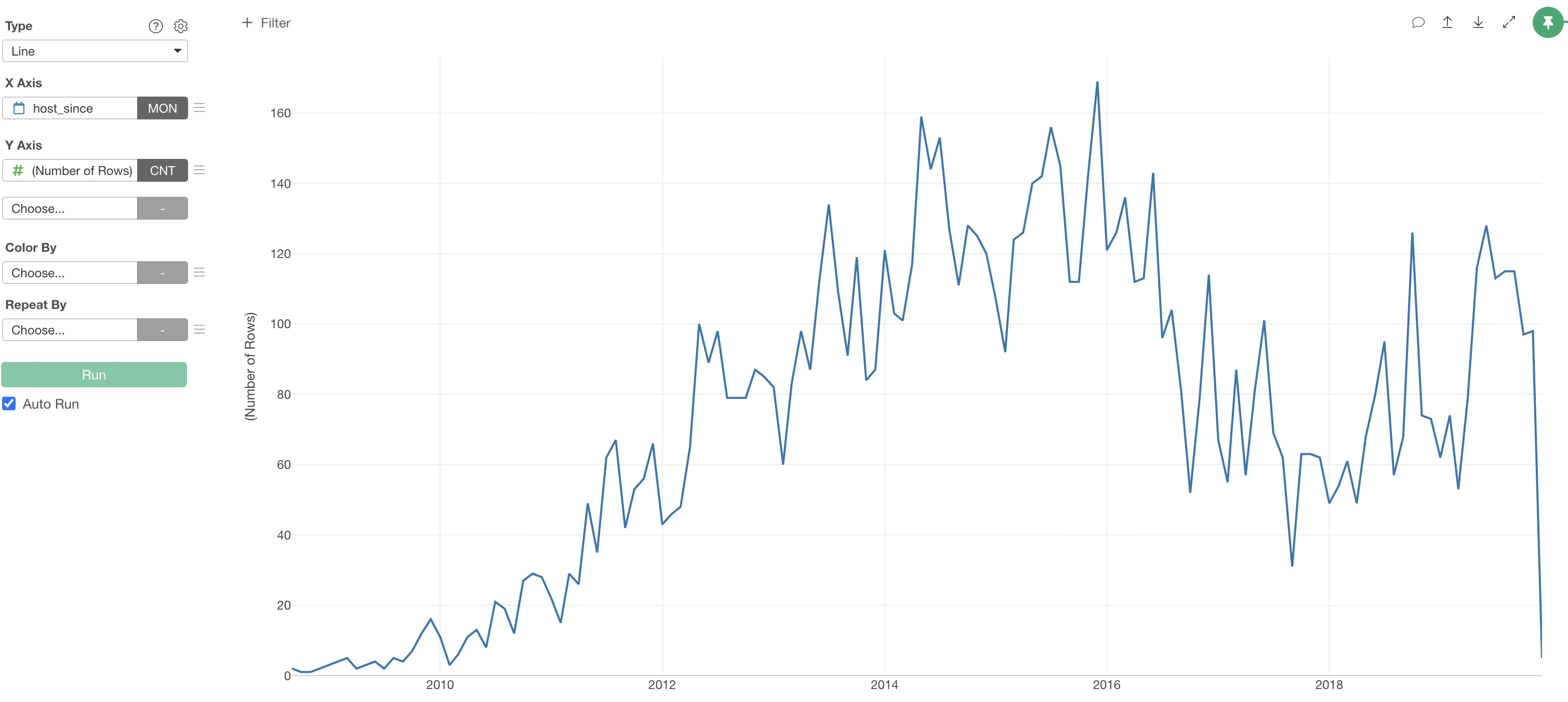
To create a chart, open the Chart view.
To understand trends in time series data, “direction” is important, and a “line” chart is often used because it makes it easy to determine whether the trend is upward or downward.
Therefore, select “Line” as the chart type.
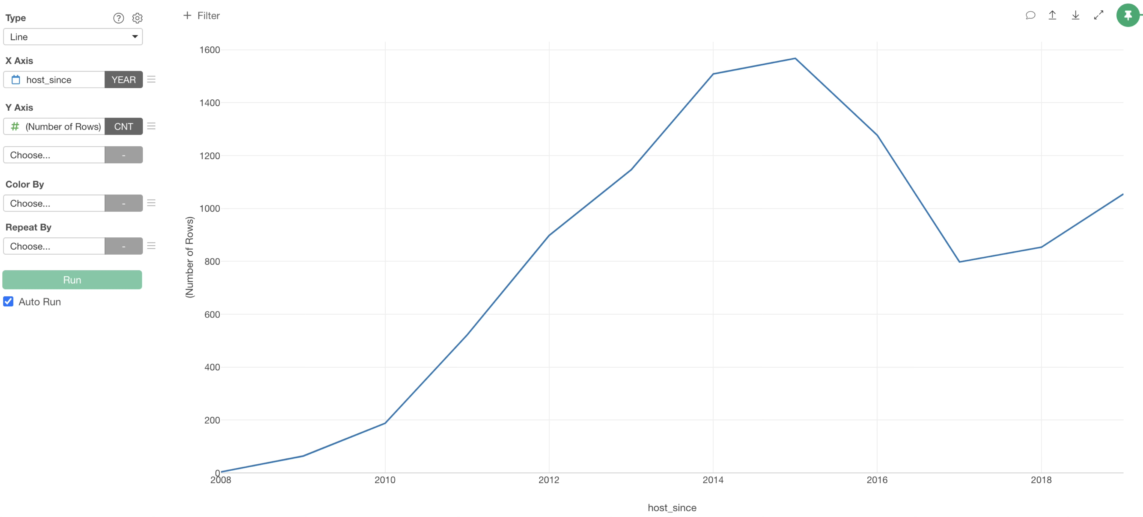
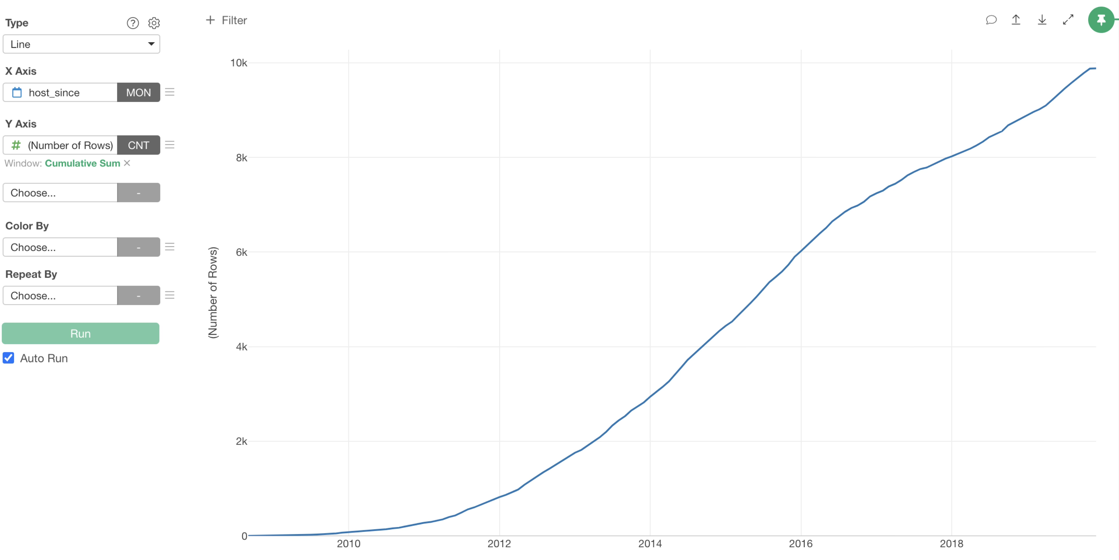
Next, select “host_since” for the X-axis and “Number of Rows” for the Y-axis to visualize the number of properties.
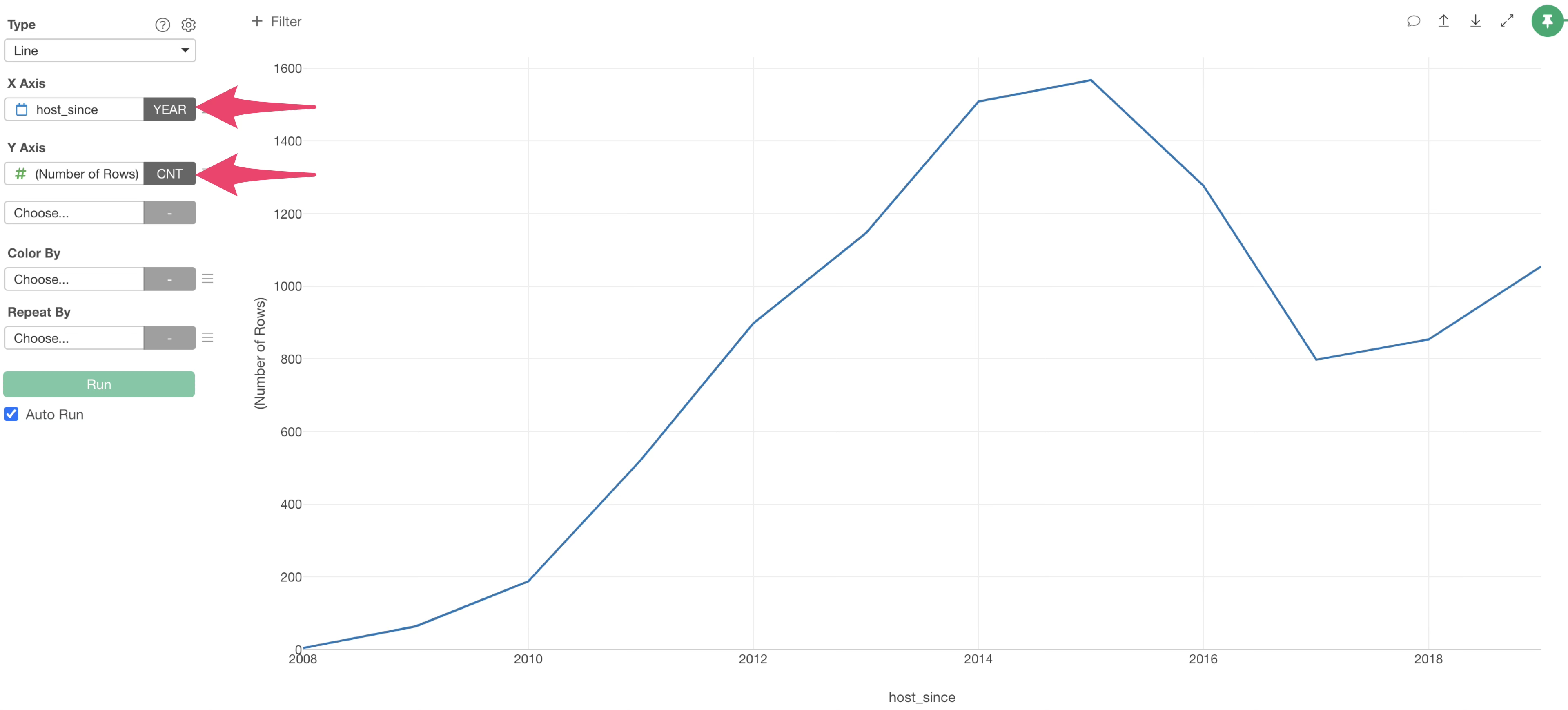
This allowed us to visualize the number of properties by year. By looking at this chart, we can confirm that the number of properties has been decreasing since around 2015.
Change Date Unit
In Exploratory, for “Date” or “Date/Time (POSIXct)” columns, you can easily change the date unit within the chart. There is no need for tedious pre-aggregation work to match the day unit.
Currently, the data is visualized in “Year” units, but if you want to change this to “Month” units, change the date unit on the X-axis to “Month”.
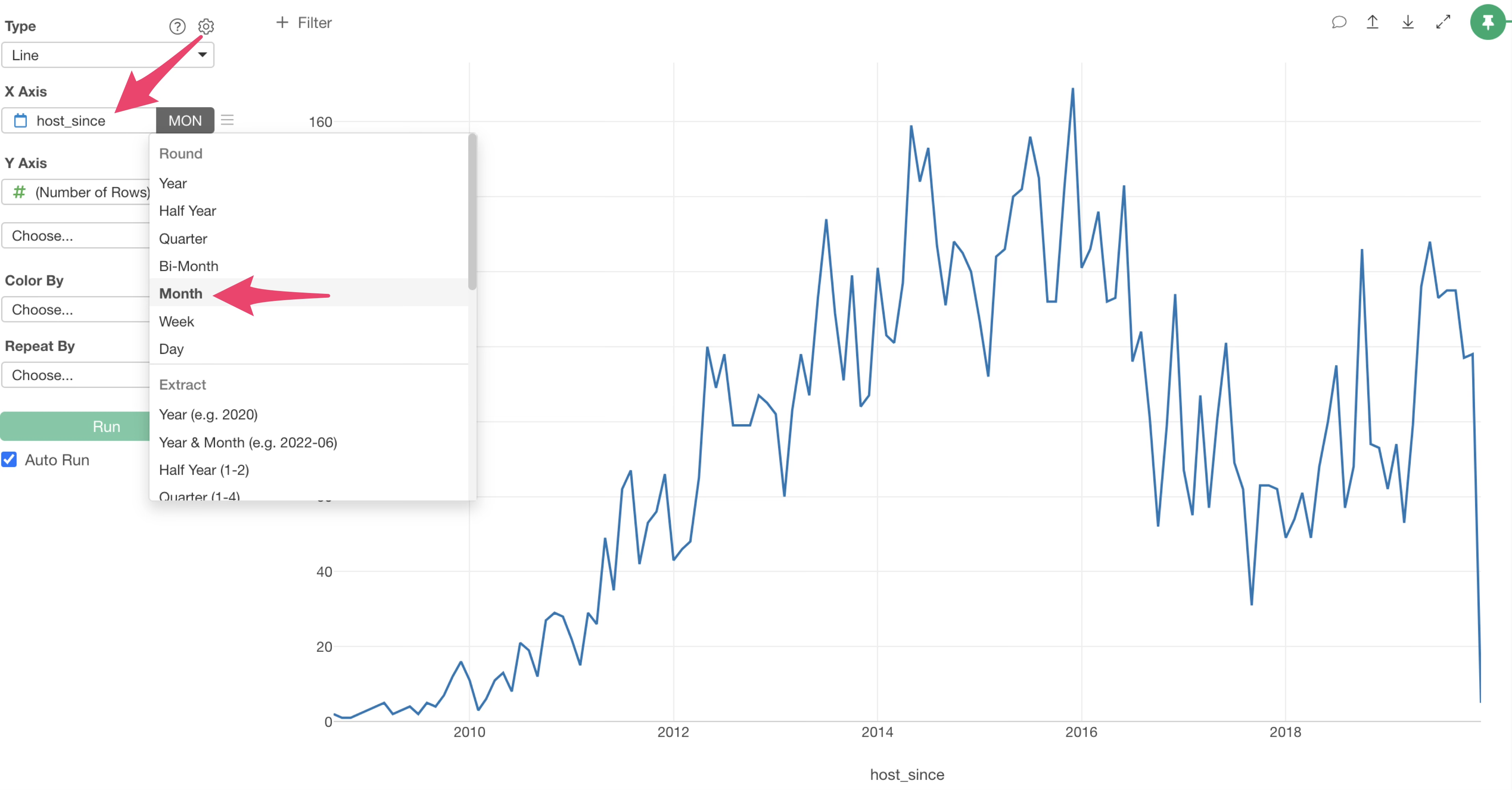
We were able to visualize the number of properties by month, allowing us to see a more granular trend compared to the previous year-by-year view.
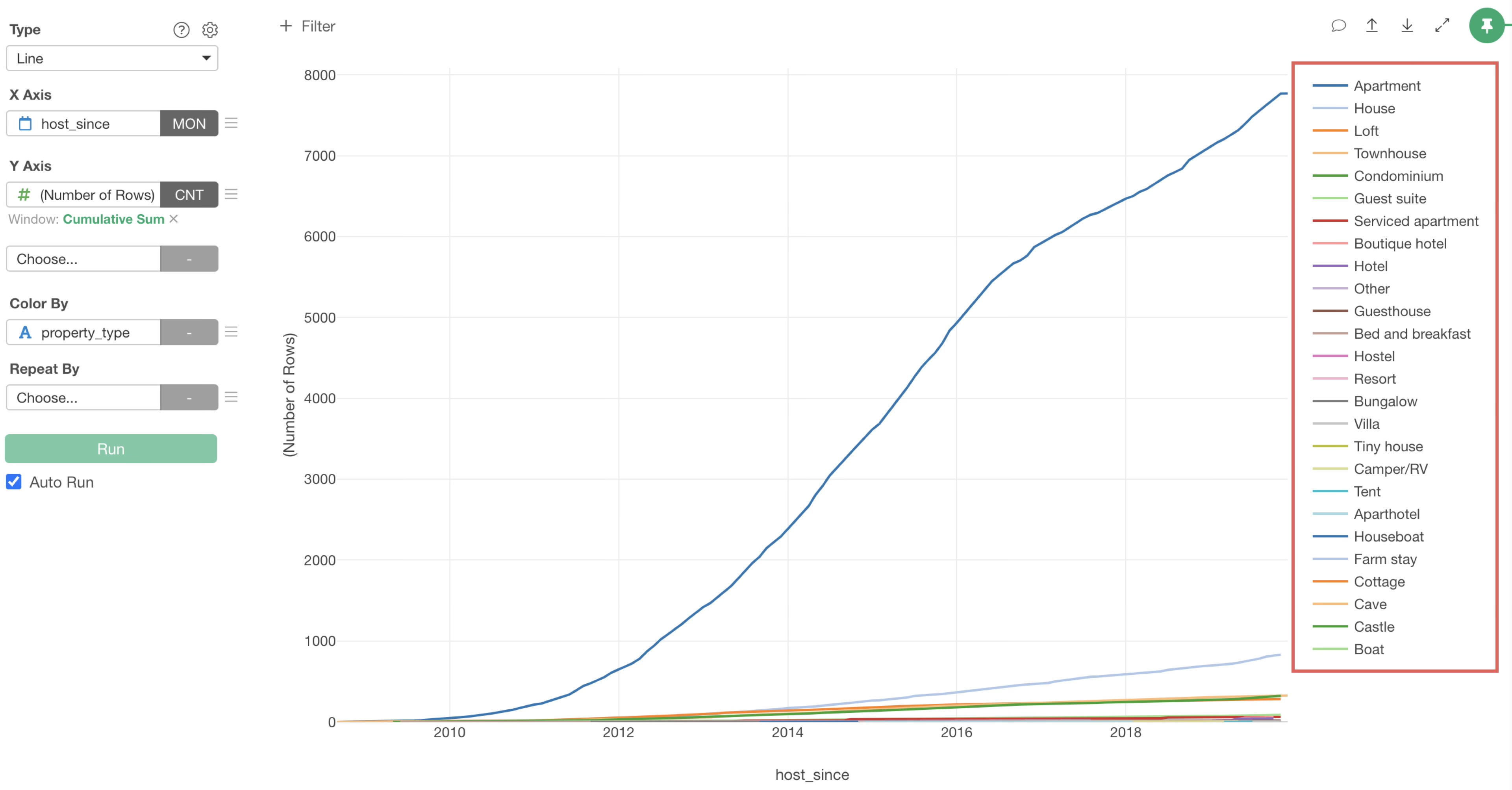
Visualize Cumulative Sum
The current chart visualizes the number of properties registered each month, but what was the total number of properties as of 2015?
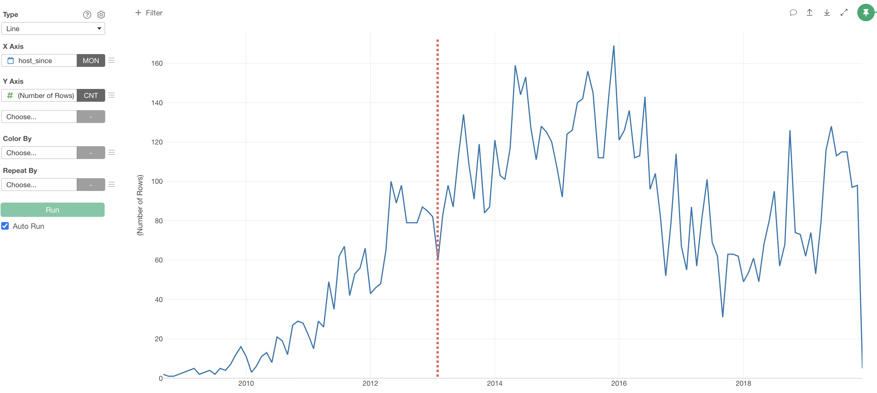
To answer that question, we need to visualize the total number of properties up to “a certain point” rather than the number of properties for each month.
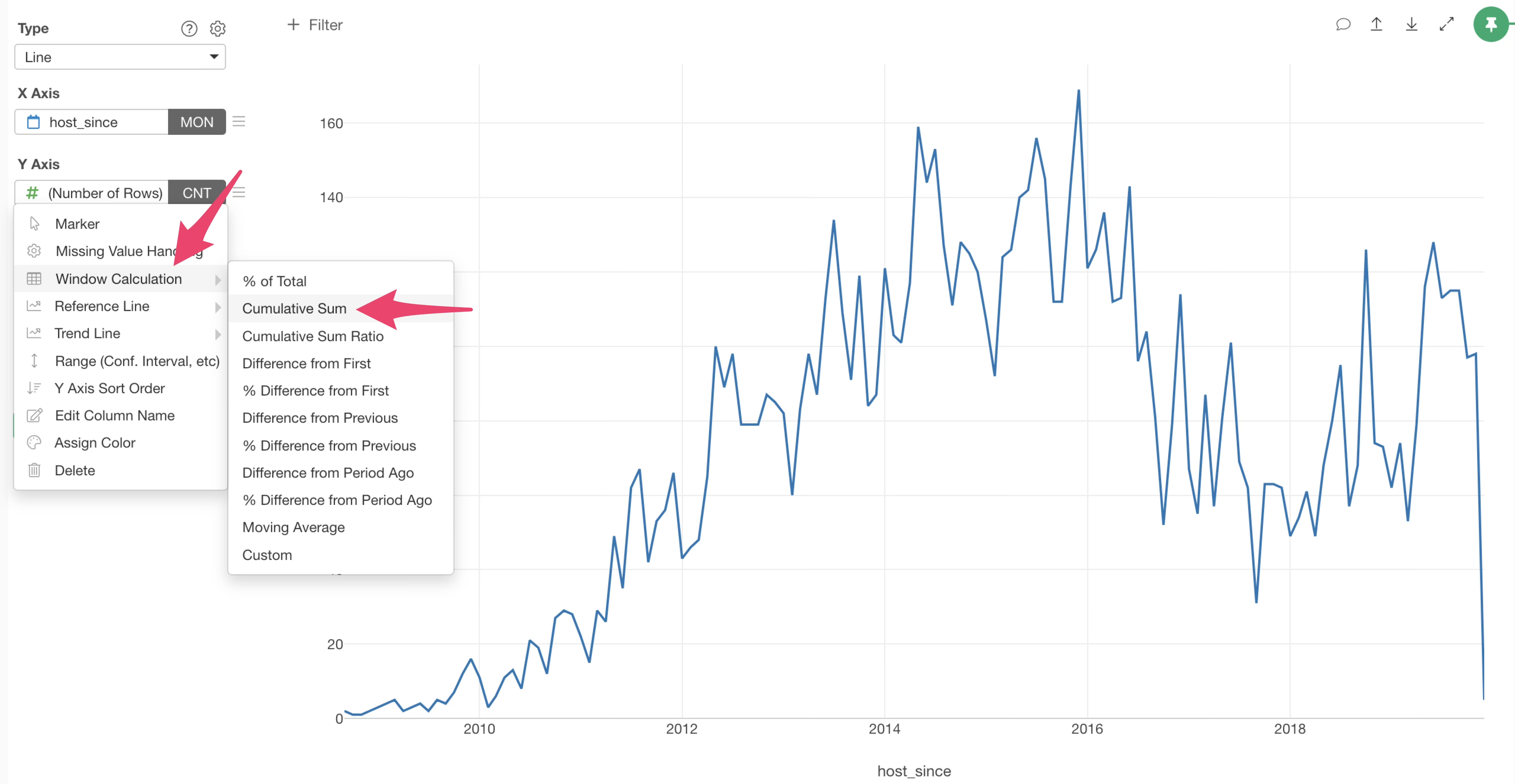
Click the Y-axis menu.
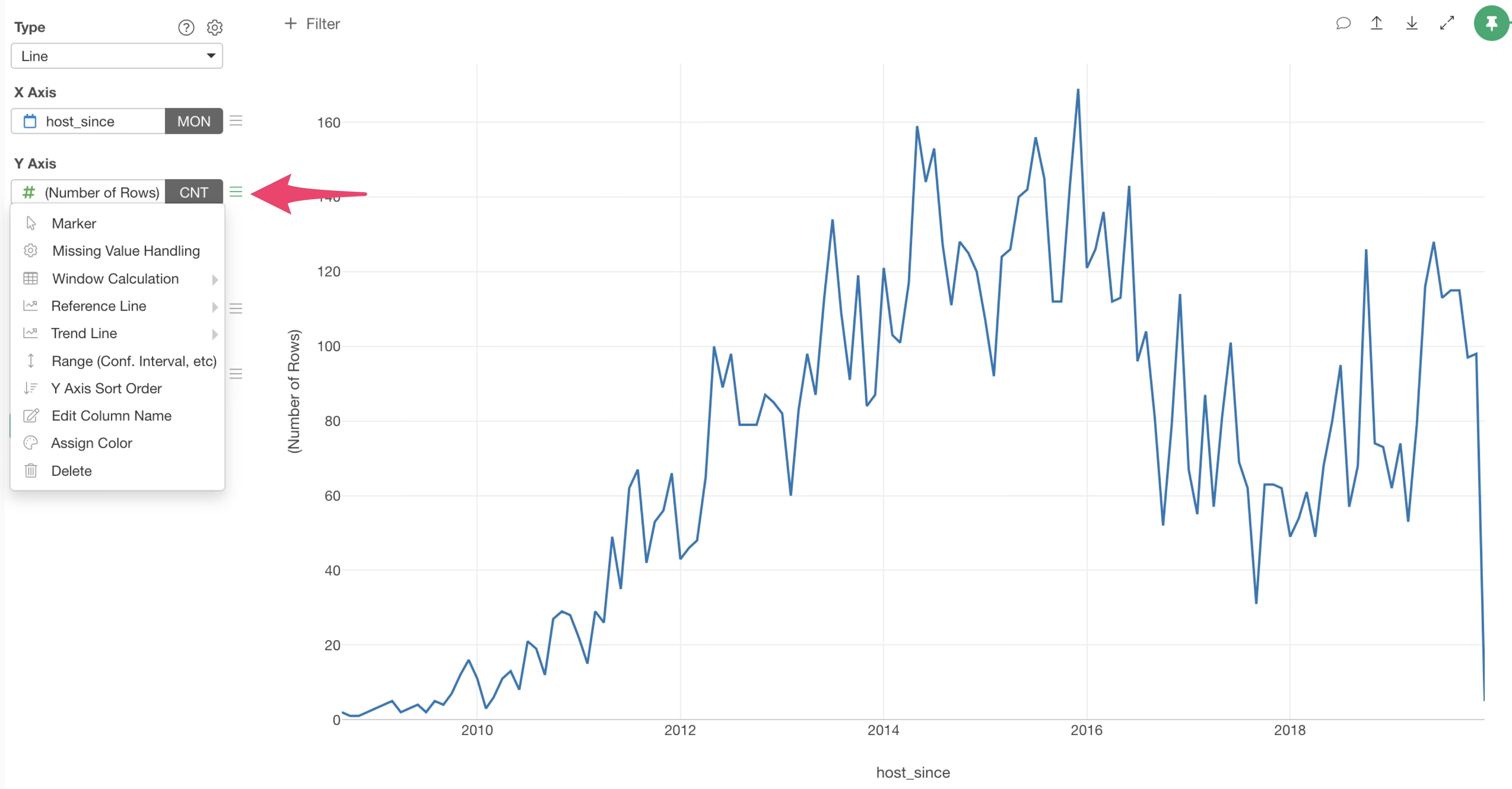
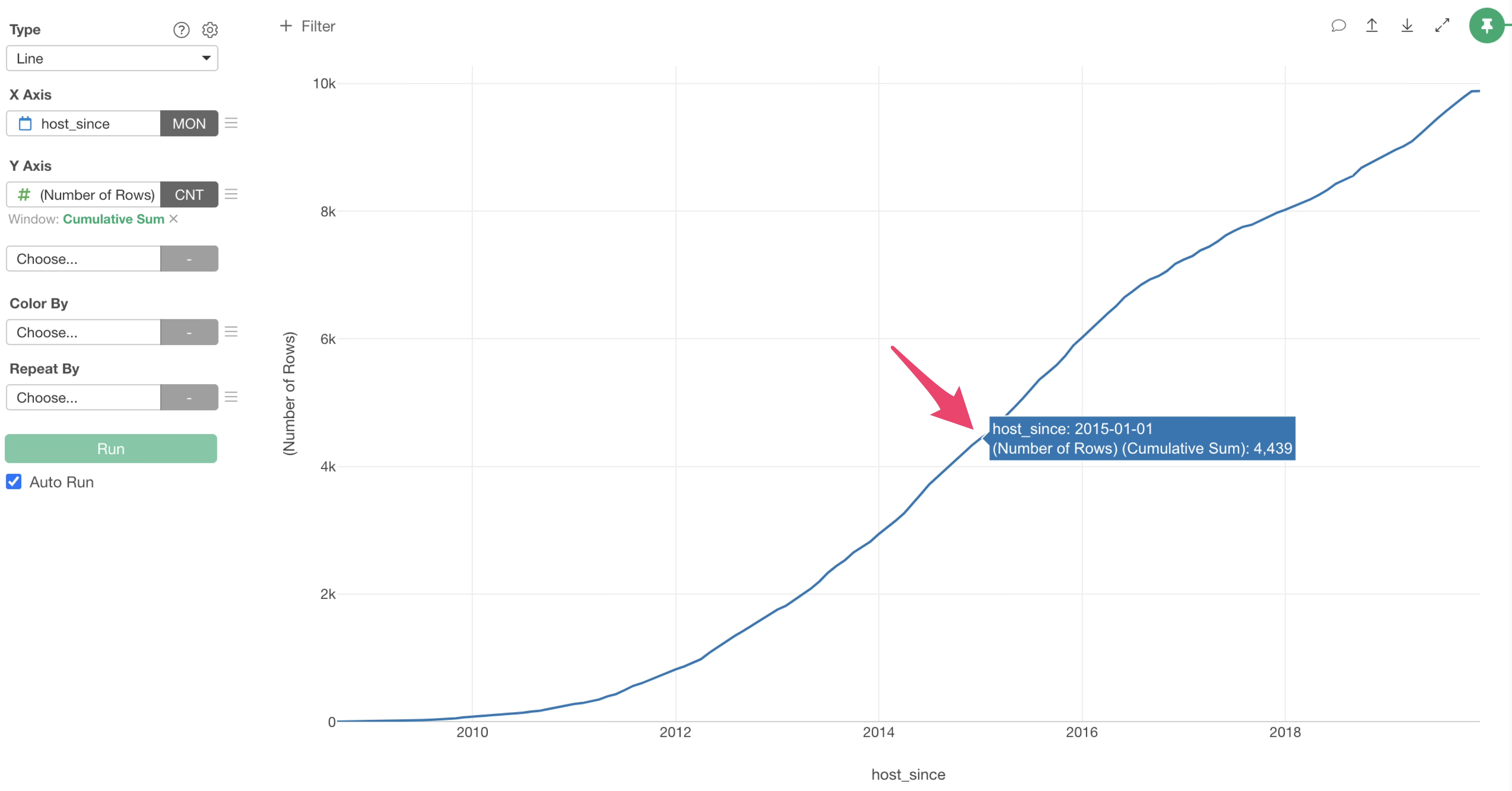
From the “Window Calculation” in the menu, select “Cumulative Sum”.
We were able to visualize the increase in the number of properties as a cumulative sum.
It is clear that there were 4439 properties as of January 2015.
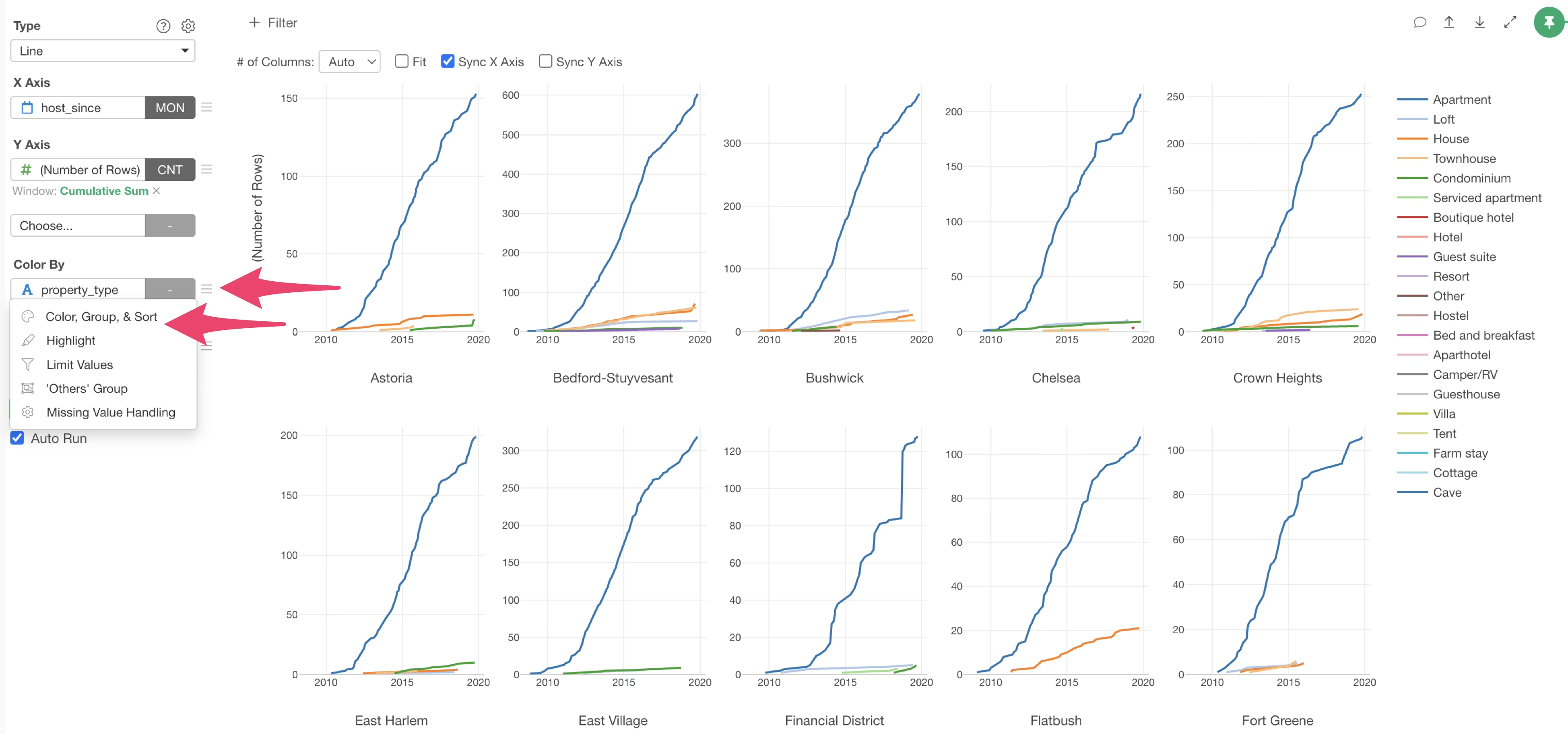
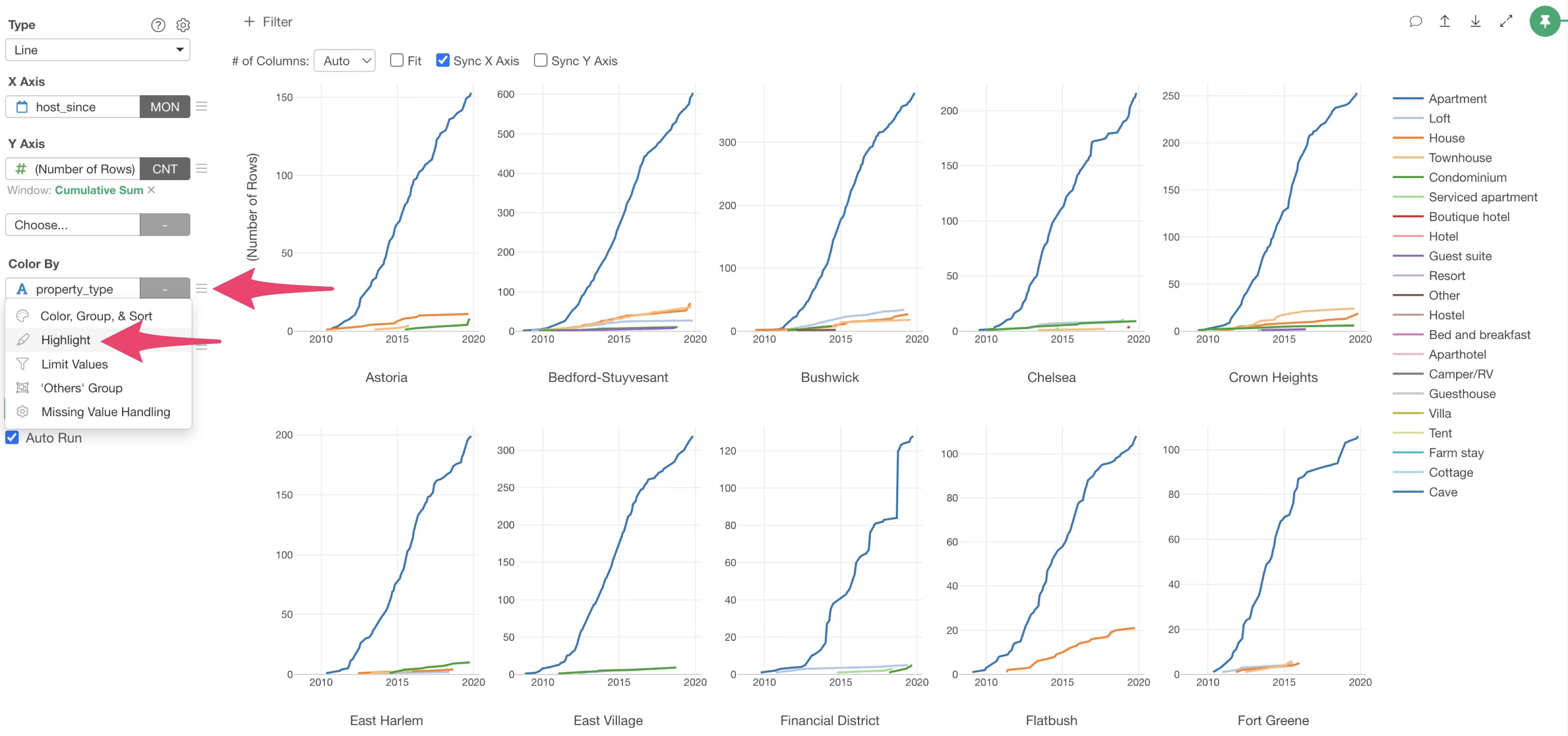
Grouping by Color
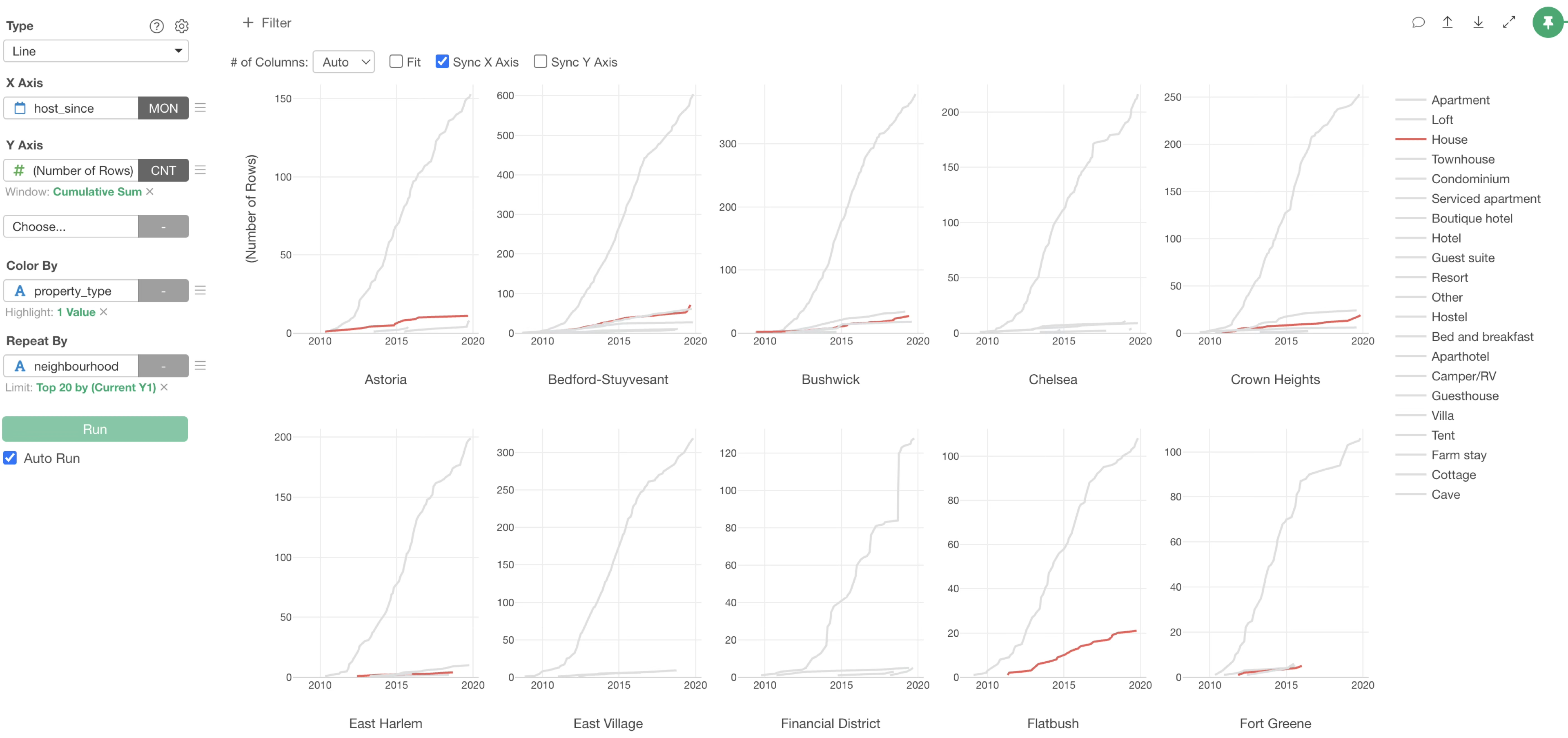
Let’s divide the lines representing the number of properties by “property_type” (e.g., Apartment).
Select “property_type” for “Color By”.
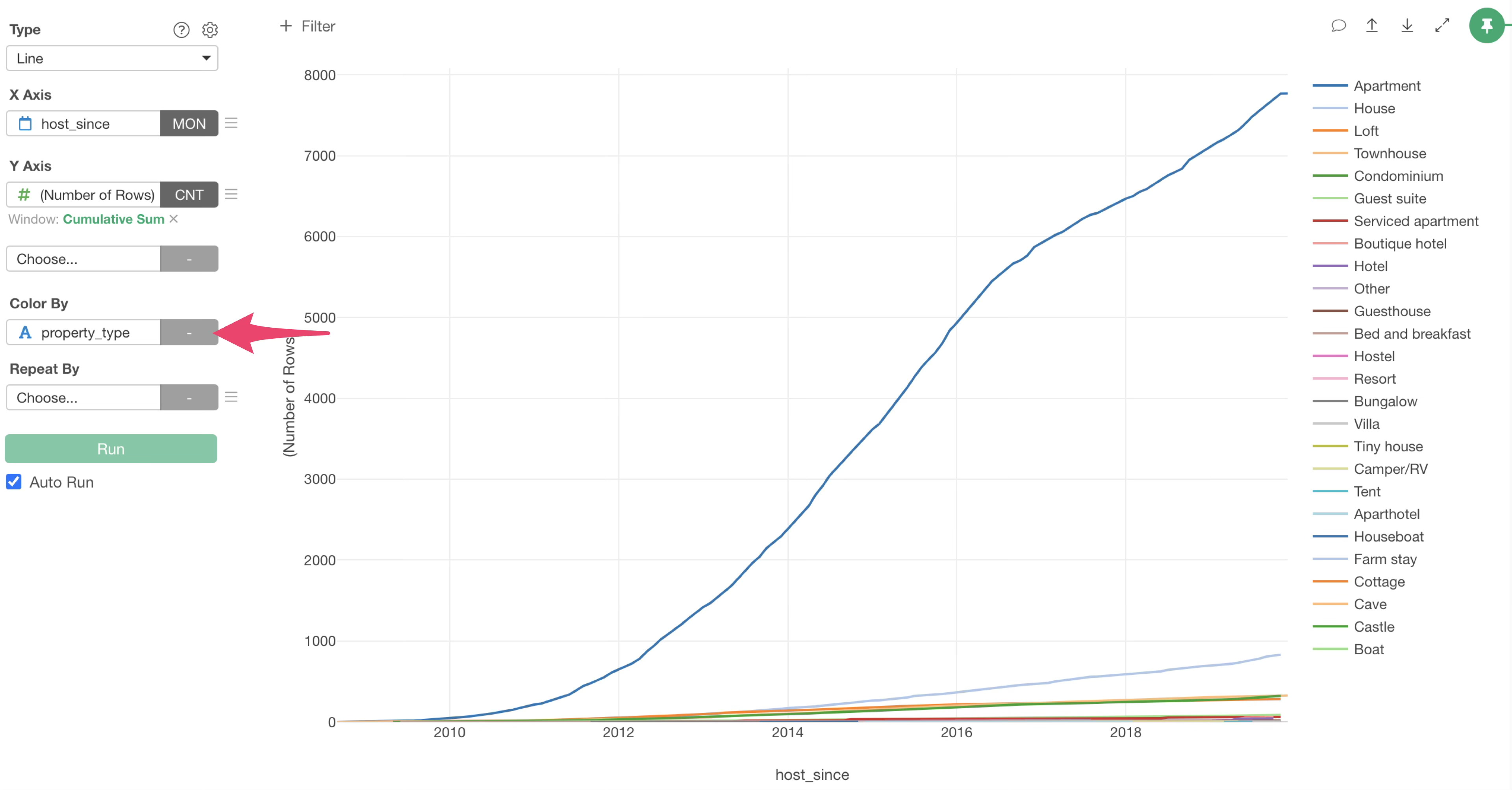
This allowed us to visualize the lines representing the number of properties, colored by property type.
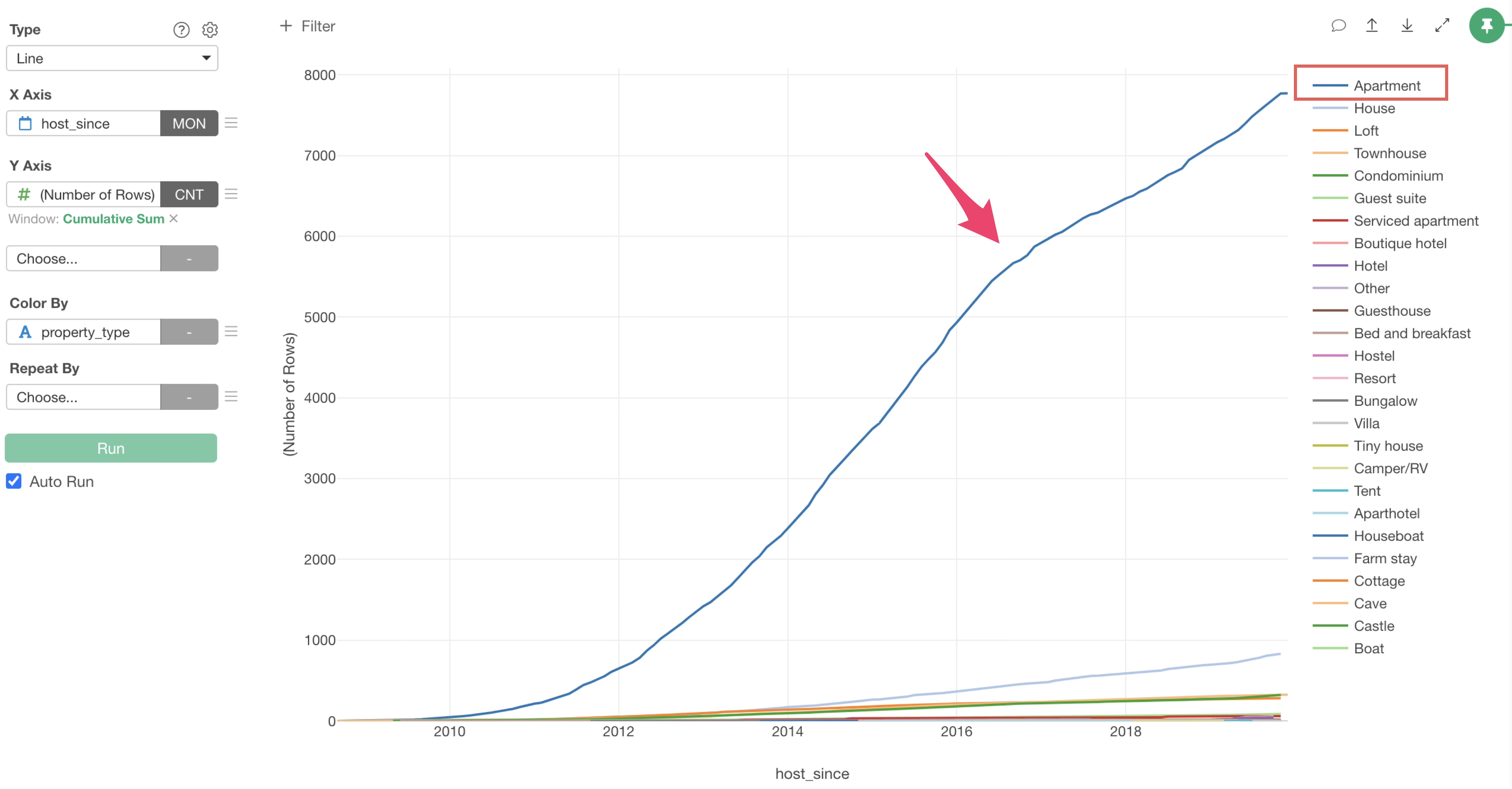
“Apartment” is the room type with the highest number of properties, and it can be seen that the increasing speed is getting slower around 2017.
By the way, the order of colors is arranged according to the “Y-axis value order”.
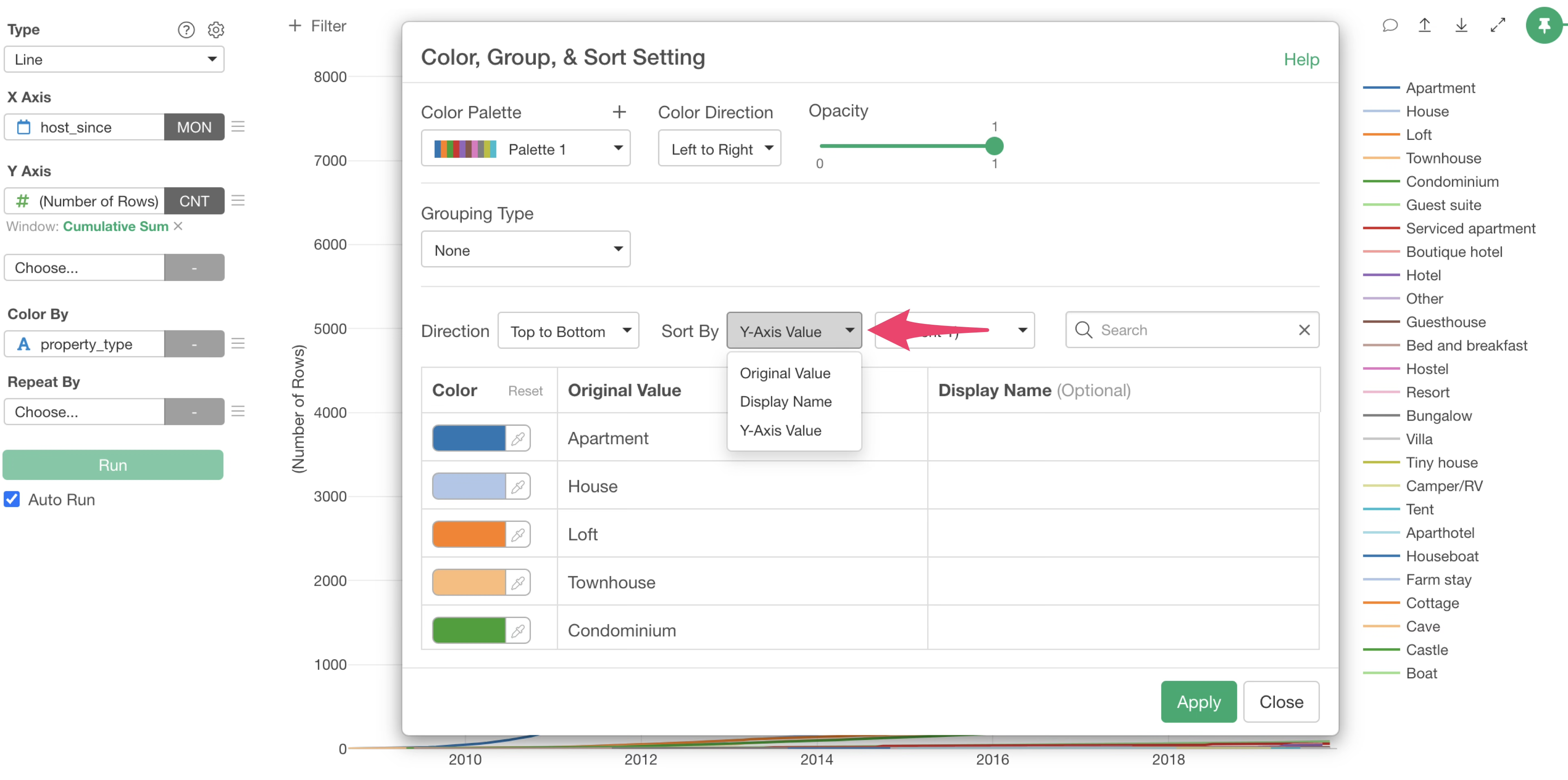
If you want to change the order of colors, click the “Color By” menu and select “Color, Group, Sort Order”.
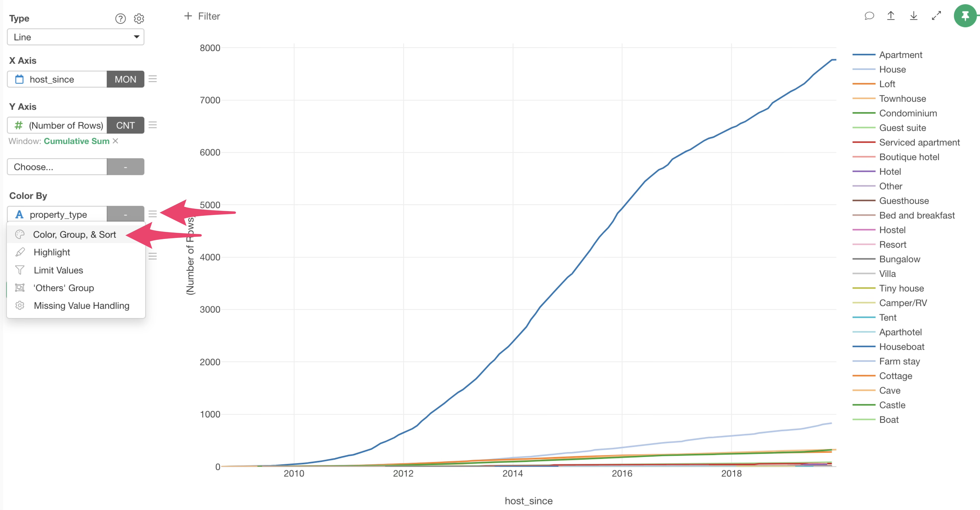
The “Color, Group, Sort Order” dialog will appear, allowing you to change the order of colors.
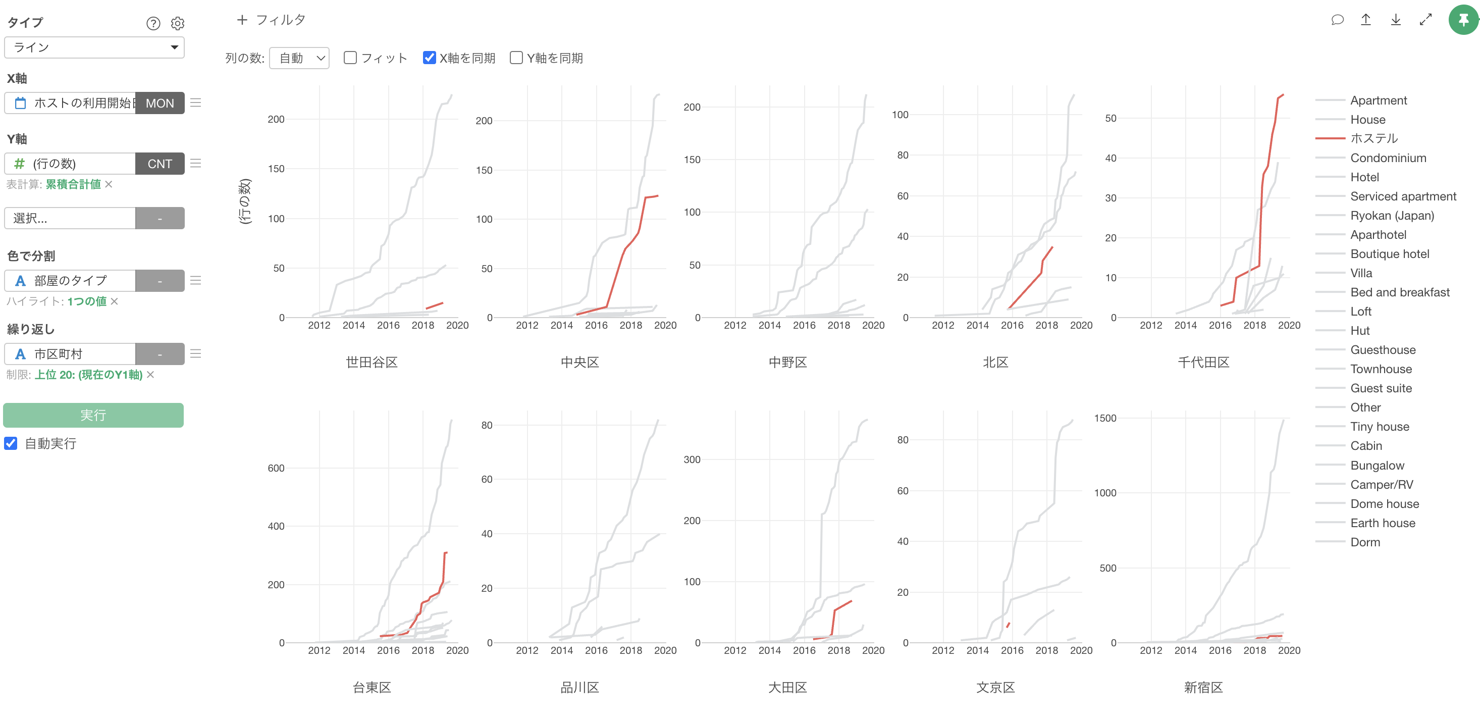
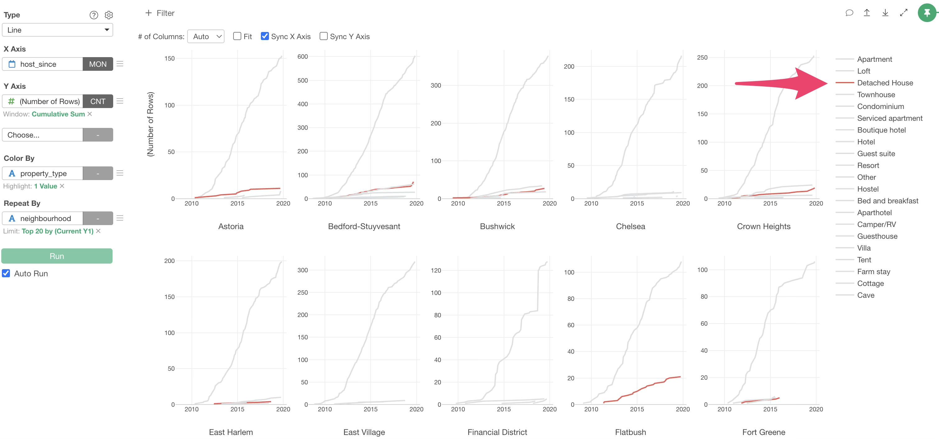
Split Chart by Repeat by
Do all neighbourhood follow the same trend as before, with apartments being the most common type and increasing since 2014? Or do some neighbourhood show different patterns?
To investigate this, let’s visualize the charts separated by “neighbourhood”.
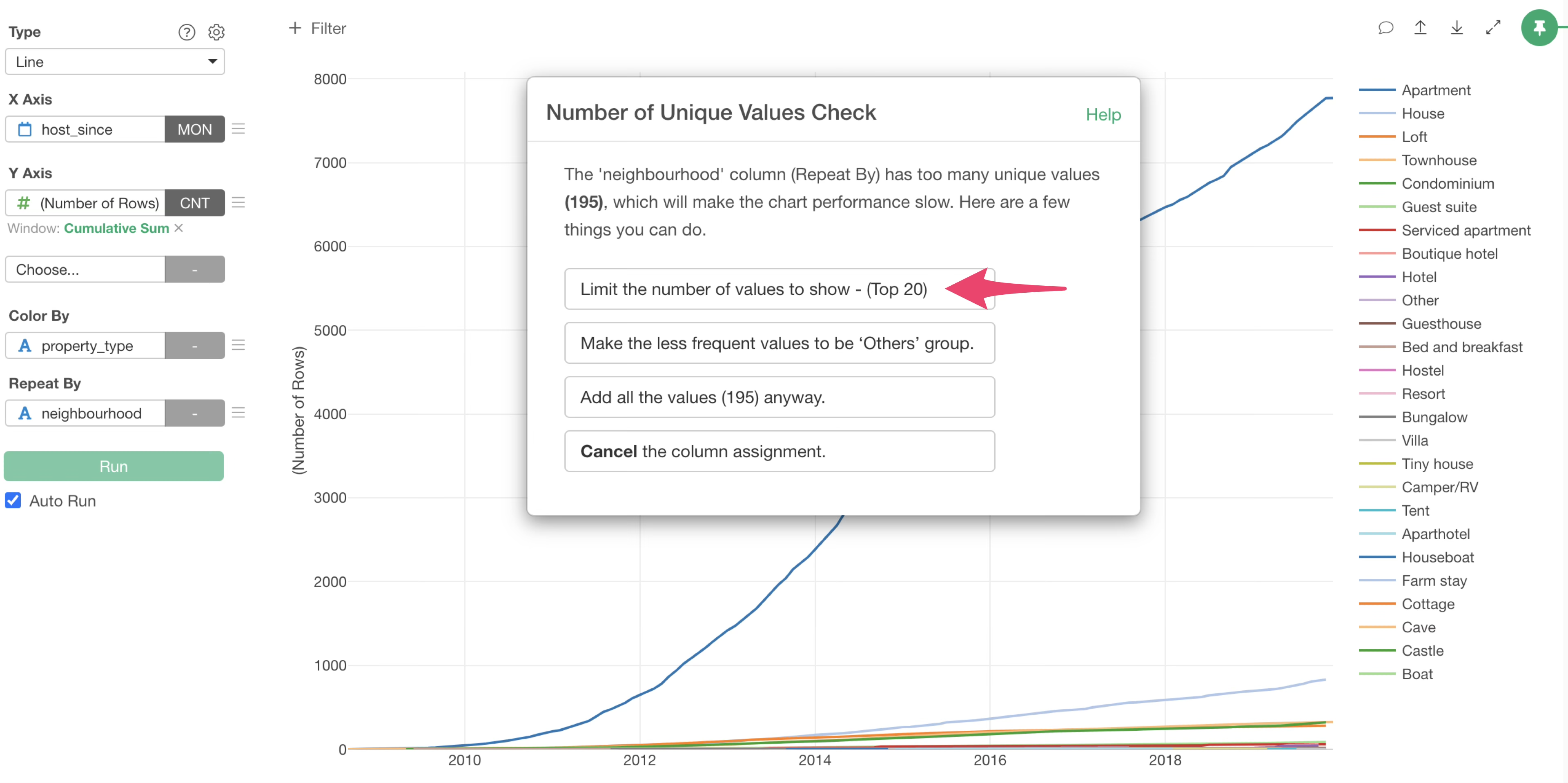
Select “neighbourhood” for “Repeat By”.
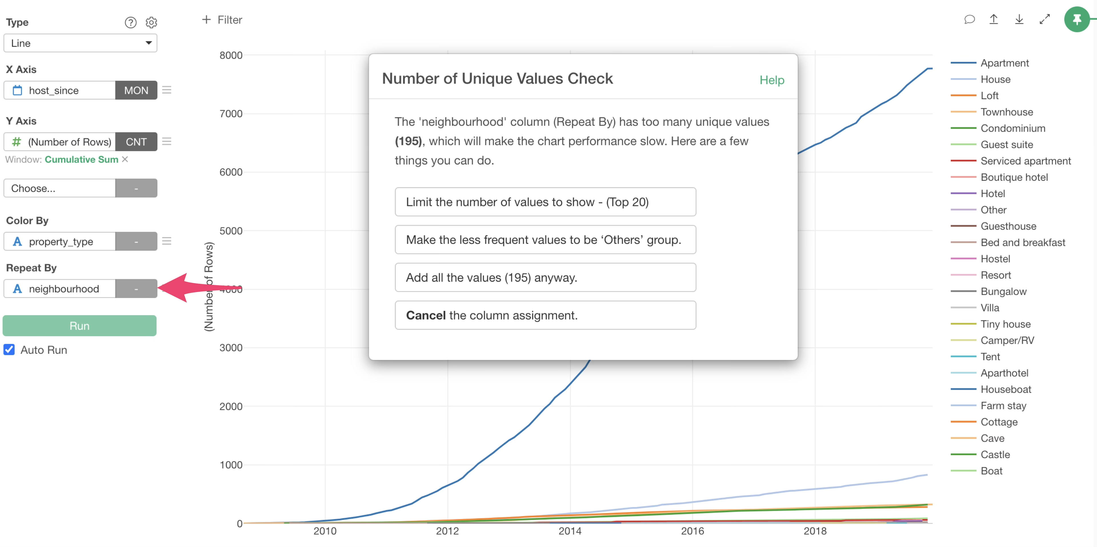
Since the number of unique values for municipalities is 195, there are 195 neighbourhood. If we visualize all of them, 195 charts will be created, which will take a long time to render.
Therefore, when the number of unique values is large, a “Unique Values Check” dialog is displayed to control the number of values to display in the chart.
This time, we want to visualize the top 20 neighbourhoods with the highest number of rows, so we select “Limit the number of values to show (Top 20)”.
This allowed us to create line charts for each neighbourhood and display only the top 20 neighbourhood with the highest number of rows.

However, some property type have a small “number of rows”, making it difficult to read the trends.
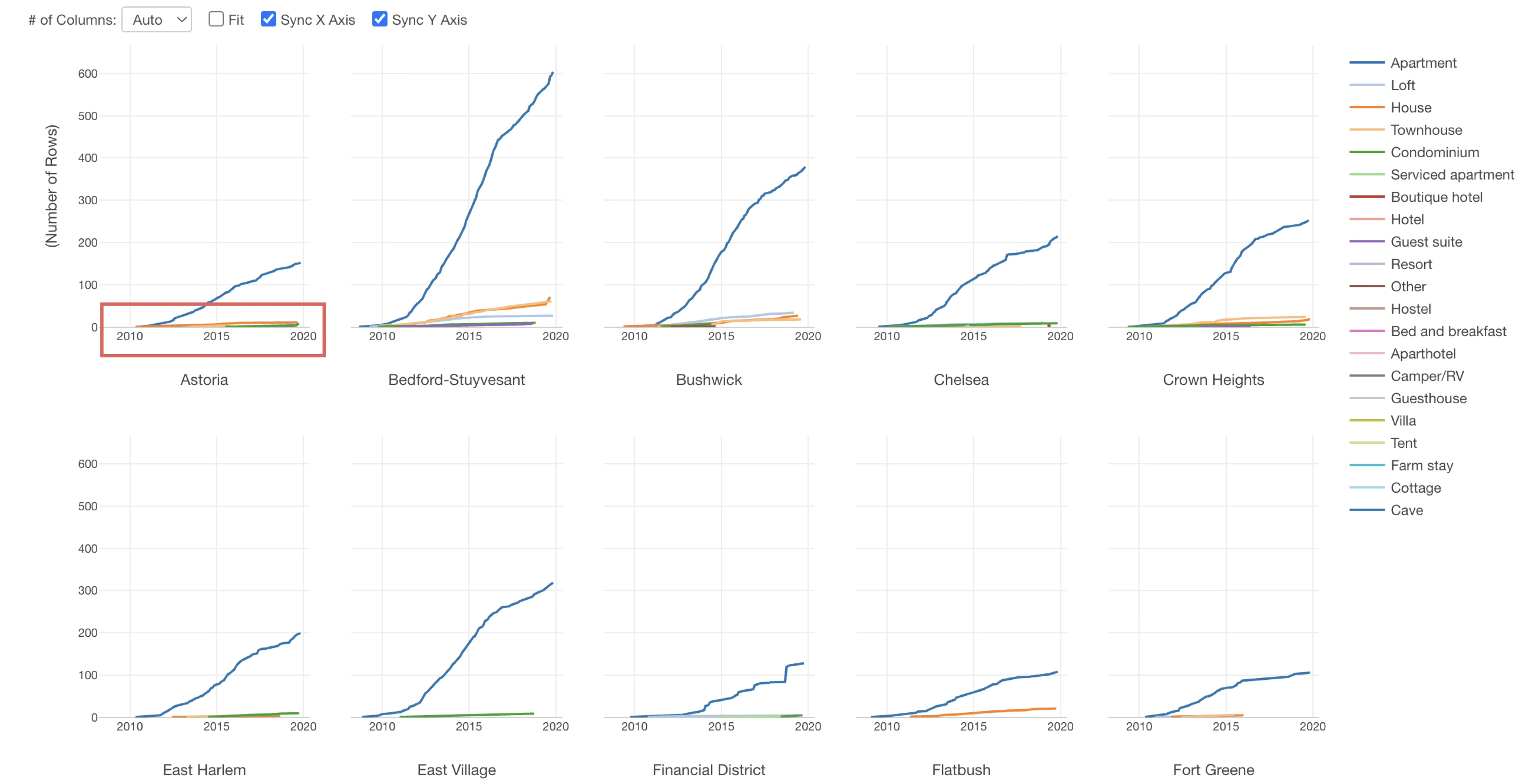
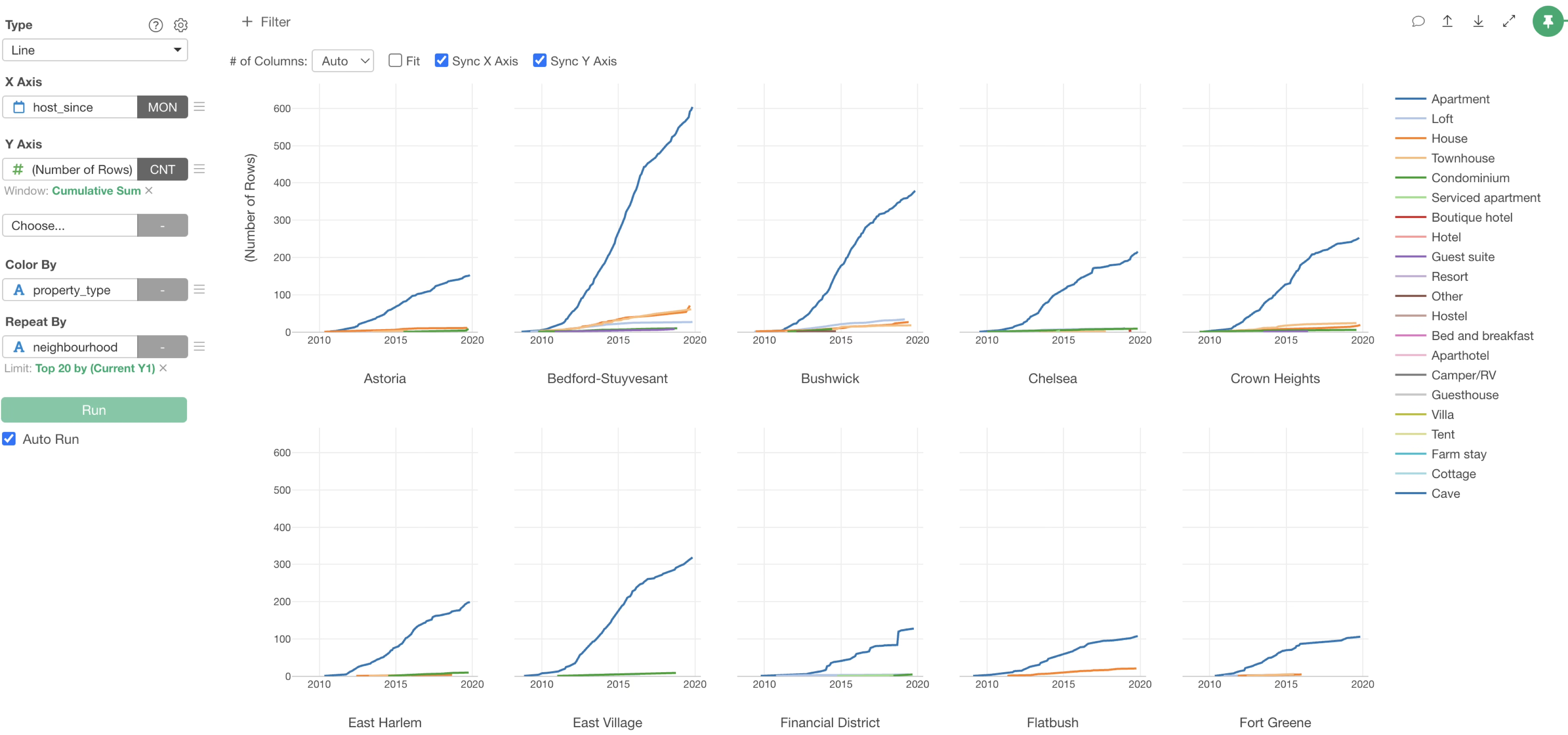
Therefore, uncheck “Sync Y-axis” to display the Y-axis according to the magnitude of the number of rows for each neighbourhood.
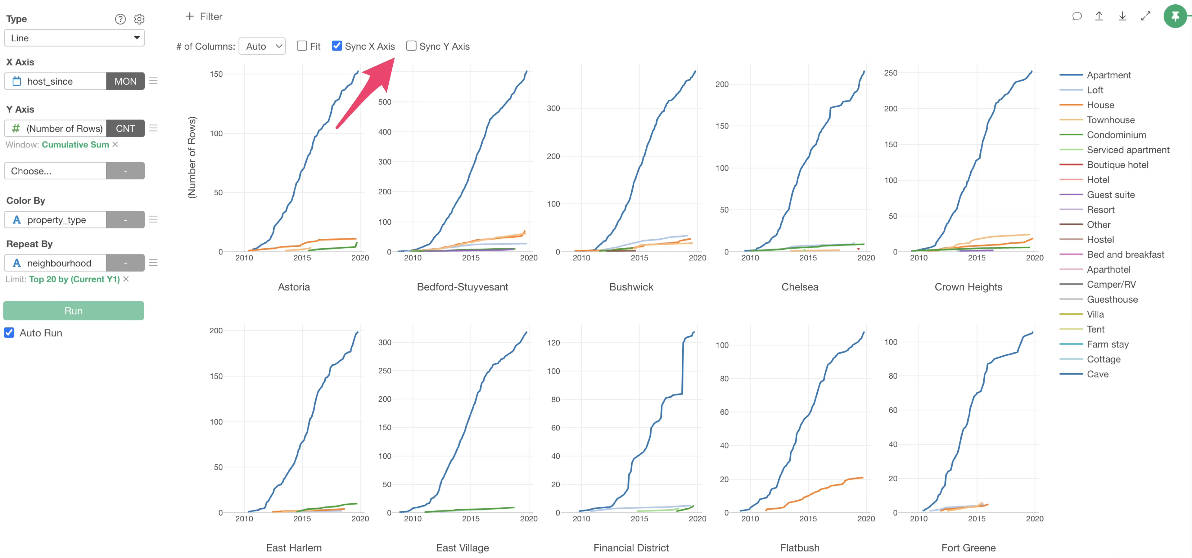
You can seei in many neighbourhood, apartments seem to be overwhelmingly dominant.
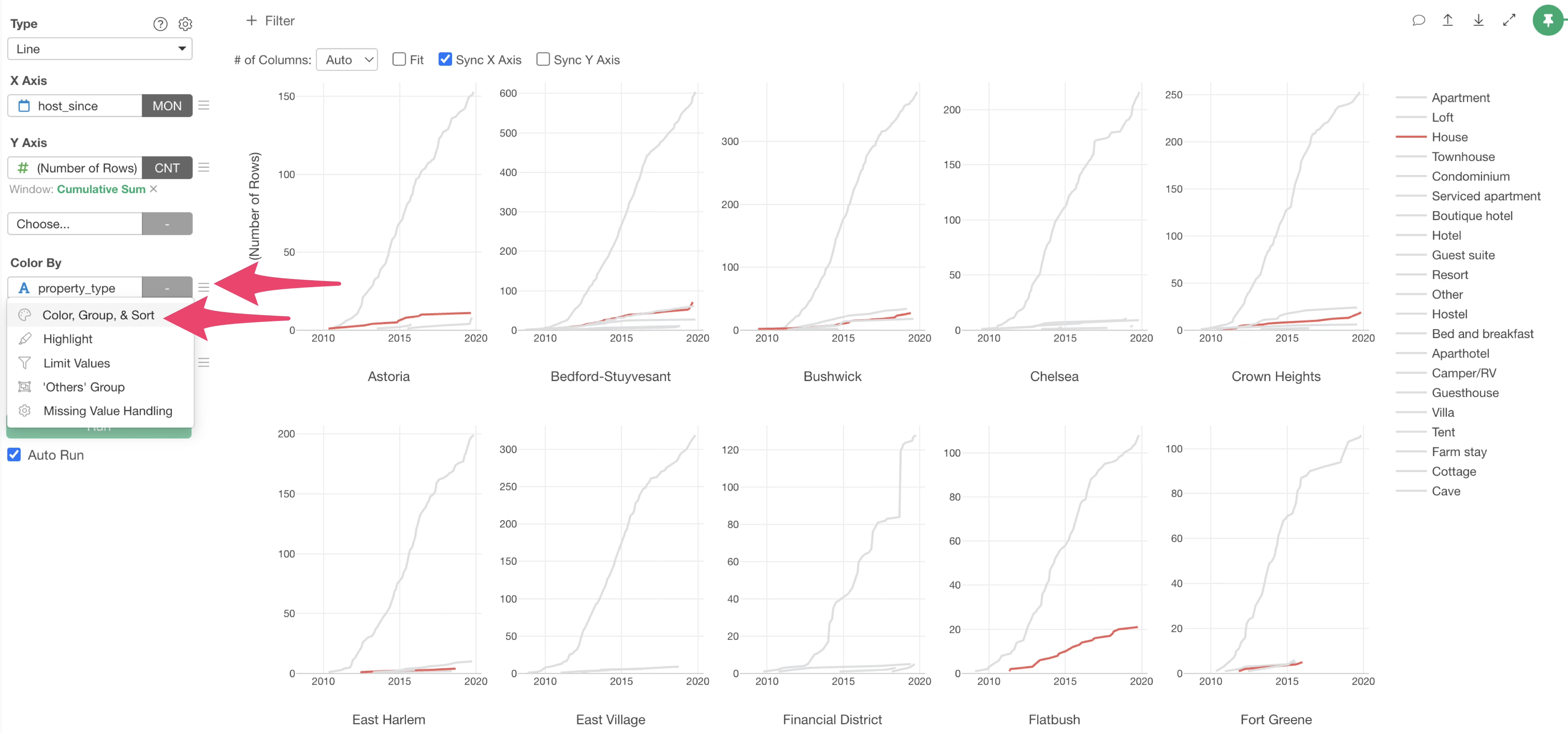
Color, Group, and Sort Order Settings
Exploratory allows you to flexibly change the colors assigned in charts and even highlight specific values.
From the Color by menu, select “Color, Group & Sort”.
The “Color, Group & Sort Order” settings dialog will appear, allowing you to make various color-related settings on this dialog.
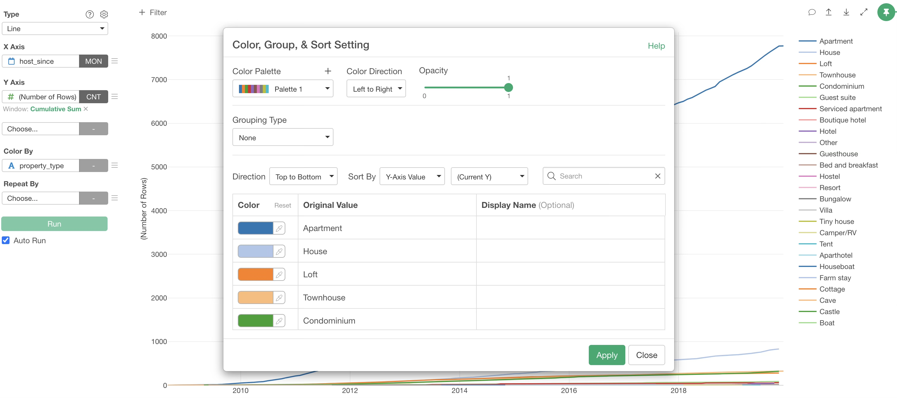
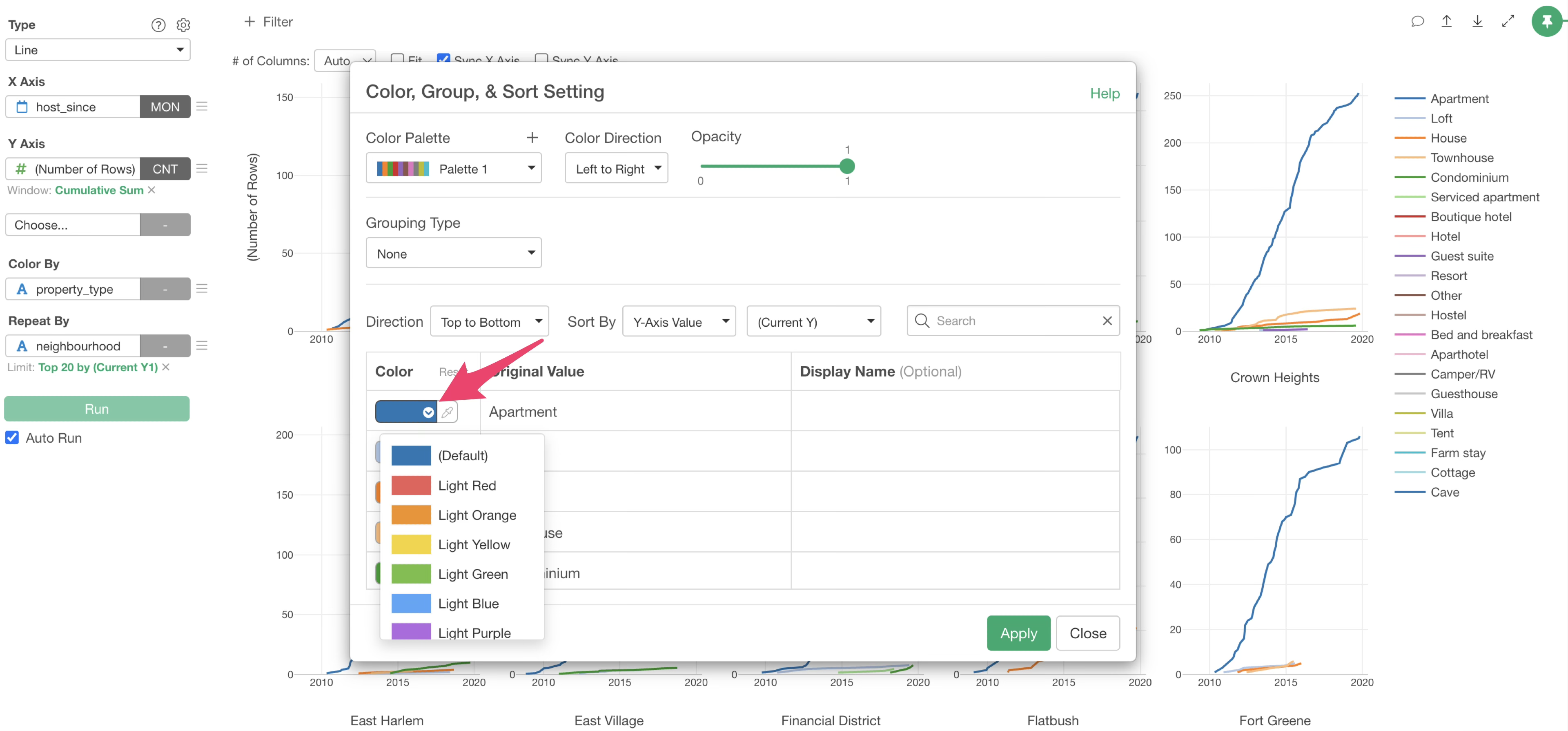
For example, if you want to change the color of a specific value, you can individually change the color by clicking on the color corresponding to the value.
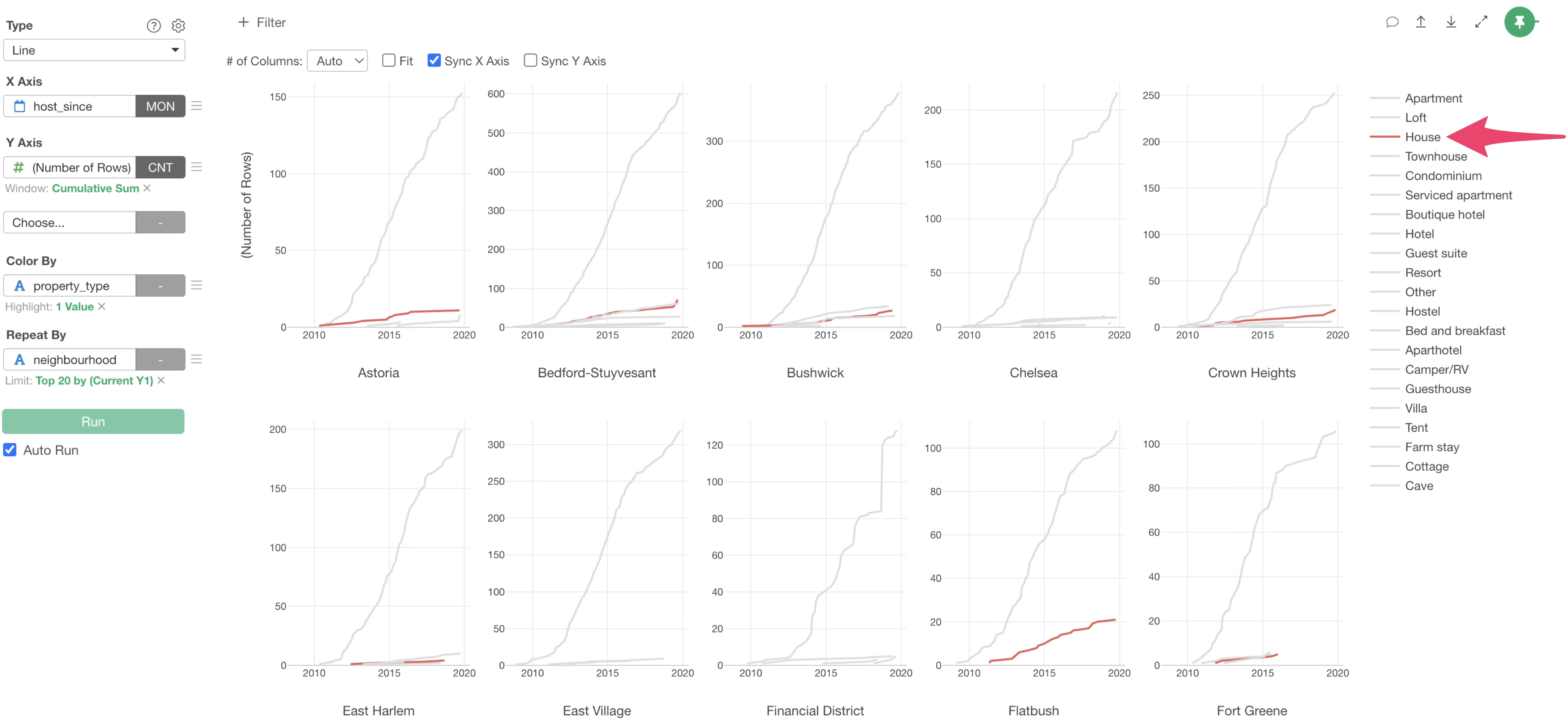
Highlight Specific Values Using Highlight
This time, we want to highlight “House”, so we select “Highlight” for the color palette.
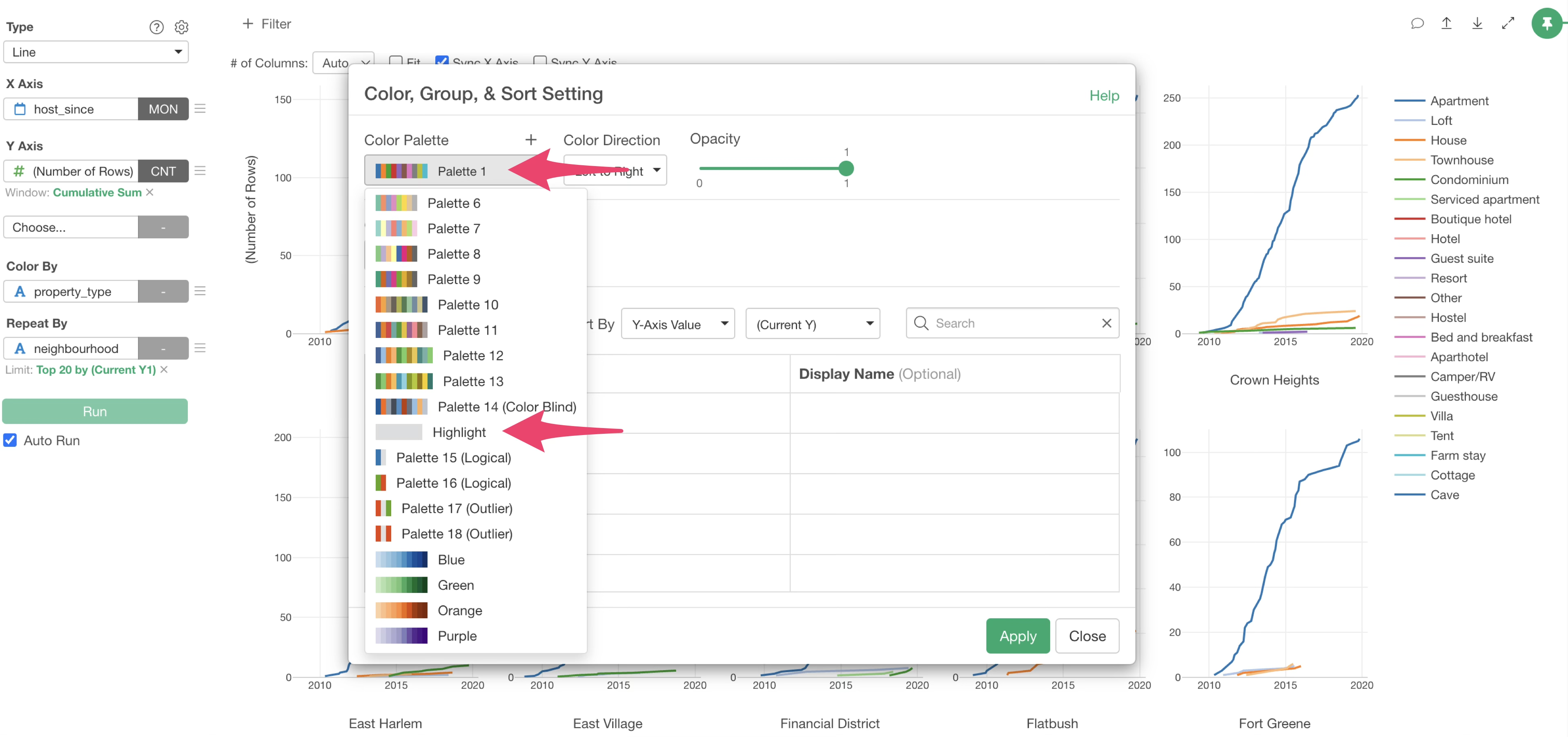
Alternatively, you can select “Highlight” from the Color By menu.
With highlighting, all default colors have become “Light Gray”.
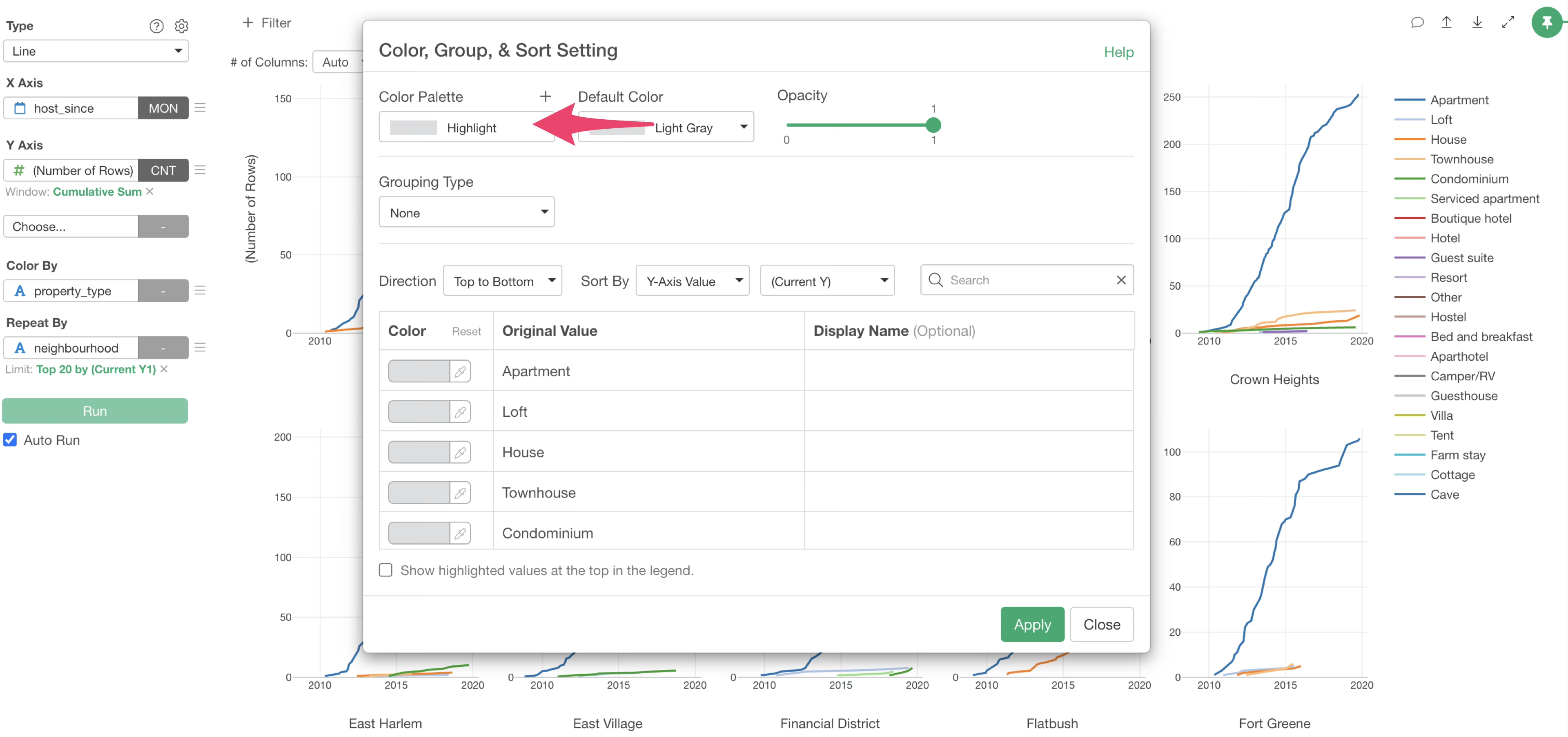
This time, we want to highlight “House”, so we change the color of “House” to “Light Red”.
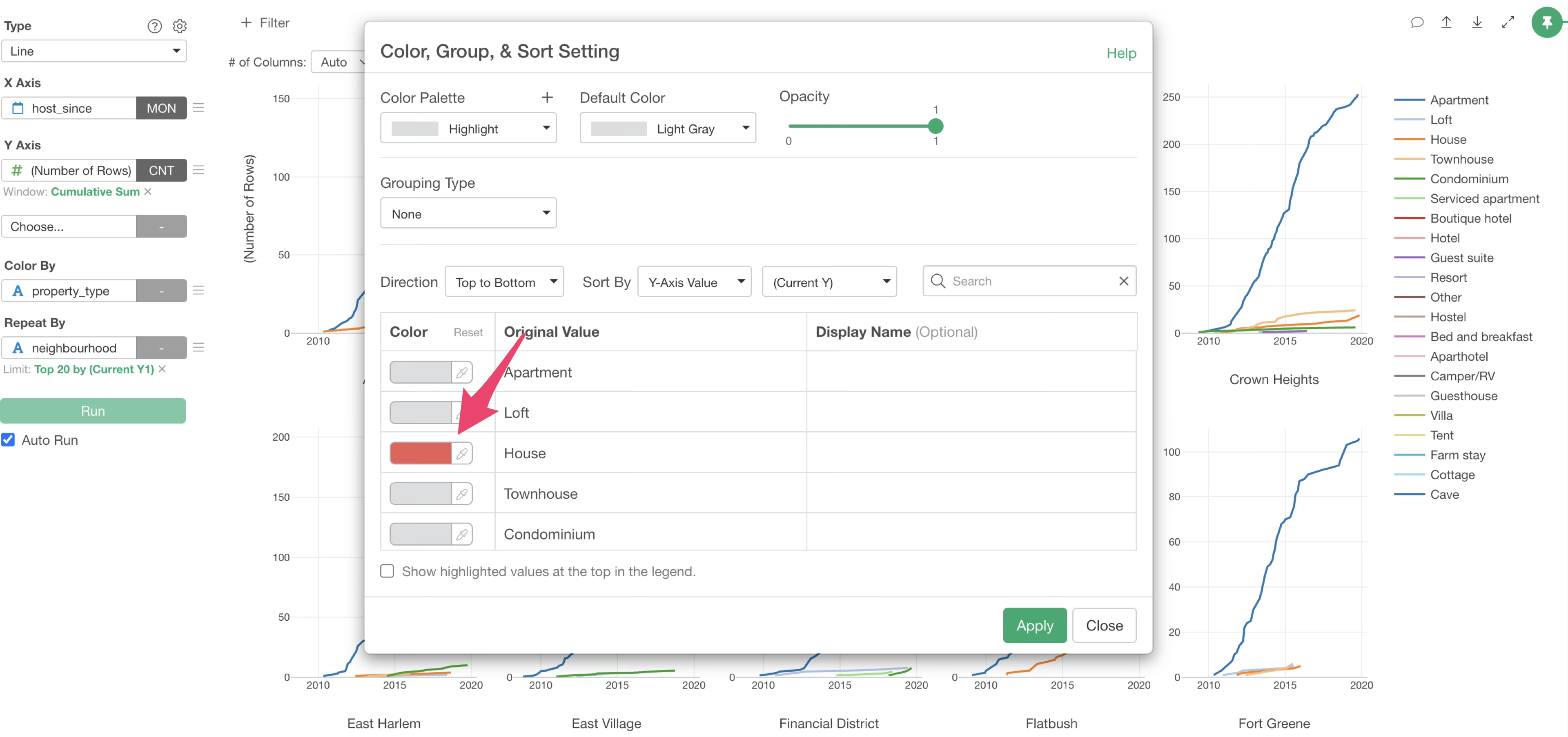
Once the settings are complete, click the “Apply” button.
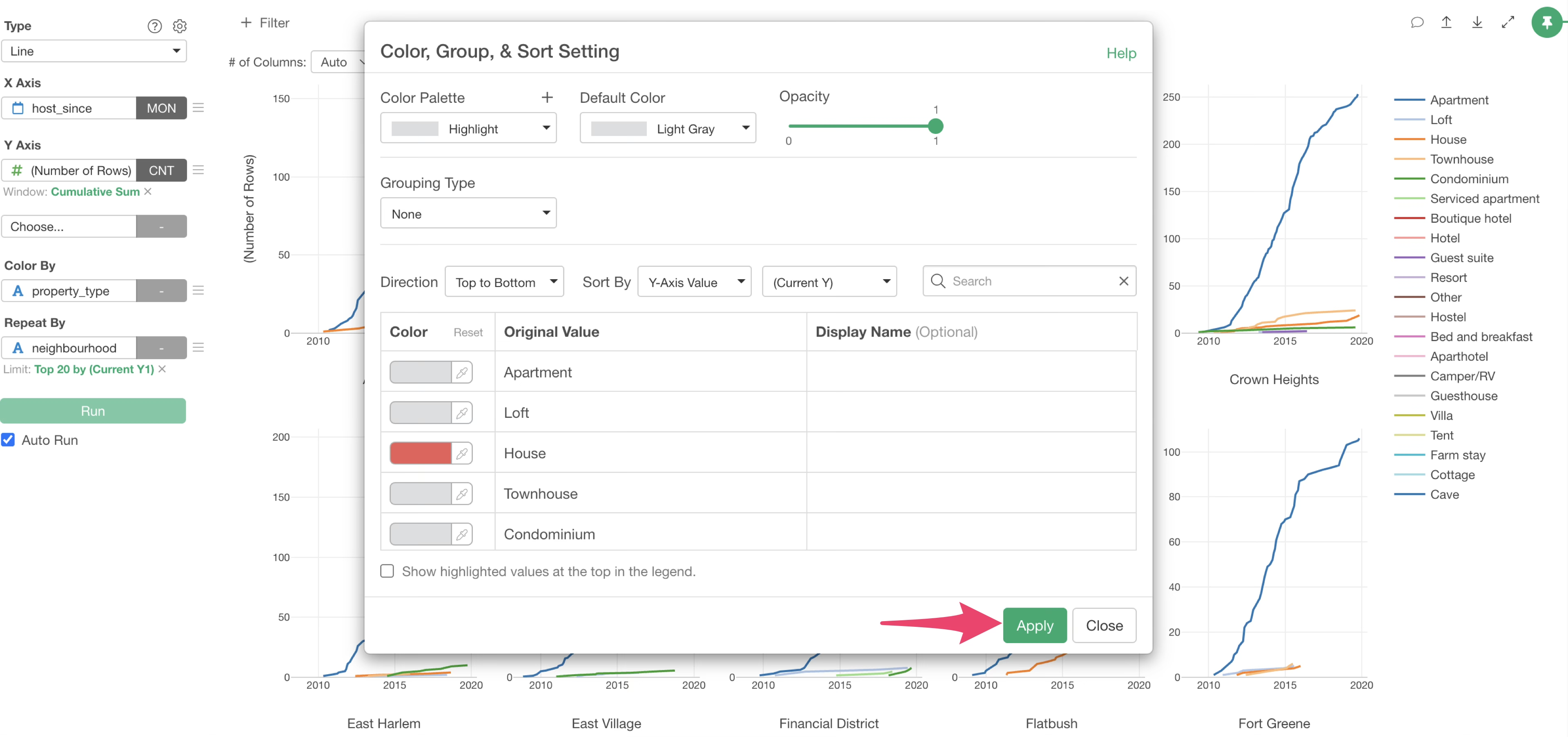
The highlight feature allowed us to display only “House” in light red and other room types in gray, thereby highlighting houses.
Change Display Name of Colors
Exploratory allows you to easily change the display name of colors. For example, let’s consider a case that you want to change “House” to “Detached House”.
From the Color By menu, select “Color, Group, & Sort”.
The “Color, Group, & Sort” settings dialog will appear. Specify “Detached House” for the display name of “House” and click the “Apply” button.
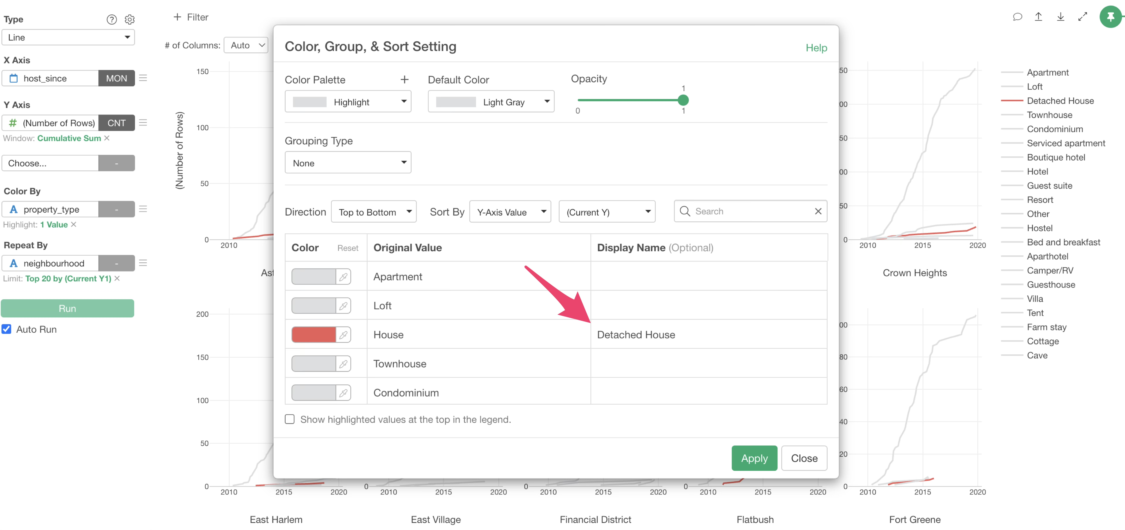
This changed the display name to “Detached House”.
By changing the display name of colors, it is also possible to group multiple values into a single group.
3. Visualize Correlation
In data analysis, it is crucial to investigate whether there is a relationship between two columns, often referred to as “correlation.”
Correlation refers to a relationship where if the value of one variable changes, the value of the other variable also changes together according to a certain rule.
The “correlation coefficient” is an indicator that represents this correlation.

The correlation coefficient ranges from -1 to 1. A value close to 1 indicates a strong positive correlation, and a value close to -1 indicates a strong negative correlation. A value close to 0 means there is no correlation.
Investigate Correlation with a Scatter Plot
Exploratory offers various methods to investigate correlation, but this time we will try the simplest method: using a “scatter plot” to investigate correlation.
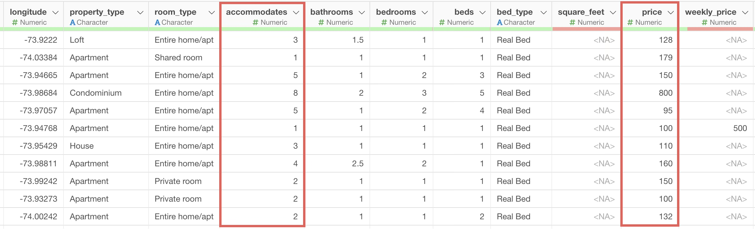
This time, we will investigate whether there is a correlation between two numerical columns: “accommodates” and “price”. Intuitively, rooms that can accommodate many people might have a higher price per night, but is that really the case?
From the chart view, click the “Add a new chart” button to create a new chart.
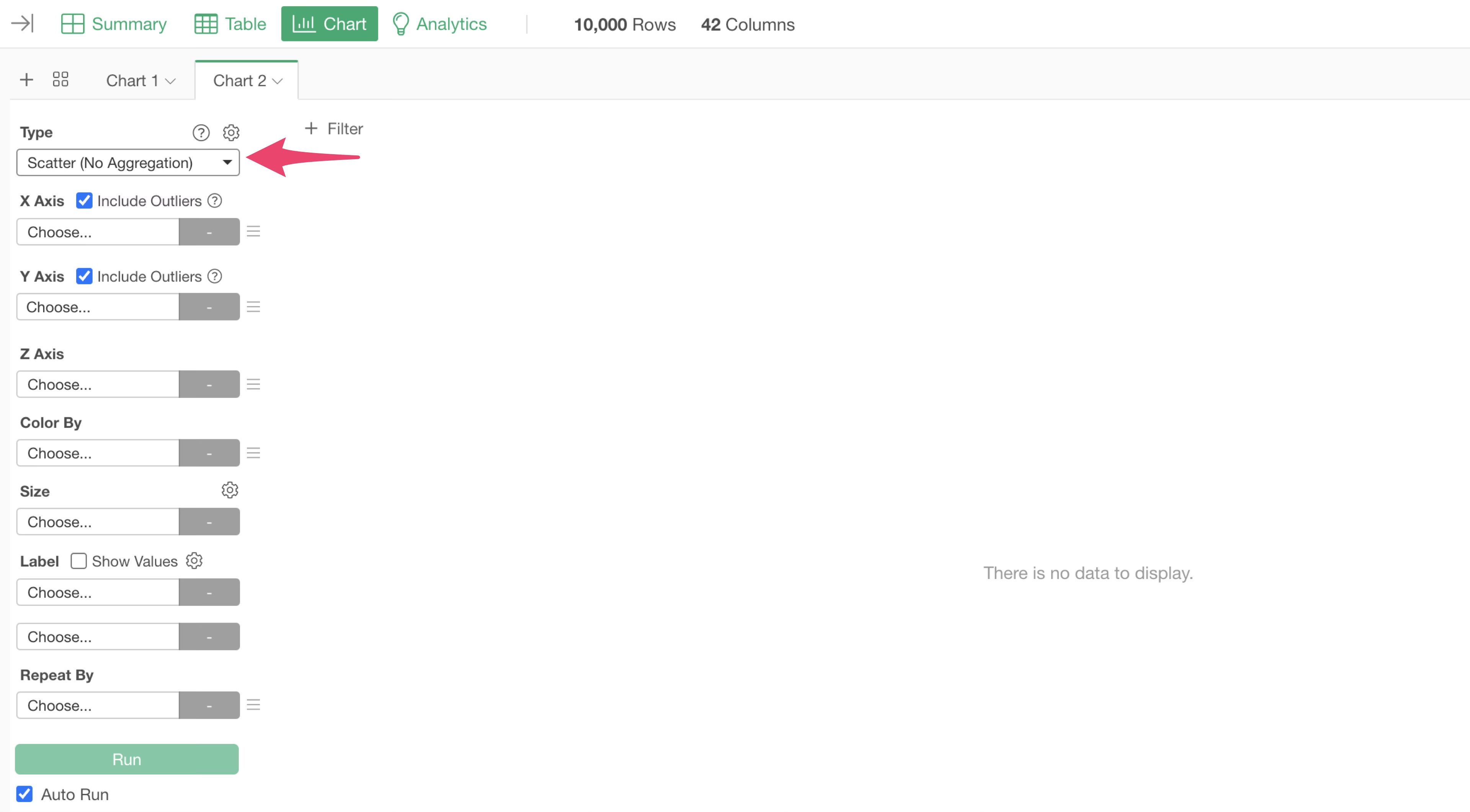
Select “Scatter Plot (No Aggregation)” as the chart type.
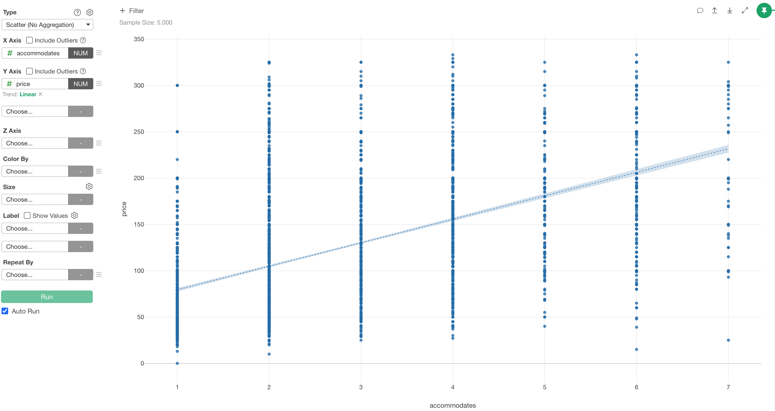
Select “accommodates” for the X-axis and “price” for the Y-axis.
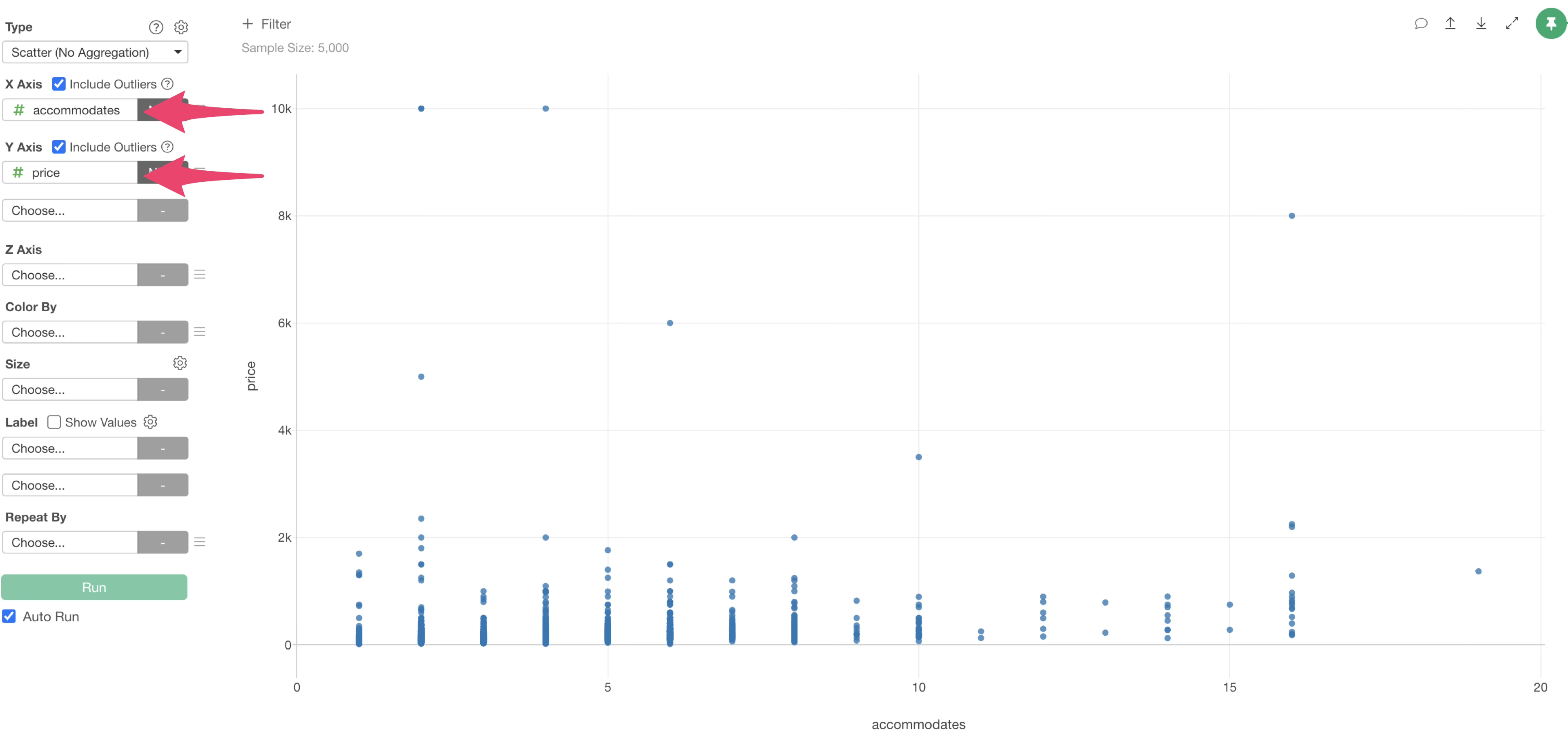
You can find some outliers in the plot.
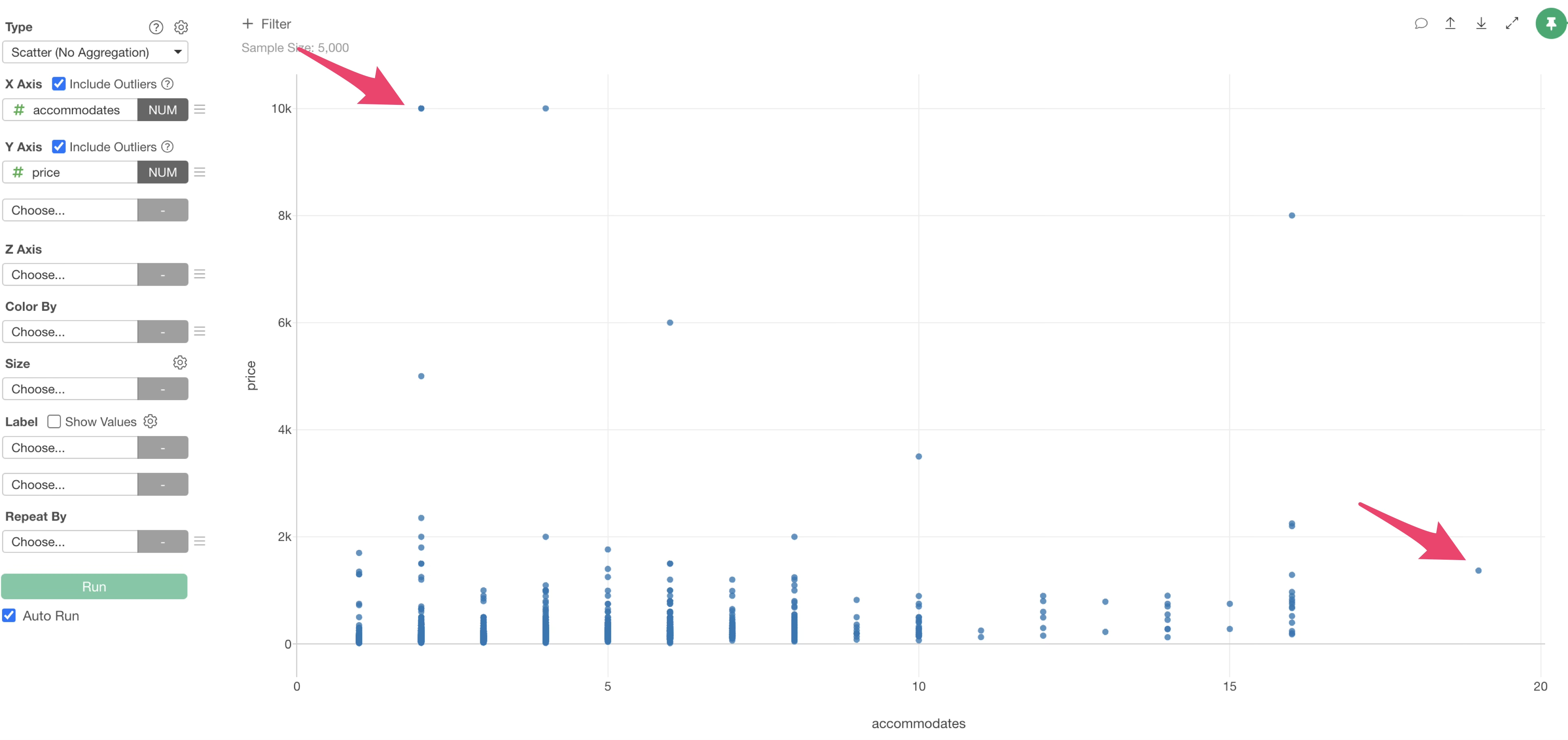
So, uncheck “Include outliers” for X and Y axis.
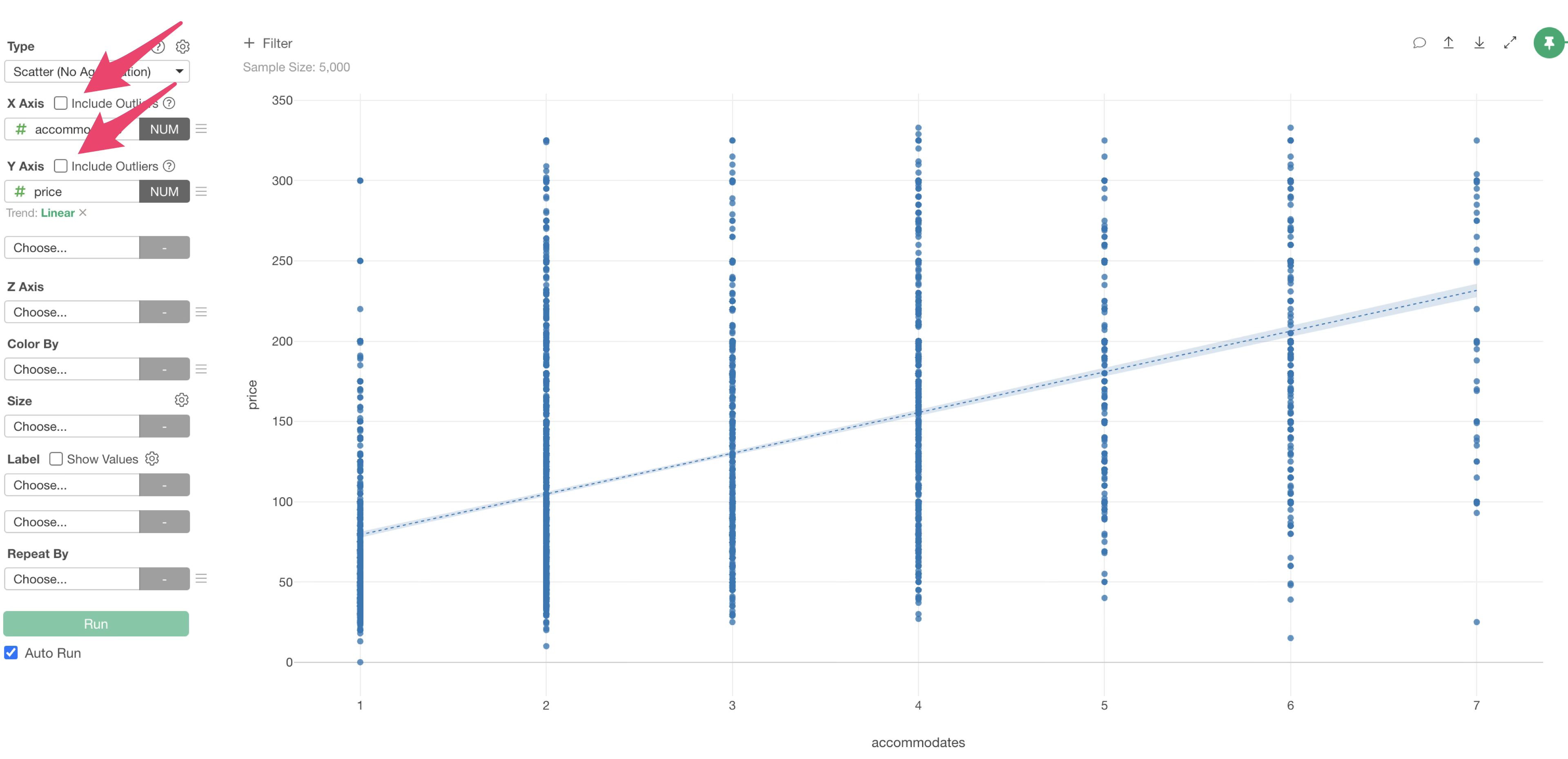
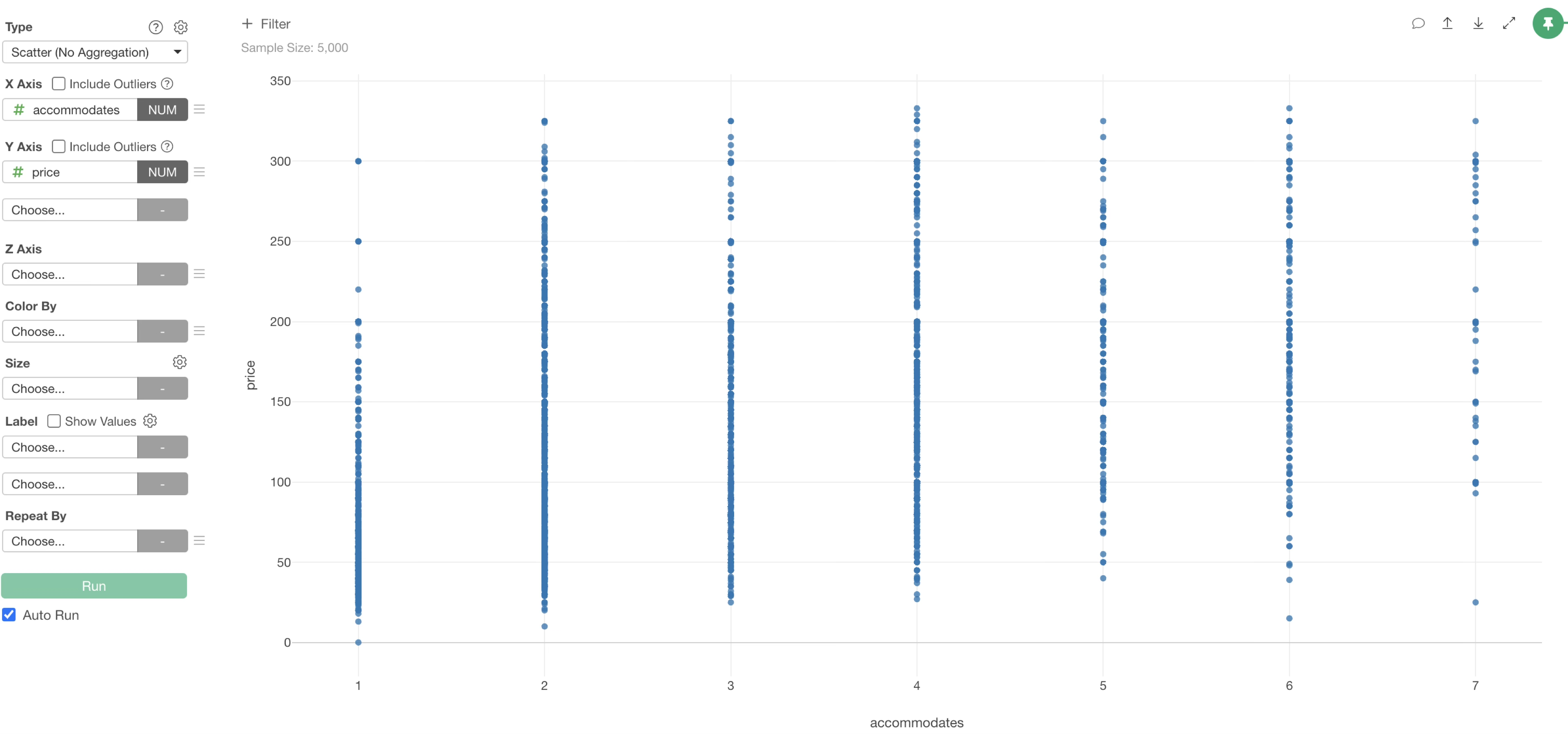
This allowed us to plot each value as a point at its corresponding position.
Trend Line - Linear Regression
Now, to investigate whether there is a correlation between these two columns, we will draw a straight line called “Linear Regression” as a trend line.
From the Y-axis menu, select “Linear” under “Trend Line” menu.
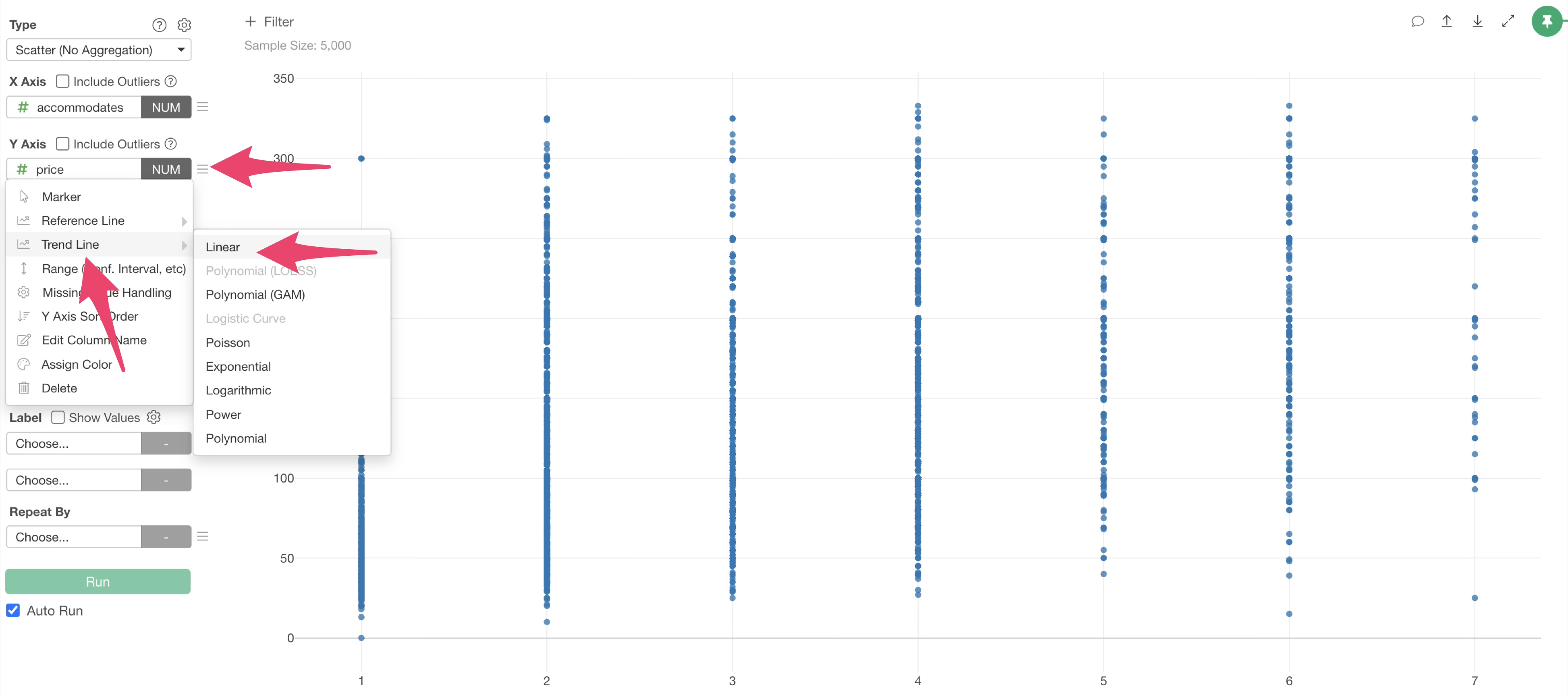
A linear trend line has been drawn on the scatter plot, and it can be confirmed that the slope is upward.
Hovering the mouse over the trend line revealed that the correlation coefficient is “approximately 0.5”, indicating a “moderately strong positive correlation”.
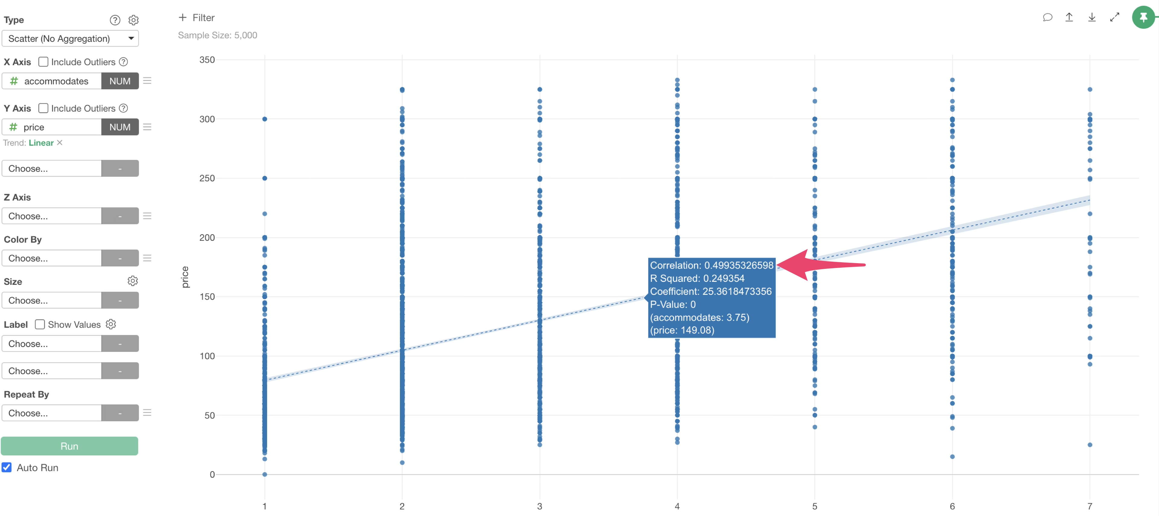
In other words, there is a correlation between “accommodates” and “price”, meaning that as the number of people who can be accommodated increases, the price per night also tends to increase.
This concludes the visualization part of the Exploratory usage guide!
How to use Exploratory Series
You can find other parts of the Exploratory Usage Series via the links below. Please try the next part on “Data Wrangling”.