How to Use Exploratory Part 4 - Analytics
This note is the fourth installment, “Analytics” edition, of “How to Use Exploratory,” designed to help you start using Exploratory efficiently.
Exploratory offers various analytics features. This time, we will guide you through correlation analysis, predictive modeling, and text analysis for free-form responses using Exploratory, allowing you to experience the basic usage of analytics.
The estimated time required is about 20 minutes.
Let’s get started!
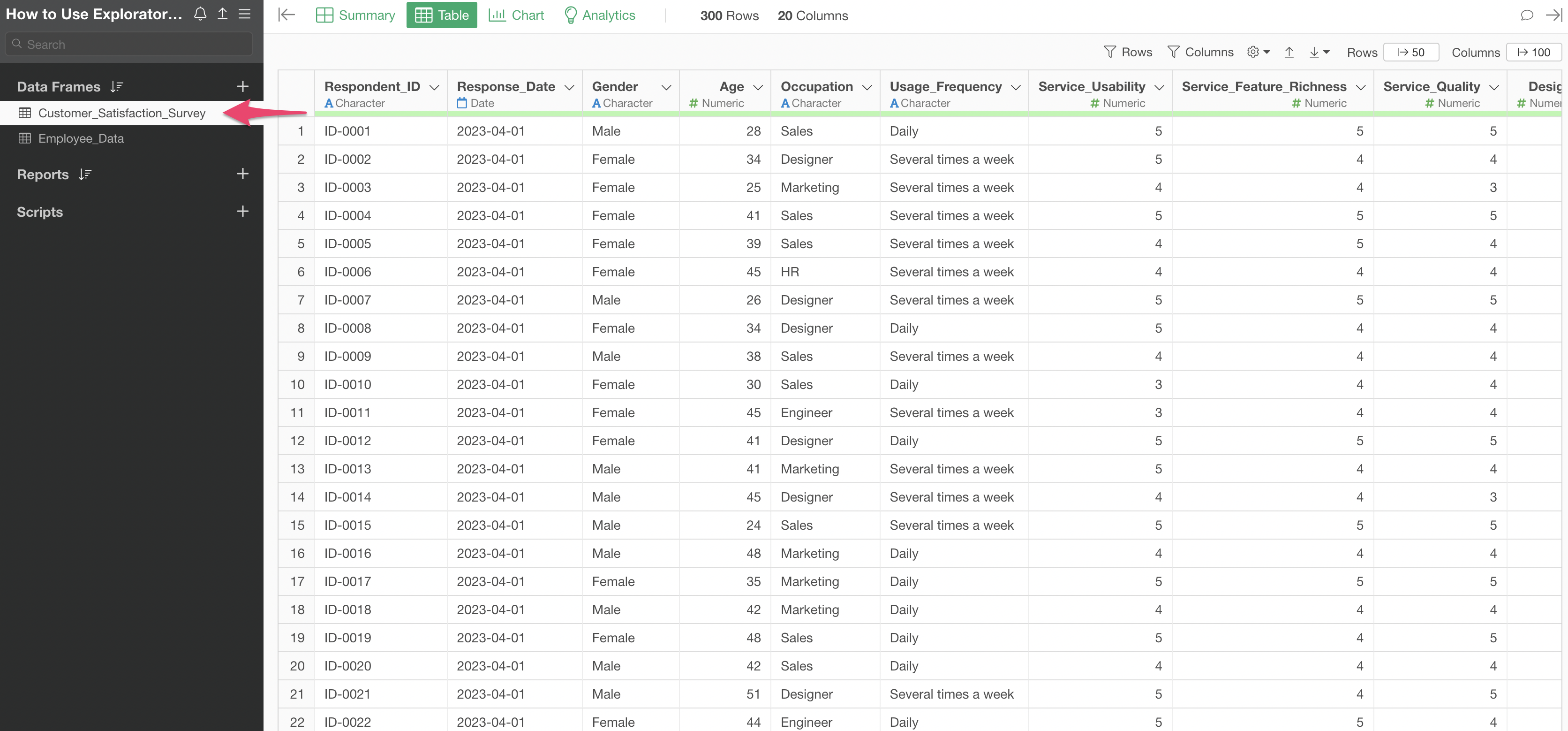
1. Importing Data
This time, we will use the following two datasets as sample data.
You can download the data from the “Download” button on the top right of the page.
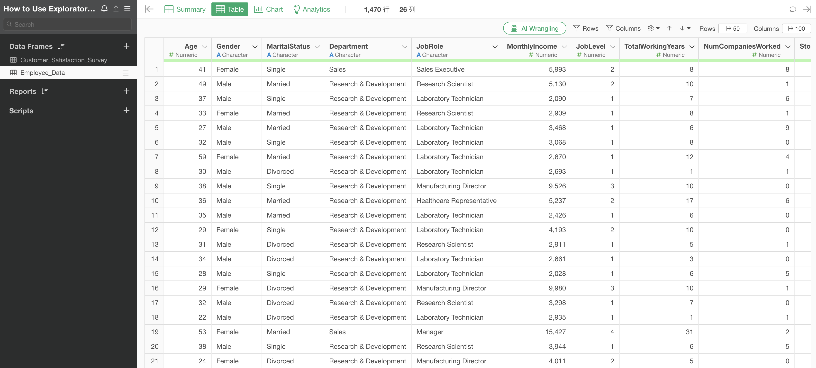
Once you have downloaded both the Employee Data and Customer Satisfaction Survey data, open the downloaded folder and drag and drop the two CSV files onto the Exploratory screen.
A file selection dialog will appear, so click the “Import” button.
You can configure import settings from the items on the left side of the import dialog, but this time no settings are required, so click the “OK All” button.
We have successfully imported the Employee Data and Customer Satisfaction Survey data.
2. Objective: Investigate what influences Monthly Income
First, let’s assume we want to understand the factors related to employee “Monthly Income.”
Using the sample employee data, let’s perform a simple correlation analysis and then a predictive model analysis to investigate what influences employee salaries.
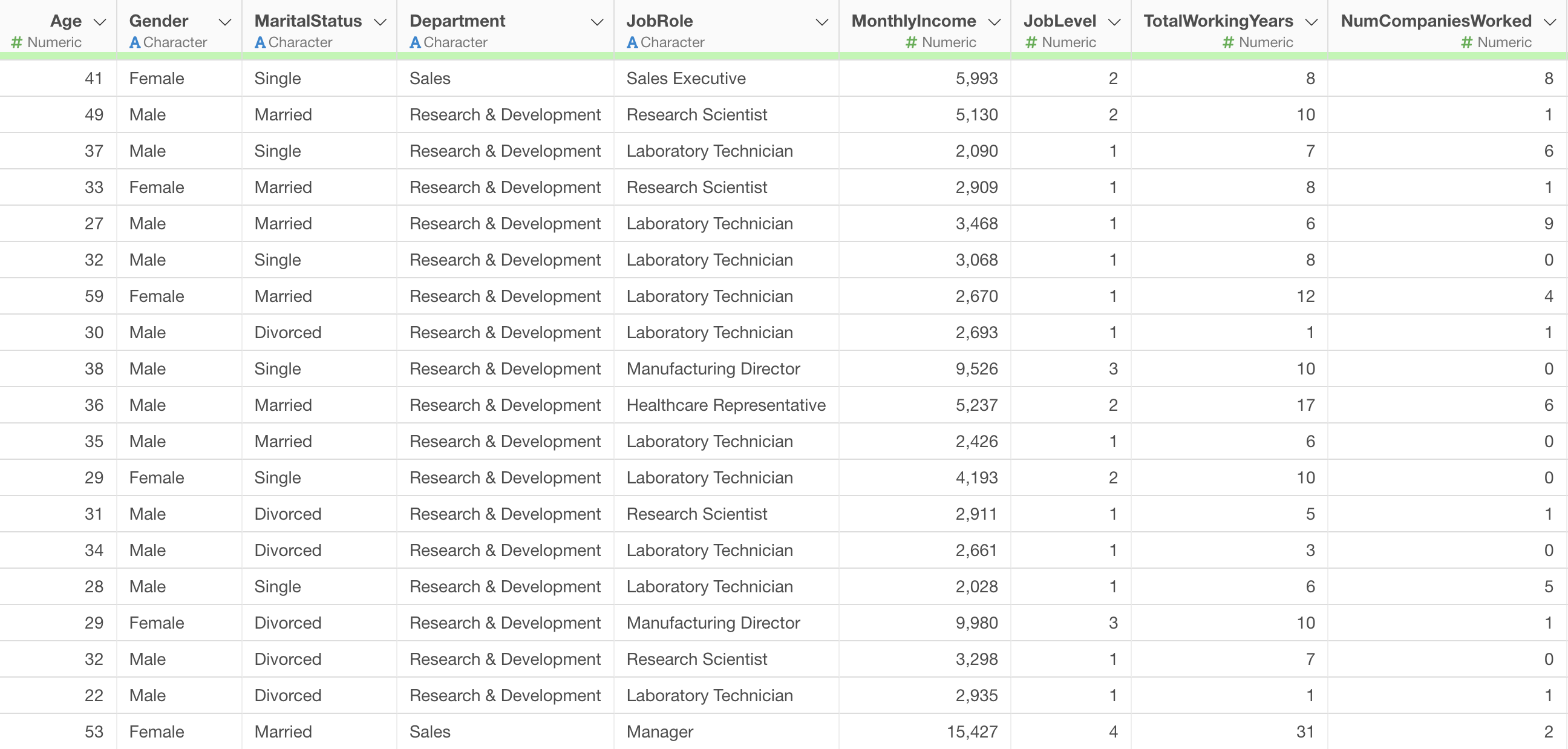
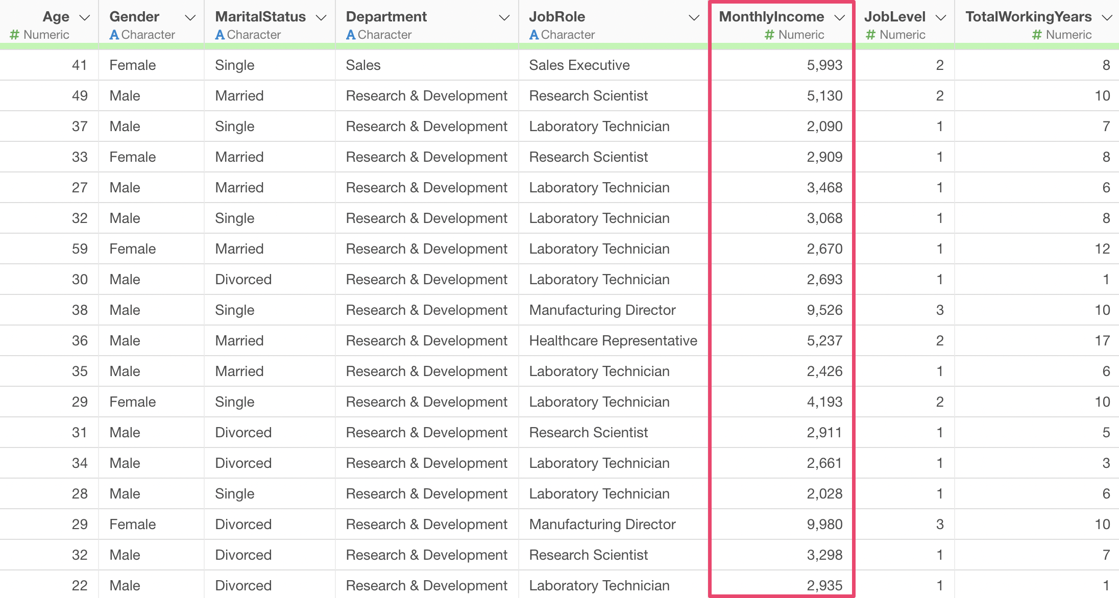
In the employee data we will use, each row represents one employee, and columns contain attribute information such as Monthly Income and years of service.
3. Investigating Correlation
Now, let’s immediately investigate which variables are correlated with Monthly Income and what kind of relationship they have.
By the way, correlation refers to a relationship between two variables where if the value of one variable changes, the value of the other variable also changes together according to a certain rule.
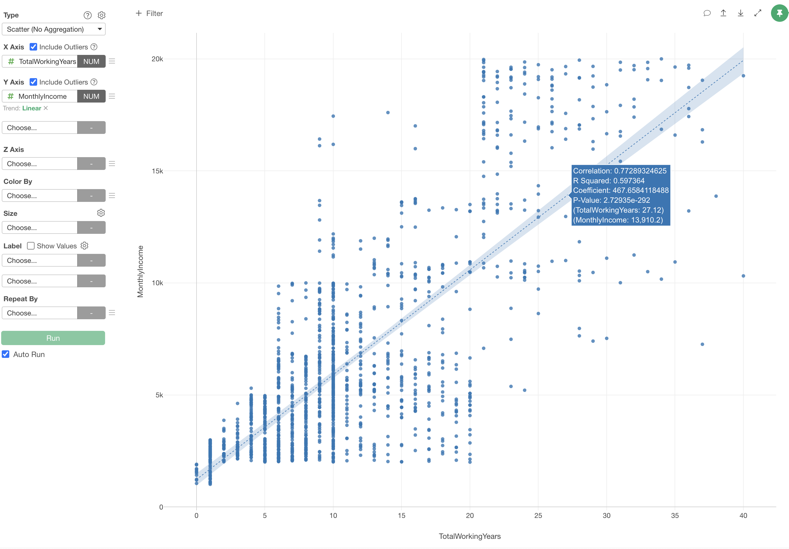
In the “Visualization” edition of the usage guide, “Visualization,” we used “Scatter Plot (No Aggregation)” to visualize correlations. However, creating a scatter plot for each column to examine the correlation between Monthly Income and all other columns would be a tedious task.
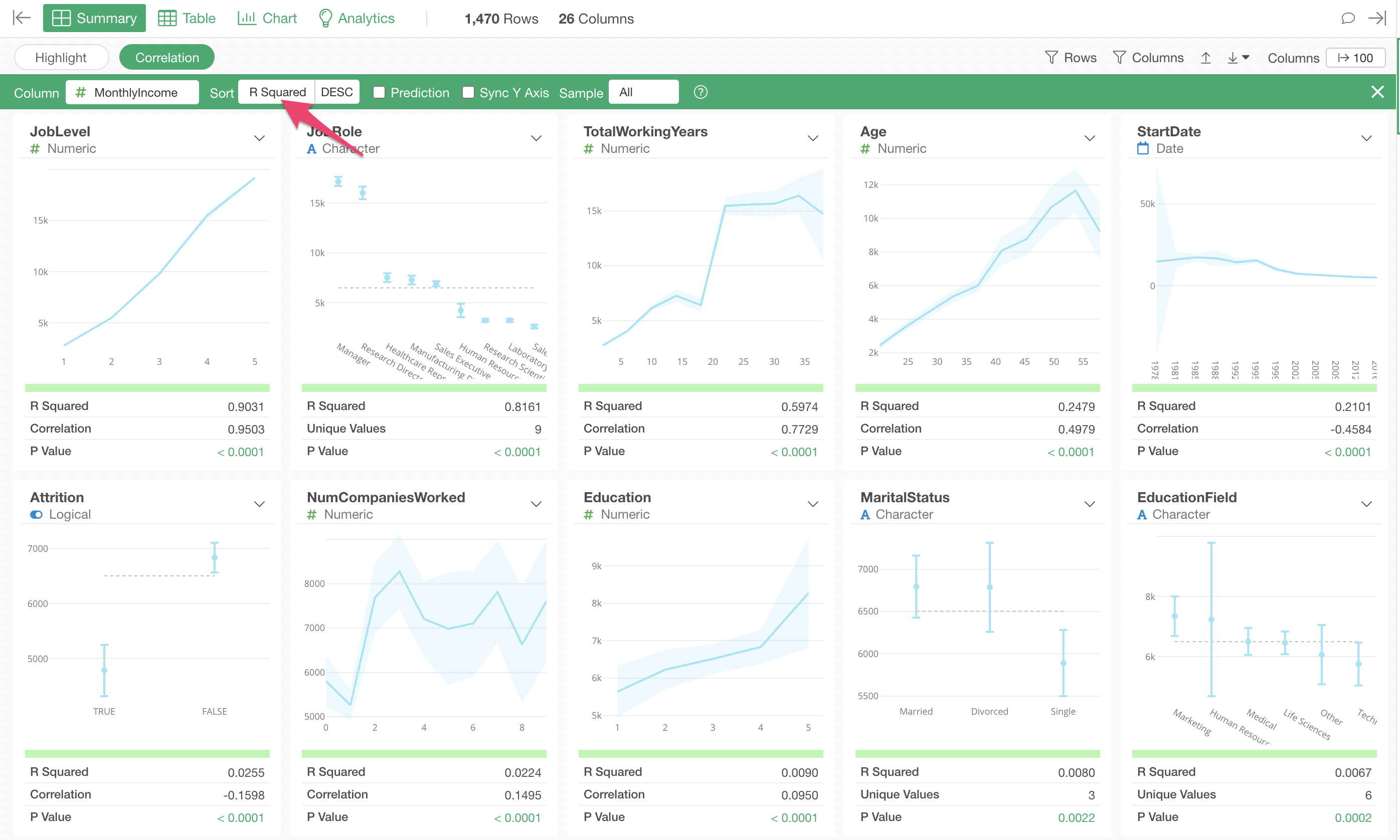
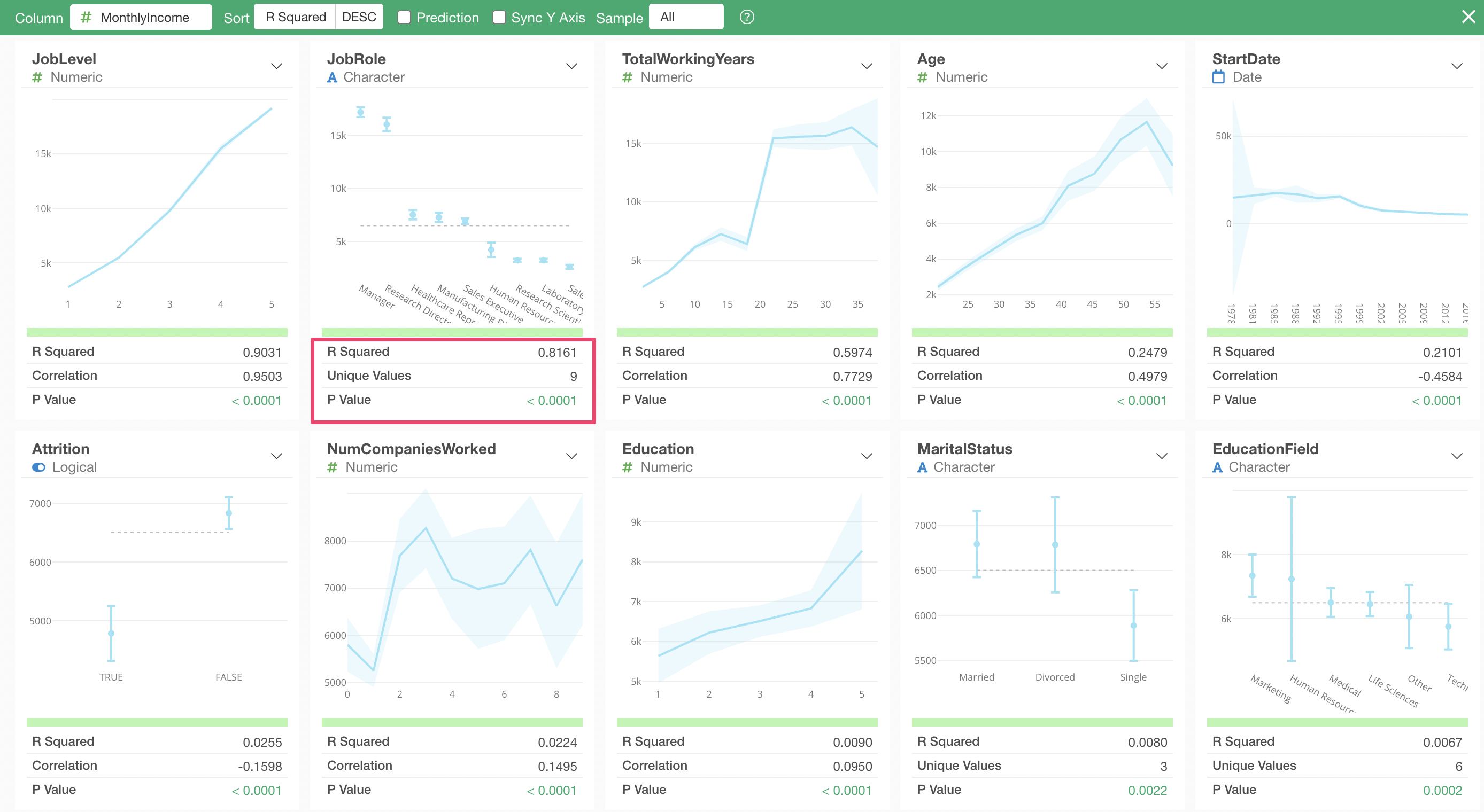
Therefore, this time, we will use Exploratory’s Summary View “Correlation” mode to quickly examine the relationship between Monthly Income and all other variables.
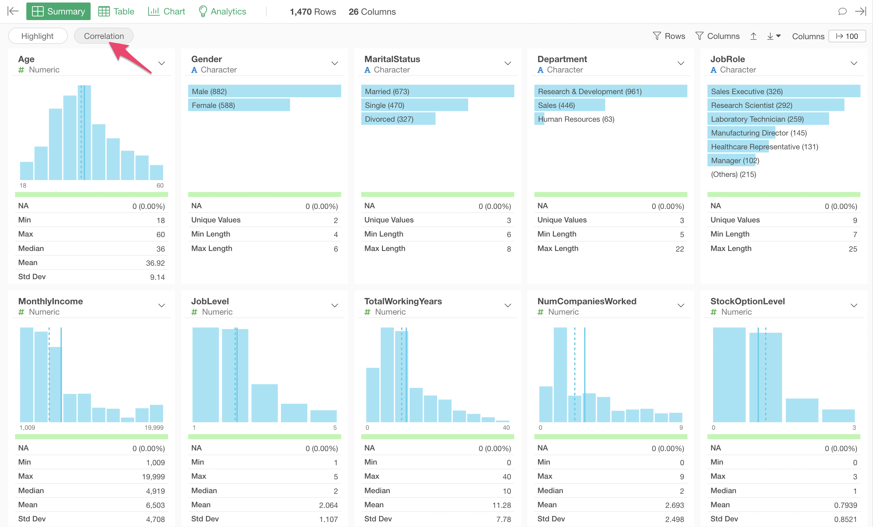
Open the Summary View and click the “Correlation” button.
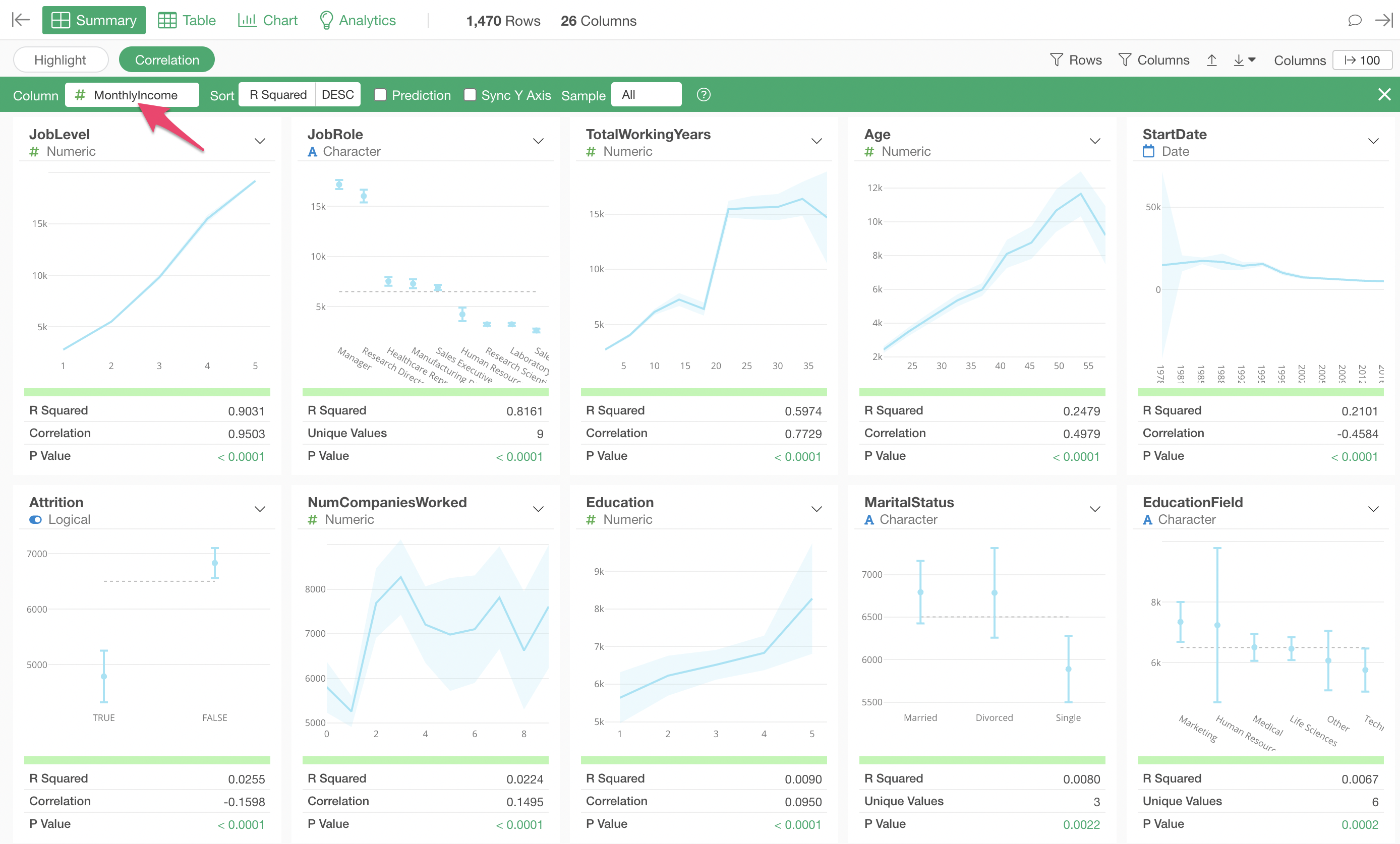
Select “MonthlyIncome” for the column you want to see the correlation for.
In Correlation mode, charts visualizing the relationship with each variable, along with indicators representing the strength of the correlation, are automatically generated all at once, tailored to the data type.
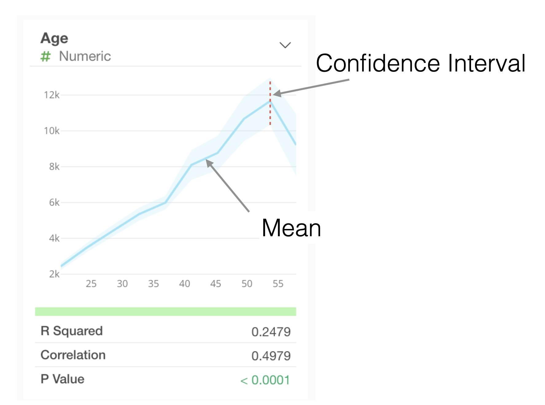
Interpreting Charts
Numeric
For numeric types, values are divided into 10 equal-width intervals, and the average value for each interval is visualized as a line chart. The light blue shaded area represents the 95% confidence interval.
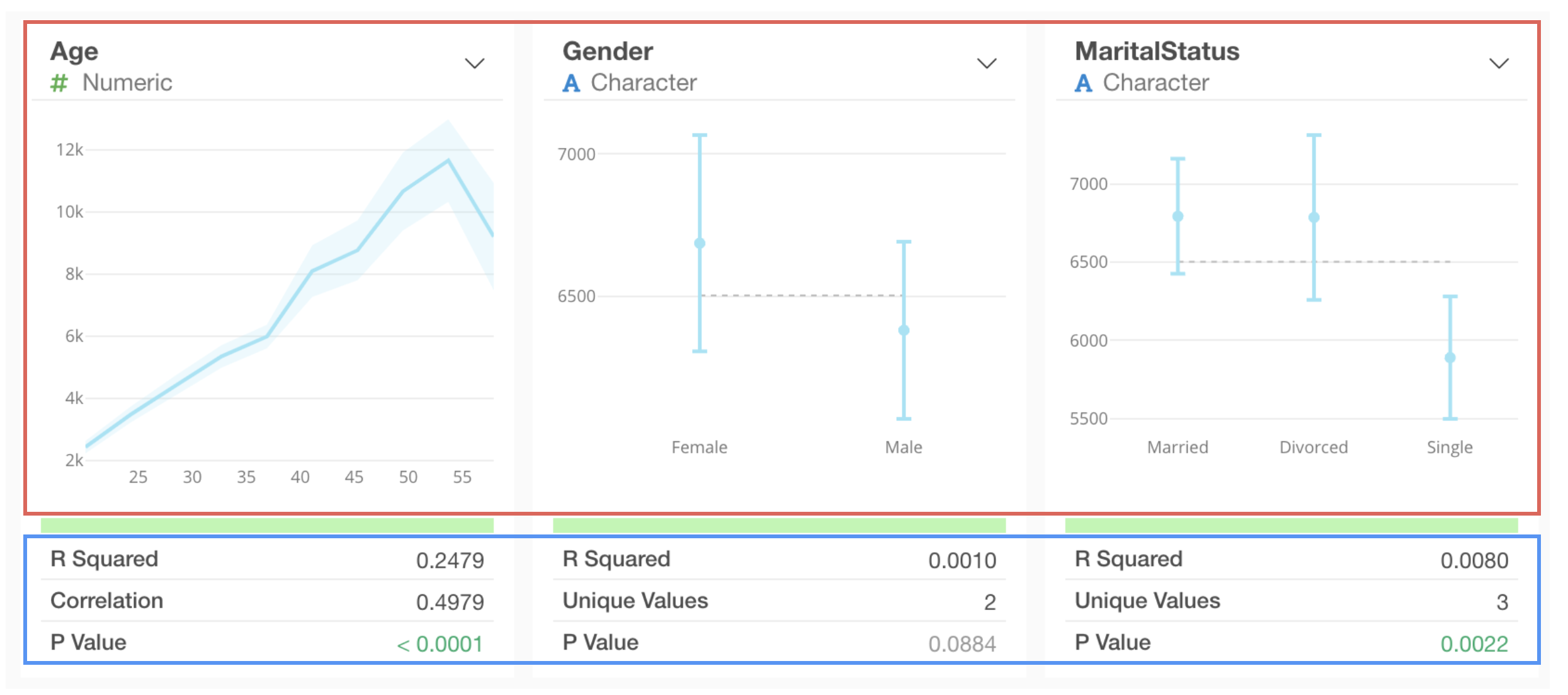
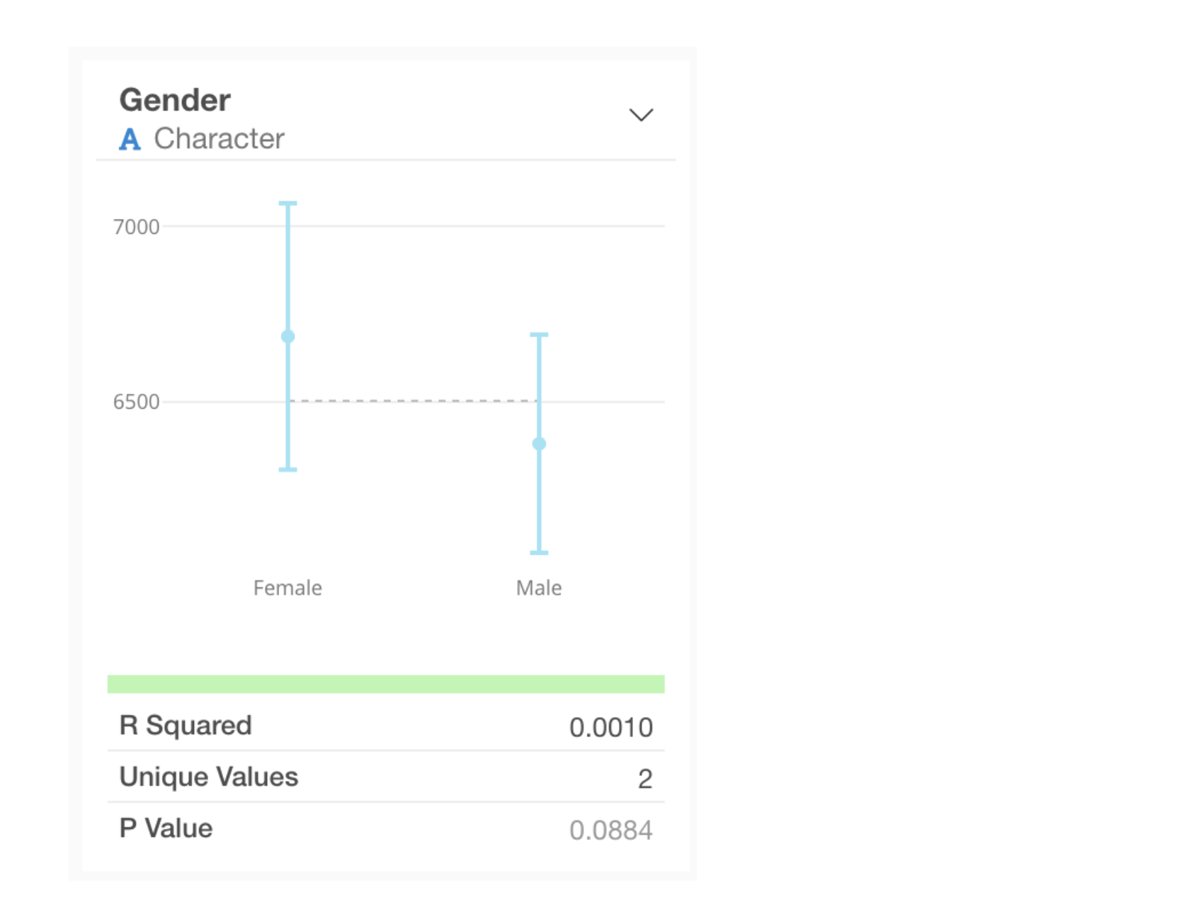
Category
For categorical types, the average value for each category and its 95% confidence interval are visualized as error bars.
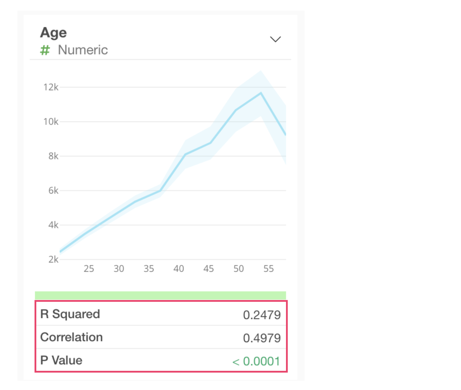
Interpreting Metrics
When a numeric column is selected as the target for correlation, the following metrics are displayed for each column:
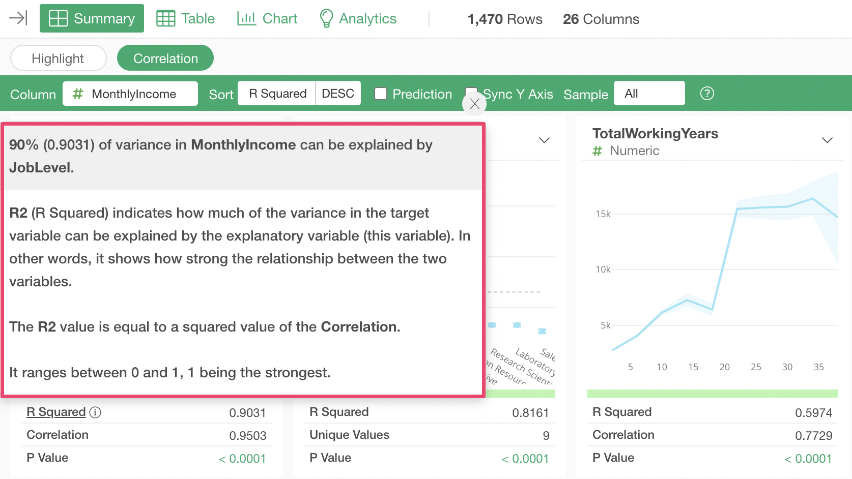
- R-squared: R-squared indicates the proportion of the variance in the dependent variable that is explained by this variable. In other words, it represents the strength of the relationship between these two variables. The R-squared value is the same as the square of the correlation coefficient. The value ranges from 0 to 1, with 1 indicating the strongest relationship.
- P-value: The P-value indicates the probability of observing some relationship here if the null hypothesis (assumption) that there is no relationship between the two variables is accepted. Generally, a threshold of 0.05 (5%) is used, and if the P-value is lower than this, the relationship is considered statistically significant.
- Correlation: The correlation coefficient represents the strength of the correlation with the dependent variable. It ranges from -1 to 1, where -1 indicates the strongest negative correlation, 1 indicates the strongest positive correlation, and 0 indicates no correlation.
By the way, clicking the “i” icon to the right of each metric allows you to check the meaning of the metric.
For example, clicking the “i” icon for the R-squared metric will display a pop-up like the one below, allowing you to confirm the meaning of the metric.
Interpreting Correlation Mode Results
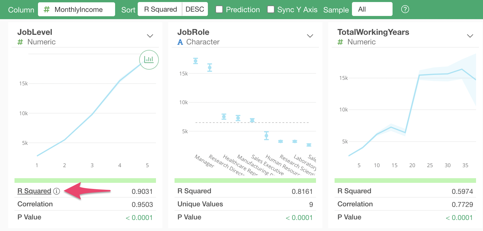
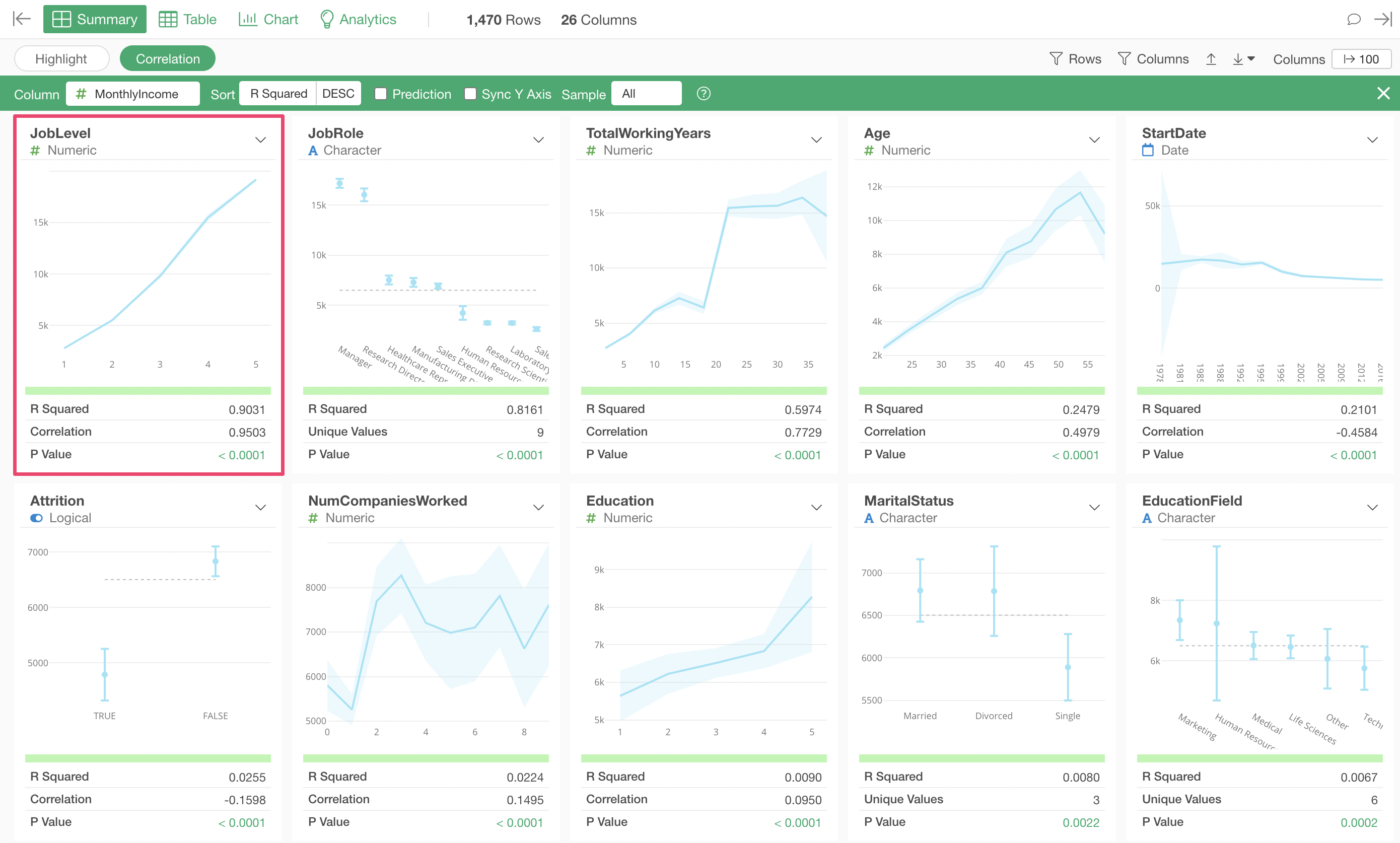
When using Correlation mode, by default, columns are sorted by “R-squared” in descending order of correlation strength.
The variable most strongly correlated with Monthly Income is “Job Level,” and the chart shows that as “Job Level” increases, the average “Monthly Income” also increases.
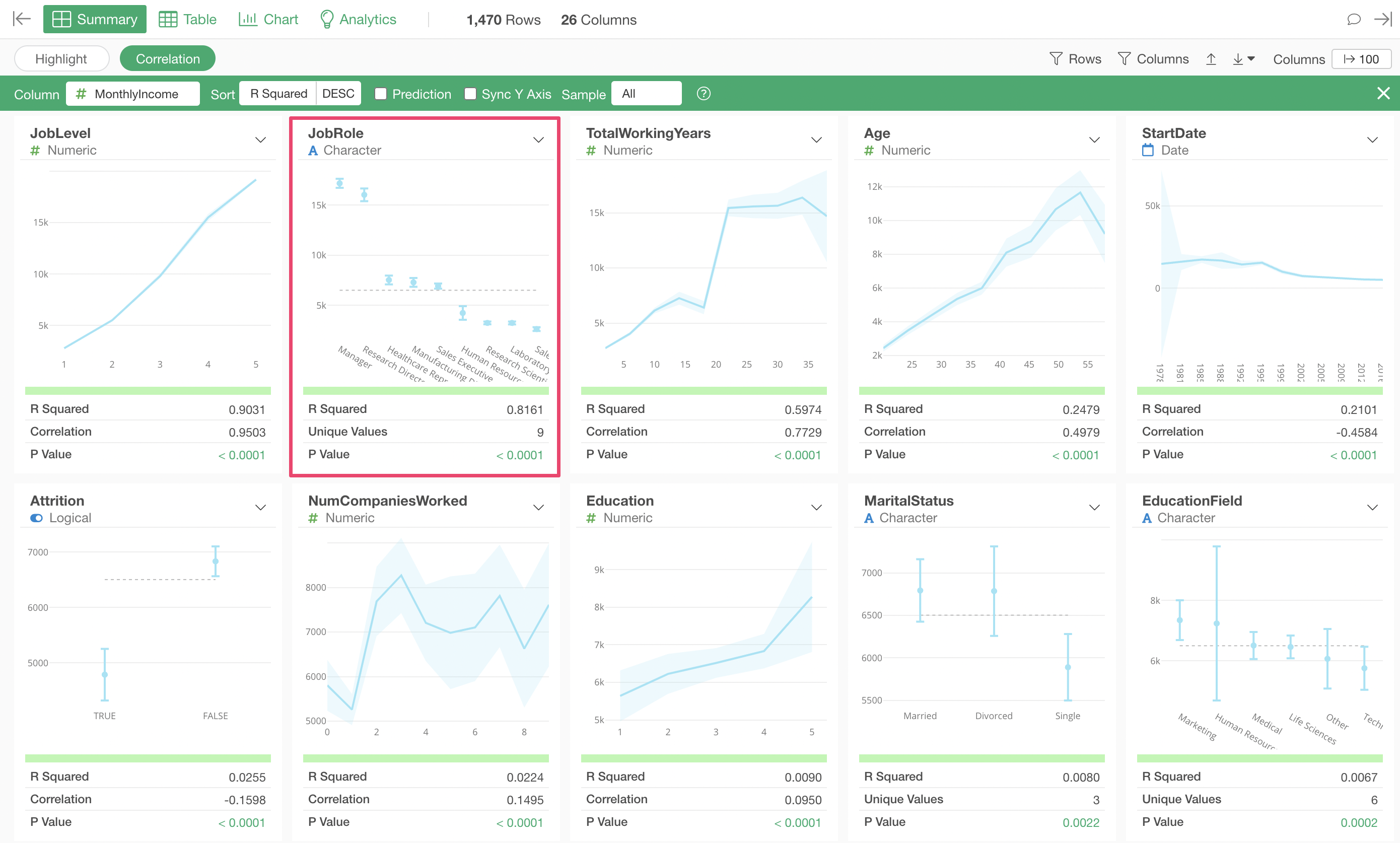
Next in correlation strength is “Job Role,” and the chart shows that “Managers” and “Research Directors” have higher salaries compared to other job roles.
Looking at the metrics, the R-squared is 0.8161, indicating a fairly high correlation, but it is not as strong as the R-squared of 0.9301 for “Job Level” mentioned earlier.
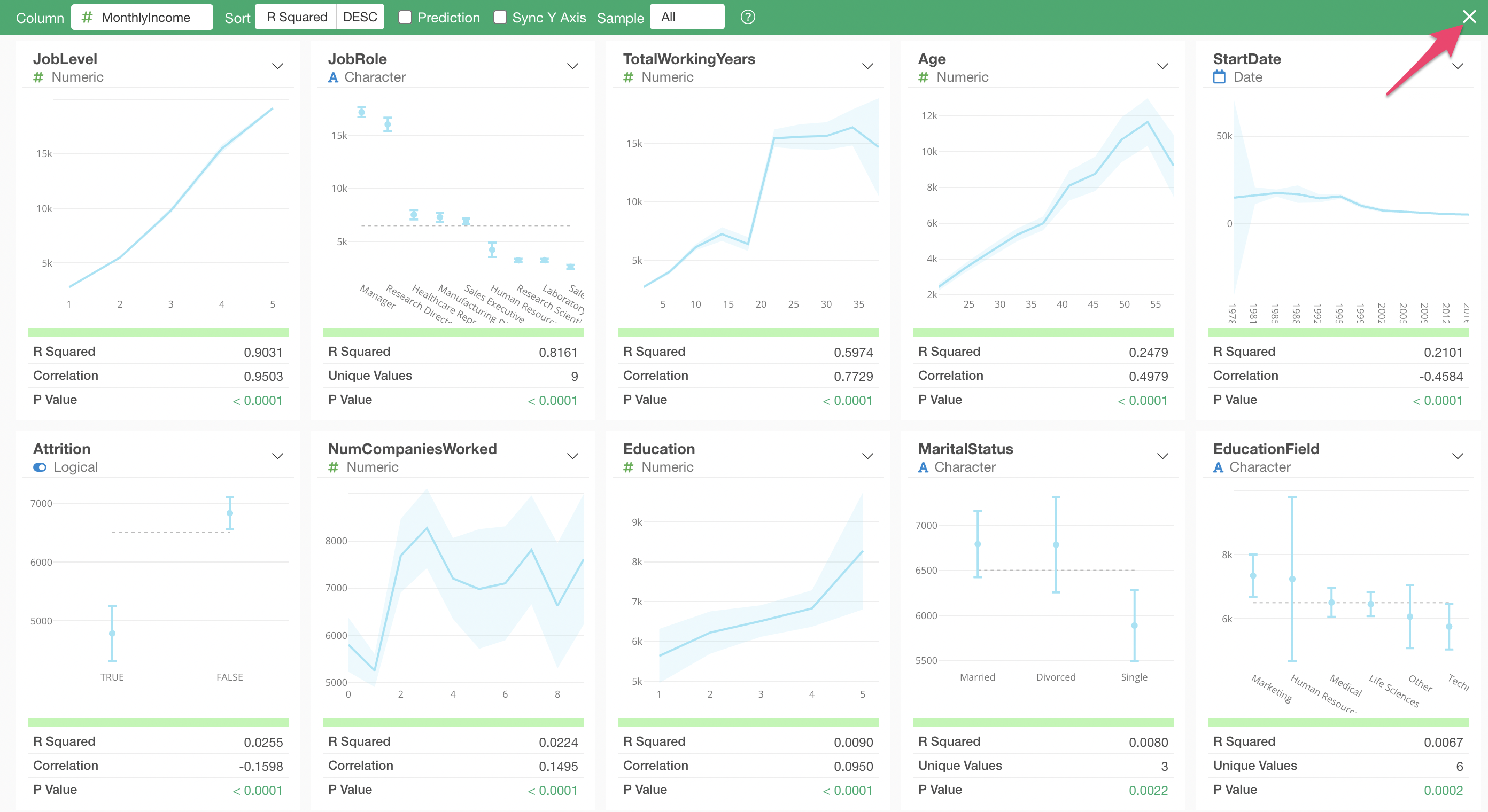
To exit Correlation mode, click the “×” button in the upper right corner.
In this way, “Correlation mode” allows you to efficiently investigate the relationship between a target variable and all other columns at once.
4. What is a Predictive Model?
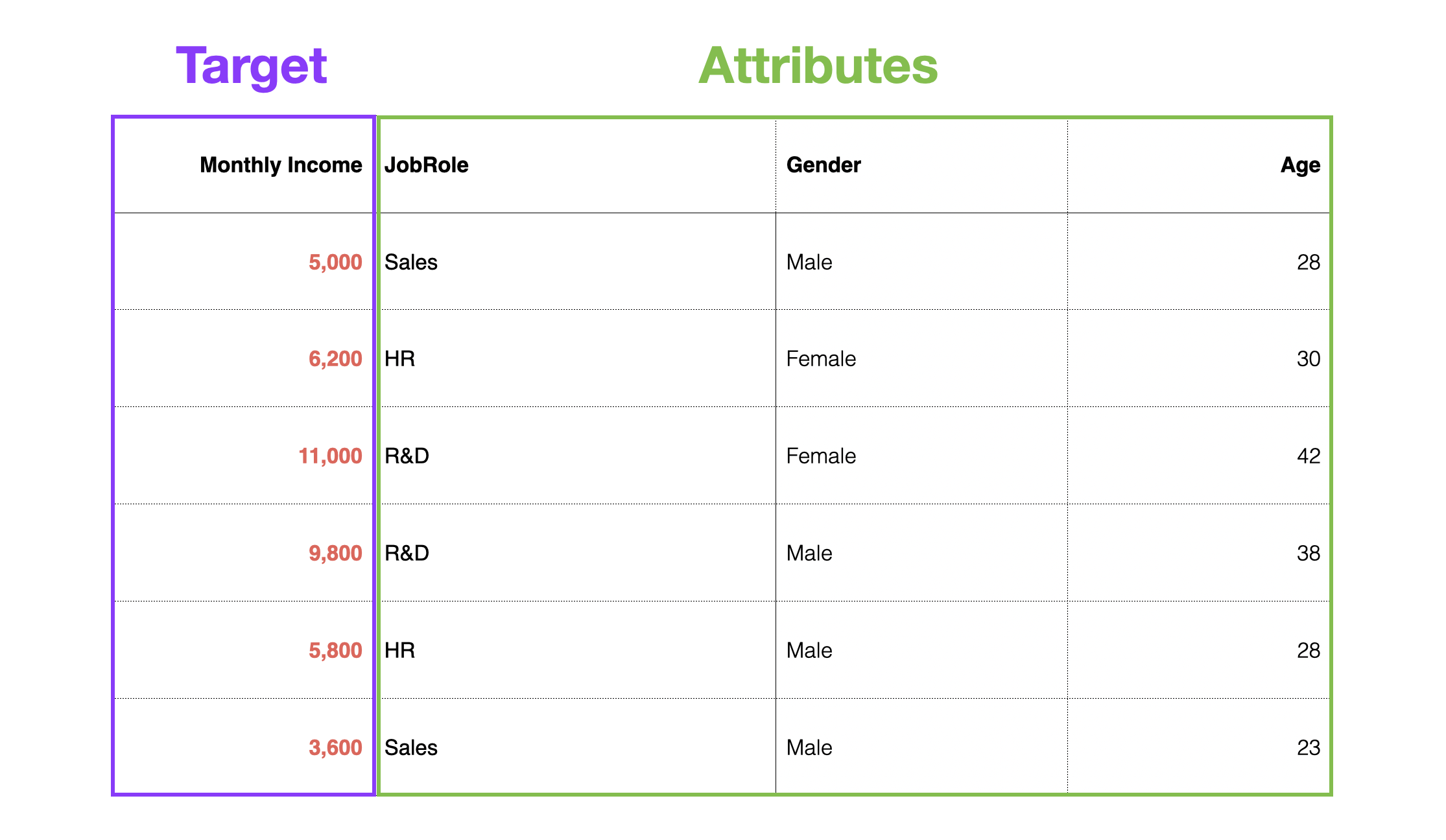
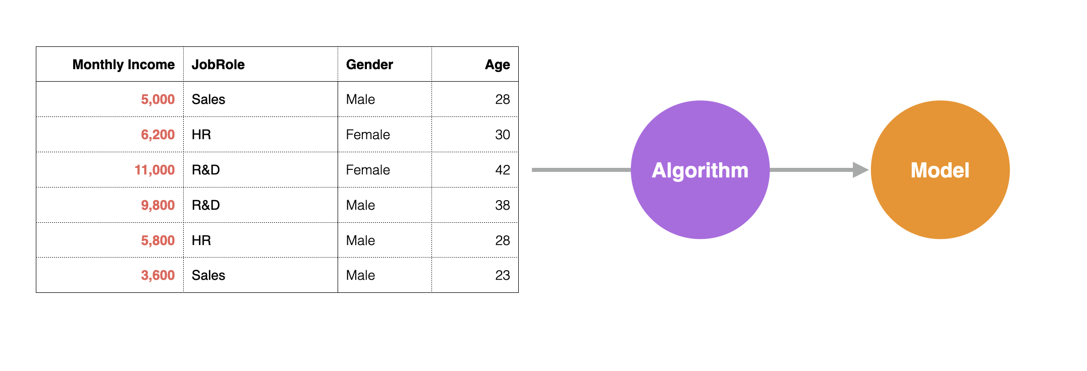
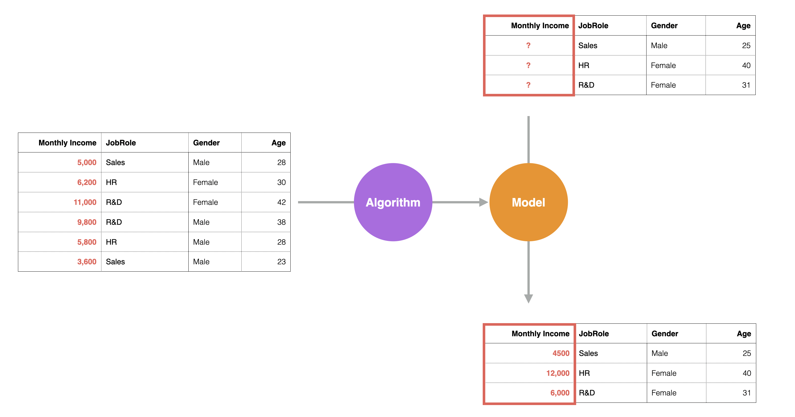
For example, suppose you have Monthly Income data for each employee. In this case, the target for prediction is Monthly Income, and the attributes include columns for occupation, gender, and age.
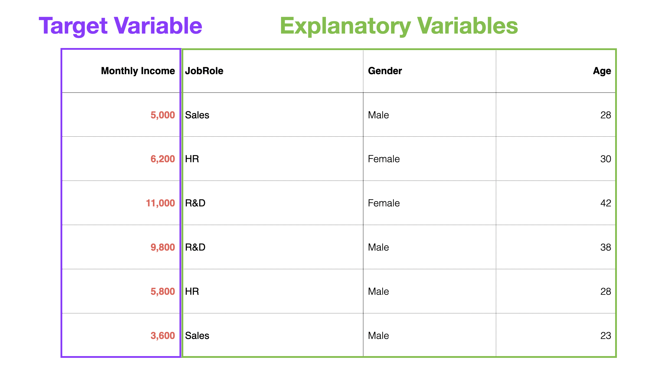
When building a predictive model, the column to be predicted is called the dependent variable, and the columns used to predict the dependent variable are called predictor variables or independent variables.
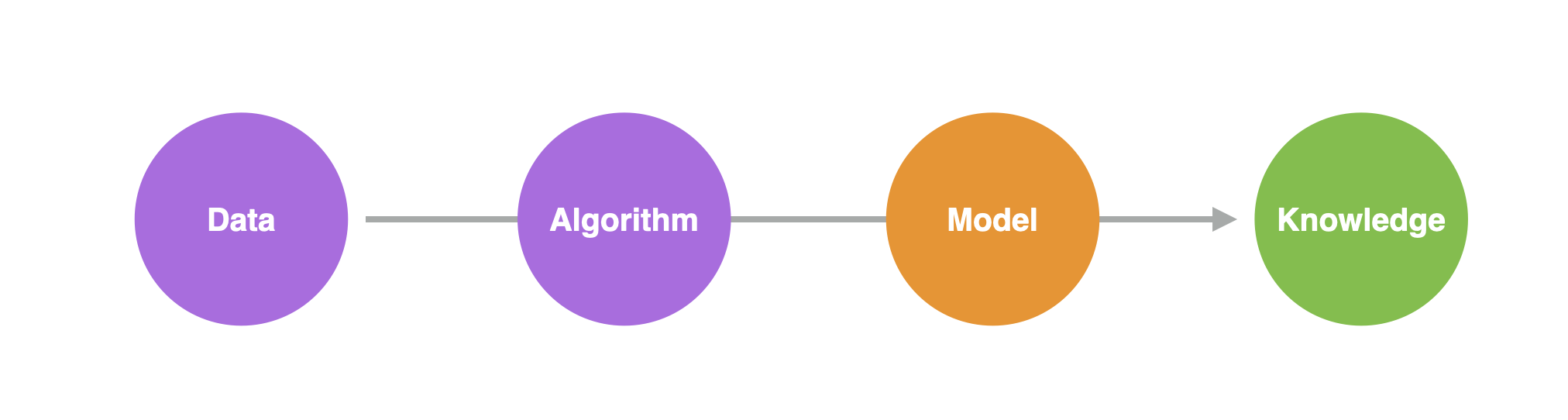
With such data, statistical or machine learning “algorithms” can be used to formulate patterns in past data into mathematical equations or rules, based on the relationship between customer attributes and conversions, to predict the future.
The representation of patterns found in data by algorithms is called a “predictive model.”
Using a predictive model, you can predict what the salary will be when a new employee joins.
Furthermore, by creating a predictive model, you can also understand the following about the patterns in the data:
- Which variables are strongly related to the dependent variable?
- What kind of relationship is it?
- Is it a significant relationship?
- How much of the dependent variable’s movement can this model explain?
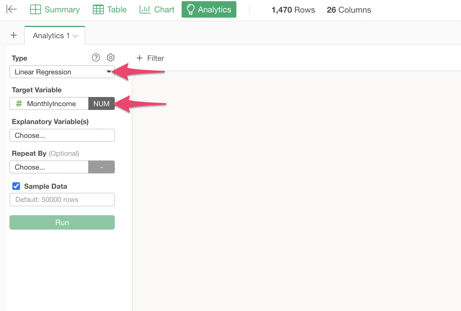
5. Predictive Model: Creating a Linear Regression
This time, we will create a linear regression model to predict employee “Monthly Income.”
Move to the Analytics View, select “Linear Regression” as the type, and “Monthly Income” as the dependent variable.
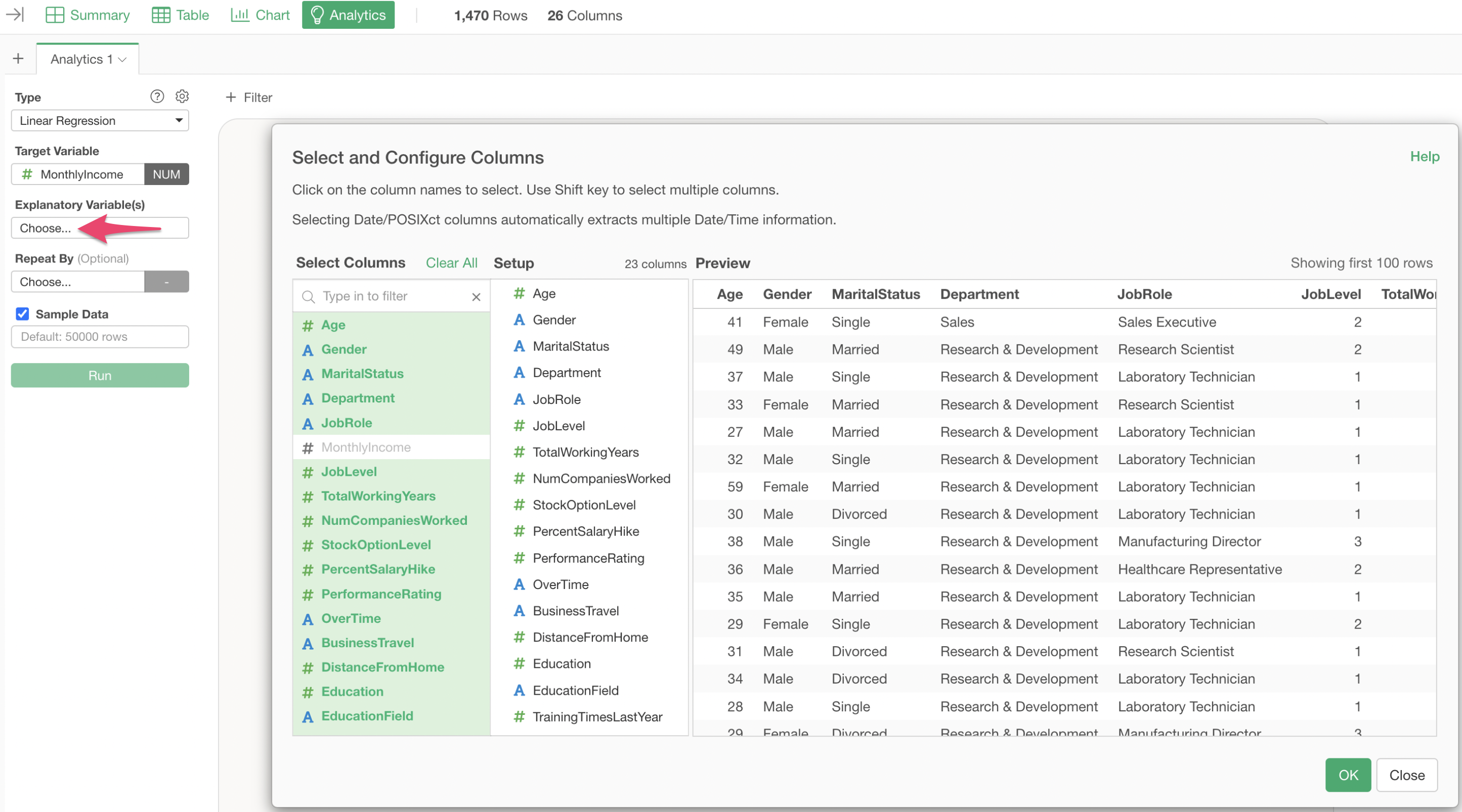
Click on “Explanatory Variables” and select the columns from “Age” to “Attrition” while holding down the Shift key.
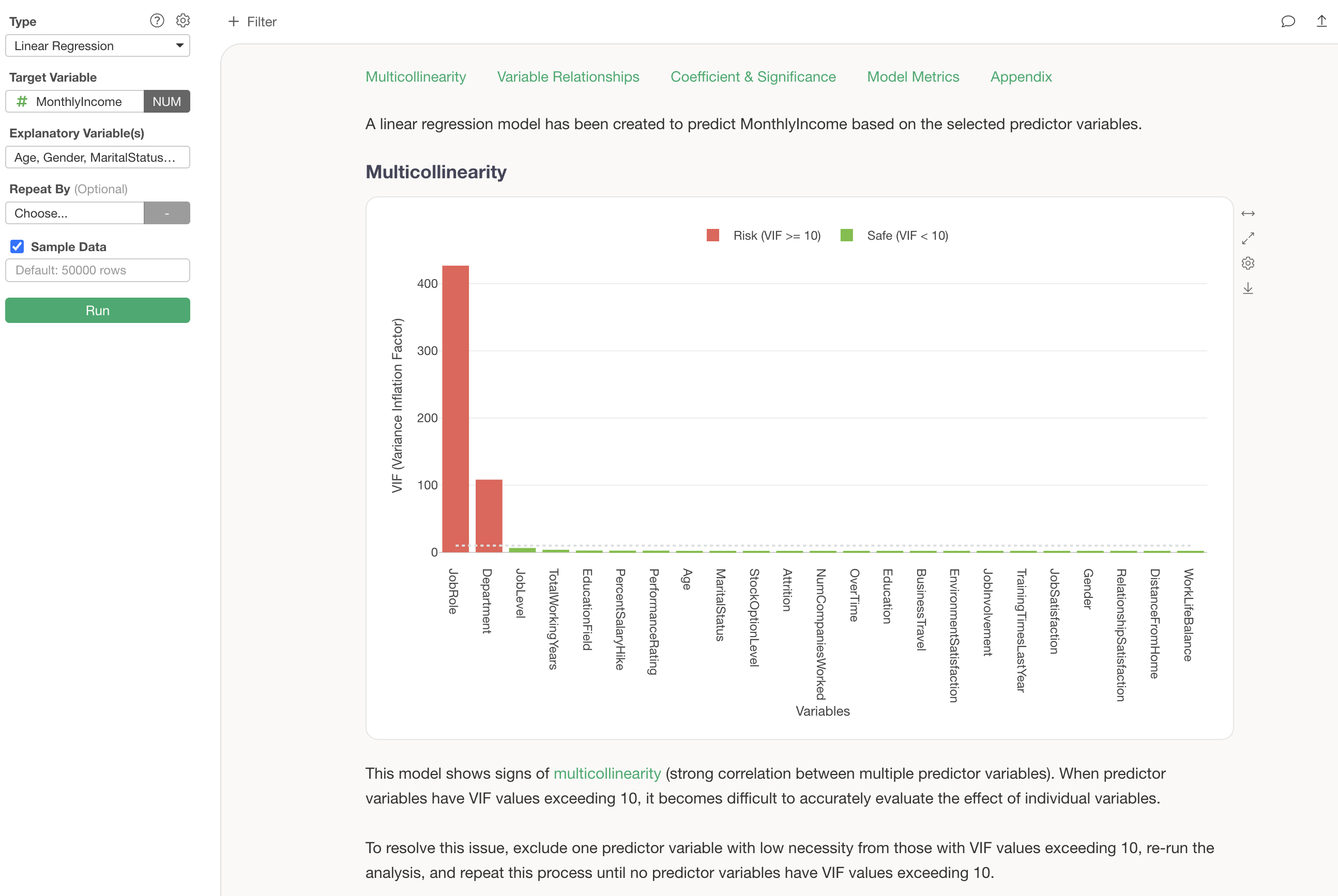
Executing this confirms that a linear regression model has been created.
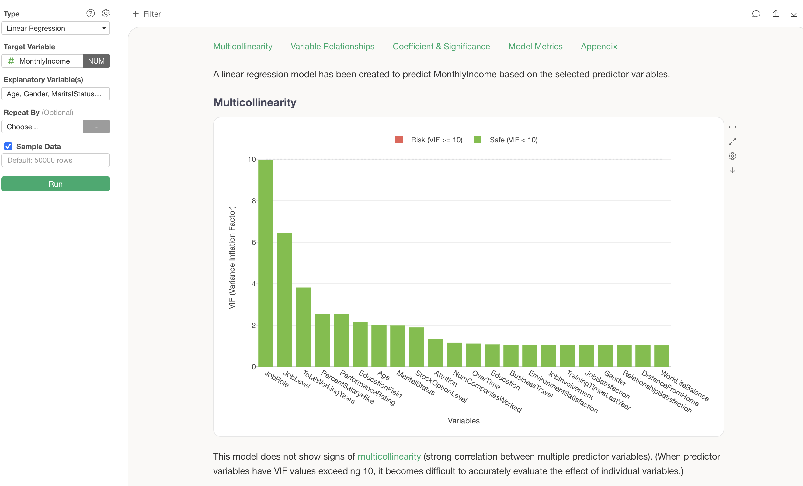
However, there is one problem here: multicollinearity. In statistical models like linear regression, if there are strongly correlated variables among the explanatory variables, the coefficients can become unstable.
In the current results, multicollinearity is present (VIF is 10 or higher), so either “Department” or “Job Role” needs to be removed from the explanatory variables.
For these analytical considerations, in versions v13 and later, guided analytics automatically displays detailed explanations of how to interpret each chart and analytical method, making the results understandable even for beginners.
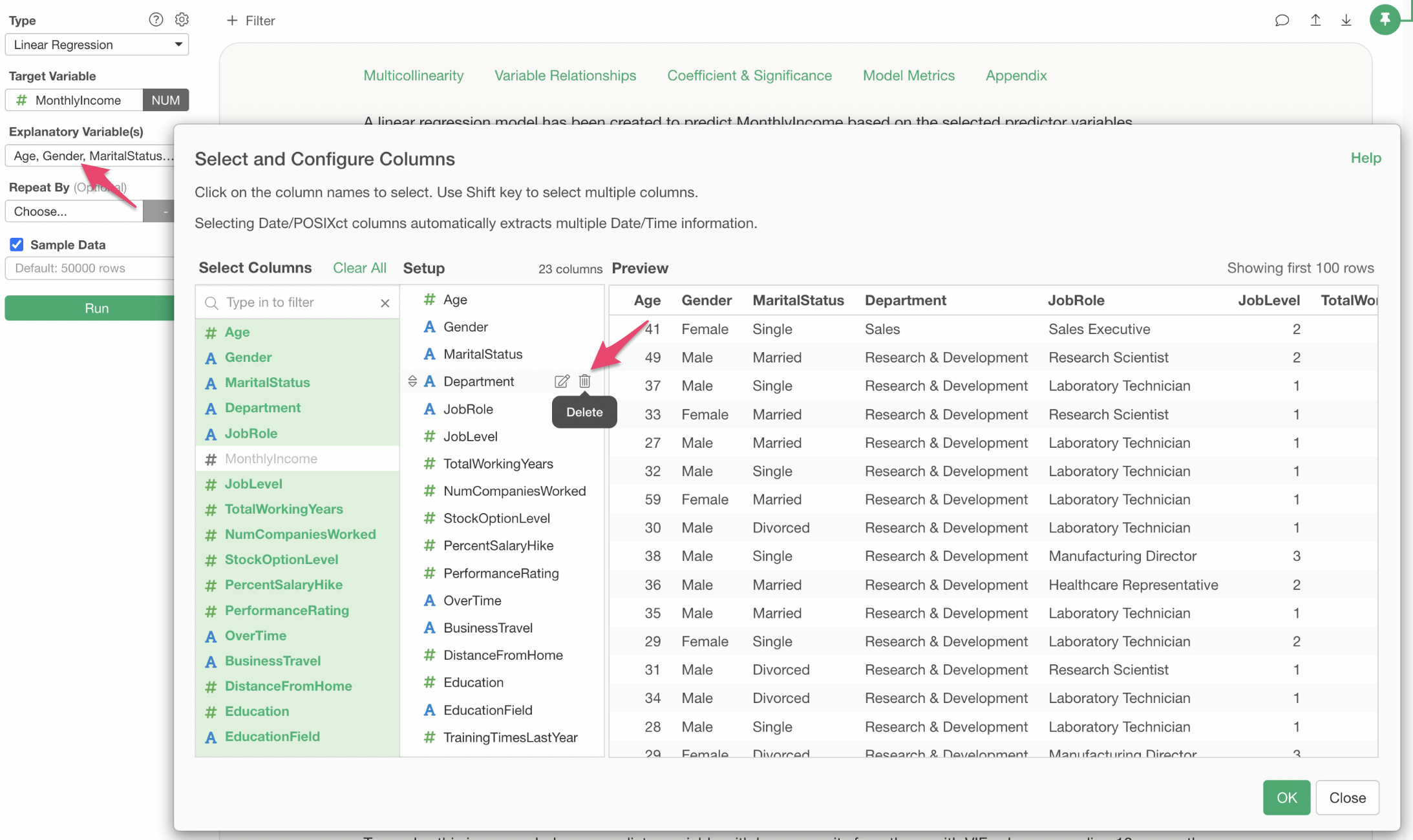
Click on “Explanatory Variables” and remove “Department,” then execute.
This resolves the multicollinearity problem.
6. Interpreting the Predictive Model
With guided analytics in v13, the interpretation of analytics can be understood by reviewing the results from top to bottom.
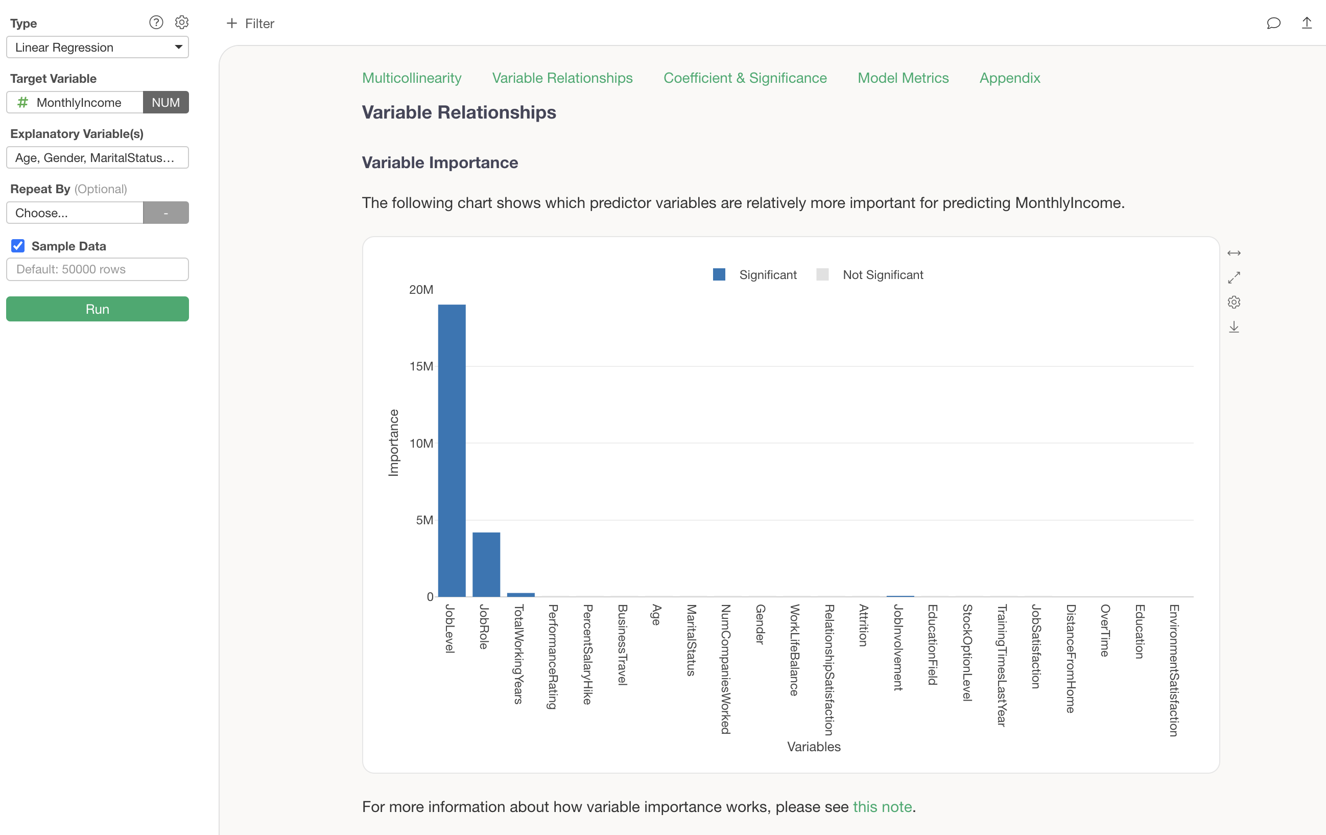
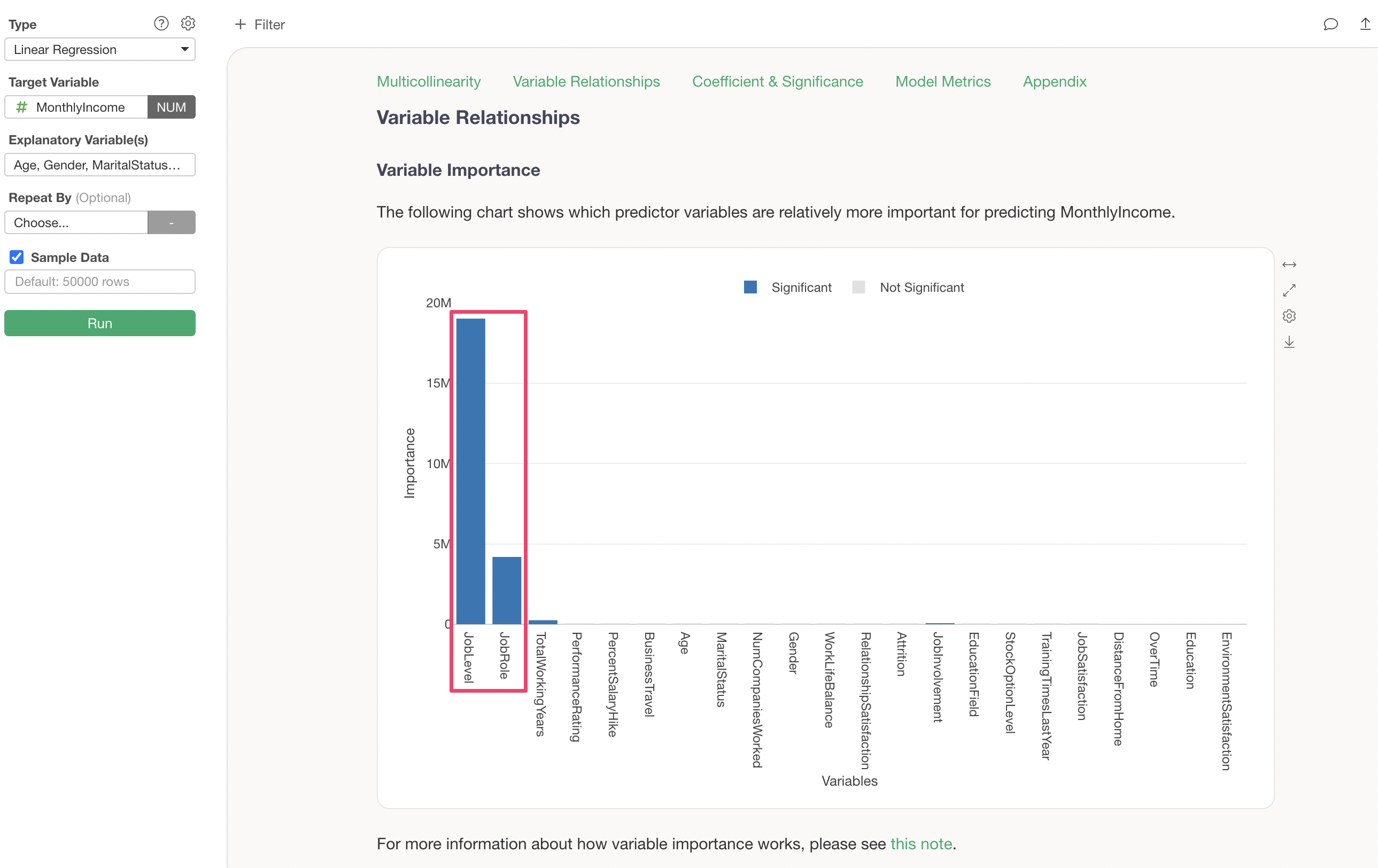
Importance of Explanatory Variables
In the “Importance of Explanatory Variables” section, you can investigate which variables are more strongly correlated with the dependent variable and are more important for prediction.
It is clear that “Job Level” and “Job Role” are important variables for predicting Monthly Income.
For more details on variable importance, please refer to the document here.
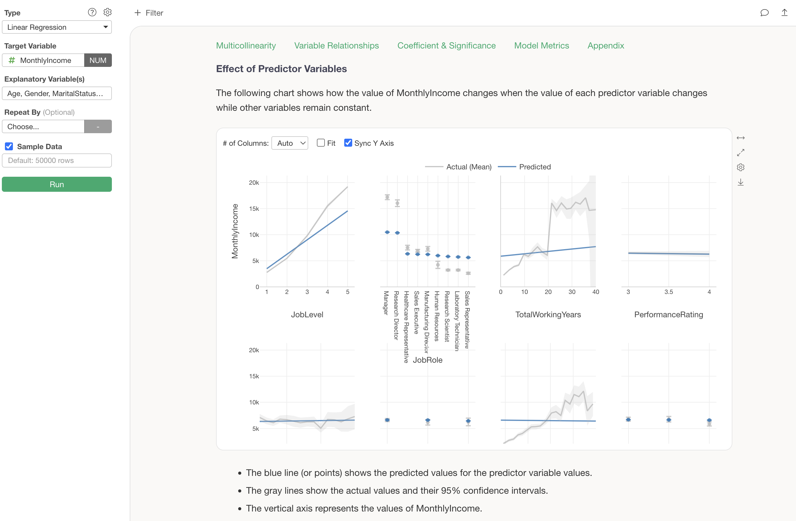
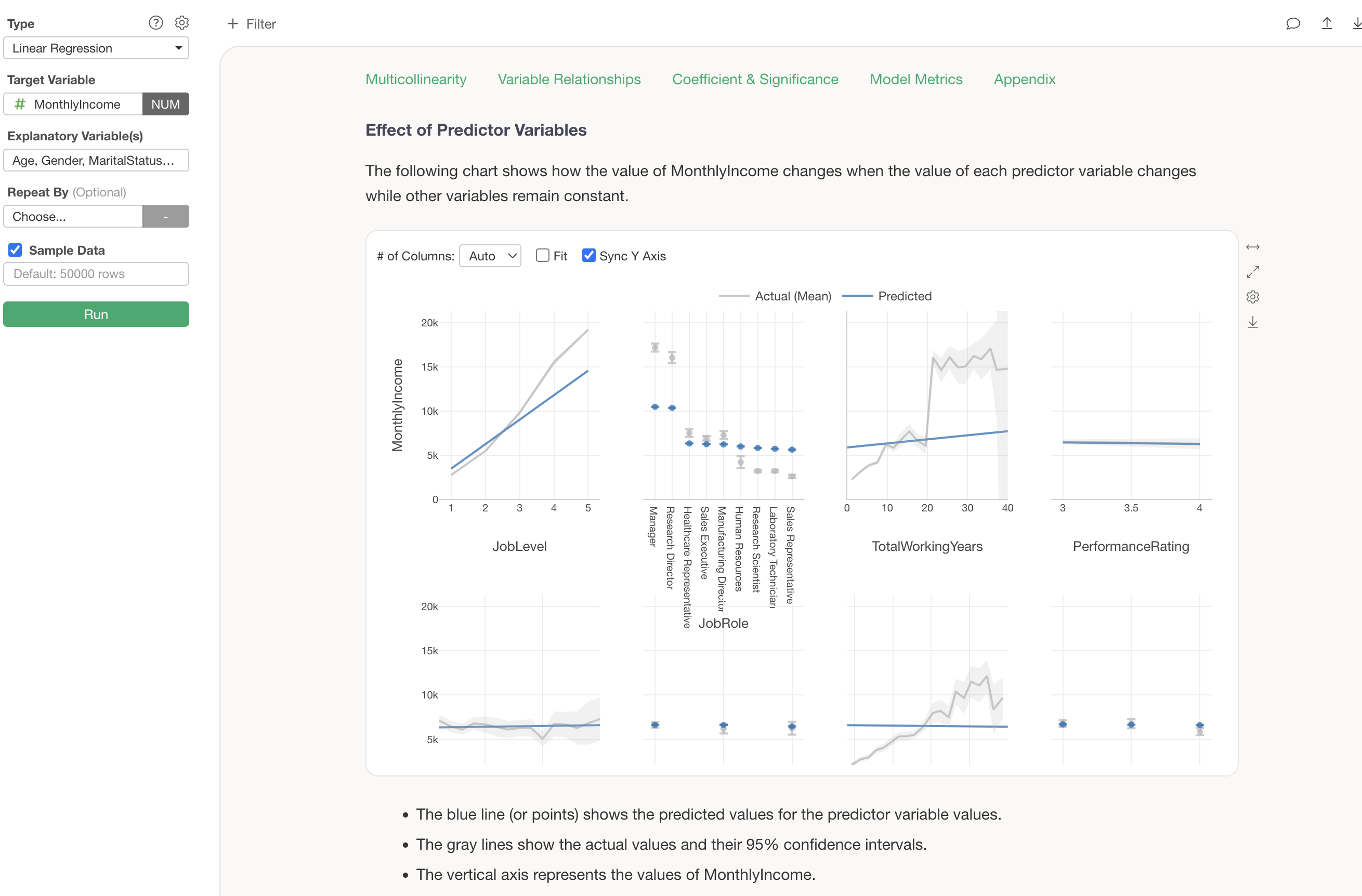
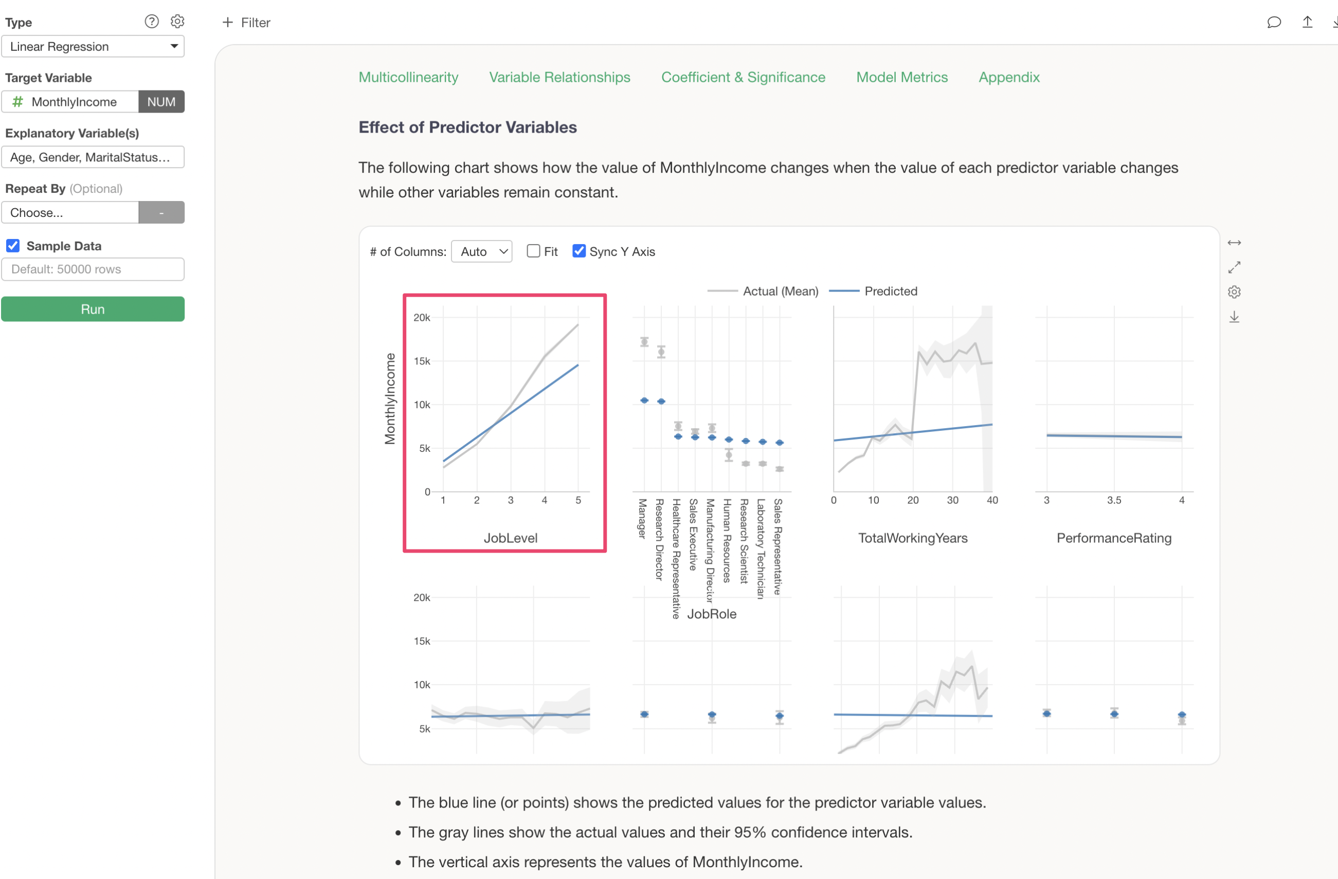
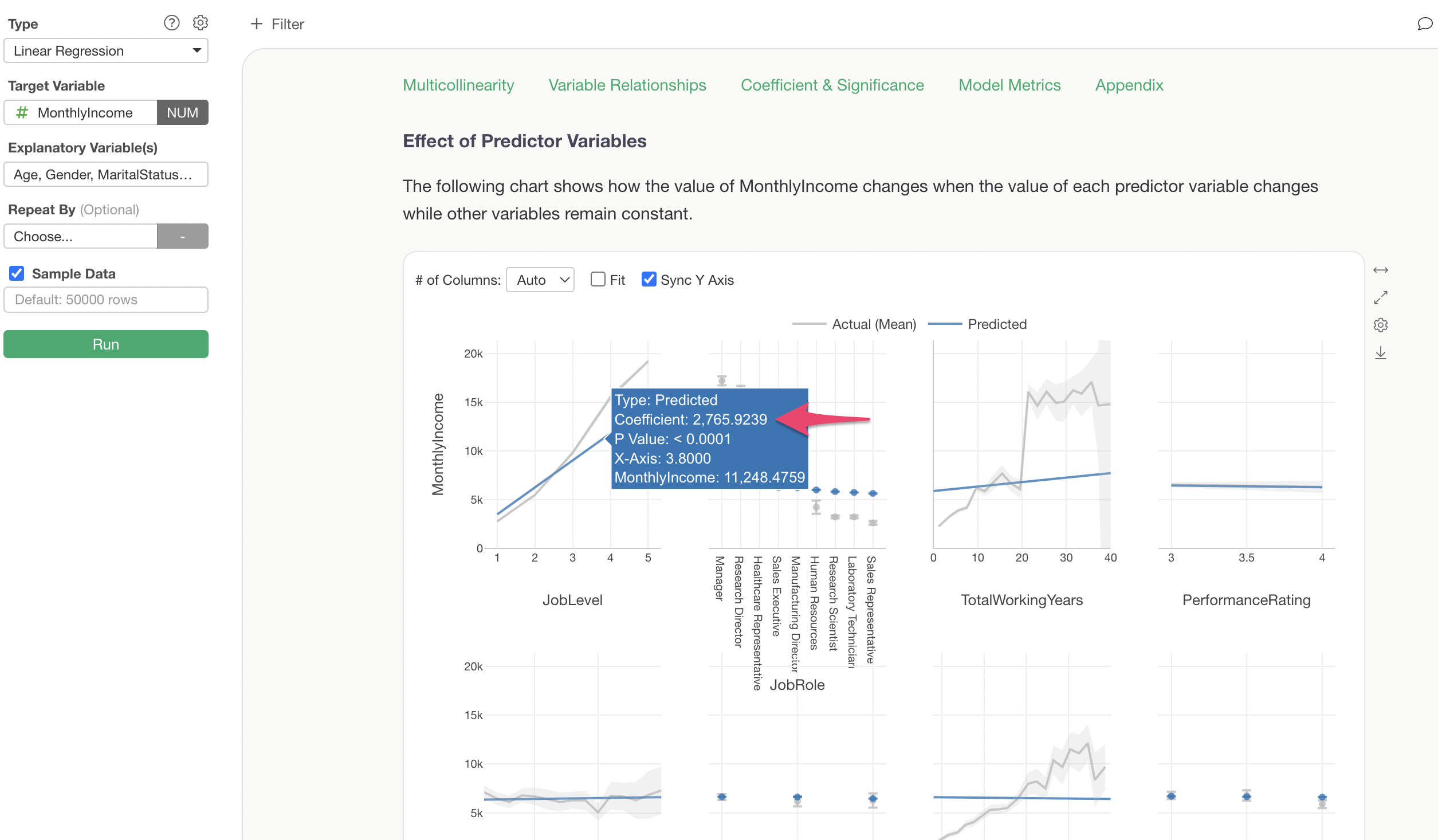
Impact of Explanatory Variables
The “Impact of Explanatory Variables” shows how the value of the dependent variable changes when the value of each variable changes.
It is evident that there is a relationship where Monthly Income increases as job level increases.
Assuming other variables remain constant, it is understood that if the job level increases by 1, the Monthly Income increases by $2,766 (coefficient).
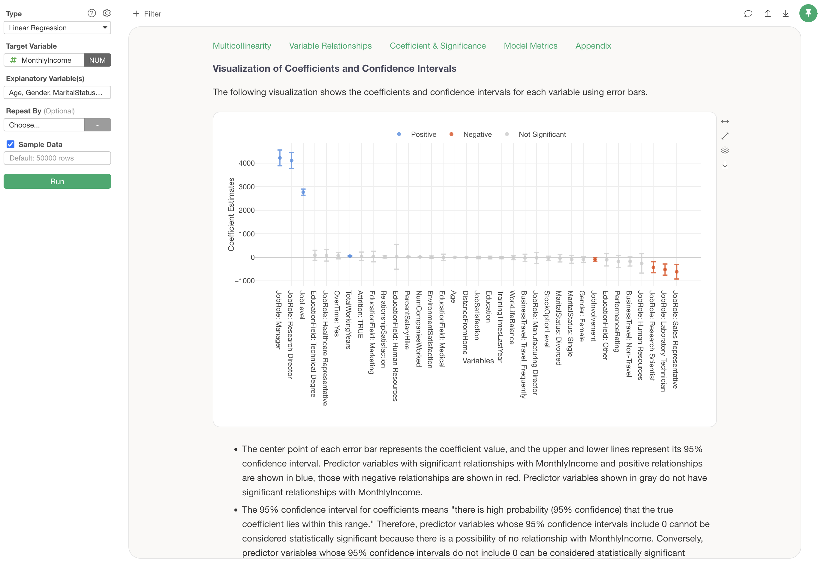
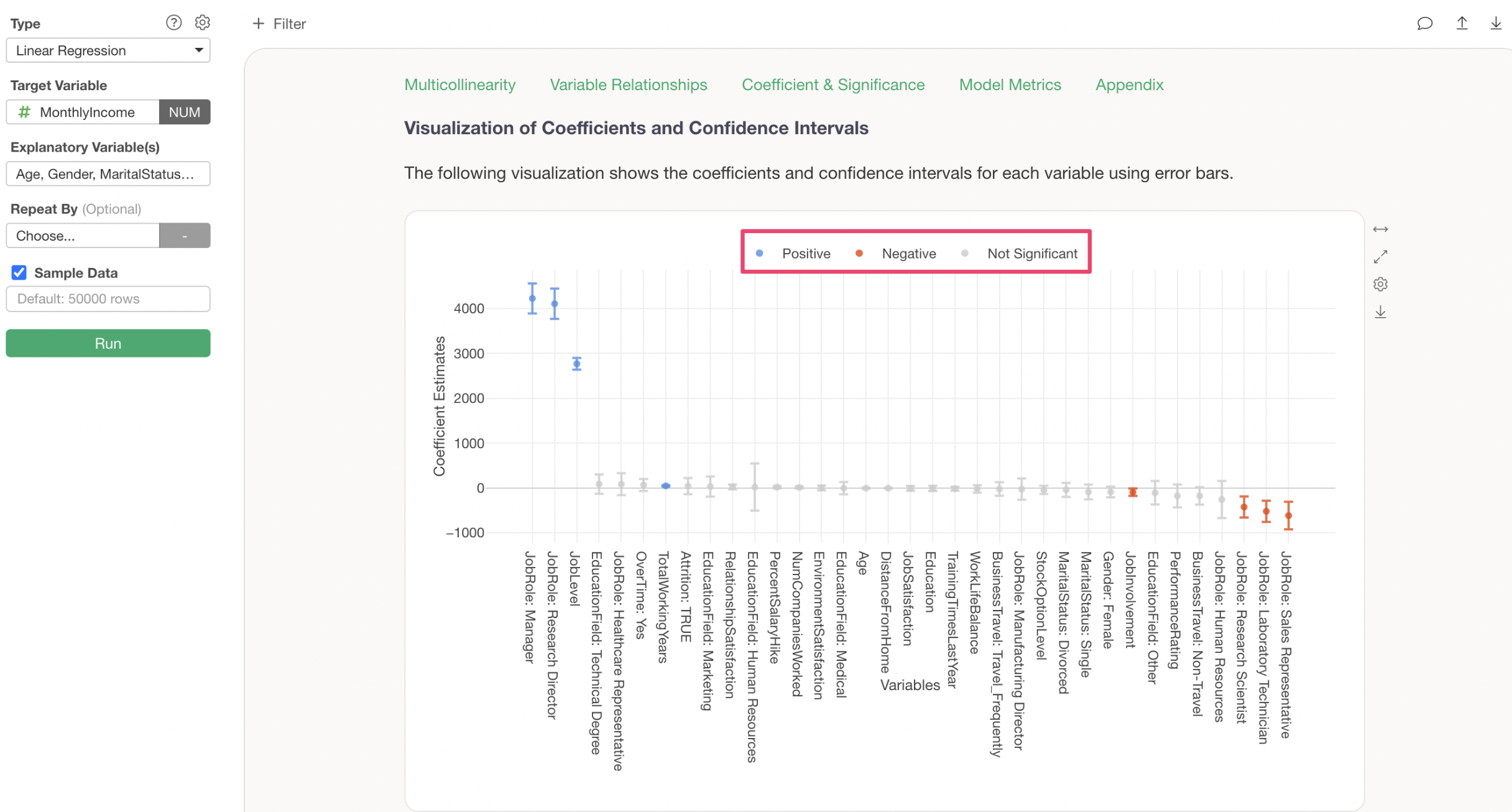
Visualization of Coefficients and Confidence Intervals
The “Visualization of Coefficients and Confidence Intervals” displays the change in Monthly Income when each variable’s value changes by one unit, along with its confidence interval.
Each error bar is displayed in blue if Monthly Income increases, red if it decreases, and gray if it is neither increasing nor decreasing significantly.
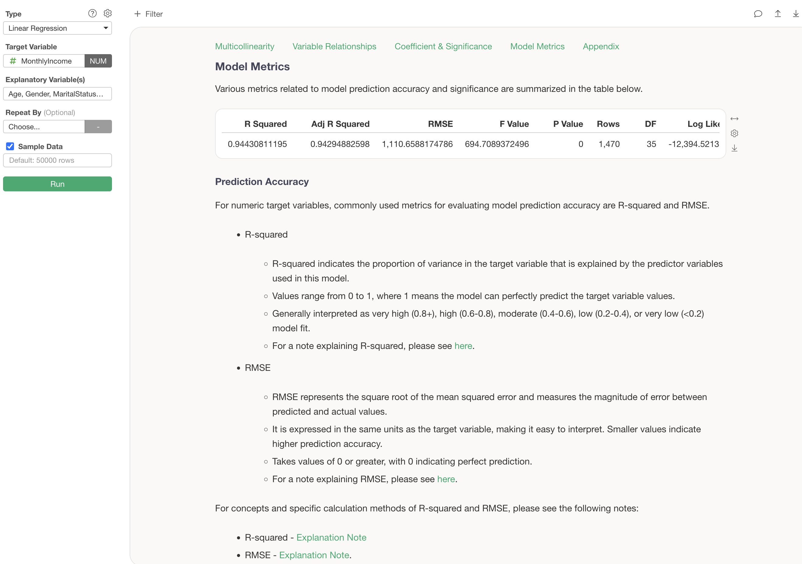
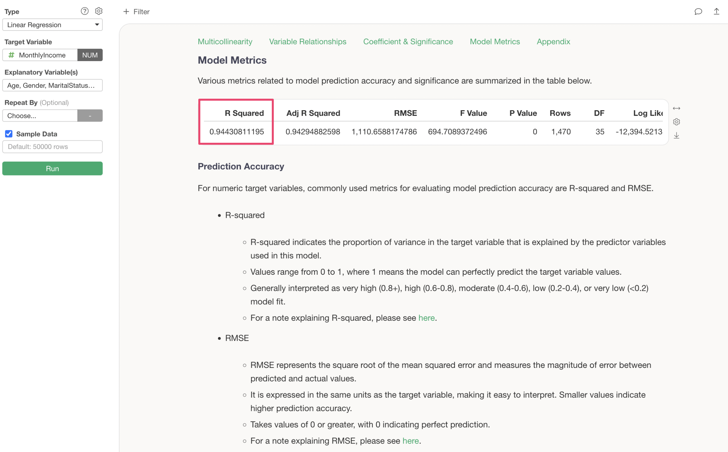
Model Metrics
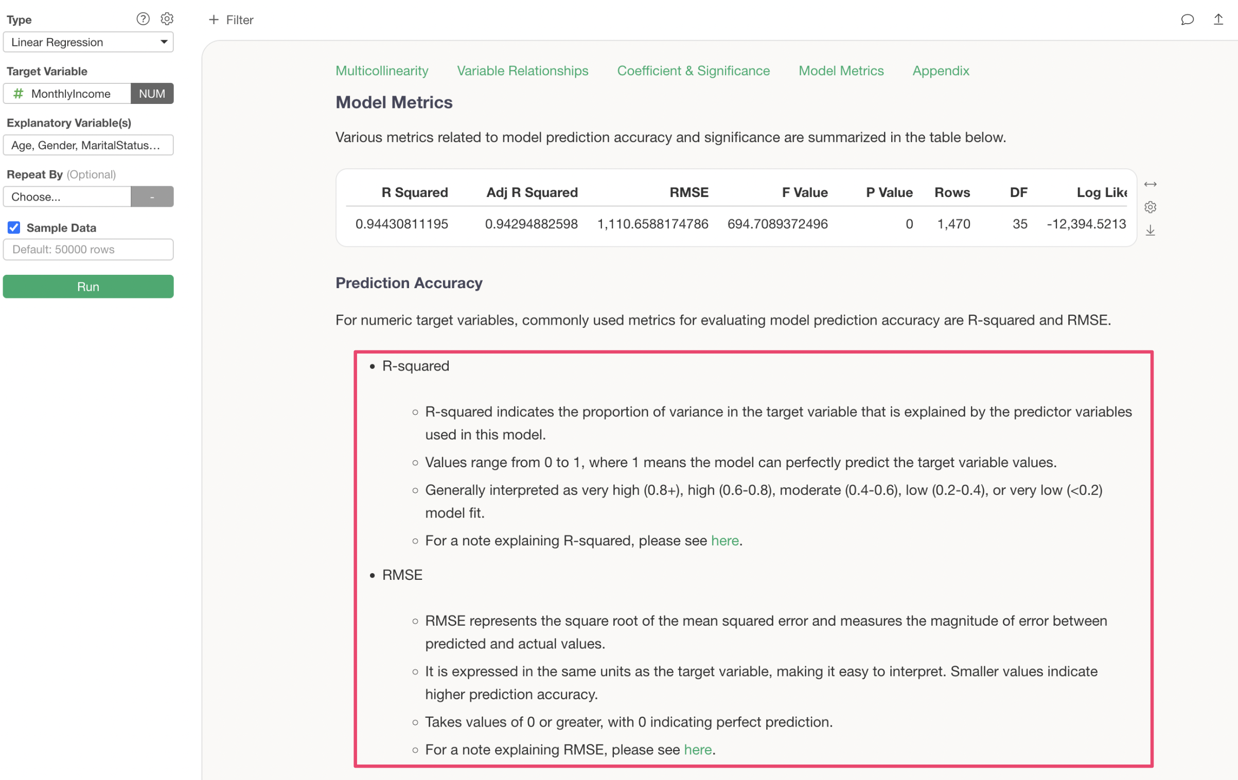
In “Model Metrics,” you can check the prediction accuracy of this predictive model.
R-squared is a metric that indicates the proportion of the variance from the data’s mean that the model can explain, taking values between 0 and 1. The closer it is to 1, the better the model explains the data’s variance.
The R-squared for the model created this time is 0.943, which can be interpreted as this model explaining 94.3% of the variance in Monthly Income.
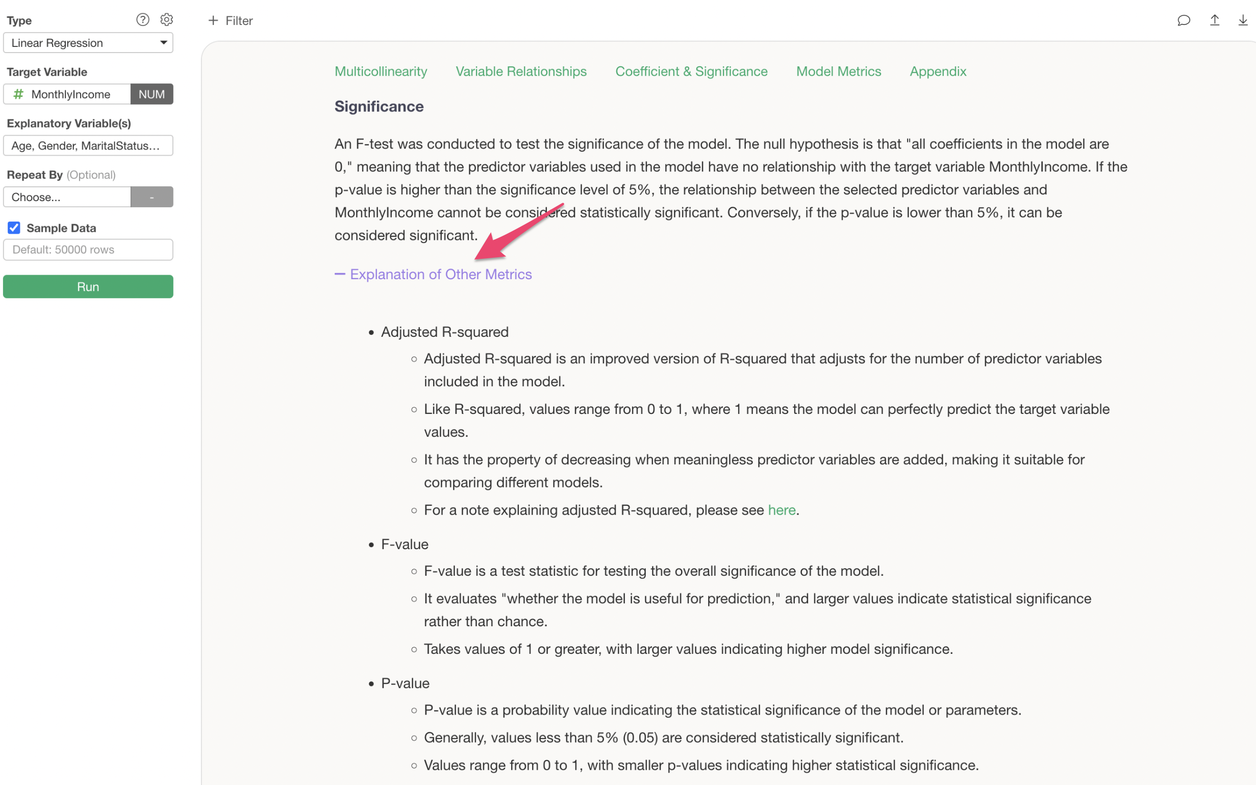
Below the prediction accuracy, there are explanations on how to interpret metrics like R-squared and RMSE.
Furthermore, by clicking the plus button for “Explanation of Other Metrics,” explanations for all metrics are provided.
7. Text Analysis
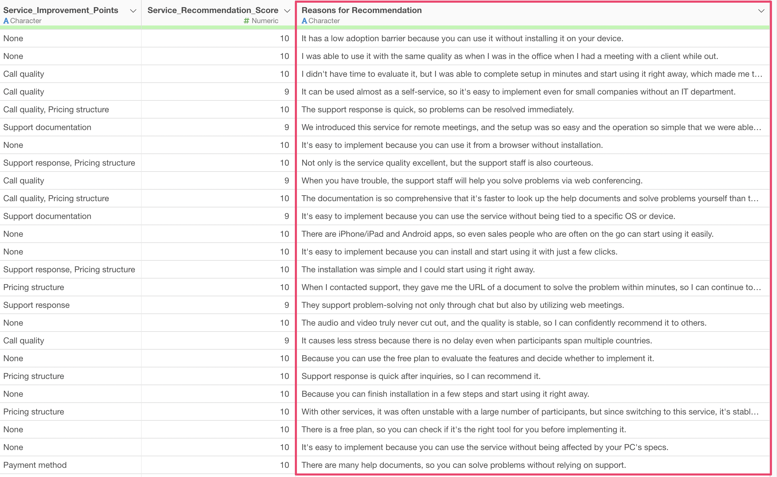
This time, we will use the “Customer Satisfaction Survey” data.
This data includes customer comments on “Reason for Recommendation.”
While free-form responses like these can be read one by one if the number of respondents is small, it becomes difficult to grasp the overall picture when there are many responses.
Therefore, Exploratory allows you to perform “Text Analysis - Word Count” to break down sentences into “words” and understand the frequency of each word and the trends of words used together.
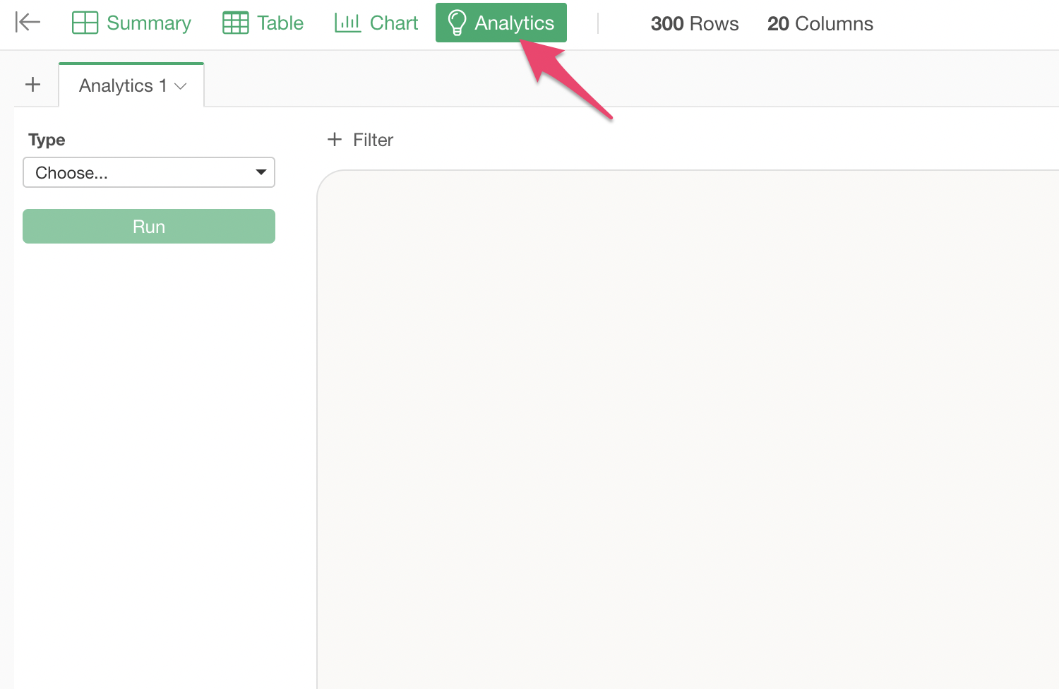
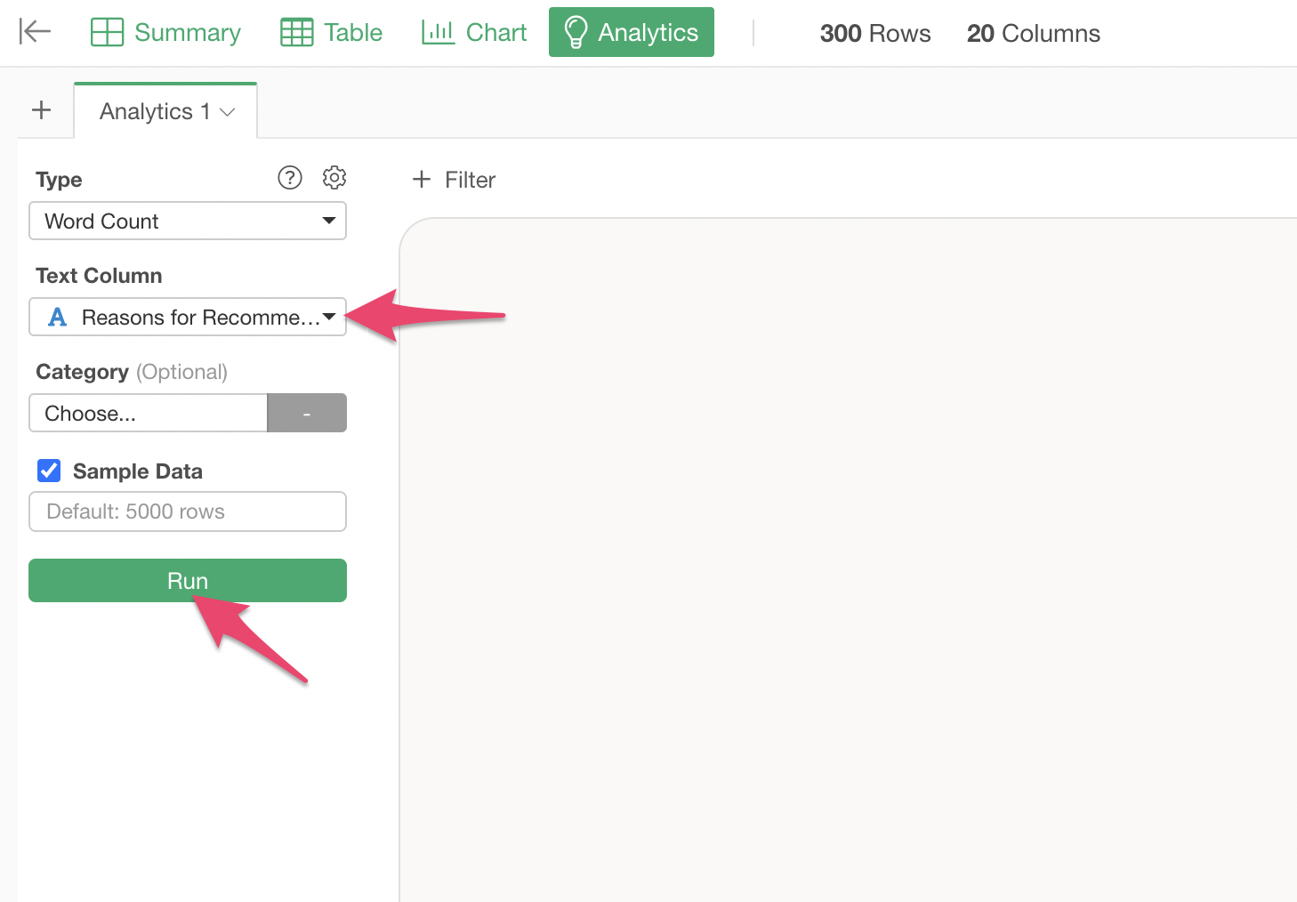
To perform text analysis, open the Analytics View.
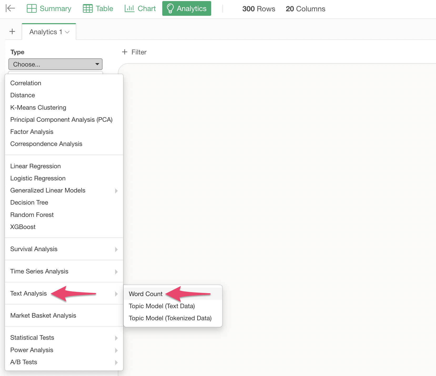
Select “Text Analysis” -> “Word Count” as the analytics type.
Specify “Recommendation Reason Comment” as the text column and click the “Run” button.

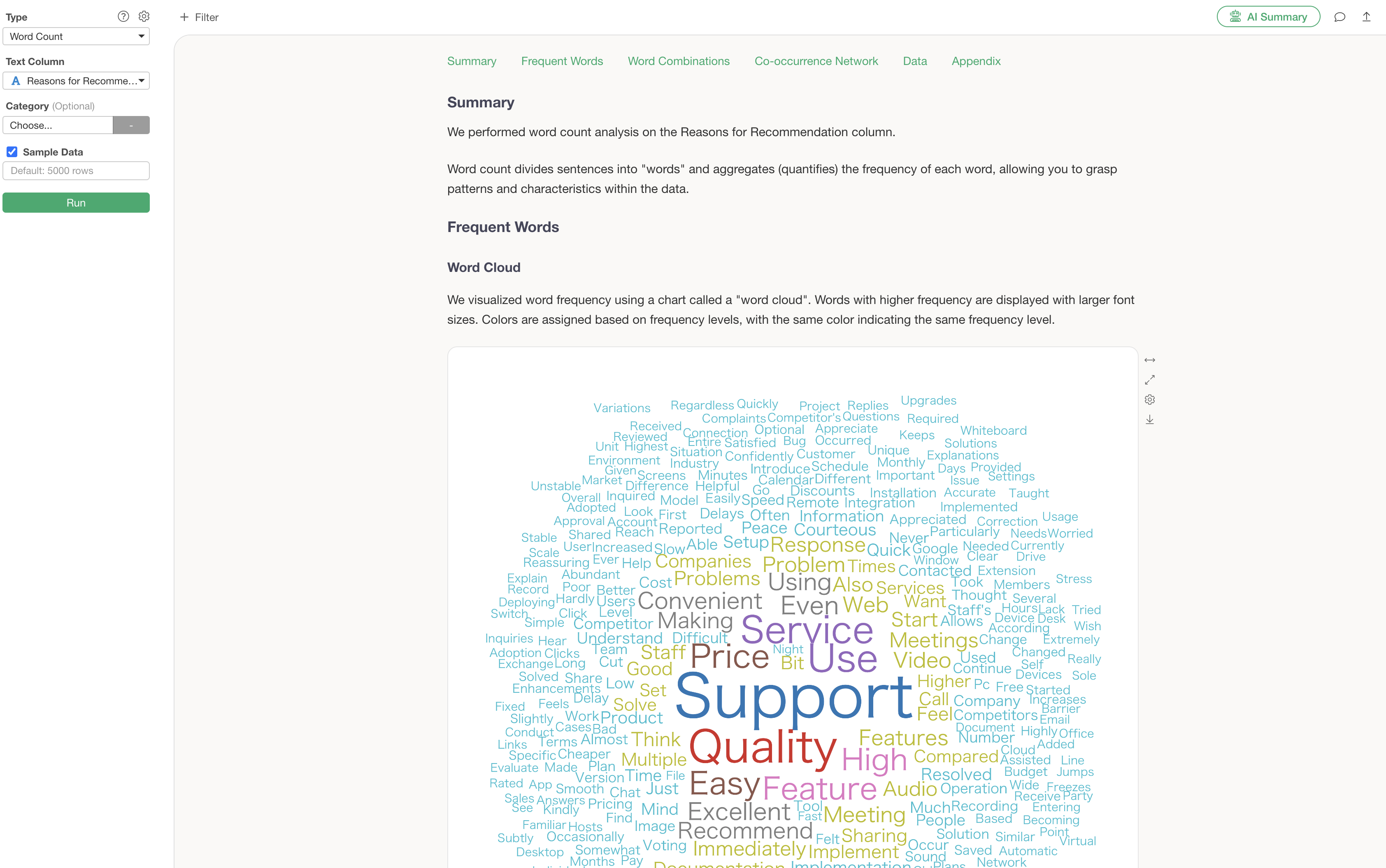
The Word Count analysis is executed, and the Analytics Guide displays detailed explanations for each section.

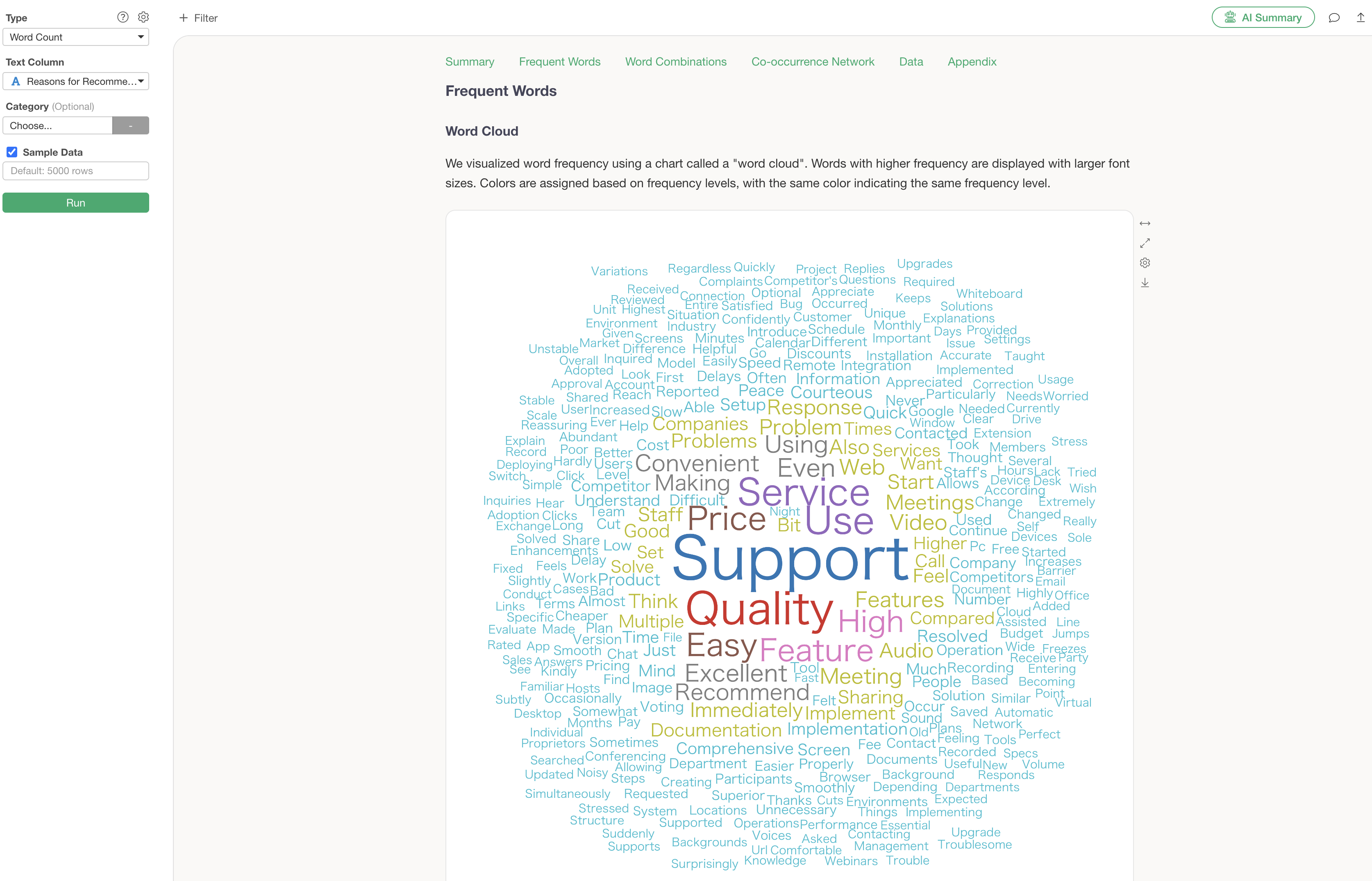
Frequent Words
The word cloud is a feature that allows you to grasp the overall trend of the text at a glance. Important words are displayed larger, making it possible to instantly convey “what was most important in this survey” when reporting to management or sharing information within a team.

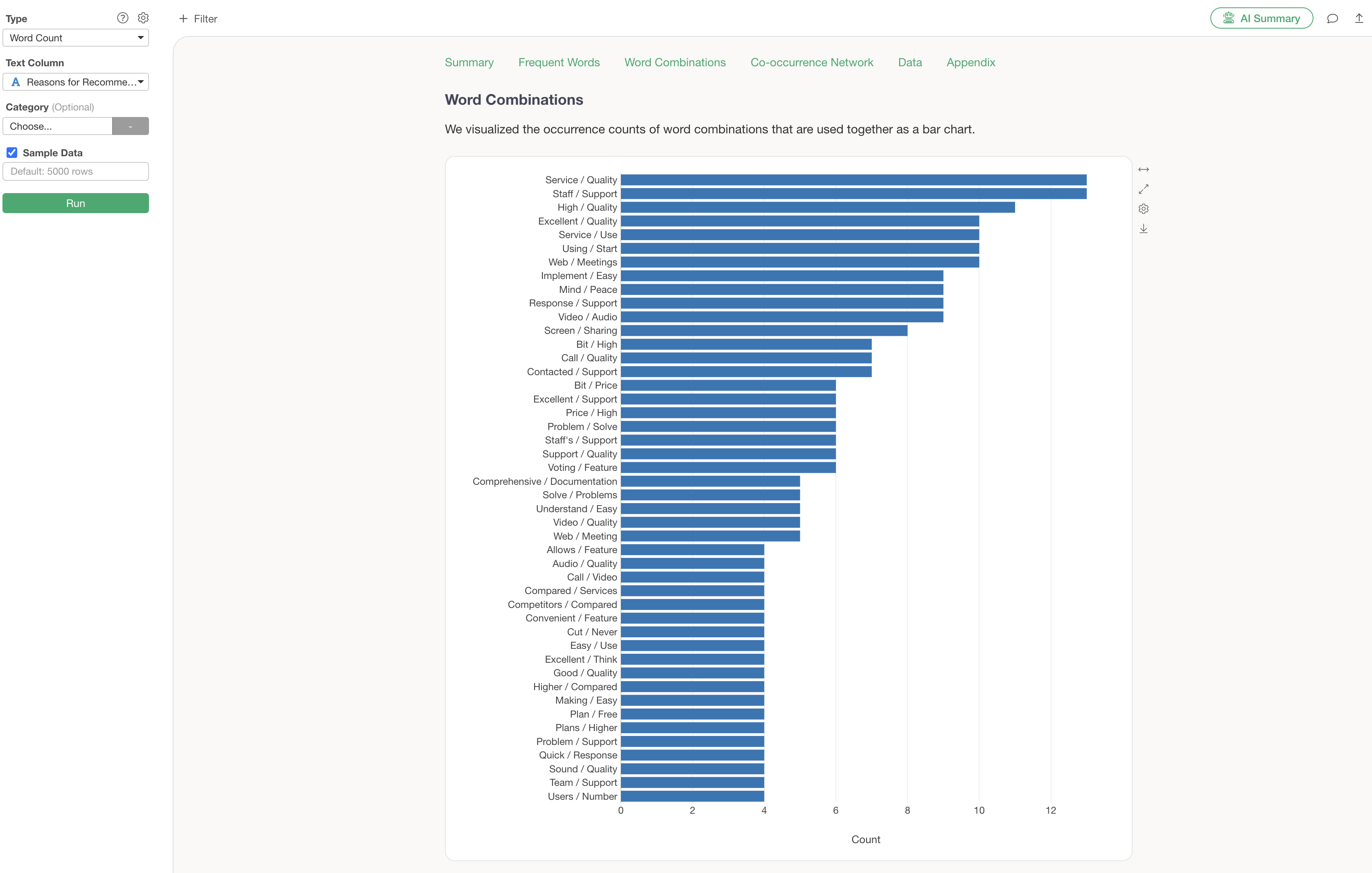
Word Combinations
Word combinations allow you to discover “trends of words used together” that might not be apparent from individual words alone.
Co-occurrence Network
A co-occurrence network is a chart that groups words used together and visualizes their relationships. This allows for an overview of what groups and words are being used.
The Analytics Guide explains how to interpret the chart in this co-occurrence network.

However, this co-occurrence network, while showing what word groups exist, has the following problems:
- It takes time to identify the groups manually.
- It doesn’t reveal the actual context in which those words were used.
Therefore, using the “AI Summary” feature, which will be introduced next, can solve these problems!
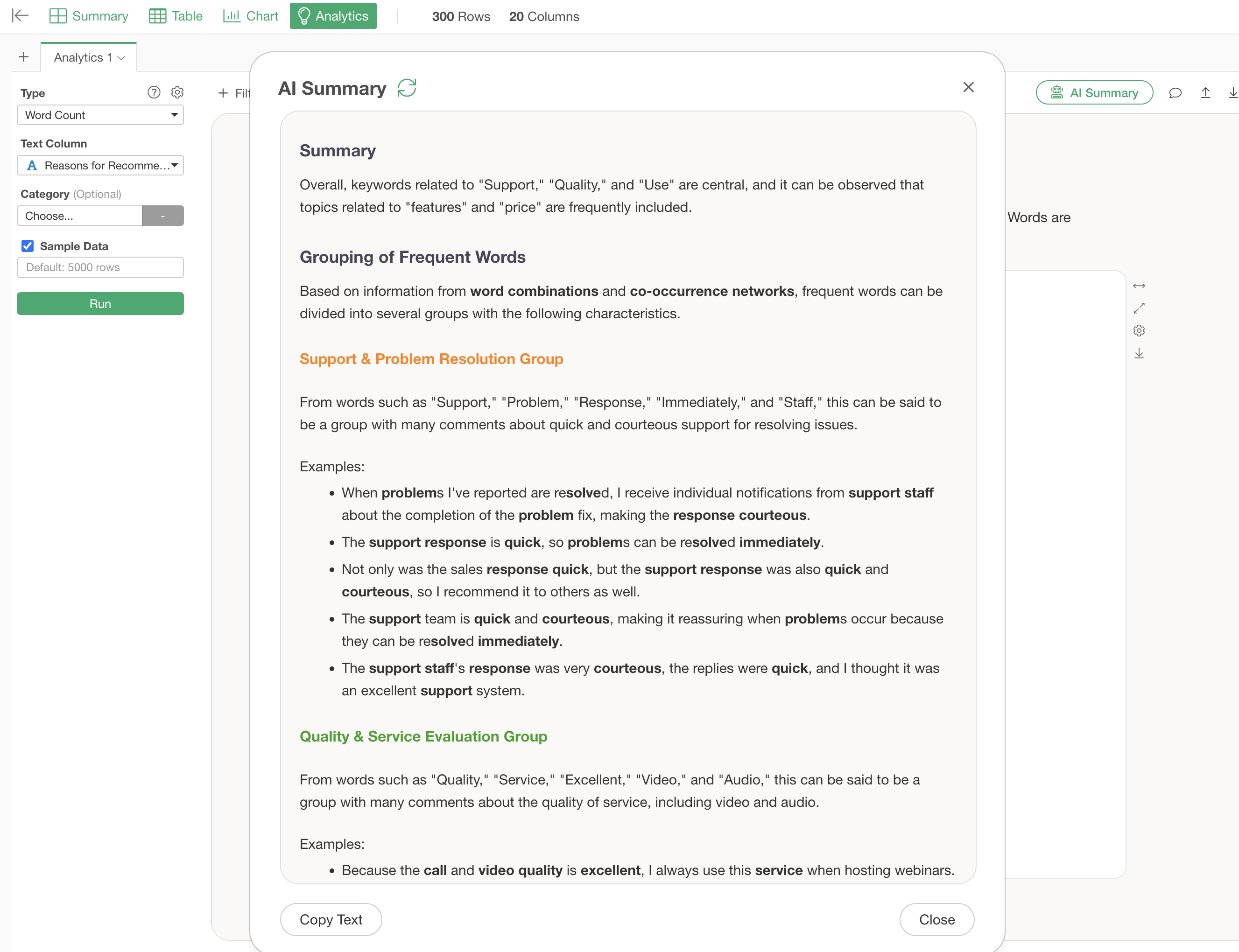
Summarize Analysis Results Using AI Summary
The “AI Summary” feature automatically summarizes analysis results.
Click the “AI Summary” button in the upper right corner of the Word Count analysis execution screen.

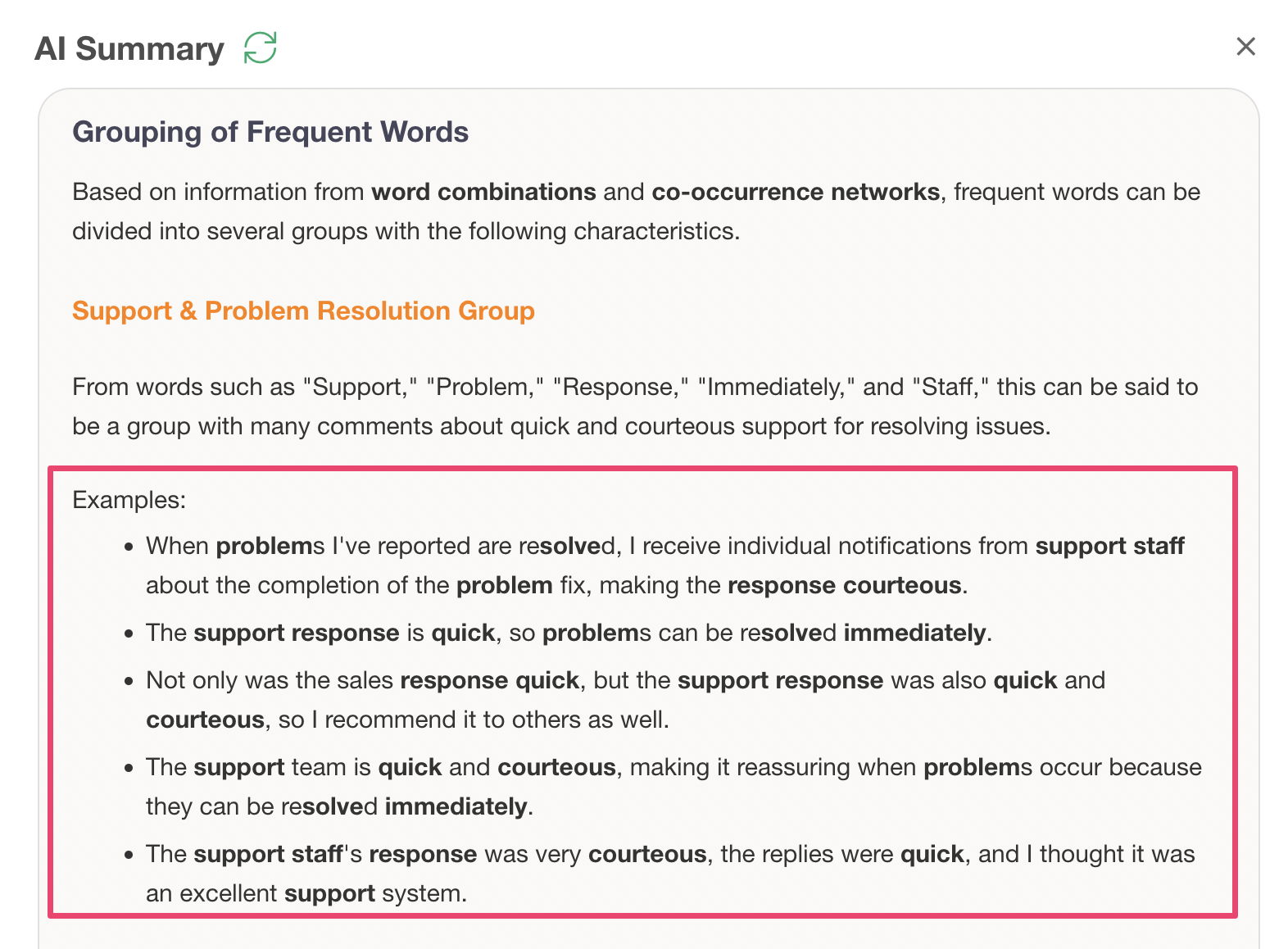
This outputs “Summary” information that summarizes the overall trend of the text, and “Frequent Word Grouping” information that compiles the characteristics of each group and actual sentences.

Just by looking at this AI Summary, you can quickly determine what words were frequent and what groups exist as a result of the text analysis.
Furthermore, examples of actual sentences are also displayed, allowing you to understand the background of customer voices that might not be visible from numerical data alone.

This concludes the Analytics edition of the Exploratory Usage Guide!
Exploratory Usage Series
You can check other parts of the Exploratory Usage Series from the links below. Please try the next “Dashboard” part as well.