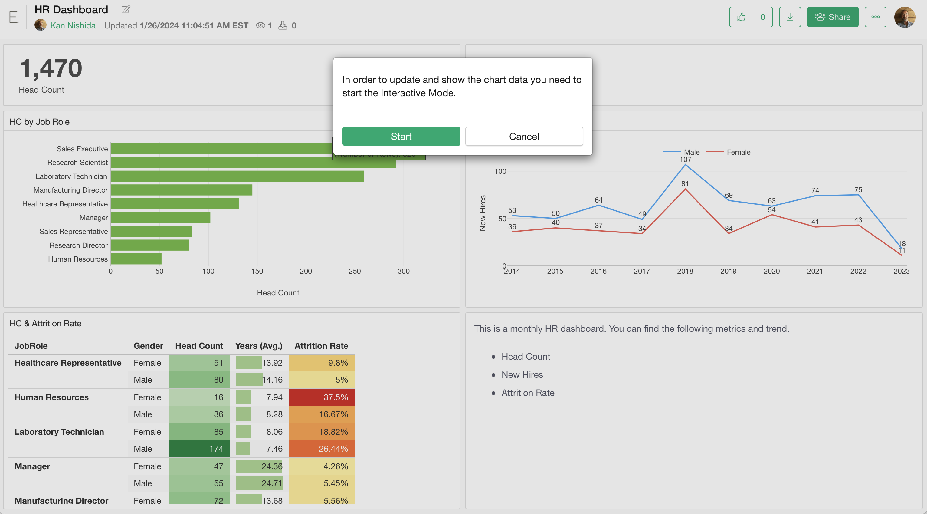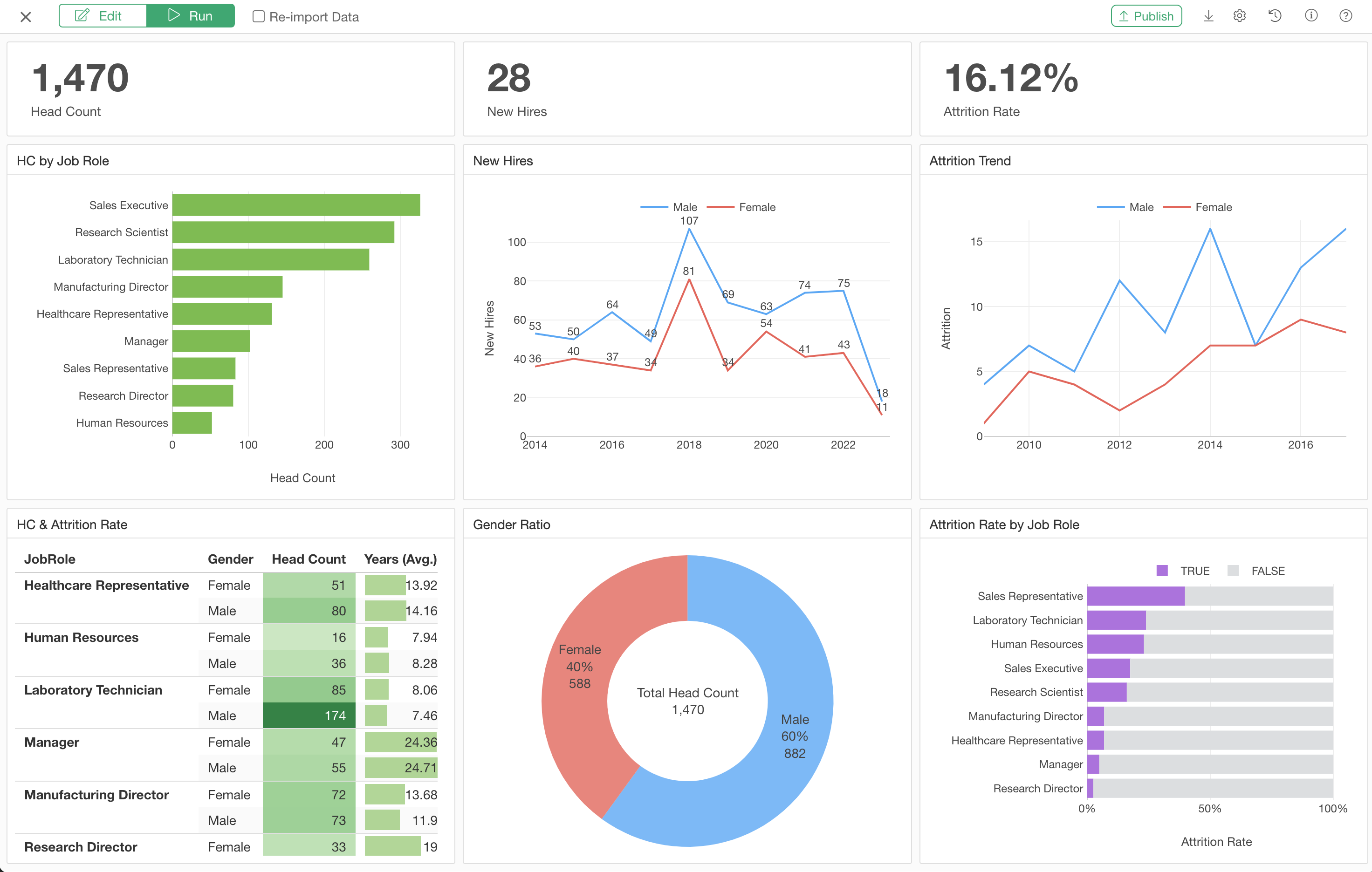
How to Use Exploratory Part 4 - Dashboard
1. Import a Sample Project
Download a sample project for this tutorial from here and save it to your PC.
Go to the Project List page in Exploratory, and drag-and-drop the project.
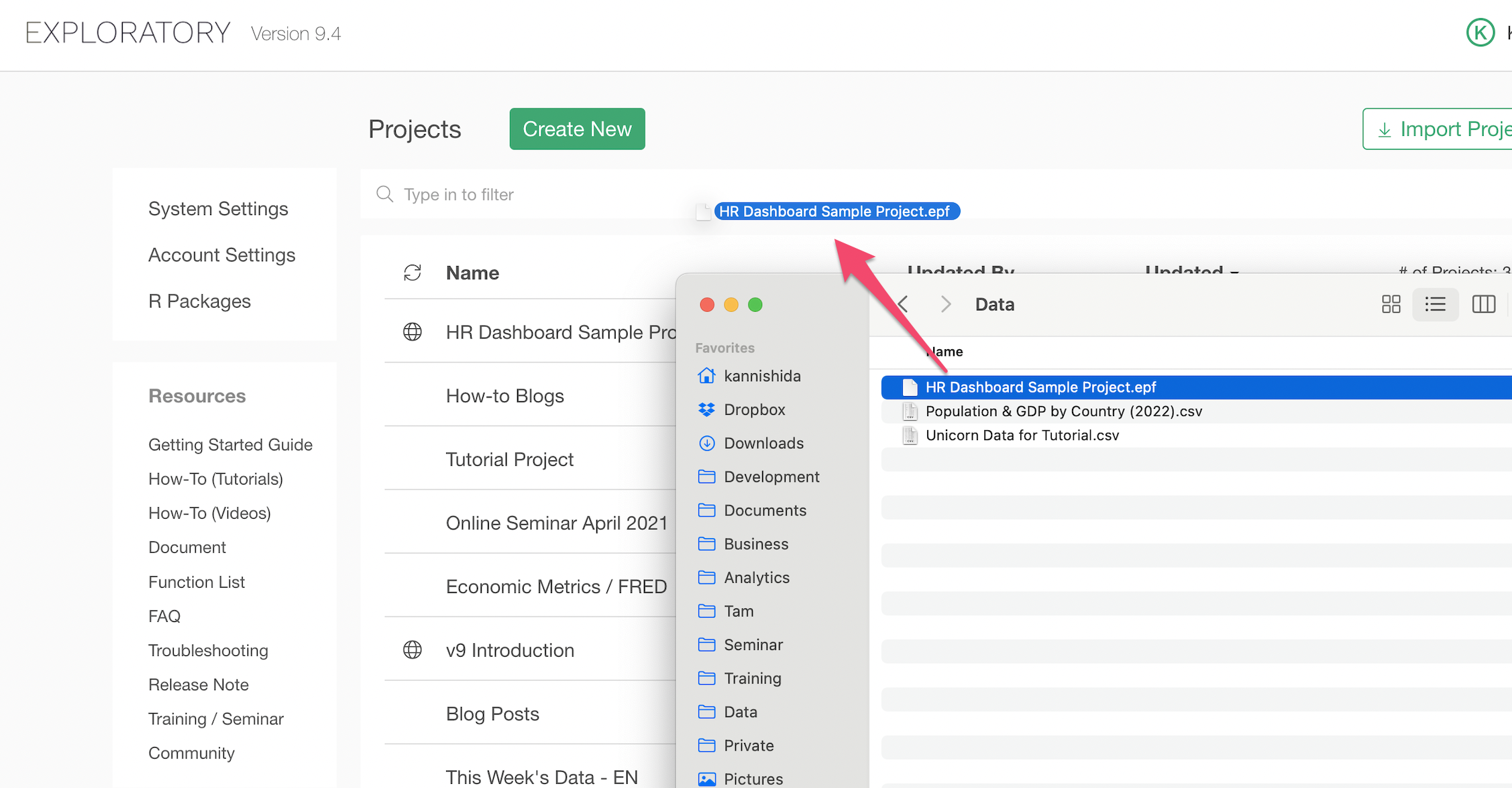
Alternatively, you can select 'Locally Saved Project (.epf)' from the Import Project button menu, and select the saved project file to import as well.
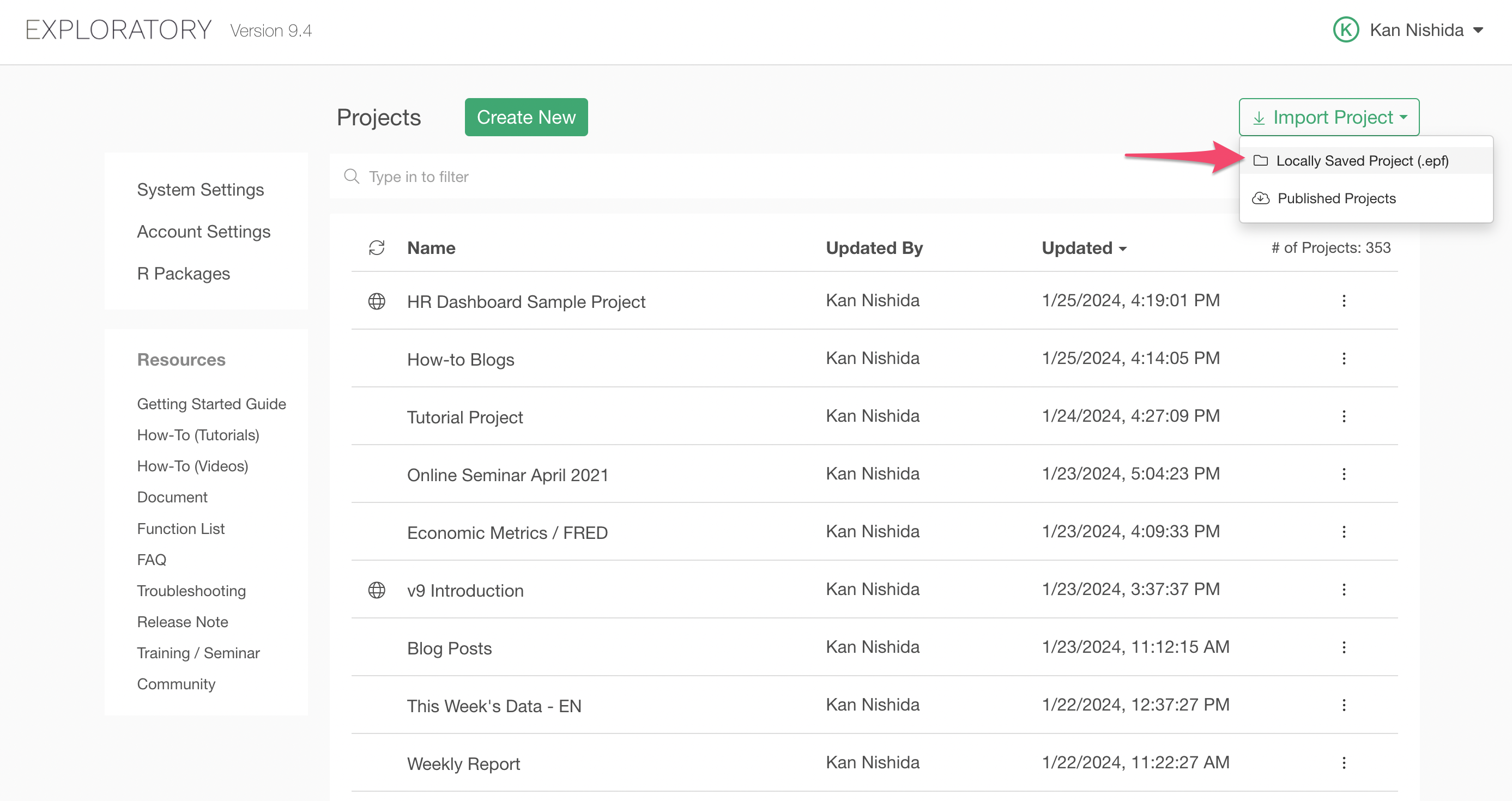
Once the project is imported, open the project, and open the HR Employee Attrition data frame. You should see a series of charts already created.
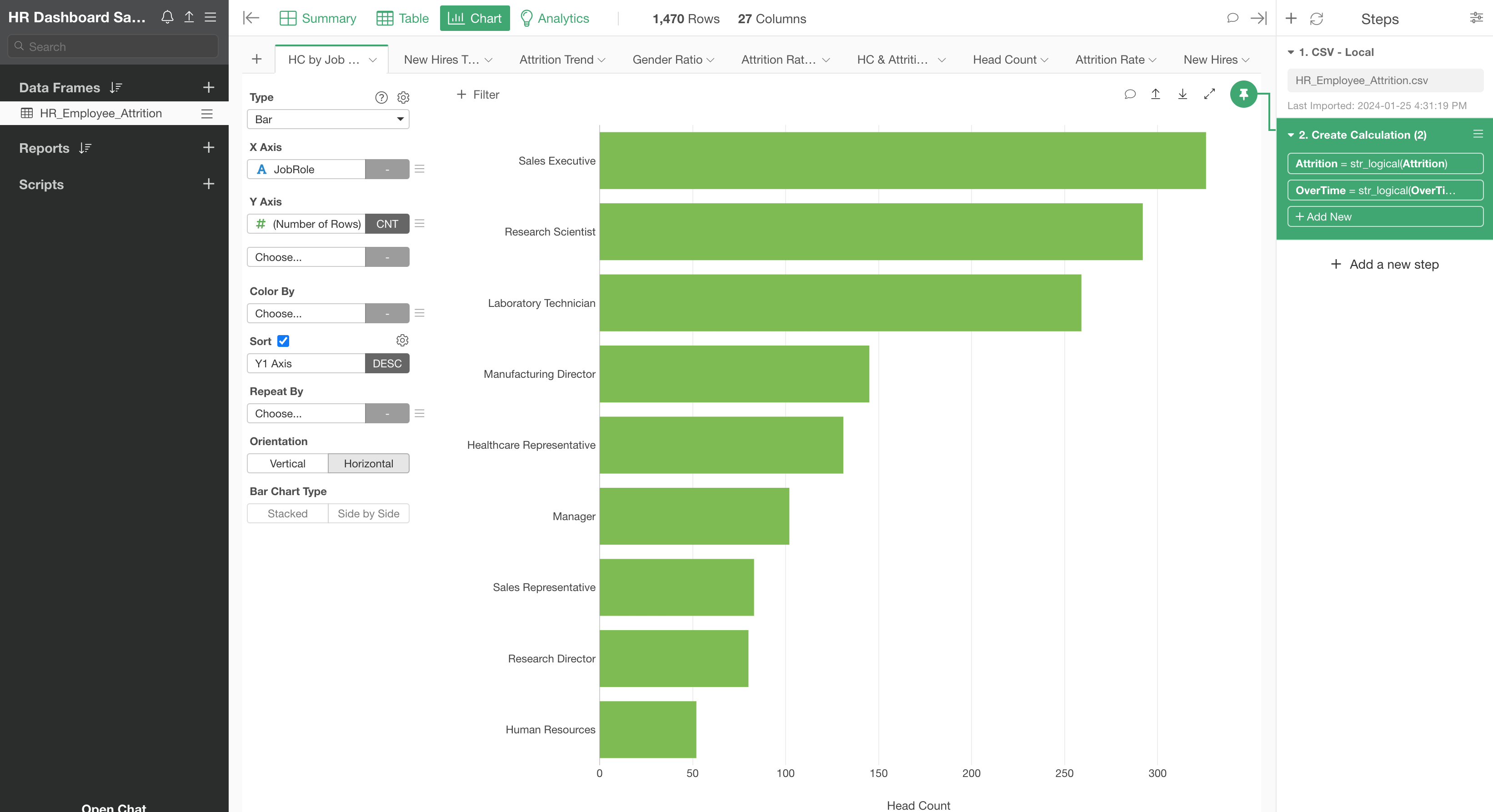
We are going to add some of the charts to a new Dashboard in this tutorial.
Let's start!
2. Create a New Dashboard
Click on the Plus button next to 'Reports' at the left hand side, then select 'Create Dashboard' from the menu.

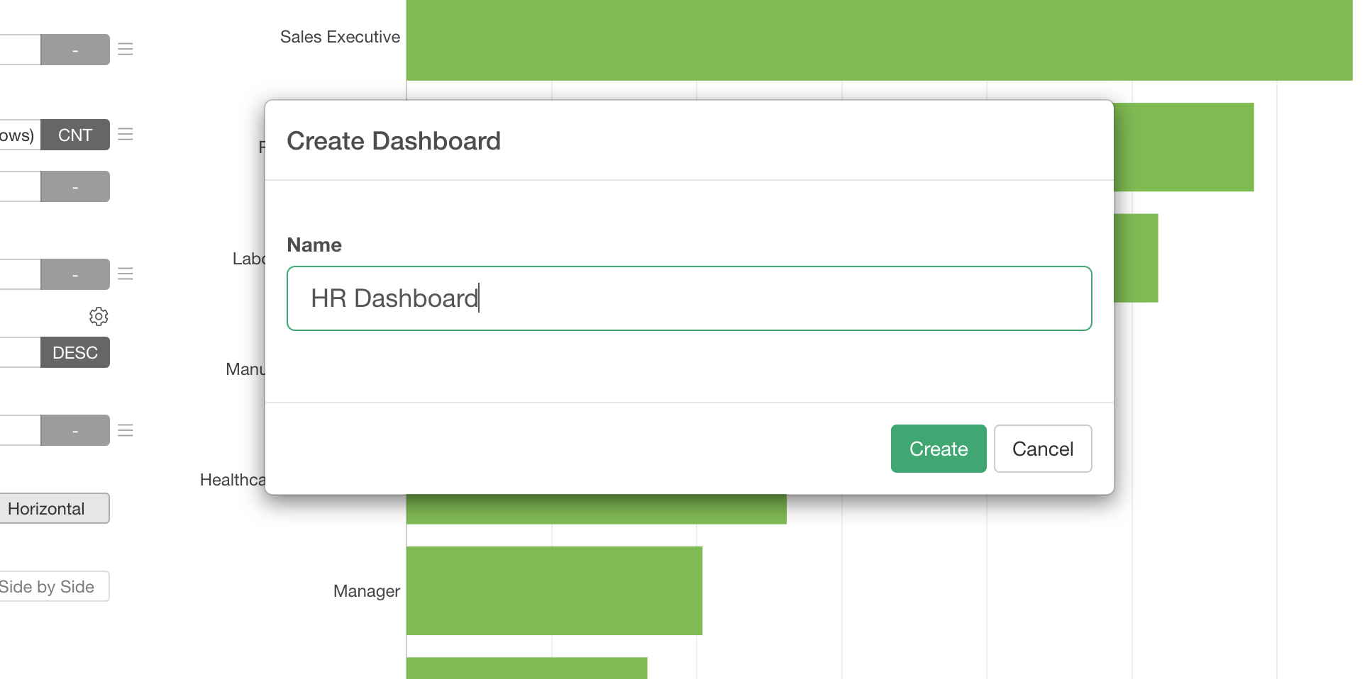
Type in 'HR Dashboard' and click the 'Create' button.
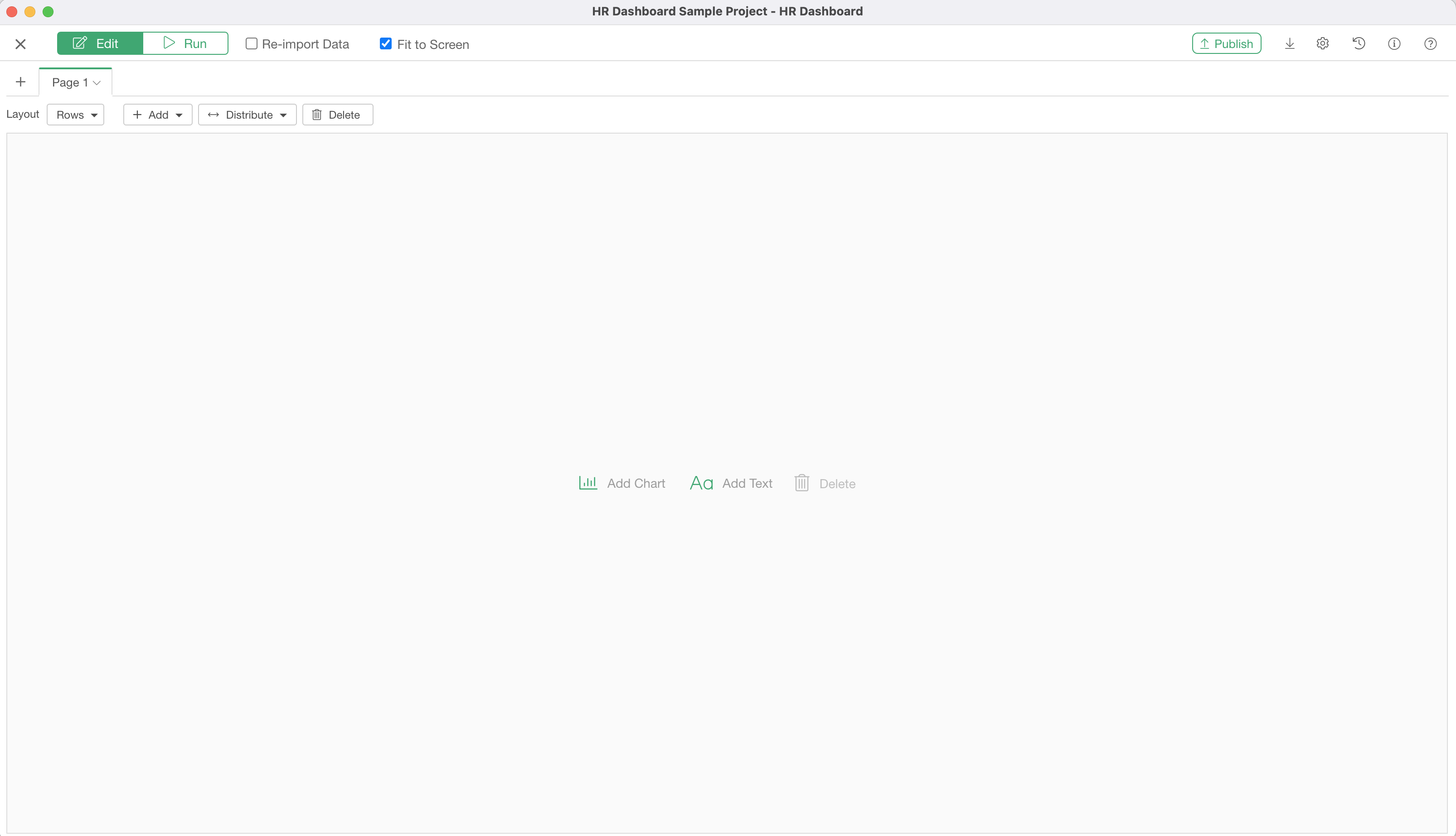
You will see an empty new dashboard.
3. Add Charts to the Dashboard
Click on 'Add Chart' button.

It will open a Chart selection dialog.
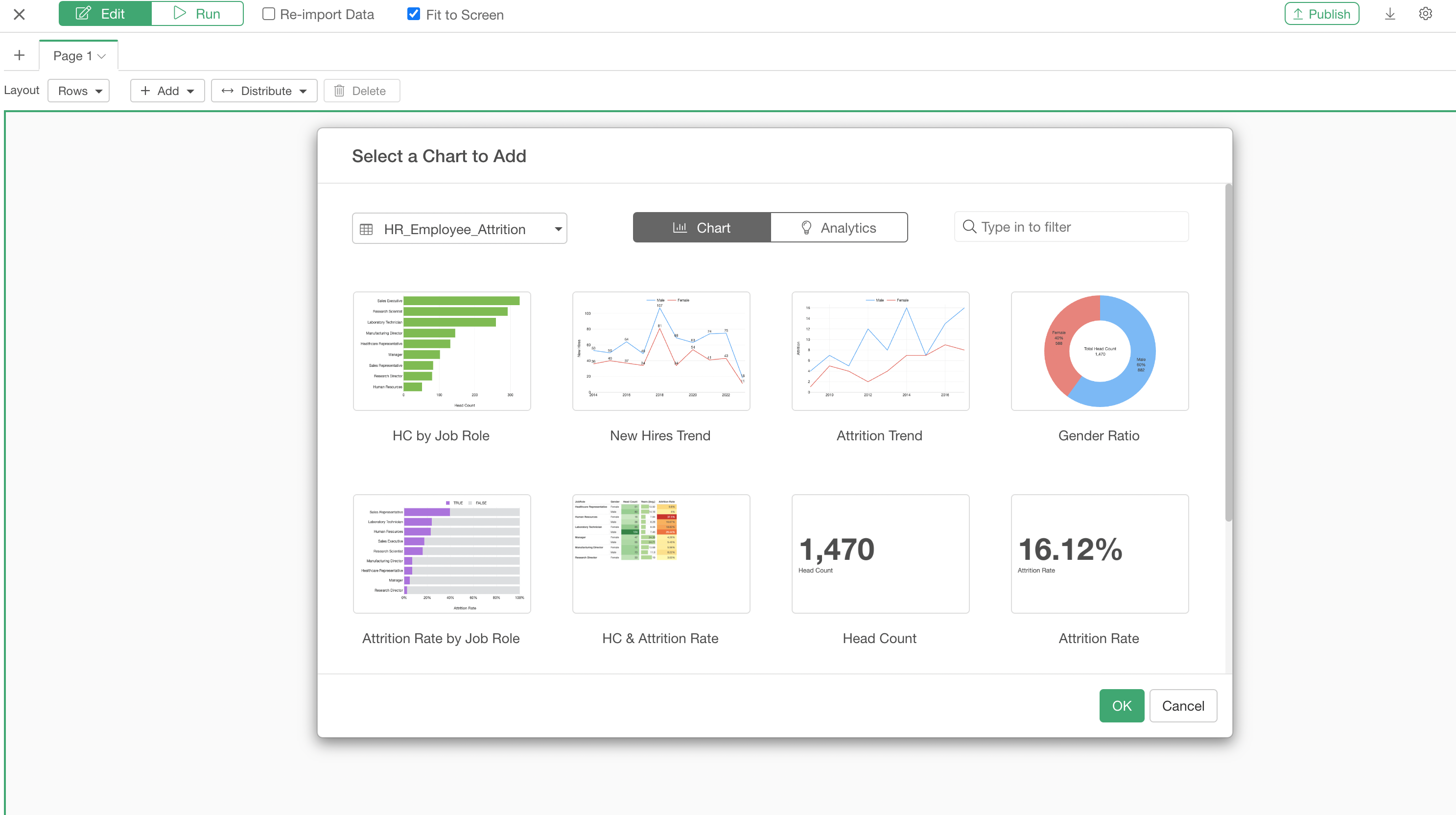
In this project, we have only one data frame. But if you have multiple data frames you can select the one where you have created charts with.
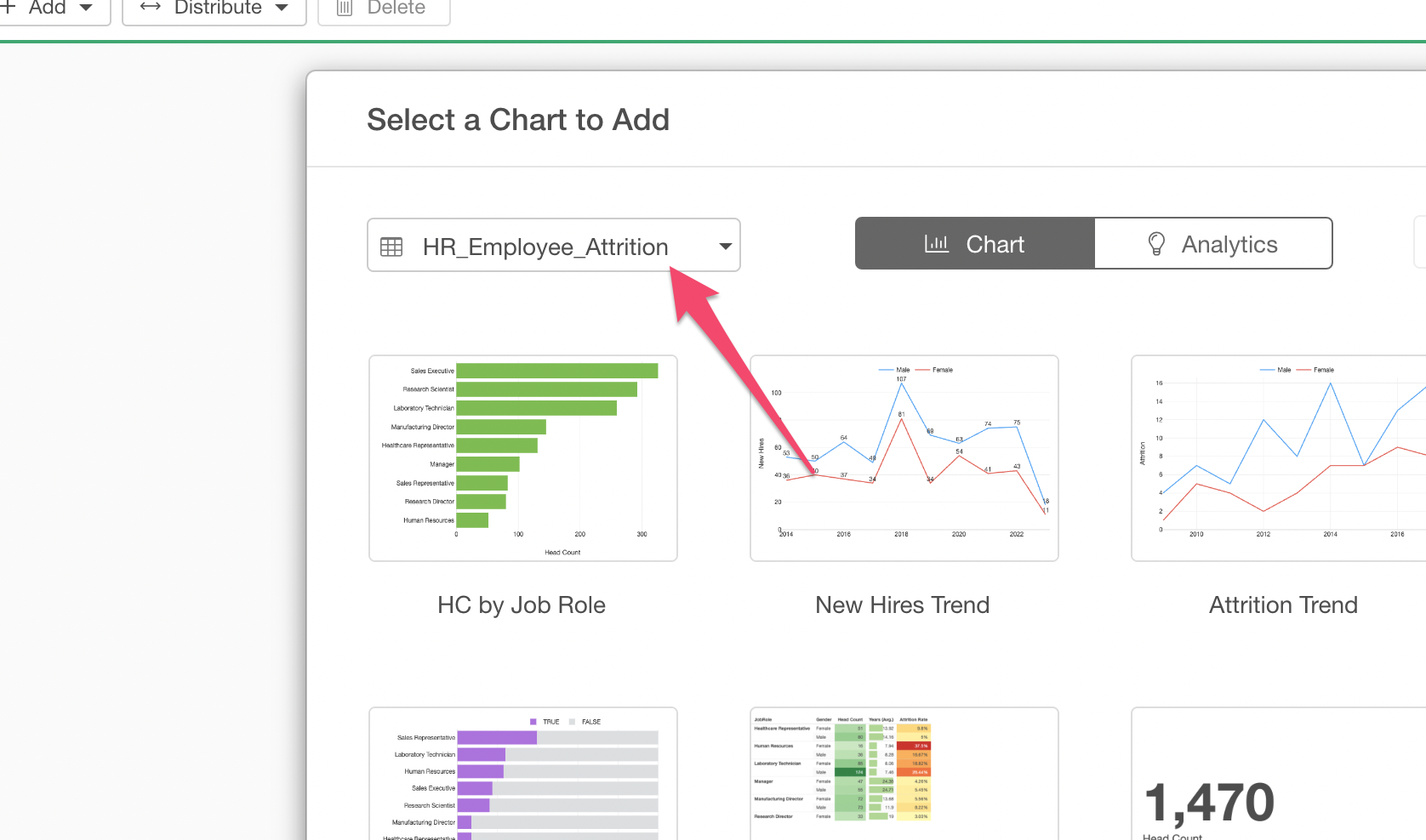
For this tutorial, select 'HC by Job Role' chart and click 'OK' button.
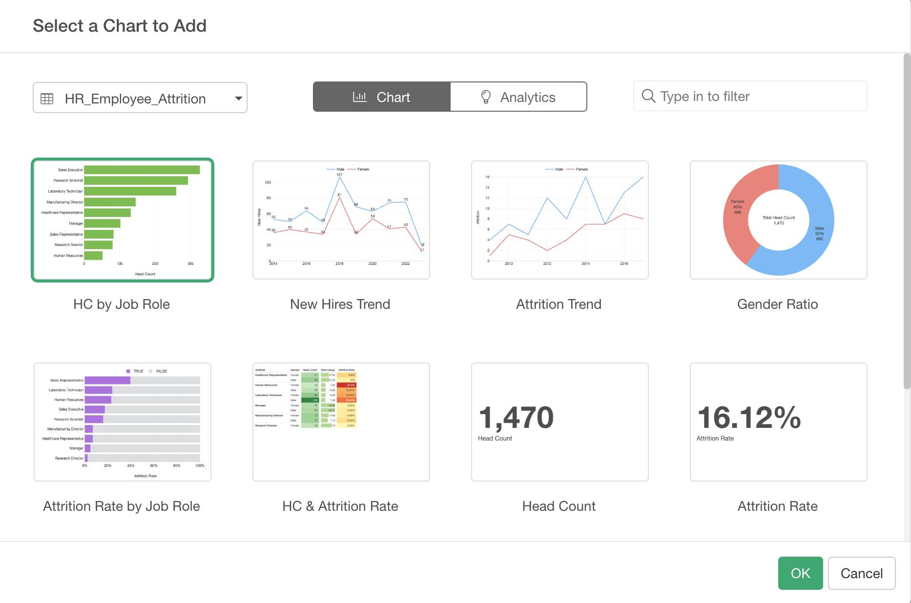
Once the chart is inserted, let's add another chart by clicking on the Chart icon at the right hand side.
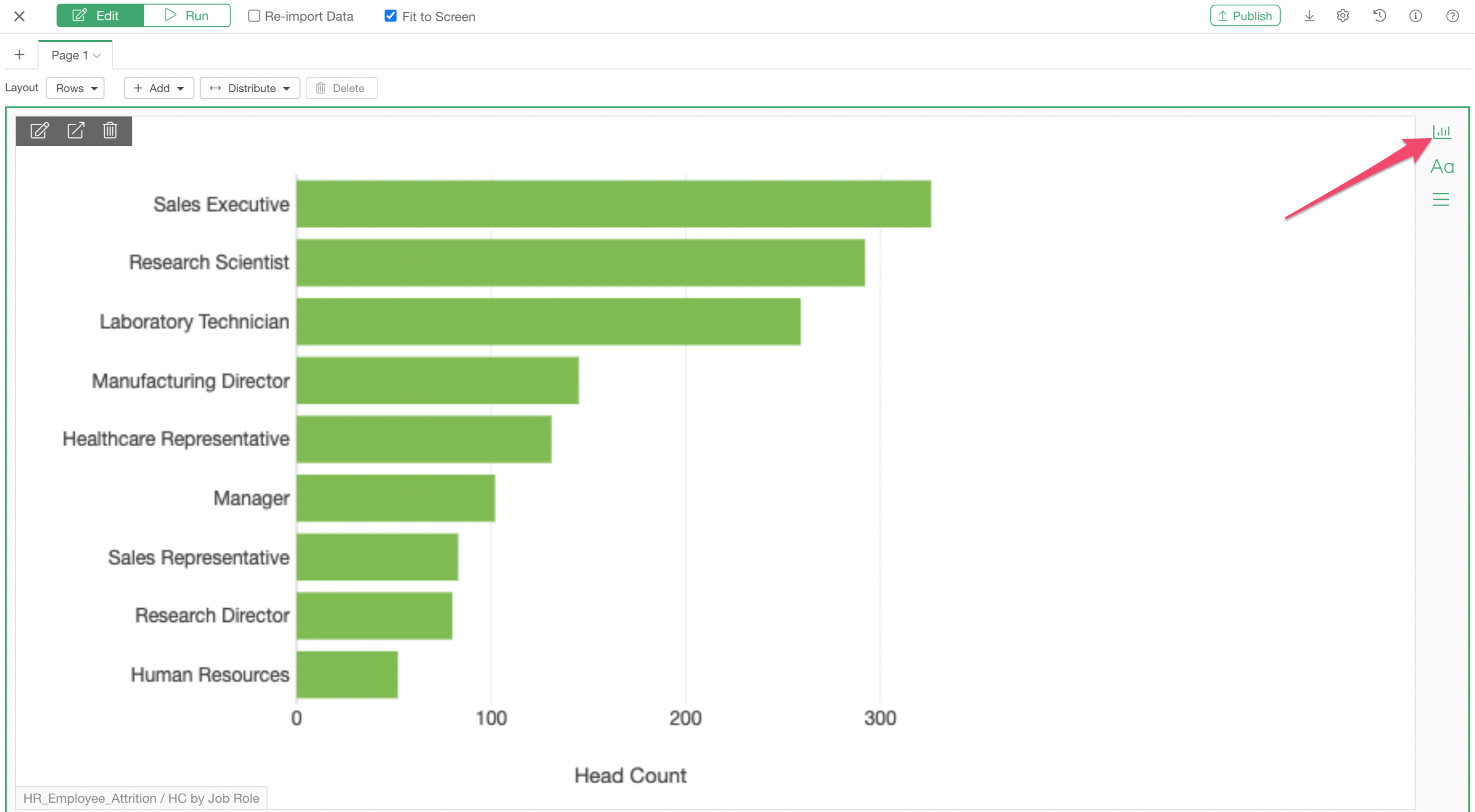
This time, let's add 'New Hires Trend' chart.
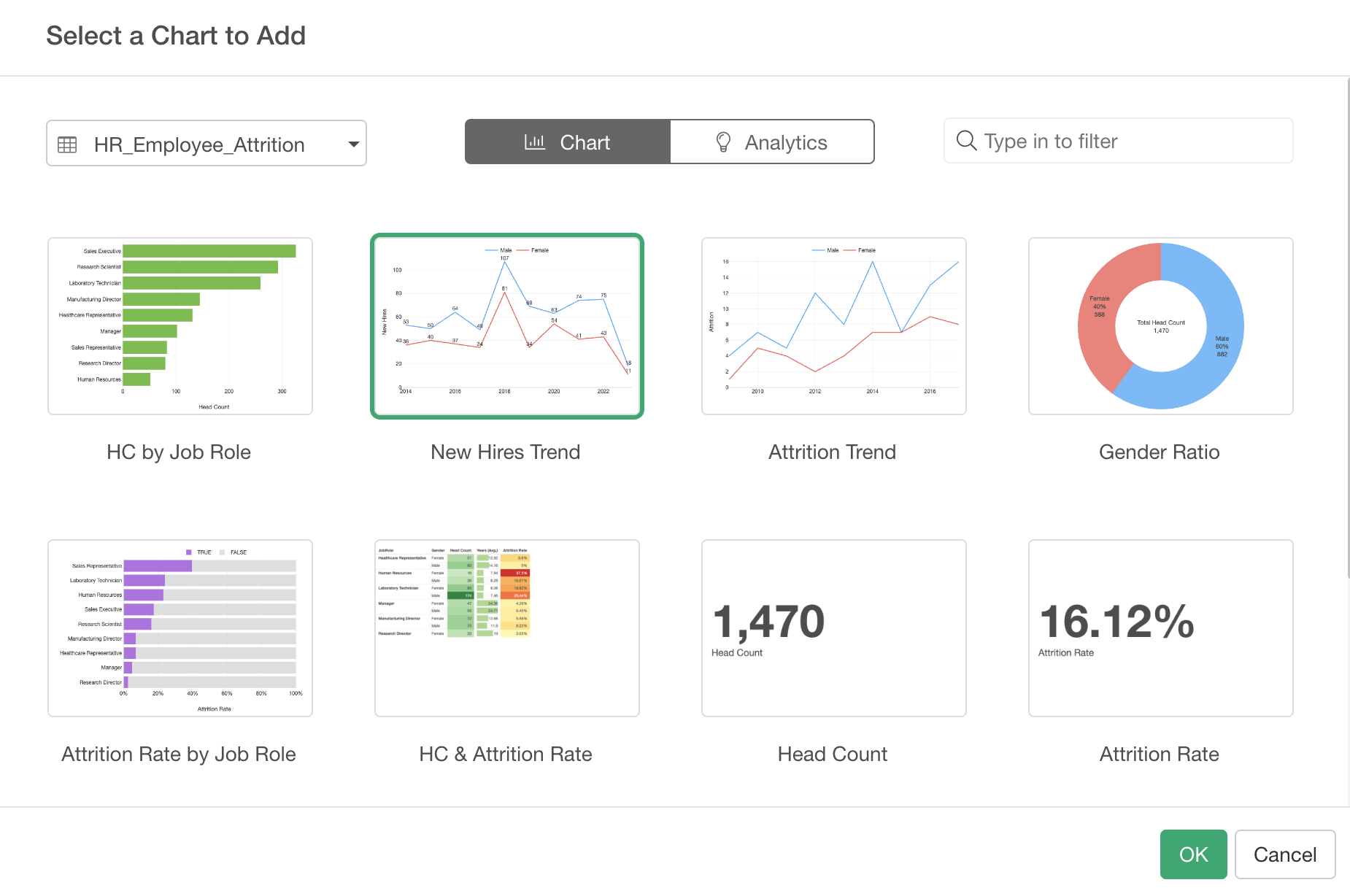
And one last time. Let's add another chart by clicking on the Chart icon at the right hand side.
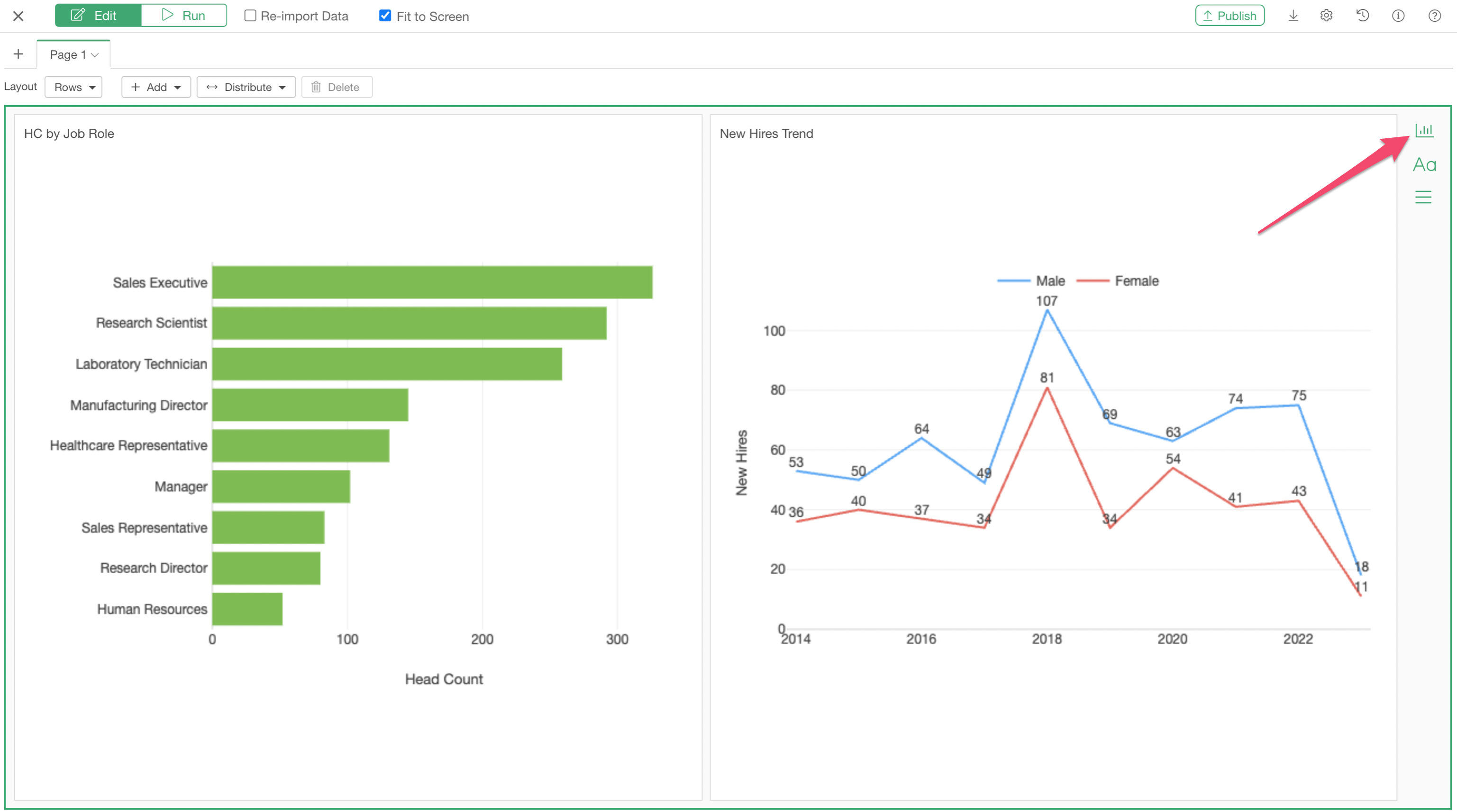
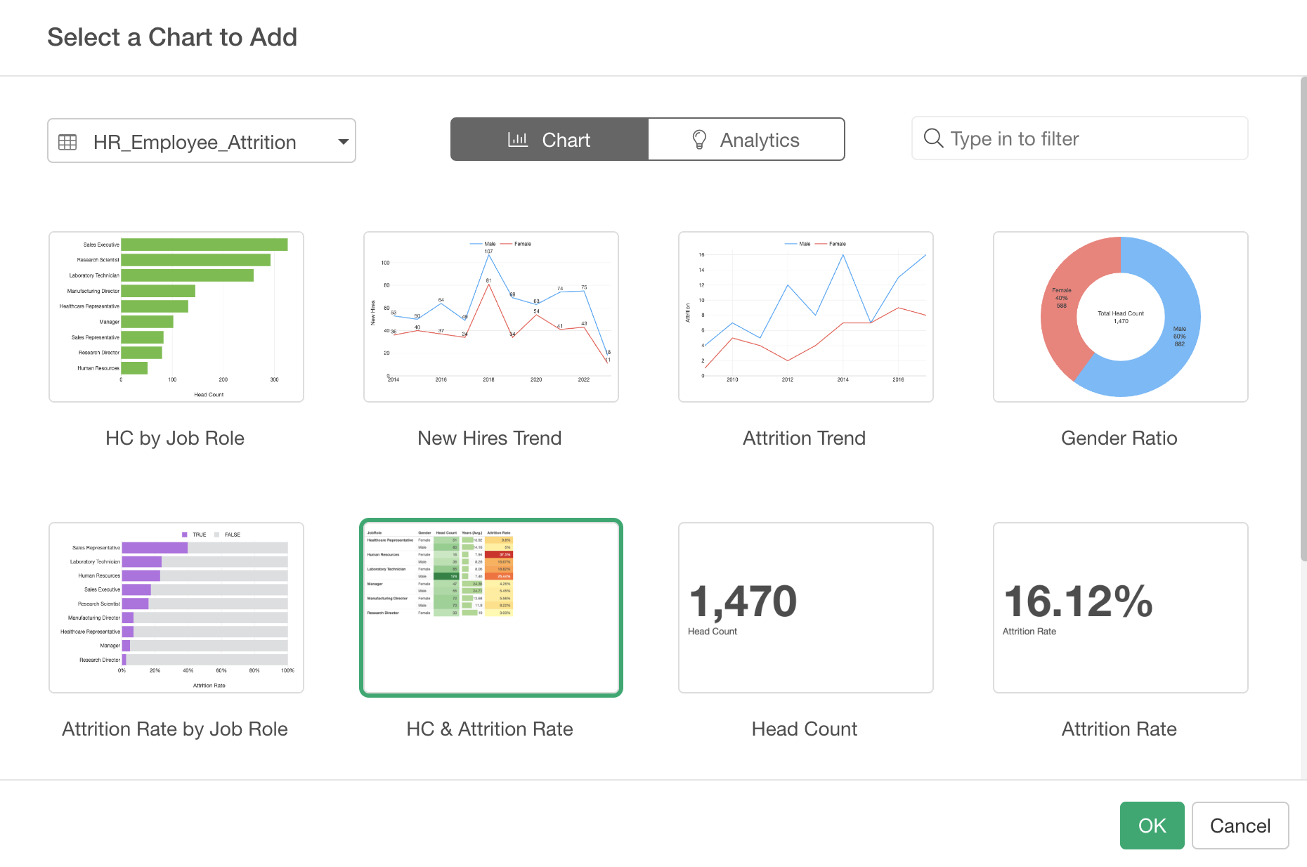
Select 'HC & Attrition Rate' chart.
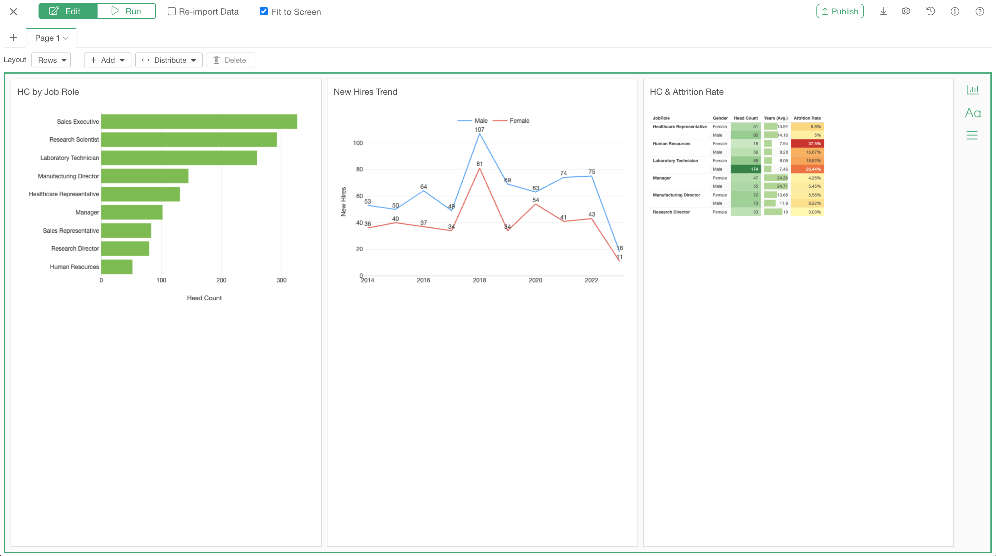
At this point, you should have 3 charts inserted like the below in the Dashboard Editor.
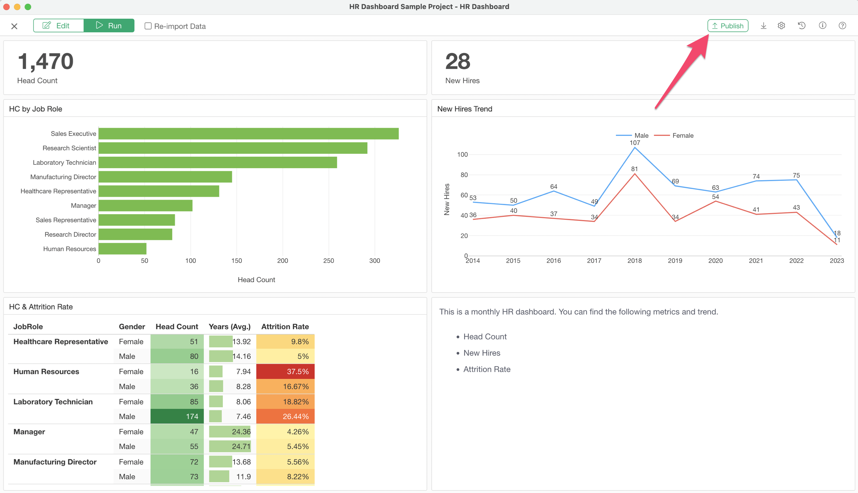
You can click on the Run button to check what the output looks like.

4. Adjust the Layout
You can design the Dashboard layout flexibly in Exploratory.
For this tutorial, let's make a two rows layout so that we will have some of the charts above and others to be below.
Select 'Add Row Below' from the Add button above.
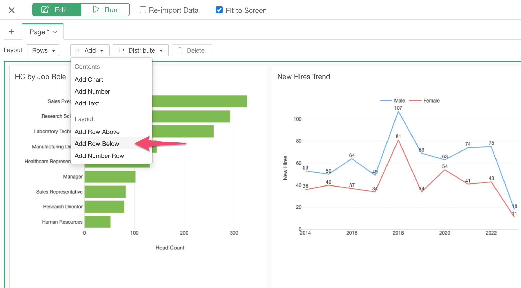
You can see an empty row area is now being added at the lower half of the page.
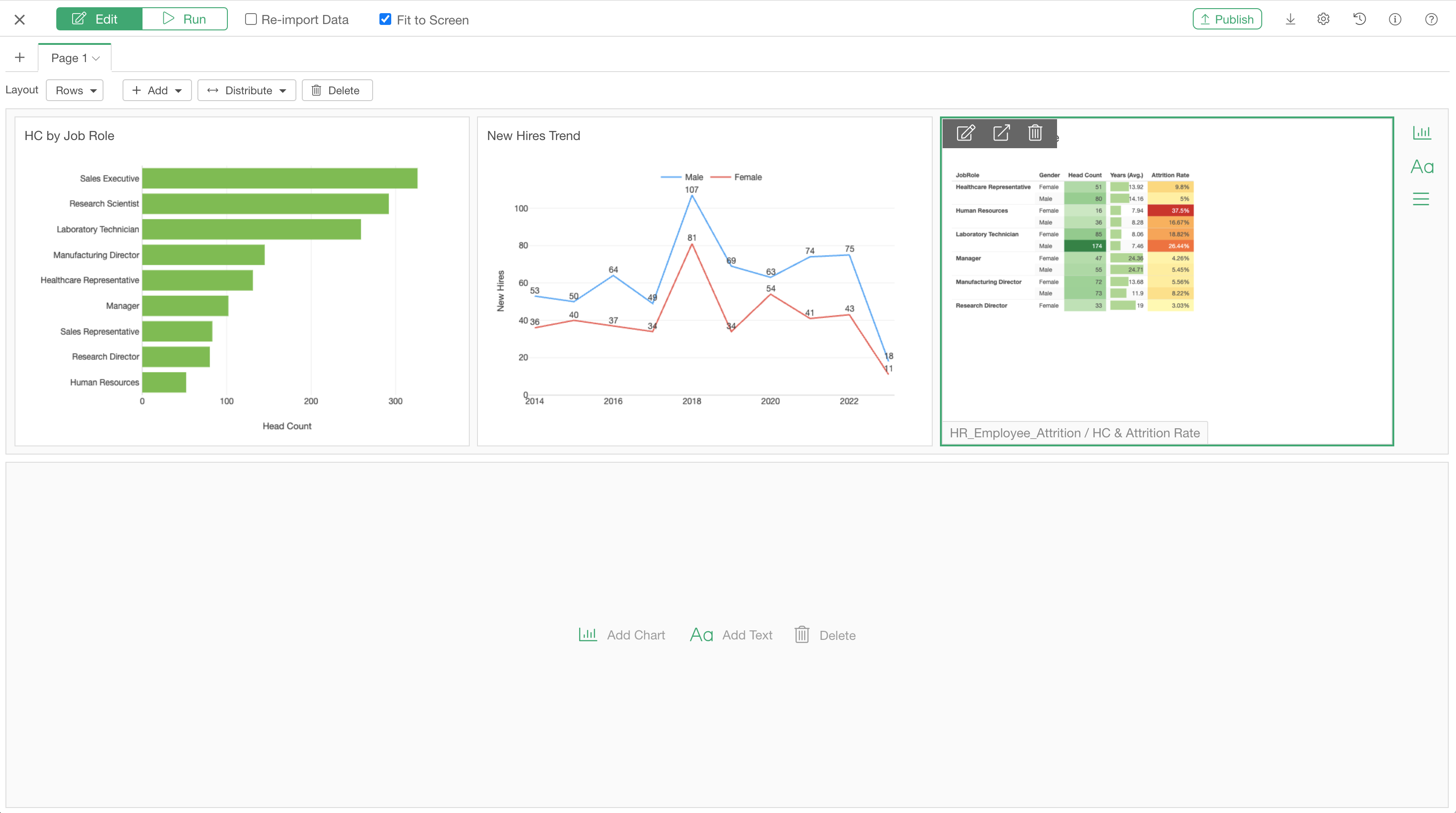
Now, you can simply drag-and-drop one of the charts to the new row area. Before you drag-and-drop, make sure to select the chart itself first by clicking on it. If the chart has the green borders that means it's selected.
And, when you drop the chart, make sure that you see a green vertical line that indicates where to drop the chart.
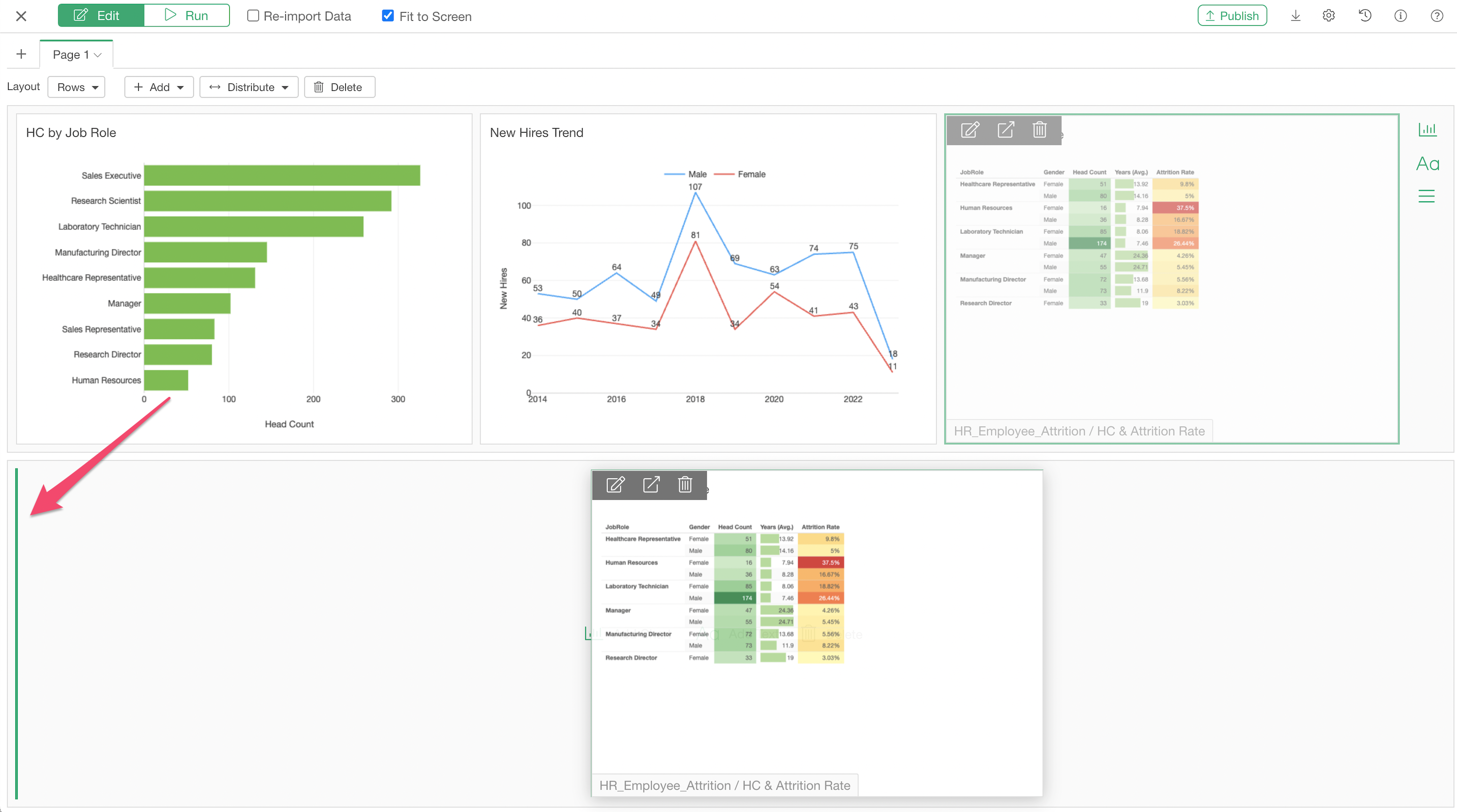
Adjust Width and Height
Additionally, you can adjust the width and the height of each chart area by drag-and-drop.
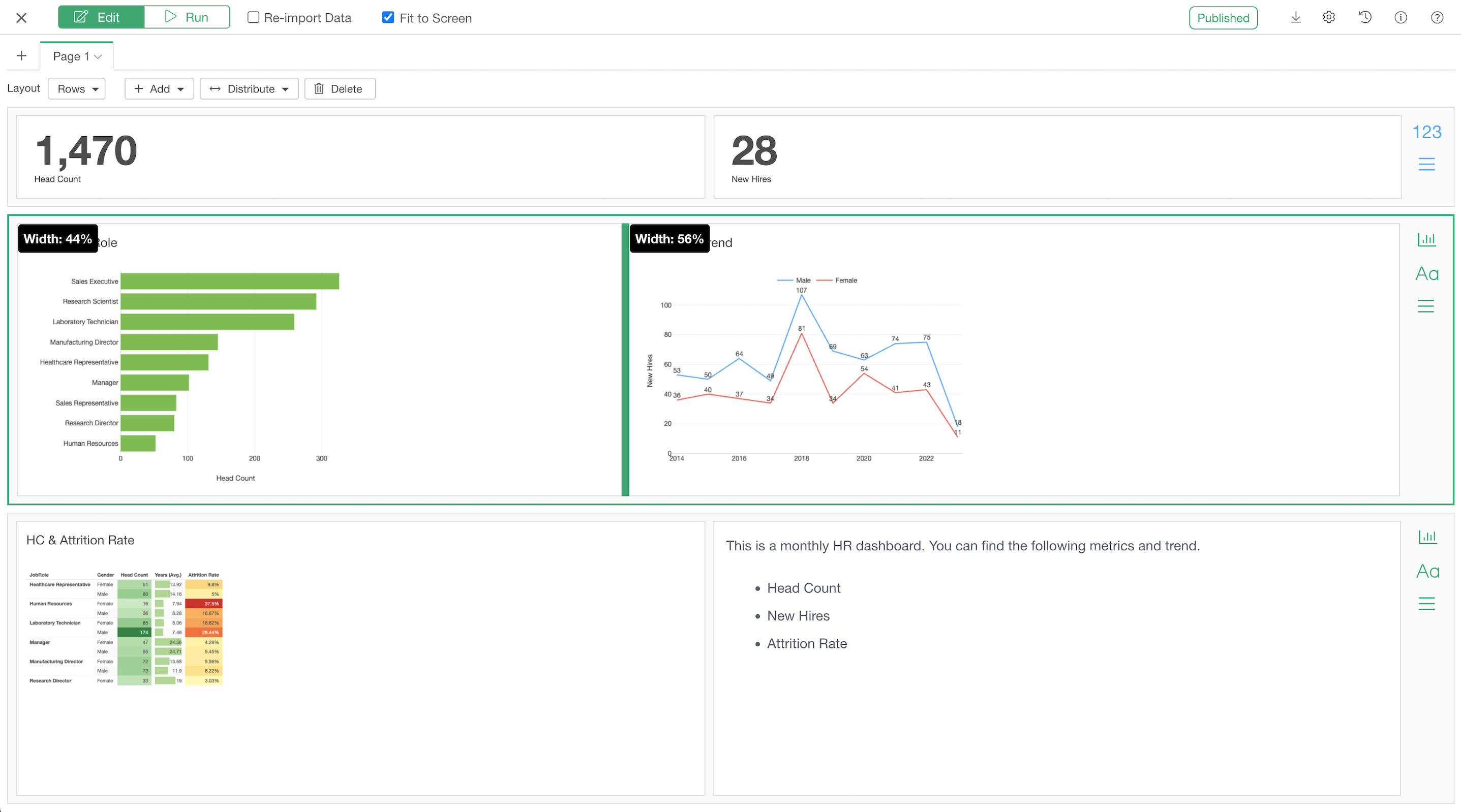
Adjusting the row height by drag-and-drop.
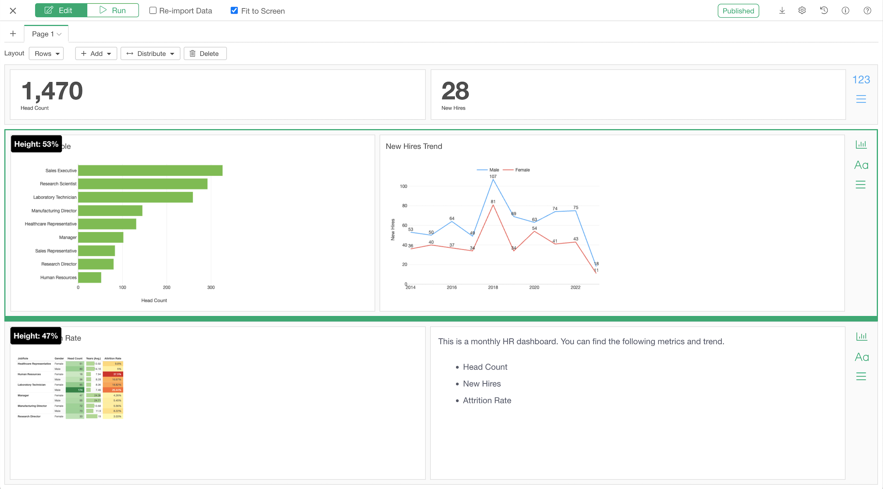
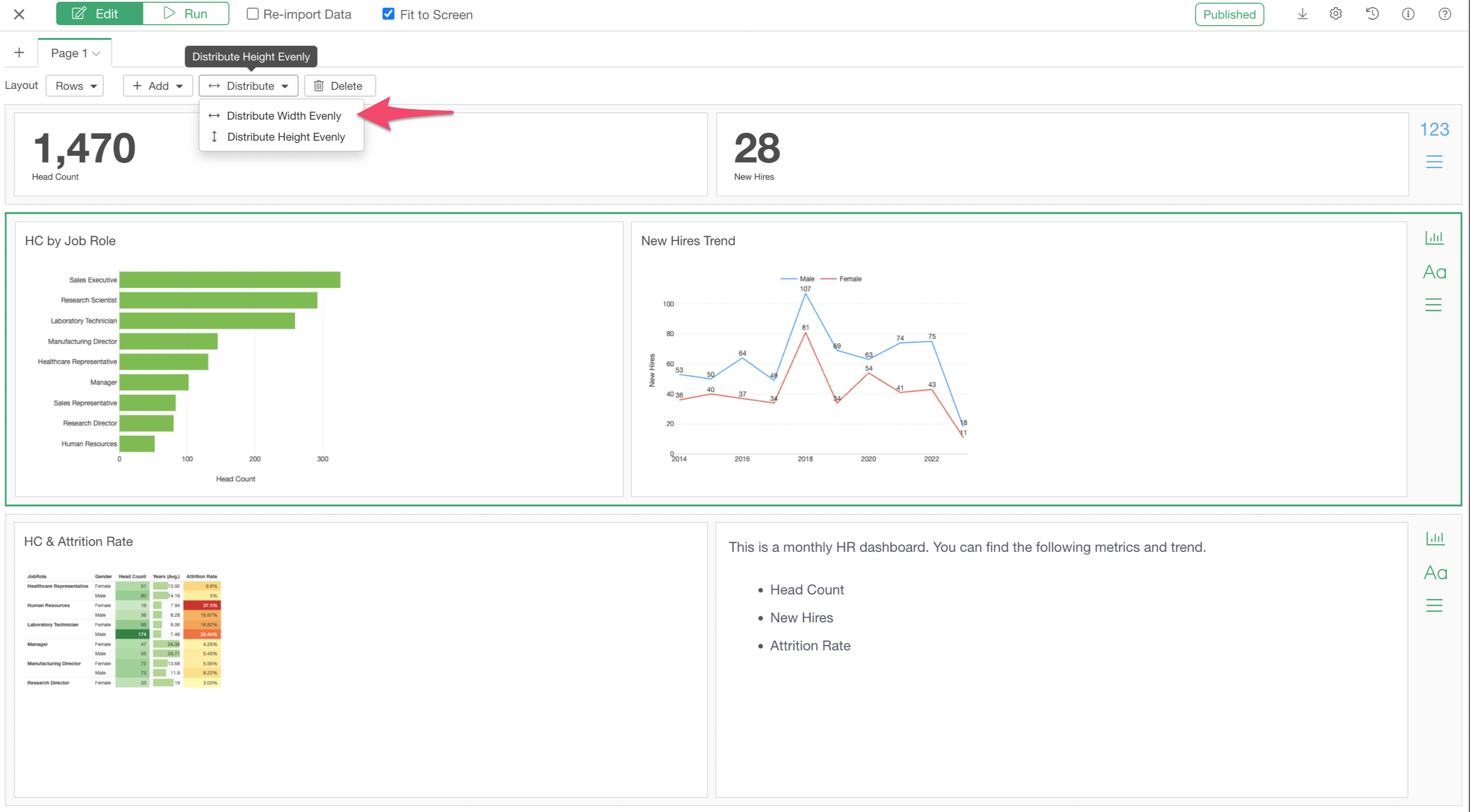
Also, you can select one of the 'Distribute' option to make all the charts width and height to be equal.
Rows & Columns Layout Types
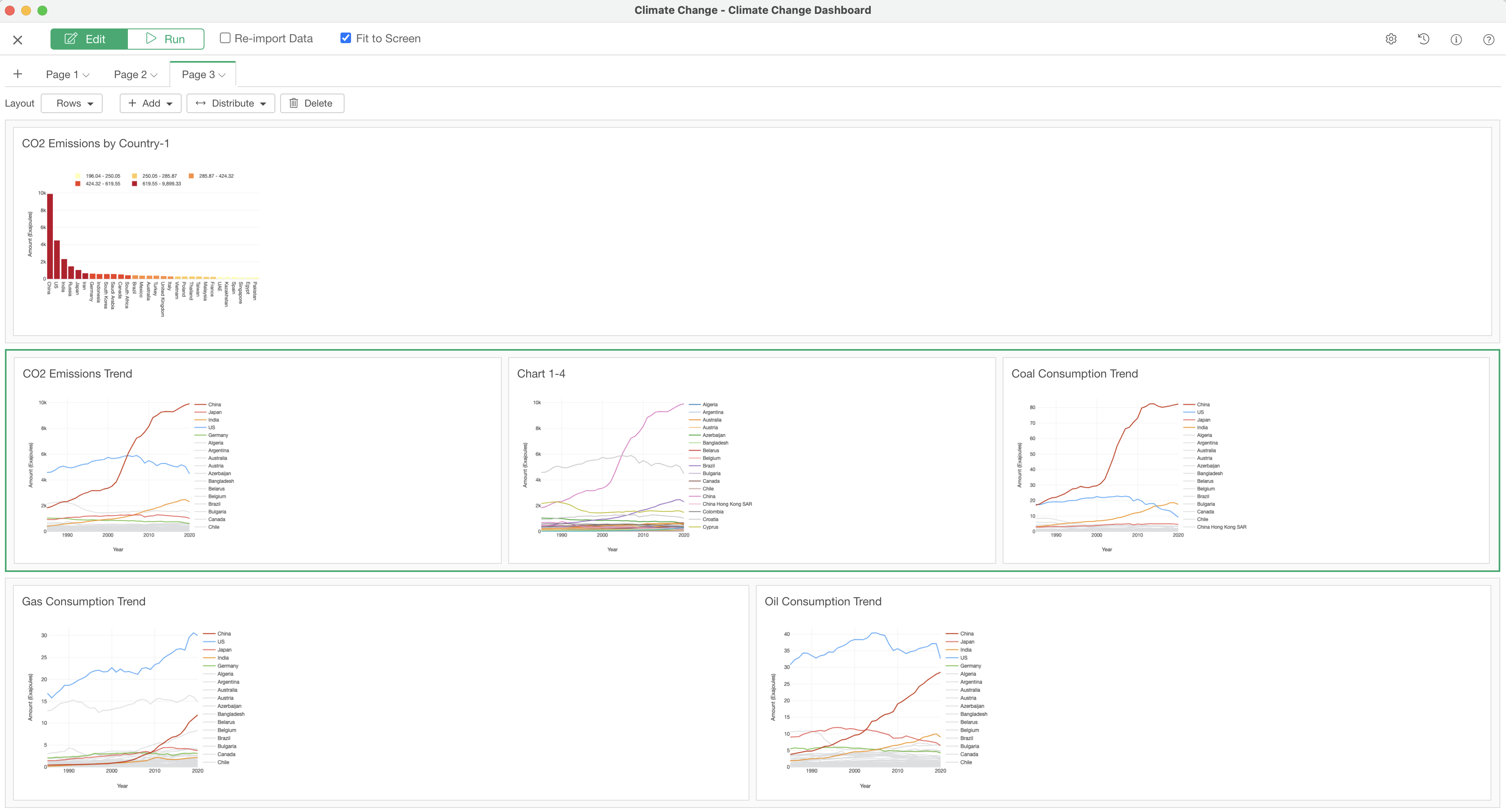
Exploratory Dashboard supports two types of the layouts - Rows and Columns.
The Rows layout type is the default layout. This is the most common layout, and you add rows to add more charts.
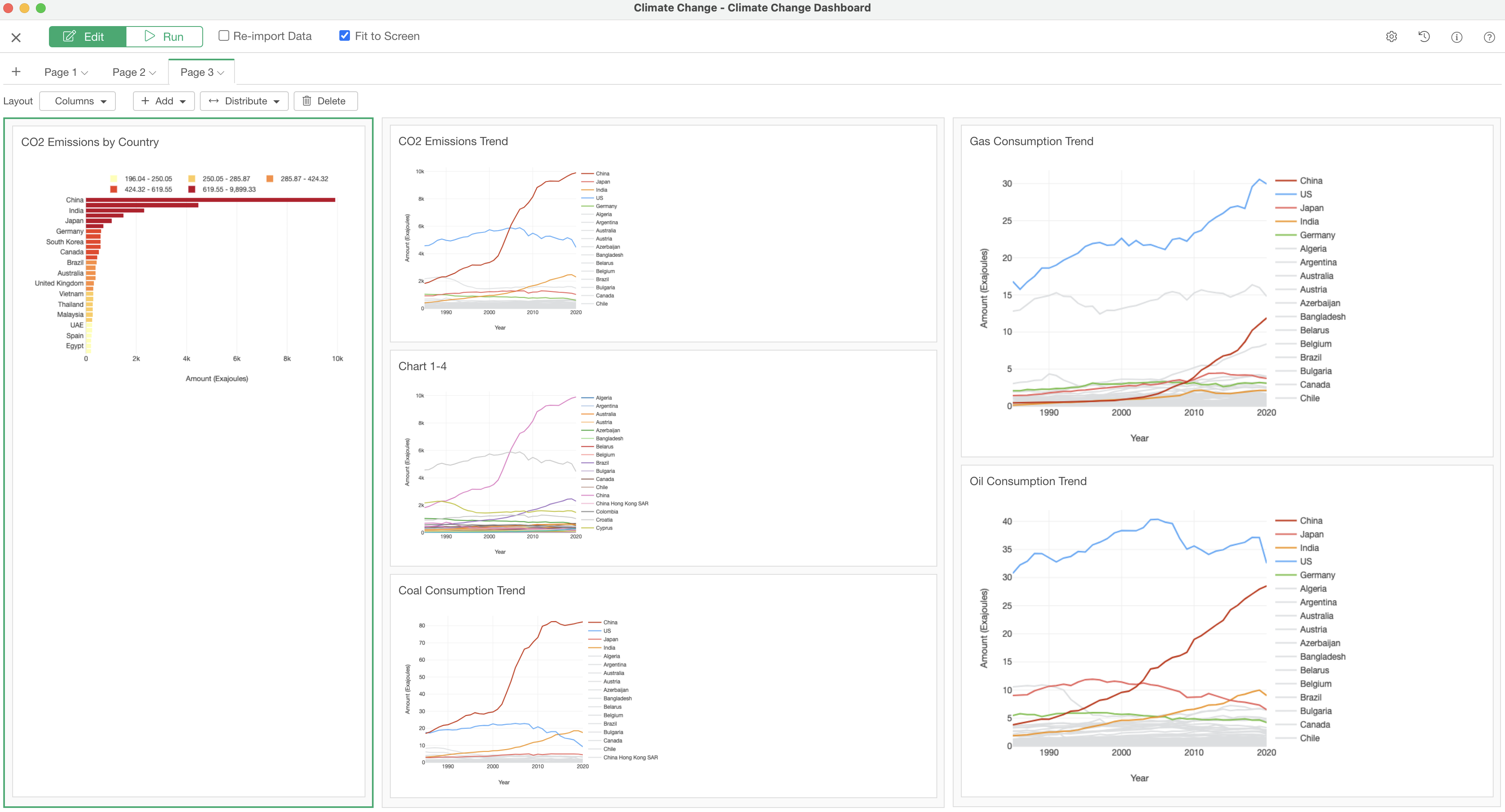
The Columns layout is useful when you have a chart or a table that require a longer height area to show all the values.
5. Add Text Comment
You can add a text input area into the Dashboard. This is useful when you want to write comments about the dashboard or the data.
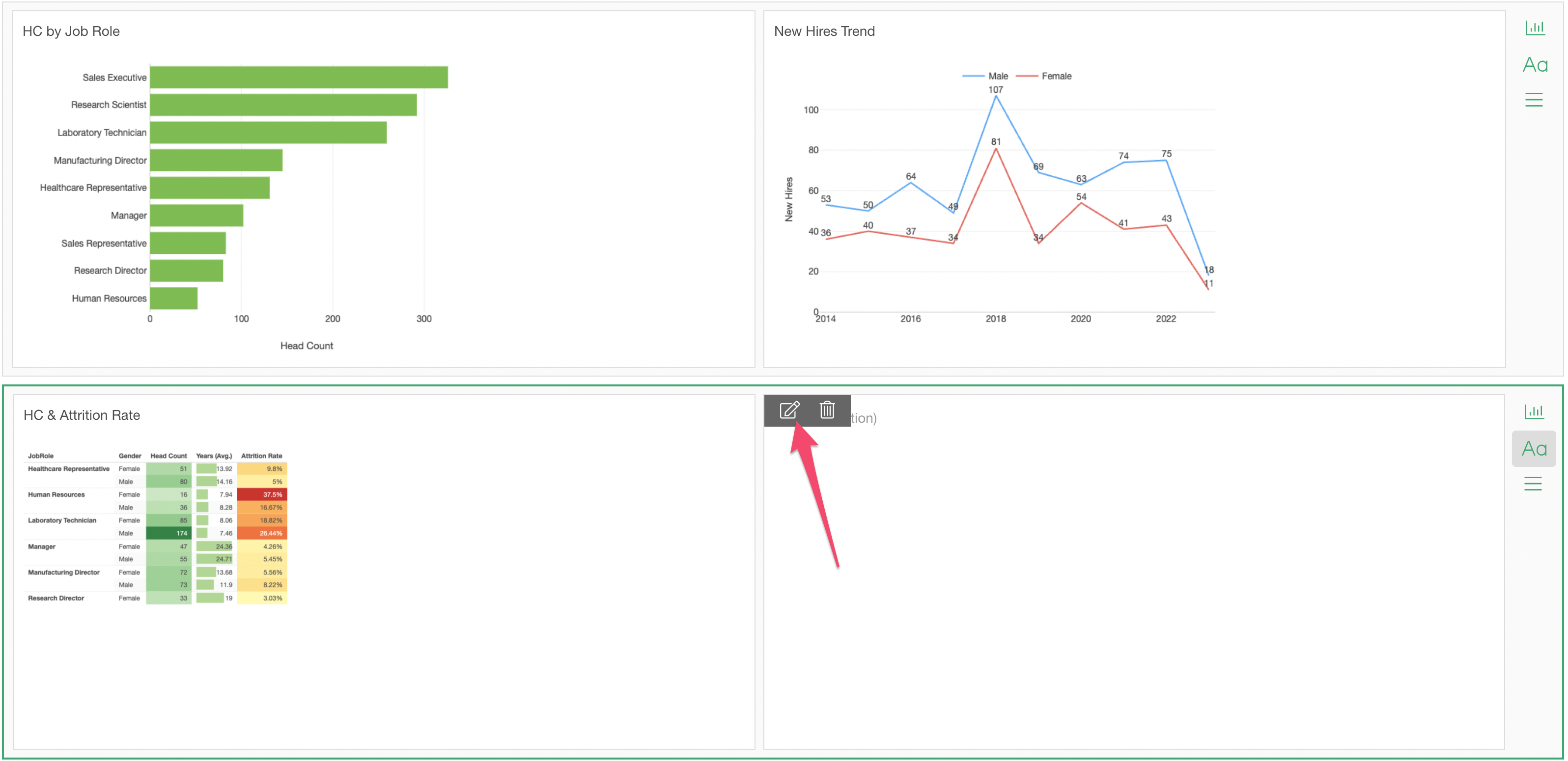
Click on the 'Add Text' icon at the right hand side.
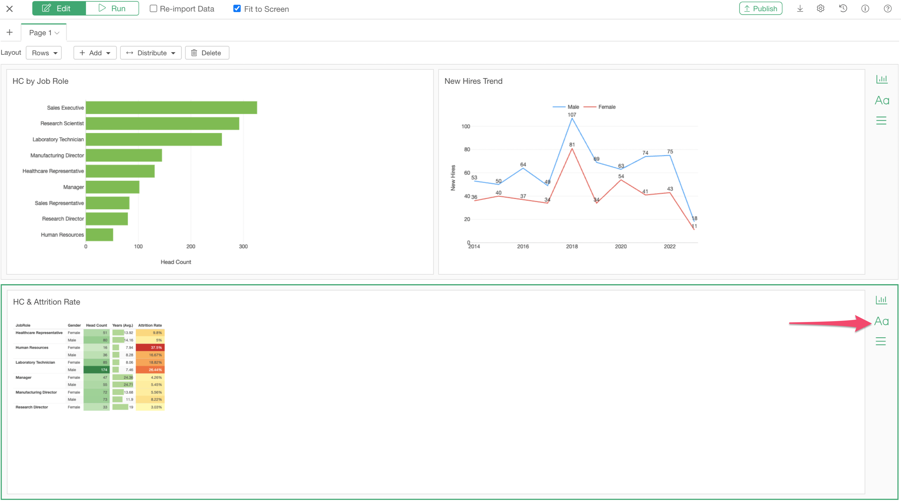
You can click on the newly added text area or click on the 'Edit' icon to open the Text Editor.
This is the same Text Editor that is used for Note. You can type in text and use the toolbar to format the text.
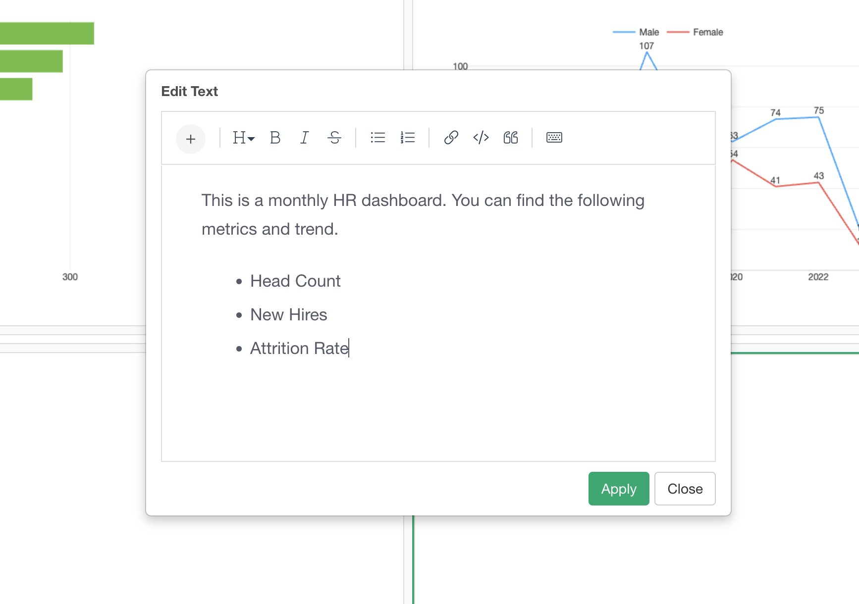
Once it's done you can click on the Apply button and the Close button to close the dialog.
6. Add Number
The most common usage of Dashboards is to monitor your business metrics or KPIs. In Exploratory, you can use Number to show your metrics.
In the sample project, these Numbers have already been created and you can check them out under the Chart view.
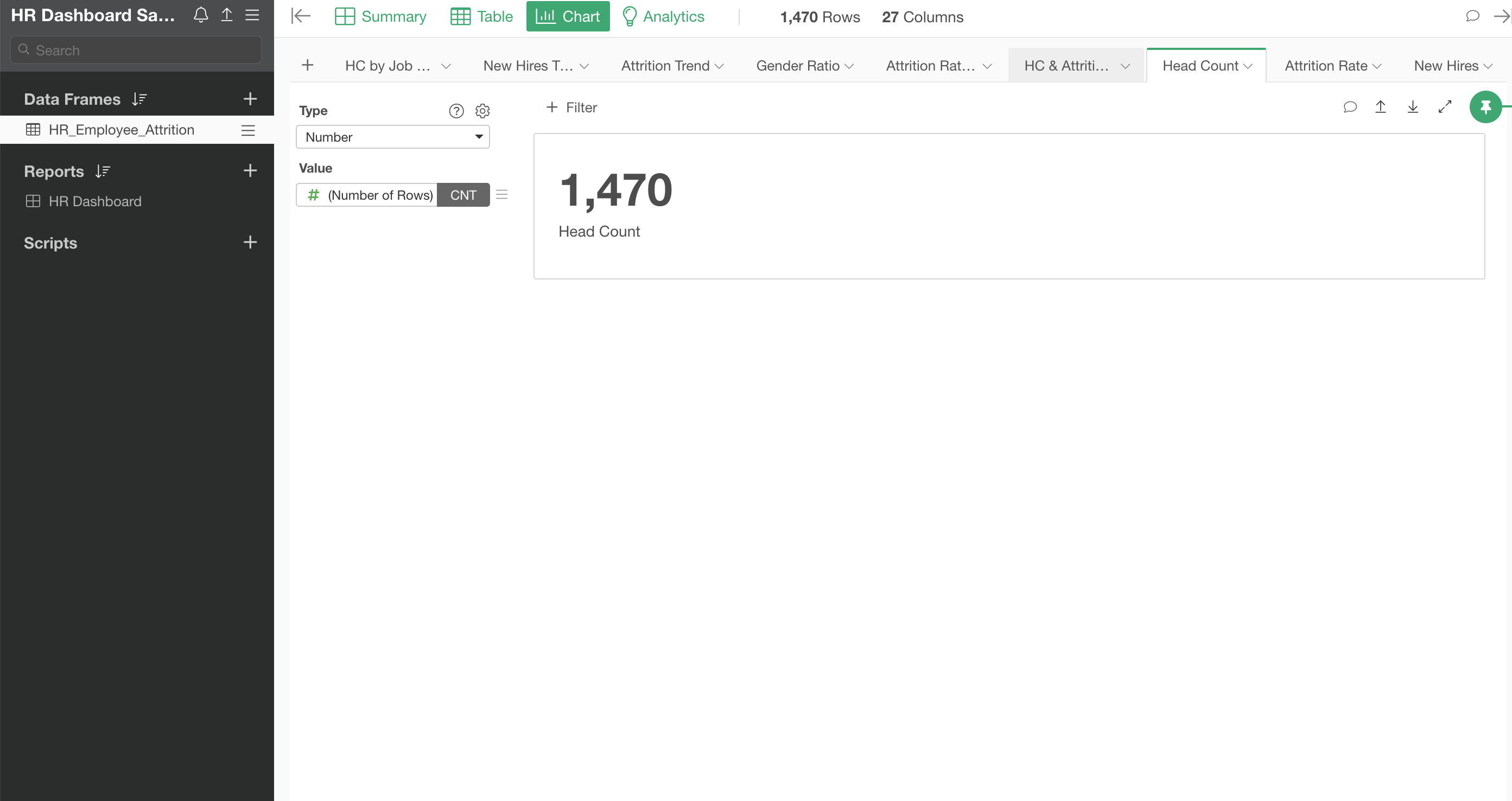
Now, let's bring them in.
First, you want to create an area where you can drop those Numbers.
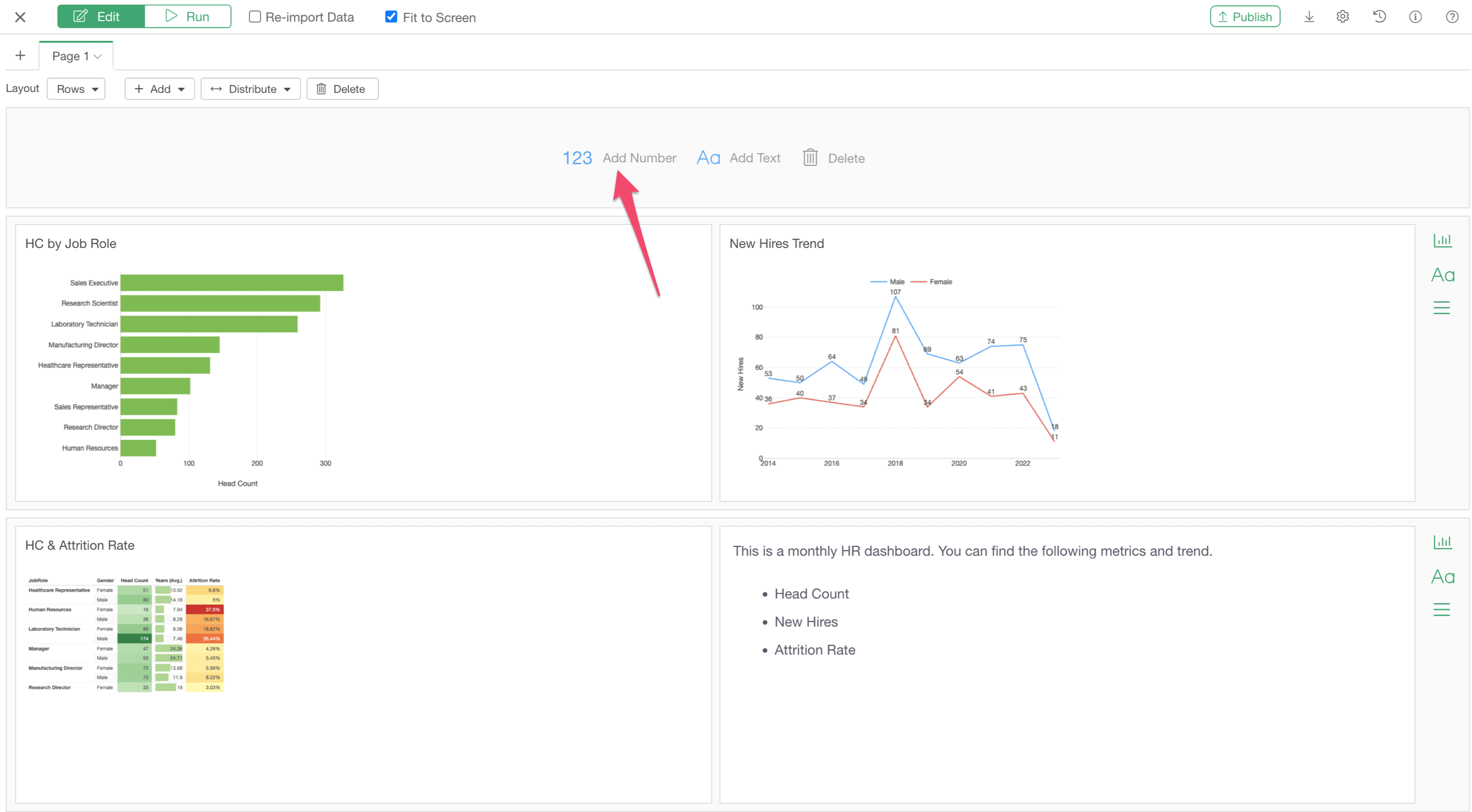
Select 'Add Number Row' from the Add button.
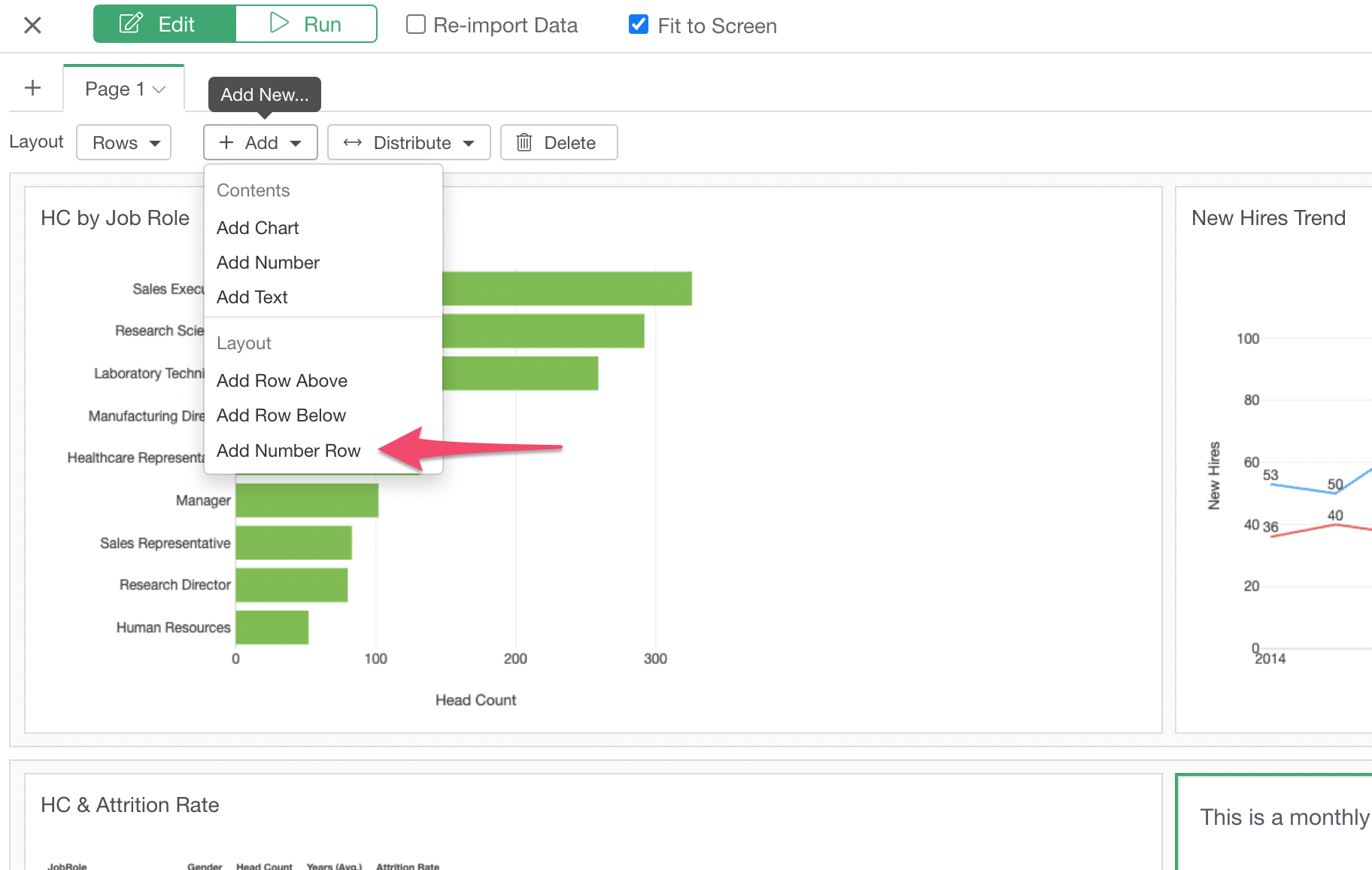
This is a special area where you can drop only the Numbers, not other types of Charts.
Click on 'Add Number' button.
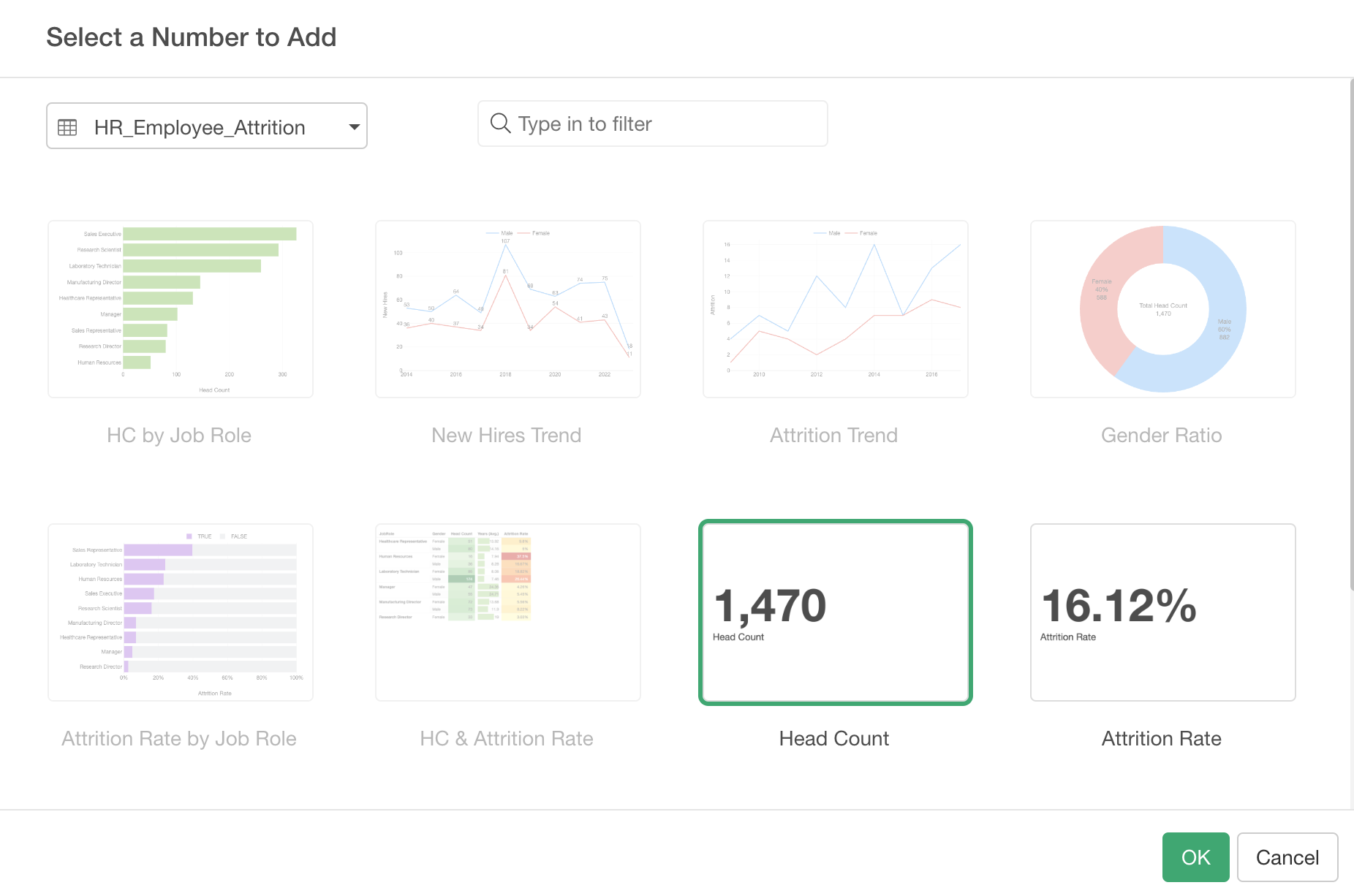
Select 'Head Count' in the Chart selection dialog and click the OK button.
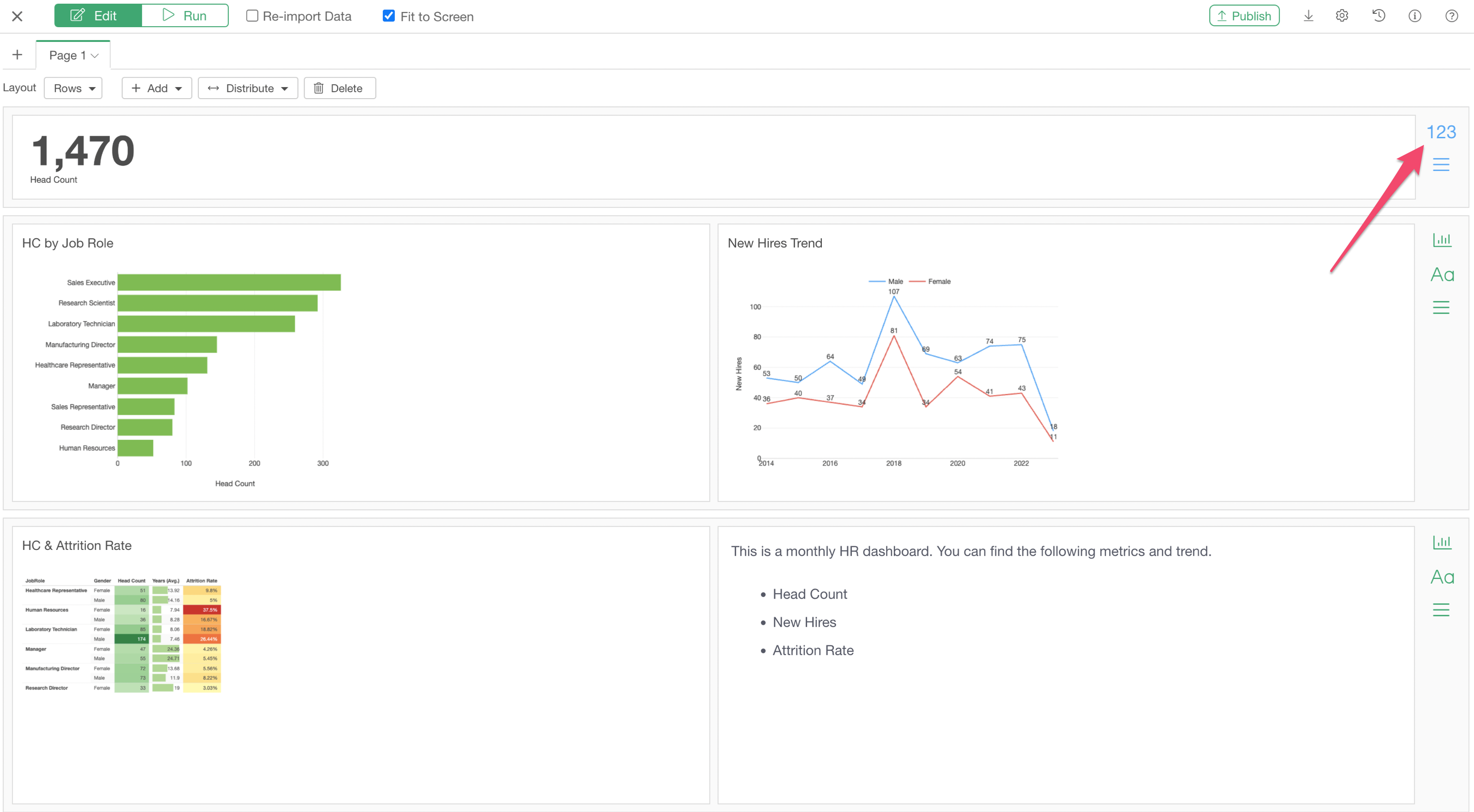
Let's add one more Number by clicking on the 'Add Number' button at the right hand side.
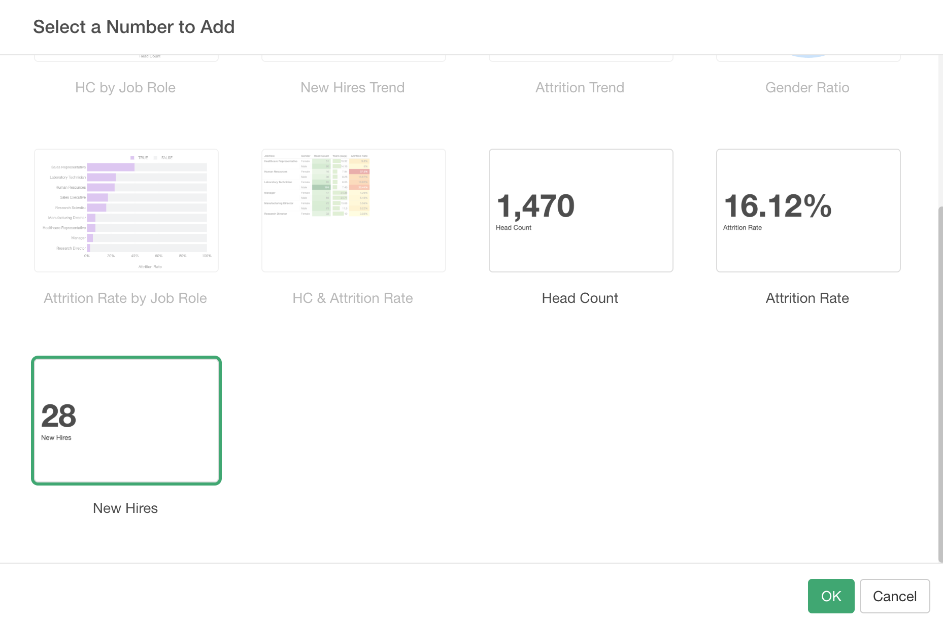
Select 'New Hires' and click 'OK' button.
Click on the Run button to see what the output looks like at this point.
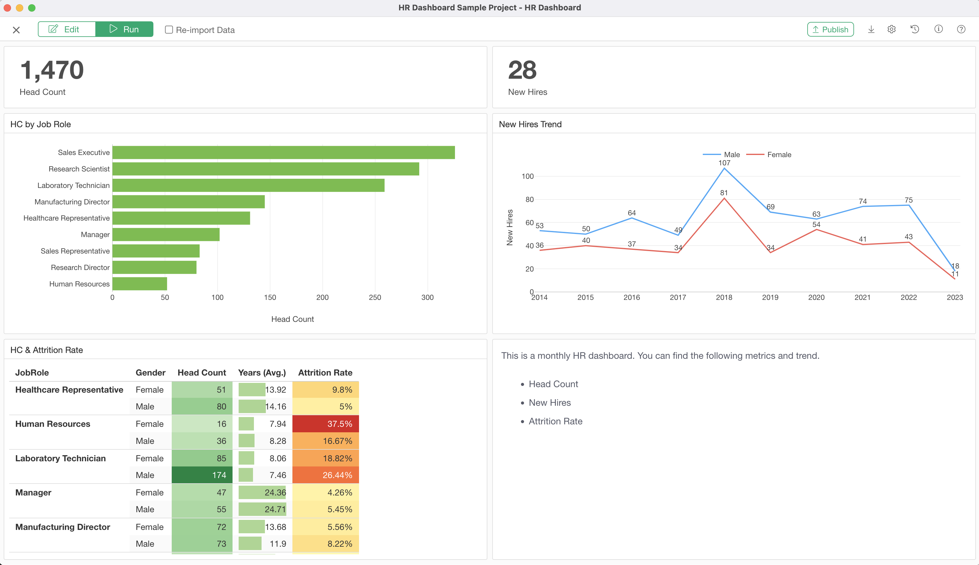
7. Interact with Dashboard
One of the great things about Exploratory Dashboard is that you can click on a part of charts and pivot tables to filter the data in other charts and tables.
Try clicking on one of the bars in the bar chart or on the cells in the pivot table, and see what happens!
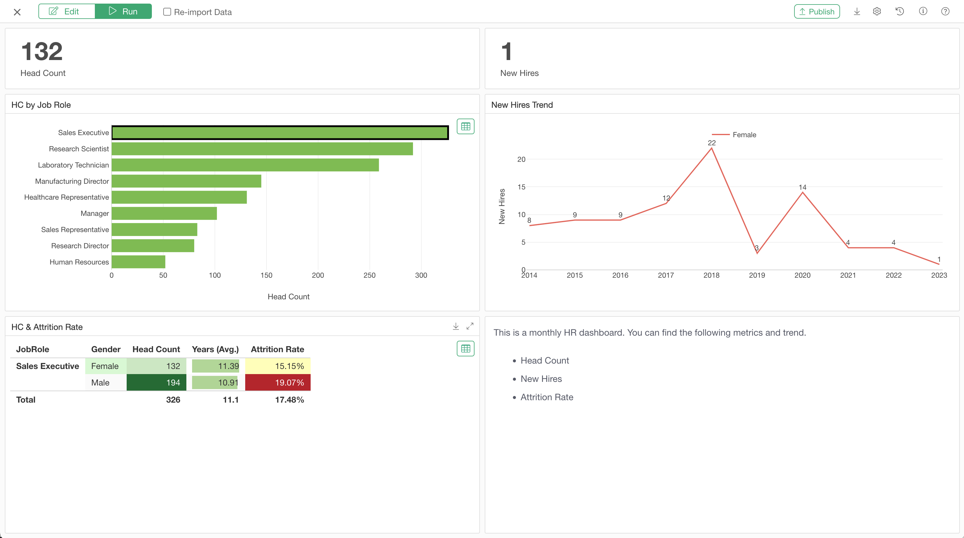
8. Show Detail Data
When you click on charts or pivot tables you will notice a green colored table icon.
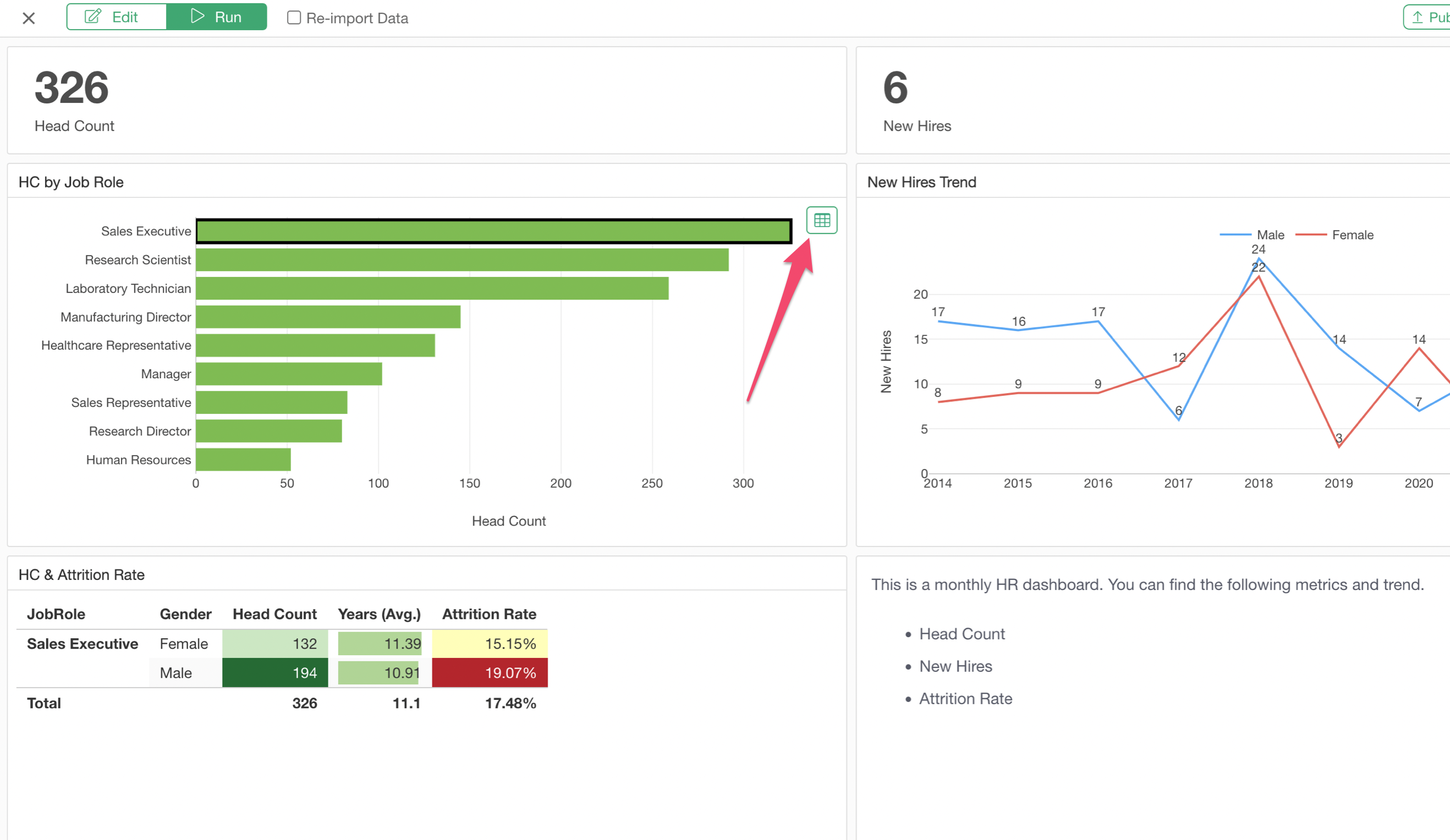 You can click on this button to show the underlying detail data.
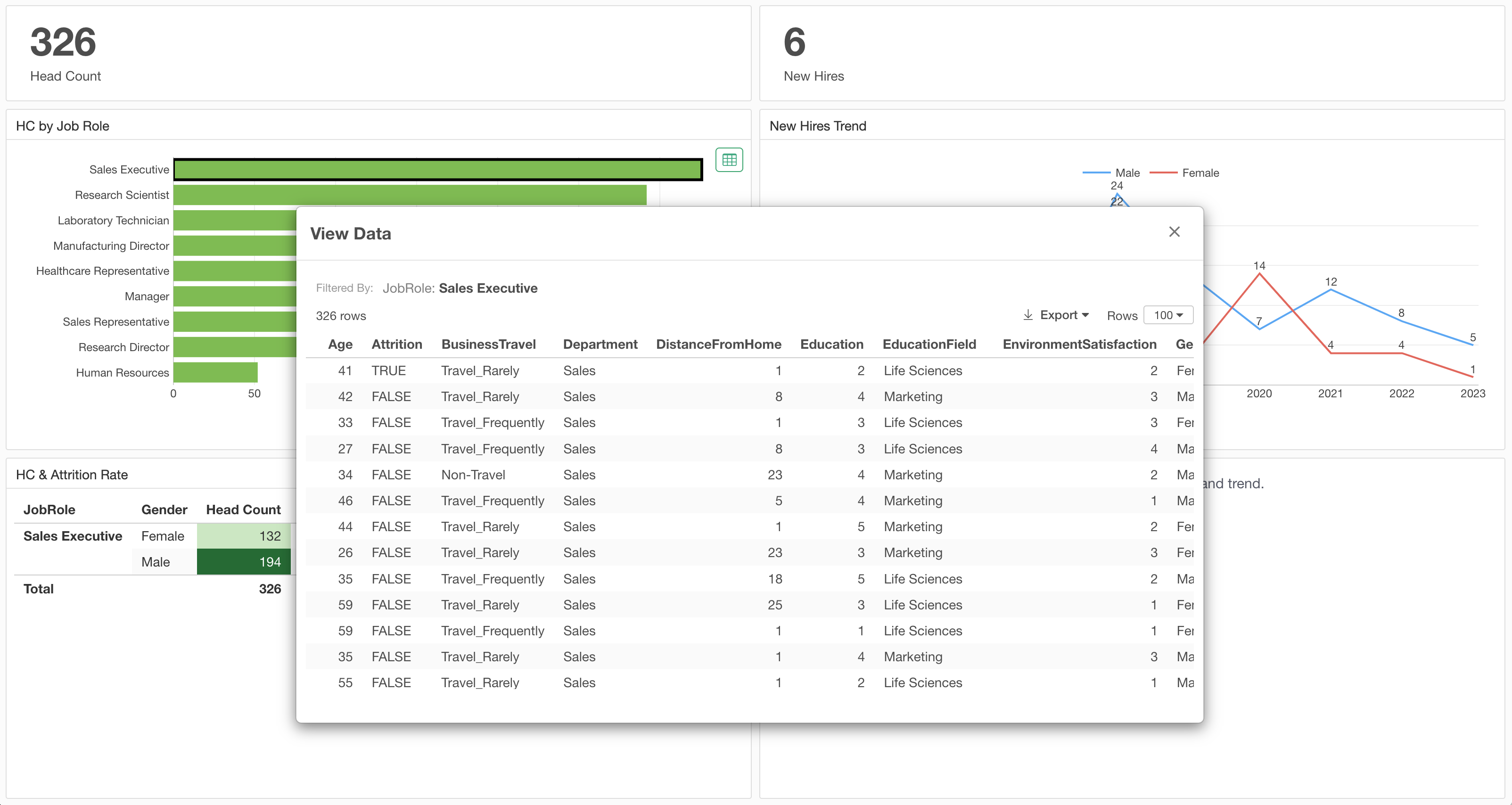
Next Step: Parameter
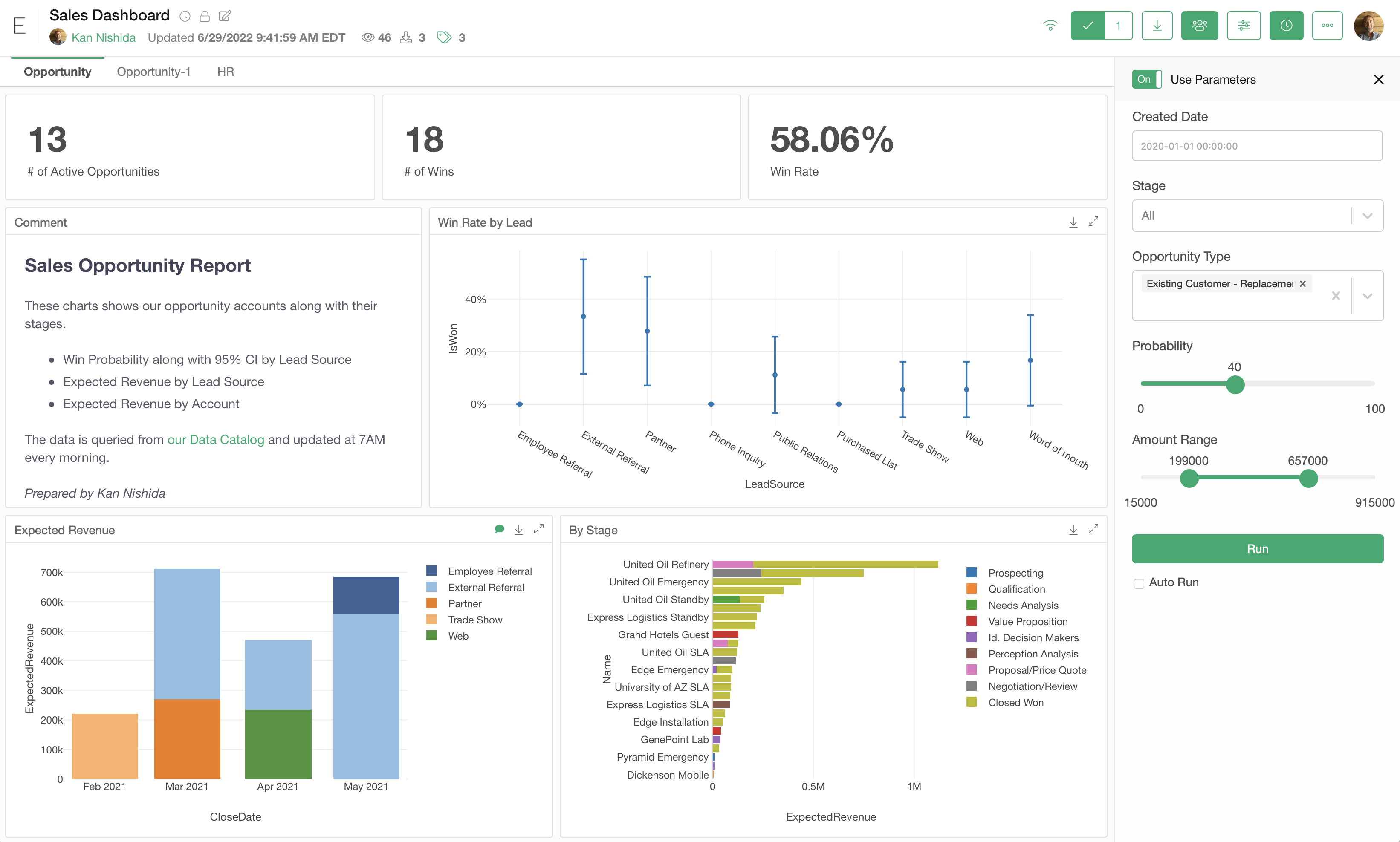
You can use Parameter to filter the data or update the calculation in a much more flexible way. If you are interested in, here's a how-to tutorial for Parameter.
- Introduction to Parameter - Link
And here's a seminar to watch!
- How to Use Parameter - Link
Thank you for reading, hope you will have a great rest of the day!
If you have any questions feel free to reach out at support@exploratory.io !
