How to display values without overlapping text in a chart
When displaying values on chart data points, the values can overlap in areas where data is dense, making them very difficult to see.
However, from version 14 onwards, a feature that automatically adjusts the display position even when values overlap is supported, significantly improving chart readability.
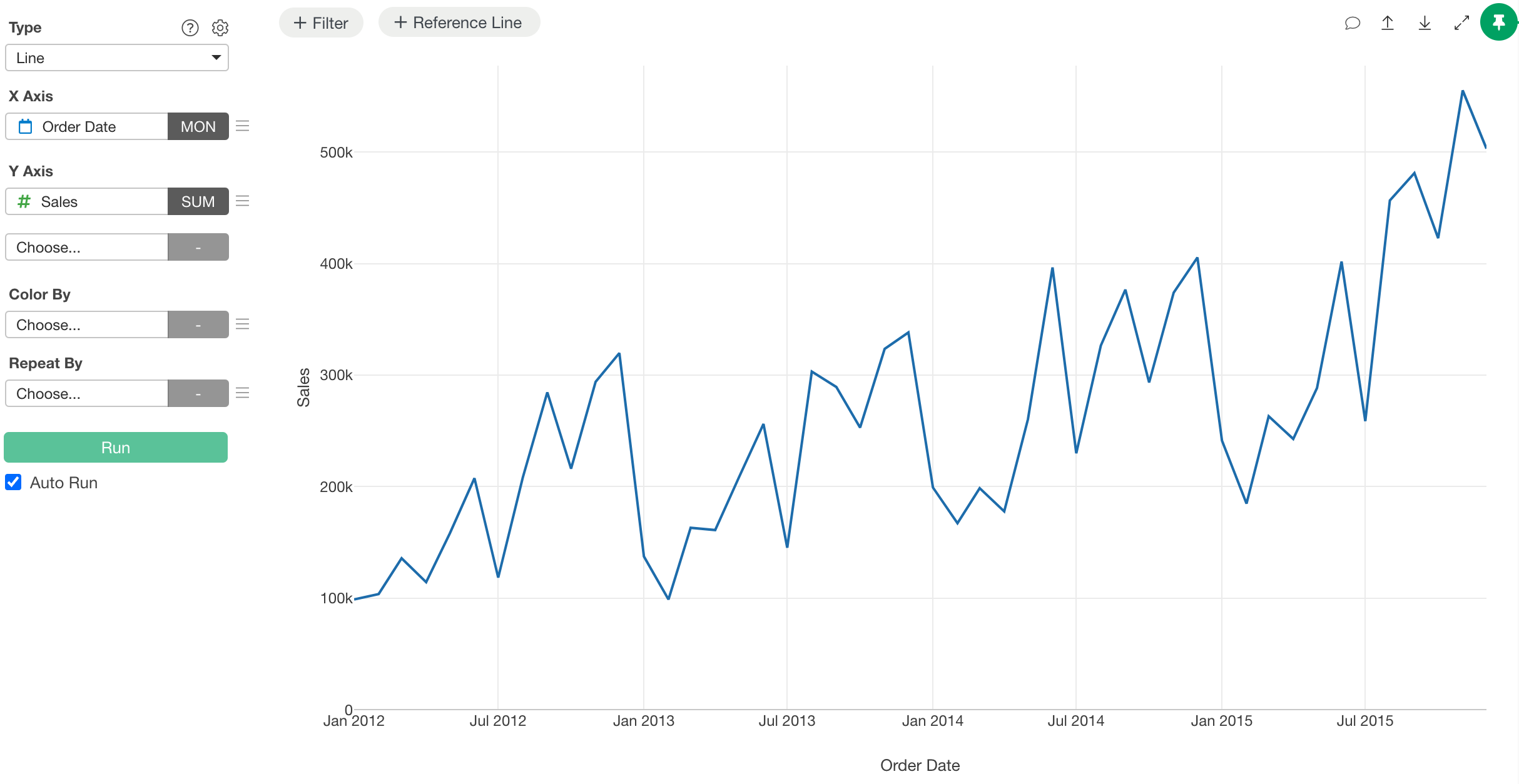
In this example, we will use the following sales trend chart to display values without overlapping text.
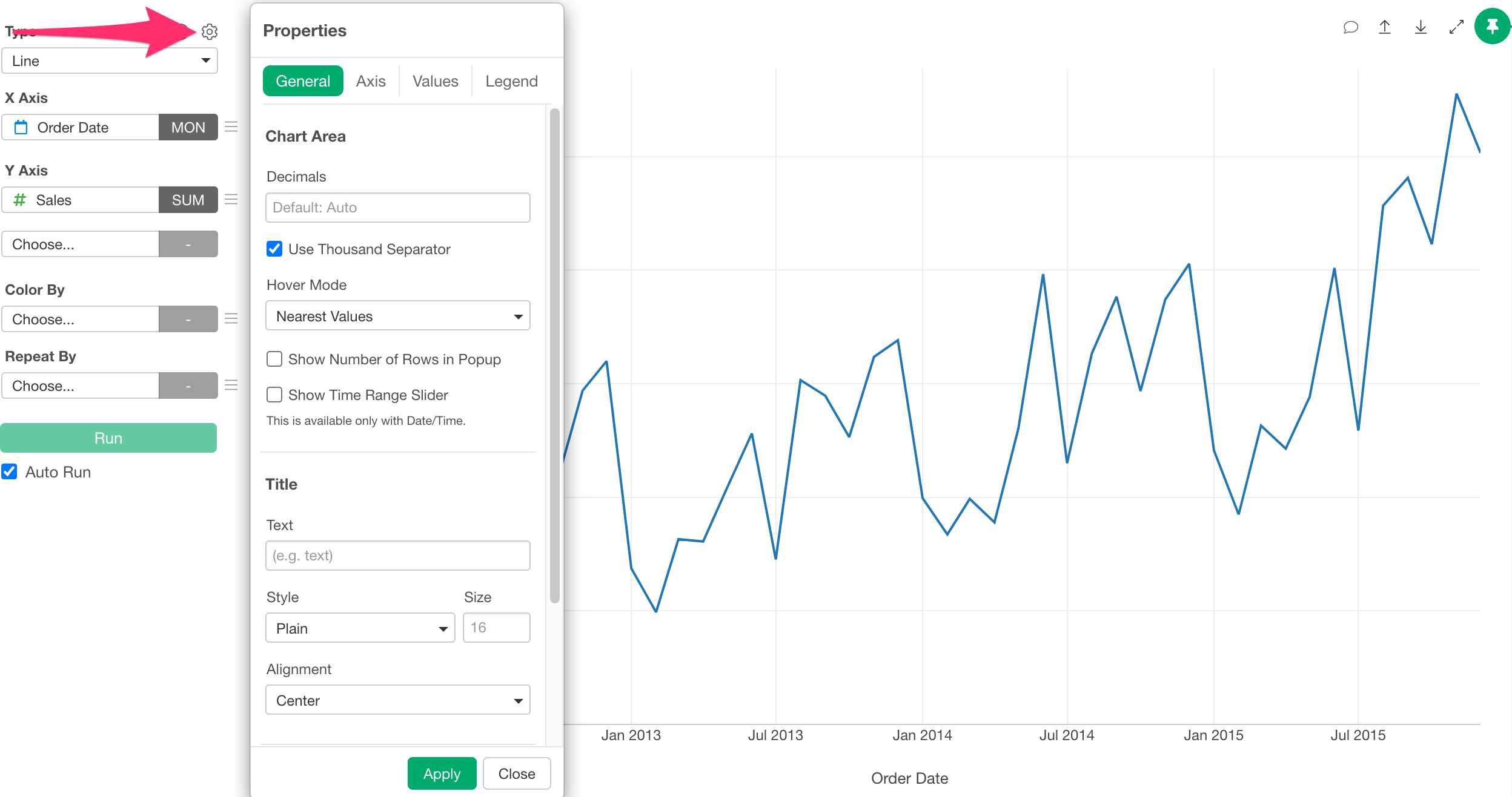
First, open the chart’s properties. Click the gear icon at the top.
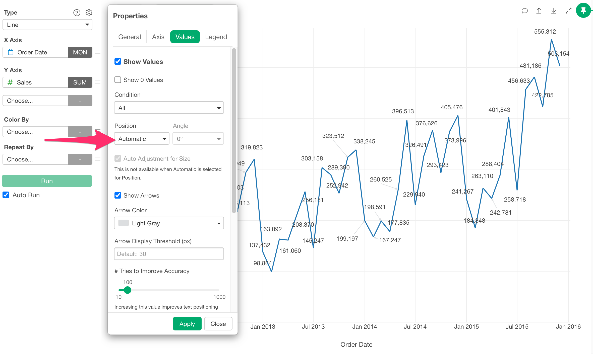
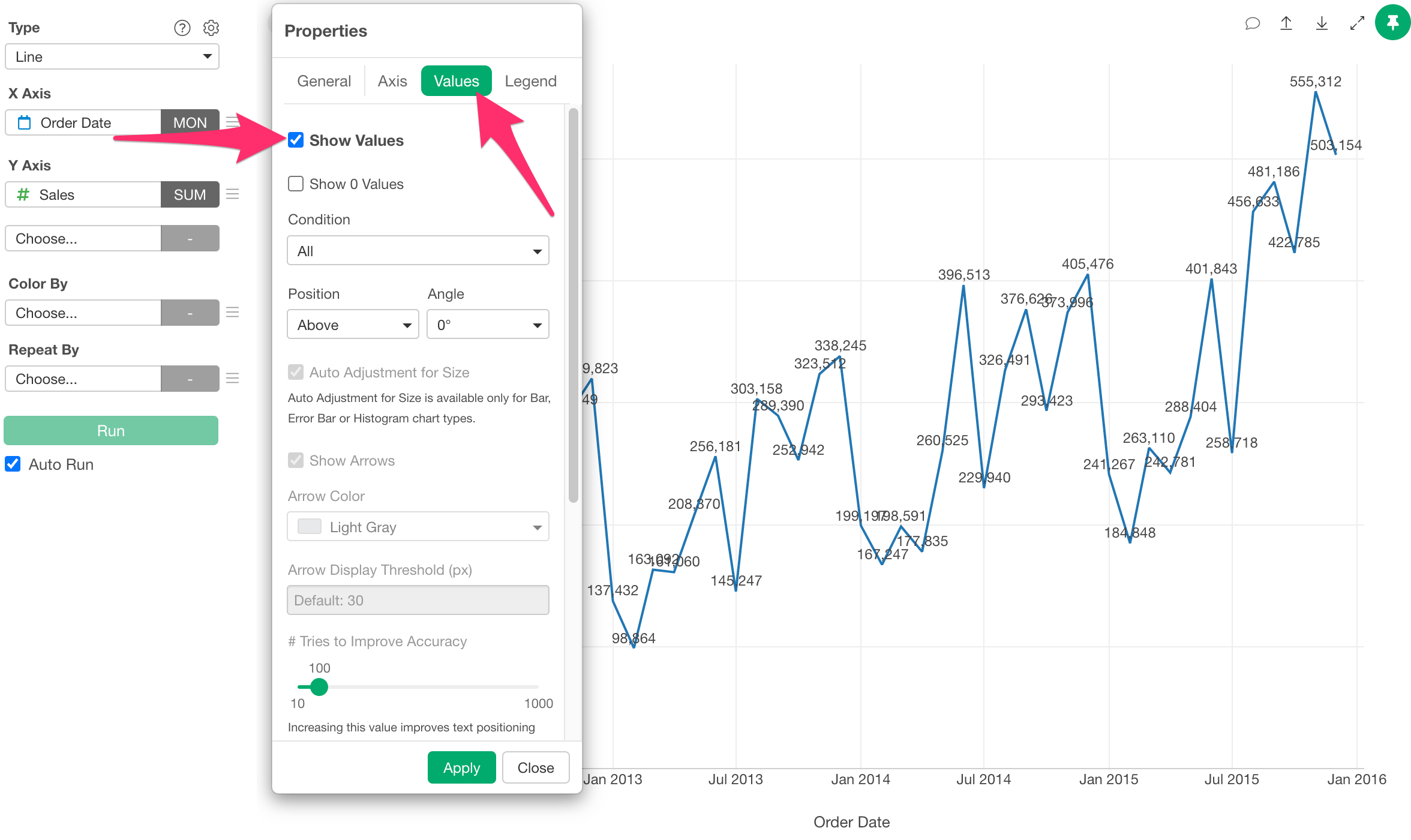
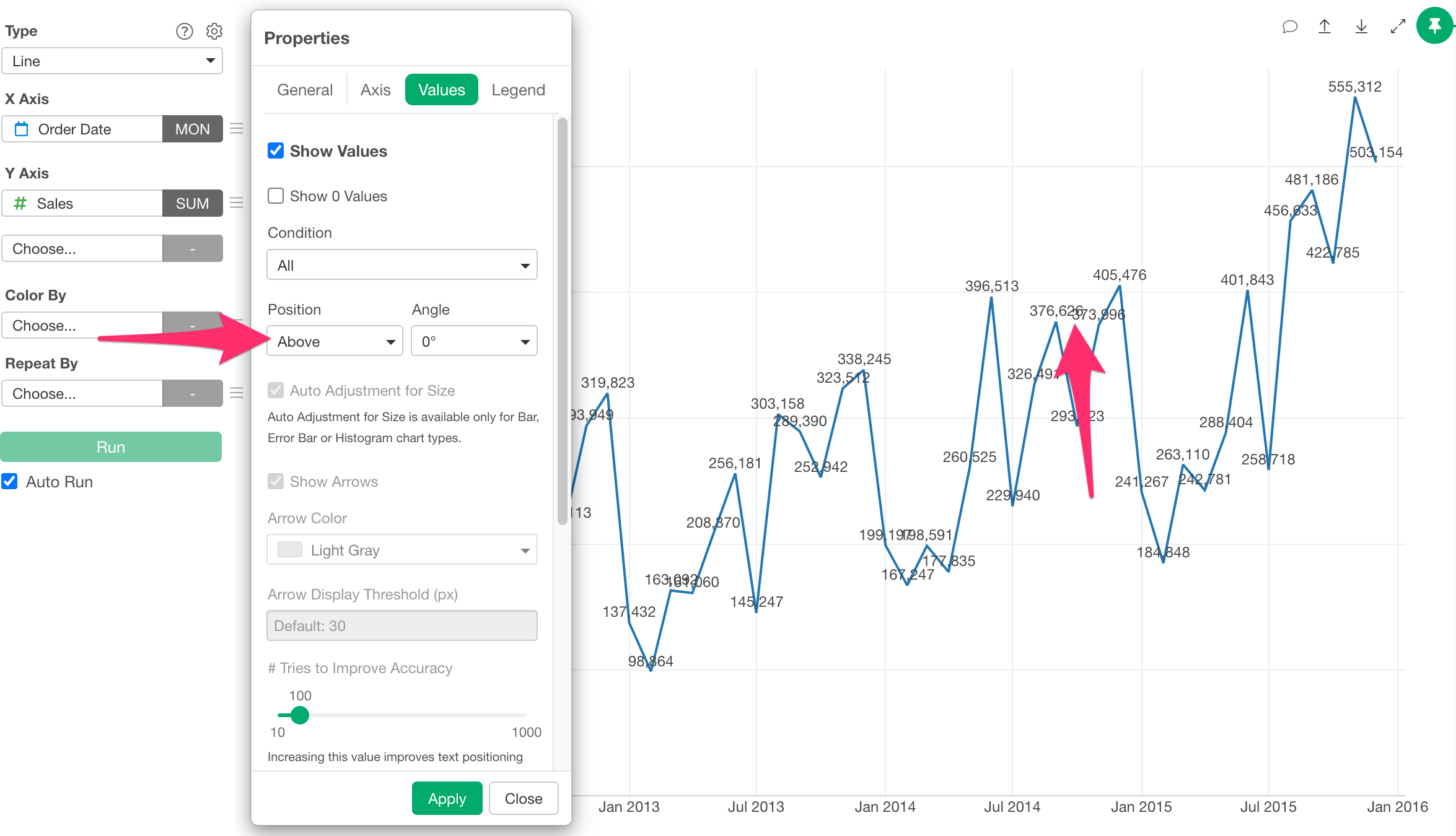
Once the property dialog opens, change the tab to “Values” and check “Show Values”.
When the value position is set to “Above” or “Below”, values might overlap in areas where the data is dense.
However, from version 14, we supported “Automatic” for the position.
When Position is set to “Auto” (the default setting), Exploratory automatically calculates the display position of the values, and the overlapping values are rearranged so they no longer overlap.
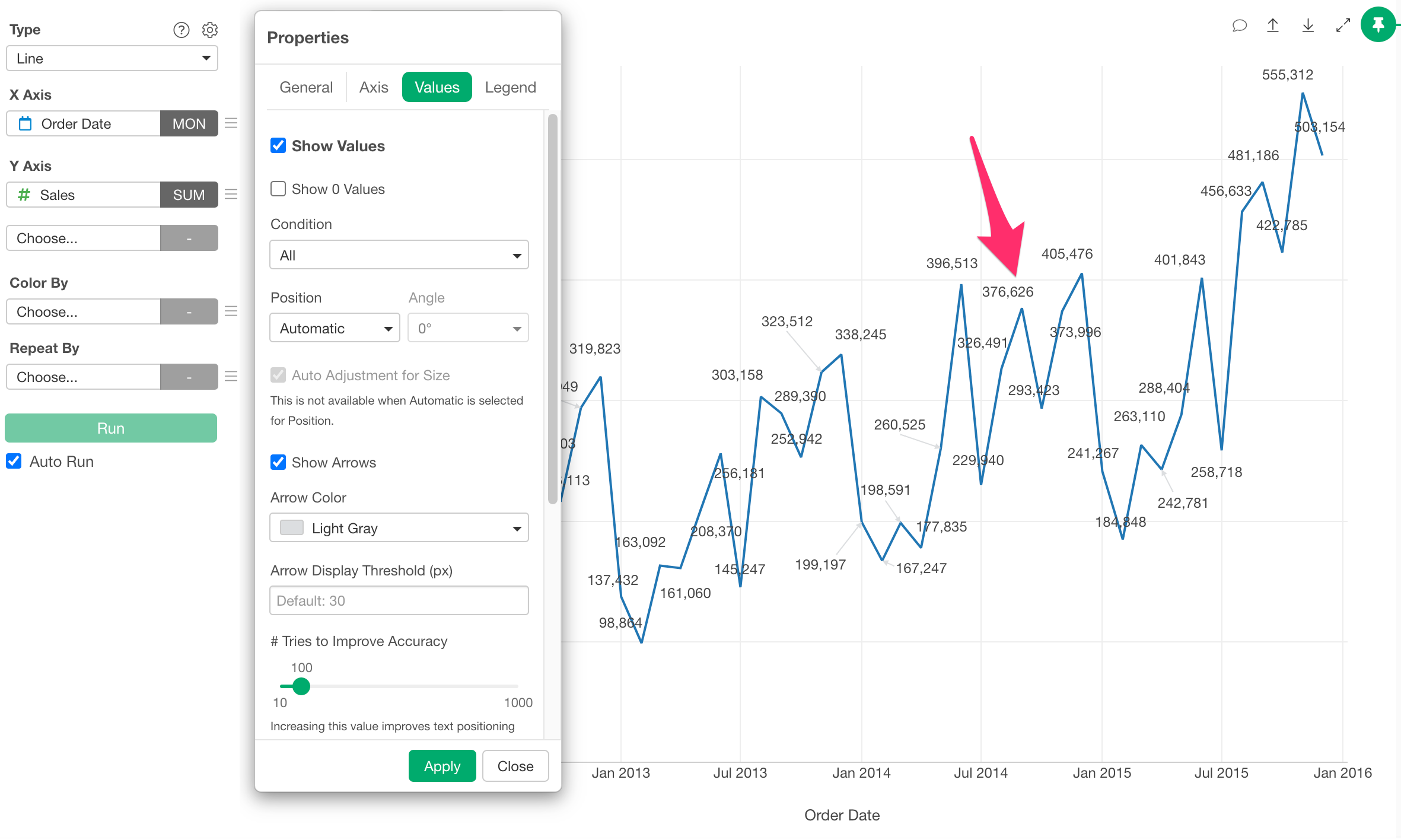
The display positions shift up or down, and if they move away from the original point, an arrow appears to indicate the point’s location.
Note that if you want to reduce the number of arrows, you can do so by increasing the threshold value for arrow display.
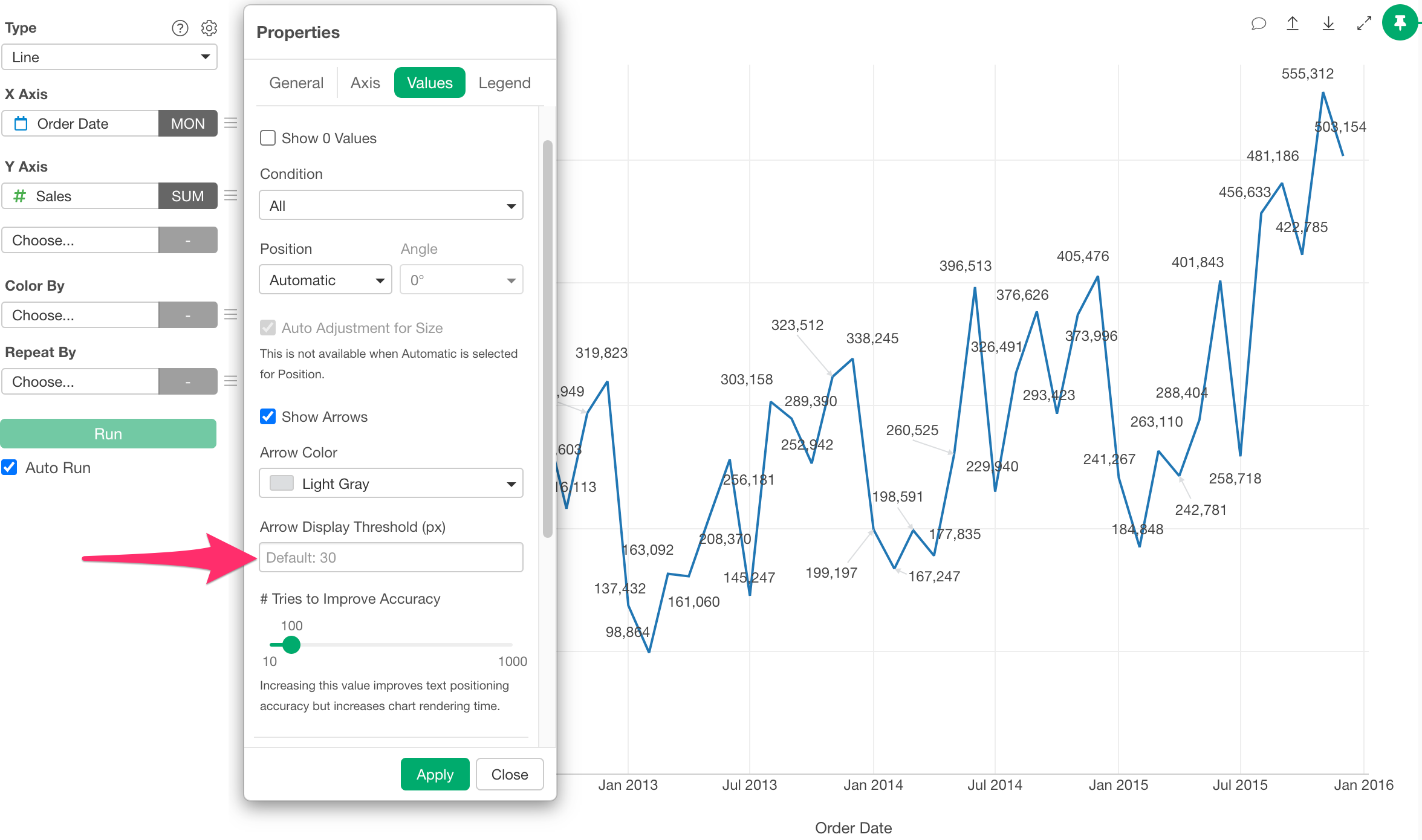
For example, if you increase the arrow display threshold and click the Apply button, only arrows longer than the specified number of pixels will be displayed. This hides shorter arrows and reduces the overall number of arrows. Conversely, setting it to a smaller value will increase the number of arrows displayed.
If you want to further improve the accuracy of value placement, you can change the “Tries to Improve Accuracy” setting.
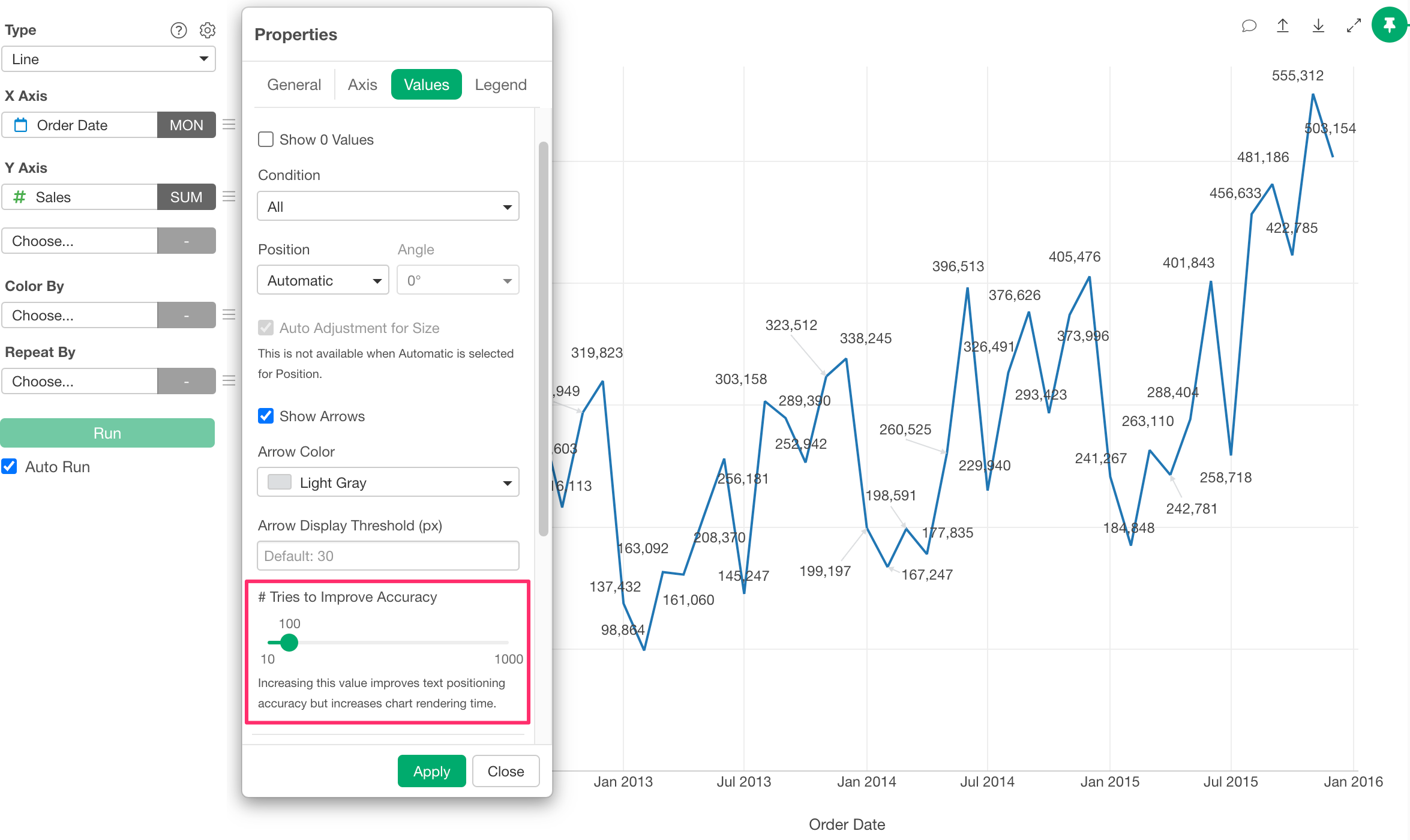
By default, it calculates the optimal placement using 100 trials.
Increasing this value improves placement accuracy but also increases the processing time required for calculation. Conversely, decreasing the value makes the process faster, but the placement accuracy may decrease.