How to use K-Means Clustering
Clustering is a technique for classifying data into groups that share common characteristics.
This document introduces how to perform K-Means clustering, a representative clustering method, in Exploratory. Let’s look at a simple example to understand what it can do.
For instance, imagine a scatter plot showing the relationship between customer age and purchase amount per customer.
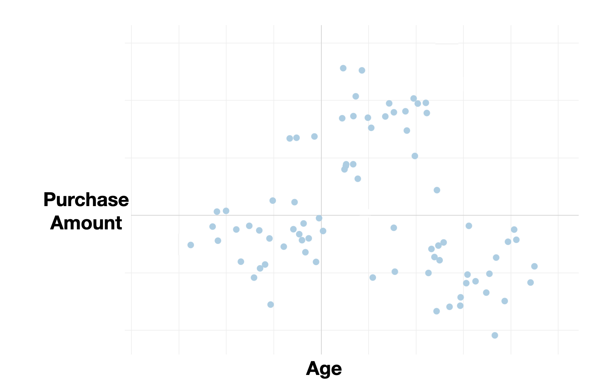
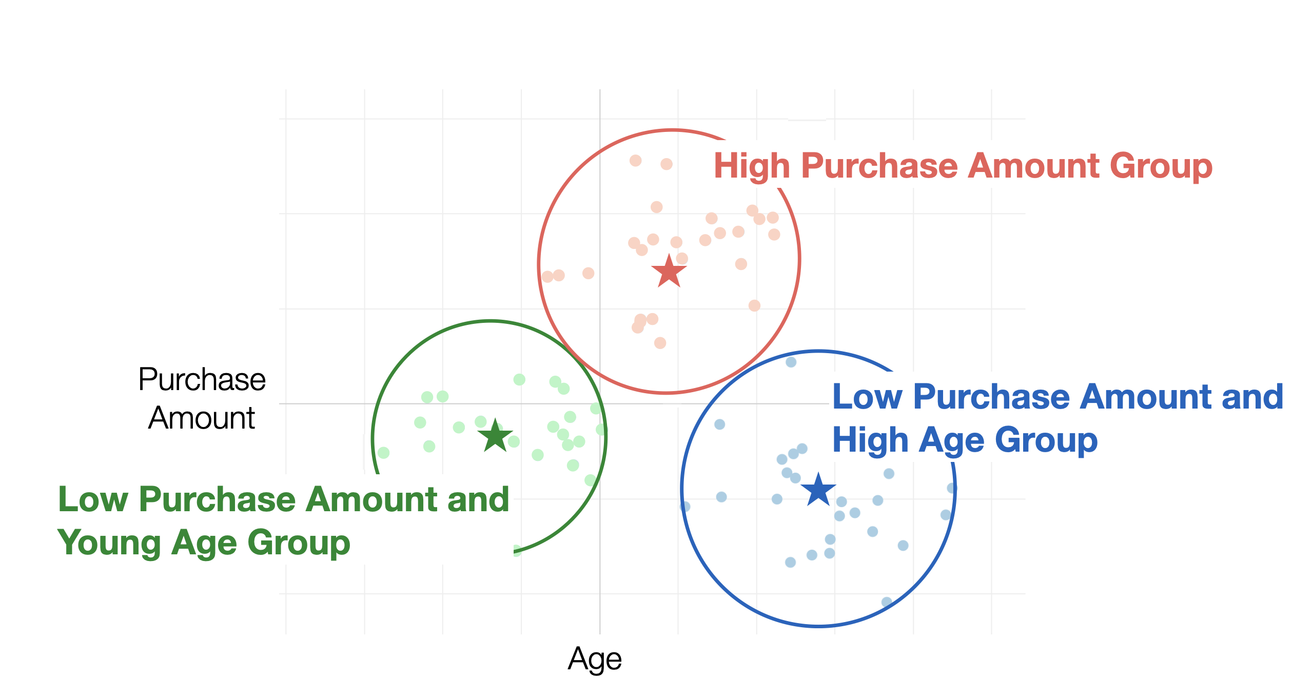
By using K-Means clustering, you can group customers based on their age and purchase amount values.
Required Data Format
When performing K-Means clustering, you need to use data where each row represents one observation.
Additionally, the data type of the variables used for clustering must be numeric.
Sample Data
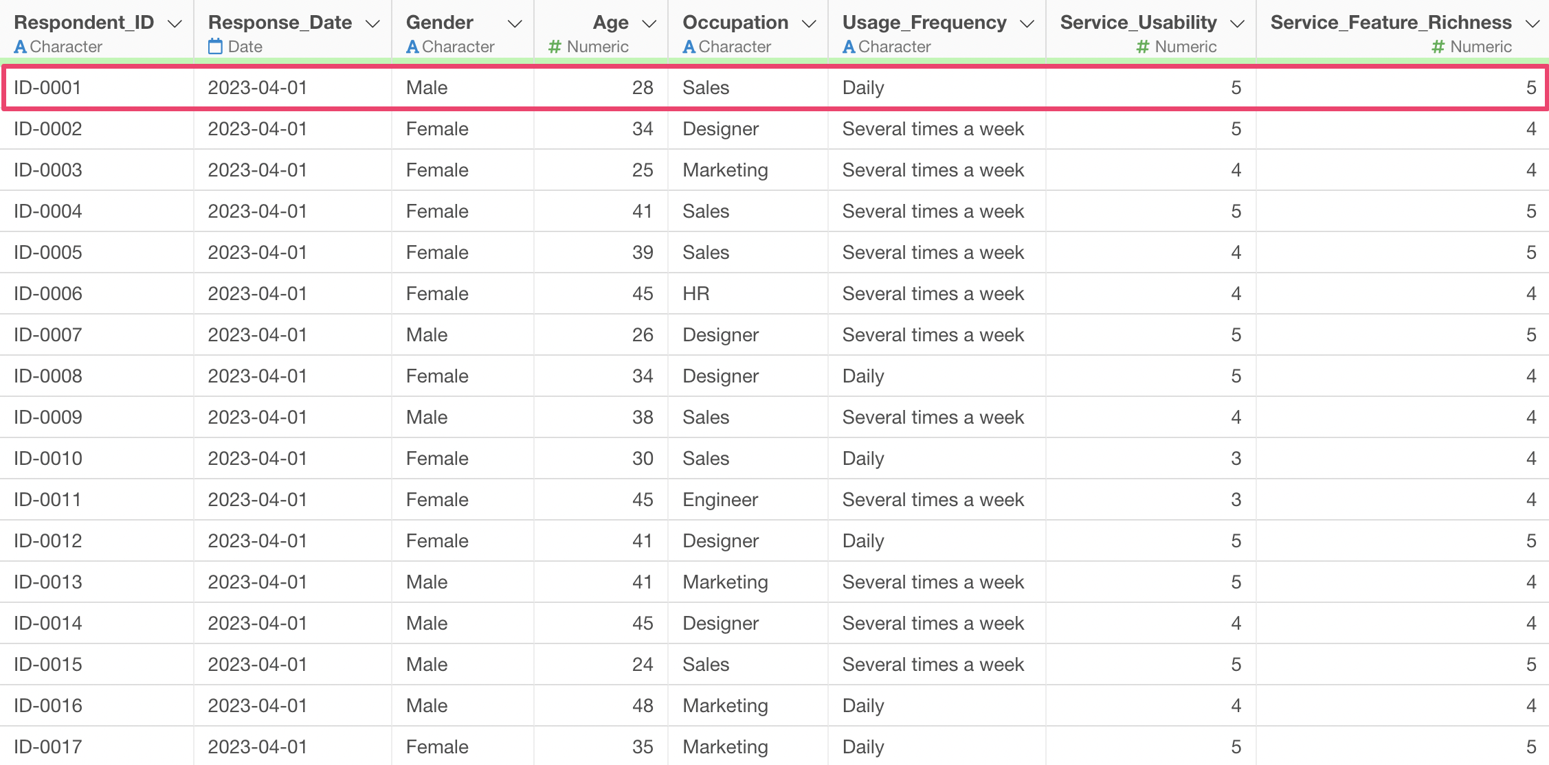
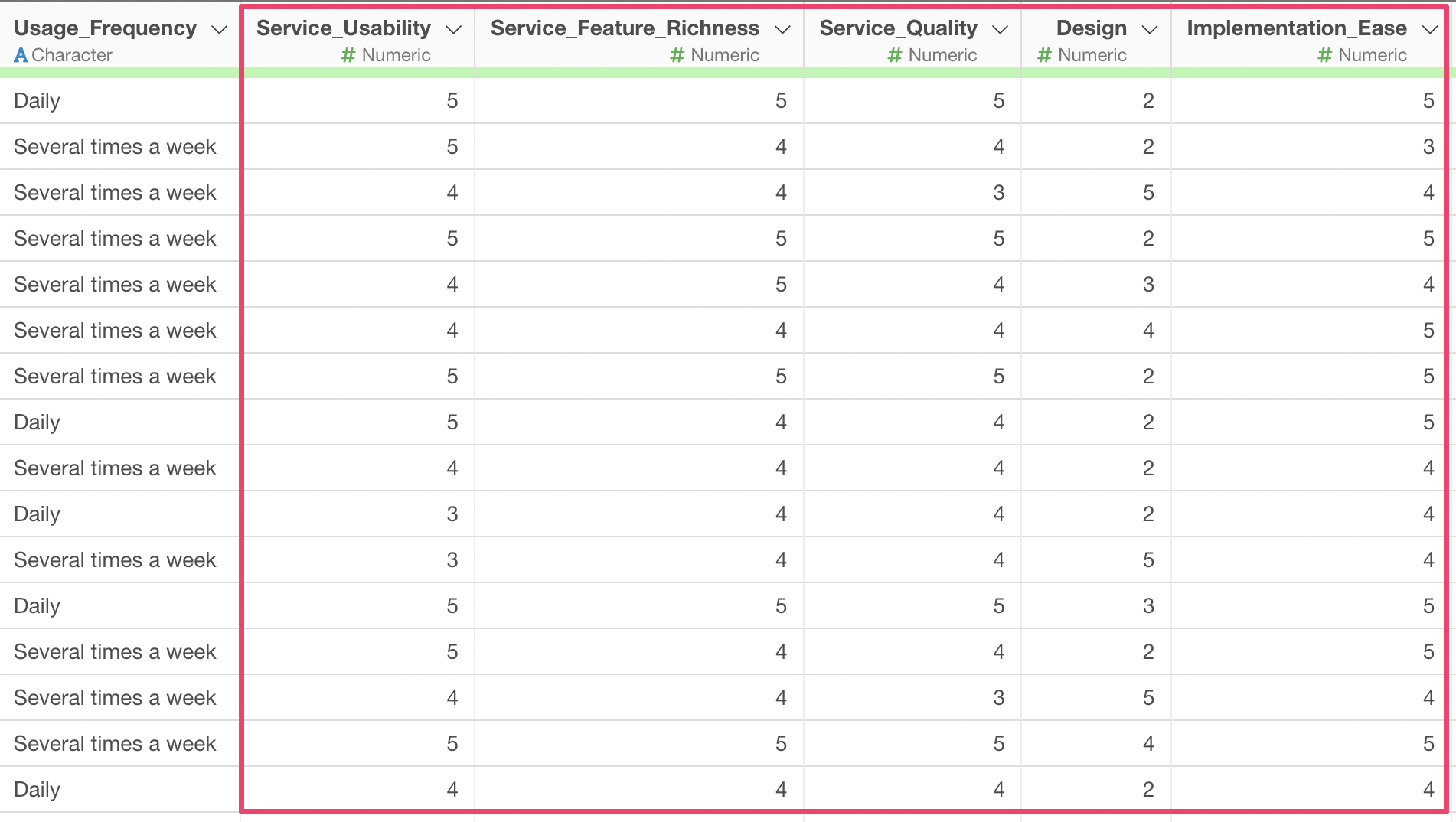
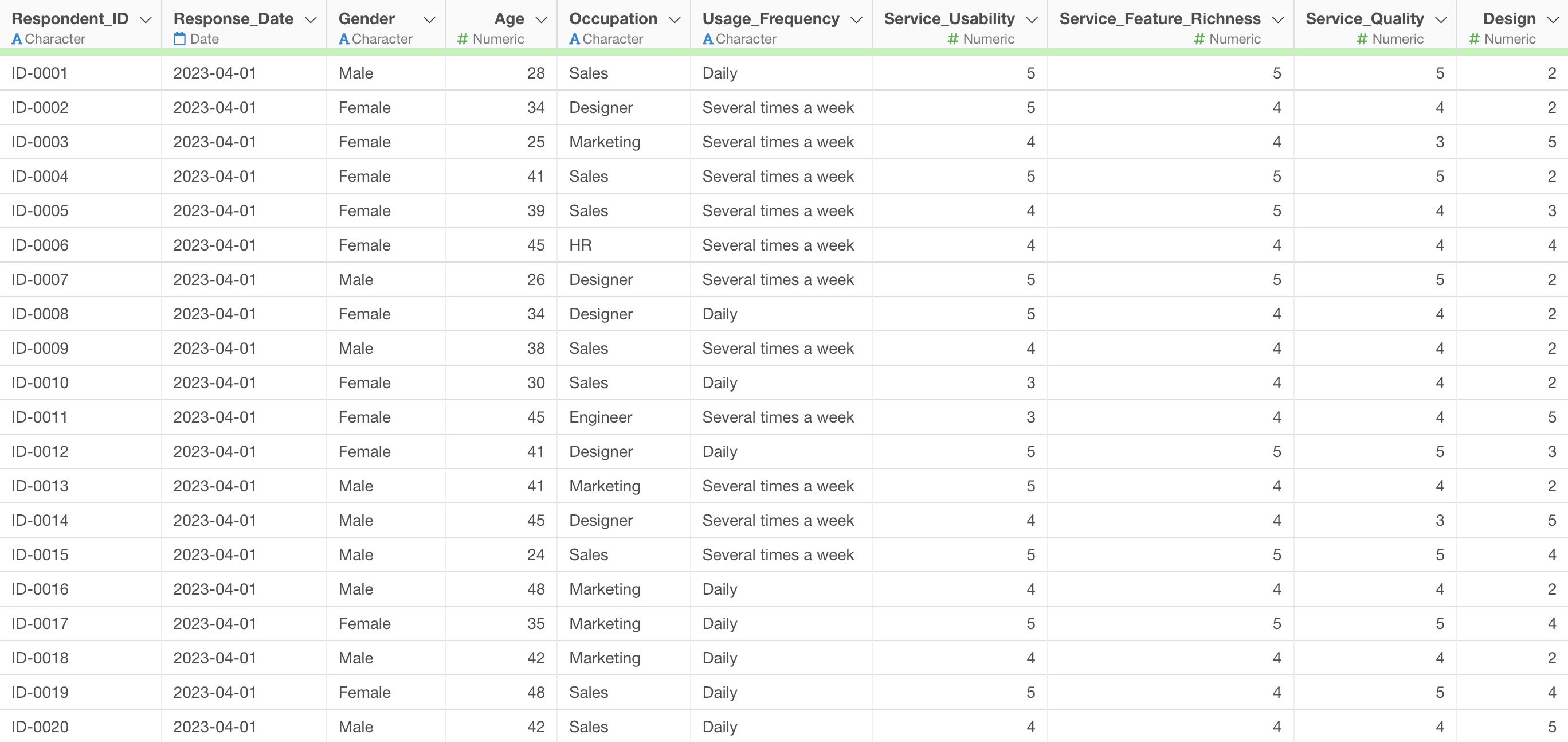
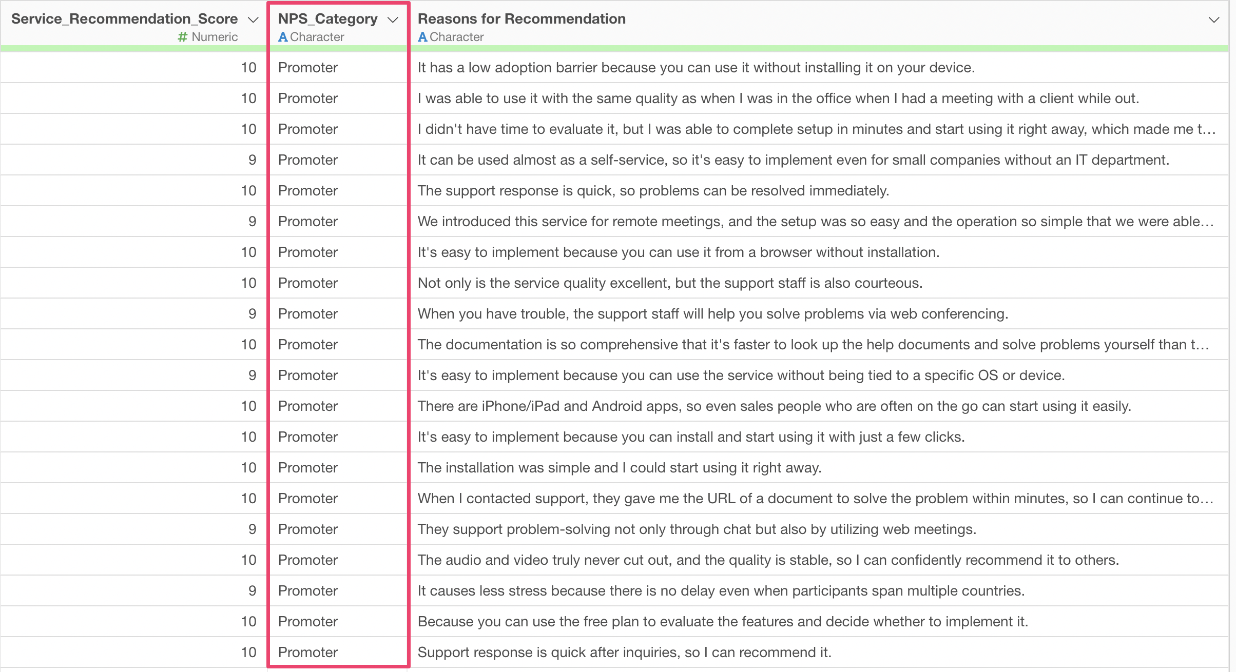
The data used in this example is “Customer Satisfaction Survey Data for Web Conferencing Services.”
In this dataset, each row represents one respondent, and it includes evaluations for 10 items such as ease of use, richness of features, quality, and design of the service.
Performing K-Means Clustering
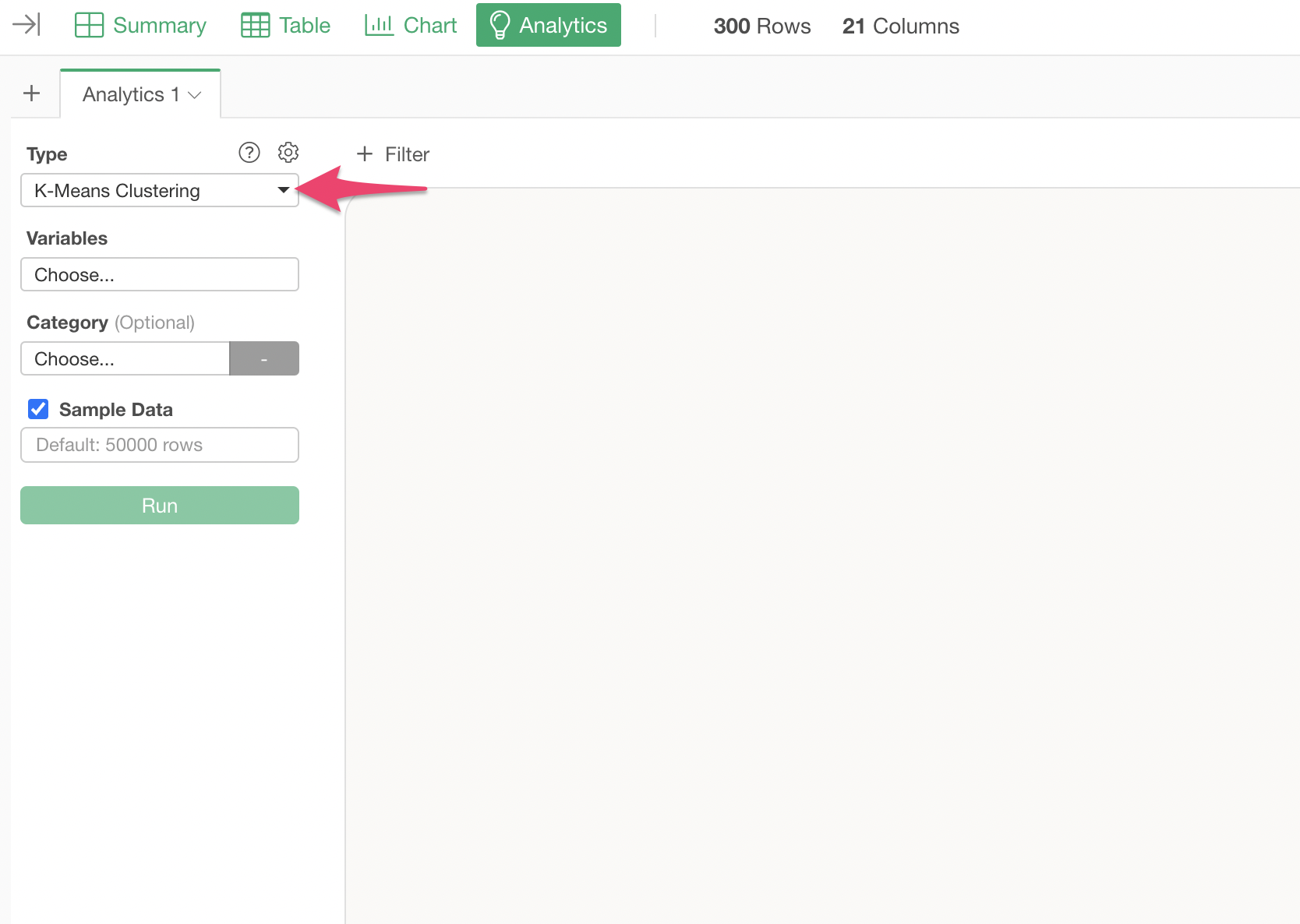
Open the Analytics view and select “K-Means Clustering” as the type.
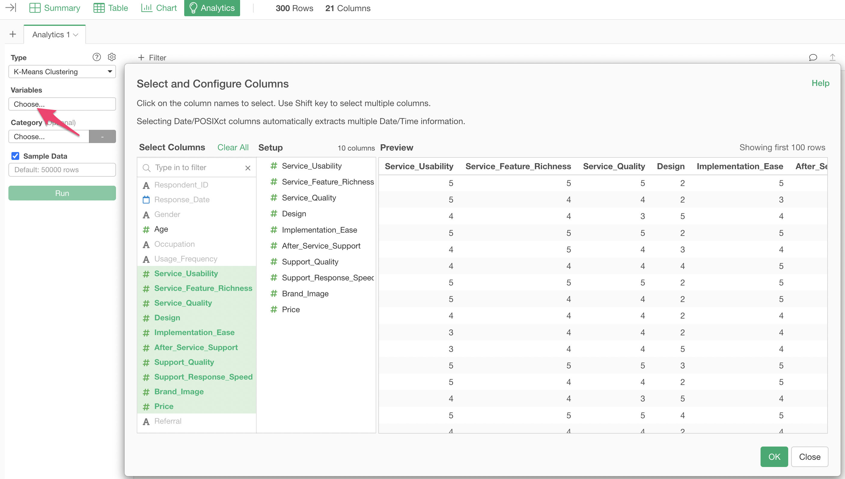
Click on the variables column to select the columns to be used for K-Means. You can select multiple columns at once by holding down the Shift key.
After specifying the columns, run the analysis to display the K-Means clustering results.
The default number of clusters is 3.
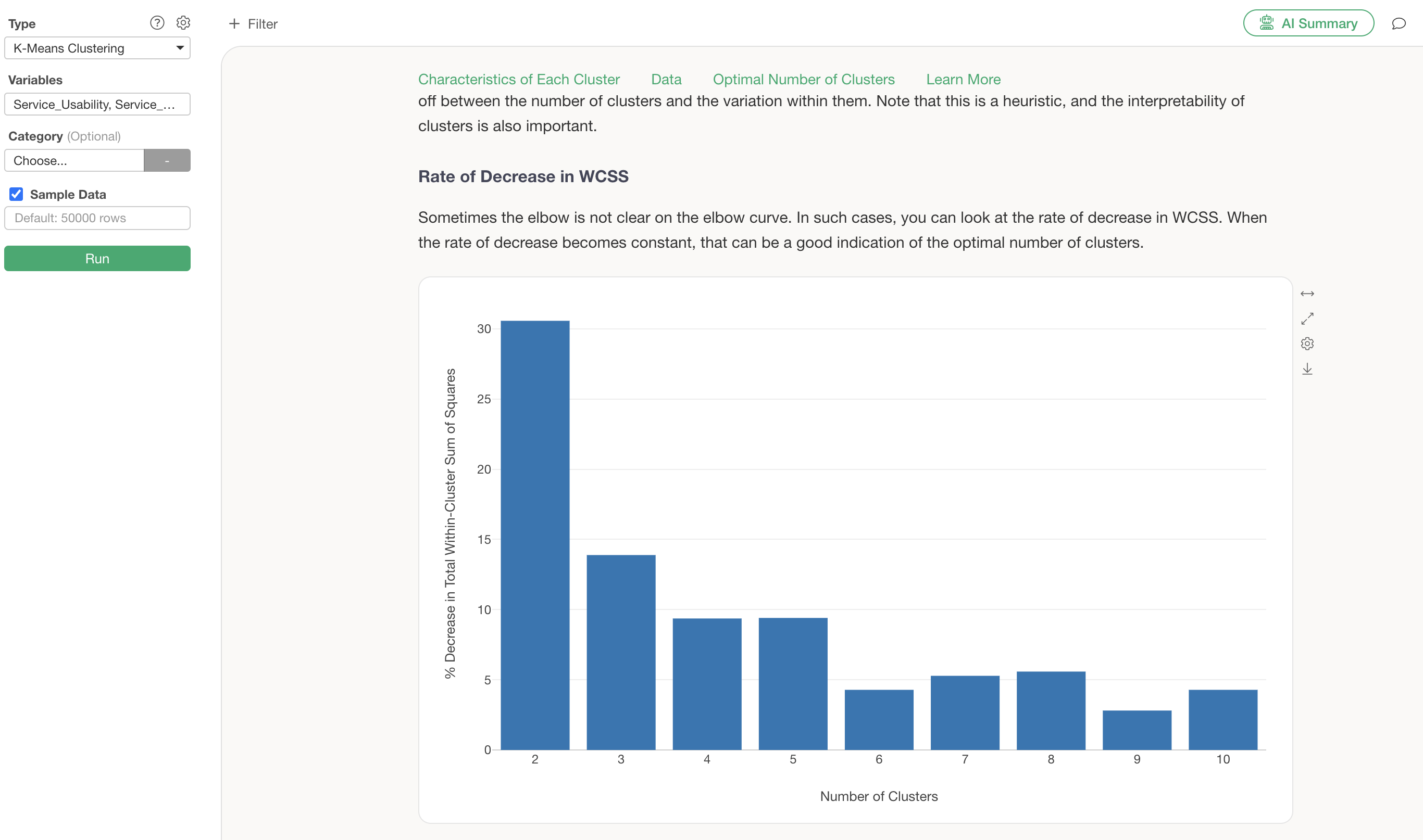
Optimal Number of Clusters
In the optimal number of clusters section, an elbow curve is automatically generated to help determine the best number of clusters.
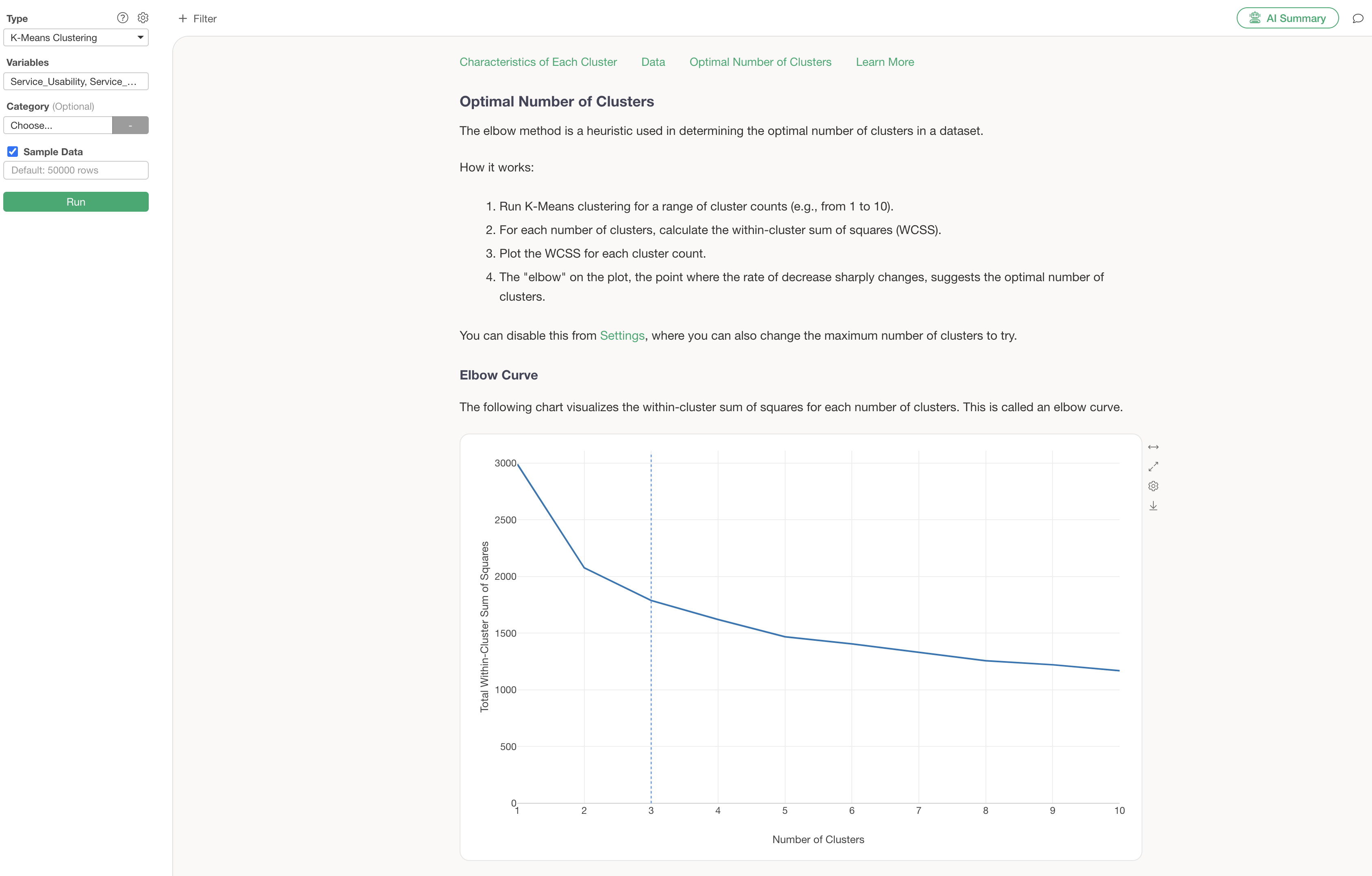
Guided Analytics explains that the “elbow” point, where the rapid decrease in variance starts to flatten, is an indicator of the optimal number of clusters.
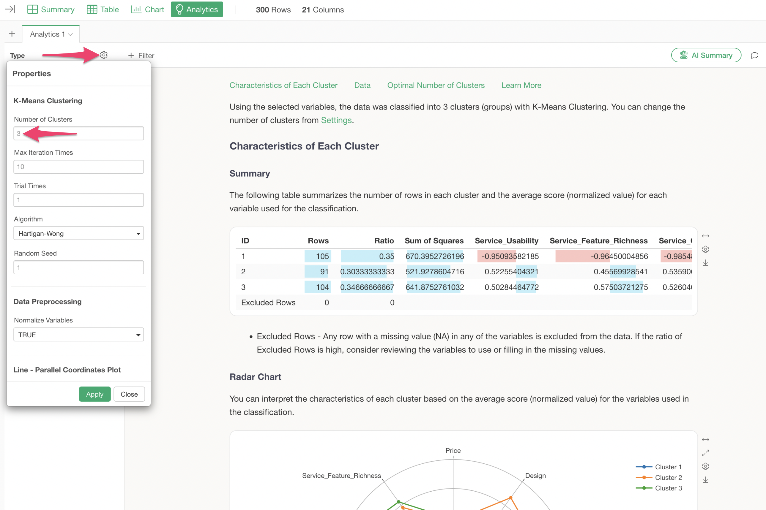
In this case, based on the reduction in variance, 4 clusters are considered appropriate, so we will change the number of clusters to 4.
The number of clusters can be changed from the settings. We will change the number of clusters to “4” and apply it.
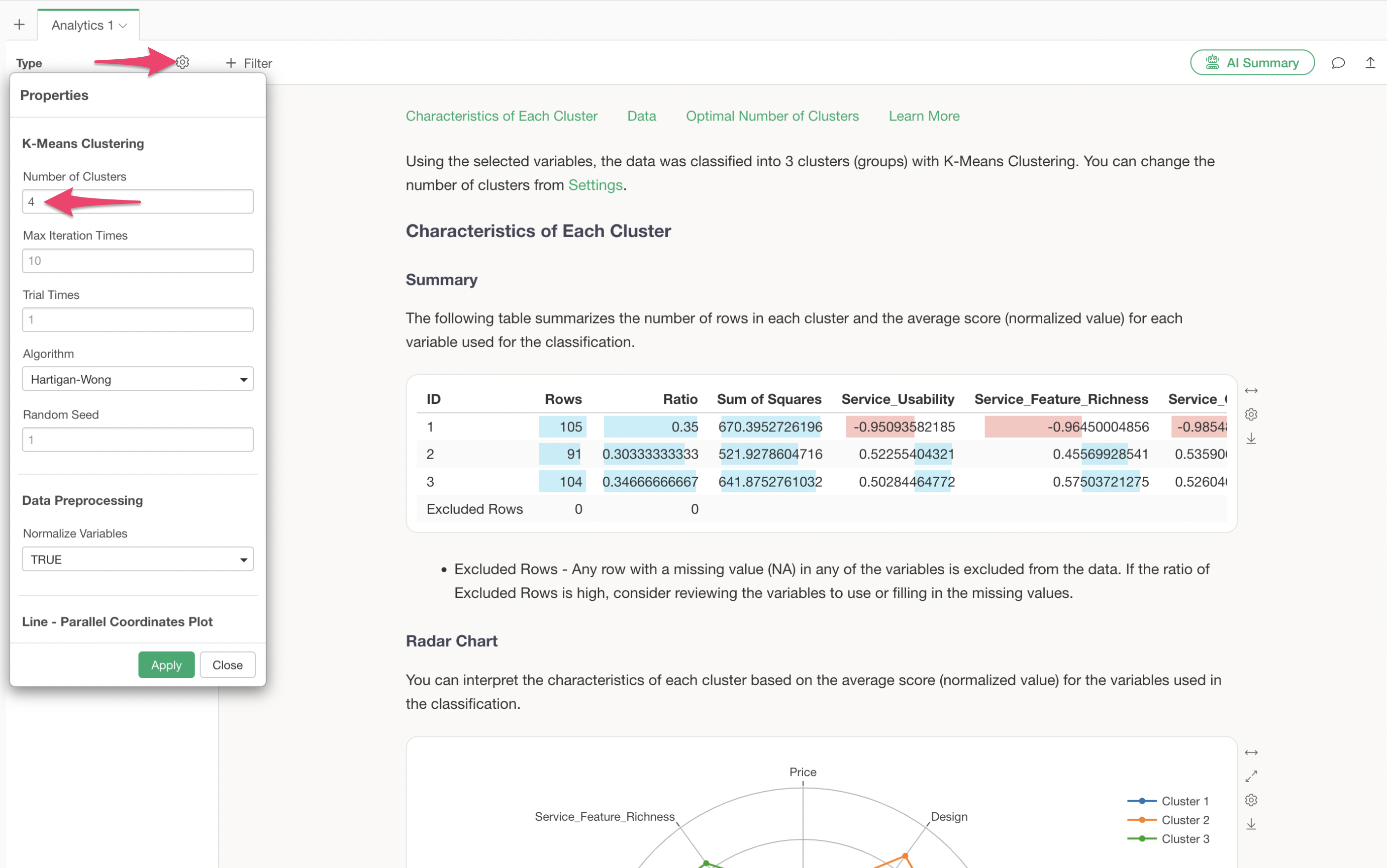
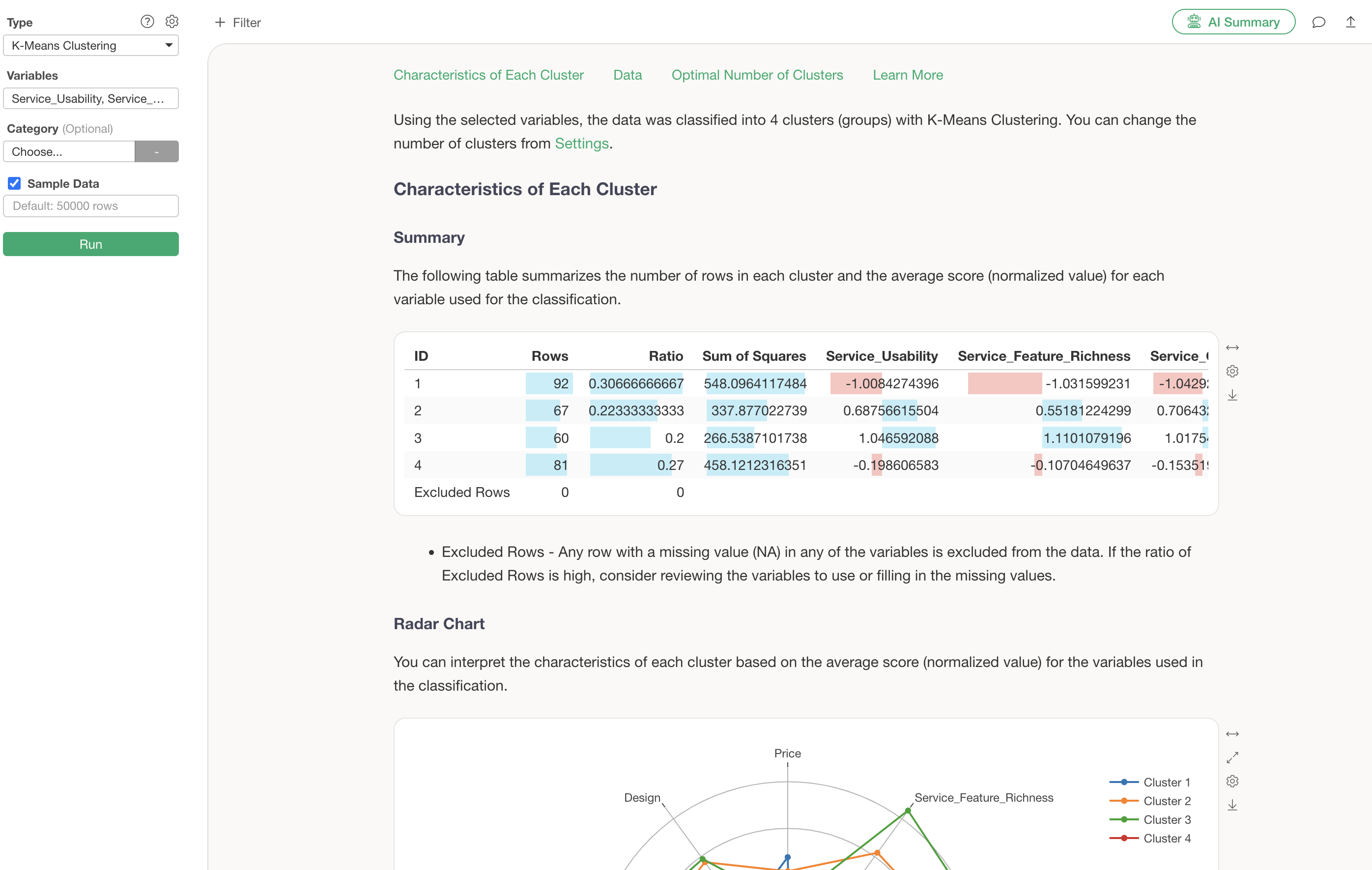
We have successfully performed K-Means clustering with the number of clusters changed to 4.
Interpreting the Results
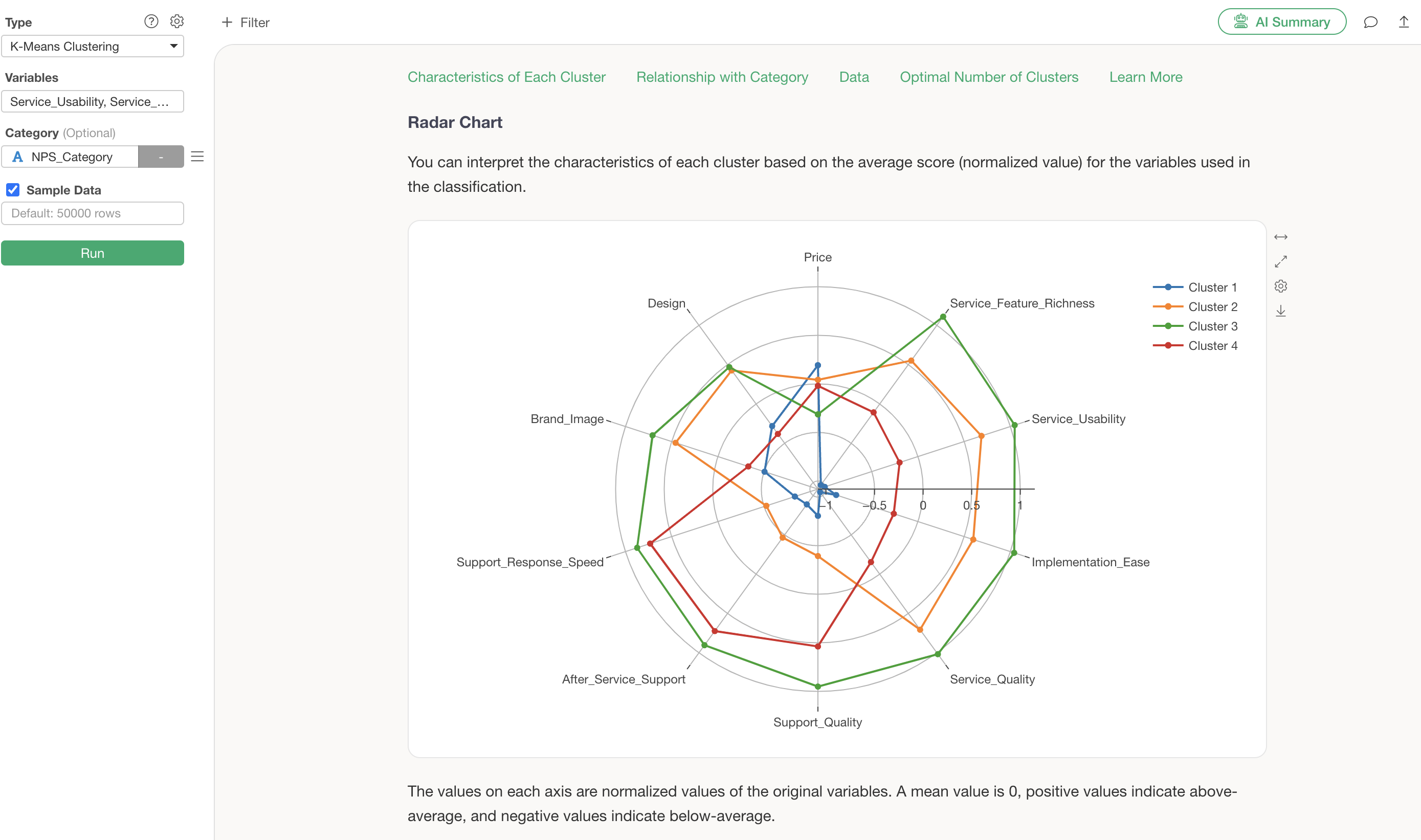
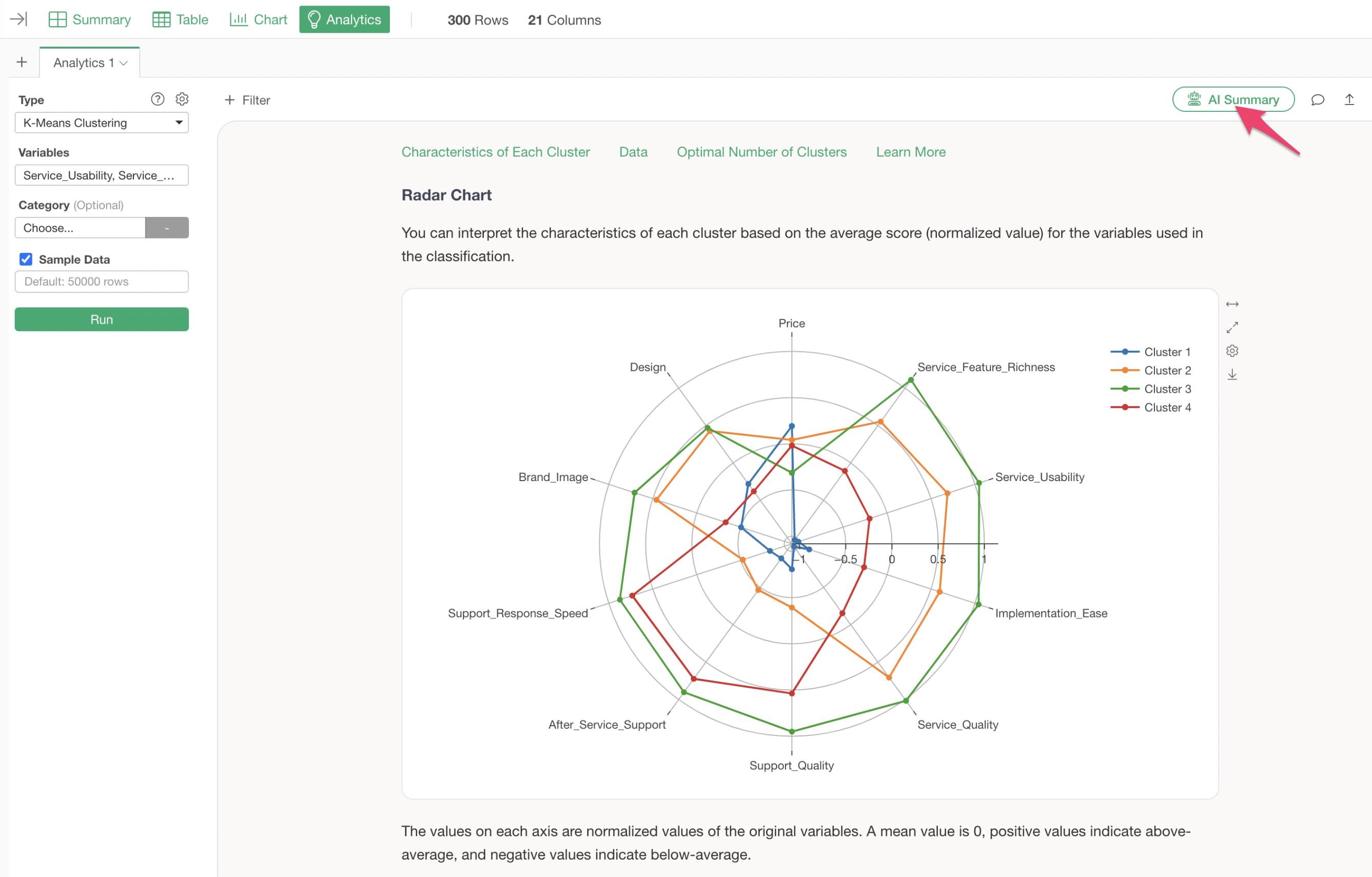
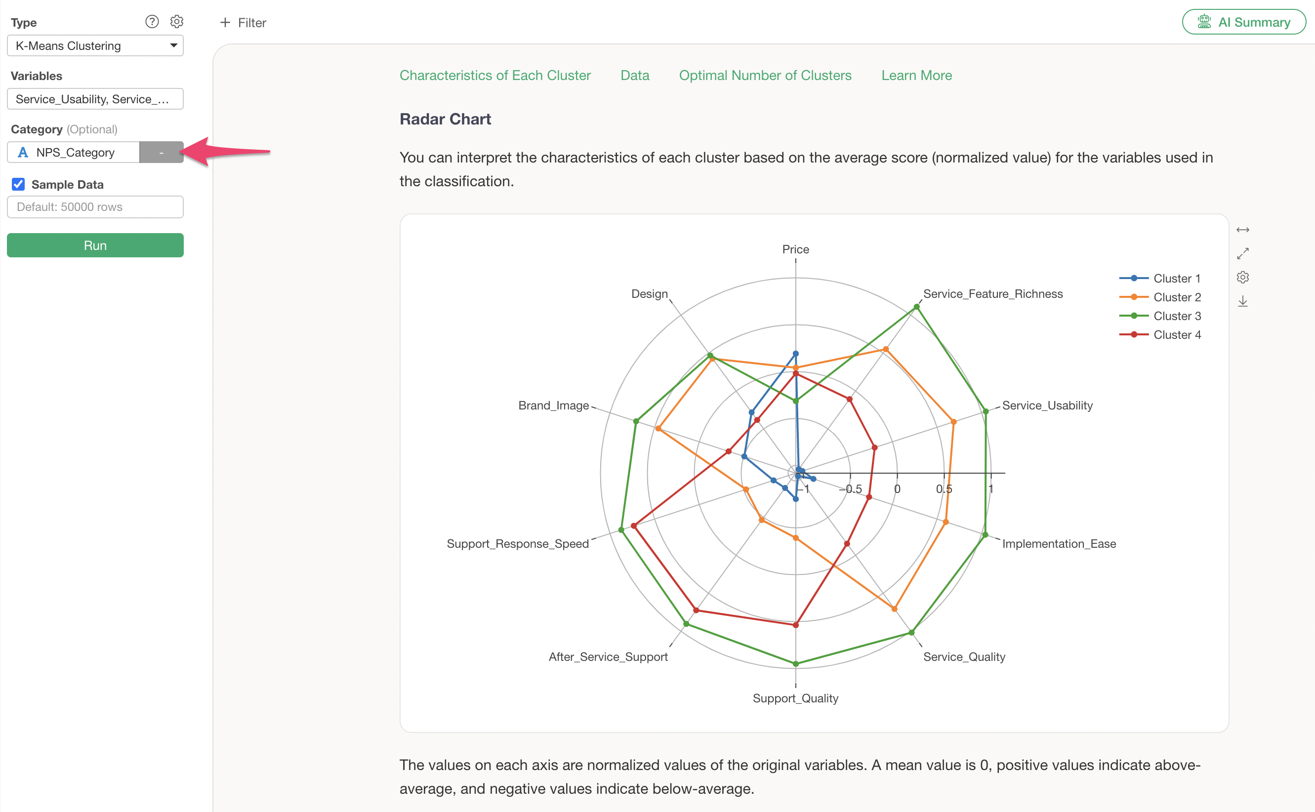
Radar Chart
The radar chart visualization displays the standardized values of variables for each cluster.
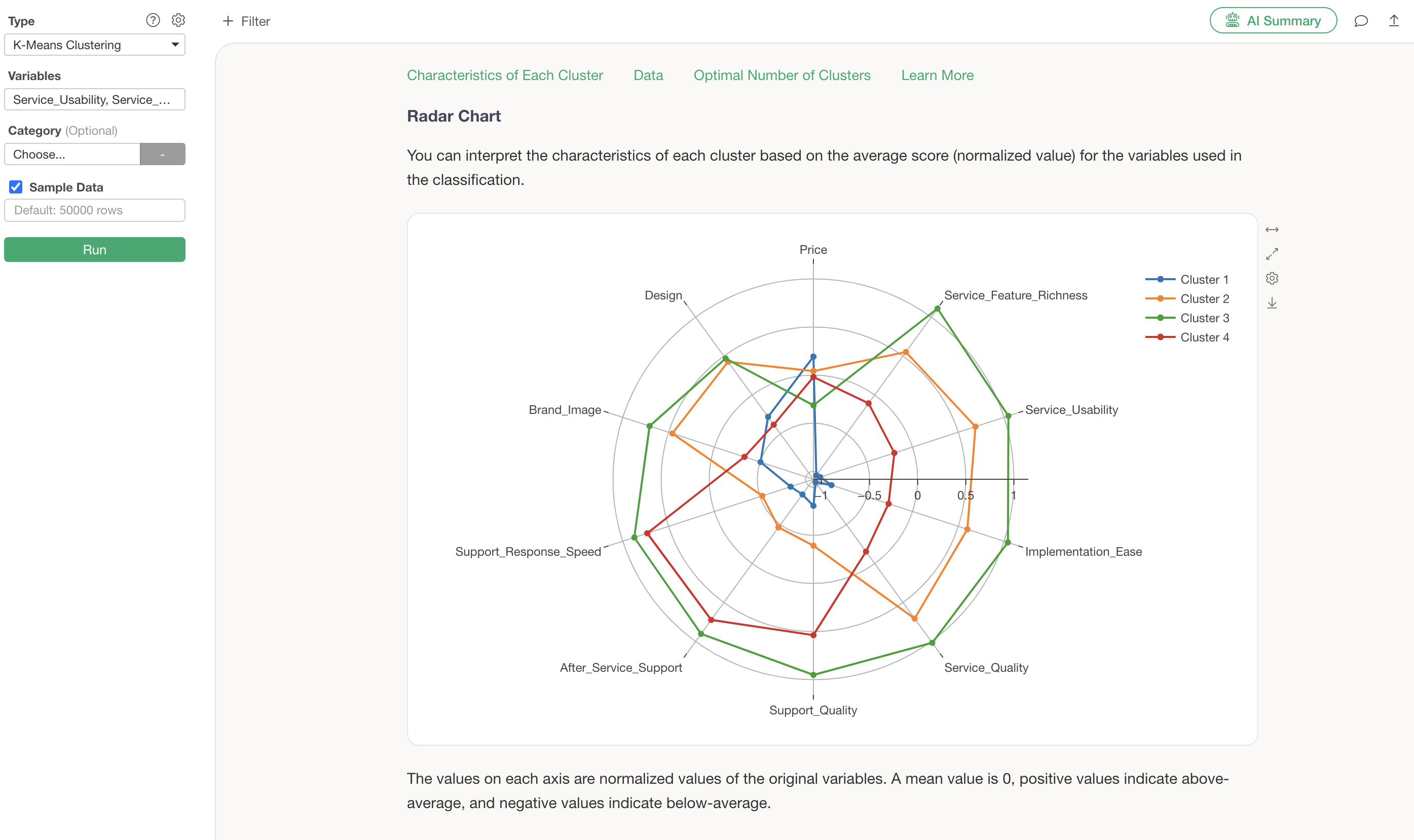
From this chart, it is evident that Cluster 3 generally has high evaluations, while Cluster 1 generally has low evaluations.
Cluster 2 shows high scores for service-related aspects such as “Service_Feature_Richness” and “Service_Usability,” whereas Cluster 3 shows high scores for support-related aspects like “Support_Quality” and “Support_Response_Speed.”
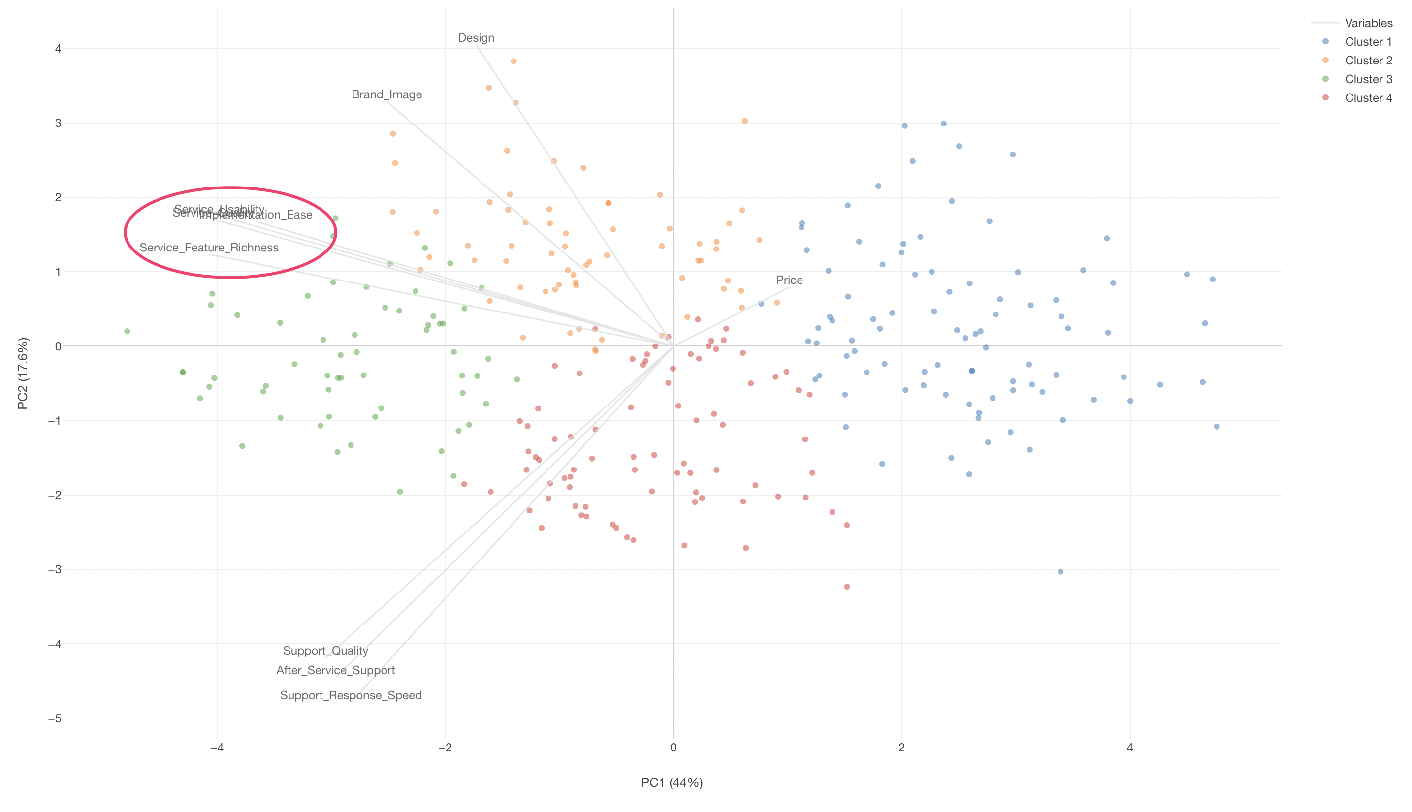
Biplot
The Biplot visualization section allows you to examine the characteristics of each cluster (group) on a scatter plot.
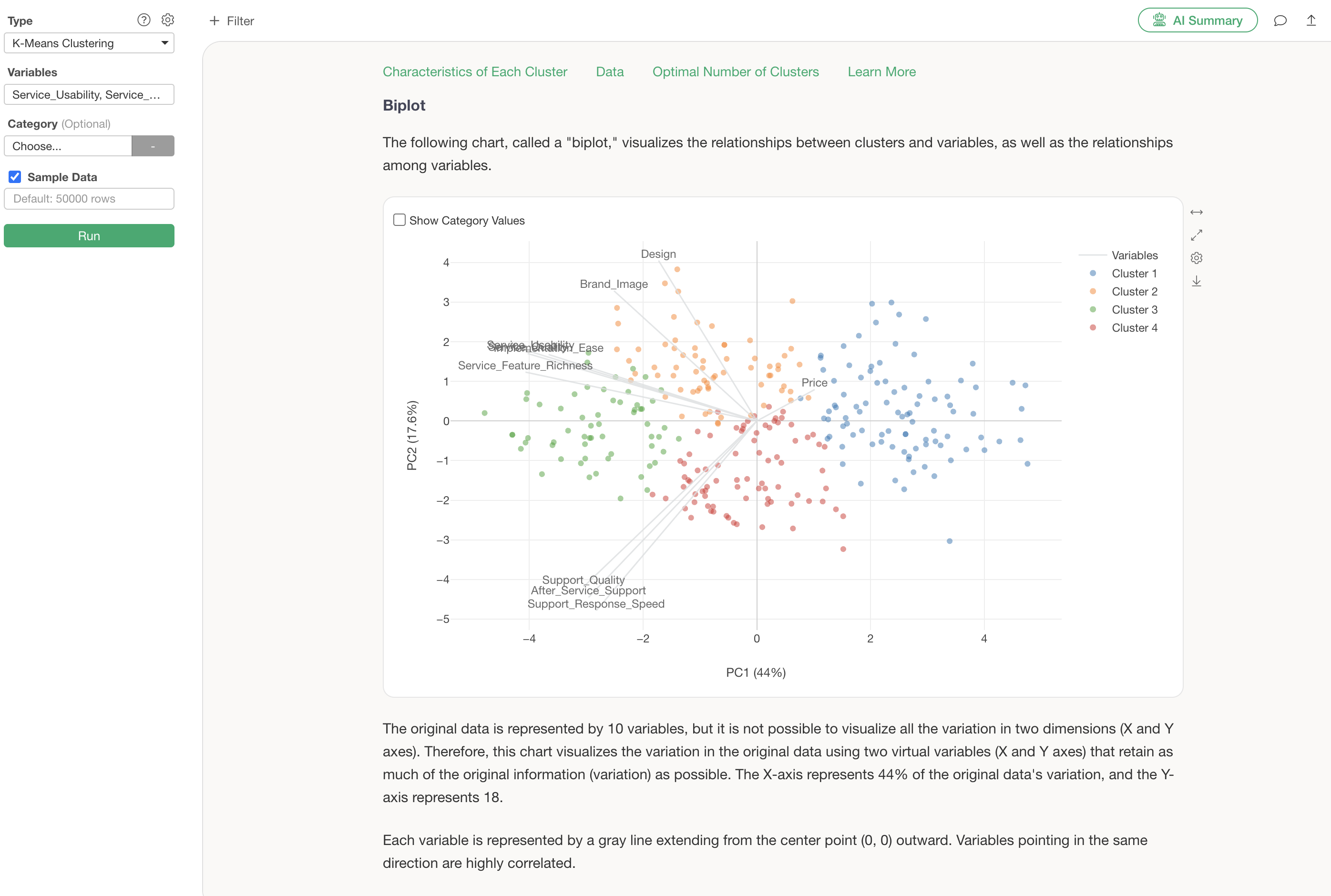
The information displayed in this scatter plot visualization is the result of “Principal Component Analysis,” which is supported as one of the analytics types in Exploratory.
Points (in this case, respondents) located in the direction where an axis line extends indicate high scores for those variables, while points on the opposite side of the axis line indicate low scores.
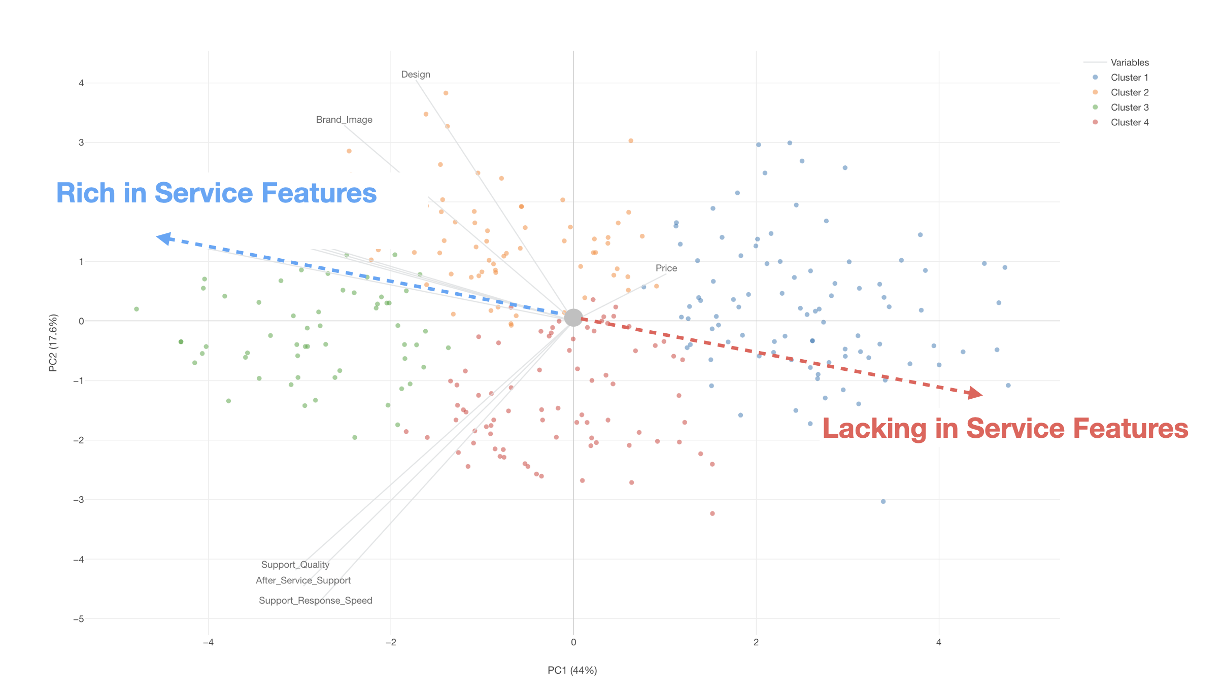
Furthermore, if variable lines point in the same direction, it suggests a correlation between those variables.
Summarizing Analysis Results with AI Summary
The AI Summary feature, newly added in v13, automatically summarizes clustering results.
Its usage is incredibly simple: just click the “AI Summary” button after performing K-Means clustering.
This generates information summarizing the cluster names and characteristics of each cluster (group).
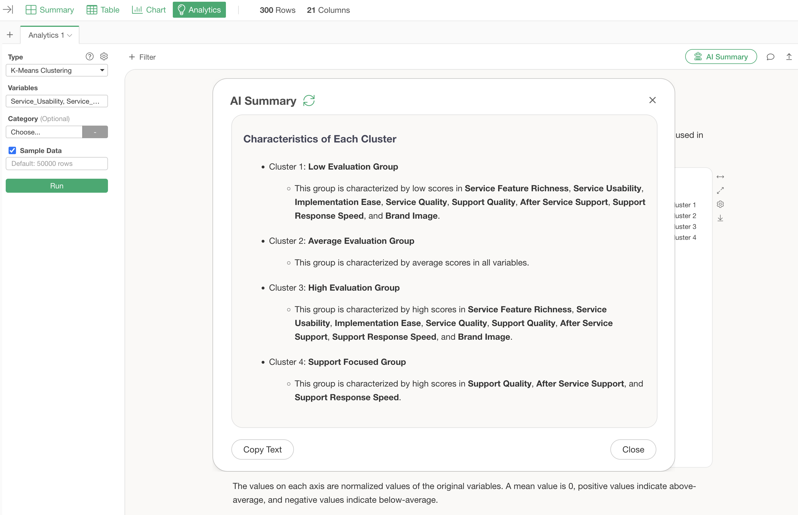
For this clustering, the AI summary categorizes the groups as follows:
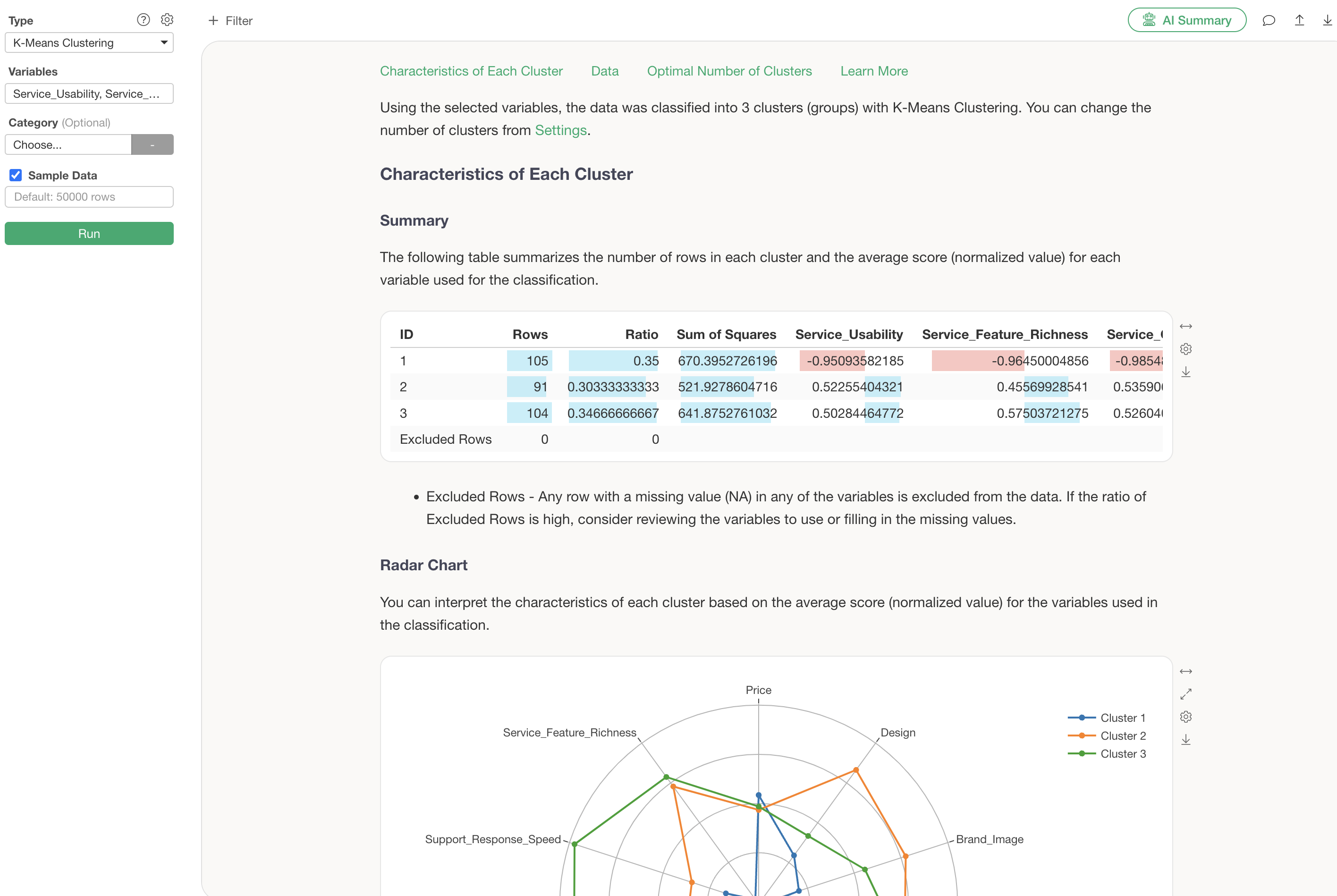
Characteristics of Each Cluster
- Cluster 1: Low Evaluation Group
- Cluster 2: Average Evaluation Group
- Cluster 3: High Evaluation Group
- Cluster 4: Support Focused Group
By simply viewing this AI Summary, anyone can easily use K-Means clustering, as the AI identifies and explains the characteristics of each divided group.
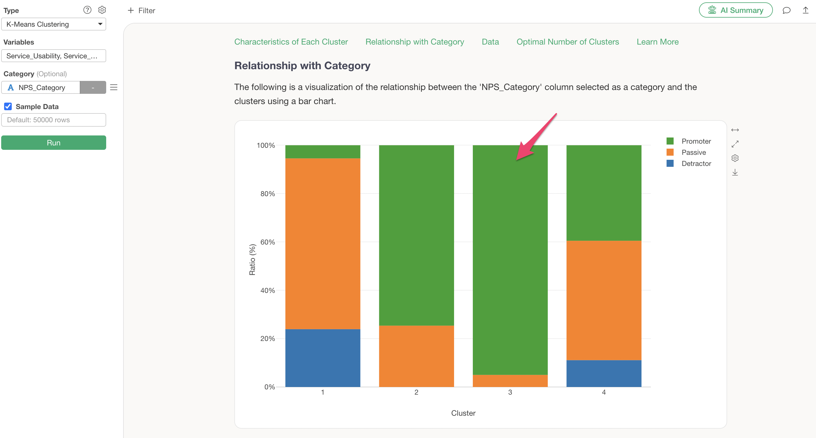
Examining the Relationship Between Clusters and Categories
Suppose there is an “NPS Category” column in the data, and you want to know which clusters have more Promoters or Detractors.
Assign the “NPS Category” column to the K-Means clustering category and Run.
Assigning a category column adds a “Relationship with Category” section, allowing you to check the proportion of the assigned category within each cluster.
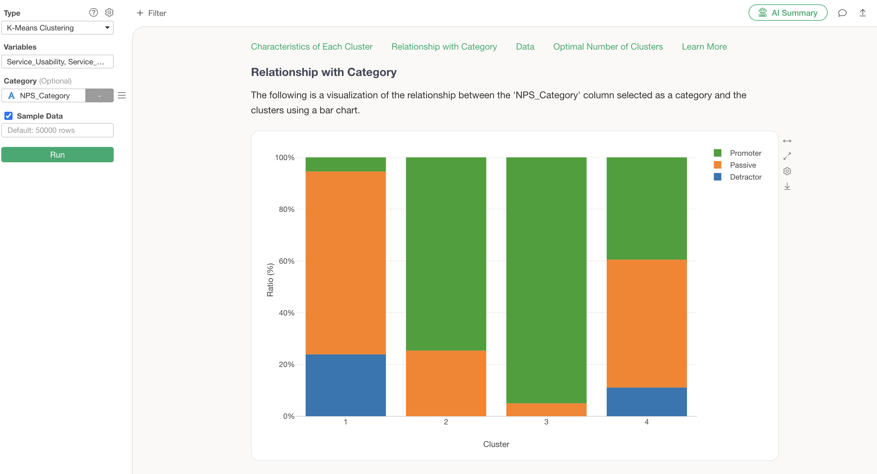
Cluster 1, which was identified as the low-rated, price-sensitive cluster, is confirmed to have a high concentration of Detractors.
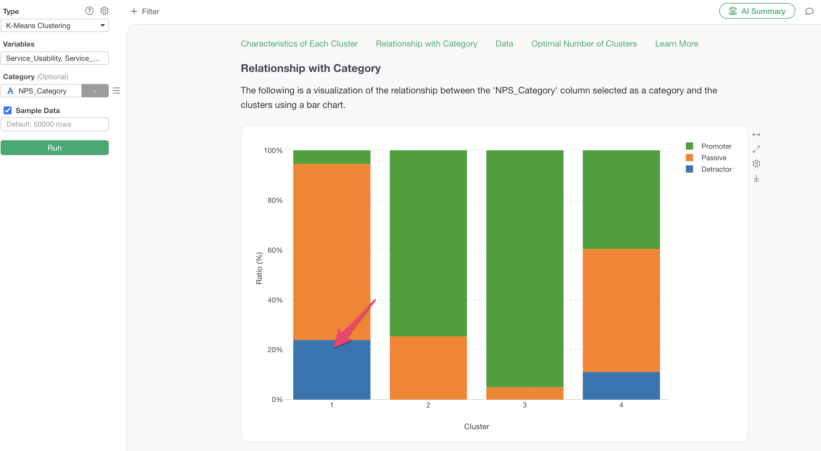
Cluster 3, identified as the highly-rated cluster, is confirmed to have a high proportion of Promoters.
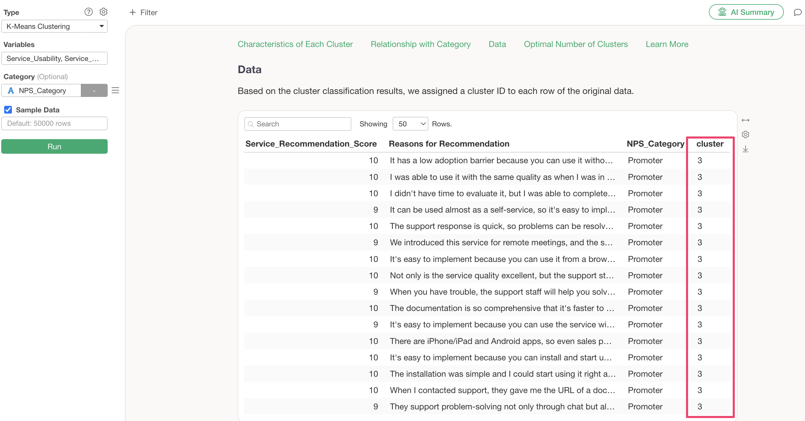
Exporting Clustered Data
The table in the Data section displays the data used for K-Means clustering and the cluster numbers.
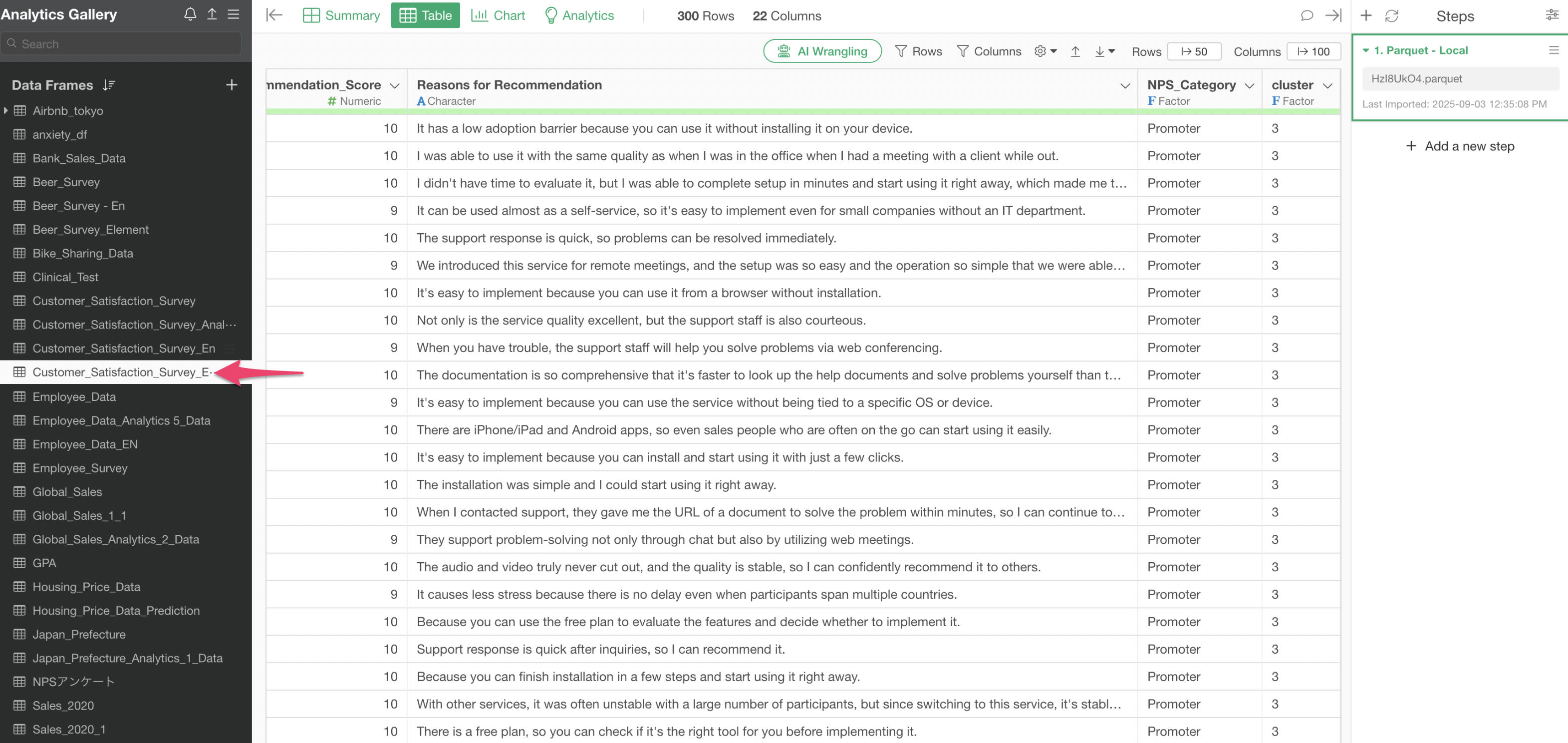
If you wish to save this data as a new data frame, click the Export button and select “Save Chart Data as New Data Frame.”
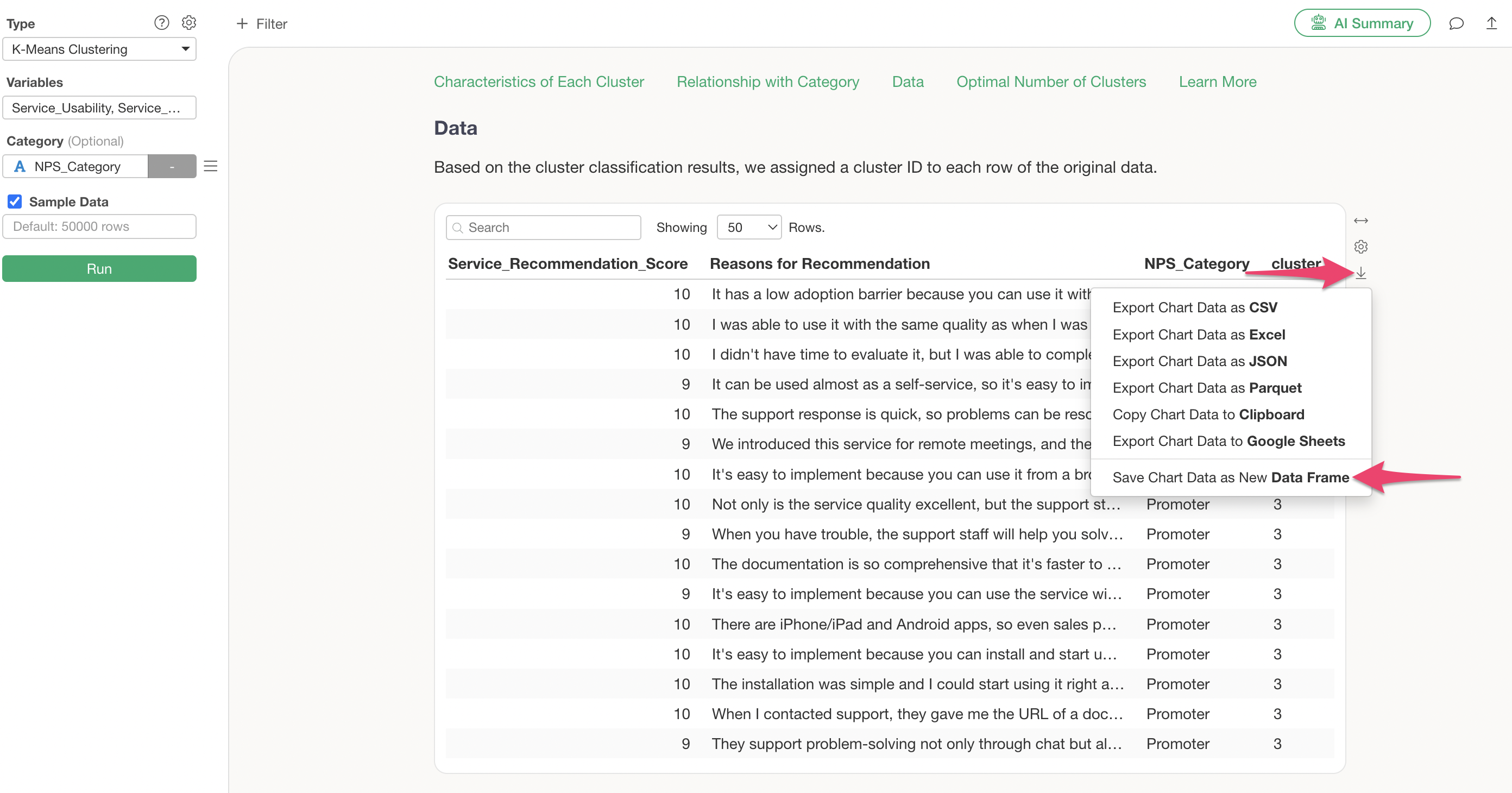
The data used for clustering has been created as a new data frame.
Frequently Asked Questions about K-Means Clustering
Q: When running K-Means clustering, I get the error “Centers should be less than distinct data points.”
When performing K-Means clustering, you might encounter the error
Centers should be less than distinct data points., and the
K-Means clustering results may not be returned.
This error occurs when the number of unique combinations of column values for each row used in clustering is less than the set number of clusters (default is 3).
Therefore, you can avoid the error by reducing the number of clusters to be less than the aforementioned number of unique value combinations.
Q: What is the random seed setting in K-Means clustering?
K-Means clustering begins by randomly determining the initial cluster centers and then proceeds to assign observations to these clusters.
The random seed is like a “number” used to determine the position of these initial centers.
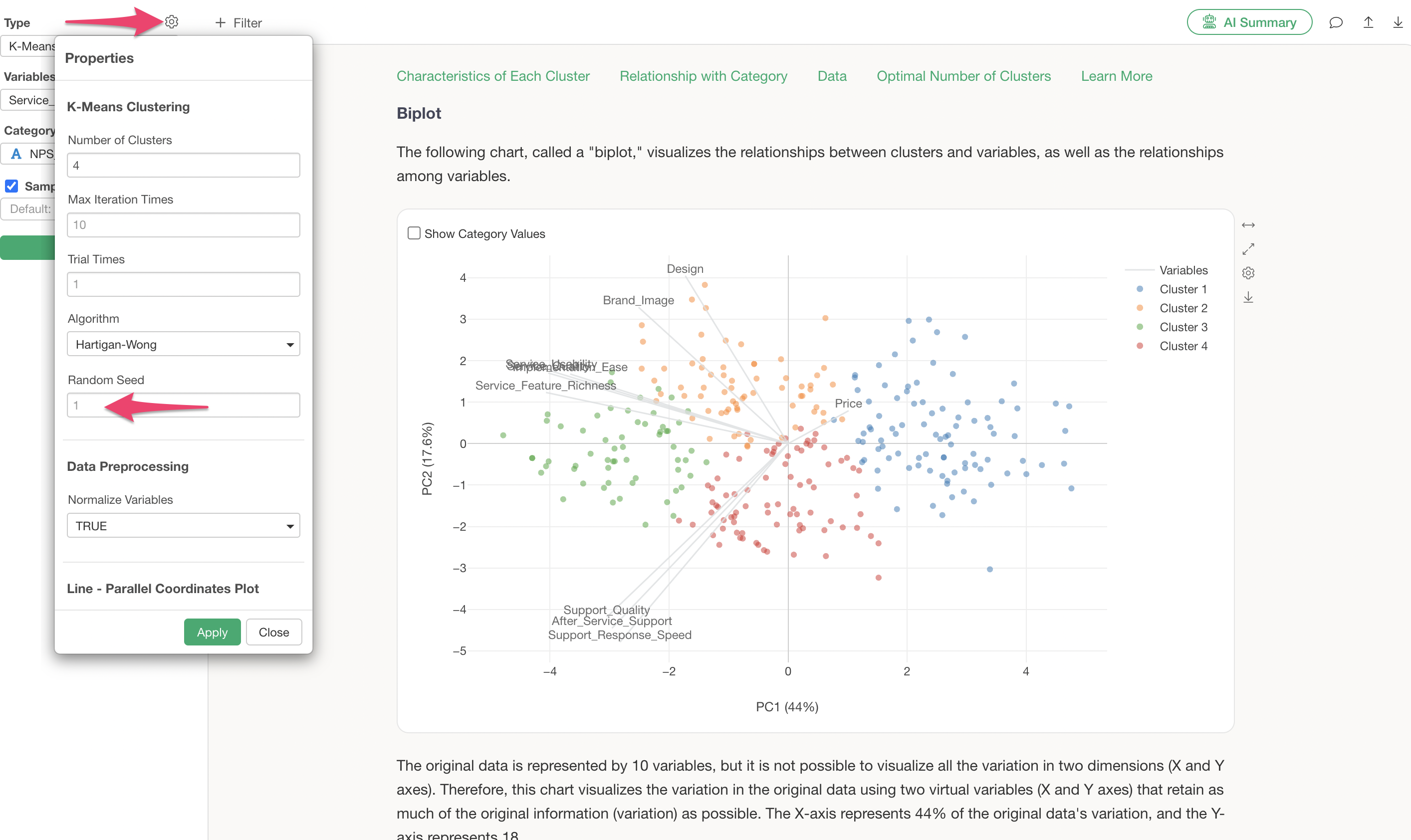
In Exploratory, the same seed is used by default, which helps ensure that you get the same results every time, provided the data and its order are identical.
However, due to differences in character encoding between Mac and Windows, slight variations, such as different cluster number assignments, may occur even with the same seed.
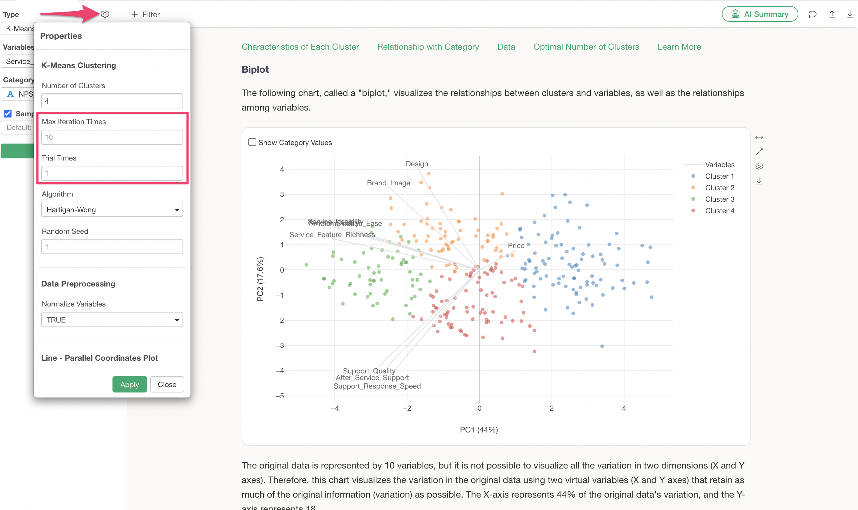
Q: When I run K-Means clustering, the results vary depending on the order of the data. Is there anything I can do to reduce this variability?
K-Means clustering starts by randomly determining the cluster centers and then assigns observations to these clusters.
Therefore, it is expected that changing the order of the data can alter the initial random centers, leading to variations in the results.
To reduce variability in results due to data order, increasing the “number of runs” (or “nstart”) and “maximum iterations” (or “iter.max”), especially the “number of runs,” can be effective.
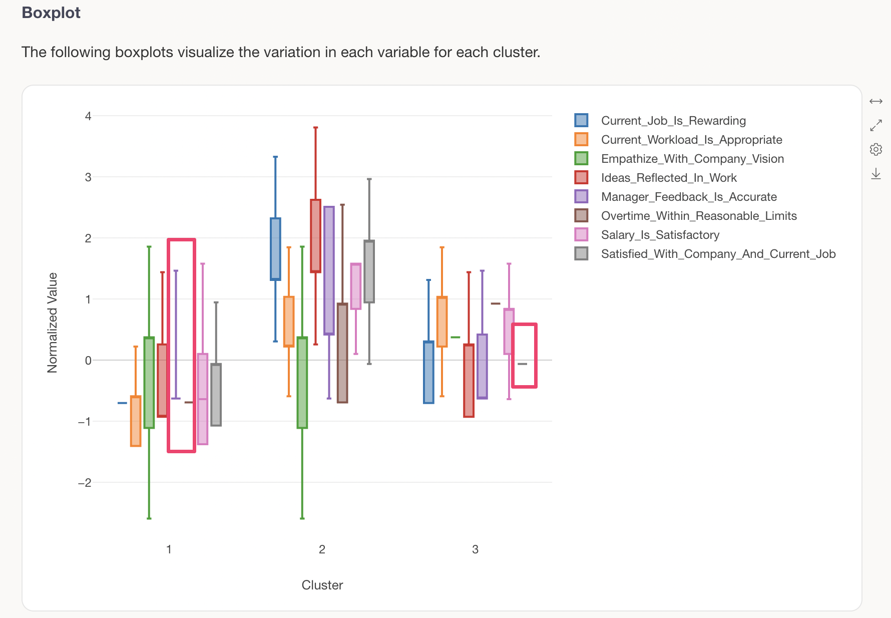
Q: The “box” and “whiskers” are not drawn in the K-Means clustering “Box Plot” tab.
There are cases where the “box” and “whiskers” may not be drawn correctly in the “Box Plot” tab of K-Means clustering. One reason for this can be a “skewed” distribution in the variables used for K-Means.
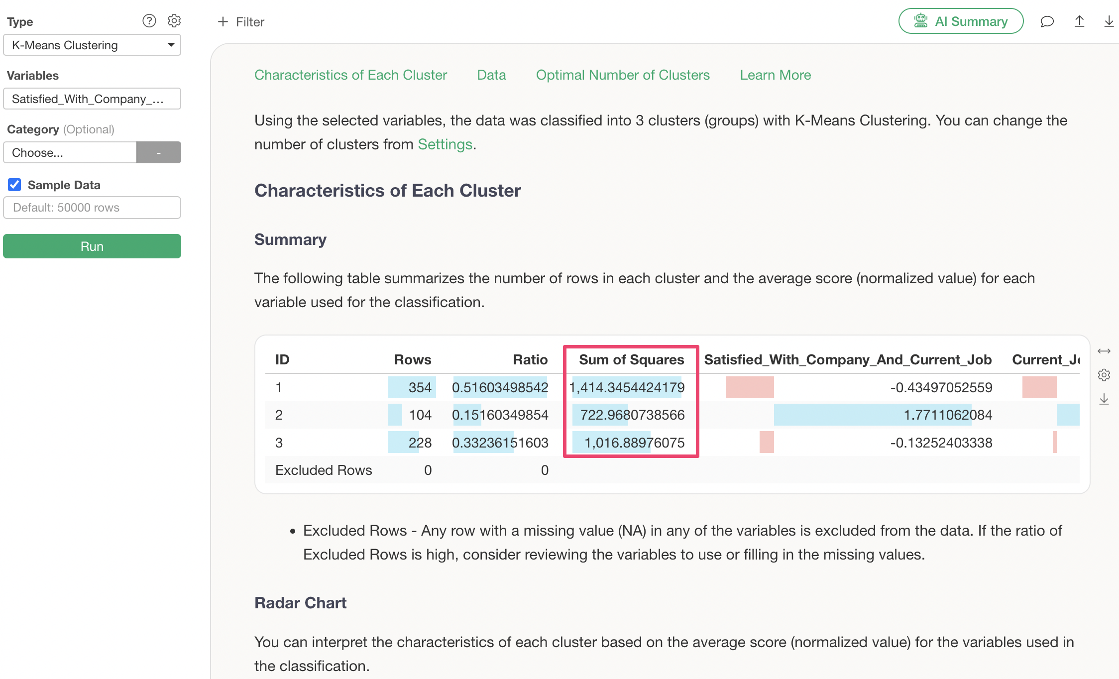
Q: What does “Within-Cluster Sum of Squares” mean in the Summary tab?
The Within-Cluster Sum of Squares can be understood as the total deviation of each data point from its respective cluster center. A smaller value indicates less deviation. K-Means aims to minimize this Within-Cluster Sum of Squares by adjusting the cluster center points.
Q: What is the Between-Cluster Sum of Squares?
The Between-Cluster Sum of Squares is an indicator that shows how far the cluster centers are from the overall data center. It serves as a relative measure of how well separated the clusters are, and is sometimes referred to as BCSS.
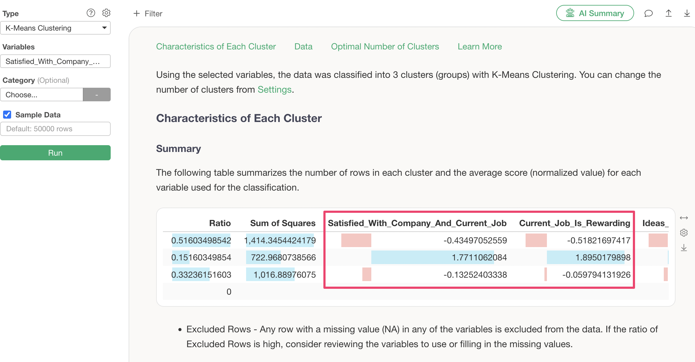
Q: What values are displayed for each variable in the Summary tab?
All variables displayed in the Summary tab are the standardized mean values for each cluster. The length of the colored bar changes according to the magnitude of the value. Positive values are shown in light blue, and negative values in red.
Q: What do “Principal Component 1” and “Principal Component 2” represent in the Biplot tab?
The biplot uses a dimensionality reduction algorithm called Principal Component Analysis (PCA). Principal Component 1 and Principal Component 2 indicate how much information (variance) can be represented when multiple variables are expressed in two dimensions.
For example, the following shows K-Means clustering performed using 20 columns. Principal Component 1 explains 44% and Principal Component 2 explains 17.6%, meaning that together, they can represent 61.6% of the total variance across all variables.
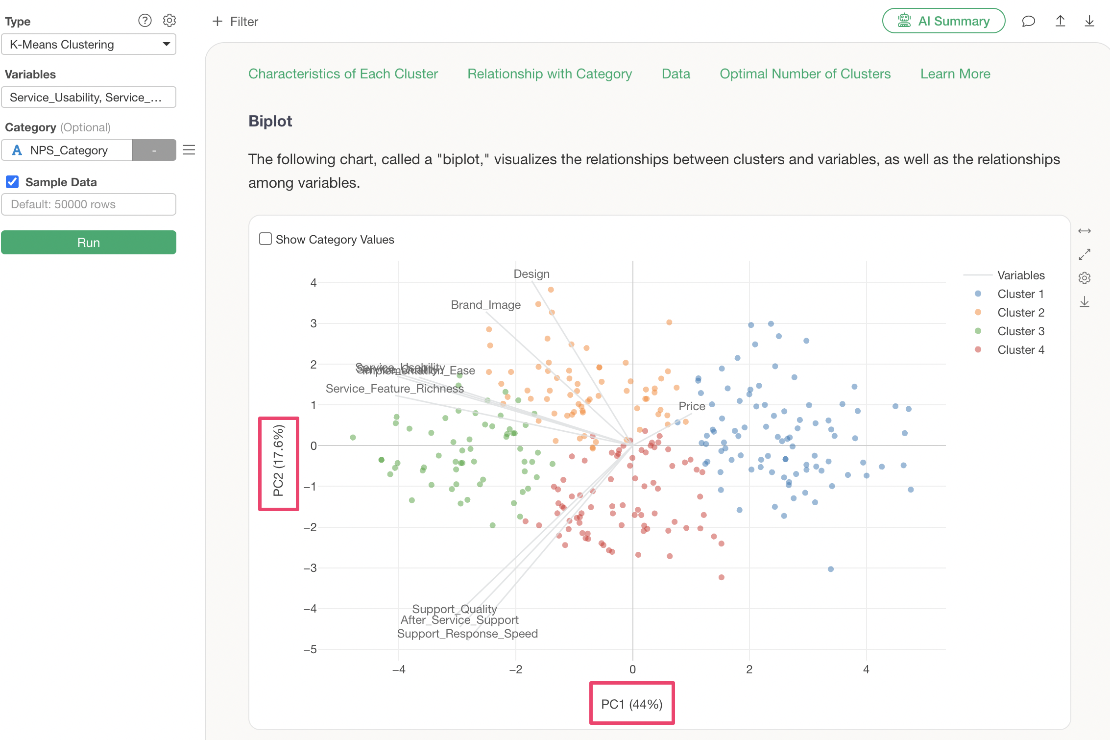
The remaining 38.4% of the data variance is explained by Principal Component 3 and subsequent components.
It’s worth noting that Principal Component Analysis is performed within K-Means clustering solely for display in the “Biplot” tab and is a separate process from the clustering algorithm itself.
For more details on biplots, please refer to the “Introduction to Principal Component Analysis (PCA)” seminar here.
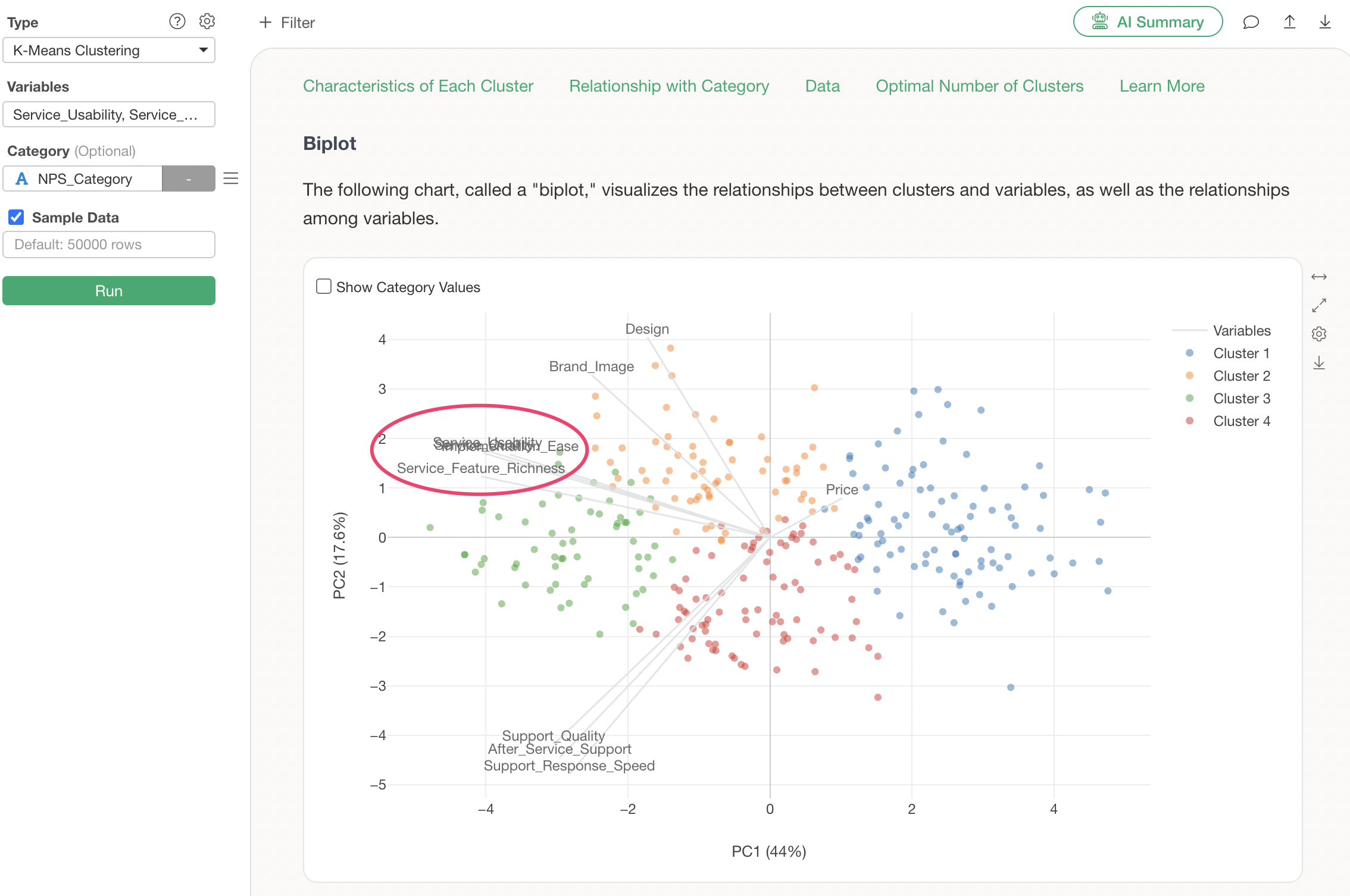
Q: How are the variable axis lines determined in the Biplot tab?
As mentioned in “What do Principal Component 1 and Principal Component 2 represent in the Biplot tab?”, the position of each variable’s axis line is determined based on the scores of Principal Component 1 and Principal Component 2 obtained from the Principal Component Analysis.
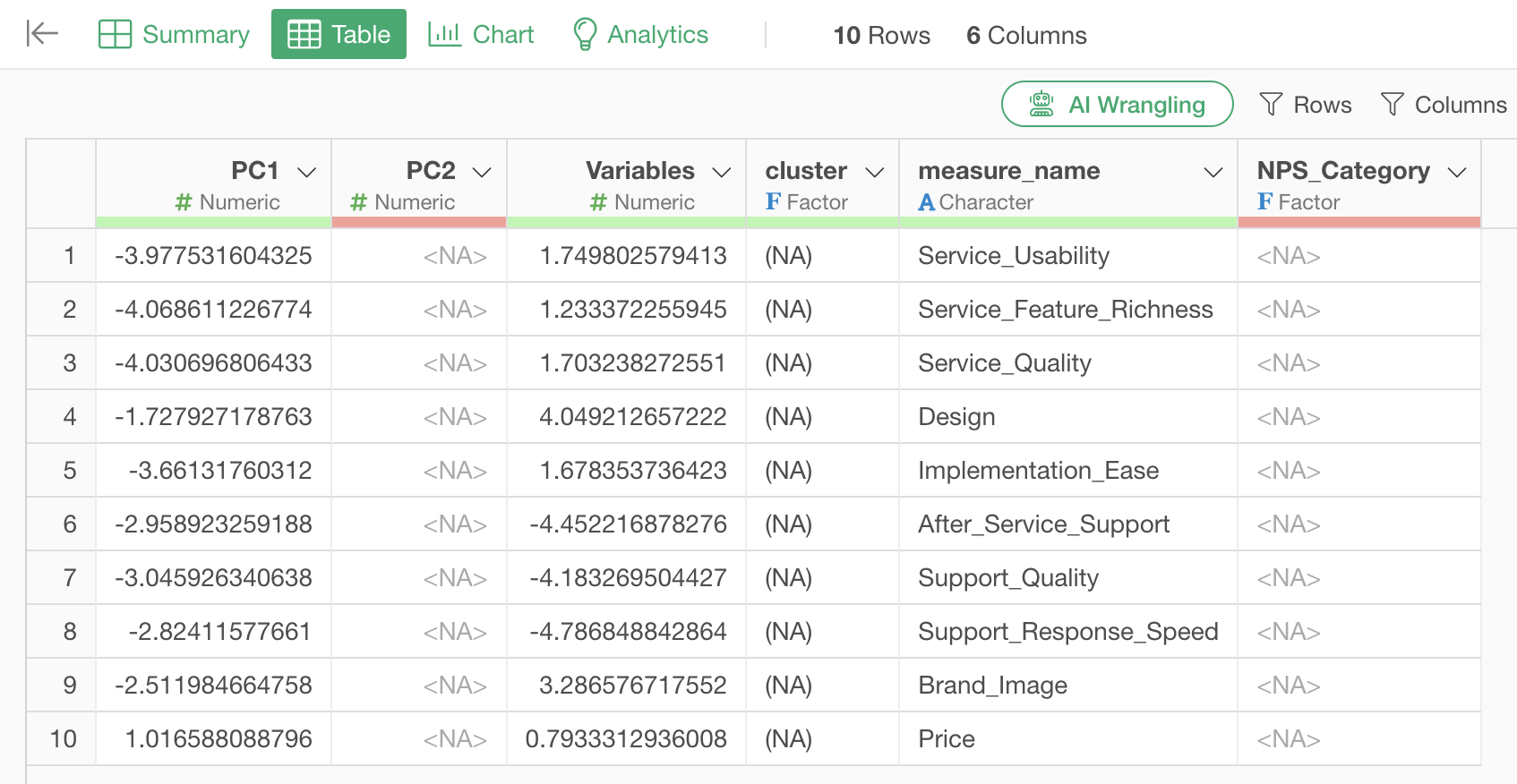
Q: What do the respective data points represent when exporting data from the Biplot tab?
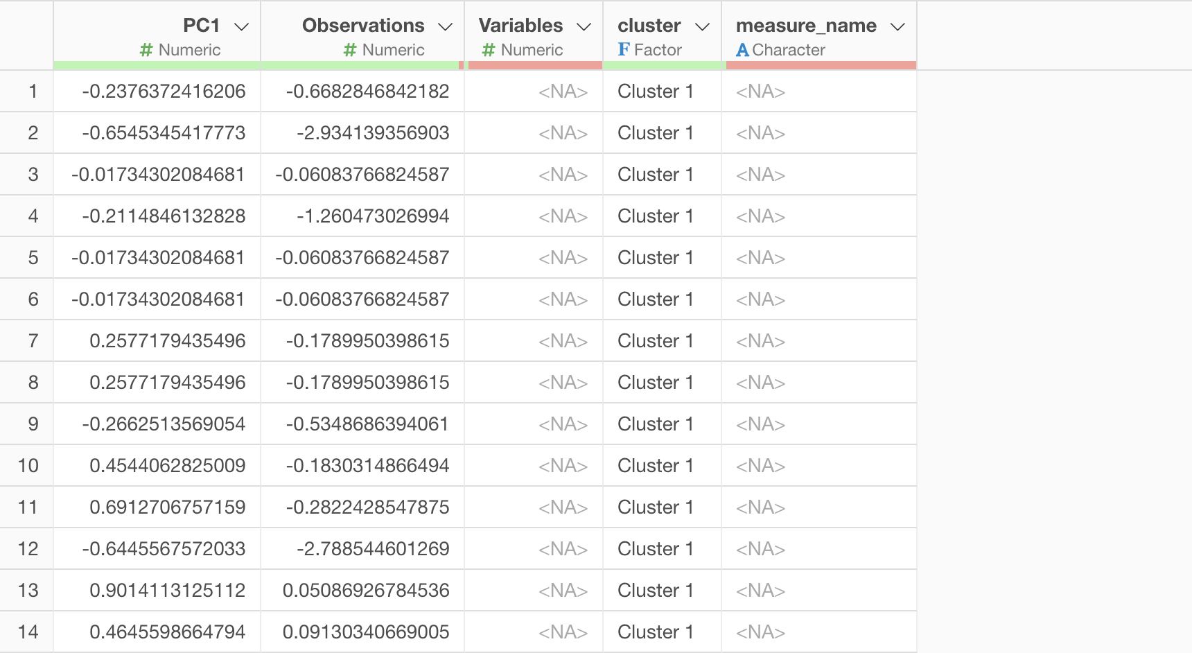
PC1 (First Principal Component) retains its column name, while “Observation” represents the value of PC2 (Second Principal Component).
Furthermore, measure_name represents the variables
(numeric columns) used for clustering, and variables
represents the values used to express the axes of each variable in the
biplot.
Below, the left side shows the K-Means biplot, and the right side visualizes the data based on the exported data.
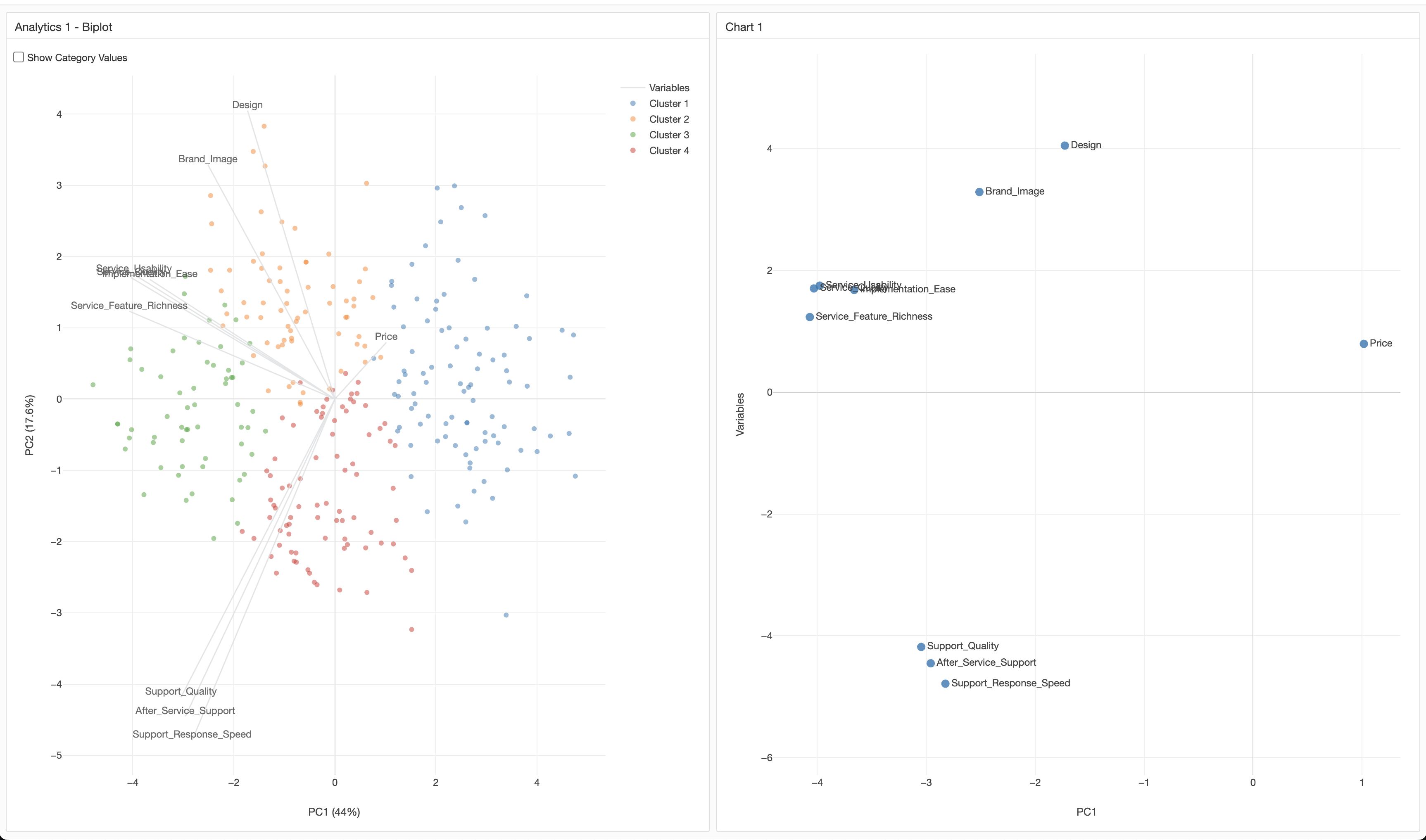
By assigning PC1 to the X-axis and Variables to the Y-axis, the positions of each variable’s axis are represented, similar to the original biplot.