Introduction to Area Chart
It's like Line chart, Area chart is a great way to visualize especially the time series data and see the trend. The main difference is that you can also see the volume of each group that is represented by each color.
Here's a quick introduction on how you can use Area Chart in Exploratory.
Sample Data
We'll use Airbnb Data. You can download it from this page.
In this data, each row represents each property listed on Airbnb, and the columns are additional information about each property.
1. Area Chart Basic
Let’s visualize how the properties have been added to Airbnb in New York over the years.
Select 'Area' from the Chart type, then select 'host_since' column for the X-Axis. We can keep the aggregation level as 'Year' by default.
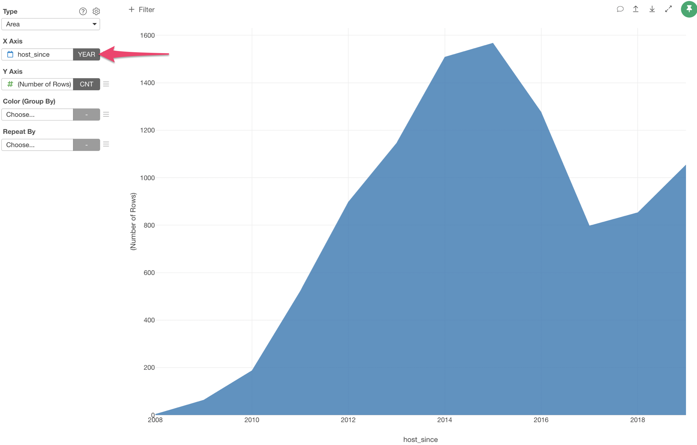
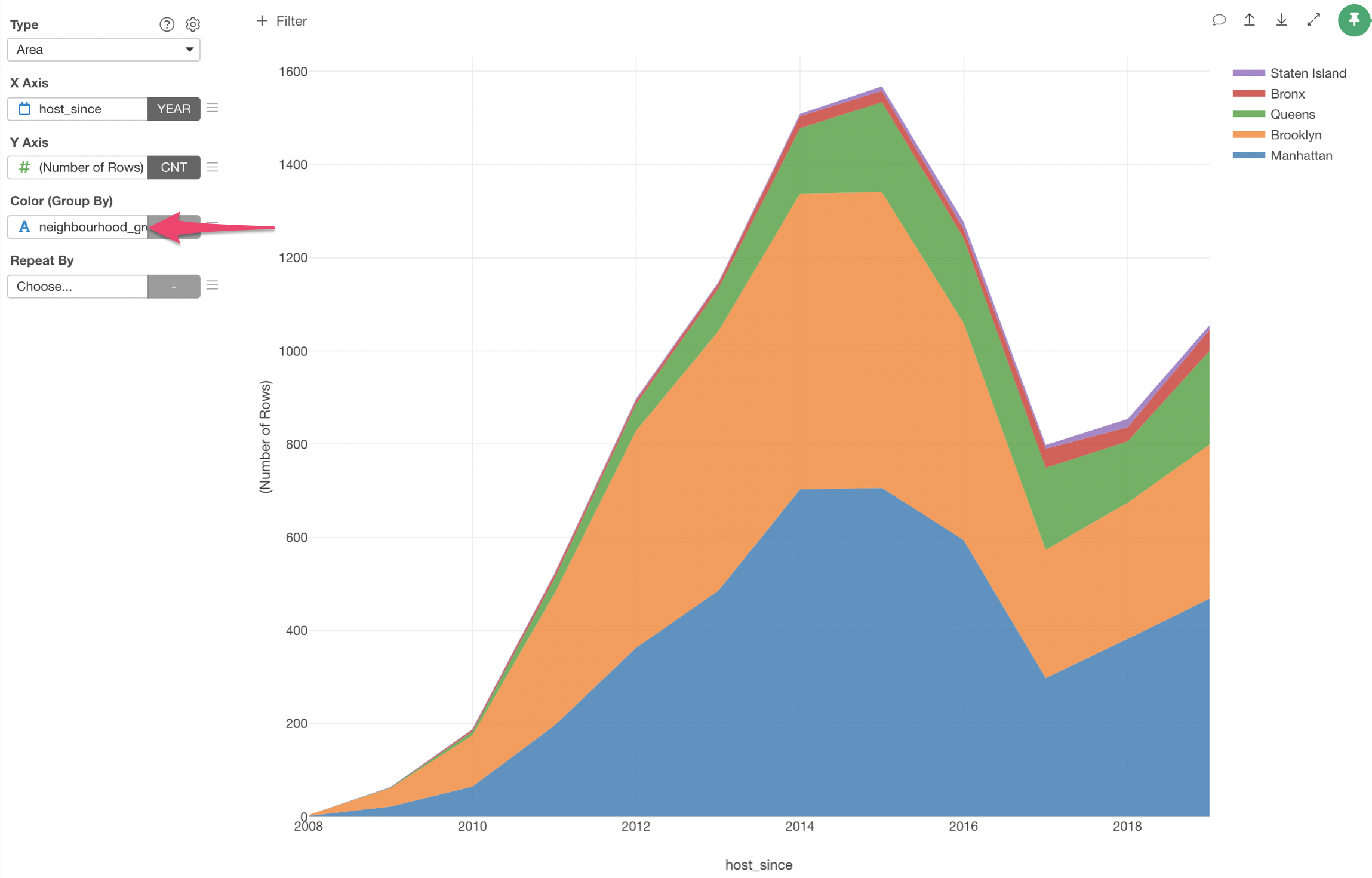
Now, you can assign 'neighborhood_group' column to the Color.
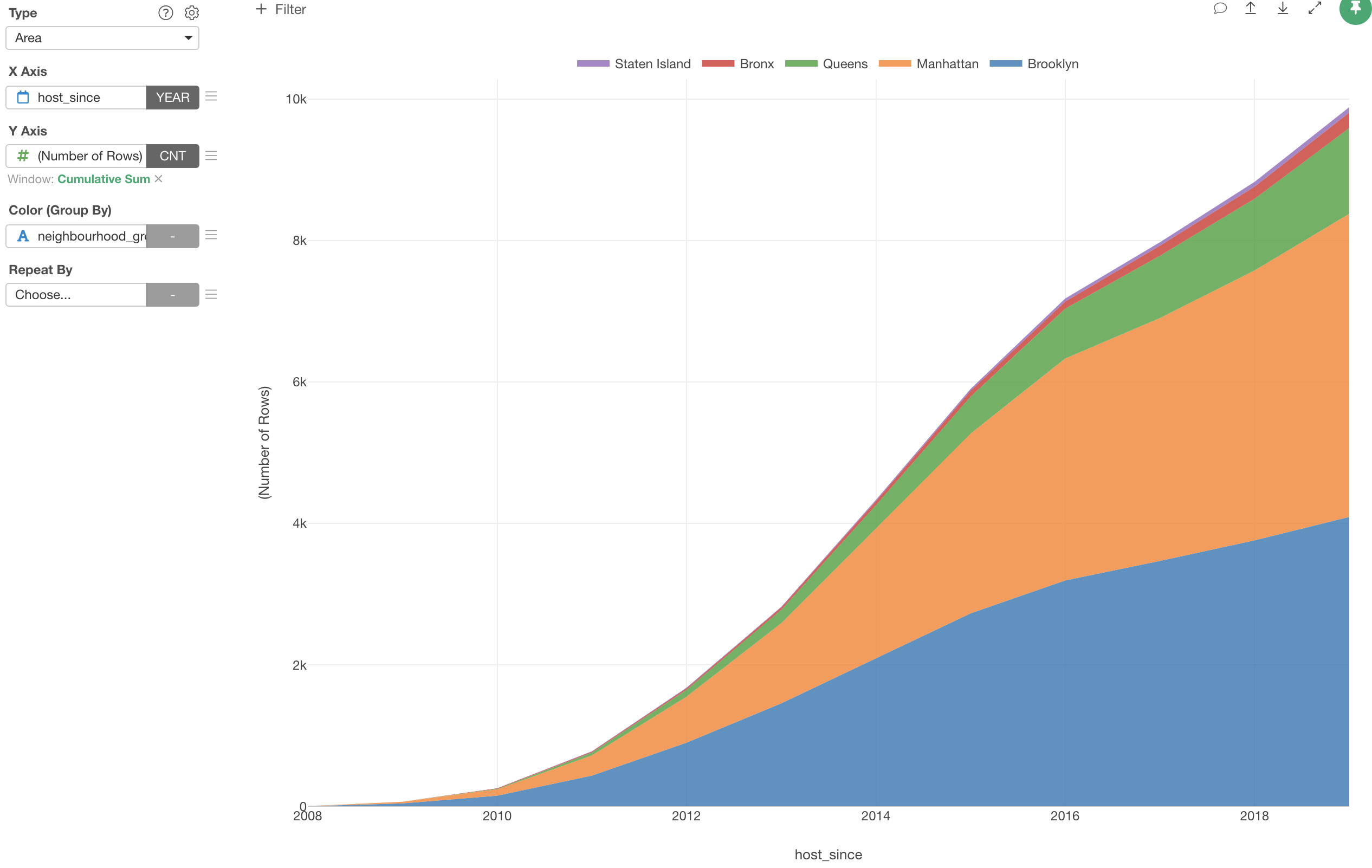
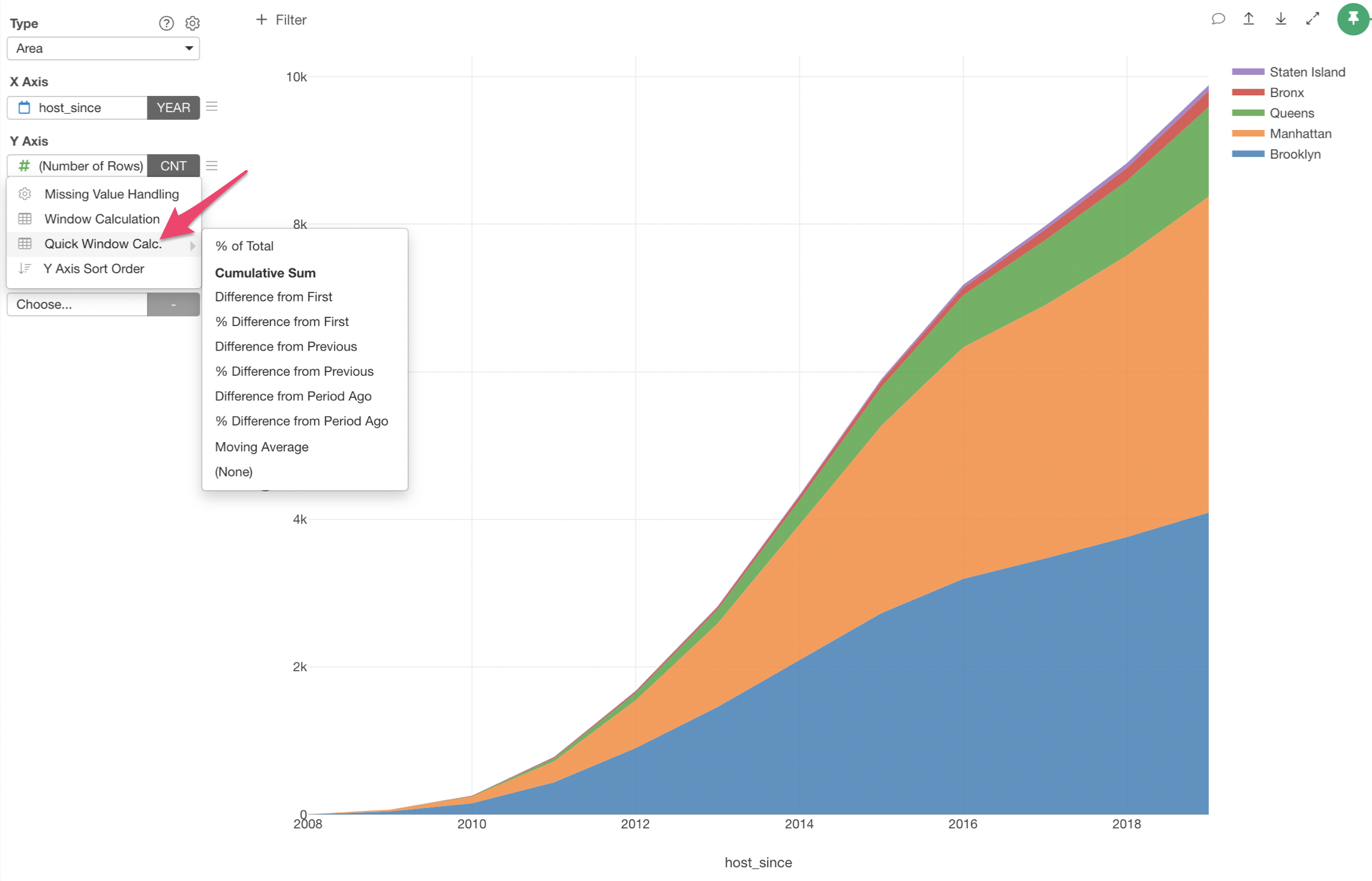
2. Use Window Calculation - Cumulative
Currently, this chart is showing how many properties were added at any given year. But how about the total number of properties had been added by each year?
In order to answer this, we want the Y-Axis values to be accumulative, and we can do it by using 'Window Calculation' with 'Cumulative' option.
Select 'Quick Window Calc.' and 'Cumulative Sum' from the Y-Axis menu.
Try it for yourself!
If you want to quickly try it out and you don’t have an Exploratory account yet, sign up from our website for 30 days free trial without a credit card!
If you happen to be a current student or teacher at schools, it’s free! Sign up for Community Plan.
And, if you don’t mind sharing what you create publicly you can sign up for Public edition of Exploratory (FREE)!