Introduction to Bar Chart
A bar chart uses 'bars' to visualize the numerical values so that we can compare the values by using the bar lengths. It's a simple and basic form of visualization, but it is very efficient if you want to compare among groups with summarized values and see how much they are different.
1. Create a Bar Chart
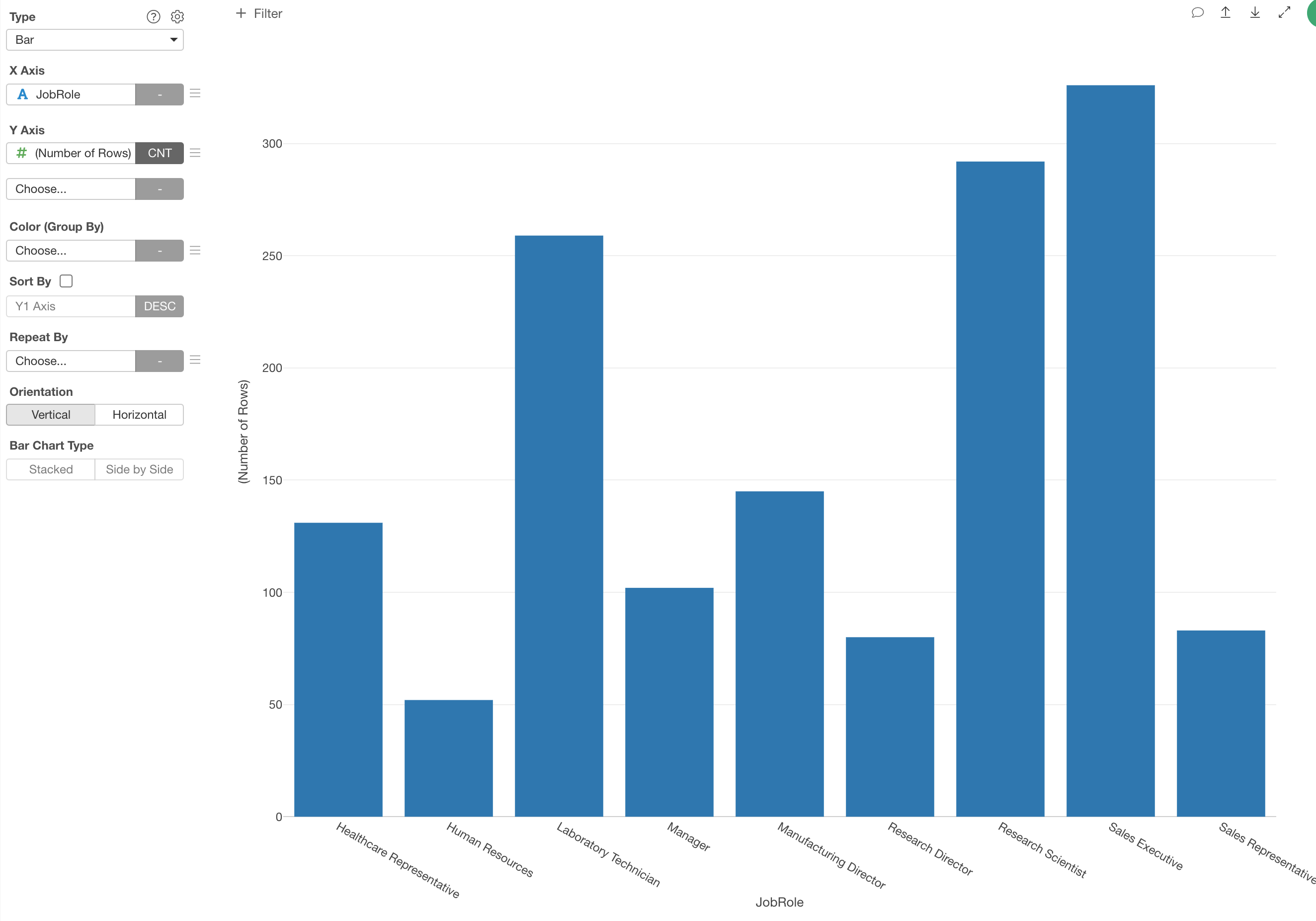
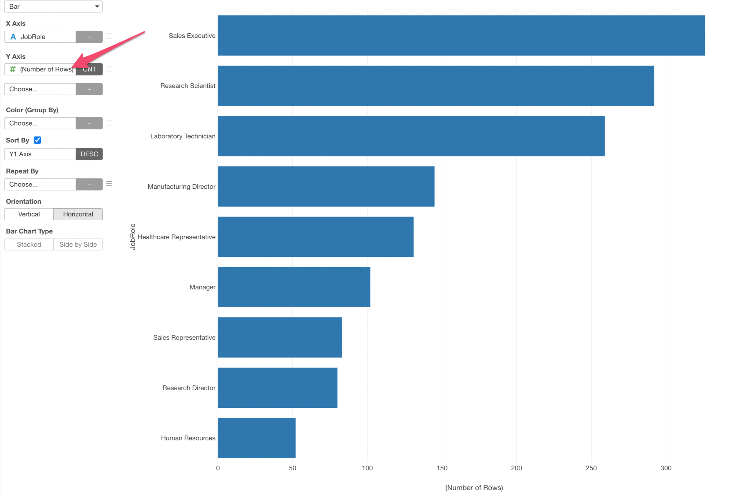
First, let's create a simple bar chart to see the number of employees by Job Role.
- X-Axis: Job Role
- Value: (Number of Rows)
Use Aggregate Functions
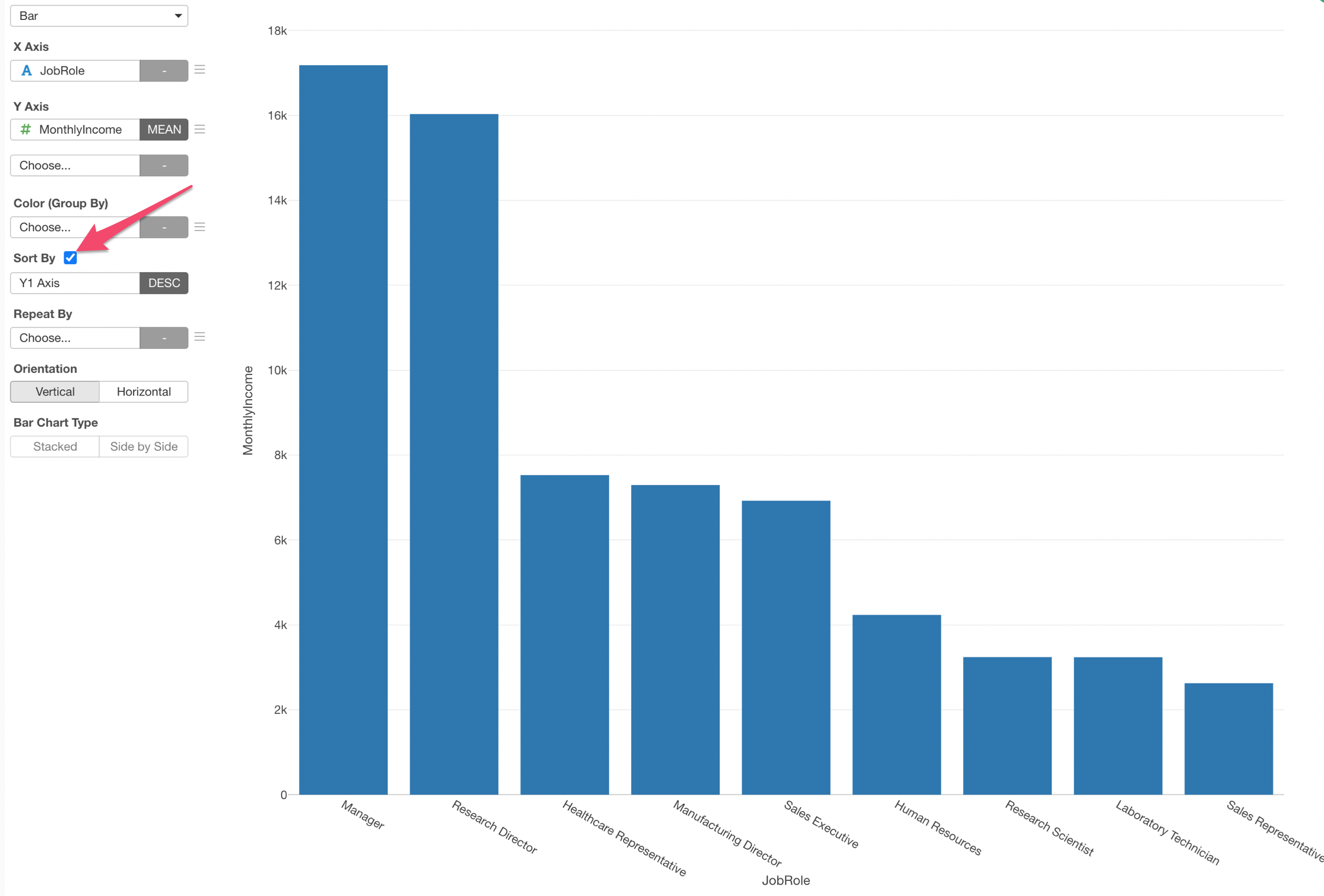
Now, let's compare the incomes by Job Role by using Mean (Average) aggregate function.

Sort the Bars
You can quickly sort the bars based on the Y-Axis values (Mean Income).
Change the Direction to Horizontal
Let's show the bar chart in a horizontal way.

2. Add Color to Create Stack Bar Chart
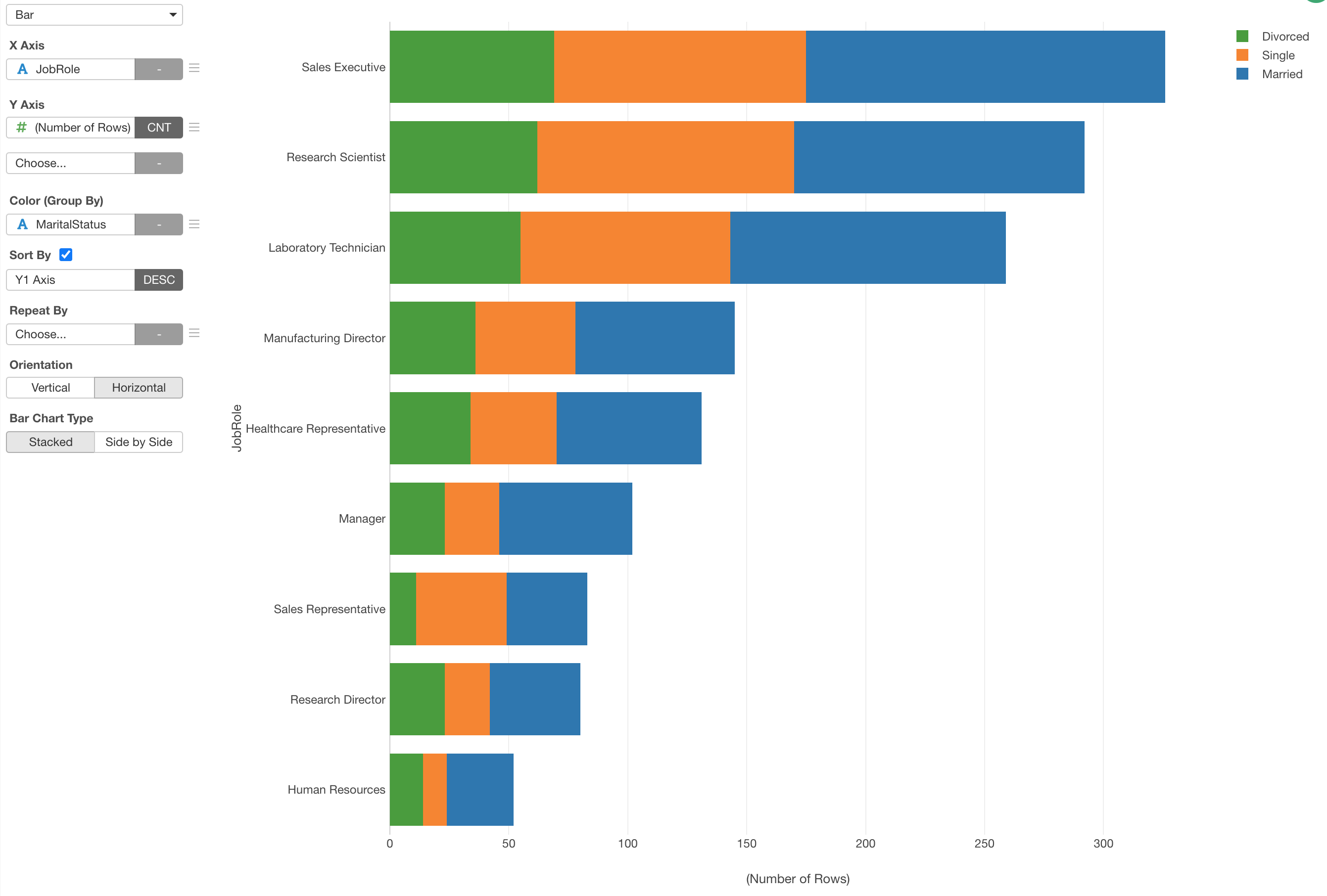
Now, let's see the number of employees by Marital Status for each Job Role.
To do, we'll get the Y-Axis back to 'Number of Rows' first.
Then, assign the 'Marital Status' column to Color.
100% Stack Bar Chart
If you want to see the ratio instead of the number of employees by the Marital Status you can use the Window Calculation. Take a look at this Note for more details.

3. Change to Group Bar Chart
You can change the chart to 'Group Bar' chart to show the bars side by side rather than stacking them up.

4. Repeat the Bar Chart
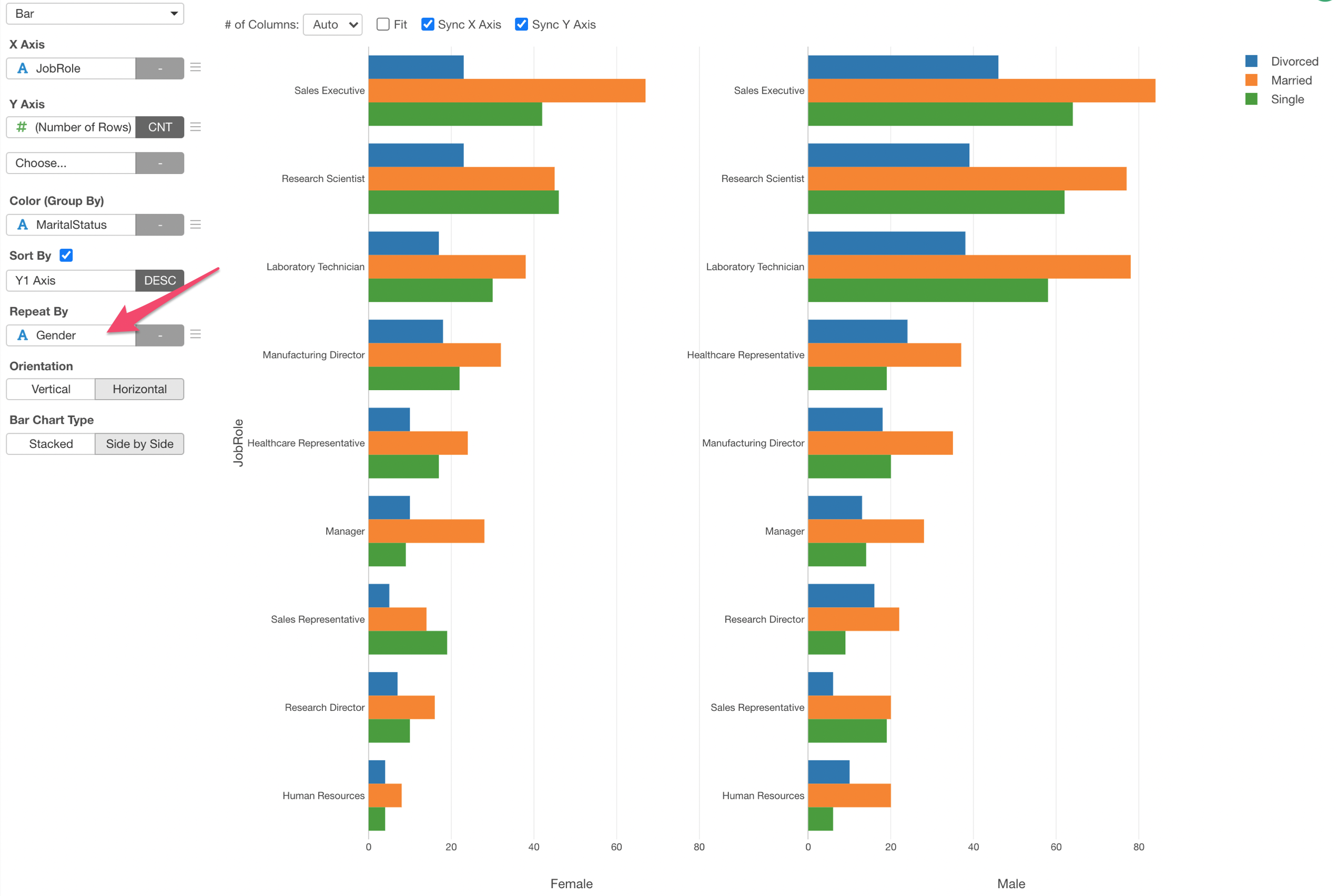
You can use 'Repeat By' to create a chart for each category of a column you are interested in.
