Introduction to Dashboard
In Exploratory, you can create “Dashboards” to monitor Key Performance Indicators (KPIs) such as daily sales. This note introduces the features of the dashboard and how to use them.
Creating a Dashboard
You can create a dashboard by clicking the plus button in the report section and selecting “Create Dashboard.”
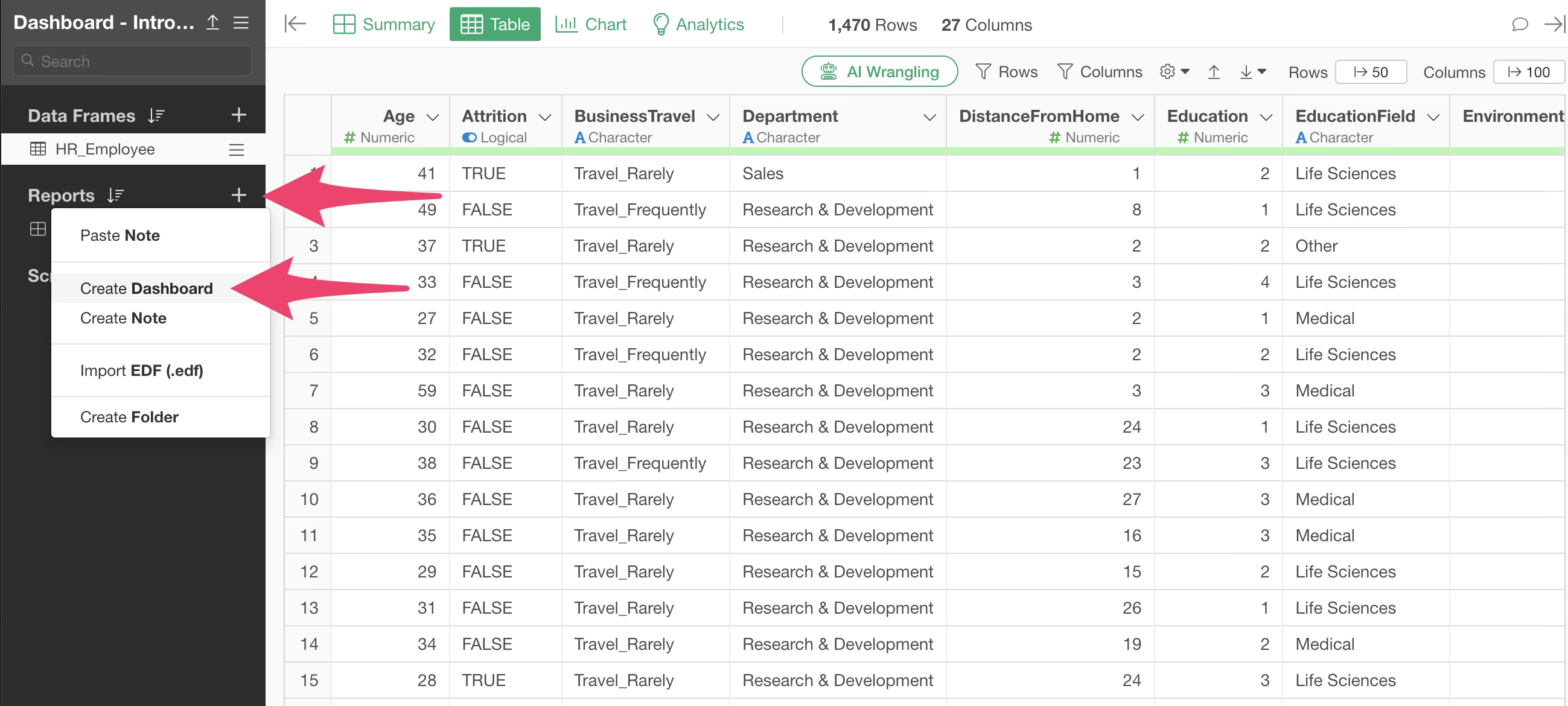
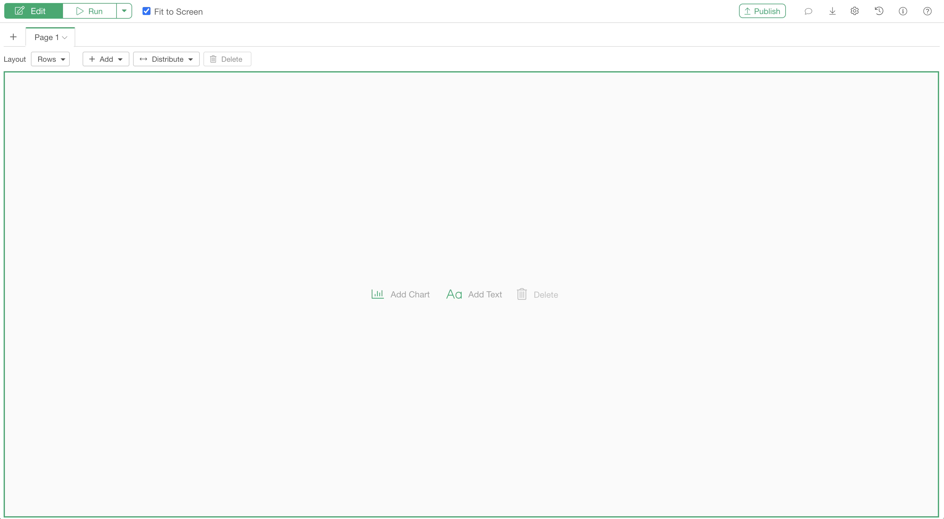
Once created, a window for editing the dashboard will open.
Adding Charts and Analytics
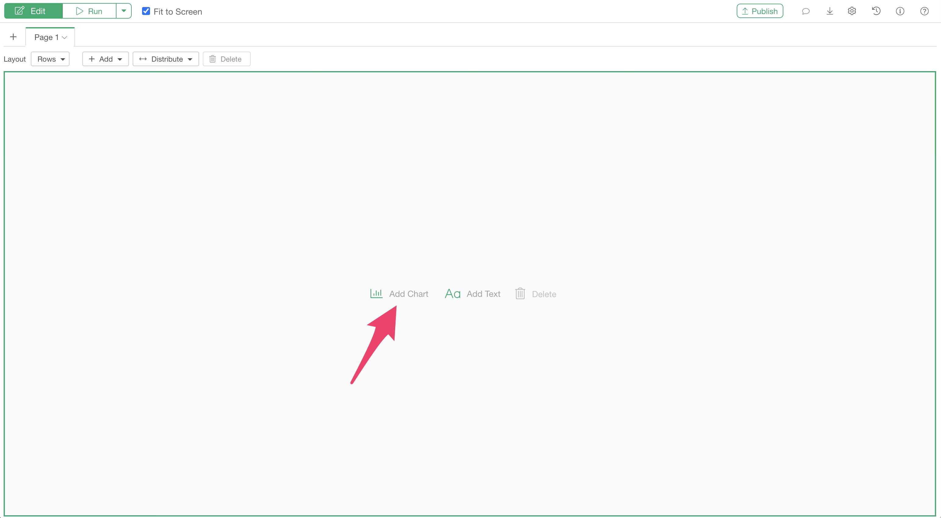
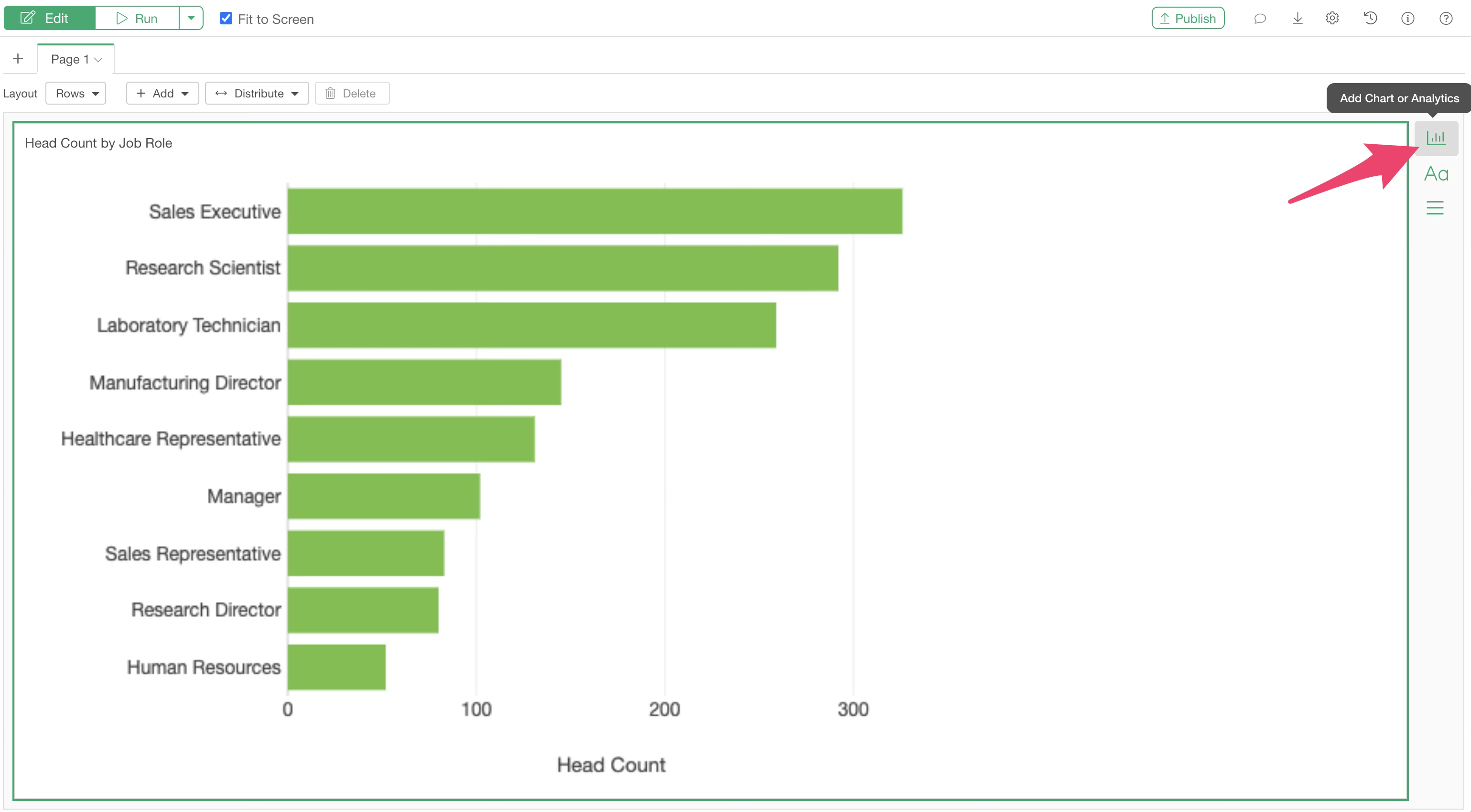
To add charts or analytics to your dashboard, select “Add Chart.”
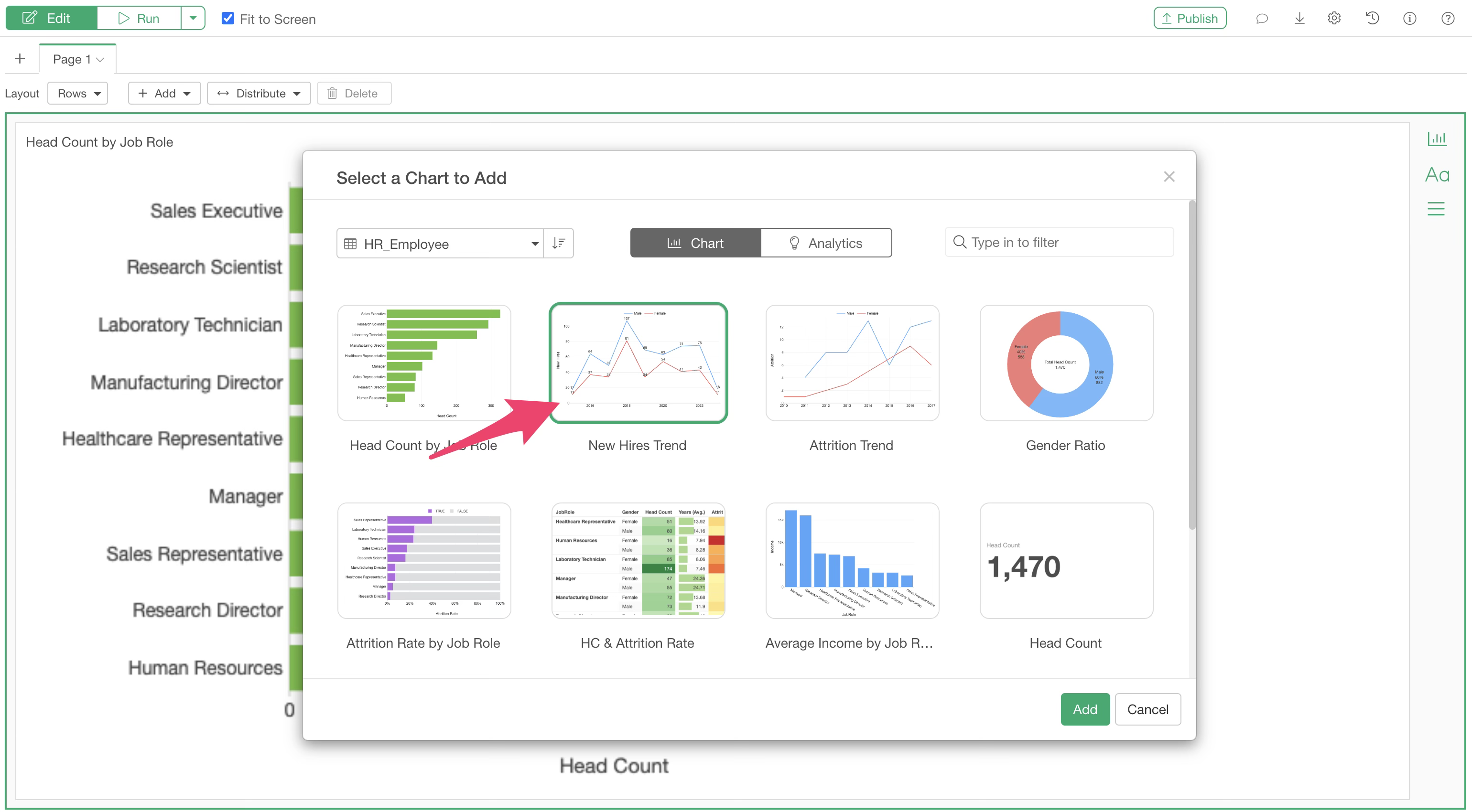
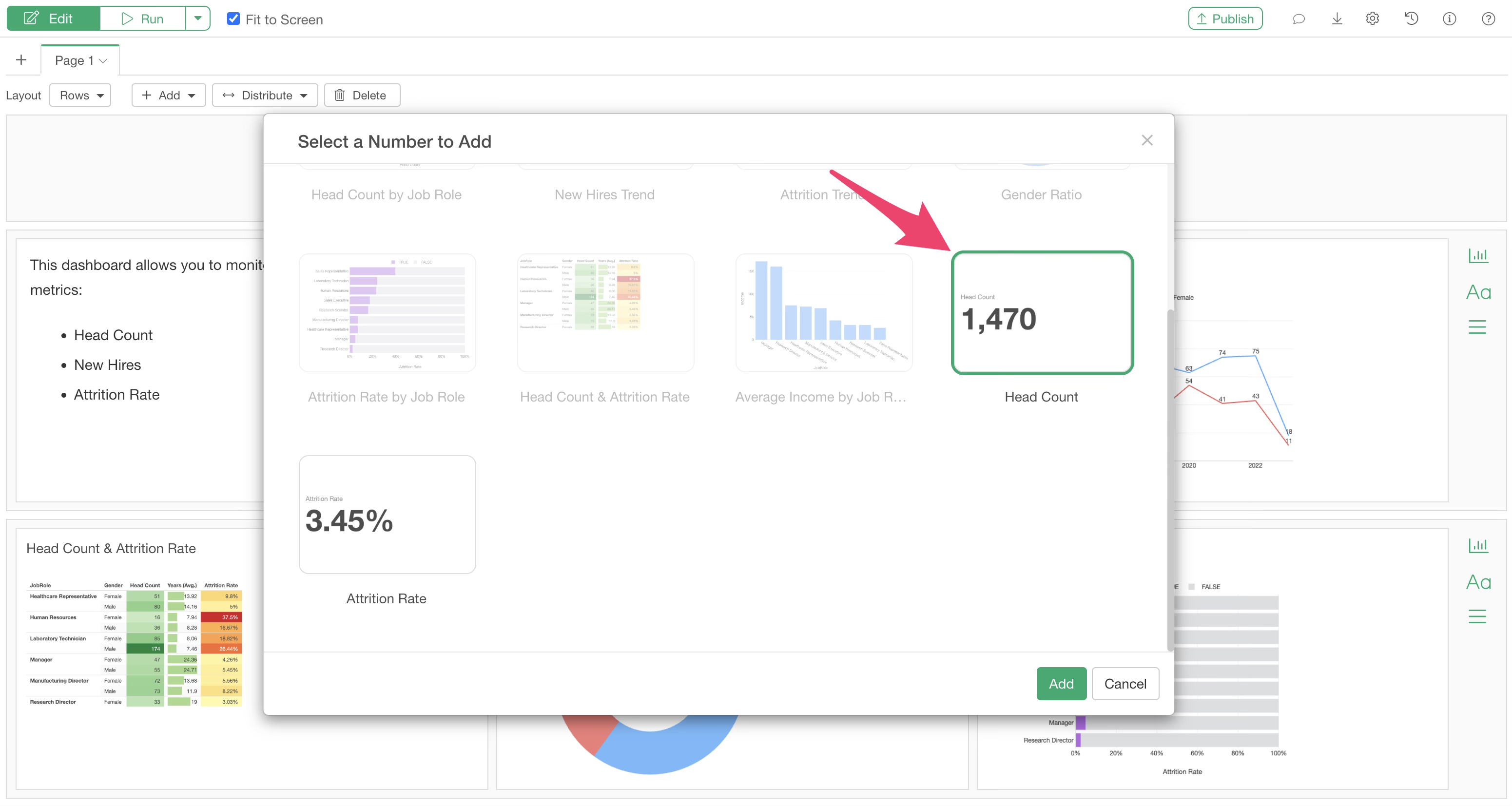
A chart selection dialog will appear. Select the data frame that contains the chart or analytics you wish to add.
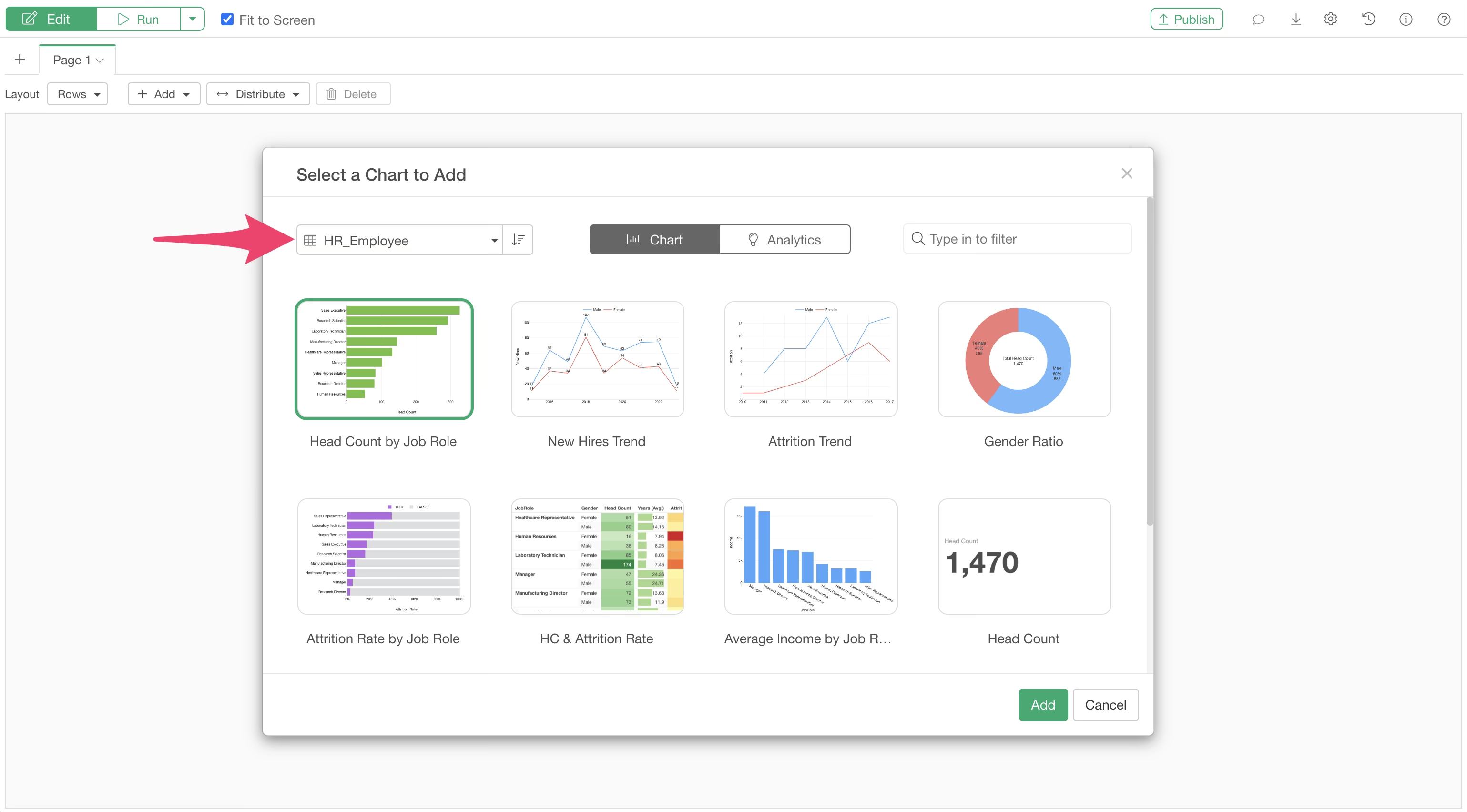
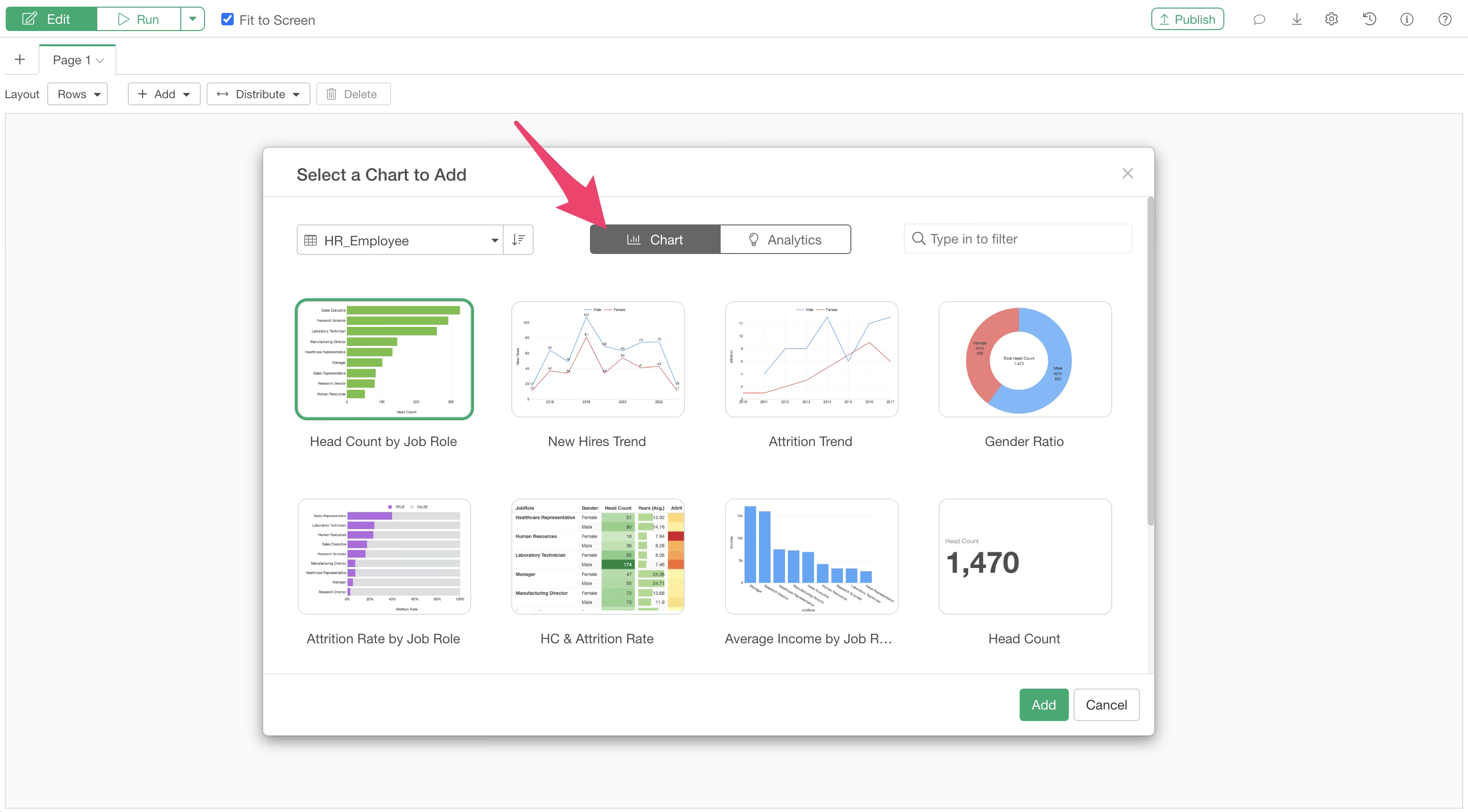
Charts created in the Chart View are displayed under the “Chart” tab, while those created in the Analytics View are displayed under the “Analytics” tab.
Select the chart you want to add to the dashboard.
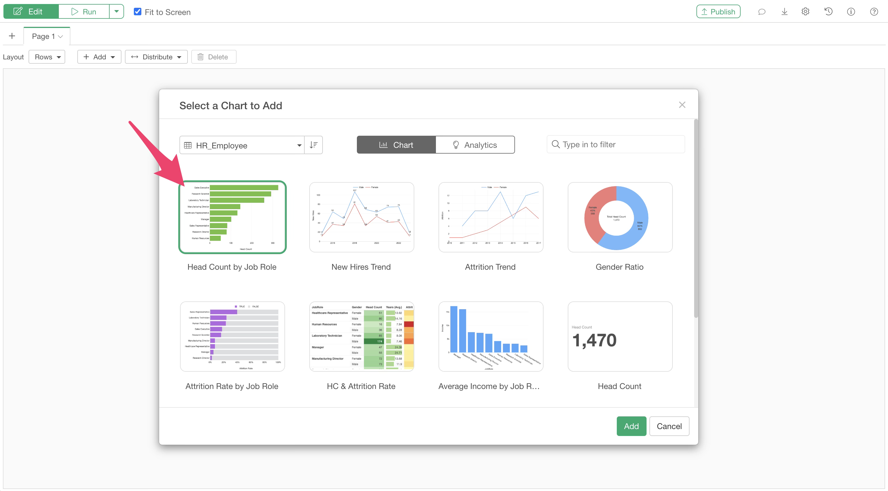
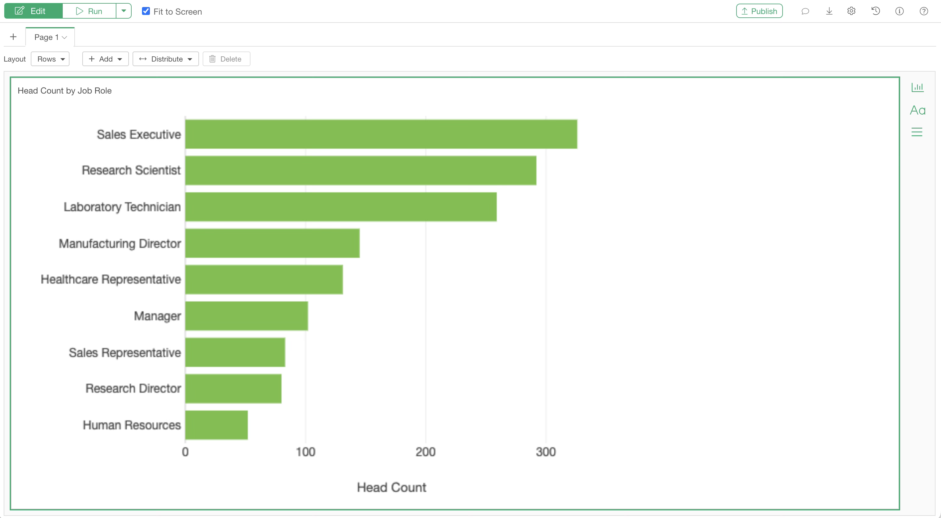
The chart will then be added to the dashboard.
If you want to add another chart next to this bar chart, click the “Add Chart” button on the right side.
The chart selection dialog will appear again, allowing you to add any chart.
With these steps, you can create a dashboard with two charts side-by-side.
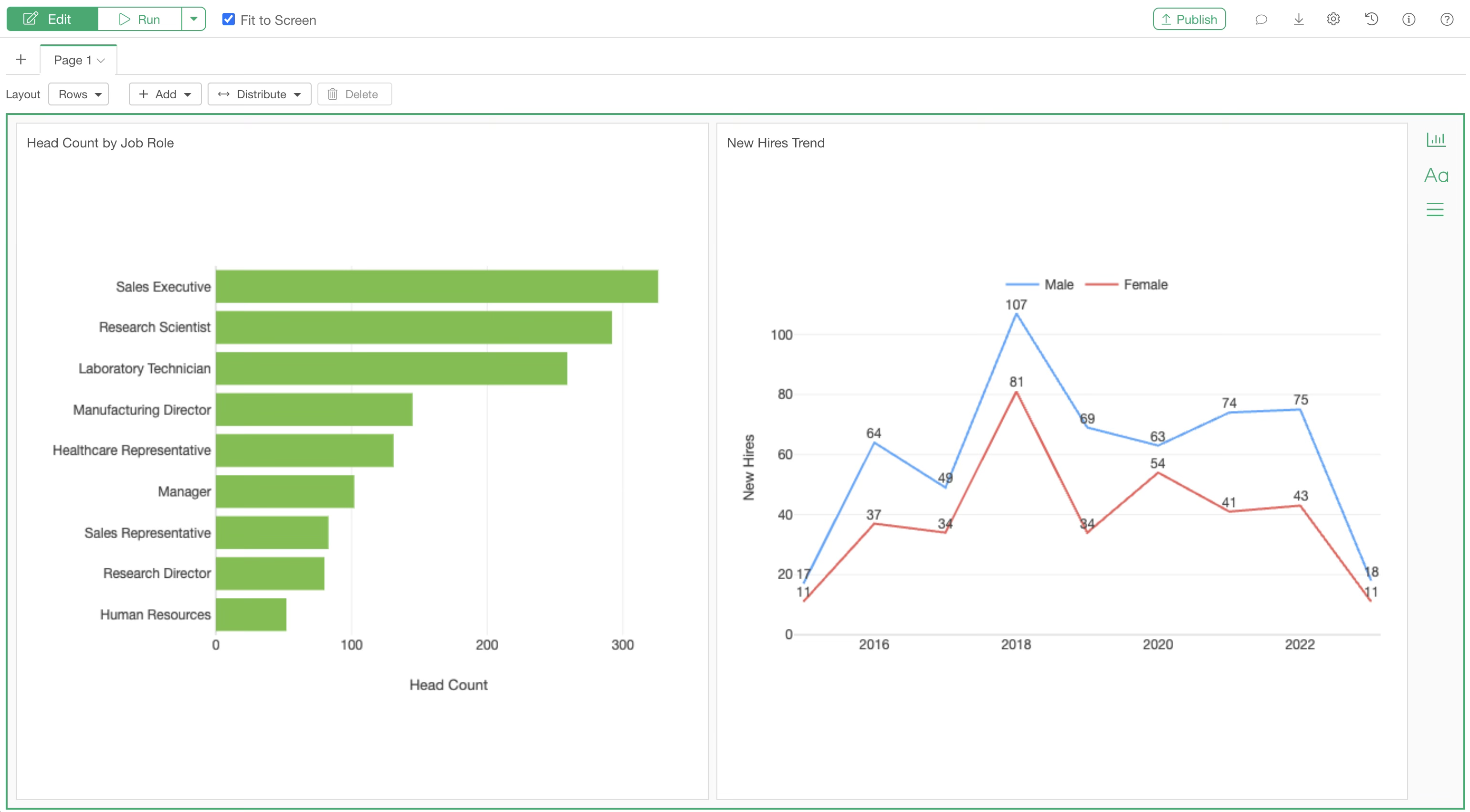
Click the “Run” button to view the output of the dashboard.
Adjusting Design and Layout
Exploratory allows you to flexibly configure the dashboard layout.
Adding Rows
To arrange charts in two rows, select “Add Row Below” from the add button.
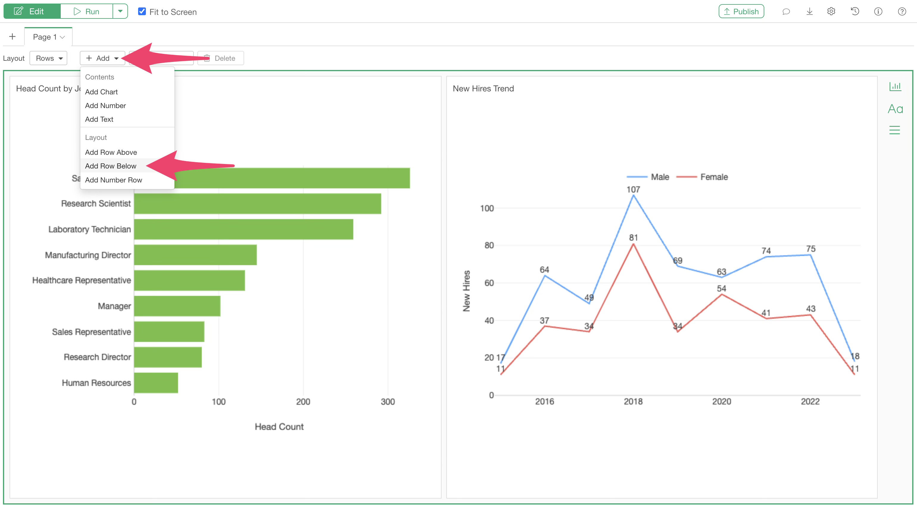
An empty row will be added to the bottom of the page.
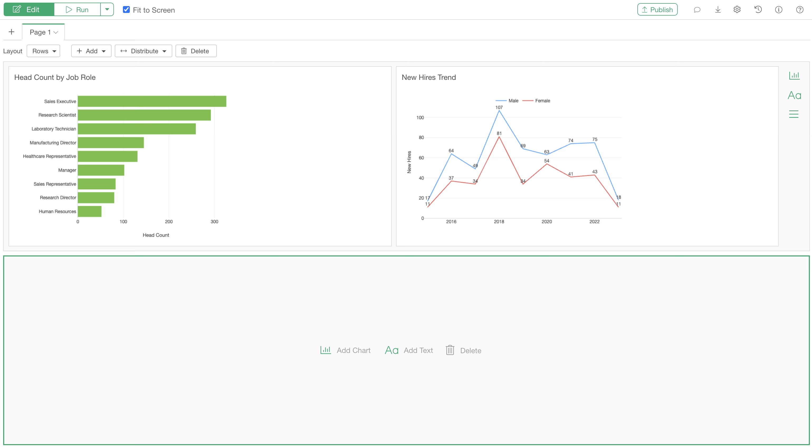
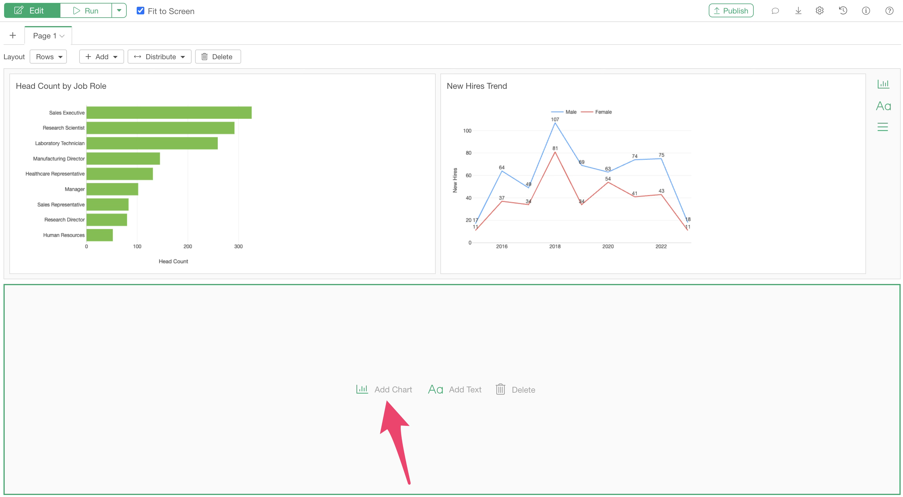
You can add charts to the newly created row by clicking “Add Chart” in the same way.
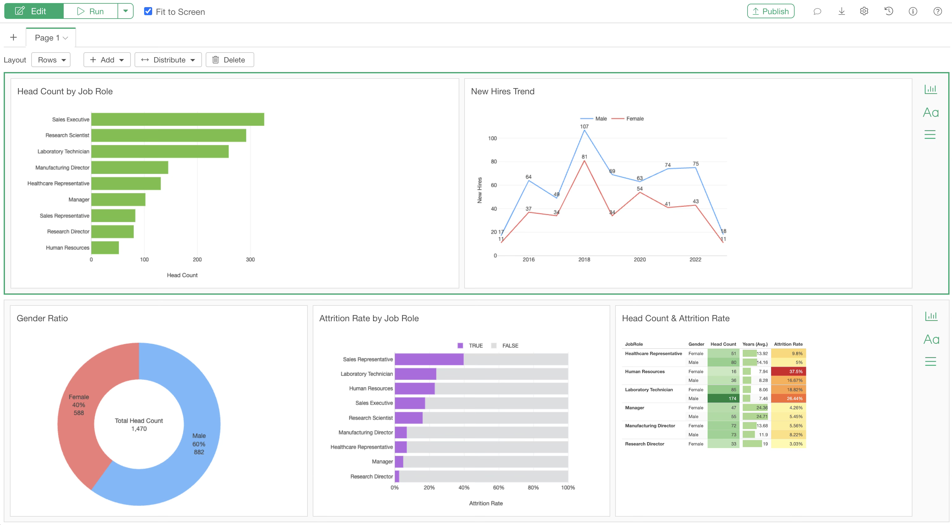
Adding three charts to the second row will look like this:
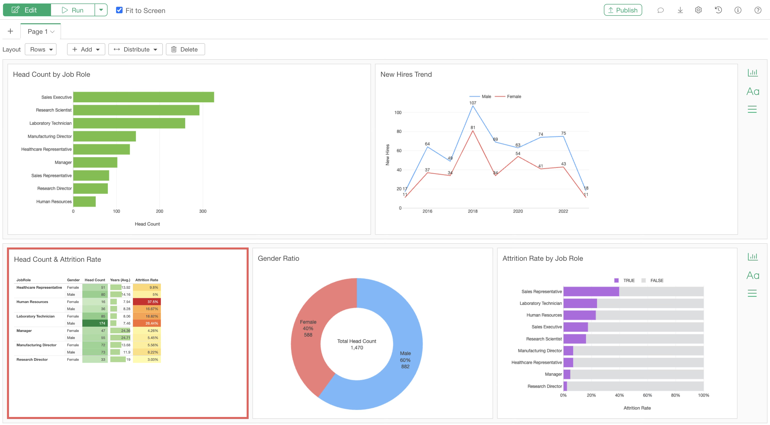
Changing Chart Positions
You can easily change the position of added charts using drag-and-drop.
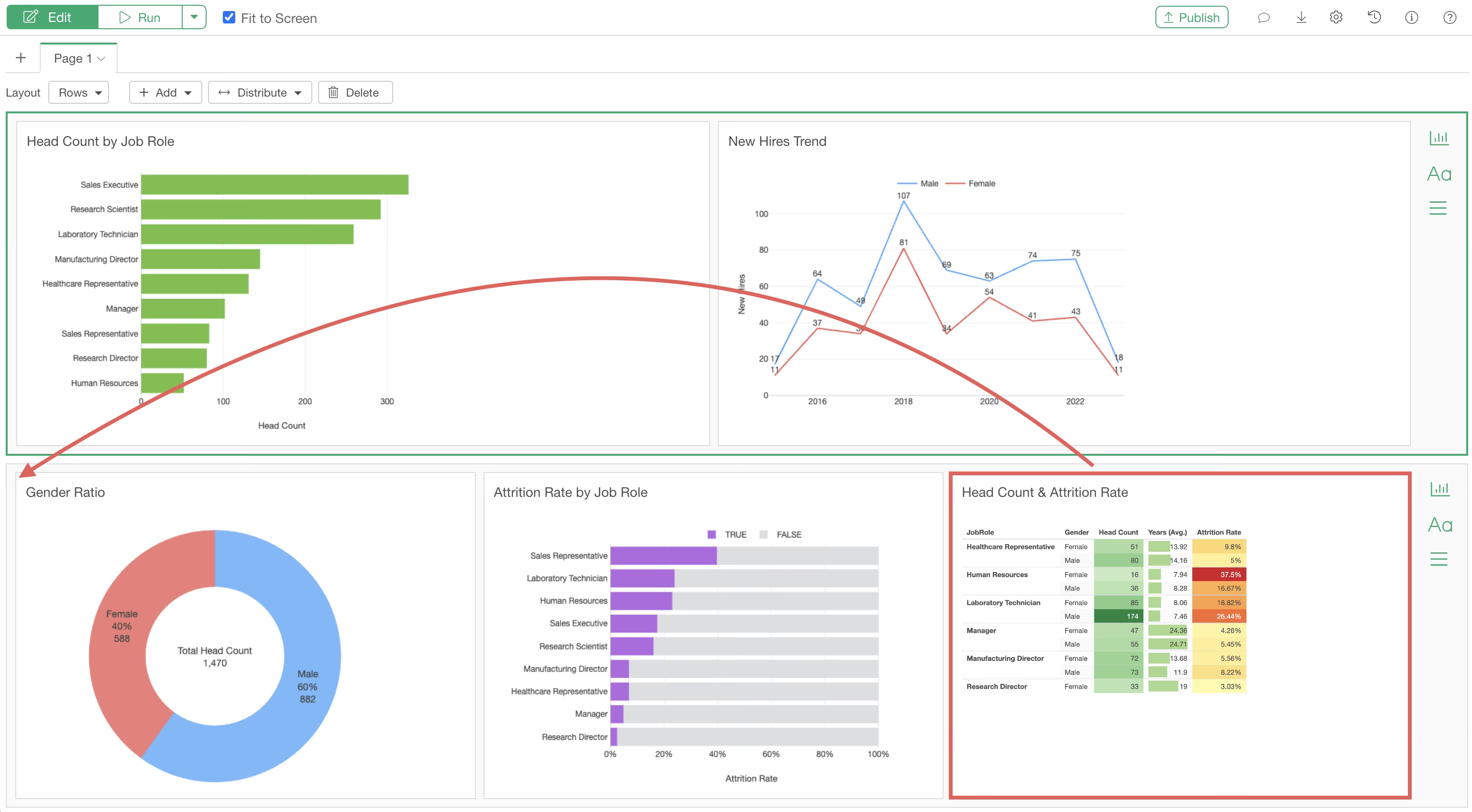
Click the chart you want to move so that a green border appears around it. (This indicates the chart is selected.)
Next, drag and drop the chart to the desired location. Ensure that a green vertical line appears, indicating the drop destination.
This allows you to reposition the chart.
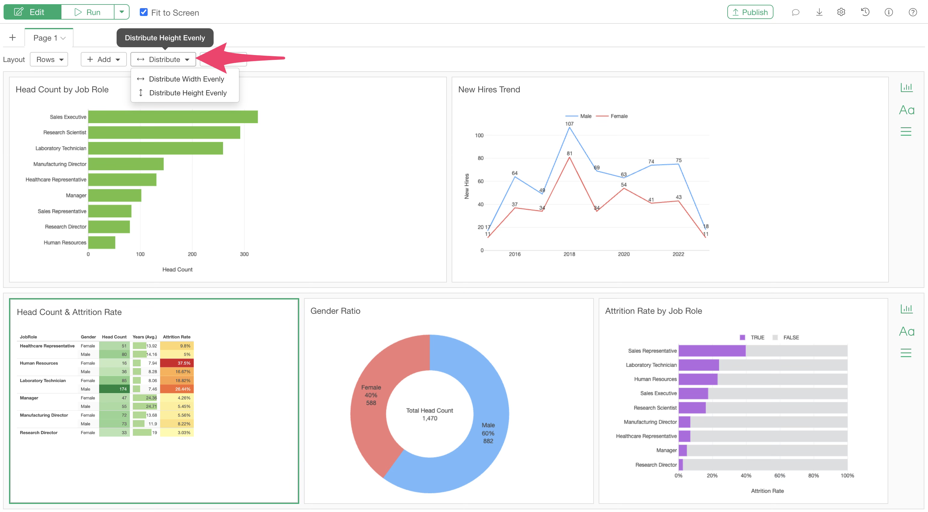
Adjusting Width and Height
The width of each column can be freely adjusted by clicking between charts and using drag-and-drop.
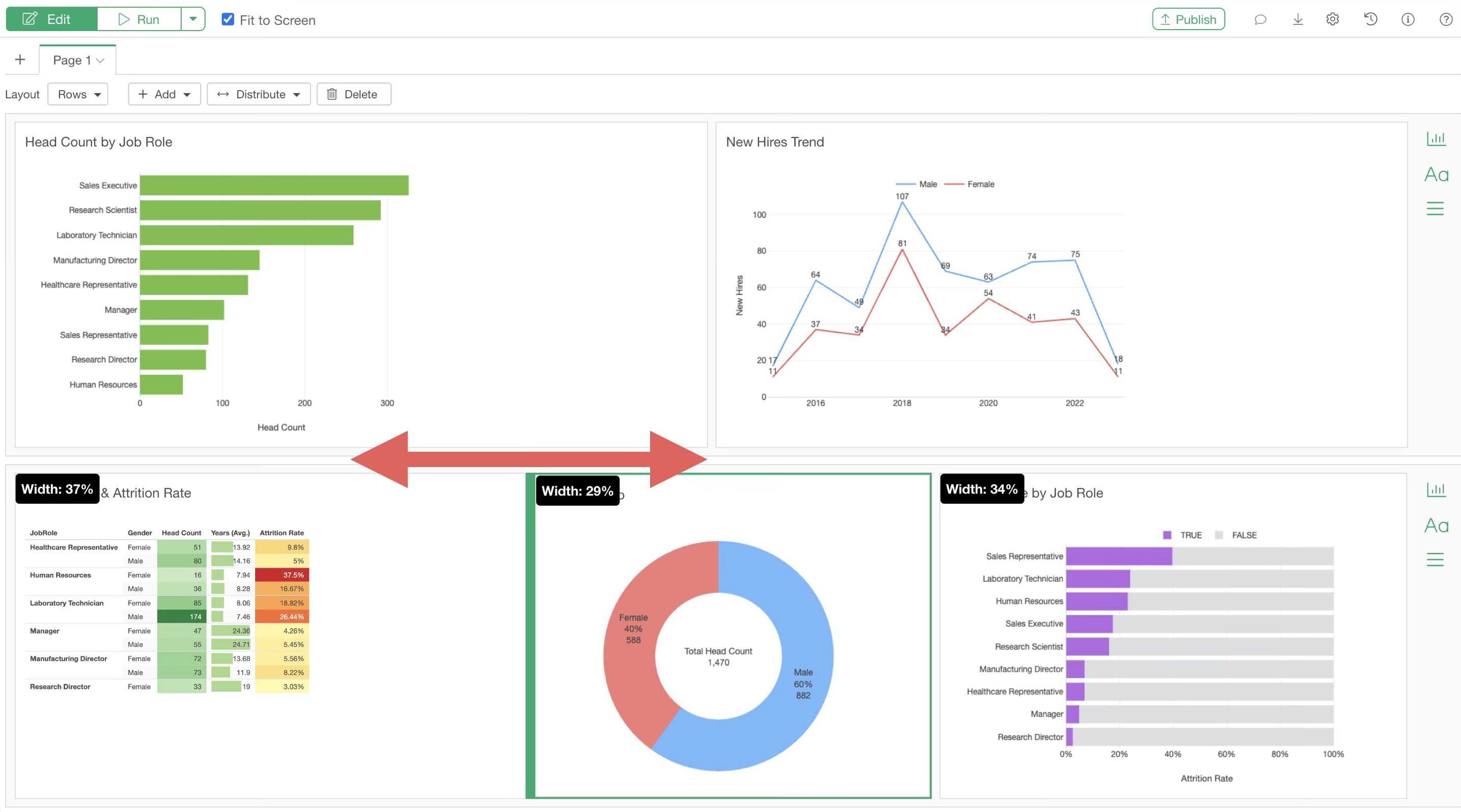
Similarly, the height of each row can be adjusted via drag-and-drop.
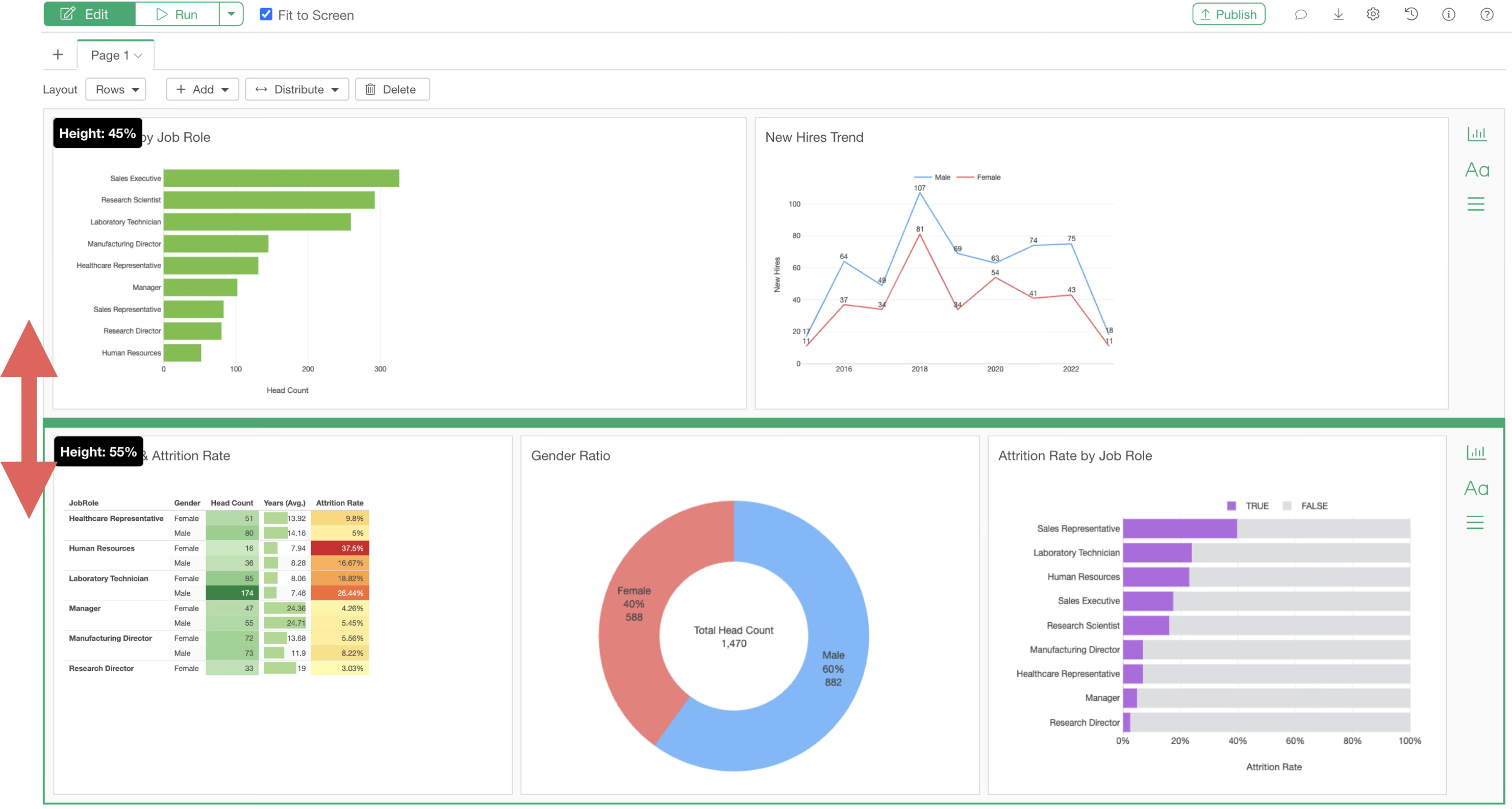
If you want to set the “Column Width” or “Height” of each chart to equal intervals, you can use the “Distribute Evenly” button.
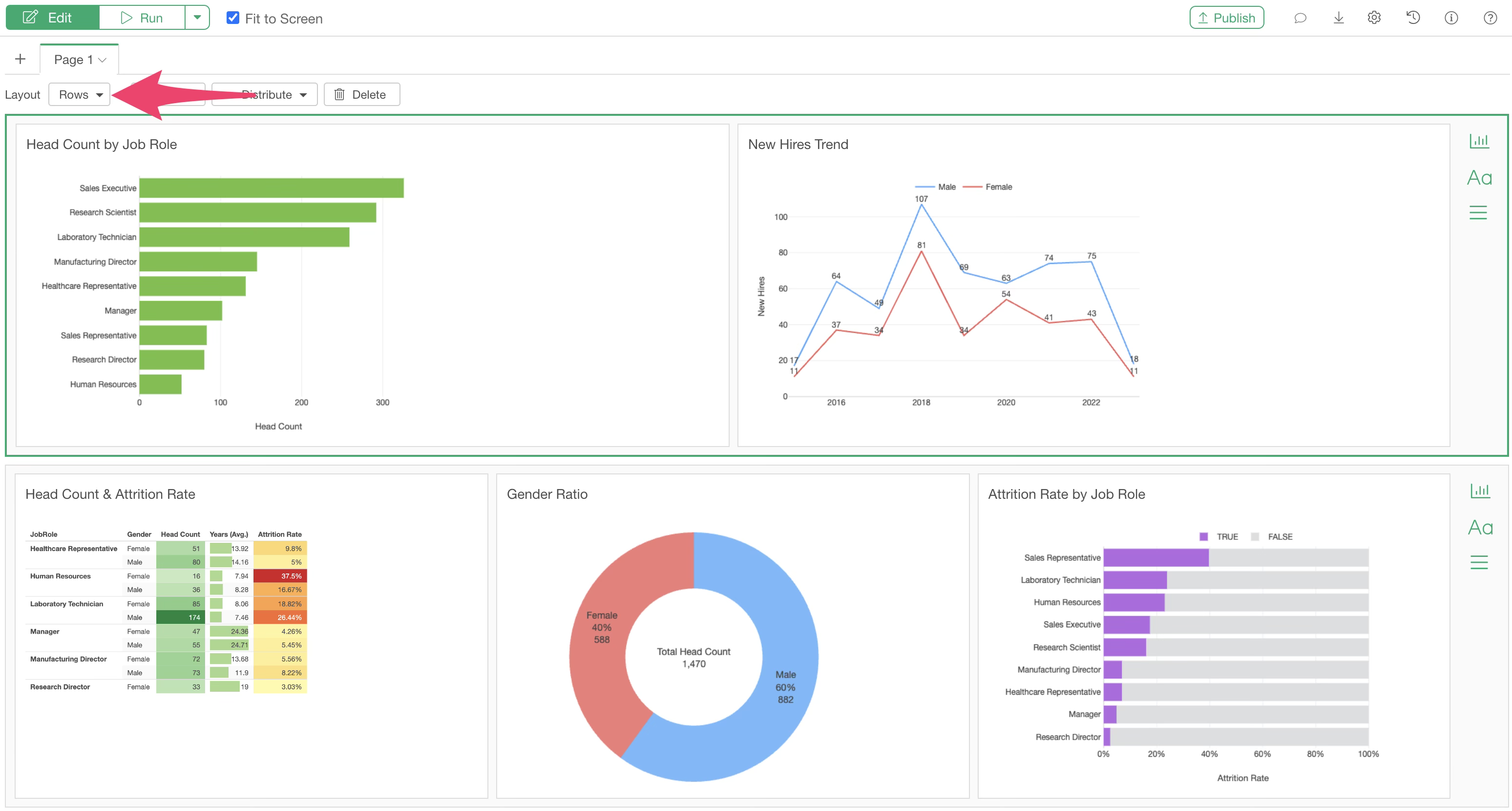
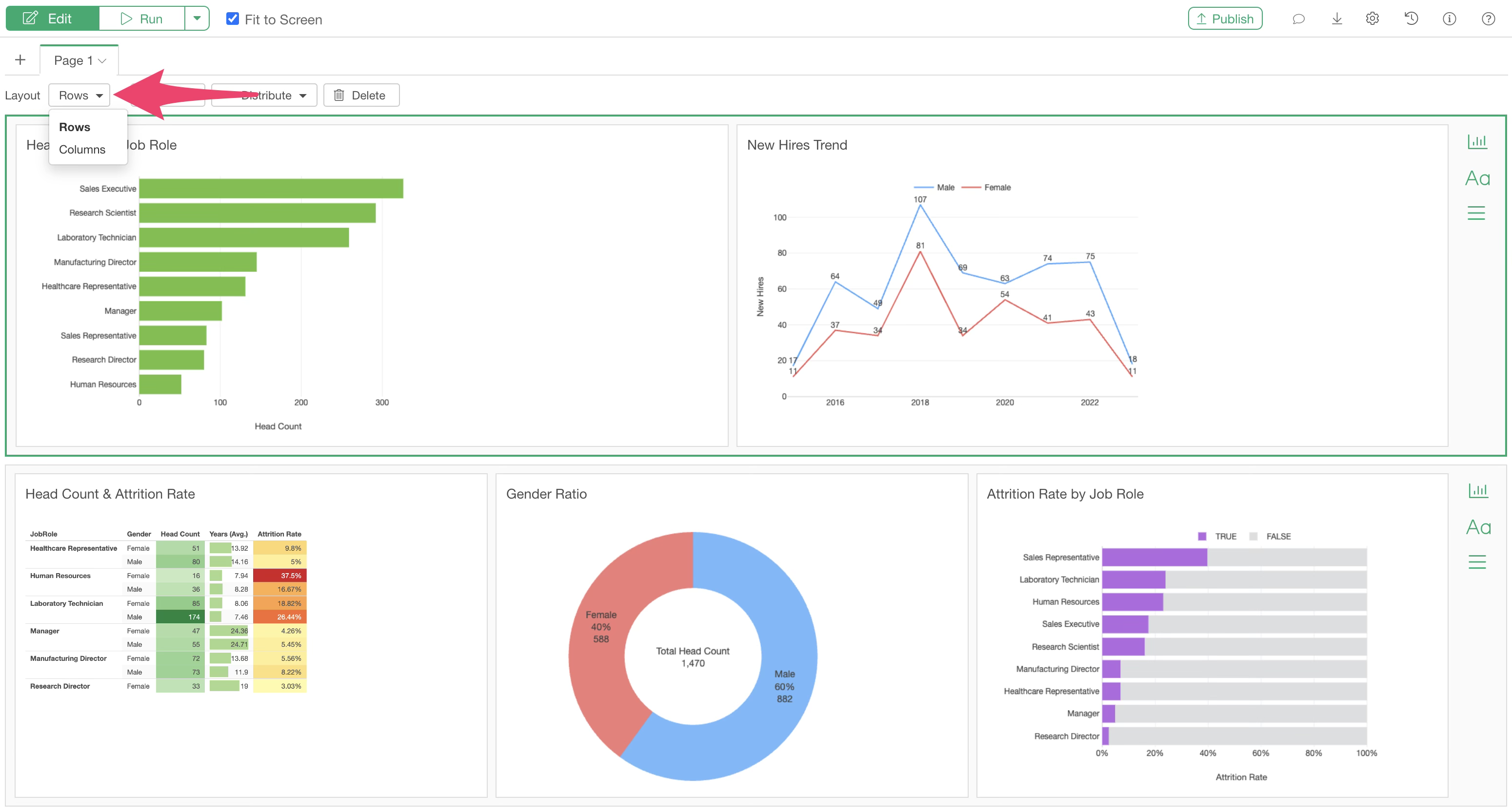
Row Layout and Column Layout
There are two types of dashboard layouts: “Row” and “Column.” The default is the “Row” layout.
Selecting the “Row” layout allows you to design the layout row by row, as shown below.
Using the “Column” layout allows you to design the layout column by column.
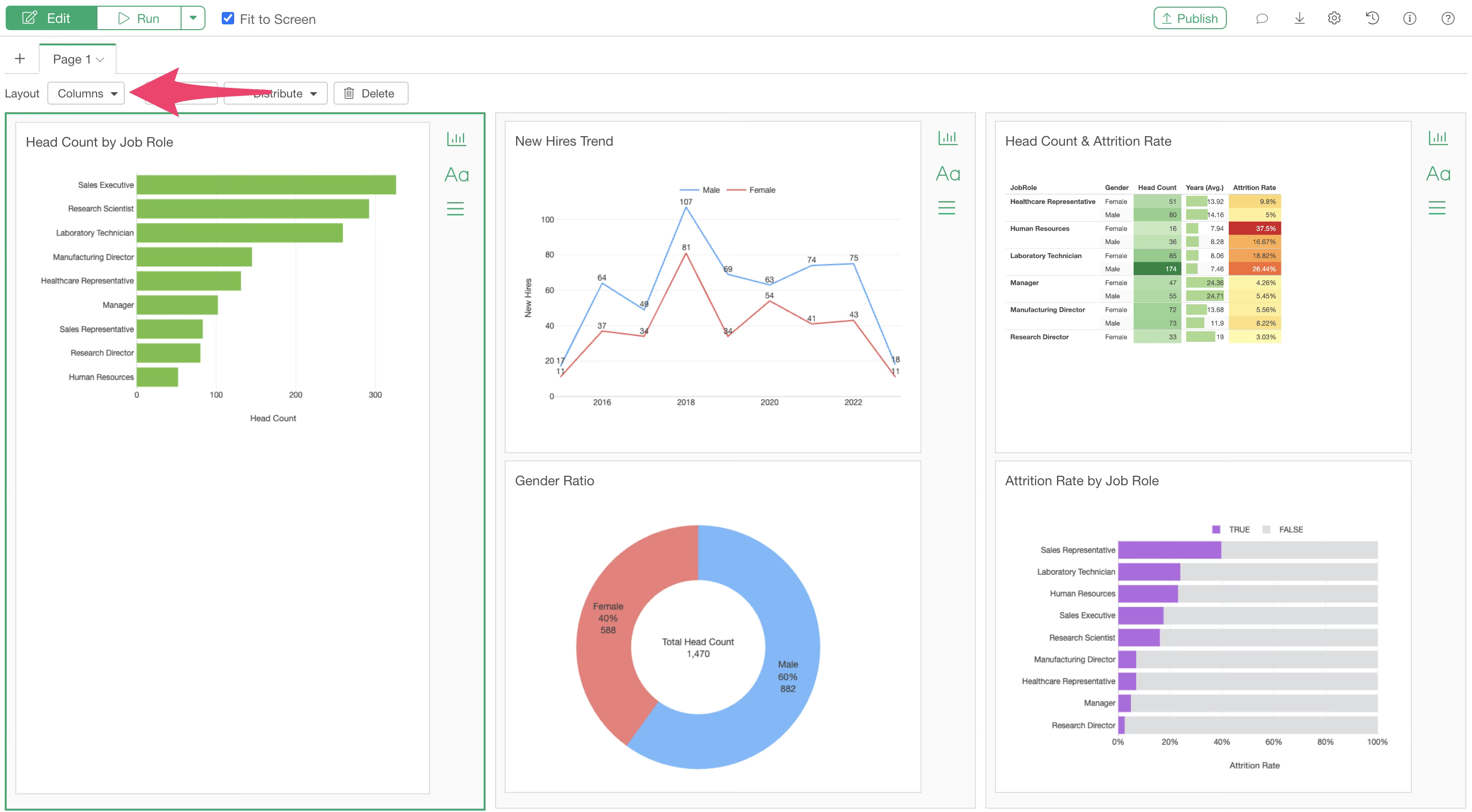
You can specify the layout change from the “Row/Column” setting as shown below.
Fit to Screen
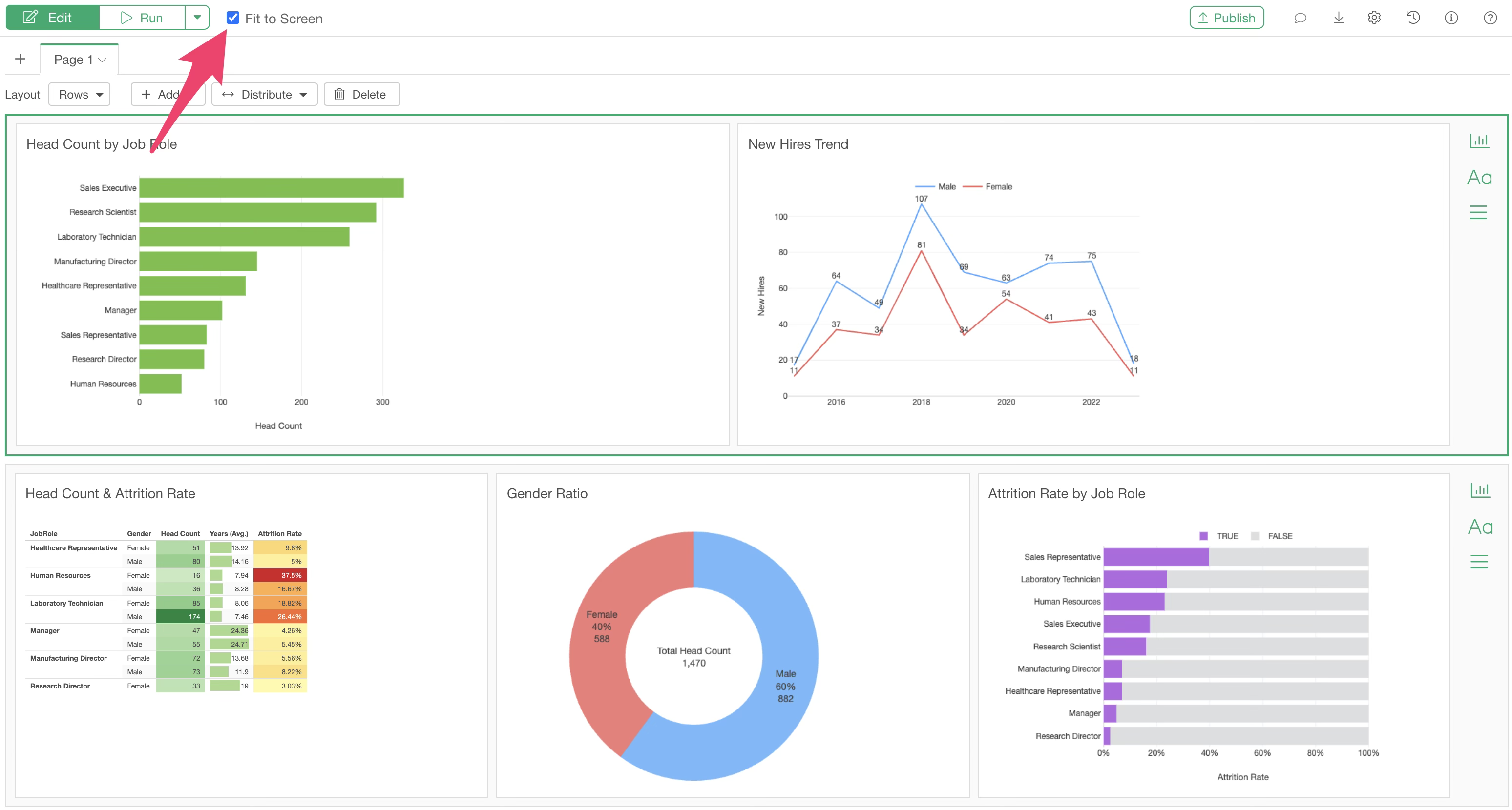
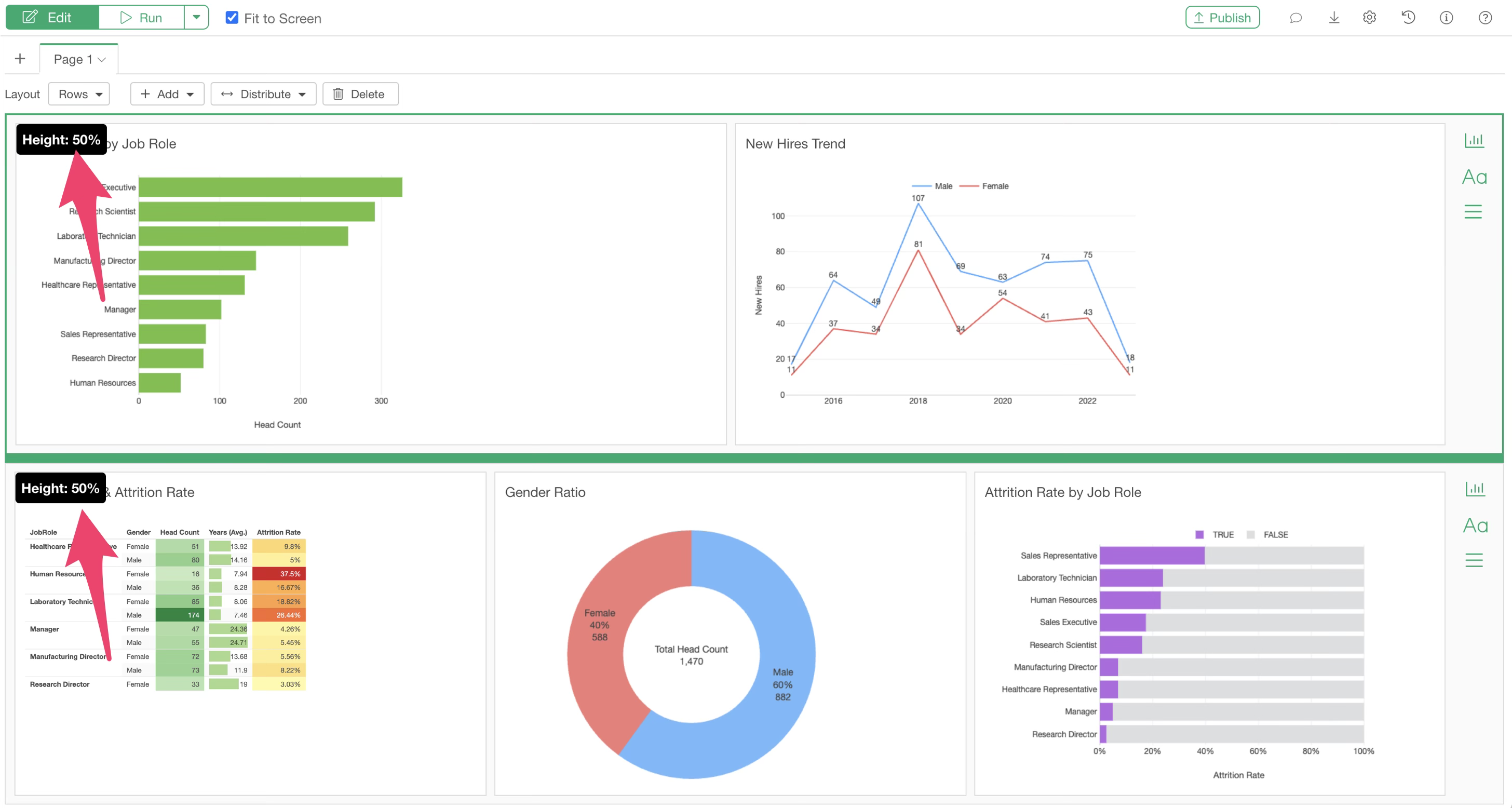
Checking “Fit to Screen” ensures that the dashboard content fits within the screen dimensions.
When designing the layout with drag-and-drop, the percentage of the screen occupied by each content item is displayed.
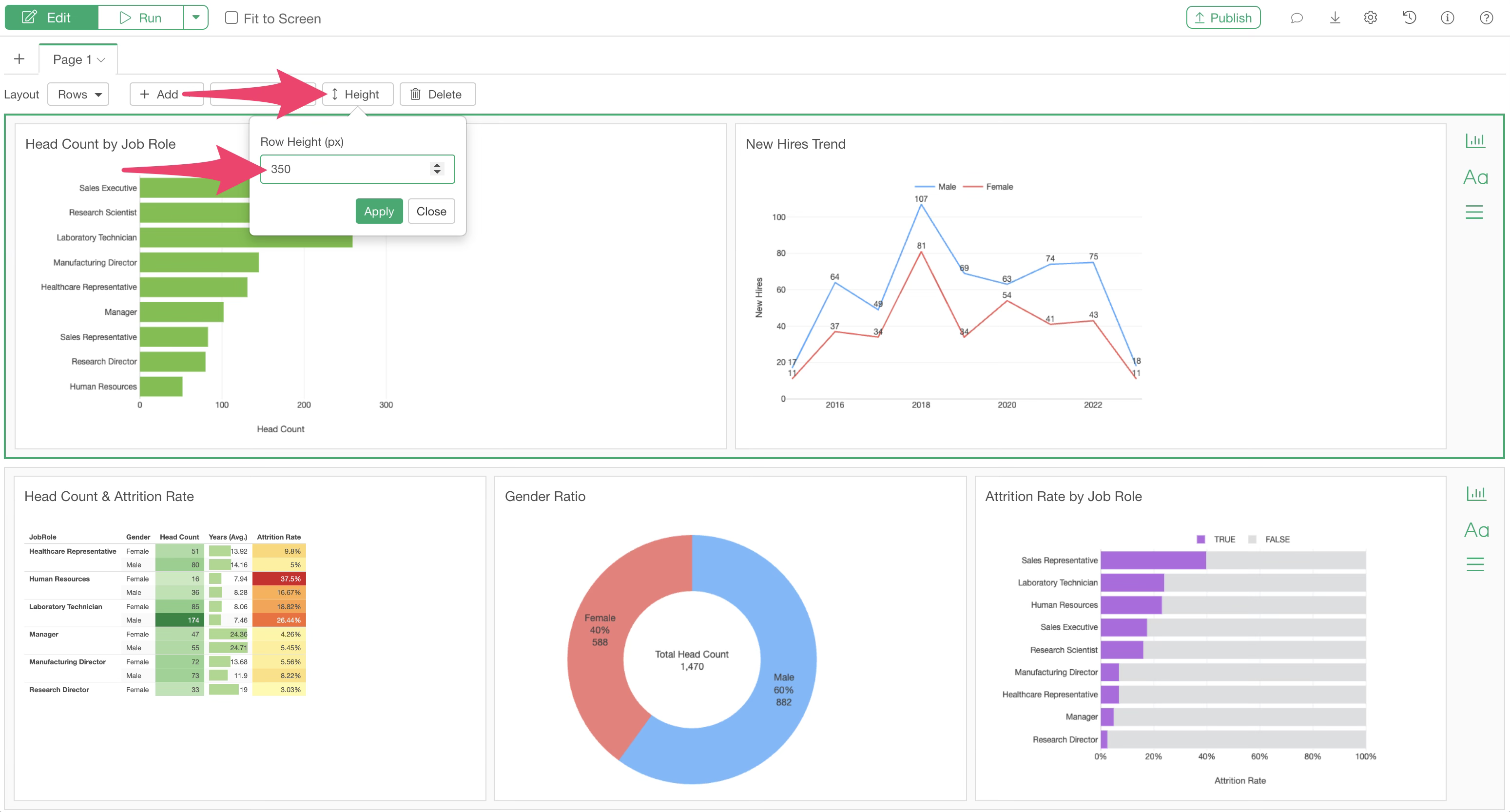
Conversely, if you uncheck “Fit to Screen,” you will specify the “Height” of each content item in pixels.
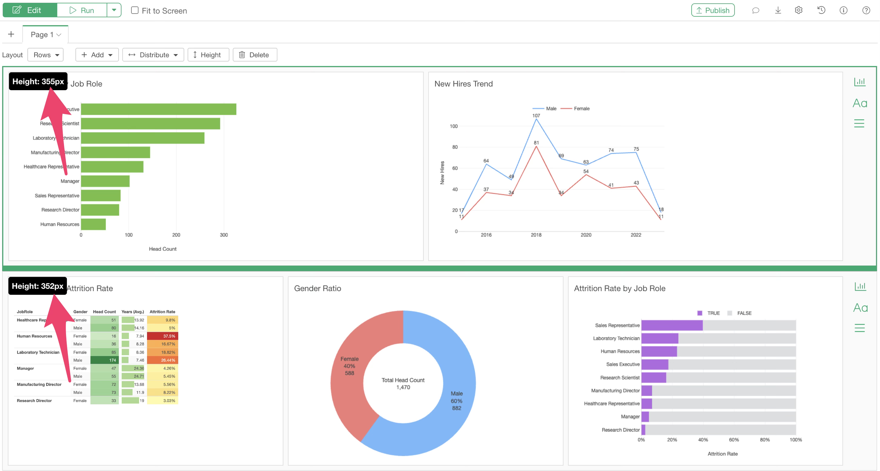
The height of each row or column can be changed via drag-and-drop.
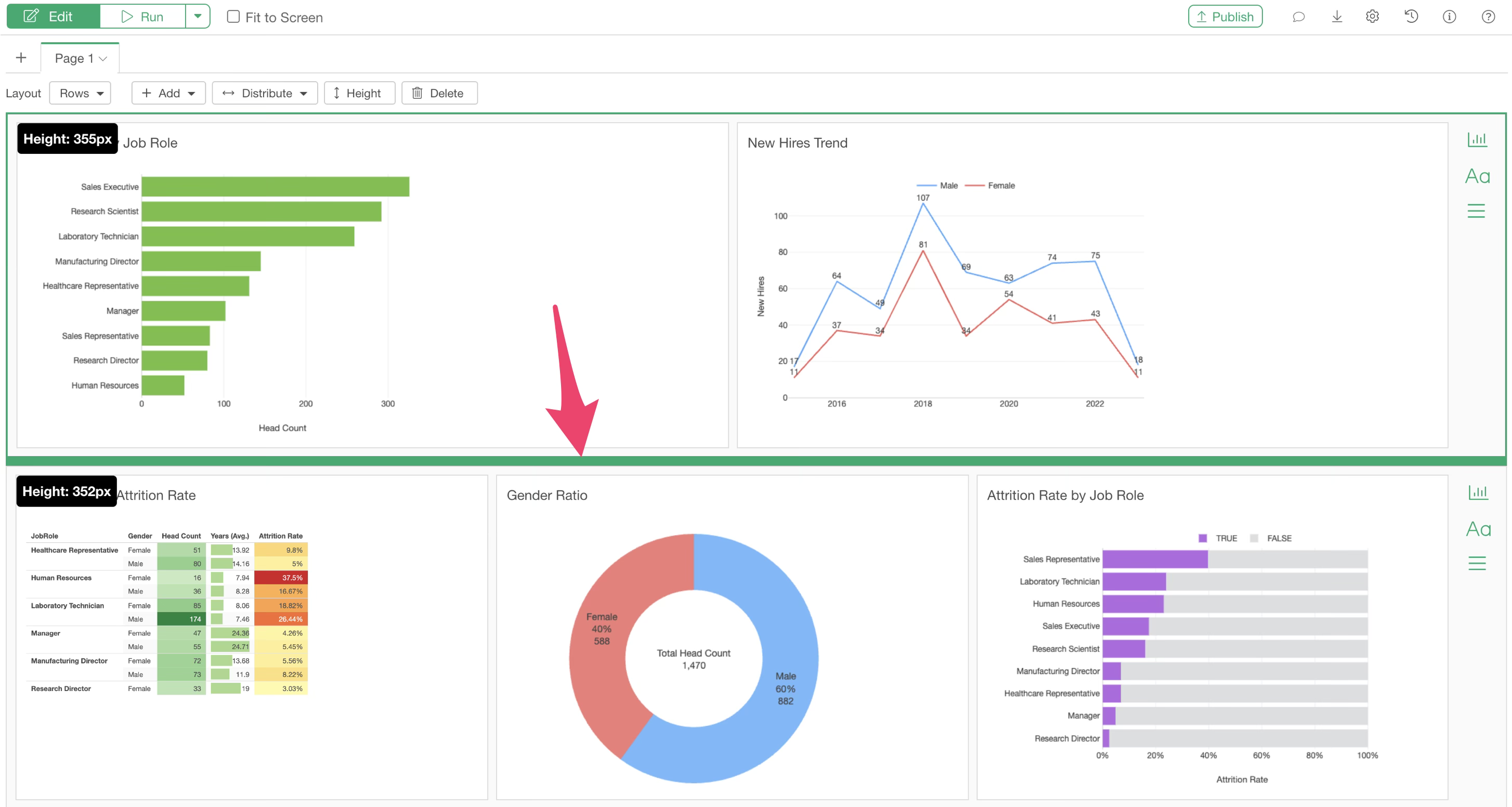
Furthermore, the height of each row can be specified directly.
Adding Pages
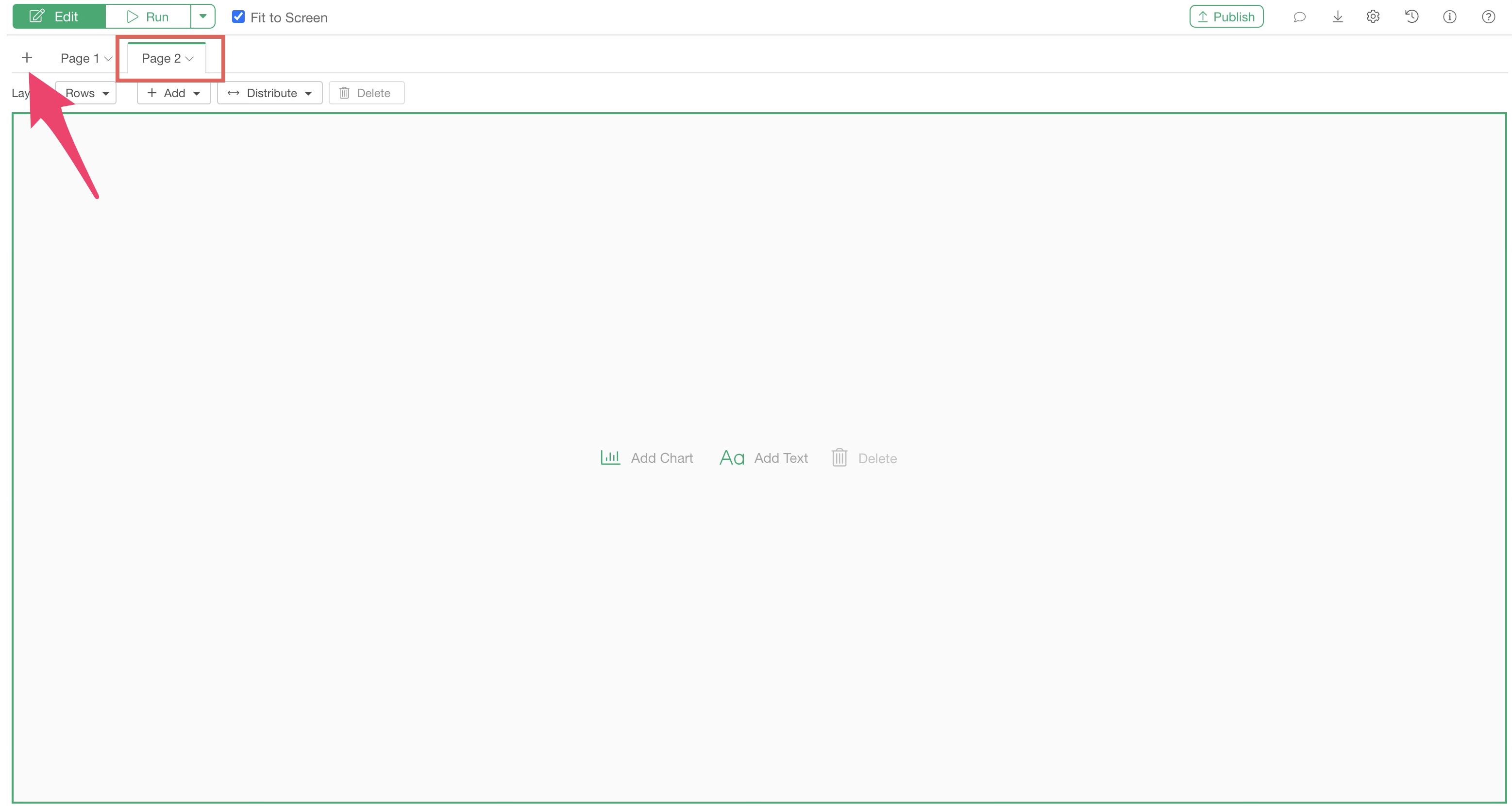
In a dashboard, you can add pages and design the layout for each page individually.
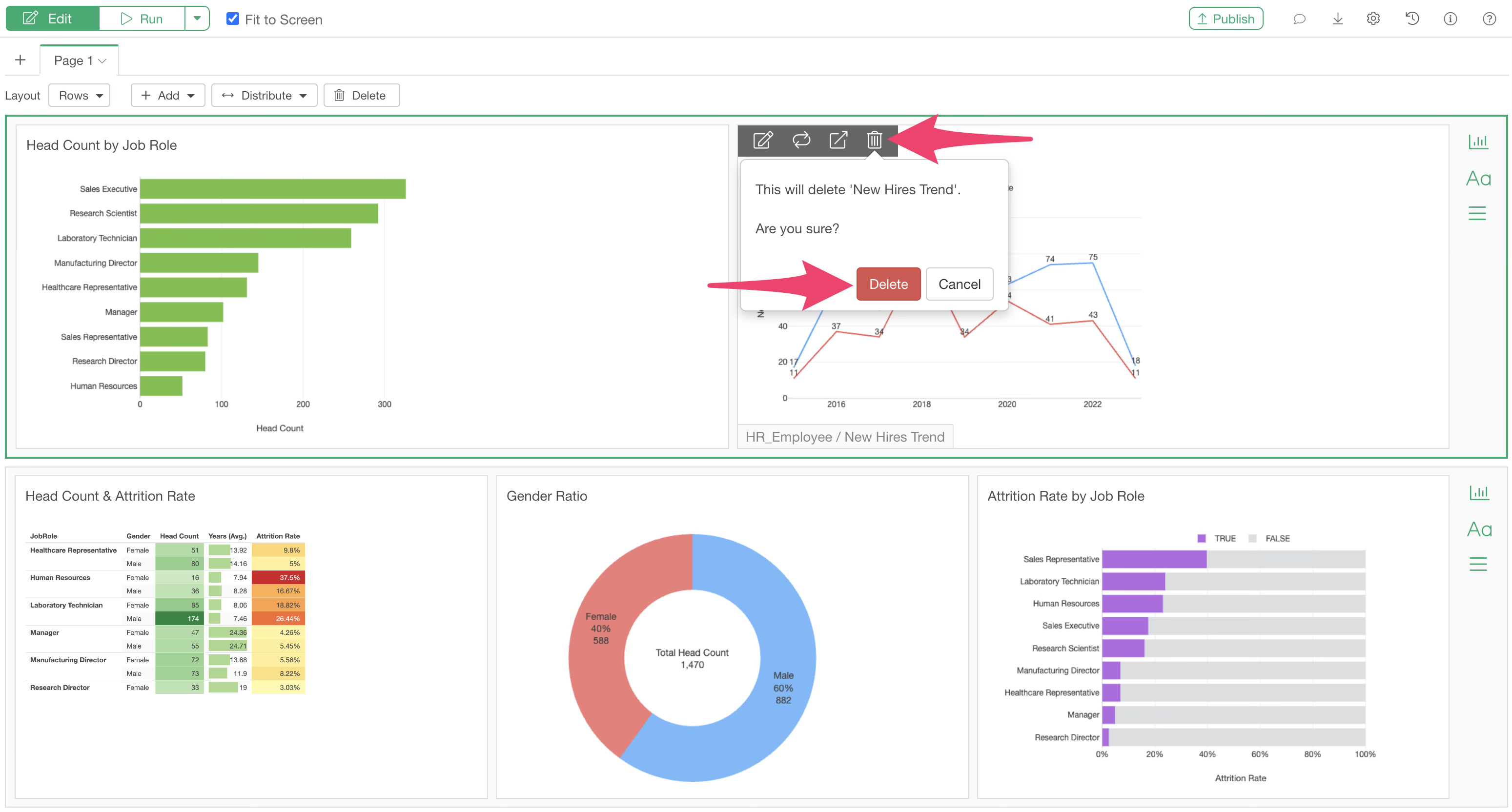
Deleting Charts
To delete a chart added to the dashboard, click the delete icon that appears when you hover over the corresponding chart.
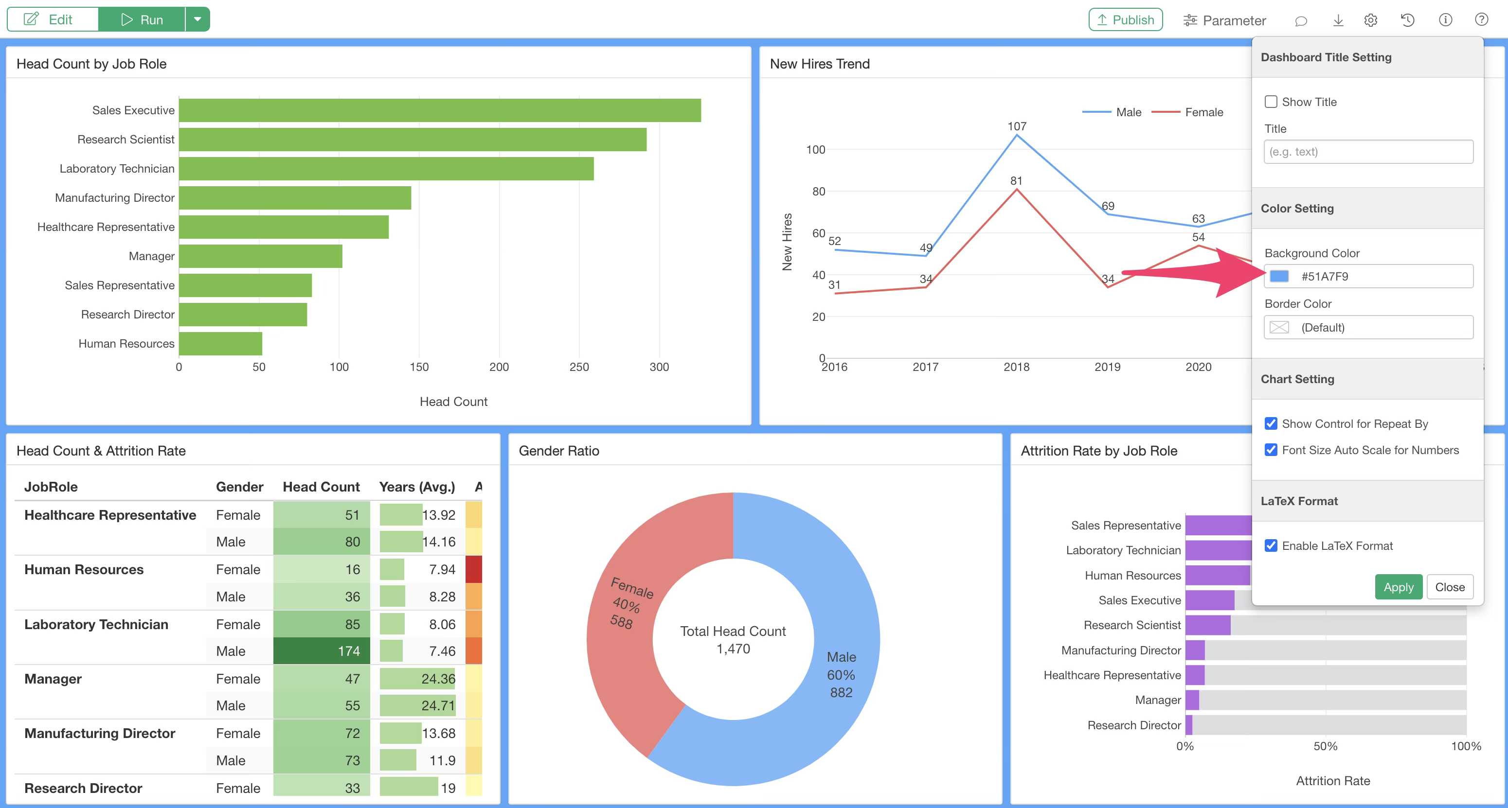
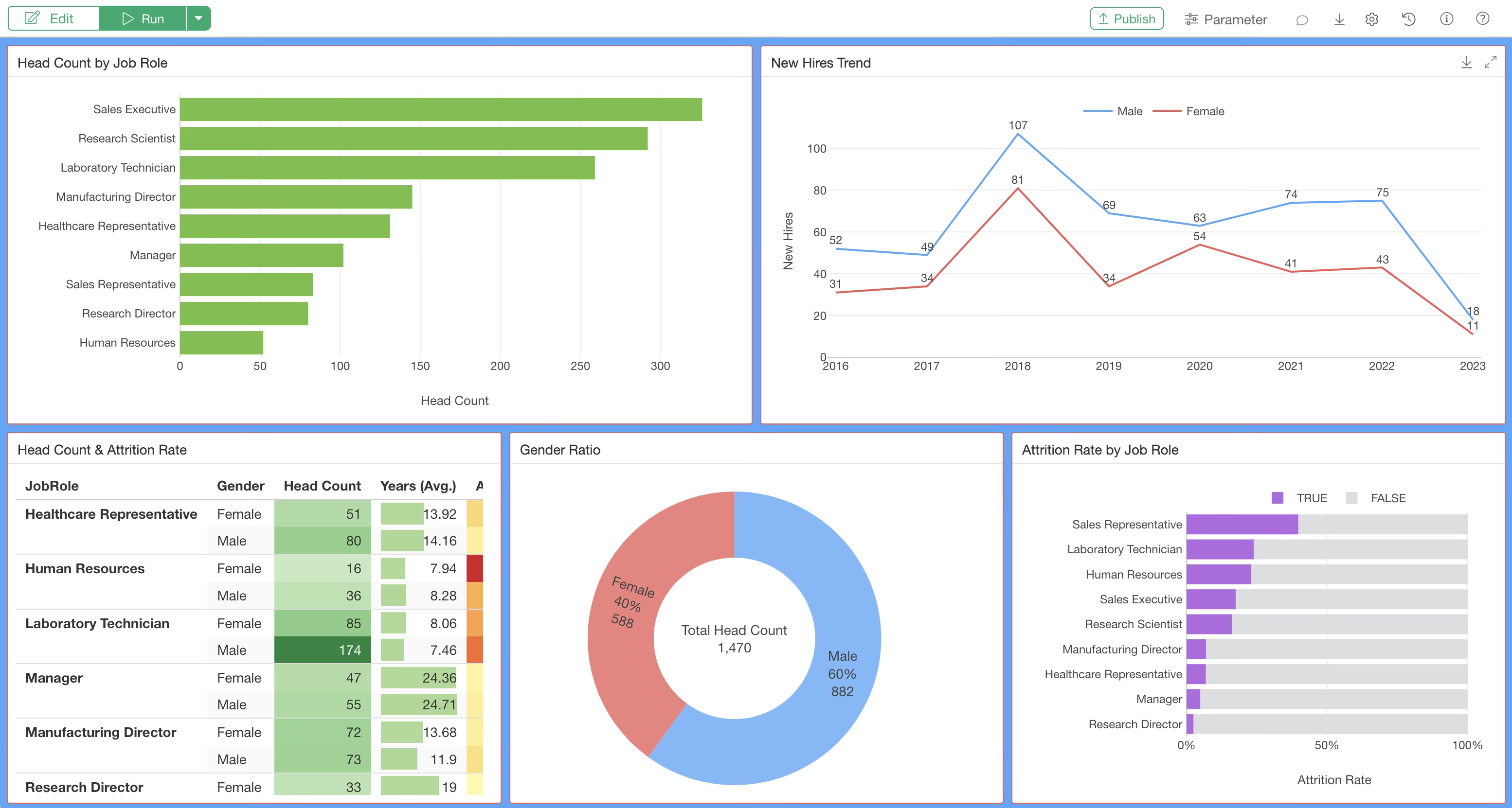
Changing Background and Border Colors
You can change the background color and content border color from the dashboard settings dialog. (This feature is available from Exploratory Desktop v14.5 onwards.)

To customize these colors, click the dashboard settings icon to open the settings dialog.
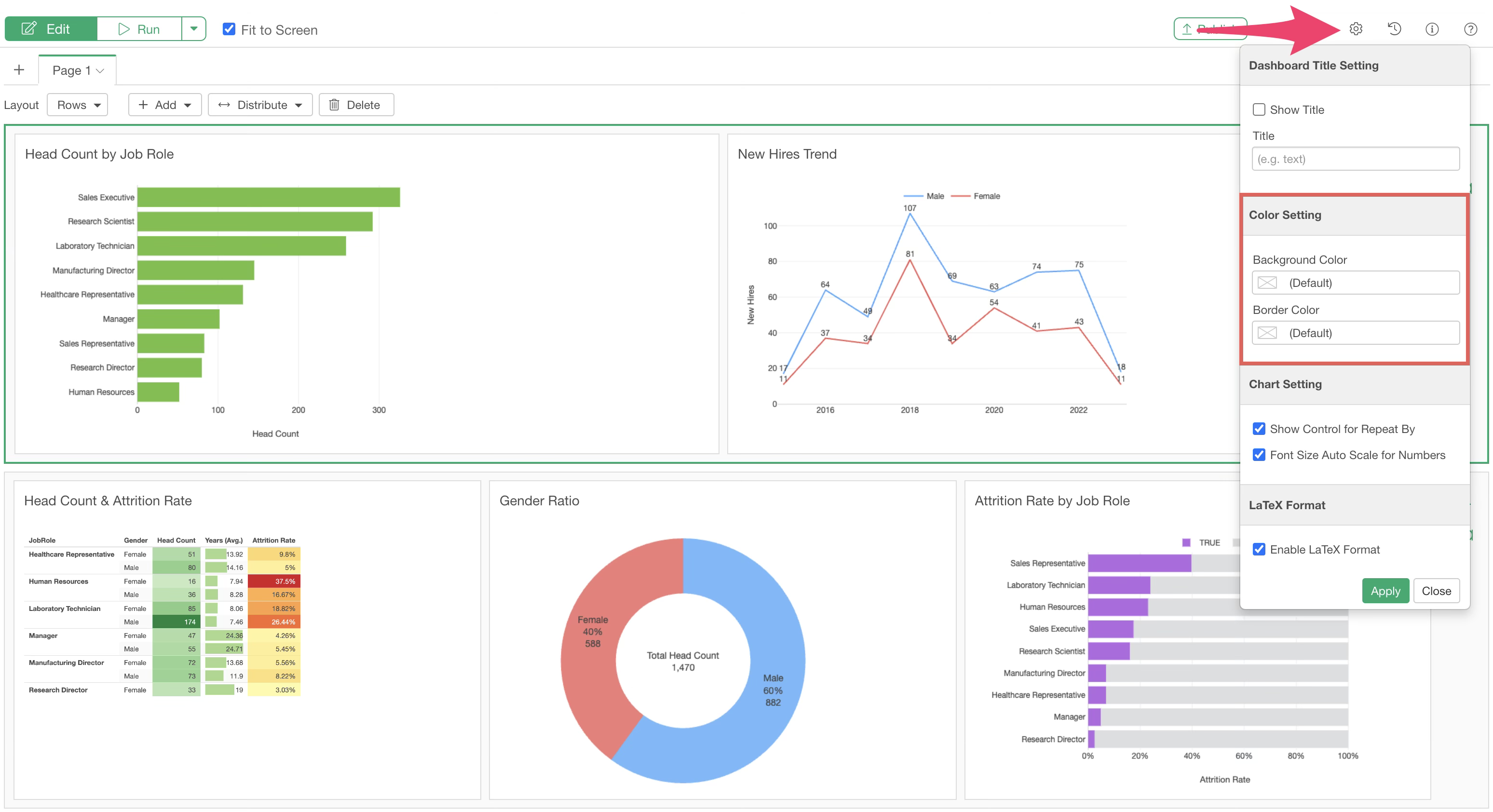
In the “Color Settings” section, you can change the following two colors:
- Background Color: Changes the background color of all pages in the dashboard.
- Border Color: Changes the border color of each panel, such as charts or numbers.
Changing the background color affects the color between content items in the dashboard.
The border color setting allows you to change the border color of each content item.
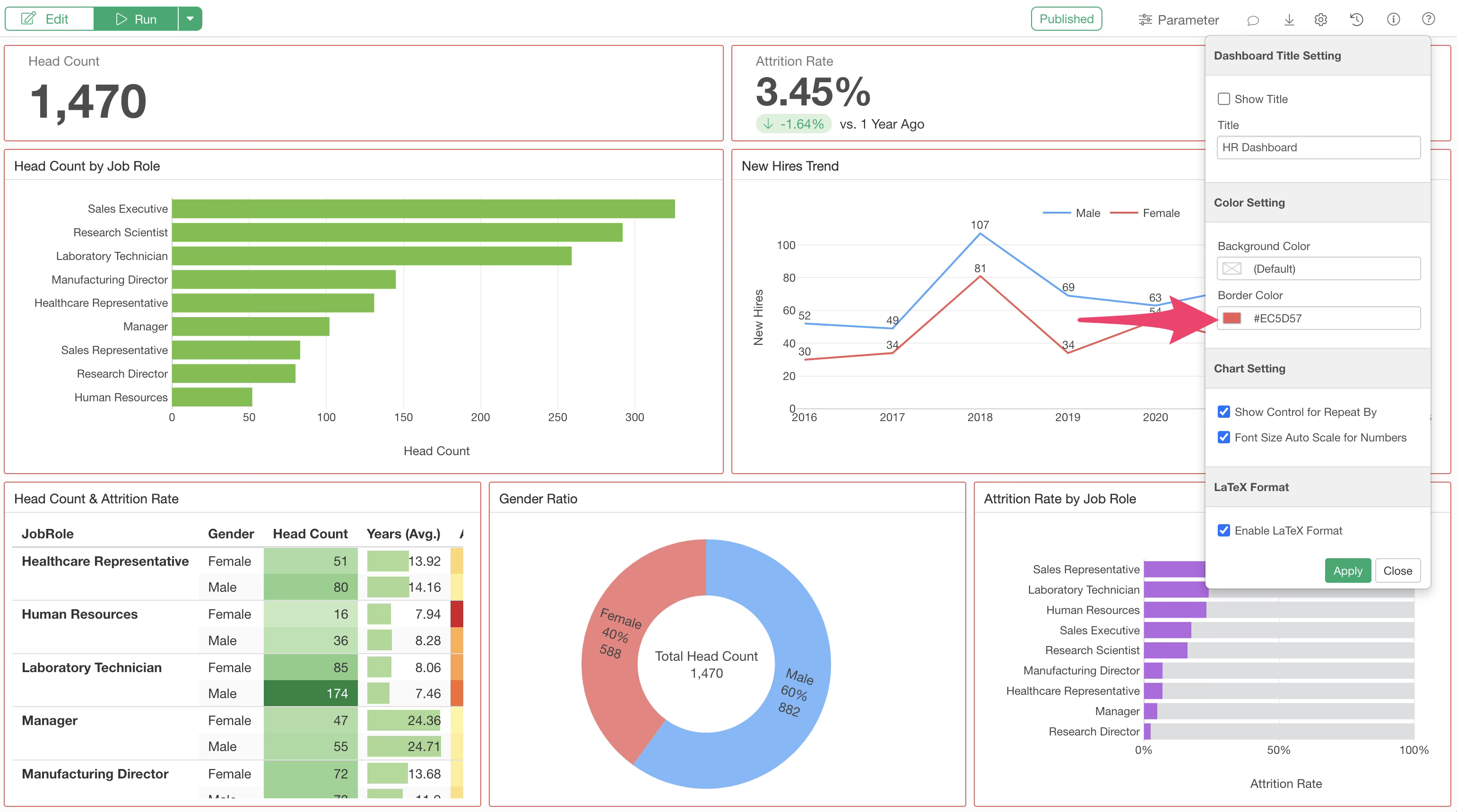
Both can be set simultaneously.
Adding Text
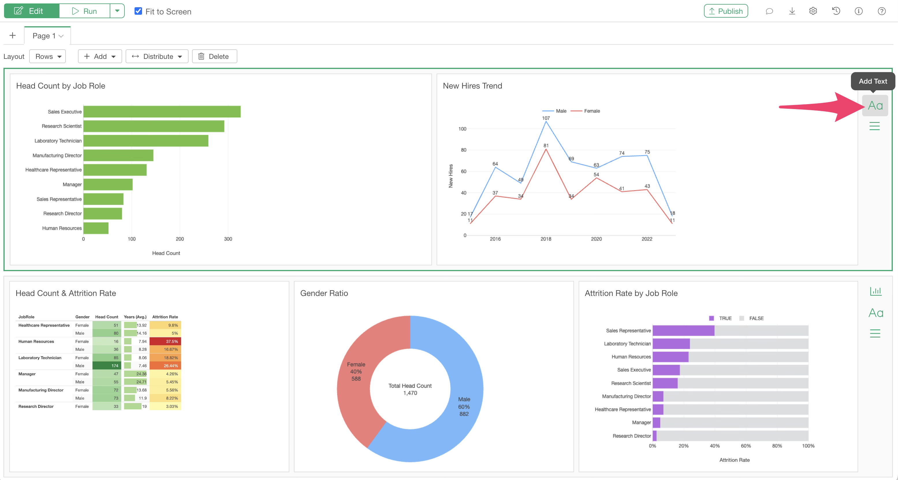
You can add text boxes to the dashboard to freely describe the dashboard, provide instructions, or explain the data.
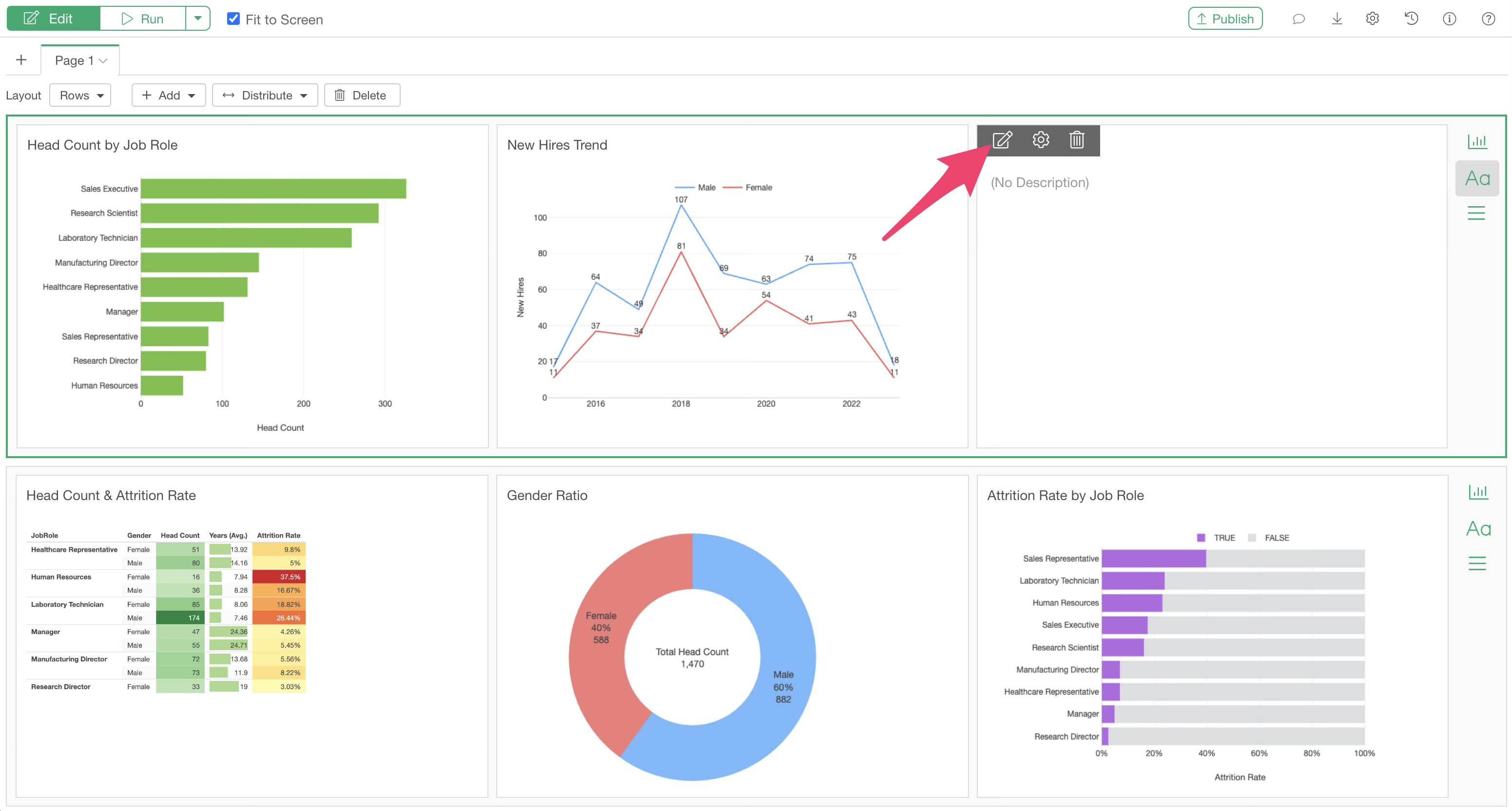
To add a text box, click the “Add Text” button in the menu to the right of a chart row.
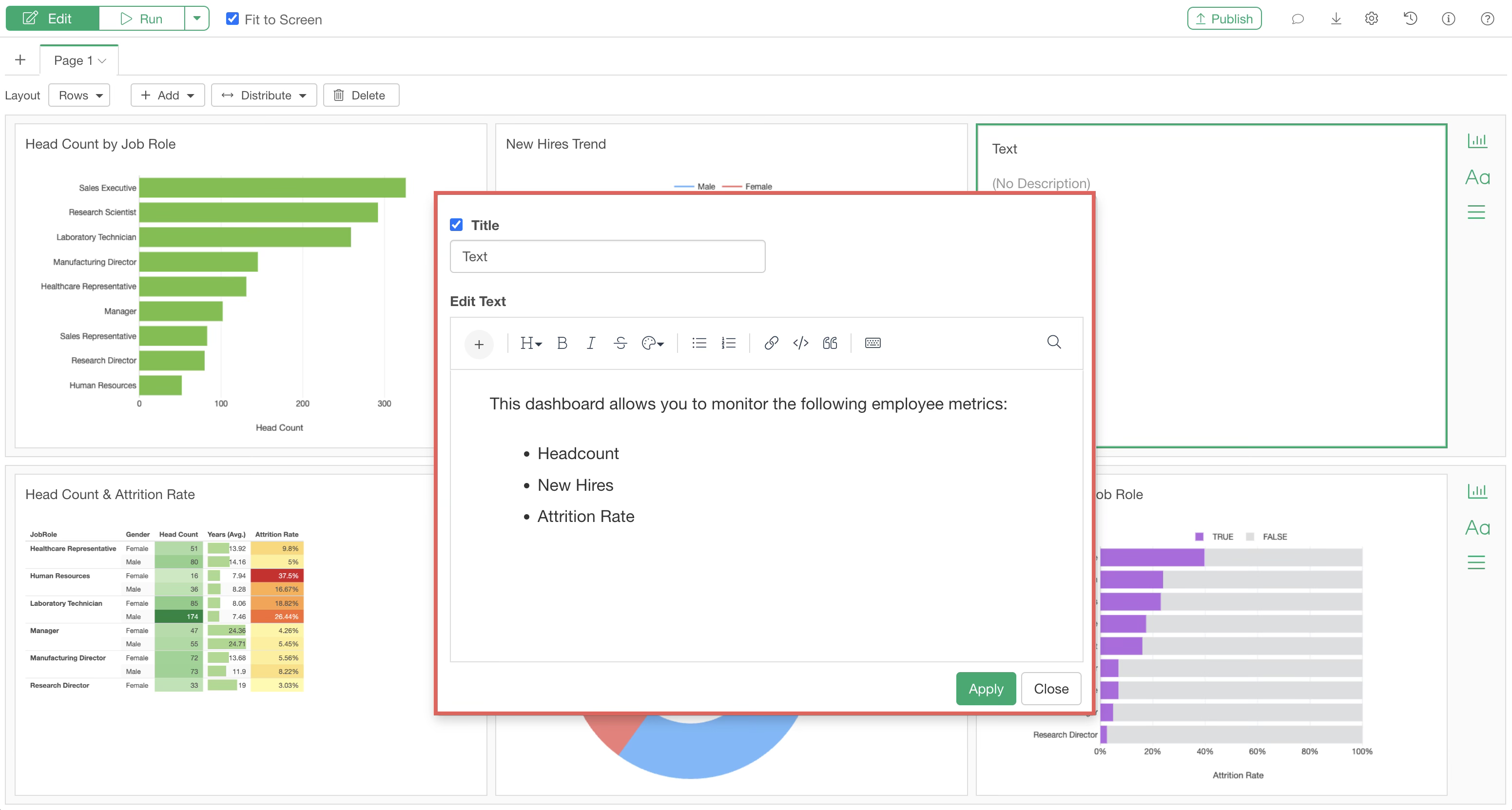
Once the text box is added, click “Edit Text.”
Similar to the Note Editor, you can easily add headings or bullet points using the toolbar.
In addition to text, various other types of content can be added within a text box:
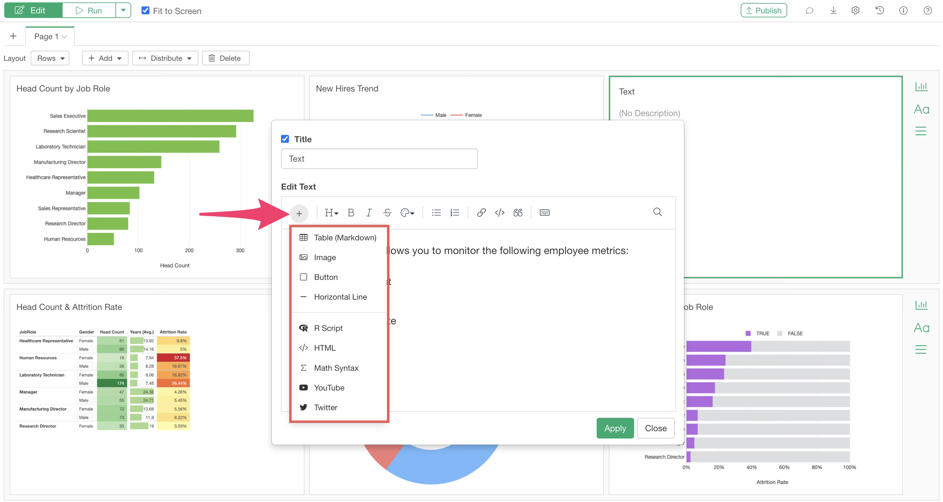
- Tables (Markdown)
- Images
- Buttons
- Horizontal Lines
- R Scripts
- HTML
- YouTube
For more details, please refer to this page.
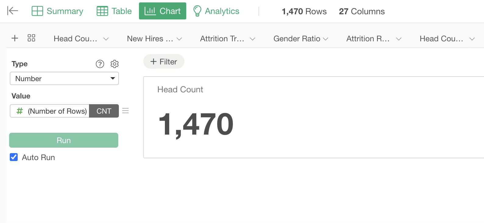
Adding Numbers
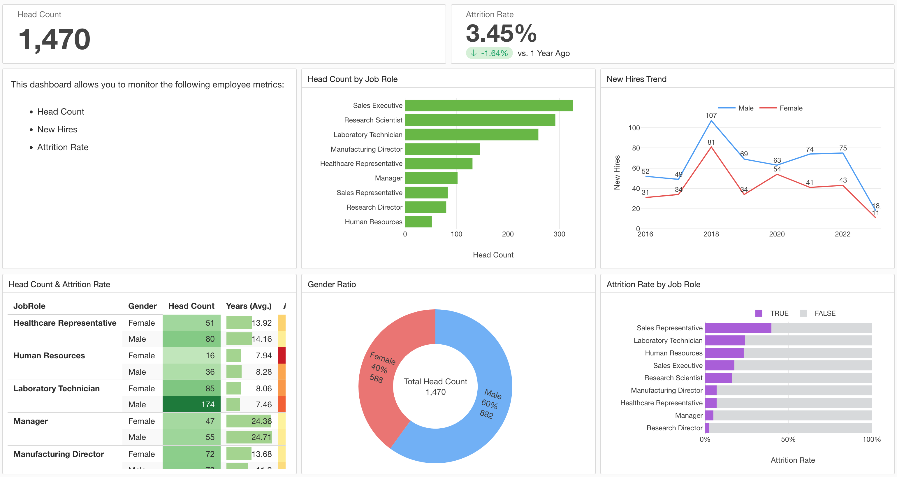
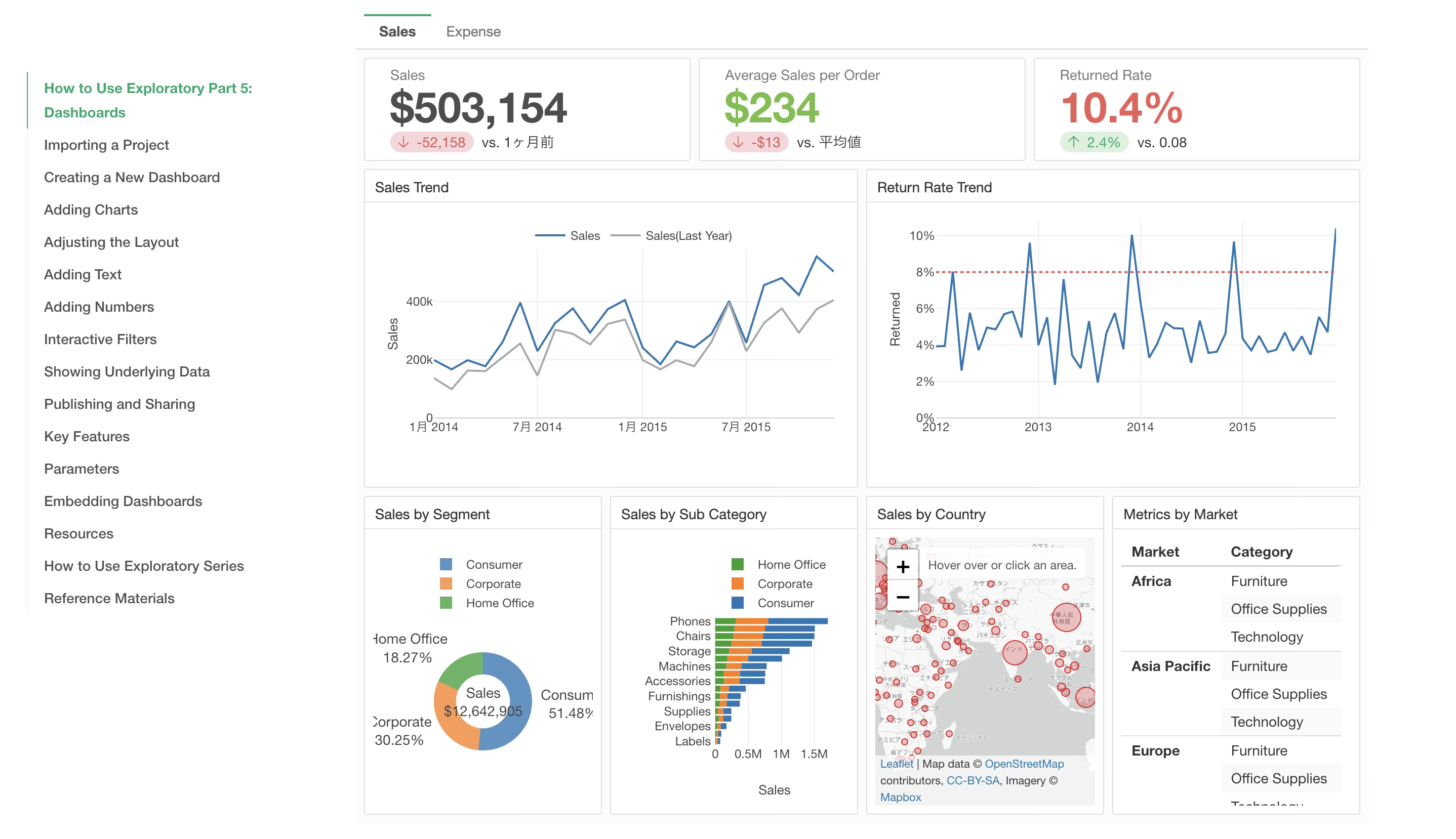
Exploratory allows you to display metrics using “Number” charts, and you can place a dedicated row for numbers at the top of the dashboard.
Add a number row using the “Add” button.
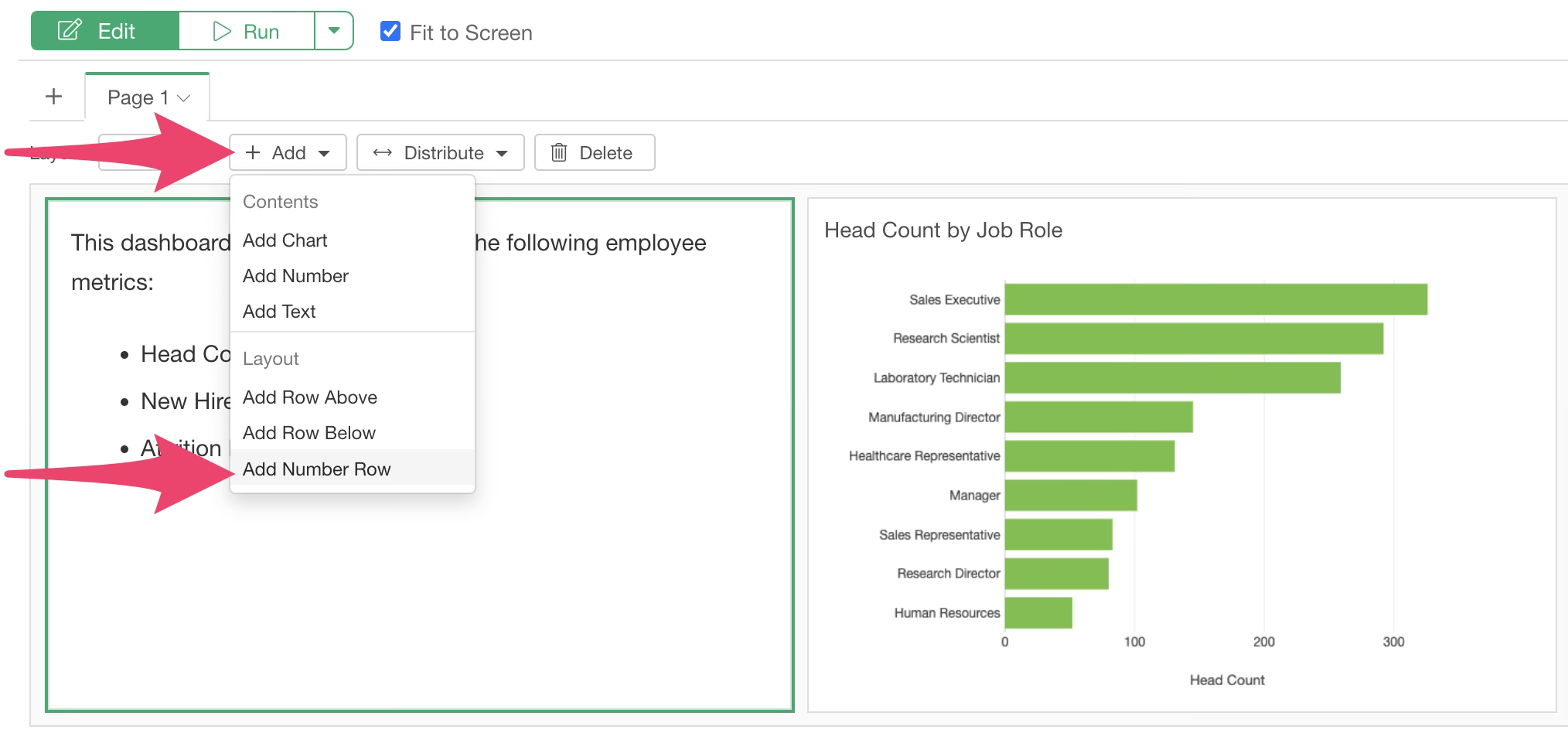
This number row is specifically for adding “Number” charts or “Text.”
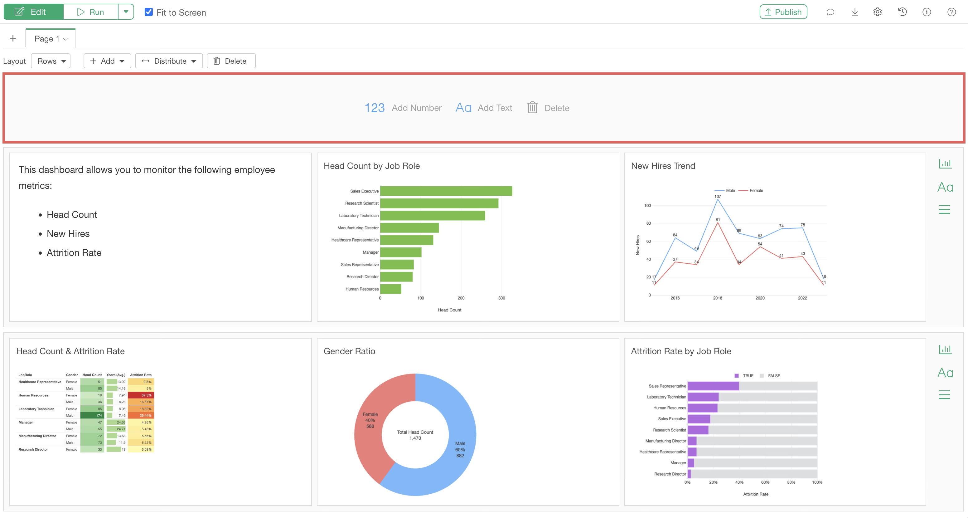
To add a number, click “Add Number.”
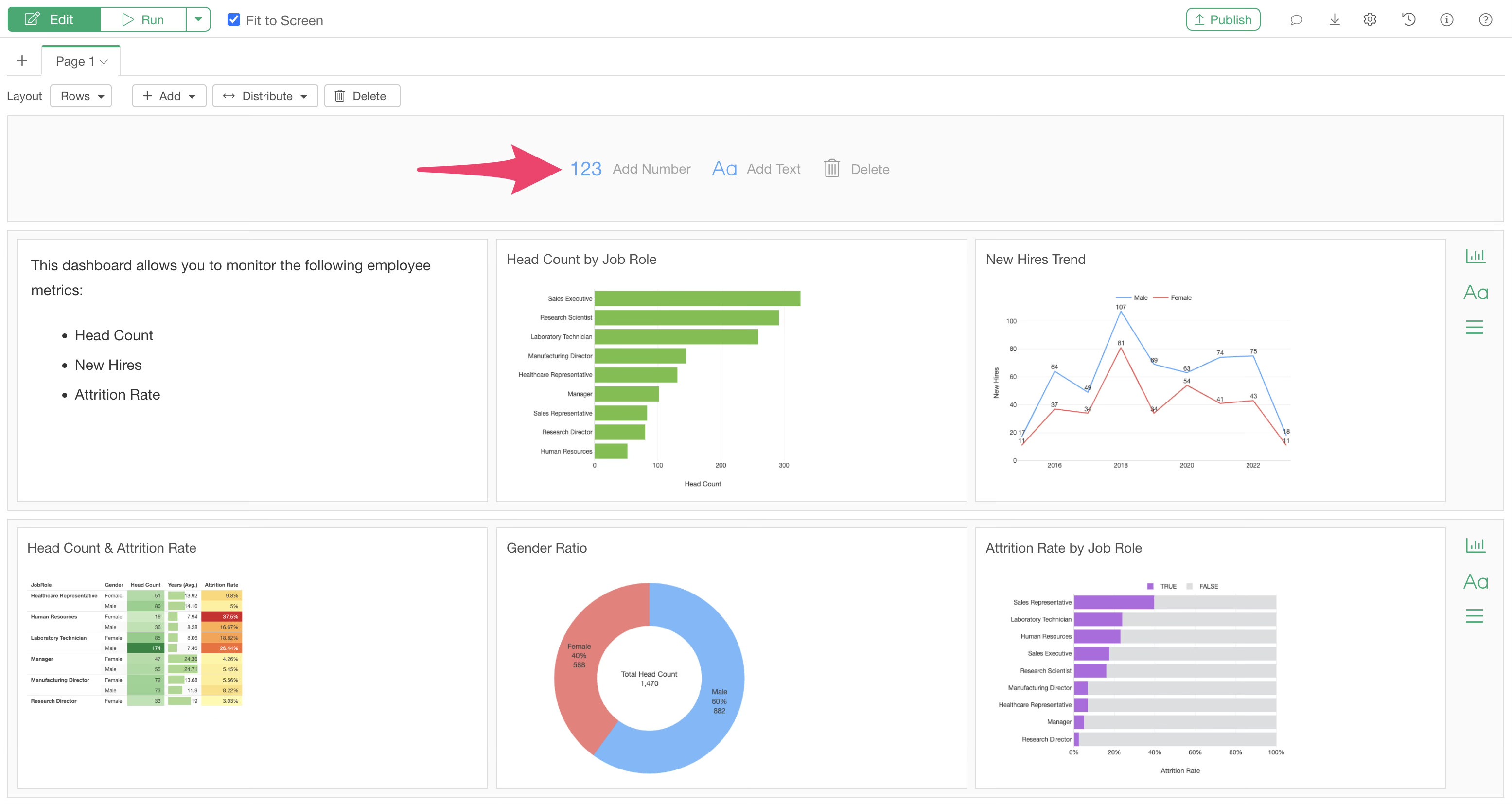
Charts other than numbers will be grayed out. Select the desired number and click OK.
This allows you to add numbers to the dashboard.
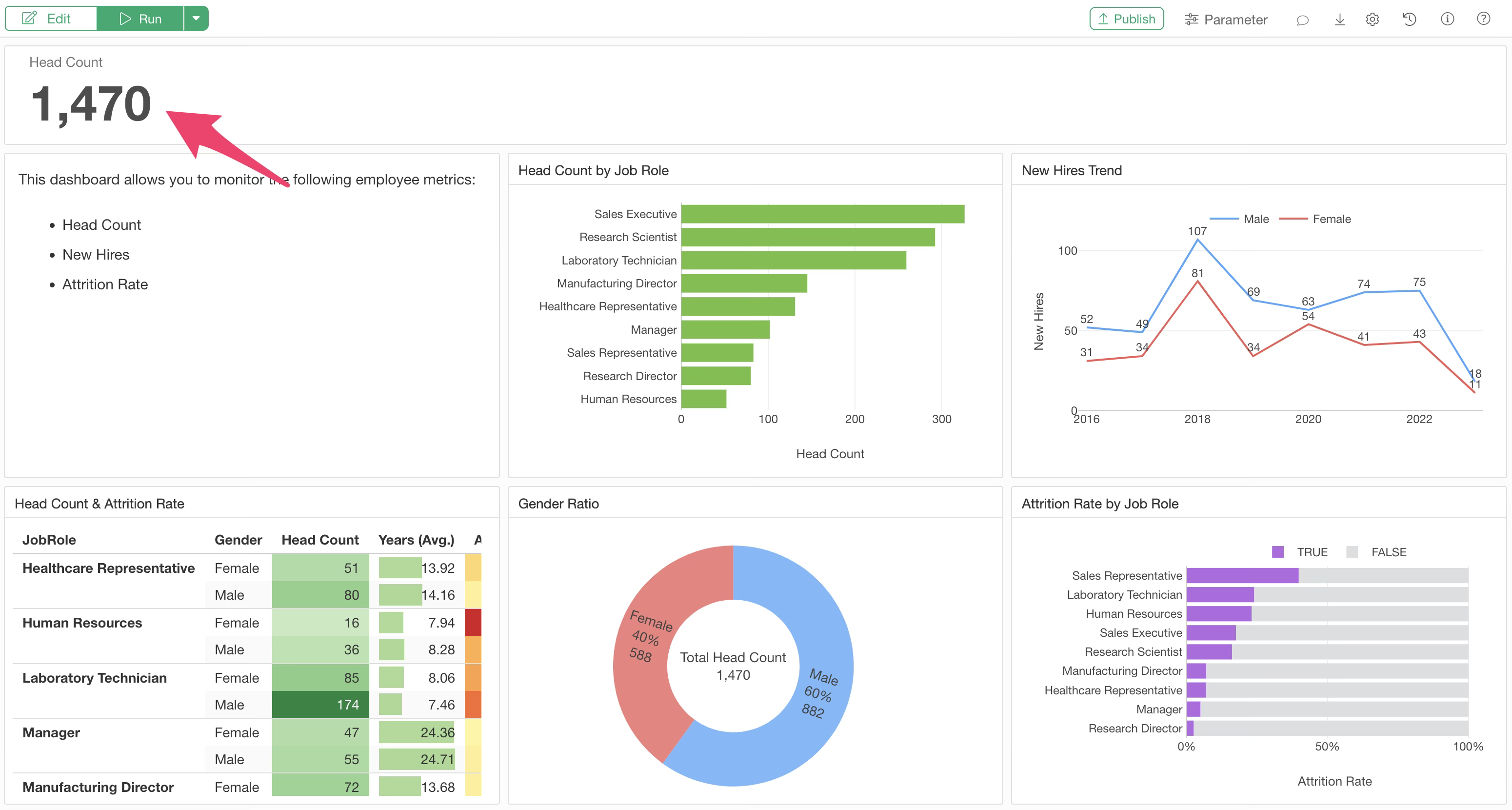
Chart and Number Settings
Several settings are available for charts and numbers added to the dashboard via the settings menu.
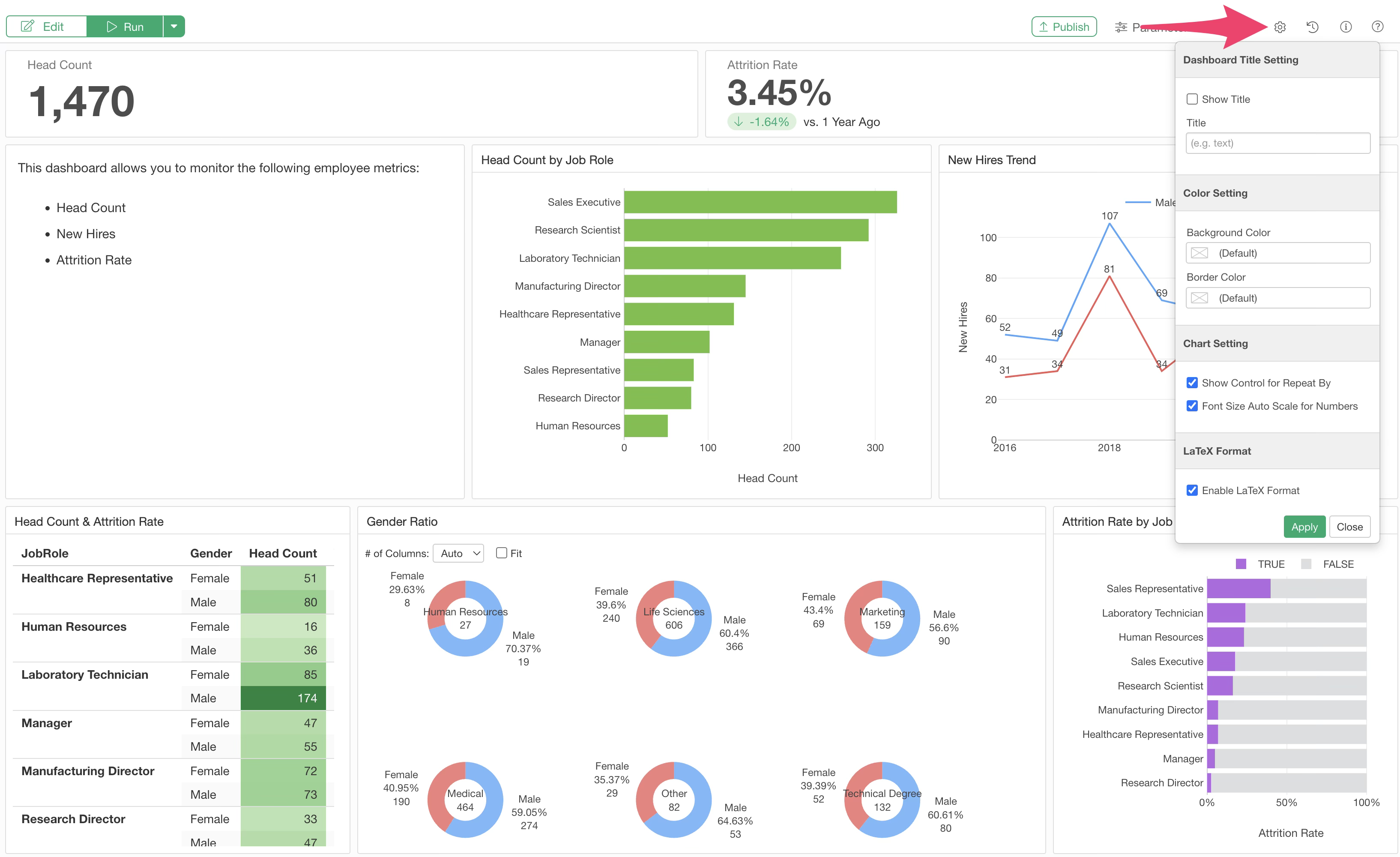
Show Controls for Repeat
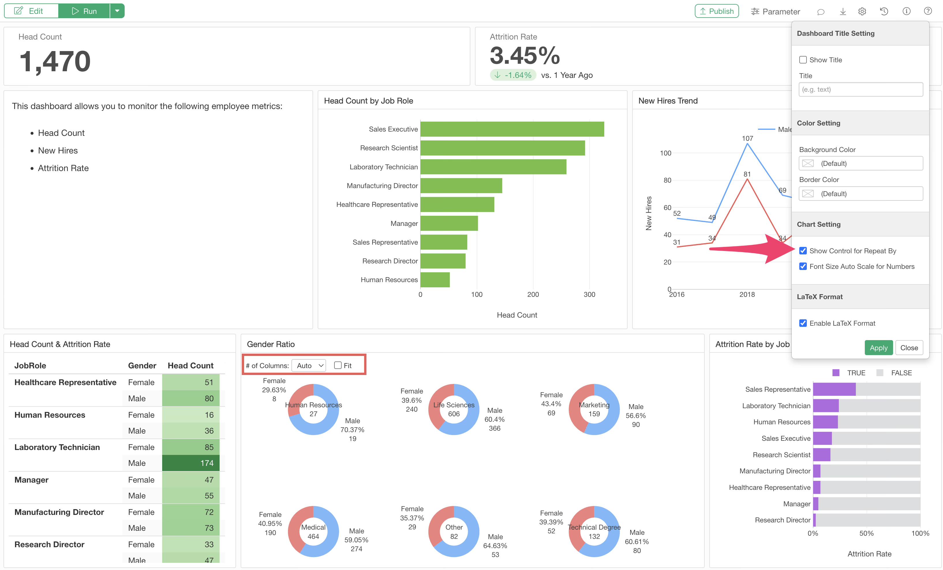
The “Show Controls for Repeat By” menu allows you to set whether to display “Number of Columns” and “Fit” settings on the dashboard for charts using the “Repeat” feature.
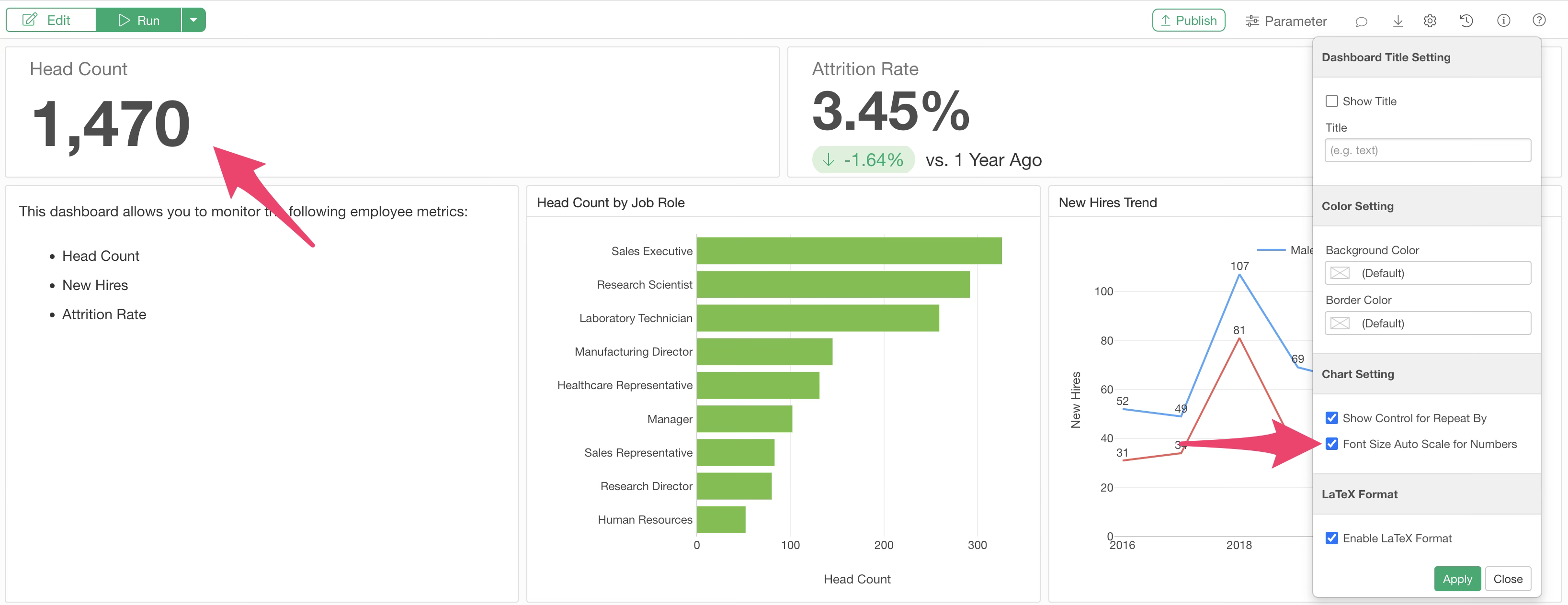
Font Size Auto Scale for Numbers
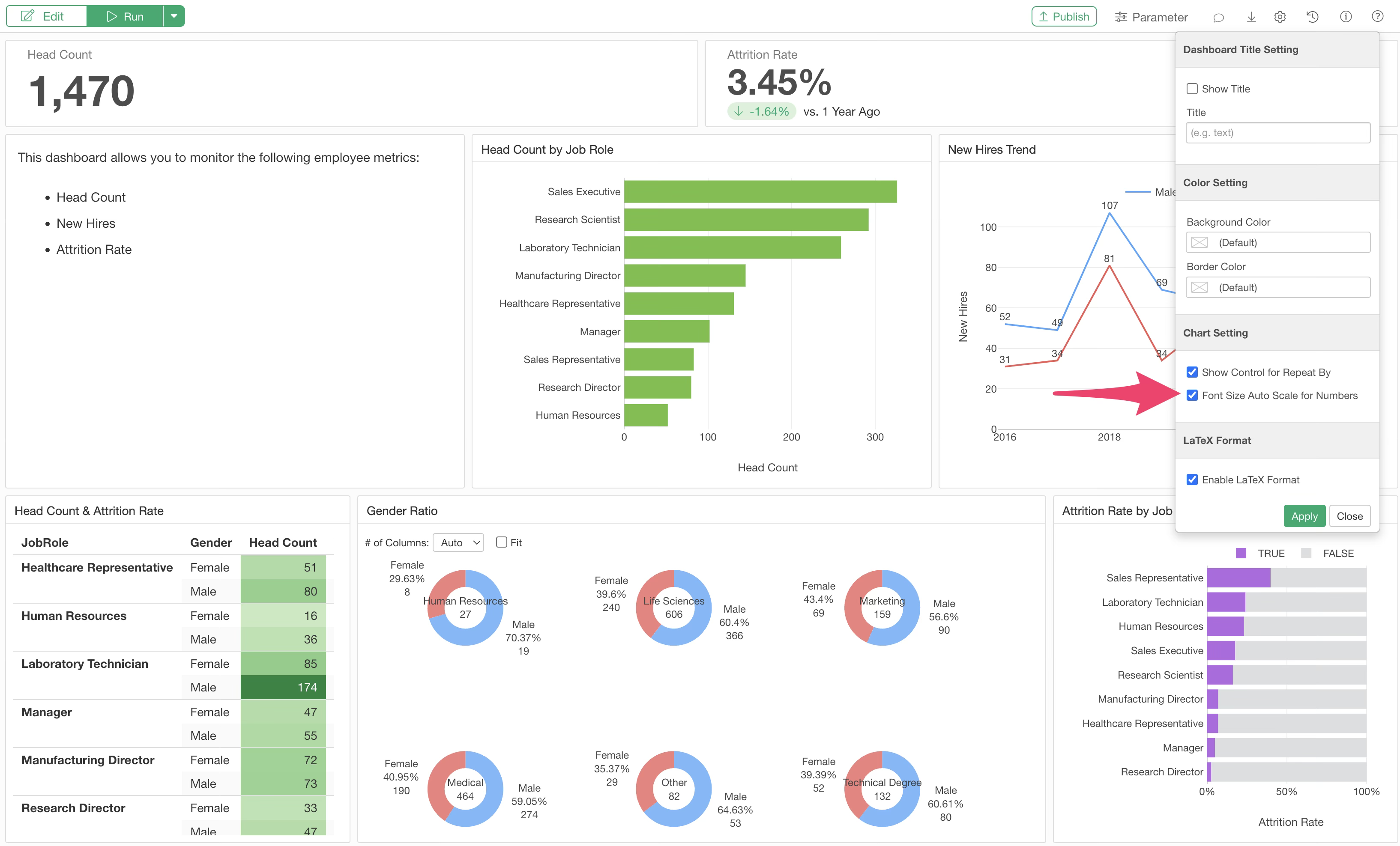
The “Font Size Auto Scale for Numbers” option is valid for numbers inserted into regular chart rows.
By default, this is checked, and the font size is automatically adjusted based on the row height.
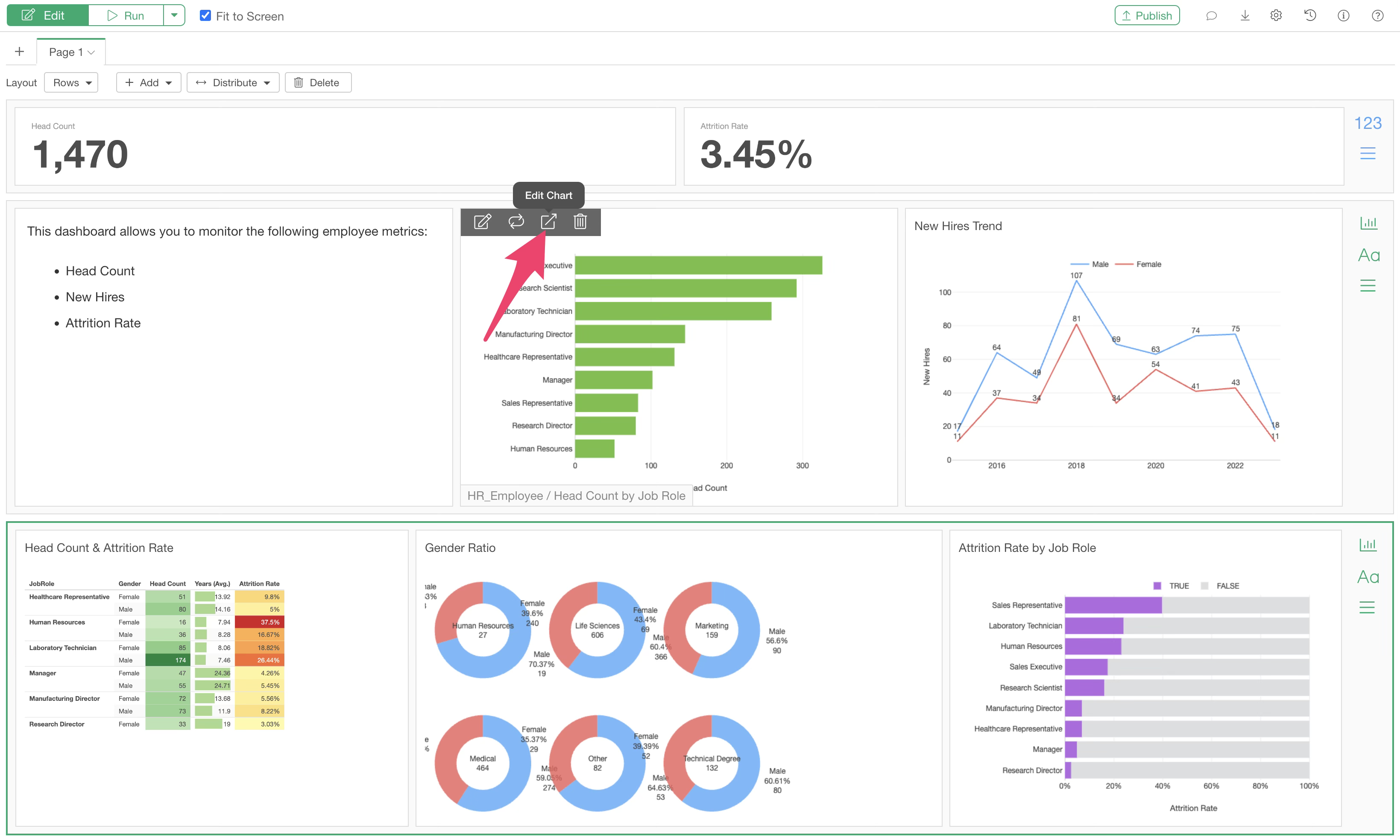
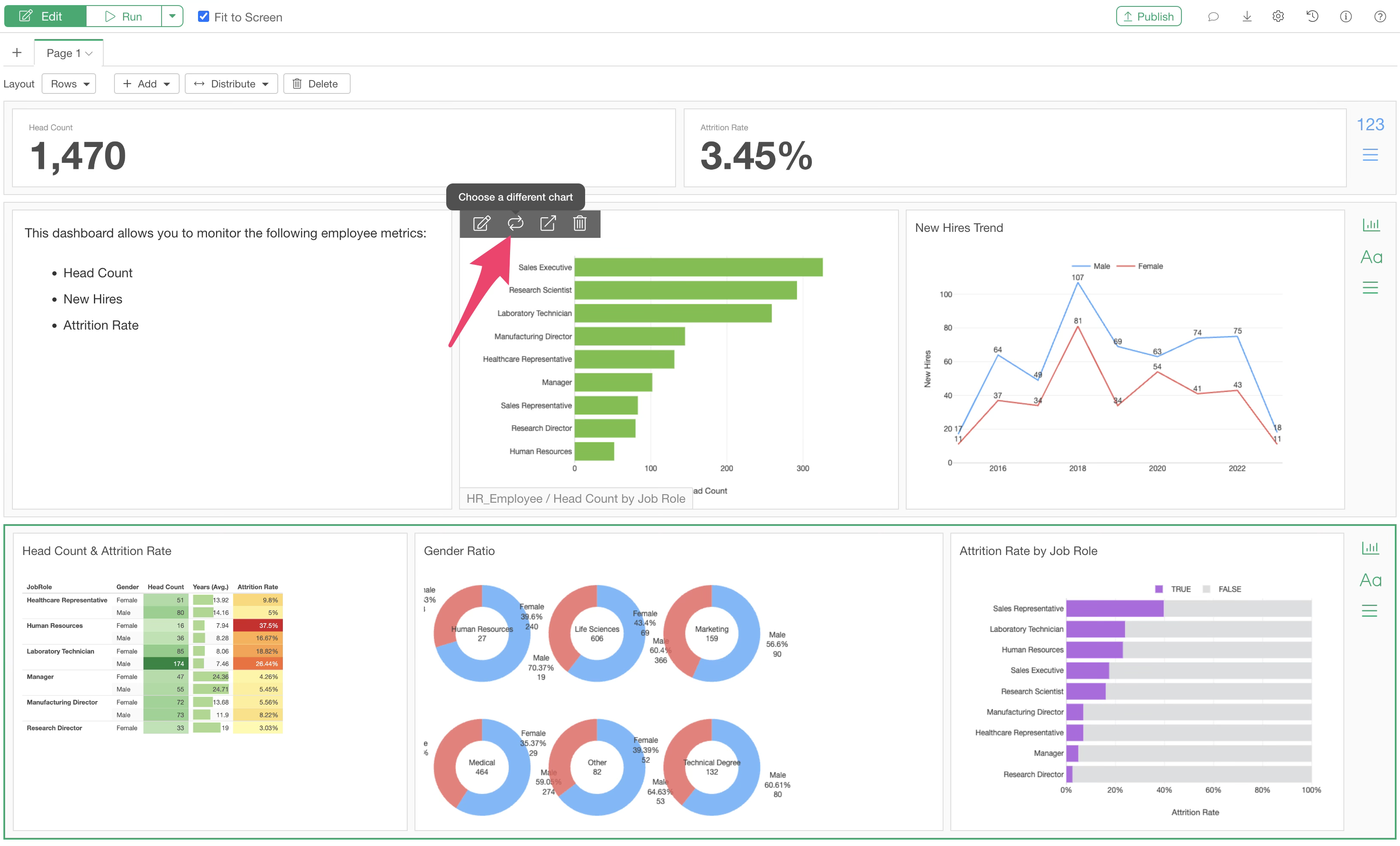
Editing Content within the Dashboard
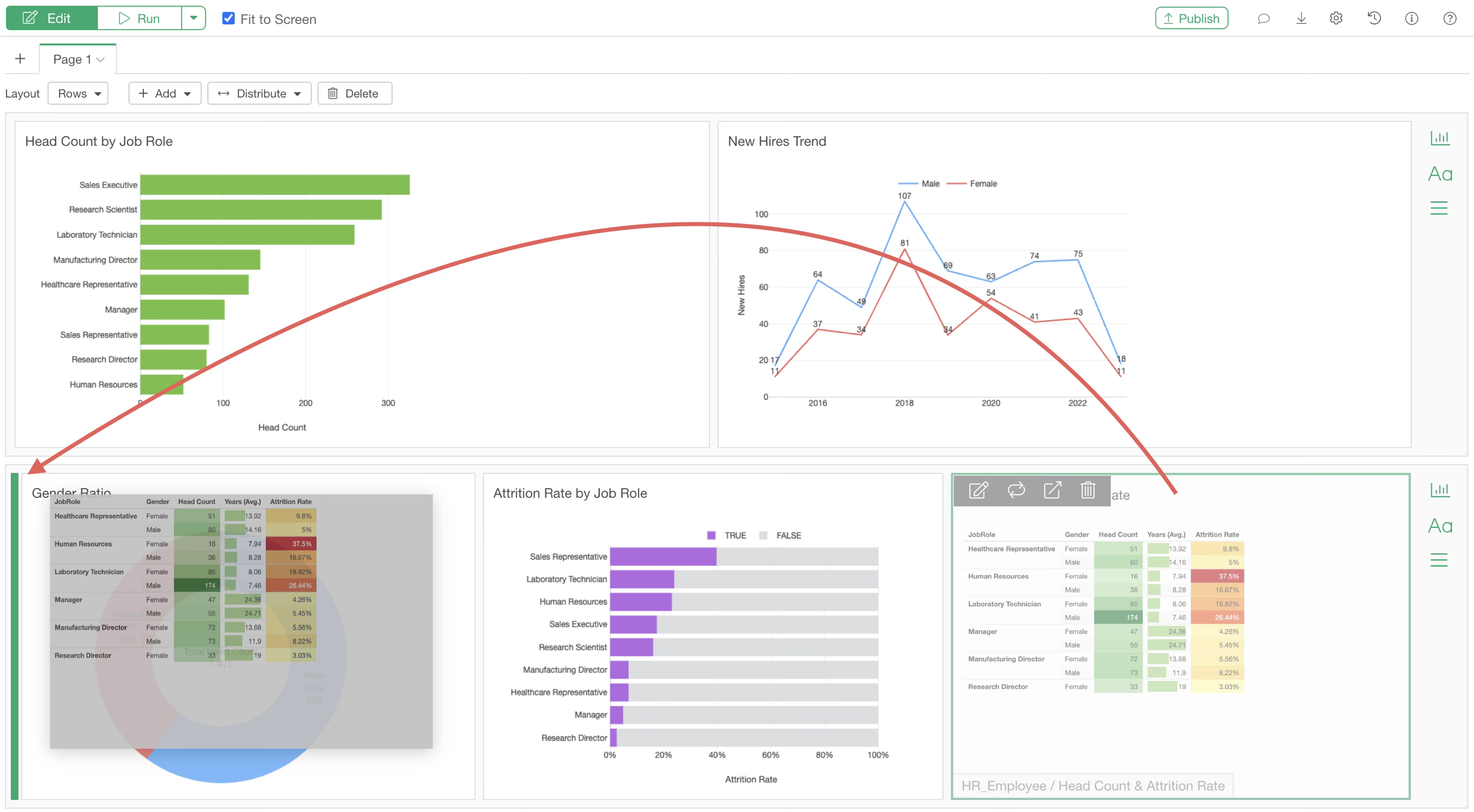
To edit a chart or analytics within the dashboard, hover your mouse over the chart.
A toolbar will appear. Clicking the edit icon will directly open the corresponding chart tab, allowing you to edit the chart or analytics immediately.
If you click the “Choose a different chart” icon, the chart selection dialog shows up and you can replace the existing chart.
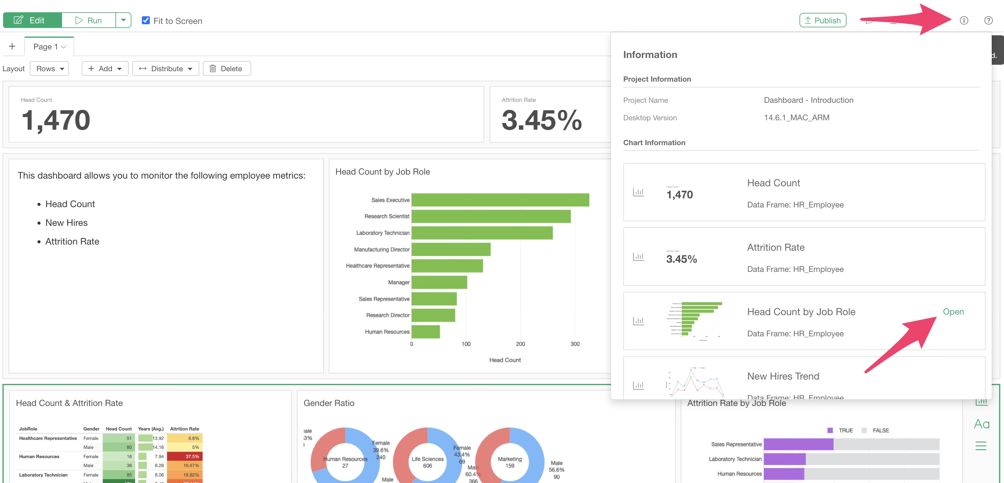
Clicking the information icon displays all charts included in the dashboard and the names of the data frames associated with them.
Hovering over a chart block reveals an “Open” button, which you can click to open the chart directly.
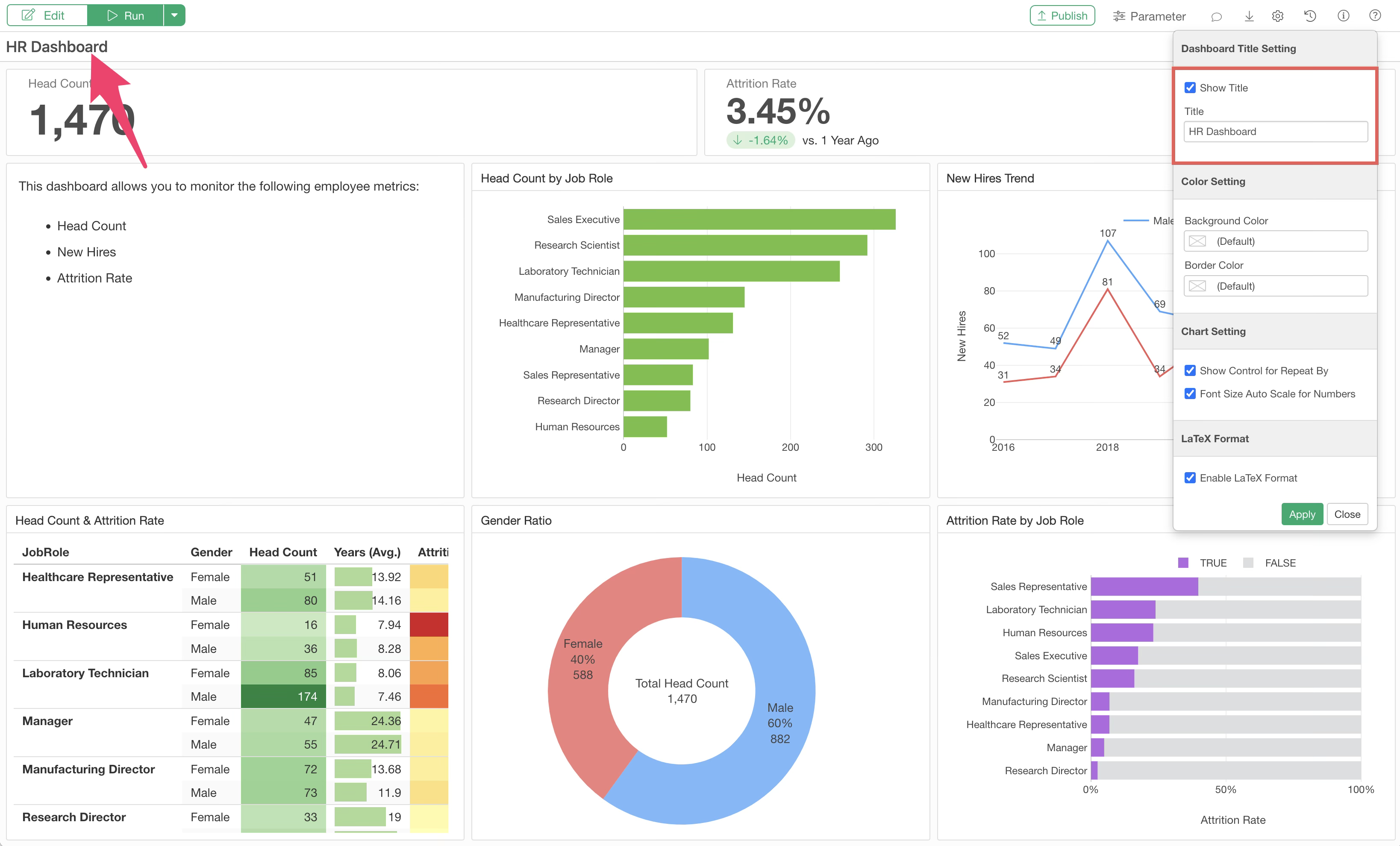
Title Settings
Dashboard Title
If you want to display a title within the dashboard, you can specify it in the dashboard settings.
Content (Chart) Title
Normally, the chart (chart tab) name is used as the title for charts inserted into the dashboard. If you want to set a different name, you can change it using the title edit icon.
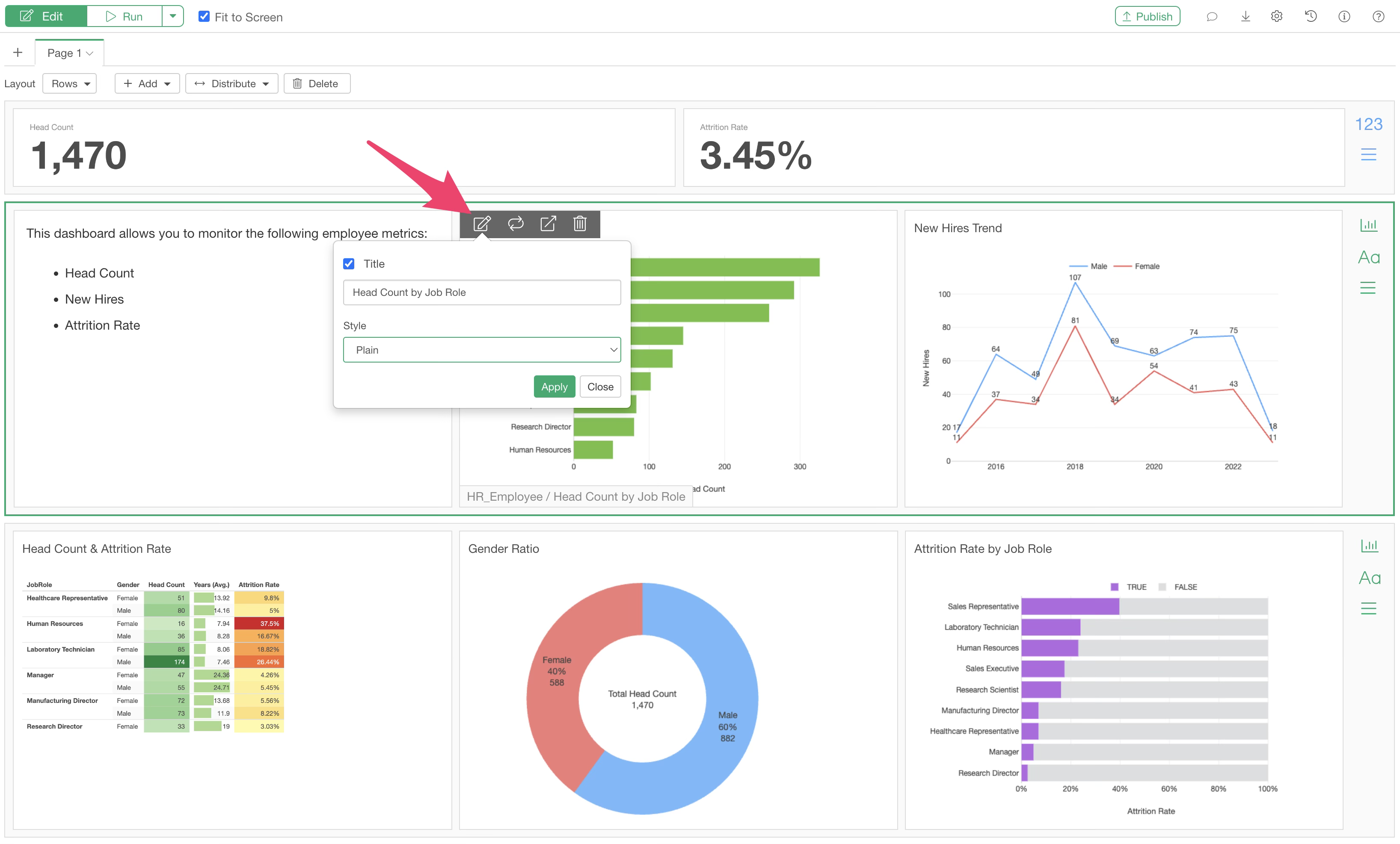
In addition you can change the style of the title.
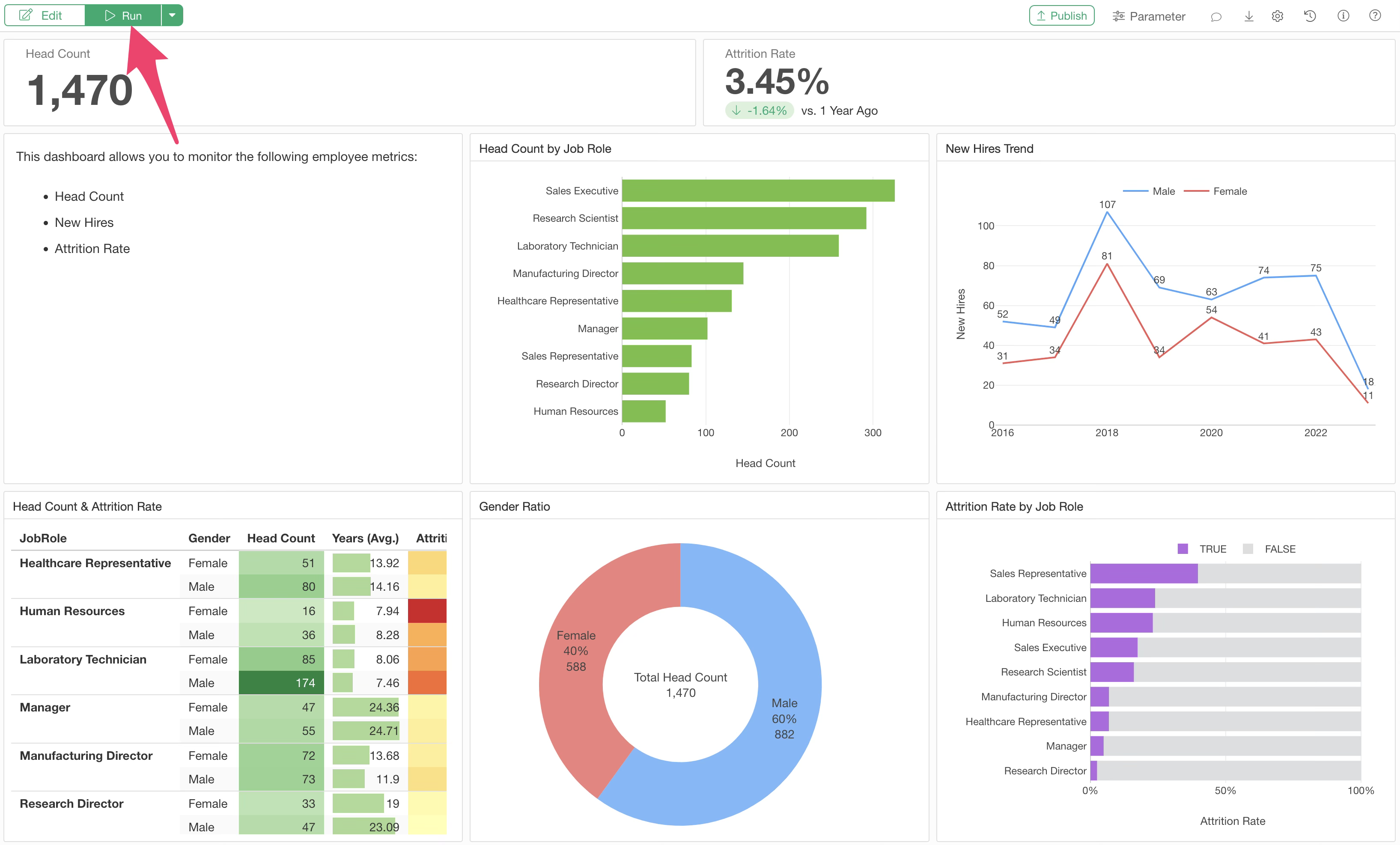
Running the Dashboard
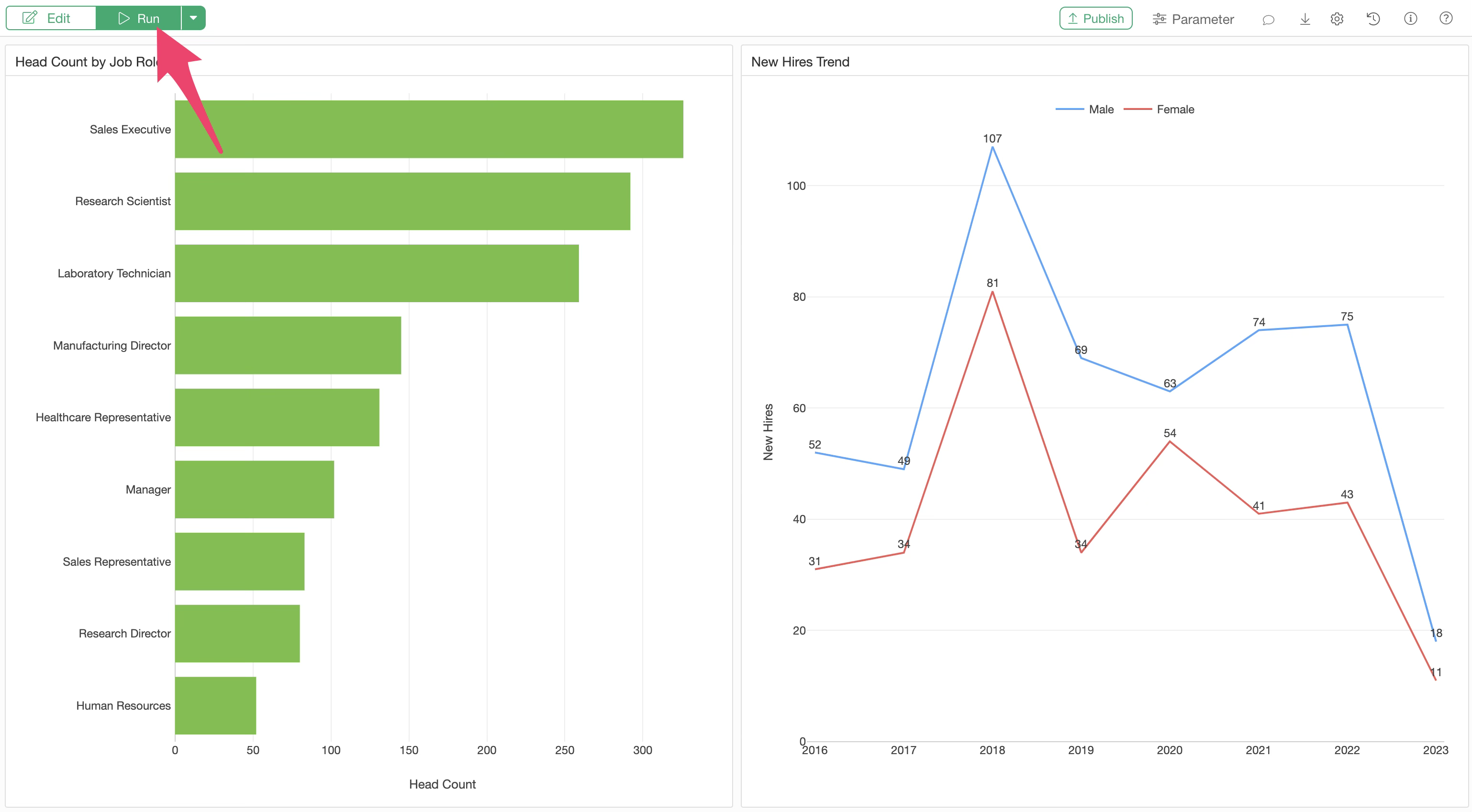
To check the content of the edited dashboard, run the dashboard.
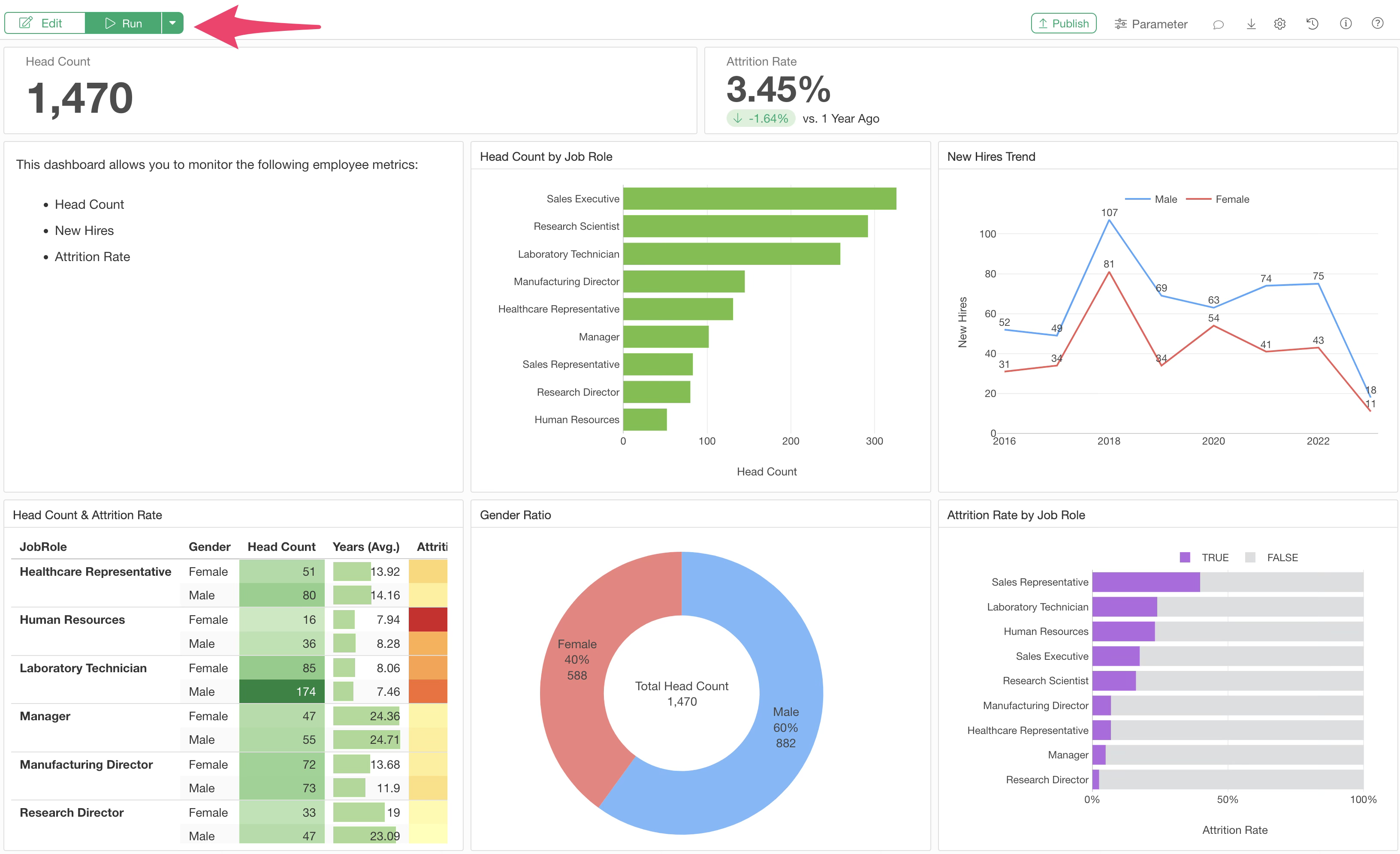
On the screen after execution, just like when viewing a chart in the Chart View, values are displayed when you hover over the chart, and you can zoom into each chart.
Data Filtering
Interactive Filter
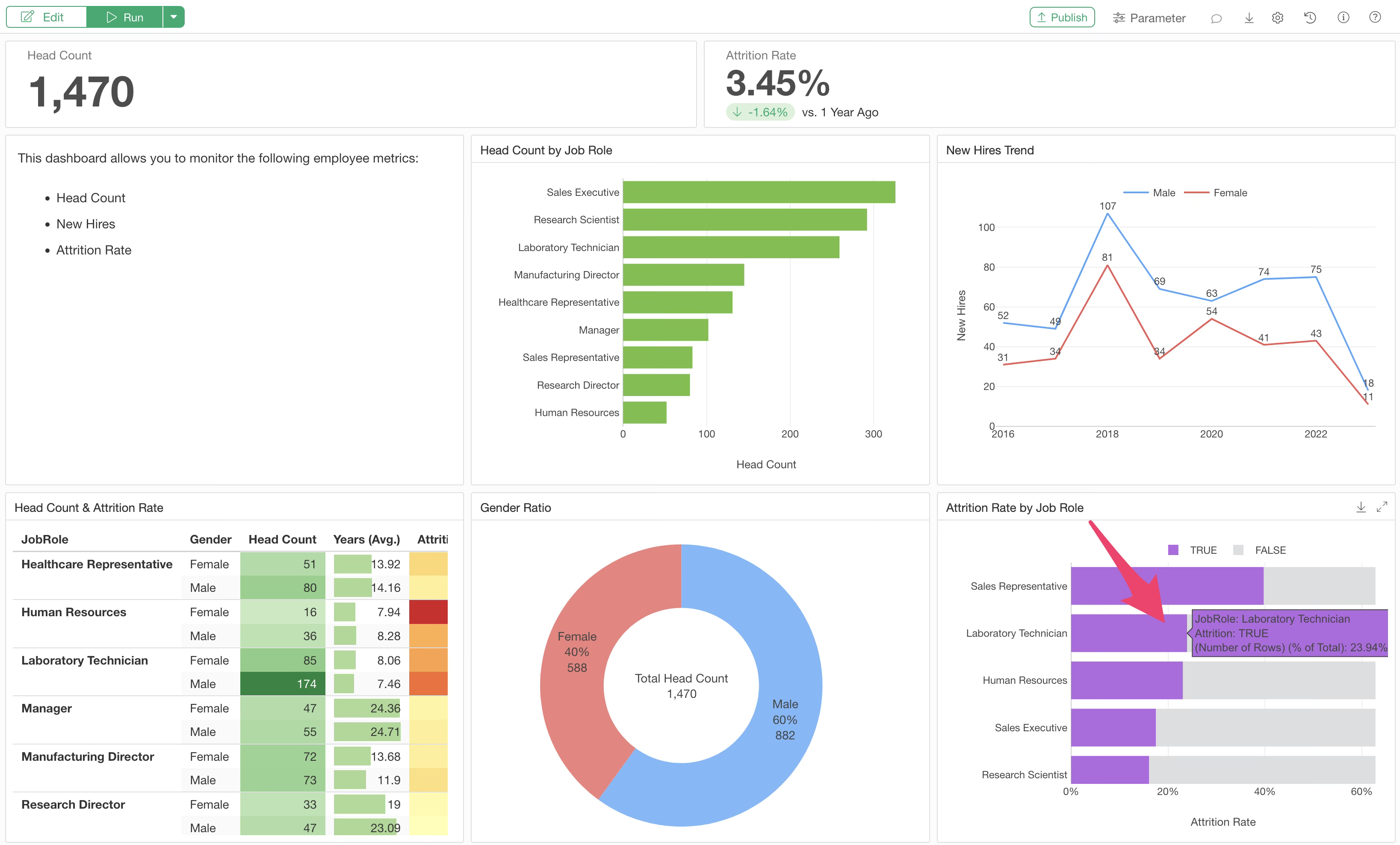
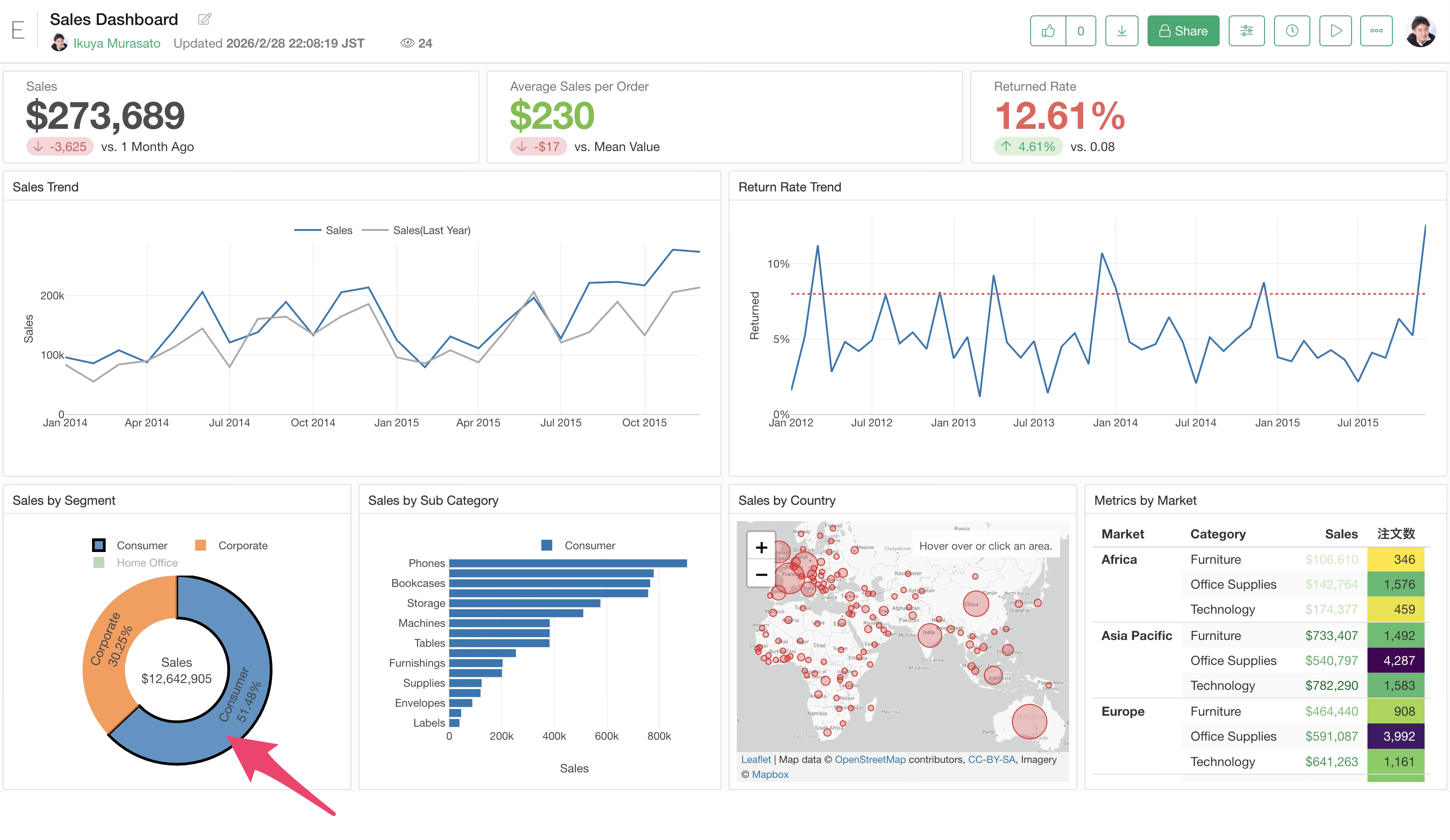
If you want to narrow down the data displayed in the dashboard, you can easily do so by clicking on a group within a chart. This feature is called the Interactive Filter.
For example, click on “Female” in a pie chart.
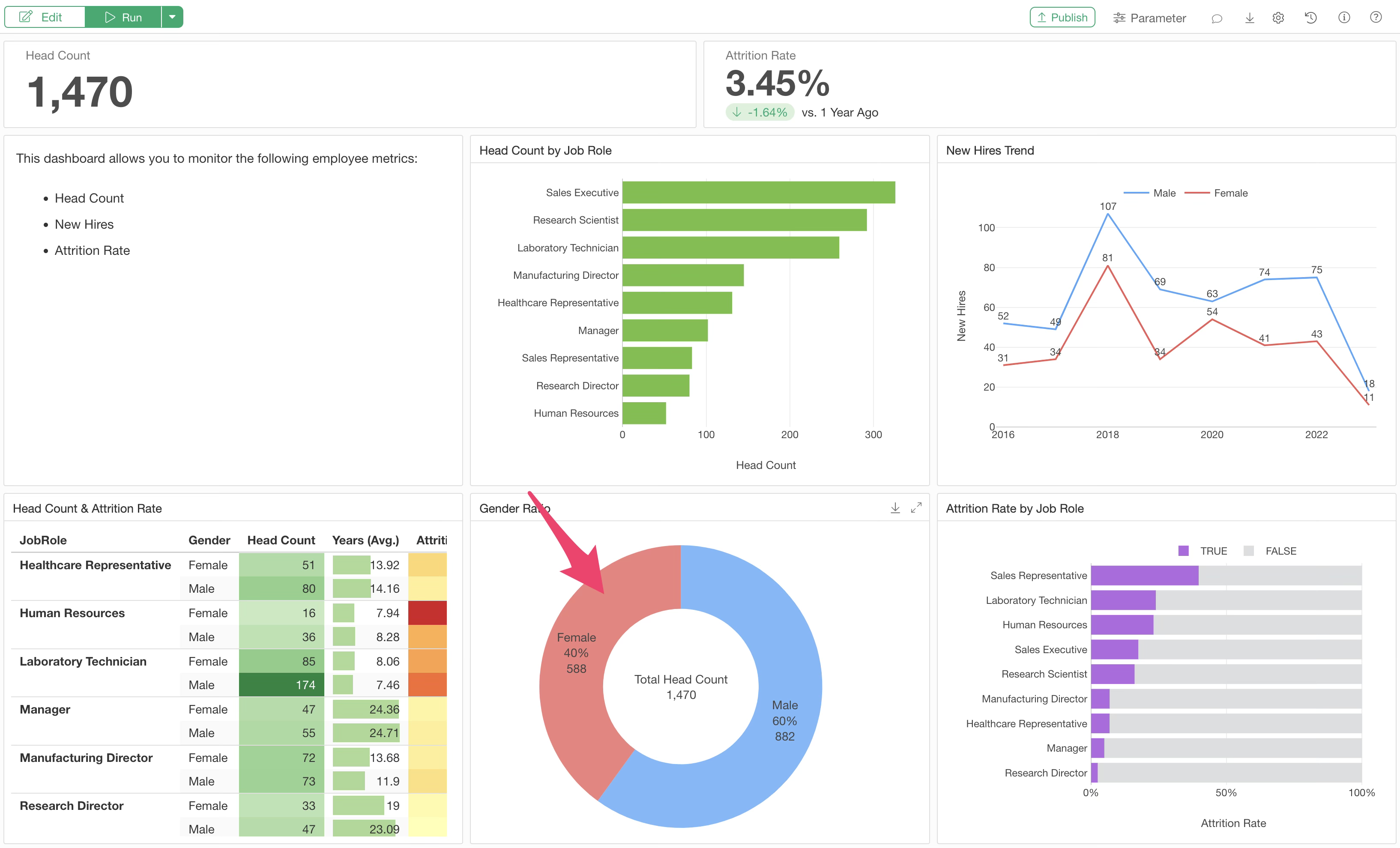
The other charts and numbers in the dashboard will then display results filtered only for “Female” data.
For instance, if the original employee count was “1,470,” it changes to “588,” which is the number of female employees. Furthermore, the trend in the number of new employees will also reflect only female results.
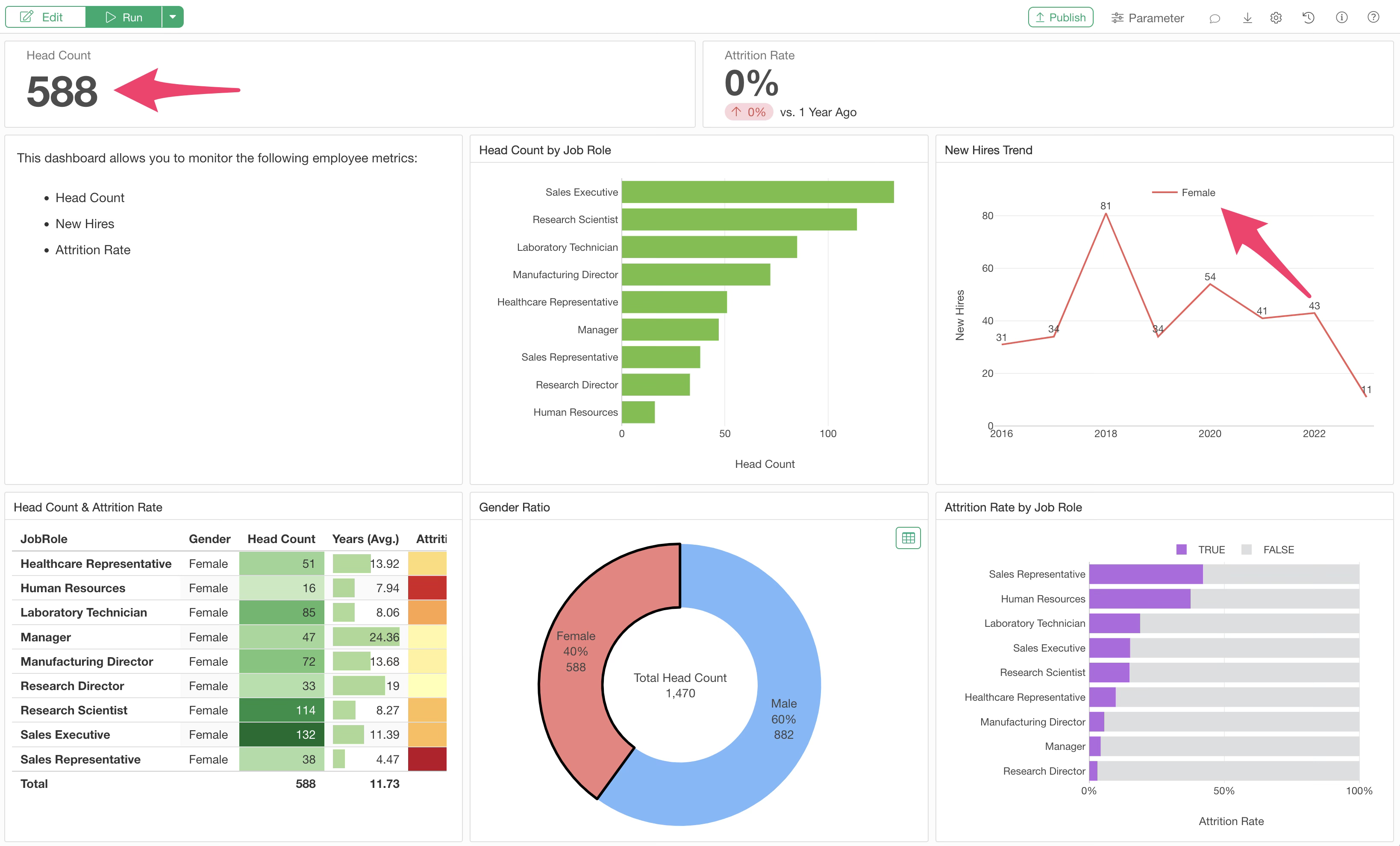
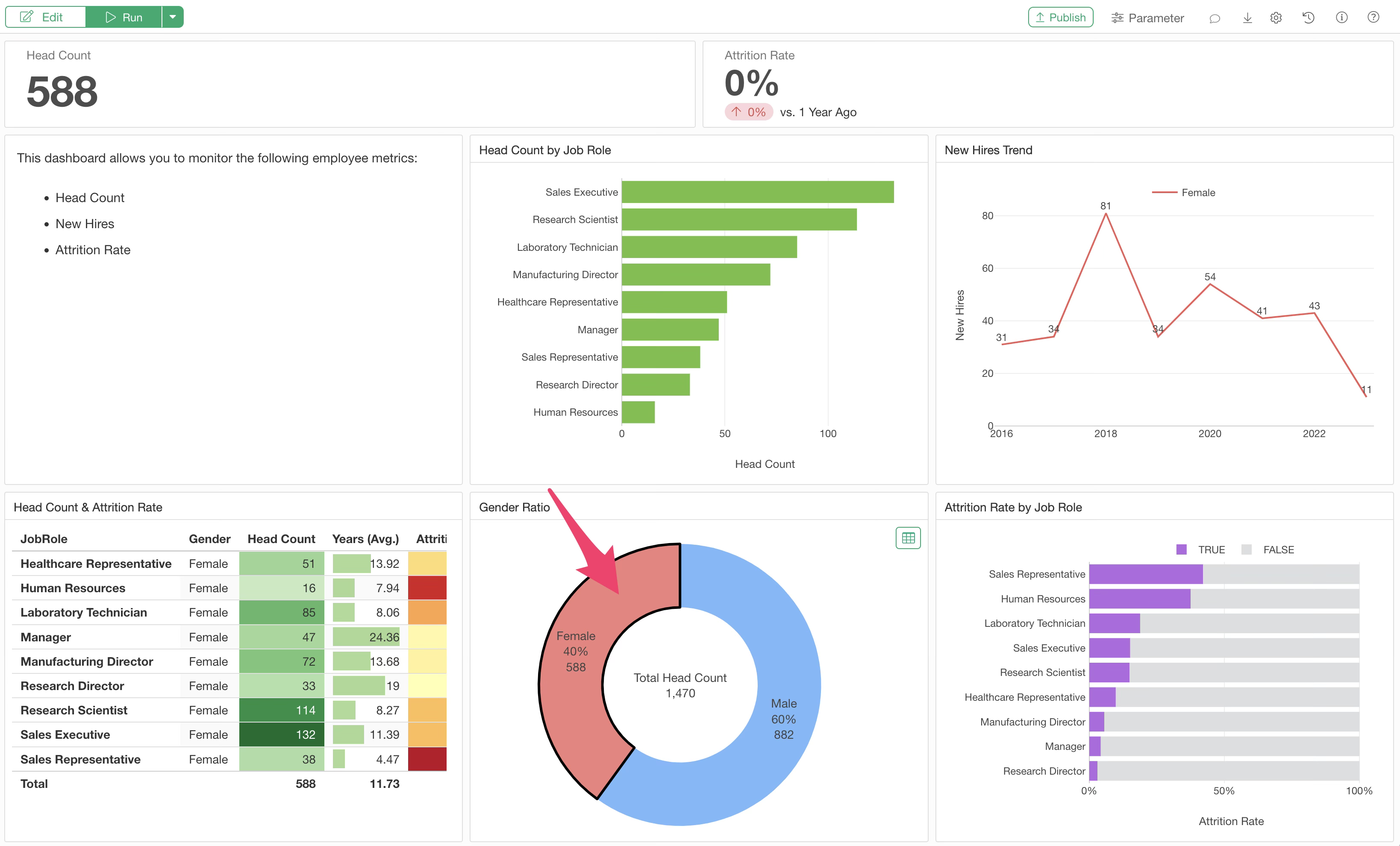
To clear the Interactive Filter, click on the filtered area again.
Parameters
While Interactive Filters allow you to filter charts by clicking specific groups, “Parameters” are used when you want to filter data more flexibly, such as specifying a date range or a numeric range.
Parameters can make the dashboard more interactive by changing calculation methods or SQL query content for databases, in addition to filtering data.
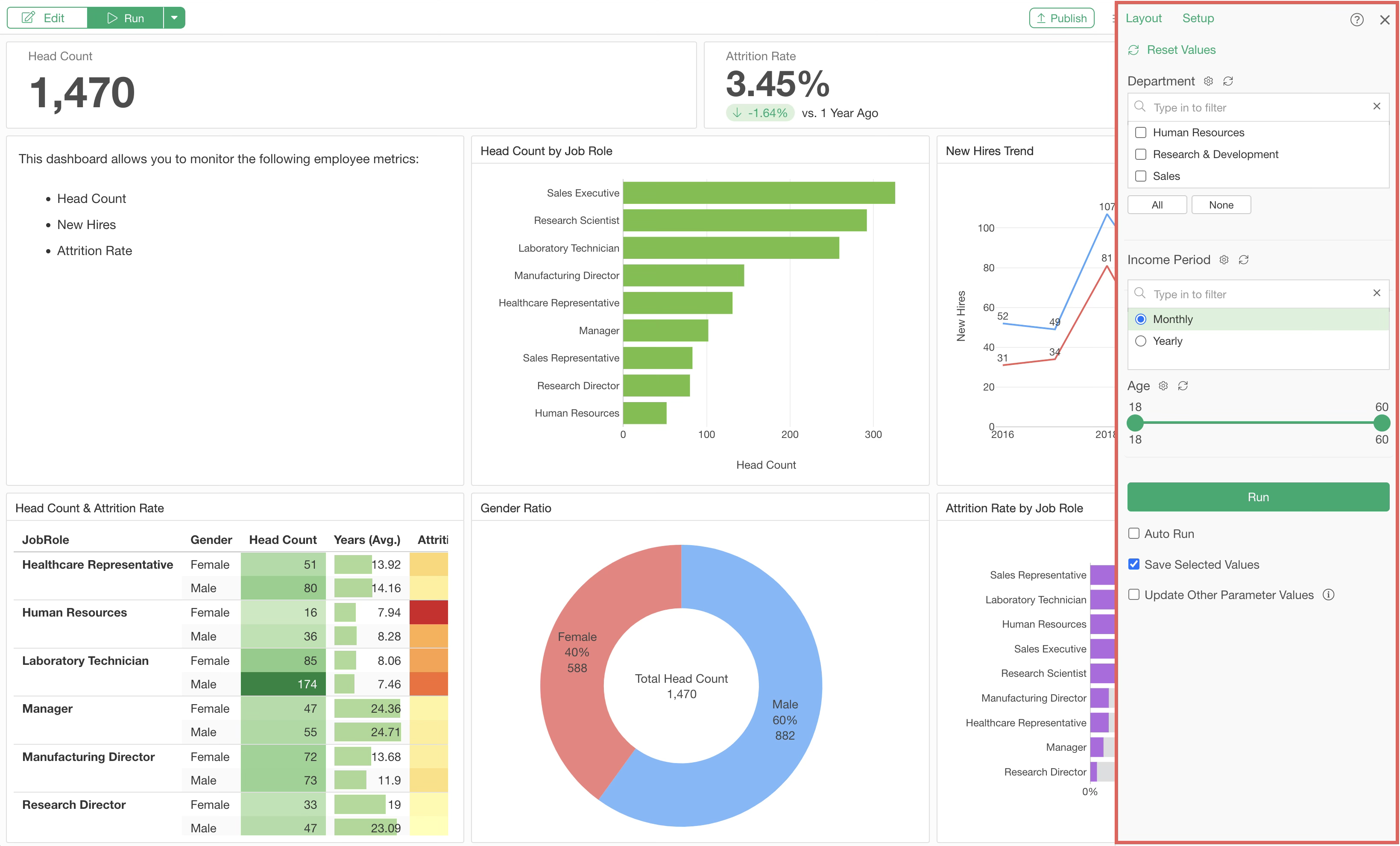
For more details on parameters, please refer to this document.
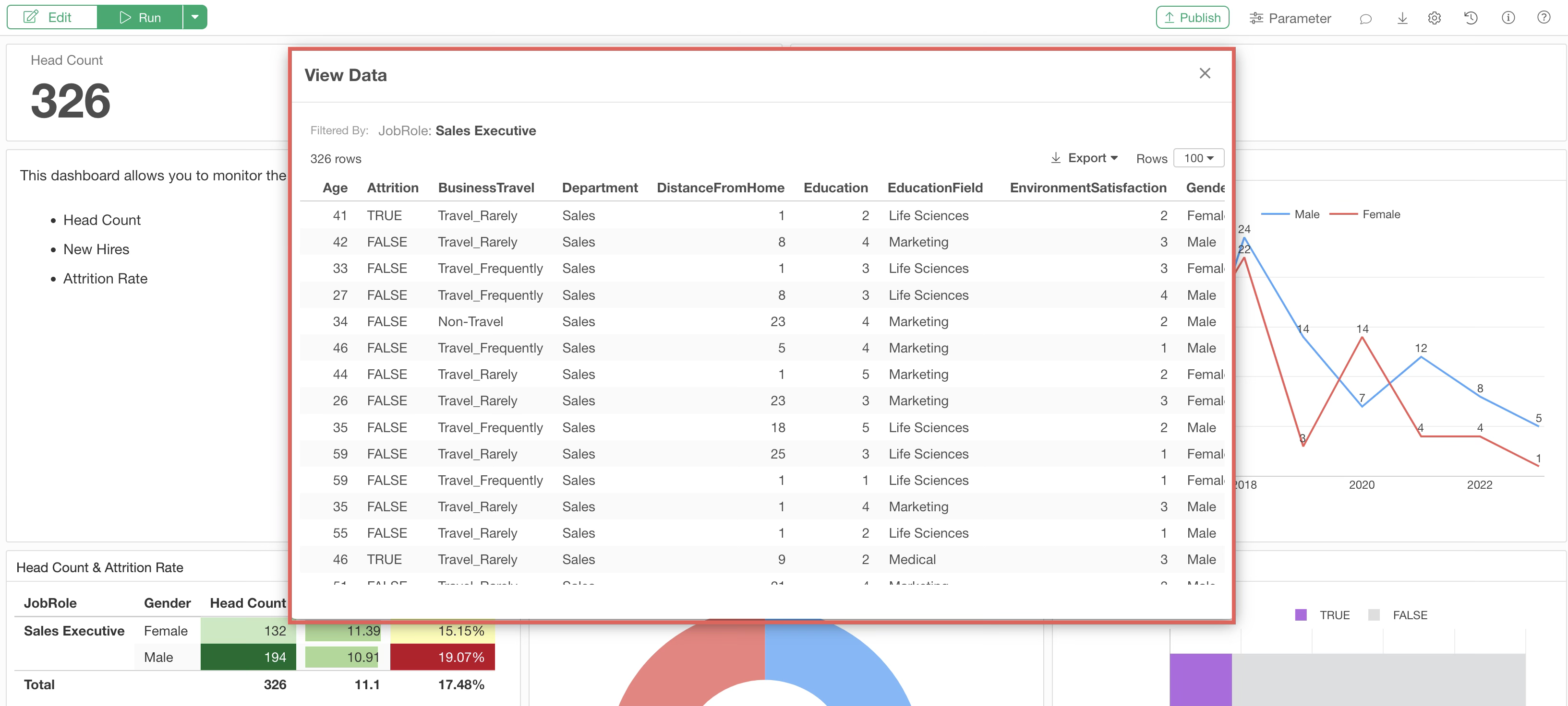
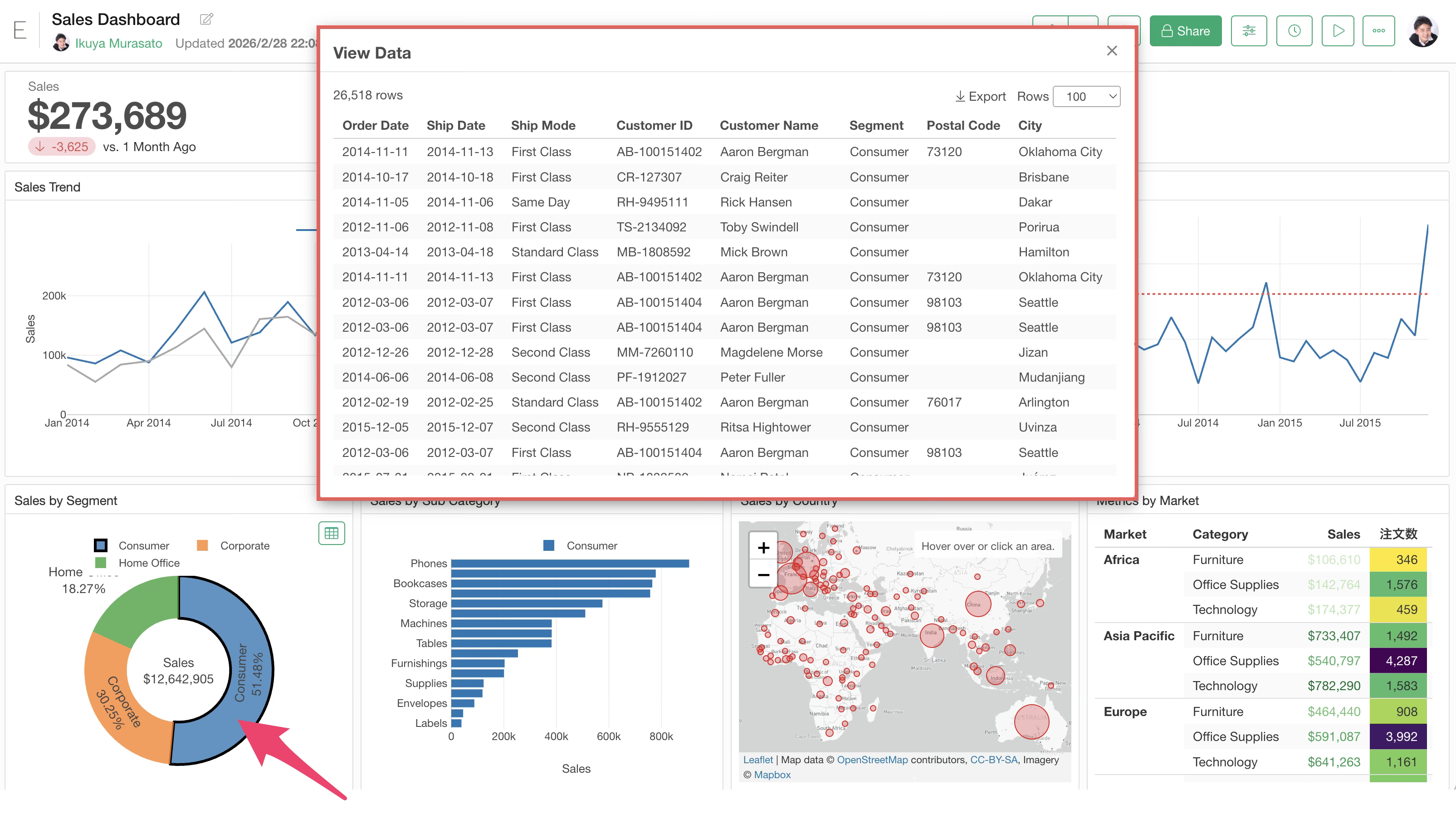
Viewing Detailed Data
People sharing the dashboard may want to know the detailed data behind a chart—for example, details about customers or sales that make up the chart.
In such cases, click a specific group in a chart on the dashboard and click the “Table” button at the top right of the chart.
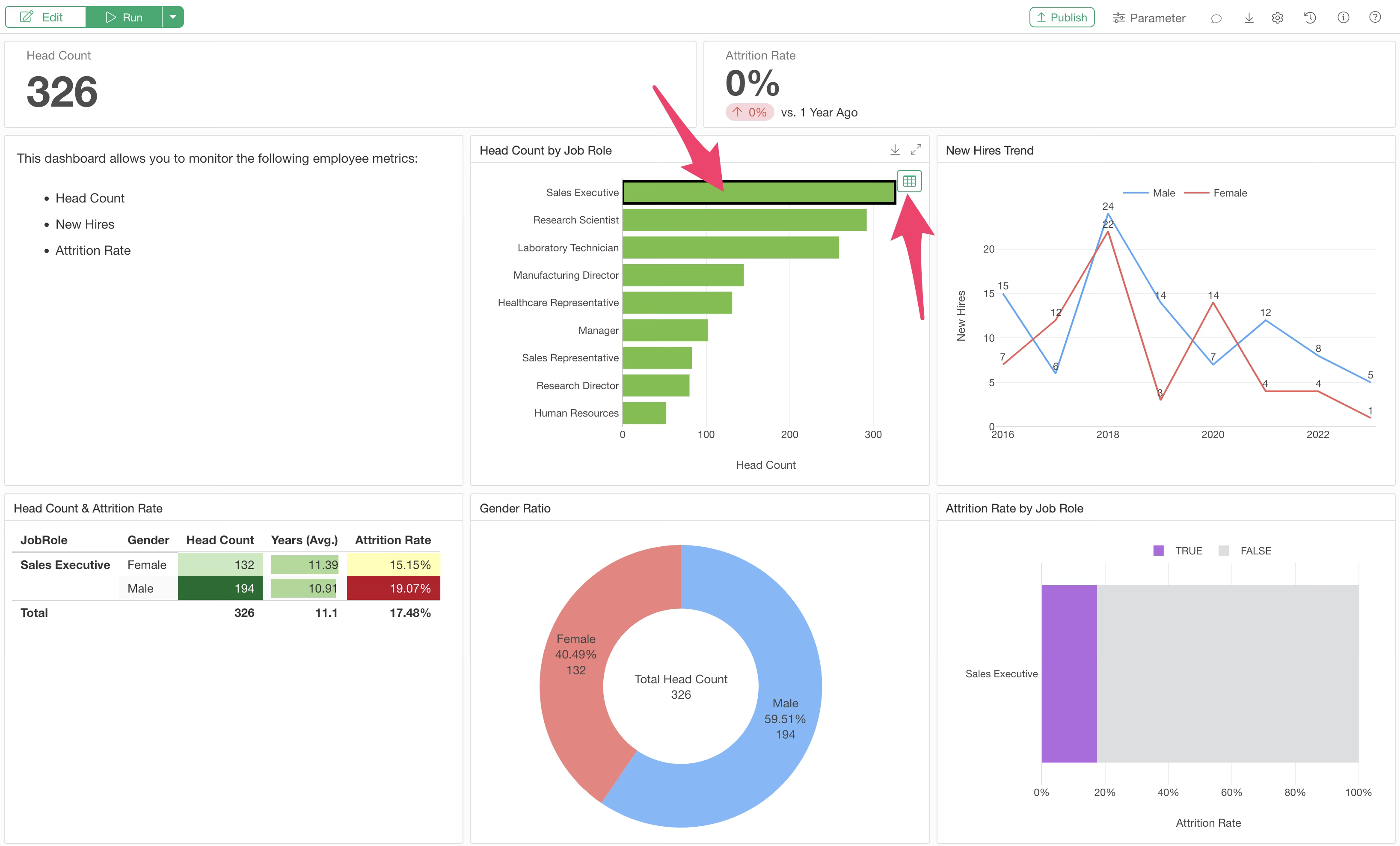
This opens the “View Data” dialog, where you can check the data belonging to that group in a table format.
Updating Dashboard Data
Even if you update the settings of a chart inserted into the dashboard (e.g., selected columns or aggregation functions) while editing the dashboard, the changes will not be reflected in the dashboard immediately.
This is because the content visible in the dashboard reflects the results at the time the chart was added. Therefore, after modifying a chart, you must re-run the dashboard.
Update by Re-importing Data
To update the dashboard after re-fetching data from the data source, select “Run (Re-import Data)” from the run menu.
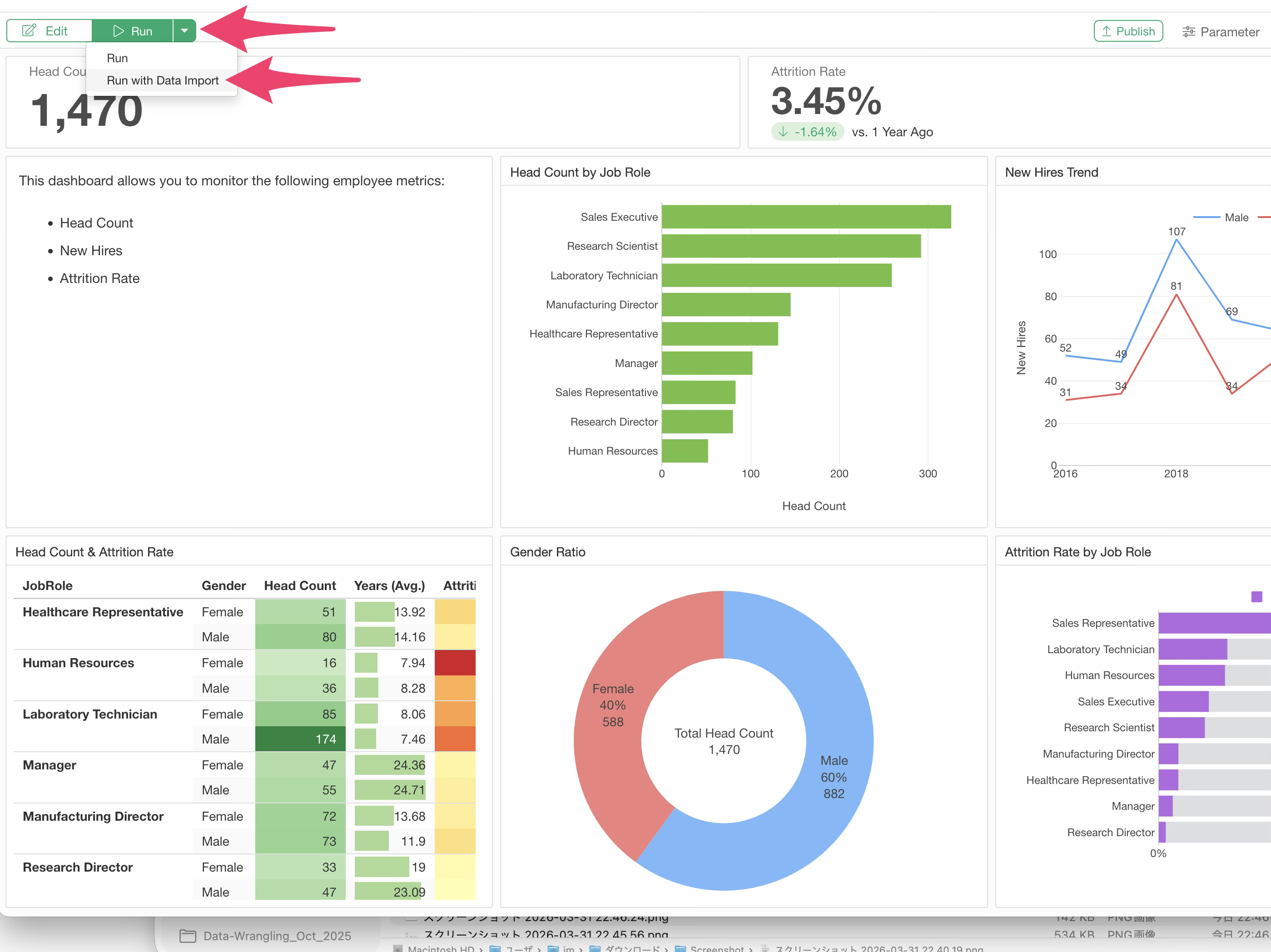
This re-imports the data and updates the charts and analytics included in the dashboard.
Reproducibility
Selecting “Export to EDF” from the export menu generates an EDF (Exploratory Data Format) file to reproduce the dashboard from Exploratory Desktop.
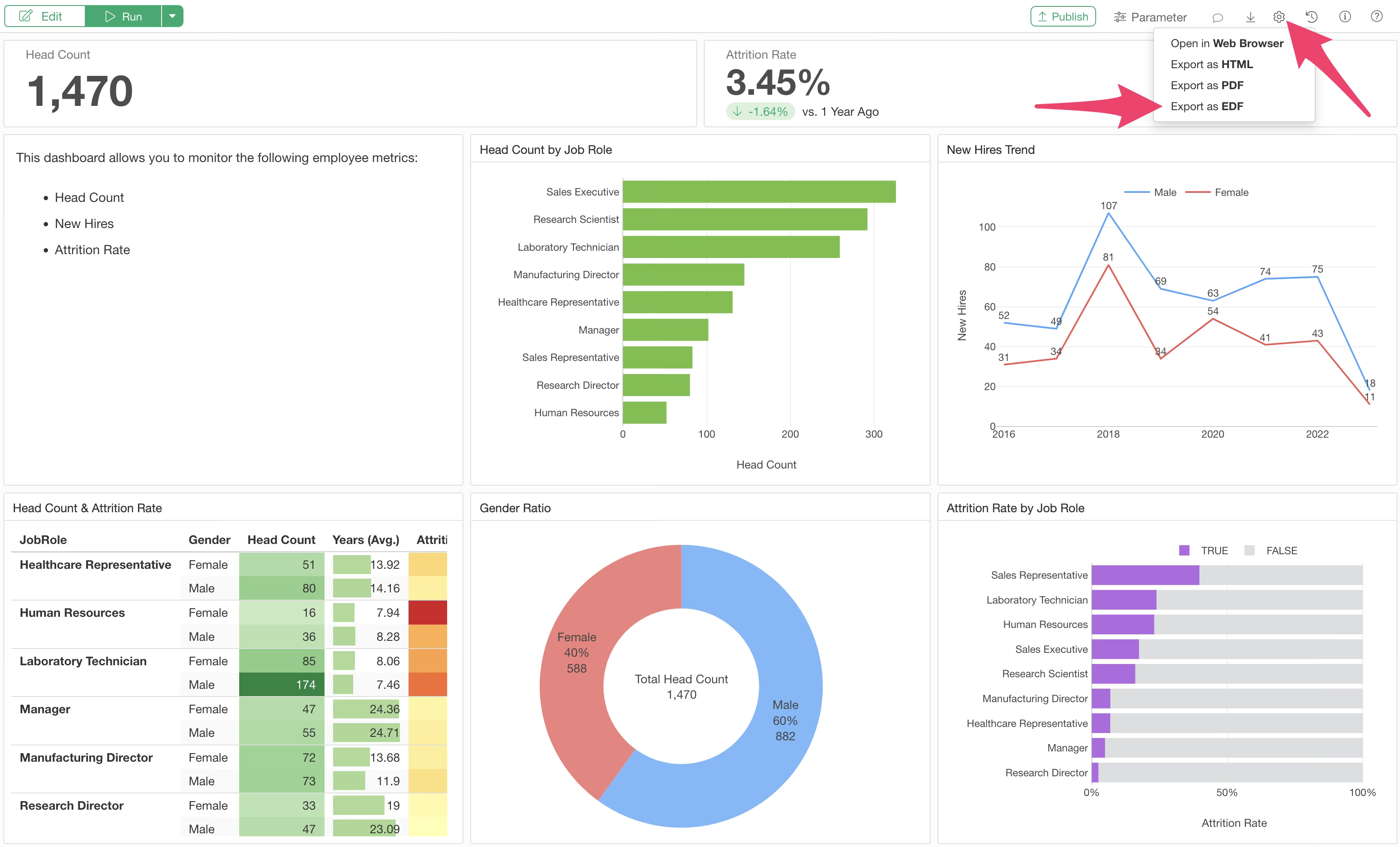
By importing the EDF into Exploratory Desktop, you can reproduce the dashboard with all necessary data, data wrangling steps, and charts. For more details, please check here.
Sharing (Publishing and Exporting)
Created dashboards can be published to the Exploratory Server and shared with others so they can be viewed anytime, anywhere via a browser. You can also export the dashboard as a file.
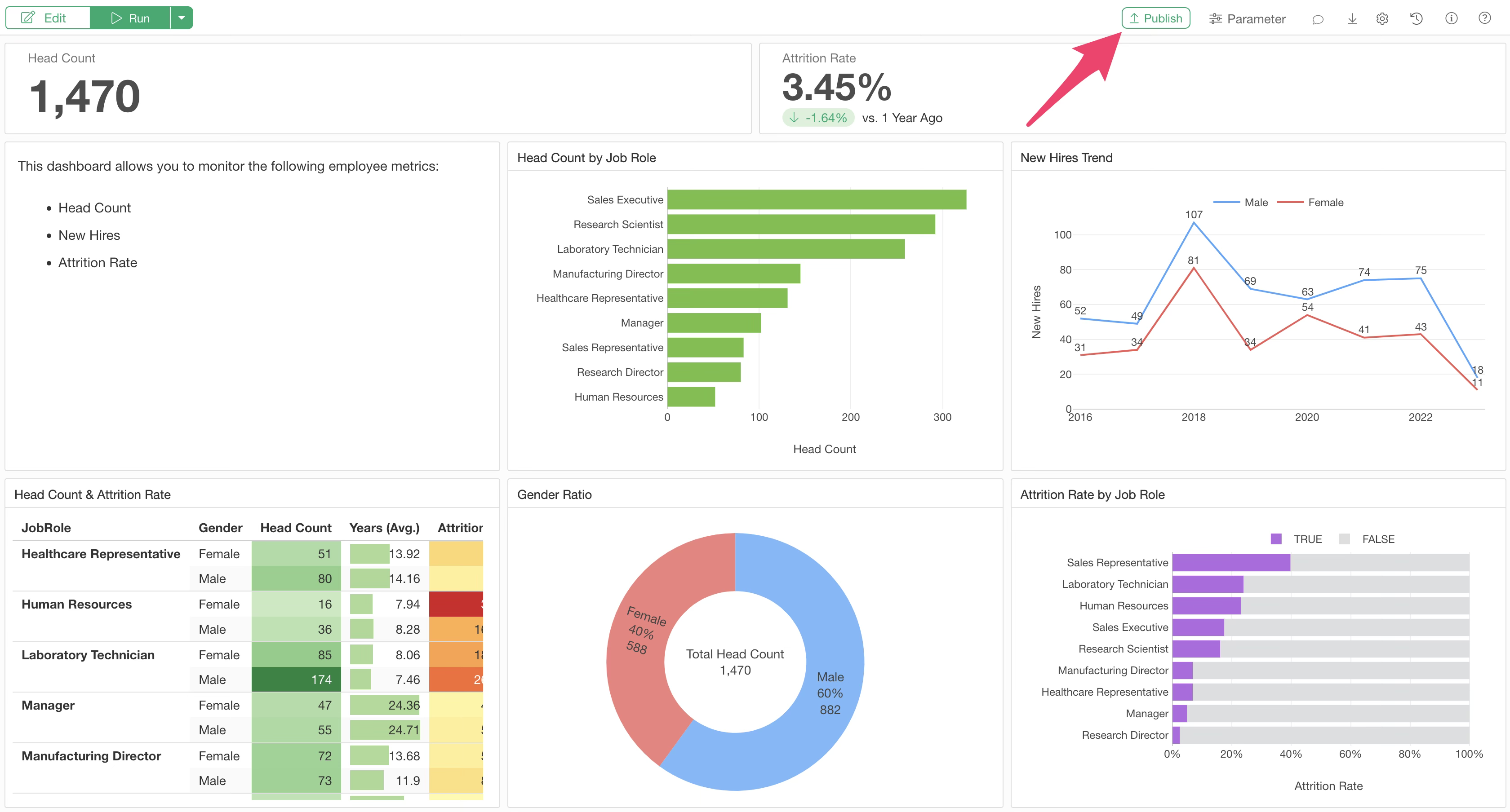
Publishing
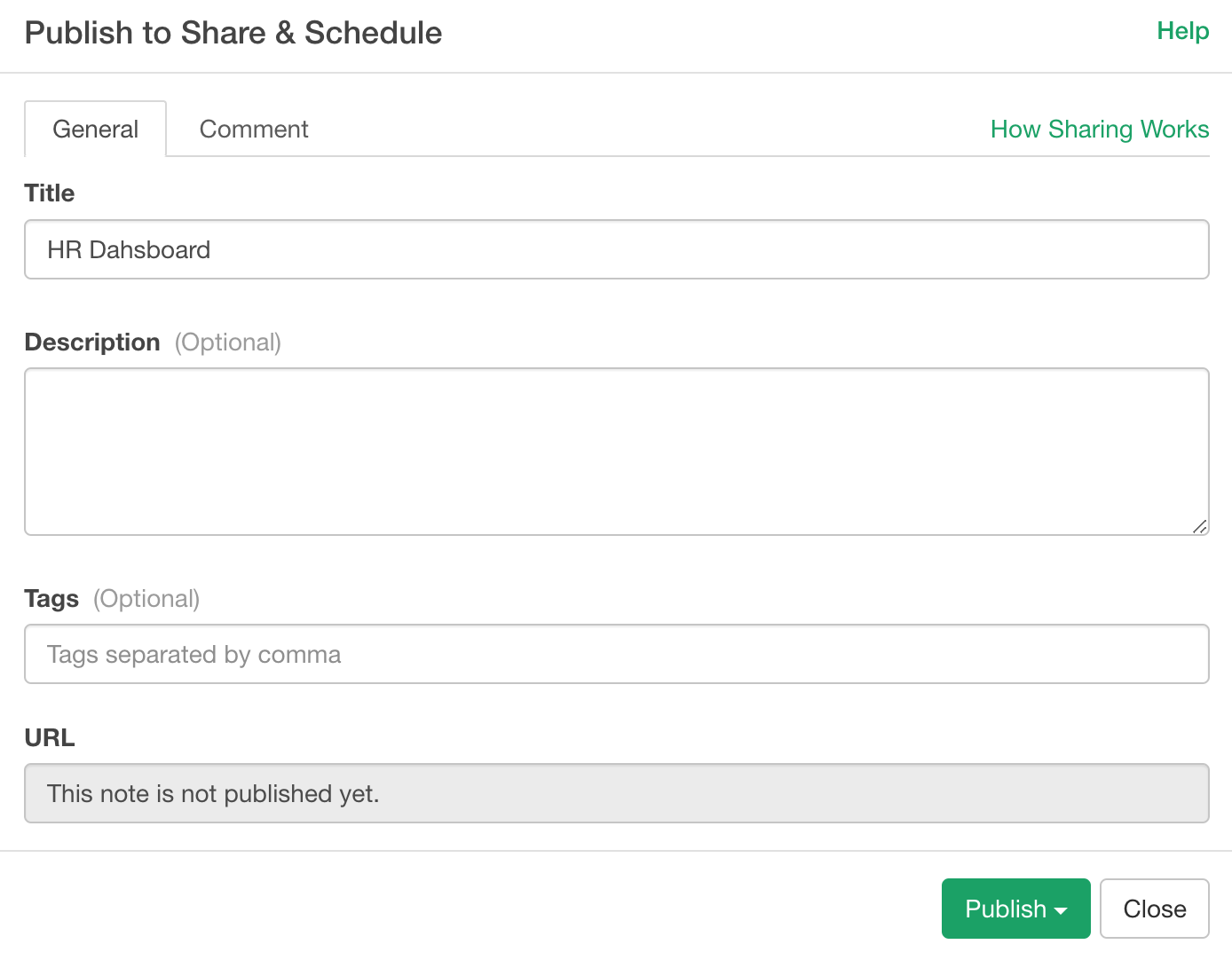
To share a dashboard so it can be viewed via a browser, click the “Publish” button.
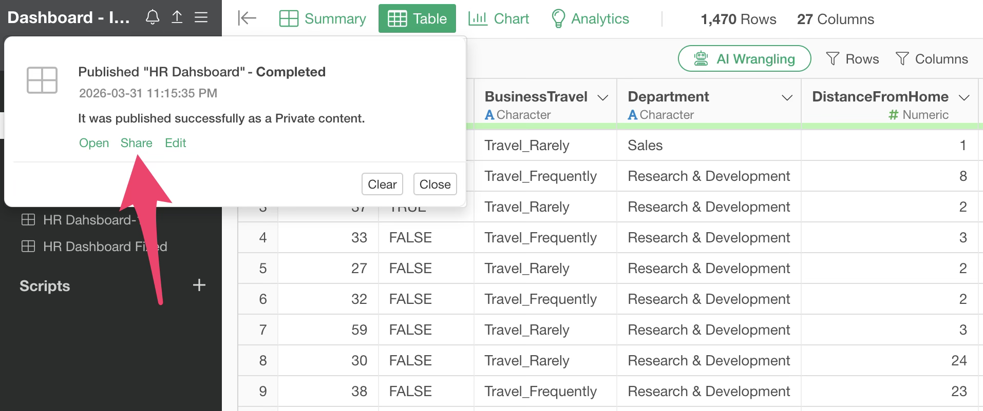
Once the publishing settings are configured, click the “Publish” button and select the entity to publish the note.
The publishing process to the server proceeds in the background. Once complete, a notification window opens on the main screen. Click the “Share” button to share it with others.
A browser will open with the sharing dialog.
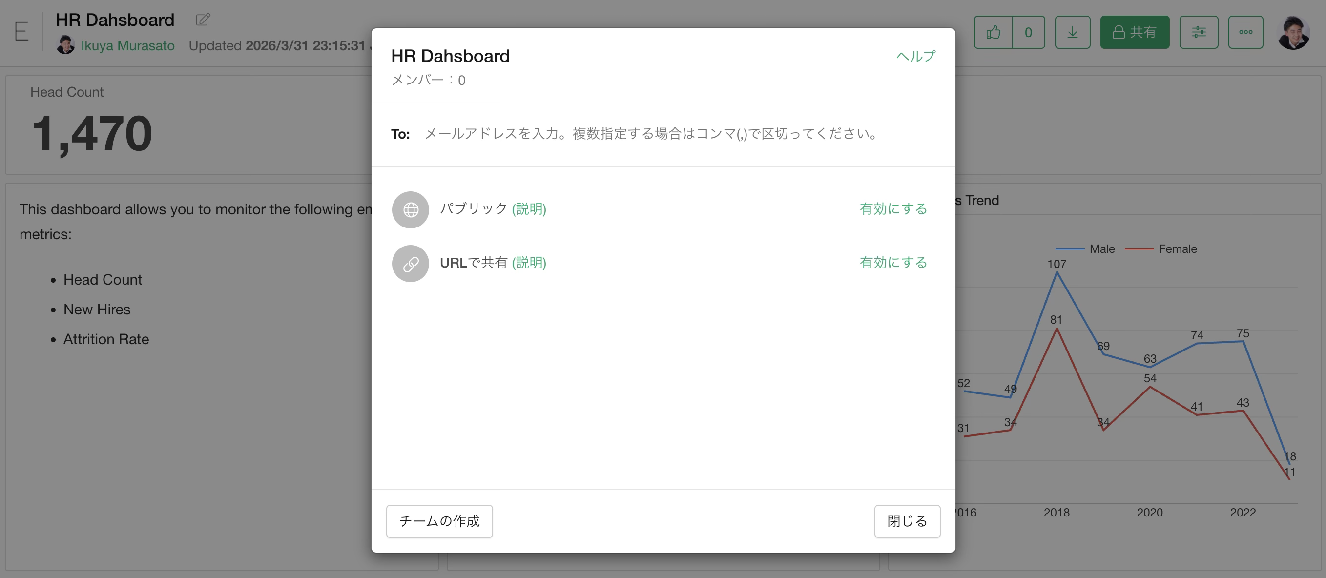
There are three types of sharing methods:
- Public
- Private
- URL
For details on sharing methods, please check here.
On the server, users can also use Interactive Filters by clicking charts or pivot tables to filter data within the dashboard, as well as the Parameter feature for more flexible filtering.
Exporting as a File
In addition to publishing to a server, dashboards can be exported as HTML files for others to view.
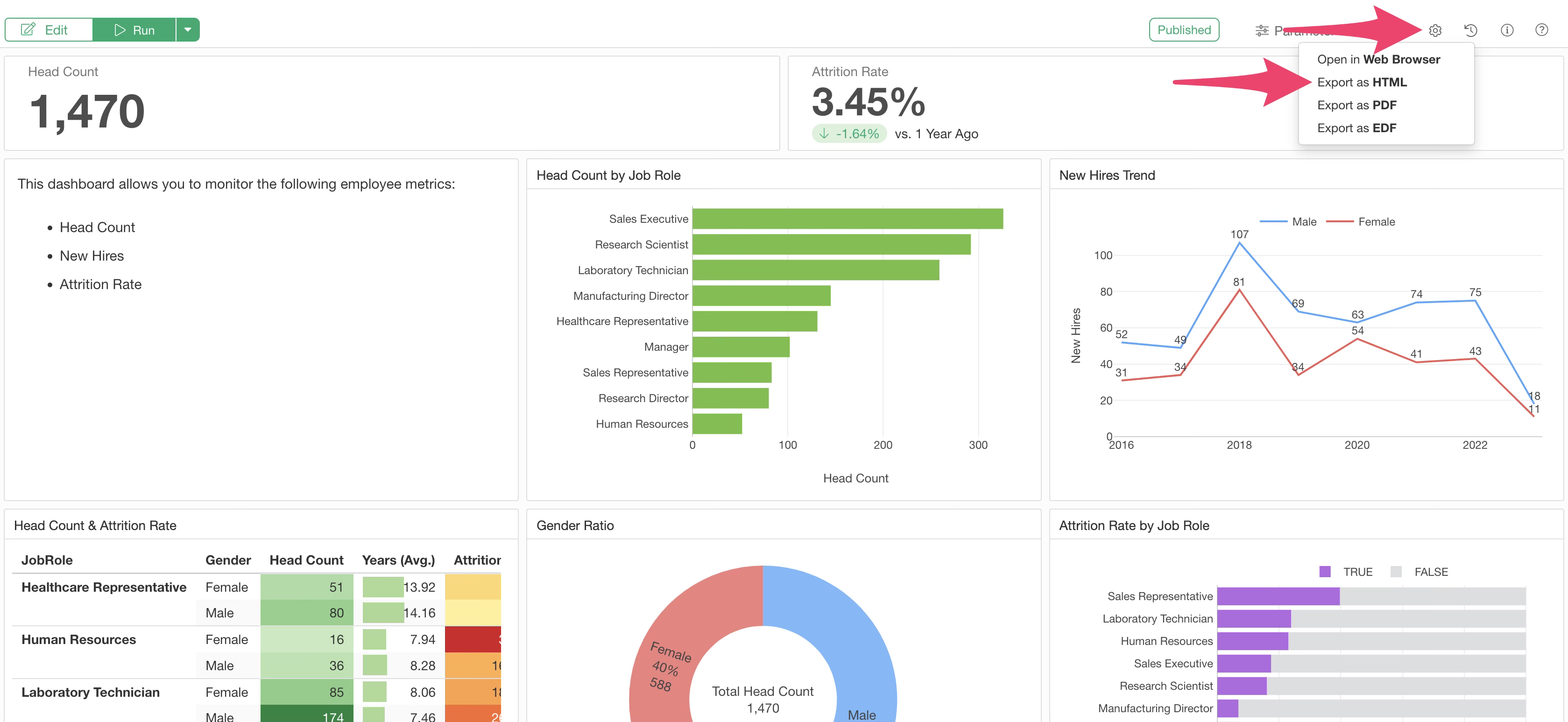
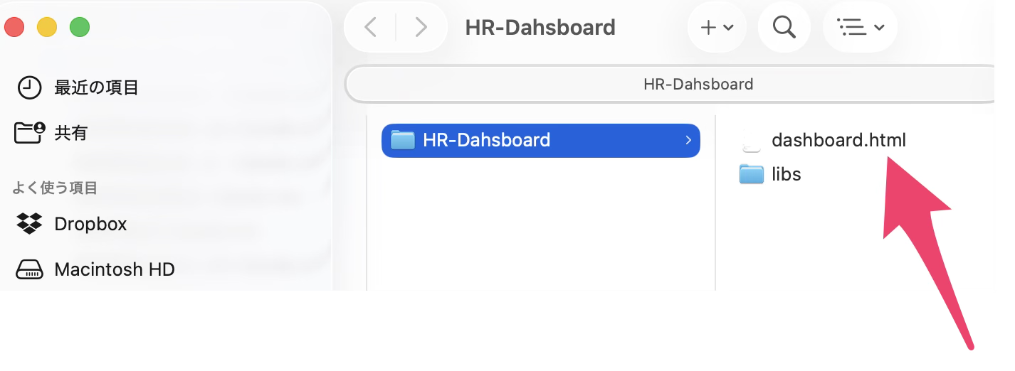
“Export as HTML” generates a compressed (zip) file containing all elements necessary for the dashboard.
The zip file includes the HTML file and the JavaScript required to display the charts. By clicking the extracted HTML file, you can view the content of the note locally. Zooming in and out is also possible.
Downloading EDF and Chart Data/Images on the Server
For content published to the Exploratory Server, authorized users can export EDF files to reproduce the dashboard in Exploratory Desktop, as well as images of each chart and data.
EDF File
The EDF file can be downloaded from the top of each content screen.
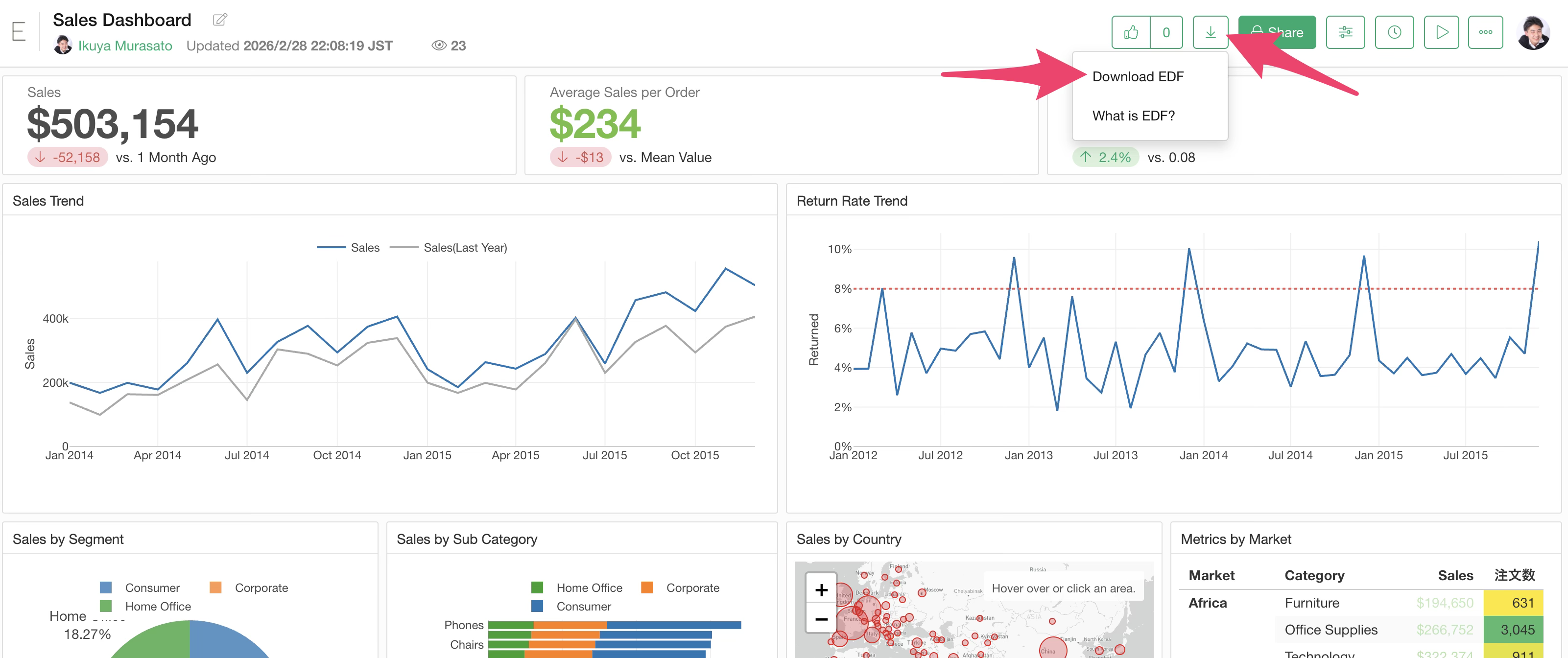
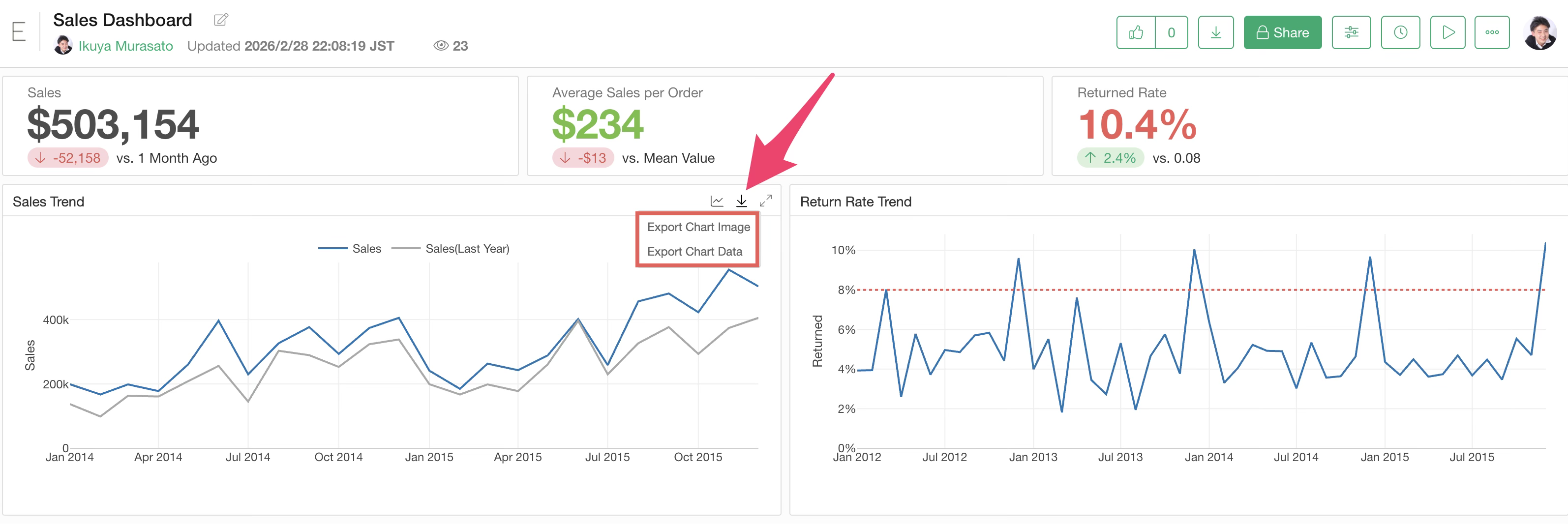
Chart Data / Chart Image
Chart data and chart images can be downloaded from the export button of each chart.
Download permissions for each file can be specified as follows:
- Author only
- Author and Viewer
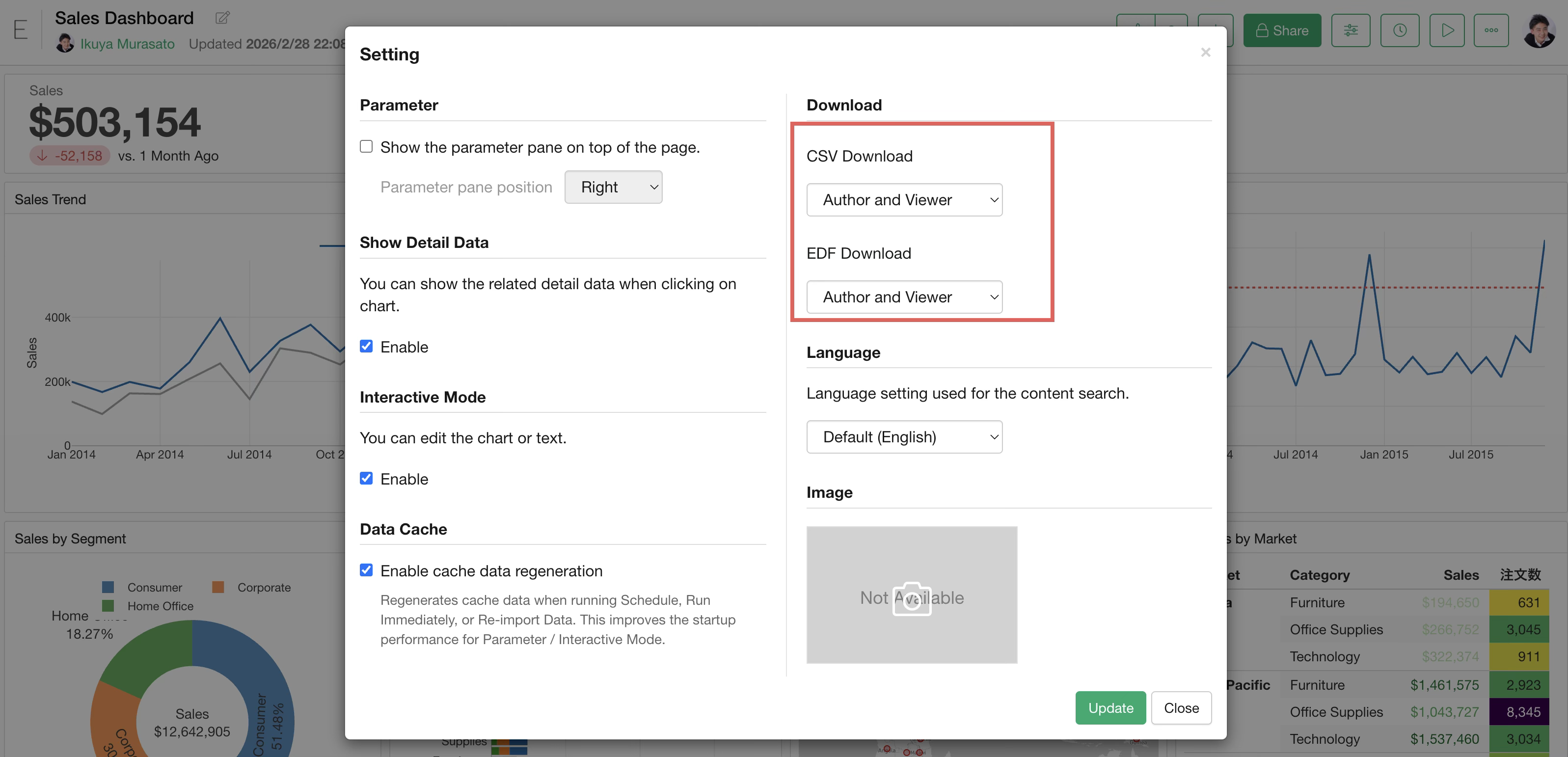
For details on how to set download permissions, please refer to the following link:
- How to restrict downloading of CSV and EDF files for content published to Exploratory Server - Link
View Detail Data on the Server
On the Exploratory Server, it is also possible to display “View Data” by clicking on charts within the dashboard.
If you do not want to display “View Data” on the server, open “Settings” from the menu at the top right.
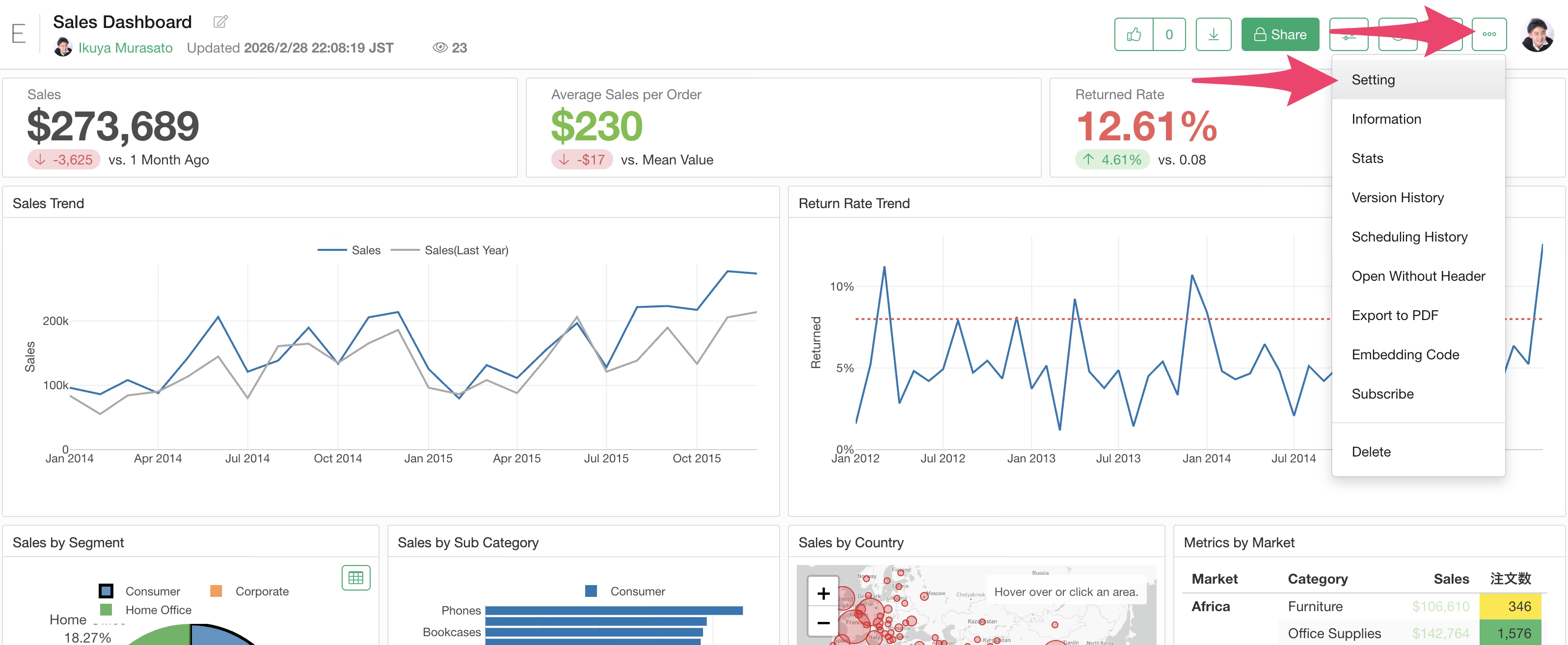
Uncheck “Enable” in the Show Detail Data section.
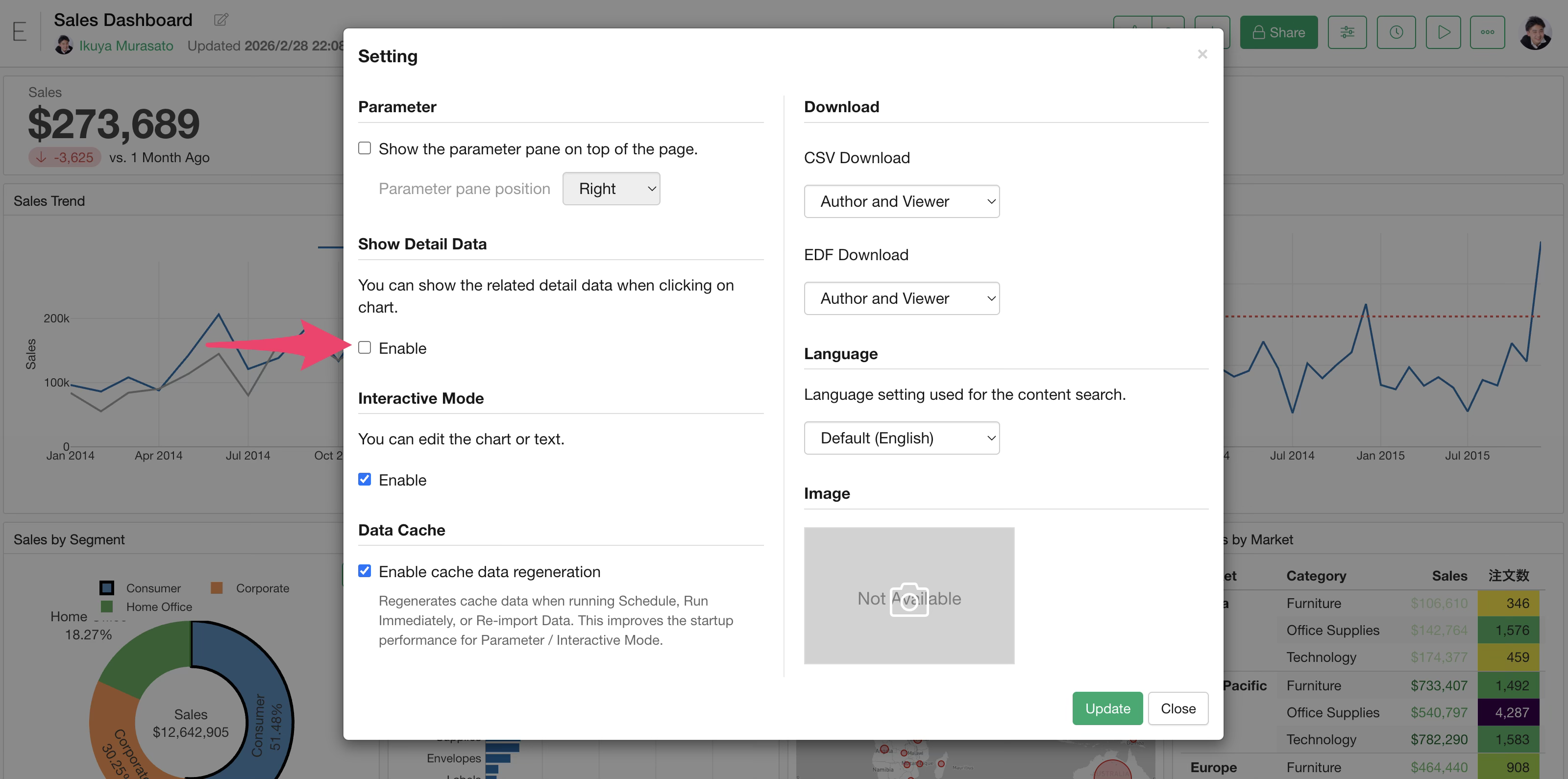
This allows Interactive Filters to continue working while preventing the display of detailed data.
Opening a Specific Page
When sharing a dashboard, you might want the second page to be the default view.
In that case, you can display the second page as the default by
appending ?page=2 to the end of the dashboard URL.
https://exploratory.io/dashboard/BWz1Bar4JF/fCH0qWt4Bp?page=2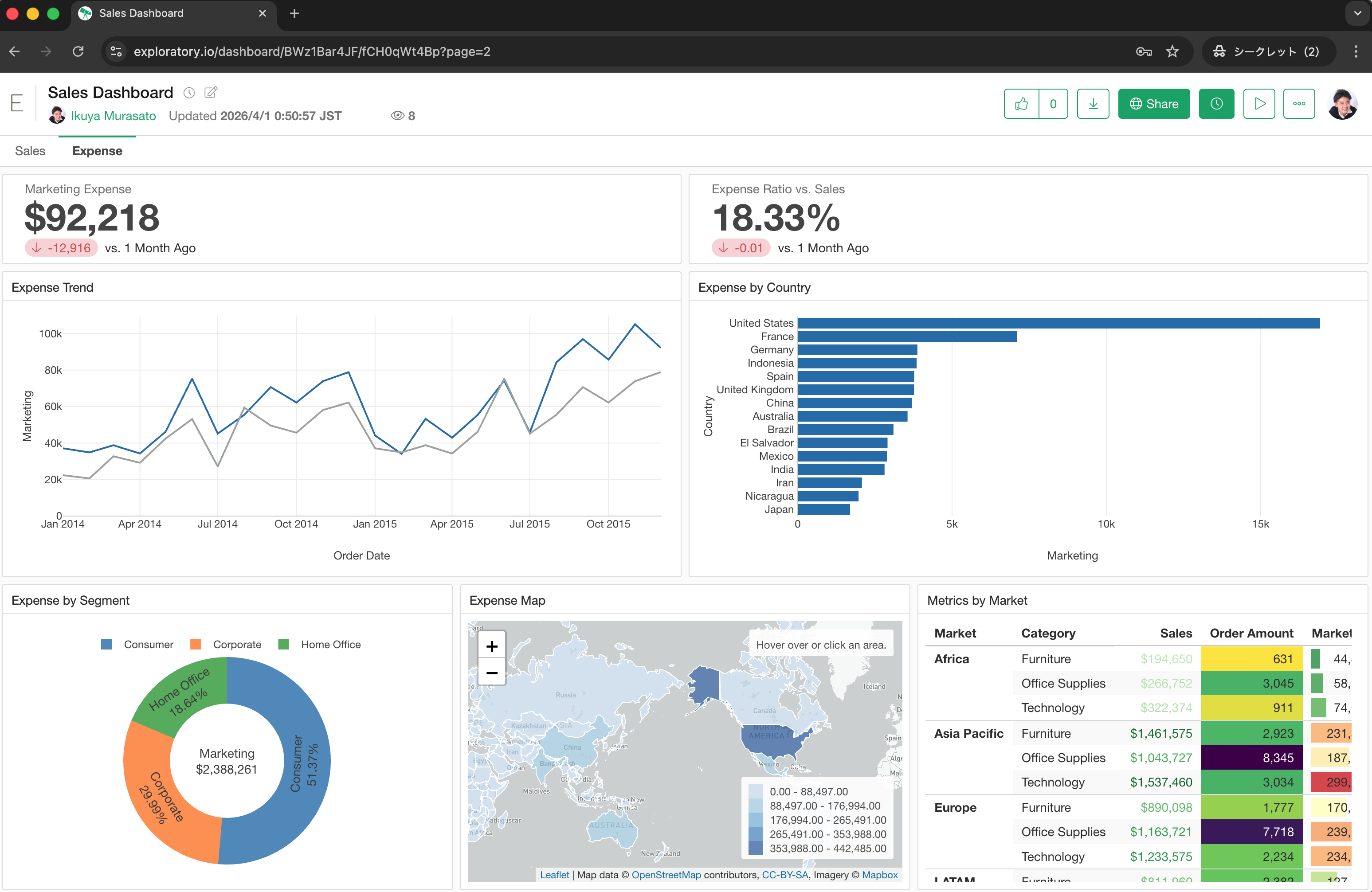
Embedding Dashboards
Dashboards can be embedded into notes or web pages of other services.

Select “Embedding Code” from the menu of the published dashboard.
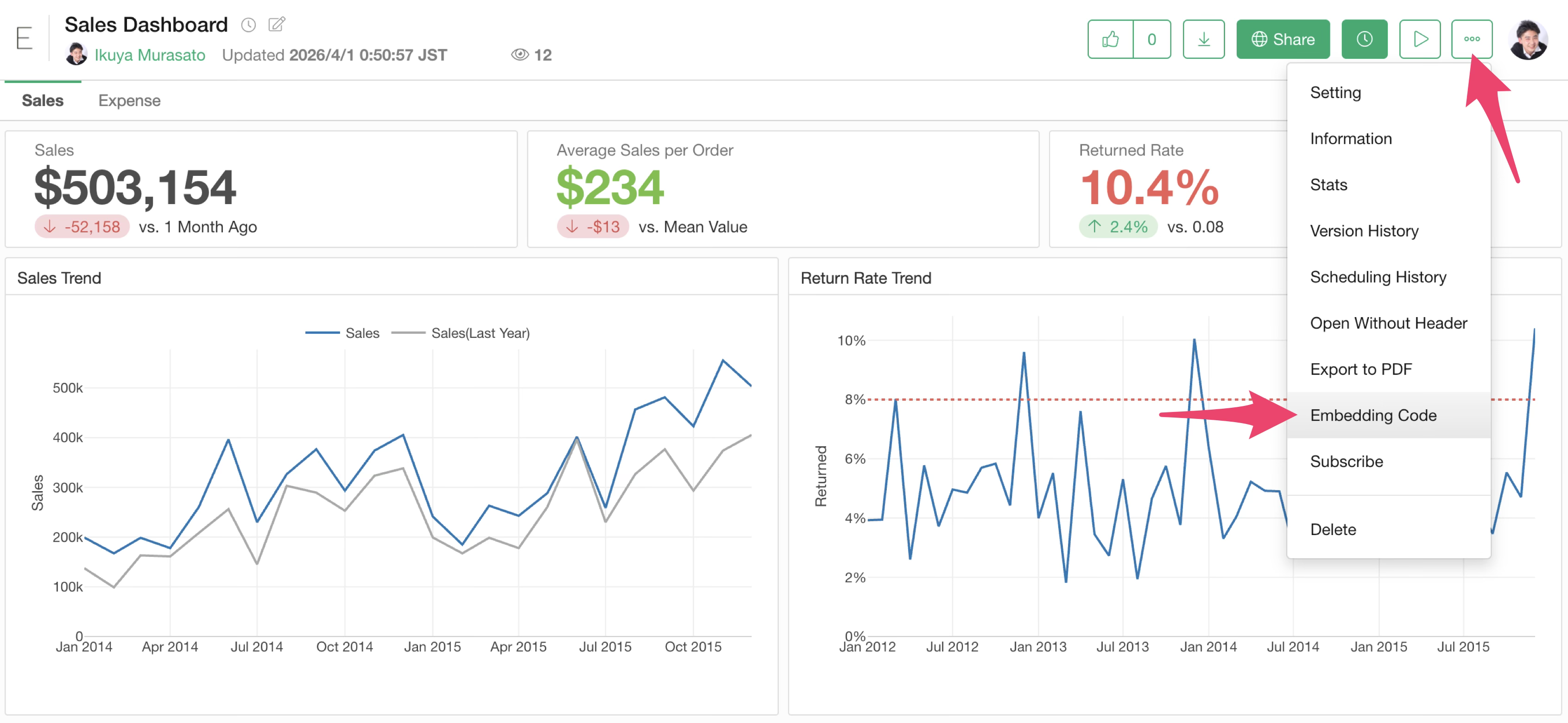
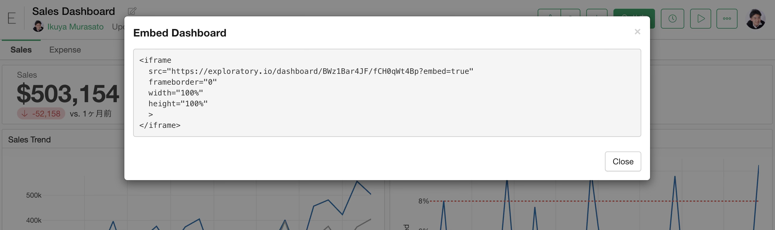
The dashboard embed code (iframe) will be displayed; copy this code.
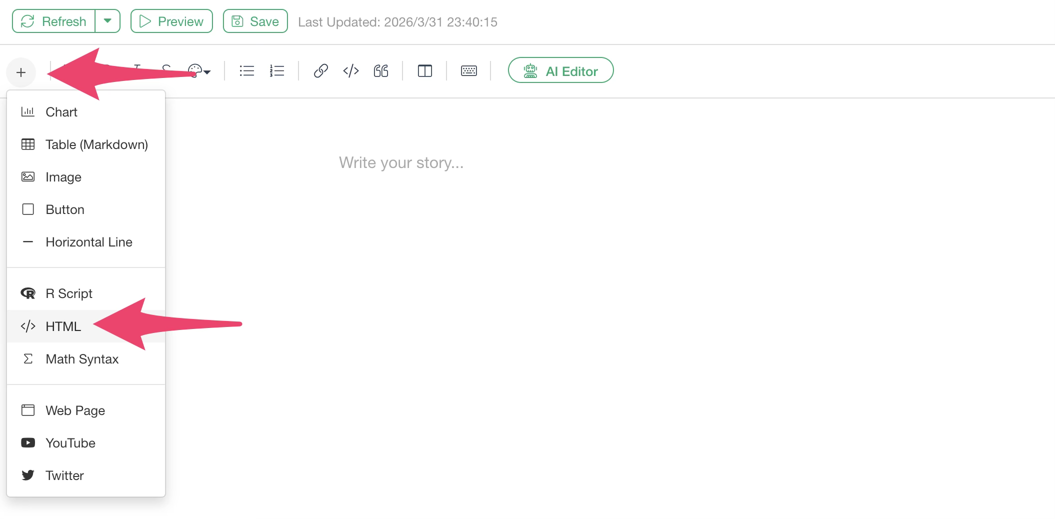
If you want to add a dashboard to a Note, select “HTML” from the note’s plus button.
Paste the copied code into the HTML code block. Specifying a width of 1000px and a height of 800px should display the dashboard nicely.
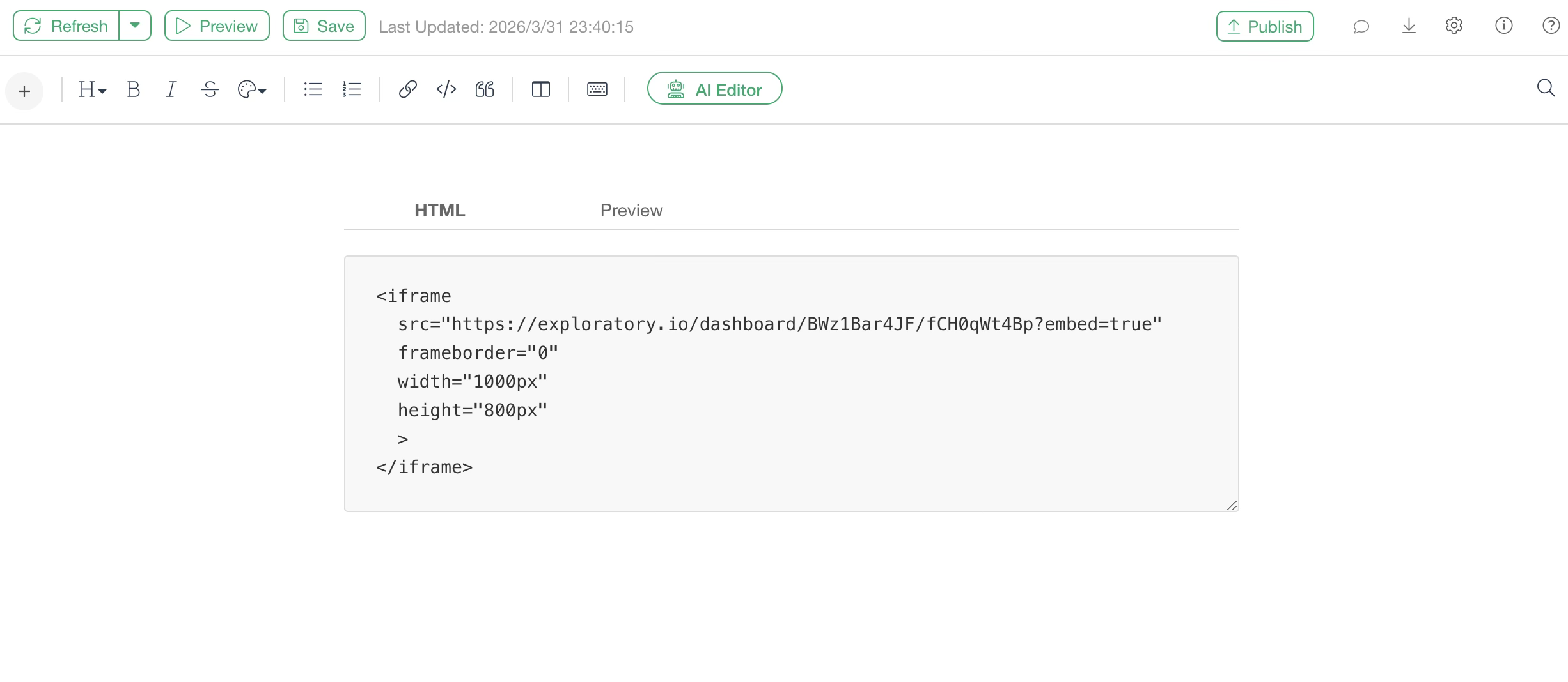
When you preview, you can confirm that the dashboard is embedded in the note.
Automatic Updates via Schedule and Subscription
When using remote files, databases, cloud applications, or data catalogs as data sources for charts in a dashboard, a schedule icon appears on the server, allowing you to set a schedule for updating the note.
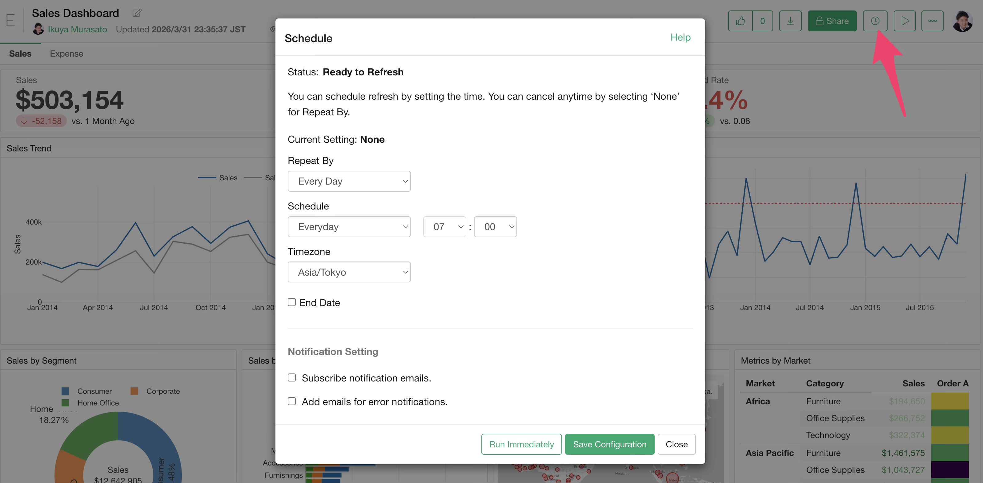
For dashboards with a schedule set, you can subscribe to notification emails from the dashboard menu.
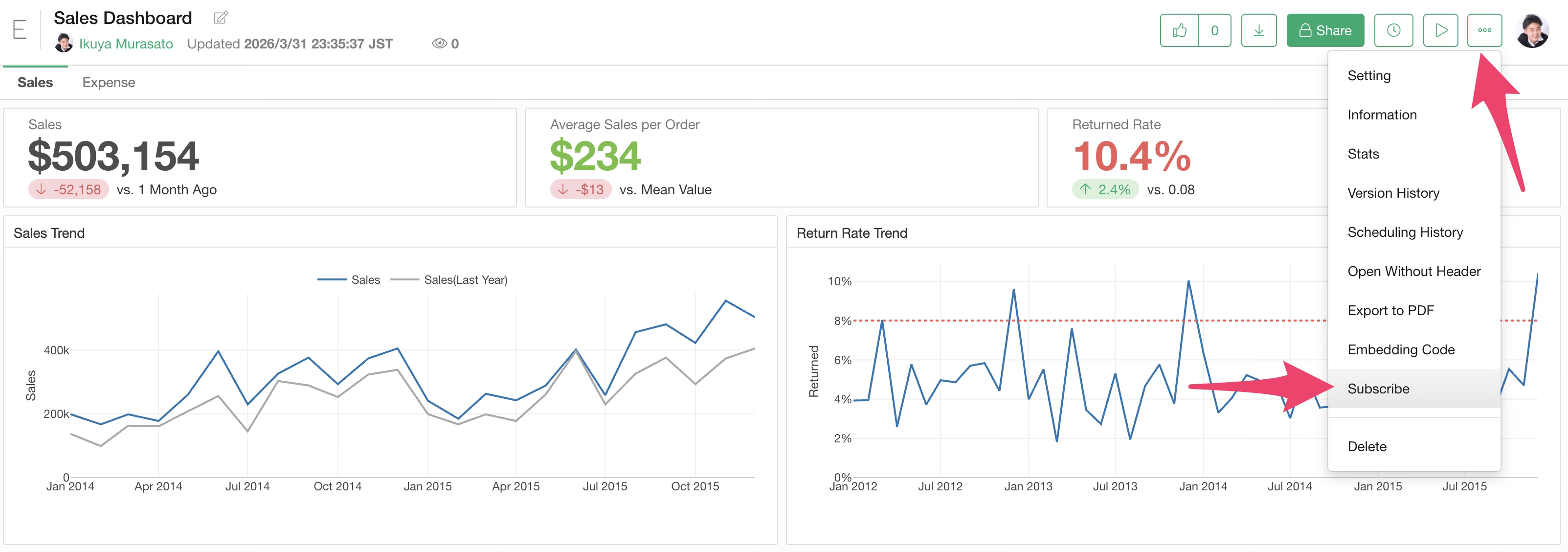
Once subscribed, you will receive an email with a preview every time the dashboard is updated.
Restoration (Undo)
If you want to revert an edited dashboard to a previous version, click “Change History” in the project menu.
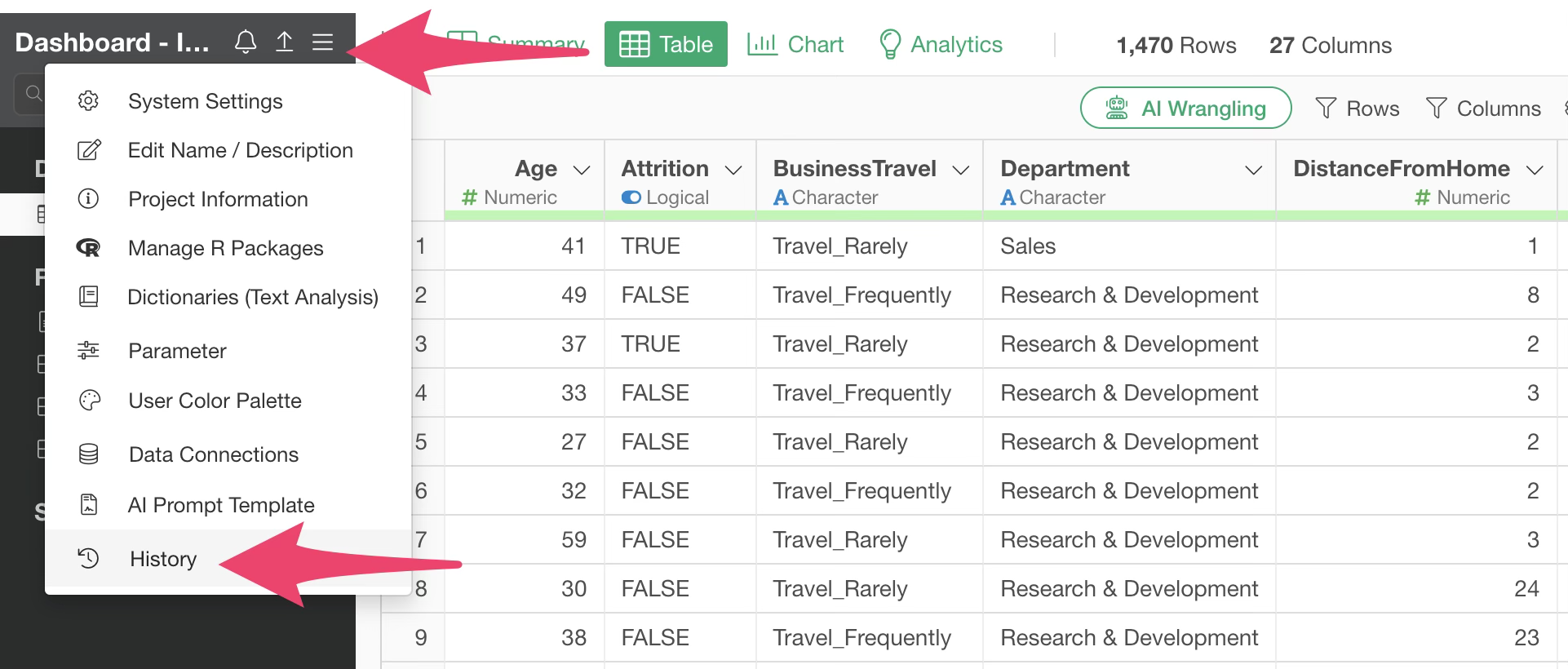
You can then see all change history for the current project and restore the dashboard to any point in time.
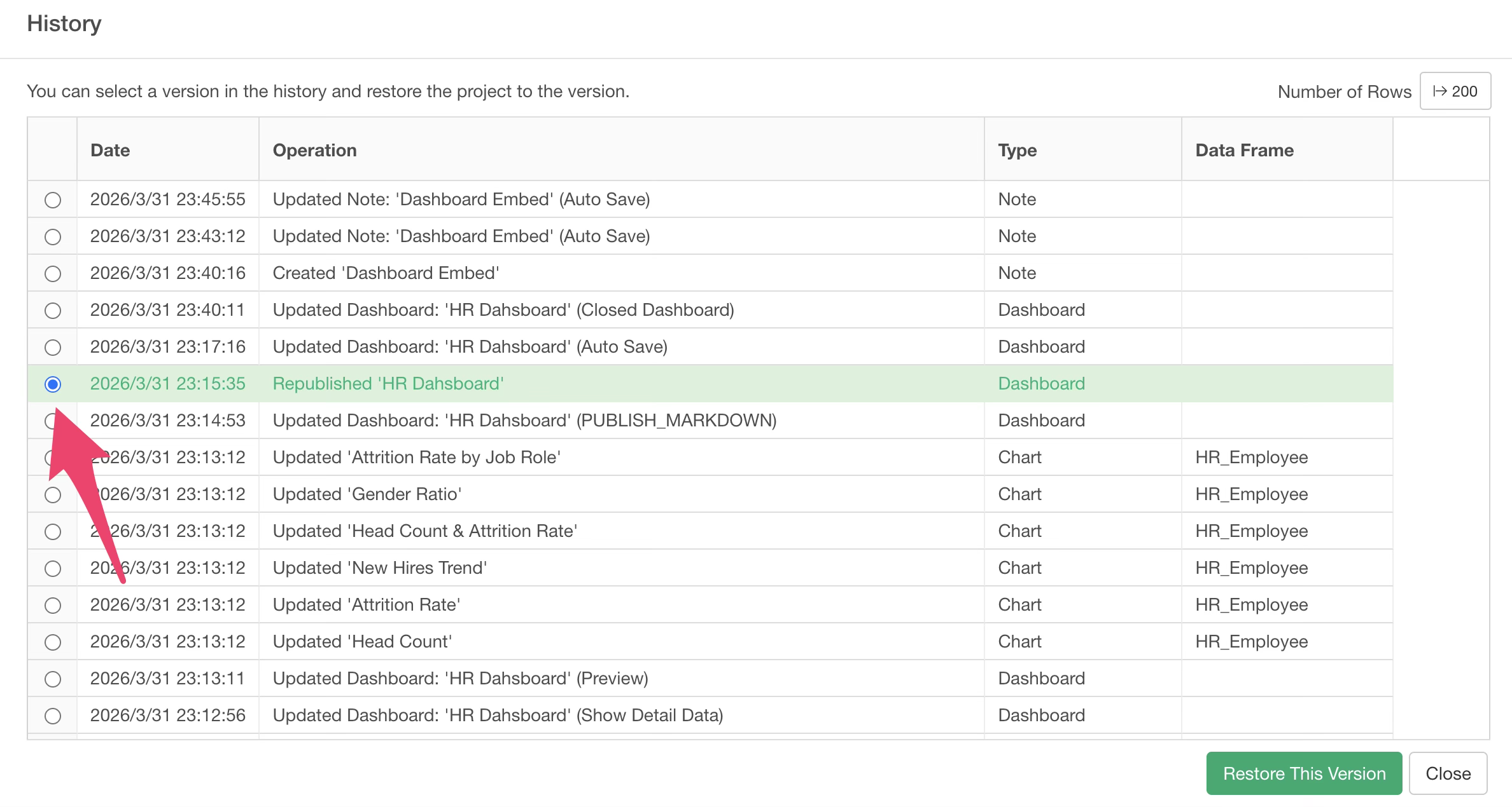
Note that restoring will revert the entire project to that state, so any processing performed after the restoration point will be invalidated.