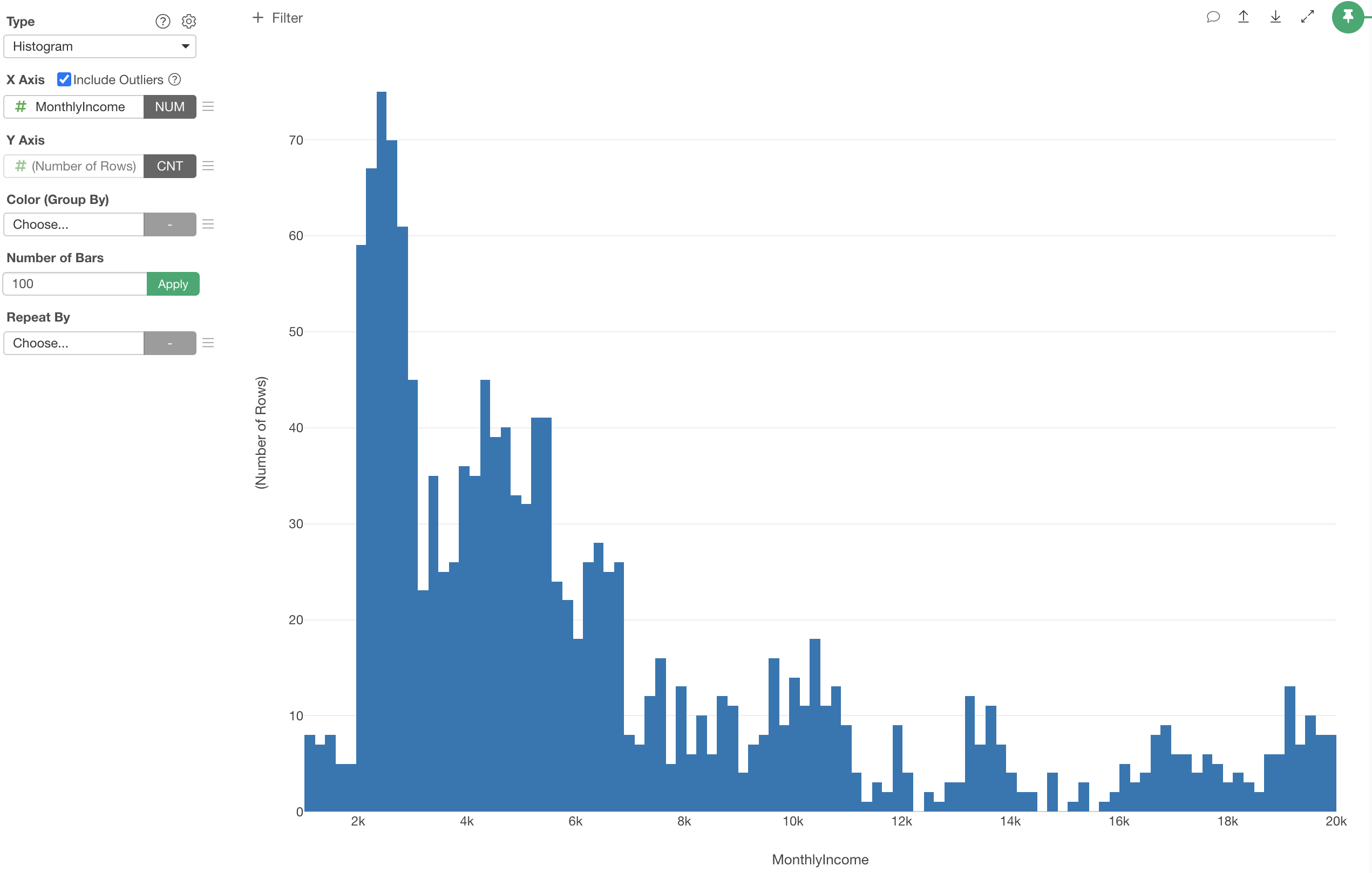
Introduction to Histogram
Histogram is a great way to visualize the distribution of numeric values.
Here's a quick introduction on how you can use Histogram in Exploratory.
Sample Data
We'll use this Employee Data. You can download it from this page.
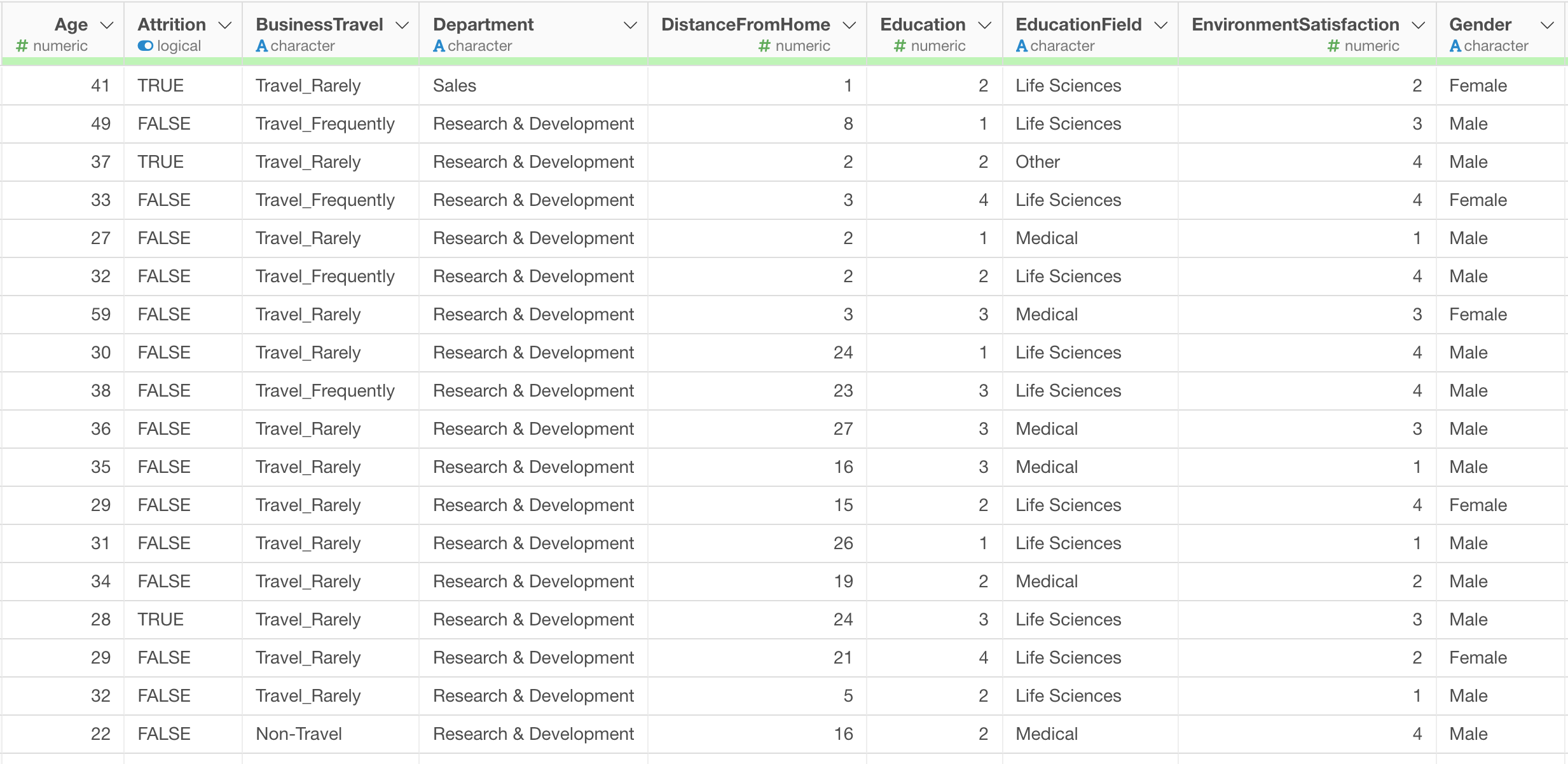
In this data, each row represents each employee, and the columns are information about each employee.
1. Histogram Basic
Let’s say, we want to see how the variance of Income is in this organization.
First, select 'Histogram' from the Chart type, then select 'Monthly Income' column for the X-Axis.
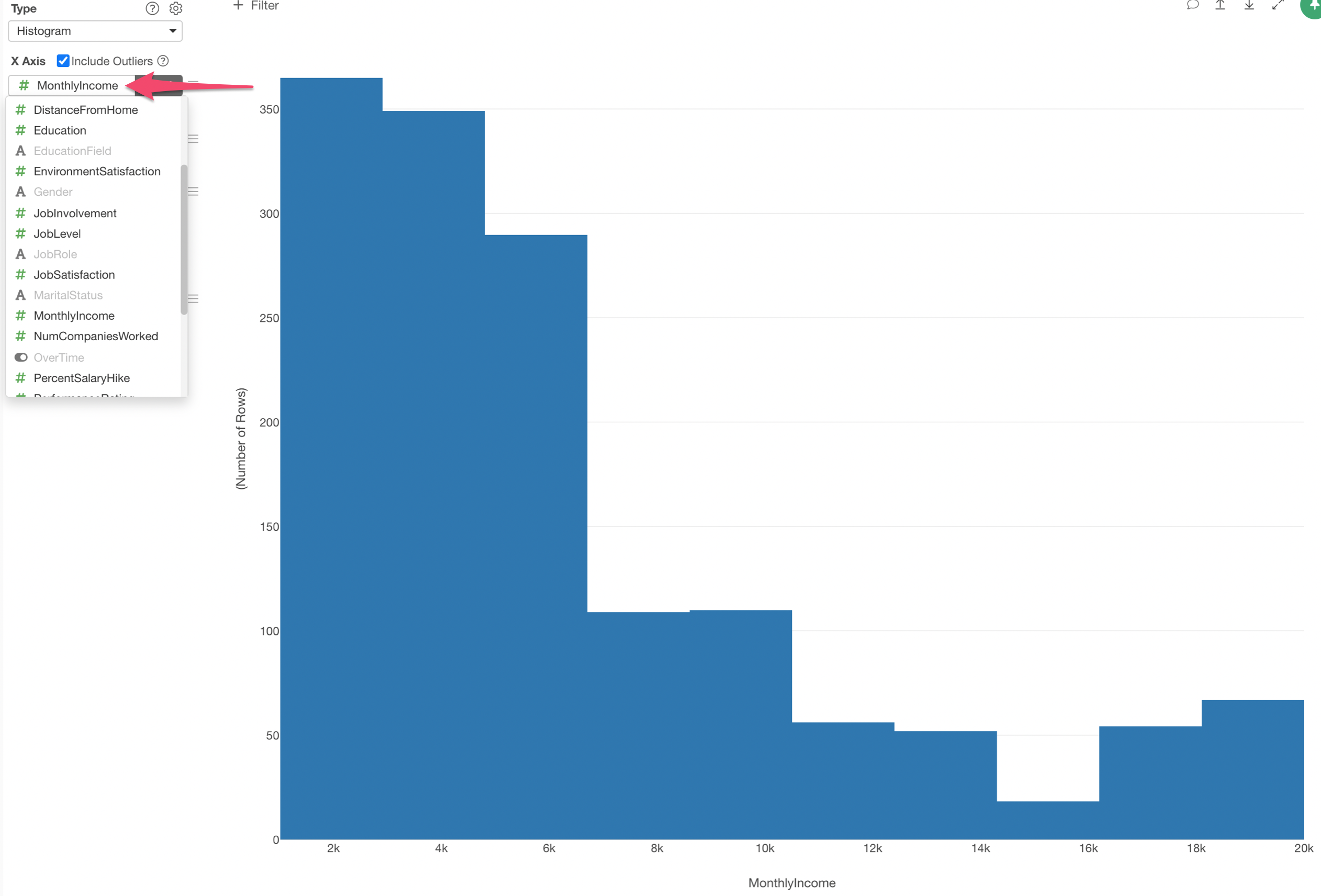
By default, the number of bars is set as 10. This means that the Income values are divided into 10 bars each of which has an equal width of the Income range. And you're seeing the number of rows (employees) in each of the divided Income range.
You can change the number of bars setting. For example, type 50 and hit the Enter key or click the green 'Apply' button.
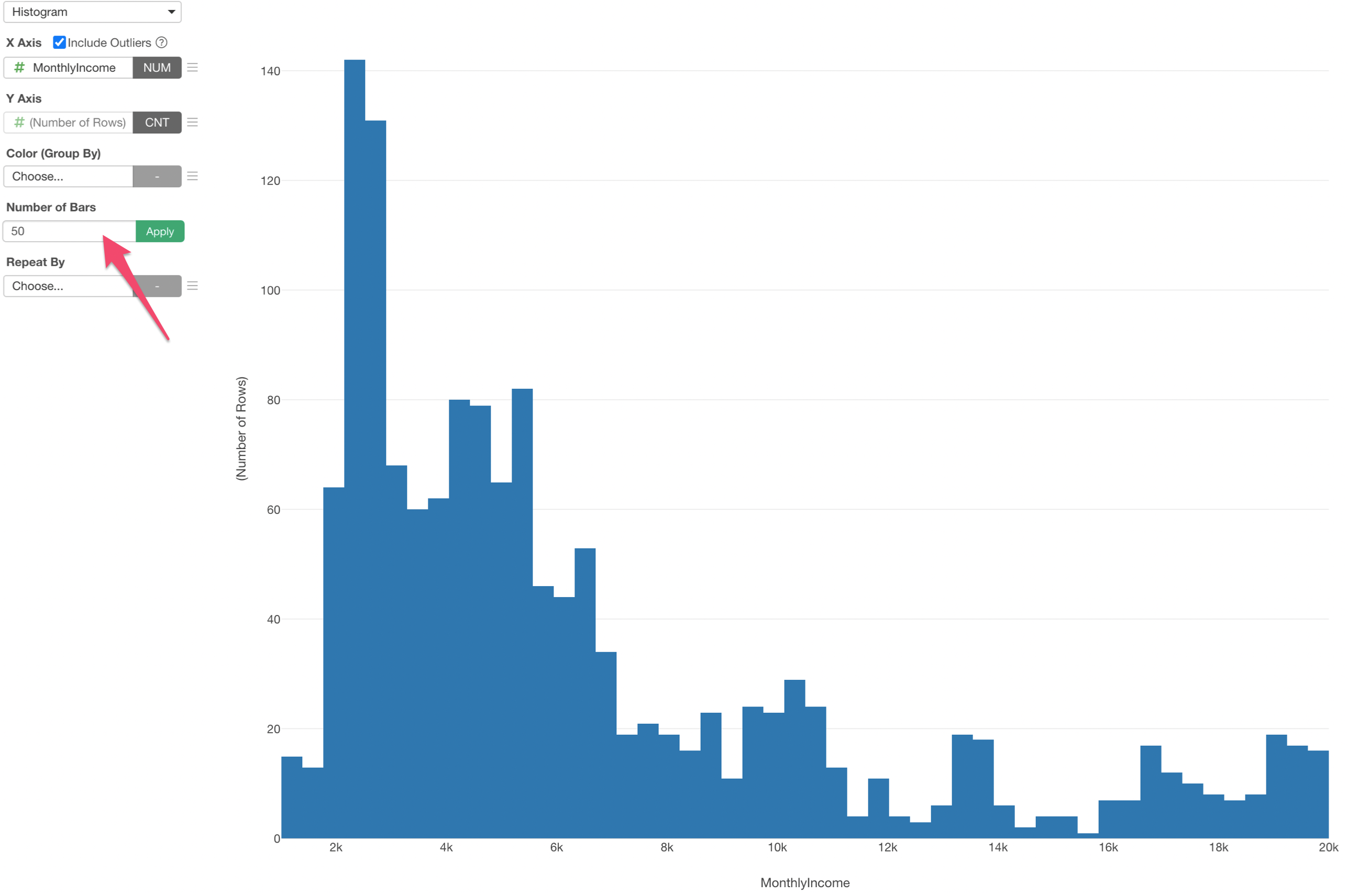
Now you see 50 bars each of which has an equal width of the Income range.
One of the great things about Histogram is that it helps you find patterns in data. For example, with this Income data we can see that there are many people whose Income are ranging between $2,000 and $6,000 and also a certain degree of peopole whose Income are ranging between $16,000 and $20,000.
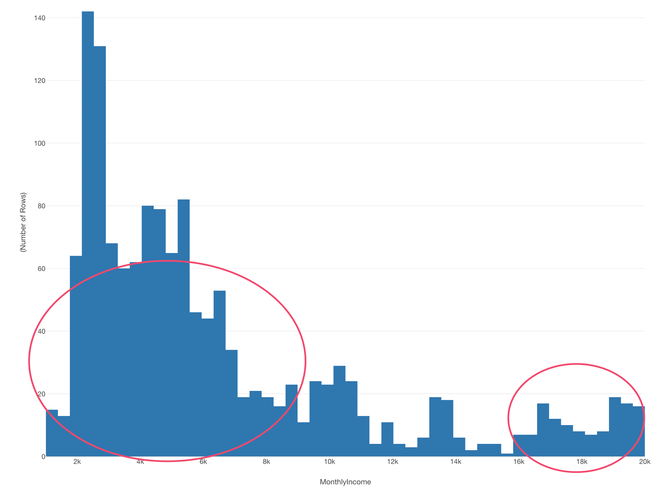
Who are they? What kind of attributes do they have?
2. Use Color to Create Groups
We can use 'Color' to create groups in the Histogram so that it might help us see how the patterns we have found above are made.
For example, we can assign 'Job Role' column to the Color.
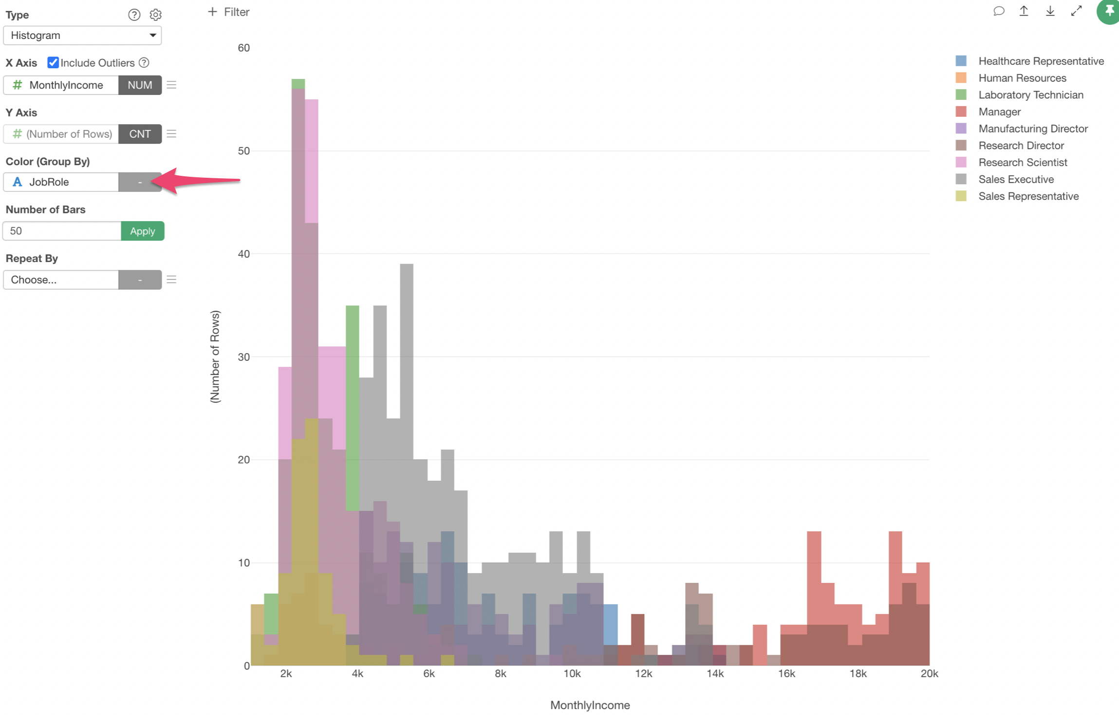
We can see Manages (Red) are the ones who make high incomes.
3. Use Repeat By to Create Multiple Charts
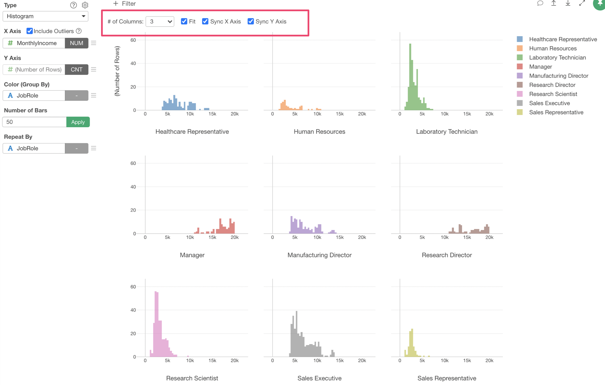
We can separate the above chart to multiple charts so that each Job Role's income distribution will be visualized by histogram separately.
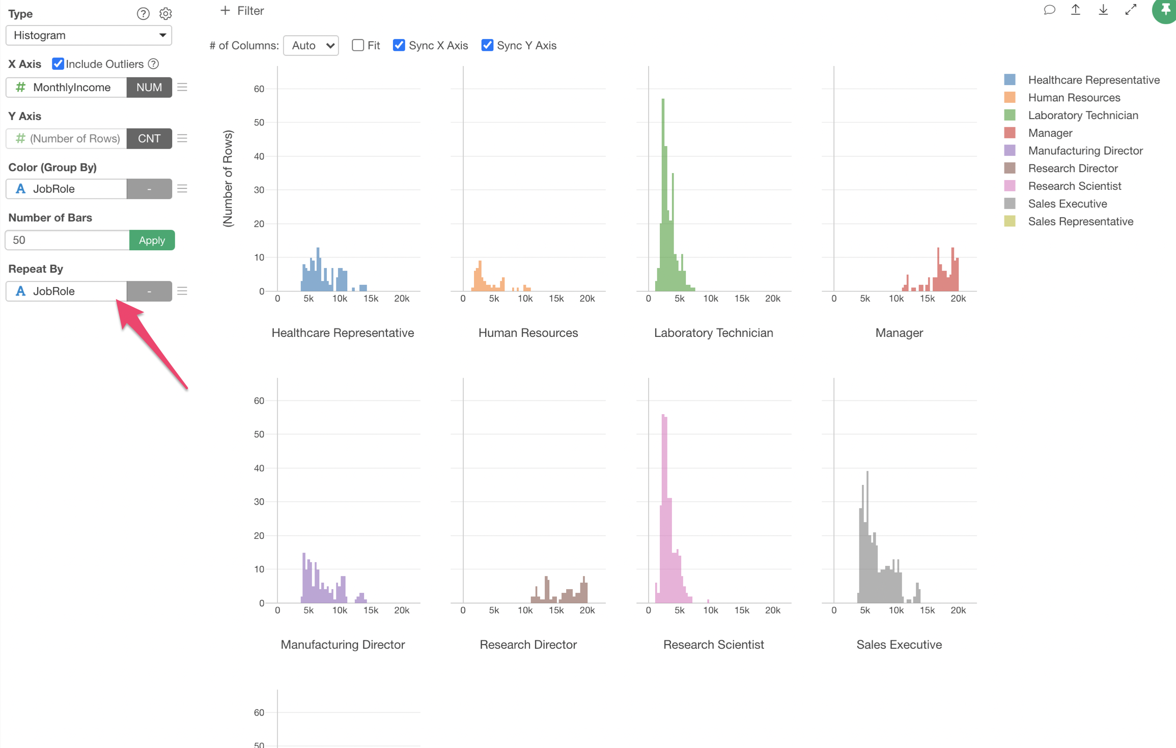
You can make adjustments on how you want to show the multiple charts. For example, I'm setting '3' for the number of charts in each row and check 'Fit' so that all the 9 charts fit in the available space.
Try it for yourself!
If you want to quickly try it out and you don’t have an Exploratory account yet, sign up from our website for 30 days free trial without a credit card!
If you happen to be a current student or teacher at schools, it’s free! Sign up for Community Plan.
And, if you don’t mind sharing what you create publicly you can sign up for Public edition of Exploratory (FREE)!