Introduction to LightGBM
LightGBM is one of the most popular ensemble learning algorithms, which trains multiple models and combines their individual predictions into a single prediction. It belongs to the same gradient boosting family as XGBoost, where decision trees are built one after another, with each new tree focusing on correcting the mistakes made by the previous ones by assigning greater weight to the incorrectly predicted data.
LightGBM is a framework developed by Microsoft that introduces several unique techniques over XGBoost to achieve faster training and better memory efficiency.
One of the key differences is how trees are grown. XGBoost, by default, uses a “Level-wise” strategy, which expands all nodes at each level of the tree evenly. Think of it as growing the entire tree in a balanced way. LightGBM, on the other hand, uses a “Leaf-wise” strategy, which prioritizes splitting only the leaf that would most improve the prediction. Since it focuses on deepening only where it matters most, it can build more accurate trees even with the same number of leaves.
LightGBM also comes with several other techniques to further speed up training. For example, GOSS (Gradient-based One-Side Sampling) skips some of the data that is already being predicted well and focuses the learning on data where the predictions are far off. EFB (Exclusive Feature Bundling) reduces computation by combining features that don’t take values at the same time (for example, when “A is 1, B is always 0”) into a single feature. Additionally, its histogram-based algorithm pre-groups continuous numerical values into bins, which speeds up the search for optimal split points.
Thanks to these techniques, LightGBM can train efficiently even on large-scale data, which is why it is widely used in data science competitions and beyond.
Required Data Format
To run LightGBM, the data must be structured so that each row represents one observation. The target variable can be either numeric or logical type. There are no specific restrictions on data types for explanatory variables. However, when explanatory variables are highly correlated with each other, they may compete for importance, causing variable importance rankings to be underestimated.
Sample Data
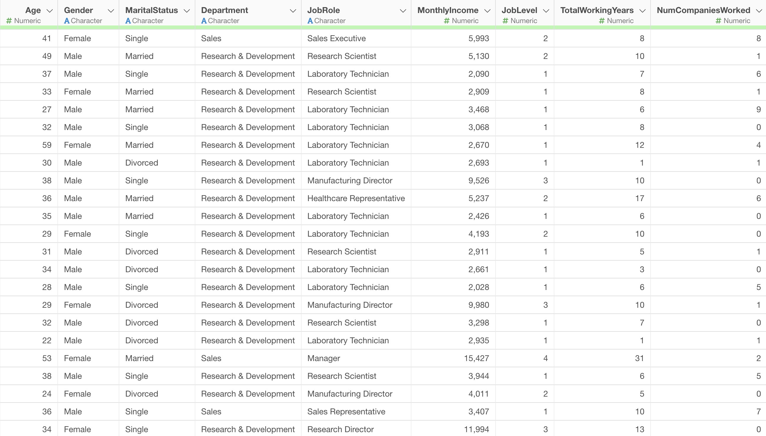
In this example, we will use the Employee Data as our sample data.
In this data, each row represents one employee, and the columns contain attributes such as age, salary, job role, and other employee characteristics.
Running LightGBM
In this example, we will build a LightGBM model to predict employee “MonthlyIncome”.
Open the Analytics view and select “LightGBM” as the type.

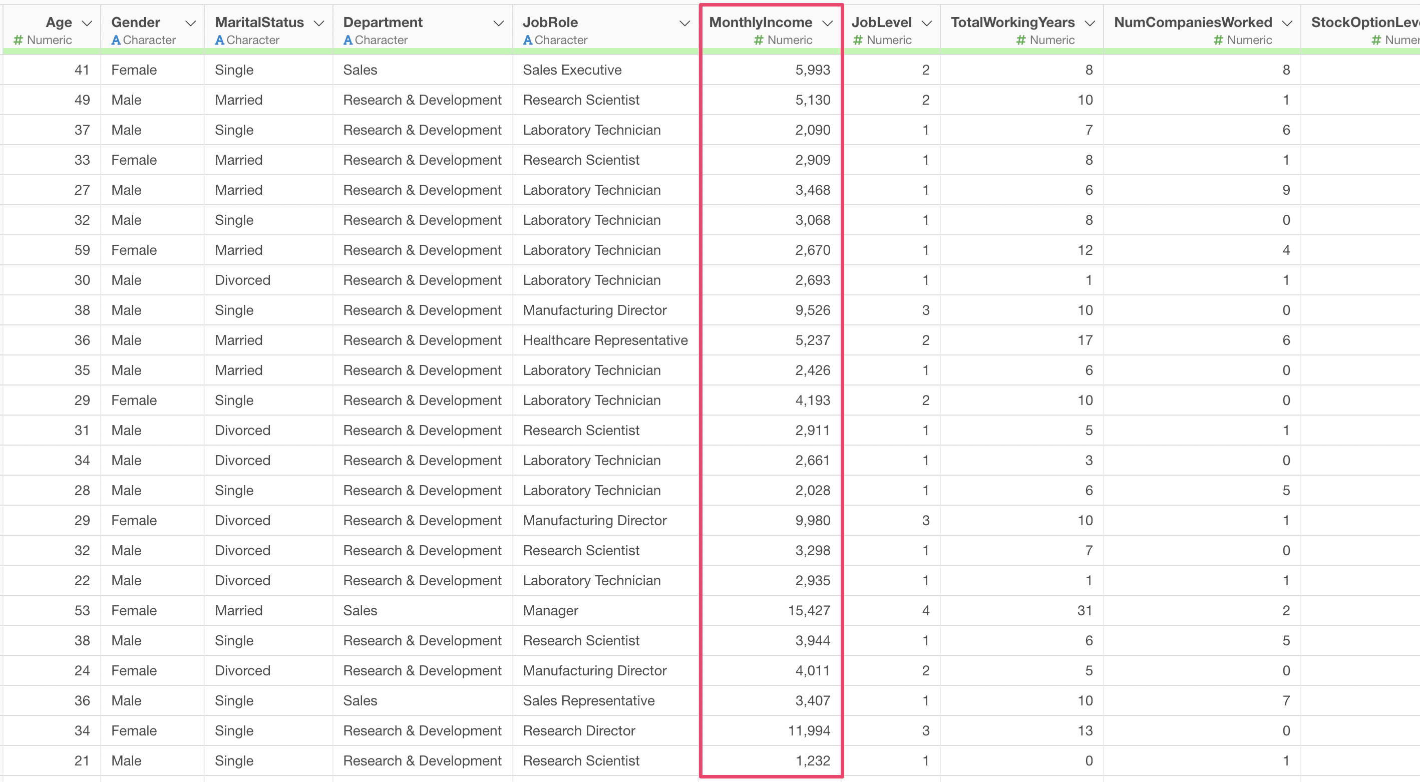
Select “MonthlyIncome” as the target variable.
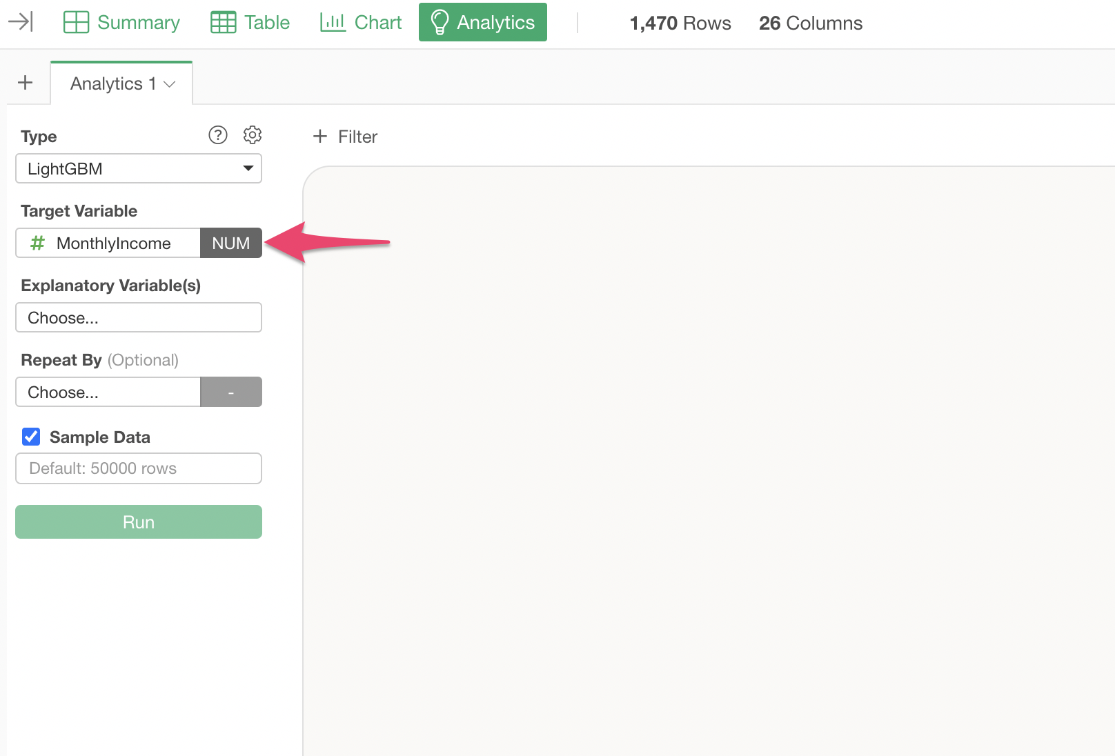
Click on the explanatory variables column and select the columns to use for predicting MonthlyIncome. In the column selection screen, you can either select columns individually or specify a range of columns to select them all at once.
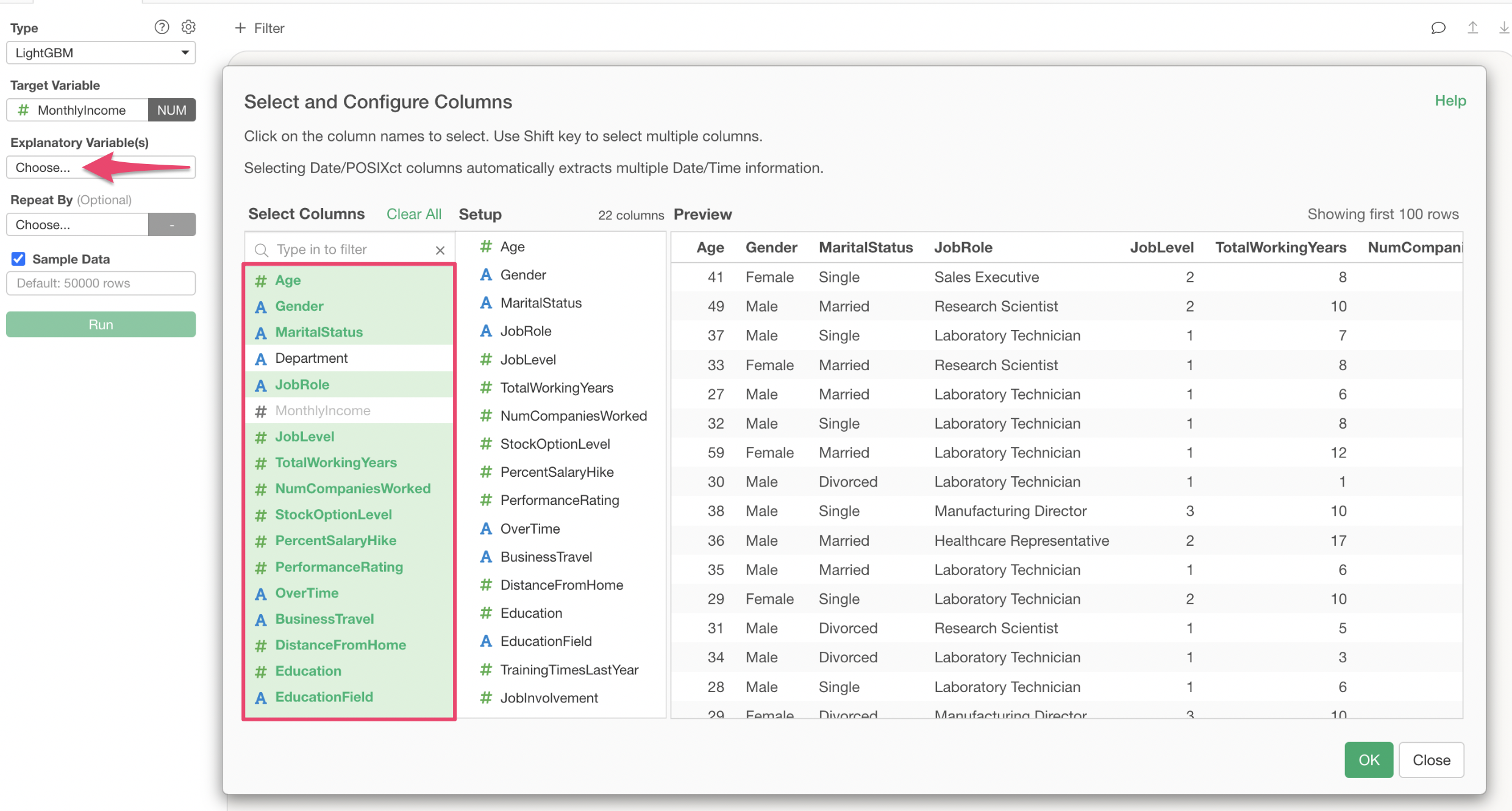
Once you have set the explanatory variables, click the “Run” button.

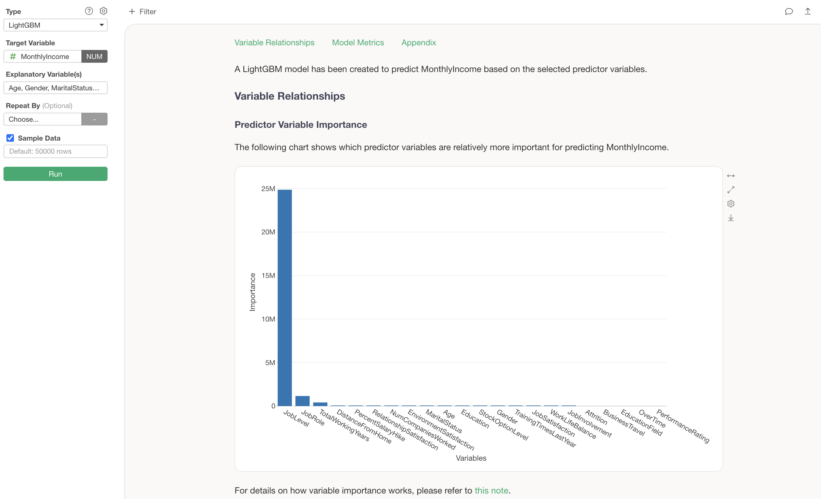
This creates a LightGBM model, and each chart displays explanations to help you interpret the results.
Interpreting the Results
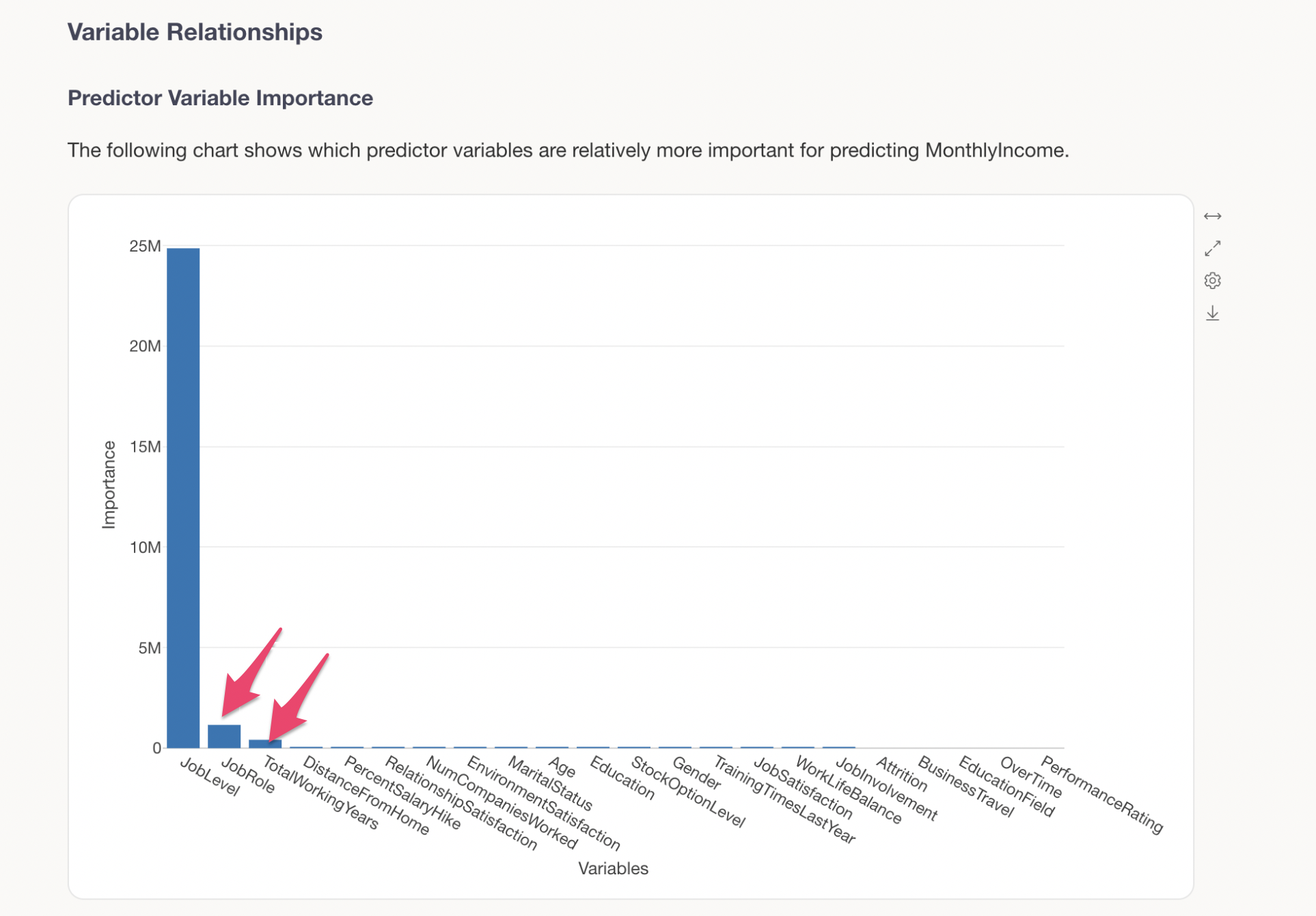
Predictor Variable Importance
The Predictor Variable Importance section shows which variables have a stronger correlation with the target variable and are more important for making predictions.
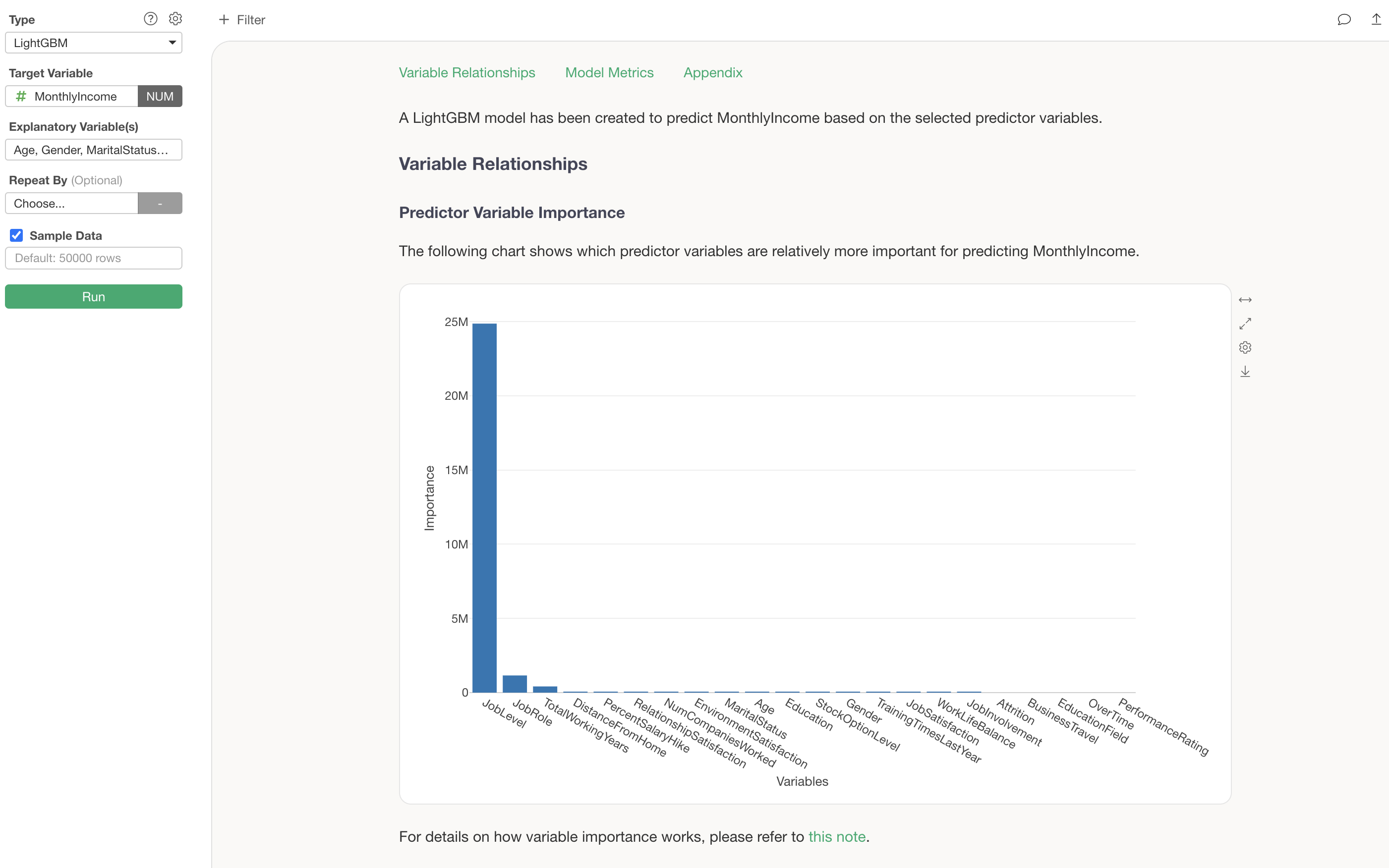
Variables with higher importance are more critical for predicting MonthlyIncome. In this example, we can see that JobLevel is by far the most important variable for predicting MonthlyIncome.
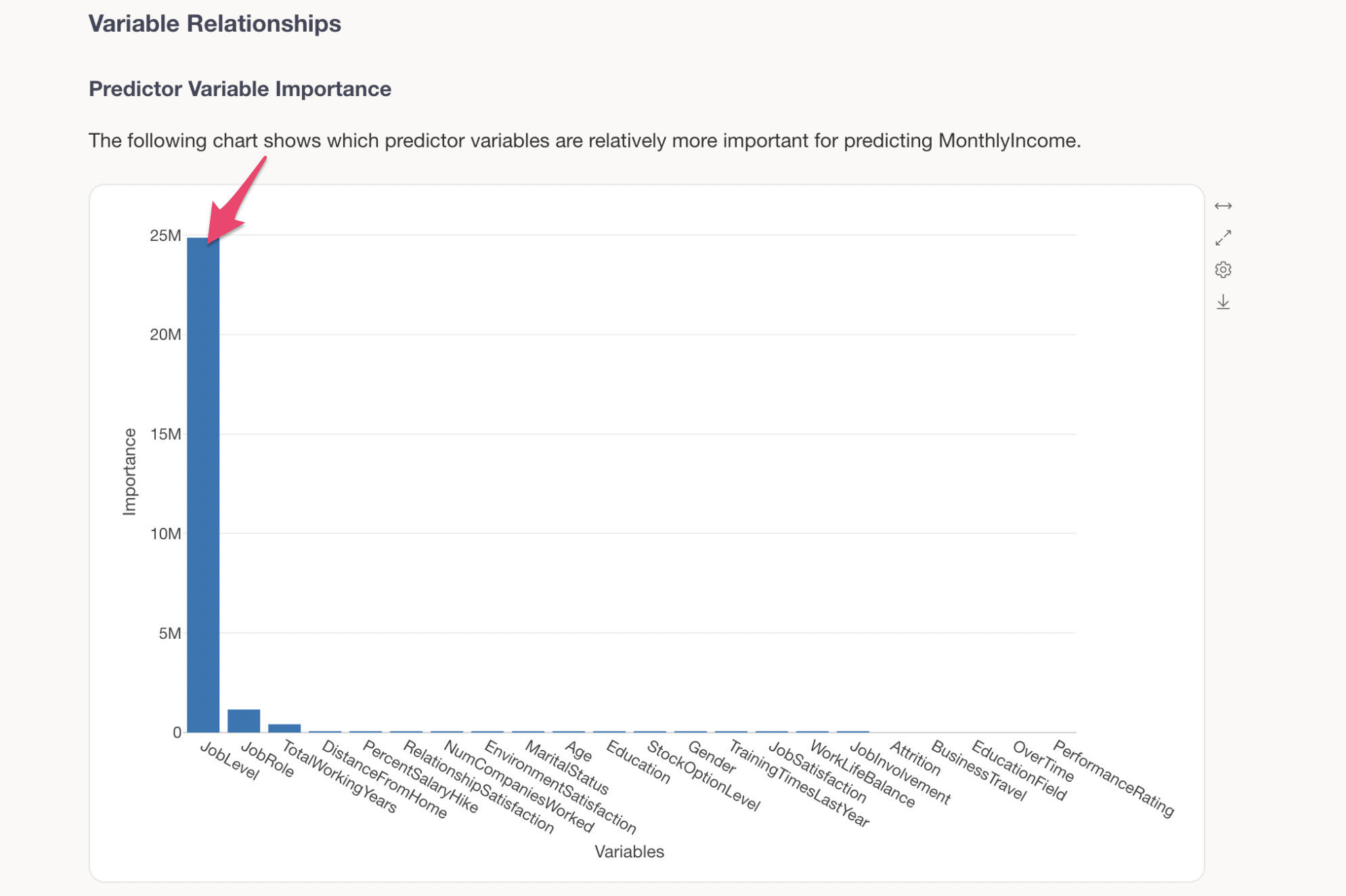
The next most important variables are JobRole and TotalWorkingYears, indicating that specific job roles and longer tenure also have an impact on MonthlyIncome.
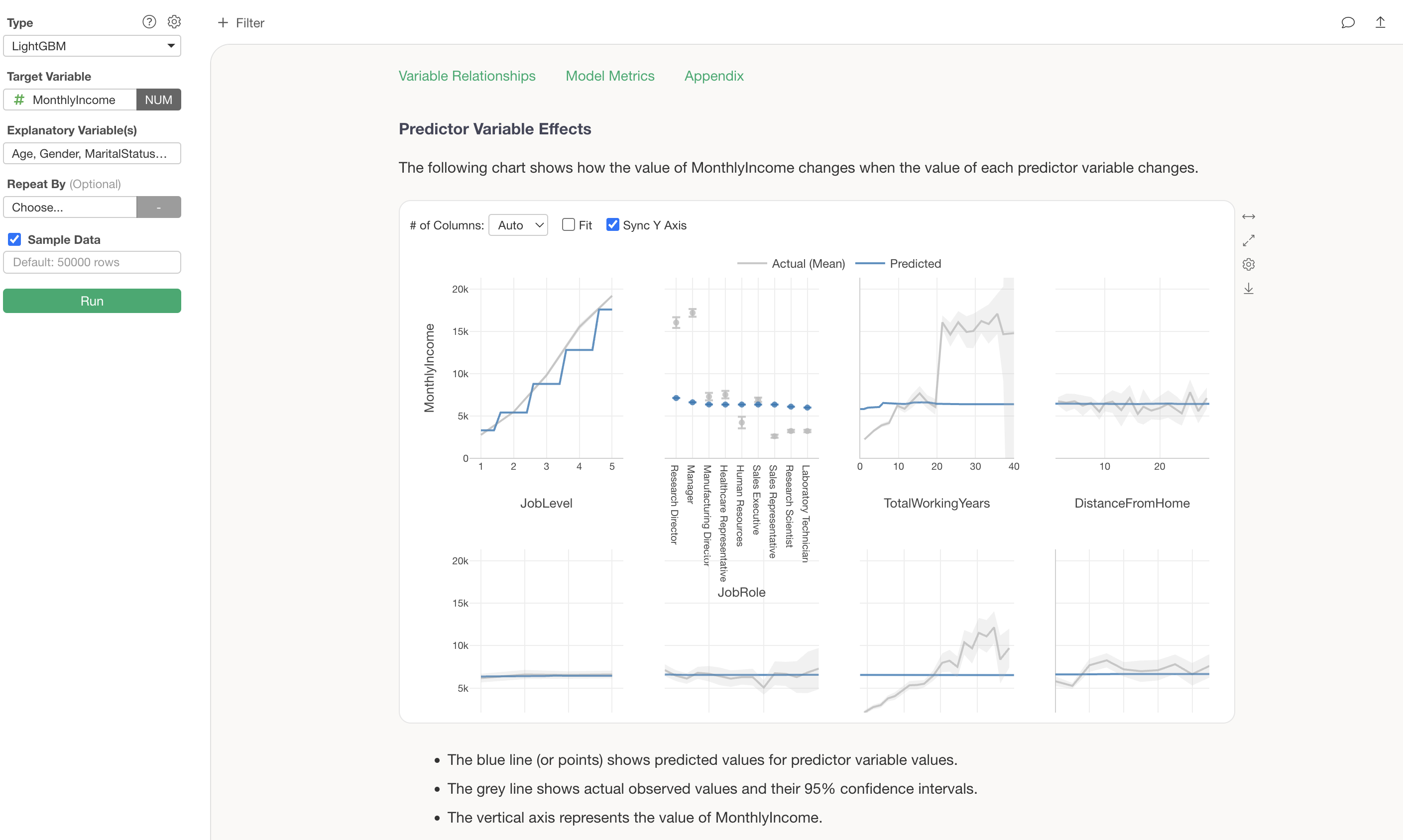
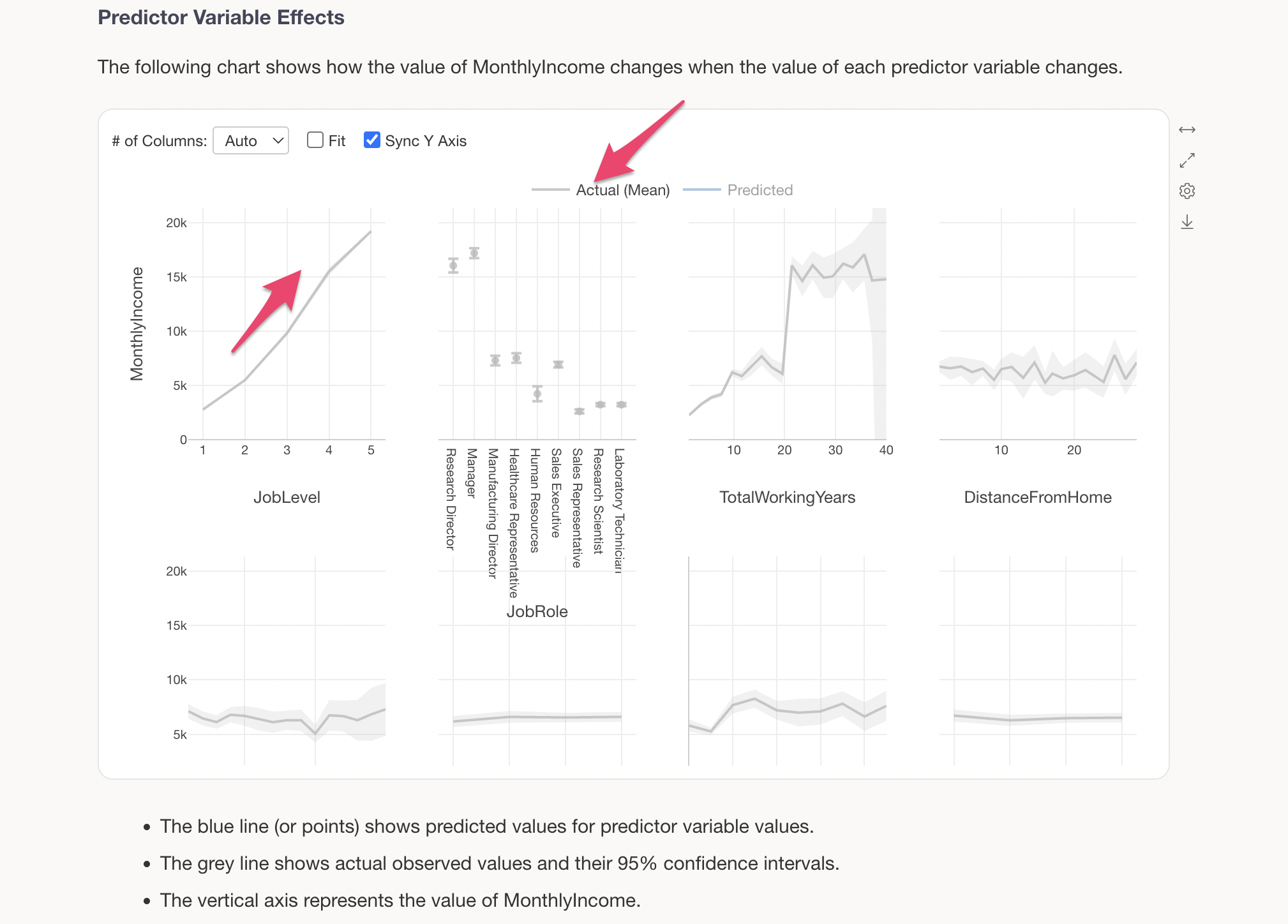
Predictor Variable Effects
The Predictor Variable Effects section shows how the value of the target variable changes when the value of each predictor variable changes. This is visualized using a technique called Partial Dependence Plot (PDP).
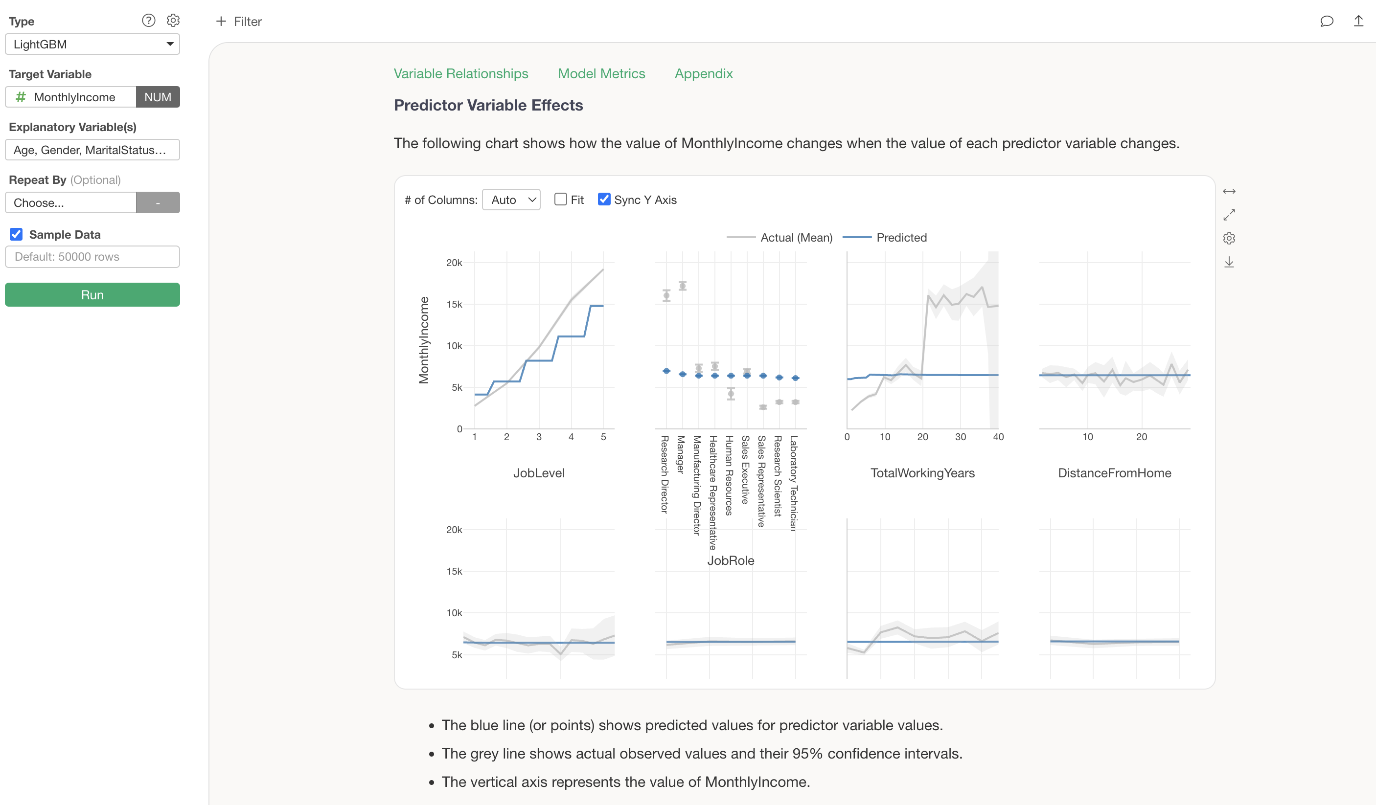
The grey line shows the actual observed values, while the blue line shows the predicted values (values estimated by the model). For example, looking at the change in MonthlyIncome by JobLevel, we can see a clear trend of MonthlyIncome increasing significantly as JobLevel goes up.
The blue line represents the predicted values.
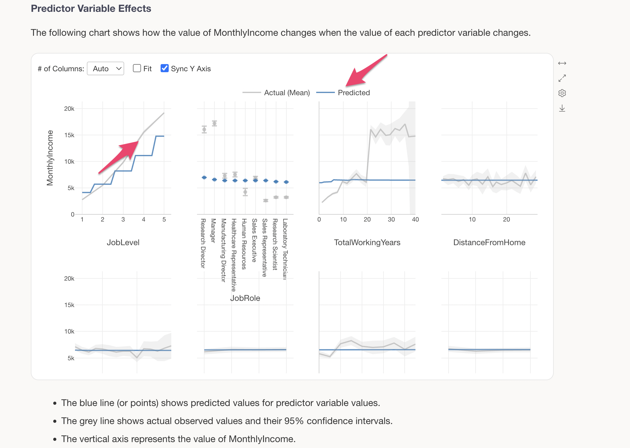
We can see that there is a relationship where MonthlyIncome increases as JobLevel goes up.
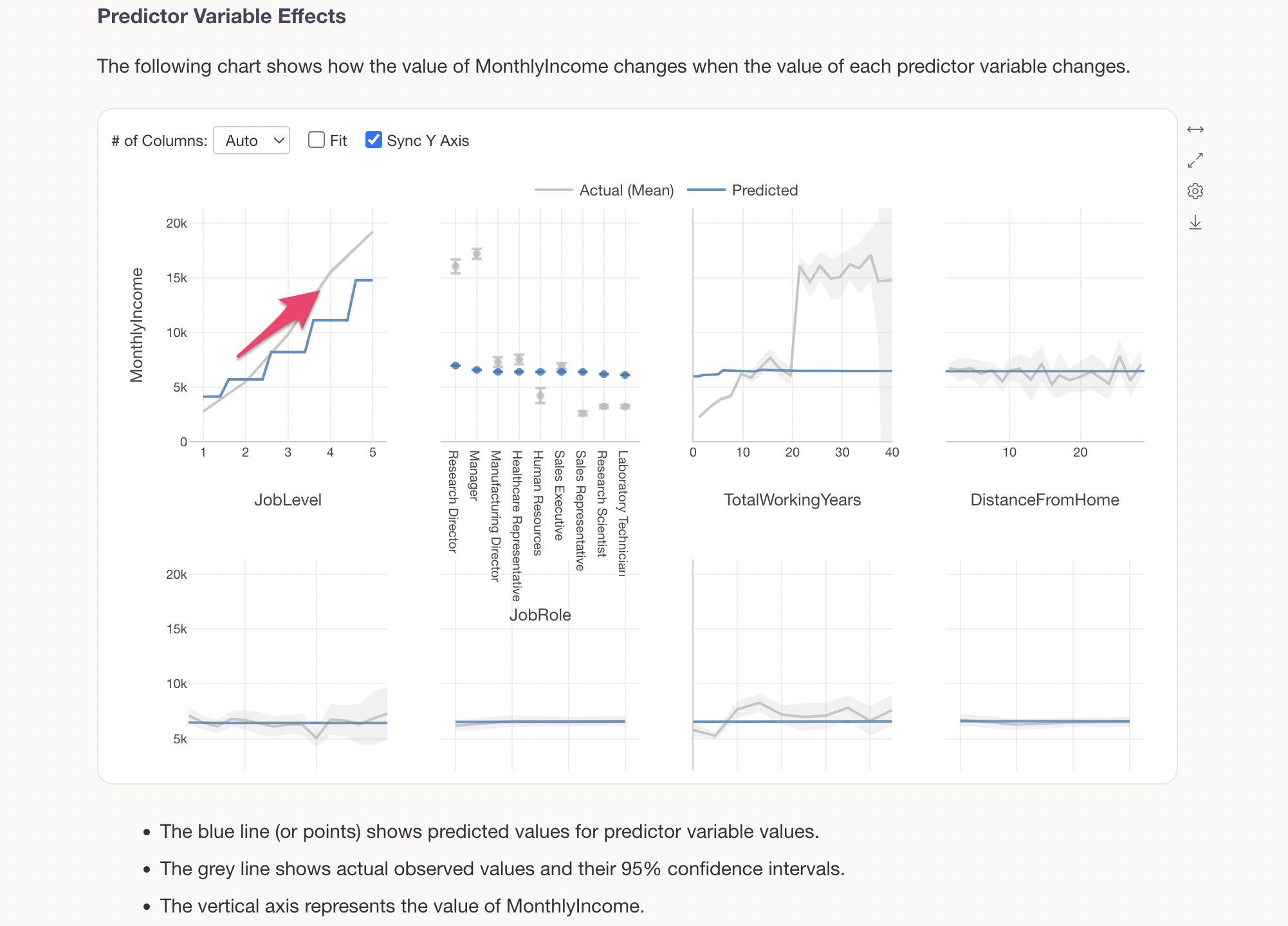
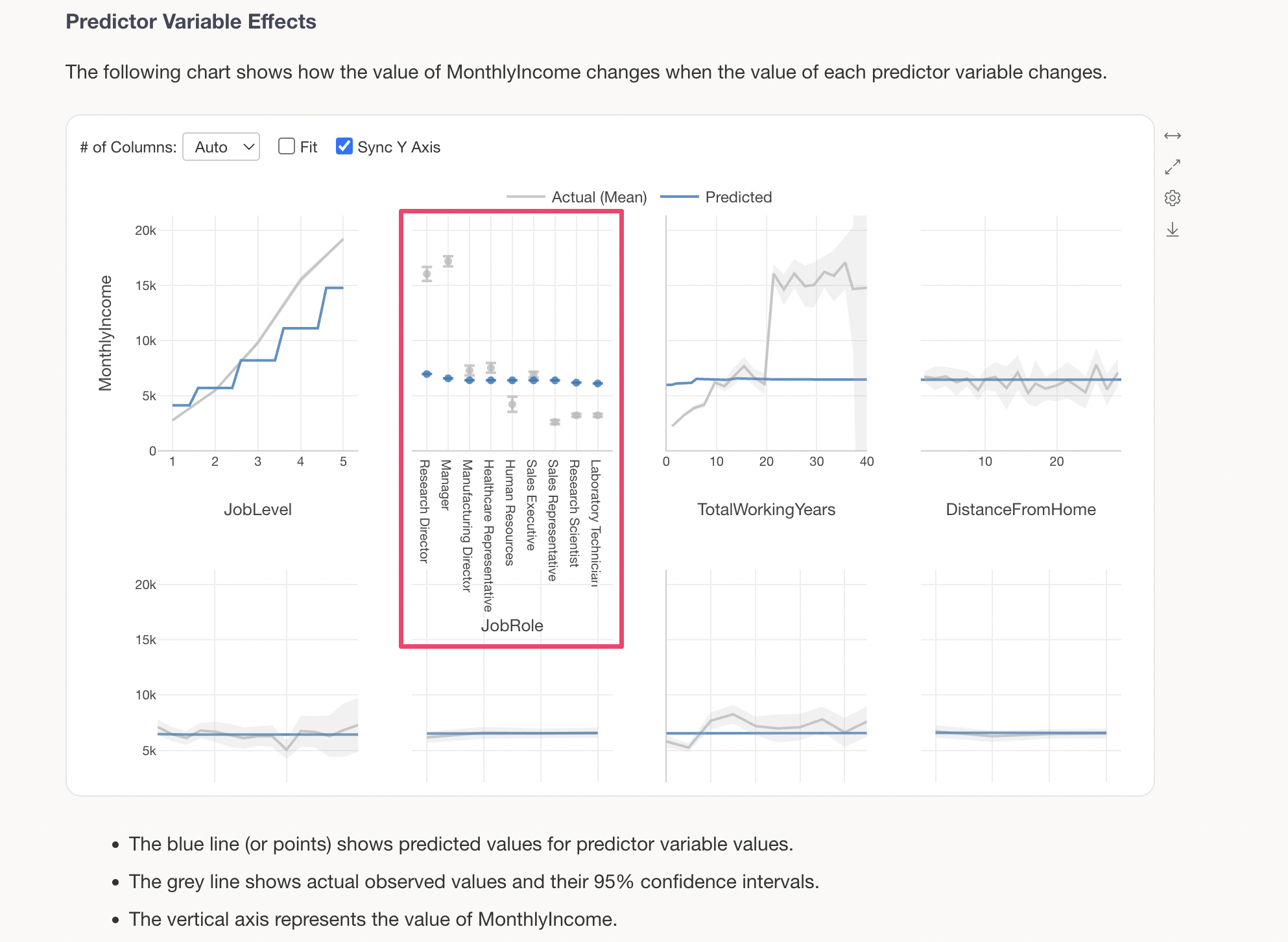
For categorical variables (character type variables), predicted values are displayed for each category. For example, looking at JobRole, we can see that Research Directors and Managers have slightly higher MonthlyIncome compared to other job roles.
Learning Iterations and Accuracy Improvement
The Learning Iterations and Accuracy Improvement section shows how prediction accuracy improves with the number of learning iterations (the number of decision trees created).
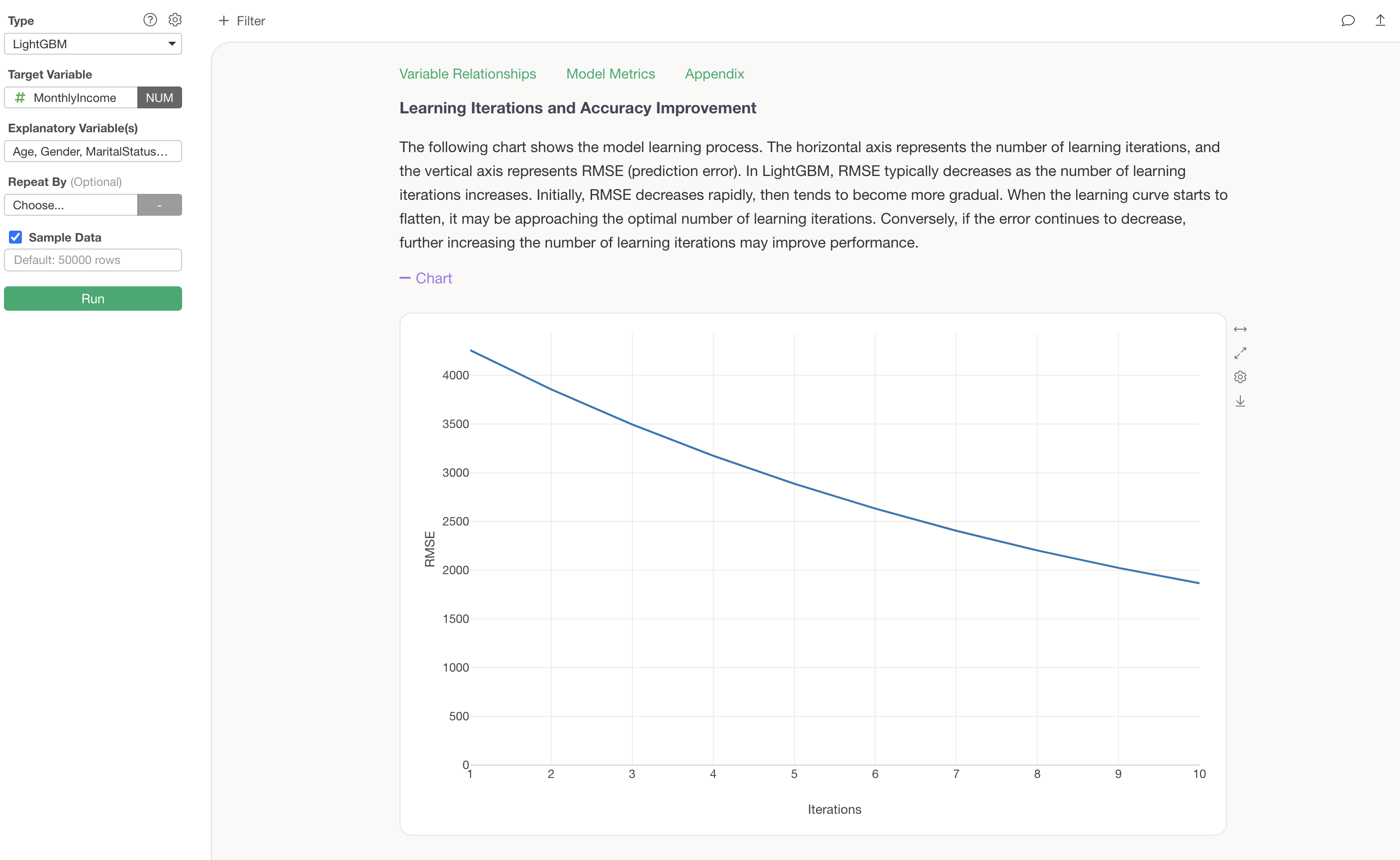
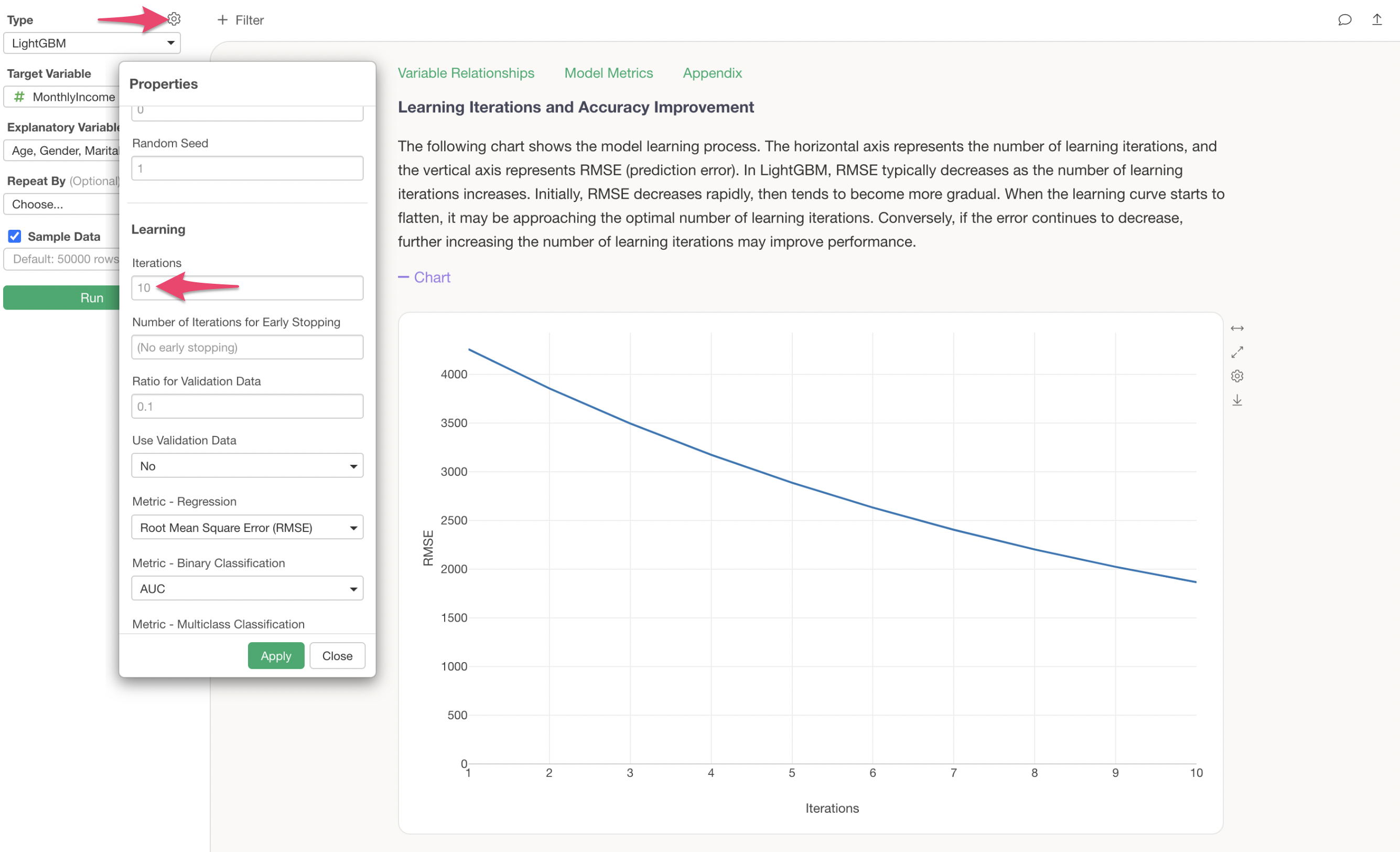
The default number of learning iterations is 10, but this can be changed in the properties. Additionally, you can also adjust the Early Stopping rounds (the number of iterations after which training stops if prediction accuracy does not improve) and the metric used during training.
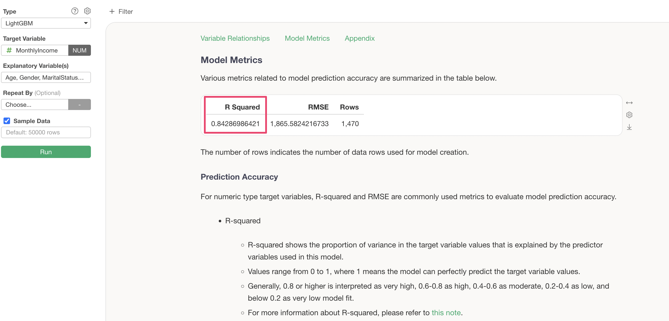
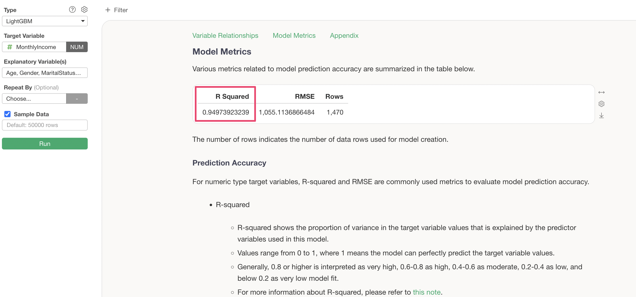
Model Metrics
The Model Metrics section allows you to check the prediction accuracy of this model.
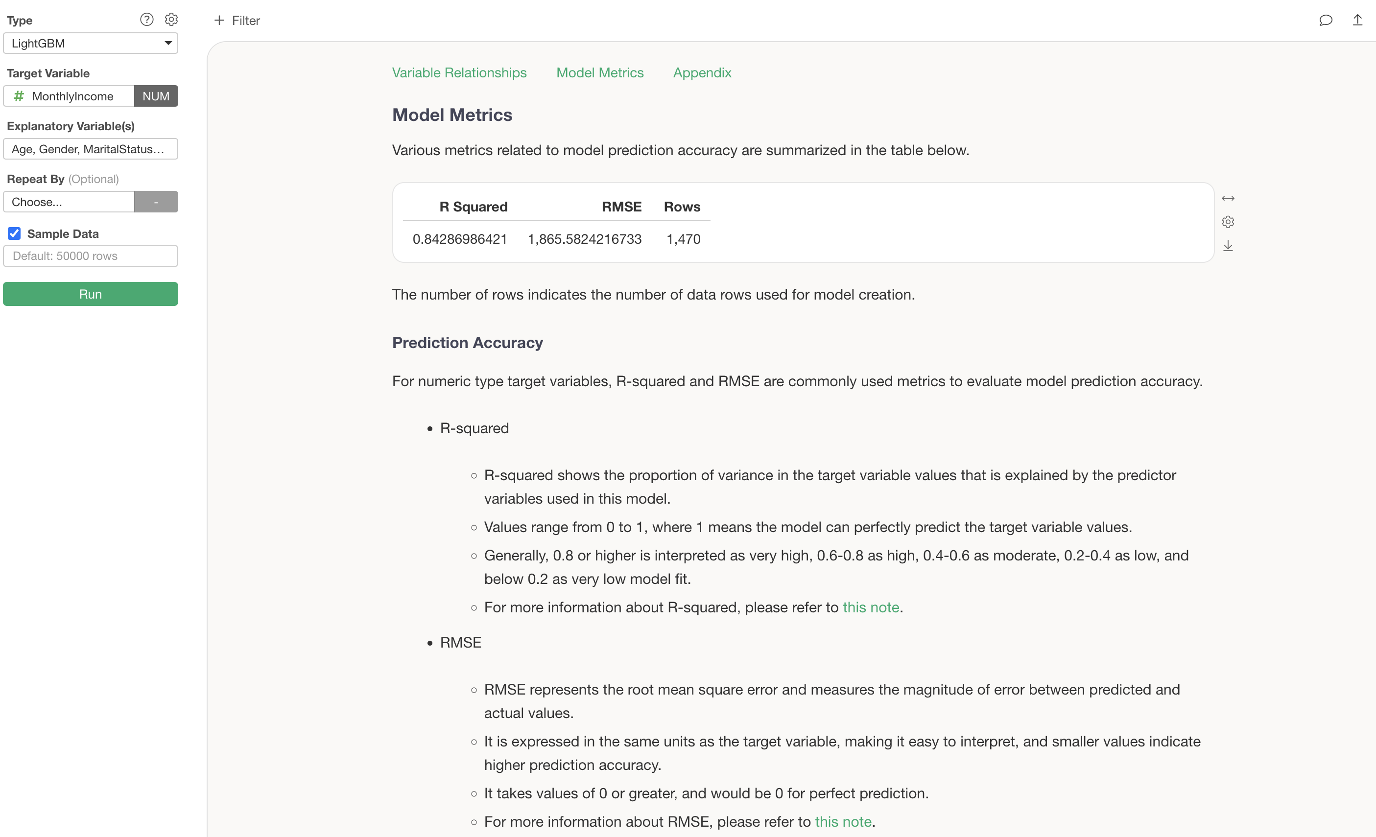
R Squared is a metric that indicates the proportion of variance from the data’s mean that the model can explain. It takes values between 0 and 1, where values closer to 1 indicate that the model explains the variance in the data well.
In this case, the R Squared is 0.84, meaning this model explains 84% of the variance in the data.
Let’s try increasing the number of learning iterations from 10 to 20 and see if the prediction accuracy improves.
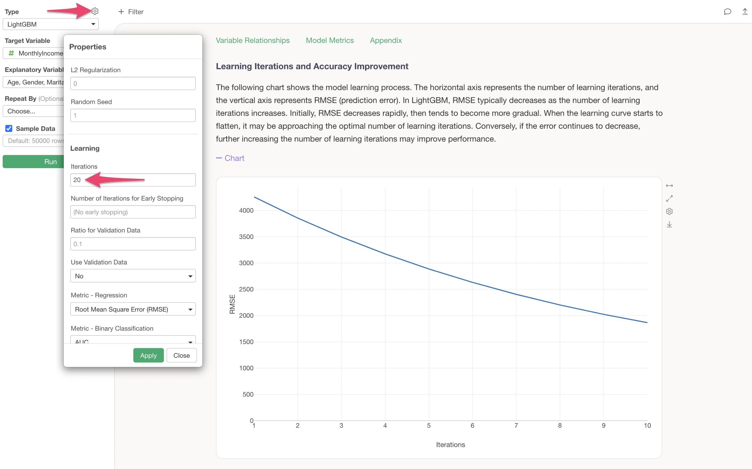
We can confirm that increasing the number of learning iterations has reduced the RMSE (the magnitude of error between predicted and actual values).
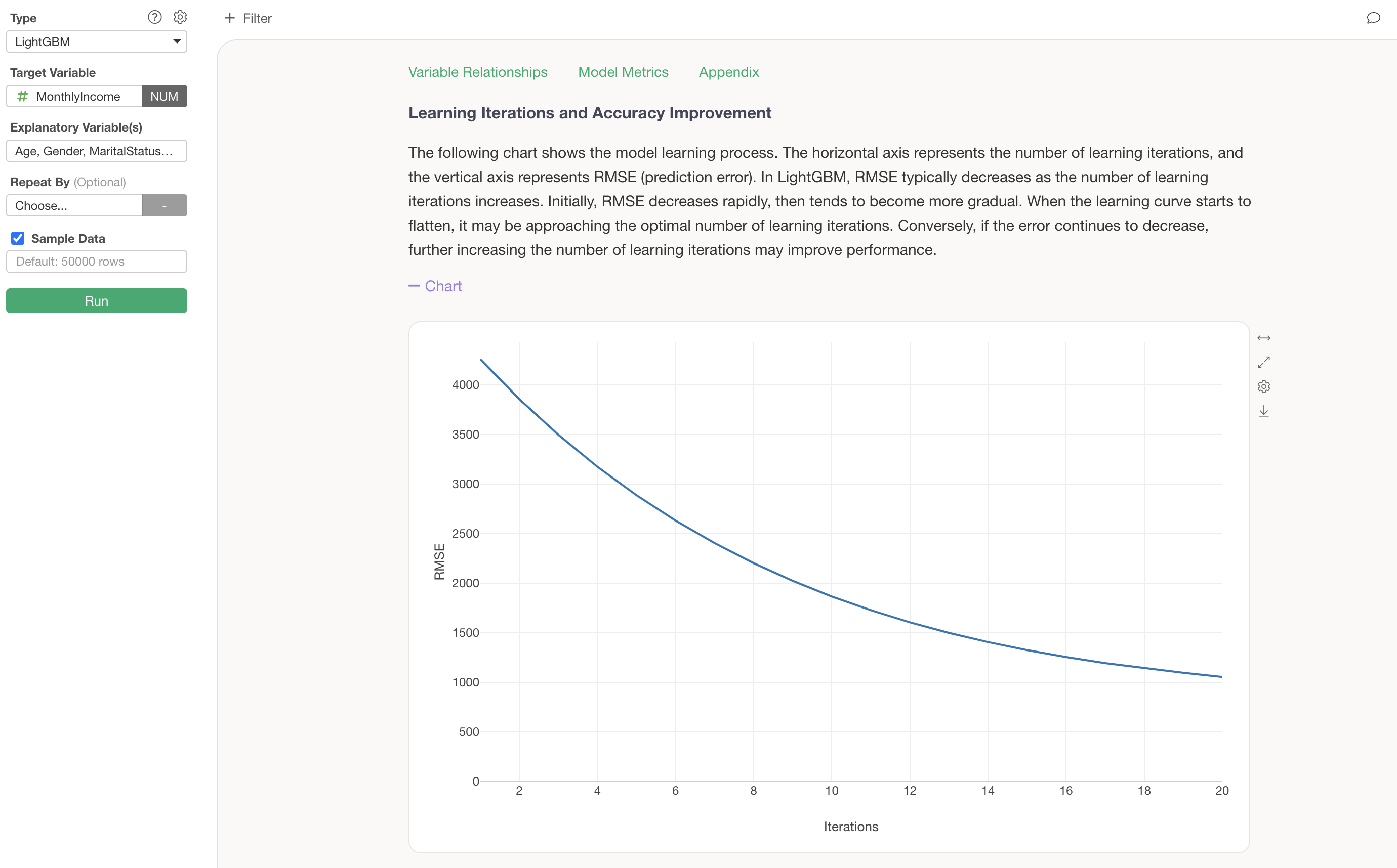
Furthermore, the R Squared has increased from “0.84” to “0.949”, confirming that increasing the number of learning iterations has improved the prediction accuracy.
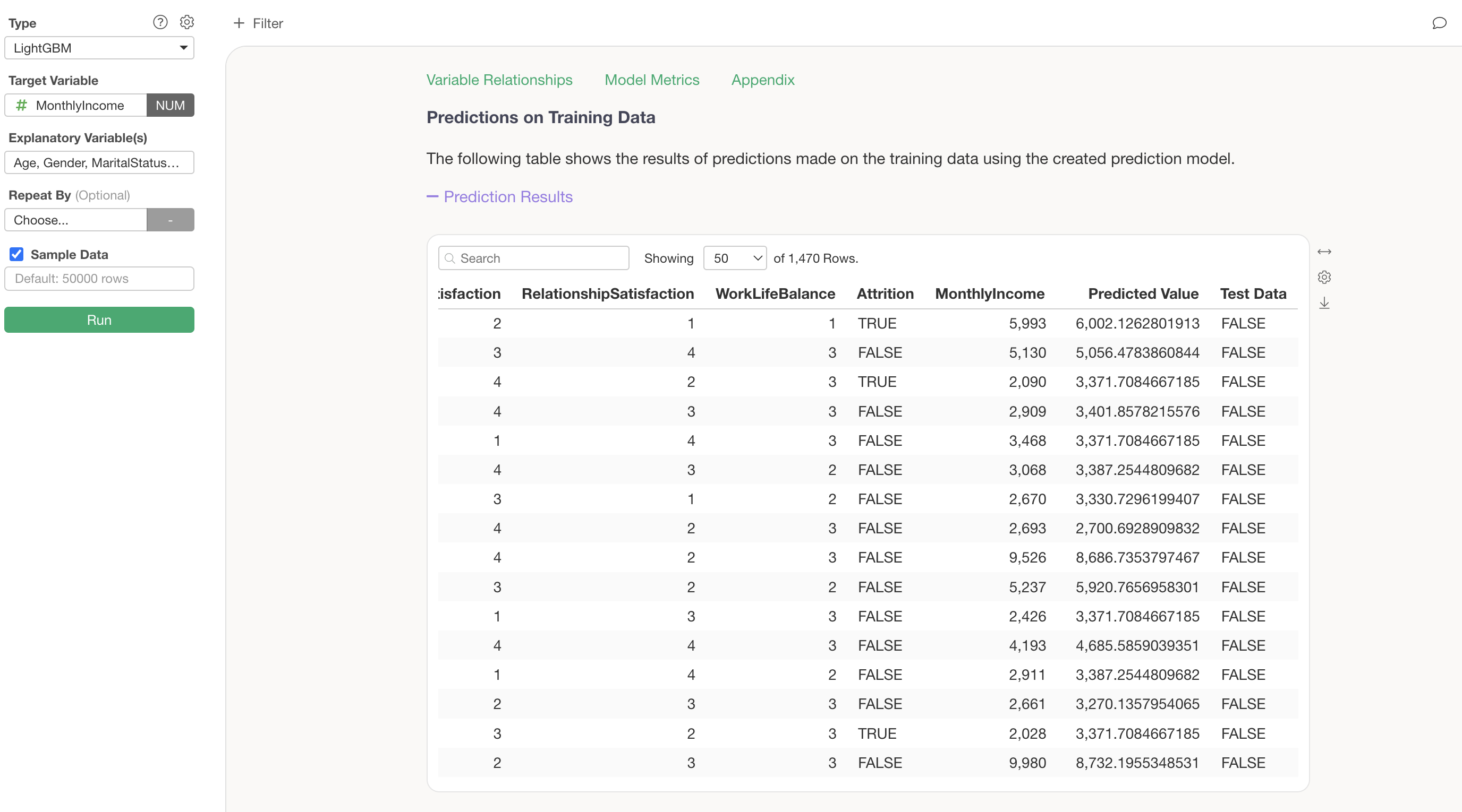
Predictions on Training Data
The Predictions on Training Data section allows you to view the data used for the model and the predicted values in a table format. By comparing the target variable MonthlyIncome side by side with the Predicted Value calculated by this model, you can assess how accurate the model’s predictions are at the individual data level.
Summary
LightGBM is a gradient boosting framework developed by Microsoft that, like XGBoost, improves prediction accuracy by building multiple decision trees sequentially. In Exploratory’s Analytics view, you can simply select “LightGBM” as the type, specify the target variable and explanatory variables, and run it to immediately see results including variable importance, predictor variable effects, the learning process, and prediction accuracy.
LightGBM achieves faster training and better memory efficiency compared to XGBoost through its unique techniques such as the Leaf-wise growth strategy, GOSS, and EFB. These advantages become particularly pronounced when handling large-scale data, so by choosing between XGBoost and LightGBM based on data size and analysis objectives, you can conduct data analysis more efficiently.
Frequently Asked Questions About LightGBM
Q: How are the actual values shown in the prediction tab calculated?
The actual values in the prediction tab are displayed differently depending on the data type of each predictor variable. For details, please refer to this note.
Q: How are the predicted values shown in the prediction tab calculated?
The predicted value chart is called a Partial Dependence Plot (PDP), which visualizes how the prediction result changes when the value of the variable of interest is varied. For details, please refer to this note.
Q: Missing values appear in predicted labels when making predictions on new data using a model that predicts categories
When you have built a model to predict category column values and use that model to make predictions on new data, missing values may appear in the predicted labels.
The main causes are likely one of the following two:
Category values that did not exist in the explanatory variables when the prediction model was created now exist in the new data being predicted.
There are missing values in the columns used as explanatory variables in the new data being predicted.
If the issue is that category values not present in the explanatory variables during model creation now exist in the new data, and if those categories are likely to appear in future predictions, you may want to incorporate those category values into the model as well.