Introduction to Line Chart
A line chart uses 'lines' to visualize the direction of numerical values so that we can see which ways the values are moving to like upward or downward. It is often used for time series data so that we can understand our numbers are increasing or decreasing as the time goes by.
Sample Data
We'll use this Sales Data. You can download it from this page.
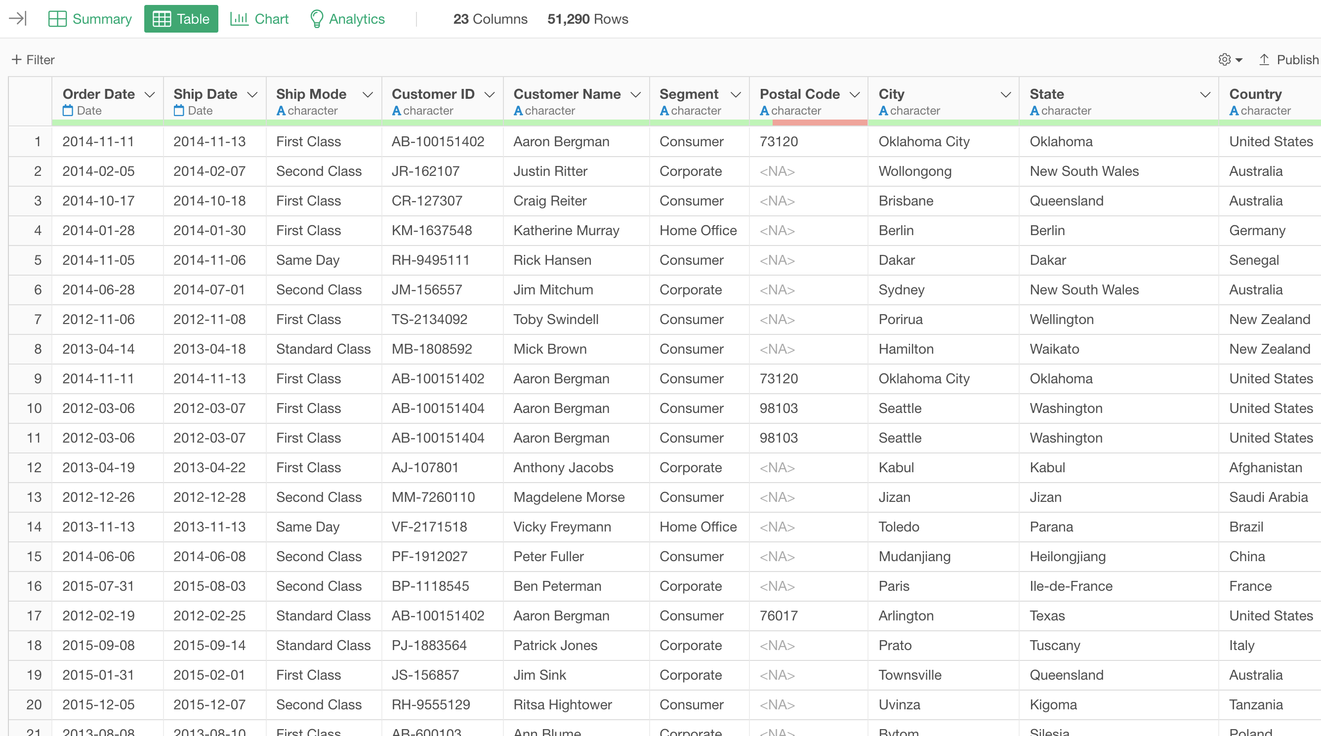
In this data, each row represents each customer's order, and the columns are additional information about each order.
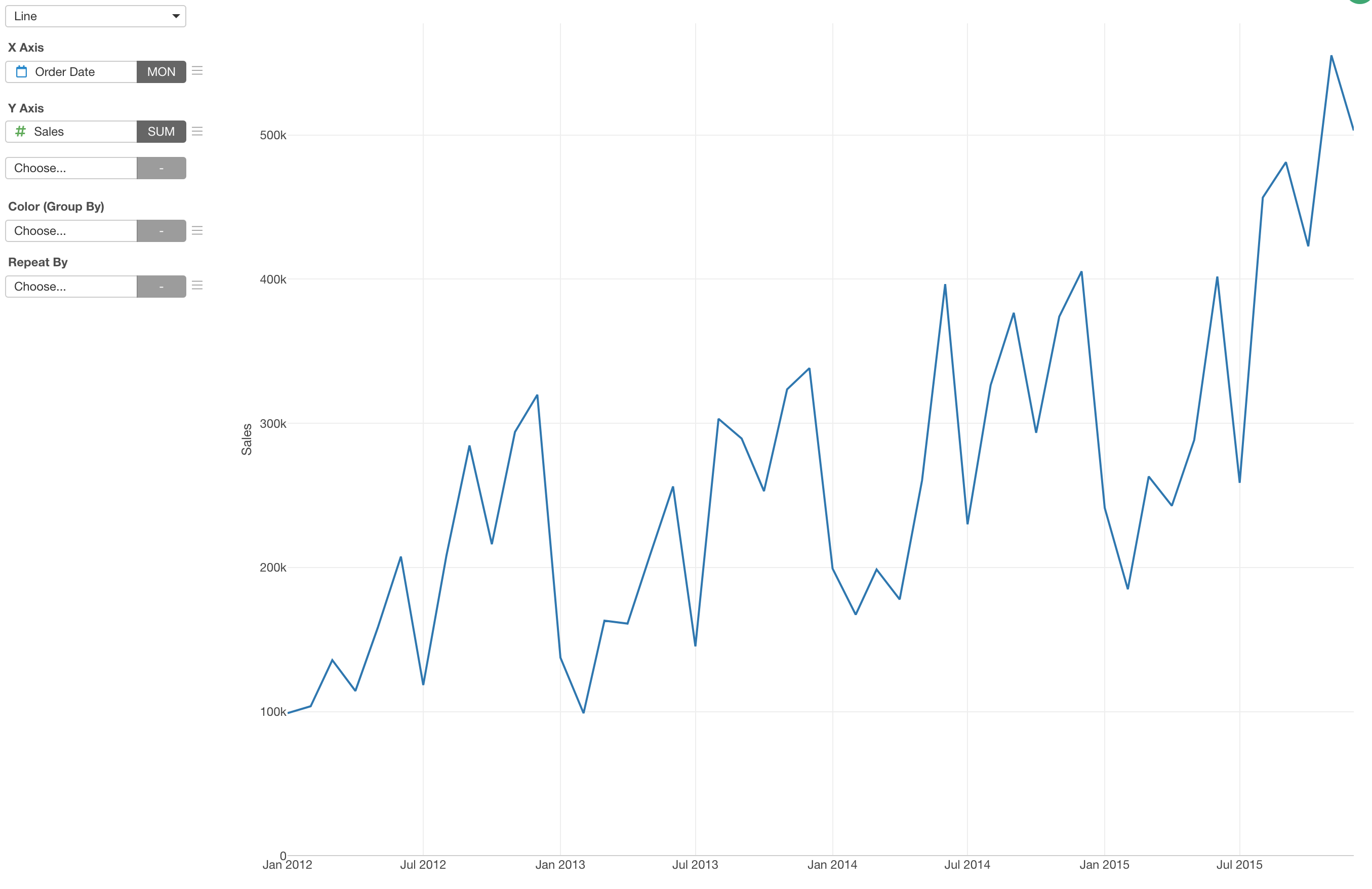
1. Create a Bar Chart
First, let's create a simple line chart to see the trend of sales by month.
- X-Axis: Order Date (Month)
- Value: Sales (Sum)
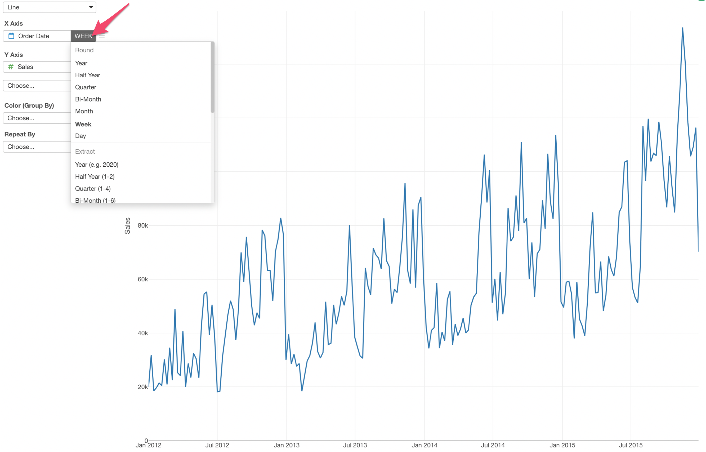
Set Aggregation Level for Date/Time Columns
When you assign a Date or Date/Time data type columns you can choose how you like to set the aggregation level. For example, if you want to aggregate the sales by week you can simply select 'Week' from the dropdown.
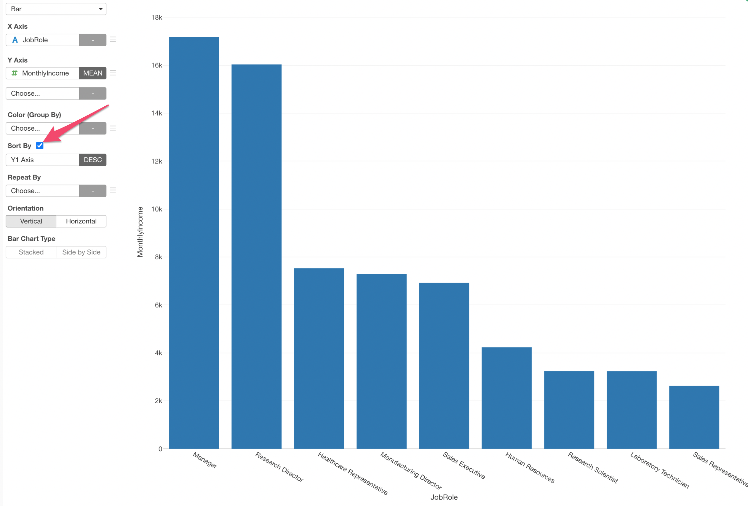
Sort the Bars
You can quickly sort the bars based on the Y-Axis values (Mean Income).
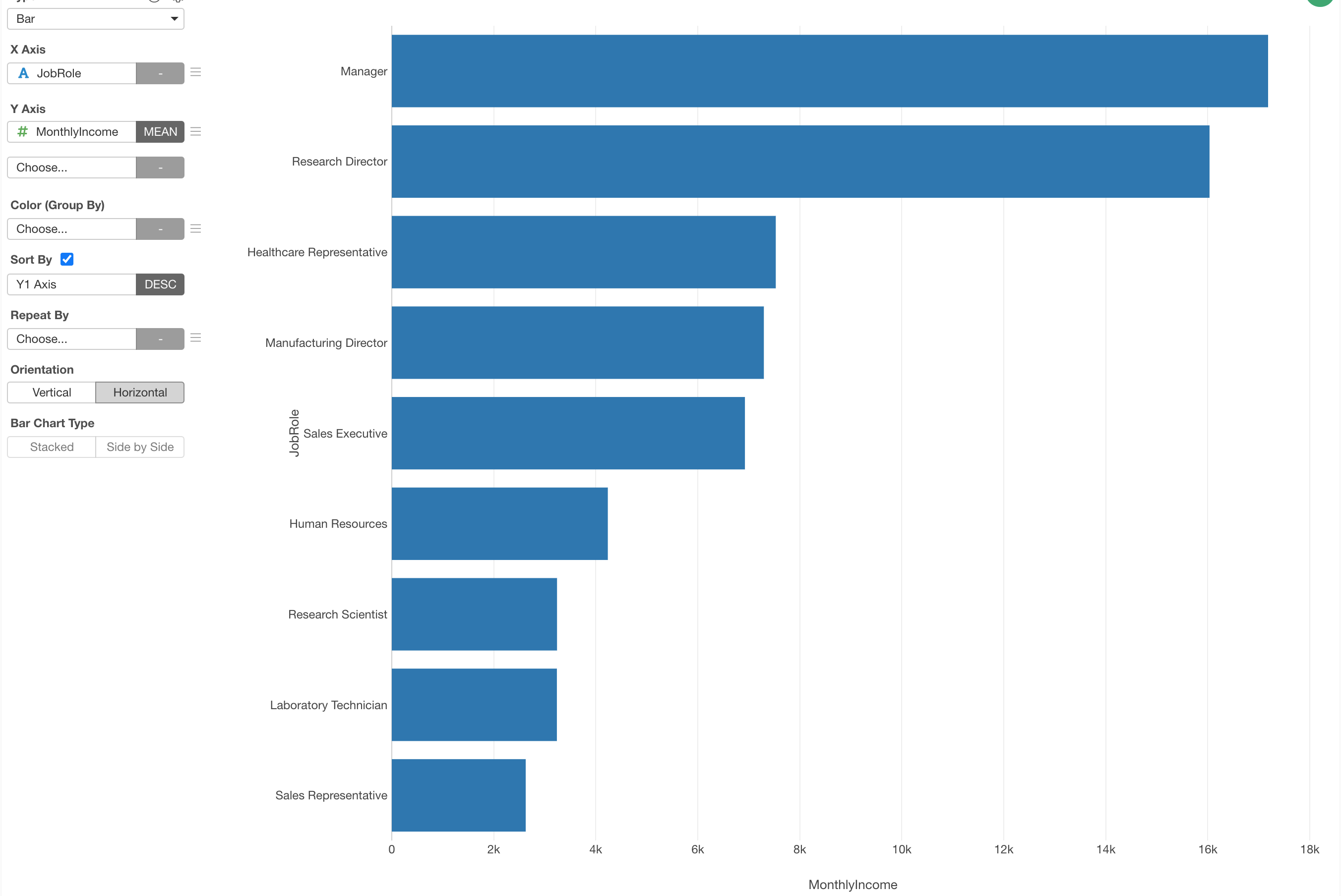
Change the Direction to Horizontal
Let's show the bar chart in a horizontal way.
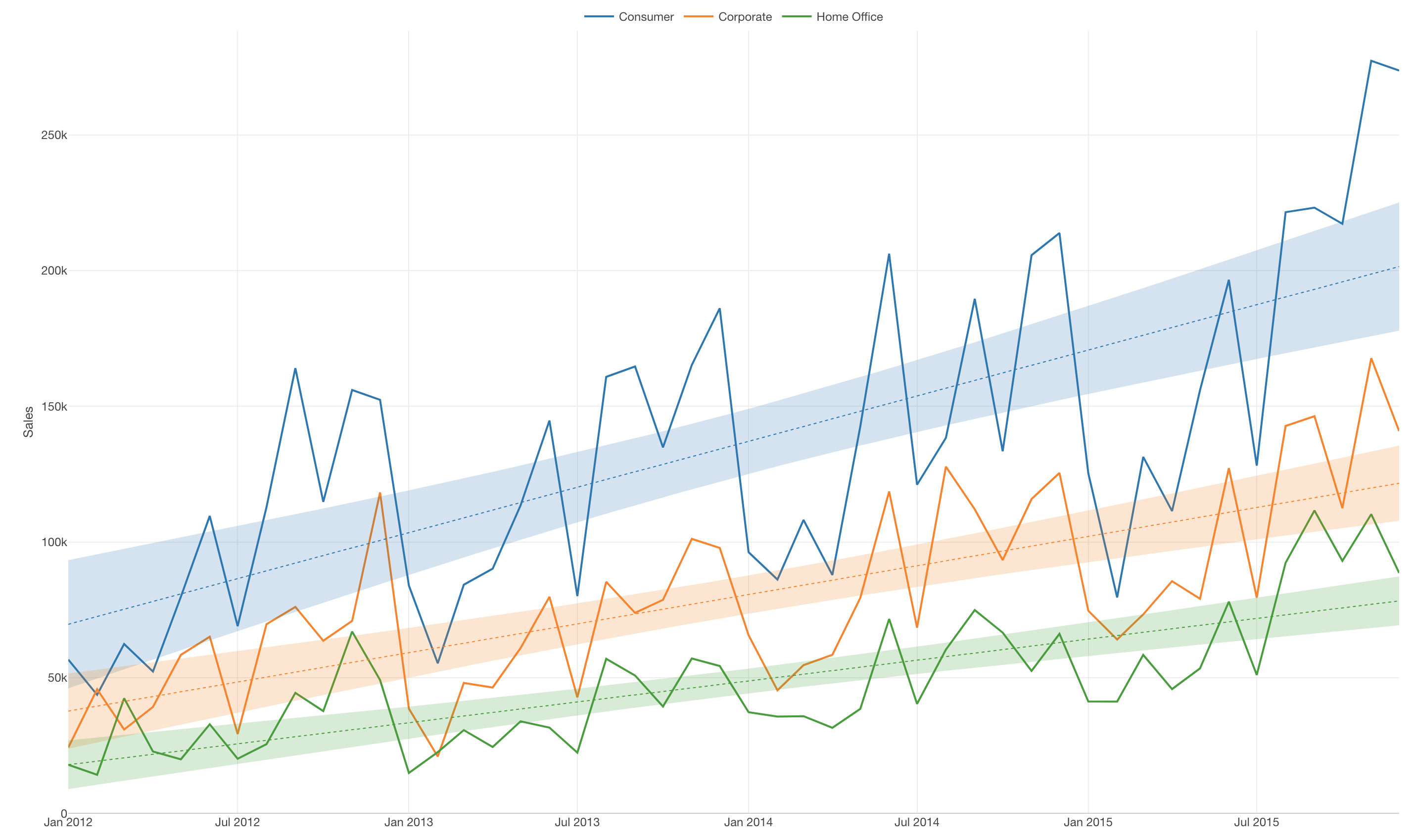
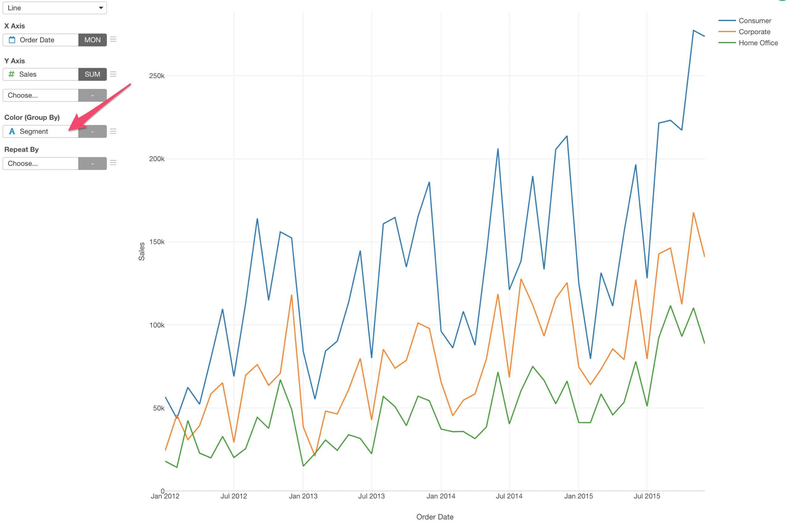
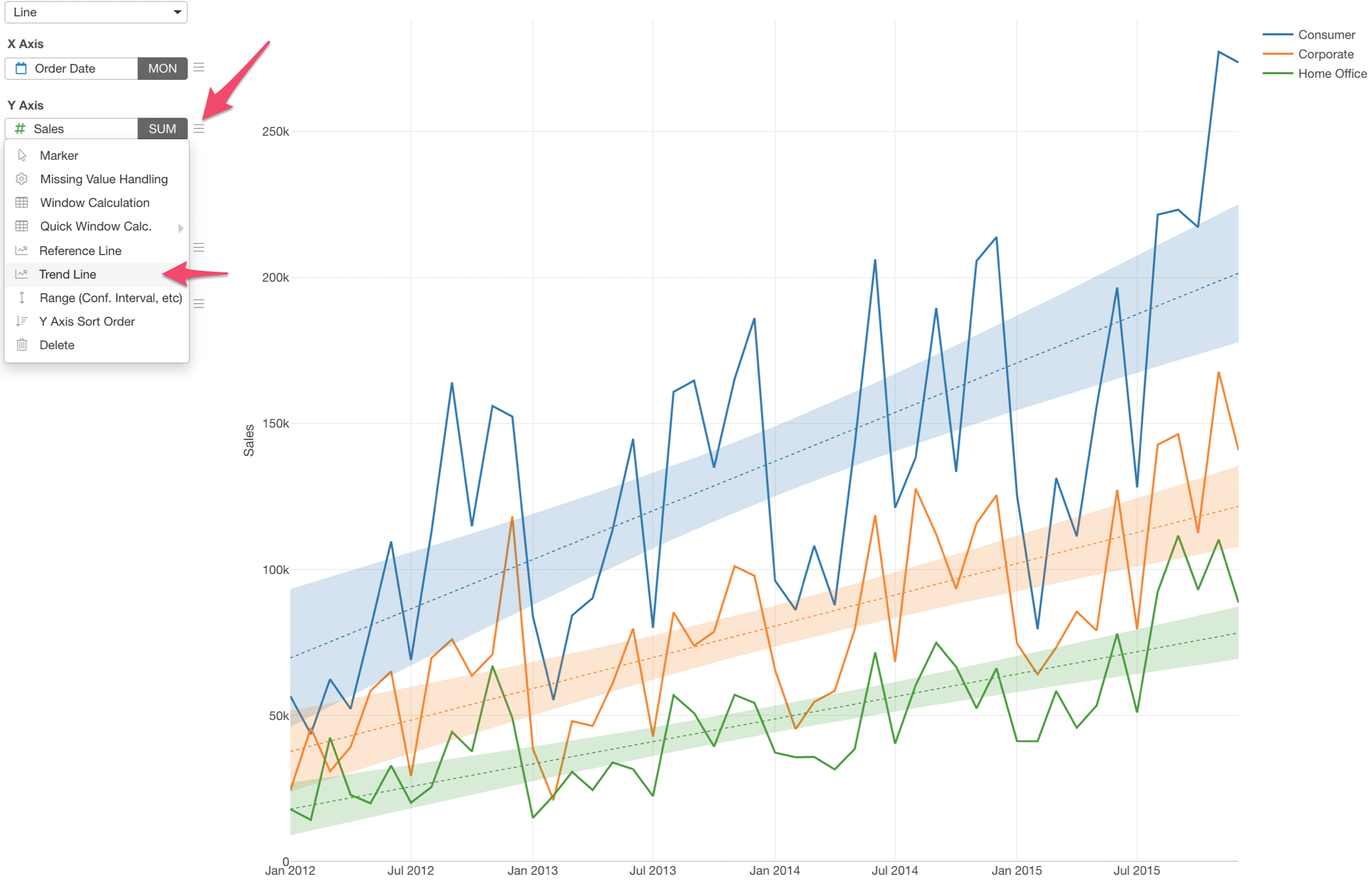
2. Use Color to Separate Lines
If we want to see the sales trend by customer segment we can assign the 'Segment' column to the Color.
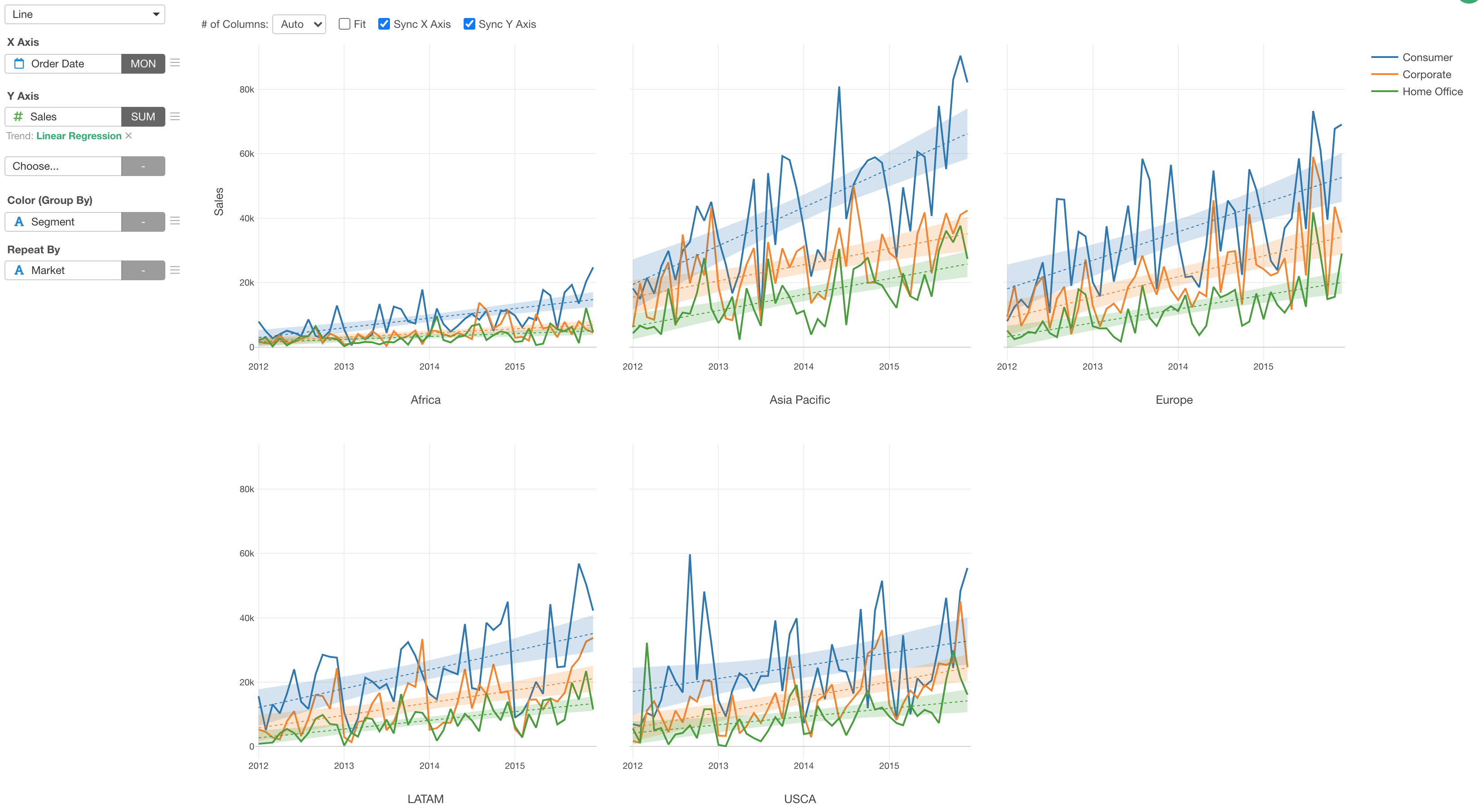
3. Show Trend Lines
You can quickly show trend lines so that you can see the overall trend. Here's a chart that shows the trend lines for each segment's sales values with one of the methods called 'Linear Regression'.
4. Repeat the Bar Chart
You can use 'Repeat By' to create a chart for each categorical value of a column you are interested in. Here we have the monthly sales trend chart shown for each market.