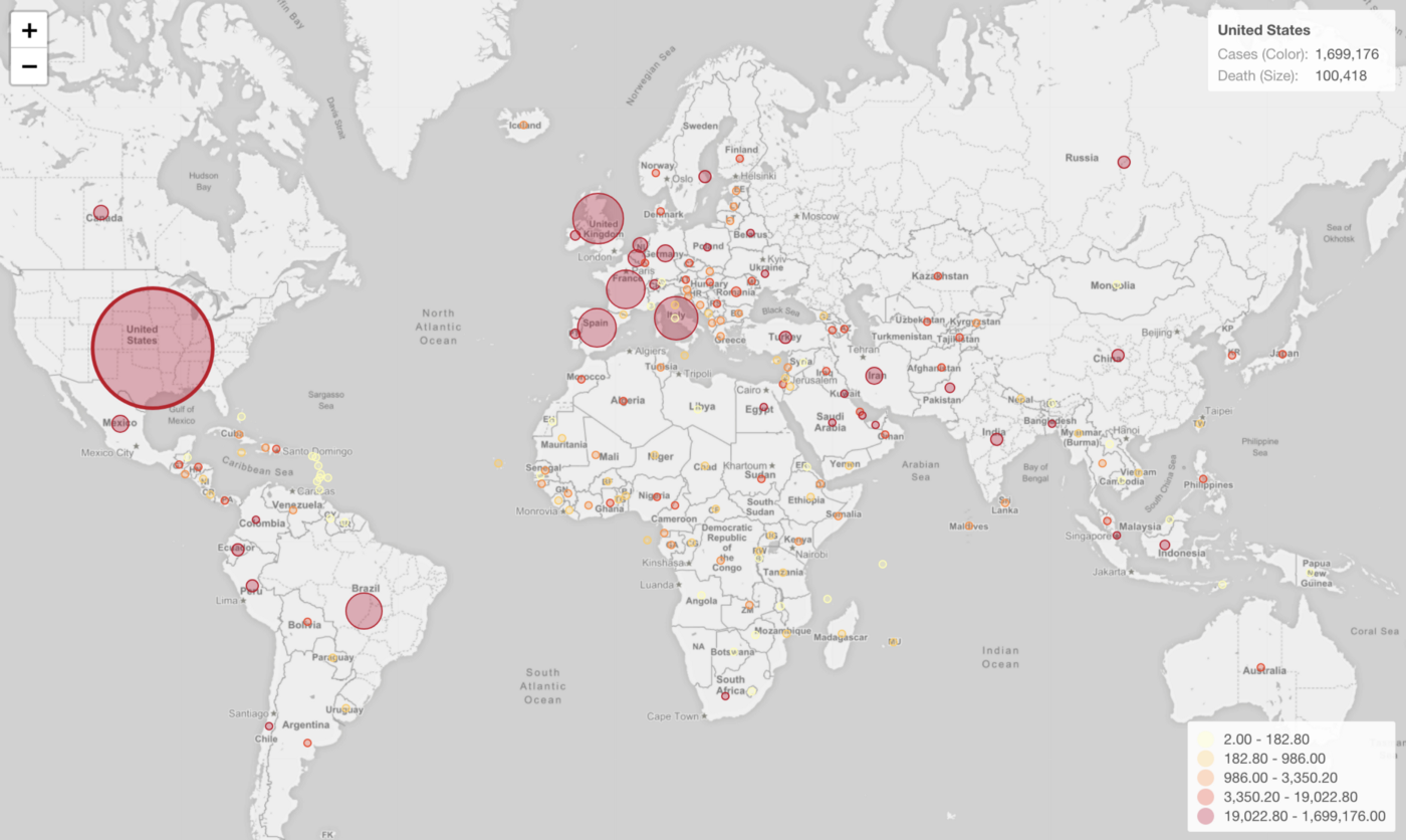
Introduction to Map - Standard
Exploratory has several map types, one of them is called 'Standard' type, which is ideal for visualizing location data such as country, prefecture, etc. in an intutive way.
Sample Data
I’m going to use this COVID-19 data that contains the infected case and death numbers per country.
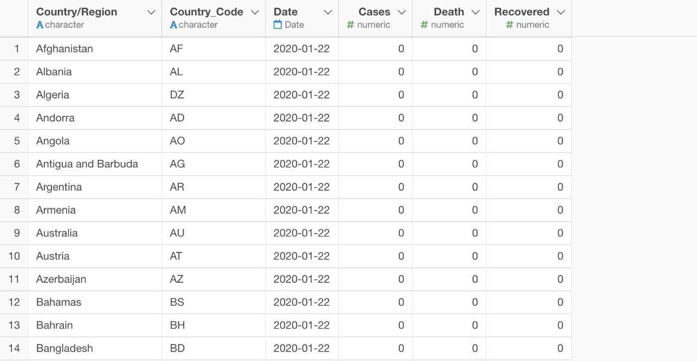
You can download it from this link, or directly import the data from the Data Catalog.
1. Creating a Map
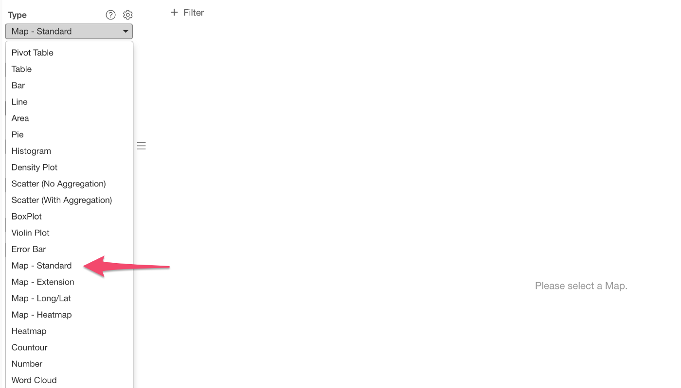
You can select ‘Map — Standard’ under the Chart view.
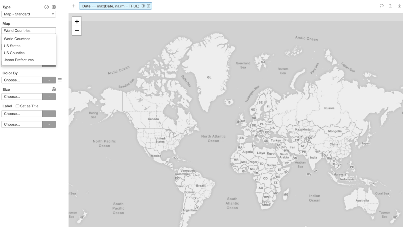
This data is about world countries, so you want to select the ‘World Countries’ Map.
And, assign the ‘Country’ column to ‘Country’ and the ‘Cases’ column to ‘Color By’.
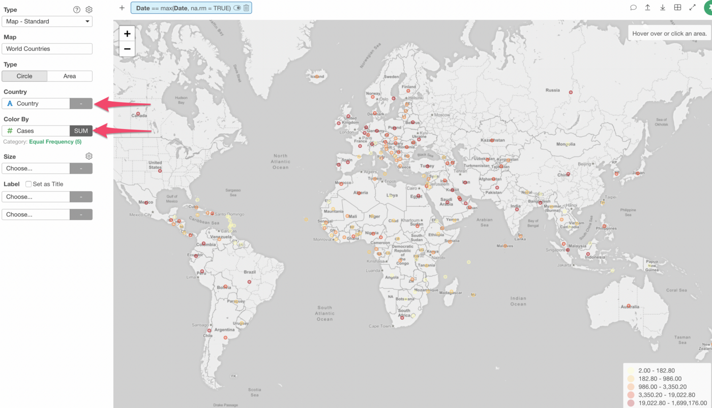
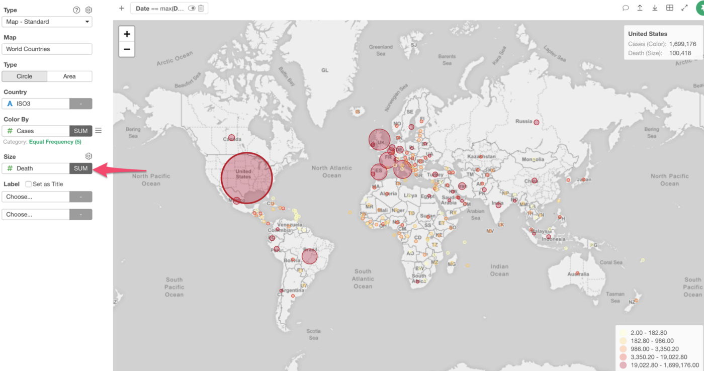
The default is ‘Circle’ type so each country is now shown as a circle with the color based on the number of infected cases.
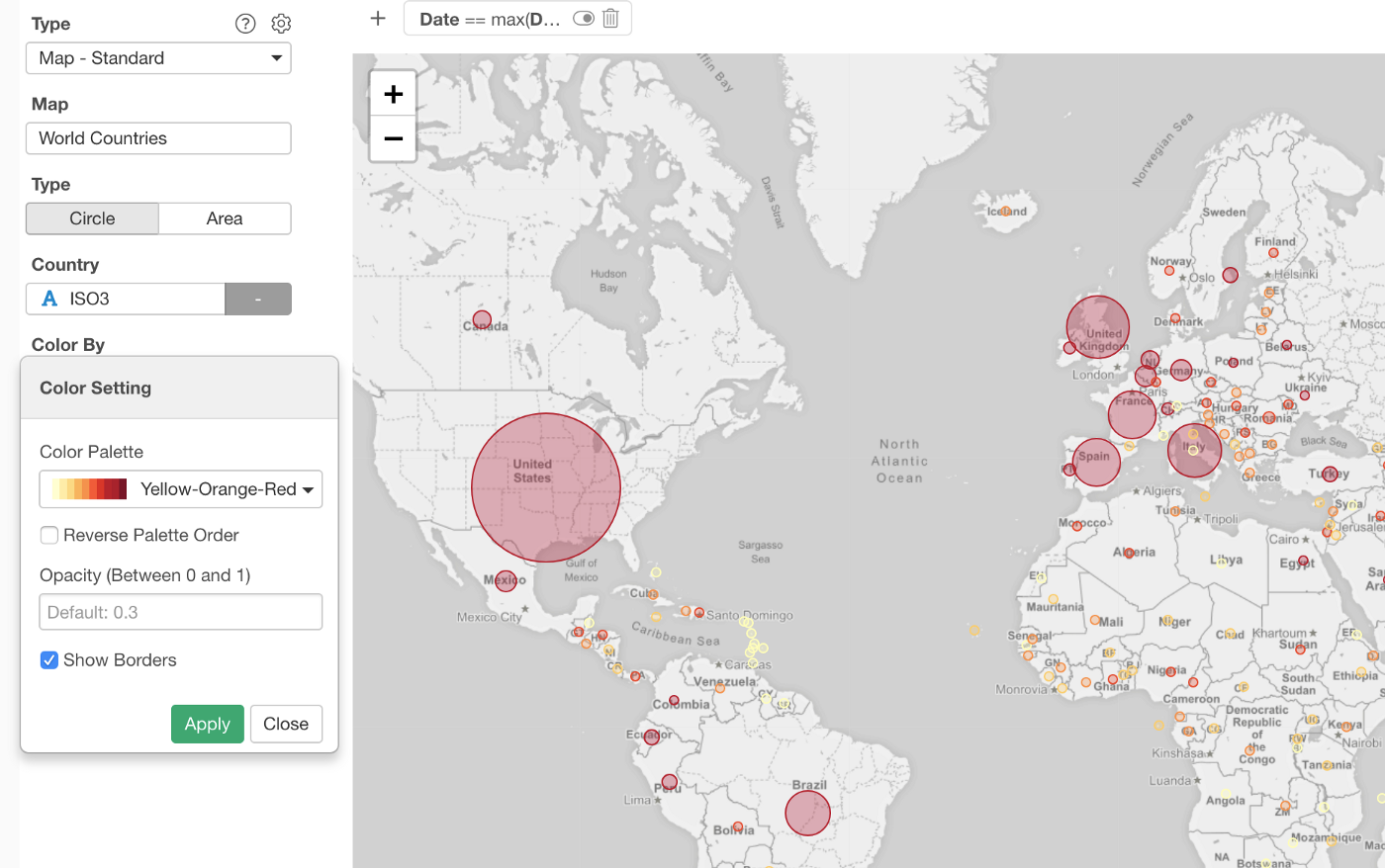
Note that I have changed the color palette and changed the binning option to ‘Equal Frequency’ so that each color bin would have the same number of countries.
2. More Ways to Visualize — Circle vs. Area
You can change the type to ‘Area’, which color each county area based on the number of cases.
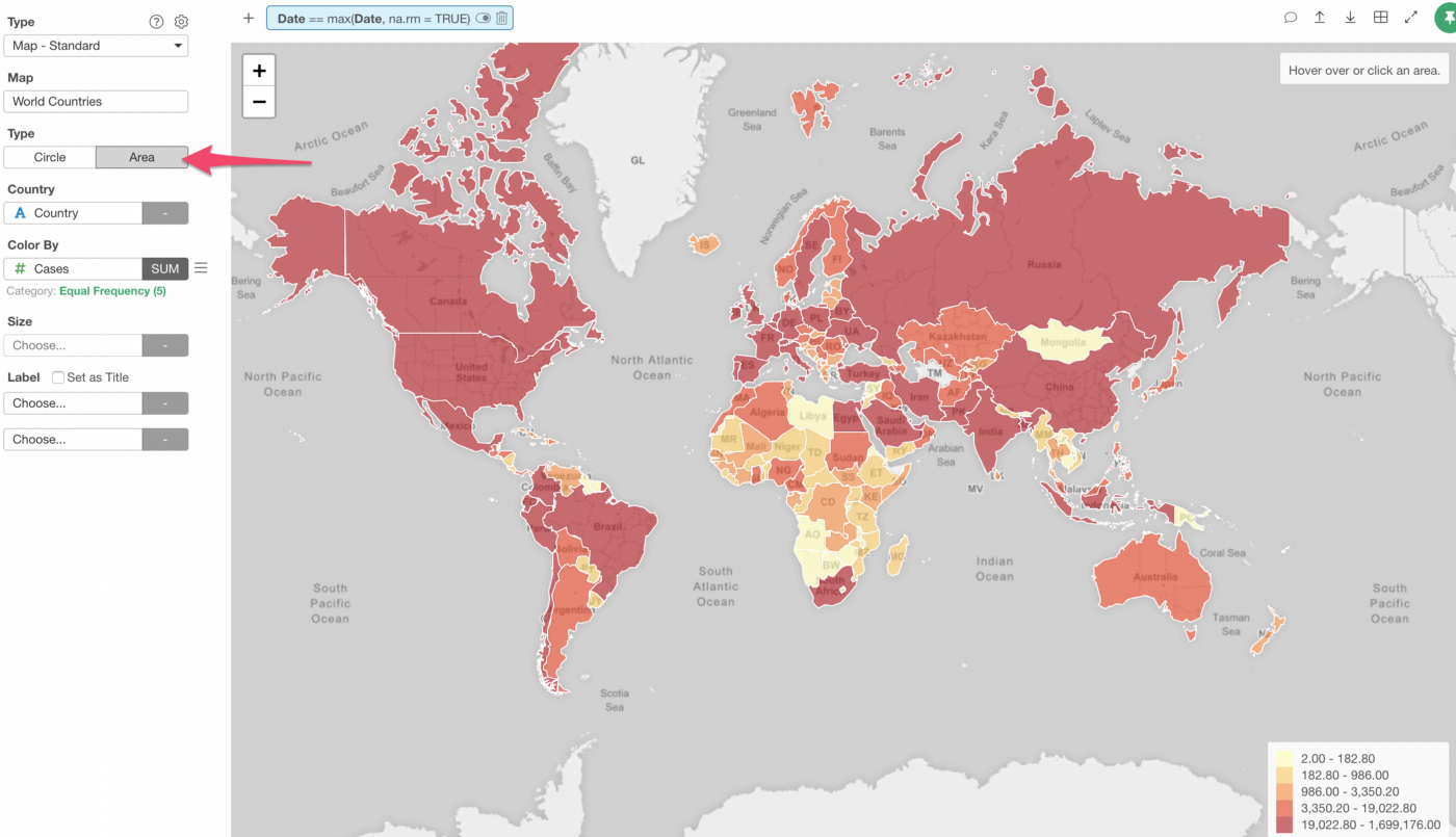
One thing to note about the Area type.
Sometimes, it can confuse you because of the difference in the territory sizes of the countries. For example, bigger countries like the United States, Canada, Russia jump into your eyes and might leave you in impression that they have really large number of cases while you wouldn’t even notice small countries like Belgium, Singapore, etc. even when their numbers are high.
In general, the ‘Circle’ type works better because you can compare the countries based on the color while the size stays the same.
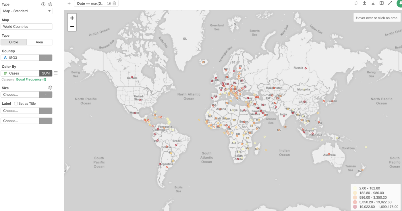
And, of course, you can use the Size to visualize another measure. In this case, I’m assigning the ‘Death’ column to show the number of deaths as the circle size.
3. Location Column Assignment
The country data typically comes in different ways.
For example, the country can be a name (e.g. The United States), ISO 2 letters code (e.g. US), ISO 3 letters code (USA), etc.
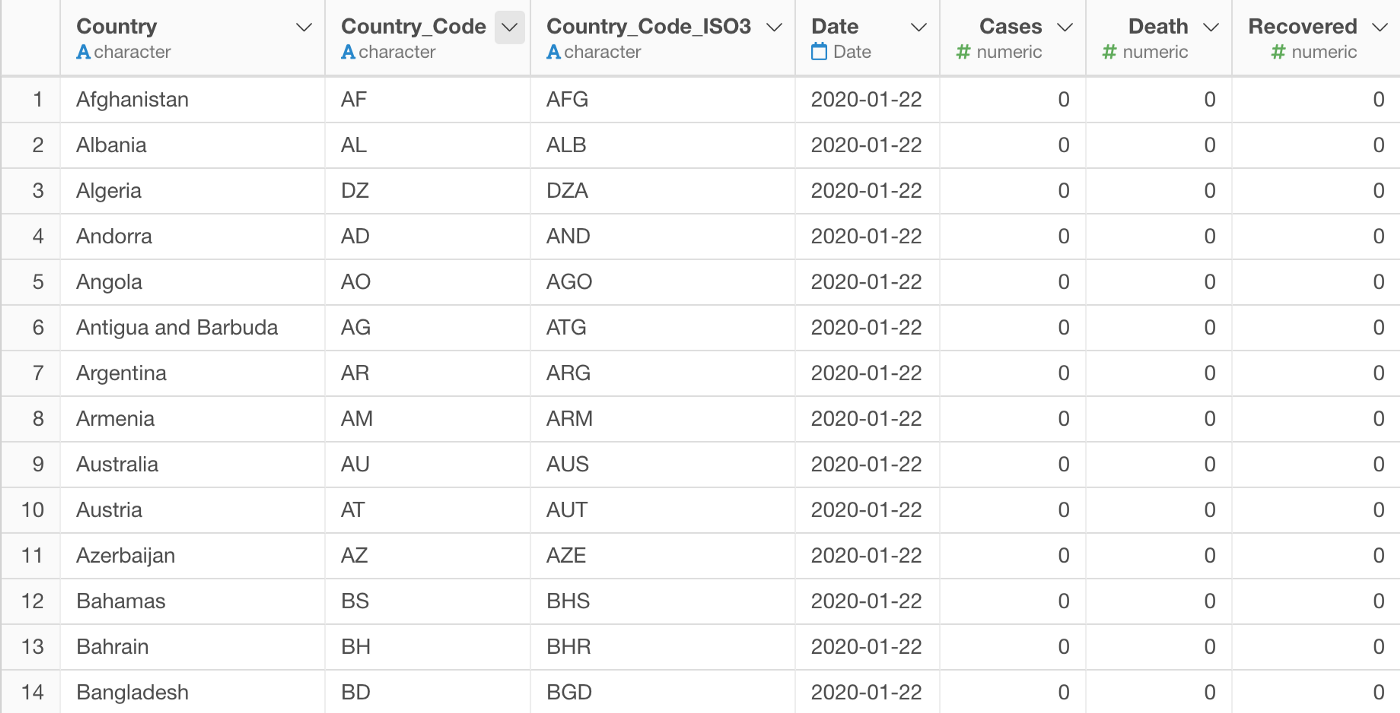
And even for the name, it can be various names for the same one country. Fo example, US can be the United States, U.S., United States, United States of America, etc.
With the ‘Map — Standard’, you can just assign any of the columns! 🔥
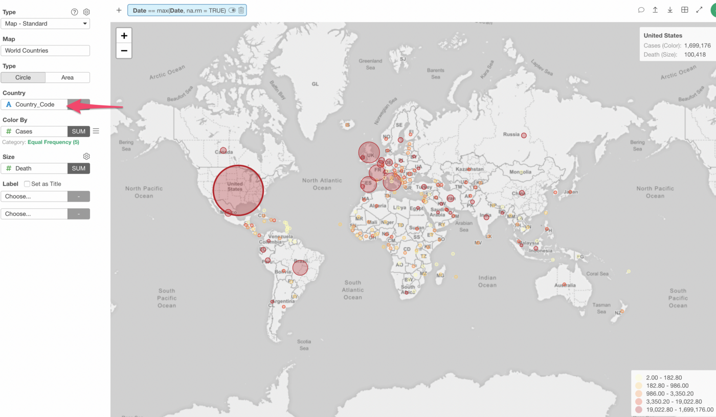
It automatically maps a given column data with appropriate countries behind the scene and generates the map.
Properties
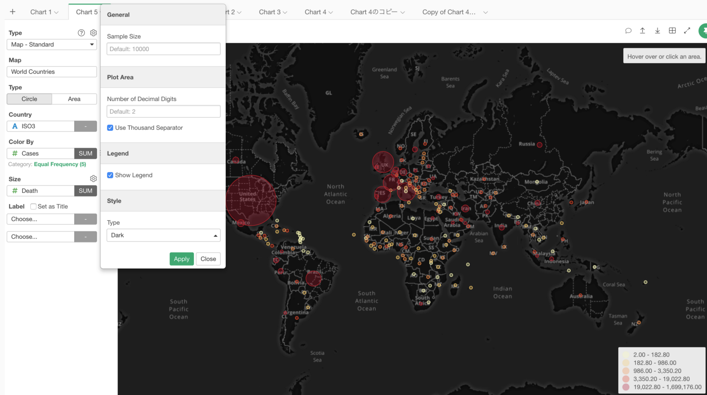
And just like the other Map types, you can change the property setting. Here’s an example of changing the map background.
4. Other Maps
The following maps are supported as of now.
- World Countries
- US States
- US Counties
- Japan Prefectures
- Japan Cities
And we’ll be adding more maps, so stay tuned!
Map Extension
For other maps such as Australia, UK, etc. you want to use ‘Map — Extensions’ type, which is used to be called ‘Map — Area’. You can click on the gear icon next to the ‘Area Type’, which will open the Map Extension dialog.
Inside the Map Extension dialog, you might be able to find maps you’re looking for.
Try it for yourself!
If you want to quickly try it out and you don’t have an Exploratory account yet, sign up from our website for 30 days free trial without a credit card!
If you happen to be a current student or teacher at schools, it’s free! Sign up for Community Plan.
And, if you don’t mind sharing what you create publicly you can sign up for Public edition of Exploratory (FREE)!