
Introduction to Pie / Ring Chart
Here's how you can quickly create a Pie / Ring chart.
Sample Data
We'll use Airbnb Data. You can download it from this page.
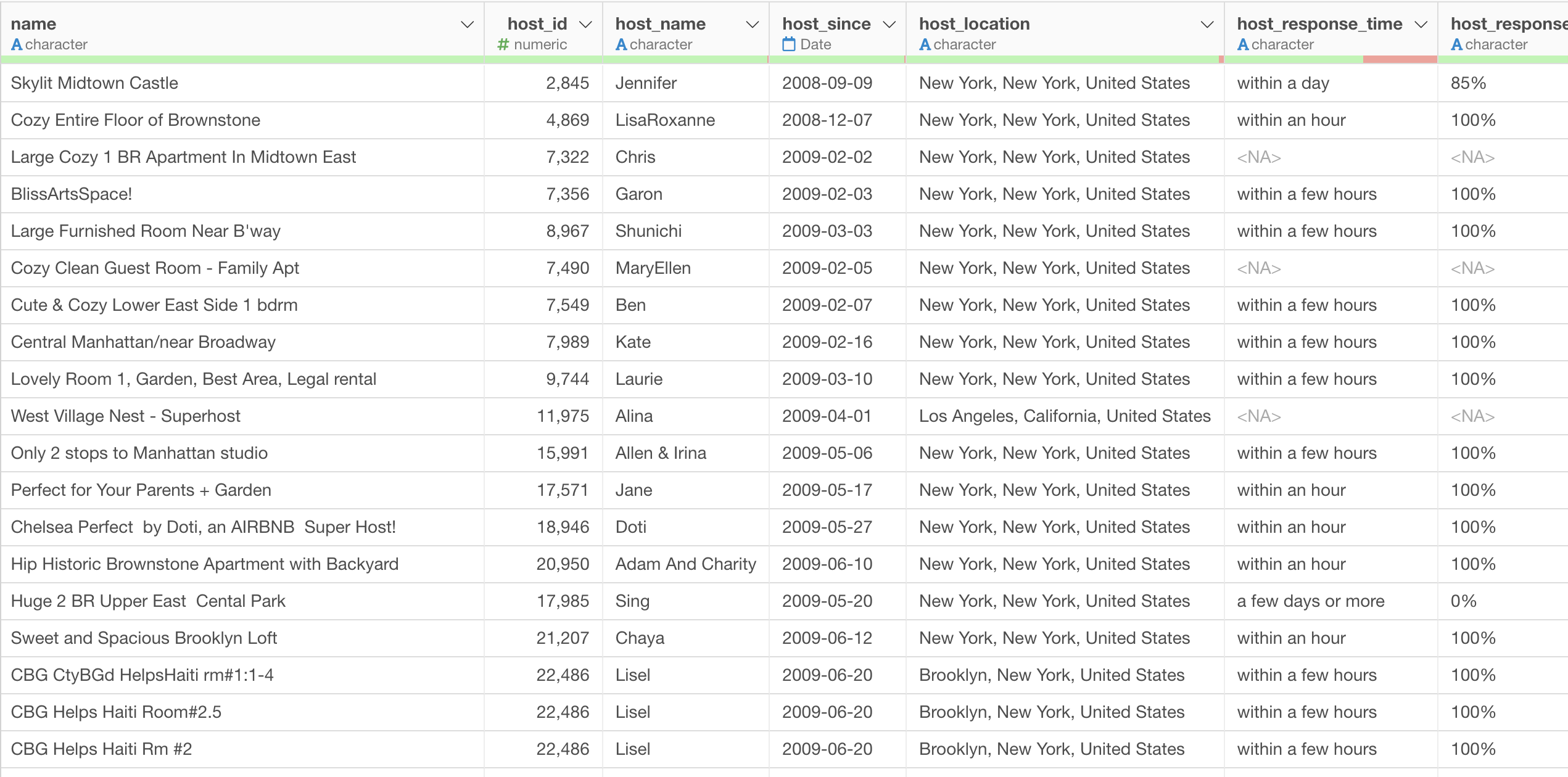
In this data, each row represents each property listed on Airbnb, and the columns are additional information about each property.
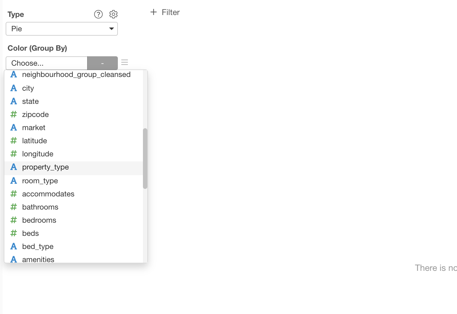
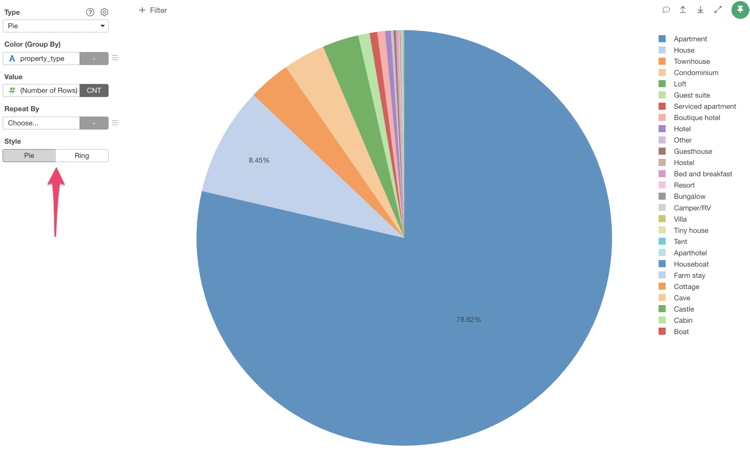
1. Create a Pie Chart
Select 'Pie' chart and assign 'Property Type' column to the Color.
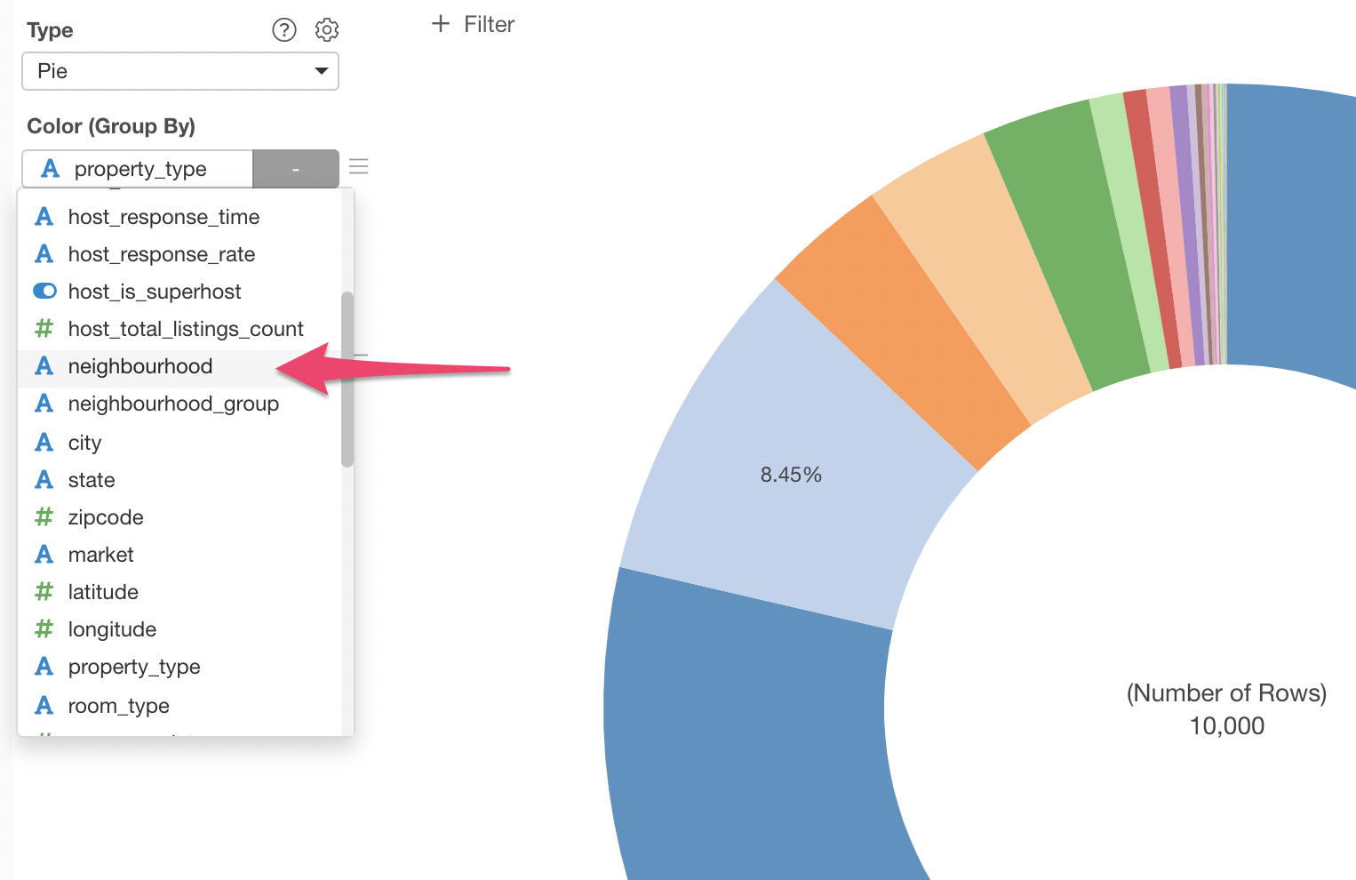
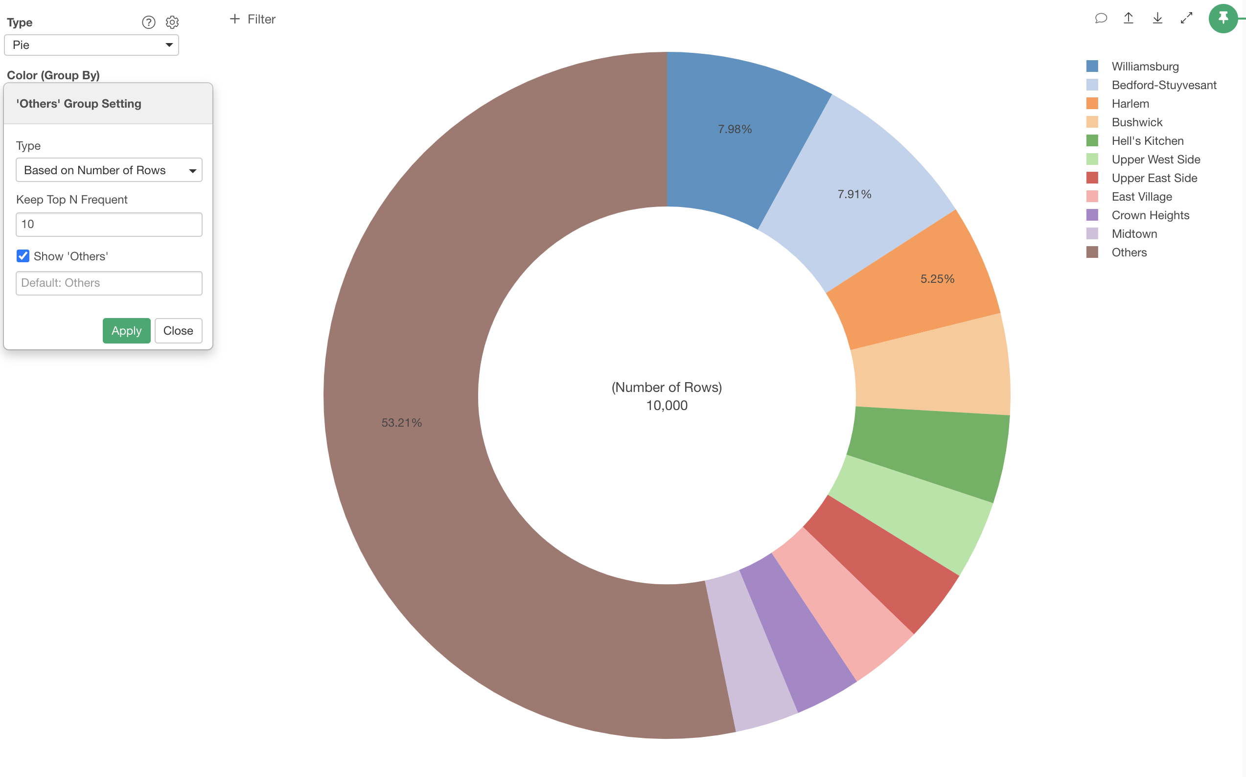
2. Set 'Others' Group
What happens when there are too many groups for the Color?
Exploratory automatically creates 'Others' group for the groups that are less frequent.
For example, if we assign 'neighborhood'
You will see a dialog that is indicating that there are too many values for the Color and asking to select one of the actions.
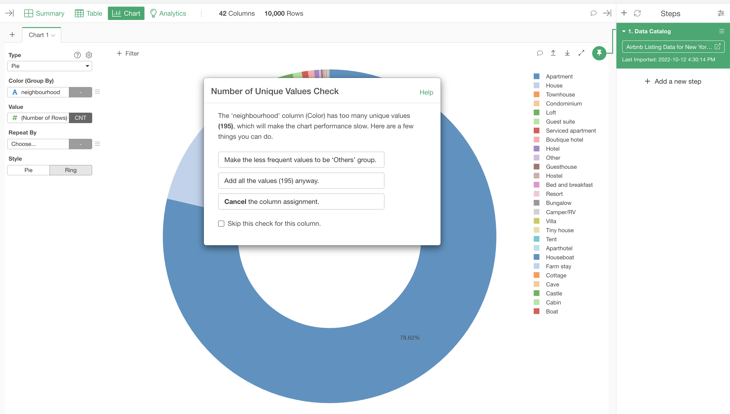
Select 'Make the less frequent values to the 'Other' group.' This will create 'Others' group for the less frequent neighborhoods.
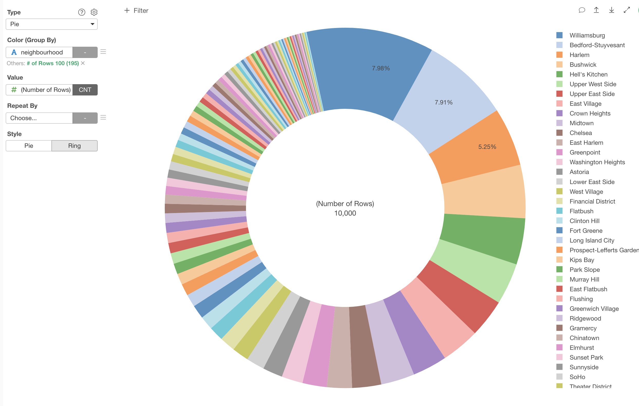
But the default setting is 'Top 100' and this is still too many colors. You can change it by clicking the green text.

Type 10 for the 'Top N Frequent' to keep the top 10 neighborhoods and make everything else to be 'Others'.
3. Change Between Pie and Ring
You can choose between Pie and Ring charts.
4. Repeat the Pie Chart
You can use 'Repeat By' to create a chart per categorical value of a column you are interested in. Here, we have a Ring chart showing the ratios of property types in each neighborhood groups.
