Introduction to Radar Chart
Radar chart is a great way to visualize differences among categories based on multiple measures. It's often used for visualizing survey response data, but can be used for many other cases.
For example, here we have a world wide university ranking data. (Download link)
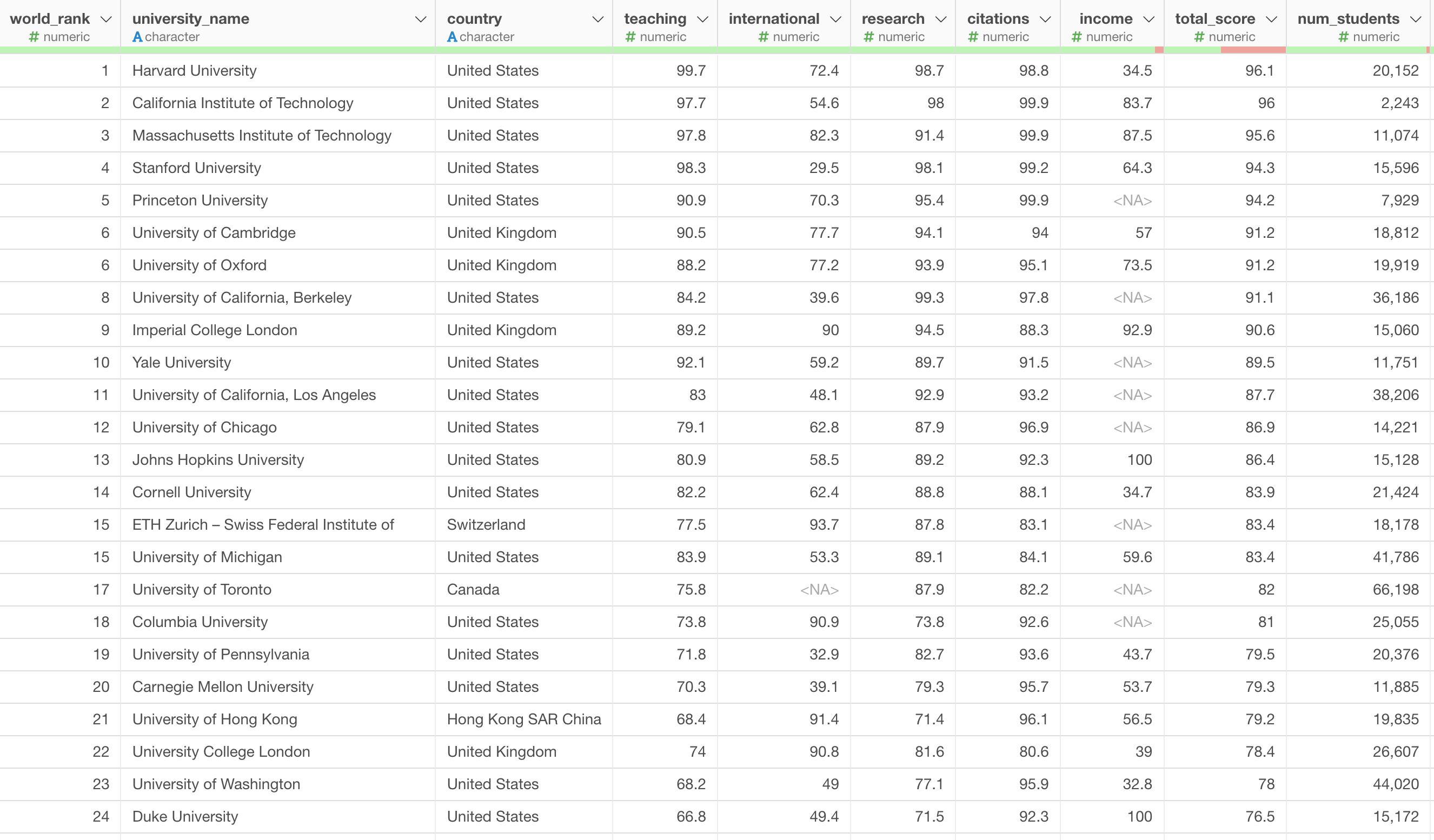
Each row represents each university. There are many countries in this data and each country has multiple universities.
Let's say we want to compare among the countries on how they score on the measures like Teaching, Research, Citation, etc.
This is when you want to use Radar Chart.
1. Create a Radar Chart
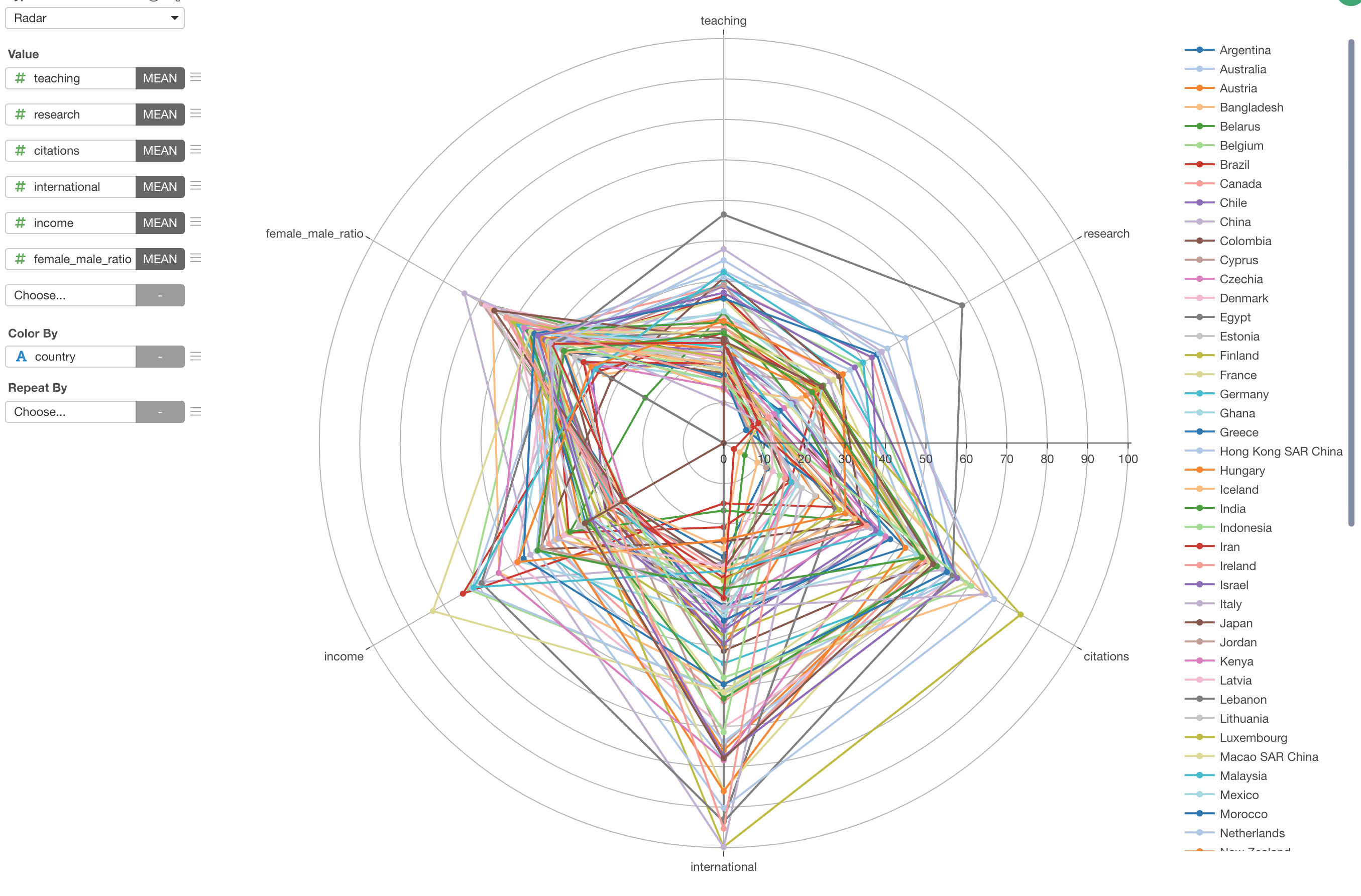
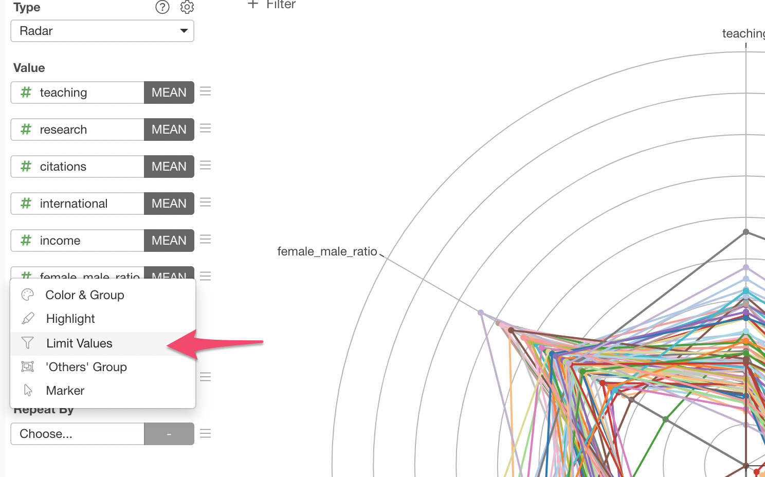
Select 'Radar' from the chart list, and assign the measures like Teaching, Research, Citation, etc. to the 'Value'. This time, we'll use 'Mean' as the summarize function so that each country would be represnted by the mean of each measure for its schools.
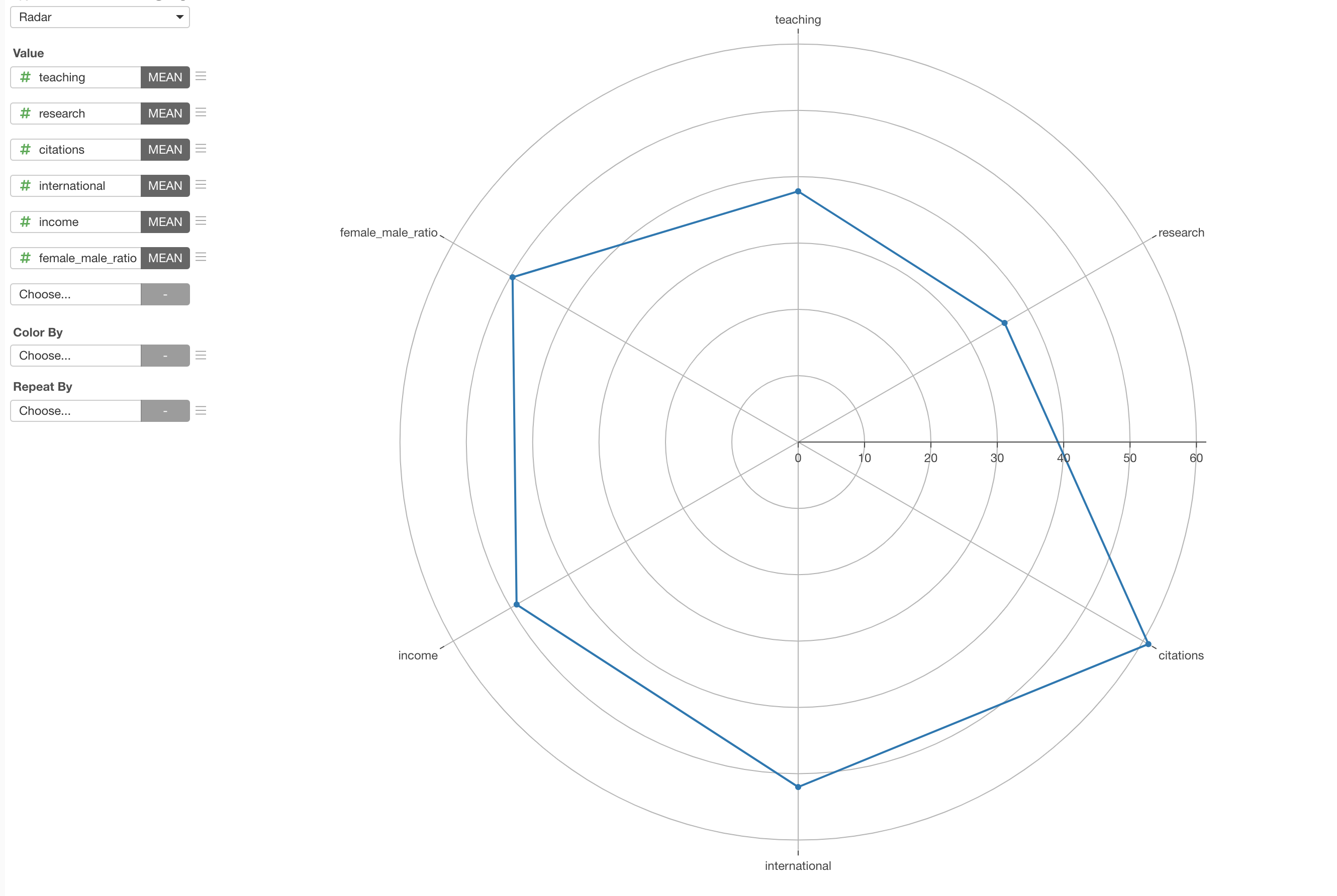
Then, select 'country' for the 'Color By' so that the line will broken into mutliple lines by country.
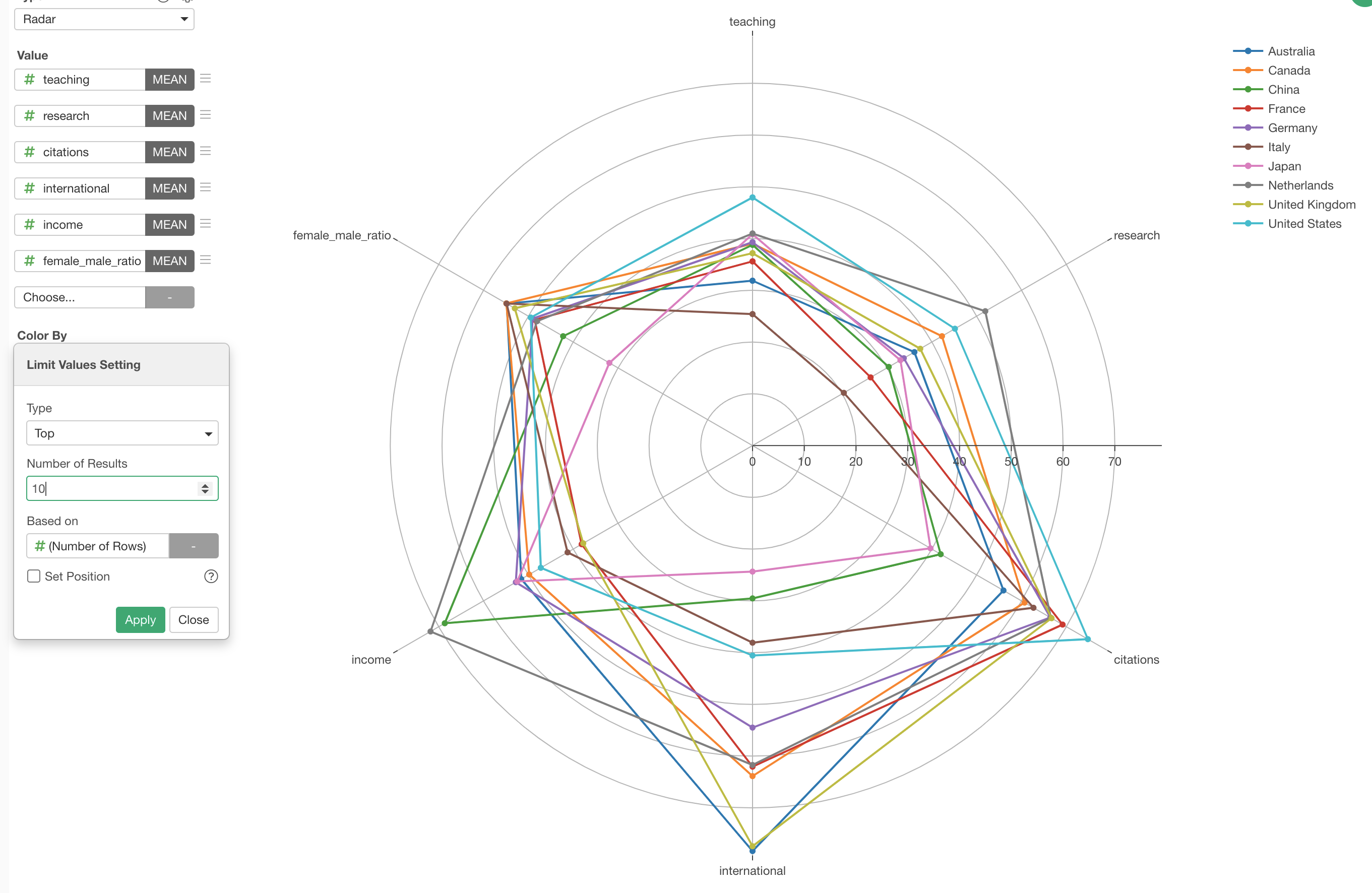
2. Limit the Number of Countries to Show
Sometimes there are too many lines like the above. In such cases, we can limit the number of lines with 'Limit' feature.
Select 'Limit Values' from the Color menu.
By selecting 'Top' as the Type, 10 for the 'Number of Result', and 'Number of Rows' for the 'Based On', we can limit to show only the top 10 countries based on number of schools (rows) they have in this data.