Introduction to Scatter Chart
Here's how you can quickly create a Scatter chart.
1. Create a Scatter Chart
Select 'Scatter (No Aggregation)' chart and assign 'TotalWorkingYears' column to X-Axis and 'MonthlyIncome' column to Y-Axis.
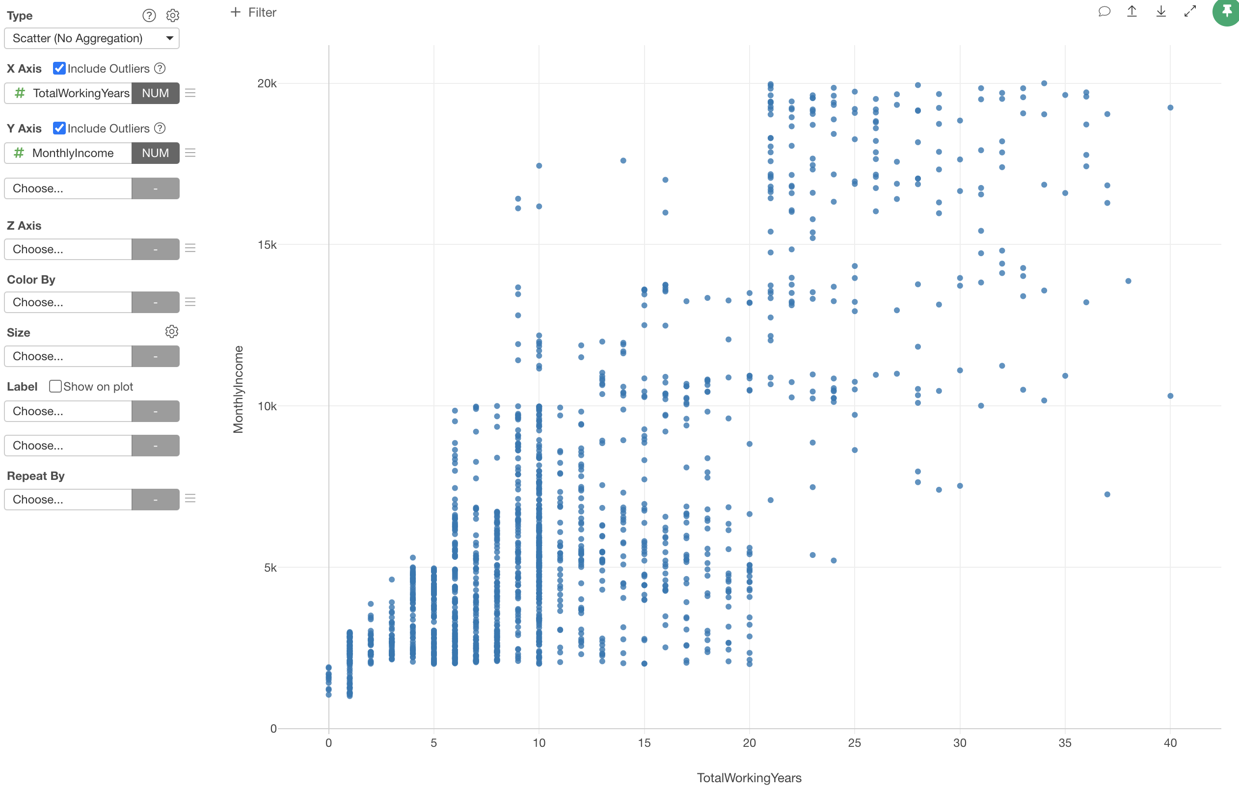
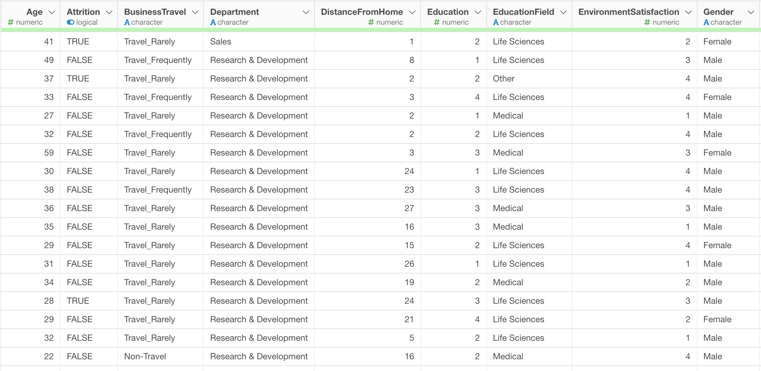
Each dot represents each row, in this case, that is each employee.
We can see some degree of correlation between these two variables.
2. Draw Trend Line
We can draw a trendline so that we can which direction the relationship is heading to.
Select 'Trend Line' from the Y-Axis menu.
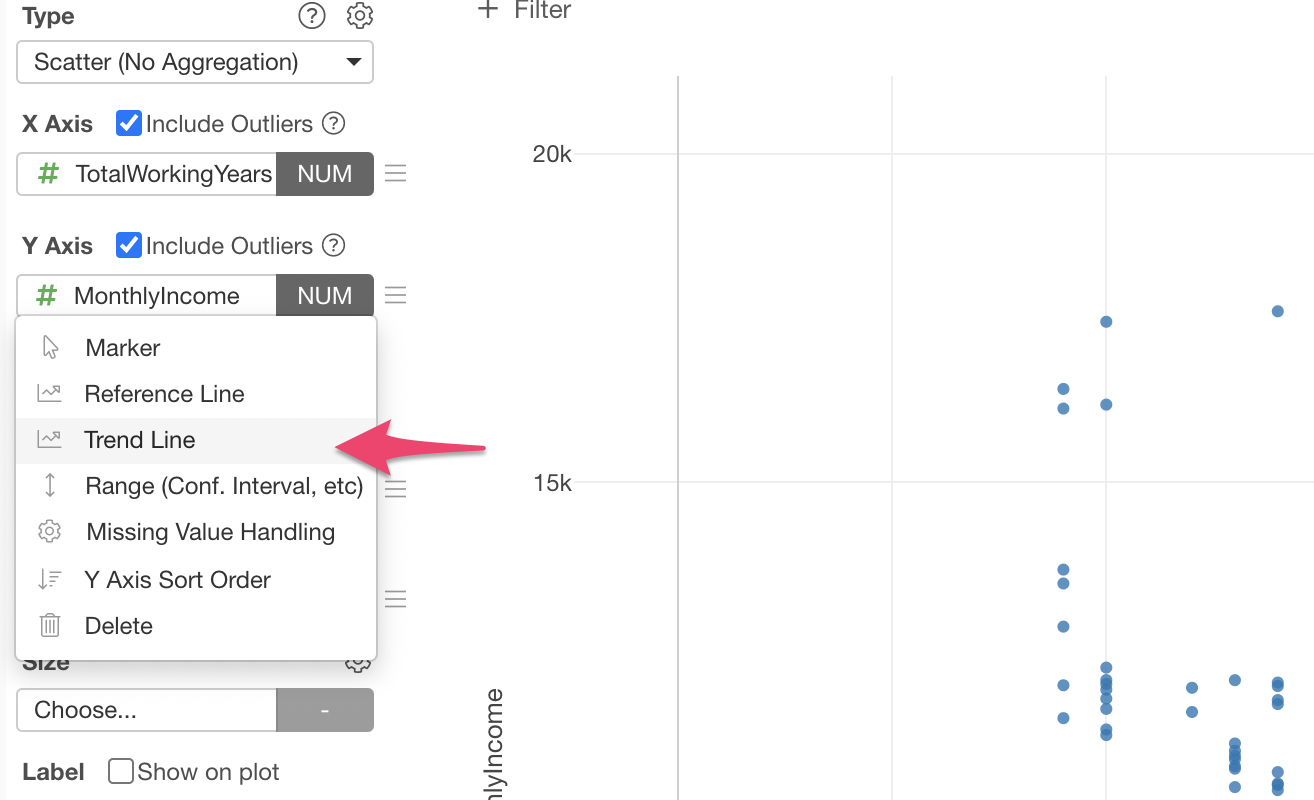
We can select 'Linear Regression' to draw a straighline that goes middle of the line.
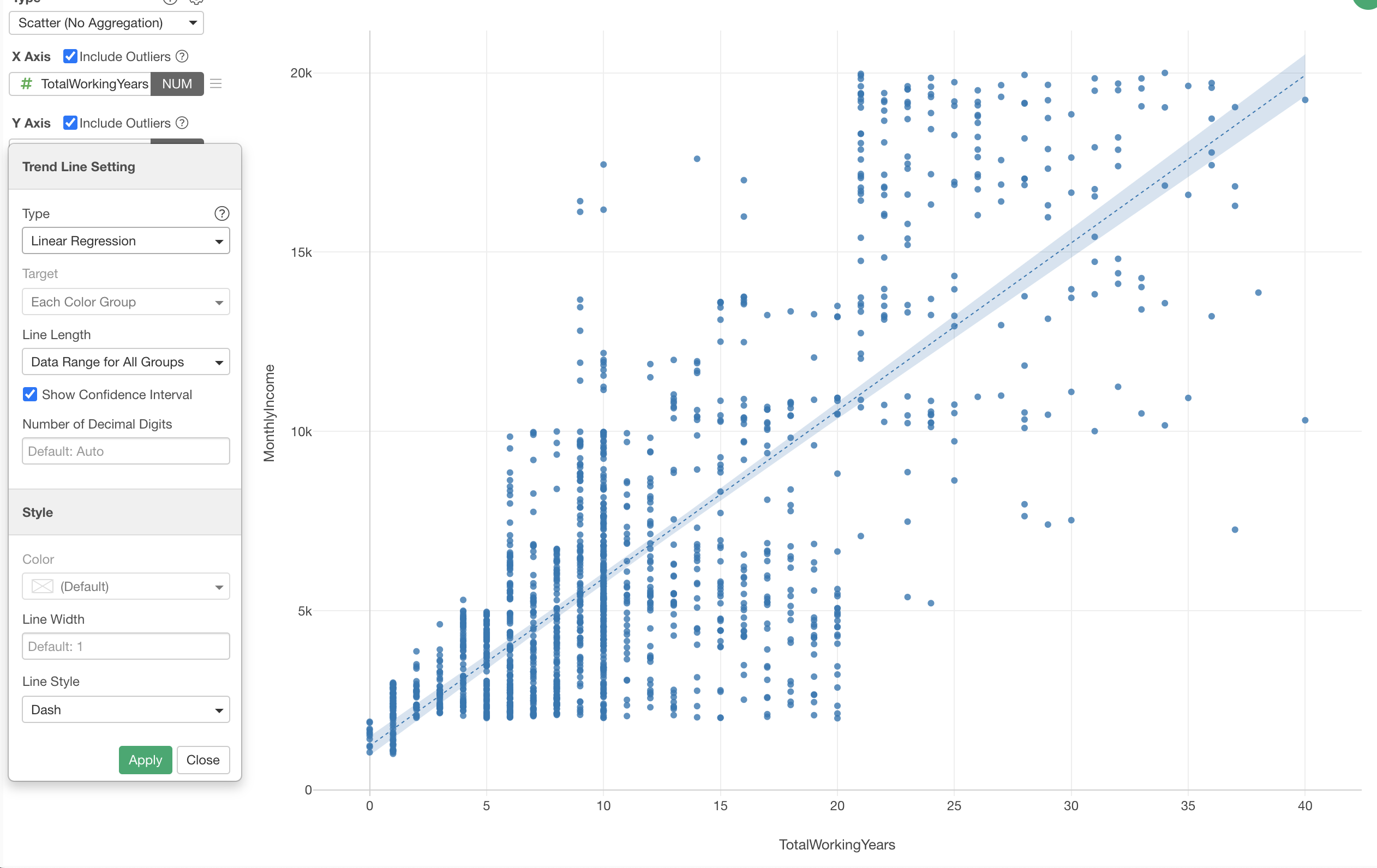
This 'Linear Regression' option draws a straight line so that the distance between the line and all the dots are minimum.
3. Assign Color
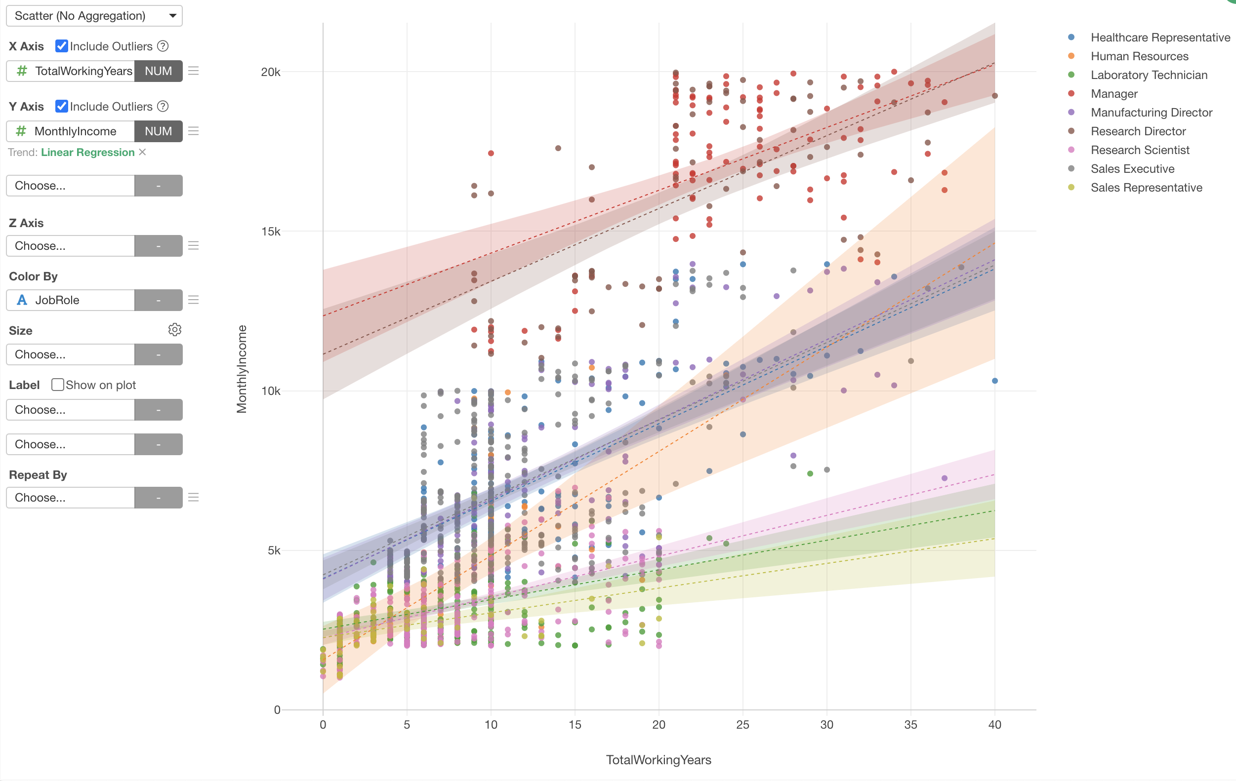
You can use Color to create groups based on a given column values.
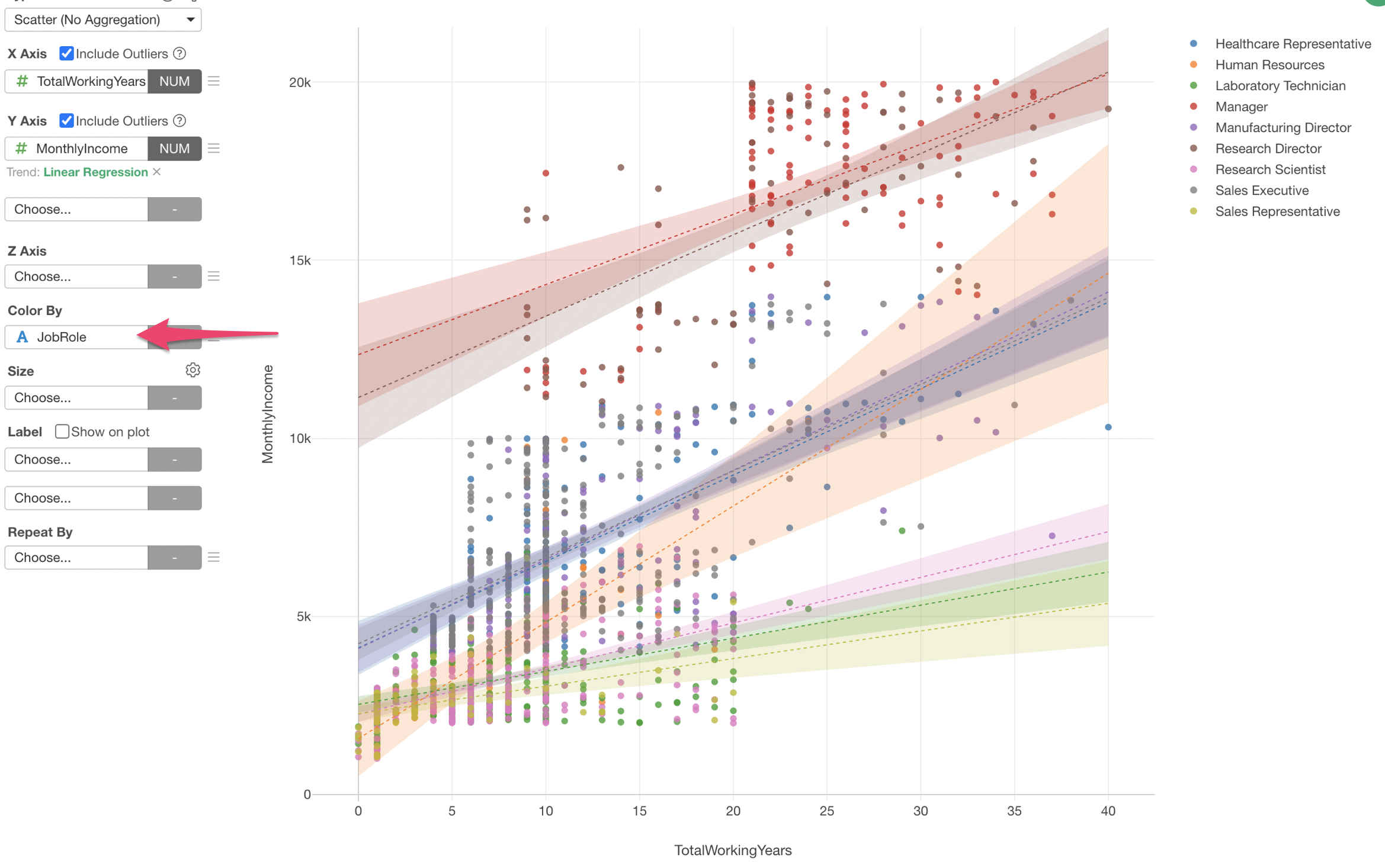
In the above case, we have assigned 'Job Role' column to the Color. This gives each job role a unique color and draws the trend line for each group.
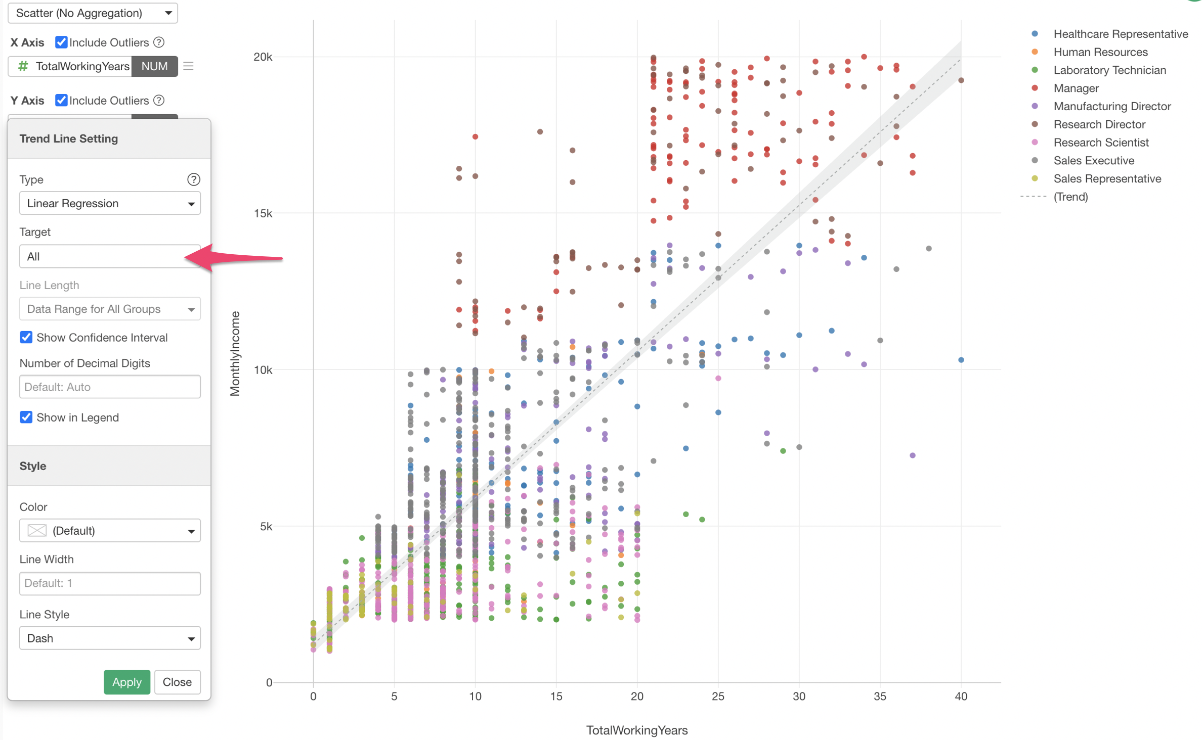
If you want to have one single trend line for all the employees you can select 'All' for the Target property.
Try it for yourself!
If you want to quickly try it out and you don’t have an Exploratory account yet, sign up from our website for 30 days free trial without a credit card!
If you happen to be a current student or teacher at schools, it’s free! Sign up for Community Plan.
And, if you don’t mind sharing what you create publicly you can sign up for Public edition of Exploratory (FREE)!
