Introduction to Scatter (Aggregation) Chart
There are two types of Scatter chart types in Exploratory. One is Scatter without Aggregation and another is Scatter with Aggregation. While the one without aggregation shows the raw data as is and therefore it's good for visualizing the original data variance, the one with aggregation lets you aggregate the data inside the chart and visualizes the aggregated data.
This note shows you how to use the Scatter with Aggregation type chart.
Sample Data
We'll use Airbnb Data. You can download it from this page.
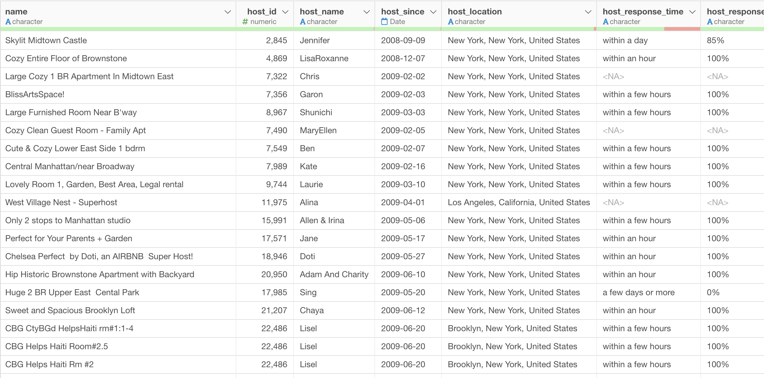
In this data, each row represents each property listed on Airbnb, and the columns are additional information about each property.
1. Create a basic Scatter (with Aggregate) Chart
Select 'Scatter (With Aggregation)' chart and assign 'TotalWorkingYears' column to X-Axis and 'MonthlyIncome' column to Y-Axis.
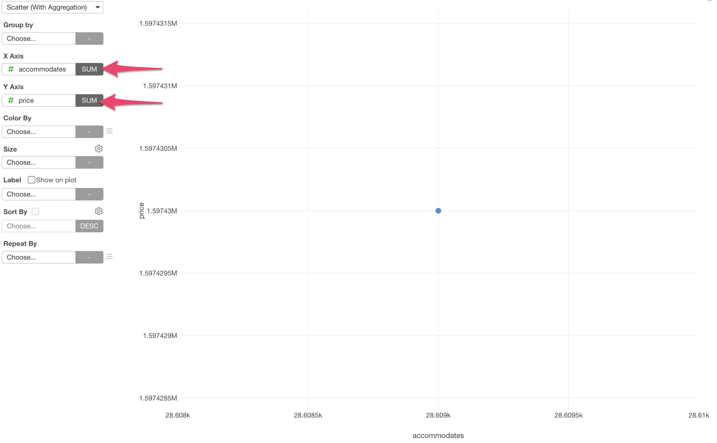
We see only one dot, which shows the sum of the two variables - TotalWorkingYears and MonthlyIncome.
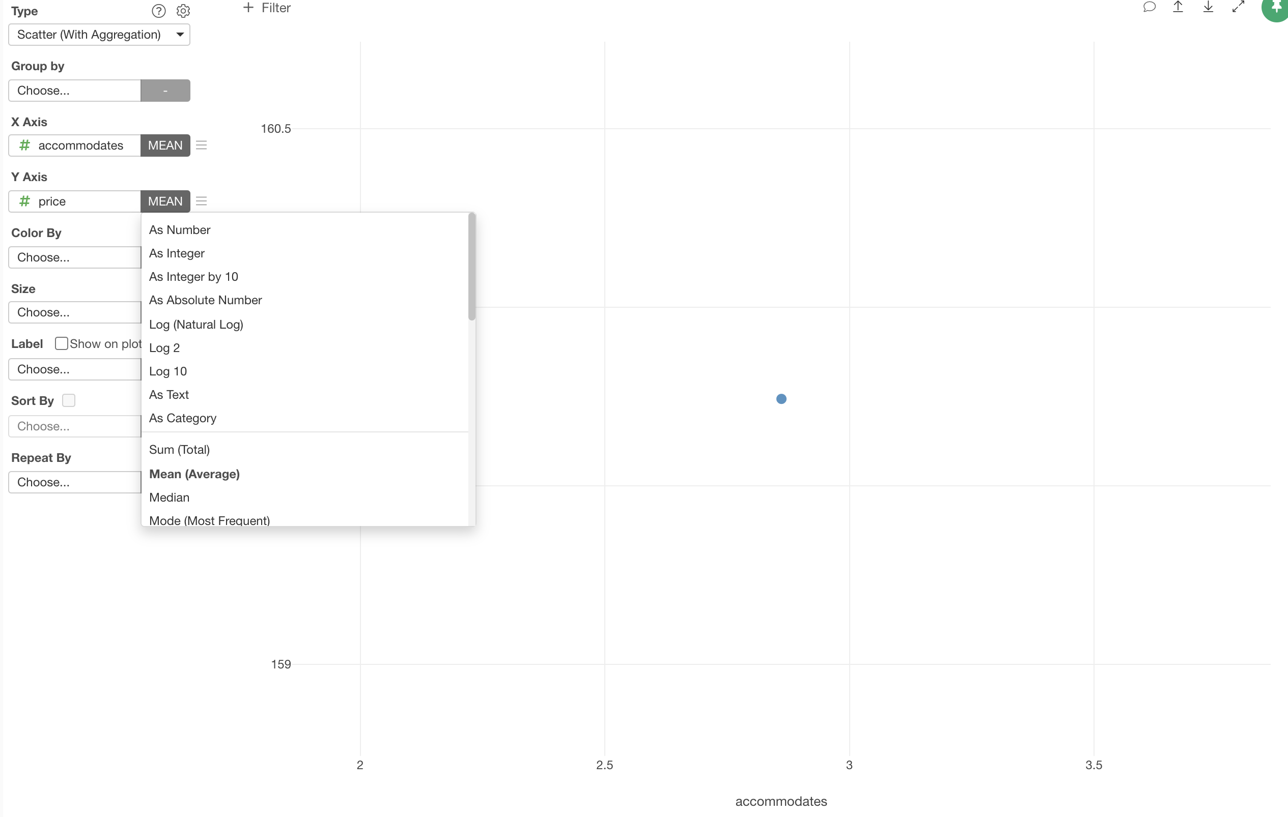
We can change the aggregation function to 'Mean' instead of 'Sum' so that we can show the mean (average) of the Working Years and the Monthly Income.
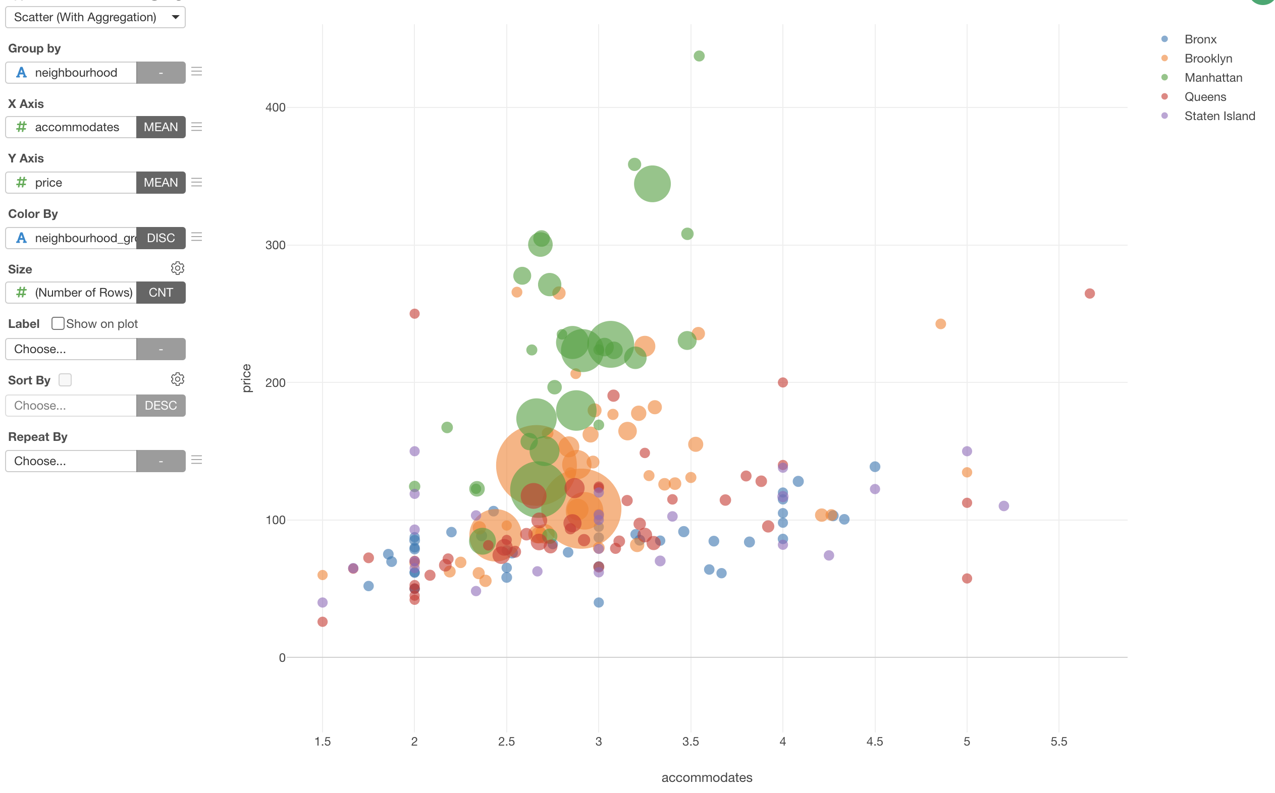
We can now assign 'Neighborhood' column to the 'Group by'. which will create 195 dots given that there are 195 neighborhoods.
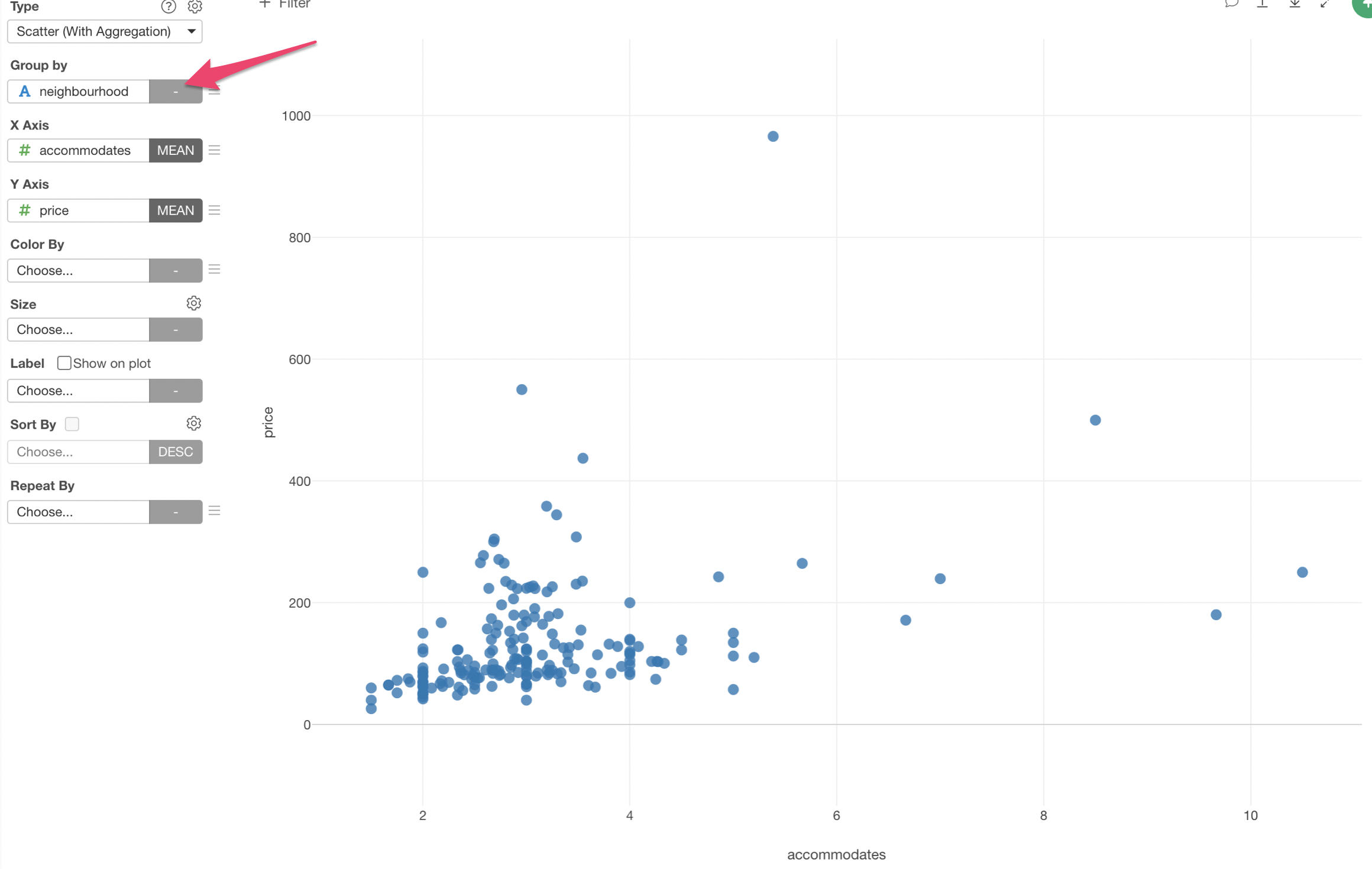
2. Use Color to Create Groups
You can use Color to create groups based on a given column values.
Assign 'Neighborhood_Group' column to the Color.
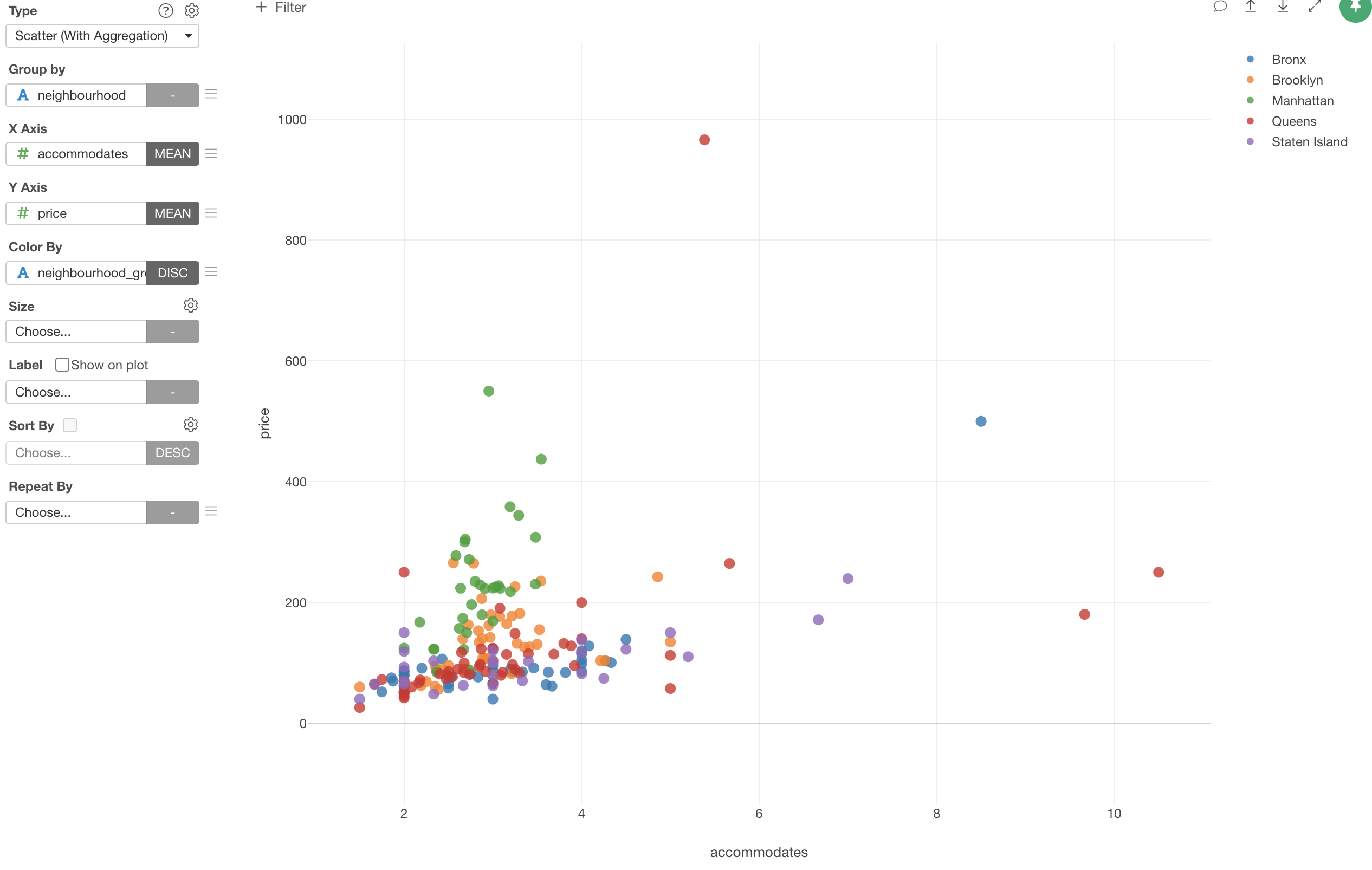
We can see that the neighborhoods in Manhattan (Green) tend to have higher prices even when the numbers of accommodates are lower than other neighborhoods.
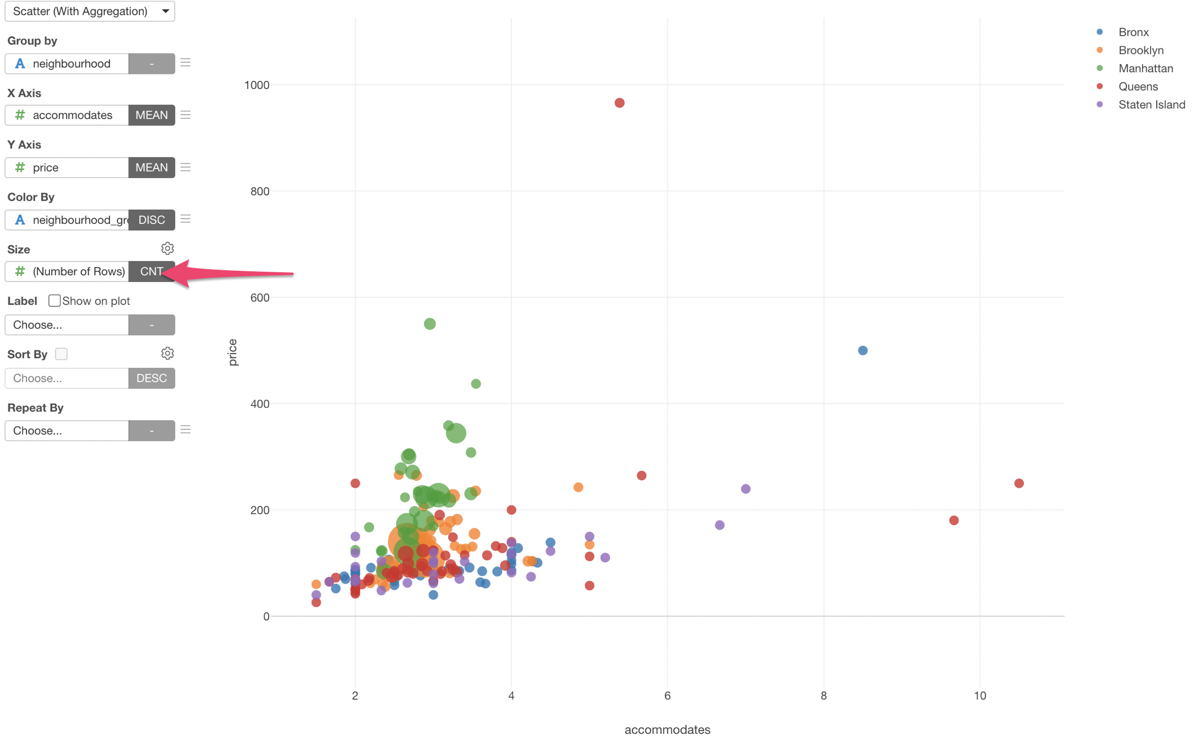
3. Use Size to Show How Many Properties
We can select 'Number of Rows' for the Size so that we can visualize number of the properties for each neighborhood as the circle size.
4. Draw Trend Lines
We can show trend lines for each neighborhood by selecting 'Trend Line' from the Y-Axis menu.
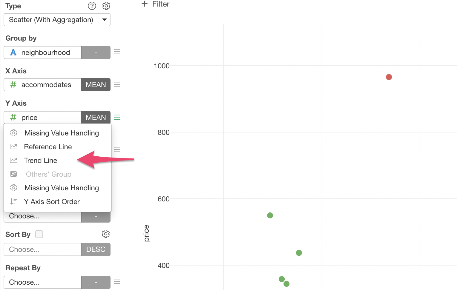
Select 'Linear Regression' to draw a straight line that goes into middle of the dots for each neighborhood group.
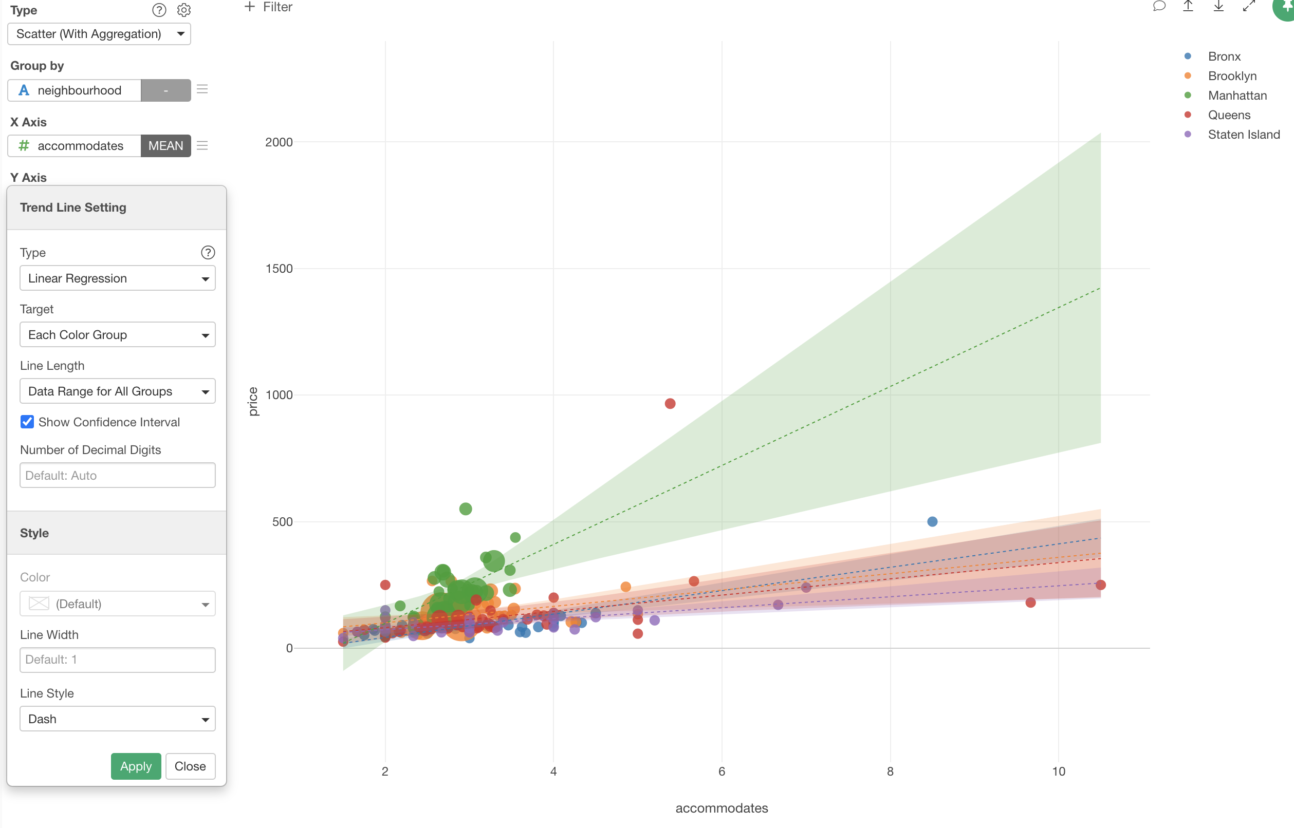
As you can see the trend line for Manhattan (Green) has very wider confidence interval. This is because there are no neighborhood has more than 4 accommodates (average).
We can make it so that the trend line can be drawn only where the data exist in each group by selecting 'Data Range for Each Group' for the Line Length.
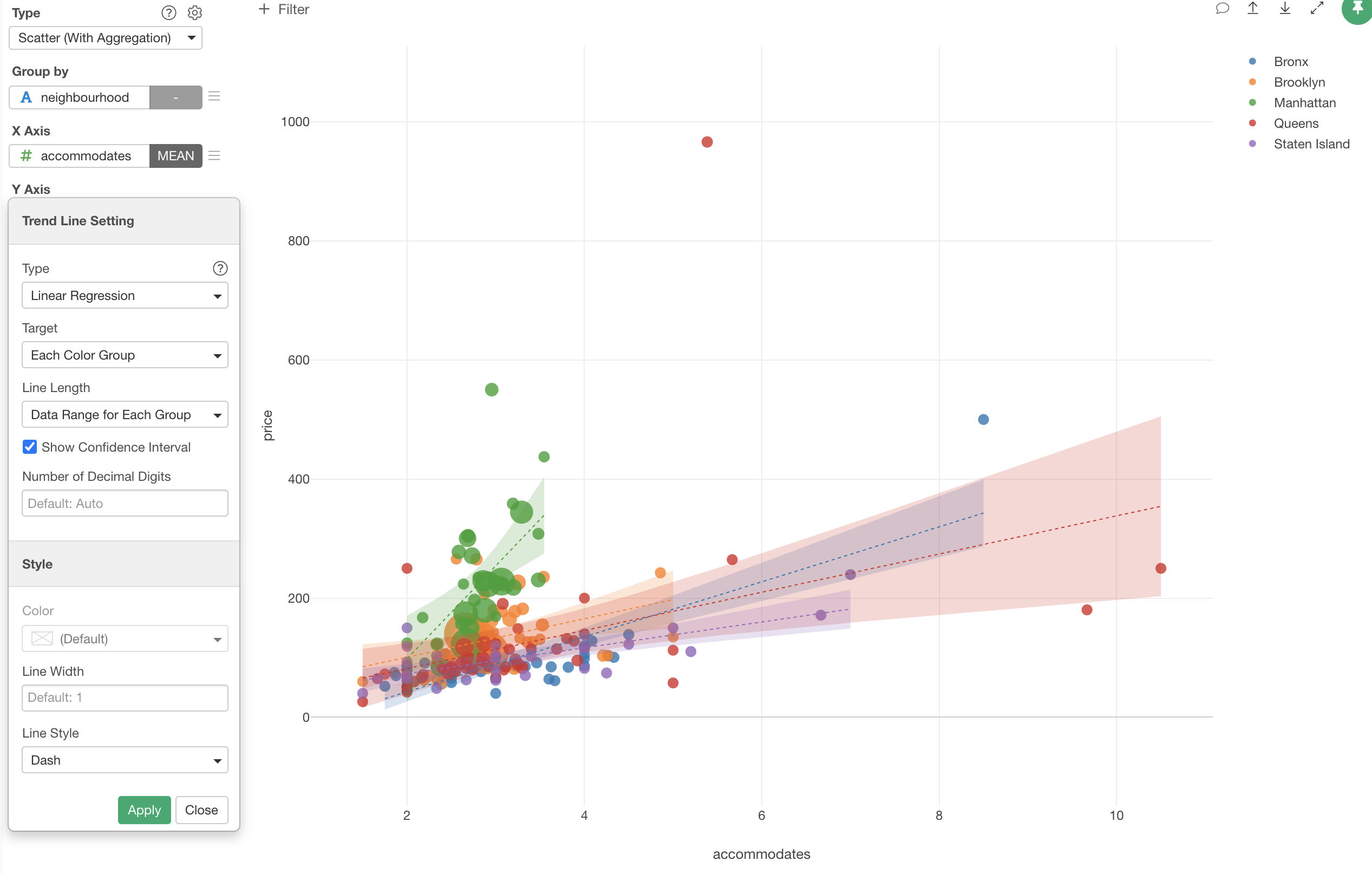
This makes the trend line for Manhattan (Green) stops where the data ends.
Try it for yourself!
If you want to quickly try it out and you don’t have an Exploratory account yet, sign up from our website for 30 days free trial without a credit card!
If you happen to be a current student or teacher at schools, it’s free! Sign up for Community Plan.
And, if you don’t mind sharing what you create publicly you can sign up for Public edition of Exploratory (FREE)!