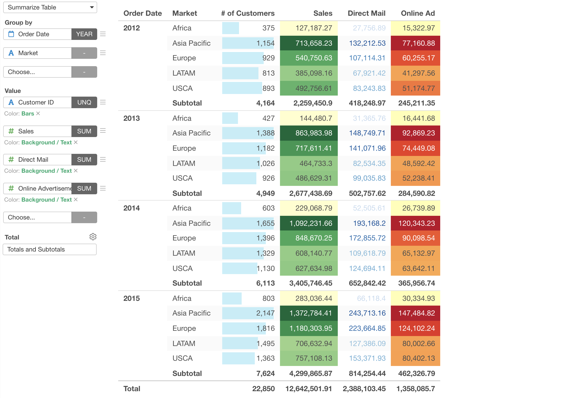
Introduction to Summarize Table
With the Summarize Table you can quickly summarize data and show it in a nicely format way. Unlike Pivot Table, you can group the data only with Row (Group By), but this would be a great choice if you have many measures to summarize.
Here's a quick introduction on how you can use Summarize Table in Exploratory.
Here is a list of features you'll learn in this note.
- Summarize Table Basic
- Missing Value Handling
- Limit Values
- Color Configuration
Sample Data
We'll use this Sales Data. You can download it from this page.
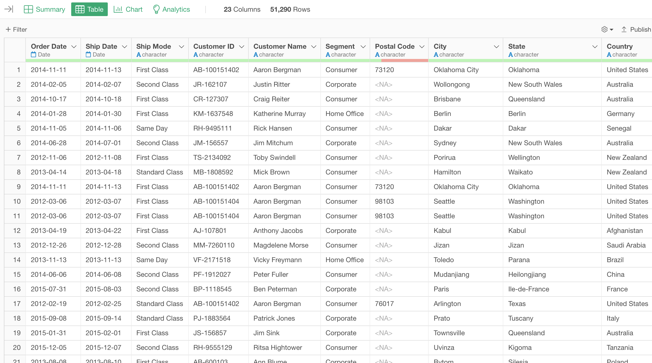
In this data, each row represents each customer's order, and the columns are additional information about each order.
1. Summarize Table Basic
Let's create a Summarize Table to show the total sales and the total number of customers by year and market.
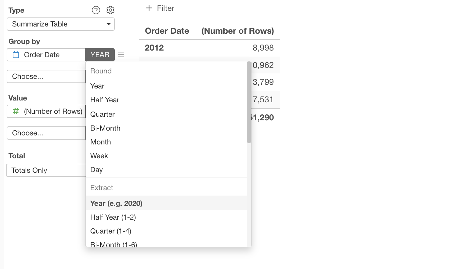
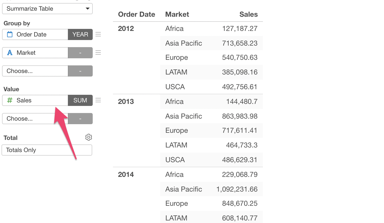
First, assign 'Order Date' column to the Group By, and select 'Year' under 'Extract'.
Next, assign 'Market' column to the second 'Group By'.
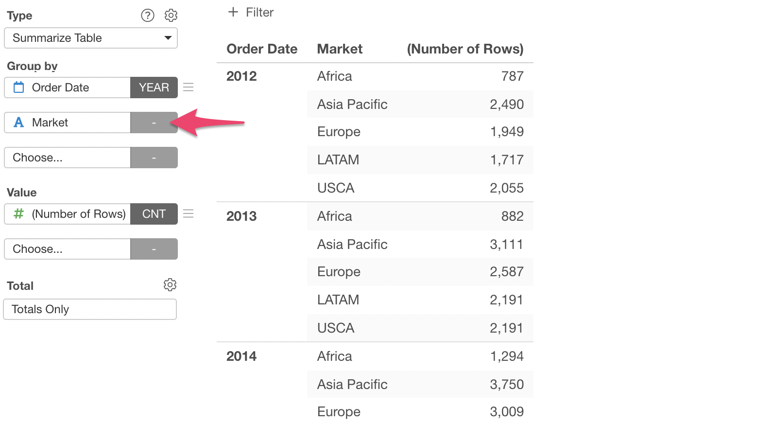
This will create the hierarchical groups (Year and Market) and summarize the values, which is currently 'number of rows'.
Now, let's select 'Sales' column to the Value. We can keep the summarize function 'SUM' as is.
2. Changing Column Name
In order to show the number of customers, we can select 'Customer ID' column for the second Value and select 'Unique Count', which is the default.

We didn't select 'Number of Rows' because this data's each row is each order, not customer.
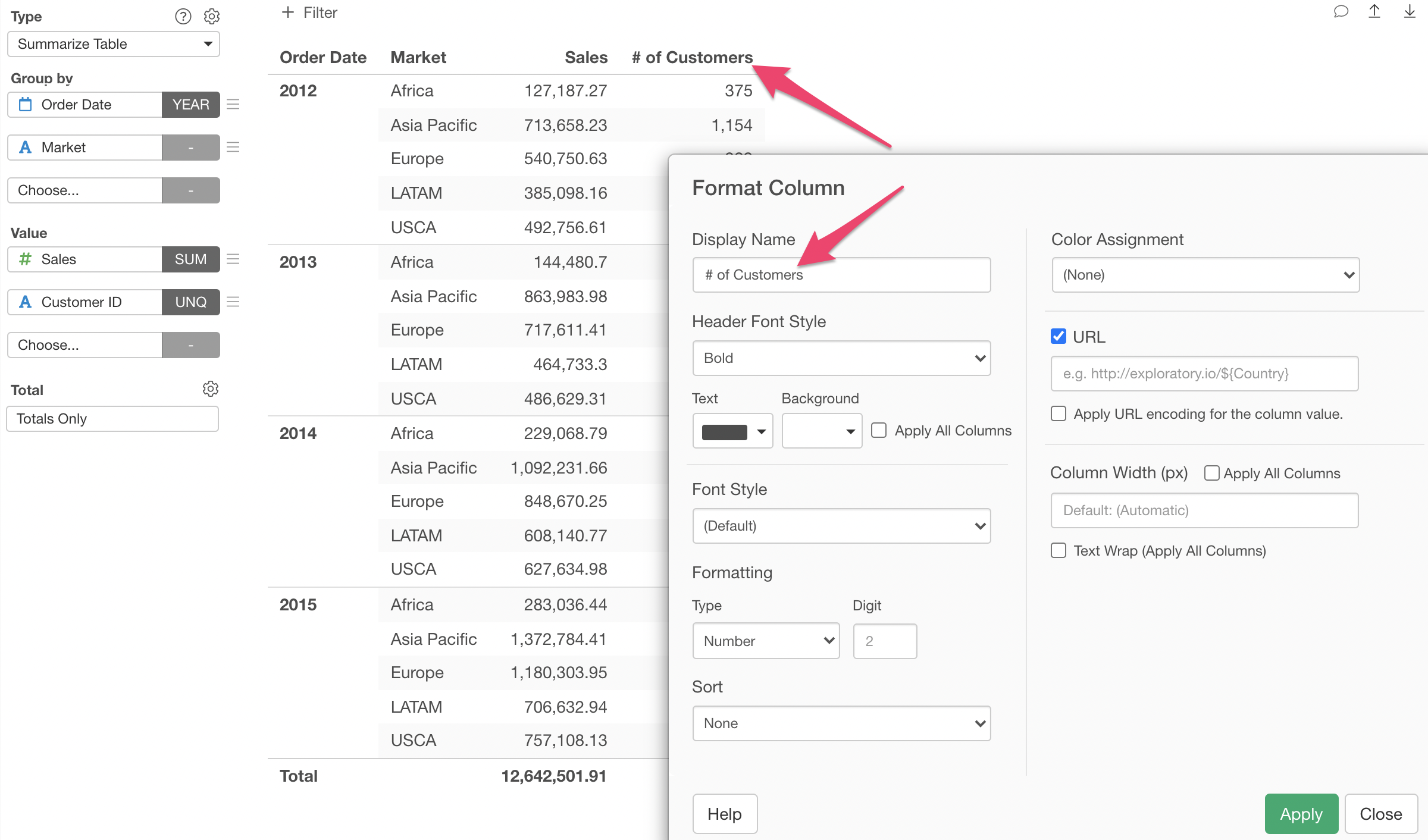
We can change the column name that is currently set as 'Customer ID'.
Select 'Formatting' from the Value menu.
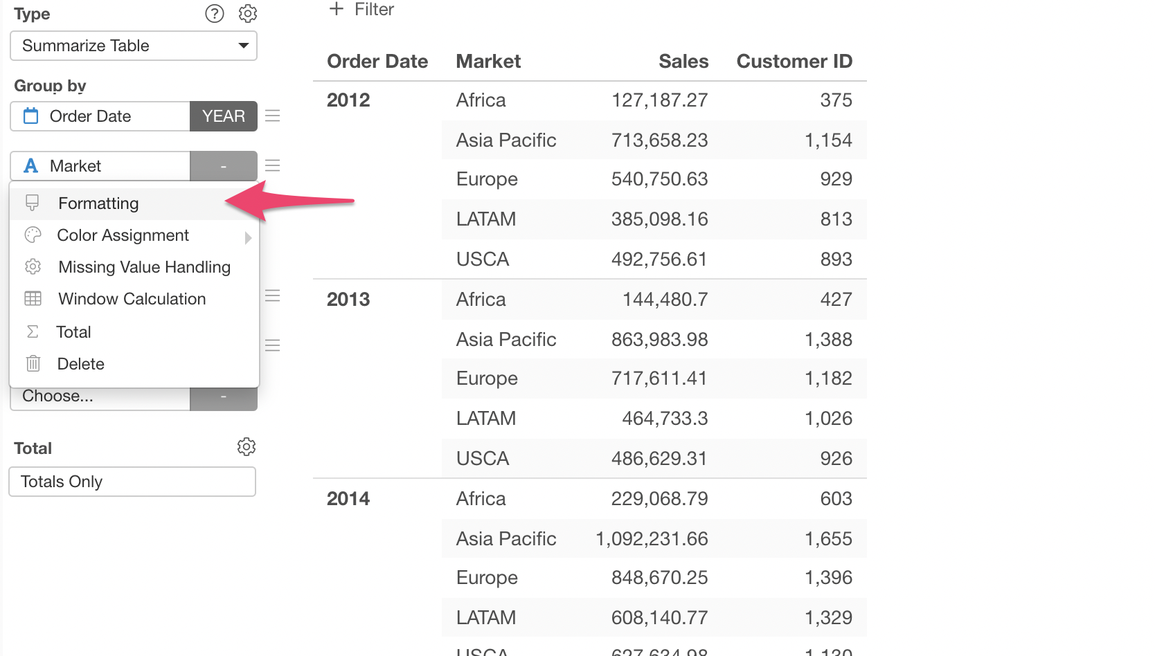
Type '# of Customers' as the column name and click the Run button.
3. Drag & Drop to Change Column Order
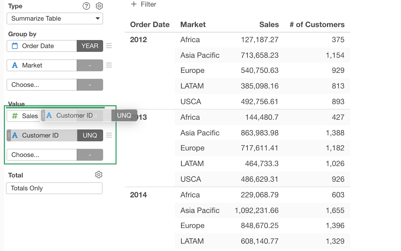
You can change the order of the columns simply by drag and drop.
4. Color Configuration
Lastly, let's use Color to visualize the numbers in the table.
Select 'Color Assignment' and 'Color Bars' from the menu of '# of Customers'.
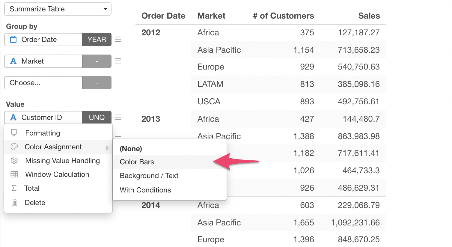
This will open the Format dialog. You can click the Run button at the bottom to see how the color is applied to the Summarize Table.

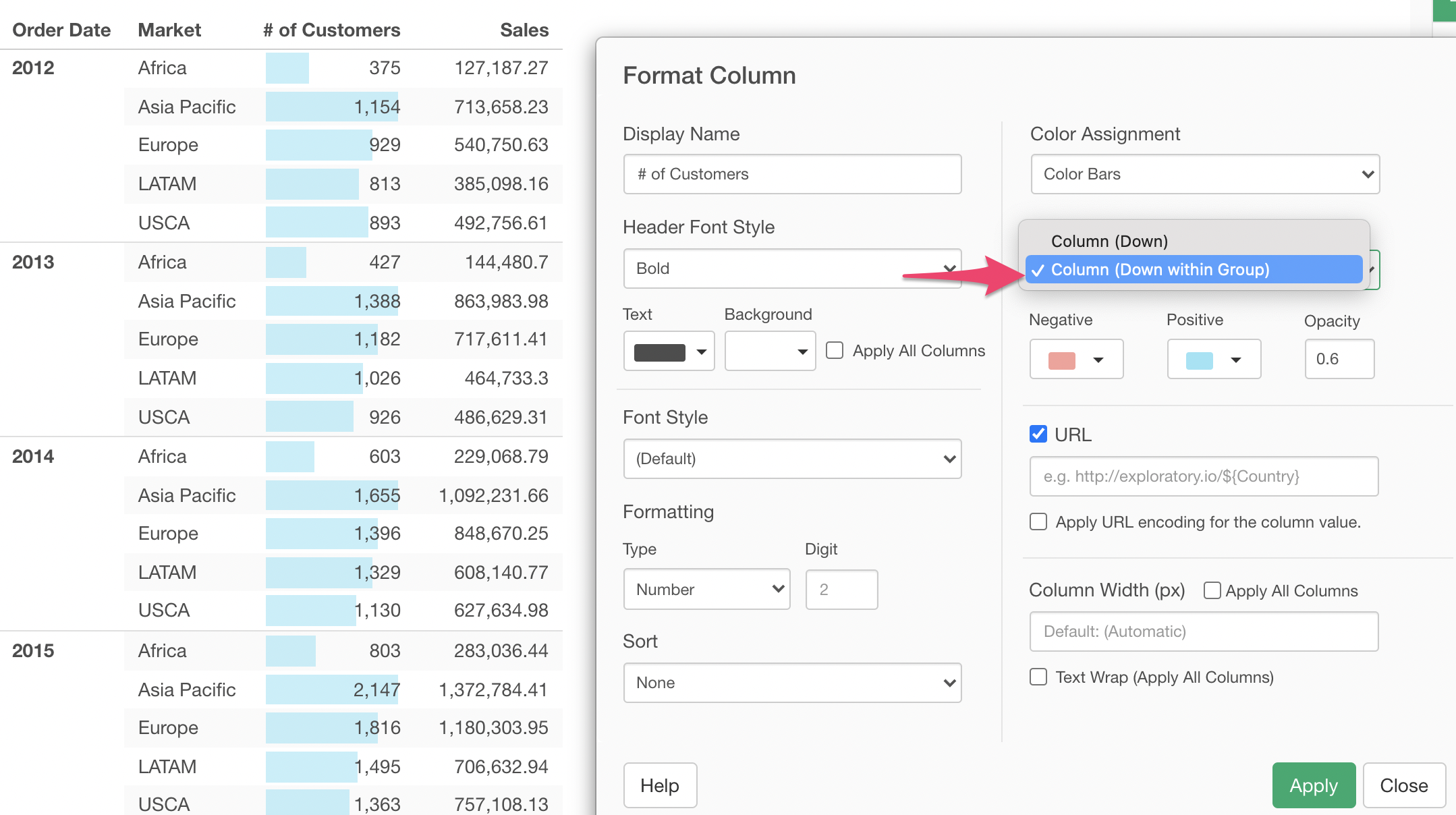
By default, it shows the bars in a relative scale for the entire column.
Let's say we want the length of the bars to be evaluated for each group of the Year rather than across the Year.
We can select 'Column (Down within Group)' option for the Direction and click the Run button.
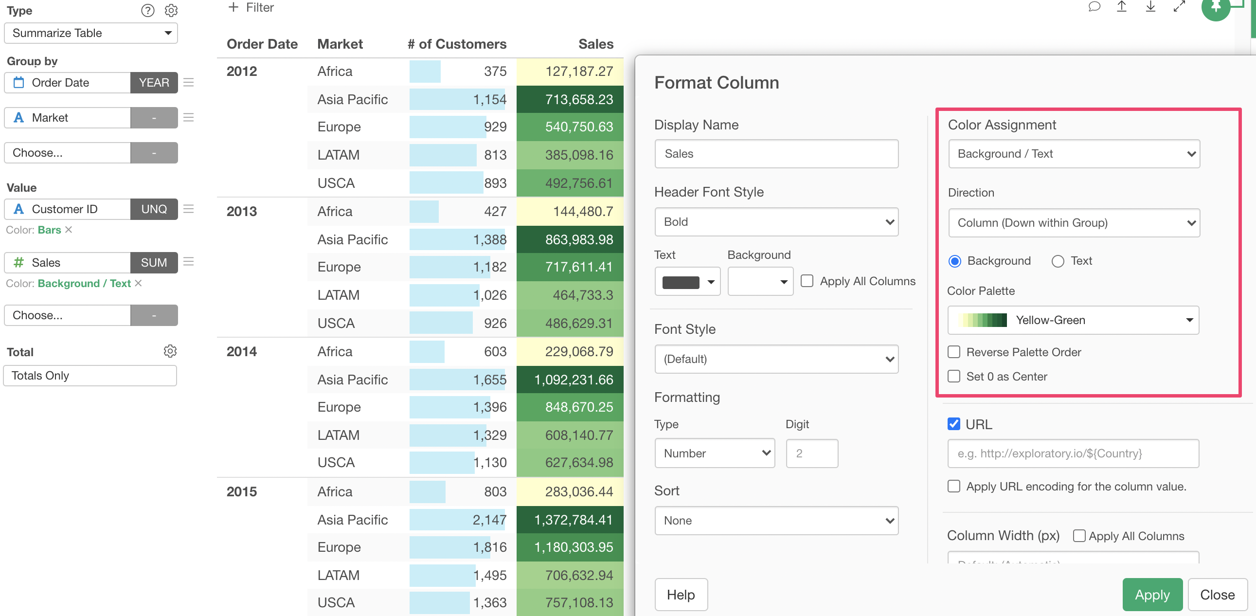
We can set Color to another measure column. Here, we used 'Backgroud' option and 'Yellow to Green' color palette for the Sales column.
5. Show both Grand & Sub Total
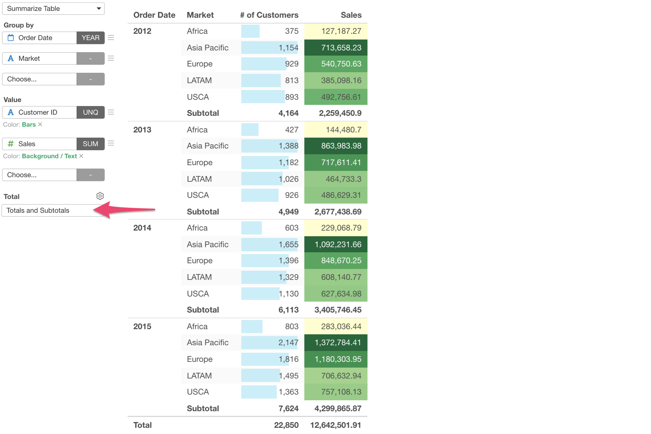
By default, it shows the grand total at the bottom of the table. You can show the sub total of each group of the Year as well.
Try it for yourself!
If you want to quickly try it out and you don’t have an Exploratory account yet, sign up from our website for 30 days free trial without a credit card!
If you happen to be a current student or teacher at schools, it’s free! Sign up for Community Plan.
And, if you don’t mind sharing what you create publicly you can sign up for Public edition of Exploratory (FREE)!