Introduction to XmR Charts
XmR charts are powerful tools for analyzing time-series data, helping you distinguish between true signals and expected, normal variations.
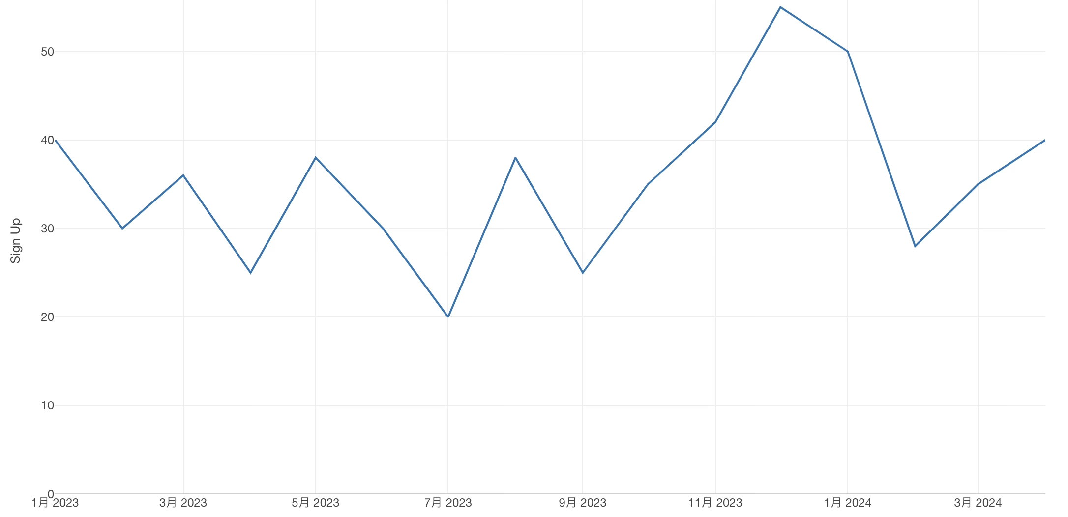
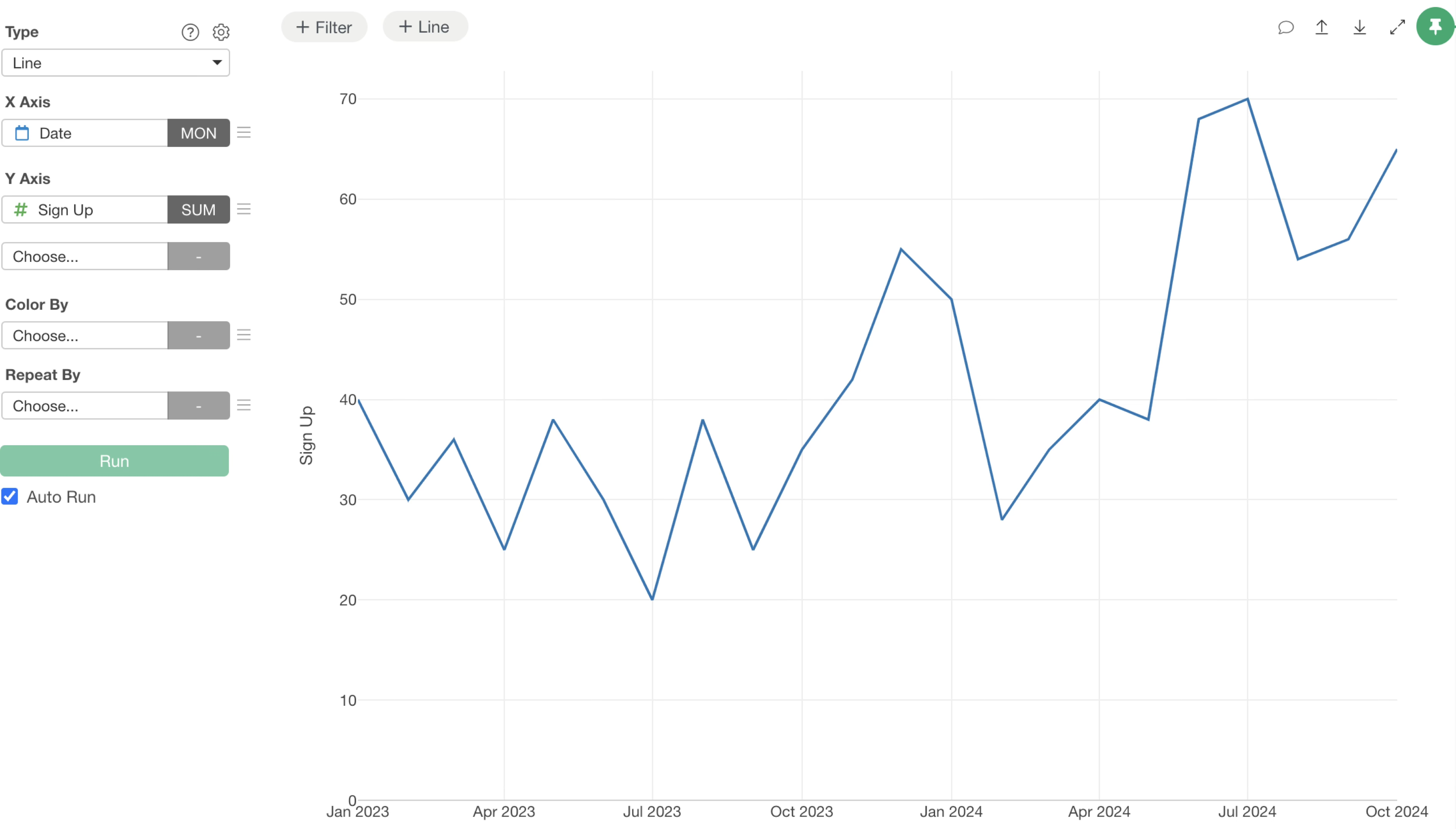
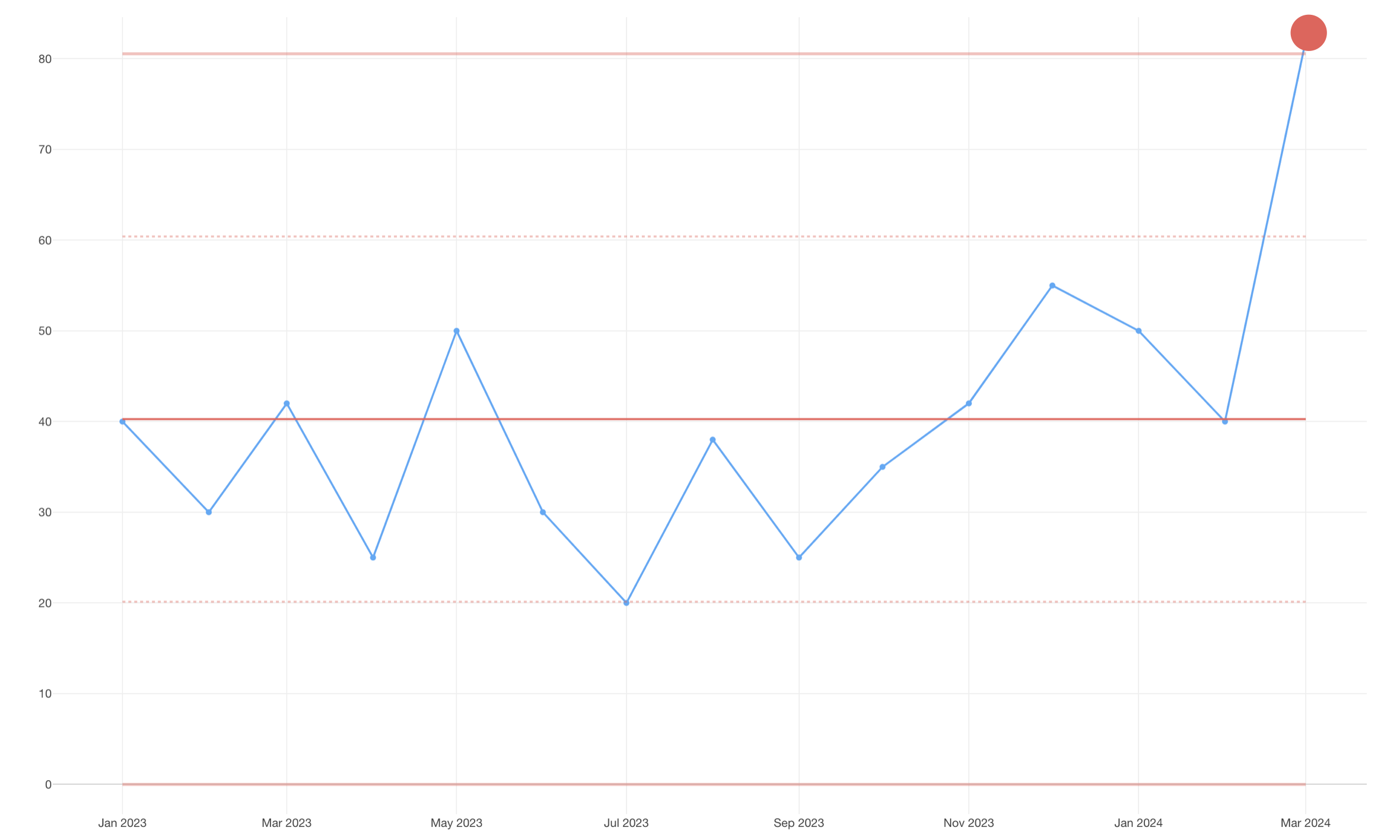
For example, imagine you’re monitoring monthly sign-up numbers using a line chart, as shown below. You’ll notice that sign-up numbers fluctuate each month, always showing some degree of variation.
The key question here is: Are these monthly changes significant enough to pay attention, or are they simply normal data fluctuations that can be disregarded?
XmR charts provide a clear answer to this question.
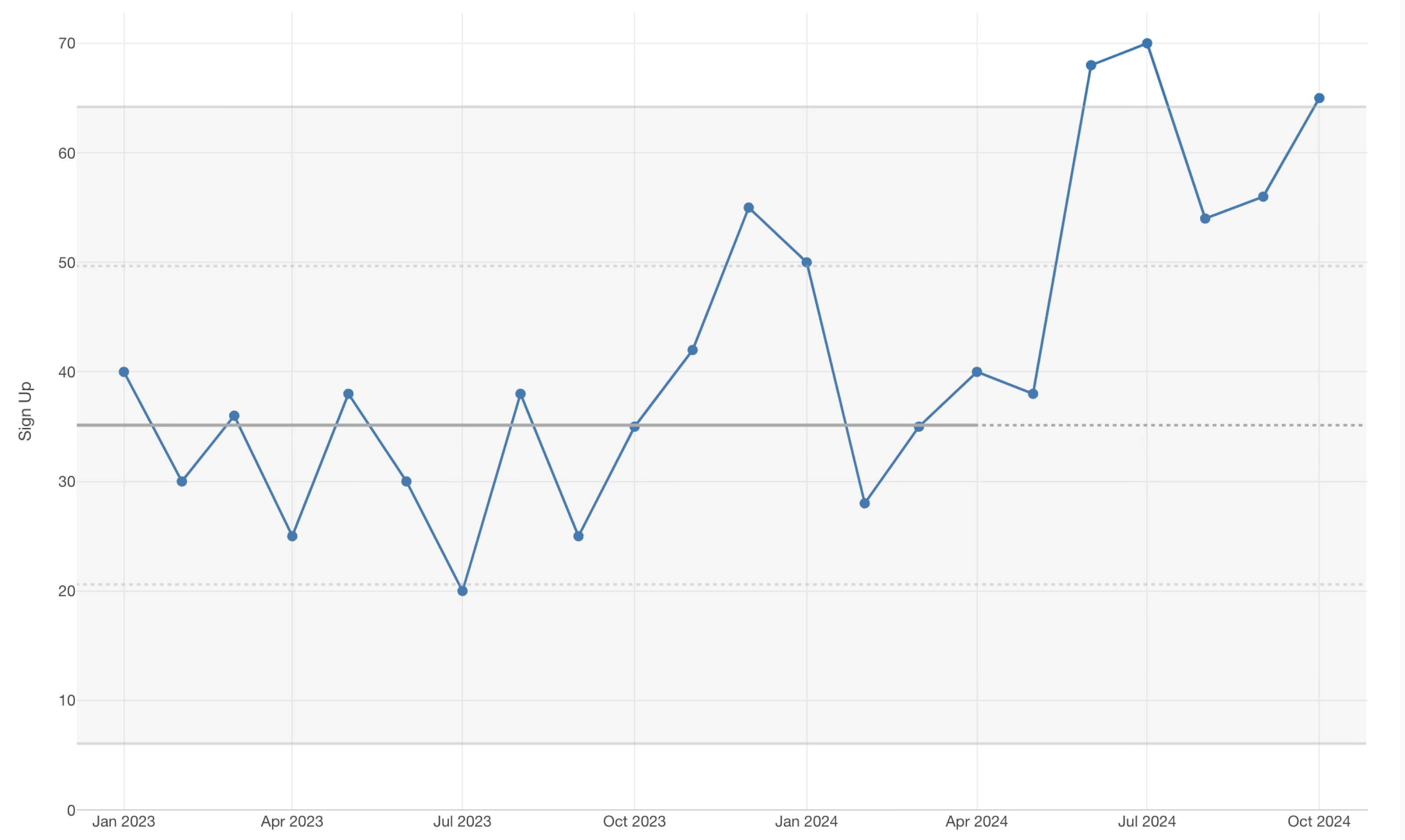
An XmR chart enhances a standard line chart by adding several horizontal reference lines. The central line represents the overall average value for the entire period. The upper and lower lines, known as control limits, define the expected range of “normal variation” in your data.
If data points fall within these control limits, it indicates that the observed changes are merely random fluctuations. In such cases, no specific investigation or action is typically required.
However, if sign-up numbers cross either the upper or lower control limit, it signals that something beyond normal data variation is occurring.
When this happens, it’s crucial to investigate the underlying factors.
For instance, it could be a positive outcome from a recent initiative, or it might be due to a specific external event.
By effectively separating signals (special causes of variation) from noise (common causes of variation), XmR charts help you determine when to take necessary action based on your data. This ability to drive informed decisions is why XmR charts are considered an essential analytical method for business improvement.
XmR Chart Webinar
You can watch a detailed webinar on XmR charts below.
How to Create an XmR Chart
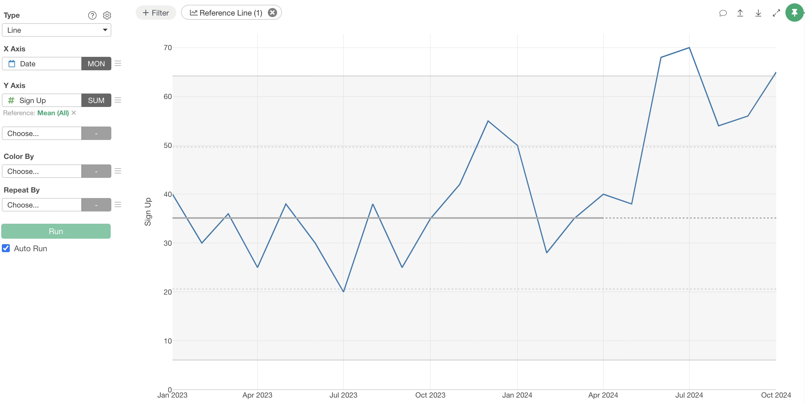
To create an XmR chart, start by opening the Chart view.
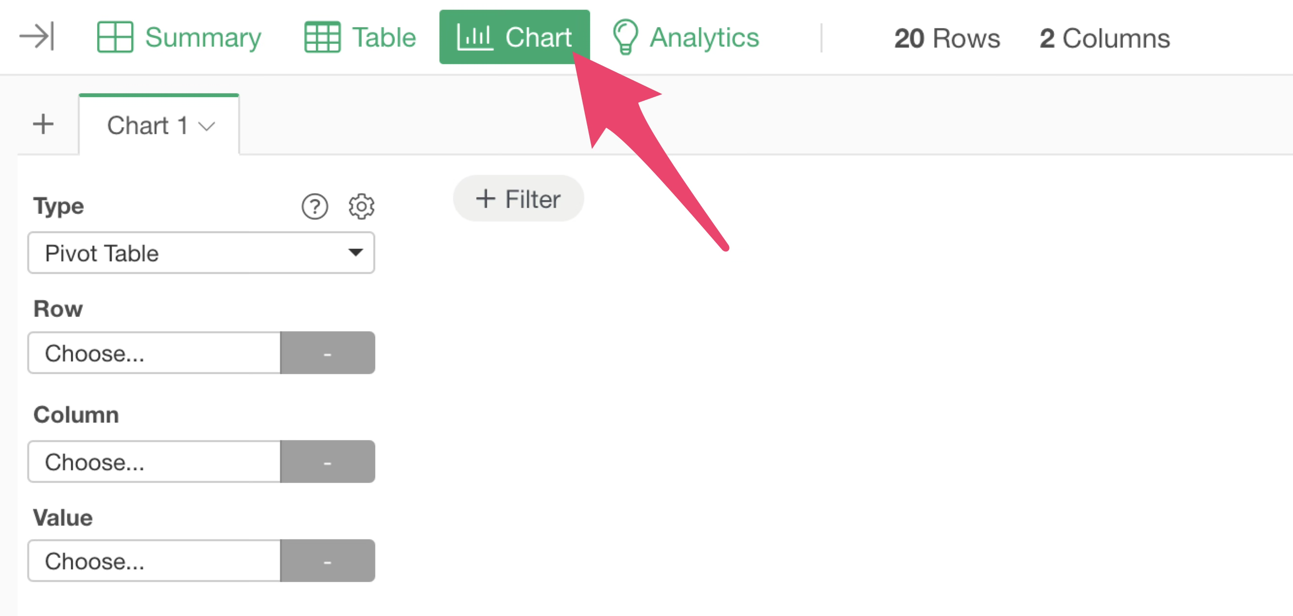
Select “Line” as the chart type.
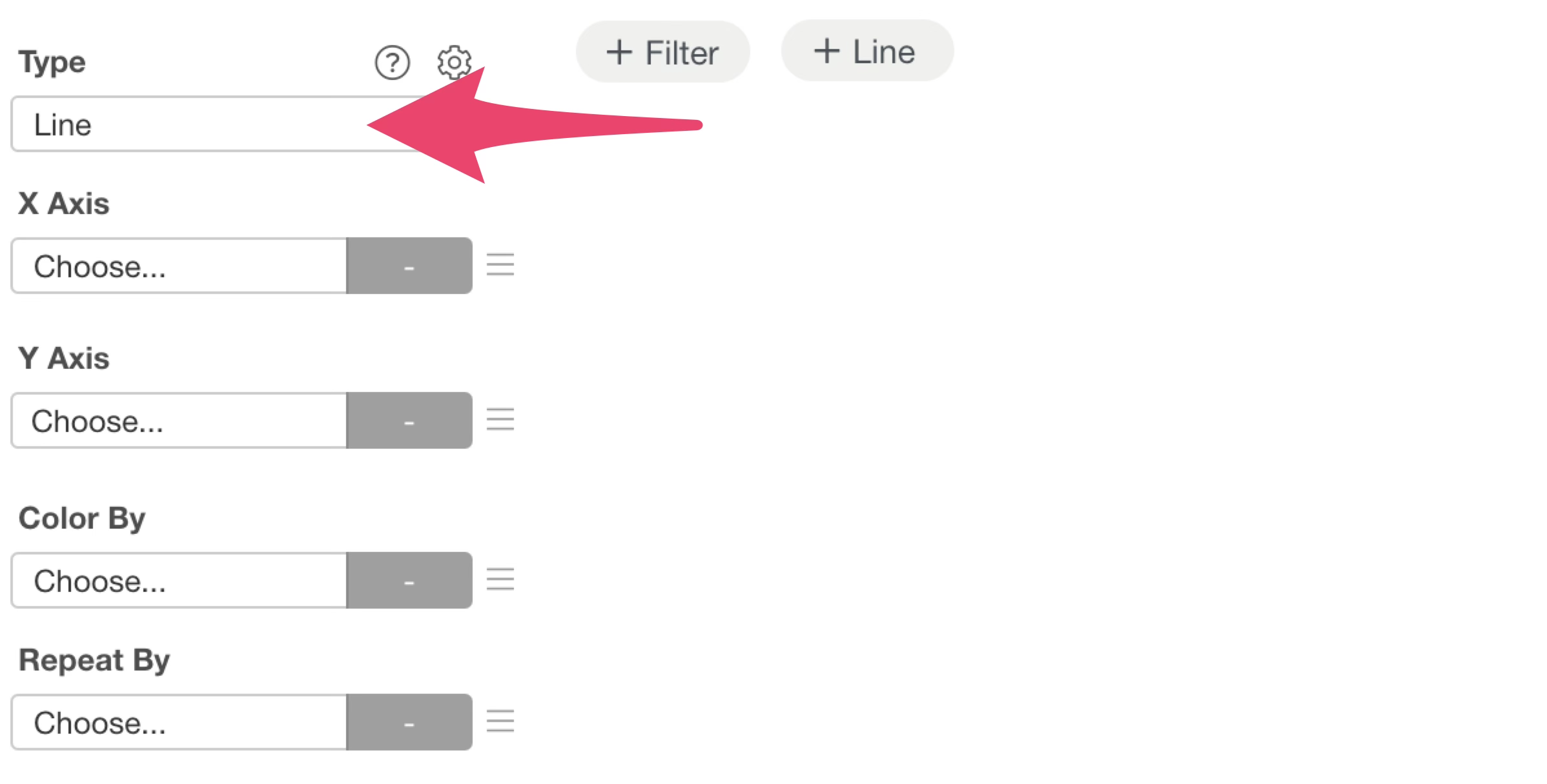
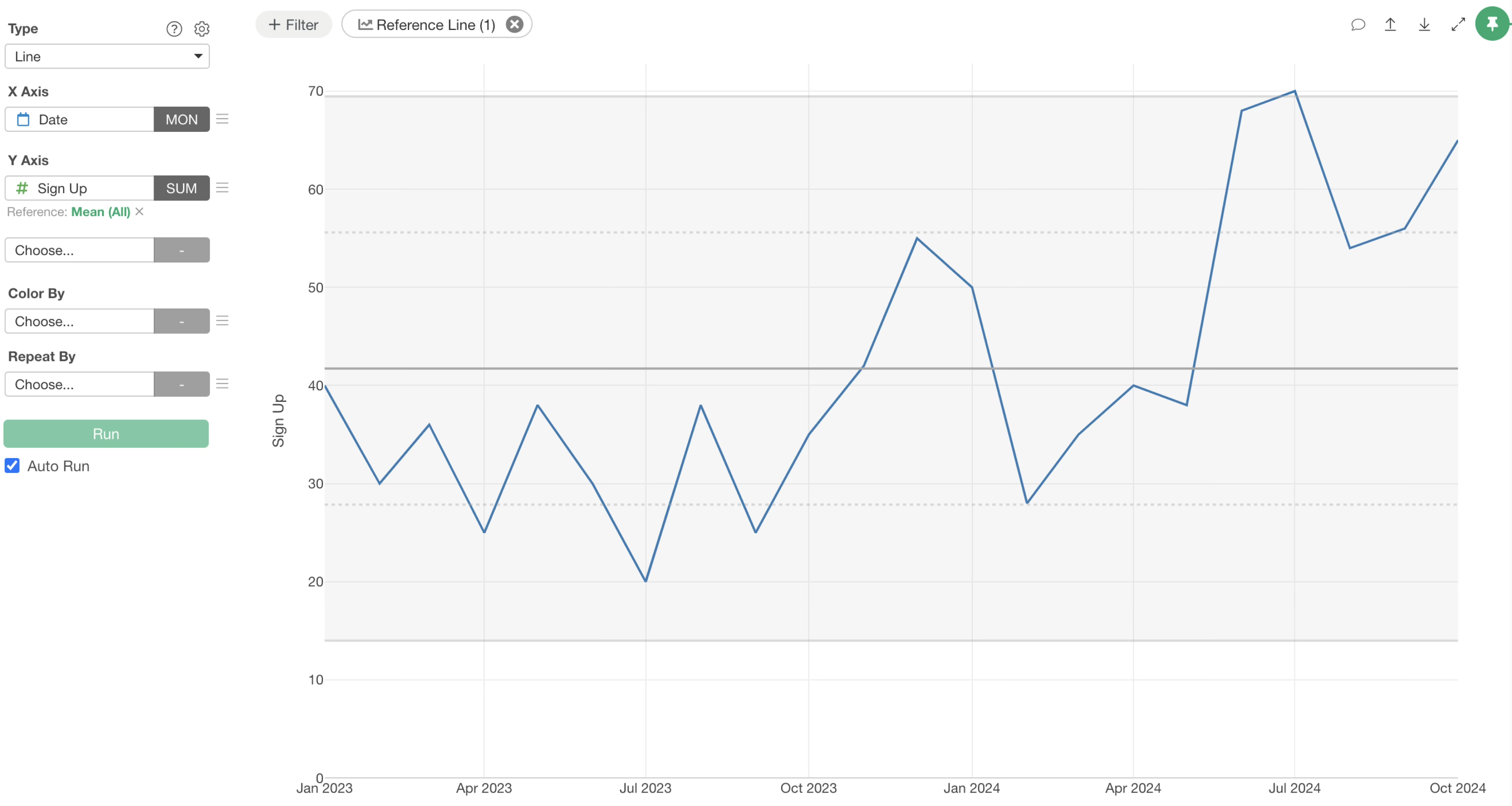
Next, assign “Date” to the X-axis and choose “Month” for the date aggregation unit. For the Y-axis, select “Sign Up” and set the aggregation function to “SUM.”
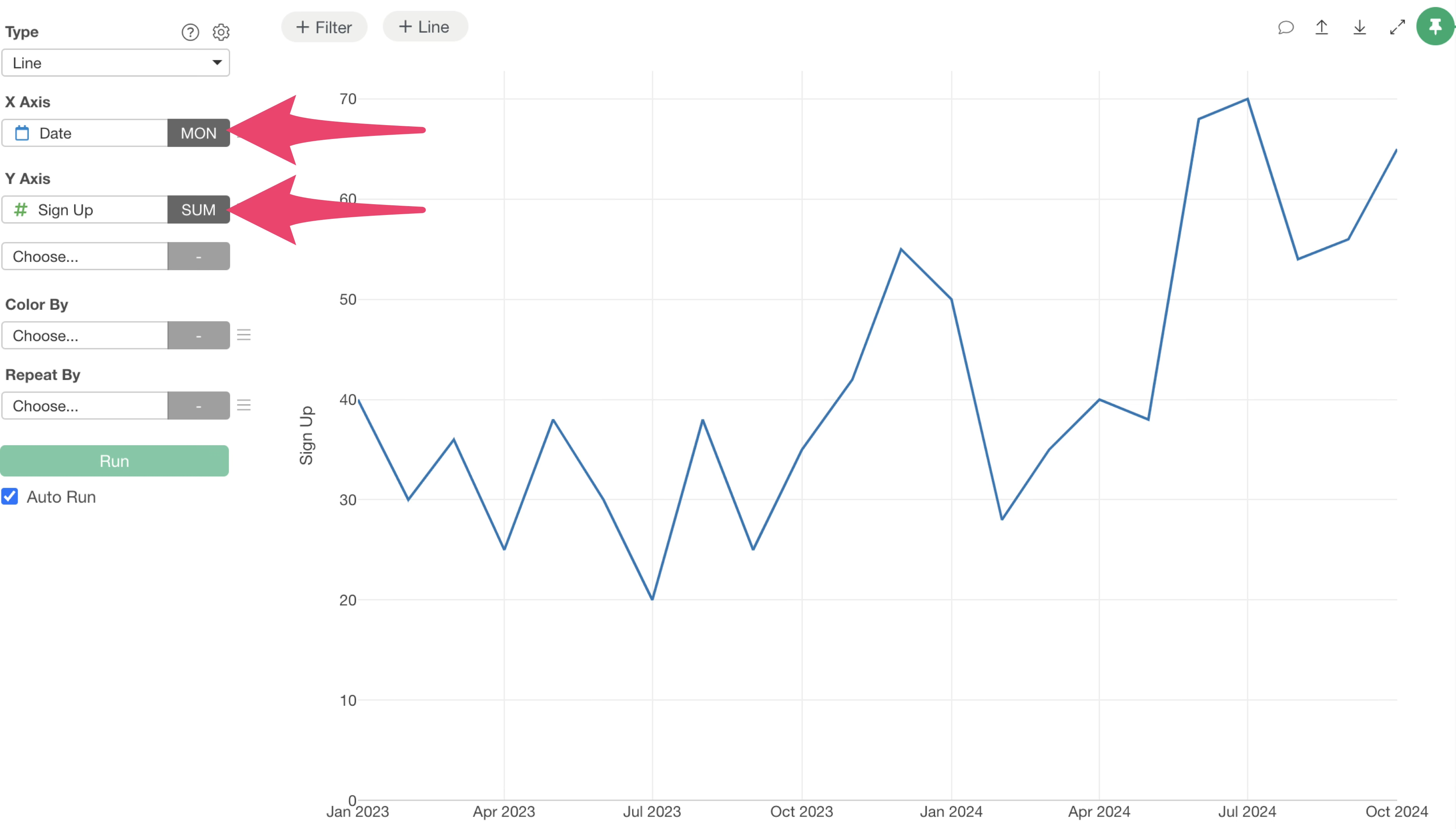
This setup visualizes the monthly trend of sign-up numbers.
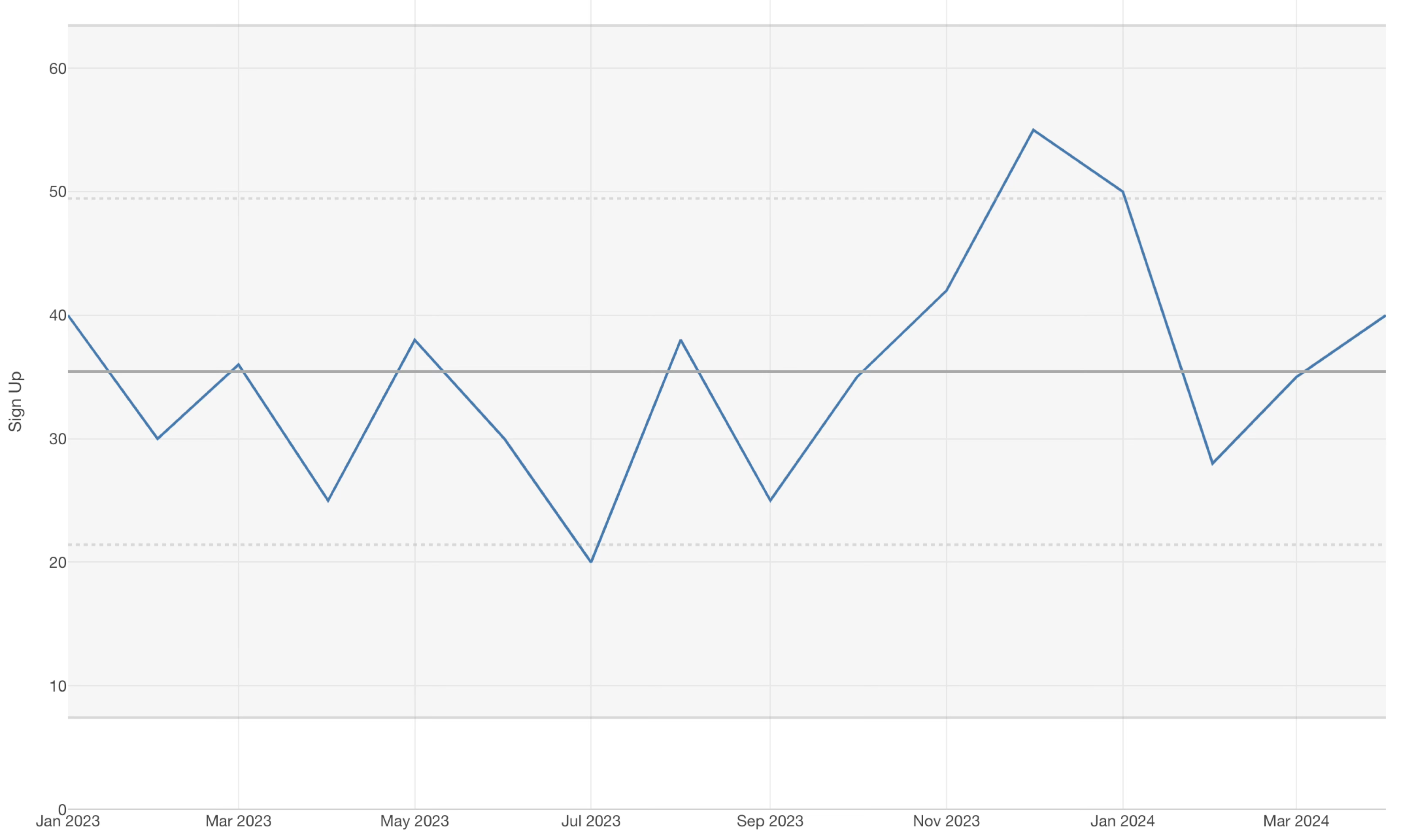
Now, let’s add the variation range to this chart to transform it into an XmR chart.
Click the “Reference Line” settings button at the top of the chart, then select “XmR (Control Chart)” from the Y-axis menu.
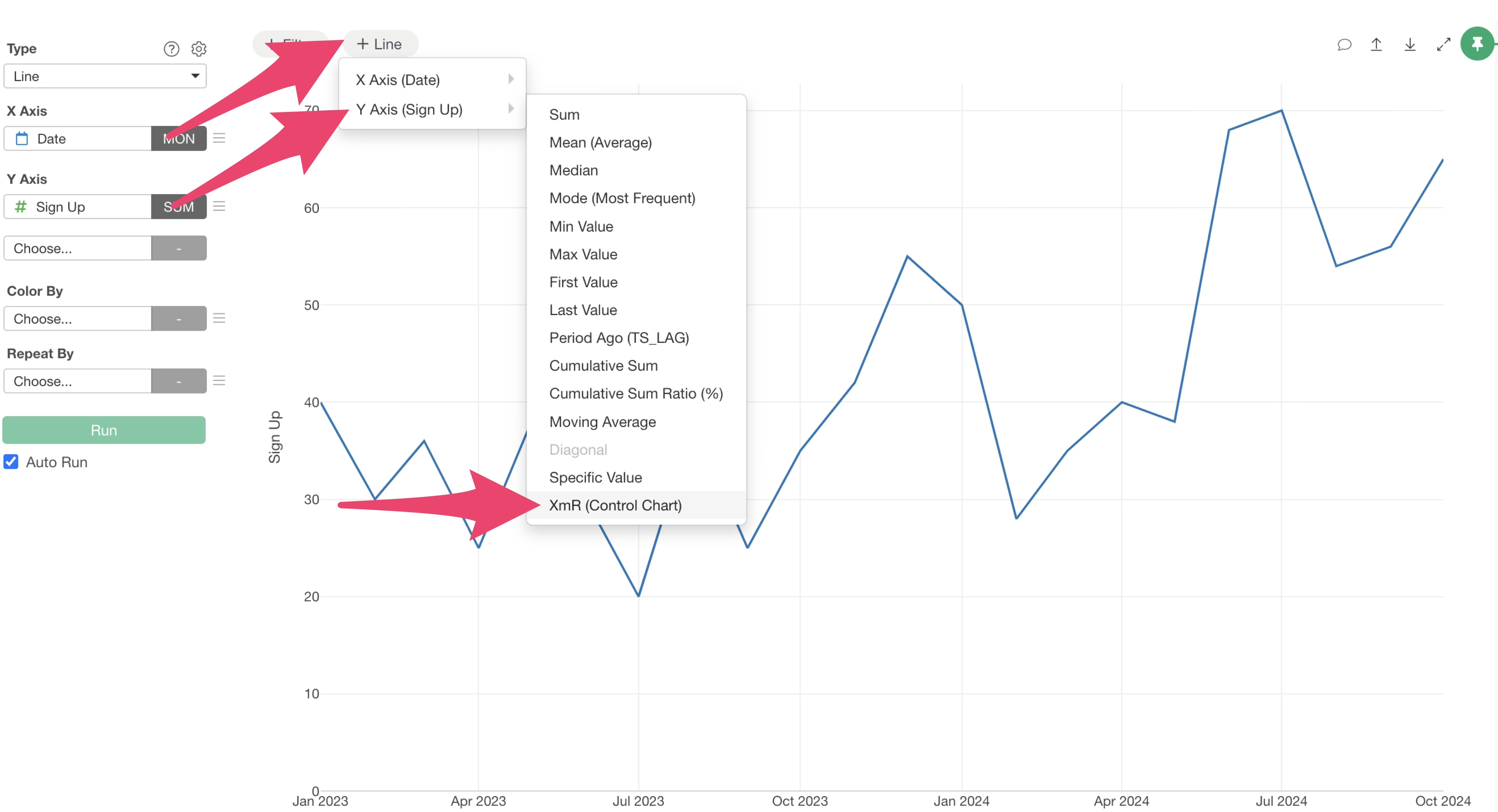
Alternatively, you can achieve the same result by selecting “Reference Line” from the Y-axis value menu and then choosing “XmR (Control Chart).”
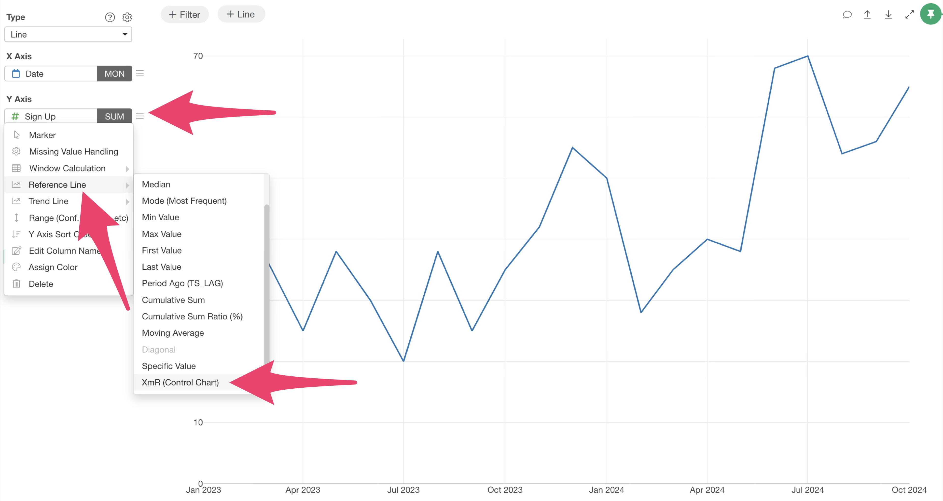
This action visualizes the control limits (variation range) for sign-up numbers, creating your XmR chart.
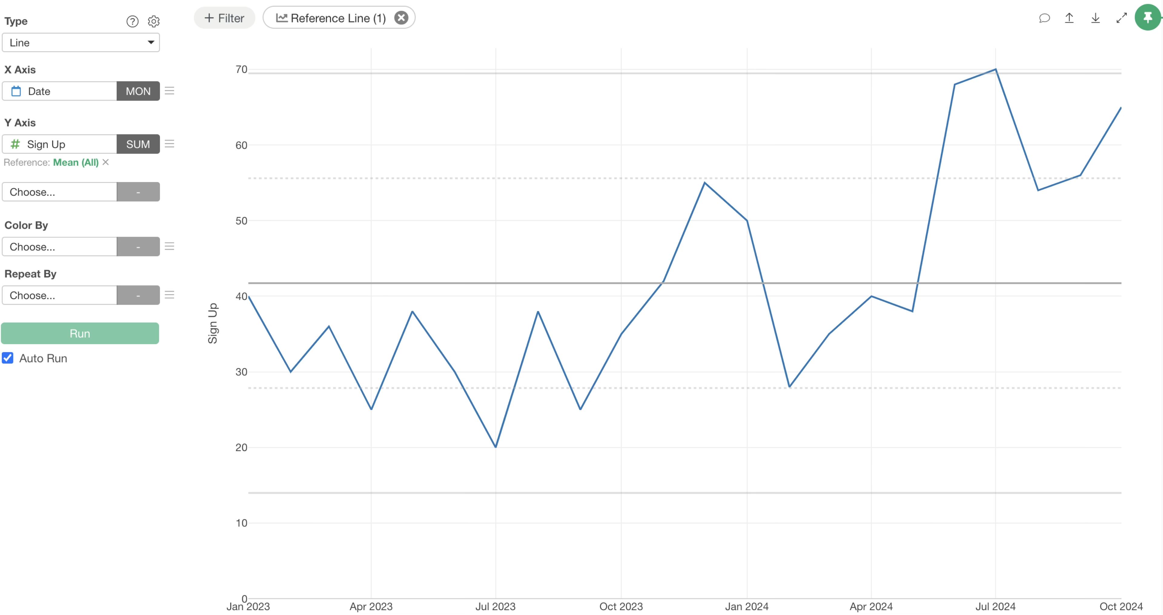
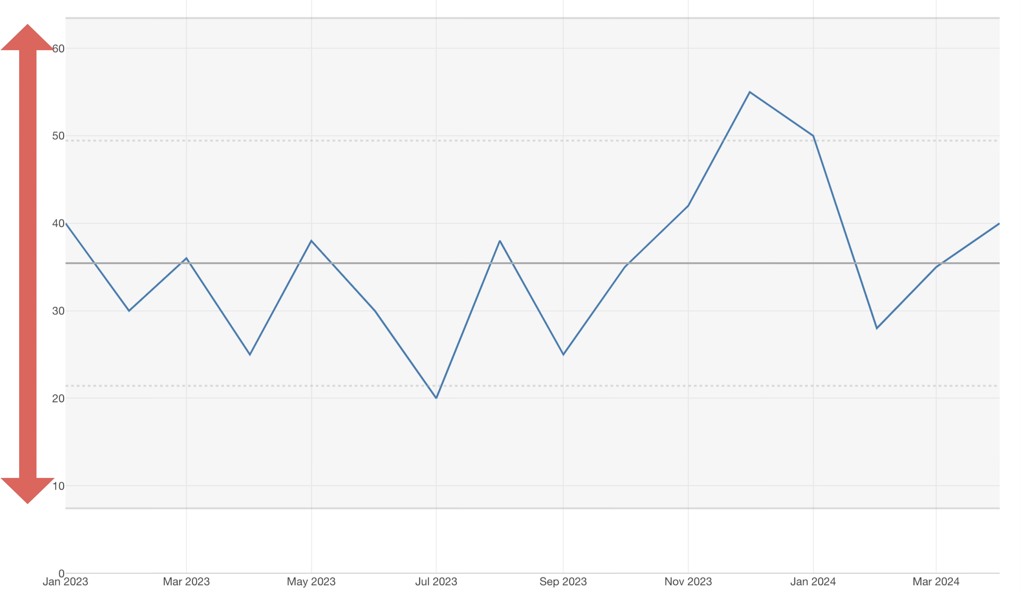
Finally, to improve visibility, fill the area between the control limits. Click the green text for the reference line.
In the range settings, check “Fill Background” and click “Apply.”
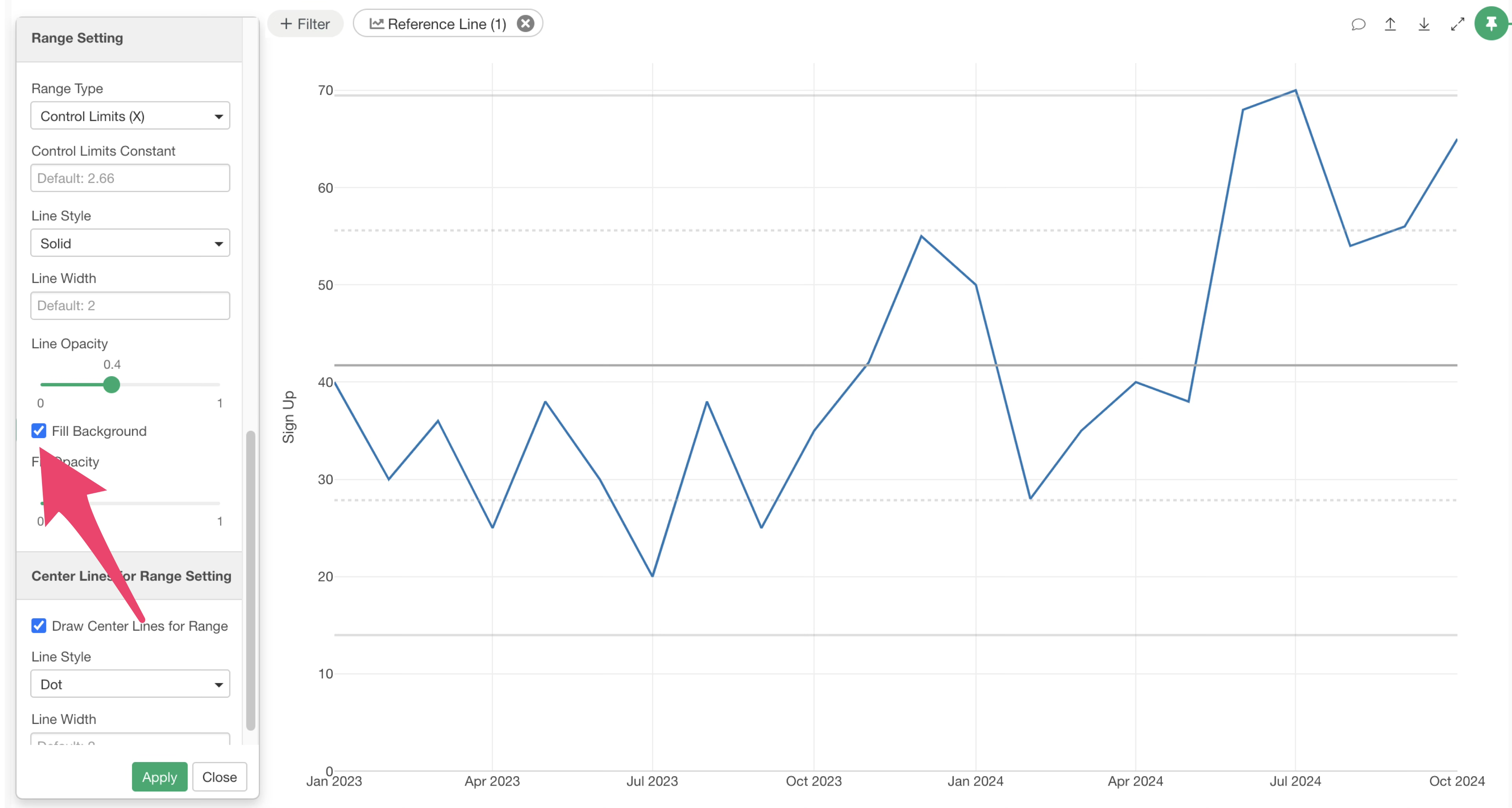
This makes the control limit range much easier to see.
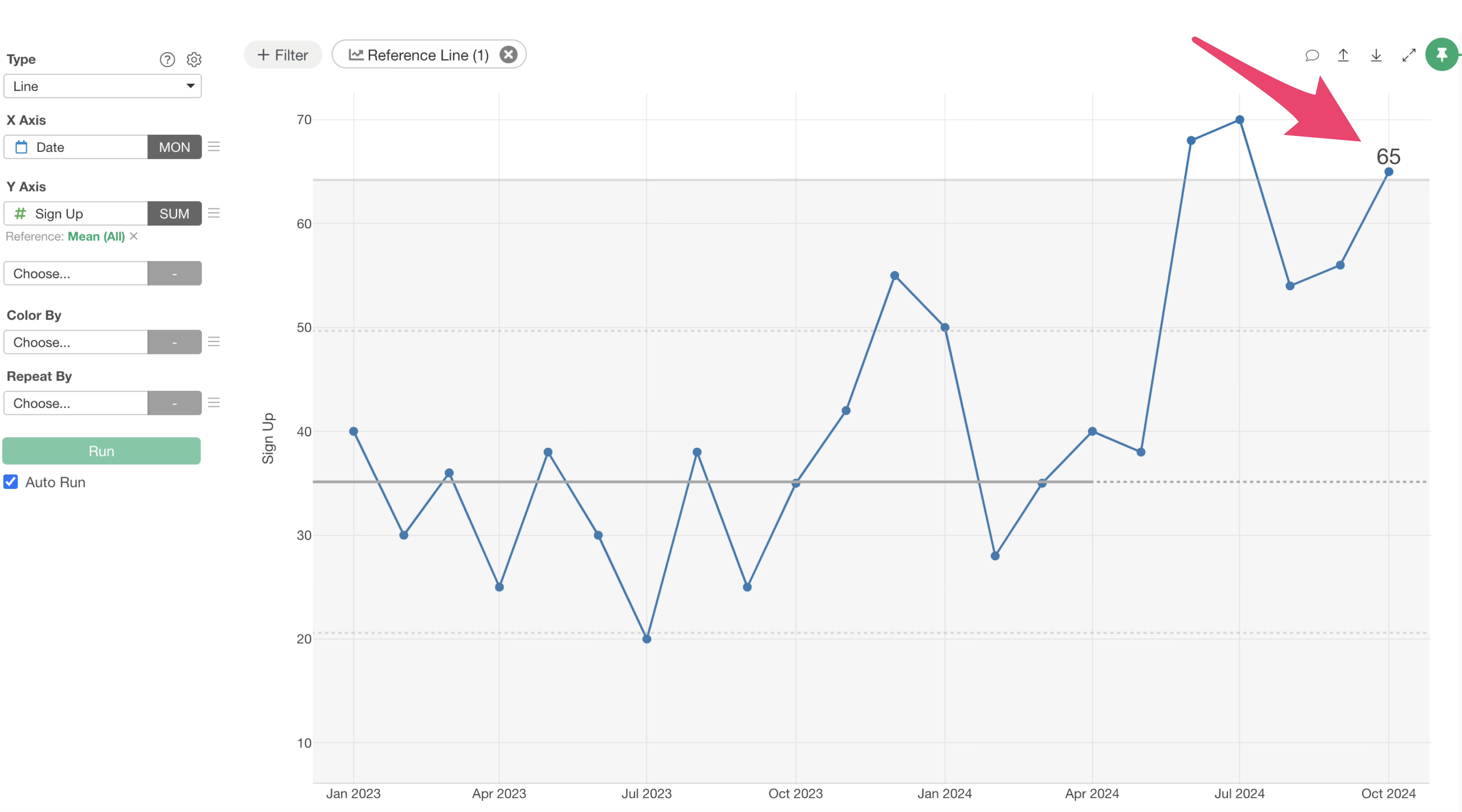
Specifying the Period for Control Limit Calculation
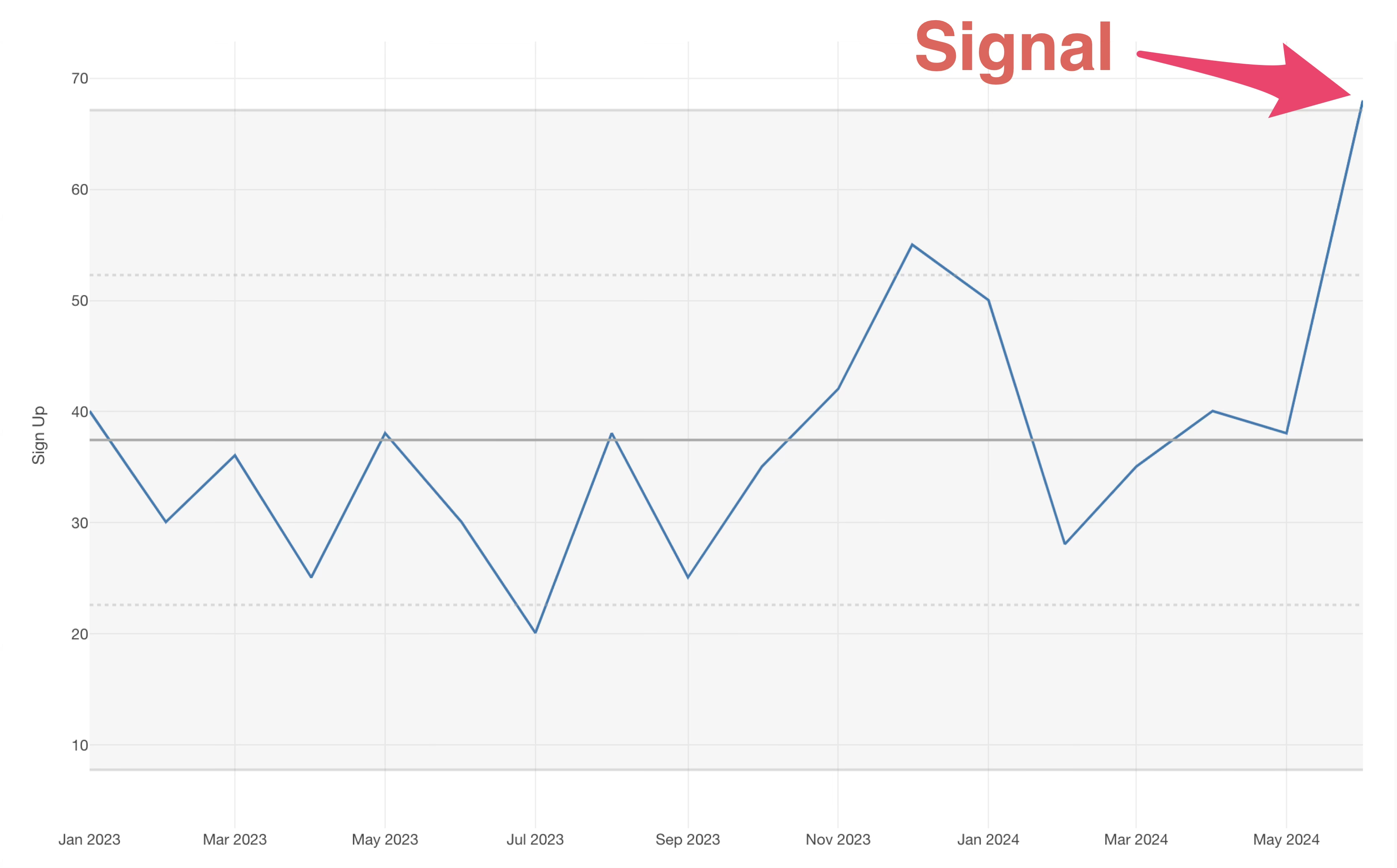
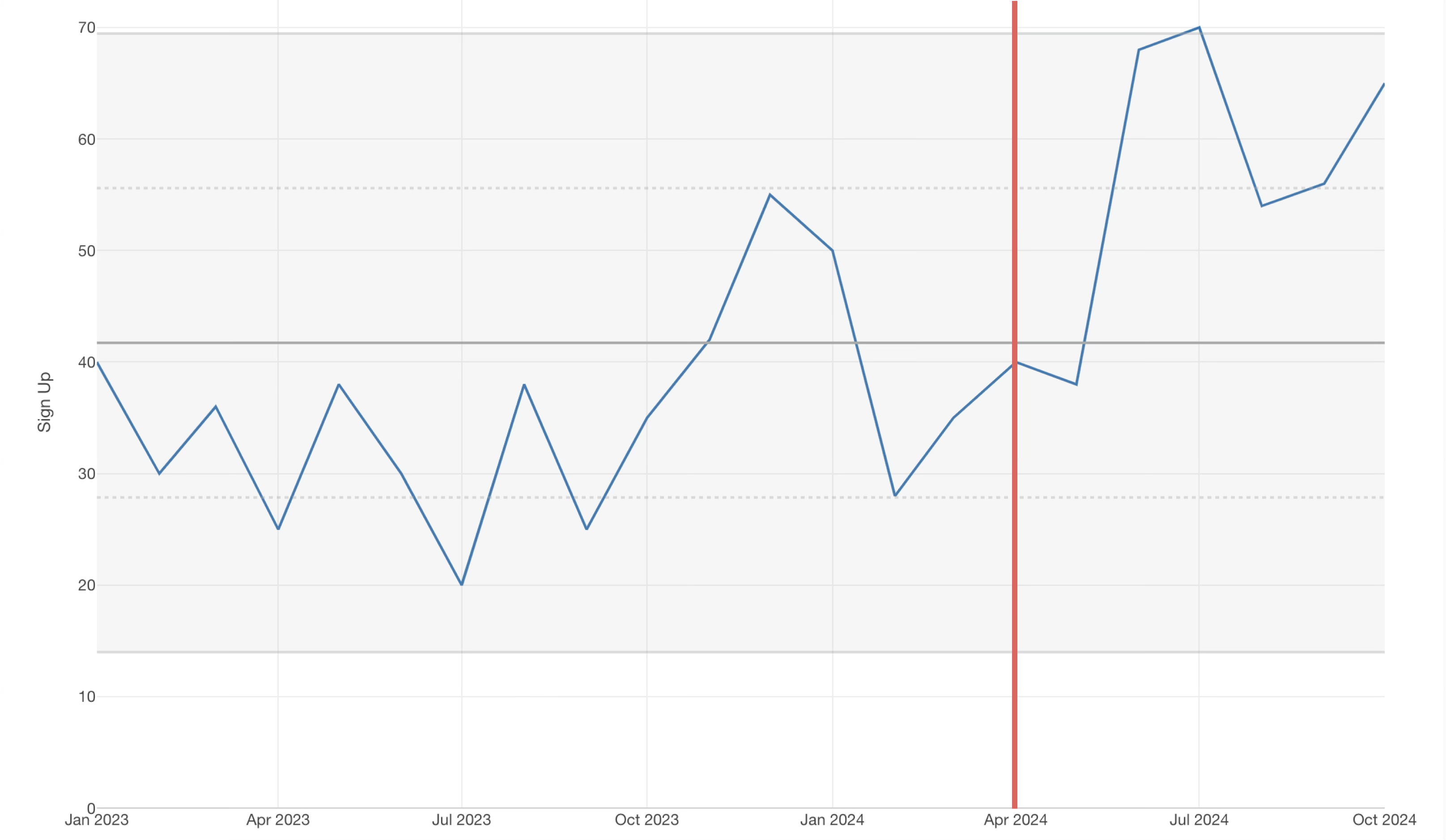
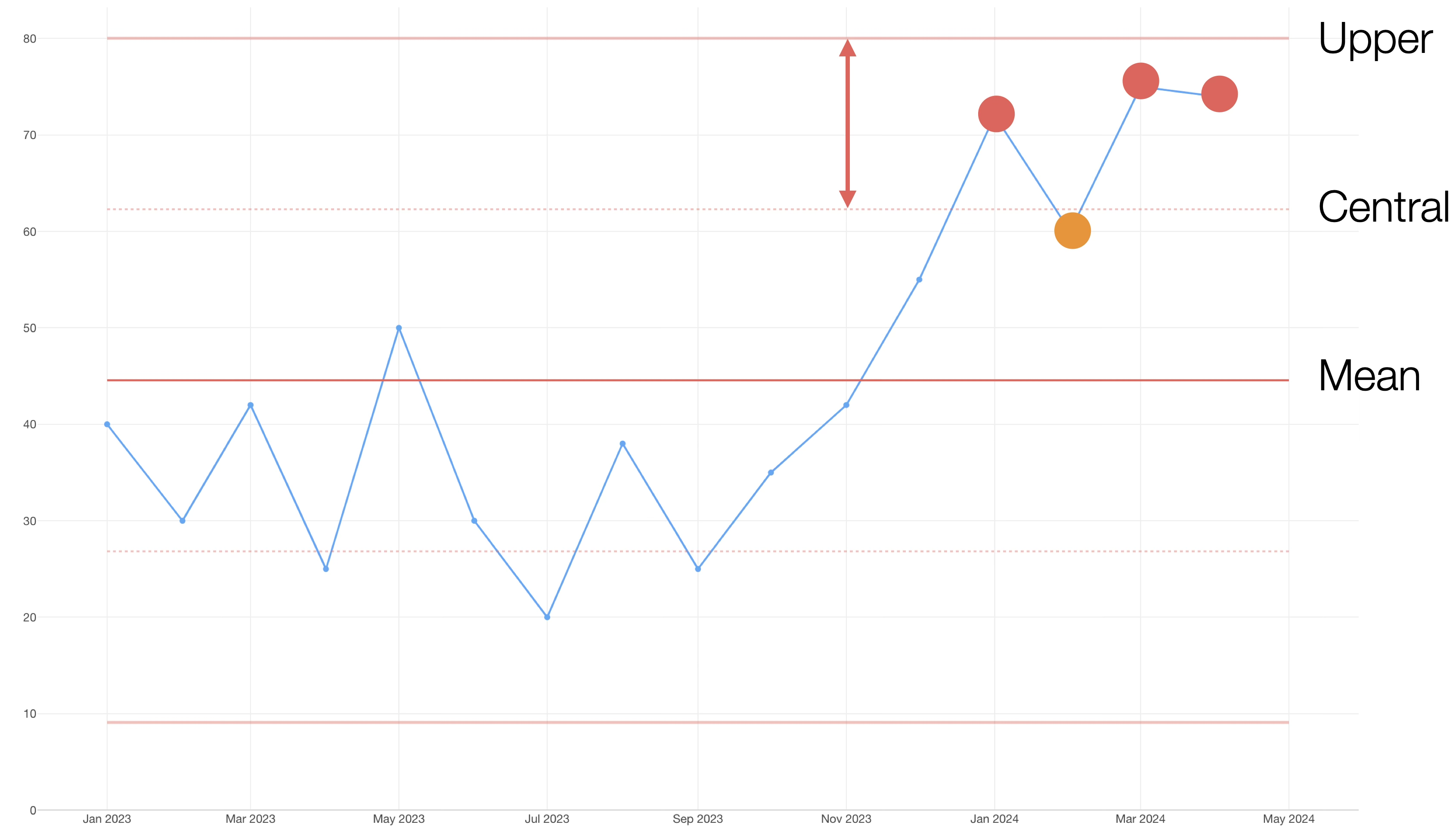
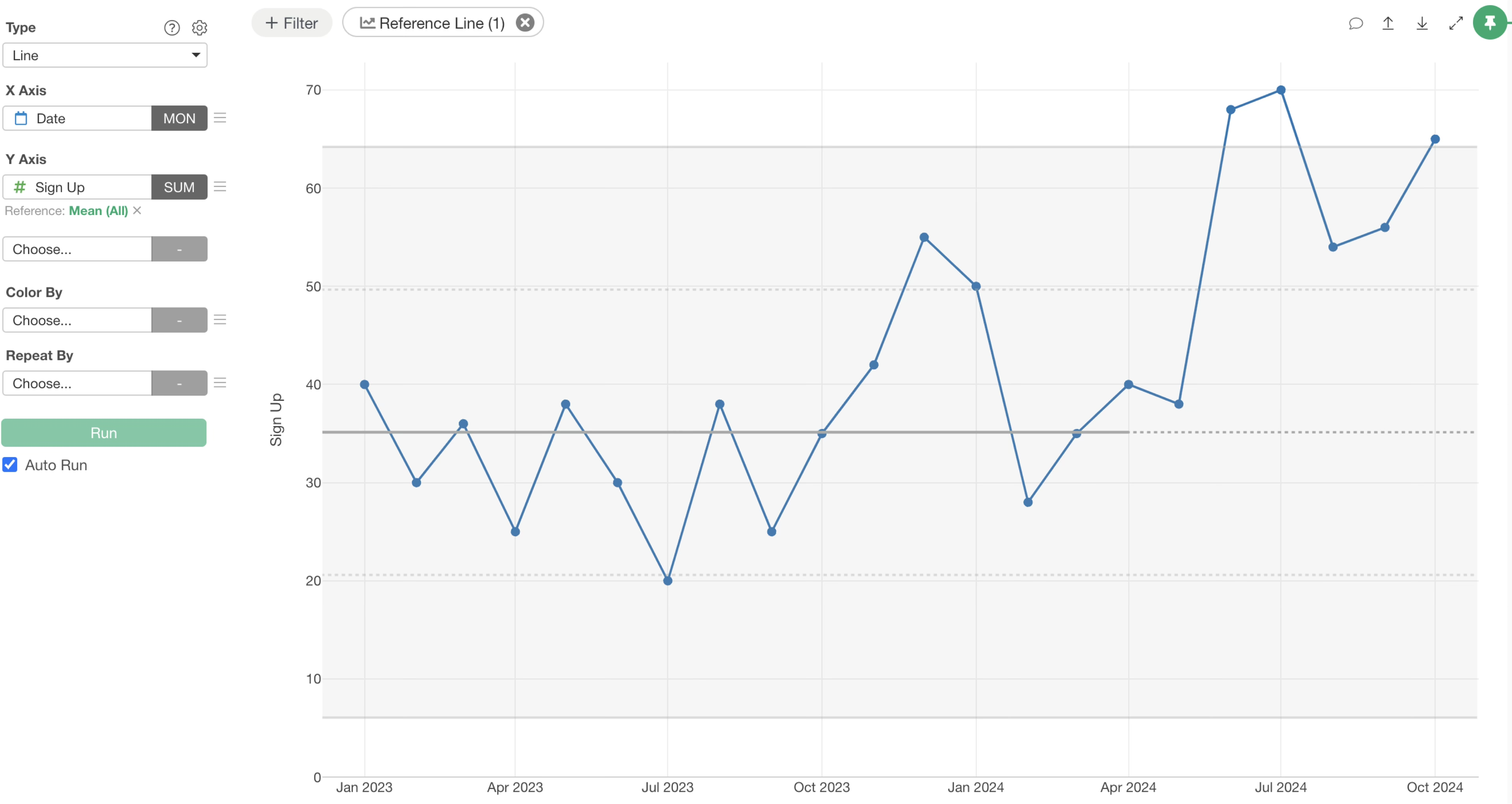
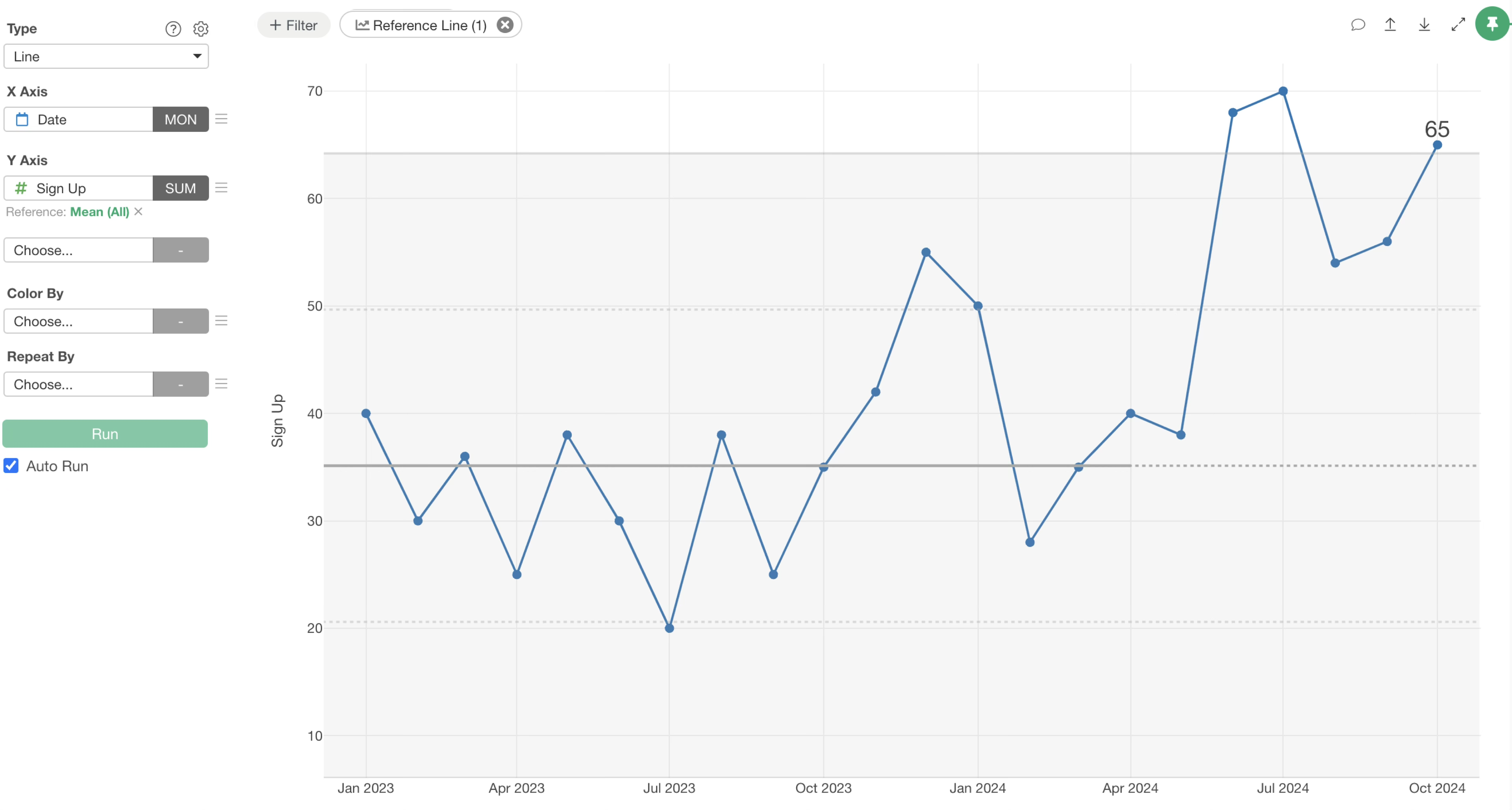
Let’s say you launched a new initiative in April 2024. You want to calculate the XmR chart’s control limits based on data up to March 2024 and then analyze how current sign-up numbers compare to that established range.
You can specify the data range for calculating control limits. Let’s walk through how to do this.
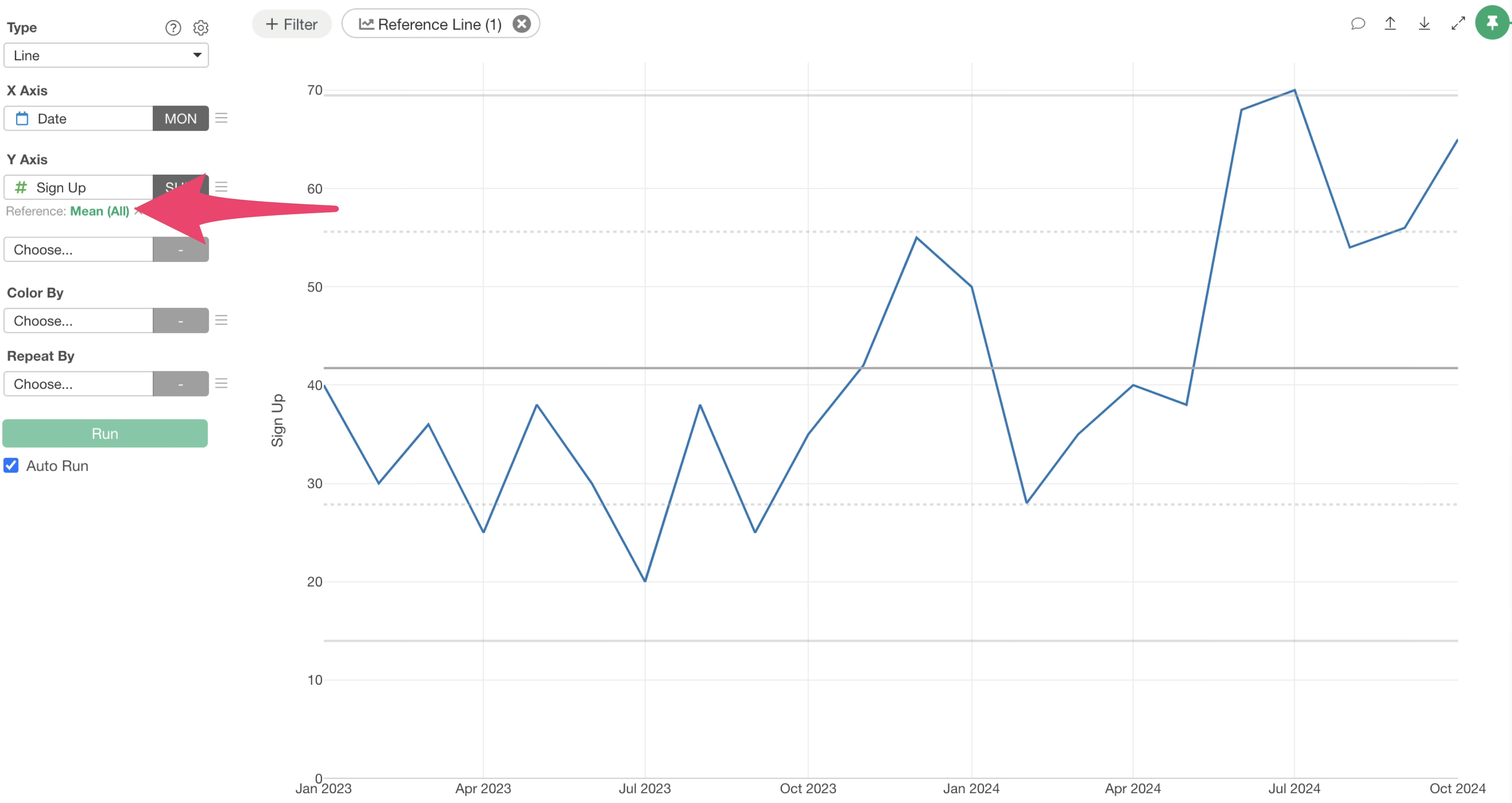
Click the green text that says “Mean (All)” for the reference line.
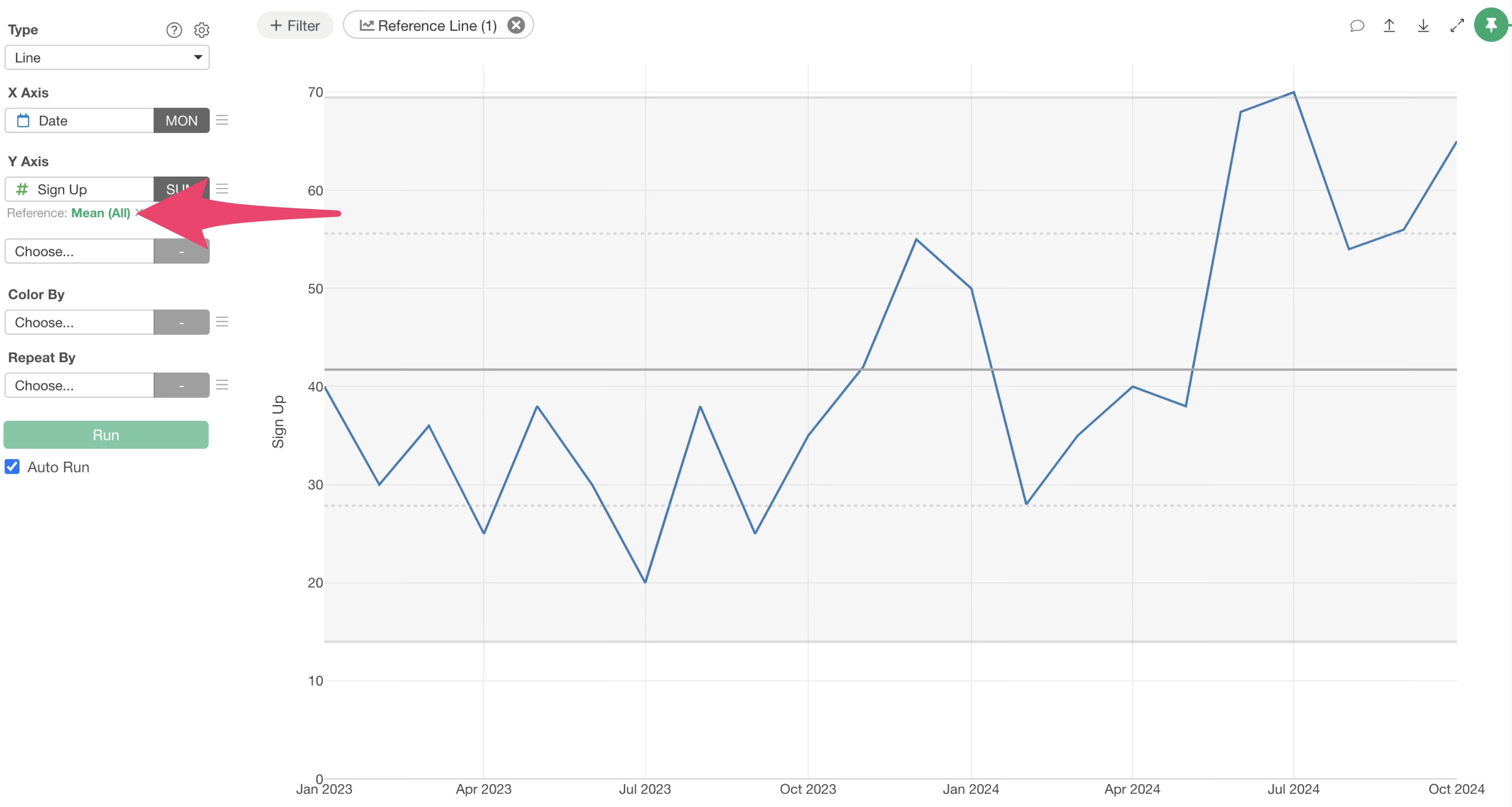
The Reference Line Settings dialog will appear. Select “Earlier Than” for “Base Data Range.”
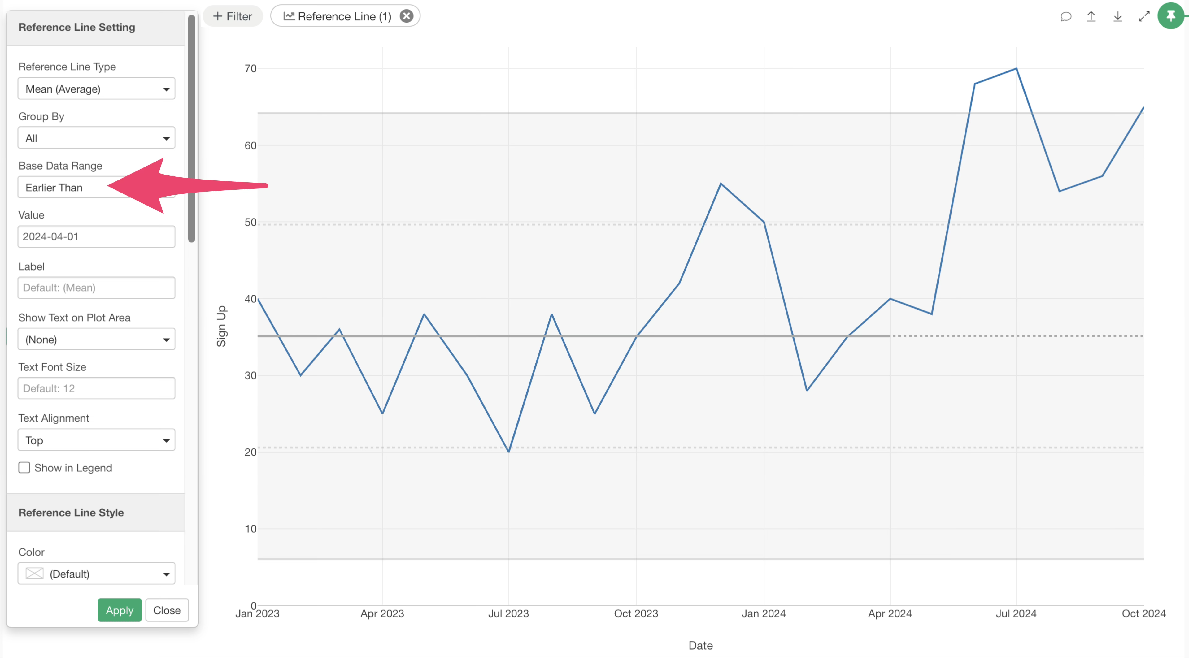
Enter “2024-04-01” as the value and click the “Apply” button.
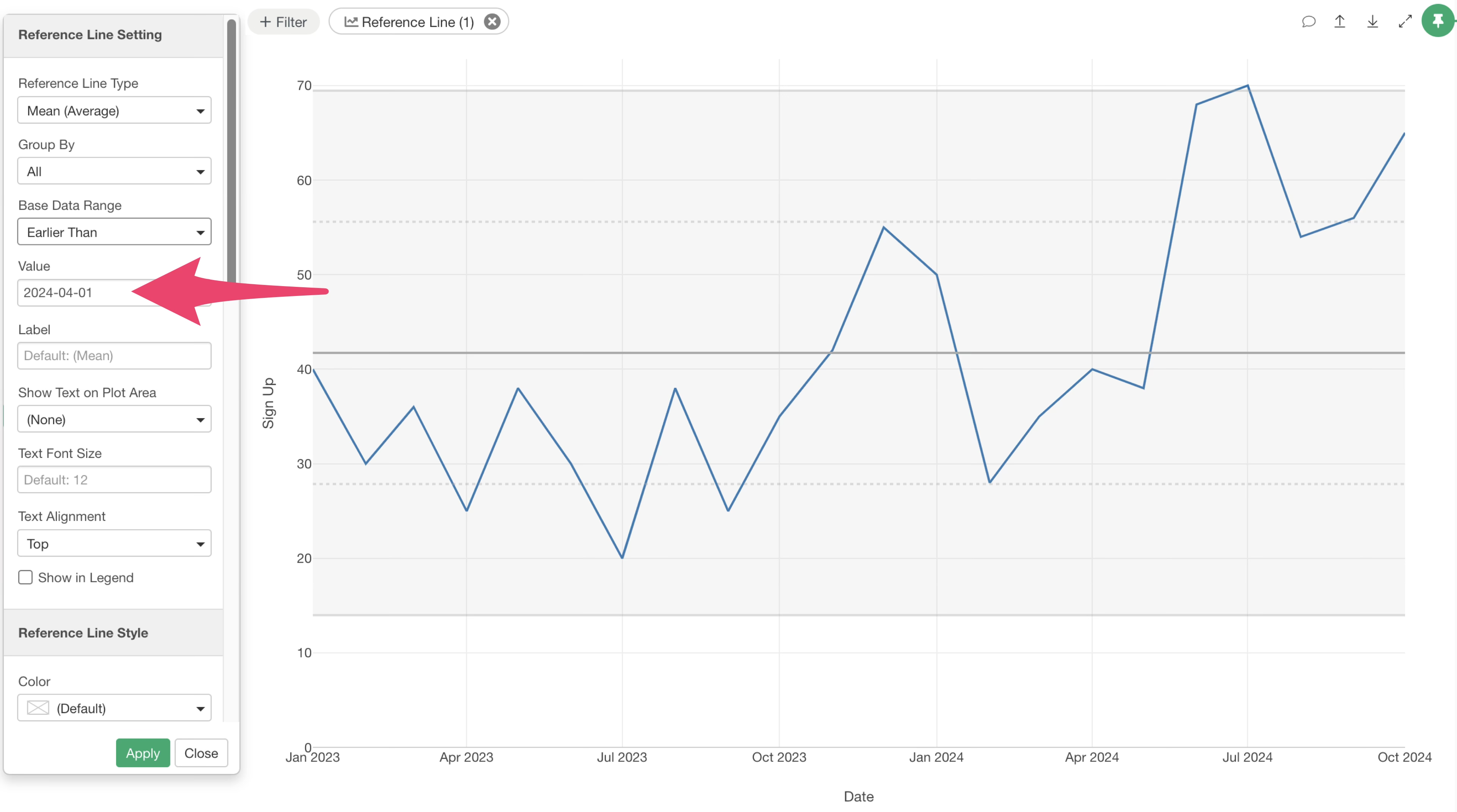
This will calculate and visualize the XmR chart’s average and control limits based on data up to March 2024.
Looking at the results, the values for June and July 2024 exceed the range of normal variation established earlier. This indicates that something special is happening.
In this specific case, since we know an initiative was launched, it suggests that the efforts are starting to show positive effects.
Three Rules for Identifying Signals
When using an XmR chart to determine if a change is a signal, consider these three rules:
Rule 1: A data point is outside of the Control Limit Lines
Rule 2: Three out of 4 consecutive points are closer to a Limit than the Centre Line
Rule 3: 8 consecutive points are above or below the mean line.
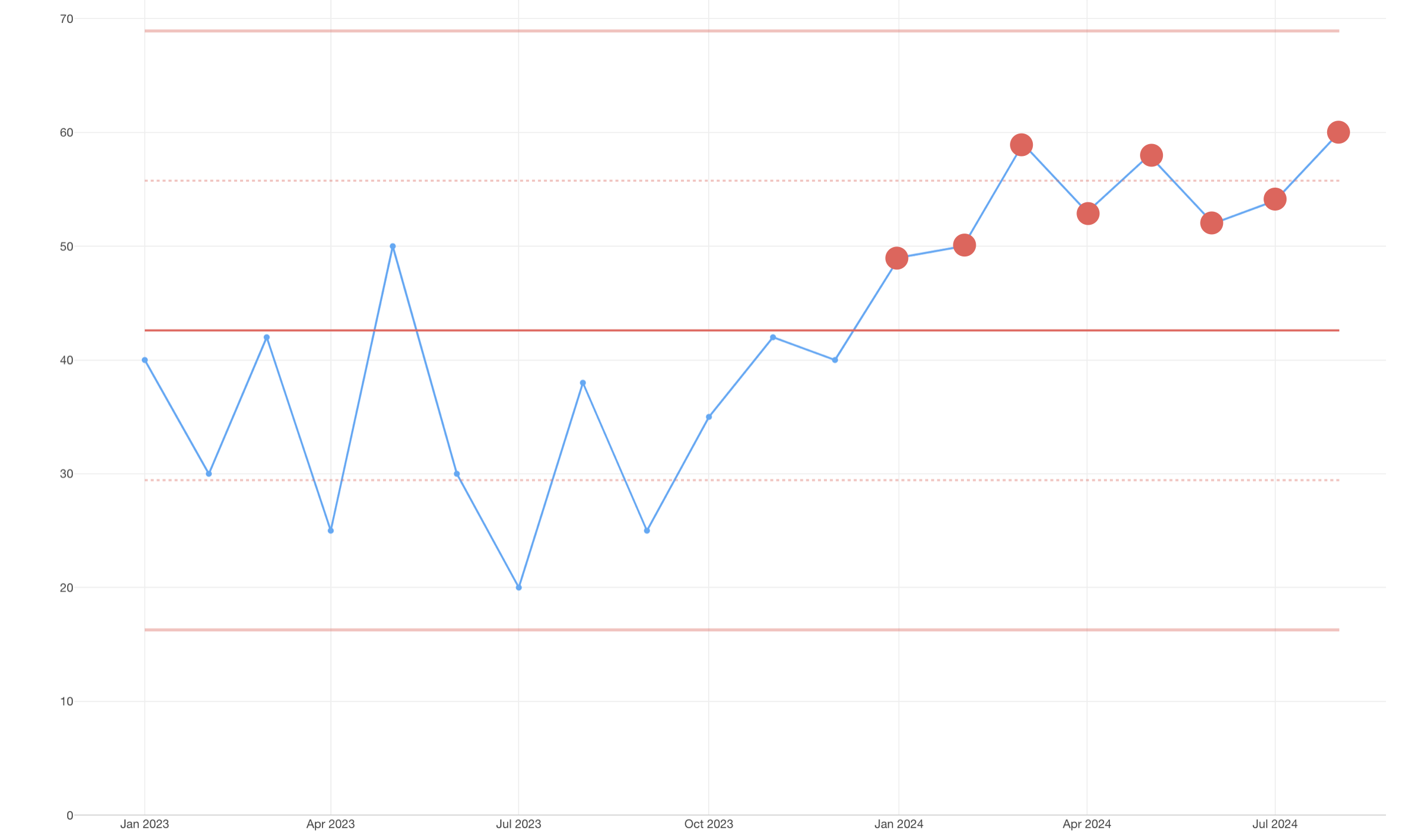
If any of these three rules apply, the data point is considered a signal, and you should investigate the underlying causes. If none of these rules are met, no action is typically needed.
Useful Settings for Creating XmR Charts
Here are some useful settings to enhance your XmR charts.
Change Marker to Line + Circle
To make individual data points clearer, you might want to add circles to the line.

Select “Marker” from the Y-axis menu.
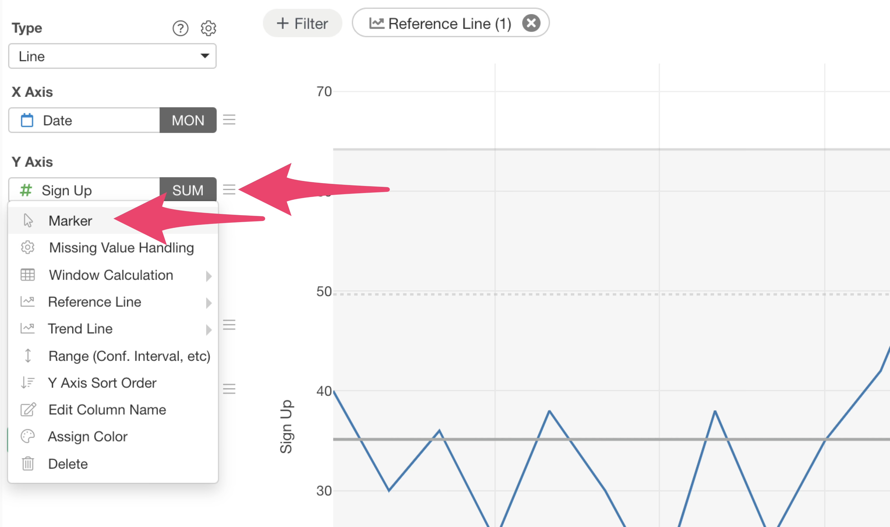
Choose “Line + Circle” for the marker type and set the circle size to “8.”
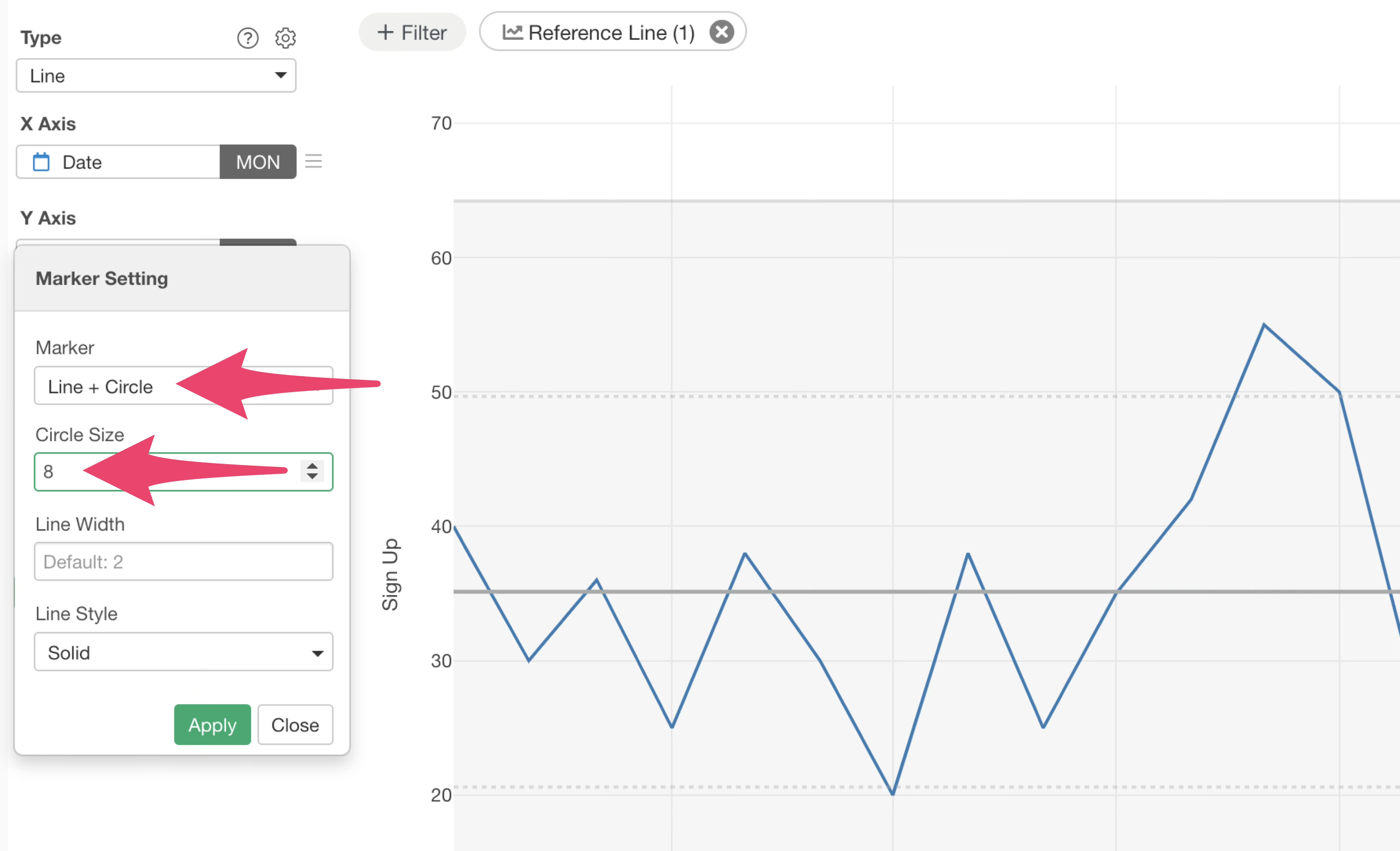
This changes the marker to “Line + Circle,” making each data point more distinct.
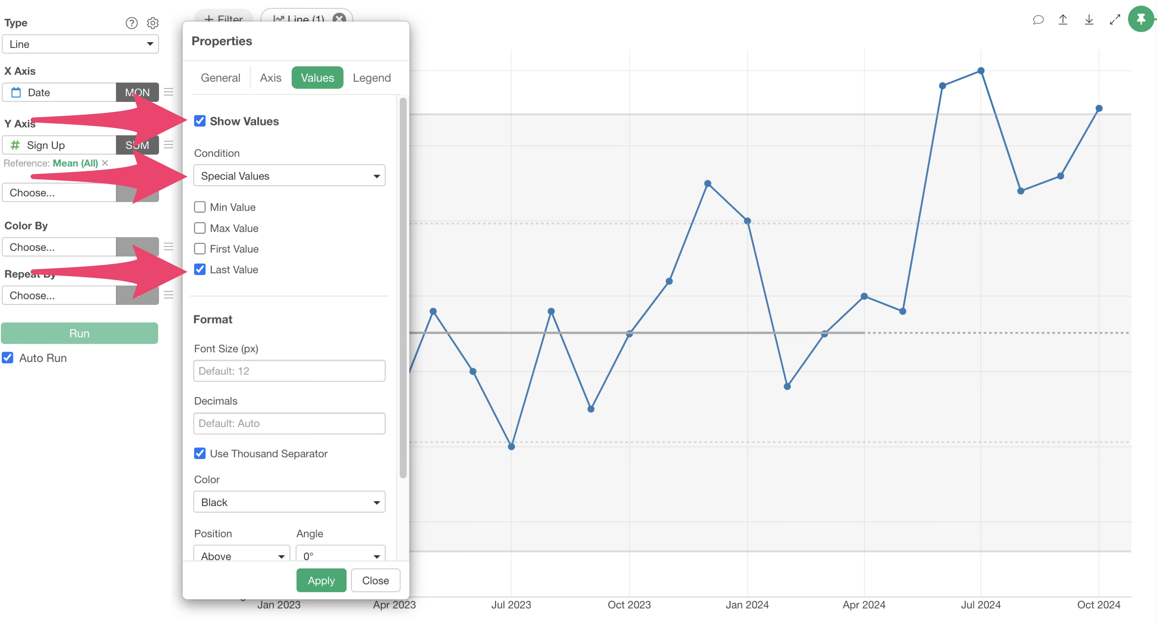
Display the Last Value
When monitoring XmR charts weekly or monthly, it’s often helpful to see the most recent value.

To display the last value, go to “Settings” and select “Value.”
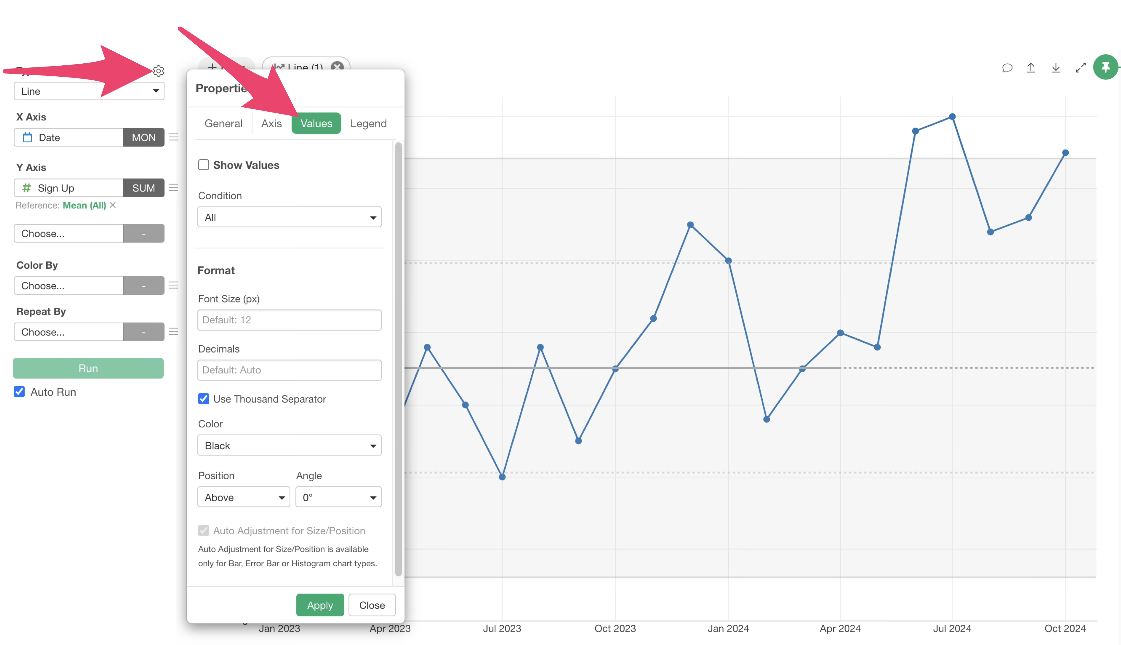
Check “Show Value,” select “Special Value” for the condition, and then check “Last Value” for the representative value type.
If you want to increase the font size of the displayed value, adjust “Font Size (px)” under “Format.”
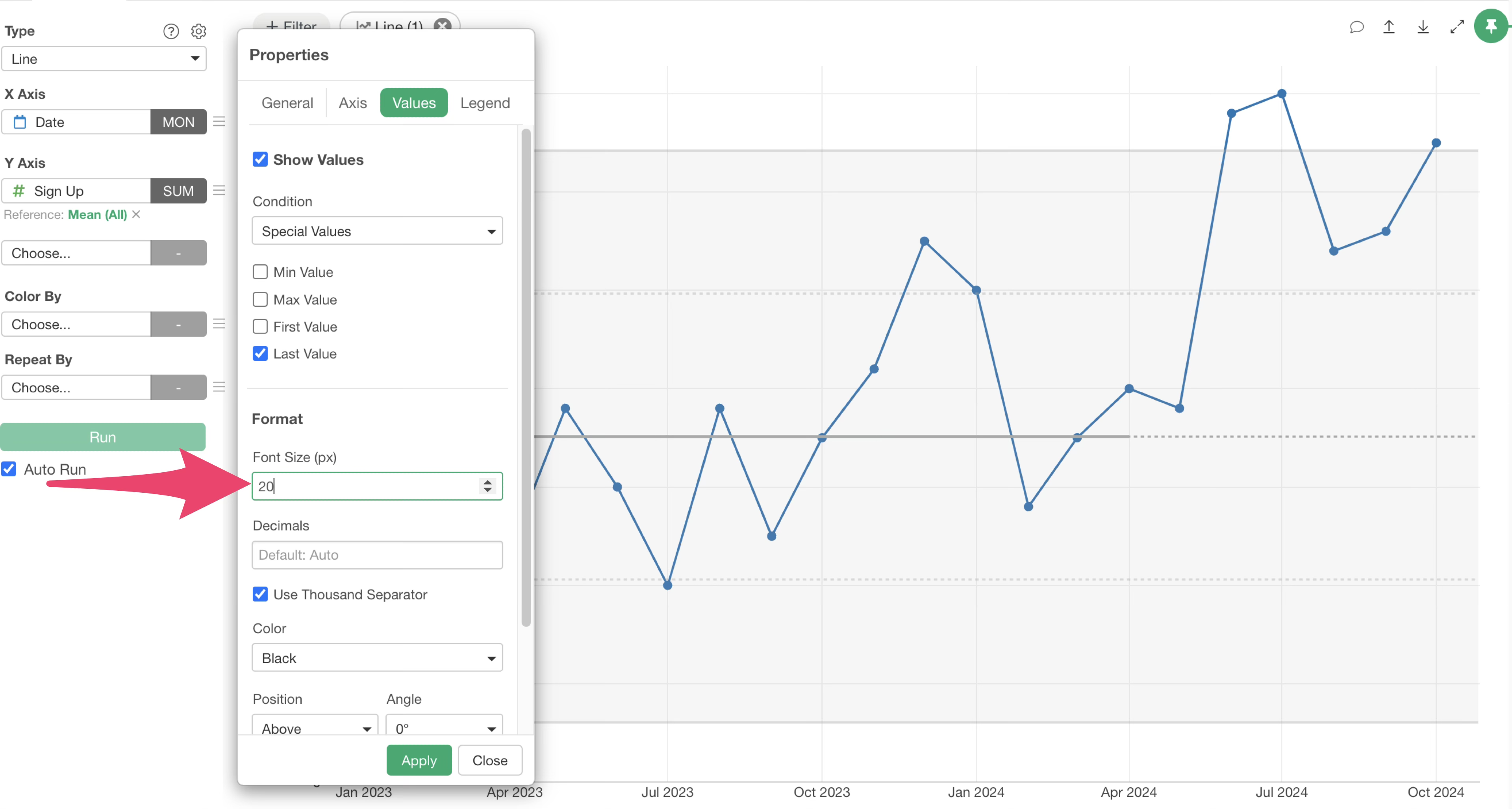
This will display the last data value on your chart.
Axis Settings
Next, let’s look at axis settings to improve the readability of XmR charts and other time-series visualizations.
Fit Y-axis Range
By default, line charts often include zero on the Y-axis.
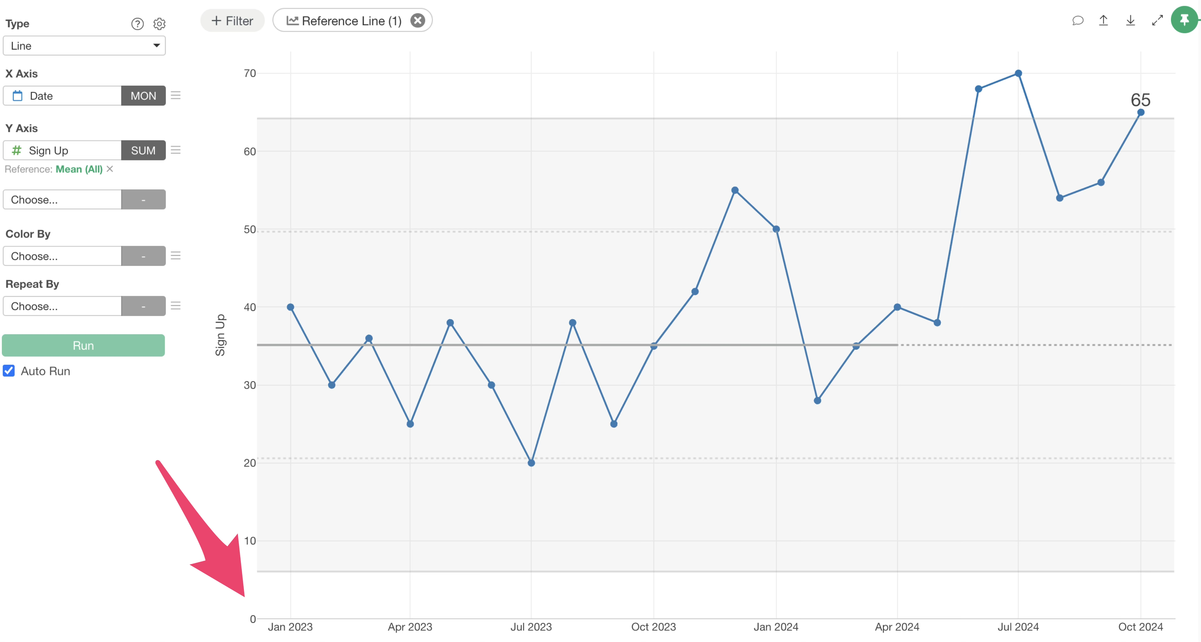
However, for line charts, the trend direction is often more important than the absolute values starting from zero.
So let’s adjust the Y-axis to fit the data values without necessarily including zero.
Go to “Properties,” then select “Axis,” and choose “Y-Axis.”
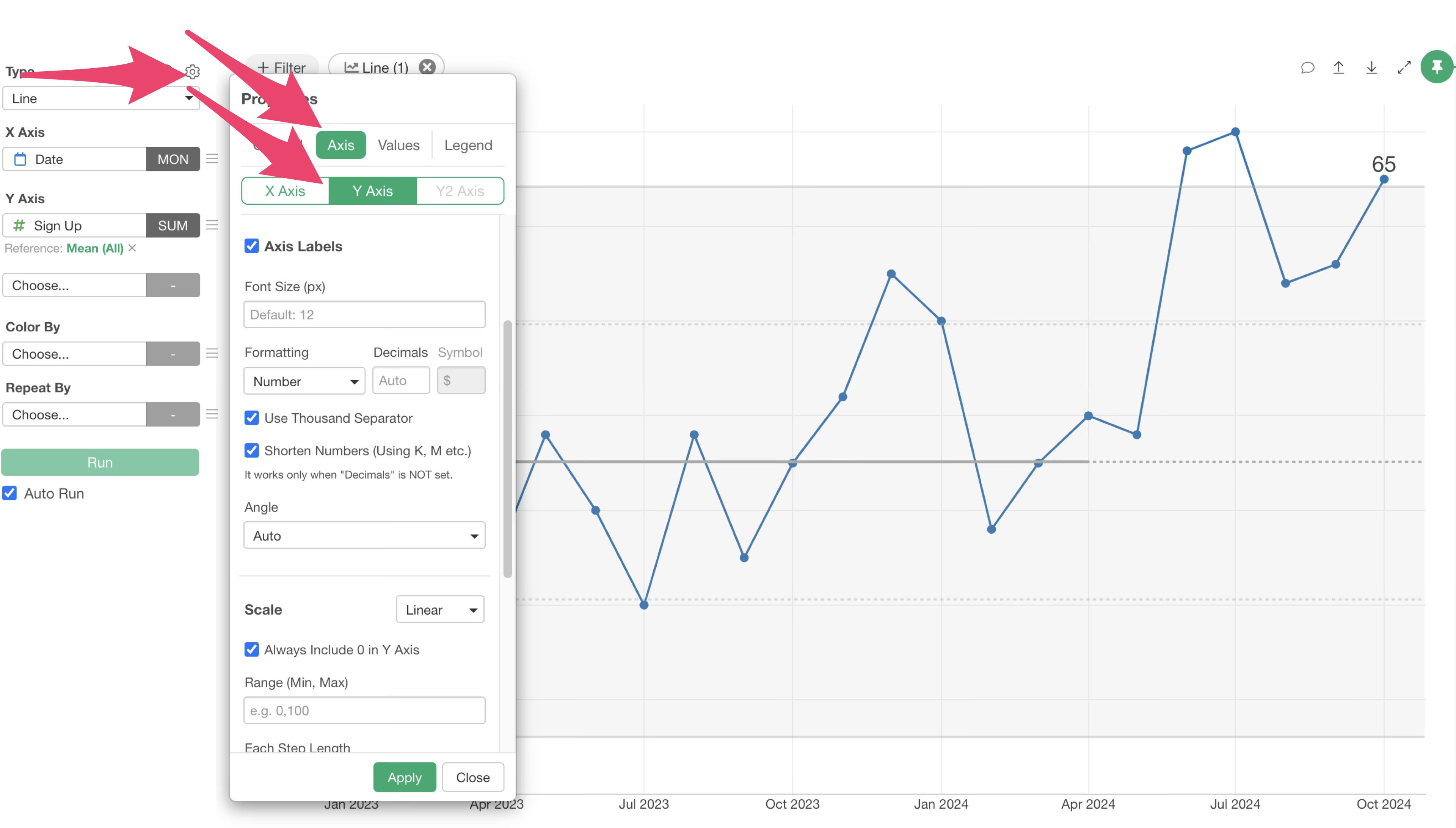
In the “Scale” section, uncheck the “Always Include 0 in Y-axis” option.
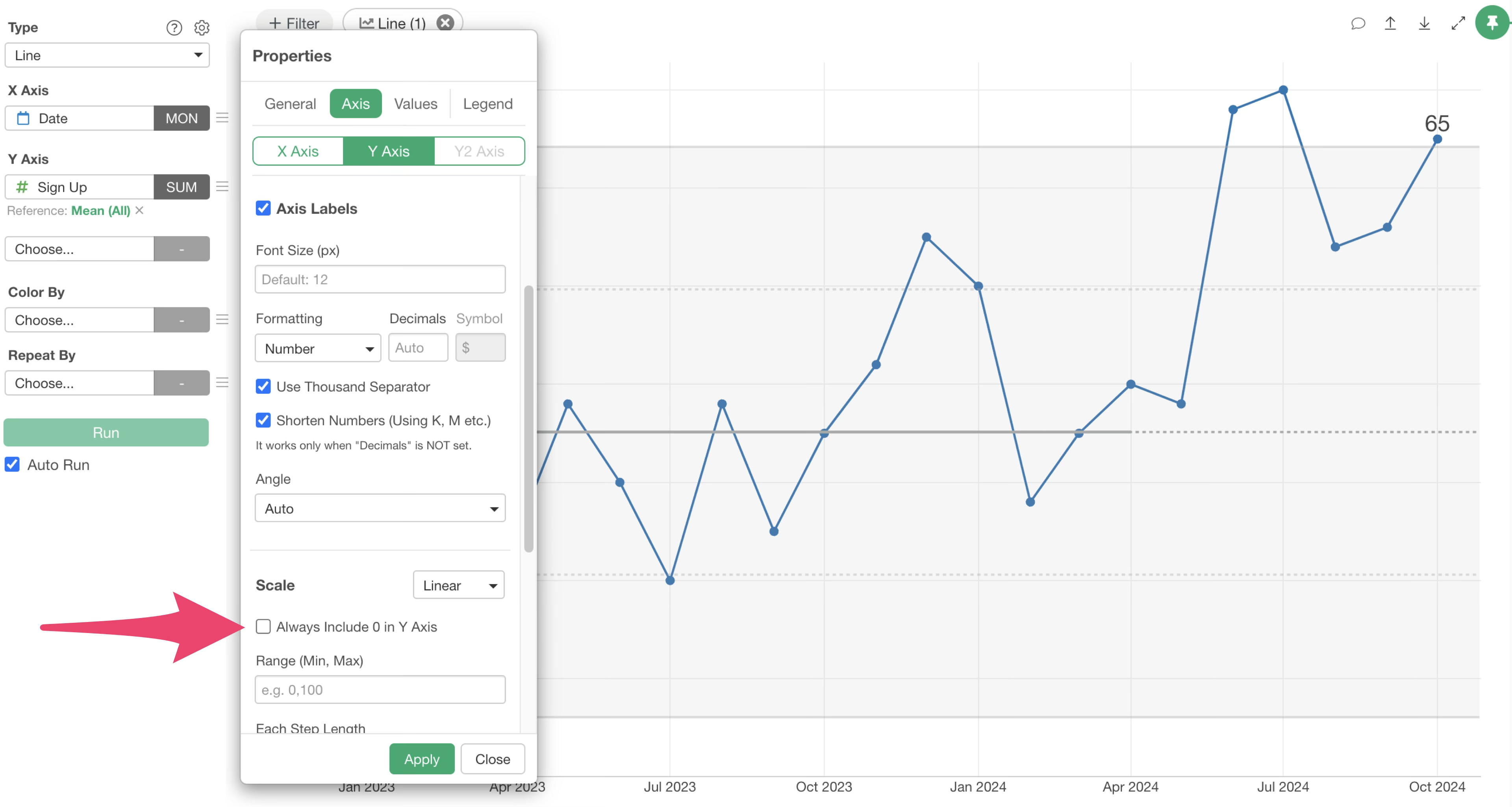
This will adjust the Y-axis to fit the range of your data values.

Hide X-axis Title
When monitoring metrics with an XmR chart, the X-axis typically represents “Date.” In such cases, you might want to hide the X-axis title if it’s obvious that it represents dates.
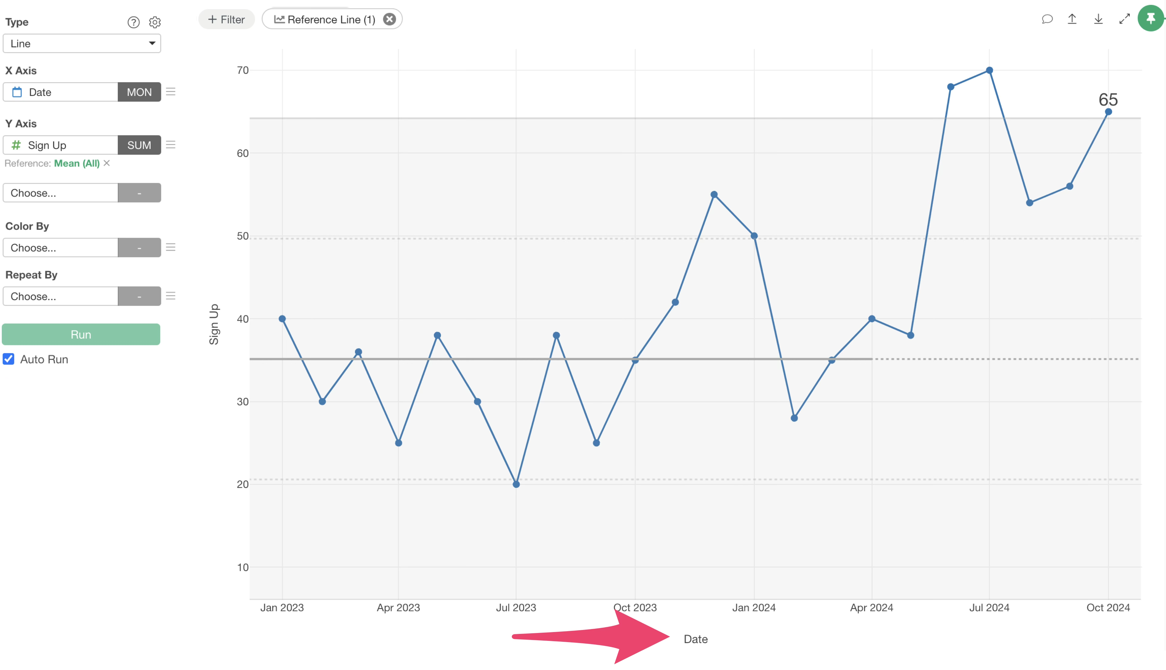
Go to “Properties,” then select “Axis,” and choose “X-Axis.”
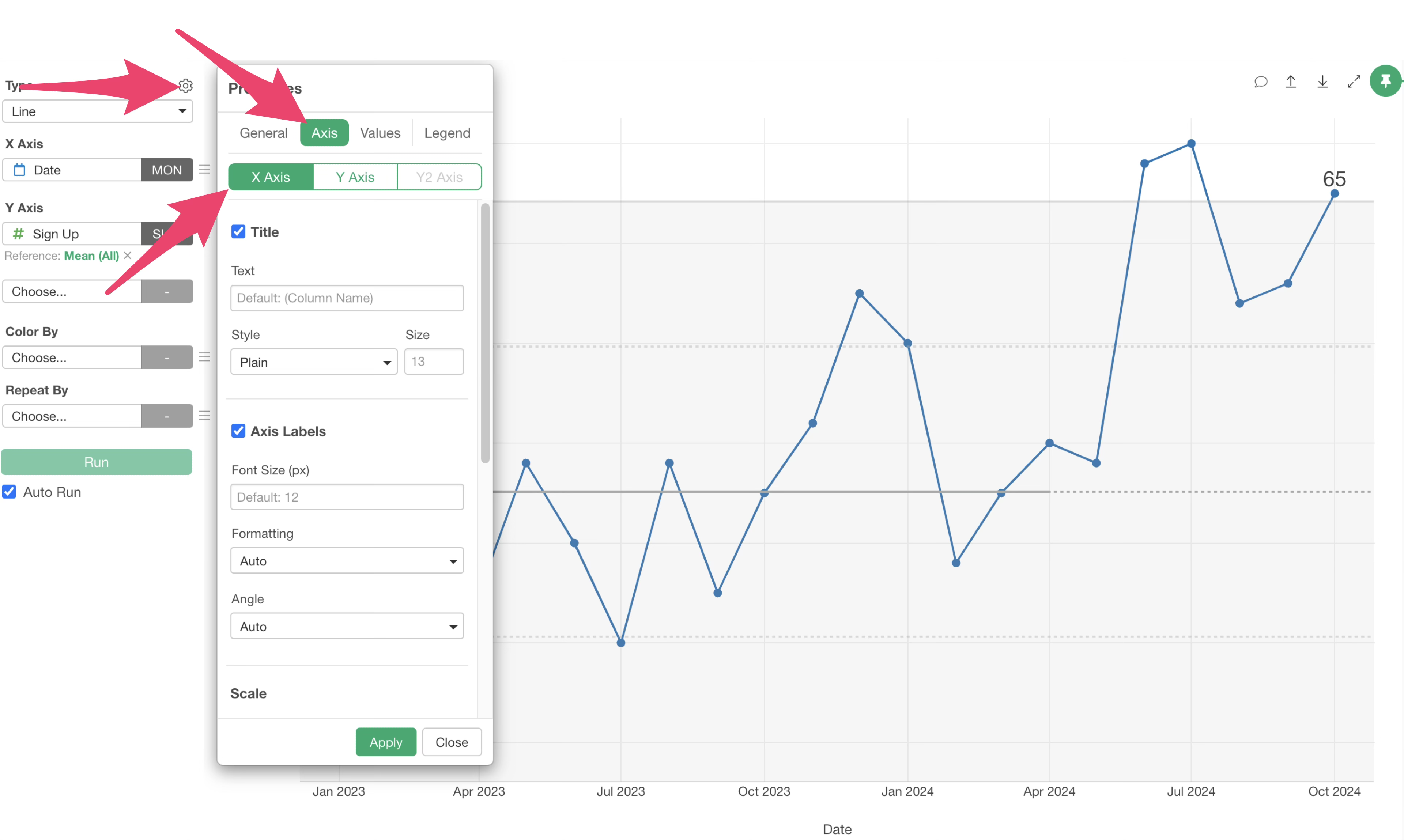
Uncheck the “Title” checkbox and click “Apply.”
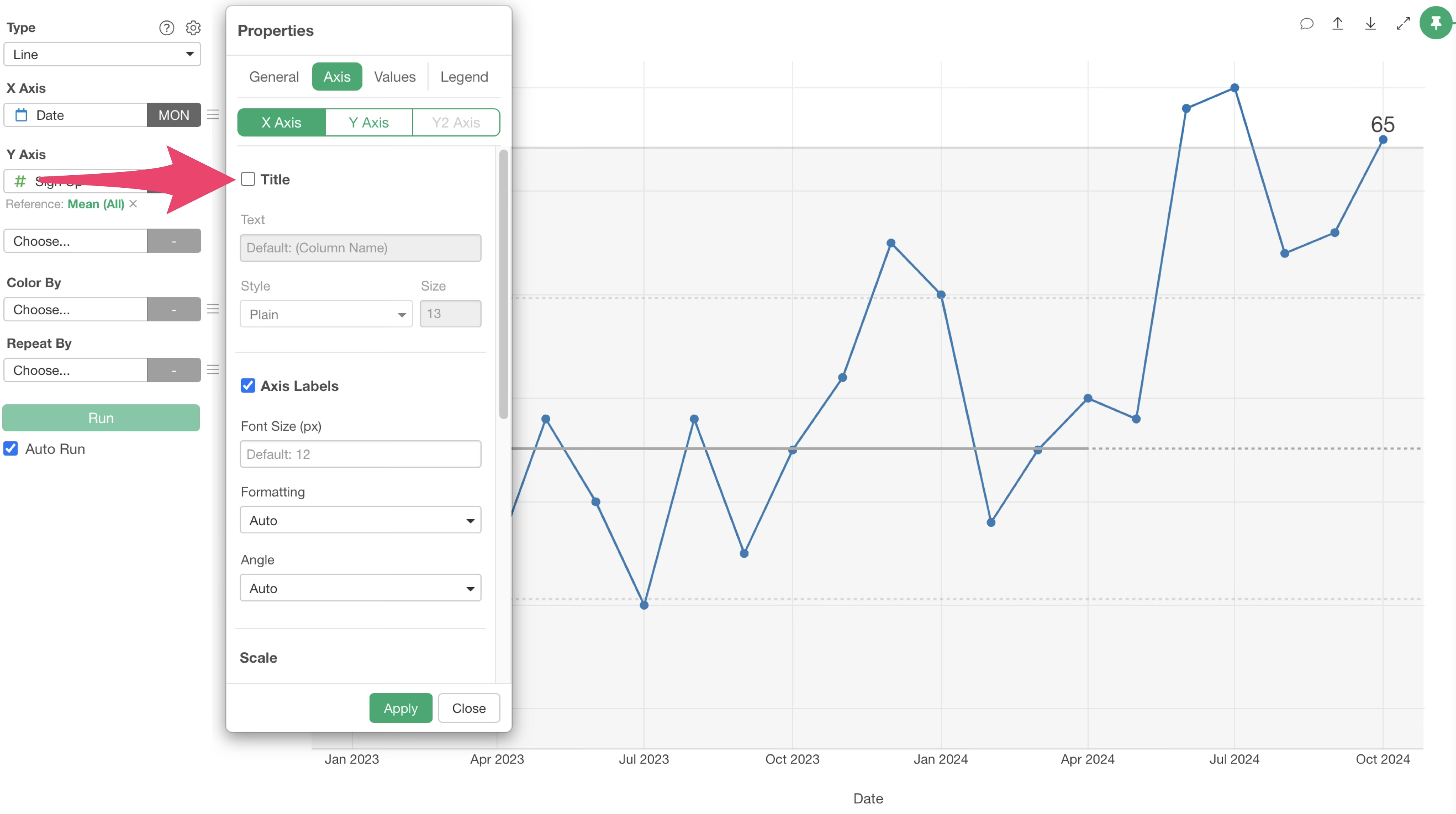
This will hide the X-axis title.
Testimonials from Our Customers
Here’s what our customers say about using XmR charts:
Marketing Industry:
- “XmR charts are more than just monitoring tools; they help us form hypotheses about ‘what’s influencing’ conversion fluctuations. We’ve found that XmR charts are easy to integrate into our operations for management-side quality control and providing guidance to team members.”
Marketing Industry:
- “Without needing complex analytics, XmR charts empower our frontline staff to improve the business, leading to practical, grounded operations.”
Retail Industry:
- “XmR charts are incredibly practical because they prompt us to think about what happened when a signal appears. It’s a very insightful way to look at charts.”
Retail Industry:
- “Being able to identify signals with XmR charts is extremely useful. While many signals are due to store renovations or relocations, other signals trigger investigations into their causes, providing valuable hints for business improvement.”
Manufacturing Industry:
- “Using XmR charts makes it easier to understand how values are fluctuating and whether there’s a signal, rather than just looking at general trends. When a signal appears, it naturally encourages us to consider why the event is happening; it’s a stimulating chart.”
Rental Business:
- “We were comparing monitored metrics against targets, but ‘good’ or ‘bad’ was often based on intuition and experience, leading to emotional reactions to data. That’s why we proposed using XmR charts.”
Publishing Industry:
- “By using XmR charts, we can identify problems earlier and take proactive measures, which has been very effective. XmR charts are a great fit for monitoring key metrics.”
Training Business:
- “XmR charts are practical and easy to use. You can create them with just date information and a metric column, so the data requirements are low, and the results are easy to interpret.”
Educational Institution:
- “Having an XmR chart monitoring environment makes it easier to try new things and run experiments.”