Number: How to Show Differences / Ratio
One of the most common uses for dashboards is to monitor business metrics or KPIs, and in Exploratory, you can display these metrics using “Number” charts.
The “Number” chart, which can display KPIs and metrics, has received a major update in v10!
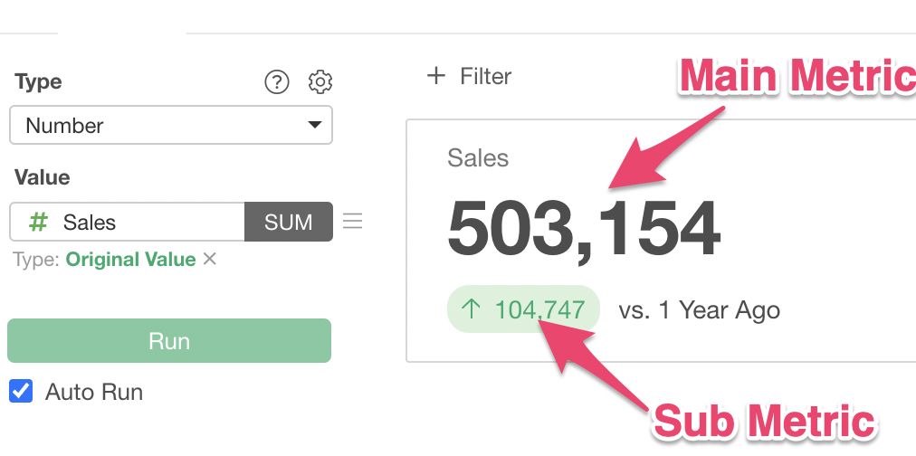
In v10, in addition to the “Main Metric” that was previously displayed, you can now add a “Sub Metric”!
By using a sub metric, you can express the “difference” or “percentage difference” compared to the previous month or the same month last year.
Furthermore, when calculating the main metric, it is now easier than ever to specify values such as the sales for the last month in the data.
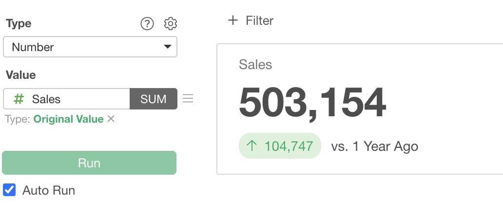
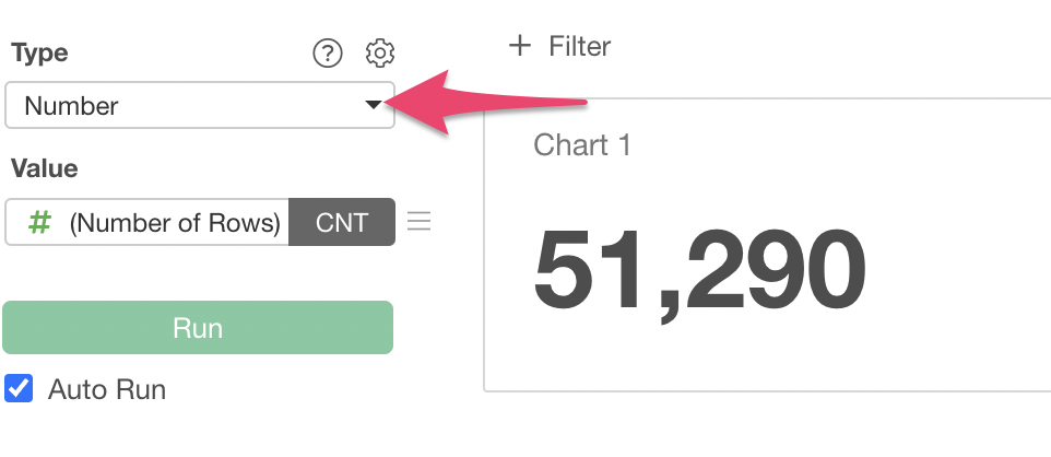
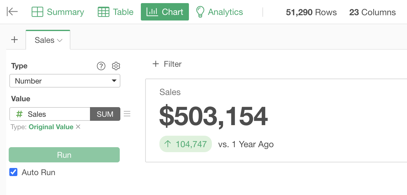
Create a chart from the Chart view and select “Number” as the type.
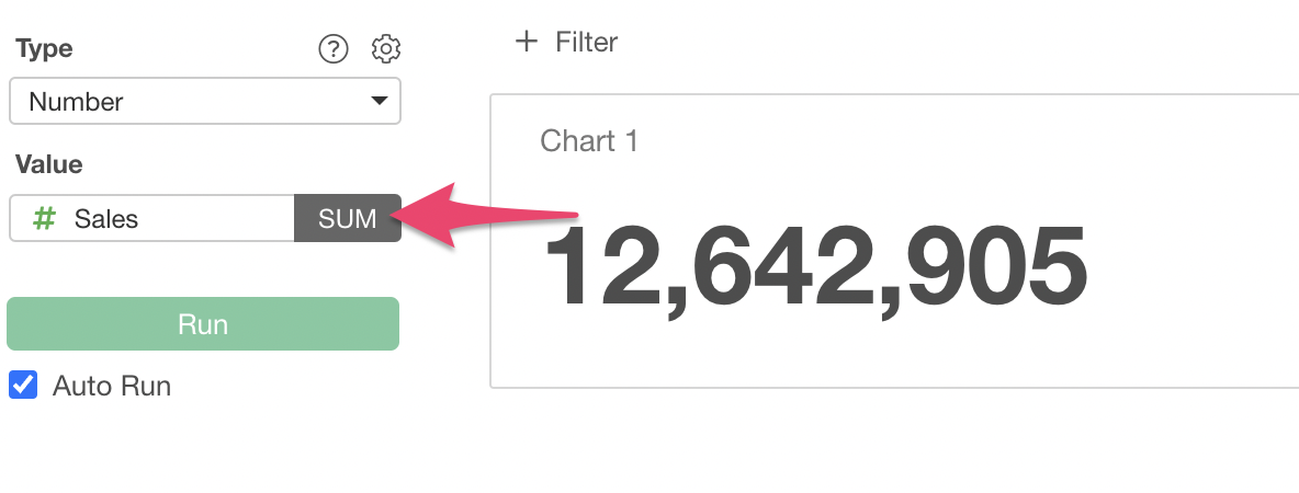
Select the “Sales” column for Value and “Sum” for the aggregation function.
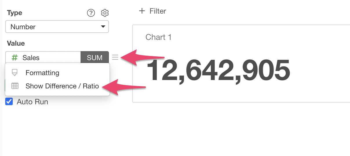
Next, let’s add “difference” or “change rate” to the number.
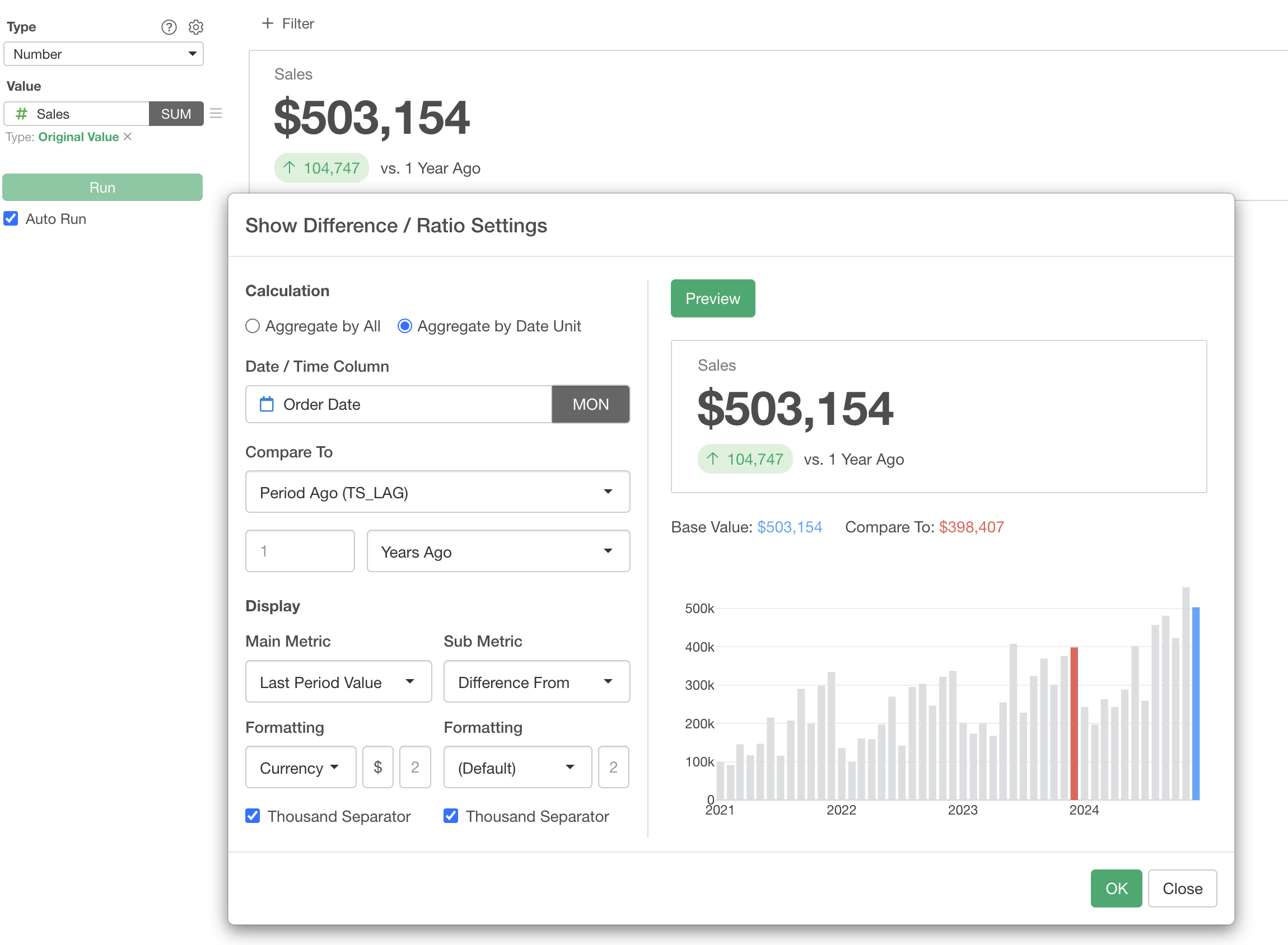
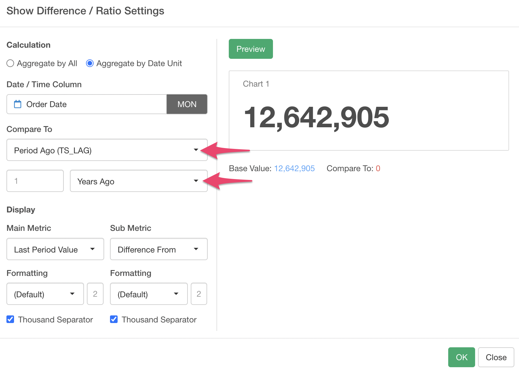
From the Value menu, select “Show Difference / Ratio.
The “Show Difference / Ratio” dialog is now shown.
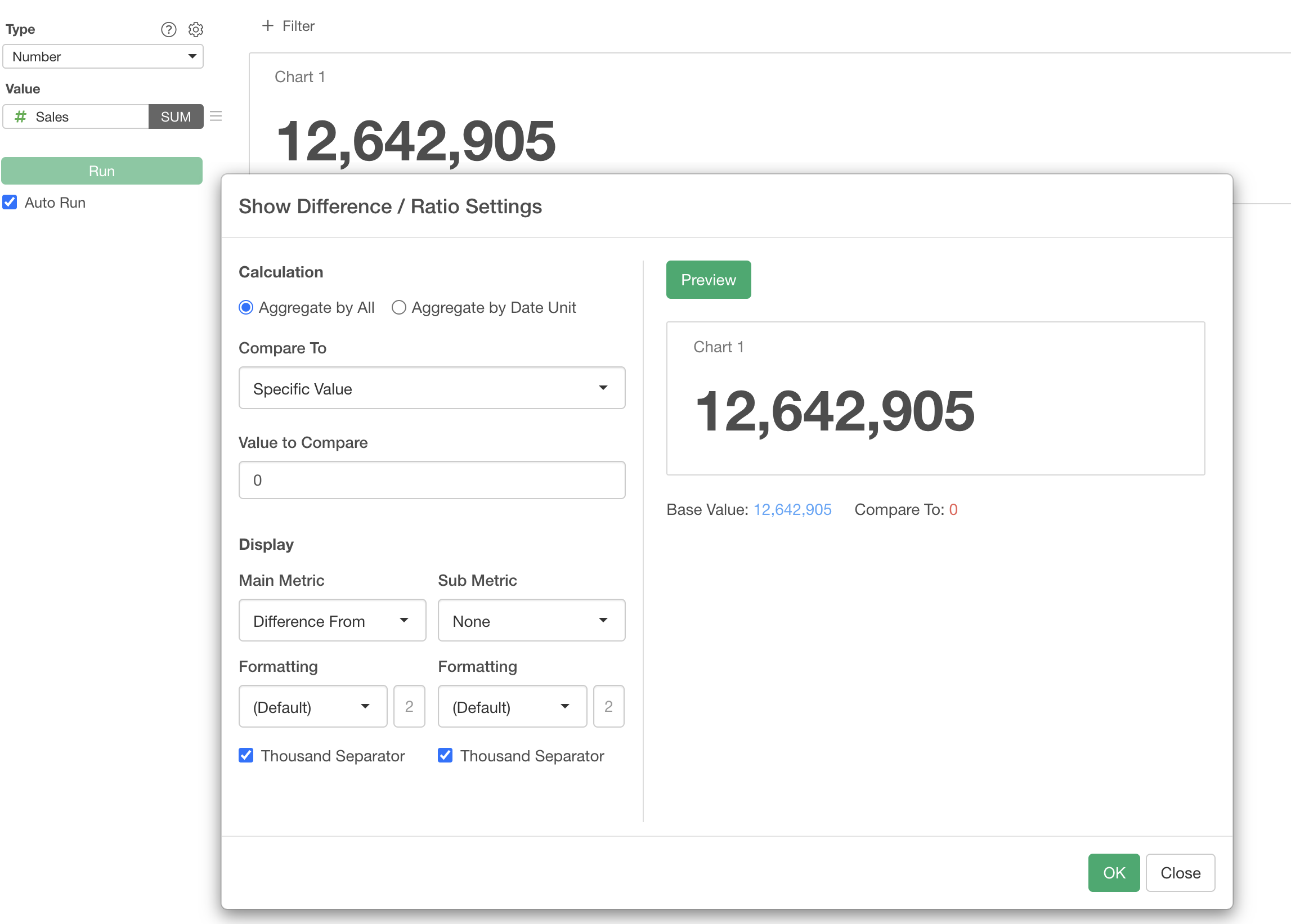
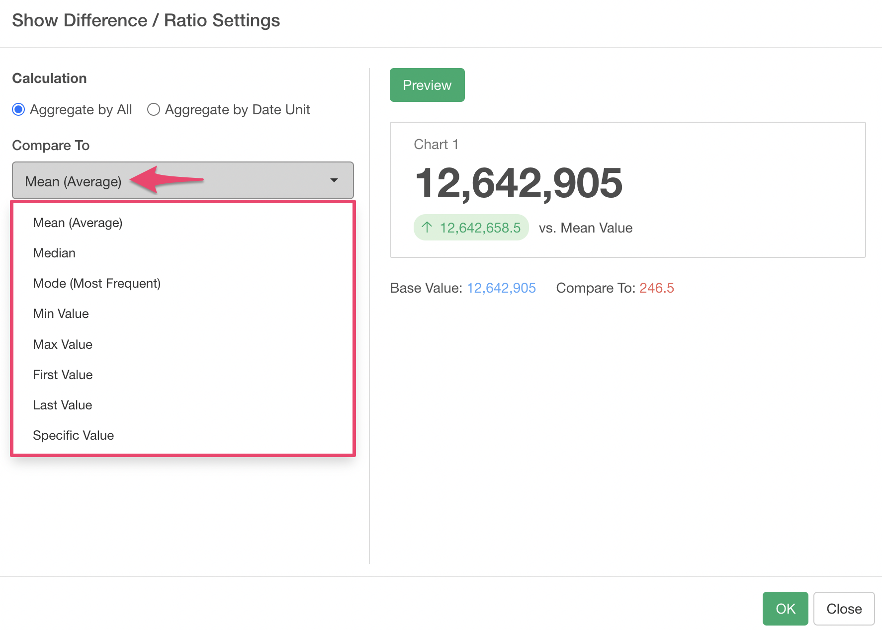
For “Aggregate by All,” several aggregation functions are supported for comparison, allowing you to see how much “difference” or “percentage difference” there is compared to those functions.
This time, we want to display the increase or decrease in sales compared to a specific period, such as the same month last year, as a number chart, so we select “Aggregate by Date Unit”.
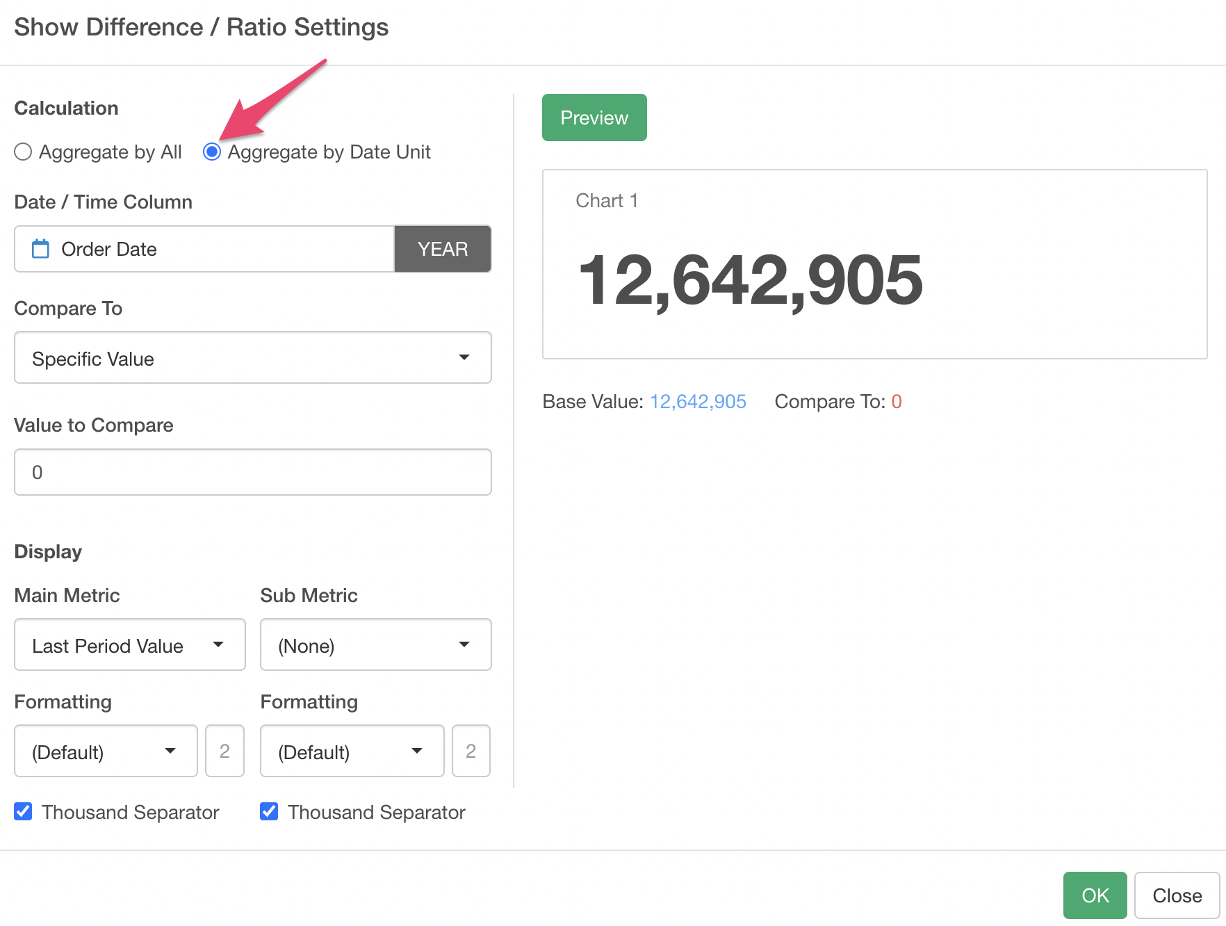
For the Date / Time column, a date column is assigned by default. Since we want to view it on a monthly basis, select “Month” for the date unit.
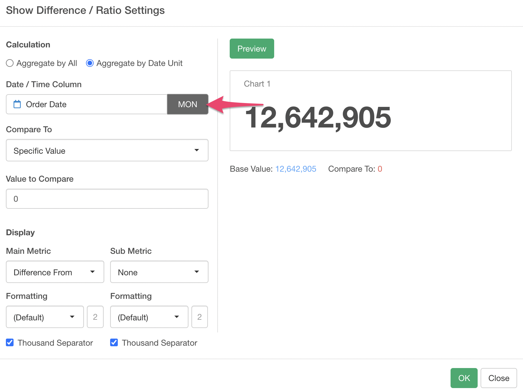
Next, by specifying the comparison target as follows, you can calculate the year-over-year comparison. If you want to compare with one month ago, select “Month” for the period unit.
- Value from Previous Period (TS_LAG)
- Period: 1
- Period Unit: Year Ago
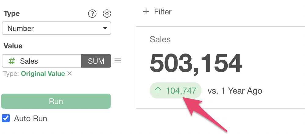
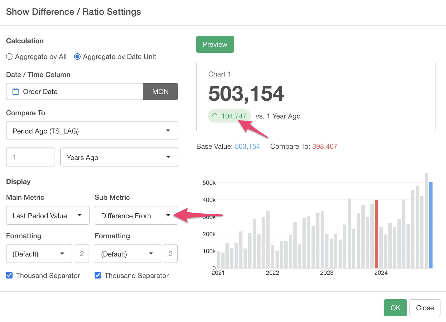
“Last Period Value” is assigned to the main metric by default, and “Difference From” is assigned to the sub metric.
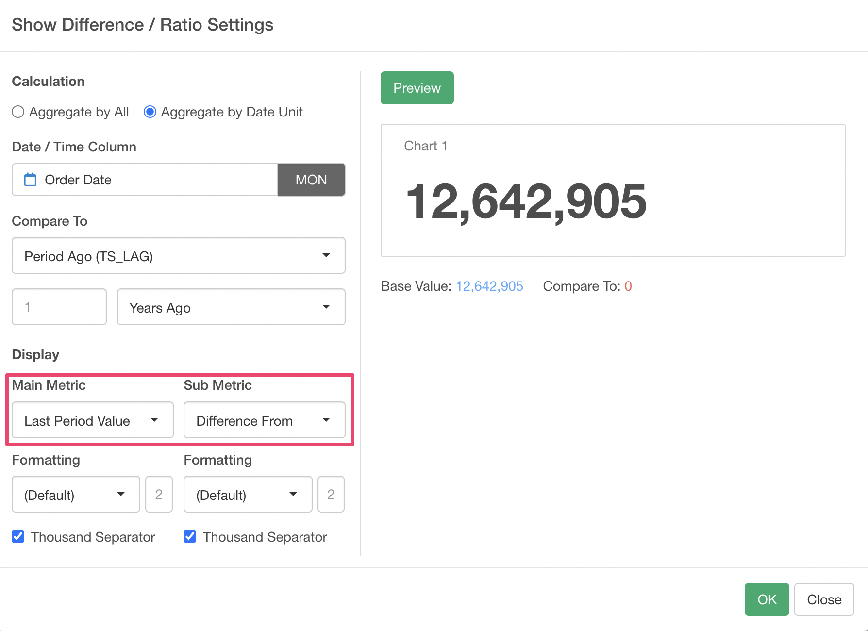
By previewing, the main metric displays the sales for the last month in the data, and the sub metric displays the difference in sales compared to the same month last year.
The sub metric also has the following types:
- Last Period Value
- Last Period
- Previous Period Value
- Difference From
- % Difference From
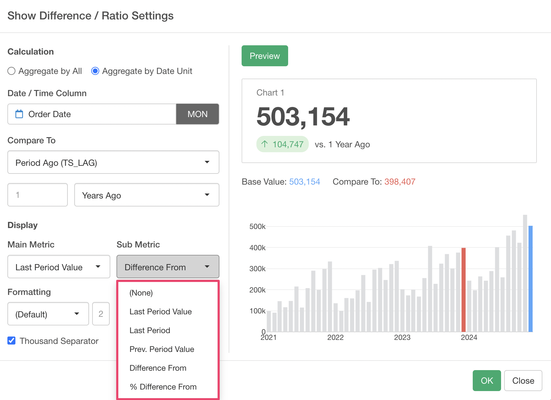
For example, by using “% Difference From” for the sub metric, you can display how much sales have increased (or decreased) in percentage compared to the same month last year.
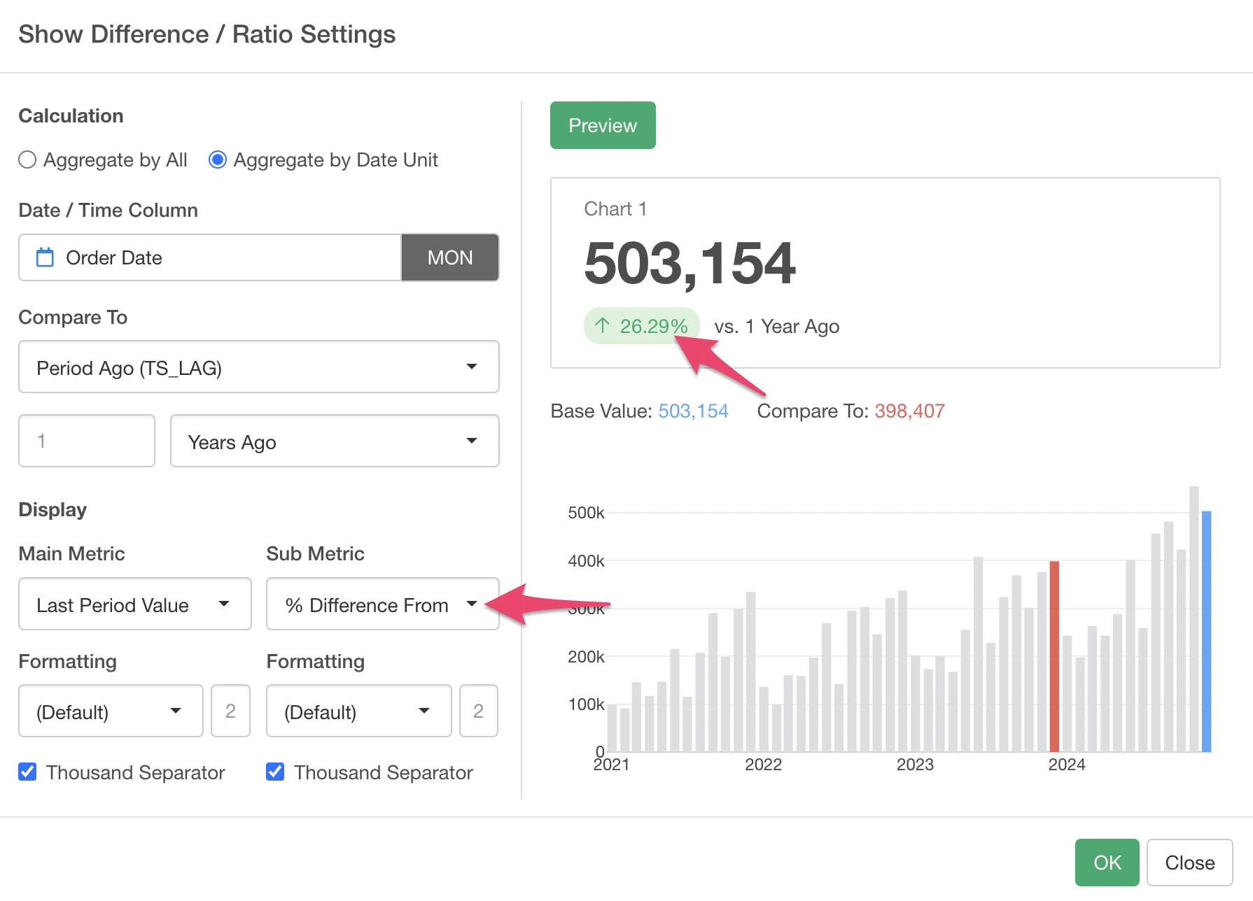
By executing this, we were able to simultaneously display the “latest month’s sales” and the “year-over-year percentage increase in sales.”
As introduced this time, the “Number Chart,” which can be used to monitor business metrics or KPIs, has been significantly enhanced, so please give it a try!
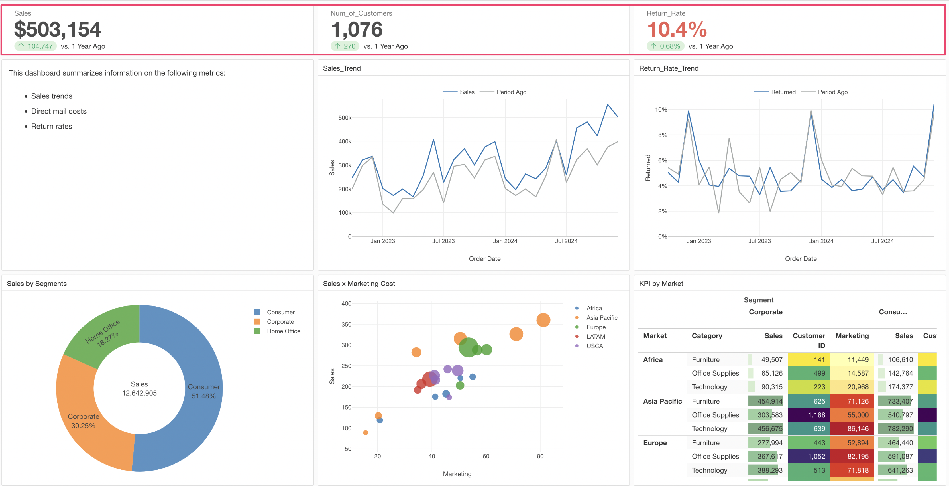
If you are interested in how to create dashboards, you can try it hands-on in this note.