Populating Missing Dates with Complete Function
Let’s say we have a retail shop and we give discounts for certain products. We change the discount rates once in a while and want to visualize the rate changes.
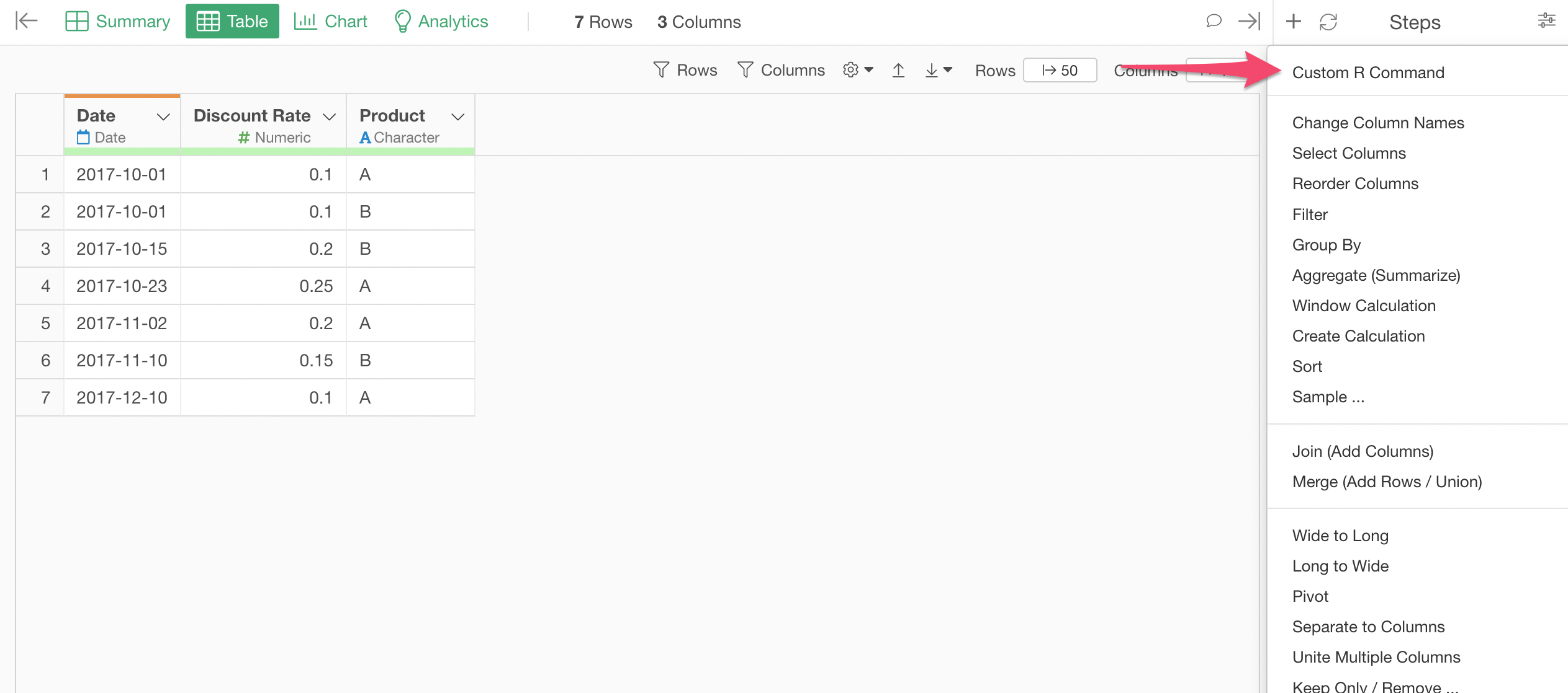
Here is the rate change history data. You can see different rates being set on different dates for product A and B.

If we simply try to visualize this data with Line chart, it would look like this by default.
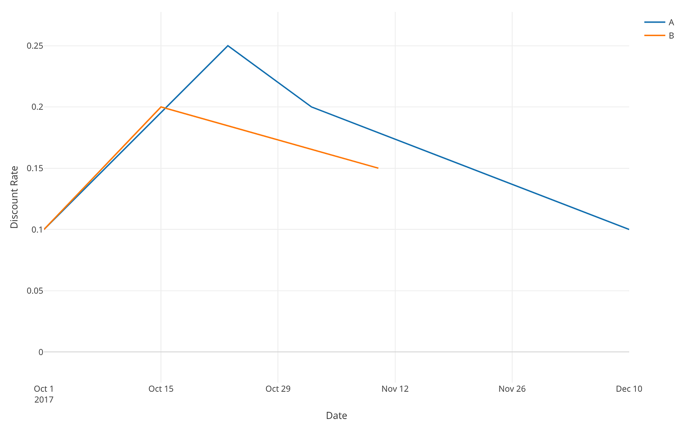
But intuitively, we know this is wrong. The discount rates shouldn’t gradually change between the two dates, for example, October 1st and 15th. Instead, they should stay at the same rate until they are set differently. So the rate for Product A should be 0.1 until October 15th and we would expect a chart like below.

So how can we create a chart like this?
This is the problem we'll address today.
Populate Missing Dates Data with Complete Function
The source of the problem is that we don’t have all the dates during the period in this data. Instead, we have only the dates when the discount rates were changed.
How can we populate those missing dates?
There are two convenient R functions, one is called ‘complete’ from ‘tidyr’ package and another is ‘seq.Date’ function from base R. Combining these two, we can take care of this task elegantly.
Here’s how you can write the function.
complete(Date = seq.Date(<start_date>, <end_date>, by=<date_unit>), <group_column>)First, seq.Date function populates a sequence of Date data for the period that is configured by the first (<start_date>) and the second (<end_date>) arguments.
We can use min and max functions to generate the start and end dates dynamically based on the data. Then, you can set the date unit. If you want to populate the dates, for example, by day, then this can be “day”.
The last argument in the 'complete' function is the grouping column. This data has a Product column that has two values of 'A' and 'B'. We want to populate the missing dates for two products hence we can set something 'Product' as the grouping column here.
With this ‘seq.Date’ function, the complete function will add rows for the missing dates.
So the final function would look like below.
complete(Date = seq.Date(min(Date), max(Date), by="day"), Product)Note that the Date column was originally POSIXct (Date and Time data type in R) but ‘seq.Date’ function works only for Date data type, so I’m changing it by using as.Date function.
In Exploratory, you can simply run this command with Custom R Command input mode.
And type the R command like below,
complete(Date = seq.Date(min(Date), max(Date), by="day"), Product)into the Custom R Command dialog, and hit the ‘Run’ button or Cmd+Enter (Mac) or Ctrl+Enter (Windows) to execute the command.
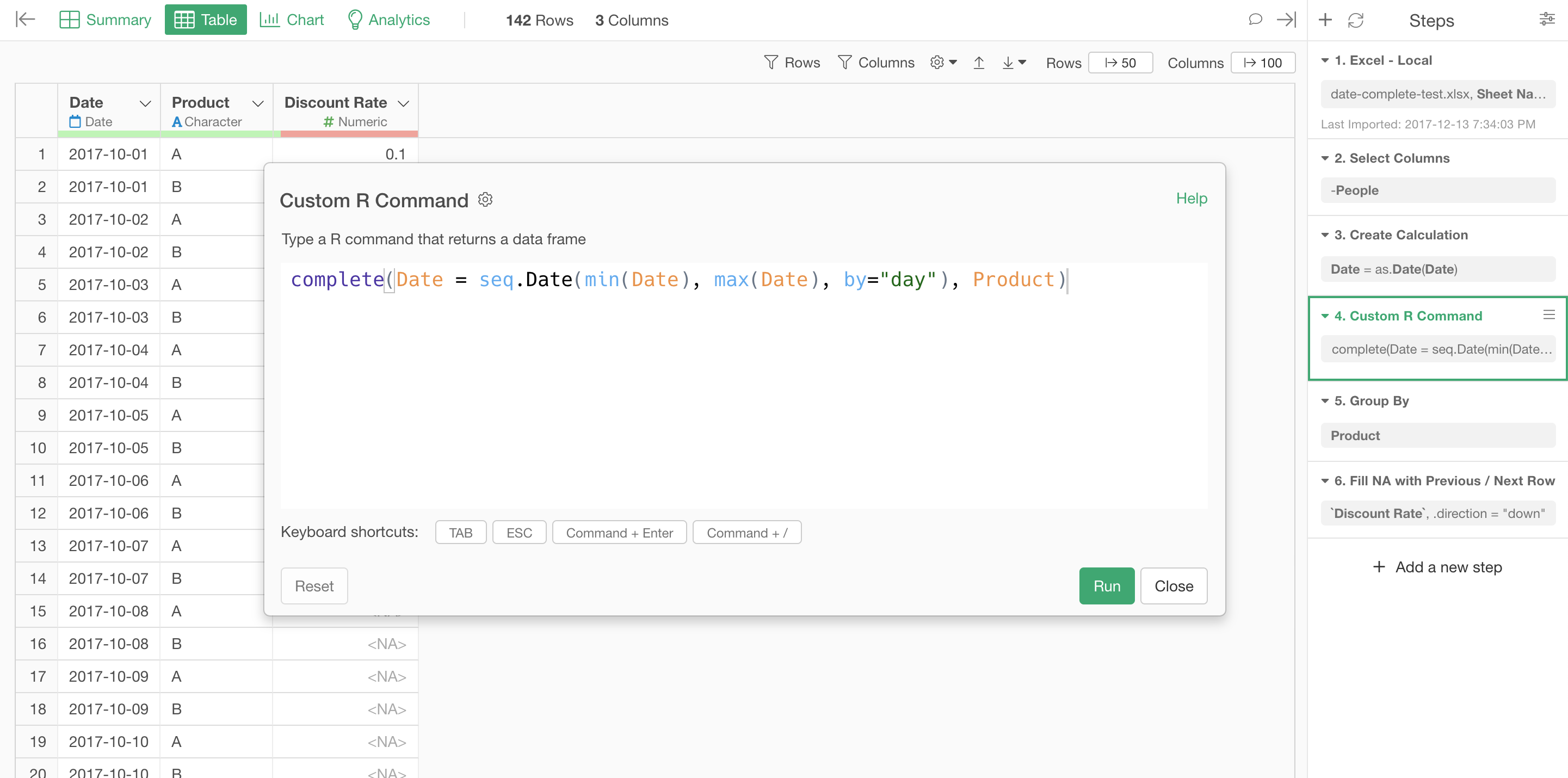
Now we can see all the dates between 2017–10–01 and 2017–12-10 being populated.

But now the problem is that we have all those 'NA' or missing values.
The good news is that you can use the chart in Exploratory to fill the missing values.
Fill Missing Values with Chart
First, when you try to create a line chart with the data we have at this point you will get something like this.

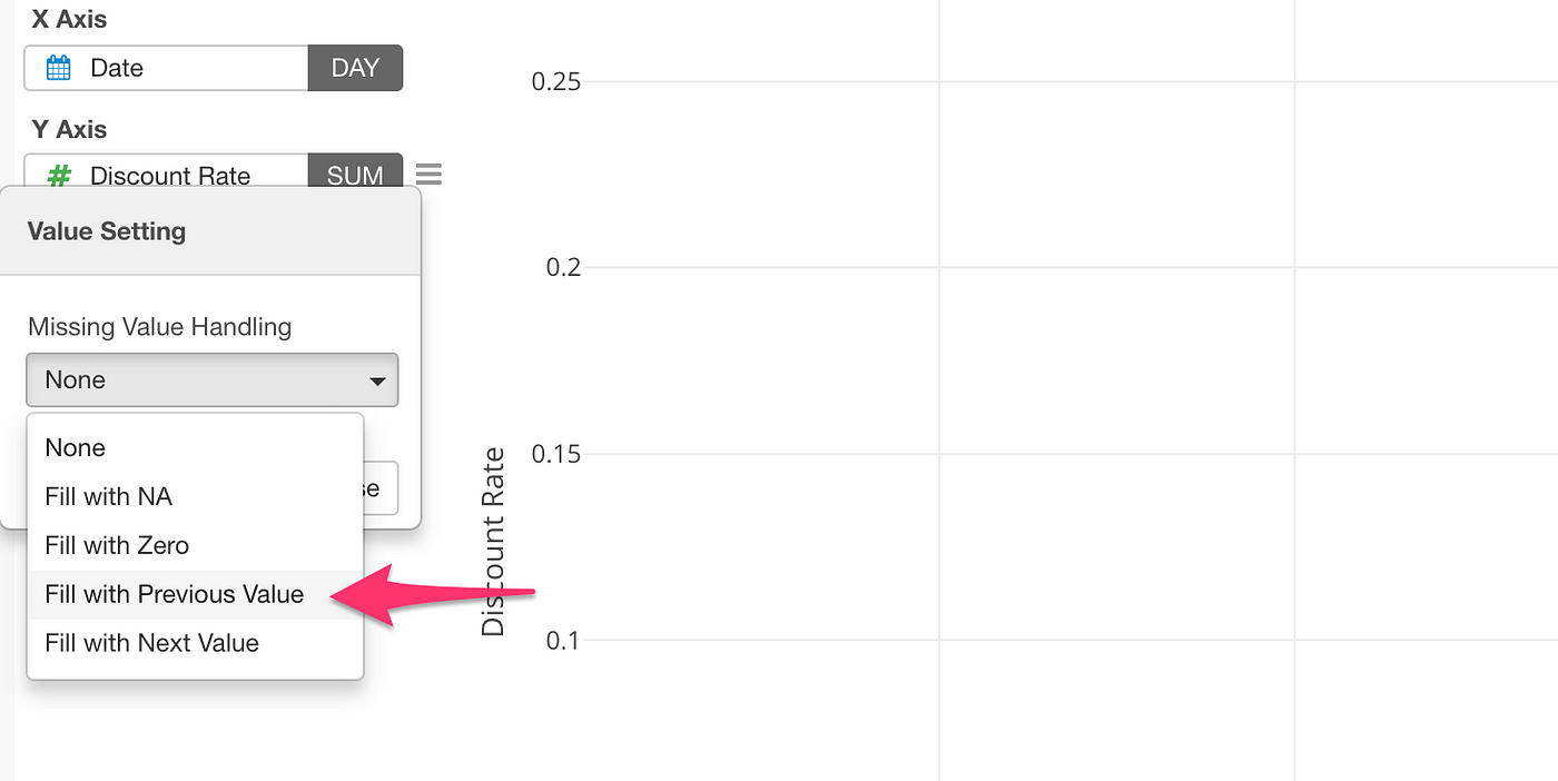
Now you want to configure how you want to fill the missing values.
Select 'Missing Value Handling' from the Y-Axis menu.
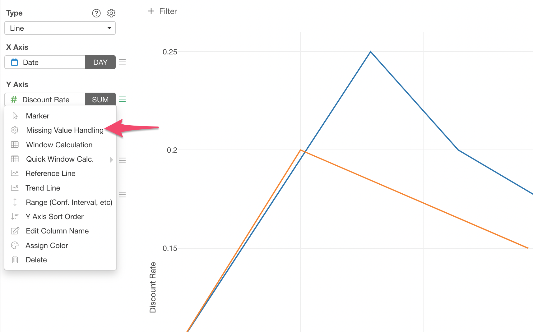
Select ‘Fill with Previous Value’ from the dropdown list.
This will create a chart like below.
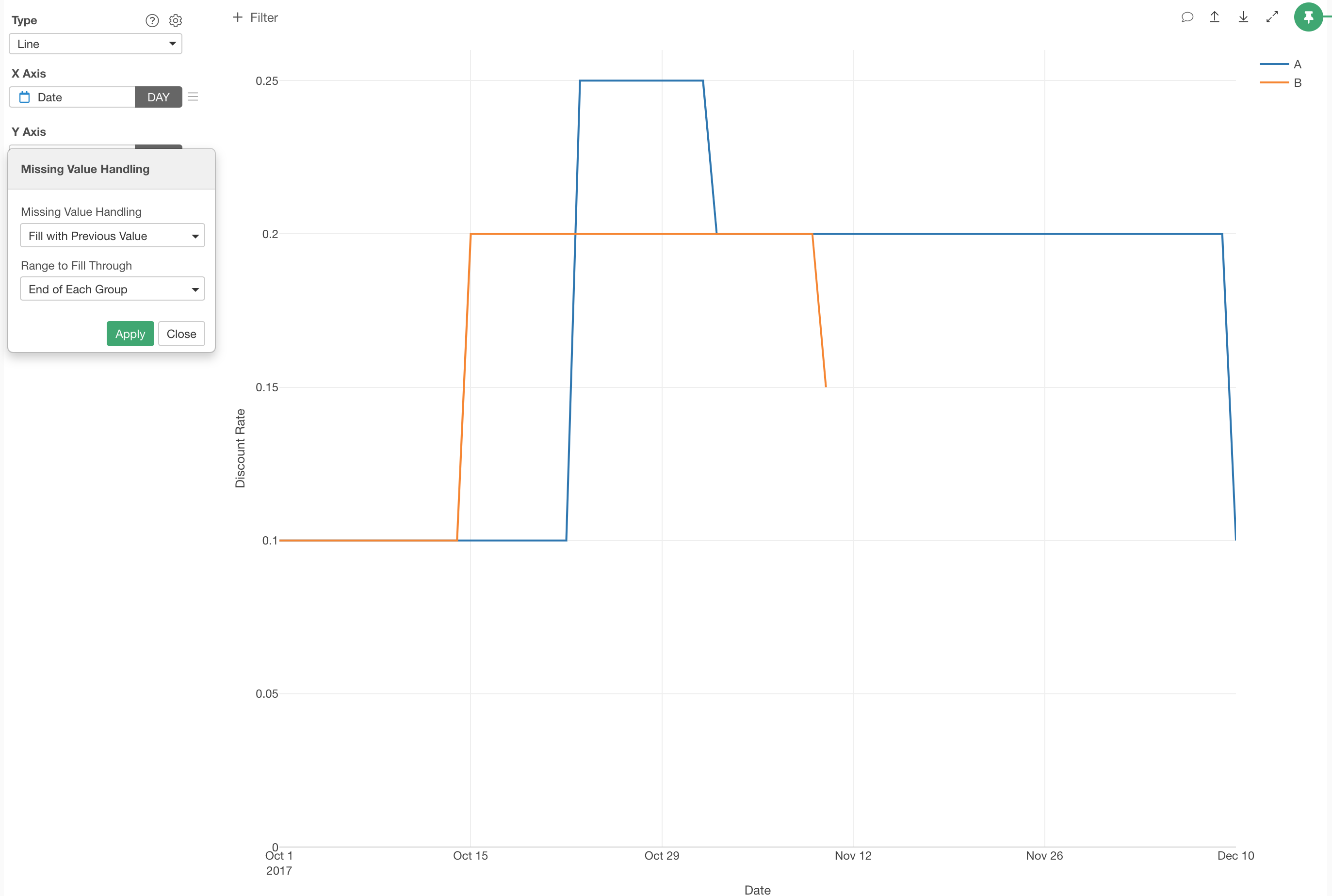
Yes, this is exactly the chart we were looking for!
Try Exploratory!
If you want to try this with Exploratory but don't have Exploratory yet, sign up for a free trial from here and download to start!